ÈGÖ

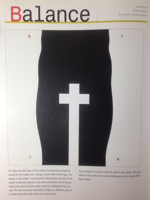
My idea on creating an adventurous theme came greatly because I personally enjoyed being in outdoor and travel. Some of elements which I used has an ideal interpretation of the adjectives that describes me.

I decided to do every frames digitally using the pen tool because I believed that I’m more well versed and confident in using the medium.

Besides that, I would also like to achieve a minimal clean vectorized design, but at the same time has a great impact that could grab the attention of viewer.

Take for example the first equation, I used a honey yellow for the base as yellow is a color that grabs the attention of the viewer. And I believe it works here without we even realizing it.

So the ensemble of the colors, complements each other in every equation, I repeated the colors across each equation so that it has a consistency in the overall aesthetic look despite that we could see distinct contrast like the background colors which is honey yellow, the Prussian blue, teal, and khaki. These colors have a sets of meaning that I would like to evoke.

Before I started on putting the right colors, I made some research and get some inspiration on a color palette in color.adobe.com. I used mostly split complementary and triad color combination split-complementary color scheme has the same strong visual contrast as the complementary color scheme, but has less pressure. As for the triad color it combines to create color harmonies.

.Final12_03

Final12_06

Final12_08

Final12_10


MY STORY


Final12_03

The first equation is independent plus adventurous equals explorer me. I used the swiss army as it is best describe an independent me. Generally, I don’t like to rely on others for aid or support unless I really need it. I used red color to evoke courage, strength, energy and determination. Red also has a great contrast against the yellow background to bring out the subject further.

I describe myself adventurous mainly because I really love exploring and taking risk, sometime when we travel or explore to a foreign place we tend to get lost but to me it is an adventure to get lost. Hence I used Pine green for the tent to represent optimism, green also relates to nature. Independent plus adventurous and I got me, still finding myself and exploring by showing a sense of achieving towards my goal in a mountain composition. Having the khaki or brownish tone for the mountain that also represents endurance, nature and earthy.

Final12_06

That leads to the next equation loyal minus possessive equals to better me. Loyalty trait has always been in me. Being faithful to friends and commitment. Hence i thought a matchbox is a great way to interpret this equation. The loyalty for a matchbox is between the matchsticks and the coarse striking surface on one edge for lighting the matches contained inside. They are like a bunch of friends that cannot be separated, but if they do, they would be separated for the rest of their life that and that leads to the possessive me, sometime I maybe possessive, keeping things within me, just like this illustration, but once I eliminate it, I will get a better me, which comes the fire that represents a burning sensation and desire in achieving the best, something better. I used the Prussian blue for the background as blue represents loyalty, it is also a color of spirits. The brown wood color on ‘better me’ composition is to evoke a sense of earthy, nature and confidence.

Final12_08

Next equation, Preparedness multiply by Nature and I get Ideal me which is also Satisfaction.   Preparedness and being ever ready, I will always take account on this whenever there is event or task to be done. Being ever ready.

Same like the mass tins that we bring along if we are into the forest. The Gray color to show serious and intelligence, contrasting the brown that is in the nature.

Multiply by nature, using fish to represents this frame. I have always appreciated the beauty of nature. It has a great intangible connection to me. Having the Honey yellow and a shade of orange to evoke lifelines, cheerfulness, and energy at the same time. And the Ideal me shows a sense of satisfaction. From my point of view, we should be grateful for what we have, because there are more less fortunate people out there. Thus I hope having a simple cooked fish delivers what I would like to convey here. Always be humble and grateful and that makes ideal me.


Final12_10

The Last equation represents Dependable Plus Visionary and I get me in five years’ time. The backpack design was an inspiration from my own bag. I used pine and forest green. Green represents durable and reliable hence with this I would like to show the dependable me which could also mean trustworthy. Being an ambivert also allows me to think a lot and always having a great sense of vision to my future, whether or not the dreams come true, I’m not sure but dreams doesn’t come just like that, it is me that needs to make the dream.

And therefore the final frame represents  me standing on a mountain. It is suppose to show me achieving my goal. But I really hope I could give back to society and do social work out there.


Behind the scene


Photo 6-11-15, 11 14 16 AM

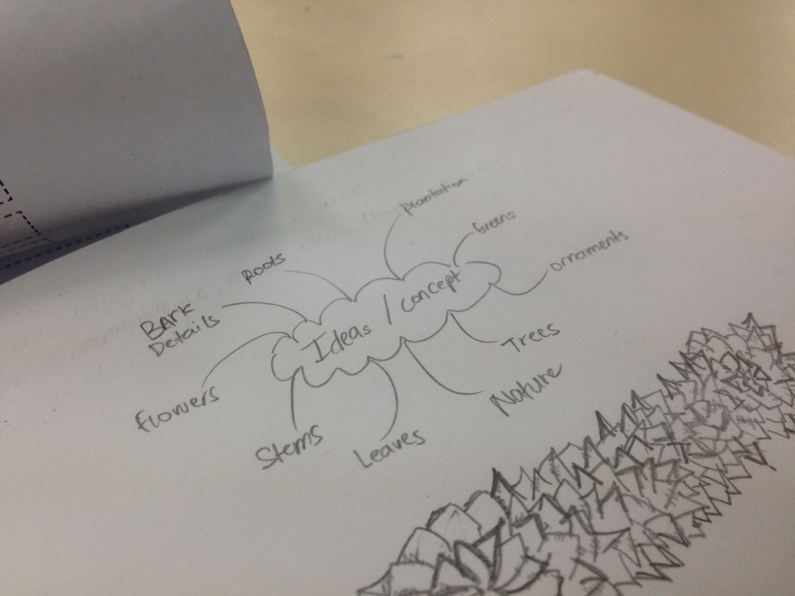
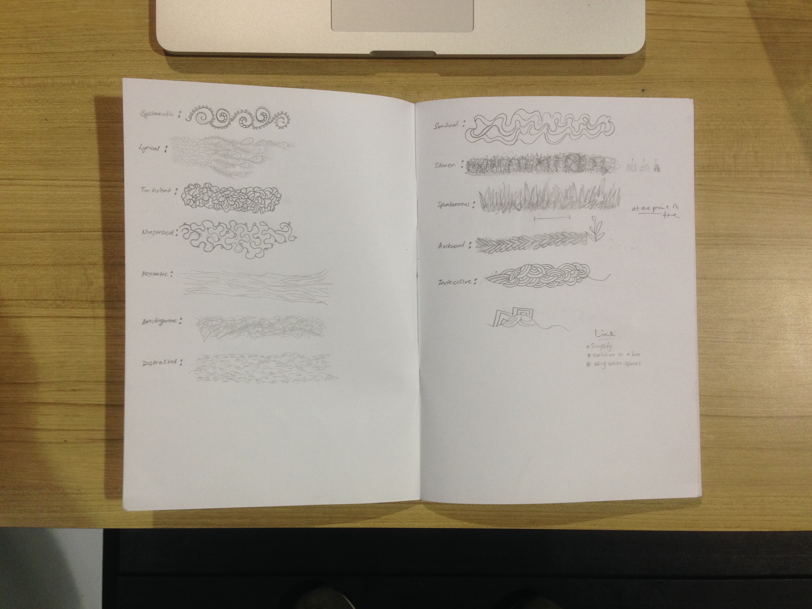
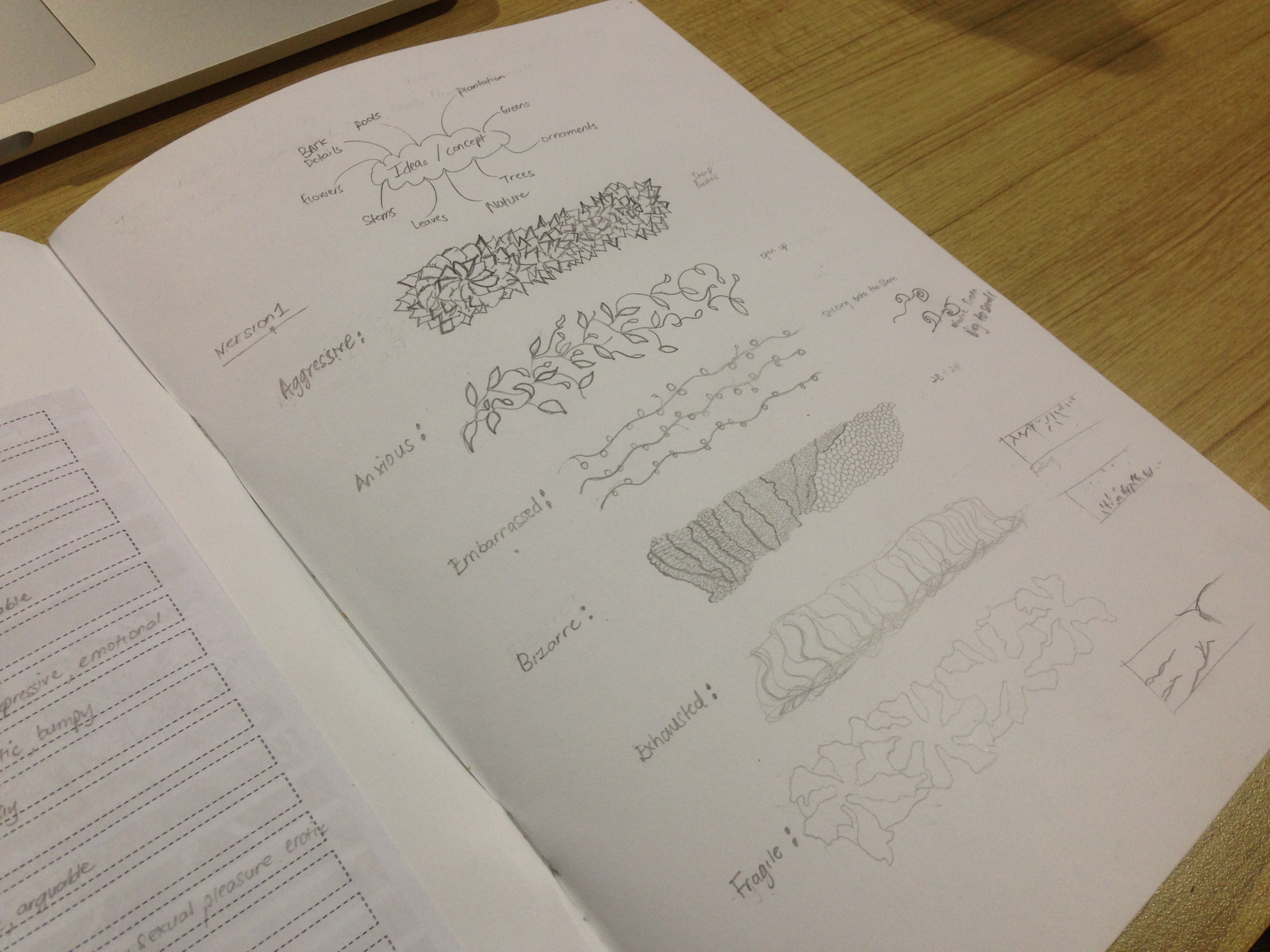
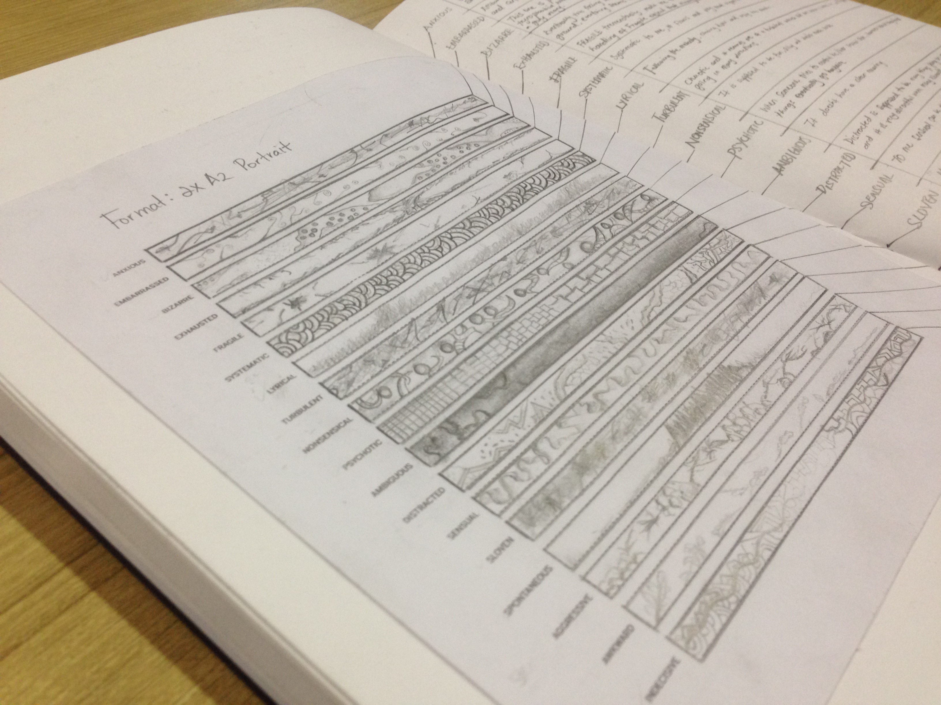
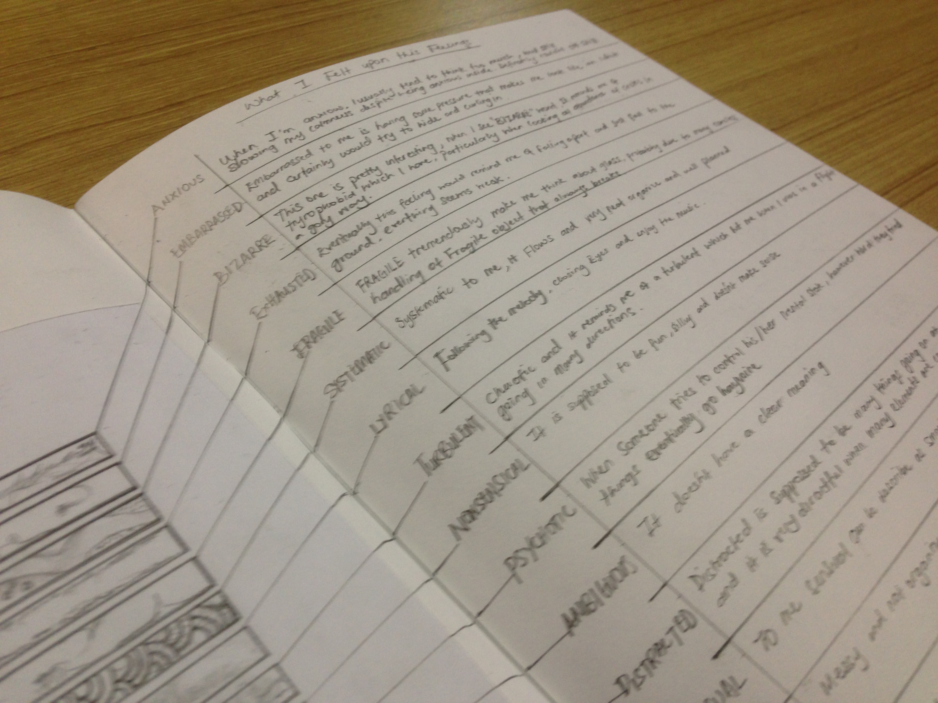
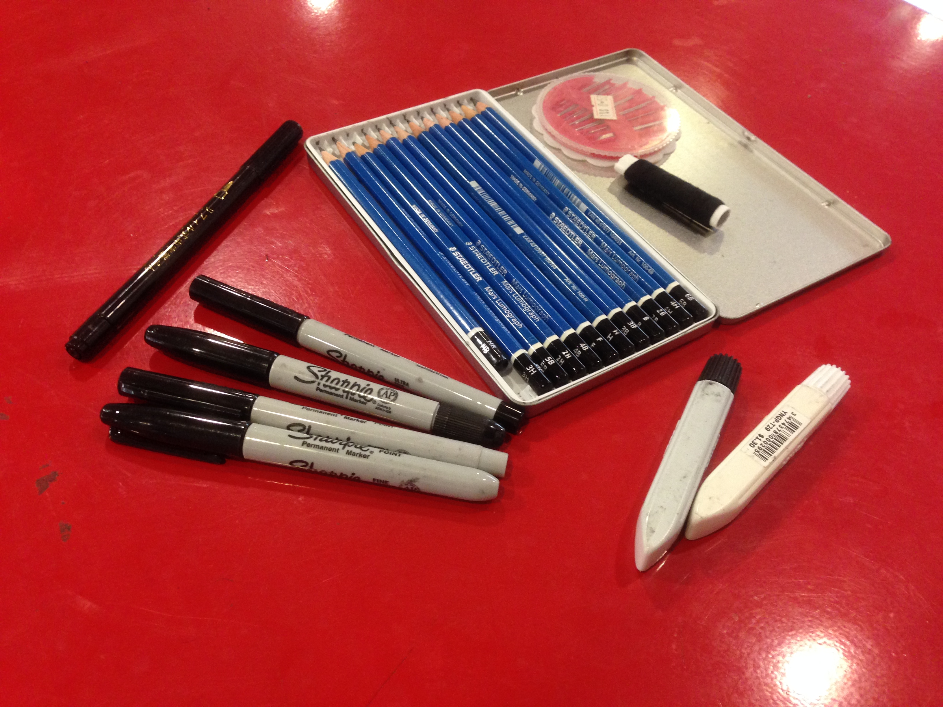
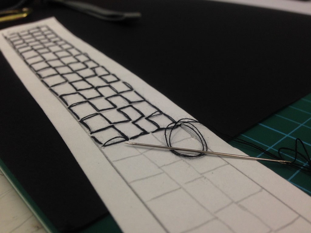
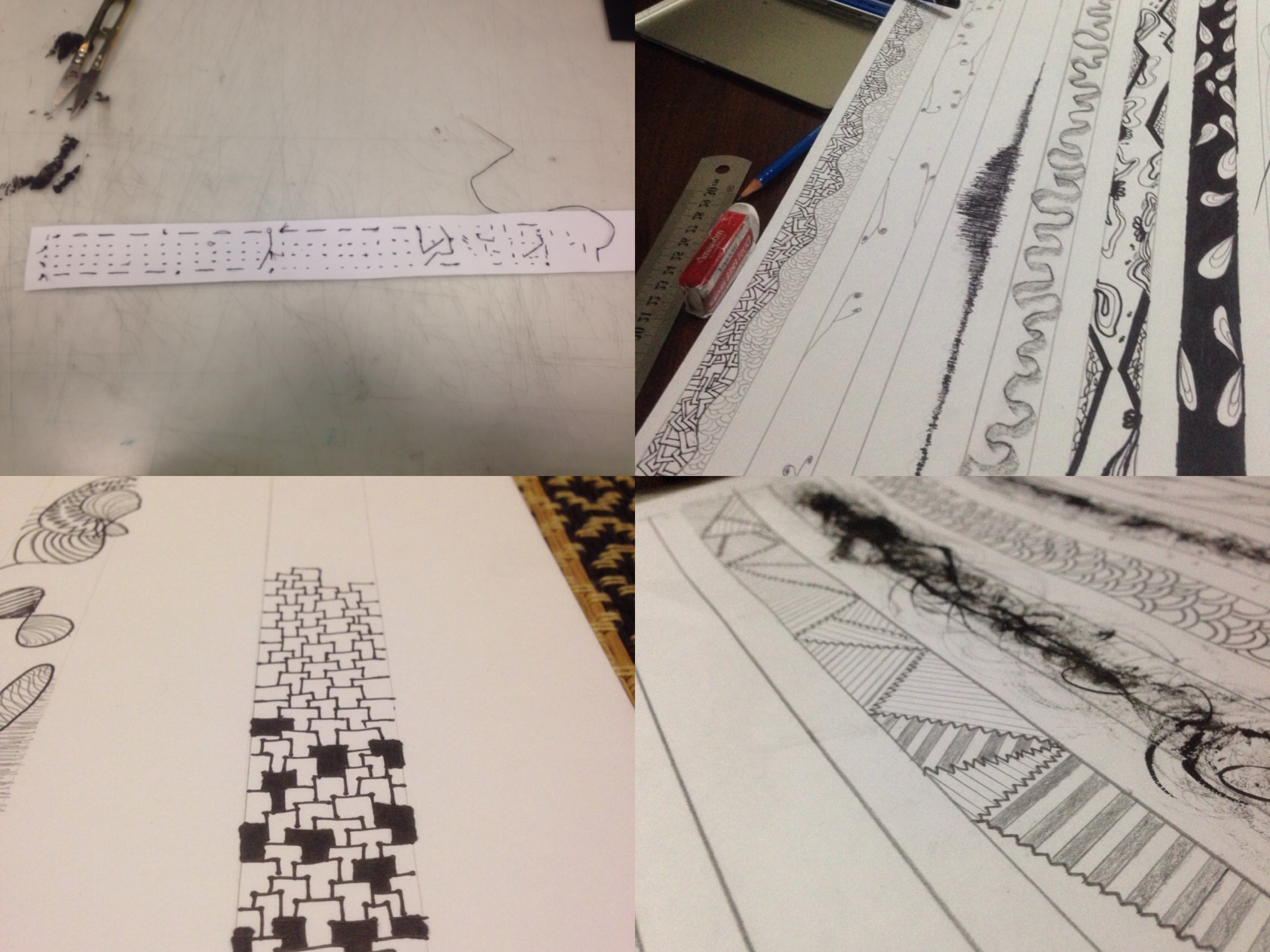
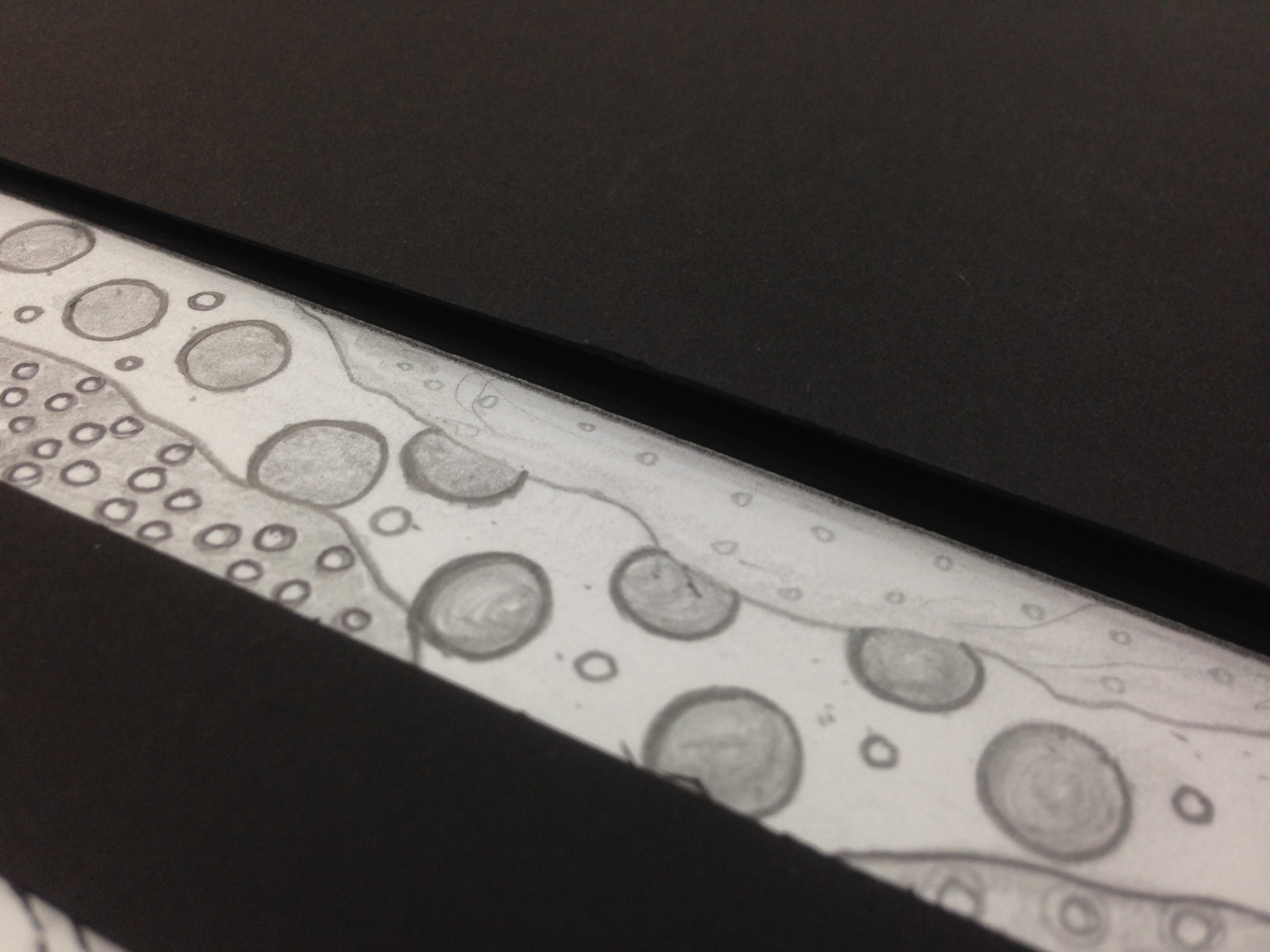
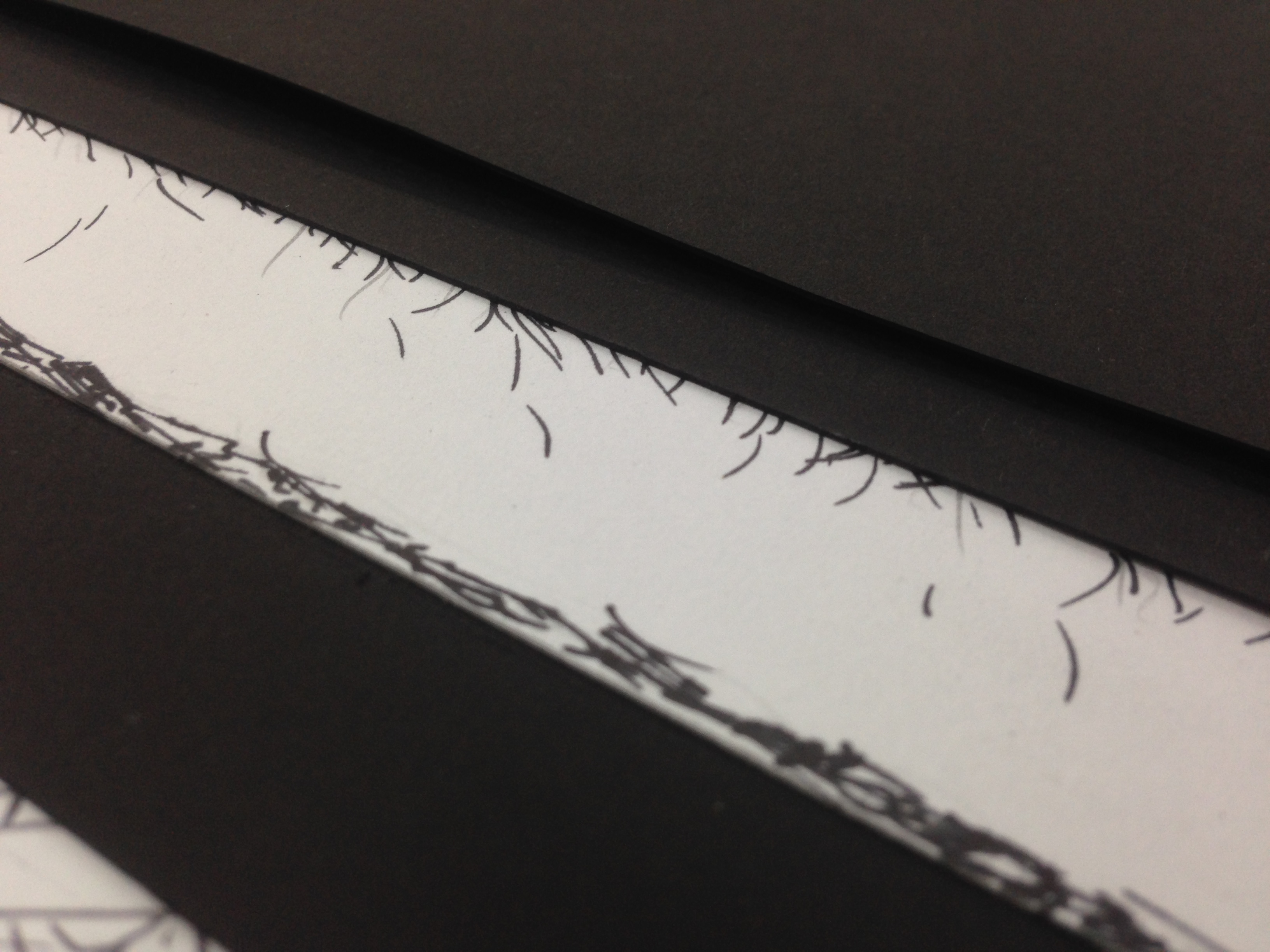
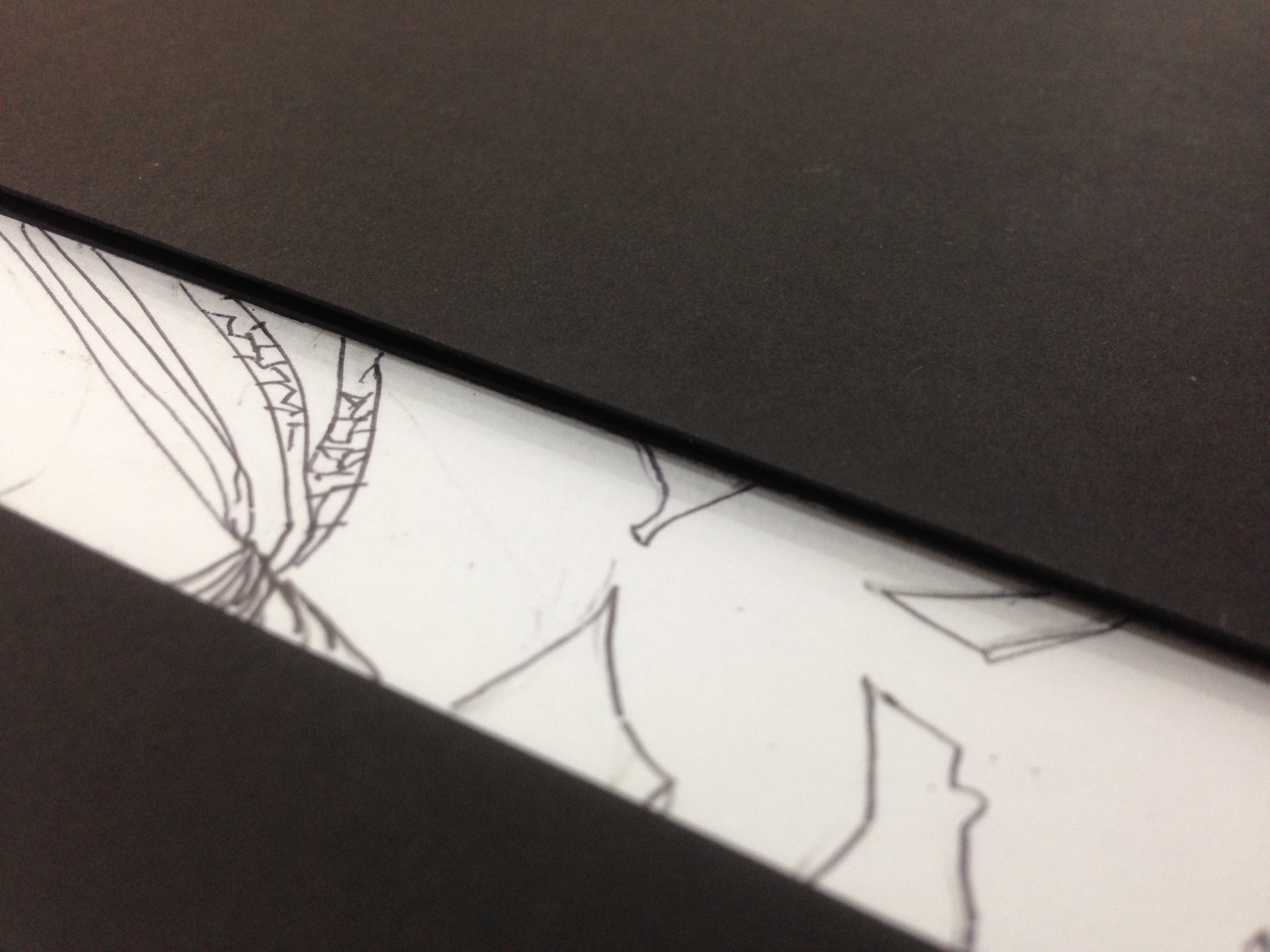
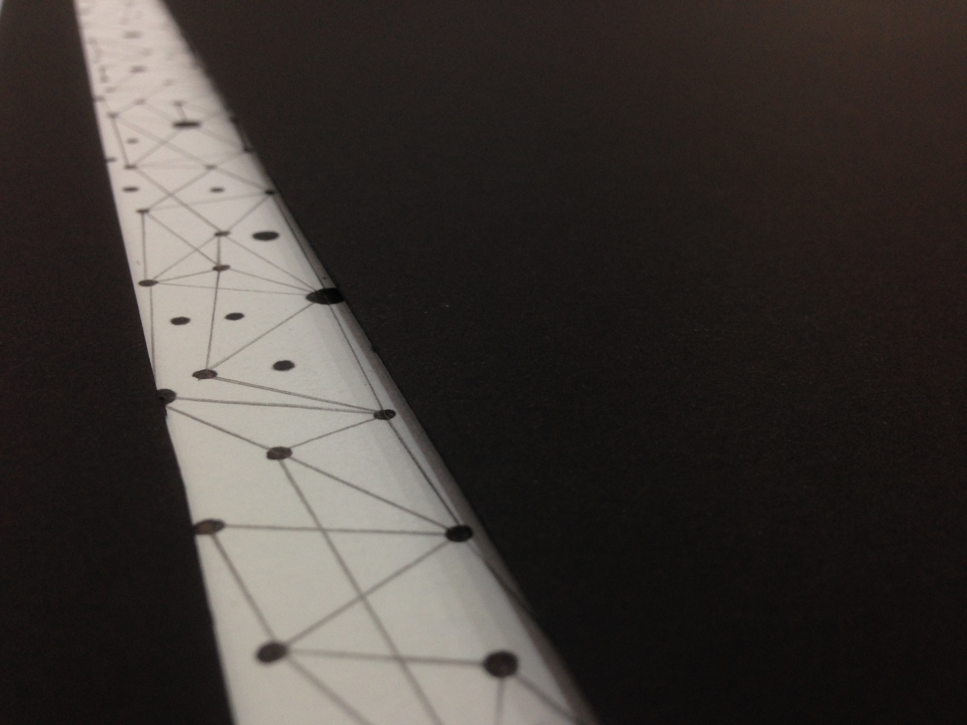
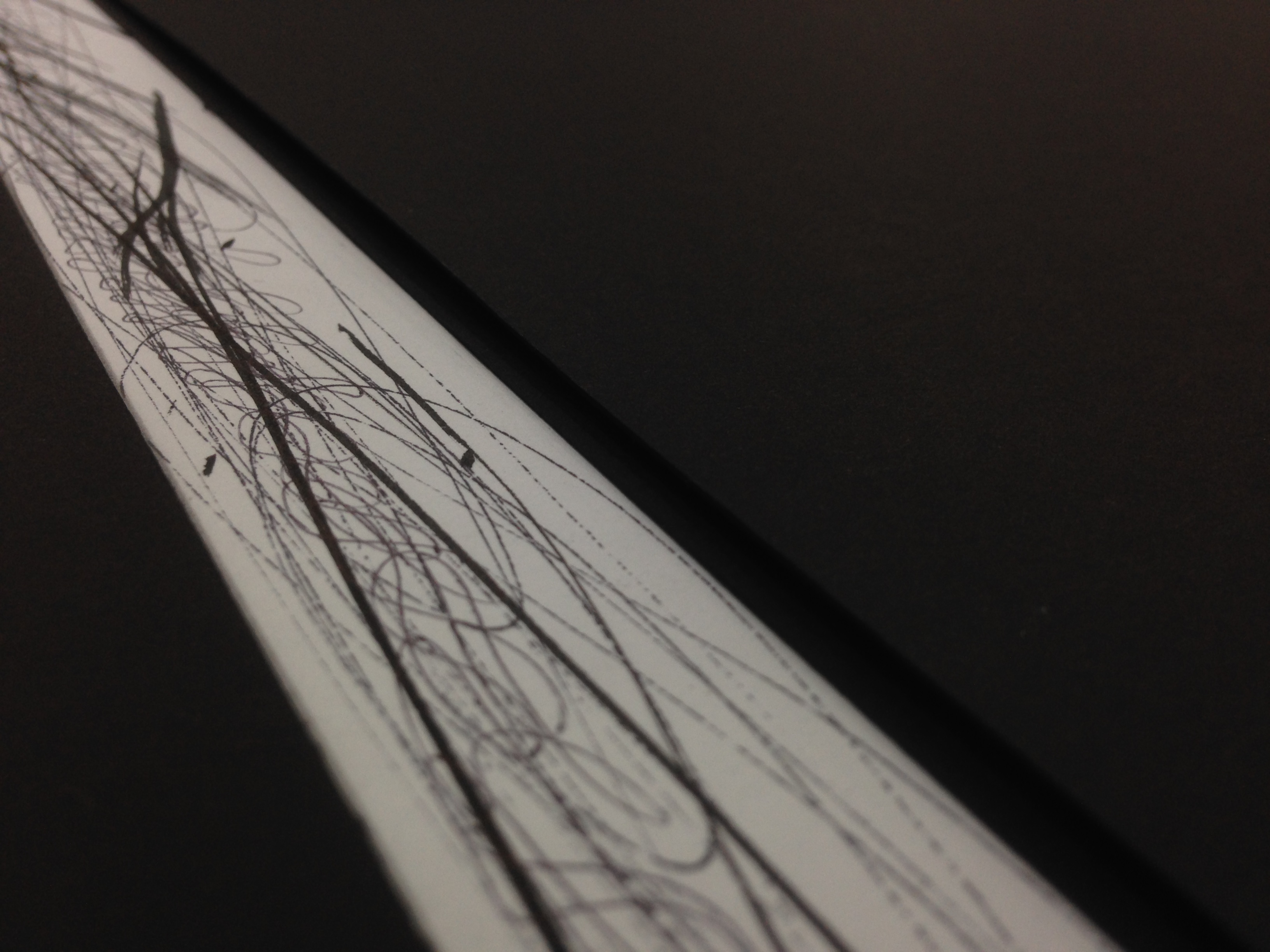
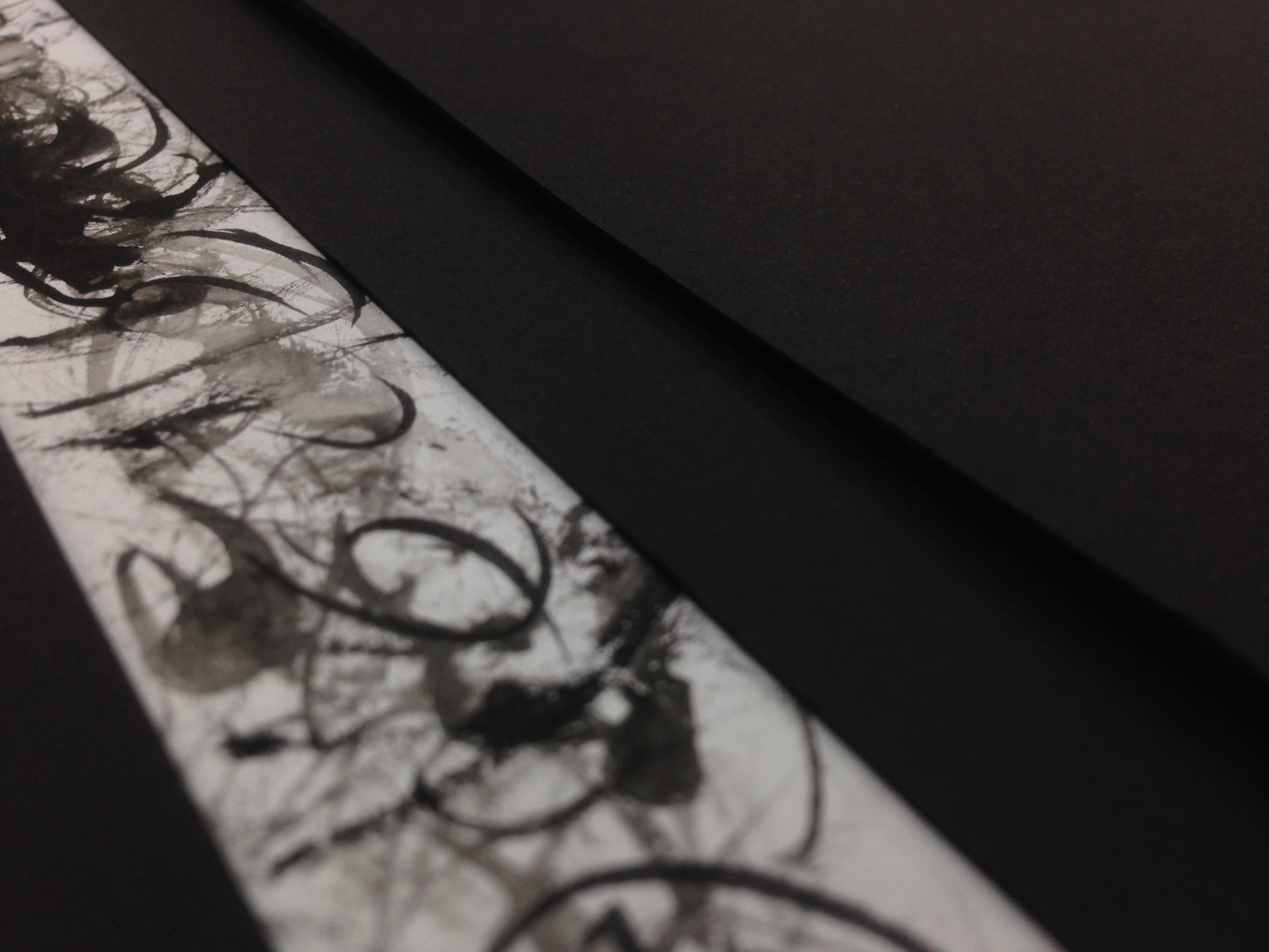
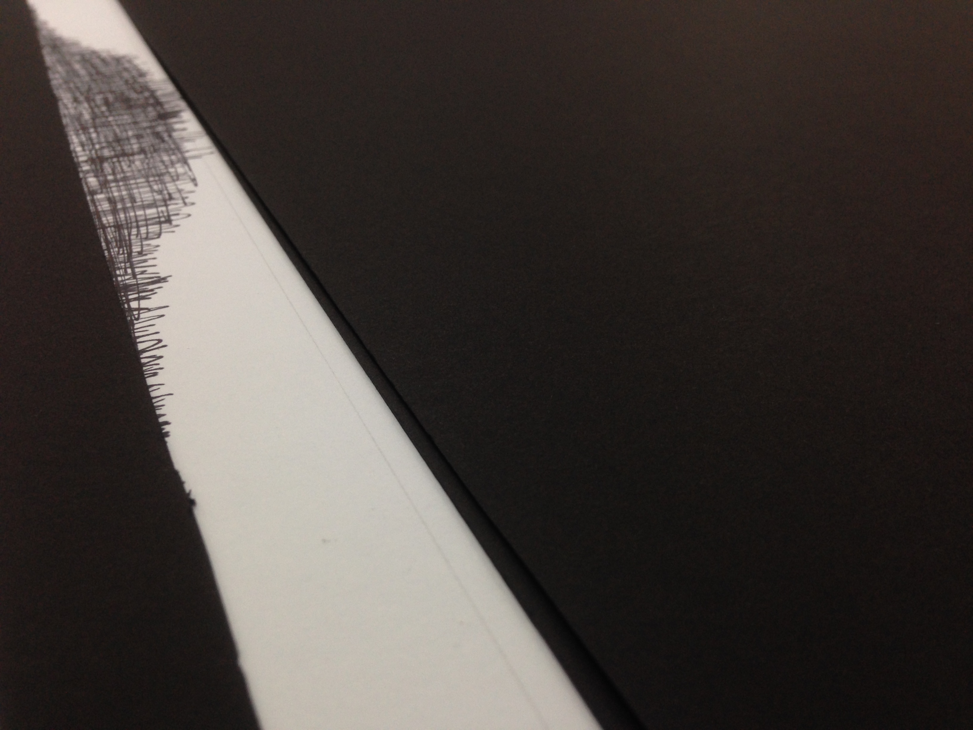
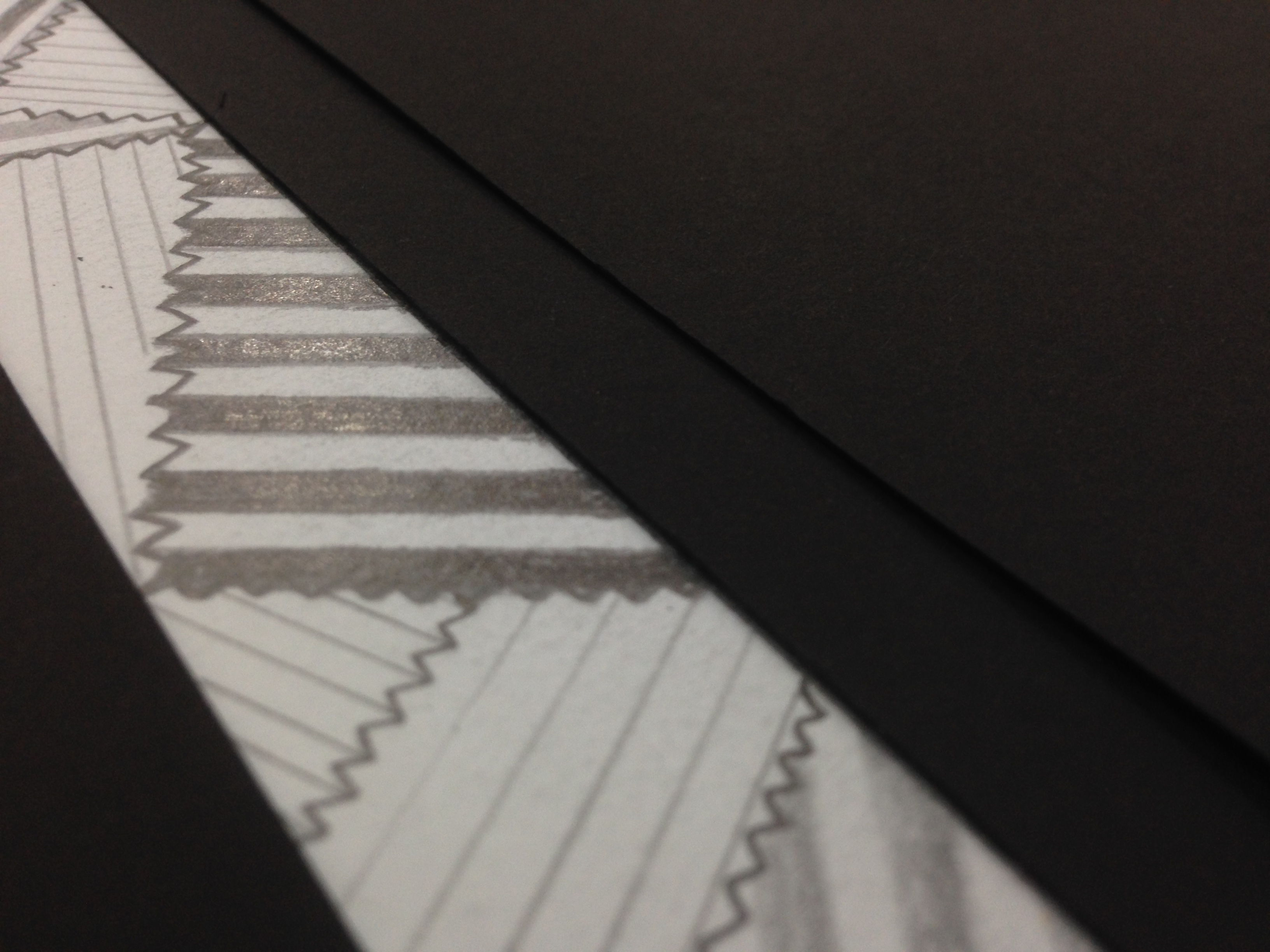
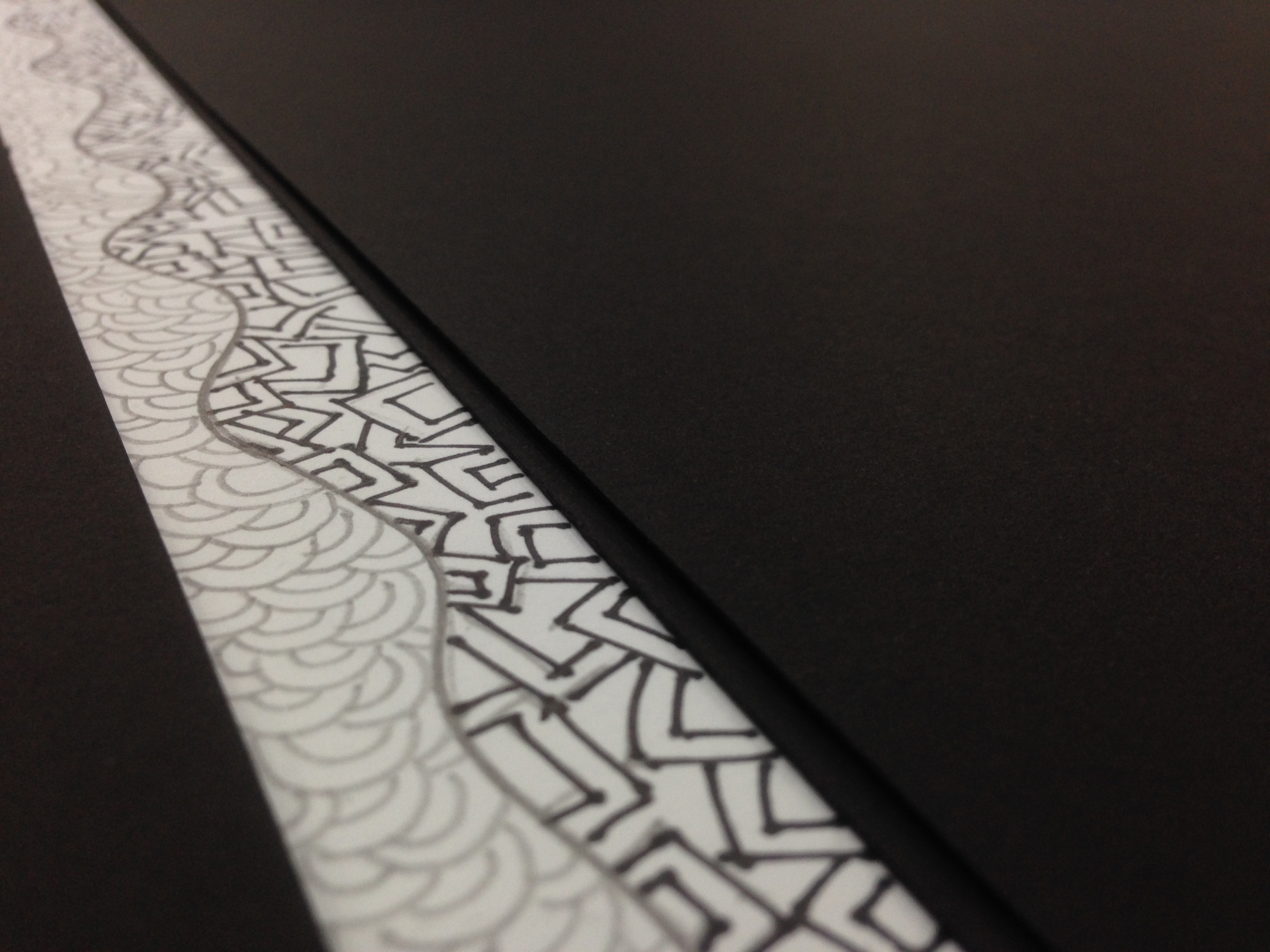
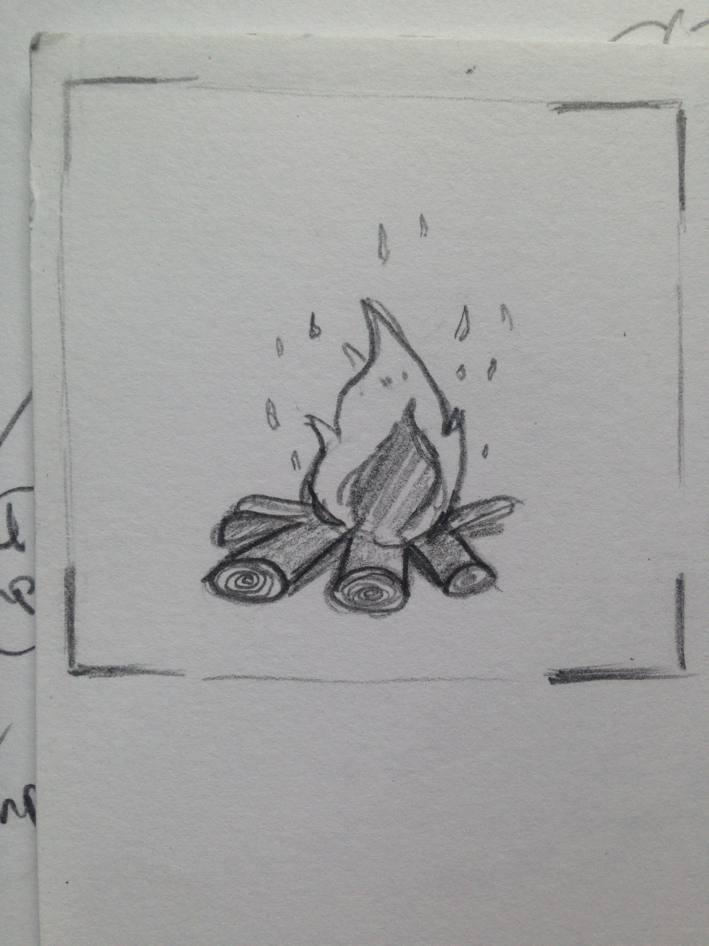
Some rough sketches done before consultation with Prof.Shirley to finalise on the ideas.

Photo 6-11-15, 11 14 58 AM copy

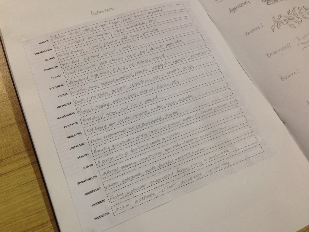
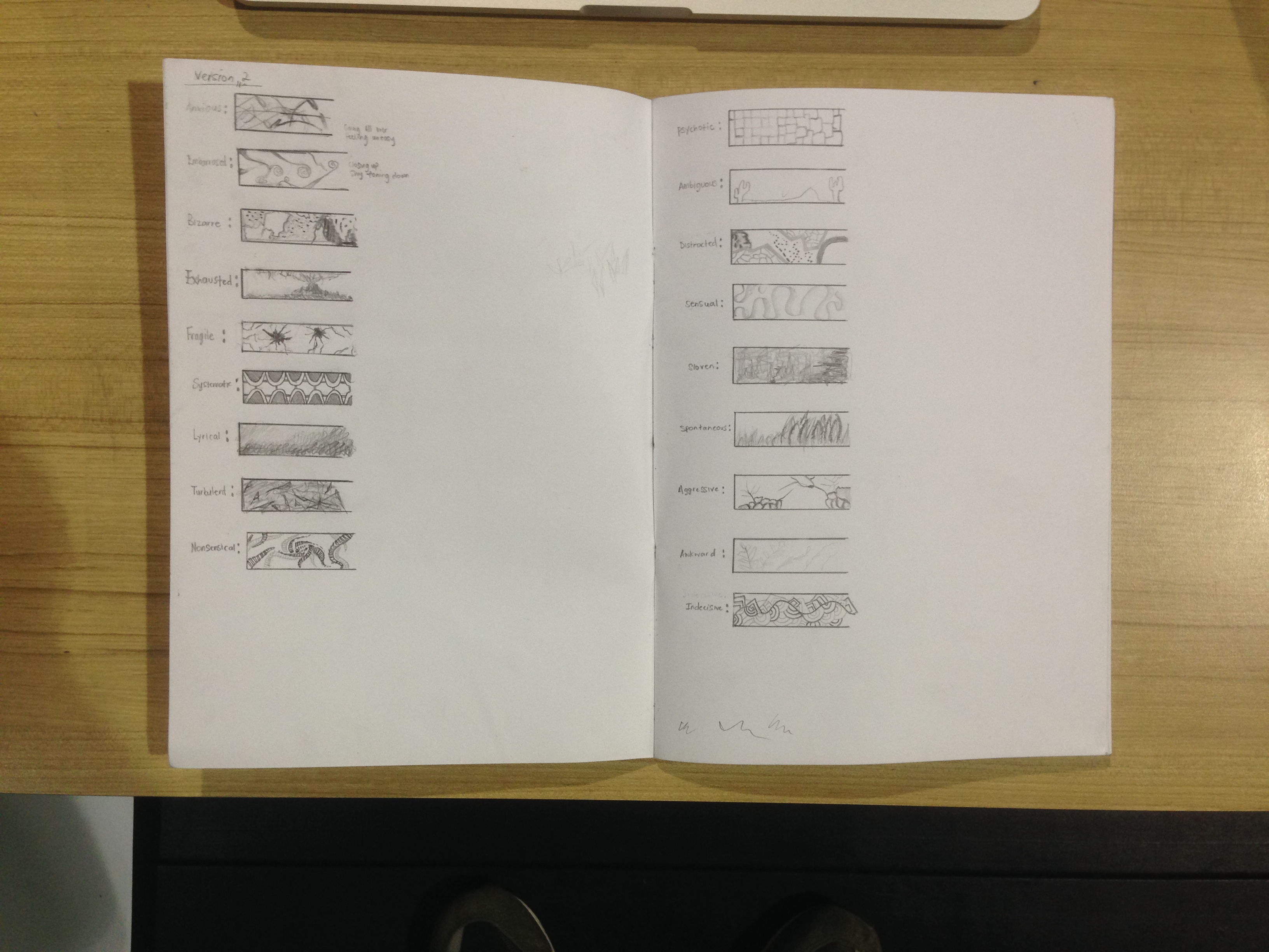
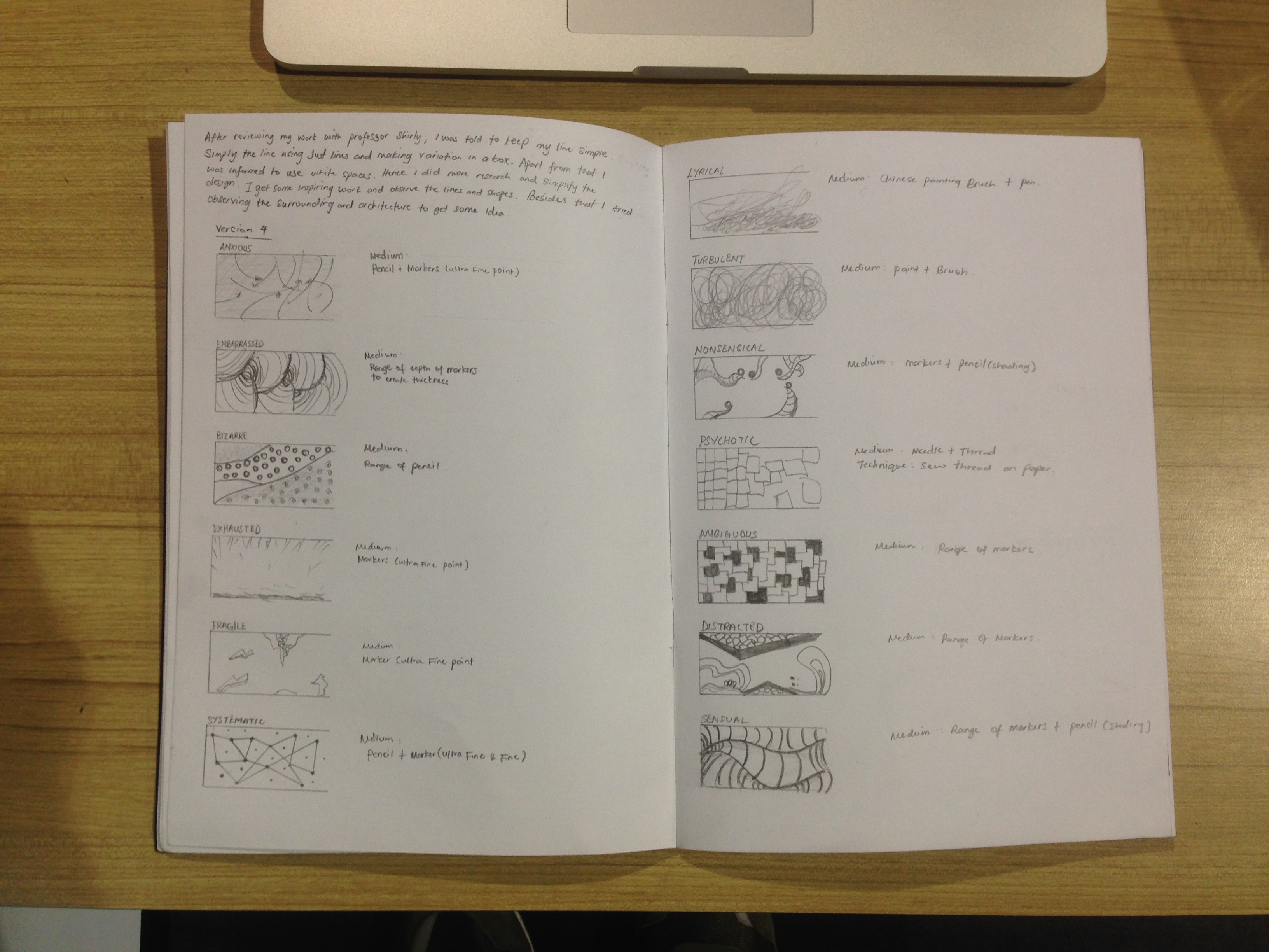
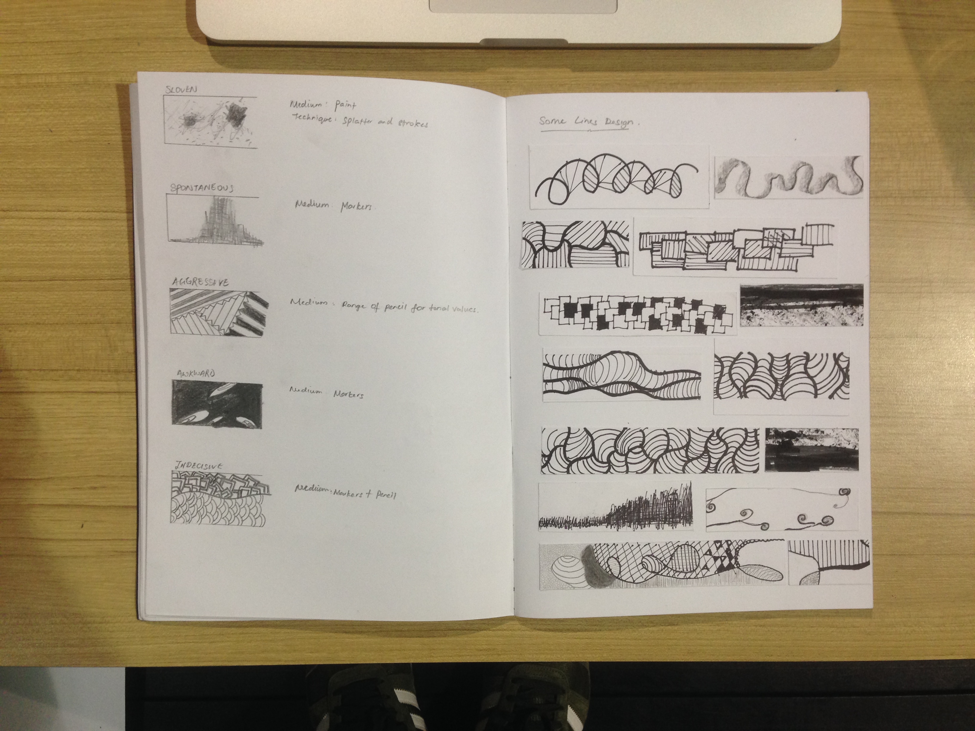
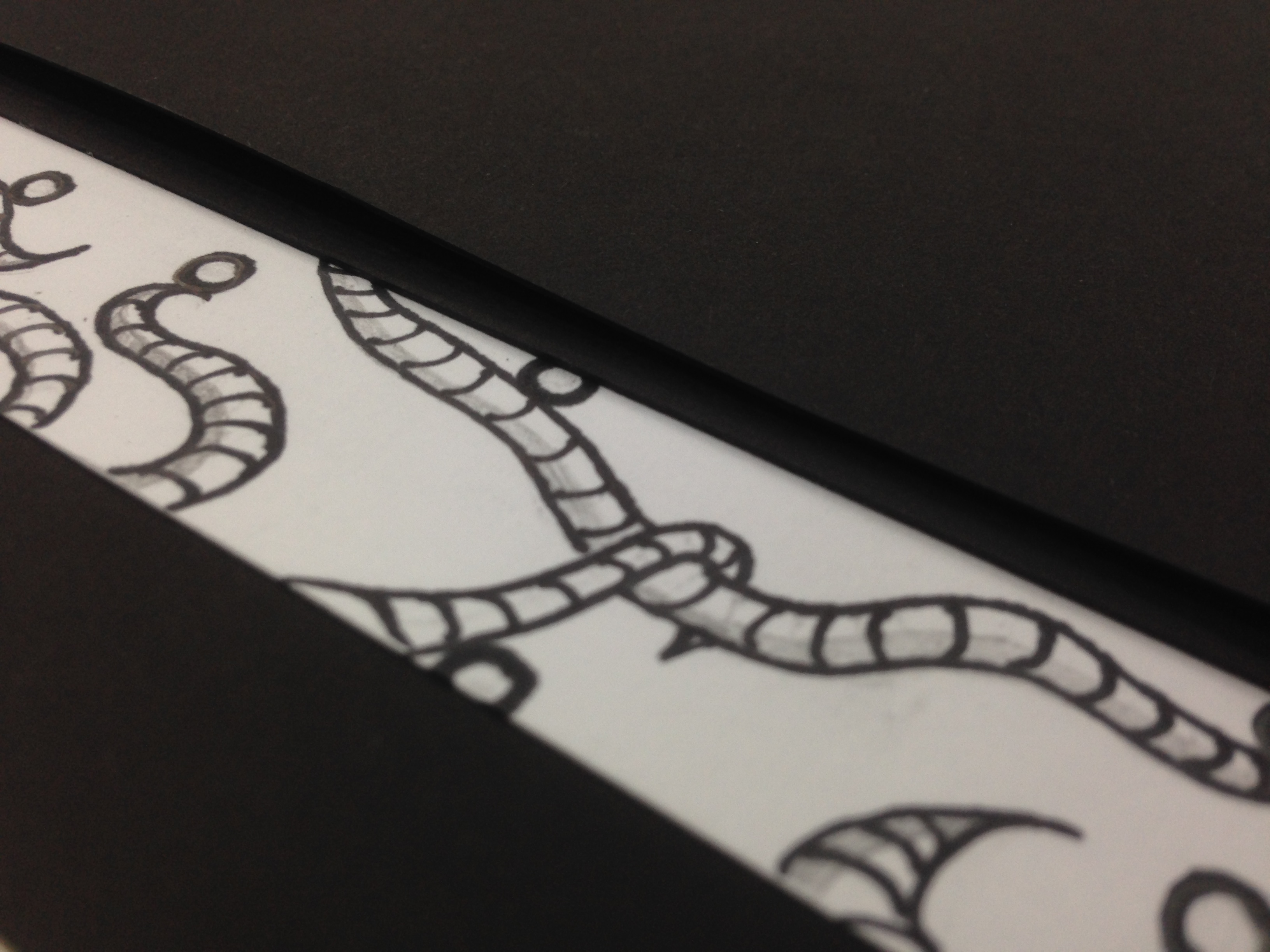
Getting some constructive feedback and work on the simple things like the EXAMPLES below

Photo 6-11-15, 11 15 08 AM copyPhoto 6-11-15, 11 15 13 AM copyPhoto 6-11-15, 11 14 24 AM


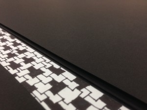
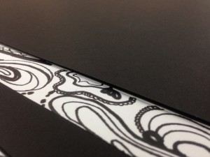
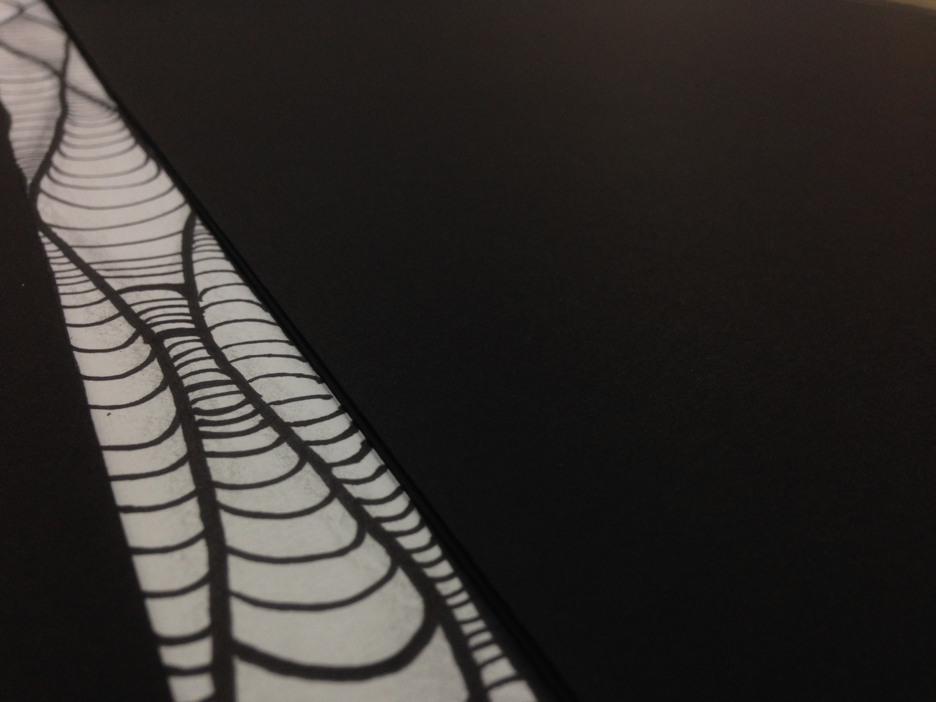
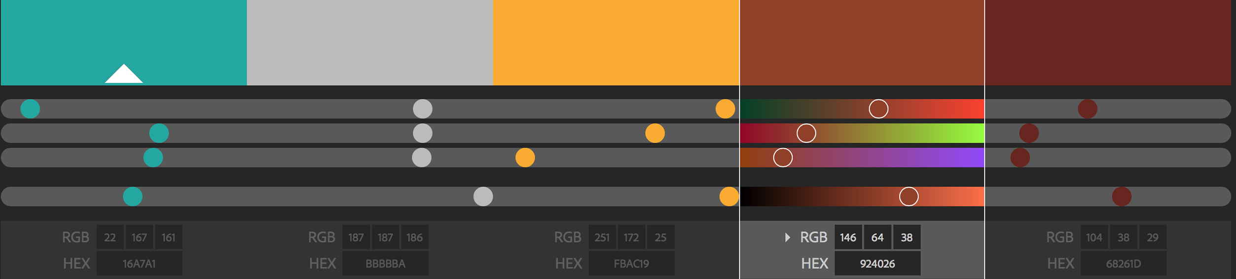
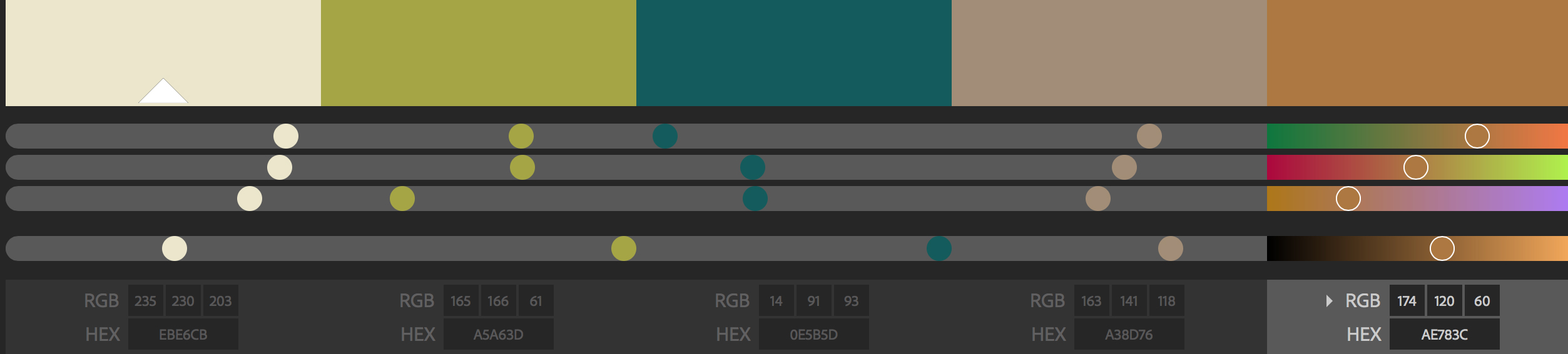
Getting the right colors…


Yellow

Blue

green

Khaki


Overall, I find this project really interesting. We make use of what we have gained from the previous two projects. Through this project also, we are able to identify some of the traits we possessed that we ourselves haven’t identify. And the best part is getting to know what are my classmates EGO(=! Thank you to everyone for making my first semester a memorable one! It has been a great pleasure knowing you guys!

Principles of Design

Given the project II brief, I was assigned into one of three group consisting of nursery rhymes: “Hey Diddle Diddle,” “Humpty Dumpty,” and “The Old Woman Who Lived in a Shoe,”

My assigned group was Humpty Dumpty. Hence I have to find images related to “Humpty dumpty” phrases. A total of ten images to be convert it into some dingbats that is of halftone, posterize, thresholds.

After which, I have to start creating a narrative composition that expresses each rhyme using only the given dingbats. The main aim of this project is to move beyond cliche solutions and habitual reaction to problem solving that leads to predictable results. Hence I have to manipulate, alter and deconstruct the images to re-invent new imagery.

But Before I start on the composition, there are Basic Design Principles I have to understand and take note in order to achieve a creative result for my narrative composition.


The four primary design principles are:

  1. Balance
  2. Contrast
  3. Unity
  4. Value & Color


  1. Balance

A design can create a mood simply by feeling organized and evenly balance. Sometimes a design can benefit by purposely unbalance feel.

image1   image2


  1. Contrast

Use of contrasting elements is a key to designing with impact. Extremes give a design interest and keep it from being static. Through careful use of contrast, a designer can emphasize the message.

image3image4

image6image5


  1. Unity

Unity may provide through the way the elements are assembled and through the choice of similar elements to begin with when appropriate. Several elements – from lines to type to shape – can be assembled to create a unified look that communicates the message to the viewer. The formal application of a unified structure to a format is sometimes called a grid.

image7 image8 image10


  1. Value & Color

Both value and color can be powerful communicators of mood. They can also provide order to a design and emphasize important elements.

image12 image13 image11


Project 1 Research and Documentation

This project of using concept of line to interpret eighteen topics is pretty interesting. What makes it even more interesting is, we are to create using abstract marks, using drawing medium that would express the character of the following subjects such as anxious, embarrassed, bizarre, exhausted, fragile, systematic, lyrical, turbulent, nonsensical, psychotic, ambiguous,, spontaneous, distracted, sloven, sensual, aggressive, awkward, and indecisive.

Exploration

Hence, i kickstart by exploring the surroundings, started to observe things better and gives some great attention to it specifically the nature, greens, flowers, interior, architecture, objects and many more in order to get inspirations. I googled all of the subjects definition and wrote it down for a clearer understanding of the meaning of each feelings.
Photo 6-9-15 11 38 48 pm


Research and The Concept 

I’m pretty much a huge fan of the nature, therefore i started to explore more on the concept of nature. I googled for images of the nature and looked at the interesting patterns that these nature portrays.

Photo 7-9-15 8 33 21 pm  Photo 8-9-15 2 33 57 pm


Lines Phase 1

After roughly getting the idea, and inspired by the beauty of nature that I could relate the emotion to, I started doodling and playing around with the lines taking consideration of the feelings using just pencil and paper.

Photo 6-9-15 11 39 00 pm

After getting first version of the eighteen lines, I went for a consultation with Professor Shirley, we went through all the lines individually, and I was given a constructive feedback, I was advice on simplifying the lines, include some variation in a box and apart from that i was informed of using white spaces to create depth.


Lines Phase 2

Therefore I went on to explore more and starts to think of the medium that I’m gonna use.

Photo 6-9-15 11 40 04 pm


The Format

Next is the format that i will need to decide, which is 2 x A2 in Portrait View. Choosing the right format is very crucial, it really depends on how your lines design are, for most of my lines, it is best to go with the format I’ve selected, as i would like to the show the idea of “timeline” and “rhythm”, therefore it has to be horizontally long and narrow in terms of height.

Photo 6-9-15 11 38 15 pm


Lines Phase 3

after getting feedbacks, I’m sort of know what I’m achieveing for in the lines, definitely i went on to simplify and did a couple more of researched. Apart from that i went on to write down the meaning of each subject according to my own definition and doodled it the way I felt. Doing this clearly defines what i felt and able to interpret into using lines.

Photo 6-9-15 11 40 29 pmPhoto 6-9-15 11 40 47 pm


Lines Final Phase

Coming to the third week, it is about time to finalise the design, hence i went on to consult professor Shirley on the processed work before i start on the actual drawing. There wasn’t much issues to highlight on, hence i went on to work on some pieces first and trying out a few medium as i want to be as creative. I made some final changes to the design of some subject in order to make it even more dramatic and visually appealing.

My Design as a whole gives some form of variations, it ranges from complexed to the most simple design, as i don’t want the whole look to be really heavy therefore keep in mind of ensure overall aesthetic look is balanced.

Photo 6-9-15 11 41 32 pm Photo 6-9-15 11 41 56 pm


The Medium Used

the Medium I used for my designs are mainly pencils, pen, markers, paint brush, Chinese painting brush and lastly the threads and needles. They are pretty basic tools but they are really good and i could uses the different set to showcase the tonal range of the art pieces.

Photo 8-9-15 8 03 47 am

However there is one subject that i kind of like to make it more interesting, and that is the “Psychotic”, I used threads to show the lines, so I started sewing the paper. Now the most interesting part is sewing on to a piece of paper and clothes is very much different, once you pierce through the paper there is no way for you to undo, the hole remains there. Well it is much more challenging, difficult and time consuming i must say. It seems really easy but the actual fact, it is not. I almost gave up doing it, but completing it was worth the effort, i wanted to portray psychotic in doing that because i felt really into the subject while sewing a piece of paper. The whole strips shows how Psychotic really works, from a steady lines it slowly turned into a really haywire.

Photo 1-9-15 9 56 06 am


Processed work
Some of the processed work..

Photo 8-9-15 2 41 25 pm


My Definition of the Subject/Lines

Photo 7-9-15 6 28 13 pm

1. Anxious
when I’m anxious usually I tend to think too much, but still showing my calmness despite being anxious deep inside. Definitely I could not sit still and move in various directions. Hence the lines I created for anxious would be adaptation of of what I felt. By using an ultra fine point, showing various directions, in a fine strokes and a little shading for the background to to create subtle dramatic effect.

Photo 7-9-15 6 29 10 pm

2. Embarrassed
Embarrassed to me is having fear and pressure that somehow I felt like being laughed at and being looked like an idiot and certainly makes me wanna hide. therefore this design convey some curving in irregular lines and the density between the intersection portrays hiding.

Photo 7-9-15 6 29 38 pm

3. Bizarre
This one is very interesting, when I see “Bizarre” word, It remind me of tyro-phobia which I have, particularly when looking at abundance of circles in a peculiar way. Hence I used pencils to create a lot of circles and shaded it in a different set of tonal range to create a sense of forms.

Photo 7-9-15 6 30 03 pm

4. Exhausted
Eventually this feeling would remind me of falling apart and just fall to the ground, everything seems very weak. Using fine strokes, I put it such that all fine line from top start to fall down and you could see from the image above the density of the strokes at the bottom are huge comparing the top. Apart from that I leaves a lot of white spaces for the overall feel of lightness and weakness.

Photo 7-9-15 6 30 31 pm

5. Fragile
Fragile tremendously make me think about shattered glasses, probably due to many careless handling of fragile object that I used to break often when I was young. Hence my interpretation of fragile here is showing some elements of shattered glass and big pieces to create variation within the strips.

Photo 7-9-15 6 30 48 pm

6. Systematic
Systematic to me it flows in certain order, can be very neat, organized and well planned, for this subject, I decided to use simple basic design elements and that is dots and lines leaving a lot of white spaces to kept it clean.

Photo 7-9-15 6 31 02 pm

7. Lyrical
Basically the Lyrical to me would be inspired when hearing music, I closed my eye and feel the emotion of the music in this subject, used ultra fine point markers and Chinese painting, I brushed the strokes while enjoying the music.

Photo 7-9-15 6 31 18 pm

8. Turbulent
My definition of Turbulent will be chaotic and it is an adaptation of a strong turbulent experience I encounter while in the plane, that got the situation really crazy and chaotic, for the strip I used different type of brushes to create a circular motions.

Photo 7-9-15 6 31 35 pm

9. Nonsensical
It is supposed to be fun, silly and doesn’t make any sense. Hence i used wormy kind design that played with balls which doesn’t make any sense at all. Markers were used for the outline and pencil for some shadings.

Photo 7-9-15 6 33 01 pm

10. Psychotic
Psychotic to me is when someone tries to control his / her mental state, however hard they tried things eventually gets worst. For my interpretation here, I used Thread and sew the strips, it started of being pretty much systematic and organised but eventually the stitches gets haywire and no longer able to control the mind that seems to relate a lot to “Psychotic”.

Photo 7-9-15 6 33 13 pm

11. Ambiguous
It is very unclear, vague and could not really interpret the meaning. Therefore I thought of using simple shapes by just overlapping it and uses high density of black and white tone to create a sense of unclear piece.

Photo 7-9-15 6 33 30 pm

12. Distracted
Distracted is supposed to be many things going at a period of time and it is very distracted when many elements are combined. Here is a piece that focus on many elements that pretty much seems to be many thing going on, it is inspired by one of the roof top of a shopping mall called JEMS that I went to.

Photo 7-9-15 6 33 51 pm

13. Sensual
To me Sensual is something that is pleasing to the body and senses, when I think about sensual, I think of a smooth groovy silky fabric that is pretty shiny and flowy. Hence I wanted to create something dramatic feeling using lines and evoke arousing effect which could be pleasing to the eye. It is also in inspired by the beauty of women curvature figure.

Photo 7-9-15 6 34 03 pm

14. Sloven
It defines as messy and not organised, hence my approach on this one is using a piece of crumpled tissue paper added a little paint on it and therefore starts to dabbed on the strips.

Photo 7-9-15 6 34 17 pm

15. Spontaneous
Spontaneous is very straight forward I believed, it is during a period of time when you show the spontaneity. Hence the long strips represents a time line and only a particular section of the strips where it has its peak of lines.

Photo 7-9-15 6 35 54 pm

16. Agressive
To me agressive is relatable to sharpness and fine lines with bold contrast, hence I created a sharp edges effect by drawing and some contrast in the shading to create the tensity level of agressiveness.

Photo 7-9-15 6 36 34 pm

17. Awkward
To me awkward is showing weirdness and some distance to the other person it tends to be shy also. This expression which I tried to evoke is showing how weird it looks and doesn’t have the harmony and showing some proximity spaces.

Photo 7-9-15 6 37 24 pm

18. Indecisive
When you can’t decide between choices and contemplating on choosing the only one, hence i put a line in between and distinguished it by the shapes using pencil and Pen.