ZINE – MY ADVENTURE

And down to the final project which is called Zine. Thank you for this experience of which I got a chance to use InDesign software, this project gives me an opportunity to further developed my skills with using such software. InDesign is necessary to create magazine, reports, pamphlet and many other prints layout that is vital for my future use.

Zine is one of the beneficial project I have done, upon receiving the brief, I was pretty excited that we were required to share our journey or experience during the foundation year thus collating some of our work into a magazine like layout.

Throughout the foundation year, I have acquired pretty much a lot, from generating ideas, sketching and doodling. I did quite a lot of research for inspiring work and references of artists work through online and print. It has been a fruitful year. what I loved most during these time was generating ideas and then proceeding with the execution on the desired designs. Not to forget, I’m really grateful to have such wonderful course mates. They give me beneficial and constructive feedbacks to further improve on my design work.

For my zine, it was much simpler because I used back all the the basic design principles knowledge that I have acquired throughout my foundation year, but I still do some research, looked at some inspiring designs from the shelves and online as well. There are plenty of ideas which I find it useful for my zine design, and the minimalist look I want to achieved. I also came across a very decent Zine design website which inspired me. For instance, the bench.li and trendlist.org. they have many layout ideas, using of the shapes and the spaces. Do check them out because there are so many kind of style and inspiring work.

My zine element has a lot to do with what I have learnt throughout my foundation year, such as the basic shapes, colors, patterns, texture and sizes. Making use of what I have learnt and applied it to my zine.

Allow me to present you my zine and sharing with you how my design works came about…

My Adventure


Front Cover Spread1Spread2 Spread3 Spread4spread5a

Back Cover

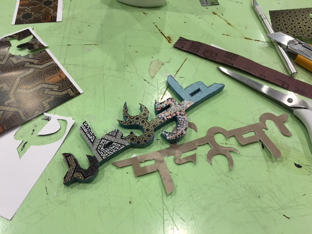
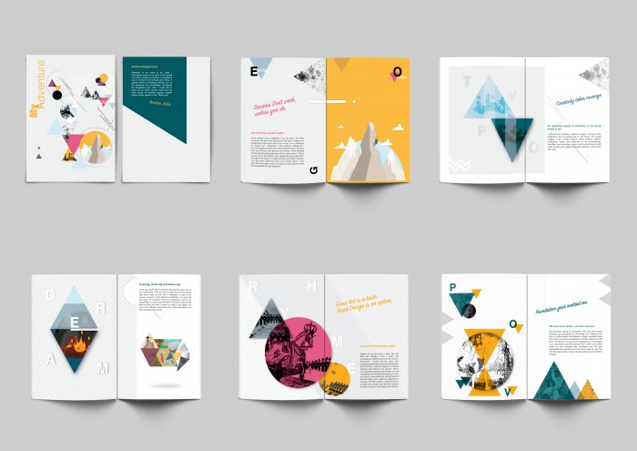
My zine has a very minimal look yet it supposes to grab the viewer attention. What I meant by minimalistic is the used of simple shapes, primary colors, meek patterns and lines and giving a generous breathing area or space for my reader. I have always like my work to be clean yet sleek. For myself, I don’t quite like heavy patterns or too much information. I would like people to think rather than putting all the information that is probably unnecessary.  I used back my illustration style from the EGO project during semester one. I tried to keep all my pages consistent throughout which is one of the greatest challenged for this project since most of my work are of the different style and medium.

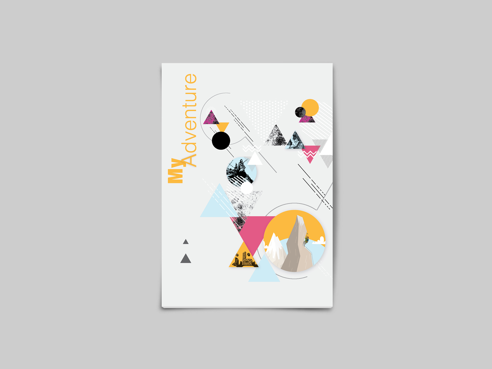
My cover page was the most time consuming but after completing them, I really love the aesthetic and dynamic look to it, I felt it was worth the time. My cover page which I gave a title called “My Adventure”. It pretty much sums up what I have learnt and often seen throughout. It also contained all my best work for the different projects for 2D module. It supposed to set the the style that I want to achieved for the rest of my pages. Using the principle of Balance, to layout all the elements into one A5 Page. Created a hierarchy and allowed readers to read from top left to bottom right. The lines, shapes, patterns and colors direct the reader eyes from one point to another. It is not easy to balance quite a number of different elements, but I managed to put them together.

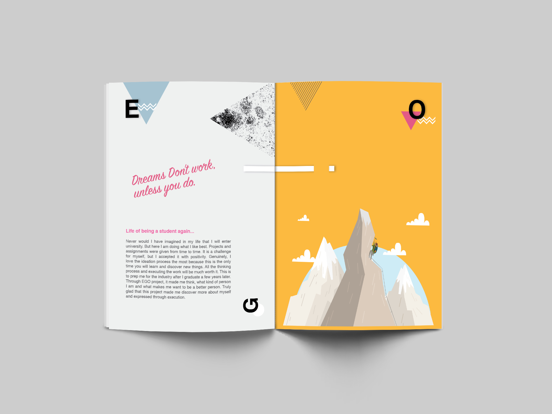
My second and third page, I showcased one of my best worked called “EGO” I used different background colors such as the grey and yellow to create a contrast, however I connected them by having an illusion white line with a drop shadow across to indicate to the reader that they are linked, as well as direct them to another page.

For the body copy, I created a hierarchy such as the title, subtitle and body, for the title I used a sign painter font that gave a handwriting effect.  As for the subtitle and body I used Helvetica fonts for reader to read the text easily as well as it is pleasing to the eye. I added some drop shadows, patterns and shapes to complement the plain grey background. As for page three, I showcased one of my best work which represents me climbing the mountain and achieving my dreams. The Yellow background grabs the attention of my reader and leaving a generous breathing space on the upper half of the page.

My fourth and fifth page, I make used of the rule of third layout. I wanted to display a spread of my illustration work. I used a light grey background and overlaid it with diagonal white lines to add subtle patterns to the plain background. I contrast it with a diamond shaped masked with my fire burning illustration work to emphasize a symbol of desire and dreams. Surrounded by a typography of “DREAM”.

On the other page consist of some text and words. On the lower half is a compilation of the “EGO” Project. Having a decent breathing space on top and bottom so as to lead the viewer to the image and give some emphasis. With a montage of some work I added a drop shadow with a decent distance of 40mm to give a sense of the Image floating, giving a 3-dimentional finishing.

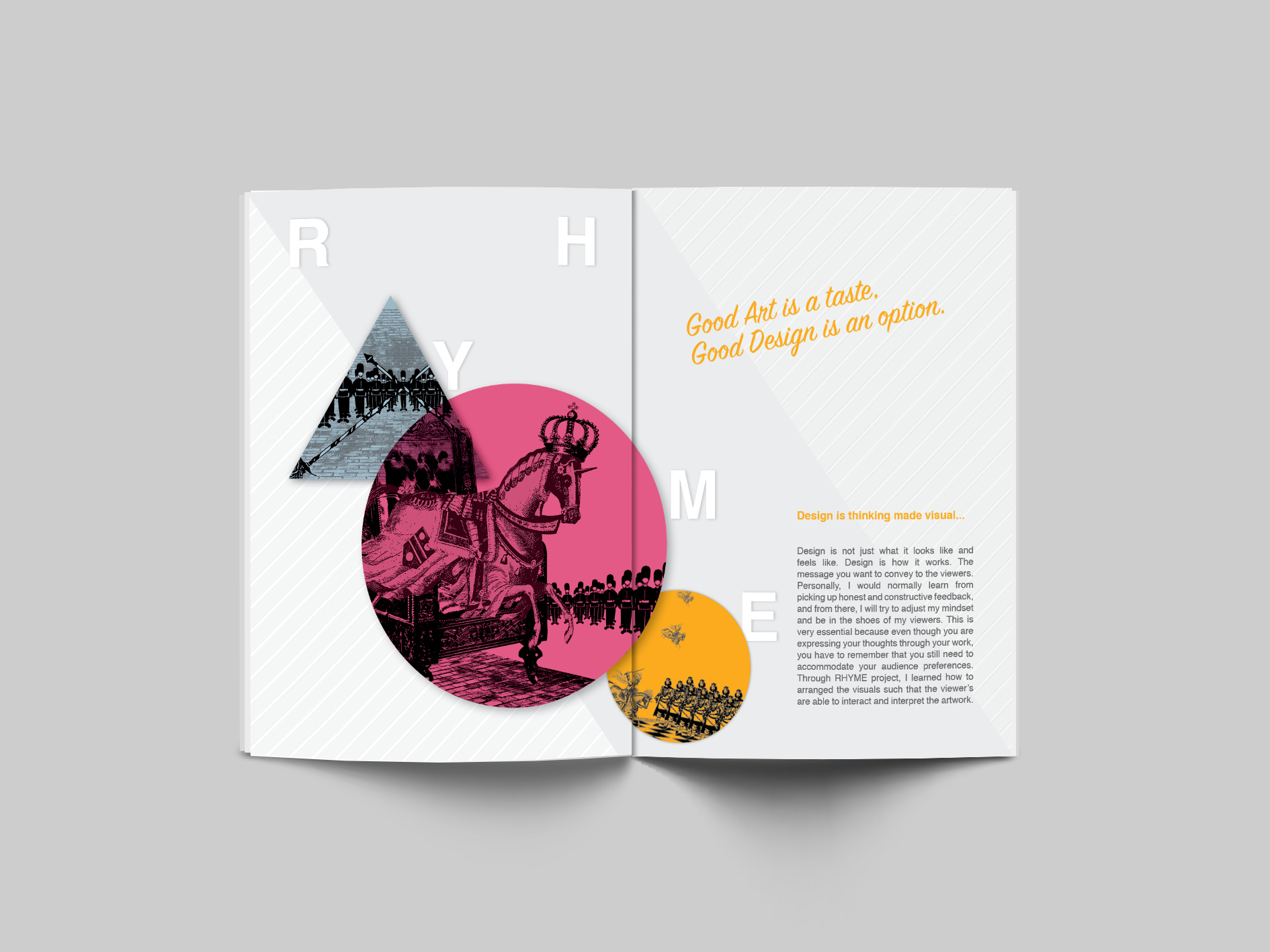
One of my favorite spread would be the sixth and seventh page. Showcased my “RHYME” project, the original images are of black and white, but I overlaid and masked them with the basic shapes and colors. Distinguished by their sizes but still considered their unity by slightly overlaying them side by side. Viewing it from the Biggest to the smallest. I Just loved the way I layout my work here, giving a huge emphasis on the strongest elements which I learnt from 2D module. A little twist to my background with a solid diagonal shape in between the diagonal patterns that I merged with.

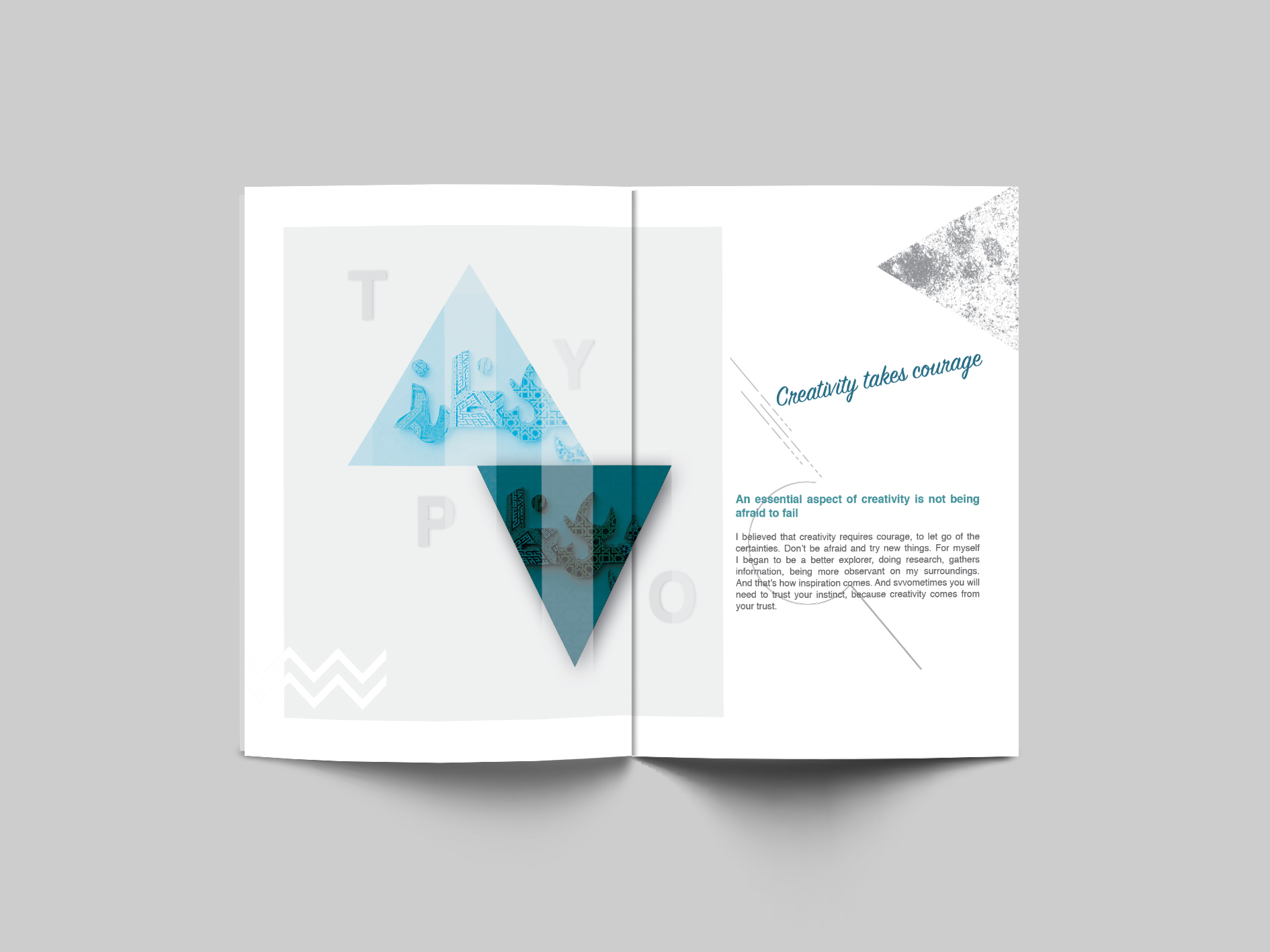
As for page eight and nine, I’m keeping it as minimal as possible. There was a slight difficulty for the work over here because It was originally a 3-Dimentional medium which I personally felt it was one of the best and It would be a waste not to showcased it in my zine. So I edited the image and converted them into monochromatic colors, in order to be consistent throughout my zine. I masked the design into both upward and downward triangular shapes. Separating the two by their opacity value such that one being light and another dark. These pages in particular, I intentionally used the design principal of space, to give the eye a rest and define the importance. With triangular shape I lead the eye to the text next to it as its shape could direct movement.

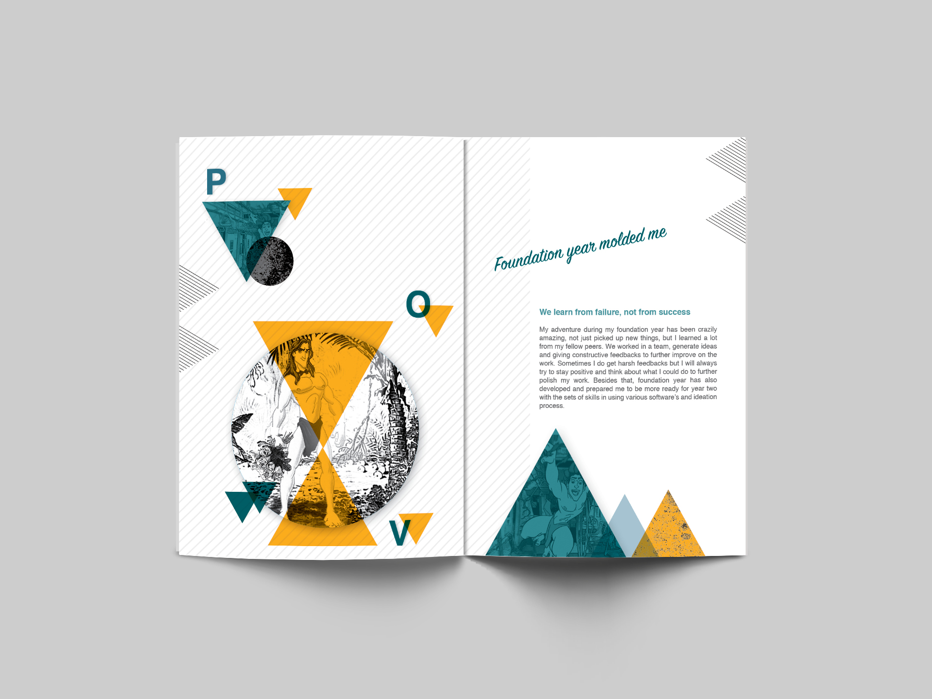
The last spread I combined patterns, shapes and the used of bold colors. The triangular shapes lead the eye from top to the next page. The most important image is the “Tarzan” therefore I placed two triangle pointing in middle of a circle to define its importance. The color that I used, such as yellow supposed to evoke pleasant, cheerful feelings. Also yellow is an attention getter. As for the green, it is the color of nature which is my favorite and complement well with the yellow. For this I used dark green which supposed to evoke ambition.

Noticed I used many shapes, this is for me to organized information through connection and separation. I used them to create movement and depth as well. Apart from that I would like to convey mood and emotion. It supposed to emphasize and create entry points and areas of interest that lead the eye from one design element to the next.

For the write-ups, it was supposed to be inspiring and simple enough to understand what I’m trying to convey. All this wouldn’t have worked without the help of Professor Shirley Lim. THANK YOU SO MUCH for the guidance and consultation throughout the foundation year. And not to forget, all my fellow course mates that has been giving me endless support, and constructive feedbacks.


Typographic Portrait – Final

So here you go! The final four typographic portrait, I’m really satisfied with the overall concept of my typographic portrait. It is one of the most fun experimentation I did so far. I think I have met the objective of my concept which to create a 3-dimentional feel to the art work. I used various tools and materials to work and craft. I don’t really used digital here, except for layout and some prints.

Let me briefly share the idea and the story behind each portrait…

MY NAME IS

FullSizeRender copy

AND I’M A GARDERNER

Nature has always been part of me, I always wanted to have my own plantation, for me it gives a sense of satisfaction to have your own garden when you see it grows and bloom. Hence my idea came about to create a miniature garden which has my initals on it.

Initially I was thinking of using a real soil, but to think again I though I would like to experiment more by creating a similar effect with food product. And there goes my “edible garden”. I carefully play with typography using the parsley, vanilla essence sticks, tomatoes cherry and chocolates. All these are my favorites. I personally enjoyed much doing this.

I arrange them subtly to make it as natural as possible. Playing around with the space and making it rotate to a certain angle to evoke a sense of fun to it. In terms of color, I think I’ve choose the right one like red tomato cherry and green parsley that complement the whole dark brown look.


MY NAME IS

FullSizeRender_1

AND I’M A ROCK-CLIMBER

One of the cutest and simplest aesthetic look, but I believe it sent out the message across. I feel it look like a real climbing wall that I could climb anytime, Hahaha! I used some textured background like the wooden light brown wall that I usually see if I’m at climbing gym. I cut some parts, to create an inclined ramp, nailed and glue it so that it wont came off.

I used colored clay and making it much more dynamic by mixing two colors, for each group. Starting from letter “I”, is blue and pink which means reliability, caring and nurture, “B”, white and black that never go wrong together symbolizes pure, peace and also power and strength I posses during climbing. “X”, is red and green, which often we call watermelon, as there are such colors of tiles during my climbing, it also symbolized relaxation and energy, that I often get during climbing. “Z” is black and orange, which is consider to be powerful, cheerfulness and enthusiasm. And lastly “B” which is yellow and black that suggest liveliness and optimism.

All the tiles are given a thoughtful placement, with each letter that have a different color, it could be separated but still perceive as one group, this is the principle of gestalt that prof. Shirley taught.


MY NAME IS

FullSizeRender_2 AND I’M A TAILOR

The idea of tailor came greatly because I enjoyed doing it, not that I’m a tailor but both my maternal and paternal grandparent were once a tailor. And I think I adopted the skills from them, even my mom used to make dresses and clothes for herself and my family, and I enjoyed watching it since I was little, until appoint that she let me try using it and that were I picked up the skill to sew. Hahaha!

Therefore, this came back to the simplest set of tool which is the pin or needle and thread that tailor essentially need to make clothes. Just by using the tools, I thought it worked pretty well. I bought a khaki colored linen fabric for the background and used it to cover the Styrofoam which is supposed to be poked by the pins that would be a supporting or anchoring point for my thread on later stage.

I started putting the pins first and followed by attaching the thread, it may look easy but trust me my hands are quite big for such a small piece. Hahahah! I have to carefully poke the pin ensure the space between each pins are good and not too near or far. I intentionally made the “X” bigger to create some emphasis and also added a black thread to give some aesthetic so it wont be too boring.


MY NAME IS

FullSizeRender

AND I’M A MUSLIM

And so, since the start the semester I took an elective which is called symmetry. Ad there is one topic that discuss about the Islamic art. I’ve been fascinated by the pattern and so this gives me the idea of creating a papercut plus Islamic pattern to indicate that I’m a Muslim, because I think the Islamic art is the best representation of me being a Muslim. With this idea I created a typography in Photoshop of my initial “IBXZB” but giving it an Arabic font style. It was an idea from Prof Shirley and I think it is genius. So I further explore on it, and these gives me idea to include and Islamic pattern or art for my fonts.

Since most of my artwork is like a 3-dimentional, I decide to give some perspective to this one too, using blue foam and cut out my name, this was the hardest part I did so far, it is really time consuming because the word is small and cutting them need a lot of patience especially around the edge.

After I got my blue foam cut out, I cut all my patterns paper according to the way I wanted for each letters, I mixed and matched them around and to give some variation, i added a subtle background, again it is islamic pattern but it is white in colour. White background to give contrast to the type. and white also mean pure which is associated with islam religion.

I definitely love the final outcome. Overall I’m really satisfied and proud of this work of mine.

Typographic Portrait – Process/Execution/Experimentation

Well, I’m glad to be able to finalize the six occupation or activities that I want to work on, without thinking much, I decide to use my Instagram account username to be part of the portrait, and that is “IBXZB”. I strategically planned to use this text across all my design just to ensure the consistency, although my design varies form one another.


Therefore, I came out with some sketches, after doing a research. Doodle out some designs as well before consulting Professor Shirley.


IMG_0388IMG_0390IMG_0389IMG_0391


A couple of feedbacks and constructive comments was given to me by Prof. Shirley, what work best and what’s not to be include. I asked some opinion of my friends to if it works. The comments are pretty much positive. Hence I started experimenting some of my design which seems really fun for me. I went to get some materials and start to explore with them and tried making something out of it.


I’m IBXZB and I’m a Tailor.

It was fun using just the essential material for all tailor to work on their piece of fabrics which is needle and thread. I’ve gotten a red colored linen thread because it has a strong contrast when I laid a khaki colored linen fabric on the background. I used a method such that It creates a 3-dimentional form. I thought this idea was quite cool because I’ve seen it somewhere before so I adopted that and translate it to my own interpretation.


2016-01-21 21.01.592016-01-21 21.02.14

2016-01-26 12.08.032016-01-21 22.37.022016-01-21 21.01.44


I’m IBXZB and I’m a Rock-Climber

I’ve been fascinated with the tiles that I usually hung on when I do rock climbing, hence I thought I could make something out of it. The idea of arranging the tiles is pretty much similar to that arranging typography. Hence it would be really cool if I have my own rock wall with the tiles spelt out as my name. I bought some colored clay to make the tiles and some pins to create such that it looks like a metal nuts. I also used the soft compressed wood to create the background and made a little inclined ramp to give a feel of real rock wall.

2016-01-26 11.30.49 2016-01-26 11.30.43


I’m IBXZB and I’m a Muslim

I thought I would like to do this digitally, but after a careful consideration, I decided to make a paper cut. This idea of using some Islamic art elements to include would be an impactful one. As it is the foundation of being a Muslim. Therefore, went on the internet and find the best Islamic pattern to interpret my design. There are many in the internet but I choose the one that has a great contrast for the whole look that I would like to achieved and that is a simple background but evoking foreground. For the typeface, initially I wanted to use Arabic fonts, but after approaching Prof. Shirley, she suggested an English font with an Arabic style instead, which is genius. So I created them in the Photoshop and printed the fonts. I also printed the Islamic prints for the later stage.

IMG_0305 IMG_0307

IMG_03082016-02-16 09.37.005x5-pattens1


I’m IBXZB and I’m a Gardener

Gardener is considered one of the best occupation because you are working and enjoying the nature at the same time. for this particular design I would like to evoke a sense of real garden, using the elements such as the soil, plants and fruits to be in cooperated in my work. After some out of the box thought, I was inspired by some food that look like a garden concept. Therefore, I decided to do a little experiment on making a DIY soil out of food. And the closest I could get was chocolate compound and chocolate chips. And some other parts to be use with edible product if possible.

IMG_0311 IMG_0313 


Typographic Portrait Research

Upon receiving this new project, I’m was pretty much excited to create a typographic portrait of my own name, it could be my name or initials. Interestingly how this works is that we are suppose to produce a total of six A5 size of “MY NAME IS, AND I’M A…..”. it could be an occupation, feelings, personalities or trait of our self.


So my first approach on this was to list down as many as possible all my dream occupation, my hobbies and some of my current activities that I’m doing which is Rock Climbing.


After short listed a few, and went on to choose six, which is the requirement for the project. Hence I decided to work on, “I’m a firefighter”, “I’m a graphic design”, “I’m a Muslim”,” I’m a tailor”, “I’m a Rock climber” and “I’m a gardener”.  Each of these play an important role in my life and have a great story to tell.


The aim of this project is to use as end in itself, meaning minimizing supporting imagery. However, it must be conceptually driven solutions and letter forms are combined with abstract images that express the intended message. I did further research on some existing typography to get inspiration from them. It is definitely not easy. A lot of careful thoughts need to be done, especially if we want our concept and the final execution to be an amazing and worth looking at.


I had in mind some specific technique I want to work on, like crafting and digital methods after looking at some inspirational work from the internet. I also picked up some books over at the ADM library to find out about typography design. Below are some of the inspirational typographic images that could be mind-blowing to some of us, well at-least for me. Hahaha!

3d-letter-art-09 3d-typography-vault49 5aaca8758613ddd906454d6ab2a8ed9d Christoper-Labrooys-3D-Typography-Art-1-600x402 Creating-Good-Enough-to-Eat-Typography logo sabeena18r5jog5q03erjpg