EGO
This was a very fun project to work on and definitely an apt one to end our module for this semester, by sharing about our personalities with our classmates. I love how everyone has their own unique way of interpreting the theme and it was heartening to see everyone share about themselves.
This project allowed me to rediscover myself and the goals in my life that I have set out to achieve. And, I am really glad that I was given the opportunity to do so.
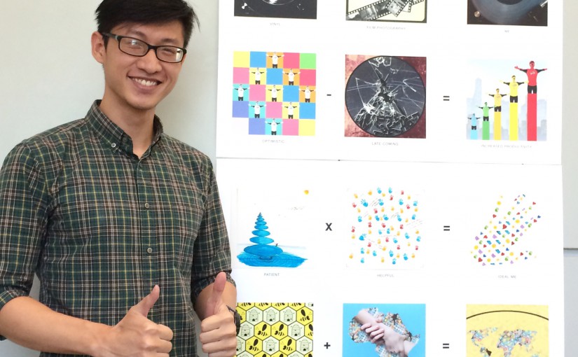
The most important thing however, was that I was not the very person that I was when I first started this module with you, Shirley. I had neither the knowledge of the jargons we are to use as designers and concepts of designs and the principles that accompany them nor did I have the skills needed to work on digital art/design work. 3 months in, I am proud of what I have worked on for all of my projects, learning very valuable things along the way that I can apply to my designing work in and outside of school. I definitely found my own style in designing and I explored many possibilities with the given theme for each project. I am very thankful for shirley’s guidance and support! Thank you!
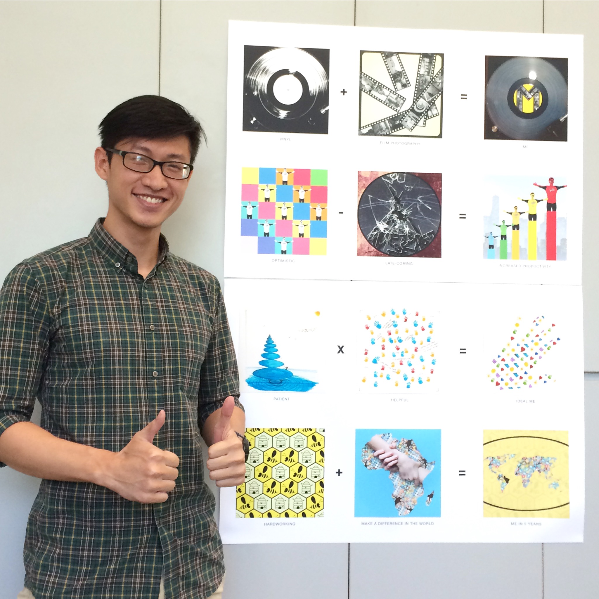
Below are the 12 pieces of my final project and the short write-up for each one.
Overall image:
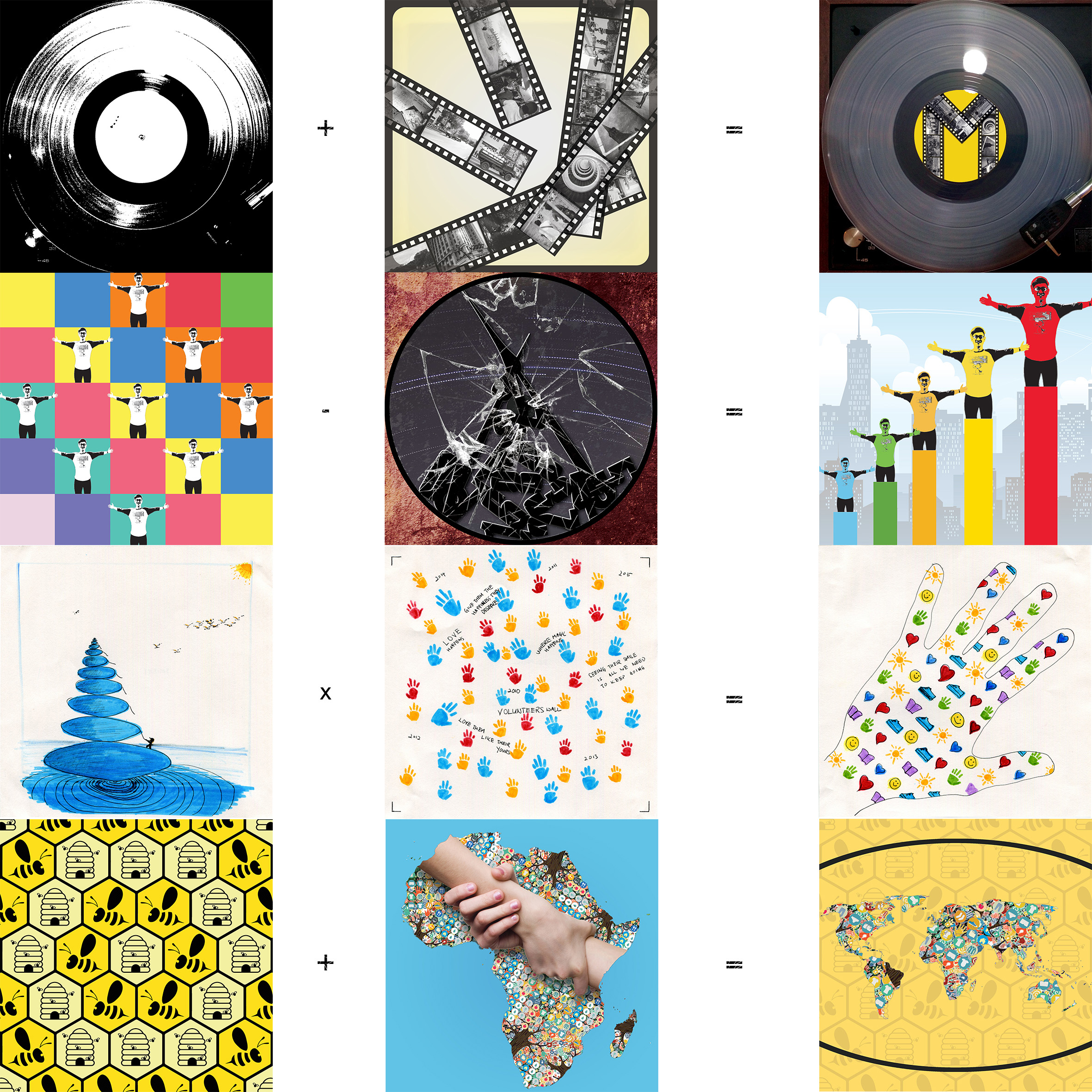
+
=
For this row of equation, I decided to go with a simplistic design that tells the story straight to the point. If anyone were to ask me to describe what I love doing the most, the two things I would say immediately would be to listen to chill vinyl records and to wander around Singapore, making images with meaning. And something that would amalgamate these two things with my personal self would be a simple letter ‘M’, to represent my mother who raised me up very well to be a person of great character and values and also to represent, yours truly.
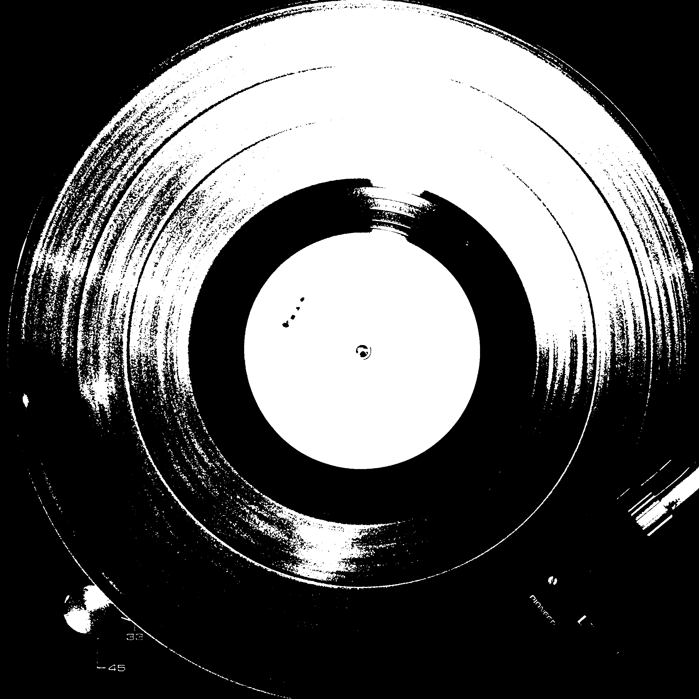
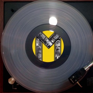
Vinyl:
Listening to vinyl’s are way way more pleasing to the ears as they are more warm and the tonal range is wider. I fell in love with vinyl’s the very moment I listened to it being played.
I made an image of a vinyl record playing on my vinyl player and decided to do a threshold and effect and up the contrast of the image to bring out the texture of grooves on the vinyl record.
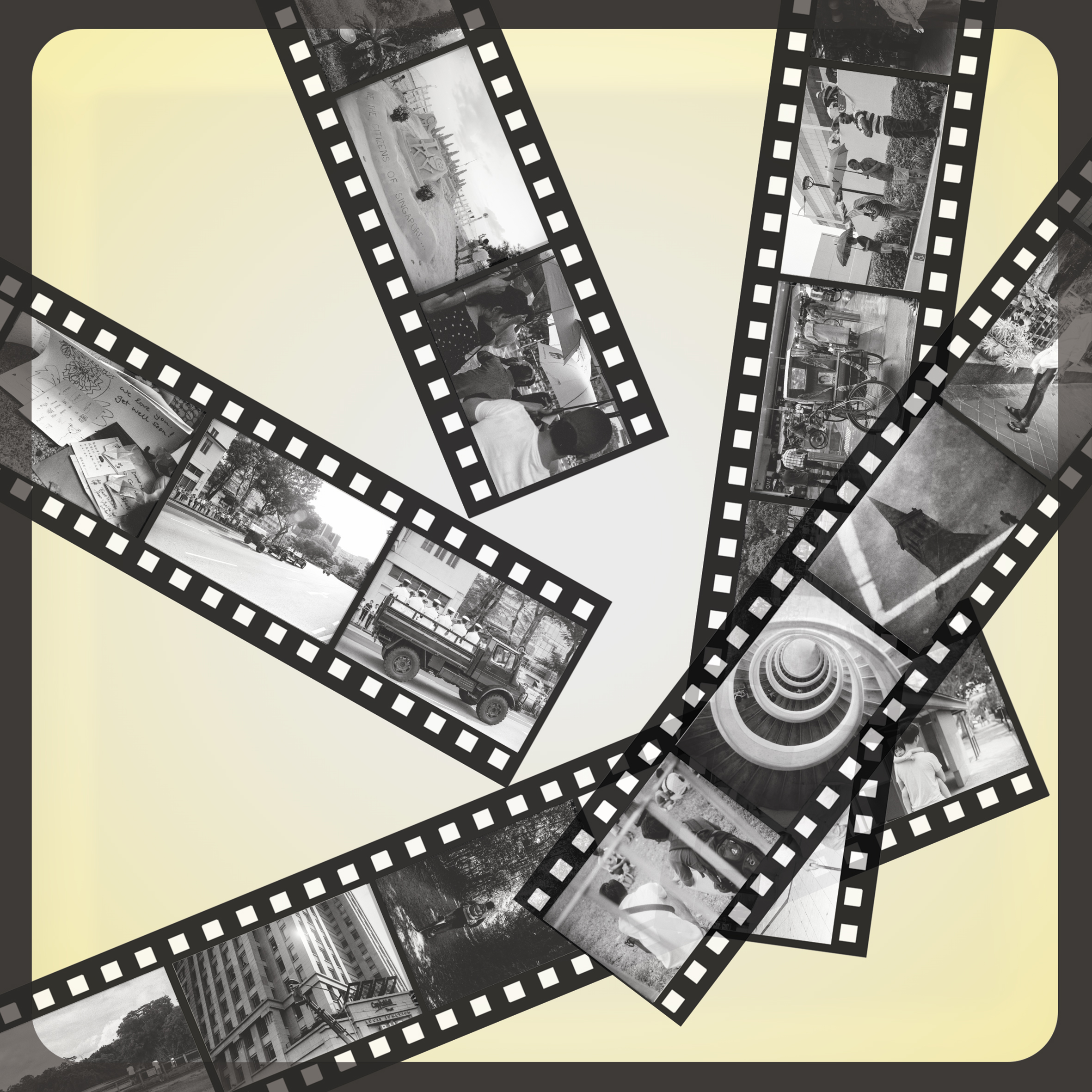
Film Photography:
I started my photography journey with my Nokia phone back in the day, with a standard issue camera. Subsequently, I used my mum’s film camera to make images and that was when I truly appreciated film photography. The entire process of it, from knowing what settings to use when I photograph to the development of the film. I am the traditional man who appreciates the old ways, and Film Photography was one form of medium that eventually became a part of my life. So, I chose to portray Film Photography in the old way of how one would view their negatives/positives. I designed a light box and contact sheets with images I made with the passing of the late Mr Lee Kuan Yew as my tribute to him, aligned at bottom right third of the composition. I am working on my first photo book, with images made using black and white film. I hope I am able to finish it by the end of this year:)
Me:
As I have mentioned above, the ‘M’ refers to my mother and myself. I found that the letter ‘M” was apt to represent us. I chose to show the vinyl in colour to let the view know how a record vinyl would look like in real life and the kind of color it can come in. The yellow I used to fill the centre of the vinyl is represent the happy and joyous time I had growing up, doing the things I like to do!
–
=
This was a series I enjoyed a lot and one of the series that I used many colours to tell my story. It took me a good amount of time to conceptualise and then designing the above three designs.
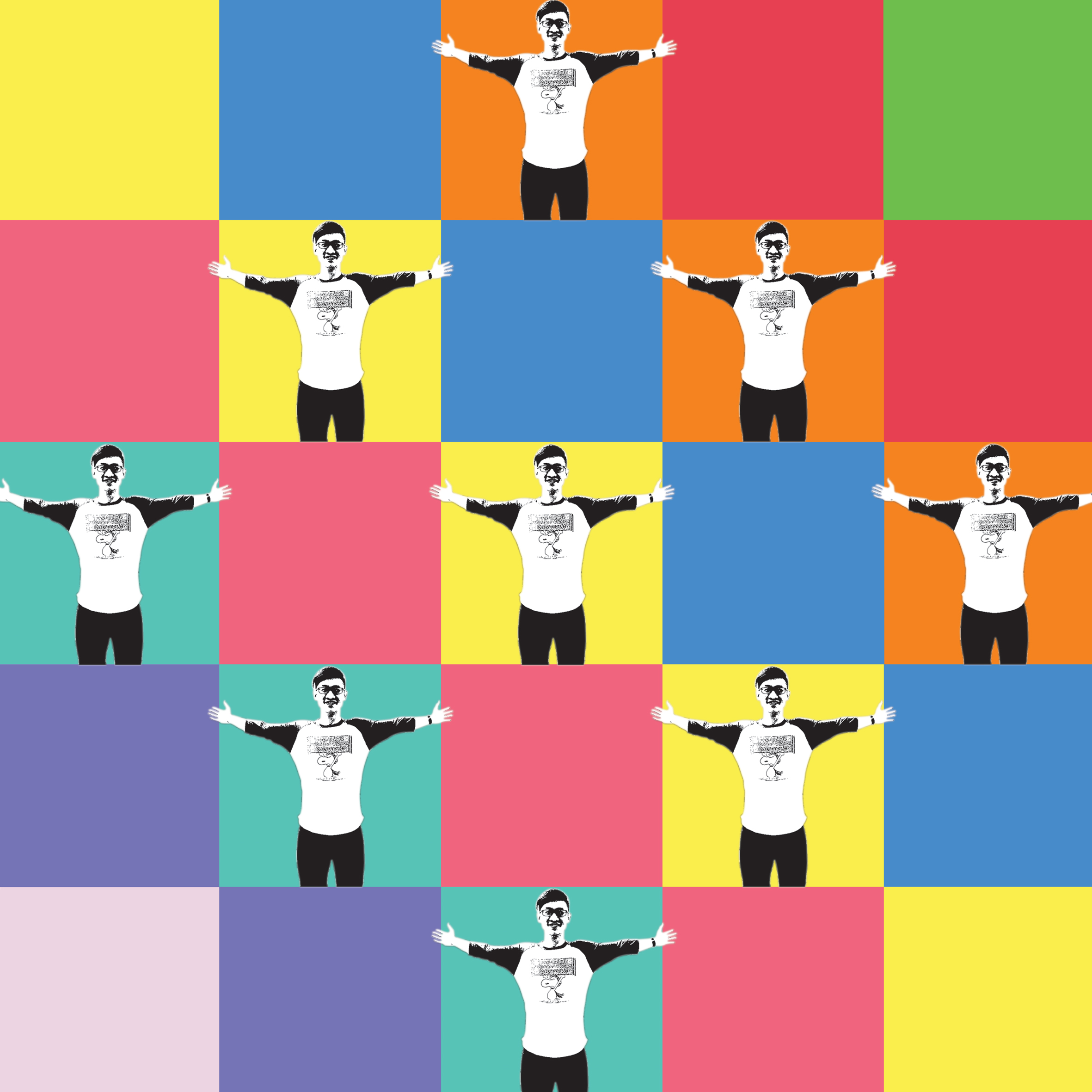
Optimistic:
I am someone whom you’ll always see smiling to anyone and everyone. I am one who want others to feel acknowledge and happy. I am optimistic. i attribute this to what I have learnt as a leader during my secondary school days, where I had to make a lot of improvised decisions and be optimistic about them. So now, whenever I am tasked to do something or I set out to achieve or do something, I will approach it in an optimistic way, always, thinking positive of the outcome. And, every time, they do. 🙂 Hence, for this design, I went with very optimistic colors, which are bright as well as the complementary colours that follow. I also added in a pose of myself in an extremely happy state and arranged it in a well balanced way in the square frame. These allows the viewer to tell that I am a very optimistic person, the moment they see this design.
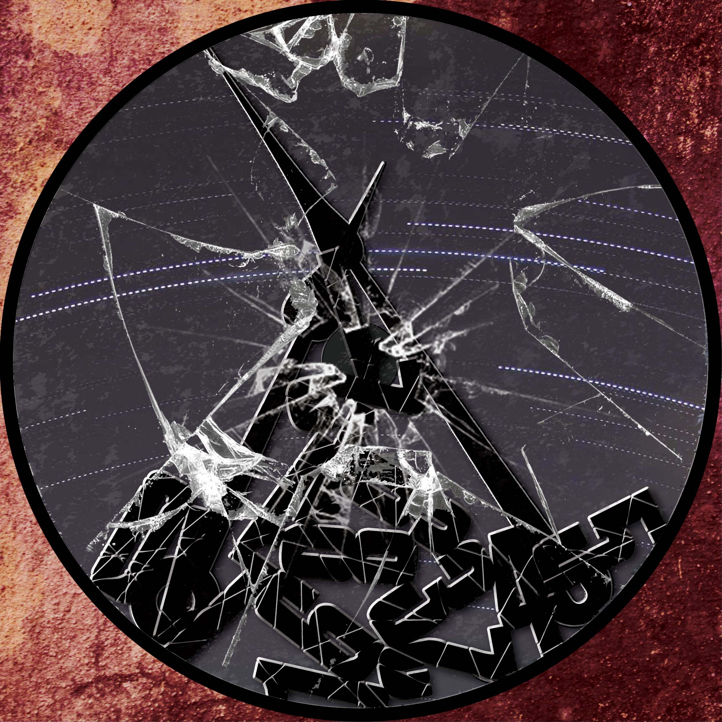
Late-coming:
Though I am very optimistic and I have pretty decent character and values, there’s alway one flaw that I’d always want to get rid off. That is, late-coming. I have a bad habit for being late, most of the time. I just can’t seem to correct it. But, I hope that I will be able to change my ways as soon as possible. For this design, I went with a very subtle and negative/uneasy mood. I made a broken clock with the numbers all fallen and the glass at the front of the clock shattered, including the two hands of the clock. This shows that I have a really bad sense of time to the point that I am always not on time because my internal clock is broken. The background inside the clock shows star trails captured me and this was intended to show how time was for me, passing by so quick for me but actually slow to others. The outer background with the textured red was used to set the overall negative mood and also signify the internal clock within myself, with the dull maroon/red depicting the inside of my body. I really enjoyed designing this and I hope that you will too have a great time looking at this!
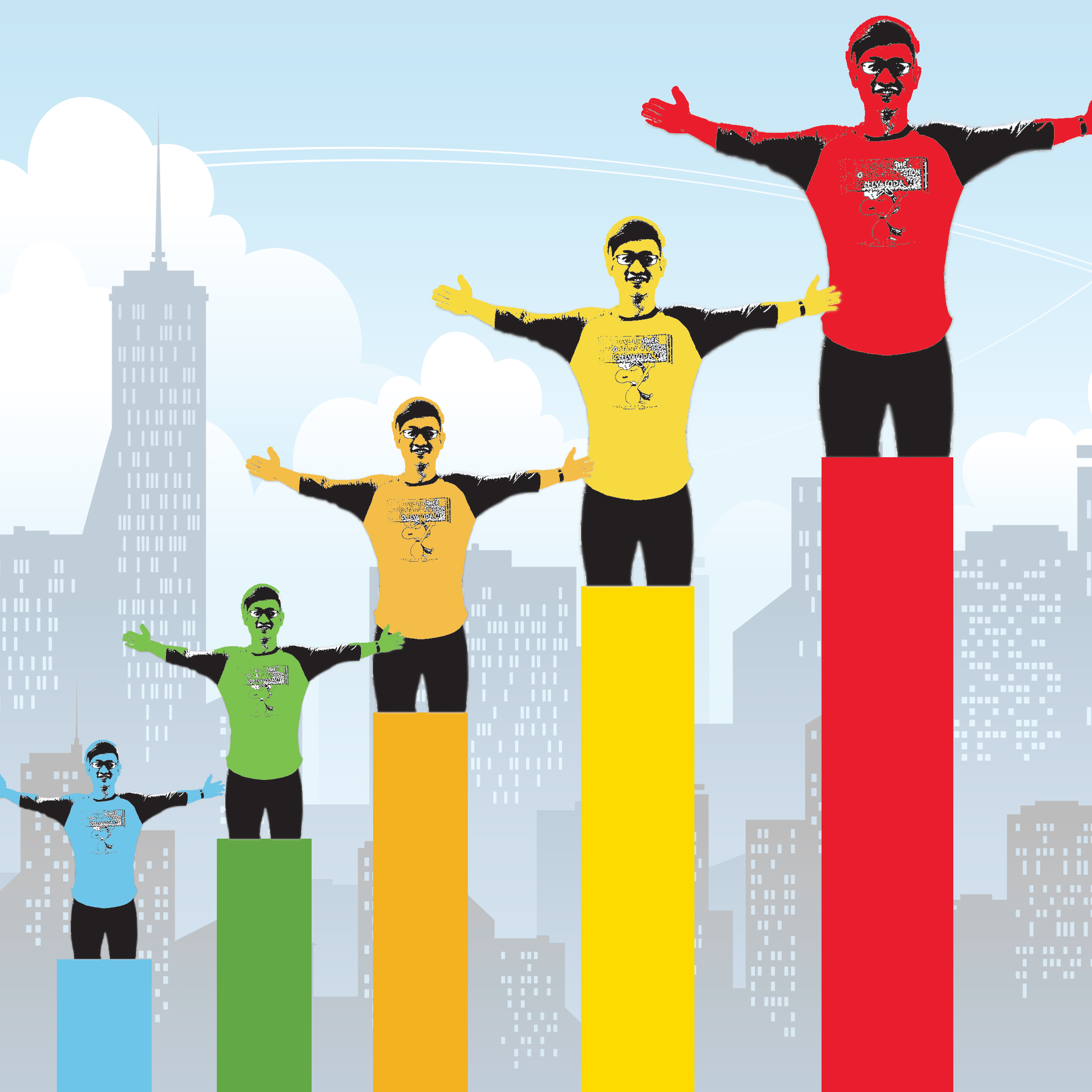
Increased Productivity:
So, what does optimism and the removal of late-coming equal to? I would like to think of it as increased productivity. Because once the late-coming issue was settled, I am able to manage my time well, be able to complete more tasks, quicker and more efficiently, and thus, leading to increased productivity. And, I thought what better way to make an increasing graph to show this! I used the rainbow colors to lead the eyes of viewers from the left side of the image to the right side, from blue to red. I used the pose of myself in the first image and amalgamated it into the last square composition for this equation and placed them a top the bars, in increasing length and size to show a more efficient me over time! I hope you enjoyed my works so far!
+
=
For this equation, I decided to explore the inner child within me. I went ahead with handwork instead of digitally designing my equation. I thought, why now just try designing something in a child-like way because I have never done it before and also because this is my final project for 2D, so why not? Shouldn’t I be exploring different ways of designing and conceptualising?
Patient:
Besides being an optimistic person, I am also very patient with the things I do and with everyone one around me. I believe that this is a very important trait to have because, when we handle issues that needs a long time to solve, remaining patient and calm at that point of time does help in getting us thinking straight and in the correct way. So, I approached this by making use of zen stones. Zen stones are used for cultivating patience and calmness in us. I used the colour blue because it allows us to feel calm when we view it. If you noticed the little silhouette on the first stone as well as ropes hanging out from the other stones above, it’s meant to signify patience because the person needs to climb up to the top of the stone but each rope is not enough for him to reach it. Hence he needs to be patient and think of a solution and keep his cool during the instances of setback.
Helpful:
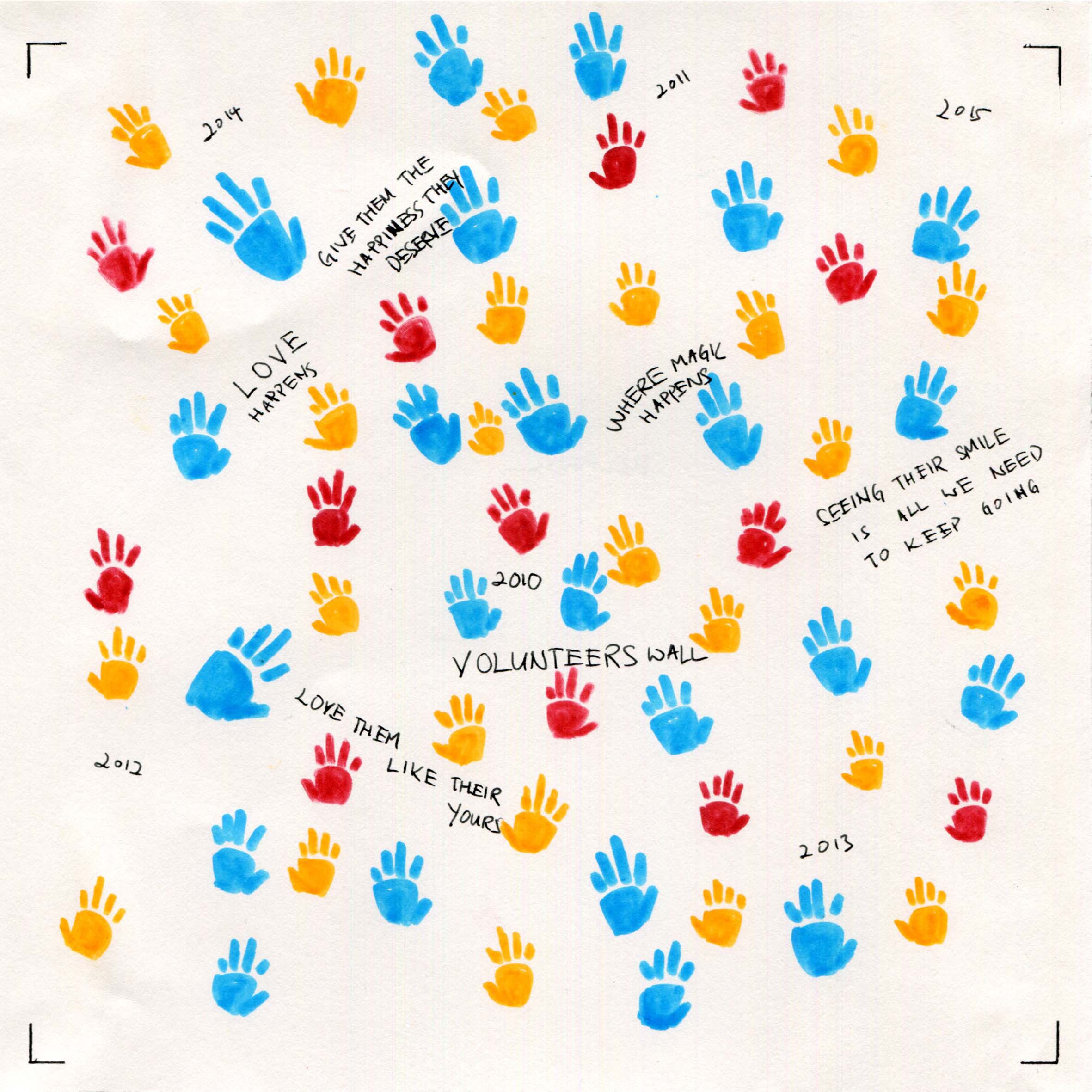
I used the idea of the people whom I want to help most (less fortunate children) and also the mural wall that people who usually does community work would do. So, on the “wall”, are hand prints of the children and also the years at which I started doing community work and the years after that follow. I have also included the words of encouragement that people will usually write on the wall. I used hand prints to show how much that I have helped the community and the bright colors I used represent how happy and contented I was with every community service I completed.
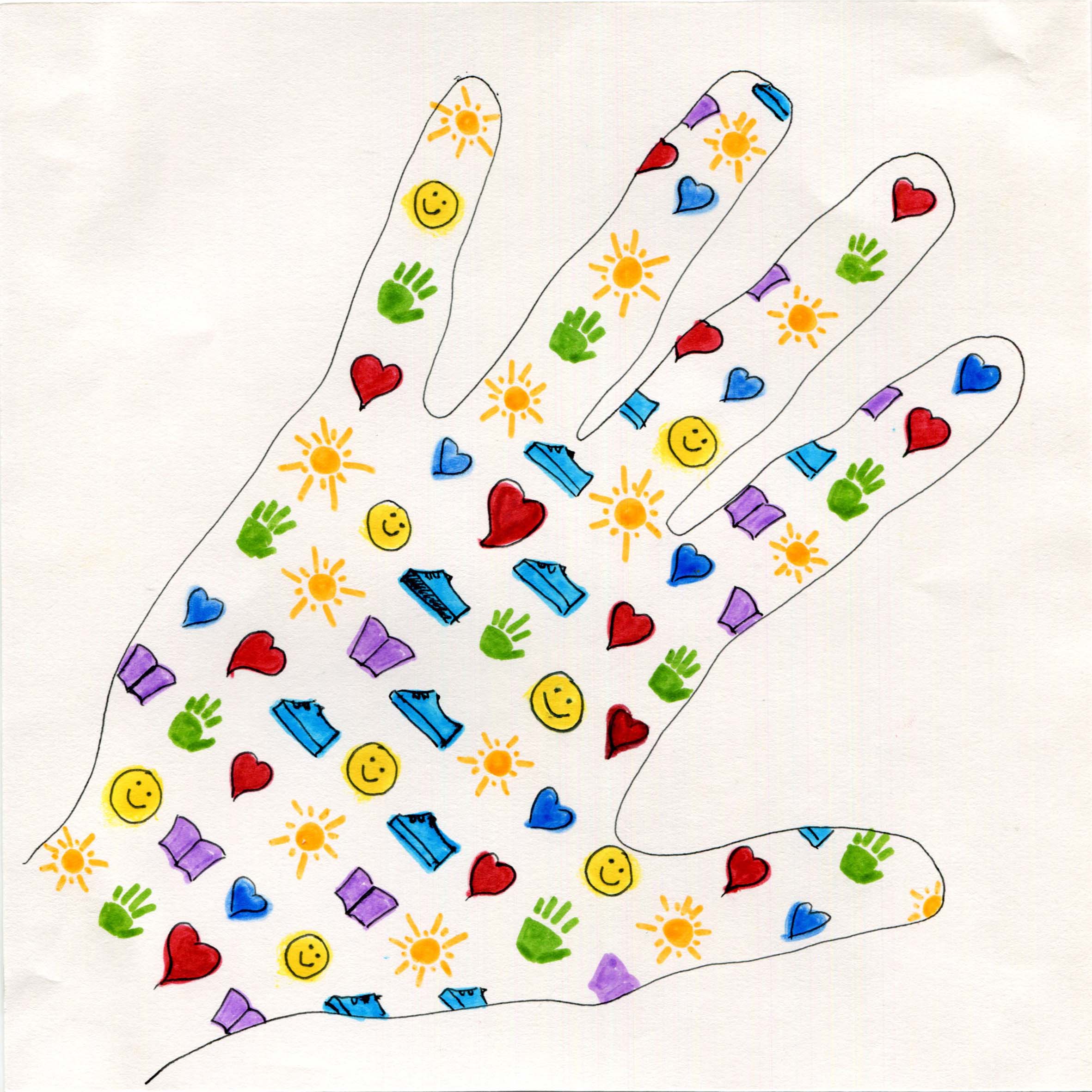
An Ideal Me:
With the patience I had along with my helpful self, I intend to help as many people in as many societies as possible. Hence, I traced the shape of my hand, and filled it in a balanced and organised manner, with simple icons that represent what I want to bring about in the lives of those I touch with my hands:
Heart shape: To feel loved
Book: Education
Sun: To feel warmth
Shoe: To have proper footwear and clothes
Smiley: To always smile
I used bright and vibrant colours (primary and secondary colors) to show the positivity I have in achieving my ideal self;)
+

=
Hardworking:
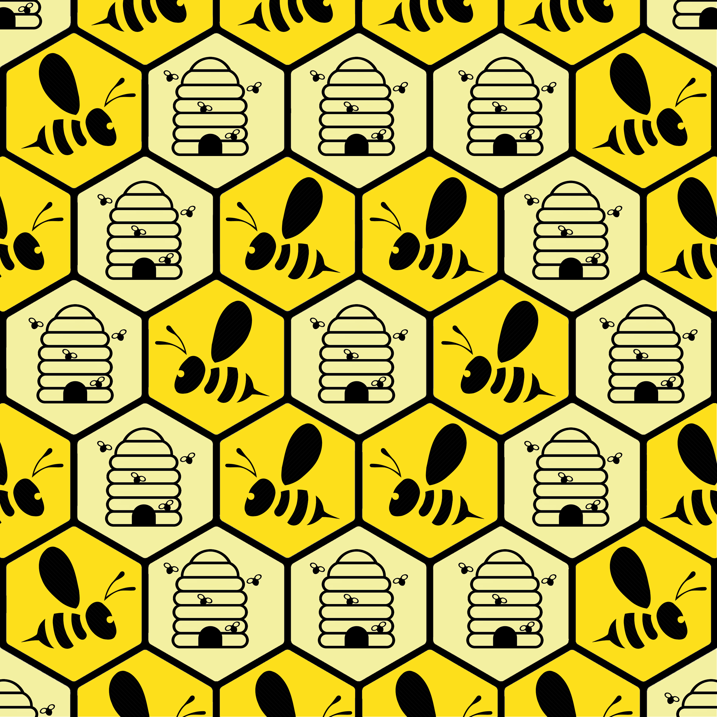
I am someone who works really hard for things that I love and enjoy doing; things that have a greater meaning in life and have a sense of purpose. To show this, I picked a honey bee to represent “hardworking”. They are resilient and hardworking and true to their conviction. I placed them in hexagons that resemble that of the honeycomb structure. The honey bees conviction to collect nectar and then making honey gave them a sense of purpose and so I used bee hives to show that I had a purpose for being hardworking in the things that I do. I used two shades of yellow to differentiate the bee from the hive and to add variety to the overall design. The use of yellow was to let viewers know that I approach every task optimistically;)
Making a Difference:
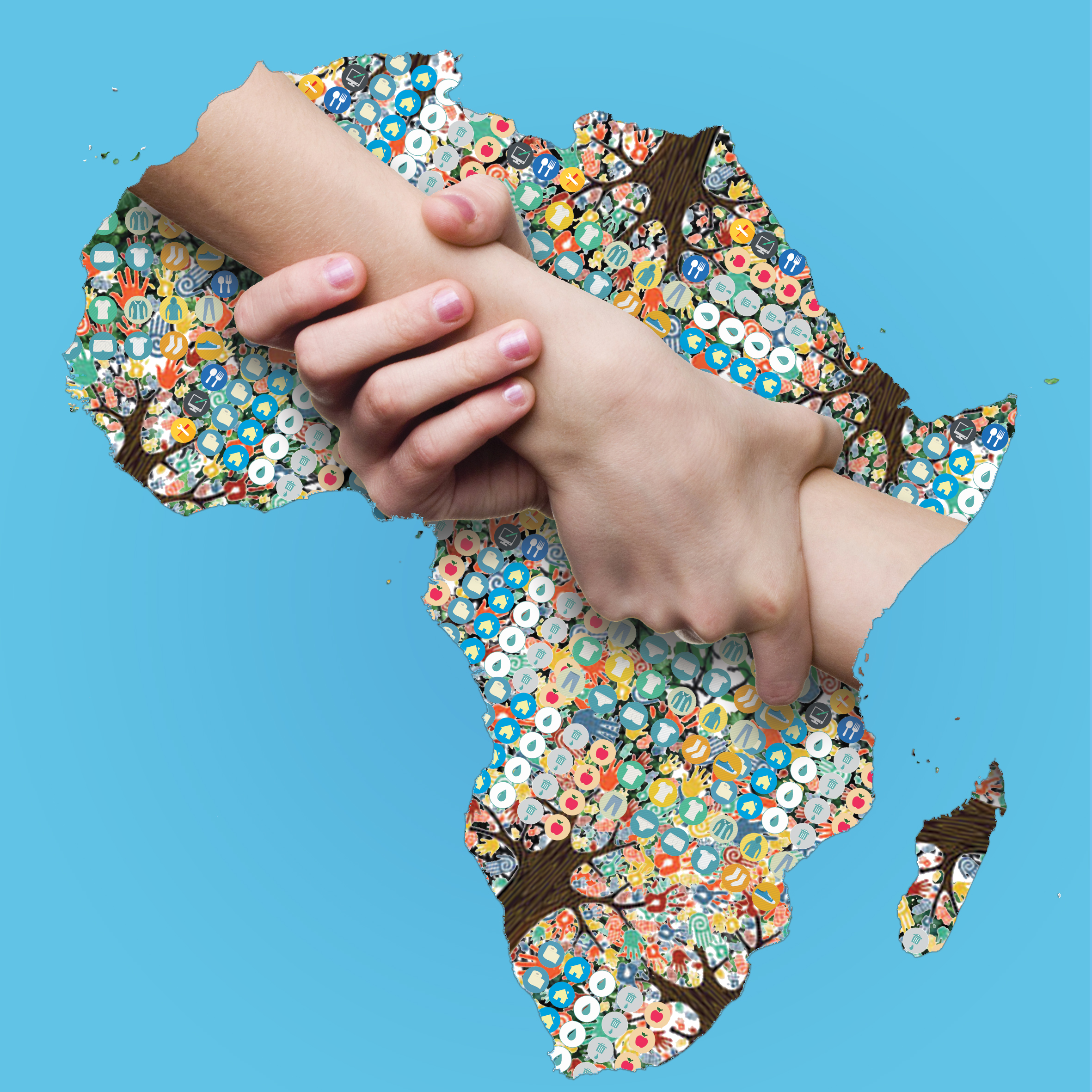
With the abovementioned traits; optimistic, helpful, hardworking, patient, I believe I am able to make a difference in the lives of others. With the knowledge and the help I can garner from those around me, I want to back to society and be able to alleviate poverty in Africa first. Hence, I started this design by using a map of Africa. And filling it with many icons that represent what I intend to do in Africa and how I want to help alleviate poverty of the less fortunate. The icons include sanitation, food, education, clothing, and many more along with the tools that I am going to use to effect a positive change. The tree trunks and branches represent the help that I get with my endeavour. And most importantly, the intertwined hands represent me helping the people there. I chose a myriad of positive colors to emulate the positivity that I have with what i envision but keeping in mind to have a balance with the entire image.
Examples of the icons:


![]()
![]()
![]()
Me in 5 years:
In 5 years, I hope that I am able to help as many people around the world as possible. Of course, this would be done with the all the traits and experience that I possess. I really hope that when I have passed on in this world, I am able to say that I have done my part as a human being. For this design, I went ahead with the amalgamation of the Hardworking and Making a Difference designs into the world map. Though it is a simple design and a humble goal, I think this design encapsulates all that I want to do into this square. I will work very hard and through the process, I hope that I am also able to effect change with as many people as possible. I muted the bees and honeycomb design to be the background and see of the world to show the amount of hard work I am willing to put in and filled the land of the world with all that I want to achieve. The final design was satisfying.
On a high note
In all, I am extremely happy with all my designs because I was not only able to communicate what I intended to share but also surpassed my expectations of how much I can actually design using photoshop. I have truly learnt a lot during my first semester. Thank you, Shirley, for a wonderful semester 1! Cheers and see you next sem! 🙂
Thank you for knowing more about me! Thank you and have a great day ahead!


 (https://www.flickr.com/photos/46909884@N05/4422269729
 (http://www.msbabkiesclass.com/principles-of-design.html
 (https://prezi.com/5prenxucodwr/smithwick-principles-of-design/


 One other emotion that I particularly like is the “Ambiguous” emotion. Ambiguous means being open to more than one interpretation. Using simple lines, I wanted to achieve a look where the viewer will question the orientation of the strip. Like, “is this supposed to be view in this way or another way?” I did so by creating a symmetrical mountain shape. Thick lines we’re used to accentuate the slope, but done in symmetrical way. This results in ambiguity of this particular emotion. I used a brush pen to help achieve this a smooth and sharp line.


