Typographic Portraits:
What is typography?
“Typography is the art and technique of arranging type to make written language legible, readable, and appealing when displayed.” – Bringhurst, Robert.
To me, Typography is an arm to the messages you intend to convey, through any medium but at the same time be legible enough for the viewers to comprehend and understand. Whether it involves aesthetic consideration or not, the main idea is always the message. This is what I set out to achieve in this project, of course with some aesthetic design involved.
When I was presented with this project brief, I was excited because I think it is really fun to be doing something that discover/rediscover ourselves. This process allows us to get to know who we are more, playing with expressionism. Which is cool, especially when we don’t really have time to slow down and be who we once were. Having this opportunity to do so really opened my eyes and broadened my horizon in terms of creativity.
Since I played with a lot of photoshop for the projects in first semester, I thought, why not experiment with more textures and a more natural approach for the Typographic Portraits.
This is what I came up with during my initial stage of this creative process.
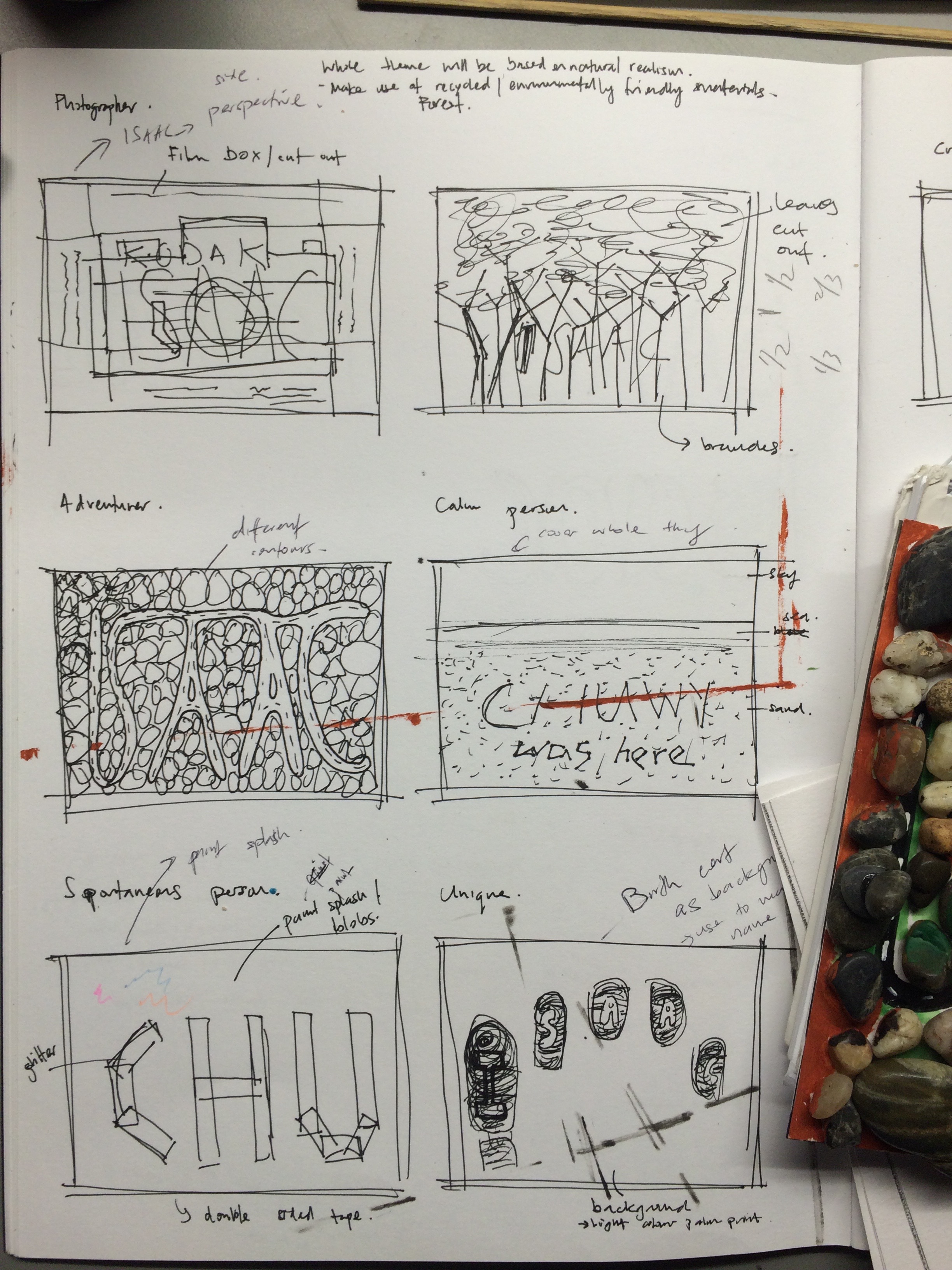
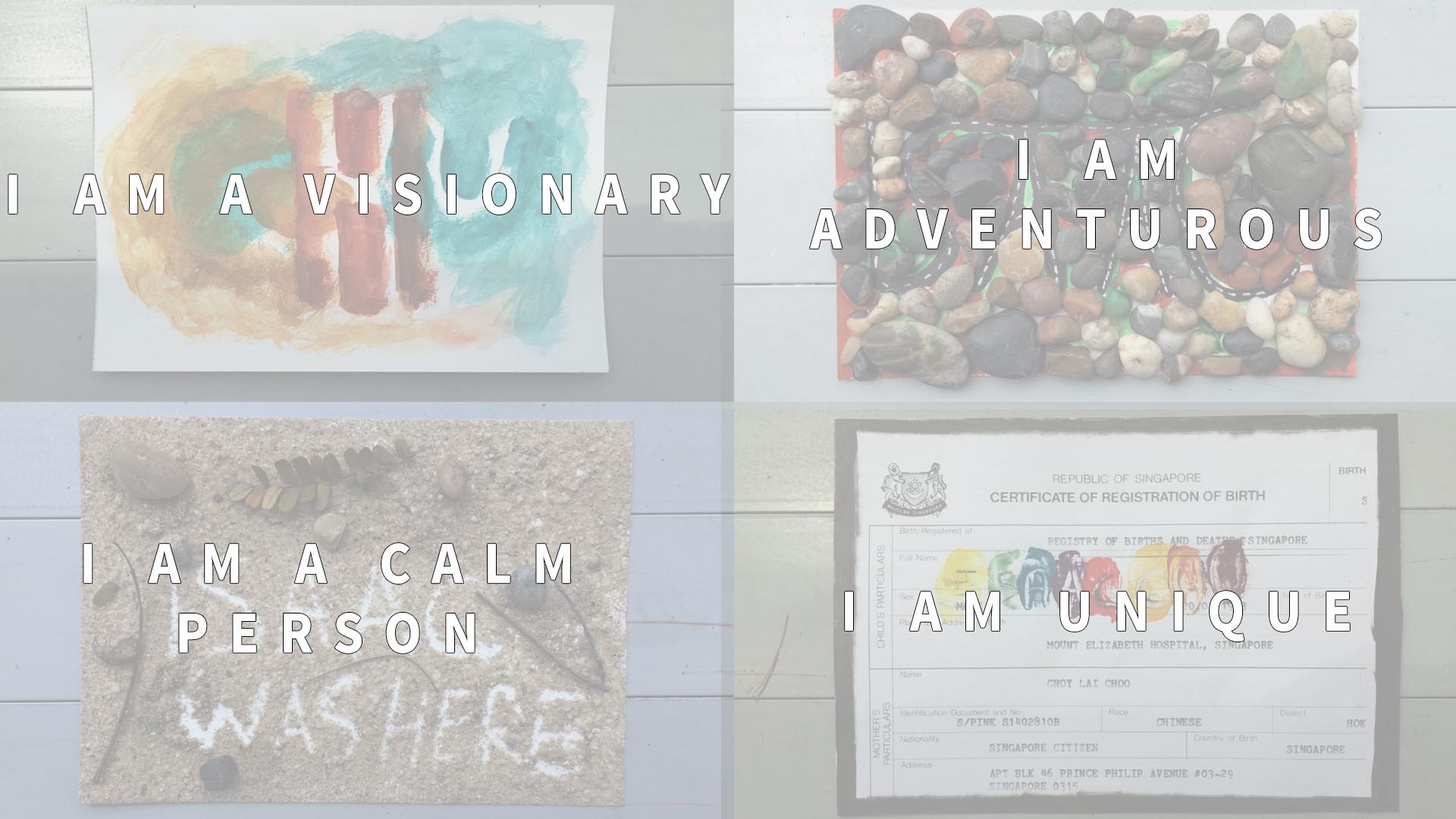
Eventually I narrowed my ideas to the best 4 that I feel would best represent who I am.
- I am Unique
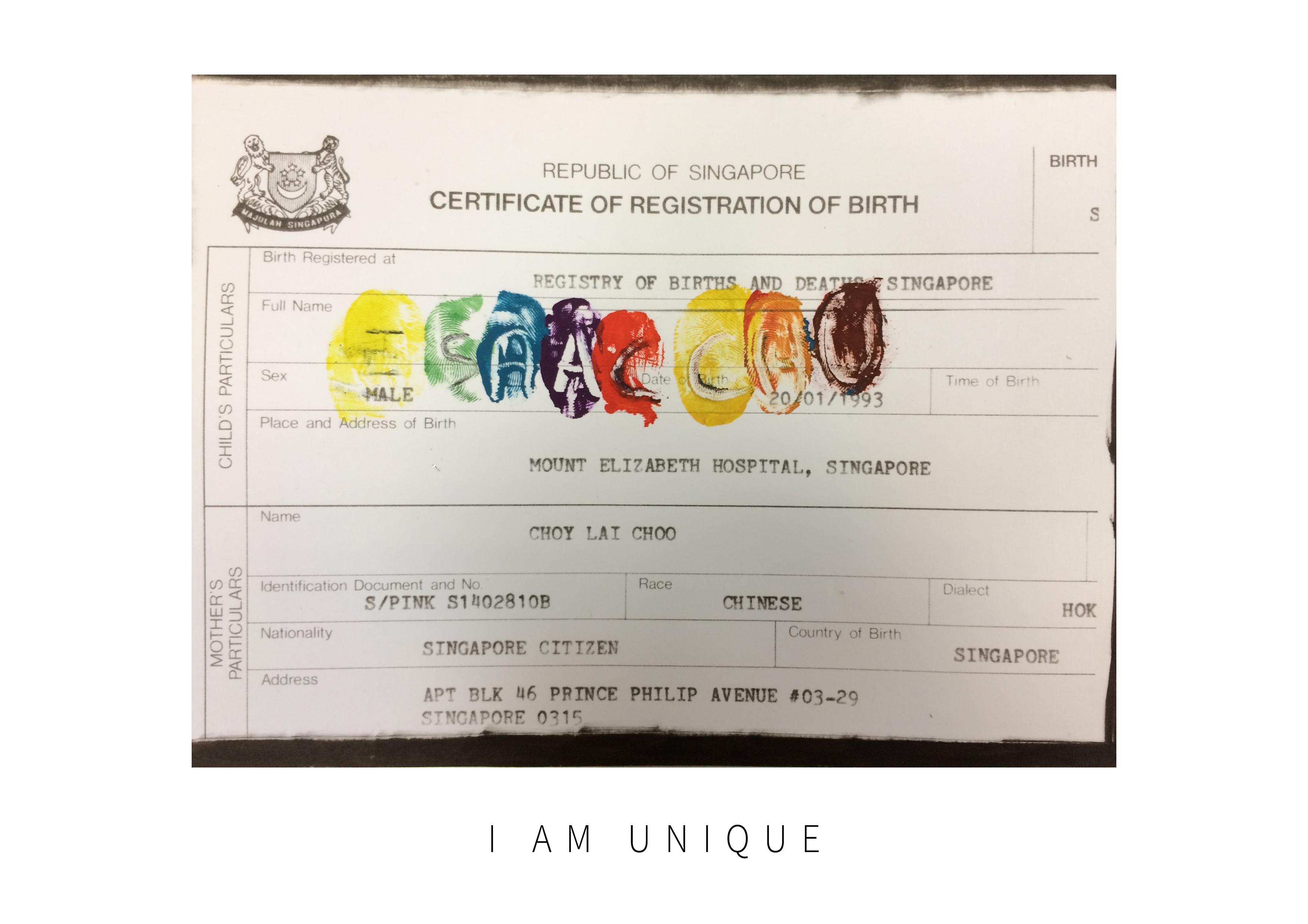
The initial stages for this was to just make prints of my thumbprint with a negative space for each alphabet of my name with a background of my palm. It was later after consultation with Ms Shirley that the idea of using a birth certificate as the background sprung up. I thought, why not just photocopy the certificate and remove the actual print of my name at the same time and fill them in with my initial idea of using my thumbprint. I played with watercolur this time, which was new to me because I have not used it before. using the knowledge of colours that we did back in semester 1, I applied it to the colour I used for this portrait. I used primary and secondary and complementary colours to synergise the whole portrait. I want to let every my viewers know that I am a very positive person and yet able to assimilate well into society, hence the choice of the colour combination as seen in my final image.
The process:
After choosing the colours I intend to use, I covered my fingers and thumb with a colour each and used a dried marker to remove the paint according to the stroke of the alphabet but in mirror format. The result of it is what I intended to achieve!
I think this first image gave me great motivation for the rest of the remaining portraits. I had the opportunity to have a good look at my birth certificate and also be able to infuse my own fingerprints onto my own copy of the certificate. There was an unexplainable sense of belonging inside of me as I looked it.
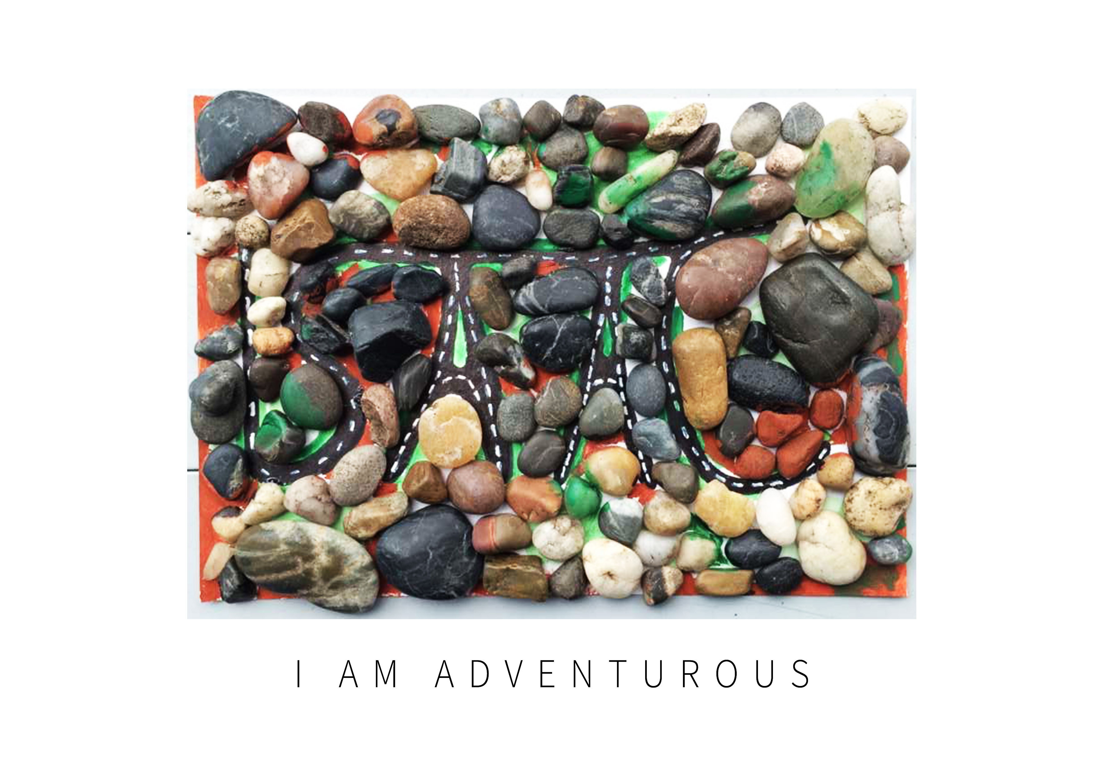
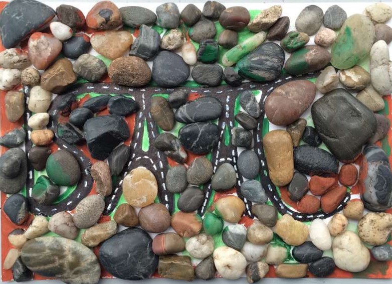
I am an adventurous person and if you throw me any adventure opportunities, I will jump at it immediately! I really love nature and outdoor activities and keeping a fit and healthy lifestyle. Especially since, I am now leading an extremely stressful lifestyle, all the more I should go out there and exercise! One of my favourite sports to do is to go for extremely long hikes/treks. This probably explains my huge legs and calf muscles! In any case, I chose to portray my adventurous side with the use of pebbles to represent mountains and hills, with the varying sizes of the pebbles. I chose the pebbles with colours that are more aligned with nature so it would look more realistic.
The process:
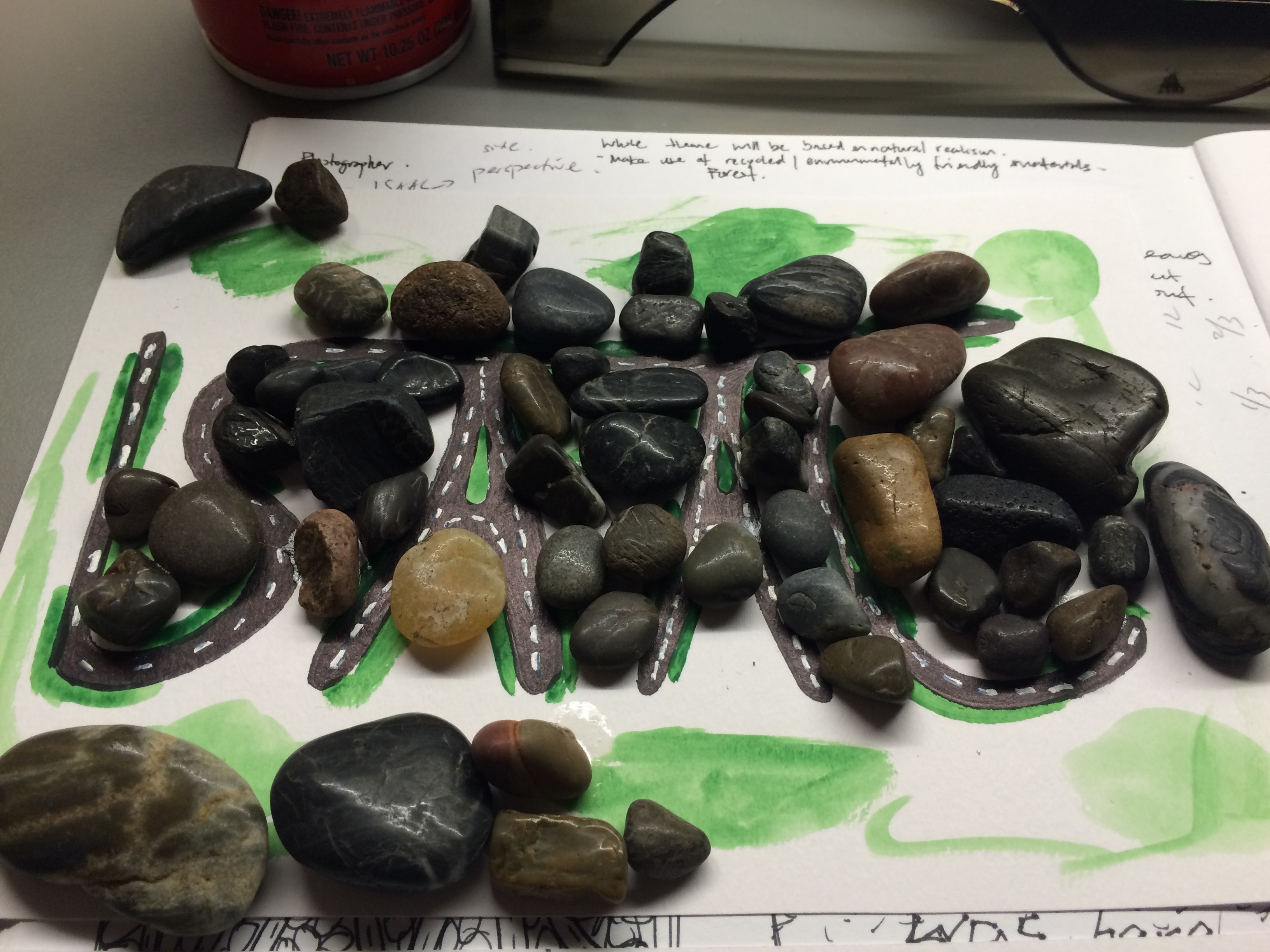
I started out by creating the roads that form the alphabets for my name, using a zebra marker and correction fluid. I painted certain parts of the canvass with green watercolour to add to the effect of a naturalistic environment. Using super glue, I first line the outer part of the alphabets with smaller pebbles. I wanted to create a more natural environment, this was why there are some pebbles that block/obstruct the overall flow of the shape of my name, “ISAAC”. Through this, not only do I aim to tell everyone that I am an adventurer, I also want to encourage them to pursue a healthy lifestyle in my lifetime 🙂
3. I am a calm person
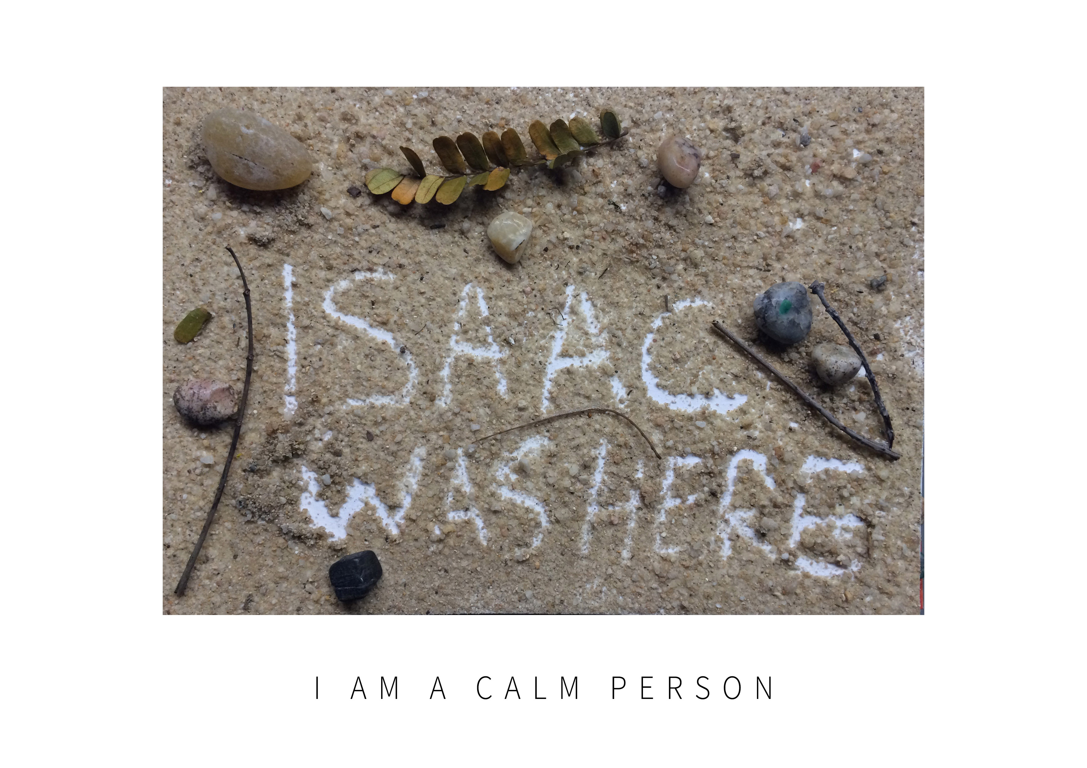
When I thought about how to express this, I immediately thought of the beach and sand! This is usually where I go to to find solace. Being at the beach has a very calming effect and I want to be able to communicate this to the audience and at the same time evoke the calming effect in them.

The Process:
I went to the beach for this one and got me some materials and to work with. It was a great opportunity because I was having many late night dance practises for the Hall Olympiad Closing Ceremony and I needed a well deserved breather at the beach. I used spray mount to get all the sand to stick and while it was wet and write out the words “ISAAC WAS HERE” symbolising after going to the beach, I have brought the calm with me. I then added in the other elements that you can find on a beach.
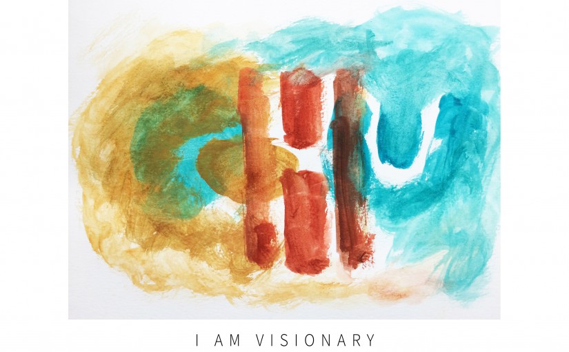
4. I am a Visionary
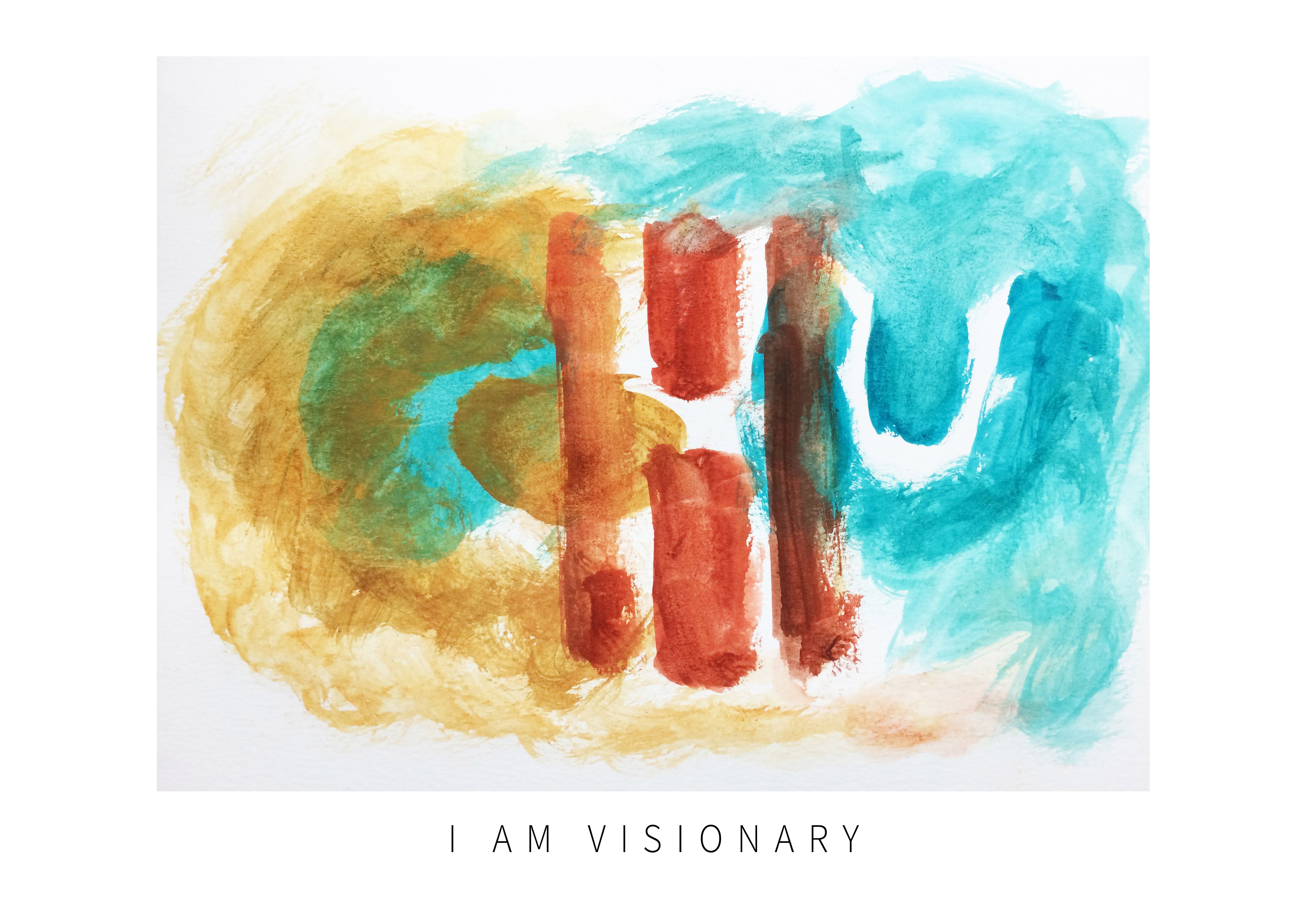
It is difficult to believe this but I am able to envision my own future and also the actions of others in the very near future. I guess it was because of the leadership experience that I had learnt almost 9 years ago. I was able to read the moves and minds of others though I wouldn’t do so to everyone. It was mainly for myself and the men that I have under my charge back when I was a leader and morale sensing was very important to maintain a group. The use of watercolour for this was because water had a very nice flow to it and I wanted to emulate this effect on this canvass, very much like the chinese paintings where painters were able to have vision for the painting they are working on.
The Process:
For this design, I first chose a very cool colour combination and just let my vision guide me in this. With each stroke of the brush, I created the above design, bearing in mind the negative space that I had to leave, in order to have my surname visible.
I hope you enjoyed what I have designed for my first project and I hope to be able to bring you more fun designs in Project 2! Cheers!