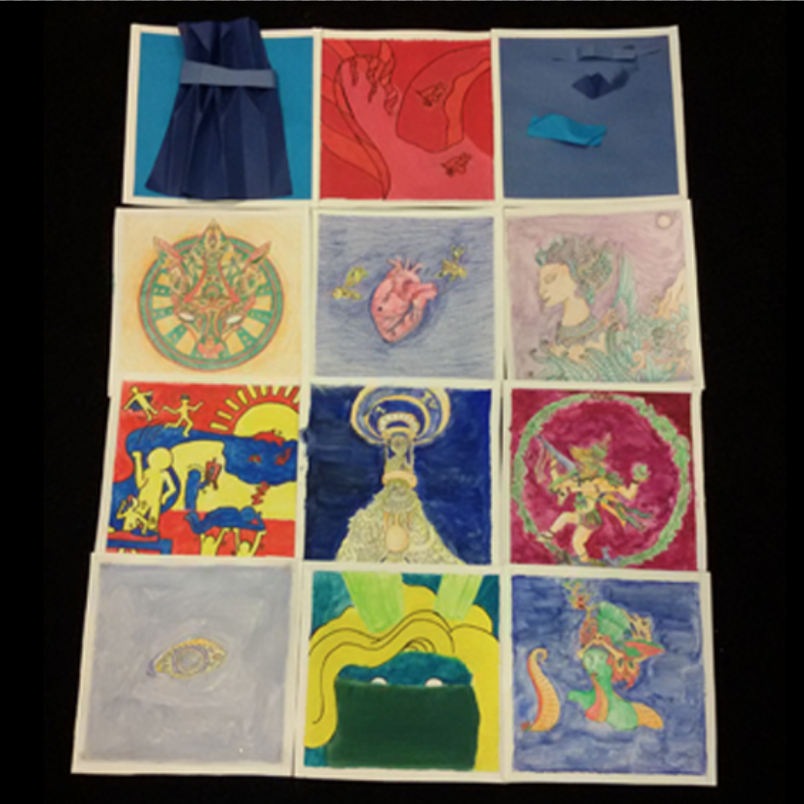
In this project, I am trying not to be literal in my compositions and make it more personal. I also have a flow in my compositions in terms of colour and methods of medium and application.
- The colour blue: 1, 3, 5, 8, 10, 12.
- 1st series: Analogous 3
- Triad harmony: 7, 10
- Tetrad harmony: 9, 12
- Last row: Faces facing left
Most of my panels used mythological features and ornate drawings – things that really influenced me in terms of design.

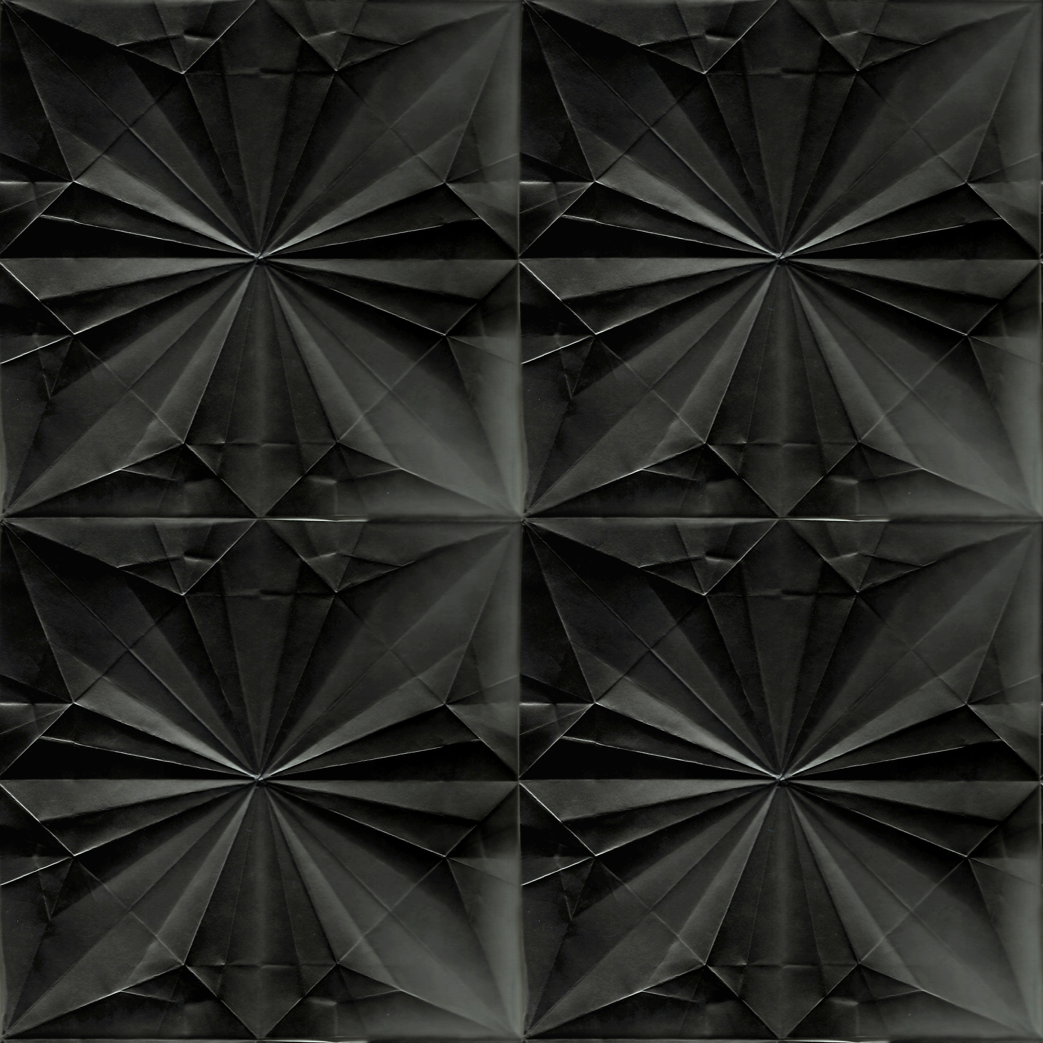
The first three pieces follows the analogous 3. The origami pieces are inspired by my 3D project and Issey Miyake.
#1: Pallid Pleats
Using paper pleats and cool colours to create something of my usual dressing and almost monochrome palette
Material: construction paper
#2: Cotton Candy Mountain
Influenced by the candy garden in Charlie and the Chocolate Factory as well as The Imaginarium of Doctor Parnassus. This piece shows my penchant for desserts. It is in a warm colour in contrast to the other two in the series and done in a different medium so as to provide contrast.
Material: block print paint
#3: Piece of Me
Shows how I, as a person, is made up of many different pieces that I picked up over time.
Material: construction paper

#4: Donatella Kitsune
A fox; my creative and independent side. The ornate illustrations stem from my years of drawing henna and this can be seen in my other drawings. The similarity to Versace’s logo is a nod to my interest in fashion. My artist reference for all of my ornate drawings is Cambodian artist on Instagram @visothkakvei
Material: colour pencils
Colour theory: split complementary
#5: Heart of the Hornet’s Nest
My bitter, vengeful side, which I need to minimise. The hornets are coming out from the hole in the heart, stinging and provoking anyone. The blue background represents the despair surrounding a bitter heart.
Material: colour pencils
Colour theory: triad harmony
#6: Inner Peace
As I remove my bitterness towards other people and go do my creative pursuits, only then I can have a peace of mind. I use pastel colours to symbolise peace, I present myself as a an ancient Javanese deity in the night to show my tranquility.
Material: colour pencils
Colour theory: split complementary

#7: Fun Times
Shows all the things that I like to do and am passionate about. My artist reference for this is Keith Harding, using of pop colours to allow the piece to come out.
Material: block print paint
Colour theory: triad harmony
#8: Need More Time
Shows an hourglass brimming with benefits inside and pouring out. Shows how I wish I have all the time/able to manage time well so I can do all the things that i like.
Material: colour pencils, watercolour
Colour theory: split personality
#9: Master of All Trades, Jester of None
A reference to the Shiva Nataraja bronze statue, but I changed it to show me able to juggle and grasp all the things that I want to do in life. I stepped on the jester to show that I can overcome my adversity.
Material: colour pencils
Colour theory: tetrad harmony

#10: Eye of Focus
The ability to focus on the task at hand will definitely help me for my future endeavours. Transparent paper with cut-out eye emphasise my point; focus on something and sieve out the rest.
Material: colour pencil, watercolour, transparent paper
Colour theory: triad harmony
#11: Cup Noodle Goddess
How I don’t want to be dependent on a cup noodle diet for a living. It shows an oni (Japanese demon) with noodle hairs – a reference to Medusa – and this one uses her noodle hard to ensnare victims.
Materials: watercolour
Colour theory: Analogous 4
#12: Indulgent Geisha
By being able to be focused in my pursuits, be a master of all trades, jester of none, and be less vindictive, I can foresee myself enjoying a comfortable life indulging in my pleasures in 5 years. I was inspired by Audrey Kawasaki’s woman subjects and Phillip Treacy’s hats for Alexander McQueen’s Savage Beauty.
Material: colour pencils, watercolour
Colour theory: tetrad harmony