Navigating through print and web may be different, but the fundamental rules of design still applies to both such as typography, hierarchy, layout, and colour, just to name a few.
Started off with an exercise that requires us to look at the print copy of The Dominion Post, a local Wellington newspaper. Then look at how the information is presented, and the ways of reaching towards that article. My article is on the memorable moments during the Oscars.
As this is the first time I know of The Dominion Post, finding the website itself is a bit of a hassle; possibly not SEO optimised (I wished I’d taken a screenshot; now whenever I do a Google search it presents me the correct The Dominion Post). This makes The Dominion Post a hard website to reach as first-time users might not be able to get to the correct site.
Below is the scanned document for the how the article is like with relation to the page.
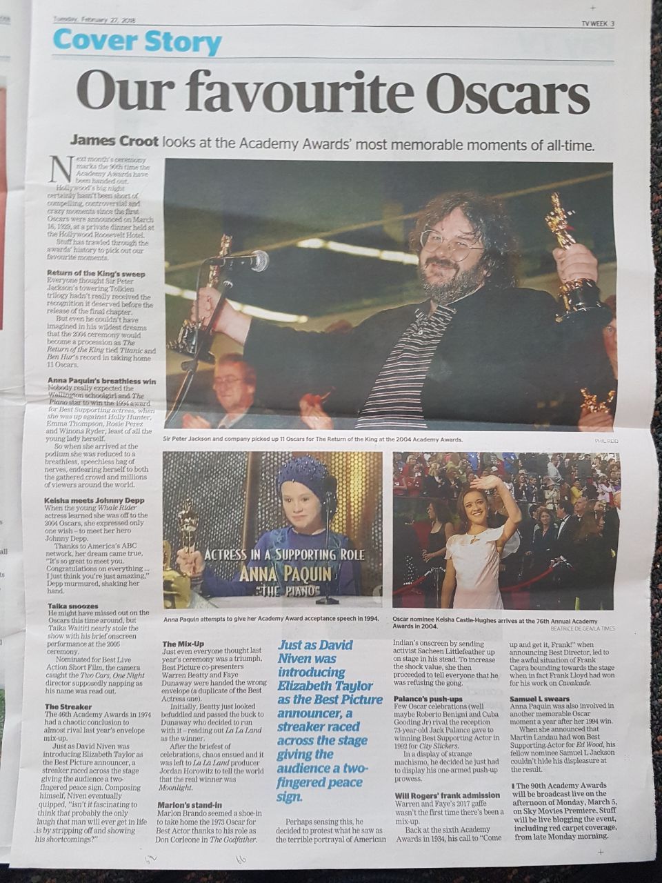 Here is the article placement on a page. There is hierarchy in the five column grid layout. The headline stretches across the page, in a bold font that quickly catches the eye. The byline is merged to the stand first, and differentiated by being bolded. As the body copy is lengthy, there are sub-headers that divides the article into sections. The pull quote is in blue, and definitely stood out from the sea of texts.
There has to be some consideration with the size of the images. Being a foreigner, I deduced that Peter Jackson is the most important photo as perhaps he is the most well-known out of the three people in the photo.
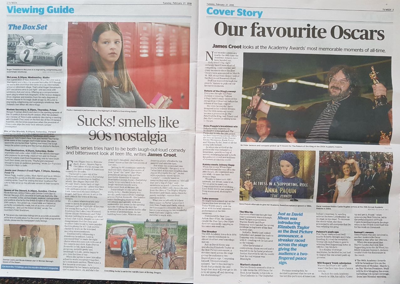
Article in relation to the spread. The article is on the third page of the news insert ‘tvweek’. Readers, when opening the cover page, will usually immediately see the third page first.
Here is a video of my attempt to navigate through the site.
will upload later (yet to create voiceover)
Its confounding and thus, I’m thinking of how to create a more user-friendly site providing the least clicks with regards to the pathways.
Meanwhile, I’m trying to see how I can make the article less wordy and more image-centred.
Initial Paper Prototype

This is the initial rough sketch of the article, where the body texts and different sub-headers have an accompanying image/video in a slideshow format. This is to make the article more dynamic (its an entertainment news, after all). This also allow user to process bite-sized information faster and by making it into a slideshow, each section of the article has their own ‘screen time’.
Below that is a quiz as a way of interacting with the audience as to which is their most memorable Oscar moments.