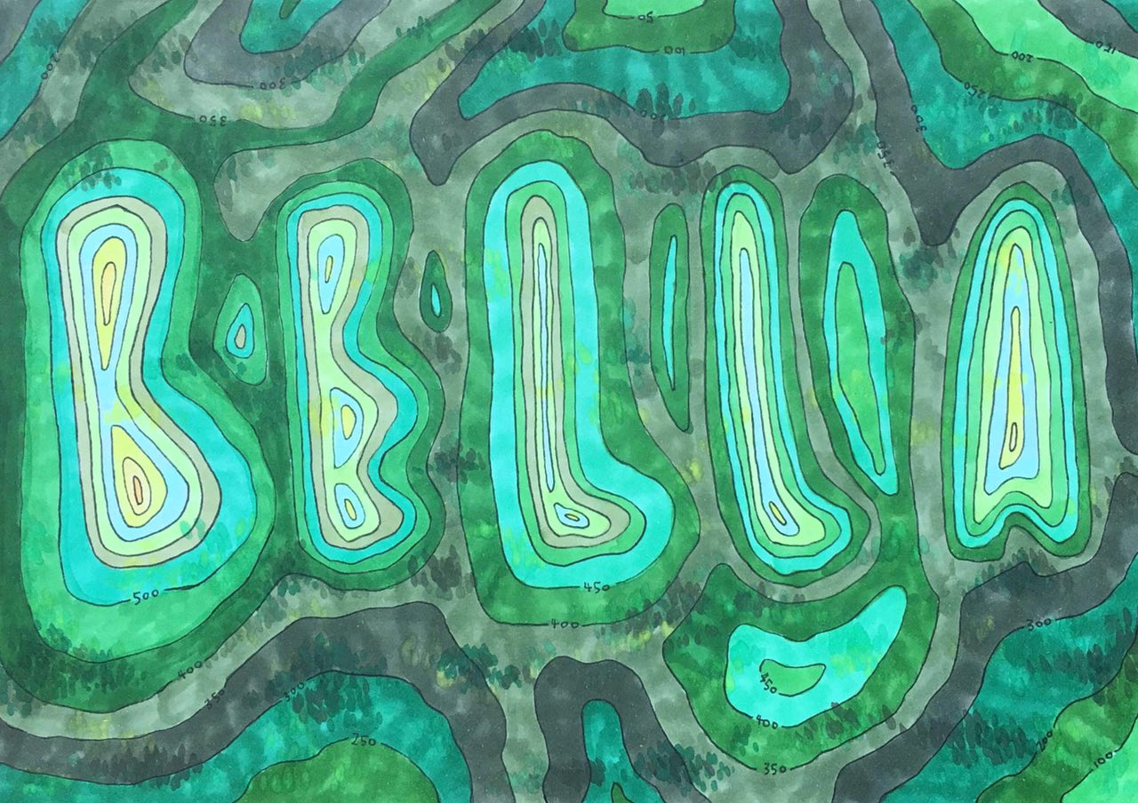
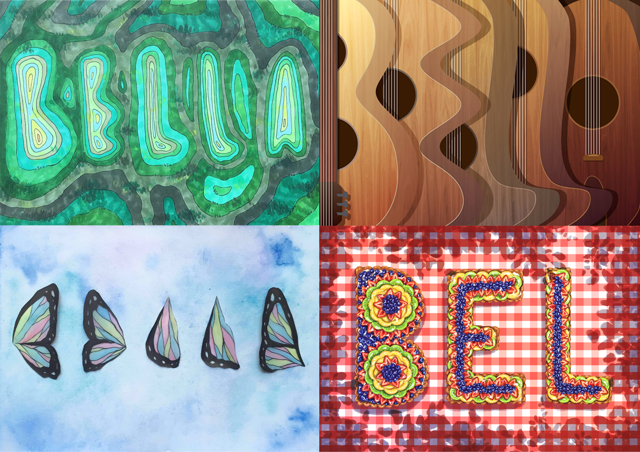
MY NAME IS BELLA AND I AM A TRAVELLER
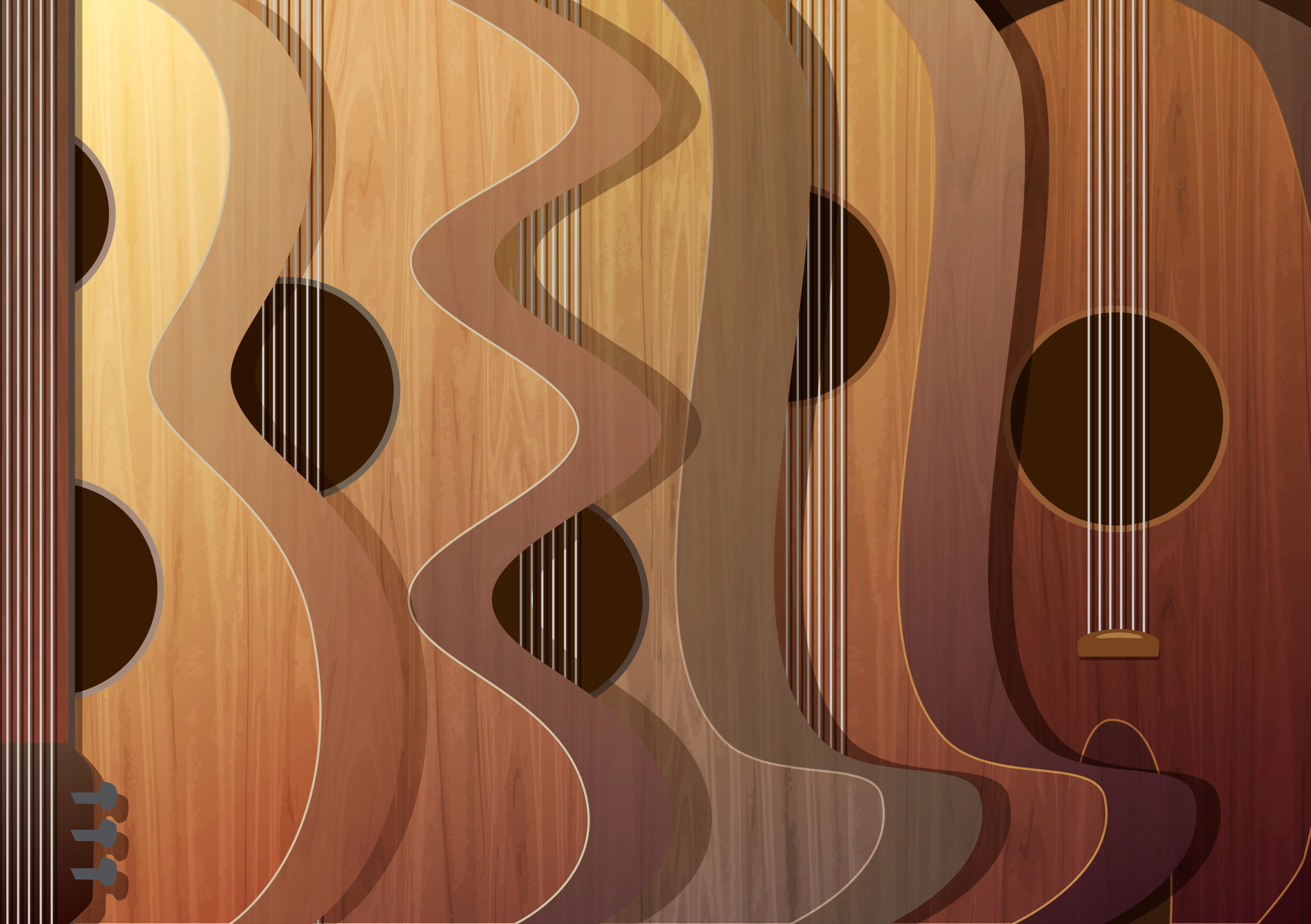
MY NAME IS BELLA AND I AM A GUITARIST
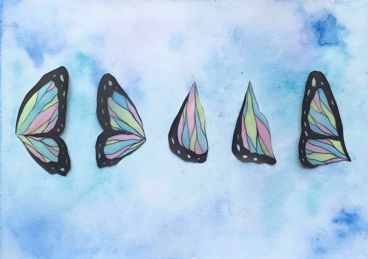
MY NAME IS BELLA AND I AM CAREFREE
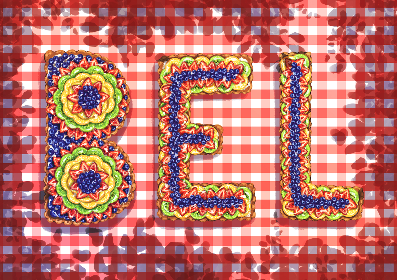
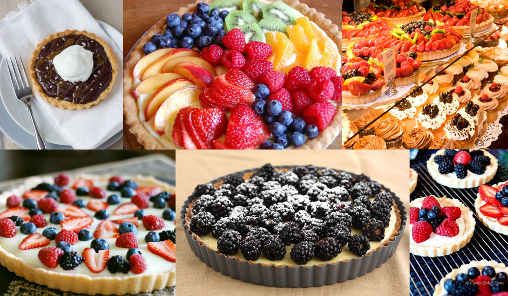
MY NAME IS BEL AND I AM A TART BAKER
MY NAME IS BELLA AND I AM A TRAVELLER
MY NAME IS BELLA AND I AM A GUITARIST
MY NAME IS BELLA AND I AM CAREFREE
MY NAME IS BEL AND I AM A TART BAKER

Initial brainstorming and rough sketches:

At this stage, i was pretty much just doodling ideas that were in my head and identifying which ones worked and which didn’t.
TRAVELLER

The idea for this piece was to mimic contour lines. The first sketch I did above was a little too uniform and the letters were kinda hard to decipher. After consulting with Shirley, i figured that i needed to play around with the distances between the lines to create more tension and also add in little details such as the numbers to represent height. I also came up with 2 possible styles that i could do this piece in. The first one makes use of alternating red and blue pencil lines to give off a simple and clean sketchy feel. The second one uses black outlines and colours which would make the piece look more “cartoonish” and vibrant. The colours also helped to define the letters more.

I tried out both styles but couldn’t decide which one to use as my final piece because i liked both. I went with the coloured one in the end because i felt that it was more exciting to look at.

When i first started working on this piece, i didn’t quite like the unevenness of the copic markers and considered using watercolour instead. But Shirley suggested that the unevenness might be a good thing because it added texture to the piece. It was appropriate because resembled the texture of mountains and land. So, i went ahead and added more texture to it.
GUITARIST

For this piece, i morphed the body of a guitar to form the letters to my name. First, i drew out the basic shapes in illustrator and adjusted until i was happy with it. Then, i added the wood texture unto the shapes and varied the colour and gradient of each letter to give the composition more depth.


CAREFREE

Here, I’m coming up with ways i could use butterfly wings to form the letters of my name.

Here, is the final sketch that i decided to use. In terms of medium, i chose to use tracing paper for the wings because of its translucent quality that is similar to butterfly wings.

I tested out whether copic markers could work on tracing paper and fortunately, it did! I drew out each letter on tracing paper and carefully cut them out. For the background, i used watercolour and painted light washes of blue and purple to recreate the sky. I then stuck the wings on only partially for a fluttering effect.

TART BAKER

My initial idea for this was to keep the circular crust of fruit tarts and use the fruits to form the letters. Later on, Shirley suggested that it would be better if the crust could form the letters.

I’m going digital for this piece. So first, i painted some fruits in photoshop.

Then i duplicate and arranged them accordingly. I used a red checkered background to give the feeling of a picnic and used the shadows casted by the trees to frame the composition. Finally, i adjusted the contrast, saturation and colour balance.

★★★
While brainstorming for this project, i thought about what would best represent me. So i first looked into things that i enjoy doing, things that i like and personal traits. I came up with a list of possible professions and characteristics that i could use and chose four to develop further. The four i have chosen are:


Since we were to come up with ‘portraits’, i thought the best approach to this was to be personal so that my final pieces would be able to reflect the kind of a person i am. I also decided to use my nickname ‘Bella‘, which is how many of my friends address me, for the pieces. (because Isabella is too long)
Other professions and traits that i considered:
“What did the rest of you find most interesting in today’s excellent presentation on the Hindu Temple?”
I think the team did a great job of setting the atmosphere at the beginning of the presentation with the bananas and the jasmine scent. I really like the interactivity and i was thoroughly engaged throughout the presentation.
The presentation was also very well organised which allowed me to follow and understand the presentation easily. For example, they started with the history of the temple, then moved on to the structure, the god/godesses, rituals, etc. Even though i did not visit the temple personally, it felt like i was there during the presentation.
Overall, i liked the presentation very much and was able to learn alot from it.
“What is your favourite Buddhist Temple in Singapore? Why?”
Unfortunately, i don’t have a favourite Buddhist temple because i’m not a Buddhist and so, i did not know how to put down my response to this question at first (which was why i took so long). Coincidentally, I had a conversation about Buddhist Temples with my uncle when i visited my grandma’s during the chinese new year holiday. The conversation started with my uncle asking me to draw something for me to hang up in his house. Then i asked him what he wanted me to draw. Being a Buddhist himself, he said he wanted a drawing of a Buddhist Temple, more specifically the Buddha Tooth Relic Temple located in Chinatown.
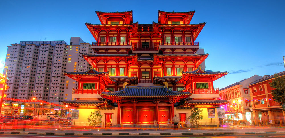
While thinking about what to write for this post 2 weeks ago, i did some research and came across this temple because it was listed in the top 10 best buddhist temples in singapore. I have to say, it is a very beautiful temple. I find the exterior of the temple simply amazing and i’m sure the interior will be too. Going back to the conversation i had with my uncle, I told him that we were learning about buddhist art in art history and he was very interested in listening to what i had to say. I also asked him which temple he usually visits and he replied that he normally goes to a temple in Eunos (which i forgot the name of).
So for now, the Buddha Tooth Relic Temple will be my (and my uncle’s) favourite buddhist temple.


Password: move
