The semester and our first year is about to come to an end, and what better way to conclude than with a zine that summarises our journey in foundation 2D!

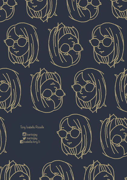
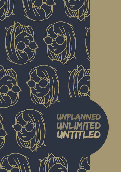
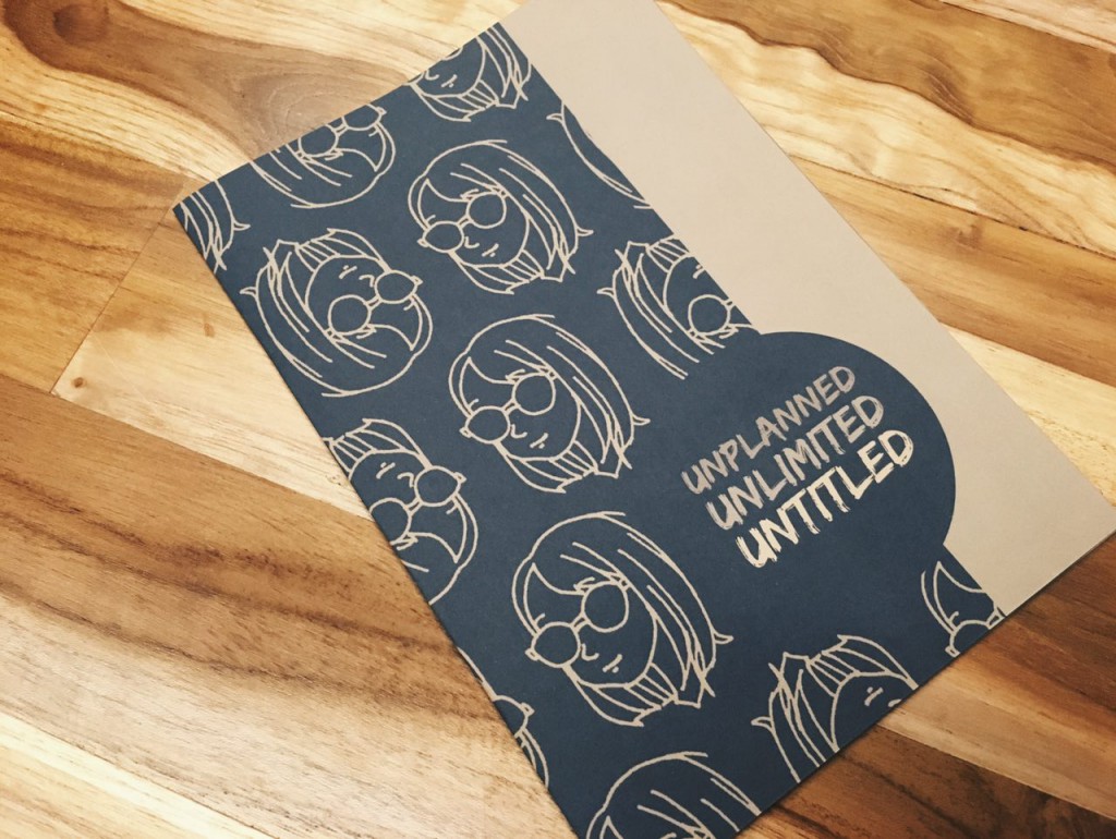
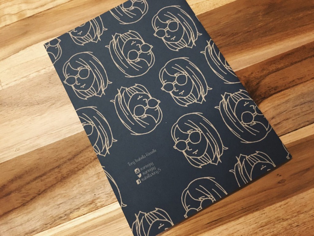
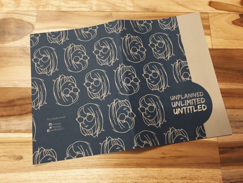
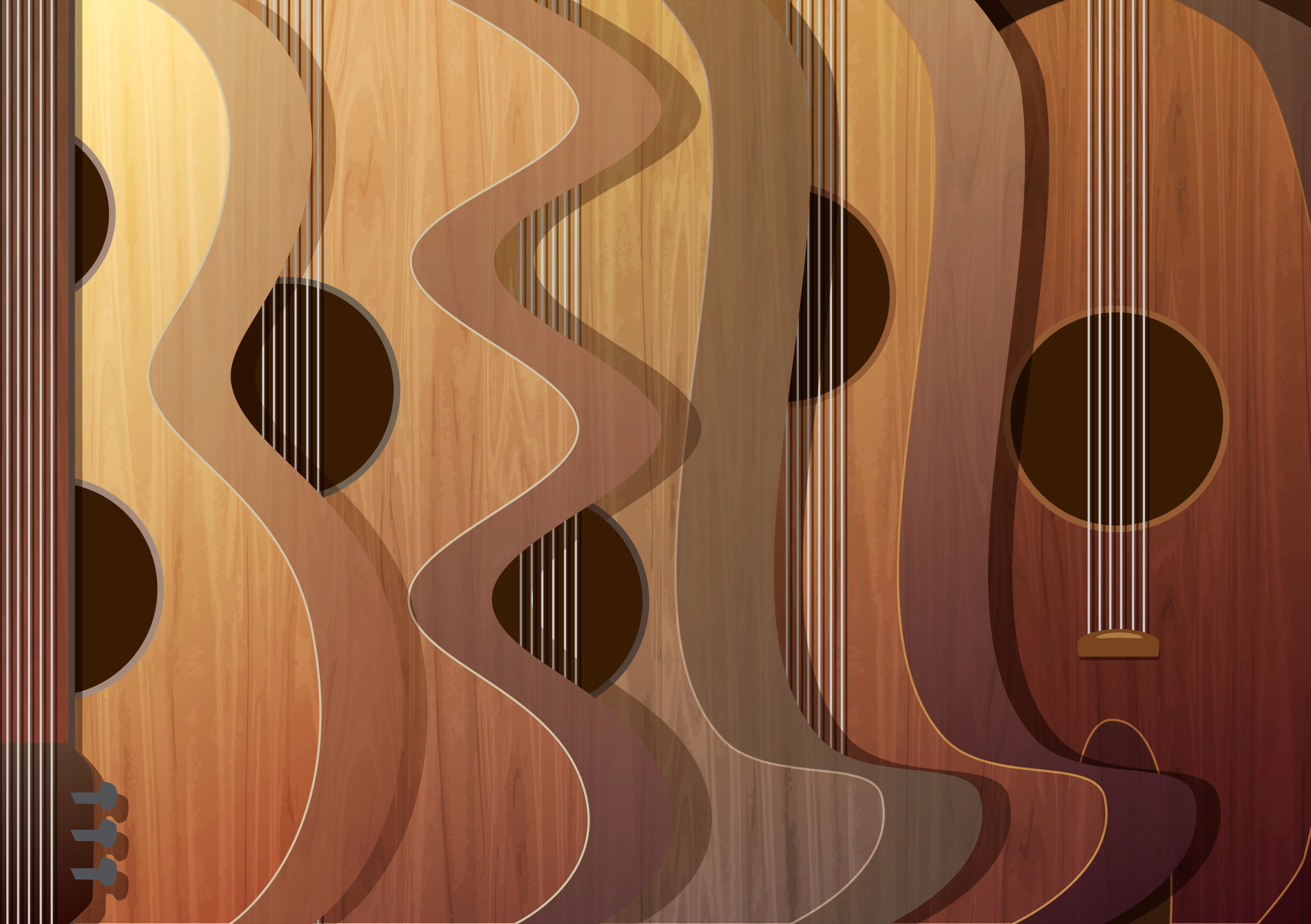
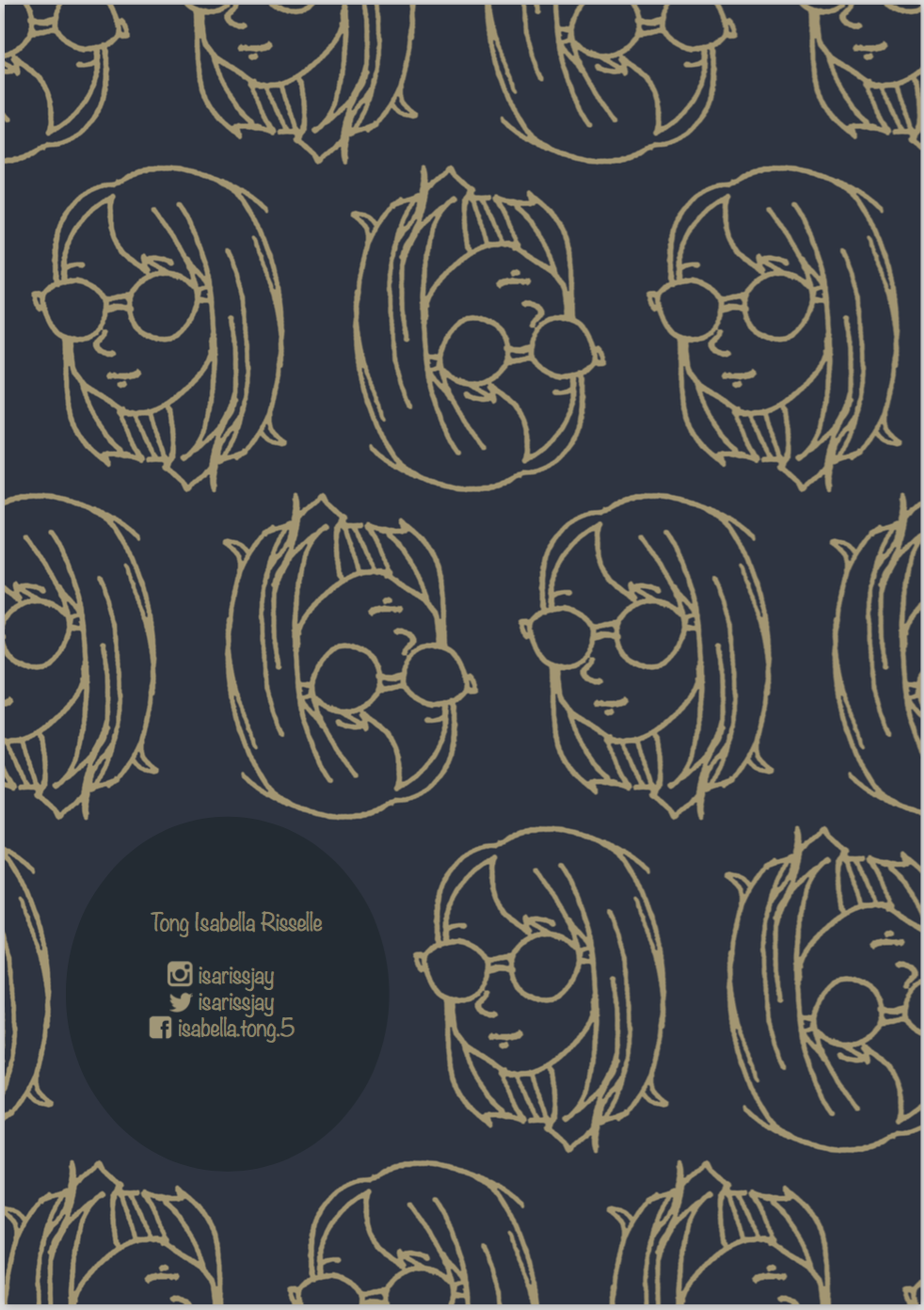
The title “Unplanned, Unlimited, Untitled” is how i would describe my foundation year in three words. Unplanned – when i first came into adm feeling confused, not knowing what to do, and still wondering if i made the right choice to be here. Unlimited – While thinking of ideas for projects, i must not limit myself. Mistakes are good. Untitled – Looking forward to the following years here and beyond. The future is like a new artwork without a title yet. For the front and back cover, i wanted to keep it relatively simple. I used the pattern i made in photoshop across the spread and placed a strip of the contrasting colour and the right most third of the front cover. Utilising the rule of third, I placed the title at the bottom right corner. Mirroring the front cover, i placed my name and social media details at the lower left corner of the back cover.

Screen Shot 2016-04-11 at 9.29.06 pm

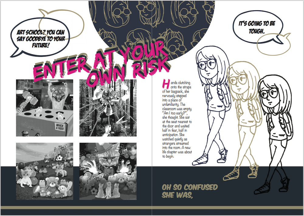
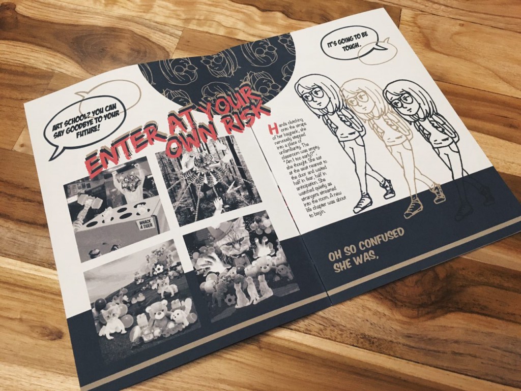
Using the same pattern from the cover, i placed a semicircle in the top middle portion of this spread to draw the viewer’s attention to it first. This will guide the viewer’s eyes in an anti-clockwise direction, starting from the semicircle. Following, the brightly coloured title “Enter at your own risk” and onto the images of my rhyme project. Then, the text and the little doodle on the right page. I also added a solid colour strip at the bottom third of the spread to mimic the cover page and keeping the colour scheme consistent.

Screen Shot 2016-04-11 at 9.29.13 pm

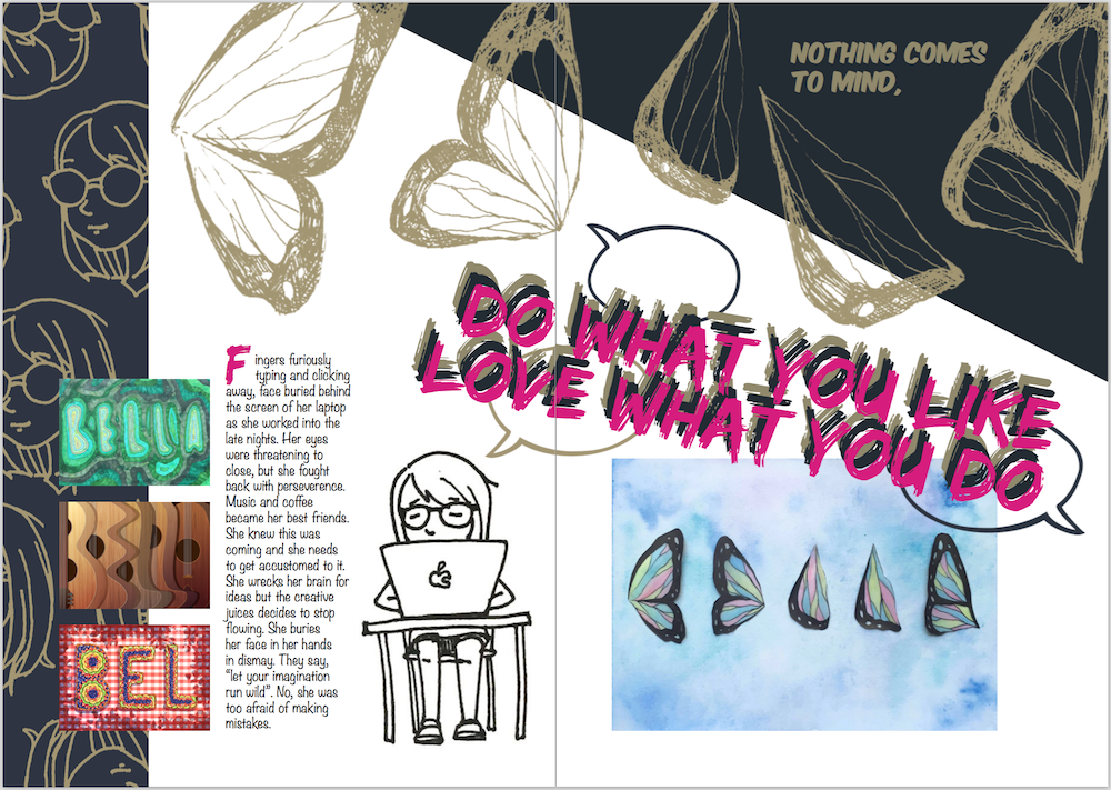
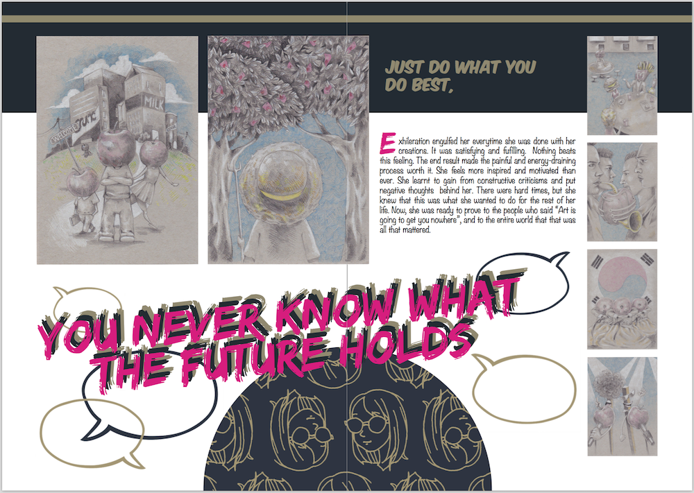
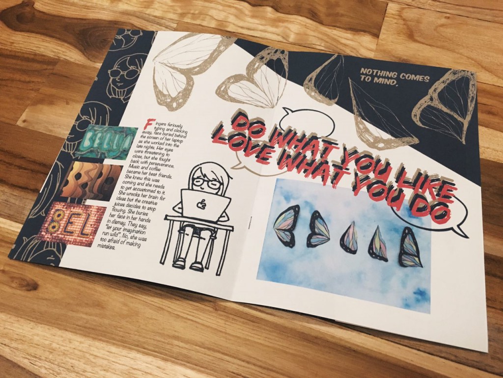
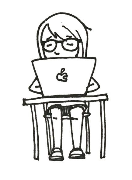
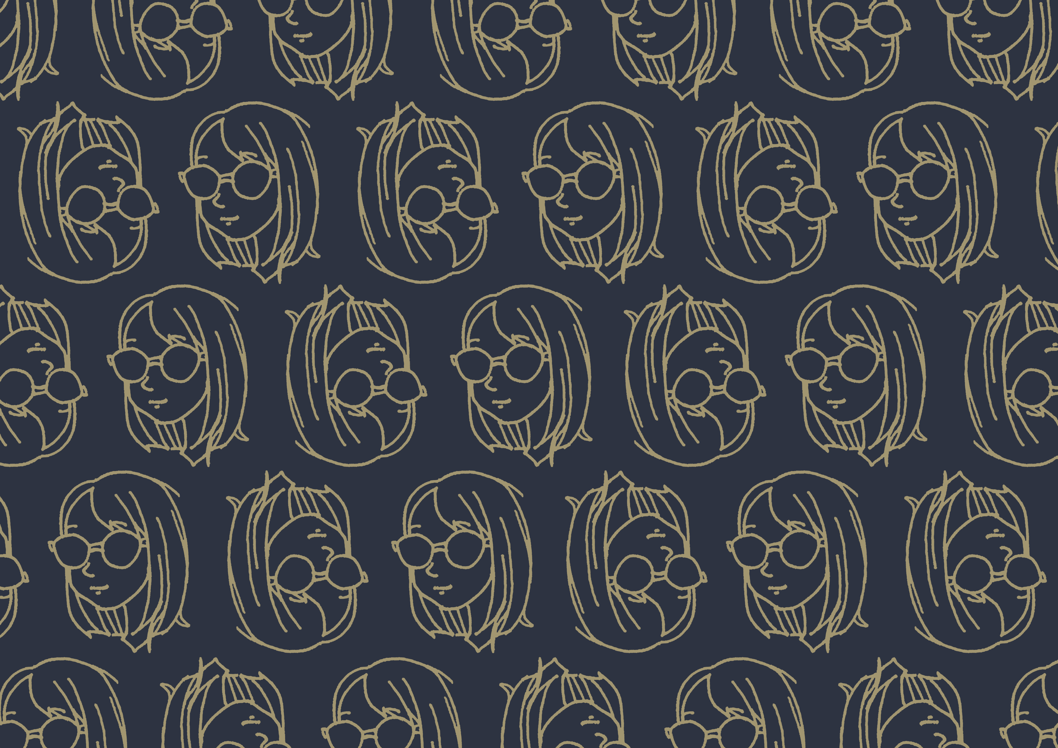
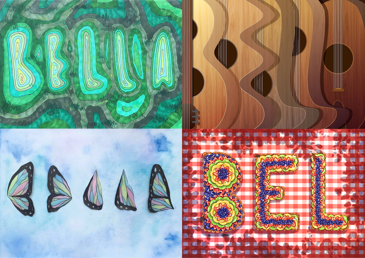
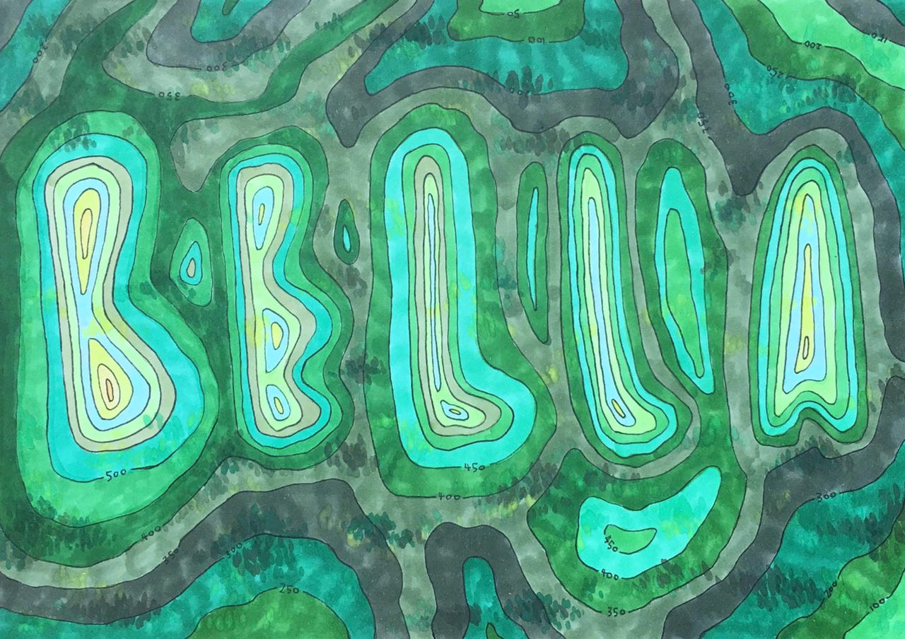
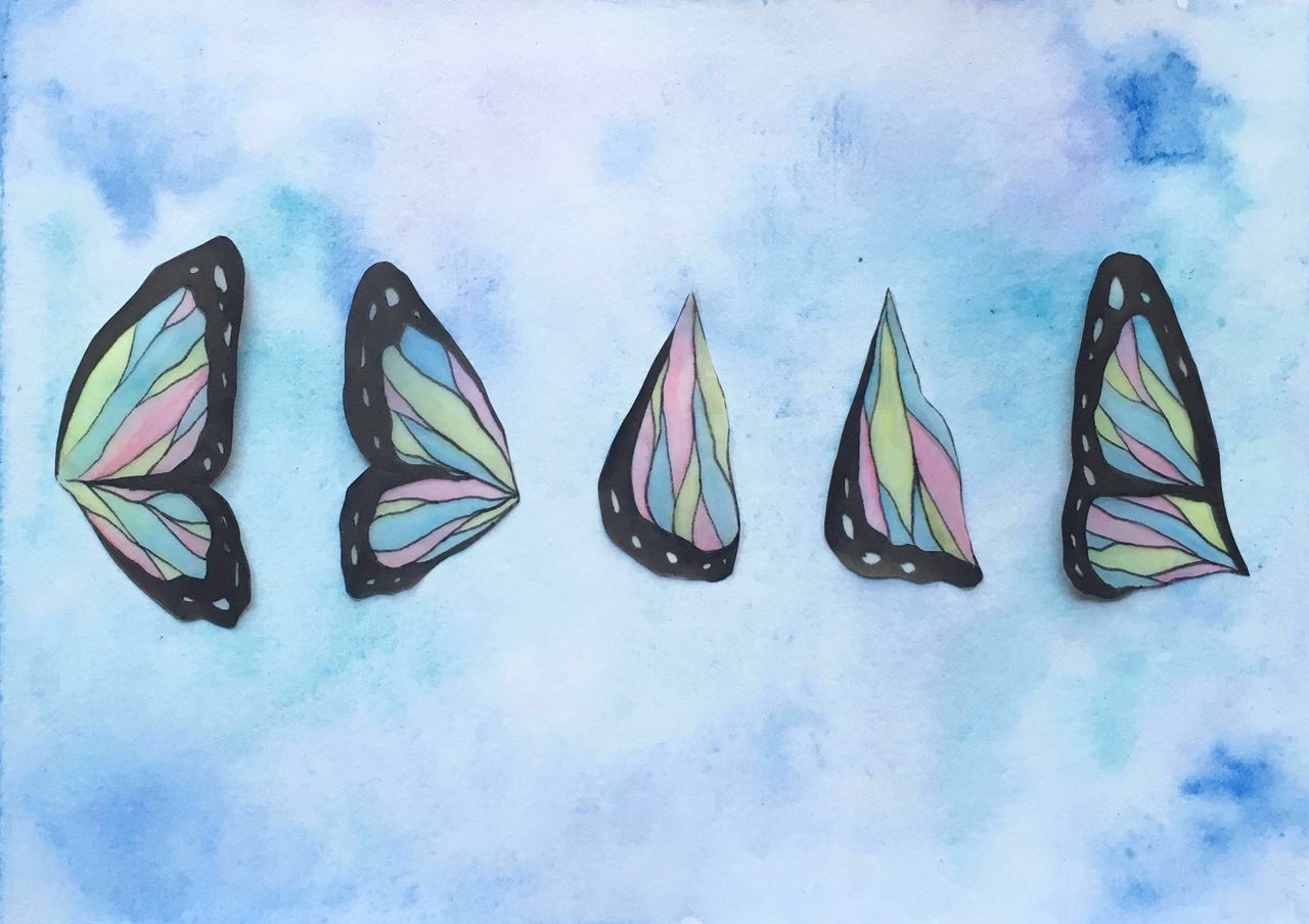
The slant at the top right corner of this spread would hopefully guide the viewer’s eyes along the title that slants in the same direction. I replicated the butterfly wings from my typographic portrait project onto the top of the spread to add texture and rhythm. Again, keeping the theme of my zine consistent, i reused the pattern, this time placing it at the left most third of the left page, a direct reflection of the cover page. By blowing up one of the images and keeping the rest small, i would be able to create emphasis and the viewer would be able to focus on the bigger one first before moving on to looking at the smaller ones.

Screen Shot 2016-04-11 at 9.29.21 pm

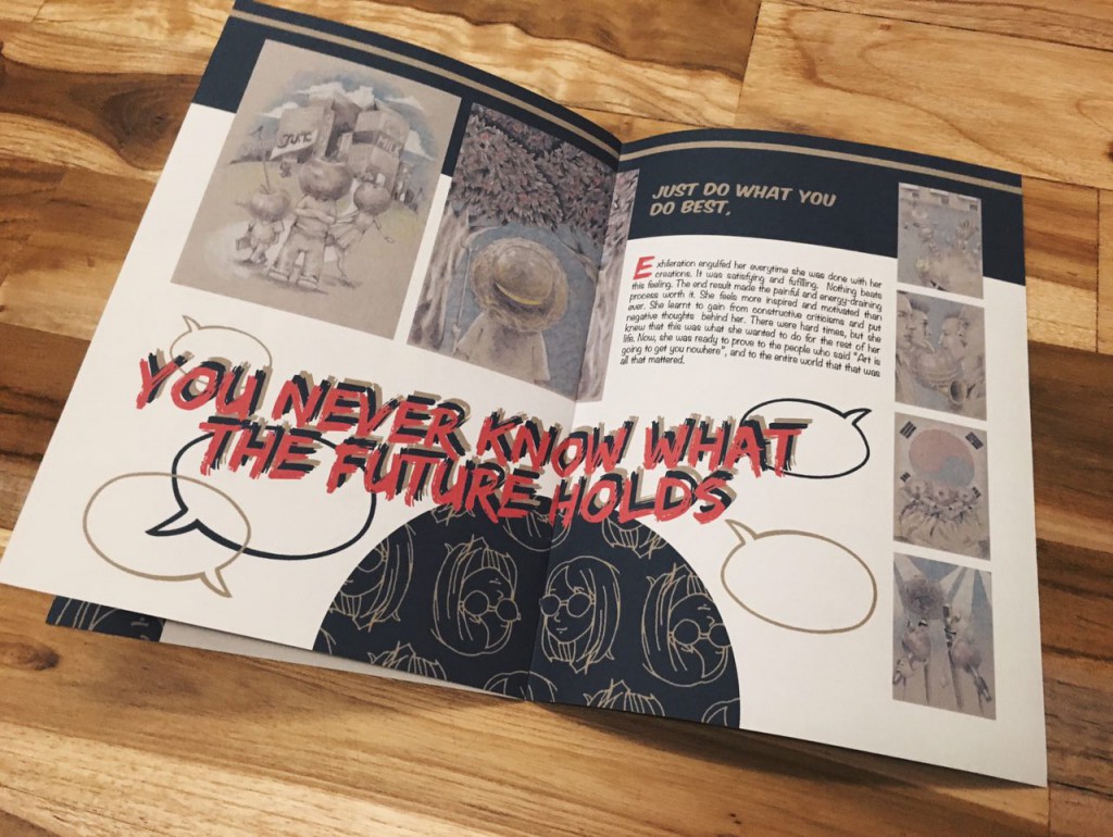
This spread has a similar layout to the first spread, this time the viewer’s eyes are guided in a clockwise direction. Starting from the semicircle at the bottom, to the title, to the biggest two images, to the text and finally to the four smaller images on the side. I added speech bubbles here and there for a little touch of fun and playfulness.
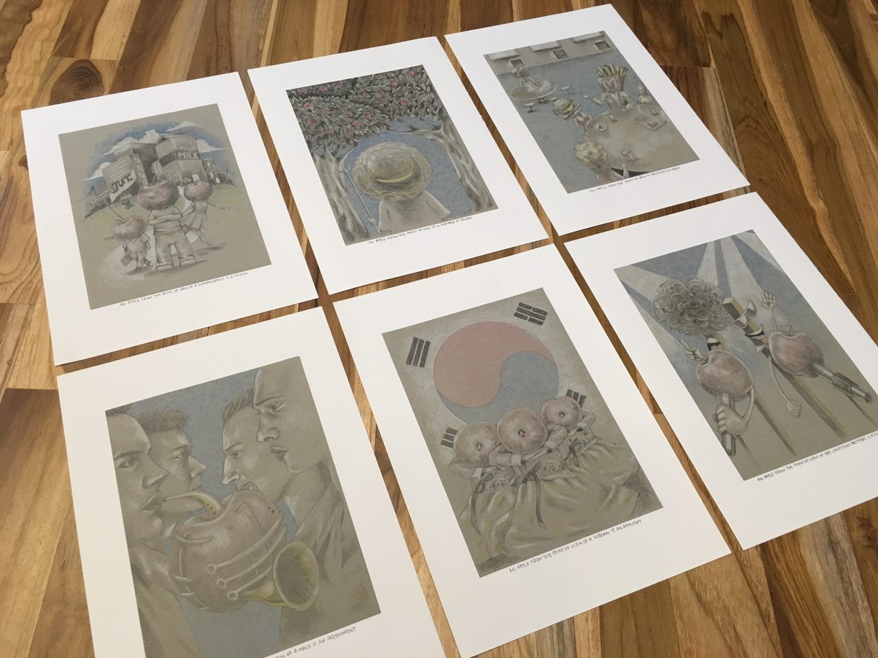
 

Printed version:

This concludes my zine project and foundation 2d! I would like to thank Shirley for giving me great advice during the course of this semester. 🙂

Building onto the idea of a narrative, i thought my zine needed a heroine. So, i went on and started doodling. I came up with some characters that i will use throughout my zine to make it more cohesive since i’ll be using past works and they are all very different. I thought this would be a good way to somehow tie in all my works together.

me me4 me5

With the doodle, i made a pattern in photoshop to use for my zine.

pattern1

While working on the spreads, i thought it would be interesting to add some elements from comics into my design. Thus, I incorporated speech bubbles and handwriting type fonts.

The text for my zine would be as though i’m telling a story from a third person perspective. Basically describing how i felt when i first came into adm and foundation 2d class, how i felt when i worked on all the projects throughout this module, and how i felt after all of this.

Screen Shot 2016-04-11 at 9.29.06 pm

The lesson Shirley held for Indesign was really helpful for me since i was a beginner at this software. To put what i’ve learnt into practice, I used some of those techniques here as well!

See my next post for the final outcome!

I was pretty excited for this project. Firstly because i get to learn how to use a new software – InDesign. I’m always looking forward to learning new skills! And also because this would be the last project for foundation 2D! This project was also a great chance to consolidate what i’ve done and learnt.

The main theme for my zine is my experience in foundation 2D and ADM as a whole. From the start, I wanted my zine to have some sort of a narrative. So i started by looking for some inspiration.

I decided to go with something a bit more playful, nothing too serious.

An apple from the point of view of a supermarket is a citizen.

01

An apple from the point of view of The Chopsticks Brothers is a song.

06

An apple from the point of view of a Korean is an apology.

05

An apple from the point of view of a male is an instrument.

04

An apple from the point of view of fast food is a nerd.

03


An apple from the point of view of a farmer is salary.

02


Research and process in my previous posts!

As always, i start off by sketching rough ideas for the composition. At this point, i wasn’t quite sure of what style and medium i was going to use. But, i knew i wanted to go for something illustrative.

Sketch


An apple from the point of view of a supermarket is a citizen.

I was trying to play around with the idea of an alternate universe, where the fruits are people of the city. It’s Fruitopia! At first, i was trying to express the different races by using different fruits. After consulting Shirley, i felt that it might be better if i stick to one fruit so that the statement made more sense and the subject matter would be more prominent. I really liked the look of using white coloured pencil on toned paper, so i incorporated that into my illustrations. As i went on, i realised the pieces lacked colour so i added minimal colours just to emphasise and highlight certain areas. I avoided getting carried away with the colours so as to keep the original look of the illustrations i was going for. In terms of composition, i wanted to create a balanced foreground and background and overall, somewhat symmetrical.


An apple from the point of view of a farmer is salary.

You reap what you sow. Literally, apple farmers rely on the production of their apples to make a living. The red spots in the trees are “apple money”. I used the trees to frame up the whole composition, as well as to put a nice focus on the central figure. As i wanted my final 6 to look cohesive, i went with the same style of illustration. I think i spent the most time on this one, mainly because of the leaves. I wanted to make it look semi-realistic, so i adopted a hatching technique. It was also effective in providing texture to my illustrations.


An apple from the point of view of fast food is a nerd.


Think of every single high school/college show out there. Fast food would be the popular kids at school. They are arrogant, rebellious and tend to be evil/cruel (unhealthy) but everyone loves them and wants to be their friend. Then, we have the unpopular nerd. The target of bullying, is looked down upon, straight A student (apples are good for you) and but, few seem to know about their good traits. I made the popular table the focus of this piece by making it occupy most of the composition. And to balance it out, I placed the outcast table at the top left corner. The difference in sizes will also help to highlight their social statuses.


An apple from the point of view of a male is an instrument.

12

A play on the “Adam’s apple” which functions to make man’s voice deeper/lower. I related this to the sounds of an instrument, especially brass instruments, because they can make really low sounds. I incorporated the apple into the shape of the trombone and drew 4 different males at the sides to add depth to the composition.


An apple from the point of view of a Korean is an apology.

The korean word for apple – 사과 (sa-gwa) also means apology. 

APPLE  -> Hangul = 사과; Hanja = 沙果 (Pronounce as: sa-gwa)
APOLOGY -> Hangul = 사과 Hanja = 謝過 (Pronounce as: sa-gwa)

If you were wondering how i knew this, i’ve studied the language before. 🙂 I also found it amusing how the word mean two different things. Fun fact! Some koreans do give each other an apple to apologise. The three figures in the foreground are wearing the hanbok (the traditional korean costume) and are in the position of a respectful bow. For the background, i used the Korean flag to set the context if the foreground was not enough to infer from.


An apple from the point of view of The Chopsticks Brothers is a song.

Referencing the song Little Apple by The Chopsticks Brothers. This happens to be my 5-year-old cousin’s favourite song to sing at karaoke. In case you’ve never heard the song before, here. Listen to it and relieve some stress. 😀 Here, i characterised the duo as a pair of chopsticks as they are recognisable for their name. The head of the microphones are replaced with apples to express the idea of a ‘song’.


Unknown

Overall, i really enjoyed working on the project. Even thinking of ideas for the statements was fun for me. I think i found a style that i really enjoy.

Research on the previous post, final on the next! Thank you!


” A _________ from the point of view of _________ is _________.”

For this project, i thought i would choose a common and simple object – an apple. The ones in bold are the ones i’m gong to use.

  1. An apple from the point of view of a supermarket is a citizen.
  2. An apple from the point of view of a farmer is salary.
  3. An apple from the point of view of a child is what stands for A.
  4. An apple from the point of view of a doctor is his worst enemy/bankruptcy.
  5. An apple from the point of view of Steve Jobs is his greatest invention/love child.
  6. An apple from the point of view of a dictionary is a fruit.
  7. An apple from the point of view of Snow White is poison.
  8. An apple from the point of view of google is a technology company.
  9. An apple from the point of view of The Chopsticks Brothers is a song.
  10. An apple from the point of view of a designer is a logo.
  11. An apple from the point of view of Twilight is a book cover/first impression.
  12. An apple from the point of view of a chef is an ingredient.
  13. An apple from the point of view of Halloween is a game. (Apple bobbing)
  14. An apple from the point of view of an Archer is a target.
  15. An apple from the point of view of Adam and Eve is a forbidden fruit.
  16. An apple from the point of view of Samsung is competition/a wrestling match.
  17. An apple from the point of view of a seed is its future.
  18. An apple from the point of view of an artist is still life.
  19. An apple from the point of view of Isaac Newton is gravity.
  20. An apple from the point of view of a Korean is an apology.
  21. An apple from the point of view of a horse is a treat.
  22. An apple from the point of view of a male is an instrument.
  23. An apple from the point of view of flies is a magnet.
  24. An apple from the point of view of oxygen is an open wound.
  25. An apple from the point of view of Japan is a test subject/scientific development.
  26. An apple from the point of view of the human heart is a warrior.
  27. An apple from the point of view of fast food is a nerd. 

Out of boredom, i came up with a fairytale series!

  1. Fear from the point of view of Cinderella is when the clock strikes 12.
  2. Fear from the point of view of Sleeping Beauty is eternal slumber.
  3. Fear from the point of view of Snow White is a poison apple.
  4. Fear from the point of view of Rapunzel is a pair of scissors.
  5. Fear from the point of view of Beauty(Belle) is a bed of roses.
  6. Fear from the point of view of The Little Mermaid (Ariel) is a pair of feet.
  7. Fear from the point of view of Mulan is makeup.


Initial brainstorming and rough sketches:

photo88399820501395421

At this stage, i was pretty much just doodling ideas that were in my head and identifying which ones worked and which didn’t.


TRAVELLER

travellersketch

The idea for this piece was to mimic contour lines. The first sketch I did above was a little too uniform and the letters were kinda hard to decipher. After consulting with Shirley, i figured that i needed to play around with the distances between the lines to create more tension and also add in little details such as the numbers to represent height. I also came up with 2 possible styles that i could do this piece in. The first one makes use of alternating red and blue pencil lines to give off a simple and clean sketchy feel. The second one uses black outlines and colours which would make the piece look more “cartoonish” and vibrant. The colours also helped to define the letters more.

photo88399820501395417

I tried out both styles but couldn’t decide which one to use as my final piece because i liked both. I went with the coloured one in the end because i felt that it was more exciting to look at.

photo88399820501395423

When i first started working on this piece, i didn’t quite like the unevenness of the copic markers and considered using watercolour instead. But Shirley suggested that the unevenness might be a good thing because it added texture to the piece. It was appropriate because resembled the texture of mountains and land. So, i went ahead and added more texture to it.


GUITARIST

sketch

For this piece, i morphed the body of a guitar to form the letters to my name. First, i drew out the basic shapes in illustrator and adjusted until i was happy with it. Then, i added the wood texture unto the shapes and varied the colour and gradient of each letter to give the composition more depth.

 Guitarist1 Guitarist


CAREFREE

carefreesketch

Here, I’m coming up with ways i could use butterfly wings to form the letters of my name.

photo88399820501395419

Here, is the final sketch that i decided to use. In terms of medium, i chose to use tracing paper for the wings because of its translucent quality that is similar to butterfly wings.

carefreetest

I tested out whether copic markers could work on tracing paper and fortunately, it did! I drew out each letter on tracing paper and carefully cut them out. For the background, i used watercolour and painted light washes of blue and purple to recreate the sky. I then stuck the wings on only partially for a fluttering effect.

photo88399820501395424


TART BAKER

sketch

My initial idea for this was to keep the circular crust of fruit tarts and use the fruits to form the letters. Later on, Shirley suggested that it would be better if the crust could form the letters.

photo88399820501395405

I’m going digital for this piece. So first, i painted some fruits in photoshop.

fruits

Then i duplicate and arranged them accordingly. I used a red checkered background to give the feeling of a picnic and used the shadows casted by the trees to frame the composition. Finally, i adjusted the contrast, saturation and colour balance.

Tart-Baker

★★★


While brainstorming for this project, i thought about what would best represent me. So i first looked into things that i enjoy doing, things that i like and personal traits. I came up with a list of possible professions and characteristics that i could use and chose four to develop further. The four i have chosen are:

  1. Traveller
    Traveller
    Definition: A person who travels or has travelled in distant places or foreign lands.
    When i think of travel, i think maps. It is a must have on a travel, especially in a place you have never been to before. I have always been fascinated with the amount of information that a map can contain. It is like a travel companion, guiding you through your journey.
    Associated words: travel, tour, trip, map, souvenir, bag pack, explore, voyage, pictures, destinations


  2. Guitarist
    guitarist
    Definition: A person who plays the guitar.
    Guitar is something i picked up when i was in primary 6. A skill i never got the time to improve on, but still something i really enjoy doing.
    Associated words: music, strings, wood, tune, strum, pluck, pick, notes, chords, tabs, classical, acoustic, song


  3. Tart Baker / Pâtissièr
    tartbaker
    Definition: A person who is skilled in making pastries (in this case, tarts)
    Tarts are one of my favourite desserts. The base is made of a crispy crust, then filled with custard and topped with a variety of fruits. This tempting dessert, how could anyone resist?
    Associated words: dessert, sweet, fruits, crust, pastry, YUM


  4. Carefree
    carefree
    Definition: without anxiety or worry
    I would say that being carefree is my biggest strength and my biggest weakness. My family often tell me that i don’t have any stress at all, because i could still be watching a movie a day before an exam. But because of my laid-back personality, i often do things last minute.
    Associated words: freedom, lighthearted, gleeful, flight, wings, butterflies, clouds

Since we were to come up with ‘portraits’, i thought the best approach to this was to be personal so that my final pieces would be able to reflect the kind of a person i am. I also decided to use my nickname ‘Bella‘, which is how many of my friends address me, for the pieces. (because Isabella is too long)

Other professions and traits that i considered:

  • Polyglot (a person who speaks multiple languages)
  • Farmer/Florist
  • Tech-savvy
  • Naive
  • Light sleeper
  • Scientist