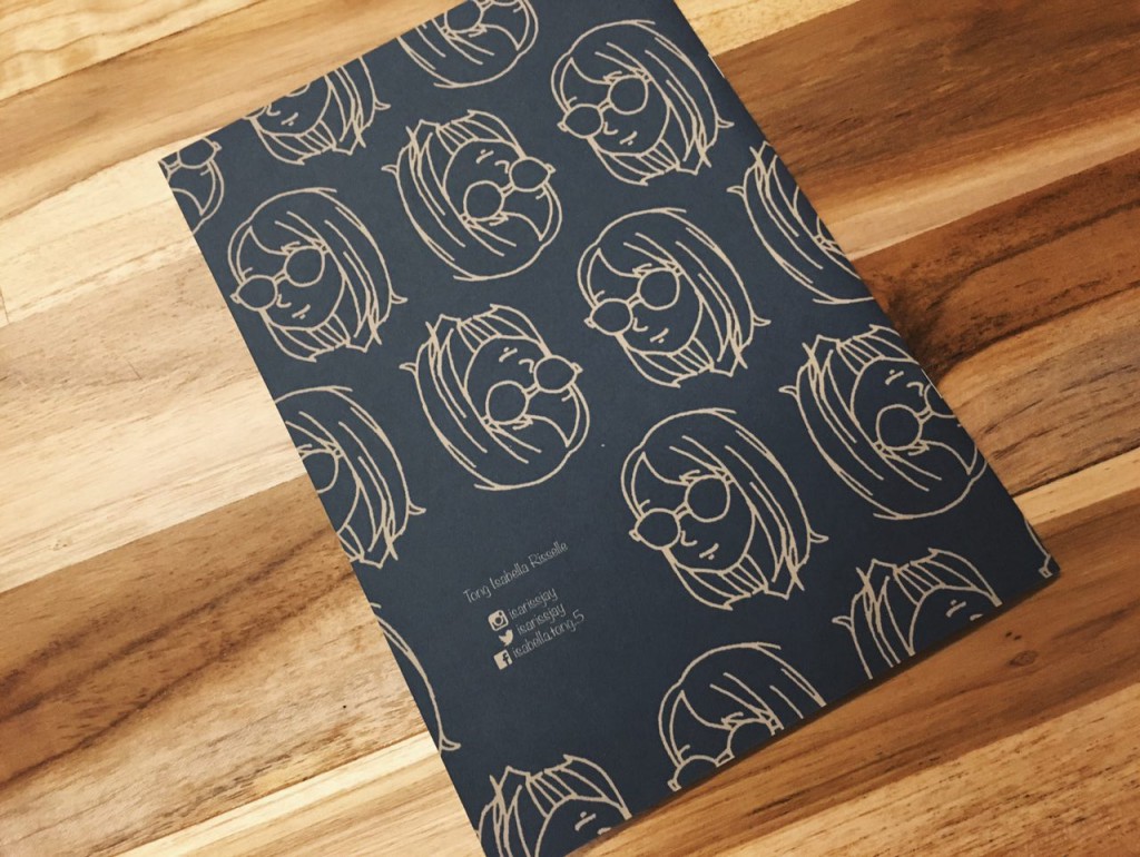
The semester and our first year is about to come to an end, and what better way to conclude than with a zine that summarises our journey in foundation 2D!
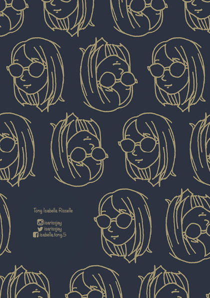
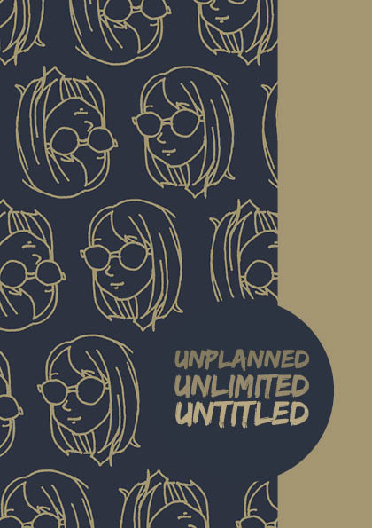
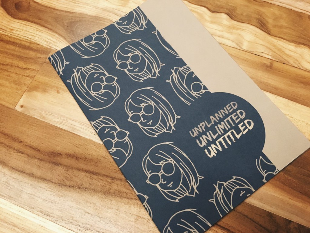
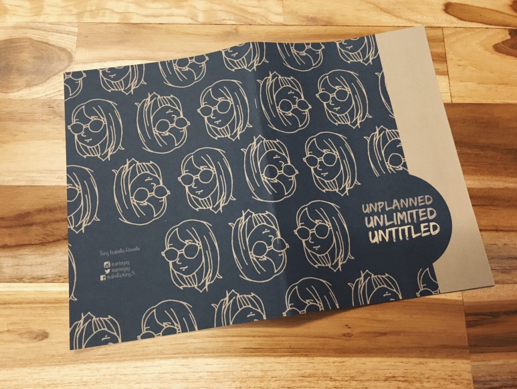
The title “Unplanned, Unlimited, Untitled” is how i would describe my foundation year in three words. Unplanned – when i first came into adm feeling confused, not knowing what to do, and still wondering if i made the right choice to be here. Unlimited – While thinking of ideas for projects, i must not limit myself. Mistakes are good. Untitled – Looking forward to the following years here and beyond. The future is like a new artwork without a title yet. For the front and back cover, i wanted to keep it relatively simple. I used the pattern i made in photoshop across the spread and placed a strip of the contrasting colour and the right most third of the front cover. Utilising the rule of third, I placed the title at the bottom right corner. Mirroring the front cover, i placed my name and social media details at the lower left corner of the back cover.
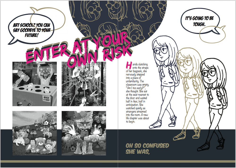
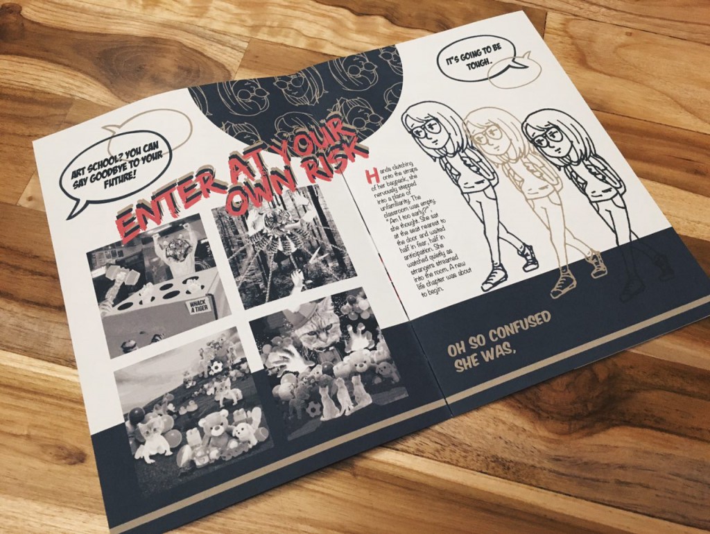
Using the same pattern from the cover, i placed a semicircle in the top middle portion of this spread to draw the viewer’s attention to it first. This will guide the viewer’s eyes in an anti-clockwise direction, starting from the semicircle. Following, the brightly coloured title “Enter at your own risk” and onto the images of my rhyme project. Then, the text and the little doodle on the right page. I also added a solid colour strip at the bottom third of the spread to mimic the cover page and keeping the colour scheme consistent.
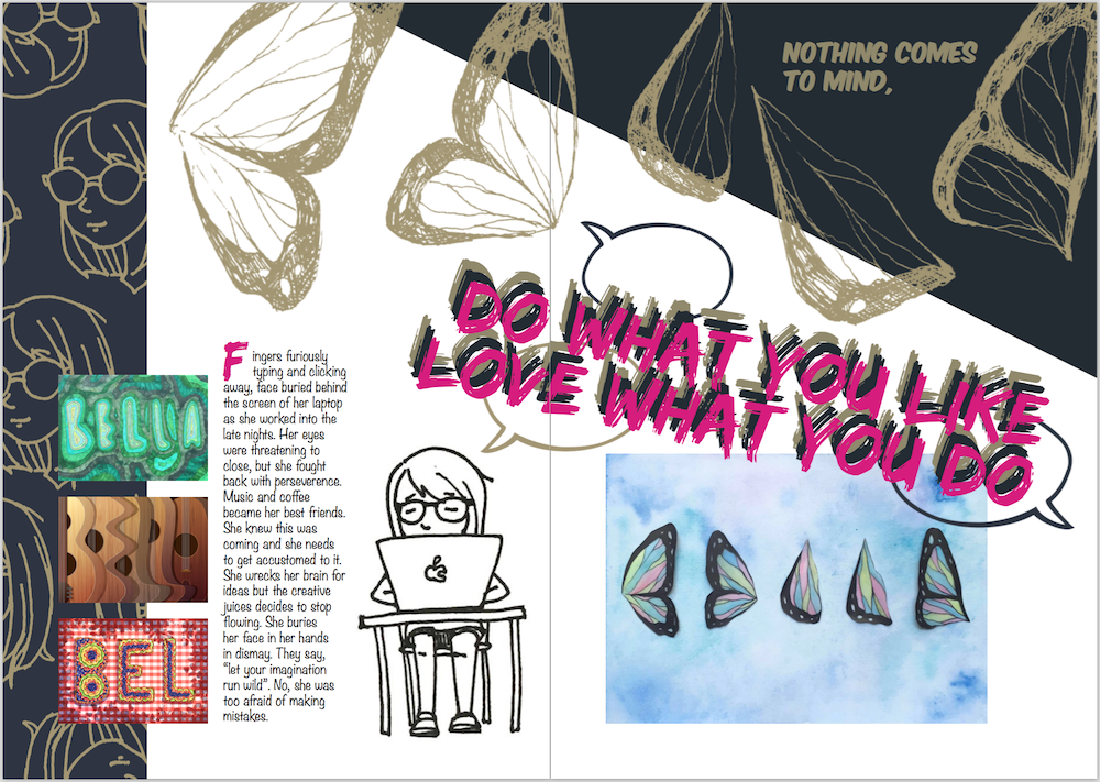
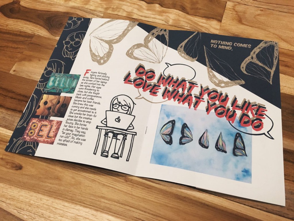
The slant at the top right corner of this spread would hopefully guide the viewer’s eyes along the title that slants in the same direction. I replicated the butterfly wings from my typographic portrait project onto the top of the spread to add texture and rhythm. Again, keeping the theme of my zine consistent, i reused the pattern, this time placing it at the left most third of the left page, a direct reflection of the cover page. By blowing up one of the images and keeping the rest small, i would be able to create emphasis and the viewer would be able to focus on the bigger one first before moving on to looking at the smaller ones.
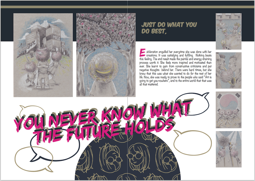
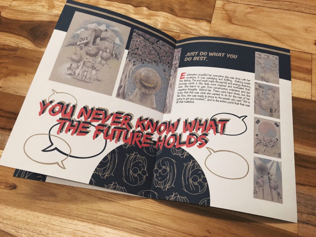
This spread has a similar layout to the first spread, this time the viewer’s eyes are guided in a clockwise direction. Starting from the semicircle at the bottom, to the title, to the biggest two images, to the text and finally to the four smaller images on the side. I added speech bubbles here and there for a little touch of fun and playfulness.
Printed version:
This concludes my zine project and foundation 2d! I would like to thank Shirley for giving me great advice during the course of this semester. 🙂
