Building onto the idea of a narrative, i thought my zine needed a heroine. So, i went on and started doodling. I came up with some characters that i will use throughout my zine to make it more cohesive since i’ll be using past works and they are all very different. I thought this would be a good way to somehow tie in all my works together.

me me4 me5

With the doodle, i made a pattern in photoshop to use for my zine.

pattern1

While working on the spreads, i thought it would be interesting to add some elements from comics into my design. Thus, I incorporated speech bubbles and handwriting type fonts.

The text for my zine would be as though i’m telling a story from a third person perspective. Basically describing how i felt when i first came into adm and foundation 2d class, how i felt when i worked on all the projects throughout this module, and how i felt after all of this.

Screen Shot 2016-04-11 at 9.29.06 pm

The lesson Shirley held for Indesign was really helpful for me since i was a beginner at this software. To put what i’ve learnt into practice, I used some of those techniques here as well!

See my next post for the final outcome!

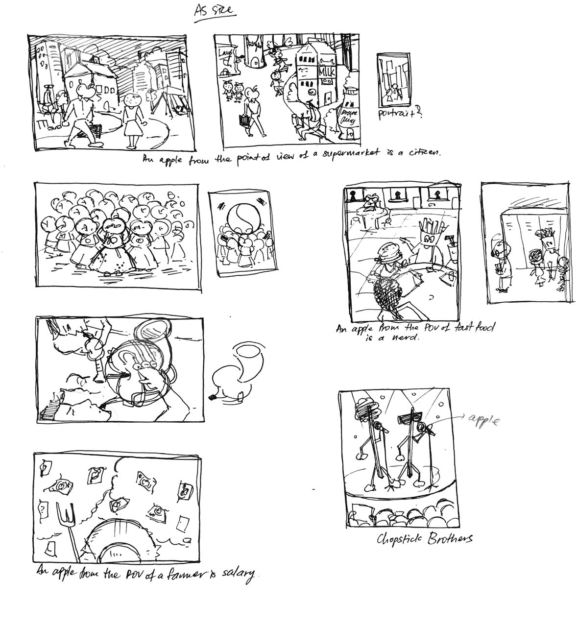
As always, i start off by sketching rough ideas for the composition. At this point, i wasn’t quite sure of what style and medium i was going to use. But, i knew i wanted to go for something illustrative.

Sketch


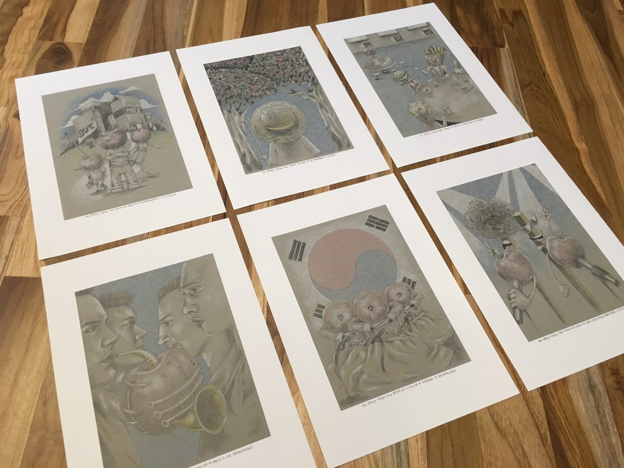
An apple from the point of view of a supermarket is a citizen.

I was trying to play around with the idea of an alternate universe, where the fruits are people of the city. It’s Fruitopia! At first, i was trying to express the different races by using different fruits. After consulting Shirley, i felt that it might be better if i stick to one fruit so that the statement made more sense and the subject matter would be more prominent. I really liked the look of using white coloured pencil on toned paper, so i incorporated that into my illustrations. As i went on, i realised the pieces lacked colour so i added minimal colours just to emphasise and highlight certain areas. I avoided getting carried away with the colours so as to keep the original look of the illustrations i was going for. In terms of composition, i wanted to create a balanced foreground and background and overall, somewhat symmetrical.


An apple from the point of view of a farmer is salary.

You reap what you sow. Literally, apple farmers rely on the production of their apples to make a living. The red spots in the trees are “apple money”. I used the trees to frame up the whole composition, as well as to put a nice focus on the central figure. As i wanted my final 6 to look cohesive, i went with the same style of illustration. I think i spent the most time on this one, mainly because of the leaves. I wanted to make it look semi-realistic, so i adopted a hatching technique. It was also effective in providing texture to my illustrations.


An apple from the point of view of fast food is a nerd.


Think of every single high school/college show out there. Fast food would be the popular kids at school. They are arrogant, rebellious and tend to be evil/cruel (unhealthy) but everyone loves them and wants to be their friend. Then, we have the unpopular nerd. The target of bullying, is looked down upon, straight A student (apples are good for you) and but, few seem to know about their good traits. I made the popular table the focus of this piece by making it occupy most of the composition. And to balance it out, I placed the outcast table at the top left corner. The difference in sizes will also help to highlight their social statuses.


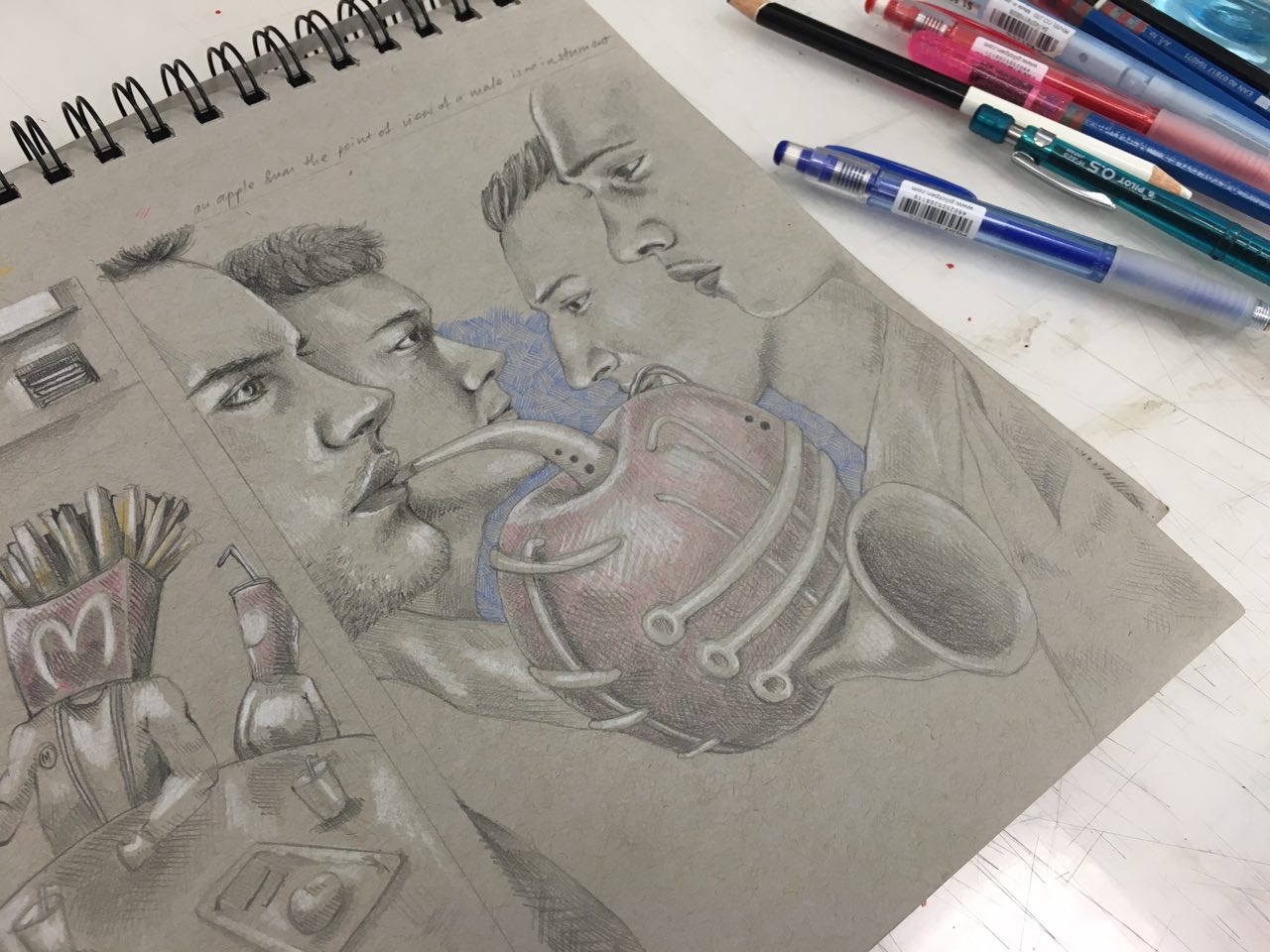
An apple from the point of view of a male is an instrument.

12

A play on the “Adam’s apple” which functions to make man’s voice deeper/lower. I related this to the sounds of an instrument, especially brass instruments, because they can make really low sounds. I incorporated the apple into the shape of the trombone and drew 4 different males at the sides to add depth to the composition.


An apple from the point of view of a Korean is an apology.

The korean word for apple – 사과 (sa-gwa) also means apology. 

APPLE  -> Hangul = 사과; Hanja = 沙果 (Pronounce as: sa-gwa)
APOLOGY -> Hangul = 사과 Hanja = 謝過 (Pronounce as: sa-gwa)

If you were wondering how i knew this, i’ve studied the language before. 🙂 I also found it amusing how the word mean two different things. Fun fact! Some koreans do give each other an apple to apologise. The three figures in the foreground are wearing the hanbok (the traditional korean costume) and are in the position of a respectful bow. For the background, i used the Korean flag to set the context if the foreground was not enough to infer from.


An apple from the point of view of The Chopsticks Brothers is a song.

Referencing the song Little Apple by The Chopsticks Brothers. This happens to be my 5-year-old cousin’s favourite song to sing at karaoke. In case you’ve never heard the song before, here. Listen to it and relieve some stress. 😀 Here, i characterised the duo as a pair of chopsticks as they are recognisable for their name. The head of the microphones are replaced with apples to express the idea of a ‘song’.


Unknown

Overall, i really enjoyed working on the project. Even thinking of ideas for the statements was fun for me. I think i found a style that i really enjoy.

Research on the previous post, final on the next! Thank you!


Initial brainstorming and rough sketches:

photo88399820501395421

At this stage, i was pretty much just doodling ideas that were in my head and identifying which ones worked and which didn’t.


TRAVELLER

travellersketch

The idea for this piece was to mimic contour lines. The first sketch I did above was a little too uniform and the letters were kinda hard to decipher. After consulting with Shirley, i figured that i needed to play around with the distances between the lines to create more tension and also add in little details such as the numbers to represent height. I also came up with 2 possible styles that i could do this piece in. The first one makes use of alternating red and blue pencil lines to give off a simple and clean sketchy feel. The second one uses black outlines and colours which would make the piece look more “cartoonish” and vibrant. The colours also helped to define the letters more.

photo88399820501395417

I tried out both styles but couldn’t decide which one to use as my final piece because i liked both. I went with the coloured one in the end because i felt that it was more exciting to look at.

photo88399820501395423

When i first started working on this piece, i didn’t quite like the unevenness of the copic markers and considered using watercolour instead. But Shirley suggested that the unevenness might be a good thing because it added texture to the piece. It was appropriate because resembled the texture of mountains and land. So, i went ahead and added more texture to it.


GUITARIST

sketch

For this piece, i morphed the body of a guitar to form the letters to my name. First, i drew out the basic shapes in illustrator and adjusted until i was happy with it. Then, i added the wood texture unto the shapes and varied the colour and gradient of each letter to give the composition more depth.

 Guitarist1 Guitarist


CAREFREE

carefreesketch

Here, I’m coming up with ways i could use butterfly wings to form the letters of my name.

photo88399820501395419

Here, is the final sketch that i decided to use. In terms of medium, i chose to use tracing paper for the wings because of its translucent quality that is similar to butterfly wings.

carefreetest

I tested out whether copic markers could work on tracing paper and fortunately, it did! I drew out each letter on tracing paper and carefully cut them out. For the background, i used watercolour and painted light washes of blue and purple to recreate the sky. I then stuck the wings on only partially for a fluttering effect.

photo88399820501395424


TART BAKER

sketch

My initial idea for this was to keep the circular crust of fruit tarts and use the fruits to form the letters. Later on, Shirley suggested that it would be better if the crust could form the letters.

photo88399820501395405

I’m going digital for this piece. So first, i painted some fruits in photoshop.

fruits

Then i duplicate and arranged them accordingly. I used a red checkered background to give the feeling of a picnic and used the shadows casted by the trees to frame the composition. Finally, i adjusted the contrast, saturation and colour balance.

Tart-Baker

★★★