“A line is a dot that went for a walk.”.
This was the guiding quote by artist Paul Klee that got us all started on our very first 2D assignment. This single statement is simple enough to understand; you get a line from moving a dot and allowing it to leave a trail which ultimately becomes your line. Understanding what it means was easy. Executing it to evoke emotion is the tricky part.
This project incited immense frustration in me, yet by the end of it I gained a sense of appreciation for this simple, yet sophisticated project. There was only so much one could do with abstract lines. How is it that one can express emotion without facial expressions or body gestures, but only through mere lines?
I started my first draft by attempting to immerse myself in a particular emotion before allowing my hand to guide my pencil (the only medium I used for my first draft) to create marks on a piece of paper.
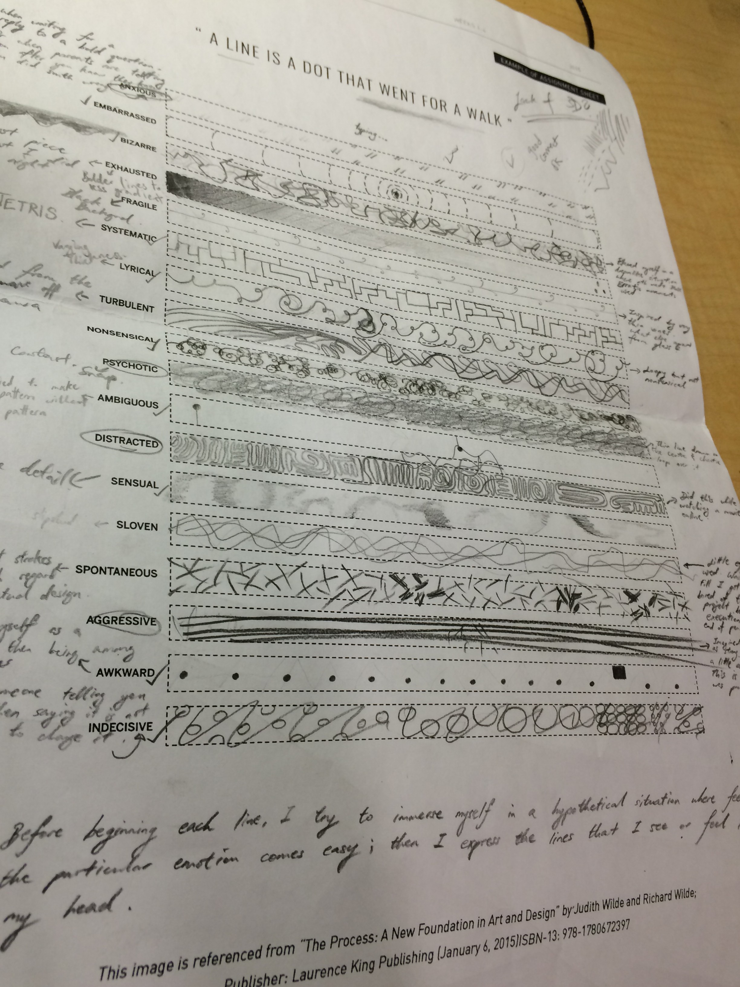
Before beginning with each strip, I searched the meaning of each word on the dictionary. I knew most of the words, but perhaps the concise definitions given would give me deeper insight into each emotion.
Anxious:
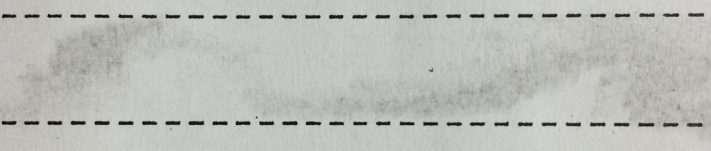
Most Singaporeans use Whatsapp, a messaging app on smartphones which display different indications that can signify if one has received, or even read your particular text. The infamous blue double-ticks serve to notify you should the receiver open your text to read it. I was in a conversation with my mother, regarding why I was not home even after spending a night out without informing her. She was clearly irate, so I felt rather uneasy throughout the whole conversation, and each time I received the double-ticks my heart pumped a little harder.

In hindsight and after reviewing it with my professor, embellishing the strip labelled ‘Anxious’ with double-ticks turned out to be a poor representation of anxiety. Ticks are generally associated with positivity. You get a tick for a right answer. You mark a tick next to something you have completed on a to-do list. Contentment and satisfaction were more relatable to the ticks I drew. A complete revamp on this rejected design was called for.
Embarrassed:
Embarrassment is not a nice feeling to have. For myself and probably many others, this emotion causes one to want to run away or disappear from the particular situation that incites this emotion. I drew concentric circles with perforated lines to signify obstacles that impede me from quickly crawling into the hole in the centre and hide from the rest of the world until it was safe for my ego to emerge again.
![]()
Bizarre:
For this strip, I tried to imagine a situation where nothing really made sense and everything was whimsical and quirky. An overturned landscape. A black lake floating in mid-air. A grinning Cheshire cat fading into oblivion. A bizarre line would be far from uniform or calm. Without giving my marks too much intention, I made the lines with jumpy, quick and erratic movements.
Exhausted:
I deliberately saved this for last. It was already late, so after finishing seventeen strips and writing an essay for another module, I returned to this work, mentally drained. It was the perfect feeling for this task. I didn’t even want to hold my pencil upright anymore. I held it on its side, like how one would hold a pencil to shade larger areas. It was quicker this way and I could go to bed faster. I recalled how my pen would drift off on my paper whenever I was writing something and fell asleep midway. The marks would get lighter and lighter until I wasn’t really creating any more marks. This was the driving concept for my strip of Exhaustion.
![]()
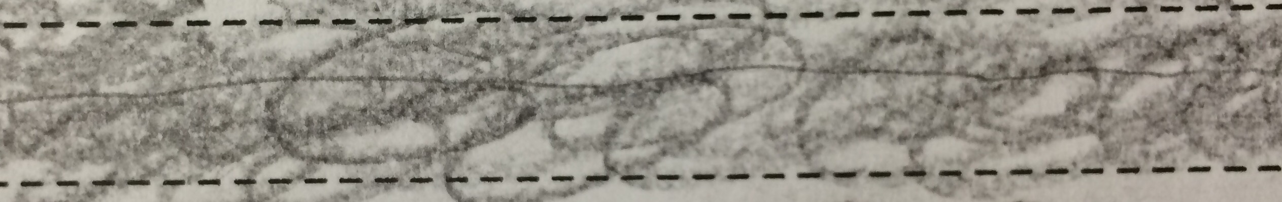
Fragile:
Glass, cracks, and smooth porcelain. These were all well for representing fragility. What struck me as fragile, however, was witnessing a millimeter-thin vine creeping up a tree trunk. As if it wasn’t thin enough, it split off into two like a vein. It needed the support of the gargantuan tree trunk to reach higher and taste the sunlight that ironically, the tree was blocking it from.
![]()
Systematic:
One of my favourite games, Tetris, came to mind. Falling blocks of different shapes would have to be methodically arranged for all the blocks to fit snugly without any jarring holes created from wrong block placements. In fact, this OCD-inducing game would temporarily change the way I saw my surroundings. Furniture or items on the table would be watered down to simple blocks and arranged to fit nicely to each other: It was addictive, and it was systematic.
![]()
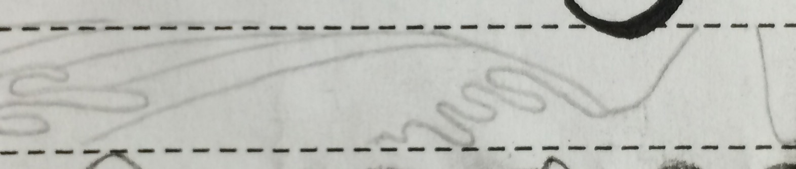
Lyrical:
Poems. Rhymes. Music. Flow is paramount in evoking a lyrical effect. It can be fast or slow, and it can calm or exciting, but ultimately it brings one on a journey where there are twists and turns, loops and dips. These thoughts were then made physical into the lines that I scribed onto the strip.
![]()
Turbulent:
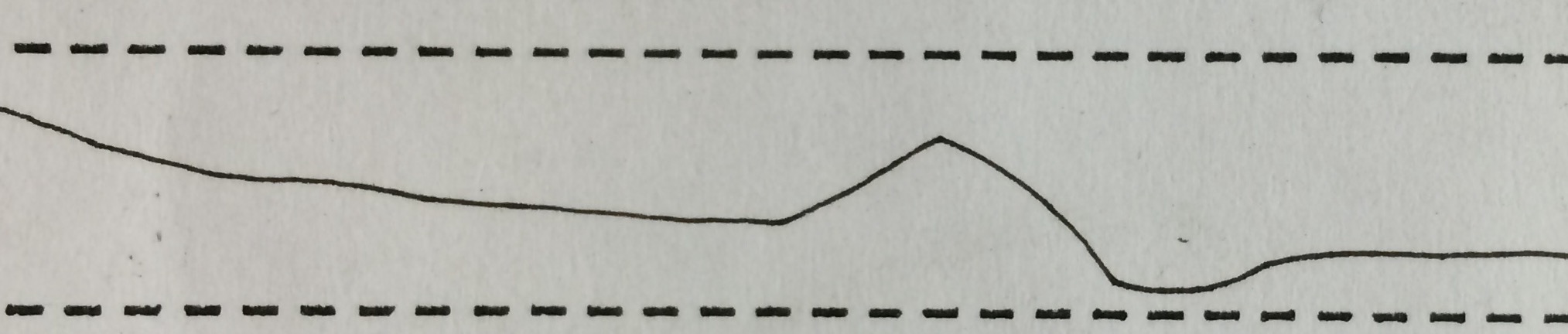
This word is arguably most commonly heard in context of a plane flight. Experiencing turbulence feels similar to how one would feel when on a raging sea complete with colossal waves that crest in the skies and trough in the valleys. The Great Wave off Kanagawa by the Japanese ukiyo-e artist Hokusai showed just that, so I tried to replicate some of that on the strip of turbulence. And then I thought how this would impact an otherwise neutral line. I guess messy sine curves was my interpretation.
![]()
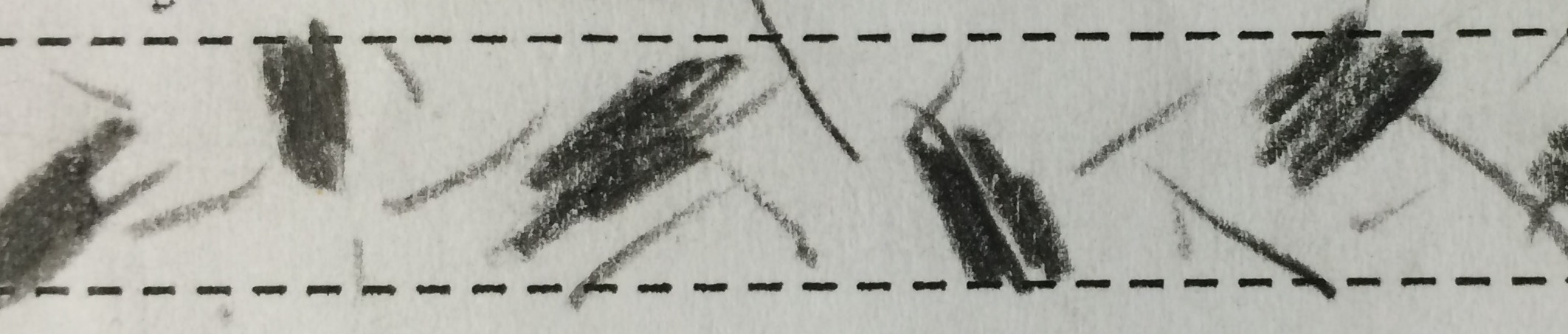
Nonsensical:
Curly scribbles and going around in messy loops was how I portrayed Nonsensical. I made a deliberate attempt not to be uniform or have a sense of direction like how I did “Lyrical”. Some parts were made darker, some were made more concentrated; all for no good reason at all. Wouldn’t that be the essence of nonsense?
![]()
Psychotic:
For this draft, I drew a thin line across the strip, and then covered it with chaotic loops over and over again until the line could hardly be seen. The line was intended to represent the sanity of a human brain, and the loops signify all the troubles and frustrations that weigh down on someone. With enough mass, the singular line can hardly be seen anymore, or even be made out and that was how I decided to show how one can lose his or her sanity.
![]()
Unfortunately, this idea of portrayal turned out to be a little too abstract for viewers’ understanding. One might even guess the emotion to be turbulent or ambiguous.
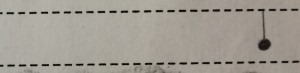
Ambiguous:
Taking a minimalistic stance on this approach, I imagined a white room with a button or a joystick, without any instruction or sign, a la the architect’s room as seen in The Matrix. I then asked a friend to decipher what emotion I was trying to portray. He shrugged his shoulders and I knew this was the response I wanted.
Distracted:
I began on this strip after searching for a movie to watch online. The movie played and I started to sketch a random pattern.
![]()
However, I ended up focusing on completing the pattern more than actually watching the movie. It was like I was distracted from the movie instead. This attempt needed an overhaul.
Sensual:
When one is more sensitive to his or her surroundings, even the lightest touch or breath will ignite the nerves and send sparks down the spine. This was the notion that I wanted to manifest in this strip, that no hard or definite lines were necessary to evoke arousal.
![]()
I felt that I had to add a little more to prevent it from appearing too sloven.
Sloven:
I had to search up this word on the dictionary. What I understood of this word was that it is used to describe negligence and being slipshod. To execute this in my strip, I drew some scrawny, could-not-care-less pathetic lines. I attempted to feel the meaning of the word. Sloven, sloven, sloven.
The more I enunciate the word, the more it bore semblance to an onomatopoeia. The lack of effort and thought in this given strip should produce the same effect.
![]()
Spontaneous:
Finally, another positive emotion after Lyrical, even if it isn’t explicitly positive. I was beginning to get a little depressed from this project so beginning on spontaneity definitely gave me some breathing room. Being spontaneous to me would be defined as acting happily on impulse, combusting from one action to another without pausing to give much thought. Given that this was my defining statement, I tried to replicate it in the strokes of my lines. From each dot, I stroked outwards quickly, spontaneously, until I ended up with a series of quick, short strokes angled at various directions.
![]()
Aggressive:
And once again I was hurtled away from any cheerful expression and into a very bold, spiky emotion. I thought I had this down. Using a 6B graphite pencil instead of 2B, I lashed out on the strip, creating deep, dark horizontal streaks. I confidently showed this to my professor, only to find out that it wasn’t fierce enough. It was true. I needed something more. I needed something aggressive.

Awkward:
How do you make something like a dot or a line awkward? By making it stand out, by making it different in an uncomfortable manner. In human relations, awkward situations arise from saying or doing something that lacked social grace or tact. 
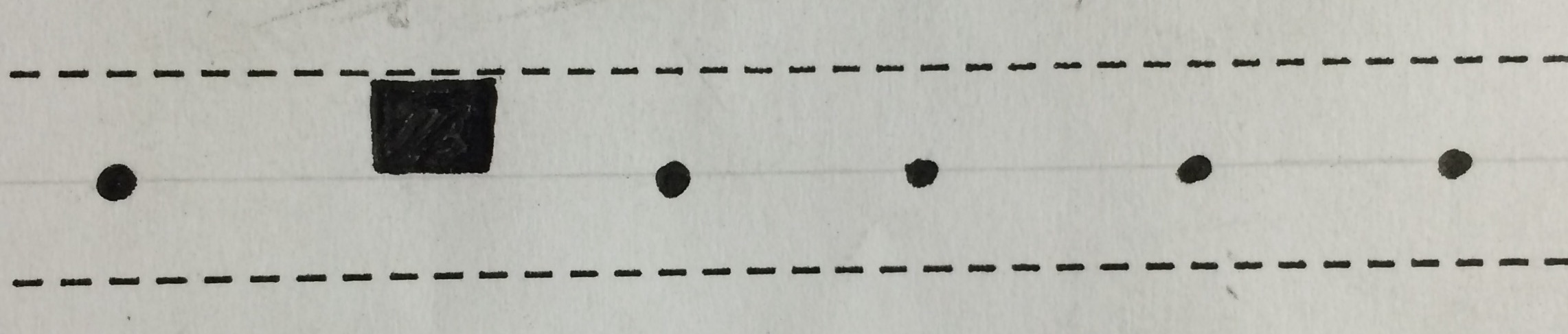
Indecisive:
“Maybe I’ll start off with polka dots. Perhaps a trail of dots increasing in size would make more sense. Should I cluster the circles together instead? Make them smaller, no, bigger.” I tried to capture the essence of indecisiveness in this manner. With each change in the pattern, I made deliberate cancellation marks to enhance the indeterminate nature of this strip.
![]()
However, I felt that this attempt was so fixed and purposeful that the intention backfired on itself. Aptly, this strip was left unresolved.
____________________________________________________________________________
For the second draft, I realized that while scribbling whatever I felt on paper was effective in displaying the particular emotion for my own understanding, some emotions were simply too similar to another emotion or too enigmatic for the next viewer to understand or grasp the emotion I was attempting to evoke.
I understood that I did not have to change my concept; there was no right or wrong in art, but I wanted my viewers to appreciate the lines I produced and bring out whatever emotion from them that I was tasked to create in each strip. My approach changed from purely creating lines with raw emotion to making sense with more relatable lines. Thus began my tweaking process and further experimentation with various lines in various mediums.
Anxious:
This time, I used oval shaped dots to assimilate footprints walking to and fro continuously. I myself am guilty of pacing about whenever I feel anxious or excited. I was satisfied with this version because they also bore some resemblance to crawling ants, which give a good number of individuals an uneasy feeling.
![]()
Embarrassed:
No change except to make the concentric circles an even more realistic ripple effect.
Bizarre:
This version was pretty similar to the first draft, but I used two different mediums instead (Micron pen and H pencil) to give it a more contrasting and almost creepy character.
Exhausted:
Instead of a single gradient fade, I depicted a shading that faded in and out of oblivion to enhance the display of exhaustion despite numerous attempts to have a constant dark shade.
Fragile:
Made the vine-looking line less straight and drawn even lighter to really bring out its fragile nature.
Systematic:
While the idea was the same as my first draft, I added pencil grids to make the strip look even neater and ultimately more systematic.
Lyrical:
The same design was used, but this time the lines were given varying thickness to add to the expressive flair of the produced line.
Turbulent:
Unchanged. However, I felt that I could do better in the next attempt. While thinking about how I could go about doing this after finishing the second draft, I stumbled upon the tissue I used to wipe black ink off my hands…
Nonsensical:
No change, except to create a slightly bigger contrast between dark and light marks.
Psychotic:
This time, I envisioned psychotic as someone whose brain has snapped like a frayed rope tearing apart from overload. I used deep, dark, jagged lines to intensify the malevolence of this strip. Outstretched roots and veins are portrayed to seem like they are desperately trying to grab hold of whatever they can in order to feel complete again. I was satisfied with this interpretation of Psychoticism.
Ambiguous:
The minimalist approach was still kept, but the figures drawn in the strip were adjusted to bear even less relation to one another to give the viewer an utter lack of finding any link or meaning in said figures.
Distracted:
Initially uniform squares are then slowly losing their linear focus and start to overlap each other. While this pattern was just as deliberate as the last, it made much more viewership sense. People who see it now have a higher likelihood of guessing the emotion accurately.

Sensual:
This time I created two gradients, both soft, ebbing and flowing with each other. I believe that having two beings together increased the level of arousal.
Sloven:
Instead of a few lines, this next draft only included a single lazy and pathetic line. I felt that while I probably gave too little effort into this strip, it made the line even more fitting to the task.
Spontaneous:
The design for spontaneous remained relatively similar. The only difference is that some of the streaks were made thicker and bolder, to signify that spontaneity doesn’t just stop at making single marks out on a whim, but can vary in thickness and contrast just as quickly and as easily. It is deliberate, but at the same time not calculated.
Aggressive:
I tried, this time, drawing a rock like surface cracking from the sheer power of a lesser pencil mark spearing through. I still could not get this emotion down, and to think I thought of this as the easiest when I first started on this project.
Awkward:
No change from Draft 1.
Indecisive:
No change as well, but to vary the cancelled out patterns even more instead of using only circles. After all, with greater choice comes greater decisions.

Some of the designs made it into my final work. Others required tweaking or a complete overhaul which can be seen in my Line Work post, especially those that lacked enough relativity for viewers to have a rough concept or understanding of each strip. The completion of this second draft gave me many ideas in execution and style for my final work.