This project was a highly experimental phase for me. I wanted to try my hand at various styles to see which would be best suited to my tastes. While this resulted in a very uncoordinated overall effect of the entire composition, I felt that I learnt a lot through this experience, and would like to thank everyone for their valued constructive feedback, both compliments and criticisms.
In this project, my chosen perspective was that of The Internet, and by implication, all things with online requirements. I had to be careful not to confuse what was simply technological/digital/computerised with the actual connectivity that the internet provides. (E.g; Microsoft word has, in this case, nothing to do with the internet.)
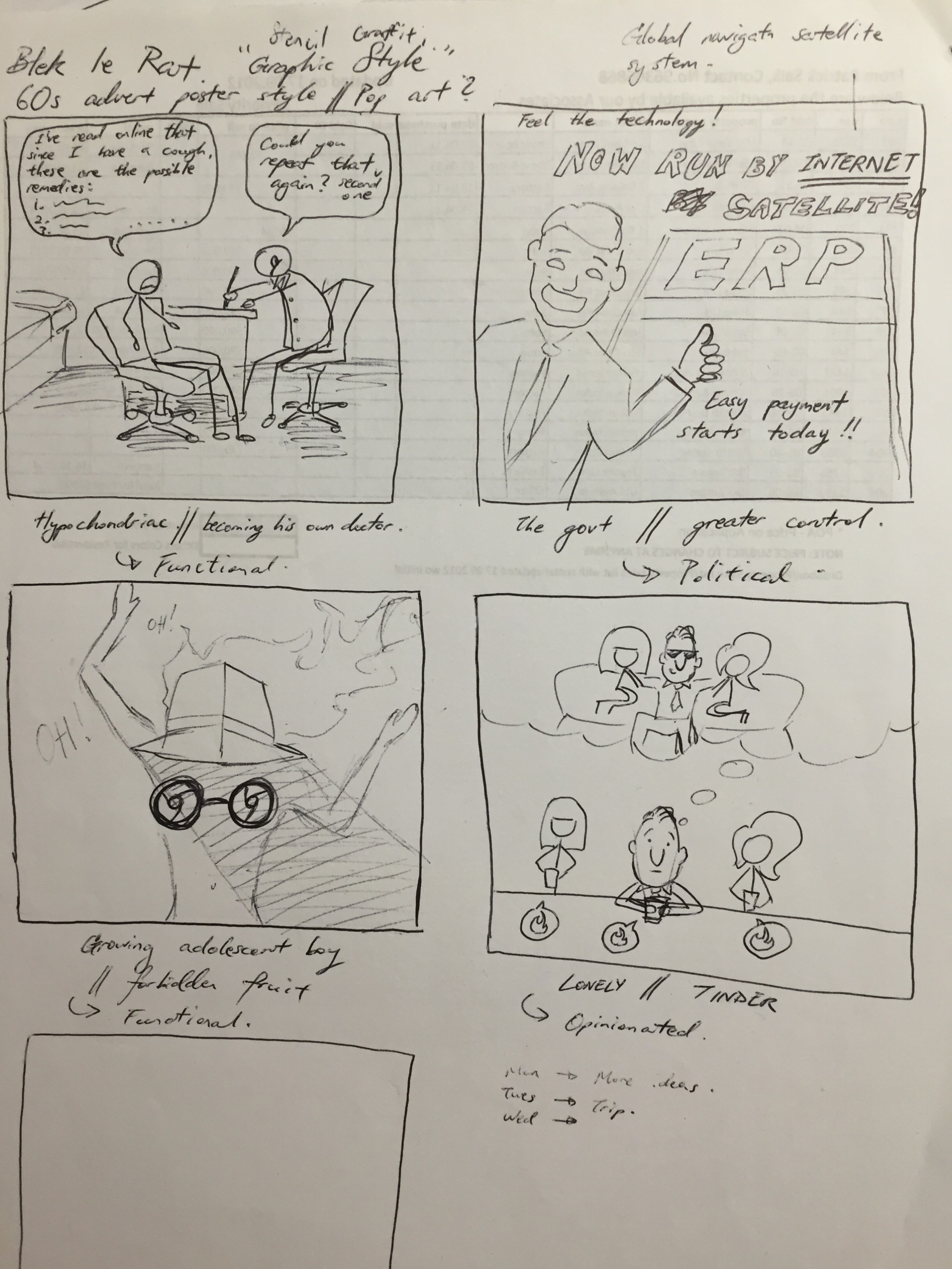
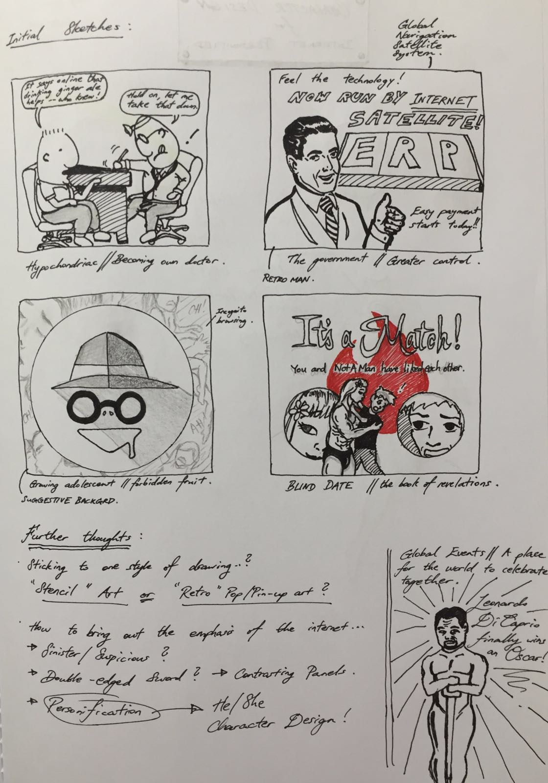
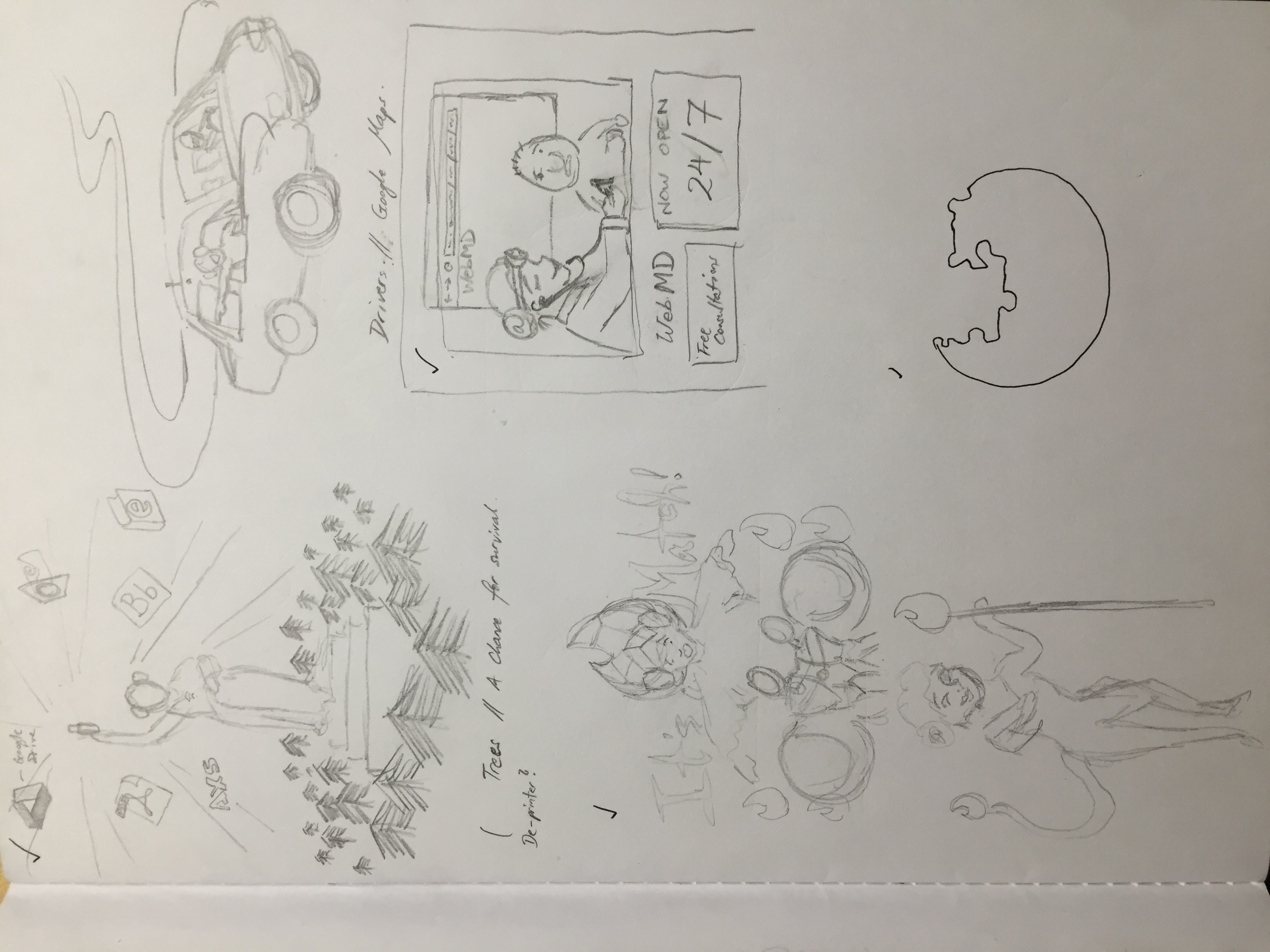
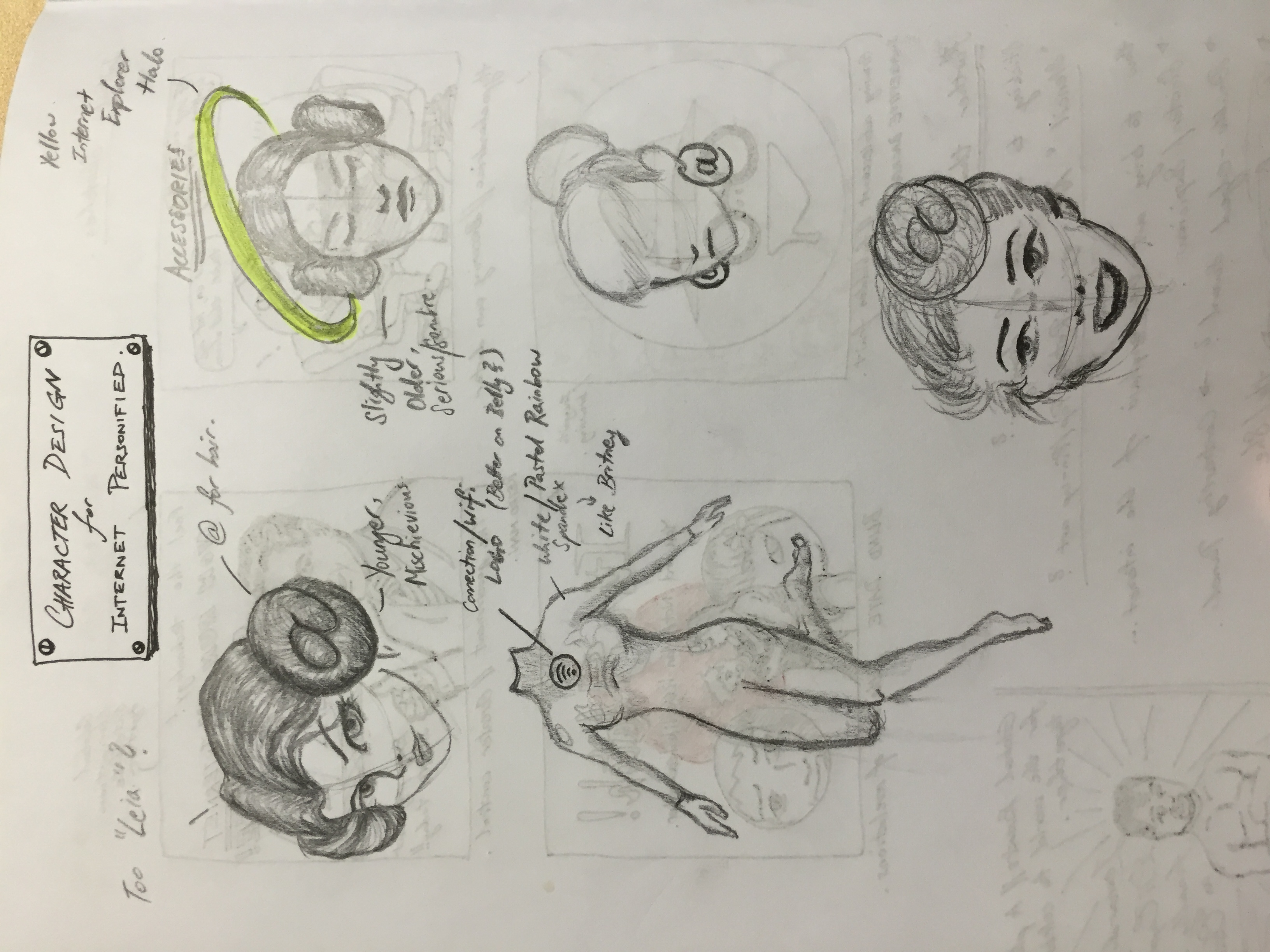
Here are some initial sketches for conceptualisation:
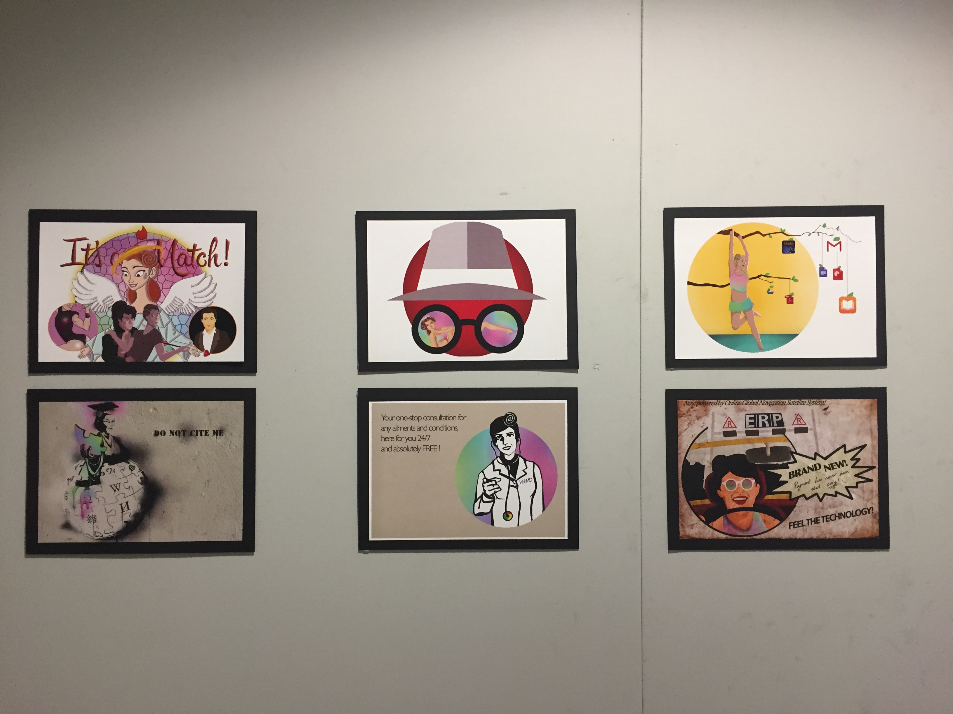
Drawing out the final works…
While each piece possessed very contrasting art directions, I attempted to create some similarities among them to portray the fact that they are all part of one project.
These are some thematic adherences I considered in the completion of these compositions:
PERSONIFICATION OF THE INTERNET
First off, I personified the internet as a woman always donning an @ hair bun, as seen in the character design stage sketches. For convenience, I will call her Internet Girl in this post.
USE OF COLOUR
Said internet chick is always surrounded by a rainbow background or wearing rainbow-coloured outfits. I chose this multicolour feature as I felt it was the most relatable to the internet, which had anything and everything in it, and possessed such a myriad of content, accessibility and utilisation.
CONCENTRATION THROUGH CIRCULATION
Somewhat similar to how a school teacher would encircle things with a red pen, I engaged the use of a large single circle/sphere in each piece, to subtly centralise the focus on the personified internet figure. This was enhanced by keeping the background to minimum detail, if any at all.
Furthermore, circles represent connectivity, which is a huge, if not the main role of the internet.
NEUTRAL BACKGROUND TONES
While initially I had wanted to portray 2 sides of the internet (good and evil) via the colours red and blue, the digital drawings in each piece became much less defined, as these colours are very strong hues. I therefore decided to literally tone it down by using only whites and earth colours for the backgrounds.
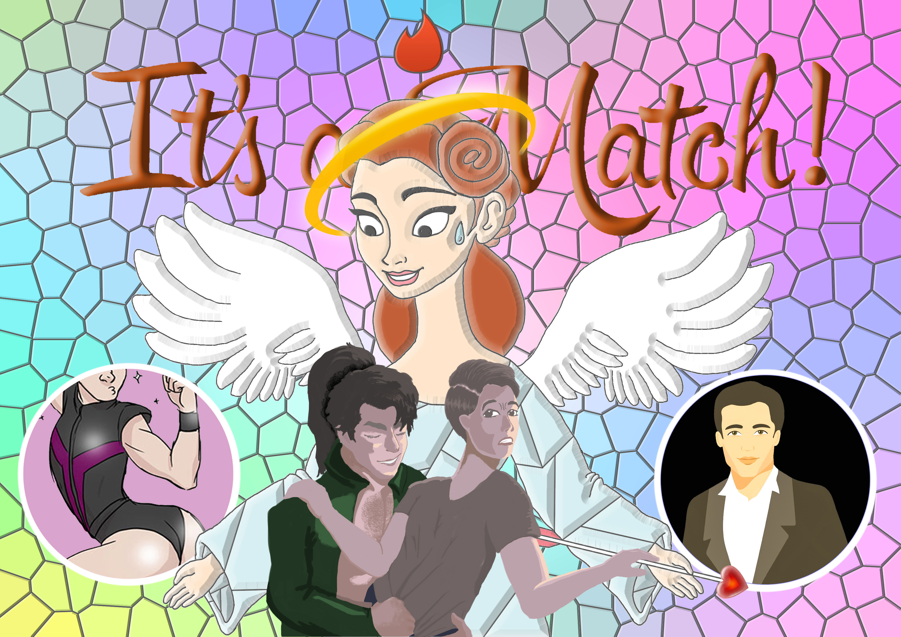
- The Internet to a BLIND DATE is REVELATIONS.
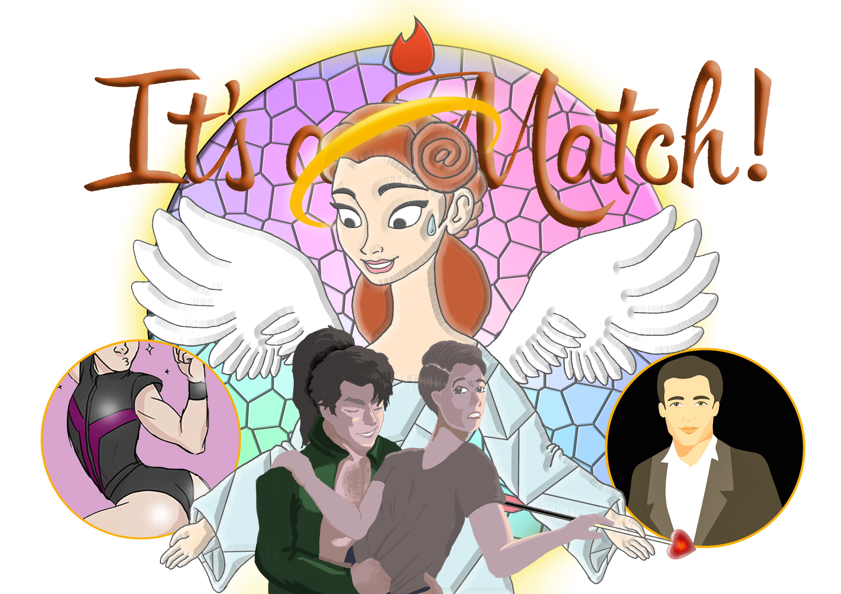
Concept: To depict a cupid attempt gone wrong via a dating app called ‘Tinder’, in a church-like gothic style fragmented glass painting.
This idea came about when a friend of mine (no, this isn’t a personal story which I try to mask using ‘a friend of mine’, i promise) was really into a girl whom he met online, but who he eventually met in person turned out a lot er, larger than life, if you get my drift. I’m not sure if there were any regrets, but it definitely was not a match he had been expecting.
Anyway, I wanted to capture the shock of experiencing such a revelation, so I chose to present this in the form of a man impersonating a woman to exaggerate things a little bit.
The angel (cupid) has a halo which I cut out from the Internet Explorer logo, as well as a flame burning above her head, an exact replica of the Tinder app.
Reflections: I felt my illustrations could do with a little improvement, as well as the sensitivity to lighting directions. Overall, the most important takeaway for me in this piece was that it was a little too cluttered, with so many things going on in a single A5 piece. This piece taught me to be more aware of the dimensions I was working with.
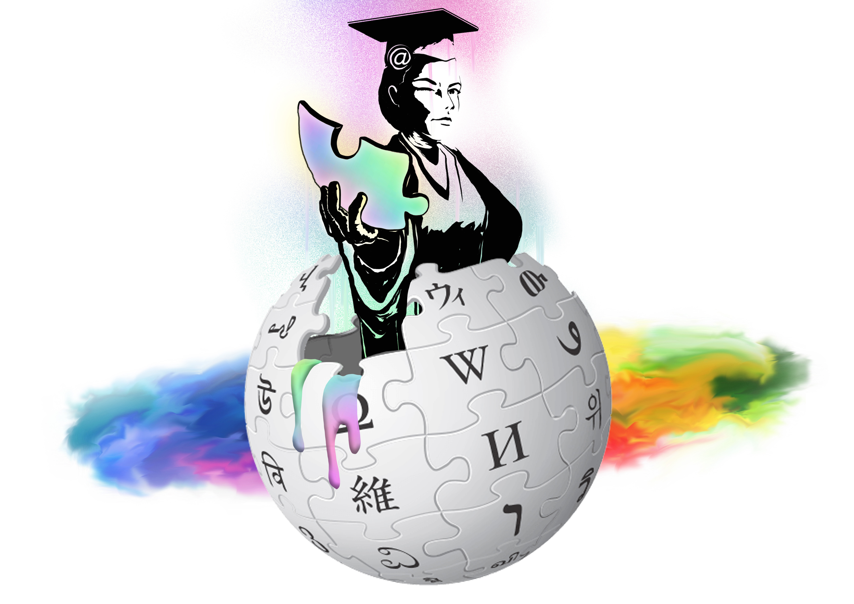
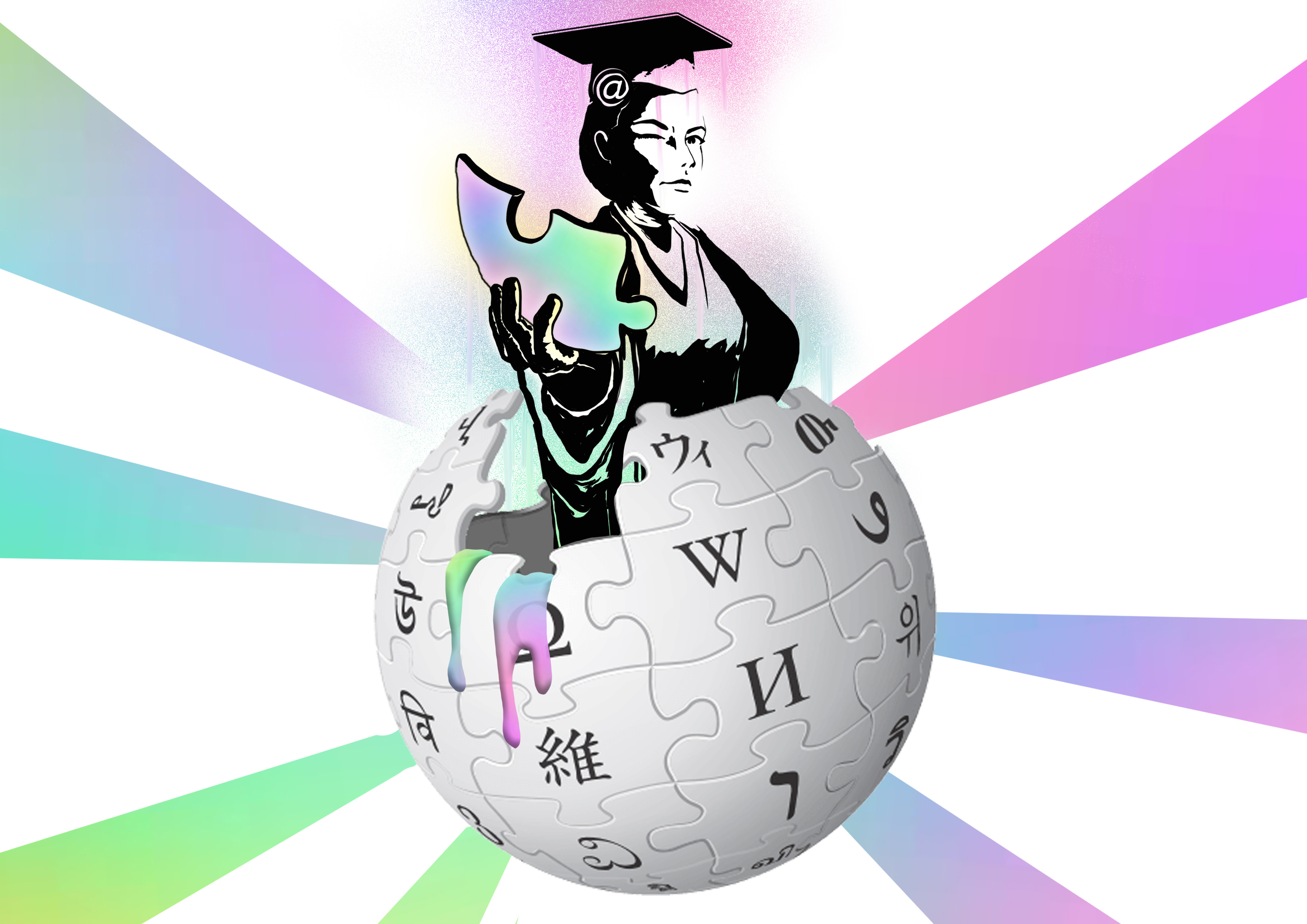
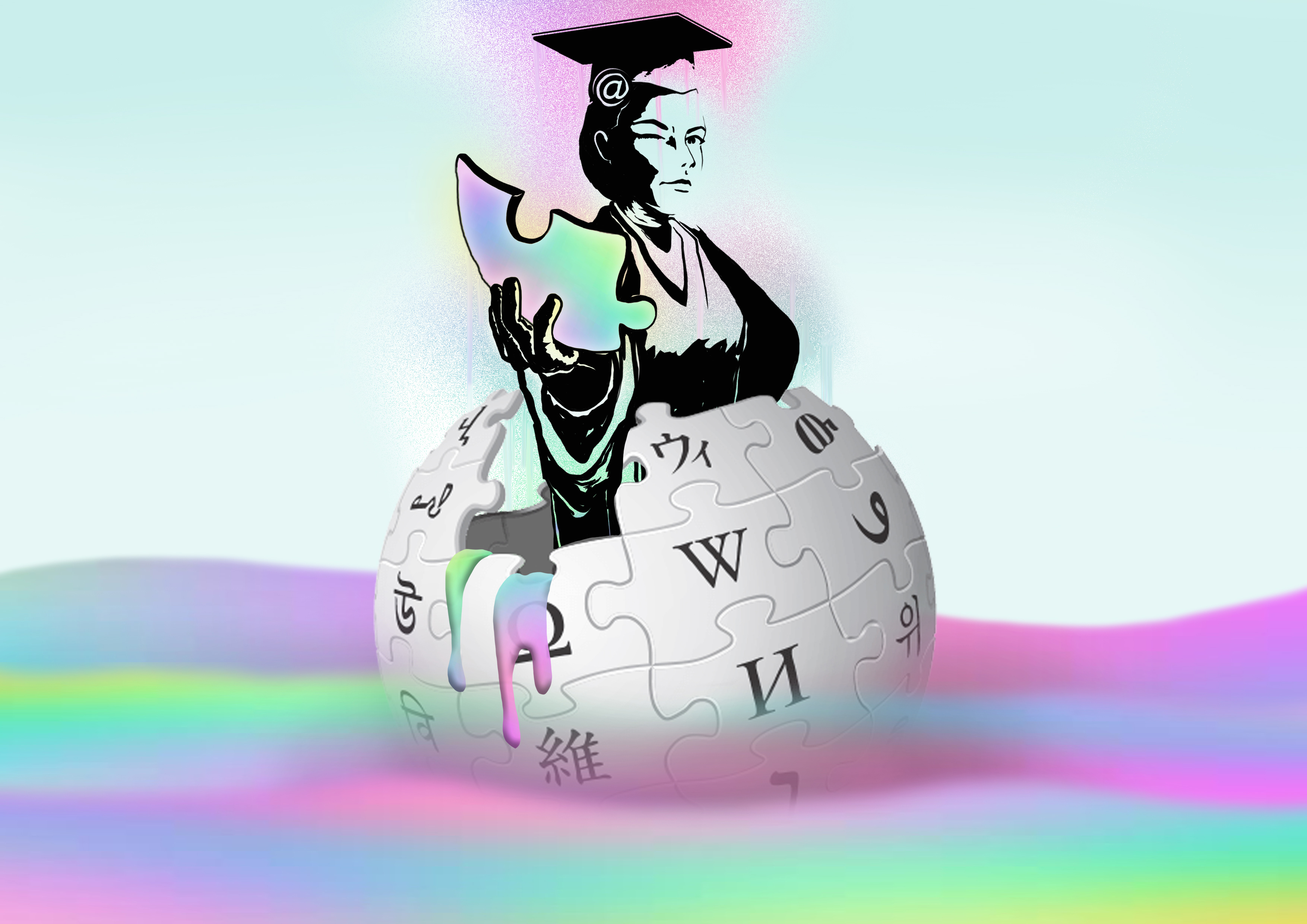
2. The Internet to a RESEARCH ESSAY is WIKIPEDIA UNCITED.
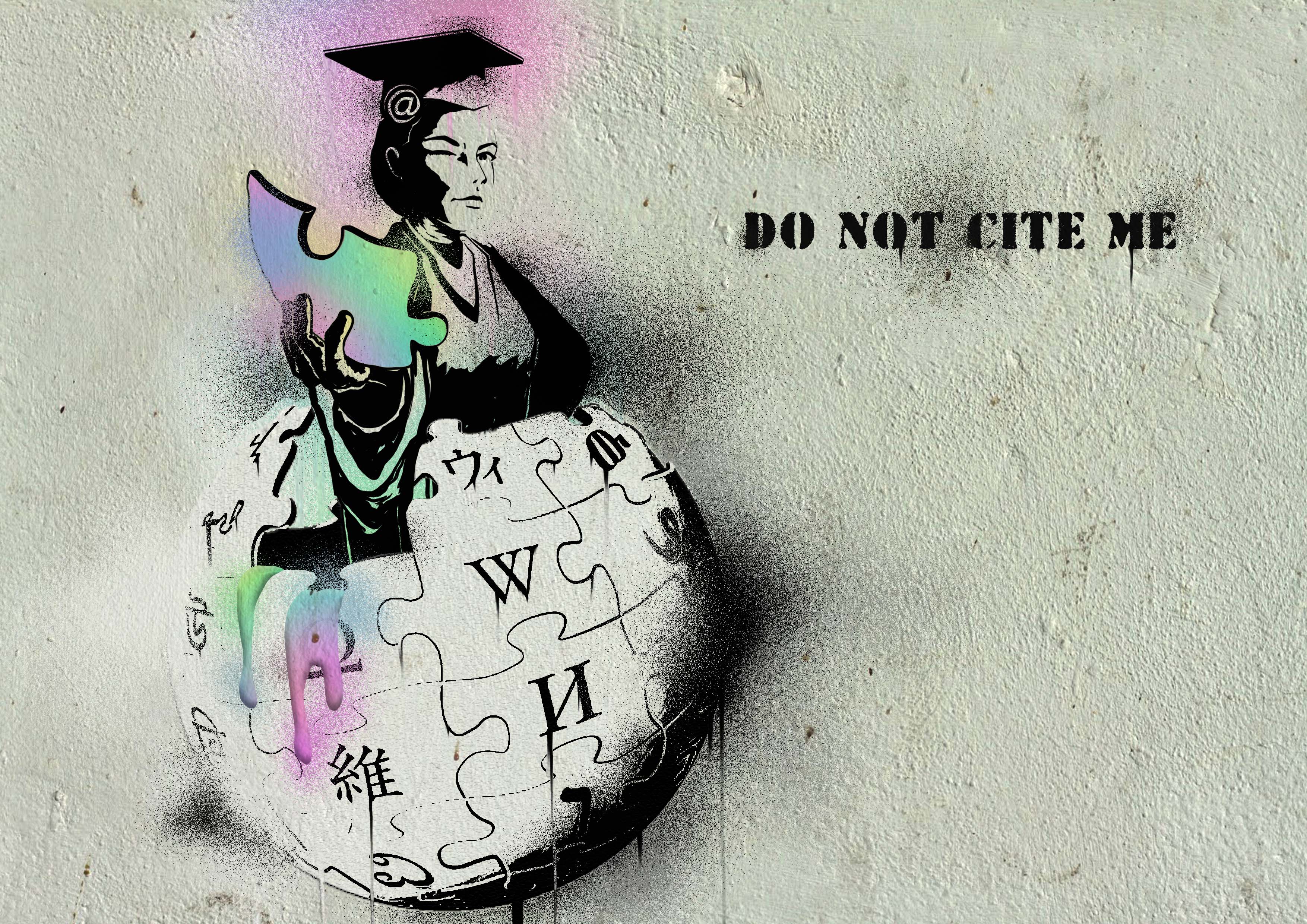
Concept: To convey the shared opinion that undergrads have when working on research essays, executed in a satirical manner.
This is my most preferred composition of this project. From this, I decided that should I have chosen to stick to one style of execution for this project, it would be this one.
Stencil art is usually used by graffiti artists with strong opinions, and their works on various walls usually convey satirical messages of varying degrees. One of my references for this piece is the famed artist Banksy.
I chose to depict the wikipedia logo as a ‘forbidden fruit’ that students all want to use but are not allowed to, delicious as it may look, aggravated further by Internet Girl offering a piece to you.
This piece was executed in the same way as one of last semester’s project (see Project on Nursery Rhymes), by manipulating adjustment levels in Photoshop. I also changed the brush mode to ‘Dissolve’ to give the spray paint effect, and used the smudge tool a little for the dripping paint streaks. Finally, I placed a wall layer above the art and changed the blend mode to ‘Multiply’ to make the graffiti look more realistic.
Reflections: I learned how to create stencil-like art digitally from attempting this piece. I found that I was rather interested in this style of artwork as well.
3. The Internet to an ADOLESCENT is FREE & INSTANT GRATIFICATION.
 Concept: Creating a simple, straightforward image that coincides with the idea of porn without depicting outright pornographic material.
When I first thought about how to go about working on this piece, I thought of the famous incognito mode that many male teens were all too familiar with, especially if they did not own their own computers/laptops.
I chose to manipulate Google Chrome’s ‘incognito mode’ logo as it was a rather accurate and unpretentious representation of the potential uses of incognito mode. By this I mean a suspicious looking character get-up, with a classic private investigator/swindler appearance.
Illustration-wise, I decided to depict Internet Girl as a retro pin-up girl, as they tend to be associated with the idea of beauty and sultriness.
As pointed out to me during the presentation, I unknowingly connected the image to the Japanese flag, which provided a convenient relation to the huge Japanese porn industry. The main reason i chose red for the background circle was because red represents passion, desire, heat, longing, lust, sexuality, sensitivity, romance and action. Red also provides a good contrast to the black and white incognito logo.
Reflections: Pin-up girls take a very long time to draw and render (at least for myself). Point to remember when completing tasks with a limited timeframe. Also, it is worth being more sensitive to what connotations your final art can hold, as in the case of the Japanese flag reference, accidents might not always be to your advantage in conveying your intentions.
4. The Internet to a HYPOCHONDRIAC is HIS OWN DOCTOR.
Concept: Following the style and orientation of ‘someecards’, which are witty and lighthearted.
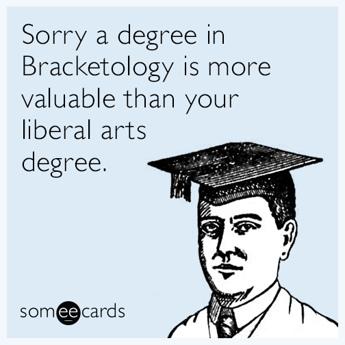
An example of satirical but not-so-serious someecards.
I wanted to manifest the template of the popular online e cards, ‘someecards’, as they were mostly clean and amusing. They are rather similar to the style and effect of stencil ‘graffiti’ art. While also offering alot of opinion, these cards tend to be less serious and weighted, and sometimes more amusing in a lighthearted manner. They also address easier and less political issues.
WebMD is (arguably) one of the most comprehensive and visited health/medical sites on the internet, so i made Internet Girl be a spokesperson for the well-known organisation. Google Chrome is (also arguably) one of the most popular web browsers around, and it helped that its simple, circular logo fit well into a stethoscope.
Reflections: With so much text going on in this piece, it was worth noting that the typographic technique of kerning and tracking should have been executed more here, to allow reading of the text to be more breathable and inviting to the eye.
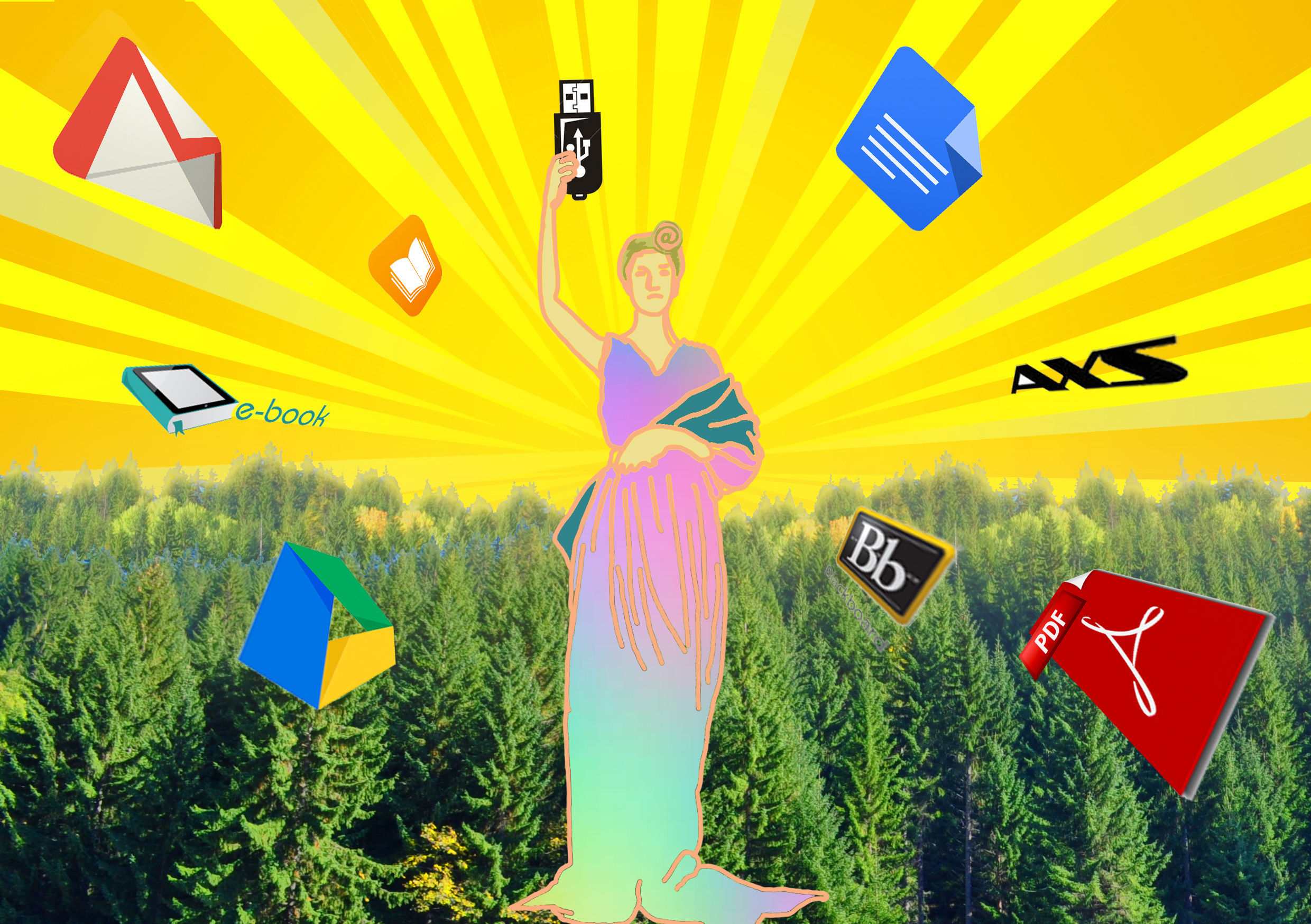
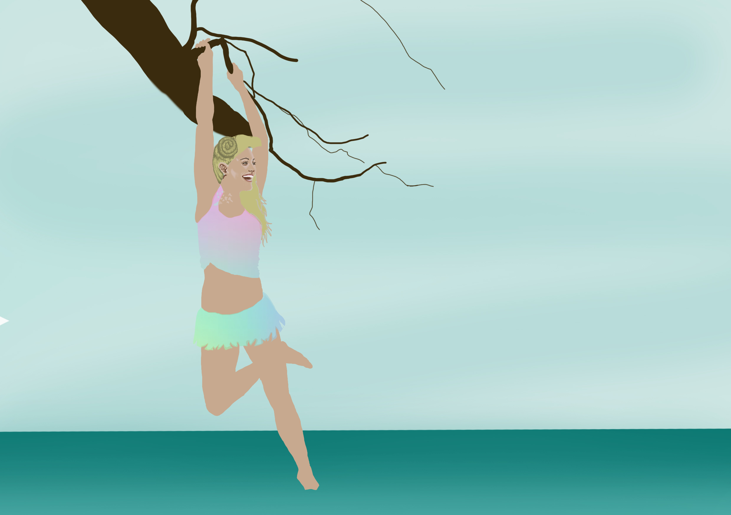
5. The Internet to TREES is A CHANCE FOR SURVIVAL.
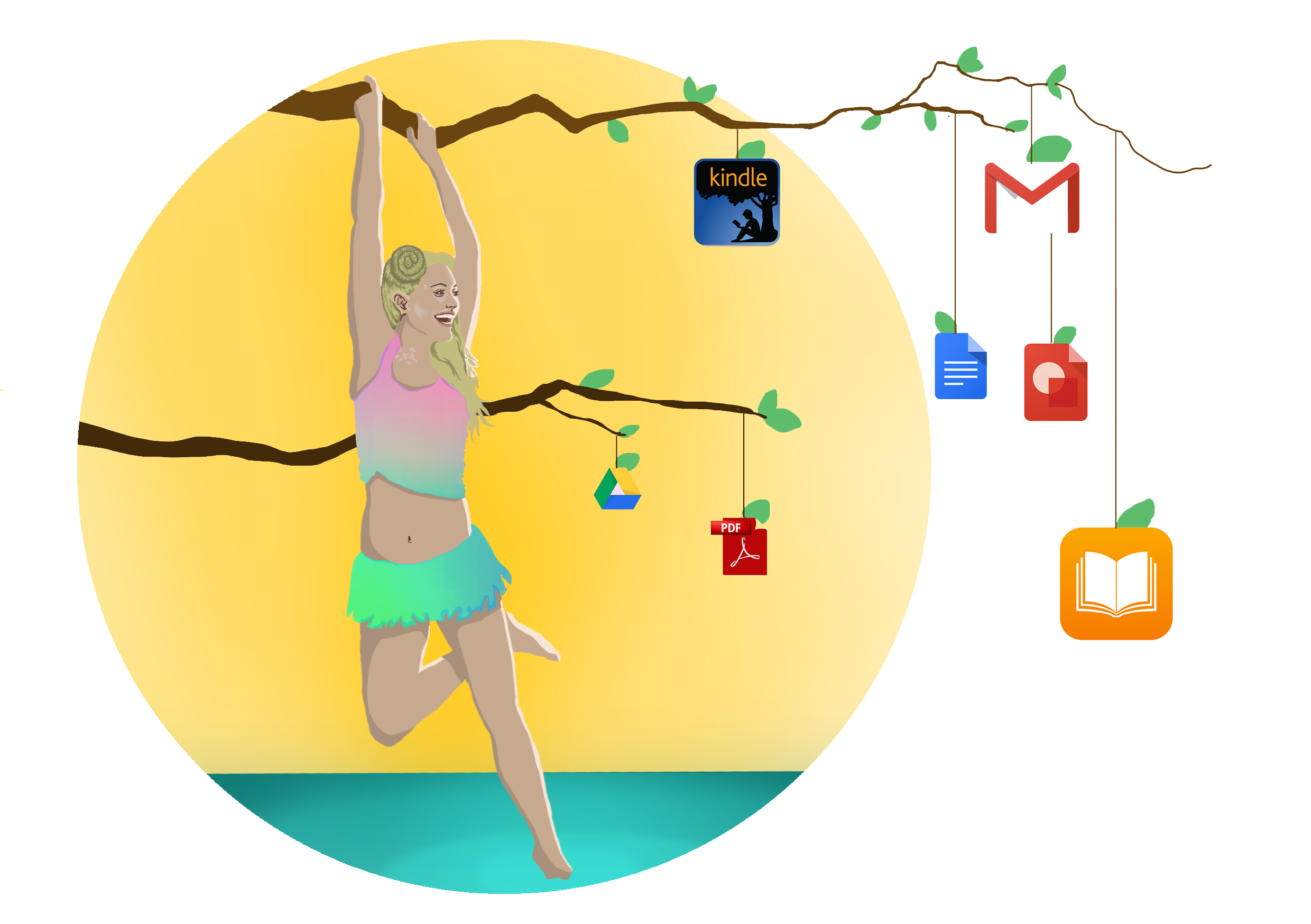
Concept: To portray Internet Girl as a joyful, natural and innocent looking person where the branches that pass beyond her bear fruit.
I attempted to use analogous colours for the background to display a sense of calm and serenity, so i gave the water a greenish tinge to compliment the yellow sun-washed sky. I also made the colour saturation of the background seem to emanate from Internet Girl to make her look slightly divine. By giving her simple clothing and a hawaiian-themed skirt, I had the intention of giving her a more environmentally friendly appearance.
The ‘fruits’ that the tree grows beyond Internet Girl are all paper-saving software, which provide direct alternatives to paper and can all be disseminated online to prevent mass-printing.
Reflections: To make the composition look more natural, and aesthetically cohesive, the software logos could be hand-drawn instead of using the real deal.
6. The Internet to THE GOVERNMENT is GREATER CONTROL.
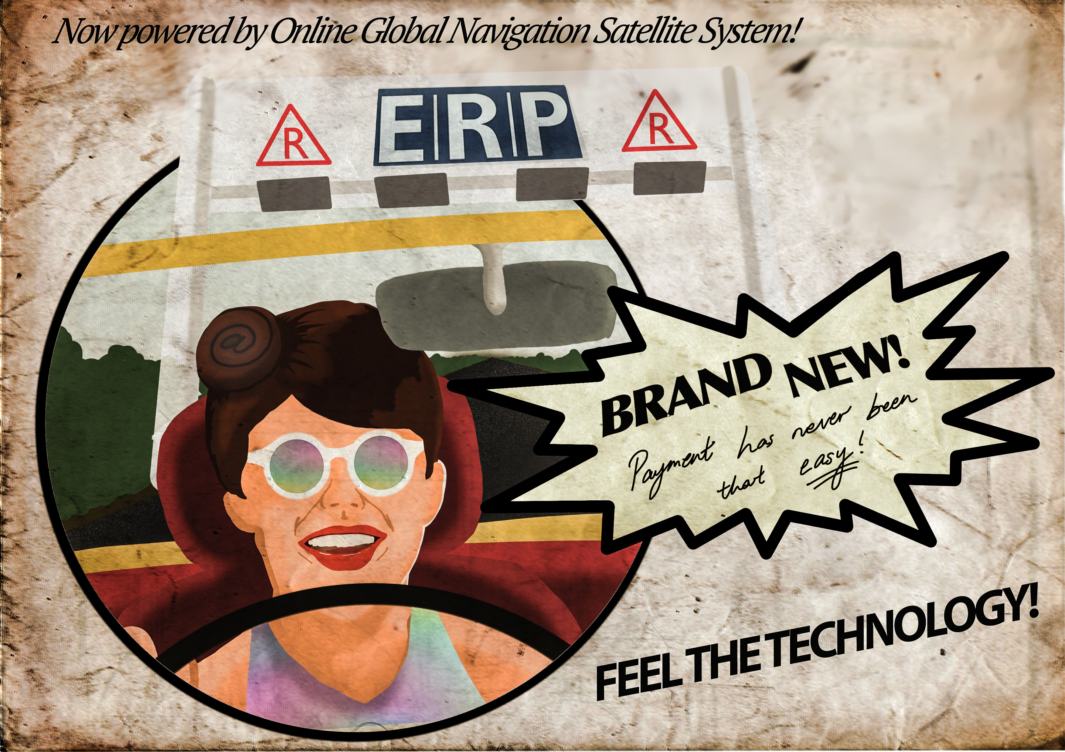
Concept: Using 50/60s advertising templates to advocate the good in the new ERP system.
A public outcry among Singaporean netizens emerged when the government introduced the new Global Navigation Satellite System to operate the already frowned-upon ERP (Electronic Road Pricing) gantries. However, from a governmental standpoint, it was a more accurate form of pricing and thus was perceived by them as something positive.
The 50’60s advert posters didn’t always carry accurate statements, and were always so one-sided that they became pretty questionable. Faces were never unhappy and products were always perfect.
speechless.
Emma Watson would not have had survived in that era.
I blended in an old paper texture to emulate the 50s advert printouts, while also trying to maintain the style of said advertisements. I also tried to form the quotes in an extremely sarcastic manner.
Reflections: Replicating the 50s style of advertising art proved much more difficult than I had imagined. This is one such case where the idea formulated much better than the execution. The old paper also made the composition messier. Probably one thing i thought I did right was the choice of adding in red and yellow as the main colours of this piece, as it helped to give a more vintage look.
INITIAL EXPERIMENTATIONS


