In this zine, I had a few concepts which I wanted to work on:
- The good and the bad of Political figures.
- Larger than life.
- Preserved buildings in Singapore.
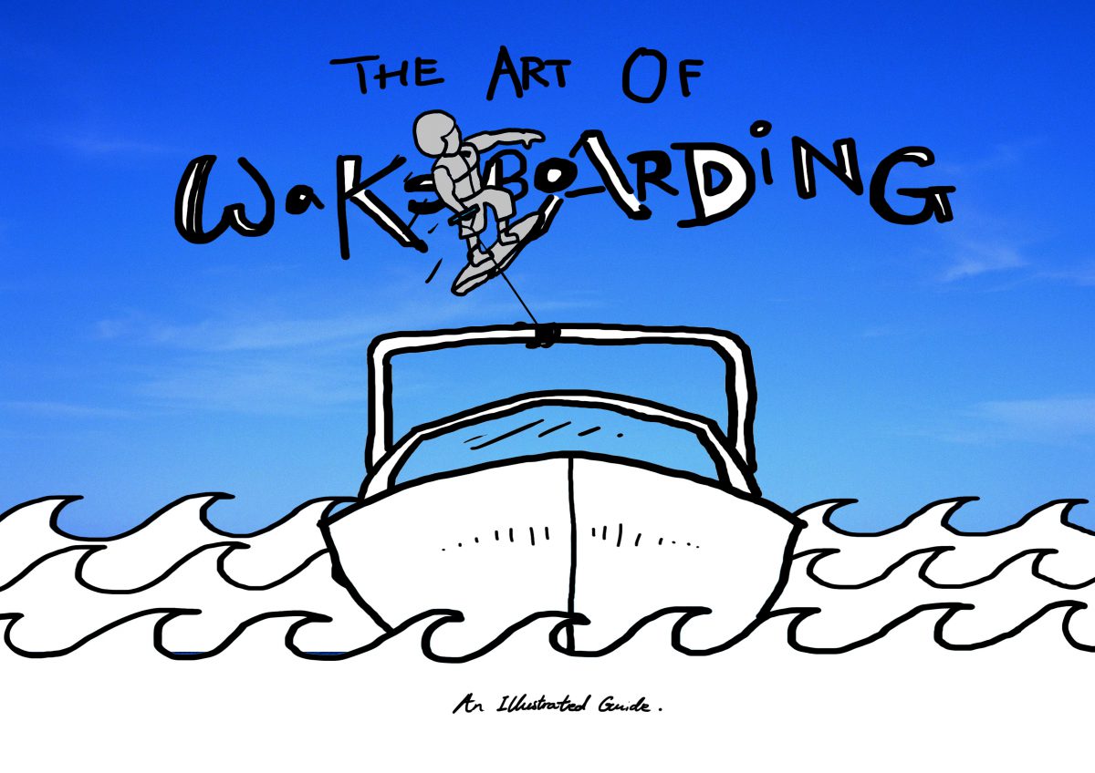
- ‘Infographic’ on Wakeboarding.
Some initial sketches:

A positive light on Trump..?
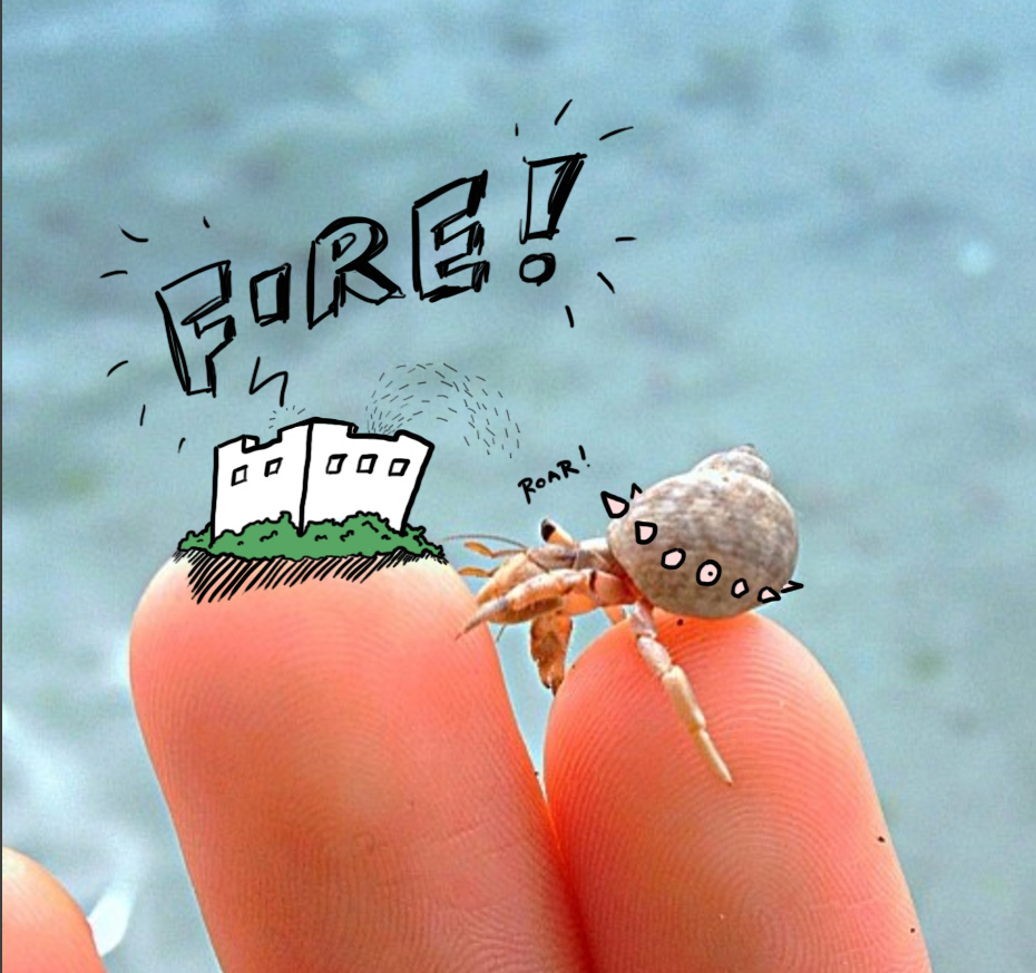
Larger than life hermit crab.
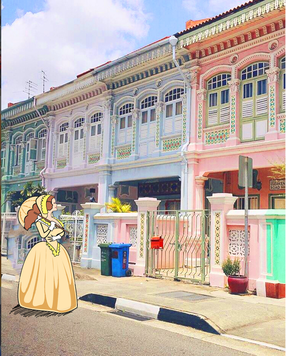
Preserved peranakan buildings in Joo Chiat.
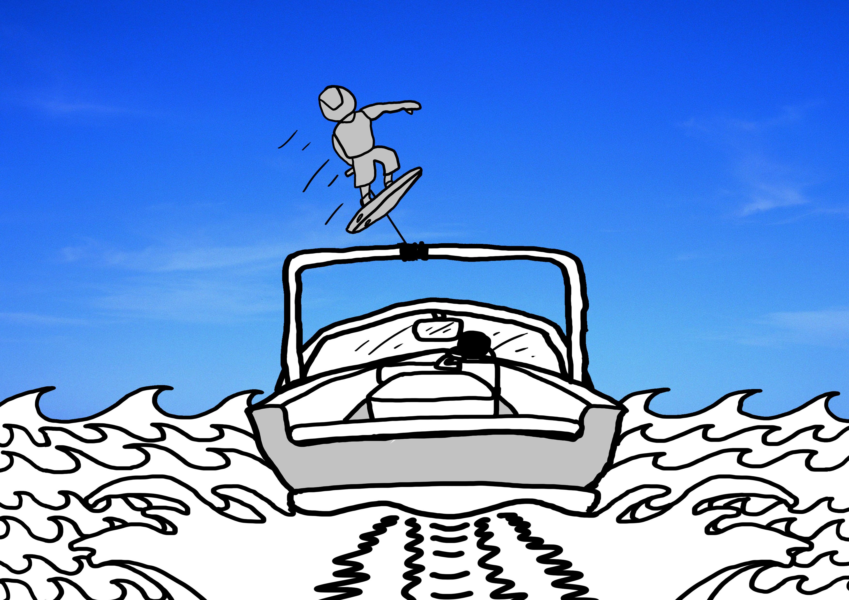
Wakeboarding like you’re Poseidon.
I ultimately decided to go with Wakeboarding, as I had a passion for the sport and I feel that not enough people know or have tried the sport. While I initially planned to create the zine in an infographic style, it morphed into an introductory booklet which served as an informative starter kit.
With that in mind, I chose my target audience to be the young crowds who walk around aimlessly in CCA booths in schools and universities, looking for a CCA that might interest them.
While it was no longer a 100% infographic zine any more, I still picked out relevant material in crafting one. Based on my research, infographics had to:
- be eye-catching.
- be easy for readers to engage in.
- include more visuals and less text.This was important as the target audience I had in mind would have a limited attention span, and would probably move on if something didn’t catch their attention within the next 10 seconds or so.
ART DIRECTION
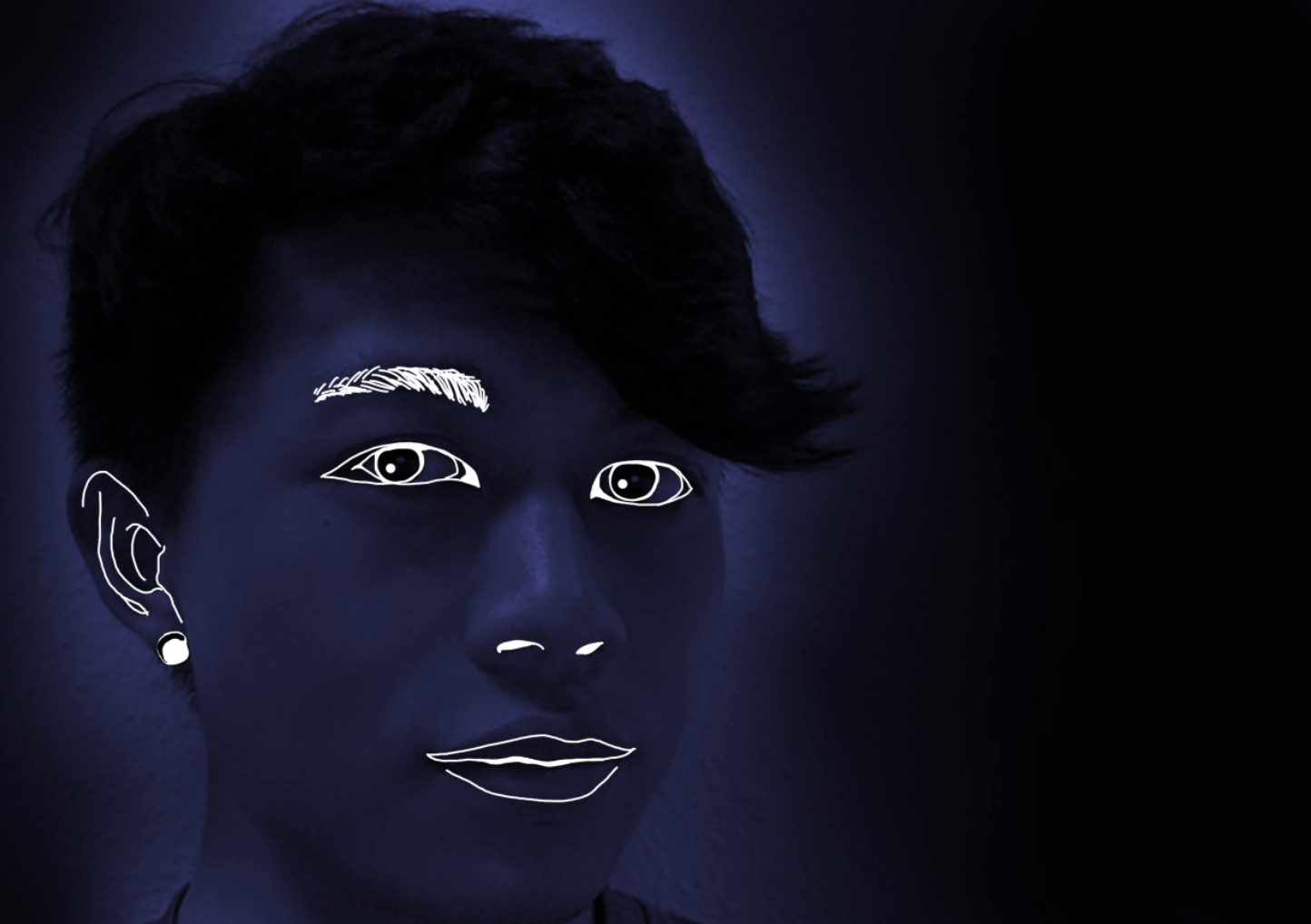
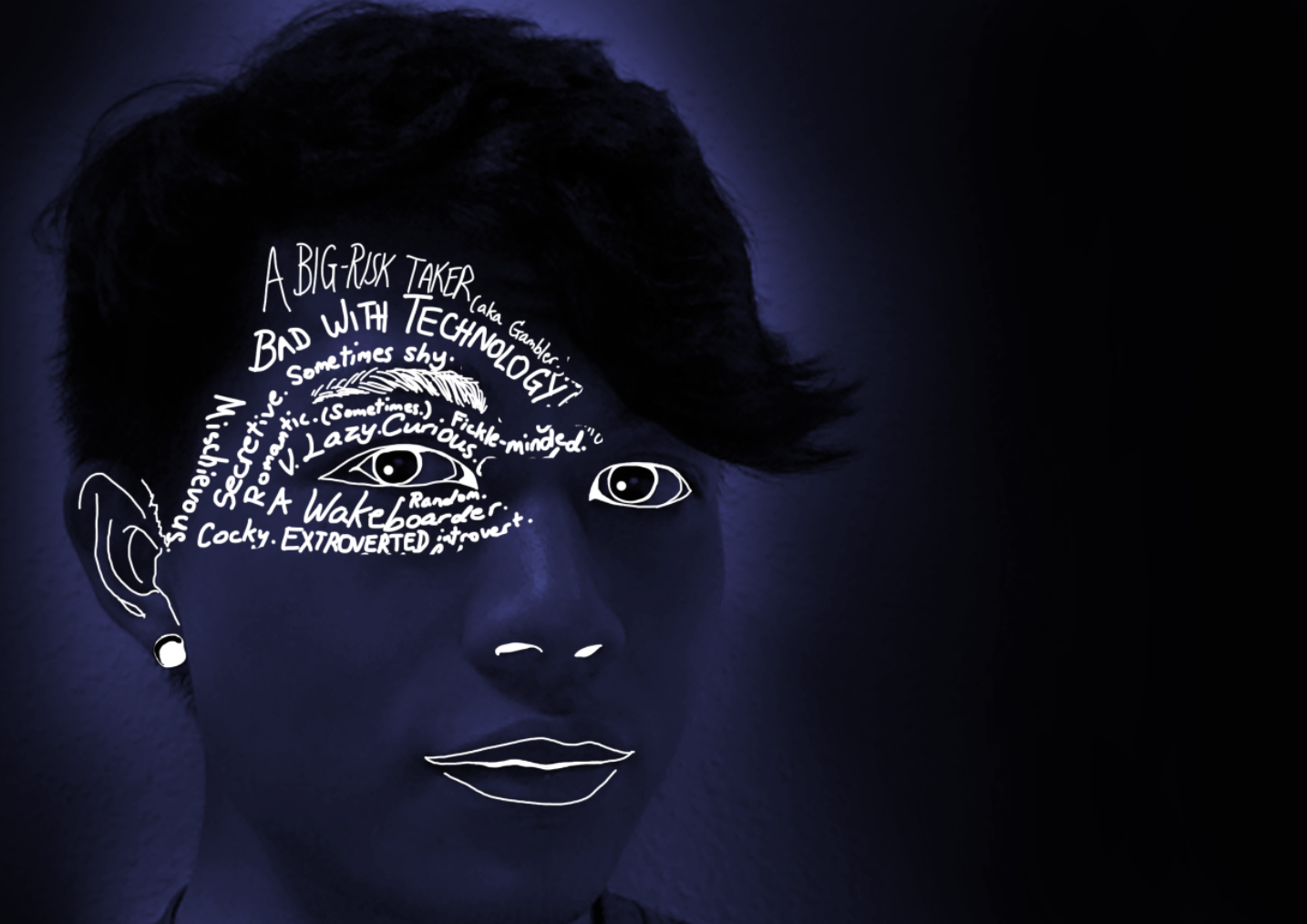
Given this knowledge, I attempted to steer my zine in those guiding concepts. In my earlier projects, I lacked a strong art direction, which caused my artworks to carry little cohesion. This time, I made sure to follow a particular artistic style, which was to be done via digitally drawing on photographs.
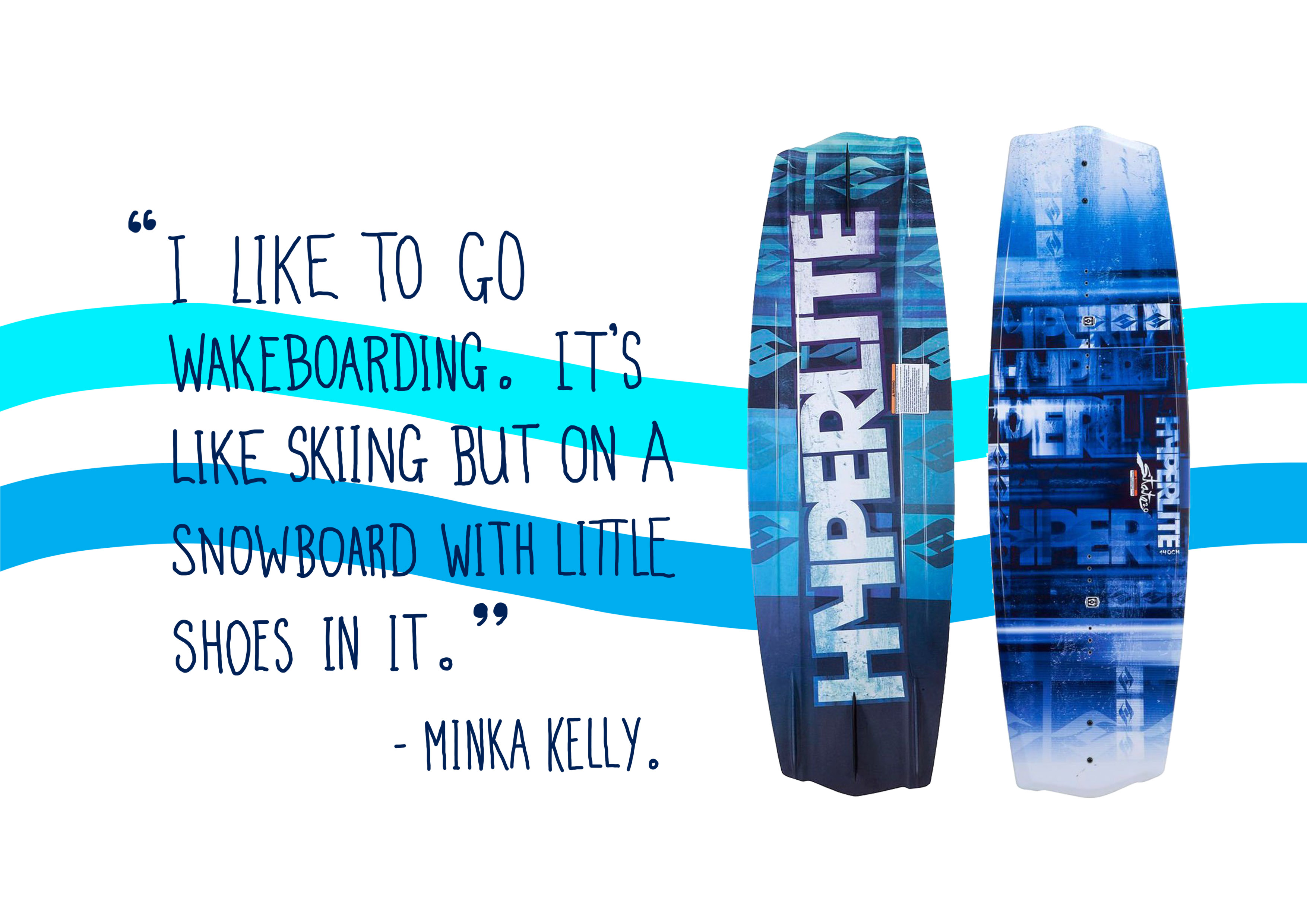
I studied some of David Carson’s typographic works to get a general idea of the types of font I would want to use. It was an added bonus that many of his works fused two of his passions: design and surfing. This made it easy to emulate some of his works onto mine. Other artists I studied include Joe Pytka (Director of Space Jam), Richard Williams (Director of Who framed Roger Rabbit) and Guila Pex.
After much contemplation, I also decided on a Landscape format as opposed to a more convential portrait-oriented zine, reason being the photographs I took while wakeboarding were more fitting of landscape formats.
Some initial cover pages:
This cover had a plain coloured sky. I received feedback that a picture of a photographed sky could be used instead to maintain a strong thematic style.
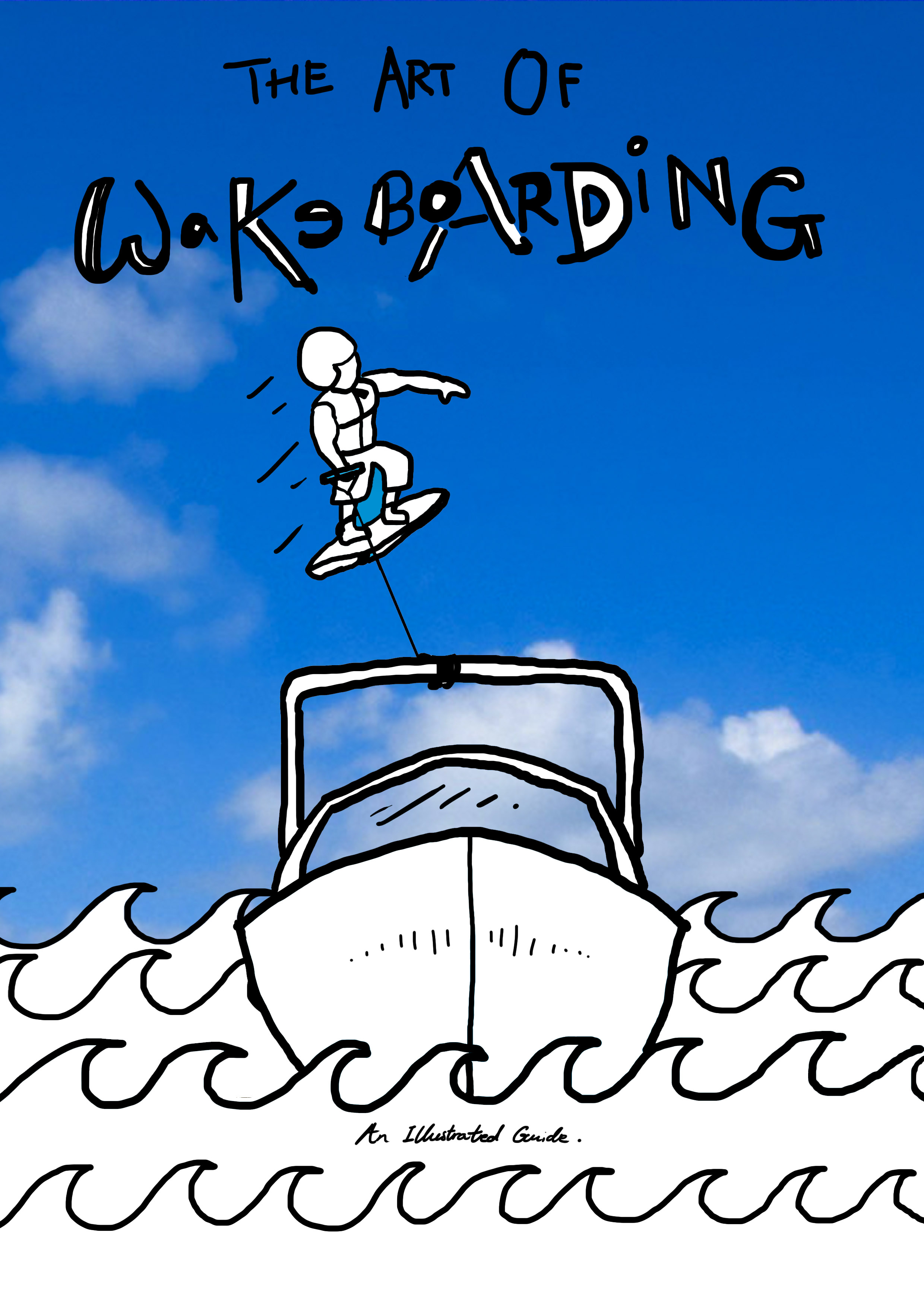
Too many clouds in this one, so i took another photograph with fewer clouds and ultimately changed to a landscape orientation.
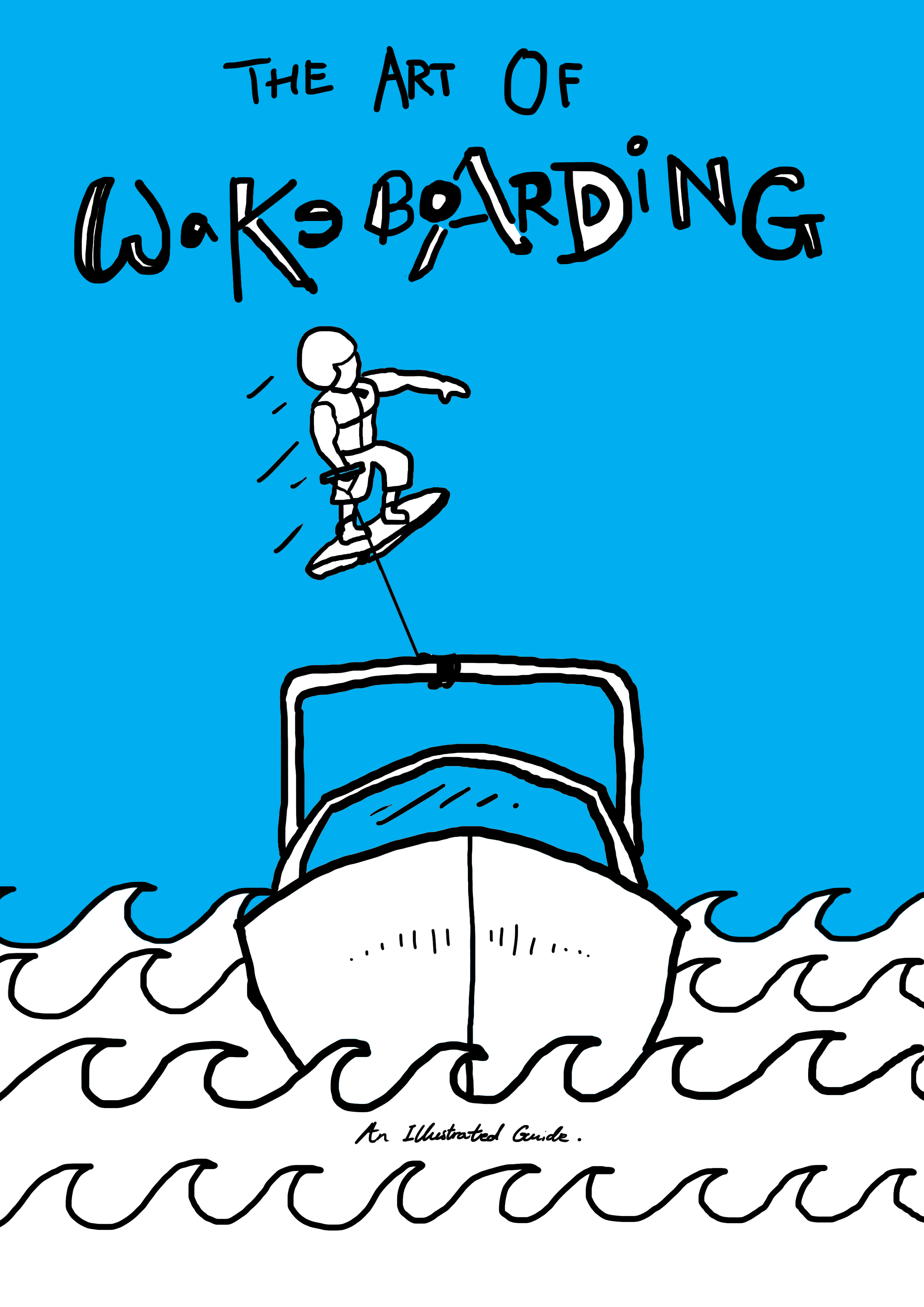
COVER AND BACK
Cover. A much clearer sky. Saturation was increased to make the zine more bold and eye-catching.
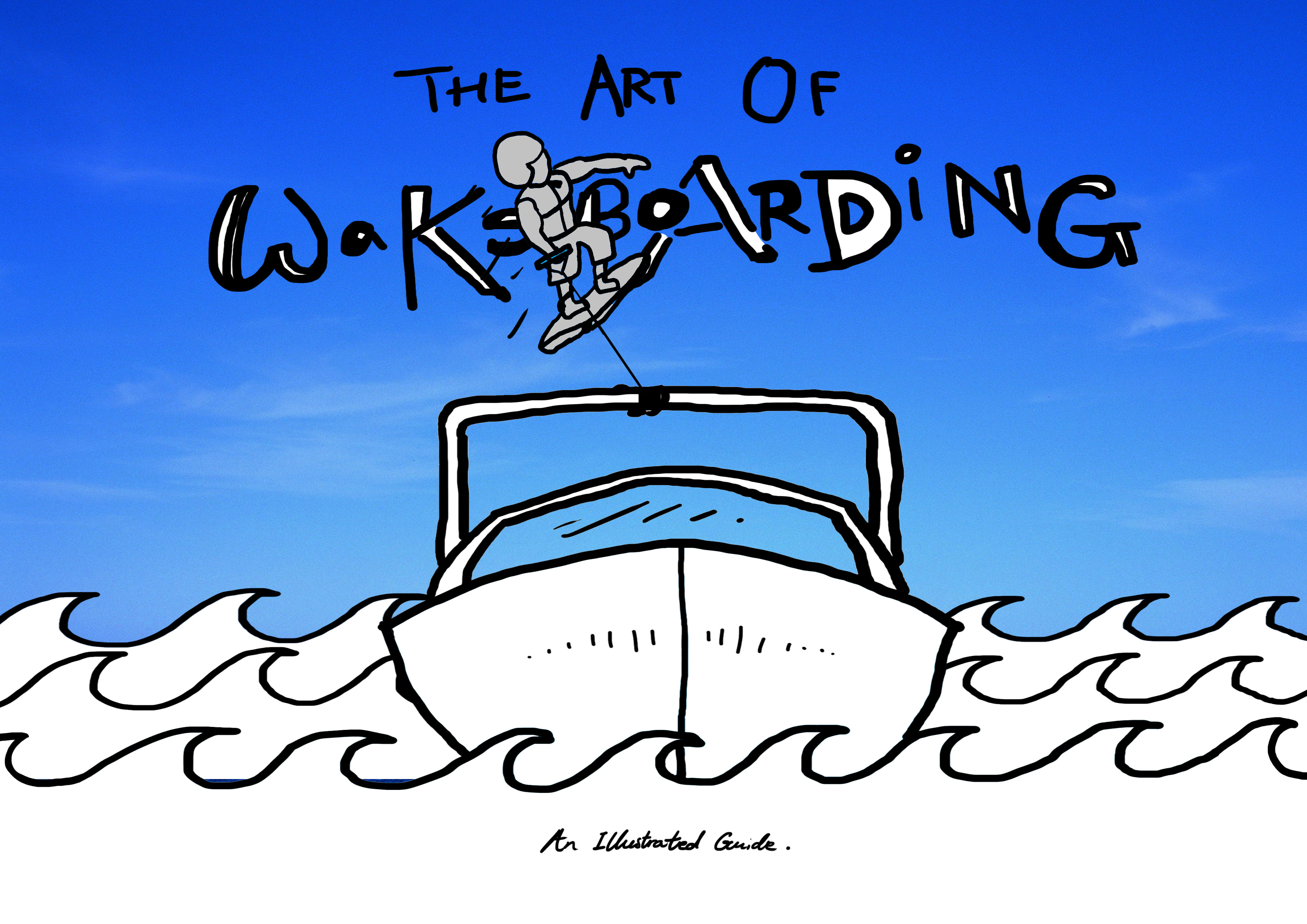
Back. Played with the concept of front and back (The back page shows the back of the cover picture.).
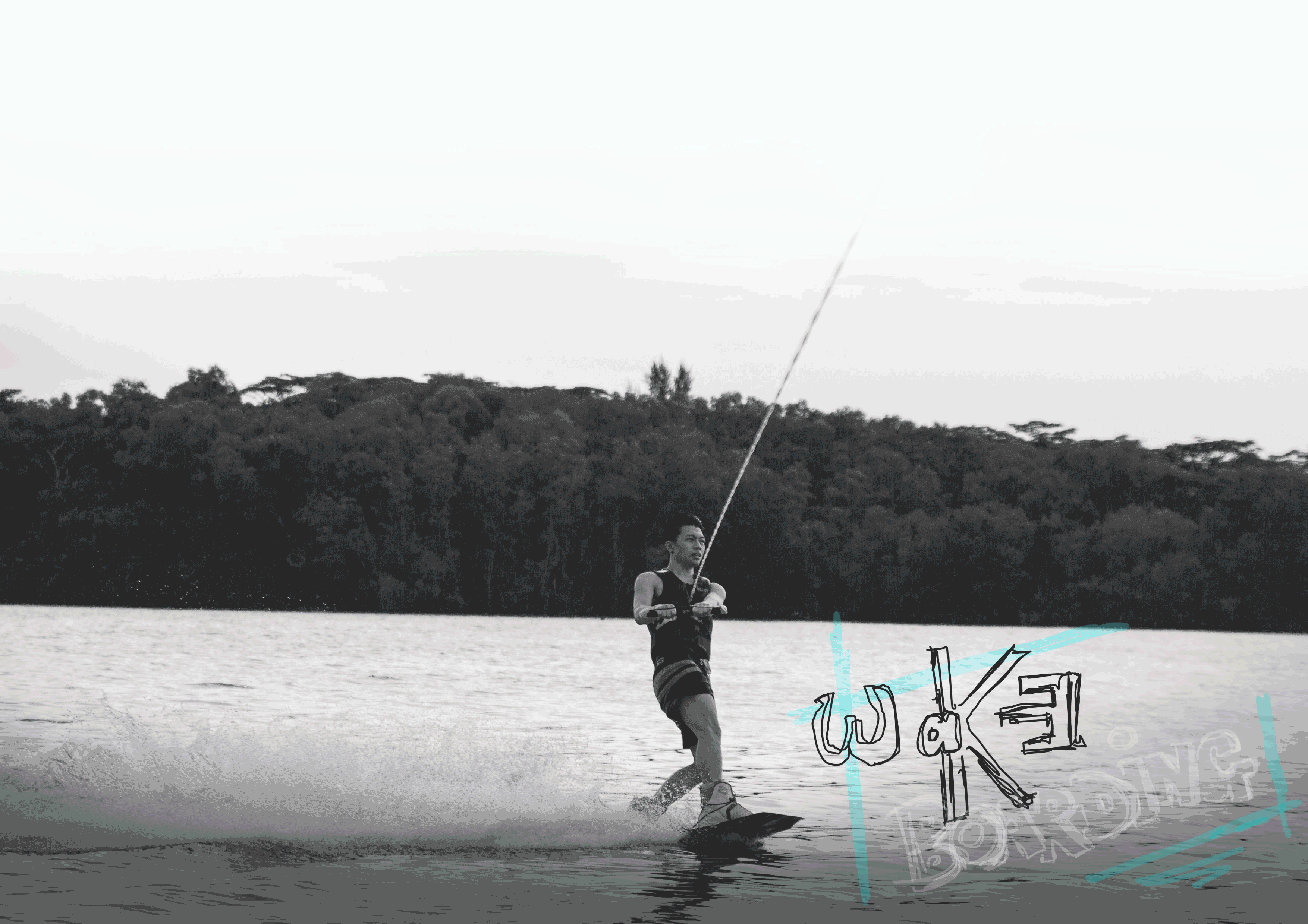
INTRODUCTION: WHAT IS WAKEBOARDING?
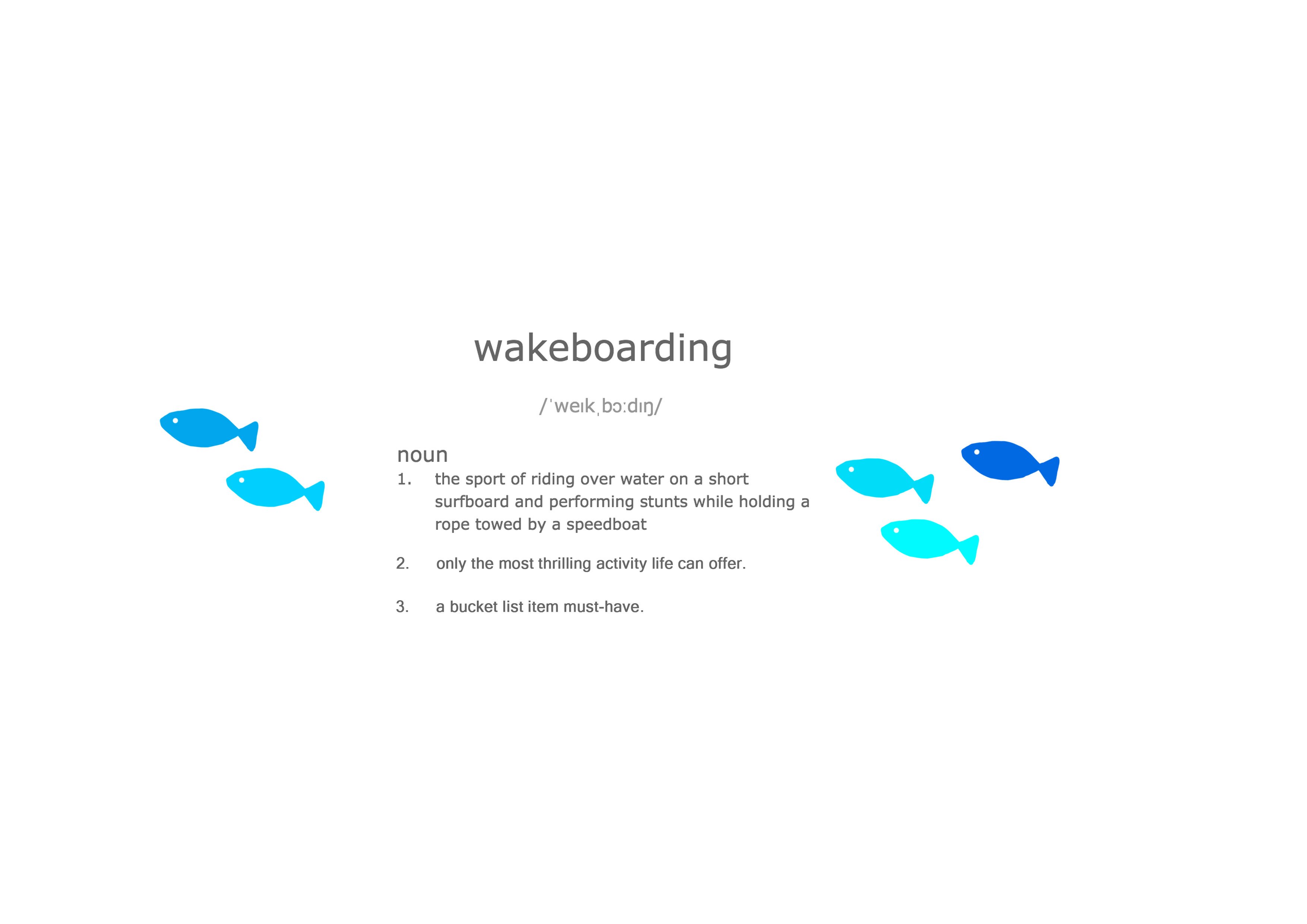
Starting off with a familiar sight: dictionary.com. This hopefully provides a fun familiarity to the reader. Note the added definitions 2 & 3.
The major colour theme of this project is blue, given the subject of the water sport. Created my own font here to keep up the fun, quirky mood of this zine. (Thank God I didn’t use Comic Sans)
TRANSPARENCIES
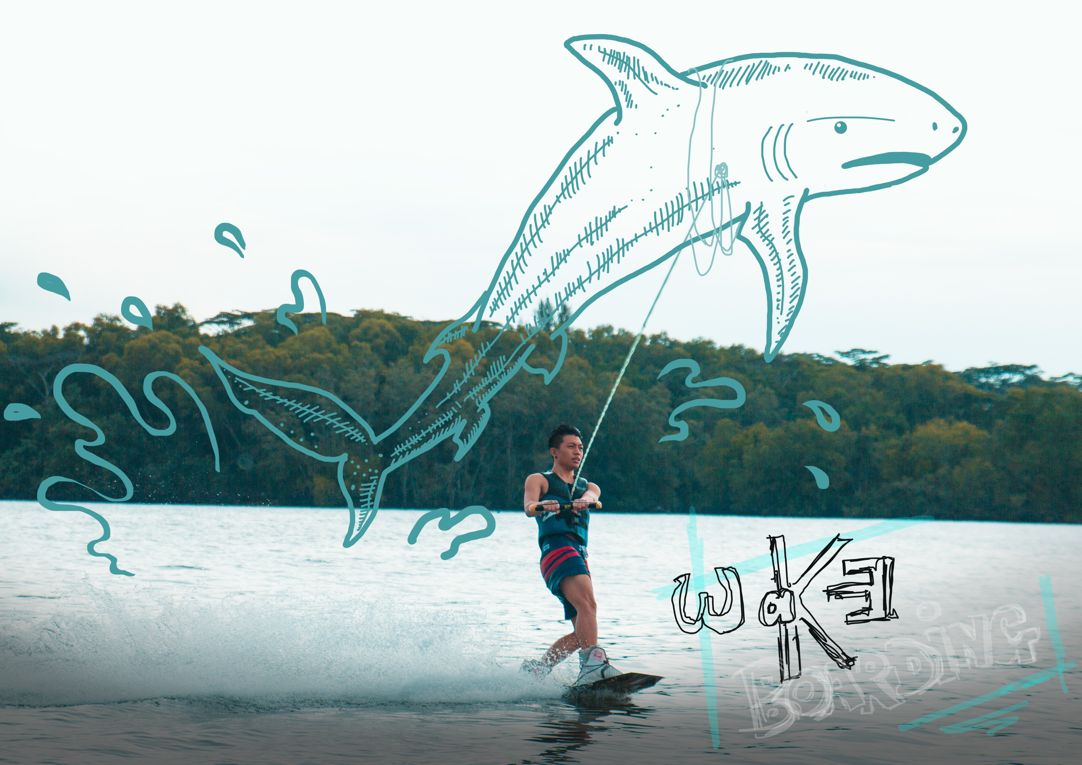
Using acetate paper brought me a lot of fun working on this zine. What I had in mind was drawing cartoons on the acetate, such that it could interact with a photograph when placed over it. I then had the idea of placing the transparent sheet between two different figures, so that there was a concept of duality where the acetate could interact with both the left and the right pages.
This idea was worked upon as I wanted something to capture the attention of the reader more, so that he or she would be entertained enough to read more, instead of losing interest in plain text halfway. The use of acetate this way was easy to play with and added to the fun element of the zine.
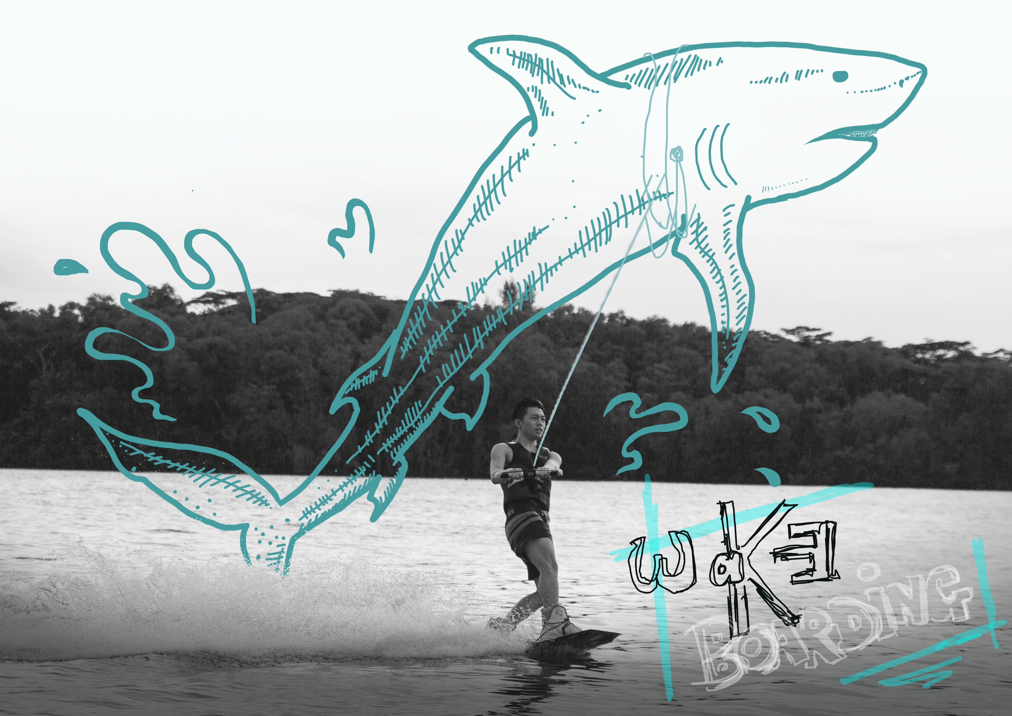
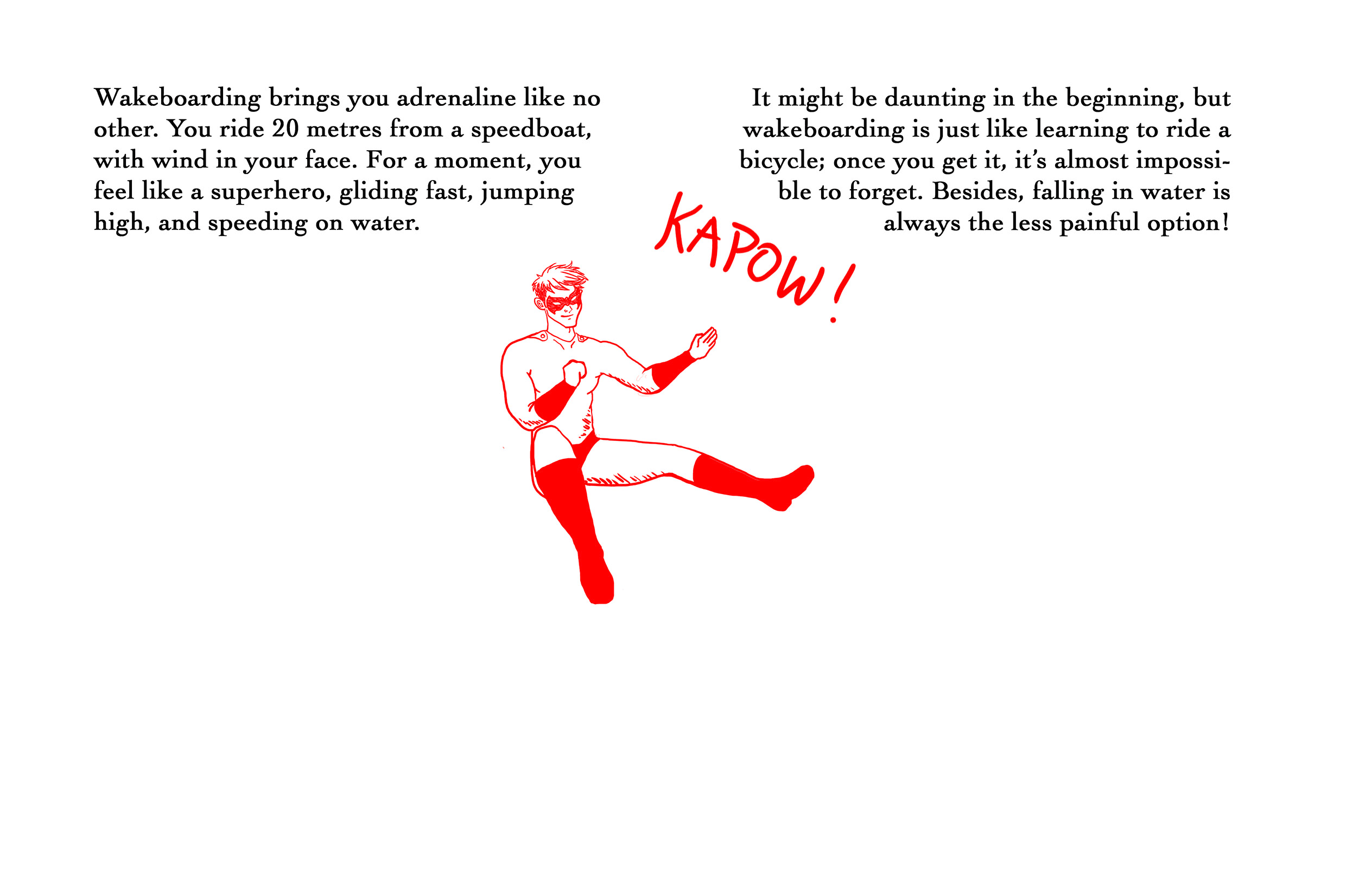
WHAT IS WAKEBOARDING LIKE?
Left Page.
Right page. Low quality photograph because OSS has a max file upload size-.-
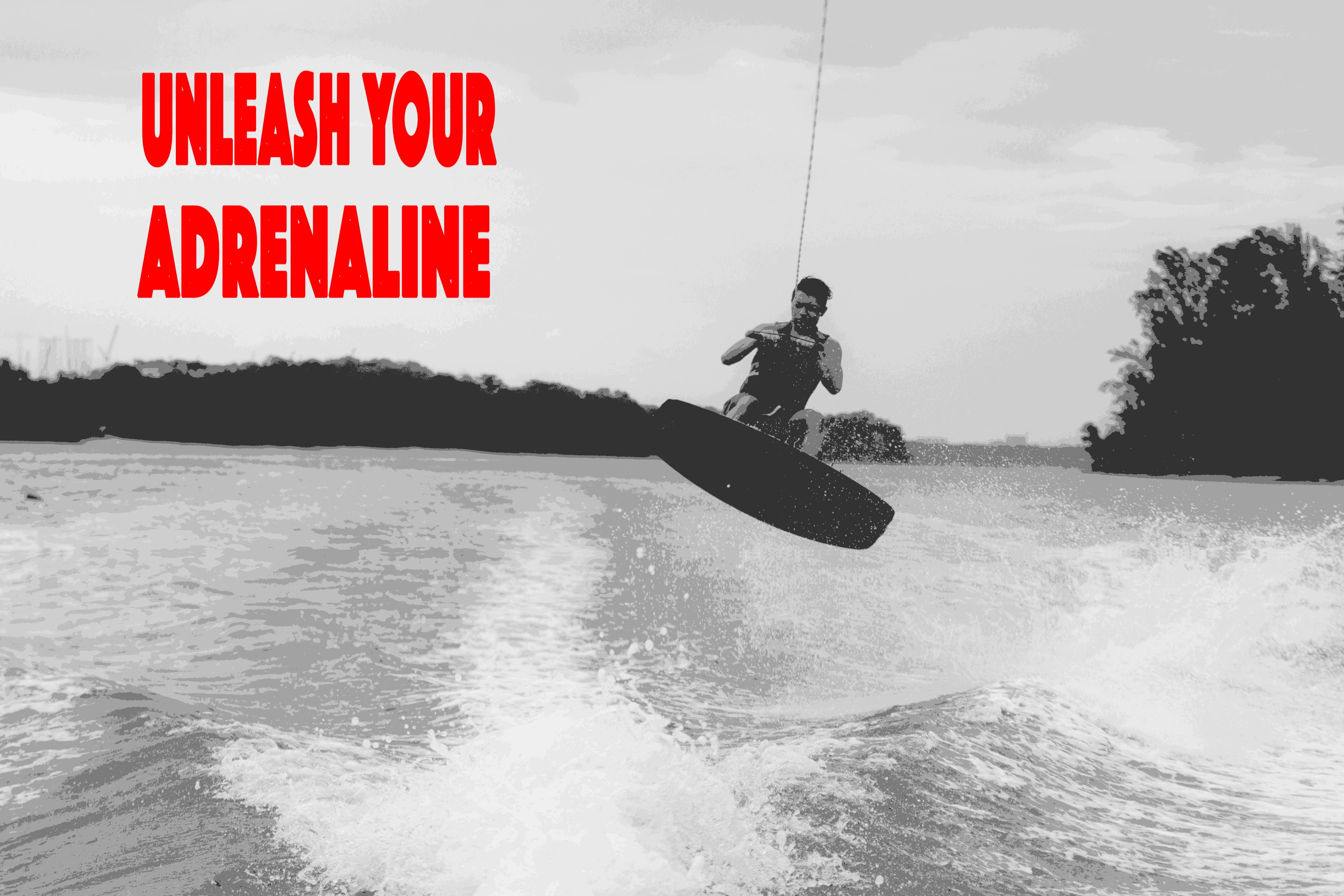
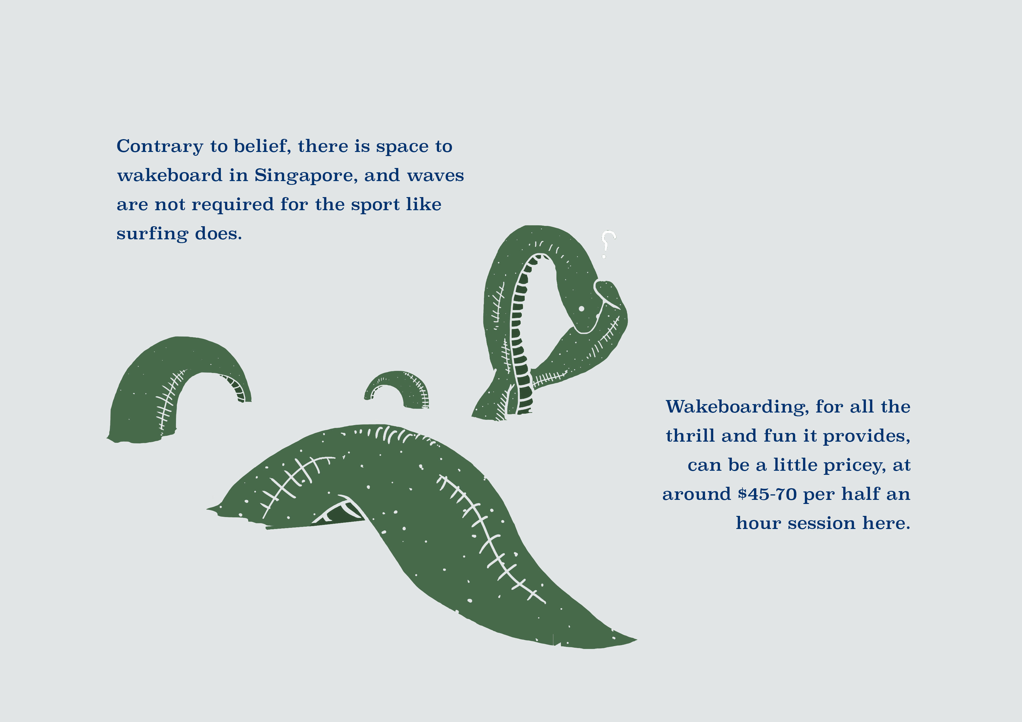
In these pages I chose to deviate from the blue colour theme as I wanted to evoke the mood of adrenaline, excitement and power. Besides, a stark colour change on a new page would add variation to the monotonous colours. In the context of the next page, I therefore chose green to be the main colour, so each section would come together to produce the RGB effect.
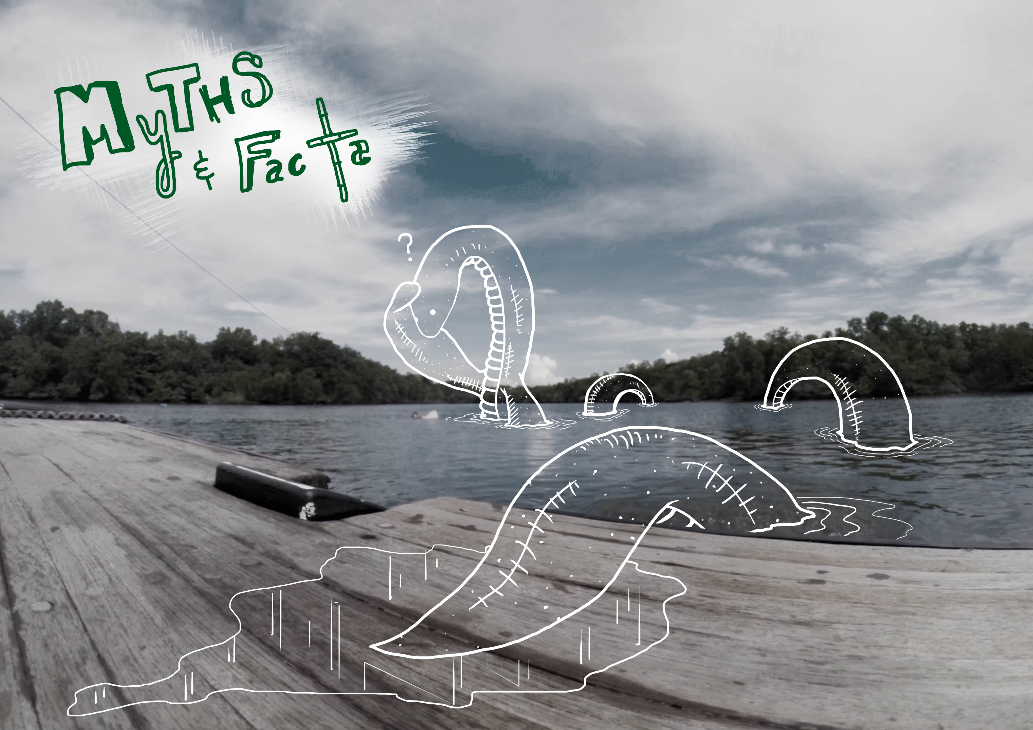
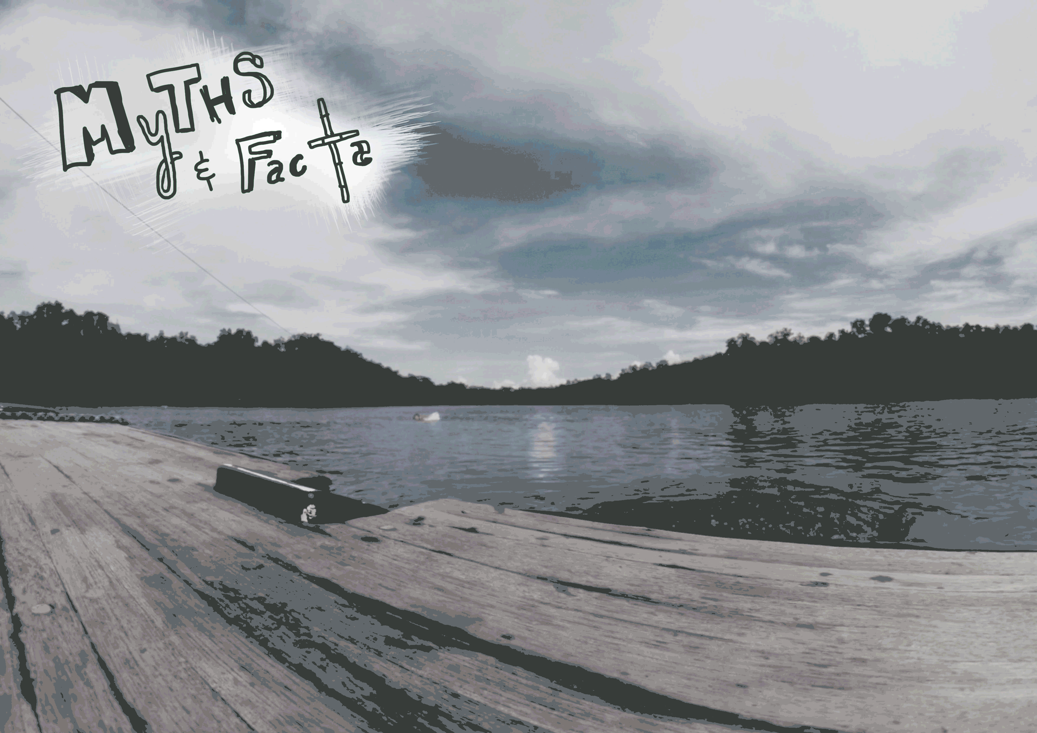
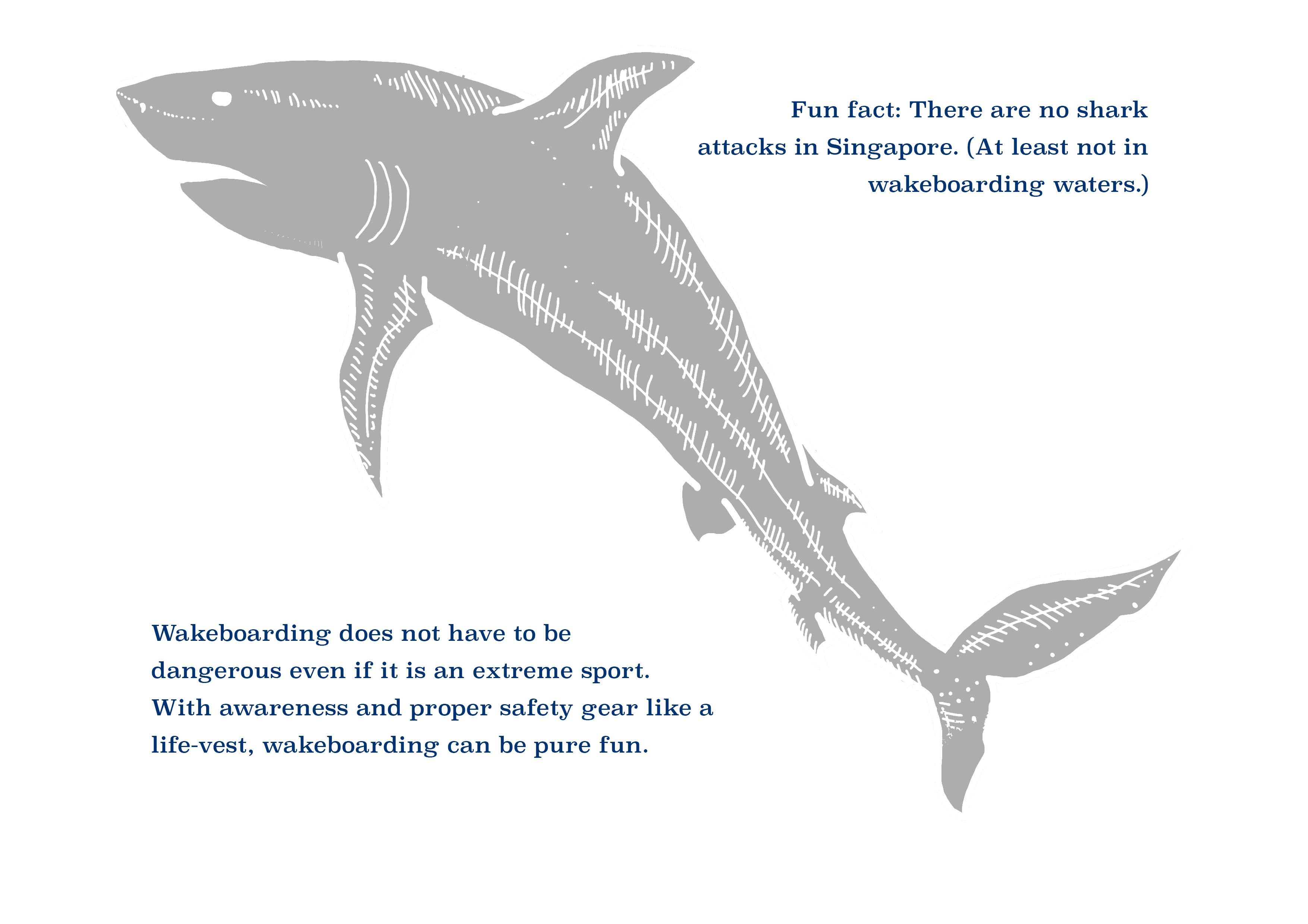
MYTHS AND FACTS
Used nessie to portray the idea of a myth.
(NOTE: In between the above and below pages is an additional transparency, where the sentence “Create your own scene here!” is written at a corner. While readers may not necessarily be inclined to do so, they are nonetheless prompted to get creative and be more observant of the scene that can be viewed when one is wakeboarding, to give a better idea of how wakeboarding feels like.)
Refer to bottom of post for better quality photographs.
ADDITIONAL INFORMATION
Back to a blue theme.
Refer to bottom of post for better quality pictures.
FINAL WORDS

Choice of paper:
Fabric paper for the covers provided a nice texture, and complimented the whole surf n’ sweat vibe. The rest (apart from the acetate) were printed on semi-gloss 190gsm paper (not too thick for the acetate alignment).
I had initially wanted to print the whole zine using the transparent acetate such that the zine is completely waterproof and I could present it in a clear rectangular container while tied to a string, just like a wakeboarder. However, the acetate pages would stick together when wet, and the zine would be very difficult to bind due to the resistivity of acetate.
Nonetheless, I am satisfied with the way my zine turned out:)