
For this project, we were tasked to create designs with our personal interpretations on Nursery Rhymes, namely: Hey Diddle Diddle, Humpty Dumpty & The Old Woman who lived in a Shoe. This project was introduced to us after we did our research on the Elements and Principles of Design to give us an opportunity to apply what we have learnt.
I chose to go with Hey Diddle Diddle, primarily because I was in a group tasked to create image compositions for Hey Diddle Diddle. While creating the compositions, I developed some ideas for the Rhyme and chose to go along with them. The rhyme goes as follows:
Hey Diddle Diddle
Hey diddle diddle,
The cat and the fiddle,
The cow jumped over the moon.
The little dog laughed to see such sport,
And the Dish ran away with the spoon.
Editing Stock Images
For the first part of our research, we were taught how to use Photoshop to edit stock images, firstly to convert them into halftone images, and then to recreate them to become more visually unique compositions. Here are some experimentations:


Playing around for compositional ideas
This is the part where it gets fun. Applying what I have understood on the Principles of Design, I began on creating a compositional image for each verse of “Hey Diddle Diddle”.
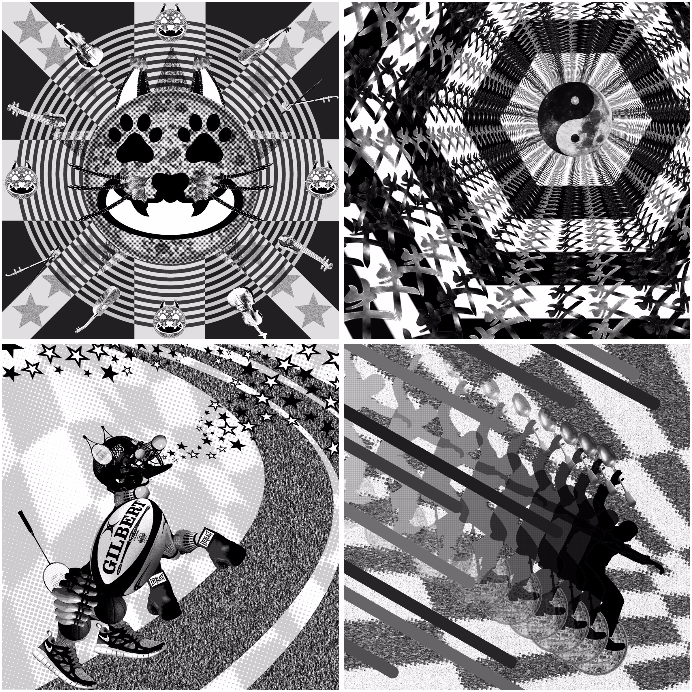
Hey Diddle Diddle, the Cat and the Fiddle
Referencing from a dictionary, the word ‘ Diddle’ can be a verb – to swindle or hoax. The mood of my composition is therefore interpreted as such; with themes of untrustworthiness and illusion.
This composition is a combination of various images related to the whole rhyme (eg; whiskers are cows’ skulls, the face of the cat is a dish, it’s mouth is a moon, and it’s eyes are dog paw prints.) It can be seen as the cat actually being tucked away within every part of the rhyme, just like any preying swindler would naturally be behind the scenes of his target/s.
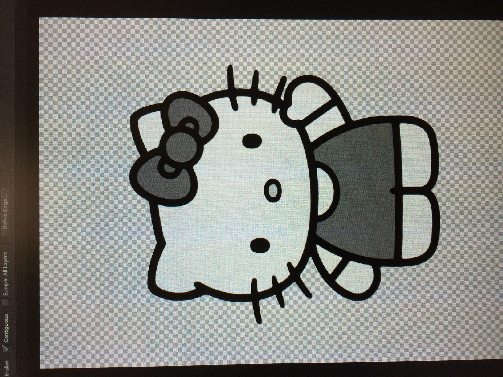
I tried to create a background themed to the stanza “the Cat and the Fiddle”, so I constructed a background wallpaper with negative hello kitty images and the Er Hu (a Chinese variant for a fiddle). However, the use of repetition did not work well for this composition, and the Hello Kitty images served little purpose except to distract the viewer from the main cat image. The only redeeming factor was the black ‘X’ that allows the eyes to be guided back to the main cat face.
The use of Hello Kitties is questionable.
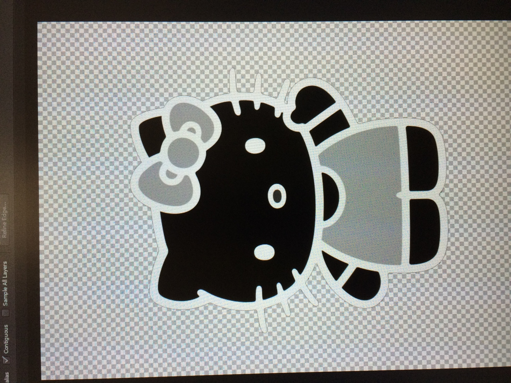
I therefore chose to keep the main cat face image as it carried the sinister feel that I intended, but scrapped the background. Multiple cat images are counteractive.
 Final Composition
- Avoid prolonged eye contact @.@
The above image is my final composition for the first stanza of the rhyme. This background, in my opinion, reflected my newly acquired knowledge of applying the Principles of Design much more than the previous version. By placing concentric circles centred on the cat face, as well as adding more straight negative lines merging towards the centre of the image, it becomes easier for a viewer to see the emphasis on the cat face. As an added bonus, there is a heavier sinister impact. The various types of fiddles are placed along the circumference of the concentric circles, very much like a clock. This is reminiscent of how hypnotists employ the use of watches to hypnotise their subjects.
This was a deliberate attempt to ignore the rule of thirds by placing the primary subject in the centre of the composition, to allow everything else to revolve around and be directed towards it.
The Cow Jumped Over the Moon
My first interpretation of this stanza was that of a literal translation. I tried to replicate the zodiac of Taurus, jumping through the night sky and out of the sky via the cow patches. While this was an interesting perspective, the composition seemed extremely detached, and didn’t flow well despite attempting to incorporate certain design principles (i.e; repetition, movement). The use of movement in the moons drew attention away from the cow, which already had some difficulty being the dominant image due to it’s camouflage with the cow patches background. There was also a lack of balance and unity. I decided to discard this piece altogether.
Unnecessary crescents streak across the sky.
My further research to create a new composition led me to themes of asian culture. The cow in this sense was conveyed with the Chinese character ‘niu’, which means cow in Mandarin. The yin yang symbol is also synonymous with the moon in some asian cultures. The use of repetition worked really well in this image. I attempted to make it seem like the characters were jumping out from behind the photoshopped ‘moon’ towards the viewer. The additional skewing of the characters gave the composition a greater depth and harmony as well. The Chinese characters were given a difference clouds effect to resonate with the fact that the moon is seen in the sky. However, it still seemed a bit plain.

Moon’s central placement seems boring
The final piece was then created by displacing the dominant object (the yin yang moon) from the centre and adding the concentric hexagons. The hexagons were inspired by oriental pagodas and as a result, the theme for this composition is clear and harmonious. It also becomes very easy on the eyes.
Final Composition Rule of Thirds: Much more visual appeal.
With only 3 types of images, the composition becomes far more sophisticated and that allowed me to appreciate the importance of the various principles of design. There is also an air of mysticism about this image that I like.
The Little Dog Laughed to see such Sport
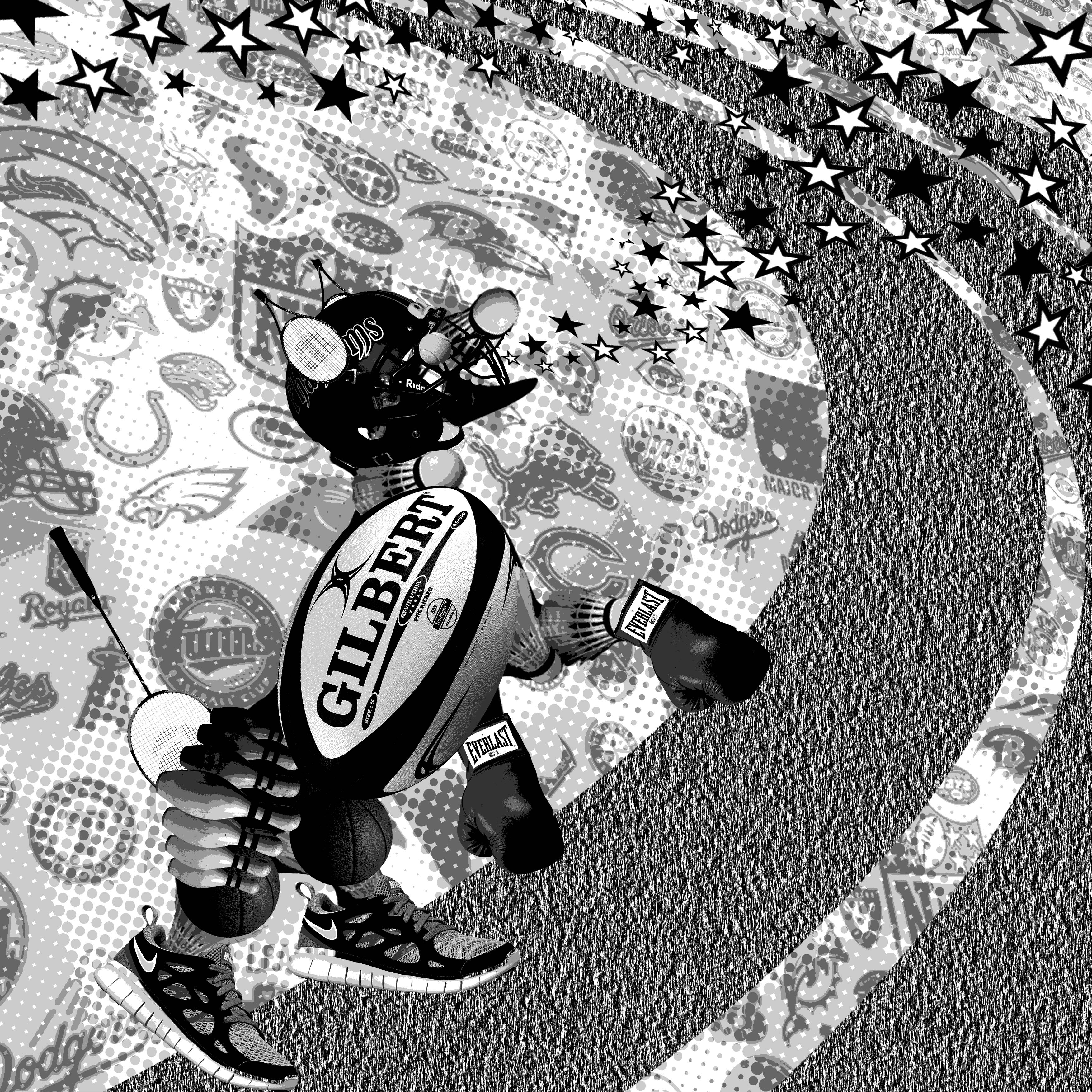
For this interpretation, I revolved my idea around the literal meaning of Sport. The dog in this image is a assembly of various types of sporting equipment (The ears are tennis rackets, the torso is a rugby ball, the head is a baseball helmet, and the eye is a tennis ball, just to name a few.) I then constructed a collage wallpaper from a multitude of sports-related logos before slightly skewing it to add depth and place as a background.
I found that there was a lack of movement (not that it was completely necessary) in this composition, so I added a curved track bearing semblance to a 400m olympic race track. The stars signified the dog’s laughter. This came about when my friend and I were amused with eating popping candy that crackled and popped upon contact with the tongue. Besides, the stars used in such a manner would hardly be associated with any negative emotions, so it was a safe bet to relate it to ‘Laughed’.
A rather messy composition.
This would have been my final composition if I didn’t have the niggling feeling that the high amount of detail in the sports logos background constantly drew some attention away from the primary subject (the dog). The whole frame seemed rather messy and a little difficult to follow. I therefore simplified the background.
Final Composition: Much cleaner.
The final composition has a faded raceflag as the background. It was much less convoluted as opposed to the previous composition. A raceflag also bears heavy connotations to sports, especially in F1 and Grand Prix events. In fact, it can almost be seen as a visual synonym of ‘racing’. Because it is much more visually subtle as well, attention is not driven (pun unintended) away from the intended dominant dog construction. The dog and track are kept in the foreground easily also because dark objects appear to have more weight when placed with lighter images. The race track is kept because it adds movement to the composition.
And the Dish ran away with the Spoon.
A common visualisation would be to display a personification of both dish and spoon running off together. I therefore decided to keep the dish and spoon simply as what they are: a dish and a spoon. However, I depicted the dish being used as a wheel for a unicycle. I thought it was an interesting composition on its own. I really loved the sophistication of this image in all its simplicity. However, it did not address the stanza of having the dish RUN off with the spoon. It merely resembled a balancing act.
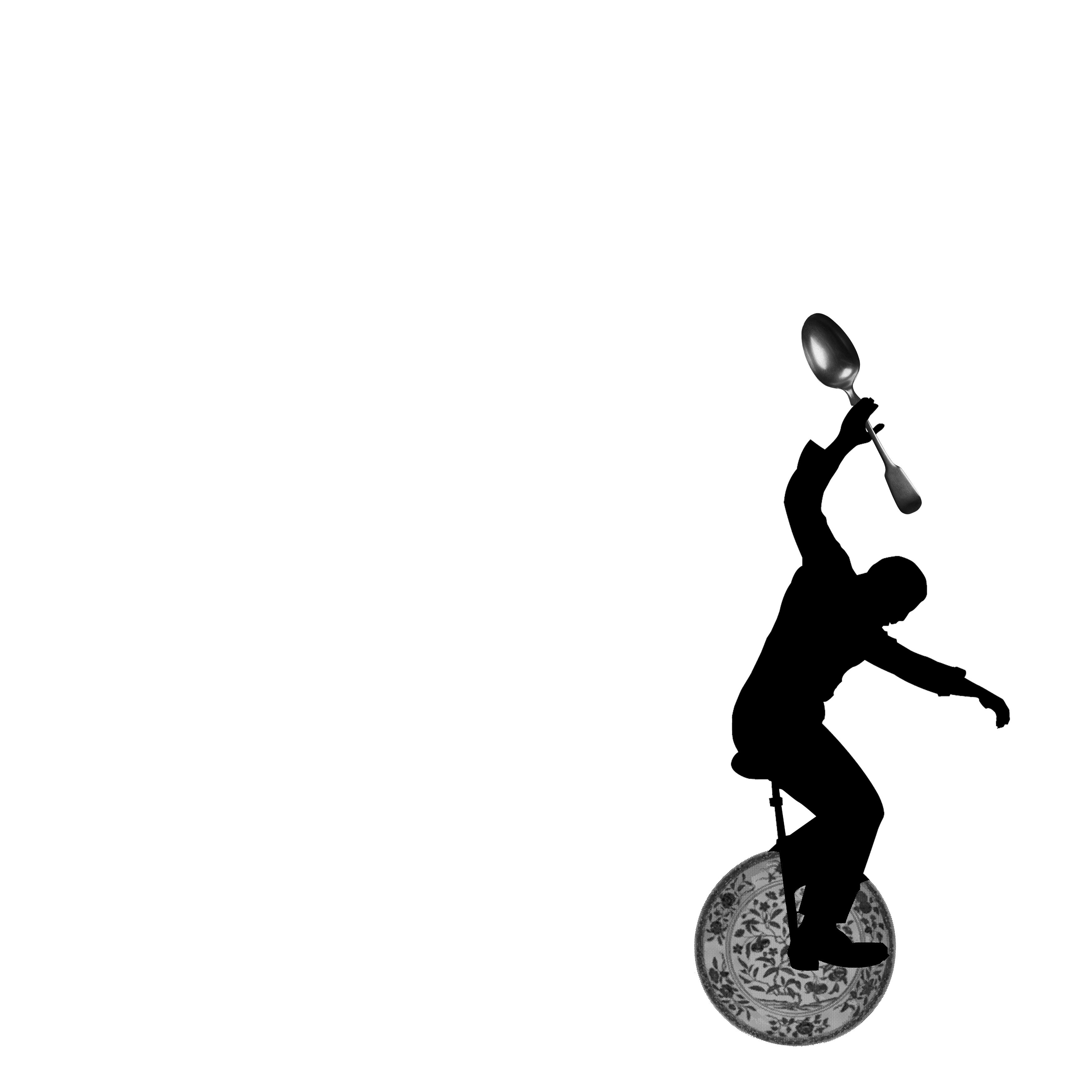
Plus it looked like a minimal effort kind of work.
Adding diagonal movement lines of varying tonal value gave a better visual effect of hurrying off quickly.
Now it looks like they are indeed speeding off .
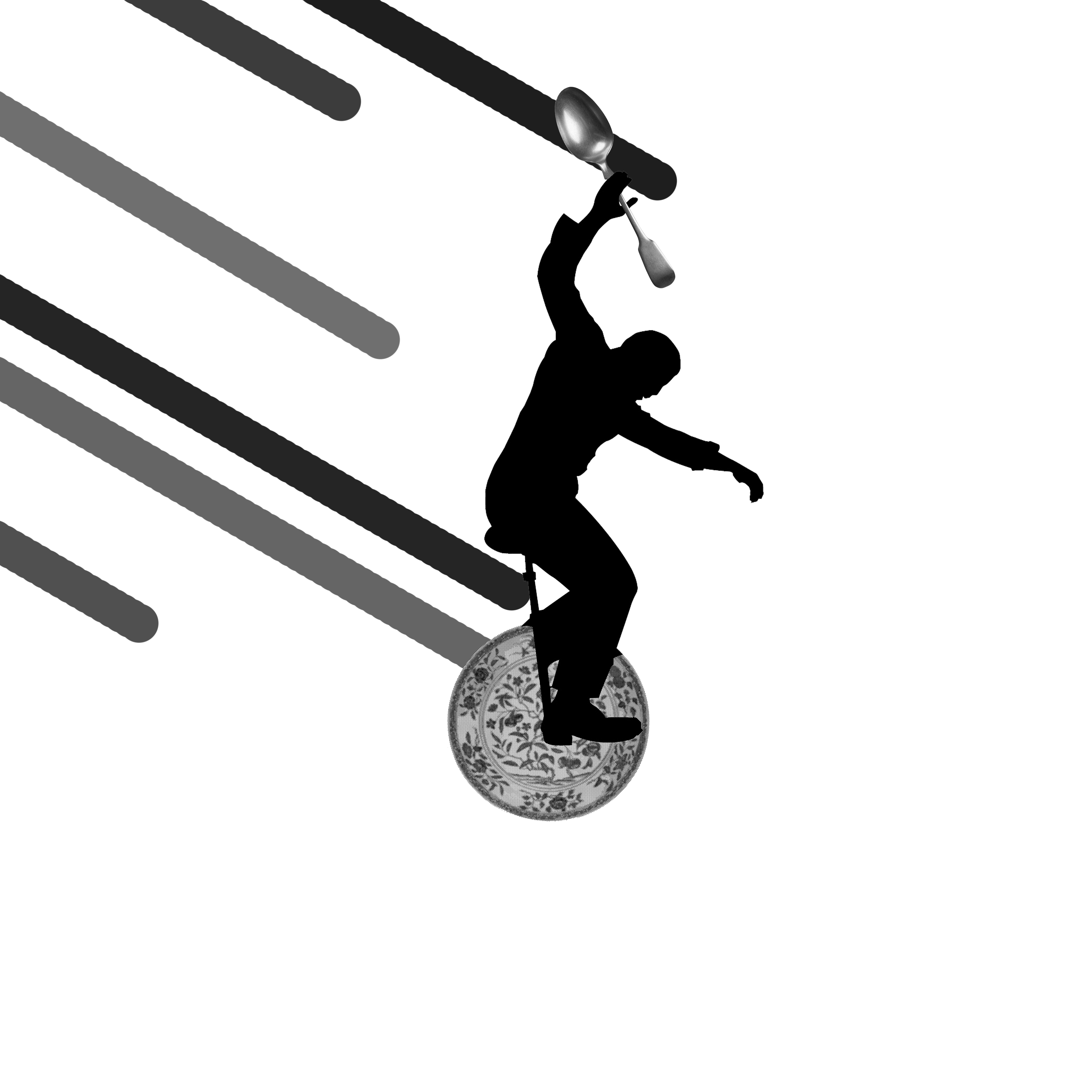
I felt that it wasn’t enough still. I tried to displace it from the centre again and added more movement lines.

Decentralised unicyclist is more visually comfortable.
However, I still wanted to give it a much greater sense of movement to really capture the idea of the word ‘run’.
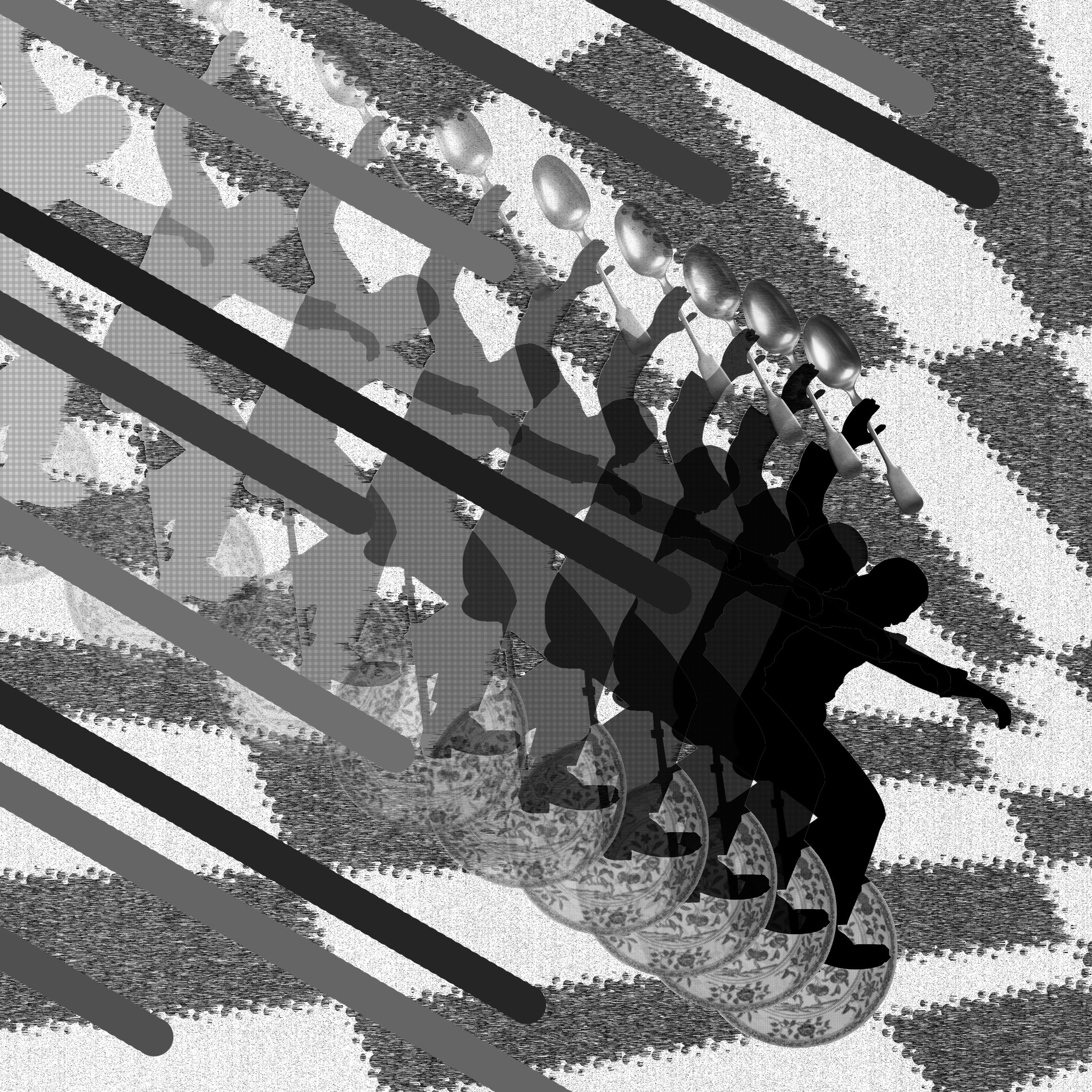
Final Composition: The Flash on a unicycle
Adding the alternating wedges as a background gave the varied tonal lines a more pronounced 3 dimensional effect. The residual apparitions of the unicyclist also added emphasis on the speed of the unicyclist. Playing around with this composition really value-added my experience of working with compositing images for design.
Balance, unity, scale, dominance, movement, repetition and contrast. These methods in a designer’s arsenal can make or break a composition. When used correctly, the collective use of these methods can give an image far more visual depth and interest.