To be honest, this project started out as almost ridiculous to me. “Hello, my name is blah and I am blah.” I was cynical about this kindergartener’s art homework. I guess this is why I still am in school, because boy, did I have much to learn.
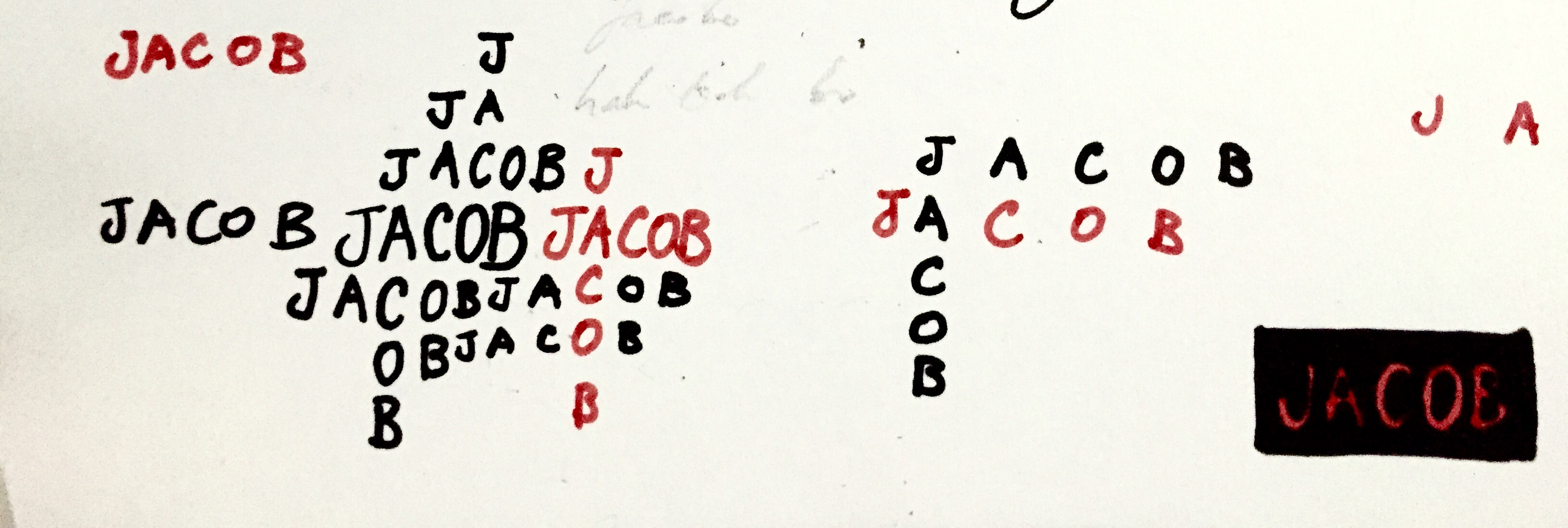
Sure, even a 4 year old could do this project, but as I researched on various typefaces and fonts, I realised how much sophistication and depth this project called for. By working on this project, I learned to really appreciate the art of typography and all the meaning and connotations it can carry, simply through different representations of words.
I decided to present these 5 compositions as they represent things that affect me very considerably, or have made a lasting impact.
Please click the link here to view all the final images (not in order for some reason) in higher resolution:
-Hello I am project 1.compressed

Front cover: featuring my signature and all the supportive feedback I received via post-its:)
In the presentation, I chose to display my works in a flip-book format. This was simply to allow each work to stand on its own, as they are meant to be viewed individually and I wouldn’t want them to have to fight for attention. It becomes more crucial given the fact that each piece was intentionally made simple; viewing them individually would then become more visually powerful. There is also the added bonus of it being able to stand like a desk calendar, which was a nice aesthetic.
 This was the first piece I decided to present. Personally, I liked this one the most as I found it to be simple and clean, yet evoking a strong message. I hope I would be able to improve in such works in the future.
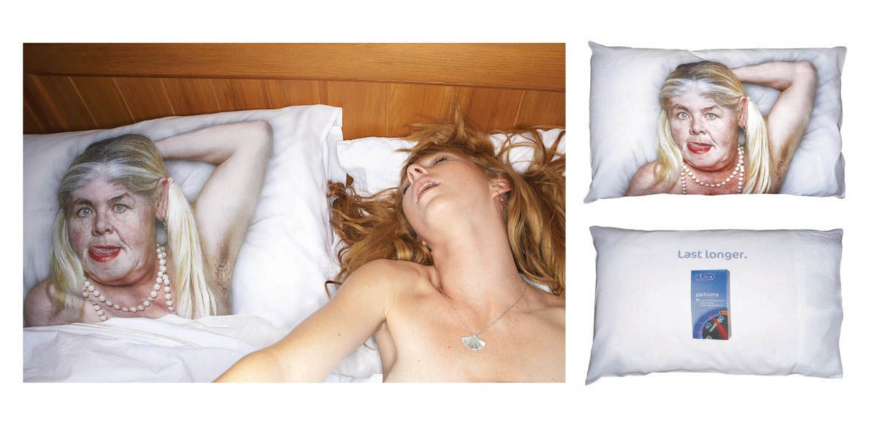
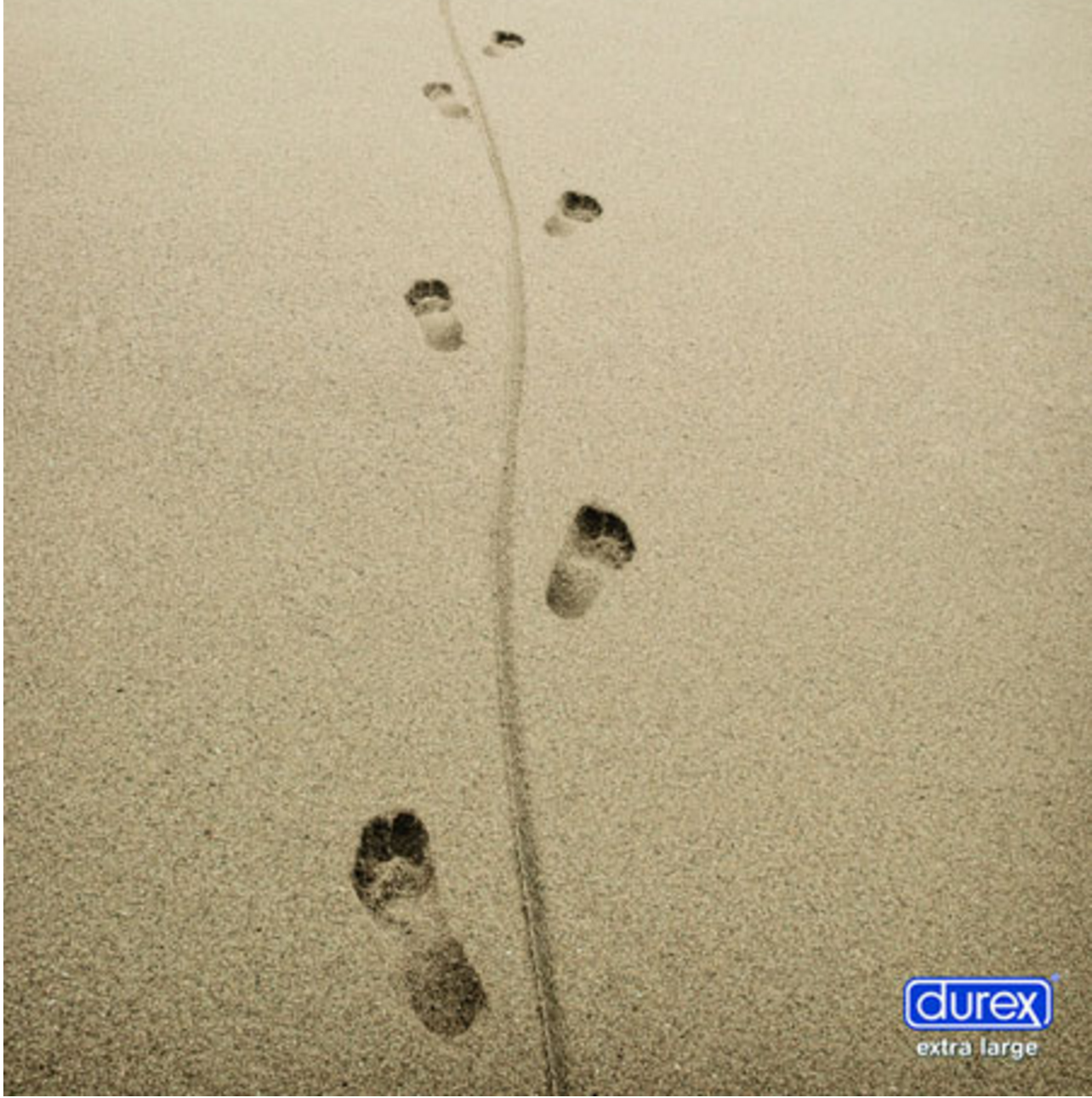
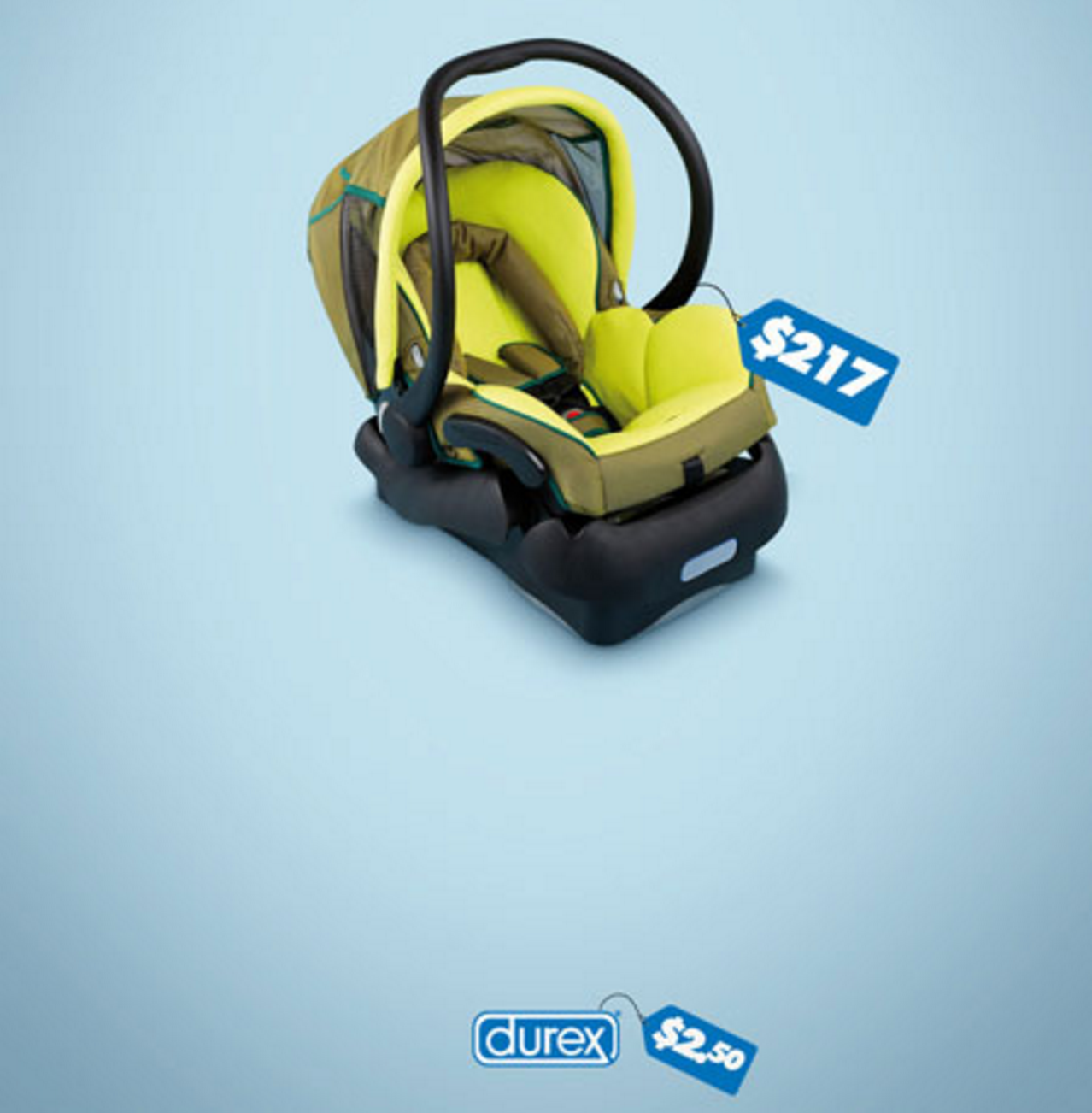
I would say that I used the idea of appropriation to create this piece. The design of my name here is a take on the very common household brand, Durex. Initially I wanted to make it more similar by creating the letter ‘b’ in my name to look like how durex portrayed their letter x, which extended to the border. However, after several attempts, I figured that it looked better the way it was, and that the whole durex thing going on was already similar enough for people to get it.
Just in case it wasn’t clear enough, I decided to replace the letter ‘o’ to an actual condom. I then gave the inner part of the condom a tinge of blue in Photoshop to make it seem realistically translucent in front of the blue background.
Initially, this piece did not include the crayon drawing of a suffocated boy. I thought that the idea of a condom was evident enough to give the message that I did not like kids, or wanted one now for that matter. Obviously I thought wrong, as many individuals claimed that I was trying to portray something provocative and nothing else. I’m glad consultations went the way it did, as I received a great deal of constructive feedback from my peers (thanks guys) and my prof (thanks Joy) to give my audience a stronger direction towards my intended message.
I chose orange to depict the crayon kid as firstly, it was a good contrast to the blue branding, and secondly, it was a friendlier colour as opposed to red, which was important when trying to depict something that related more to a child.
The encircled ‘R’ was a clear but subtle hint to show that this was taken after a brand (another reason highlighting the importance of consultations).
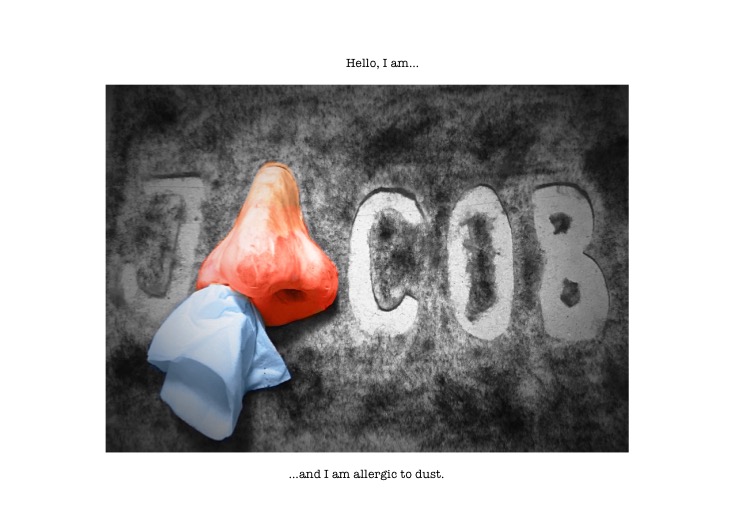
This piece is sort of a cry of misery. Being allergic to dust, in my opinion, is one of the worst things you can wish on anyone. On average, I sneeze off about 2 days in a week, because of my very sensitive nose. My eyes water, I get headaches, and I’m always stuck in the moment just before a sneeze. You can imagine how that can greatly affect productivity. If the room is dusty, I would wake up several times to sneeze and have to (attempt to) clear my nose. Tissue papers would be my best friend, and my enemy when it comes to the point where the skin around my nose gets really dry and red after all that wiping. You can see how I would be very vocal about this affliction to choose it as one of my works.
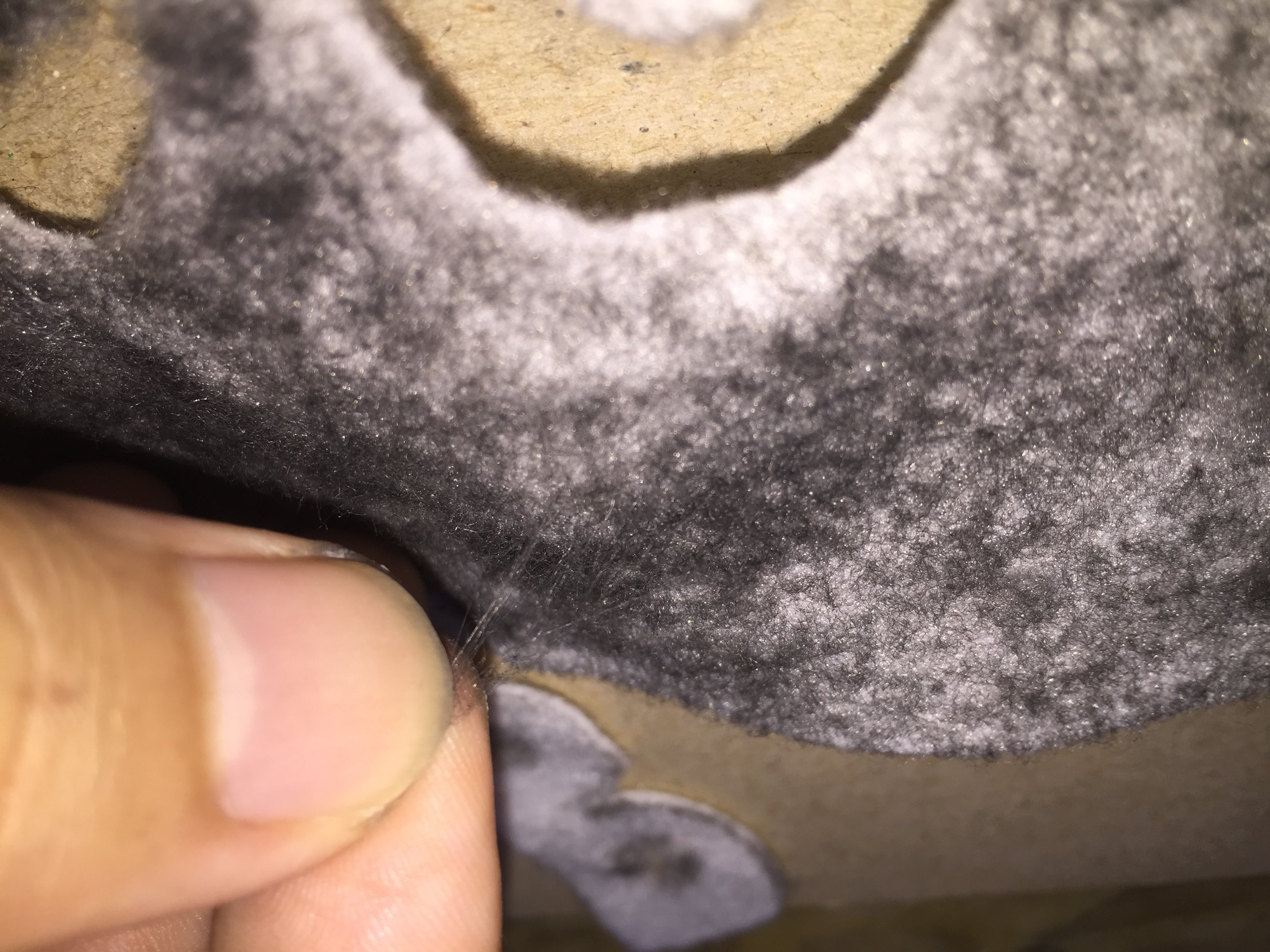
Anyway, enough of garnering pity points. I decided to create artificial dust using felt, with graphite grazed all over it to simulate the colour of dust, and then pulling at the felt to give the texture of dust bunnies. I then cut my name out from the felt (note to self: felt is pretty resistant to pen-knives), modelled a nose from plasticine and stuck a wad of tissue in a nostril.
pulling at the felt to give it the dust bunny texture
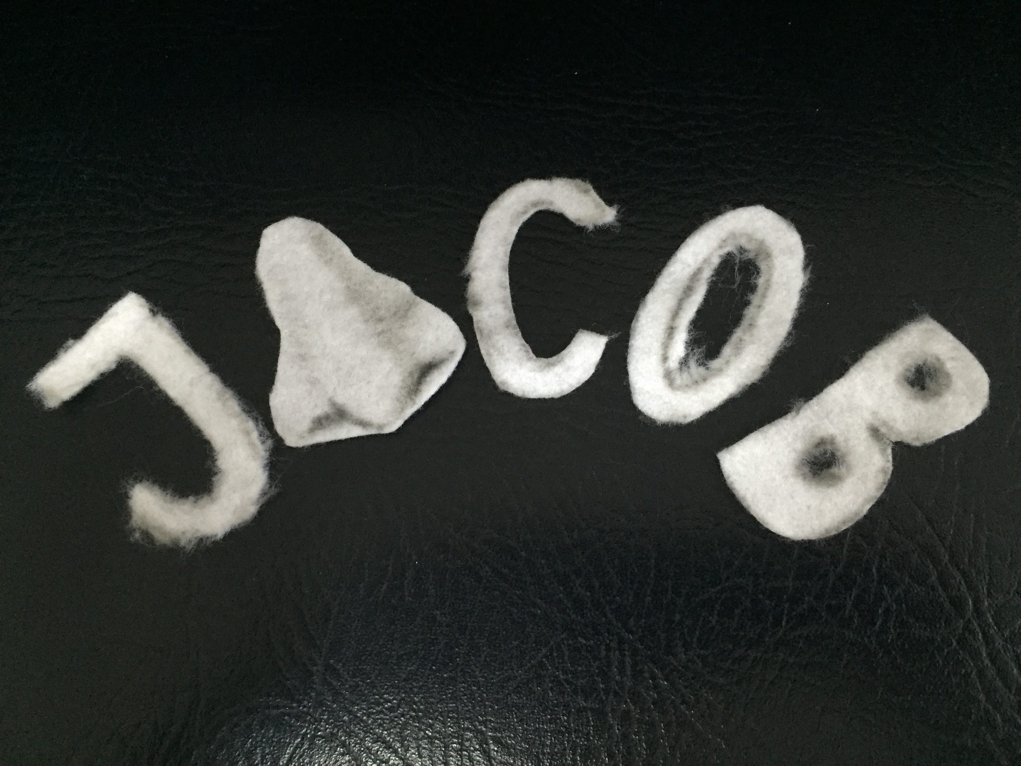
the cut out letters (and nose)
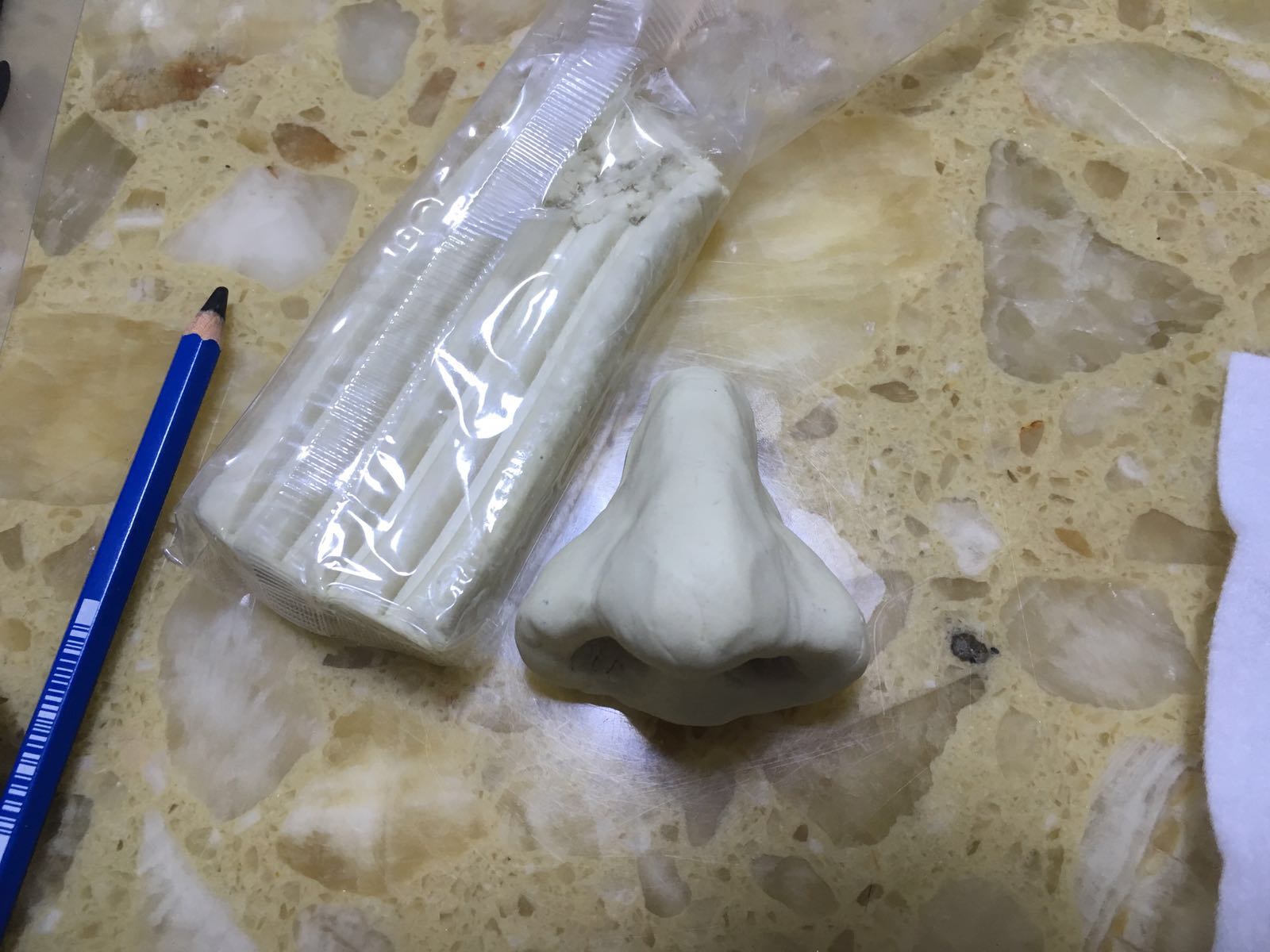
using a toothpick to dig out nostrils for the nose was a rather awkward experience.
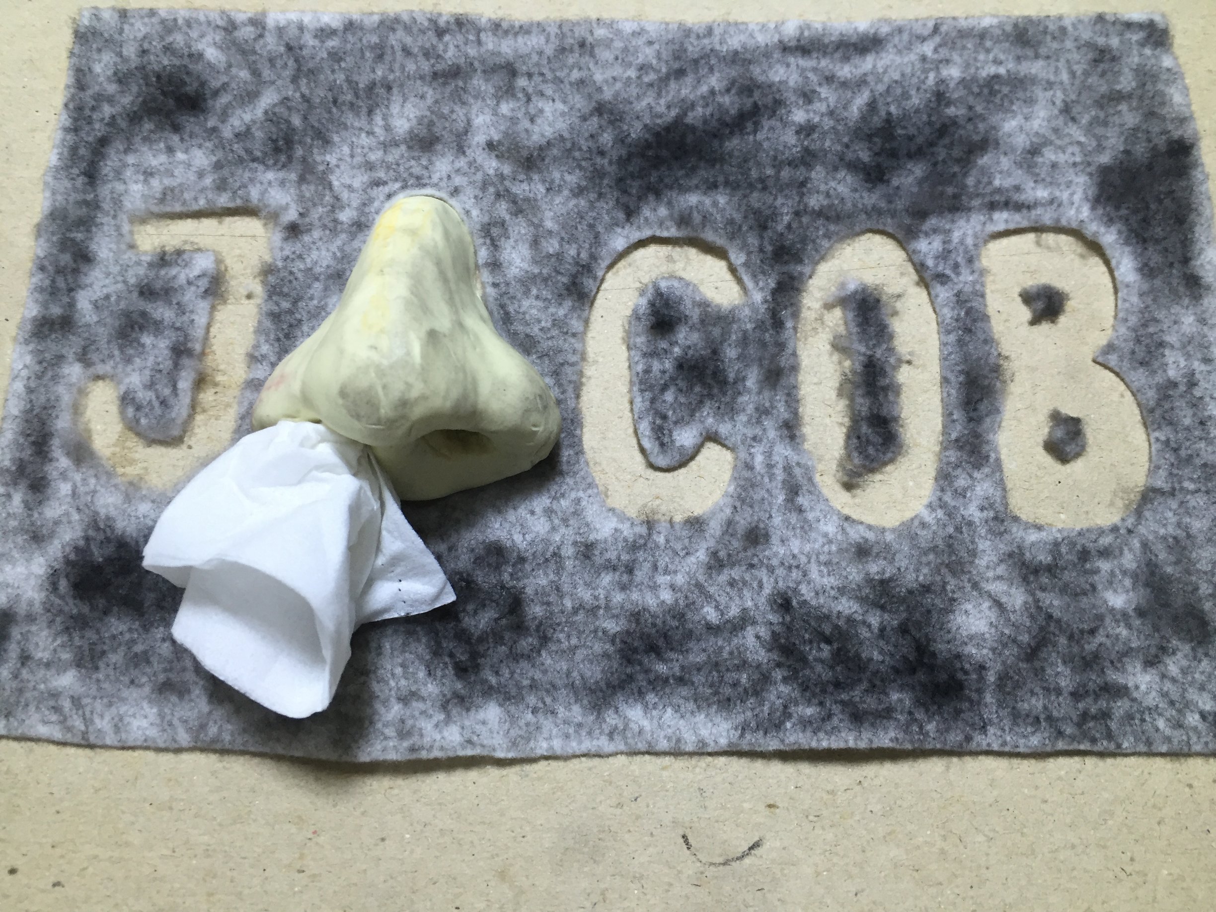
Putting it all together and stuffing a wad of tissue in, before digital editing.
While I felt (haha) that this composition would fare better as a 3d piece because of the dusty texture and the tissue dangling from the nose, I decided to keep it 2D in order to fit it into my method of presentation. The advantage of keeping it 2D was that I could paint the nose digitally, and increase the highlights and contrasts of the dusty background so that the letters would appear more clearly and the higher contrasts would make everything more visually appealing. I also gave the tissue a slightly blue colour to have it stand out from the black and white background.

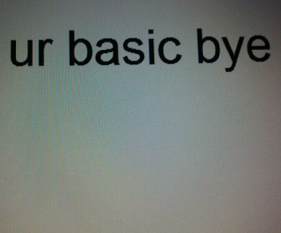
This next piece is like a visual ode to the now outdated Microsoft word on windows 95-98. I’m sure many of us in this era would be very familiar to this font: Times New Roman. I enjoyed using this font. It made me feel like I was a newspaper editor back when I was in Primary school. Whether anyone shares this sentiment with me or not, I believe that everyone who used Microsoft word then would recognize this soon-to-be forgotten font, the Calibri (Body) of the 90s.
I first screenshot my name typed out on Microsoft word, making sure the timing was right to capture the blinking | (< no idea what it’s called) as well. It was important to create the effect of what one would see when he or she was typing away on Microsoft word. I then photoshopped in the cursor one would see on Microsoft word. Funny thing about this. On a MacBook when you do a screen capture, the cursor disappears entirely, hence the need to photoshop it in. Small issue, but I like to think how only last year, before I learned how to use Photoshop, this would have posed a real problem to me!
As a nice touch, I then added in Mr. Clippy, the unhelpful paperclip. Good to see he got phased out, but still an icon of nostalgia nonetheless. Finally, as a finishing touch, I added a ‘screen’ to overlay the whole image. This screen was not easy to make, and luckily I found a tutorial online which showed exactly how to do it. The screen serves to be reminiscent of the old convex screens that those blocky computers had in the past.
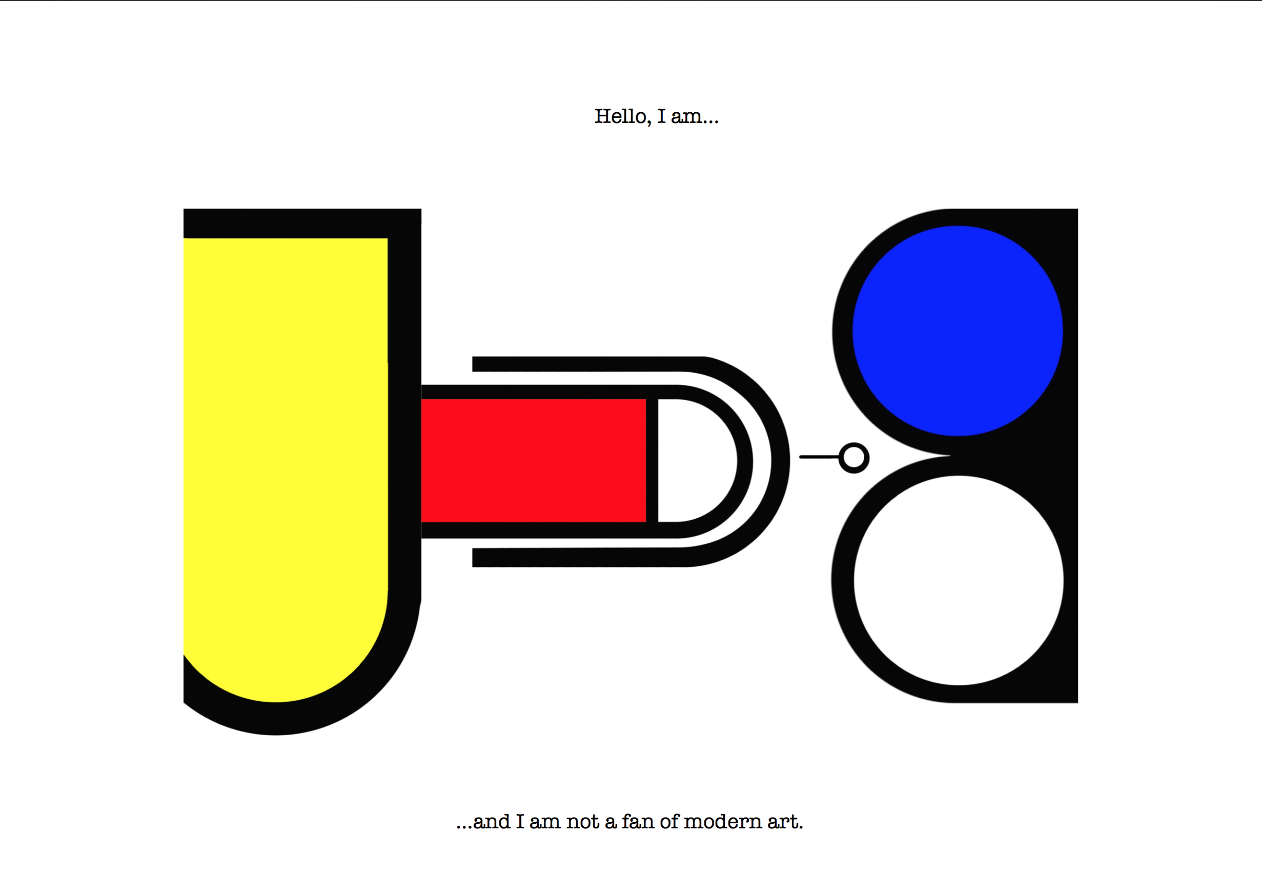
This composition is a little bold, even for my standards. I initally wanted to caption this as “…and I am unnecessarily childish.”. Perhaps it wouldn’t have been entirely inaccurate to label it as such. However, it was how I strongly felt about modern art these days. Don’t get me wrong, I don’t hate all modern artworks, just those that I find not deserving of the credit they receive. Maybe I’m just jealous, and I probably am, but I simply cannot fathom how a friggin red square painted on a huge canvas can be worth almost $2 million. I mean, whatever happened to the likes of Raphael and Da Vinci?
I prepared a little game where I asked my audience which work of art was worth millions of dollars, and which one took me just 3 minutes to photoshop in the morning without any thought.
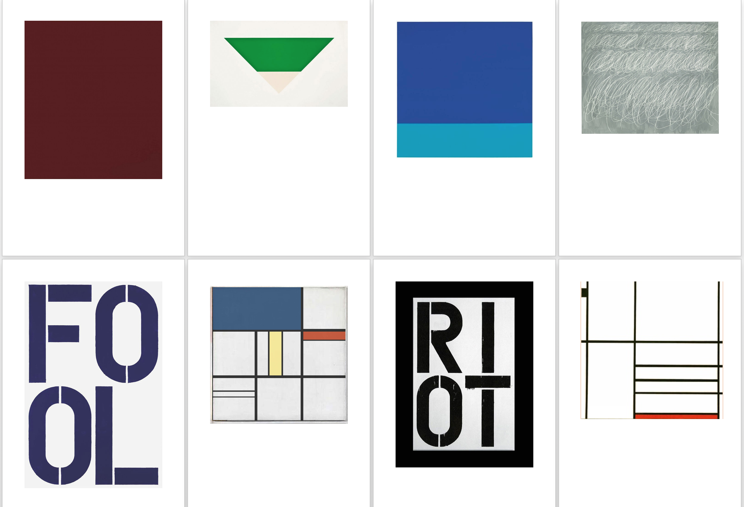
Every piece is worth millions of dollars save one.
This small exercise was not to belittle my peers, who most, if not all of them are far more intelligent and creative than I am. I simply wanted to prove my point that these works of modern art are simply not worth their priced value, at least in my opinion. Sure, they may carry some deep meaning, but so do many other art works that look like they have some skill or effort included in it as well.
As a result, I decided to make a parody of Piet Mondrian’s work, not because I particularly dislike him, but because he was one of the more notable modern artists that I have come across time and again. I do not have anything against the artists themselves, though I definitely do not share their sentiments in artistic perspective. The final outcome serves as a message for the direction that modern art is heading towards.
Maybe in time, I will come to learn and understand the rich meaning of such works of abstract art, but until then, I won’t be in the least bit inclined to pay and see them in museums.
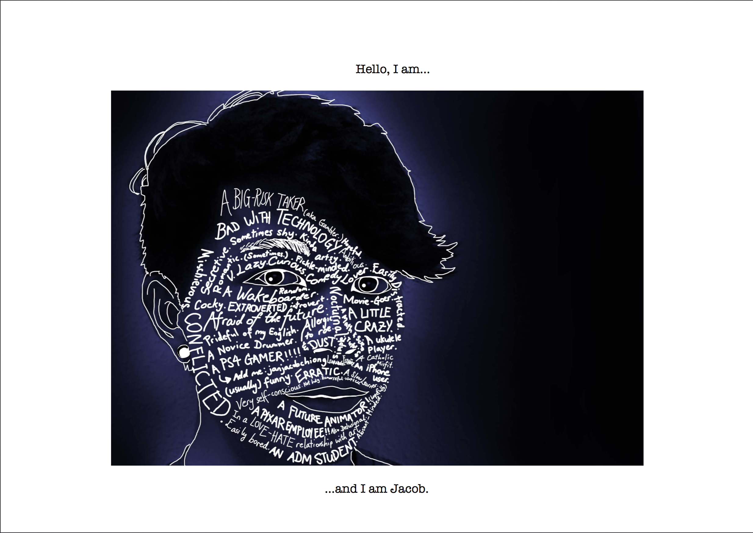
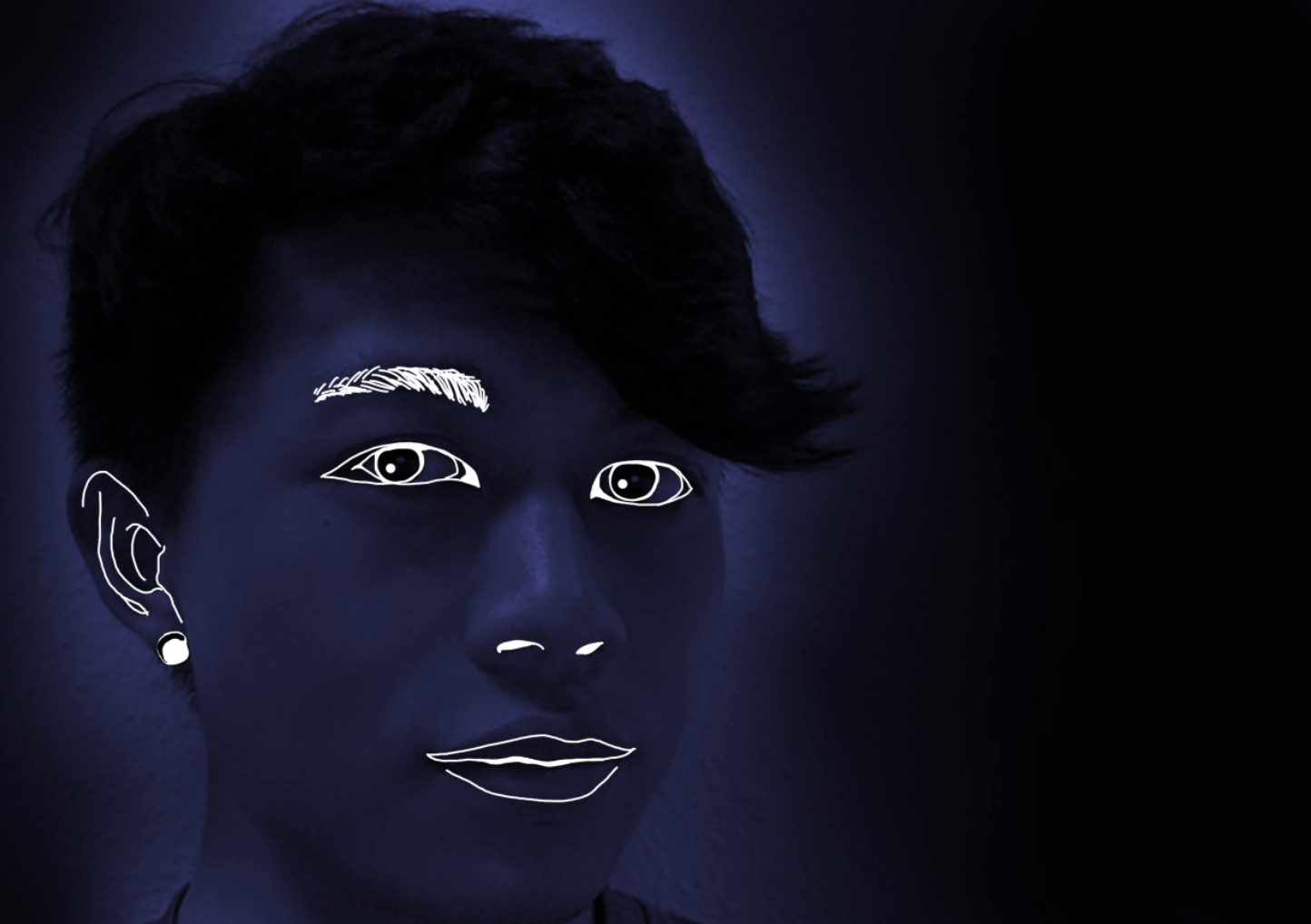
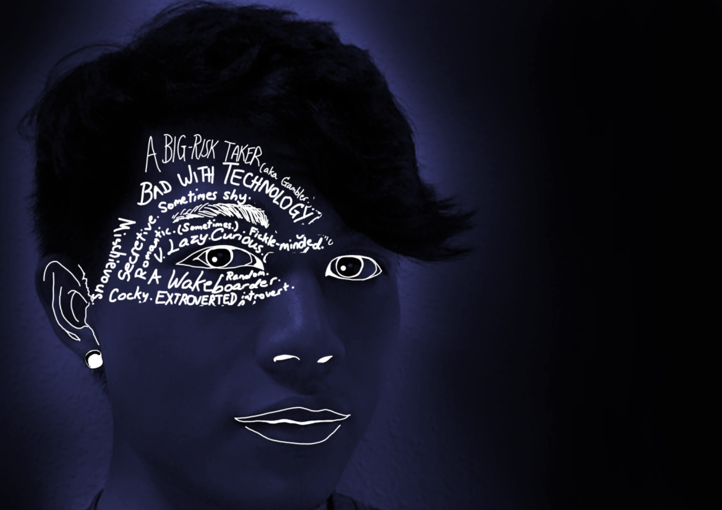
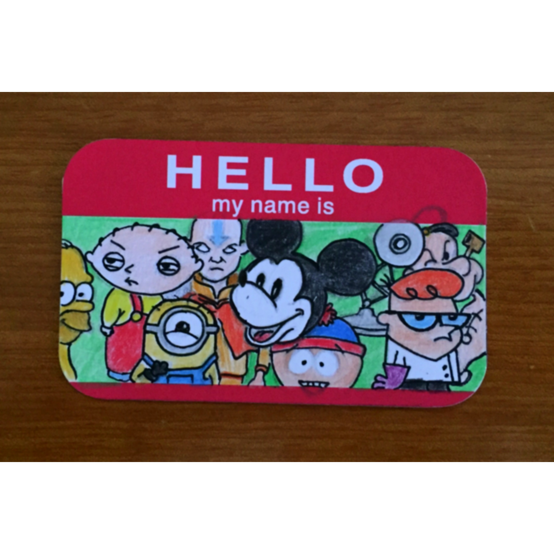
While this piece was initially one of the final 4 compositions, it became a bonus piece as I realised that I might be straying from the objective of converting one’s name to a typographic art work. This piece is a wordy collage of various descriptions that make me, such that when compiled together they create a typographic self portrait. I decided to add this as a bonus piece anyway because I felt it was a nice summary to my presentation where I end with “…and I am Jacob.” It just felt like an appropriate ‘closure’.
Rejected works:
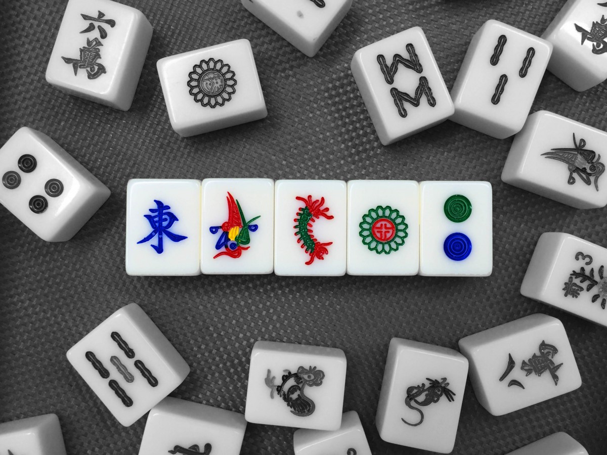
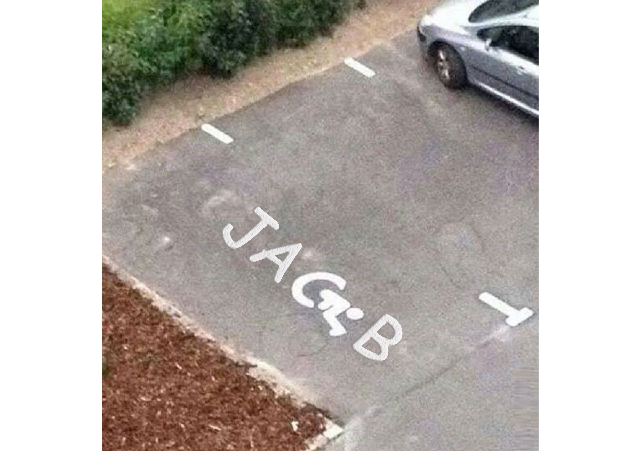
“…and I am a mahjong addict.” Tried to force my name out of the tiles that make up the “Thirteen Wonders”. You can see here that I failed very miserably indeed.

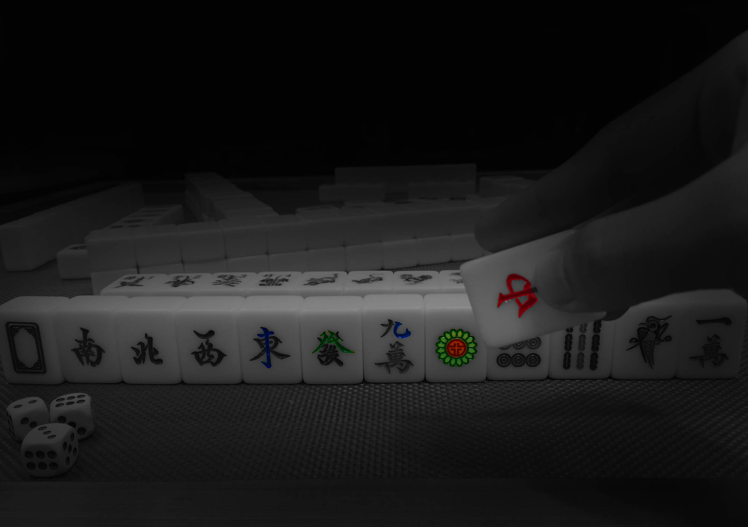
“…and I am a mahjong addict.” once again. This was a more successful attempt, and I really like it (you can tell I do because I made it the featured image for this post haha), but many of my friends couldn’t tell that it was an attempt to spell my name. I also didn’t want to digitally manipulate the tiles because I felt that it wouldn’t be a creative enough method to carry out this project.
“…and I screwed up.”. This piece just felt like it needed more. That, and the caption doesn’t give off a very strong message.
Hindsight:
I found that those works that I have chosen to include more sensitive imagery caught the attention of many during the presentation, to the extent that it dulled out other pieces of my work.
All that being said, I feel that using things that are more ‘taboo’ in nature in art, such as expletives or sexually related objects seem to attract more attention, but at the same time it should not be used solely for that purpose in my opinion, but serve to enforce the intended message of the artist. I hope I have utilized my works in this manner and did not stray too far in simply using them for cheap shock value.


