A colour scheme is the choice of colours used in design for a range of media, and these choices tend to work well in various kinds of colour harmony. Monochrome colours can also be used.

Monochromatic colours are all the colours (tints, tones, and shades) of a single hue. Monochromatic color schemes are derived from a single base hue, and extended using its shades, tones and tints (that is, a hue modified by the addition of black, gray (black + white) and white. As a result, the energy is more subtle and peaceful due to a lack of contrast of hue.
Colour Harmony
Definition:
There are 5 types of colour harmony:
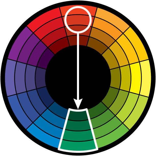
1) Direct Harmony: This is the most basic harmony. It is a point opposite to the key colour on the wheel. This “opposite” colour is referred to as the complementary colour and thus the direct harmony can also be called the complementary harmony. Virtually all colour harmonies (except Analogous) are a variation of the direct harmony.
The high contrast of complementary colours creates a vibrant look especially when used at full saturation but can be jarring if not managed properly. This is the most common colour scheme and is easy to find in all sorts of designs.
Complementary colour schemes are tricky to use in large doses, but work well when you want something to stand out. Complementary colours are really bad for text as both colors have a similar “strength” and will fight for attention.
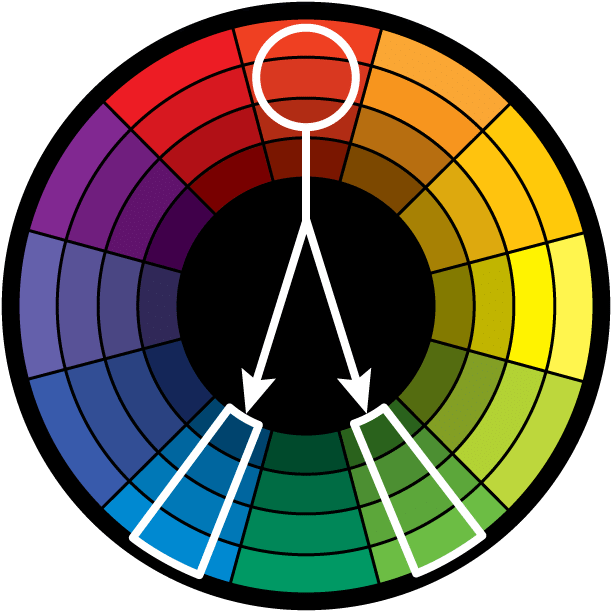
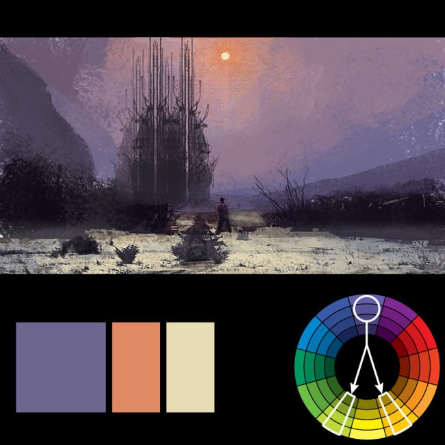
2) Split Complementary: Rather than the point opposite the key colour on the wheel, the split complementary takes the two colours directly on either side of the complementary colour. This allows for a nicer range of colours while still not deviating from the basic harmony between the key colour and the complementary colour.
This colour scheme has the same strong visual contrast as the complementary colour scheme, but has less tension. The split complimentary colour scheme is a safe choice for virtually any design as it is near impossible to mess up and always looks good.
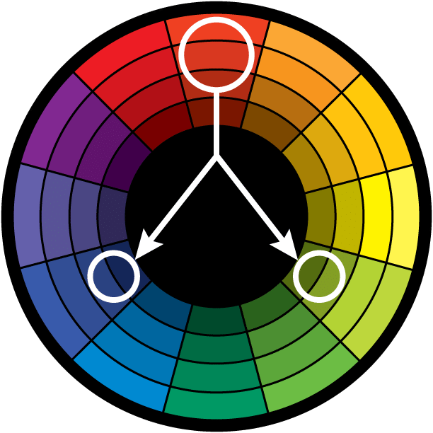
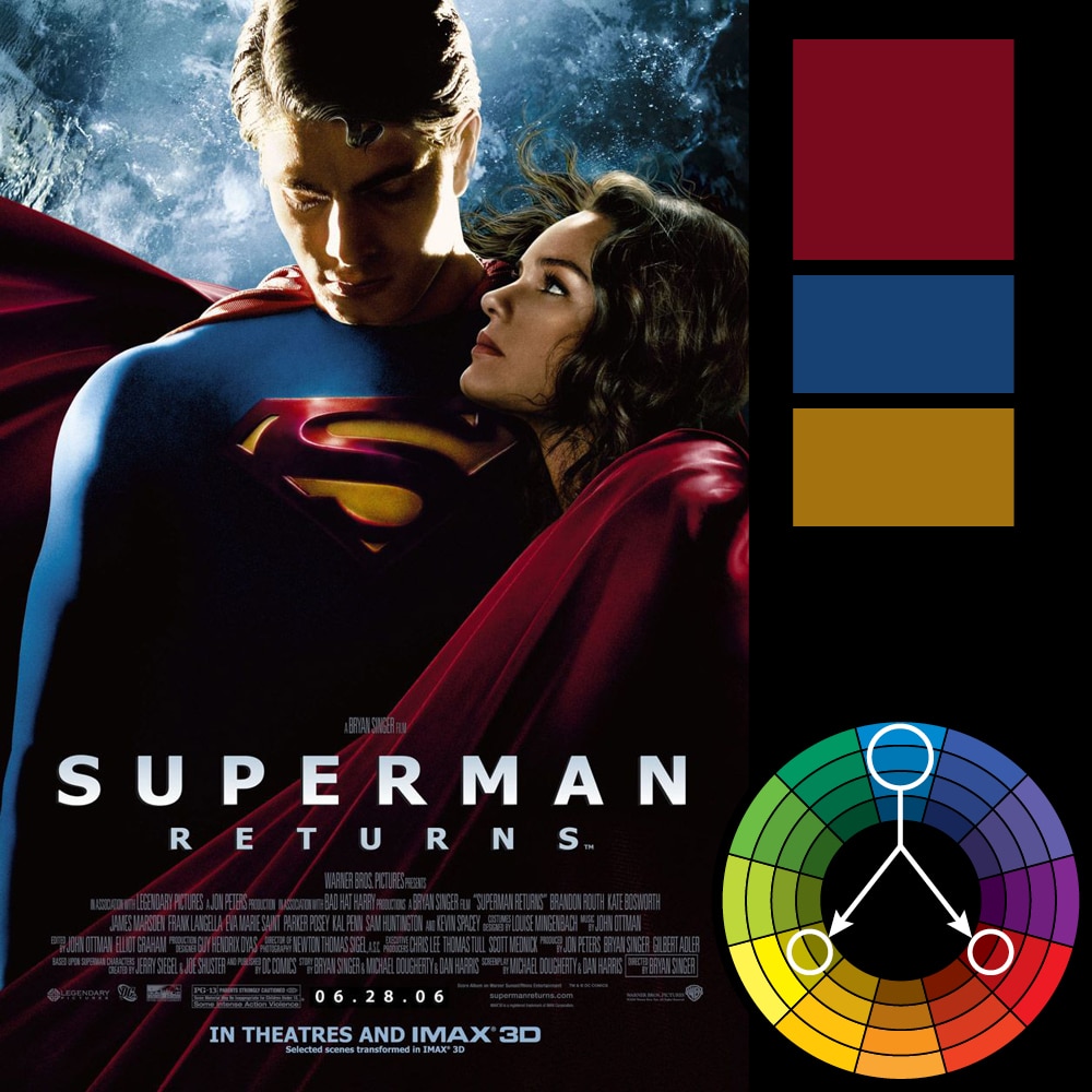
3) Triadic Harmony: This refers to the colour two spaces to either side of the key colour’s complement. Essentially, with the triadic harmony, you are using three equally distanced colours on the colour wheel. This harmony is best used with only touches of colour.
Too much of each colour and a design will appear to have too many colours and can be too vibrant.
To use a triadic harmony successfully, the colours should be carefully balanced—let one colour dominate and use the two others for accent. Or, desaturate all colours and only use the triadic colours in small spots or touches.

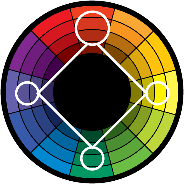
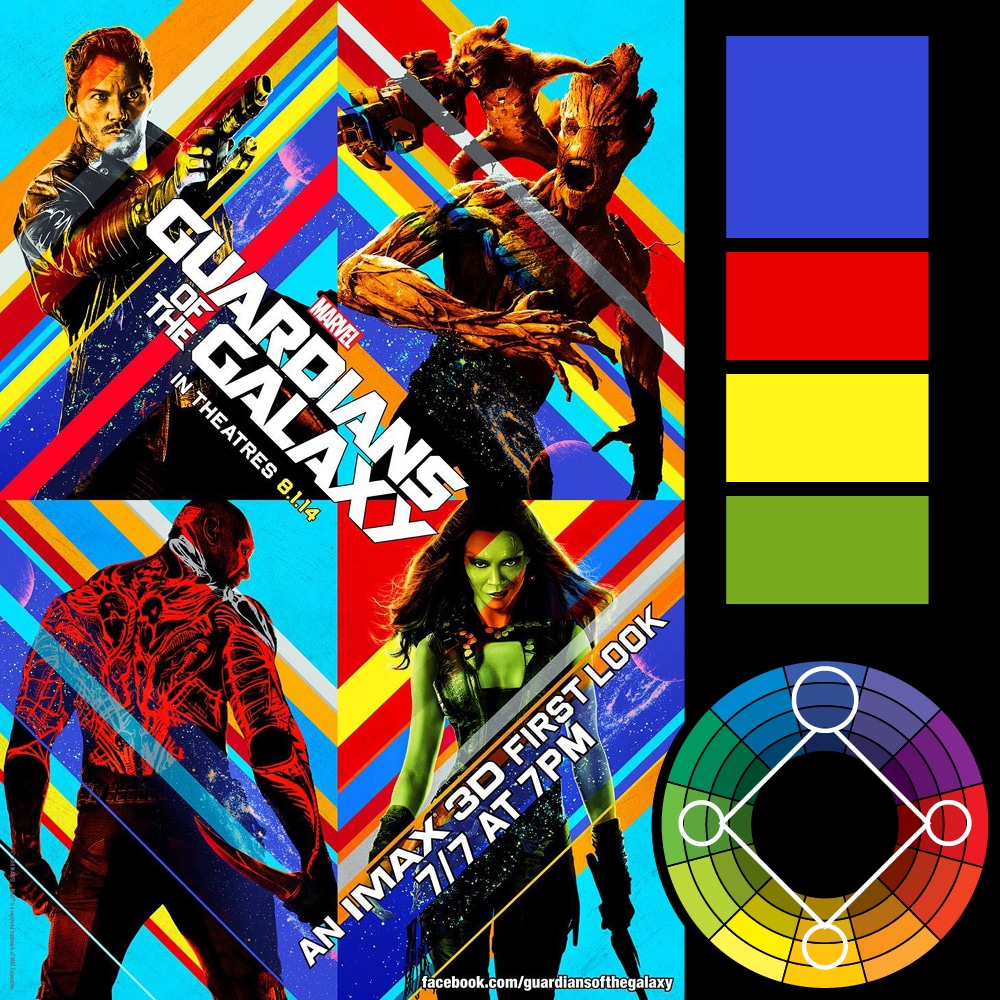
5) Tetradic Harmony: Similar to the Triadic, except that there are four points, all equally distanced on the colour wheel. It is a design simply using two sets of complementary colours.This harmony is good when you have numerous elements that all need to stand out on their own—such as a poster that features 4 or more characters. By using colours equally distant on the colour wheel, each character gets equal attention.
Visual Examples:
Monochromatic

Direct Harmony

Split Harmony
Triadic Harmony
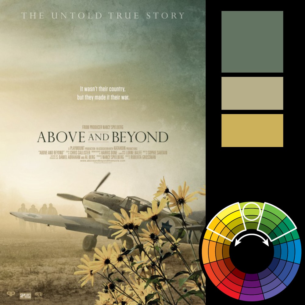
Analogous Harmony
Tetradic Harmony