
Process – Part 2
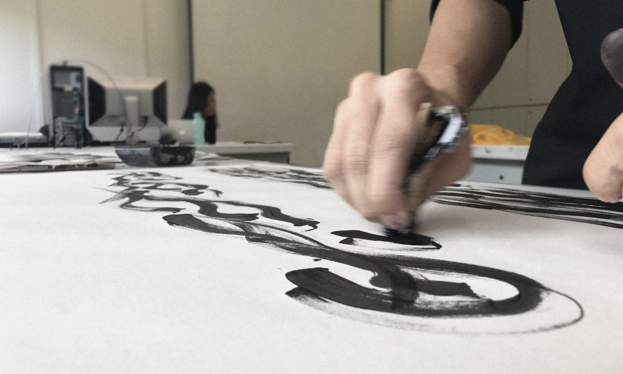
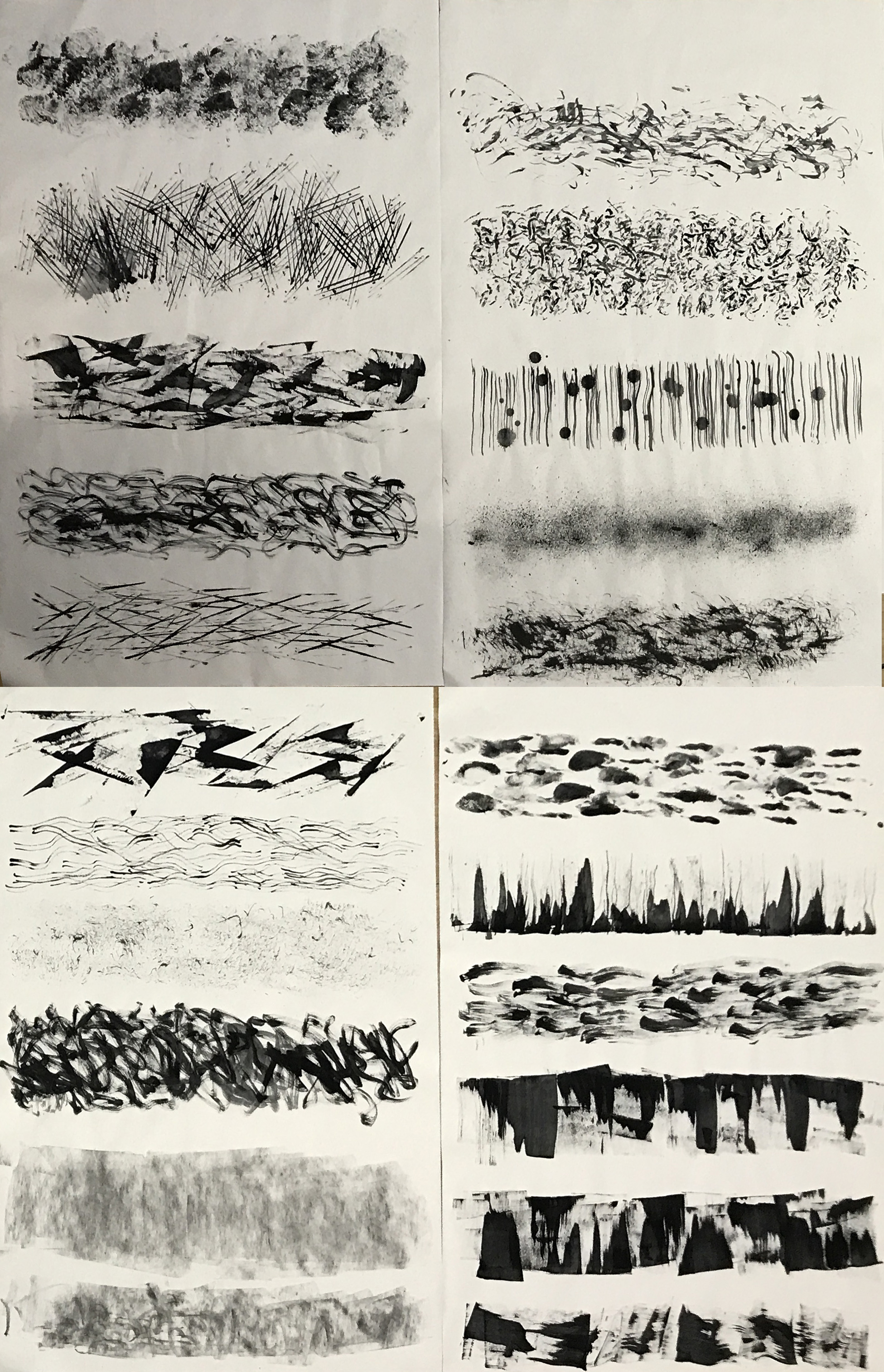
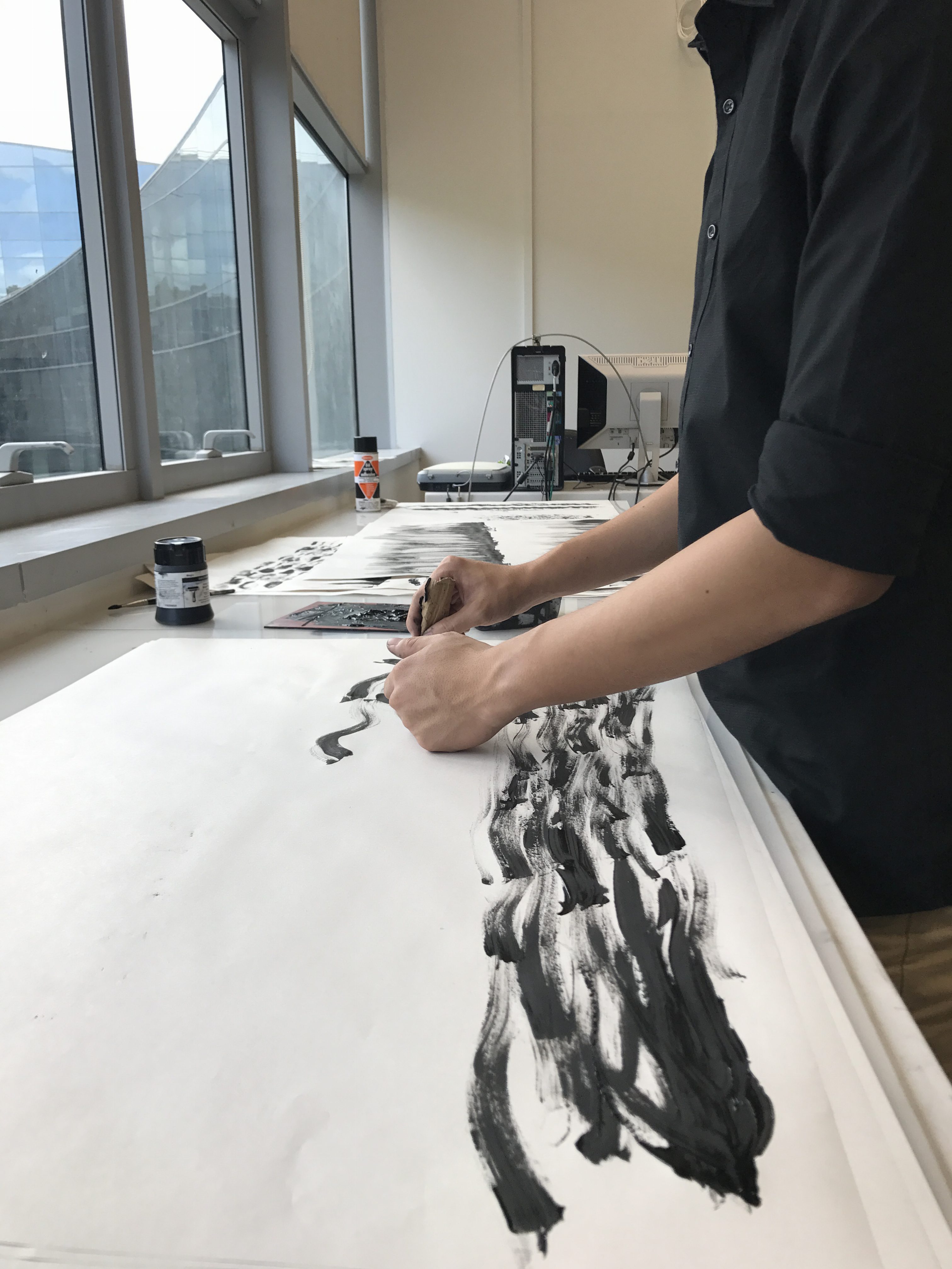
Before the start of this week’s class, I did several different prints during my spare time. They turned out quite well and I saw potential in some of them for my final submission.

During the consultation with Joy in class, she suggested that I try using different inks, such as Chinese ink, to replicate those prints that I have made previously which I saw potential in. She also suggested making the prints much bigger so that I have more freedom to choose which parts looked better.
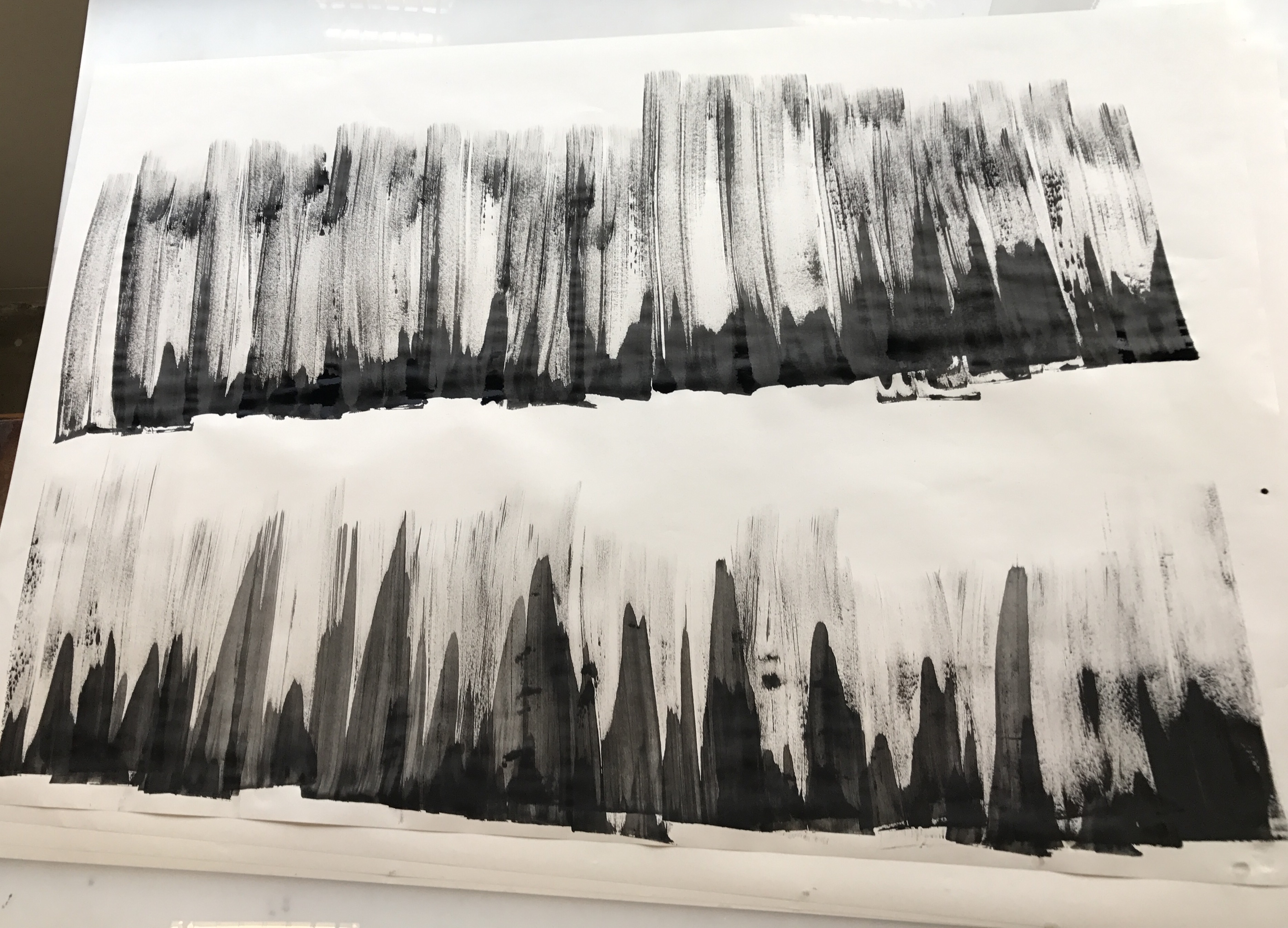
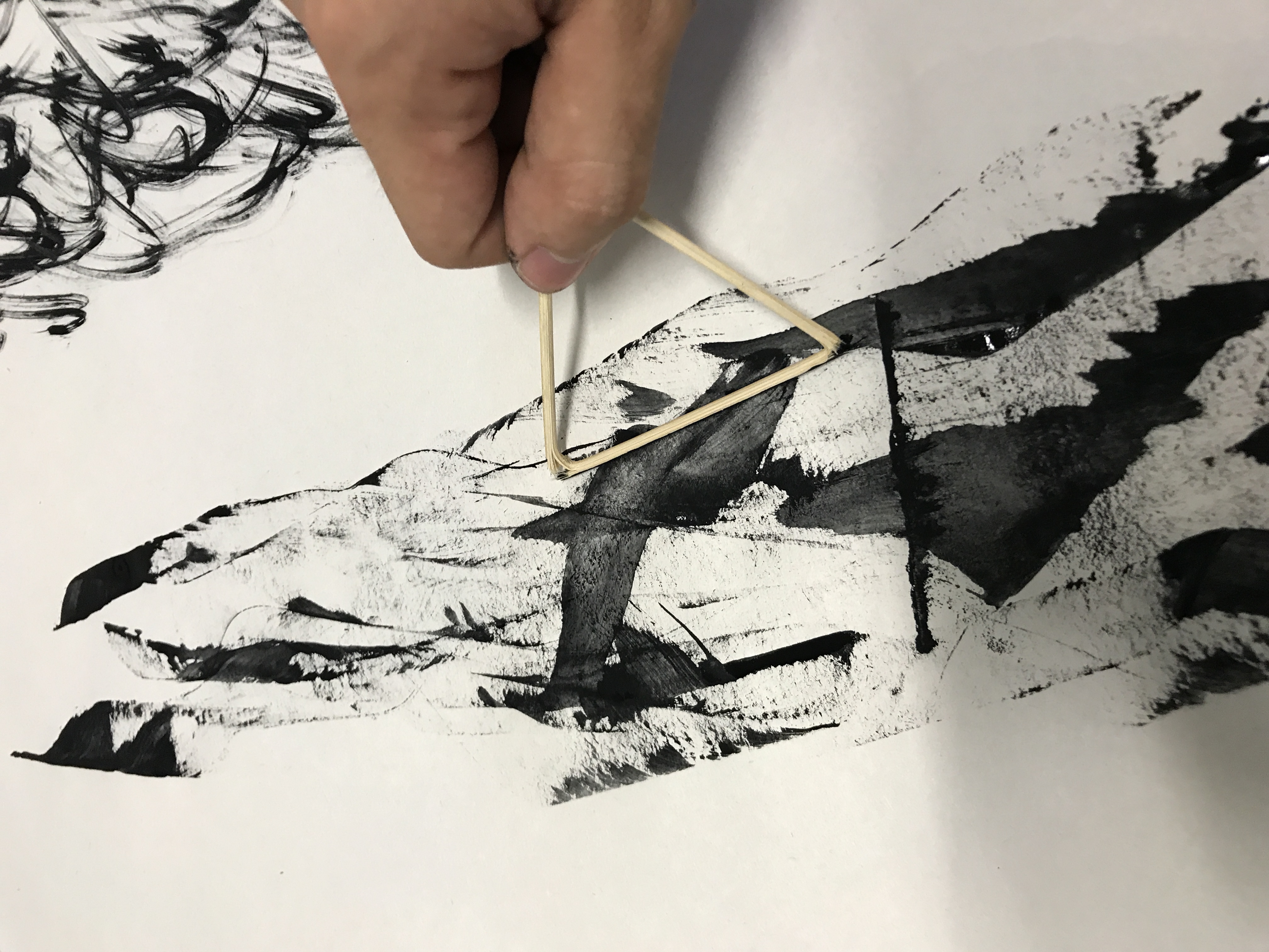
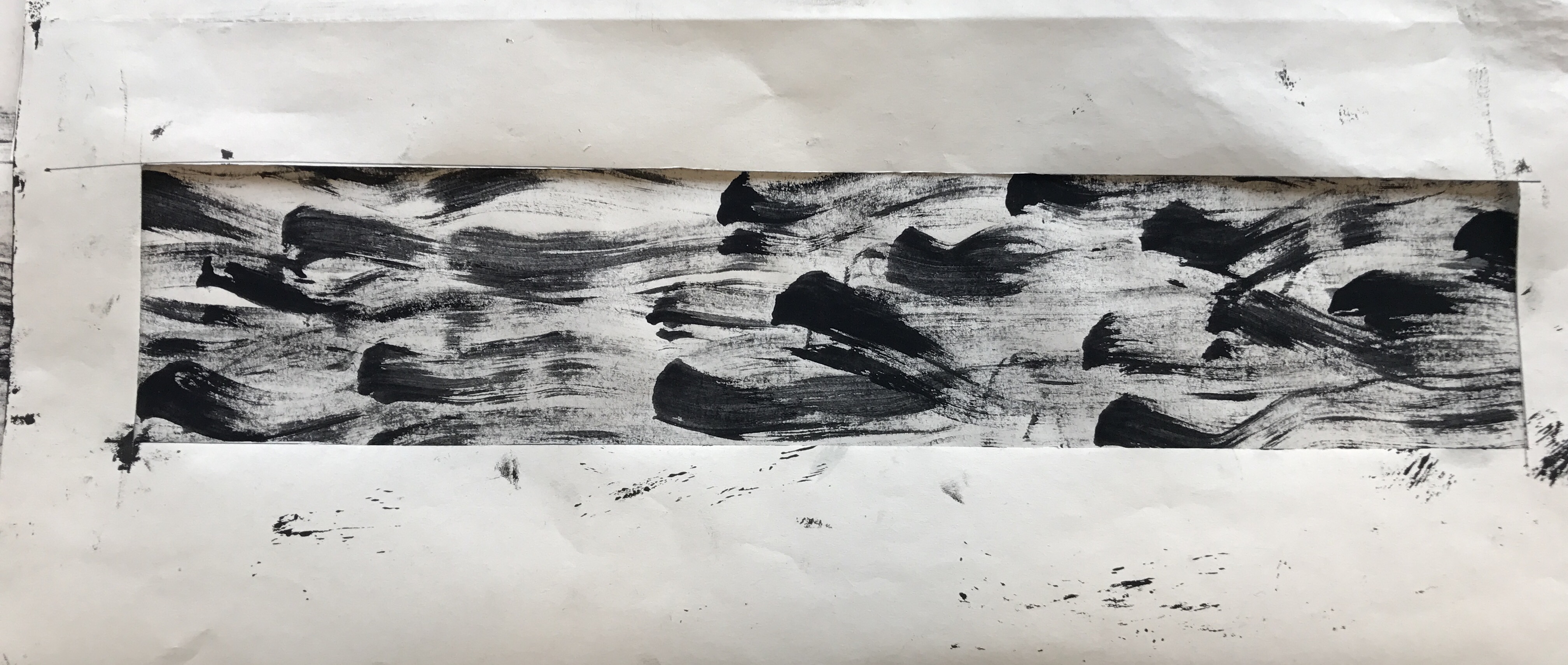
After upsizing a few, I actually found that the previous smaller versions of the prints looked better, it was probably because the patterns looked too huge when placed in the viewfinder I created, which was the size our final ‘strips’ were supposed to be. It didn’t work out, but at least I tried it.
Below are four prints that I found ‘successful’ in displaying some of the emotions.
 Joy – More towards cheerfulness and joviality, this print looks like little sprites playfully whizzing through the air.
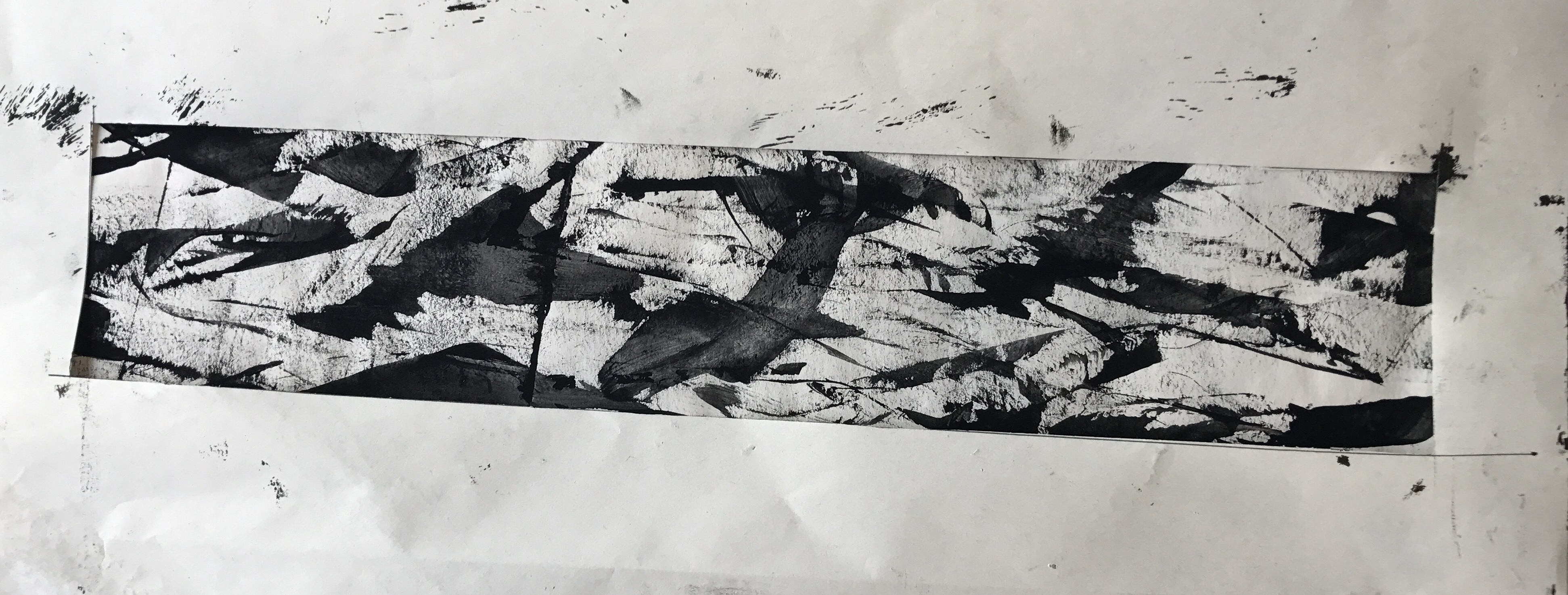 Anger – Swords swooshing through the air with the blood of those killed trailing along…
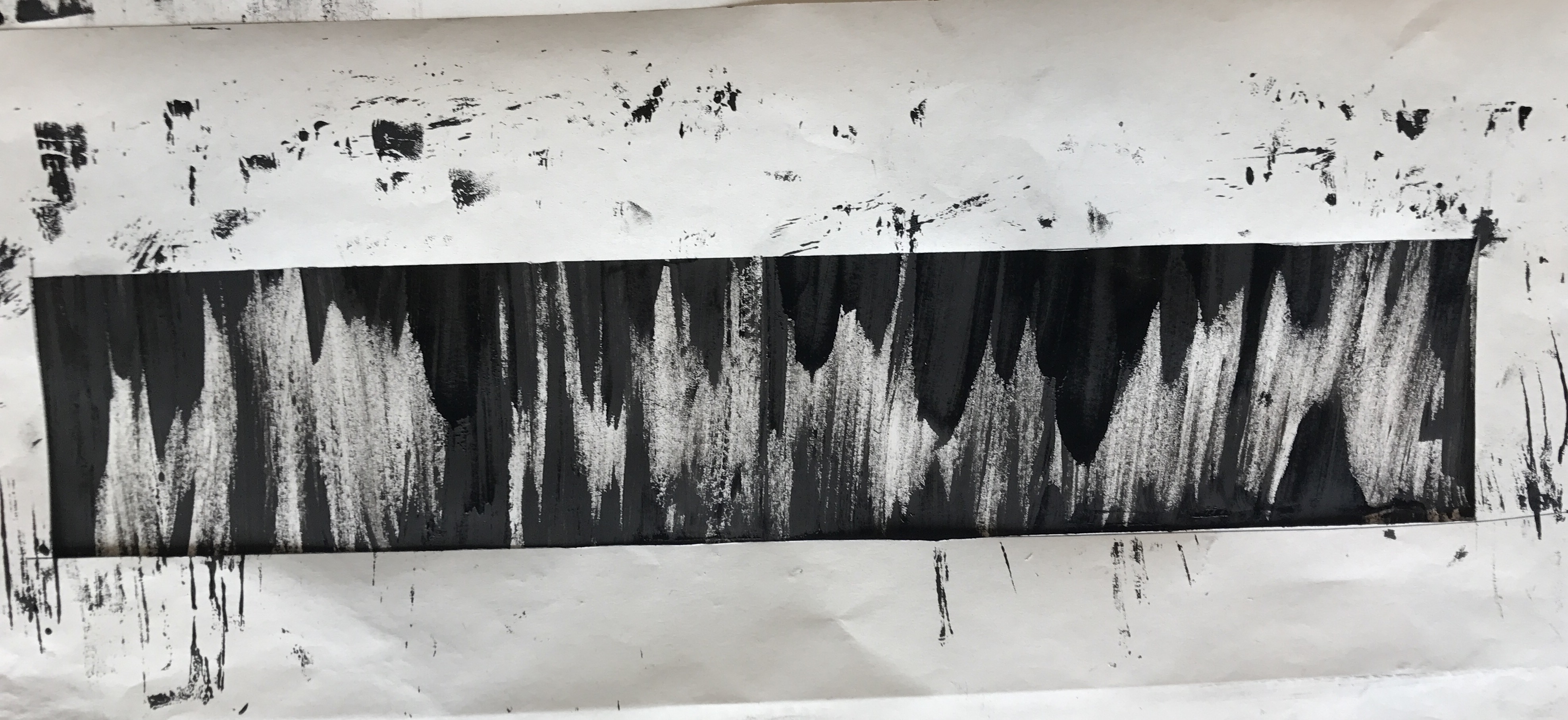 Fear – A sense of uneasiness, this looks like a cave where stalagmites and stalactites are closing in on you, the minimal negative space makes it look claustrophobic.
 Sadness – Melancholy, this print immediately reminded me of ‘The Starry Night’ by Vincent van Gogh. More specifically, I once heard Beethoven’s Moonlight Sonata in a video online with this painting as the backdrop. You can listen to it here hahaha – https://www.youtube.com/watch?v=iVfPt8jgWOY
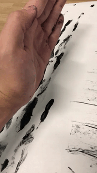
There is still ink in my fingernails.