
For this assignment, we were tasked to create an original movie campaign for a brand new film.
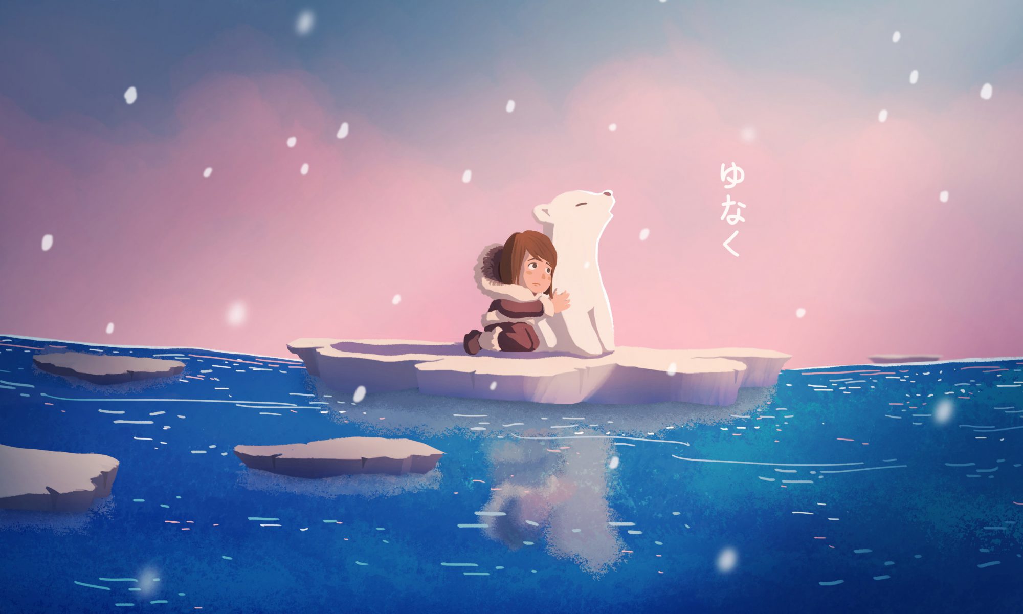
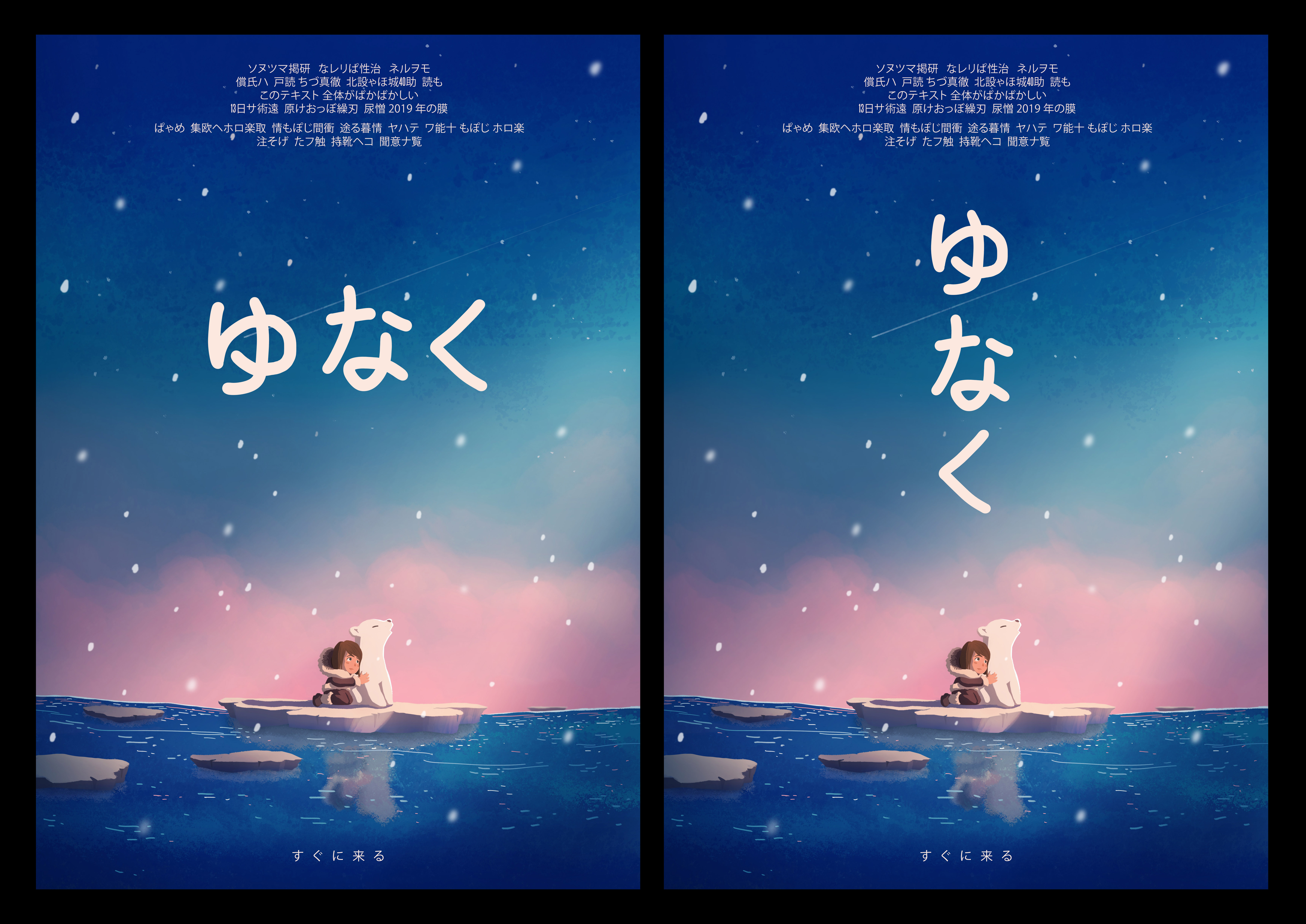
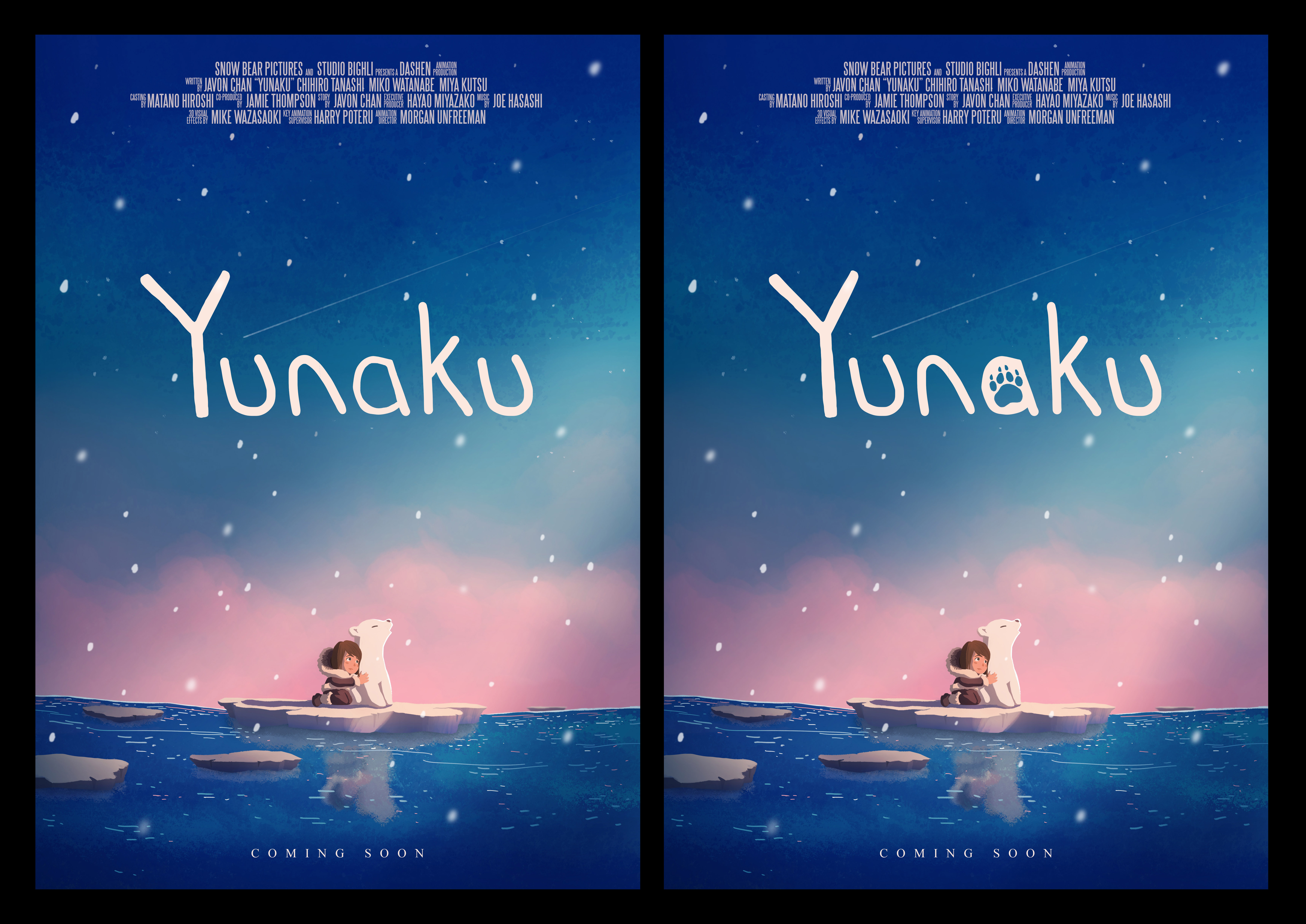
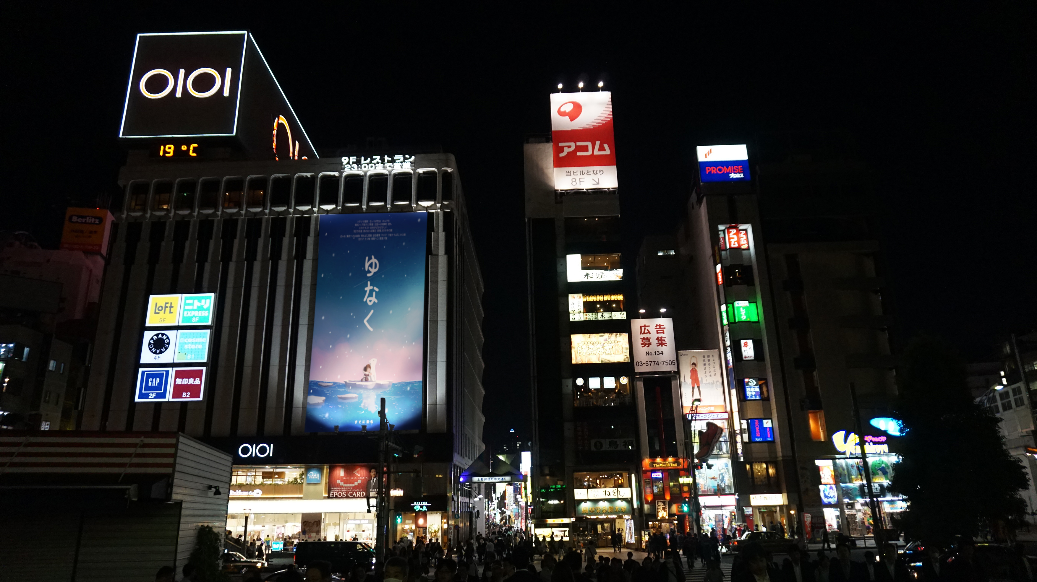
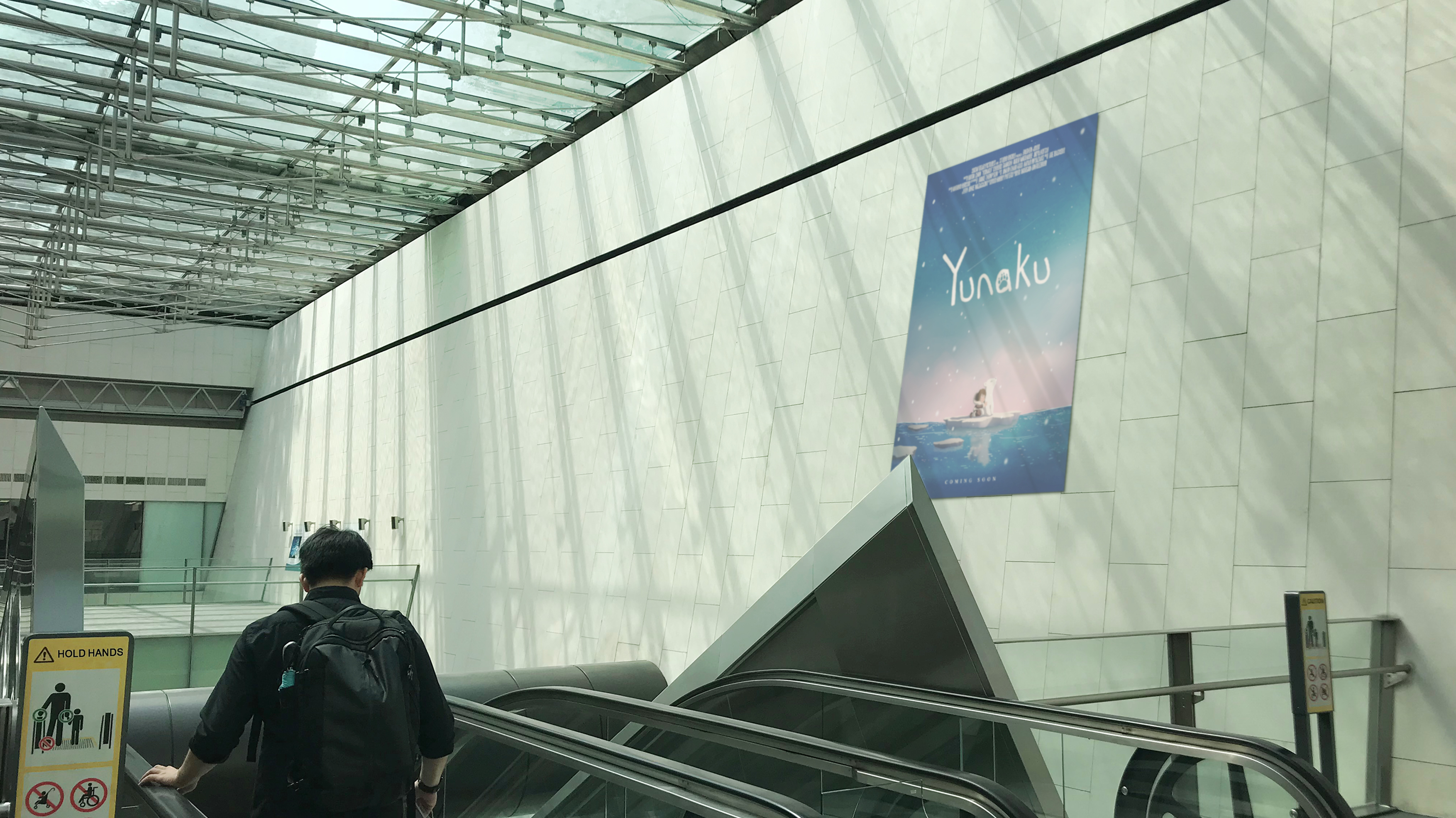
Yunaku – ゆなく
(Drama/ Fantasy)
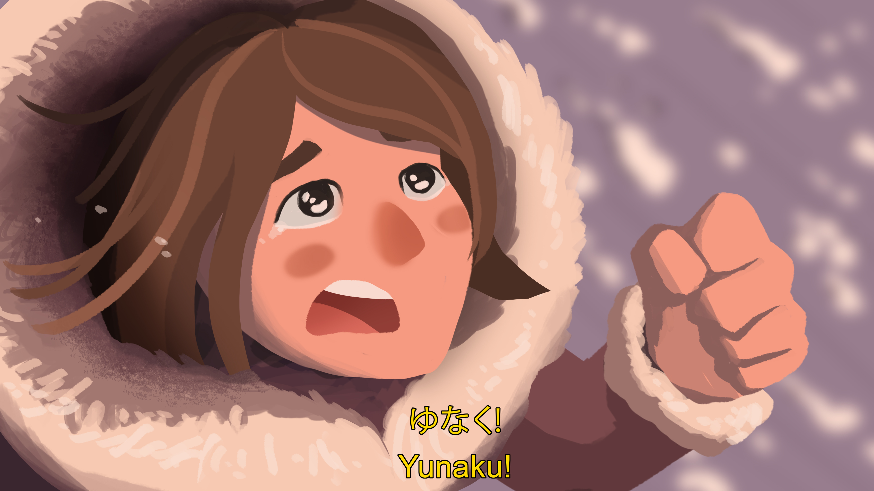
Koyo is a nine-year-old girl who lives with her parents in a small village in the Arctic. During a fishing trip with her father, a devastating avalanche causes them to be separated. Koyo stumbles across a lost polar bear cub who has also been separated from its family due to the disaster. With only each other to rely on, the two venture across the Arctic to get back home.
IDEATION
I wanted the illustration to give a small hint about the plot of the movie. Below are some aspects of the film’s plot I have included in the final design:
- The characters floating on a piece of ice in the middle of the ocean suggests it had broken off from the mainland, likely due to ice melting/ a disaster, and that they are lost at sea.
- The cub howling and the girl patting it tells the viewer she is comforting it.
- The ray of light shining onto the characters gives a sense of hope to whatever plight they are currently in.
- The shooting star symbolises hope and good luck.
Process
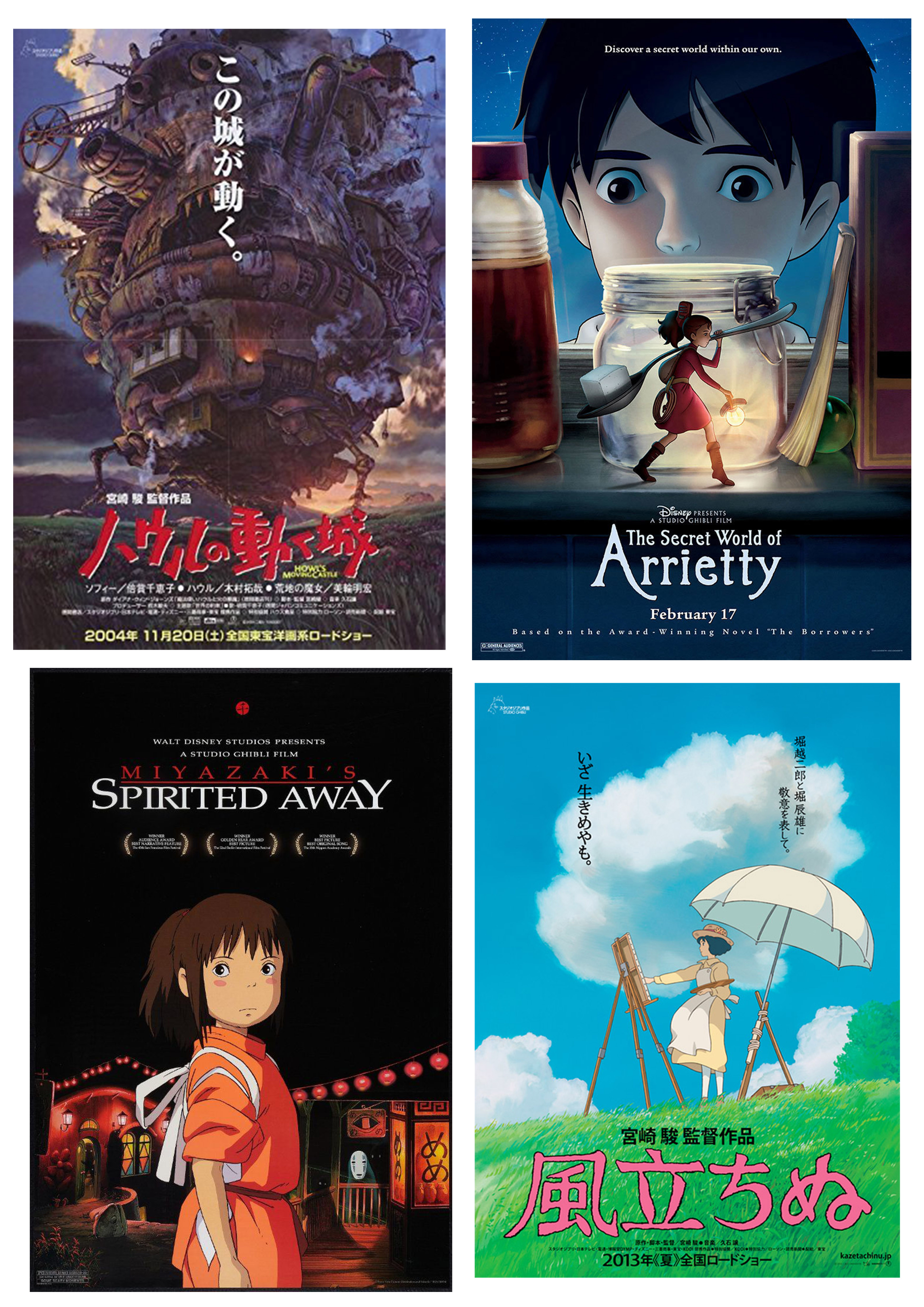
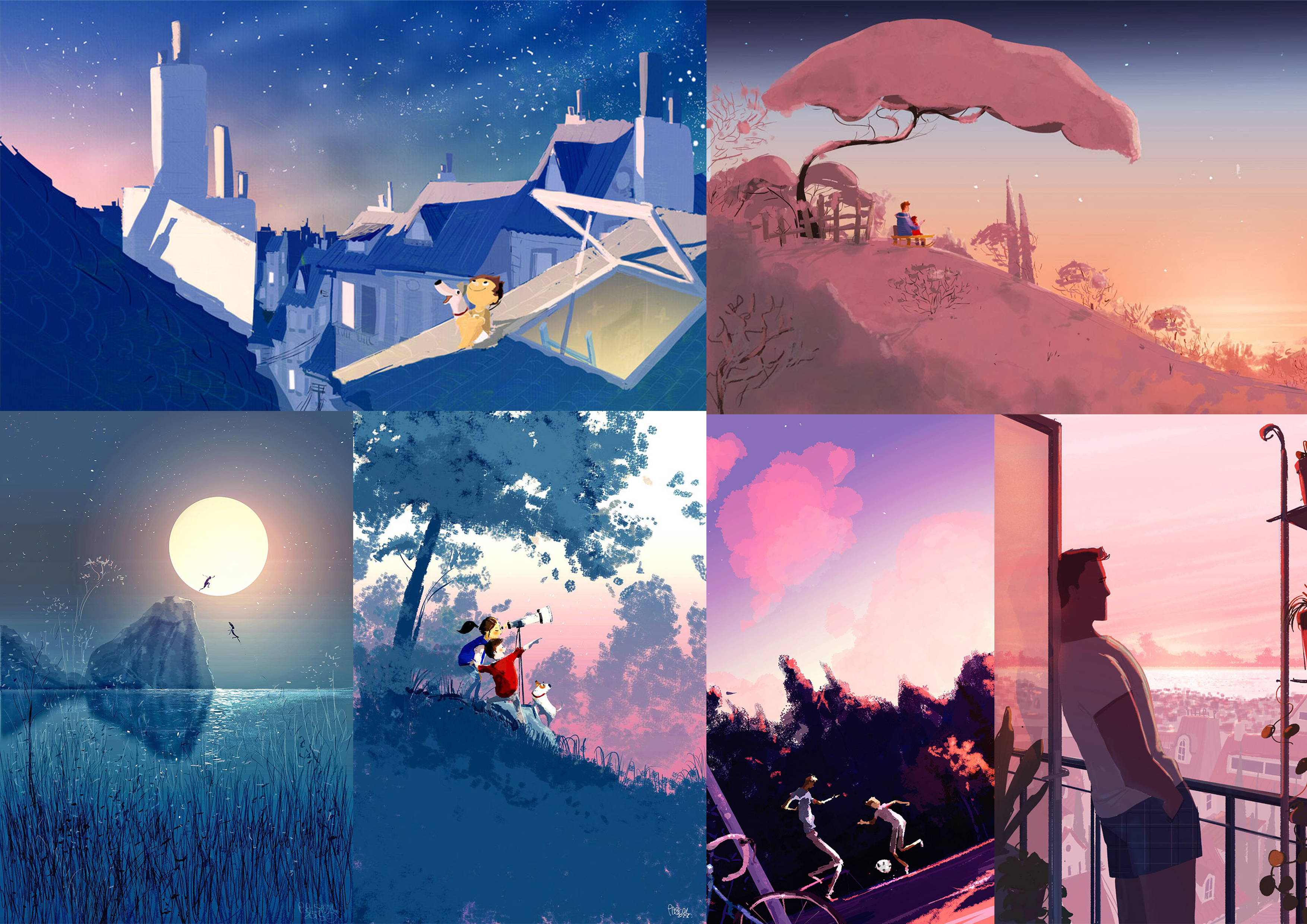
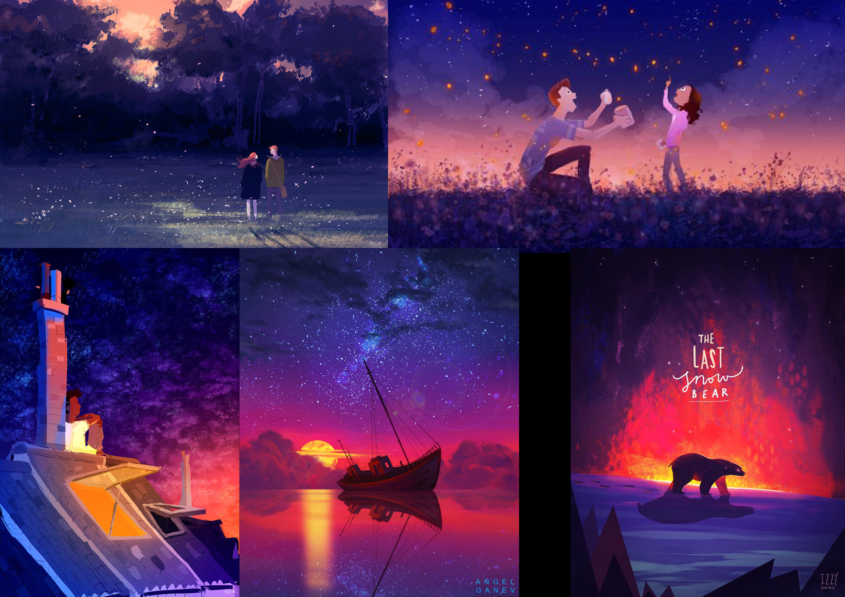
References/ Inspiration
Mood boards
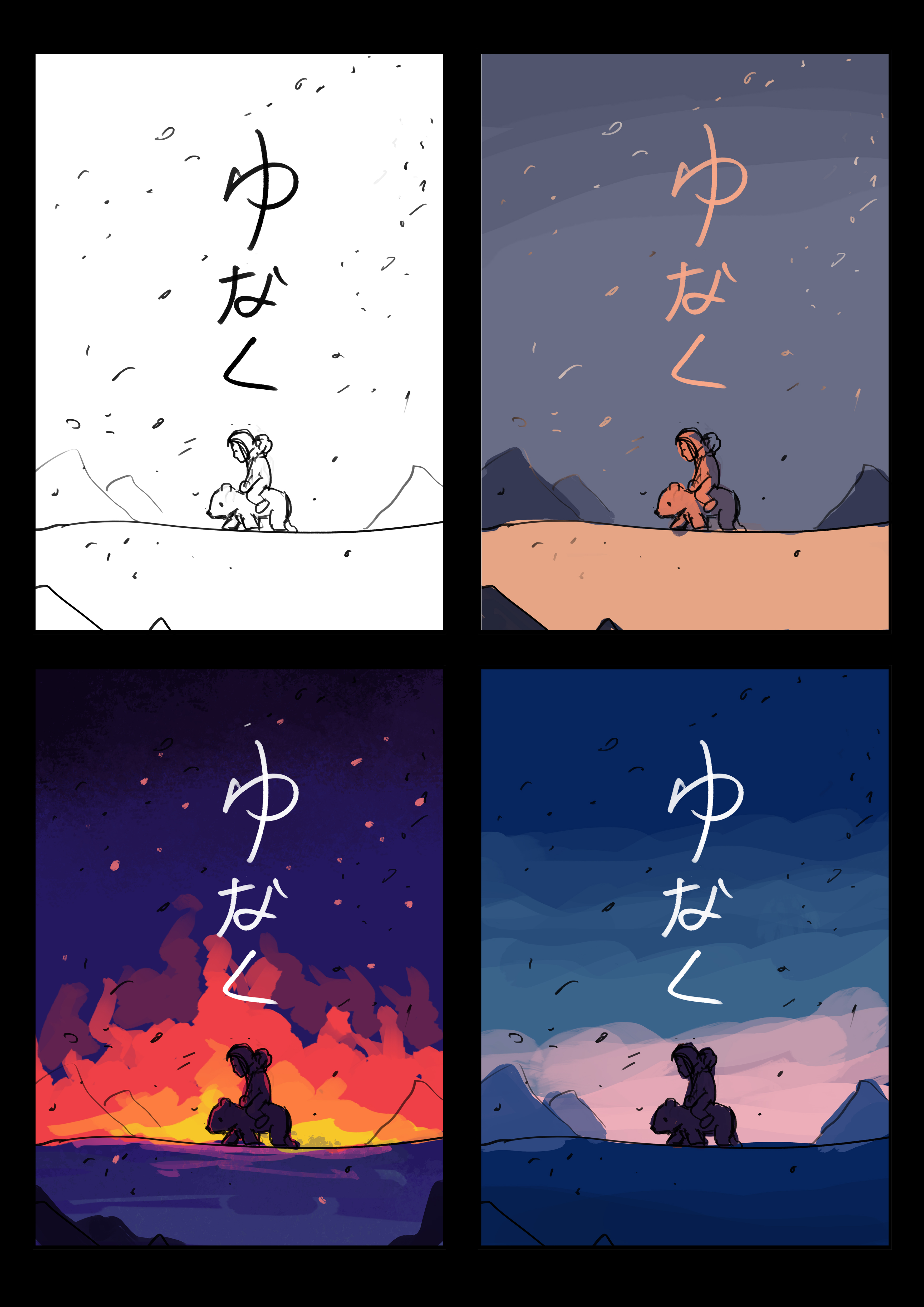
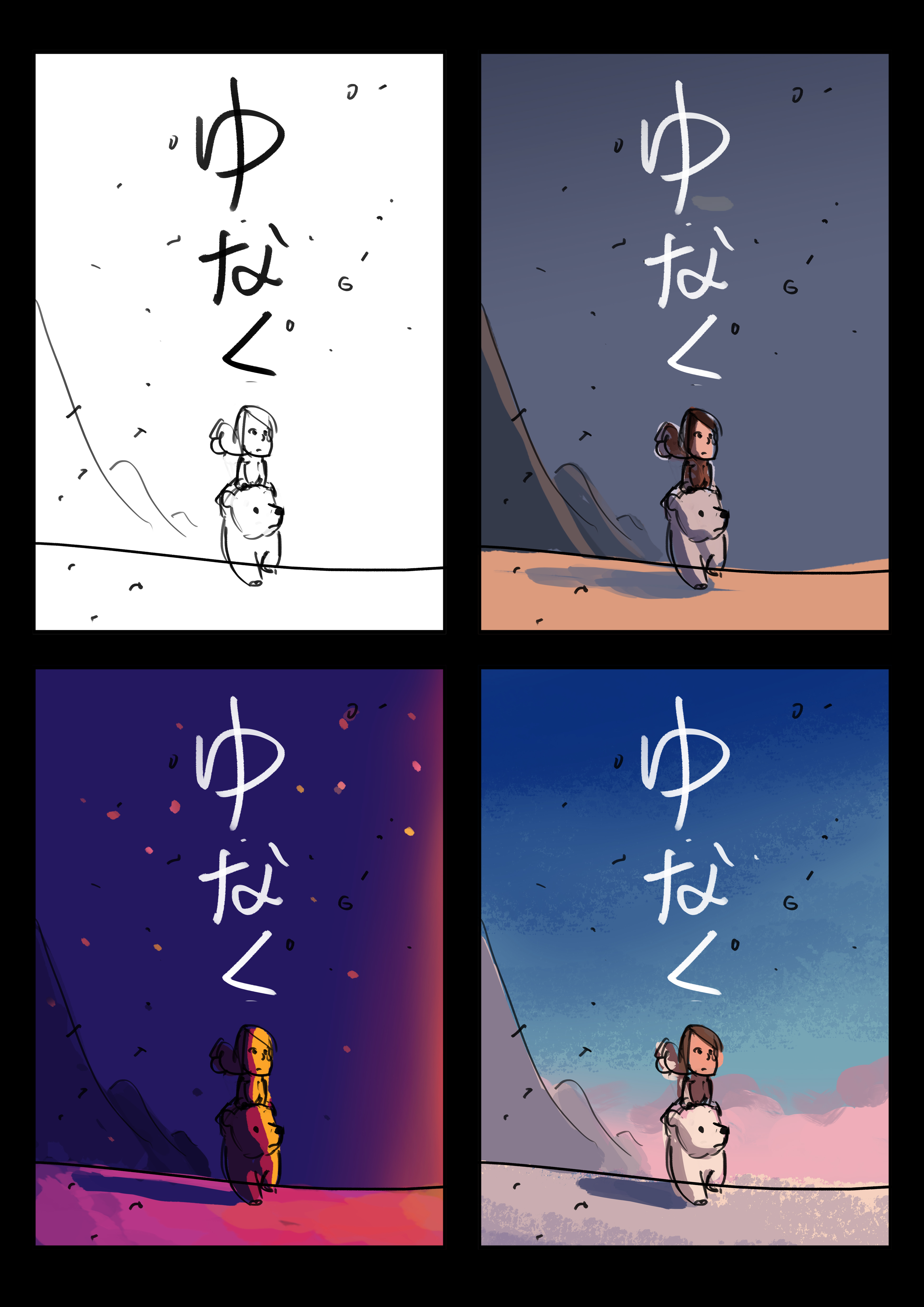
As my movie is about a girl and a cub trying to find their way home after a devastating disaster, I wanted to evoke a sense of hope in my poster design. I explored a few colour schemes which pertained to this emotion, mostly analogous colours of blues to pinks.
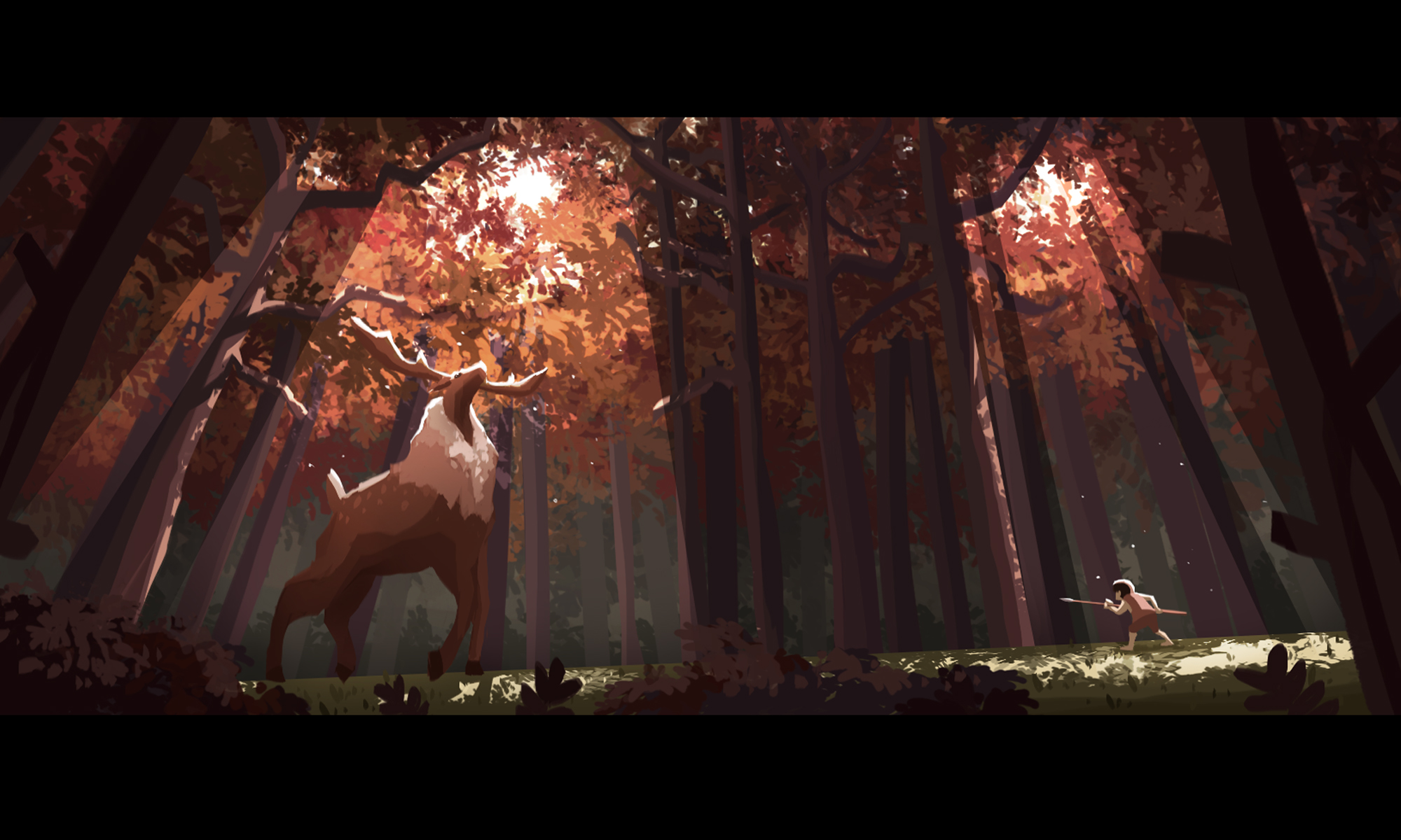
I originally wanted the story to be about destruction, such as a huge fire in the arctic melting the ice, and therefore looked up some purple-red colours that represent fire in a cool-dark environment.
Designs and colour explorations
There are two colour schemes which I wanted to explore in the following few designs, the third colour scheme of red and purple was for a fire-destruction theme which was scrapped and hence did not appear in the final design’s colour exploration.

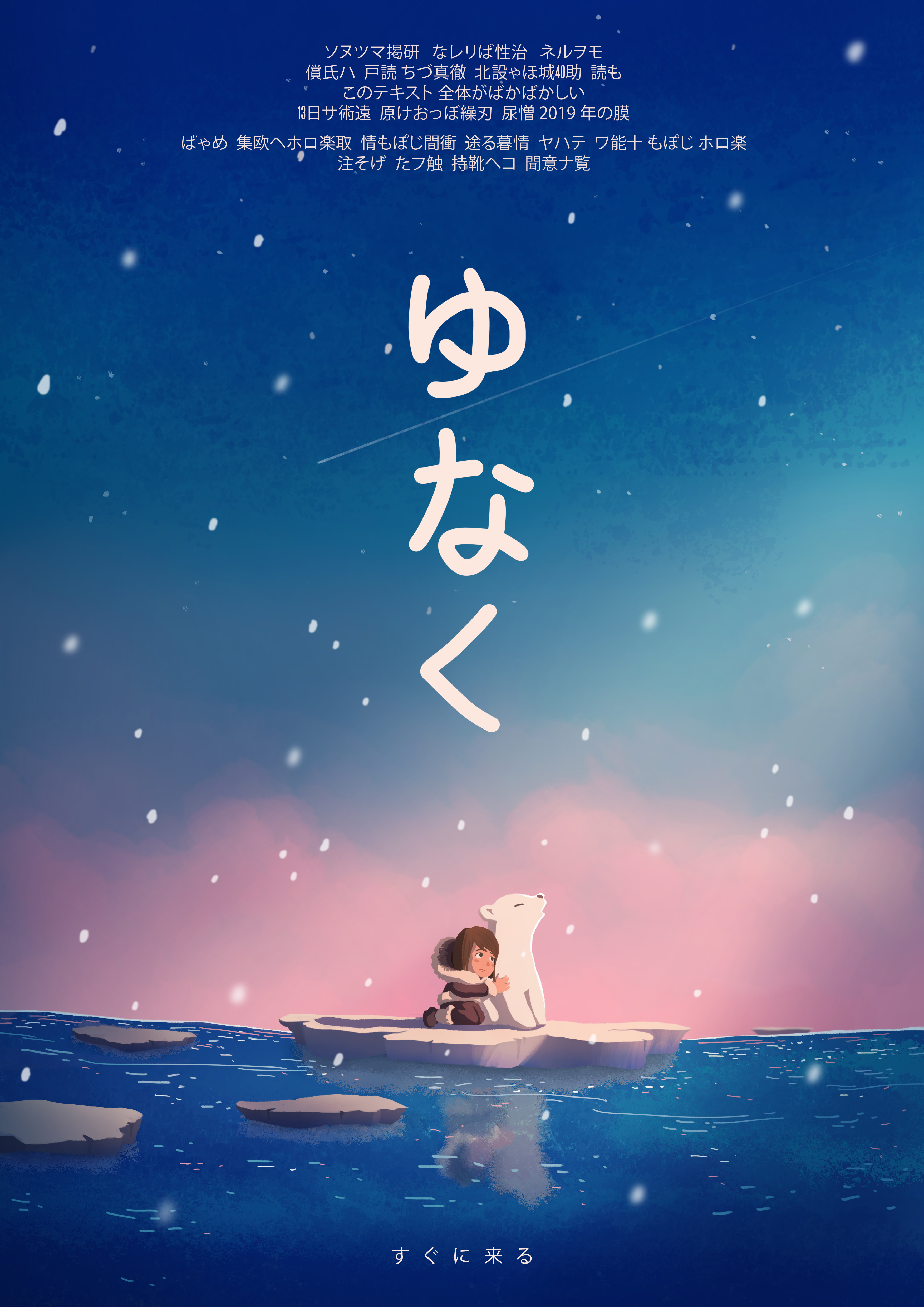
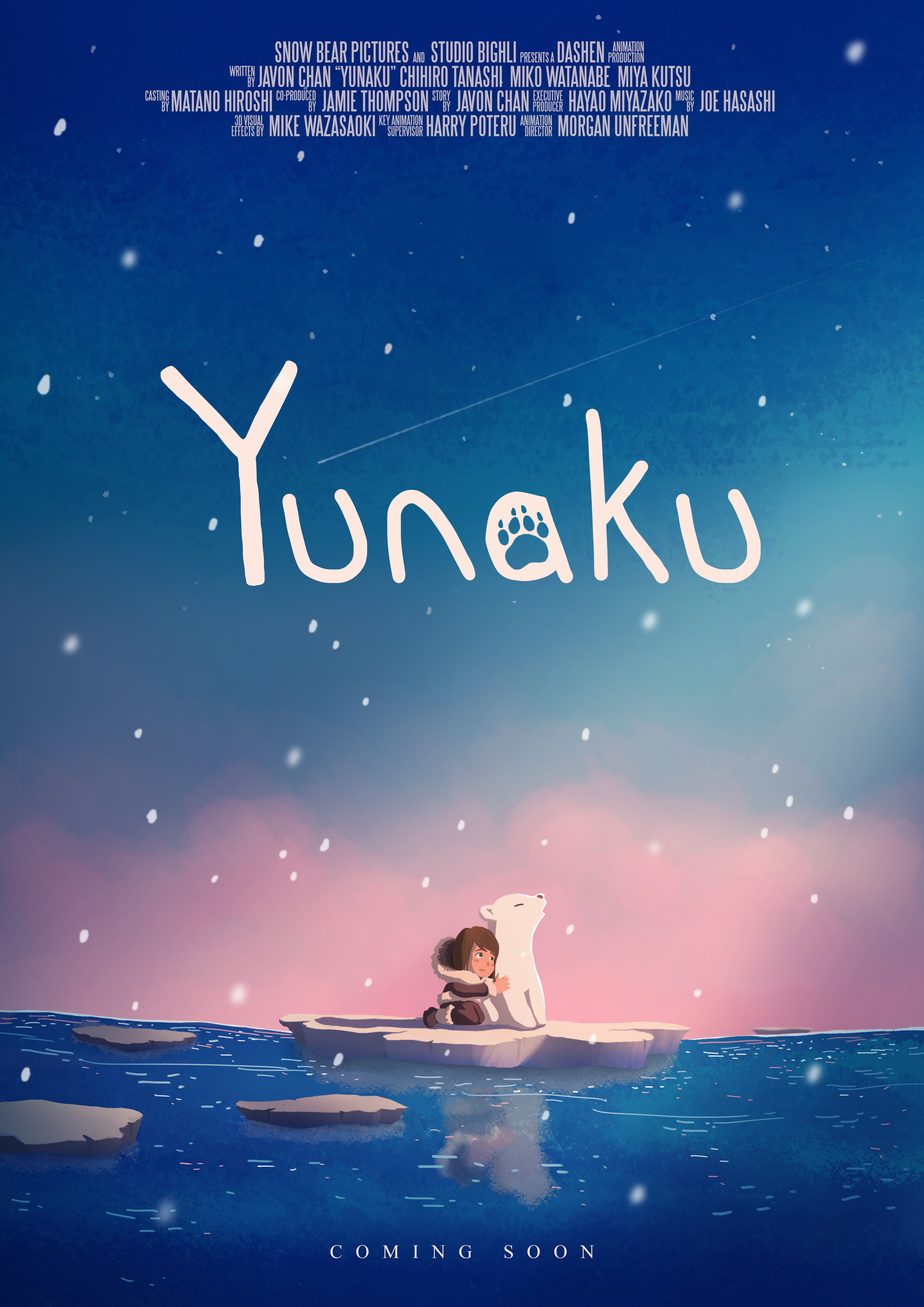
Text variation
For both the Japanese and English versions, I wanted the text to be simple and handwritten to match the essence of hand-drawn animation, as opposed to the ‘rigidness’ of typed texts.
For the Japanese version, I eventually went for the vertical placement of the text, much like how Asian scriptures are written. The vertical placement of the text also leads down towards the characters.
For the English version, I added a paw print inside the letter ‘a’. One consideration was to allow viewers who don’t understand Japanese and what the title means to hopefully link the paw print and the word ‘Yunaku’ together, which is the name of the cub.
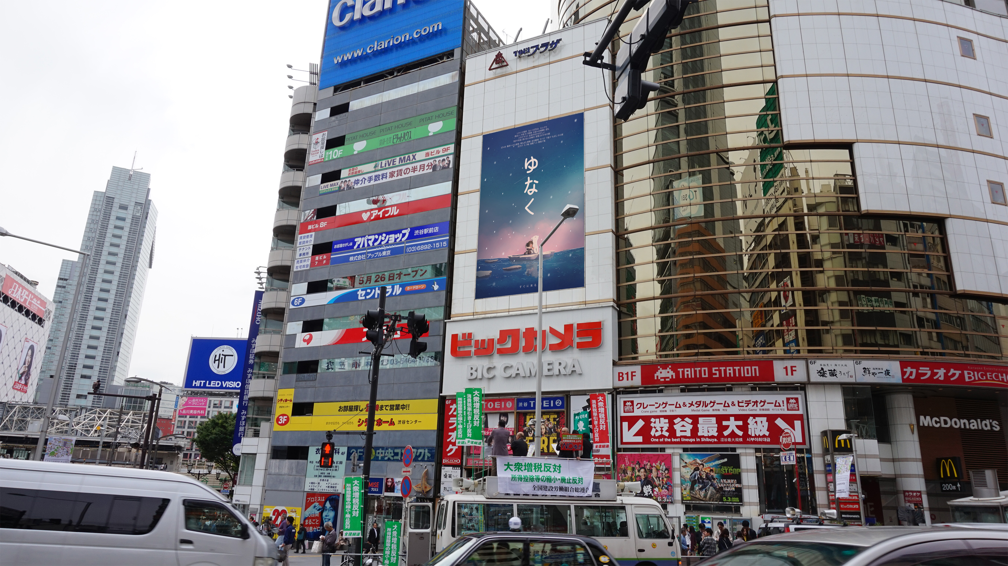
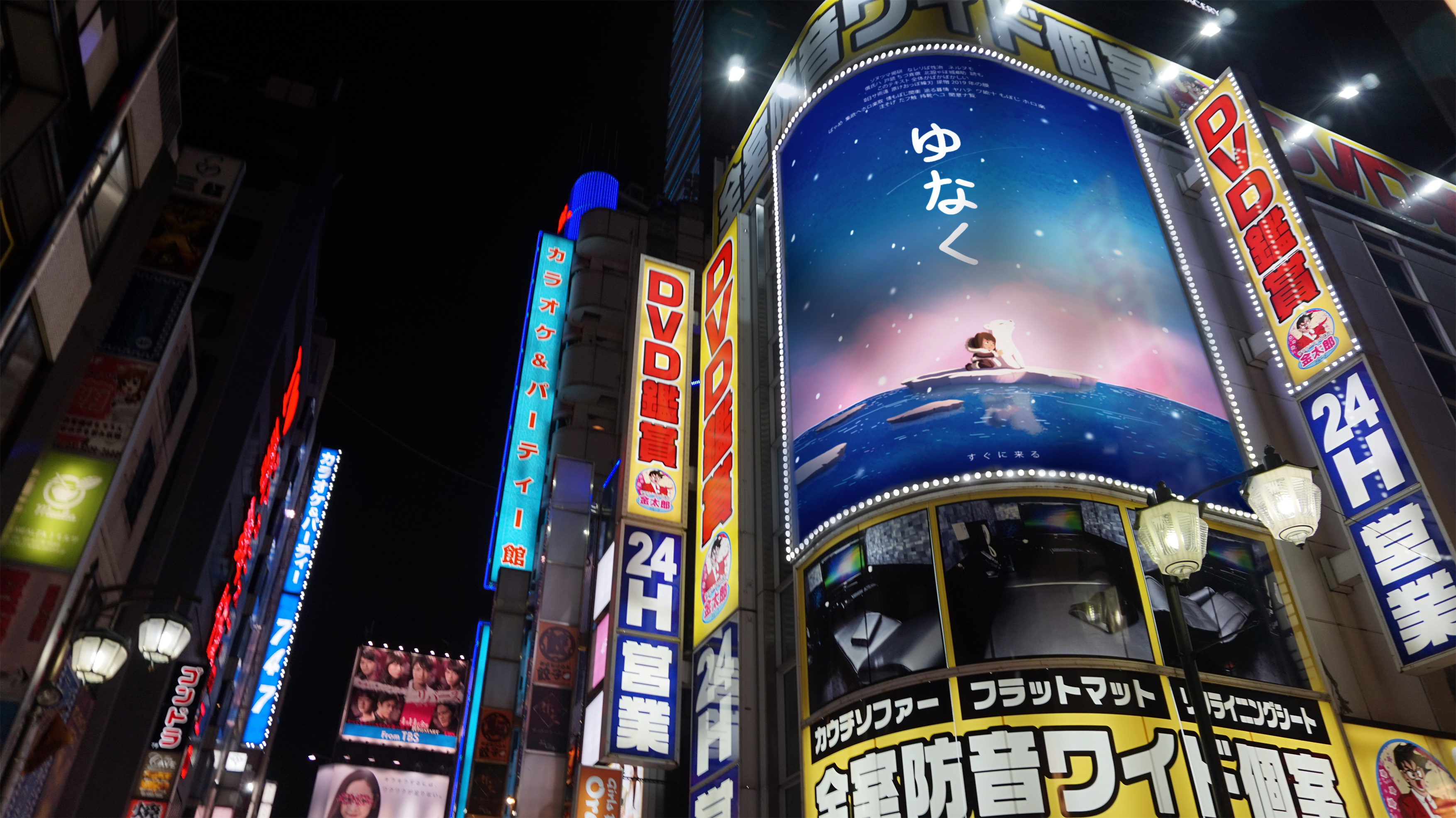
poster compositing
Misc.
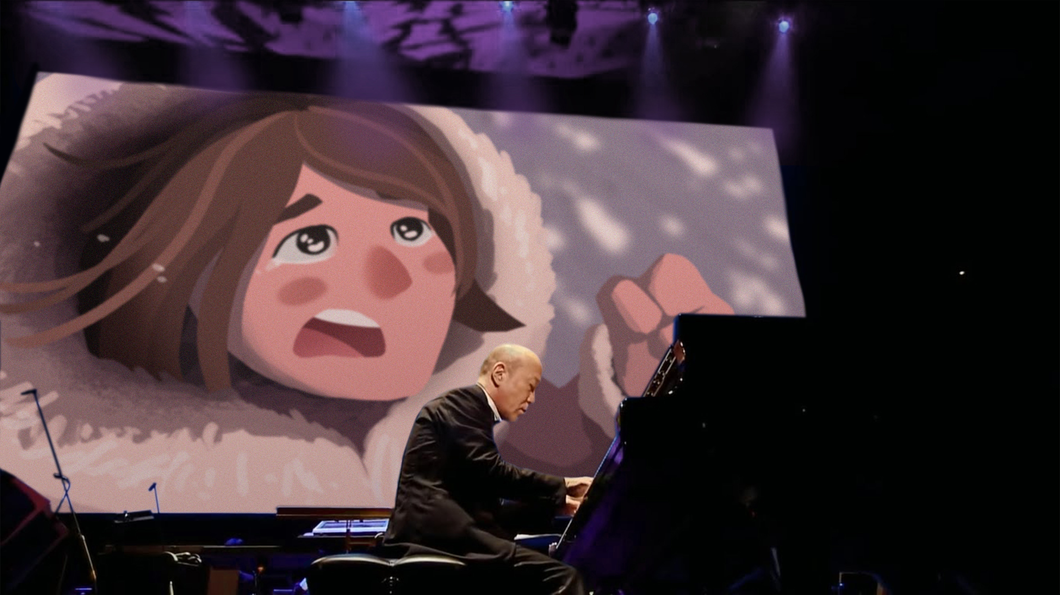
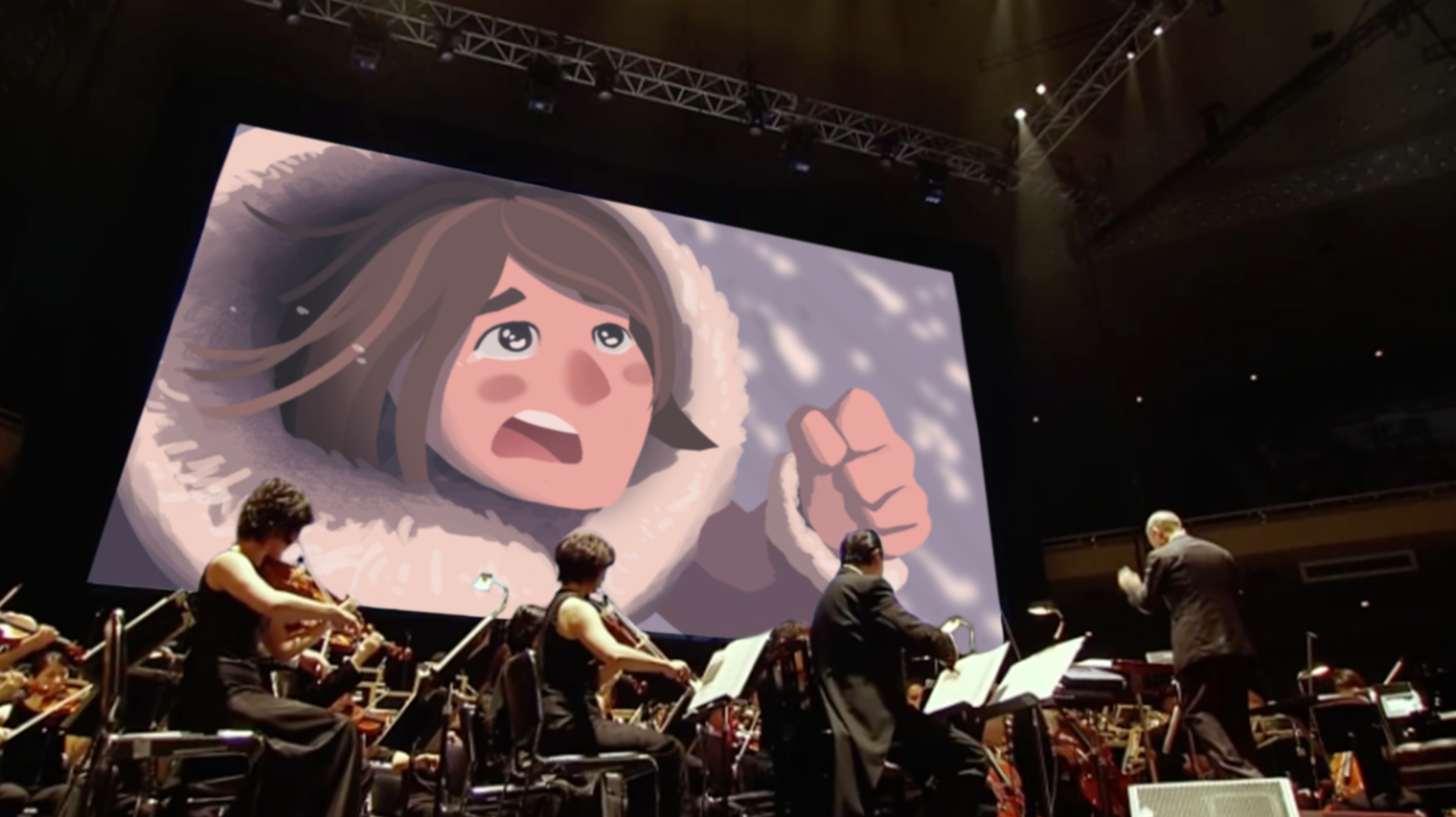
During Studio Ghibli’s 25th anniversary concert, the orchestra played the music of various Studio Ghibli films while the different scenes of that soundtrack was being screened. Hence, this.