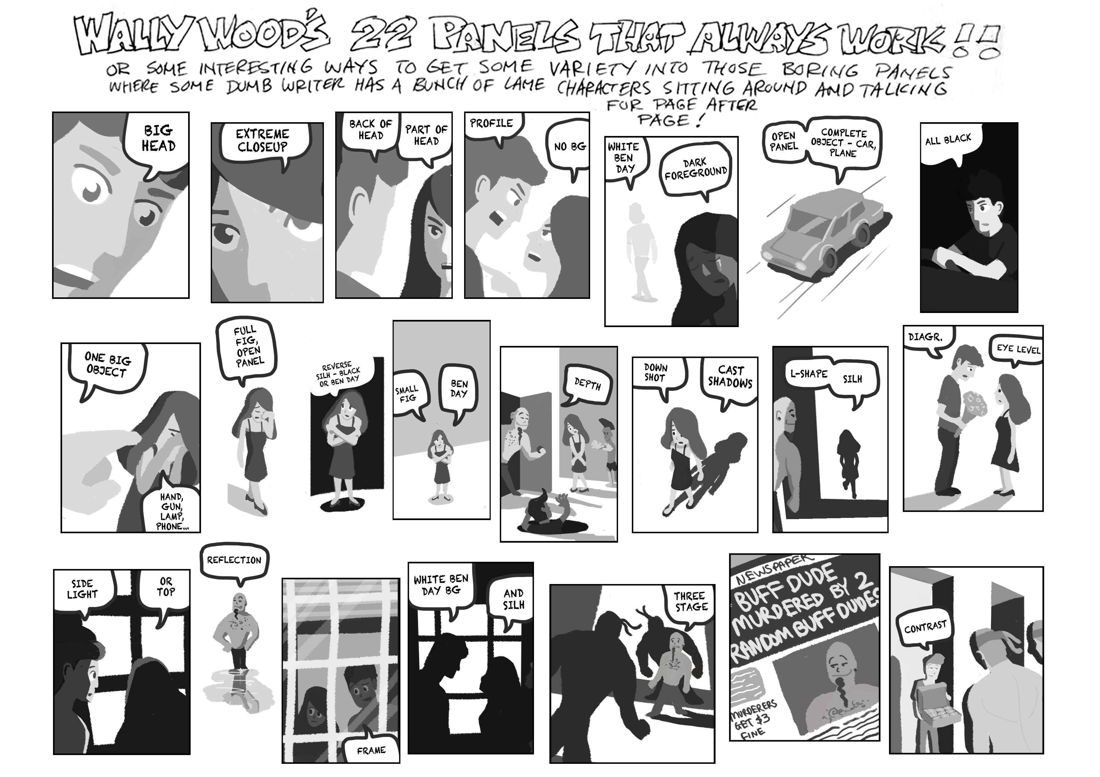
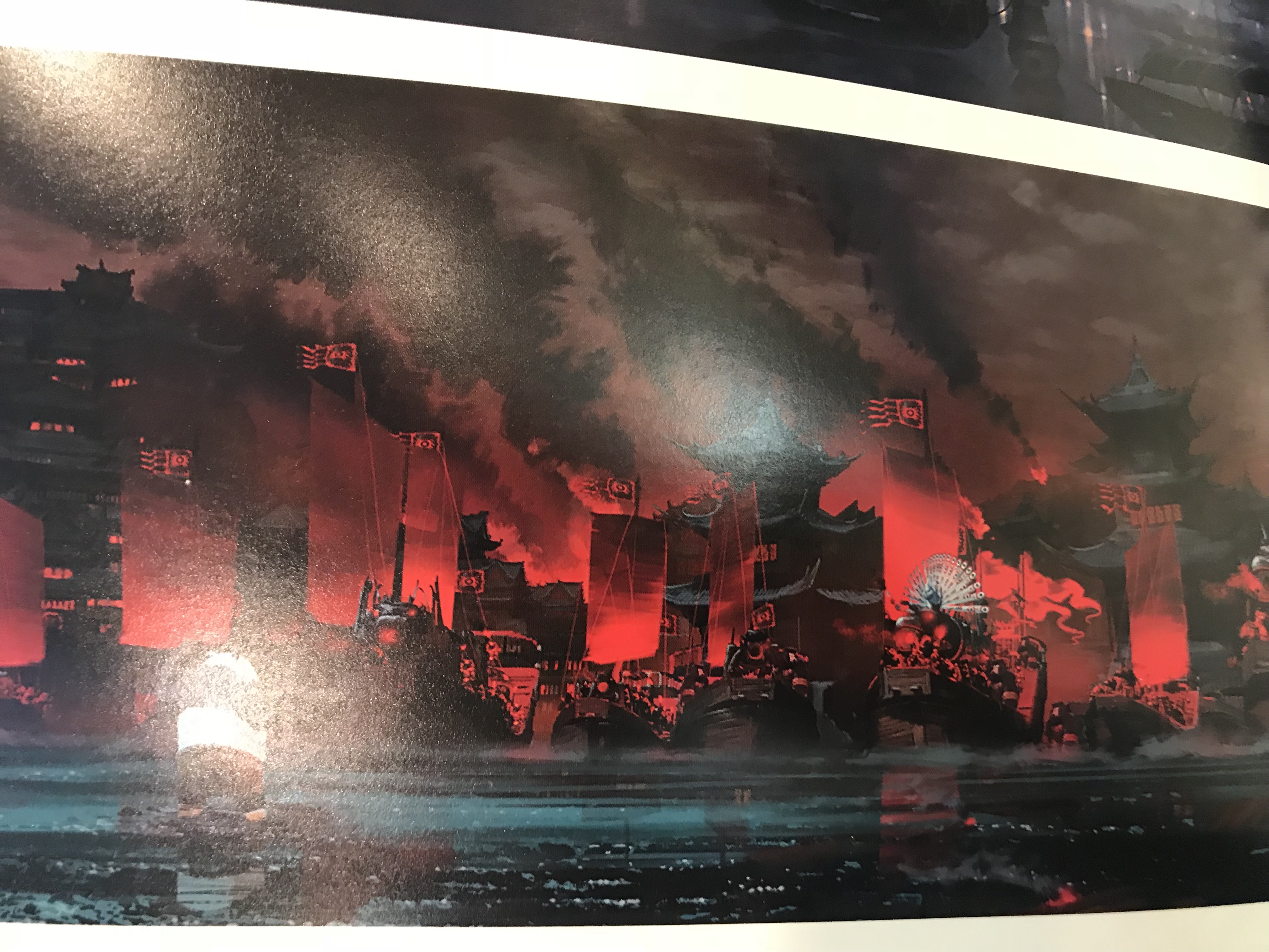
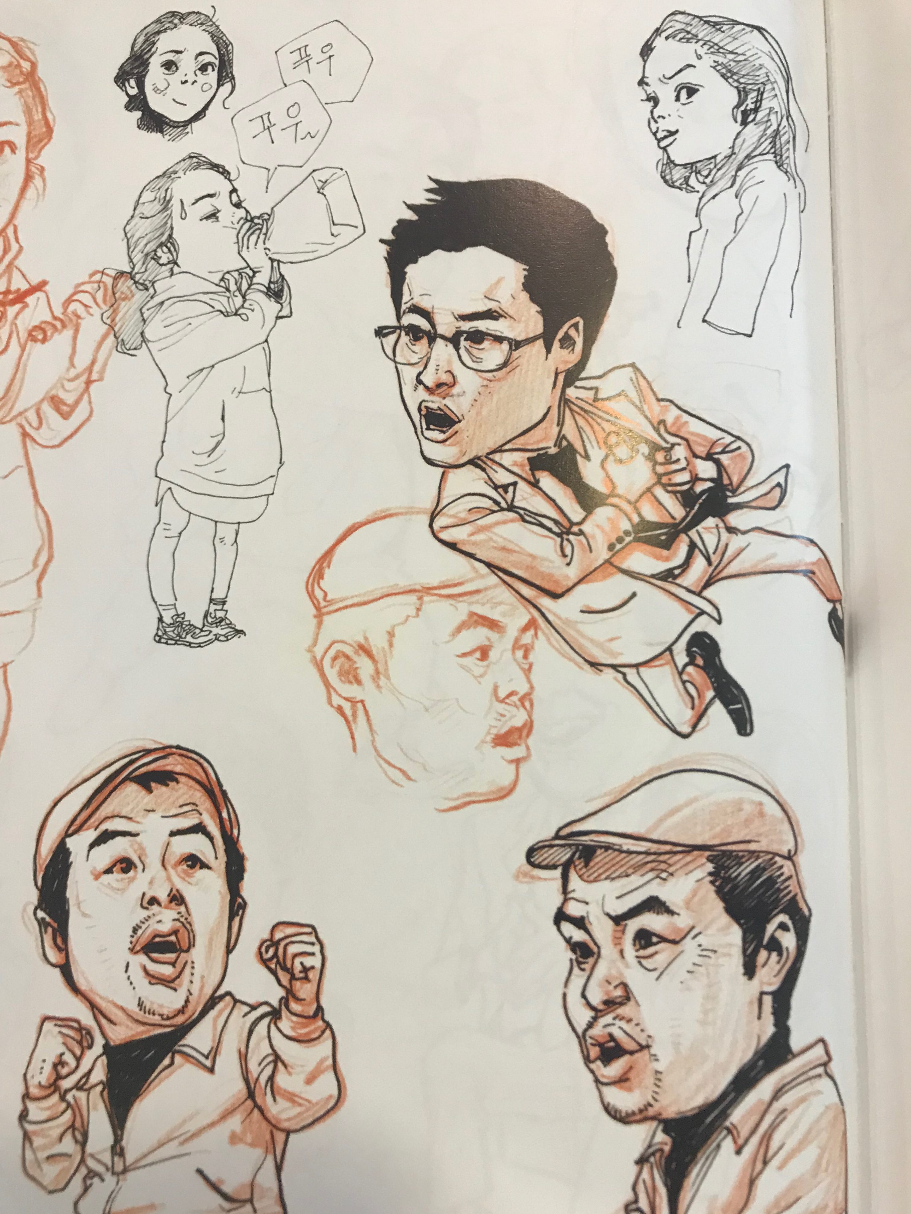
A story about a quarrelling couple and a random buff guy who gets murdered in the end.
Animator | Illustrator

A story about a quarrelling couple and a random buff guy who gets murdered in the end.
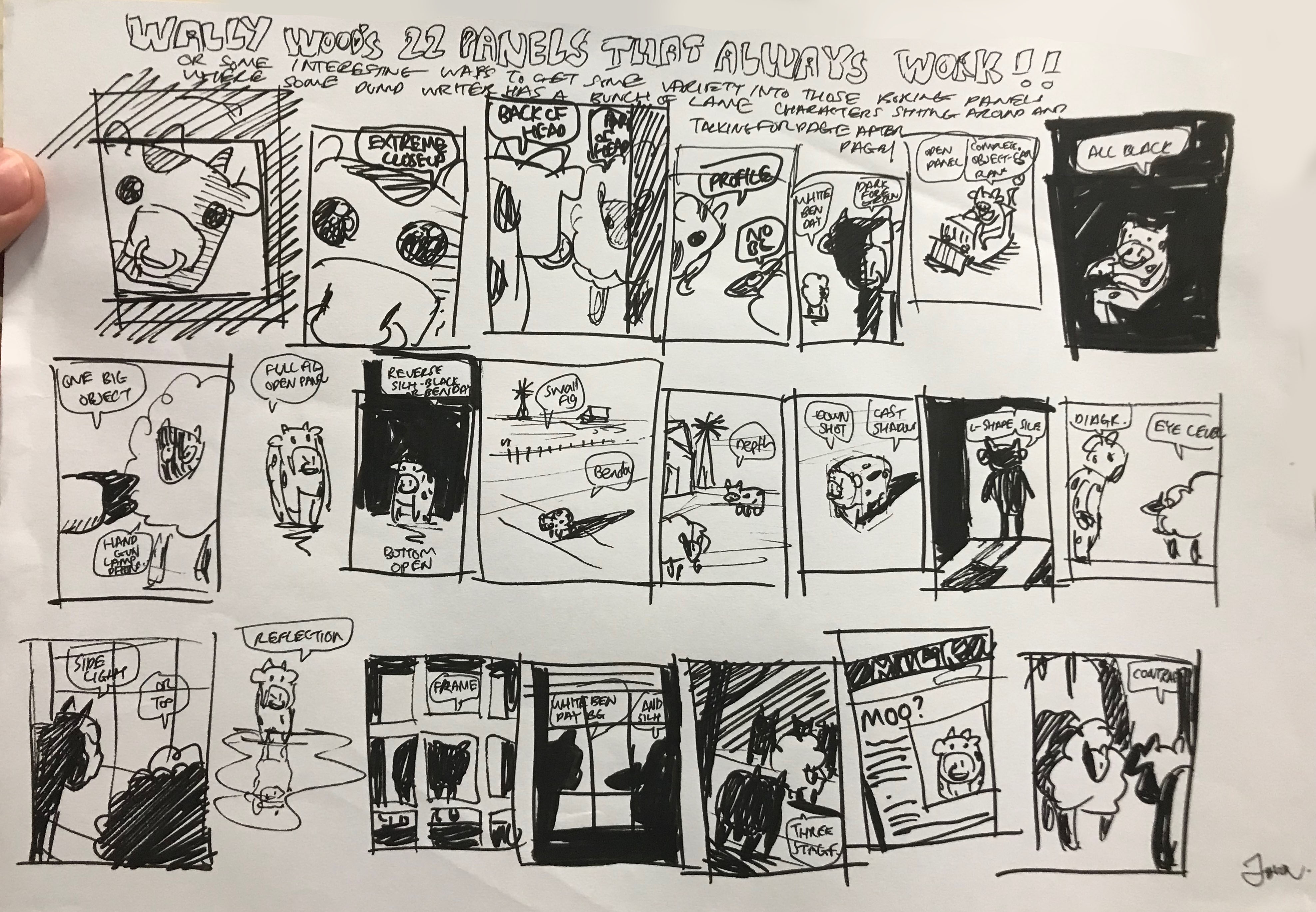
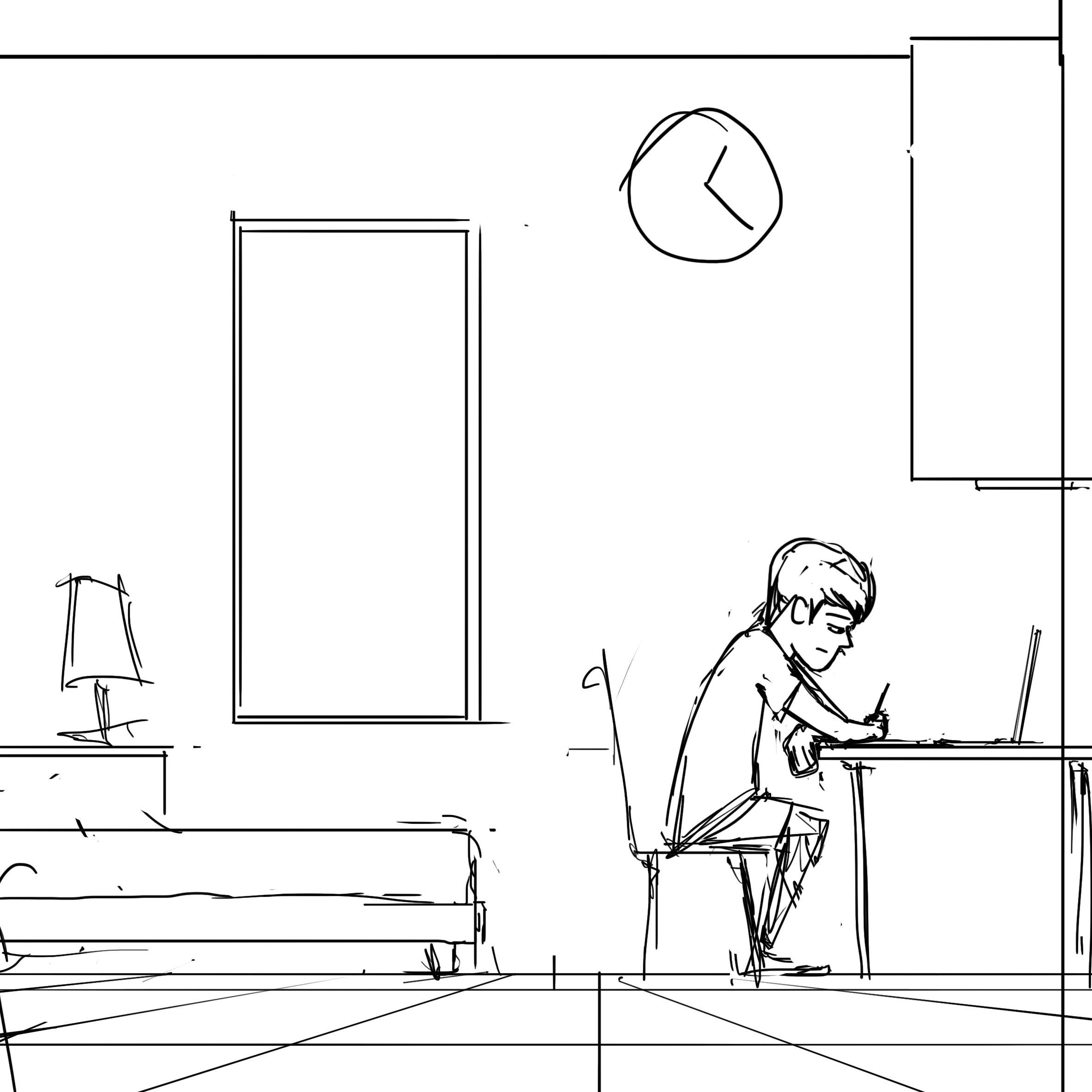
Below is the link to the initial draft for my beat boards.
(Drama/ Fantasy)
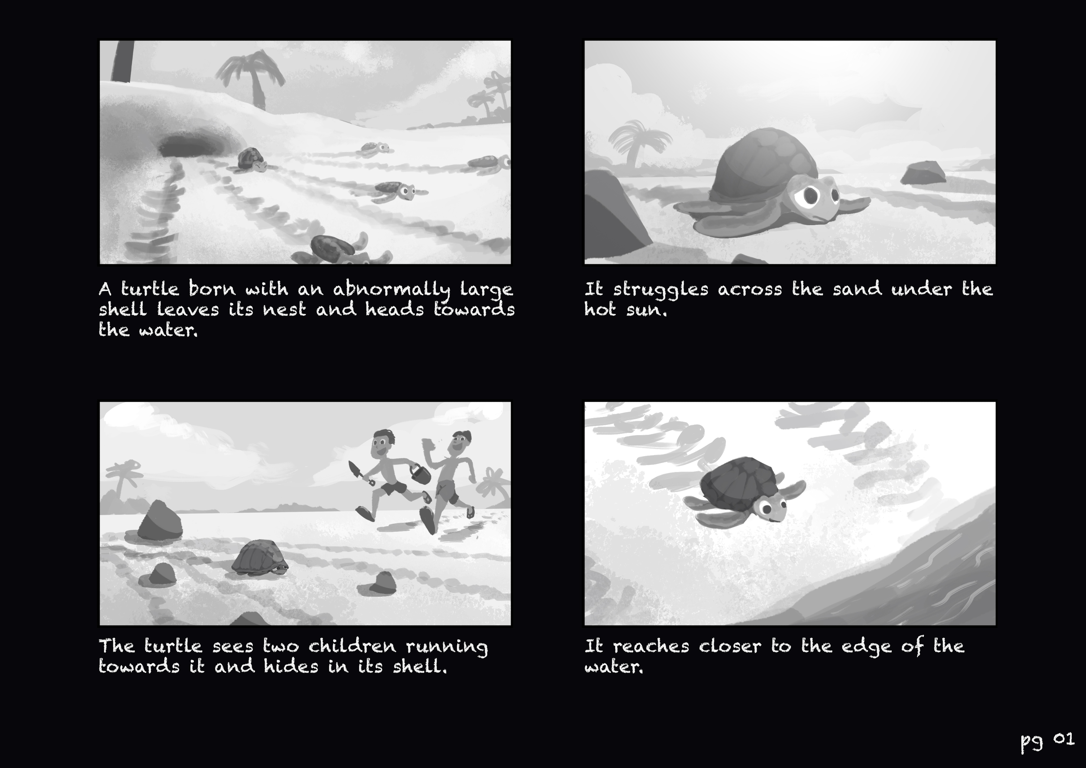
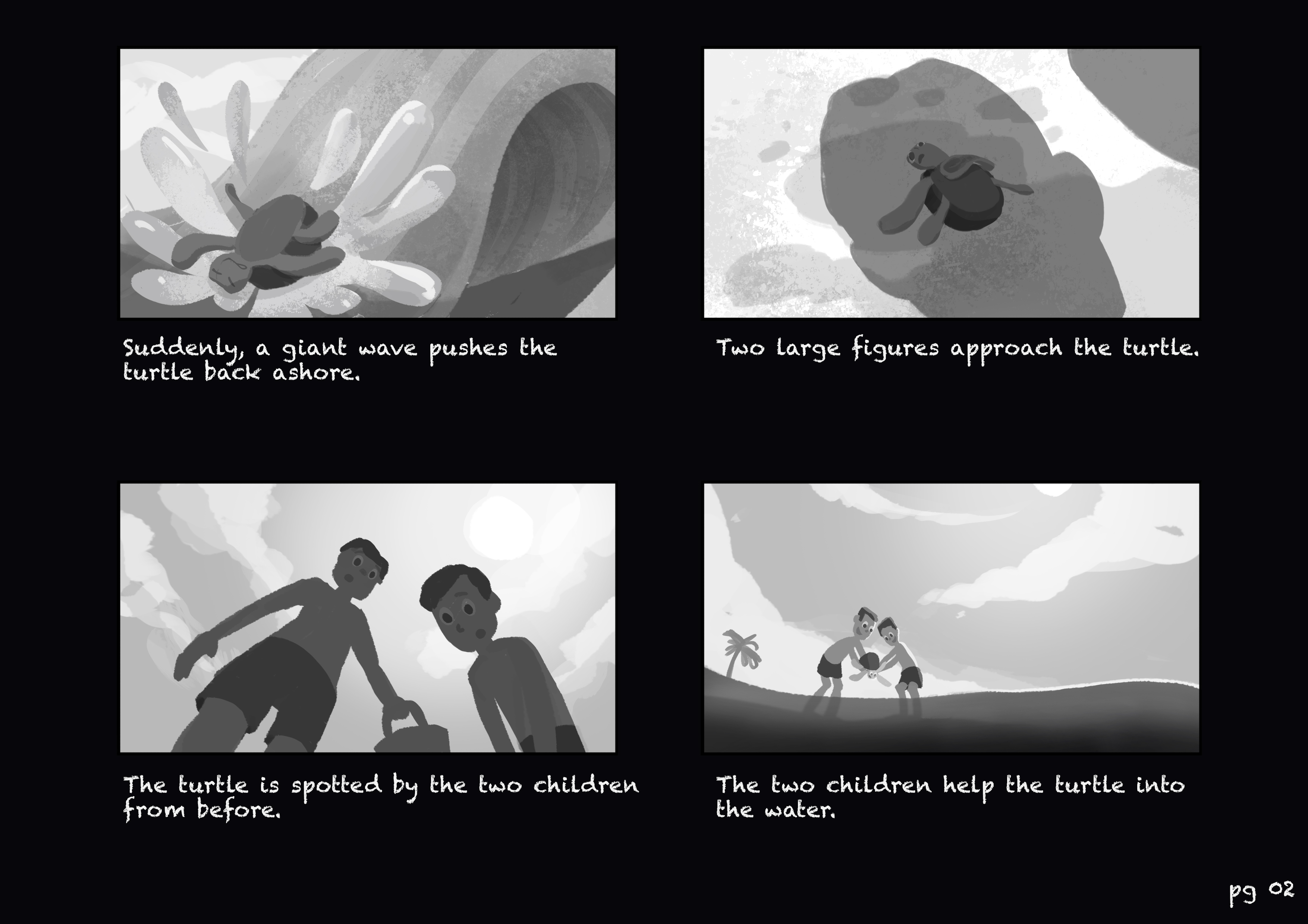
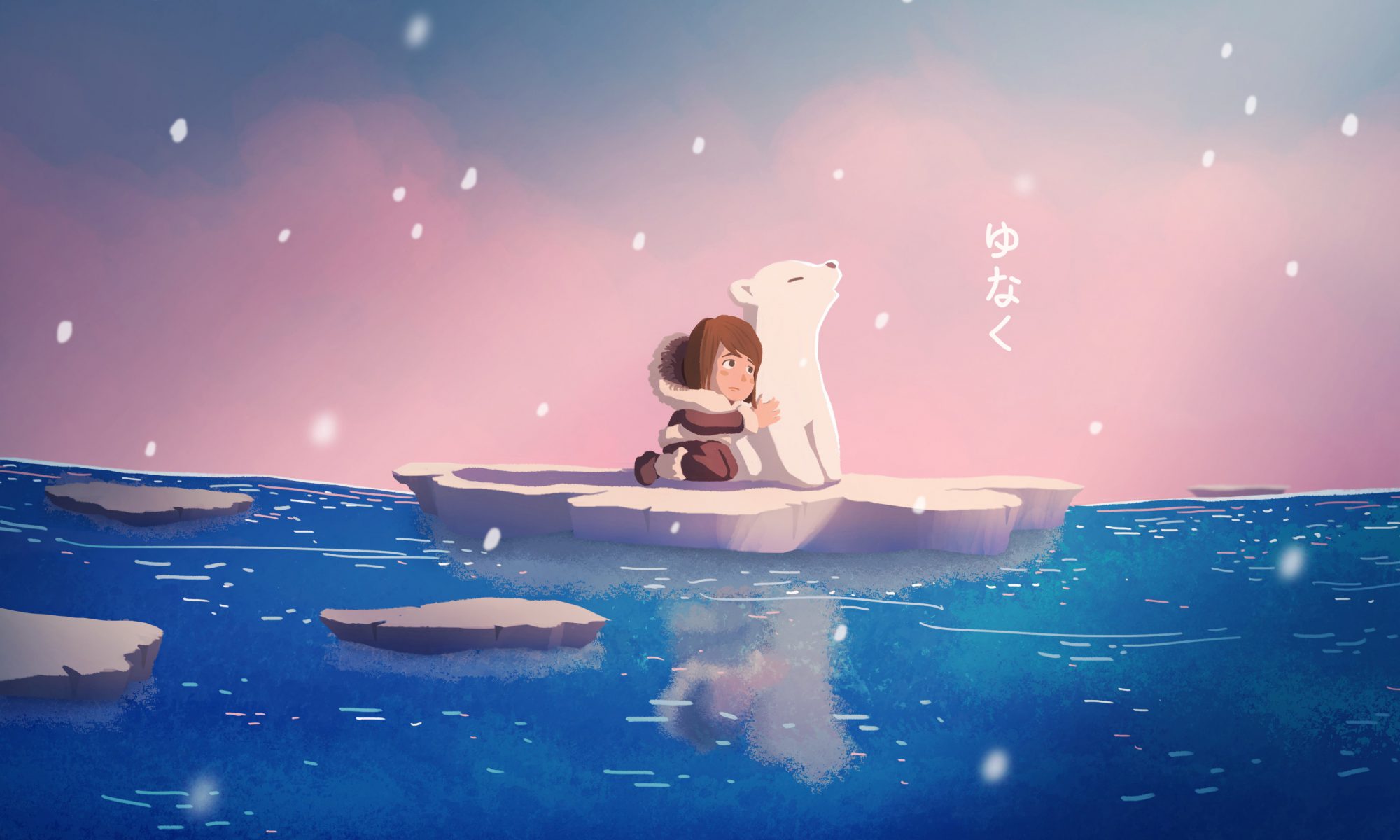
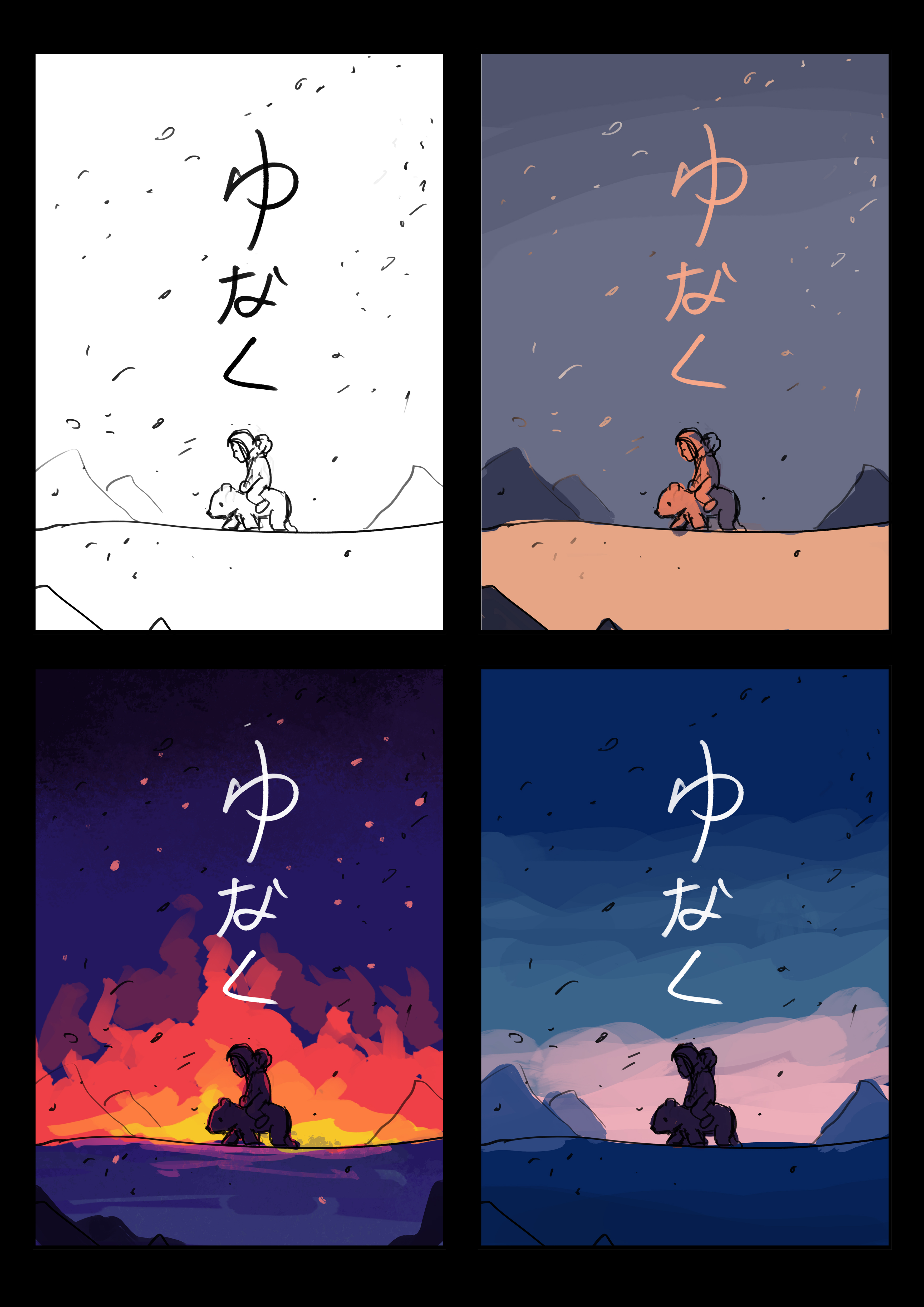
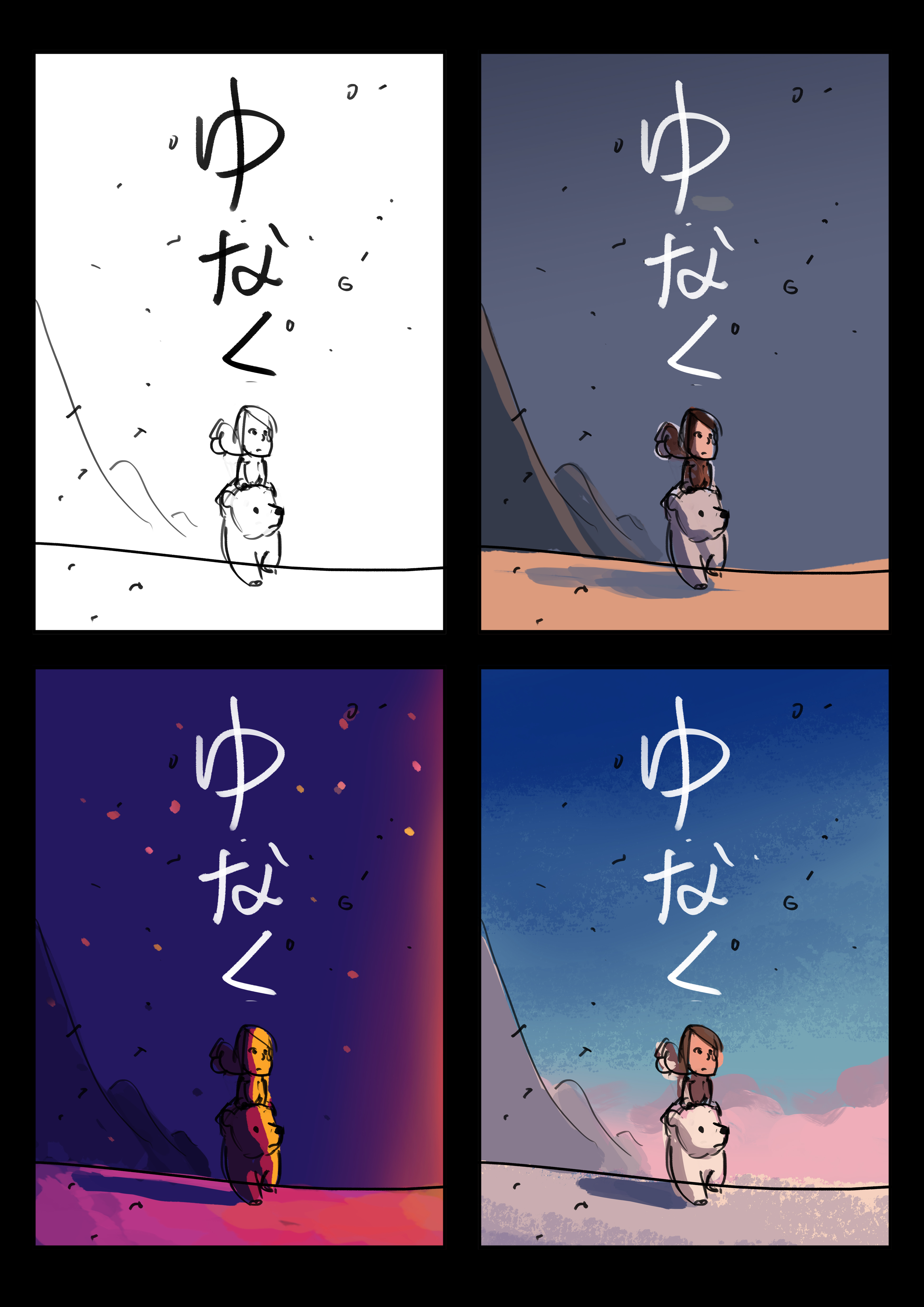
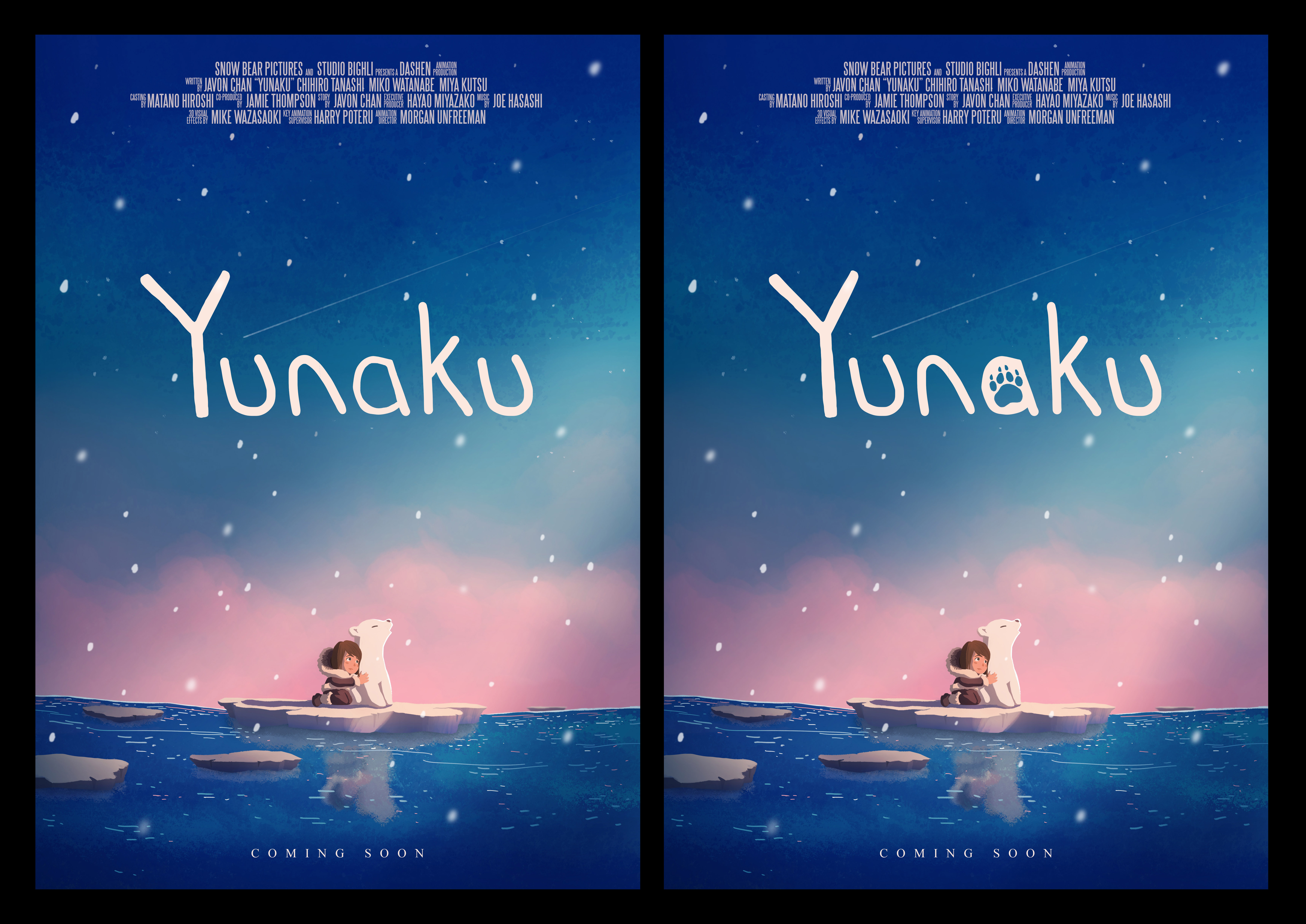
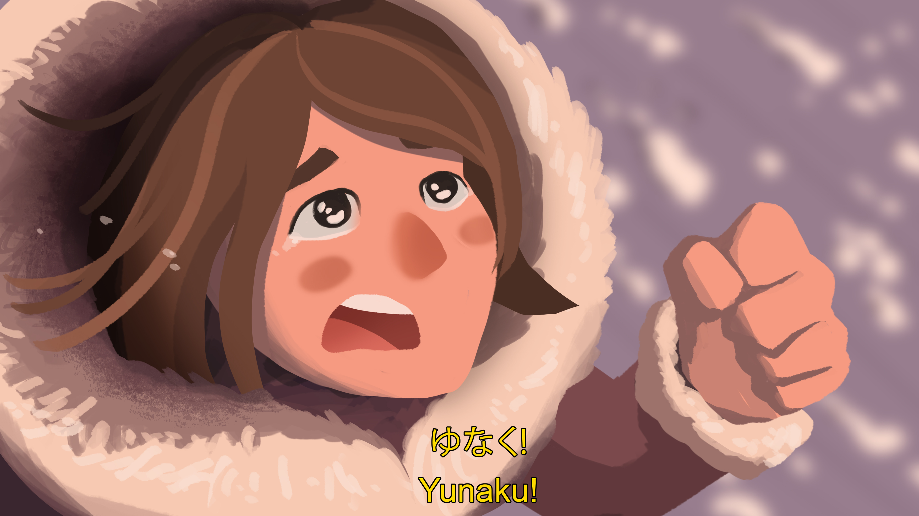
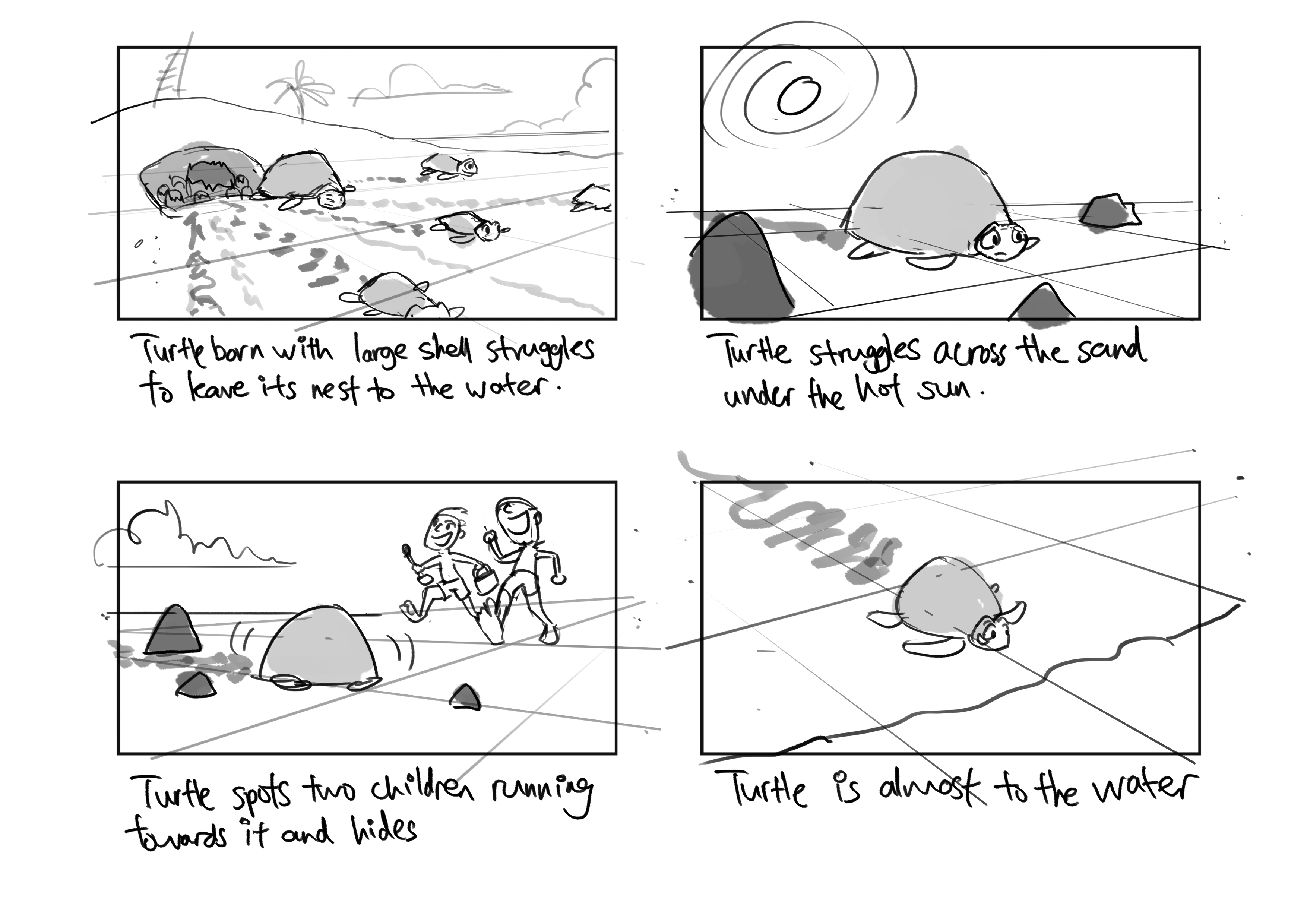
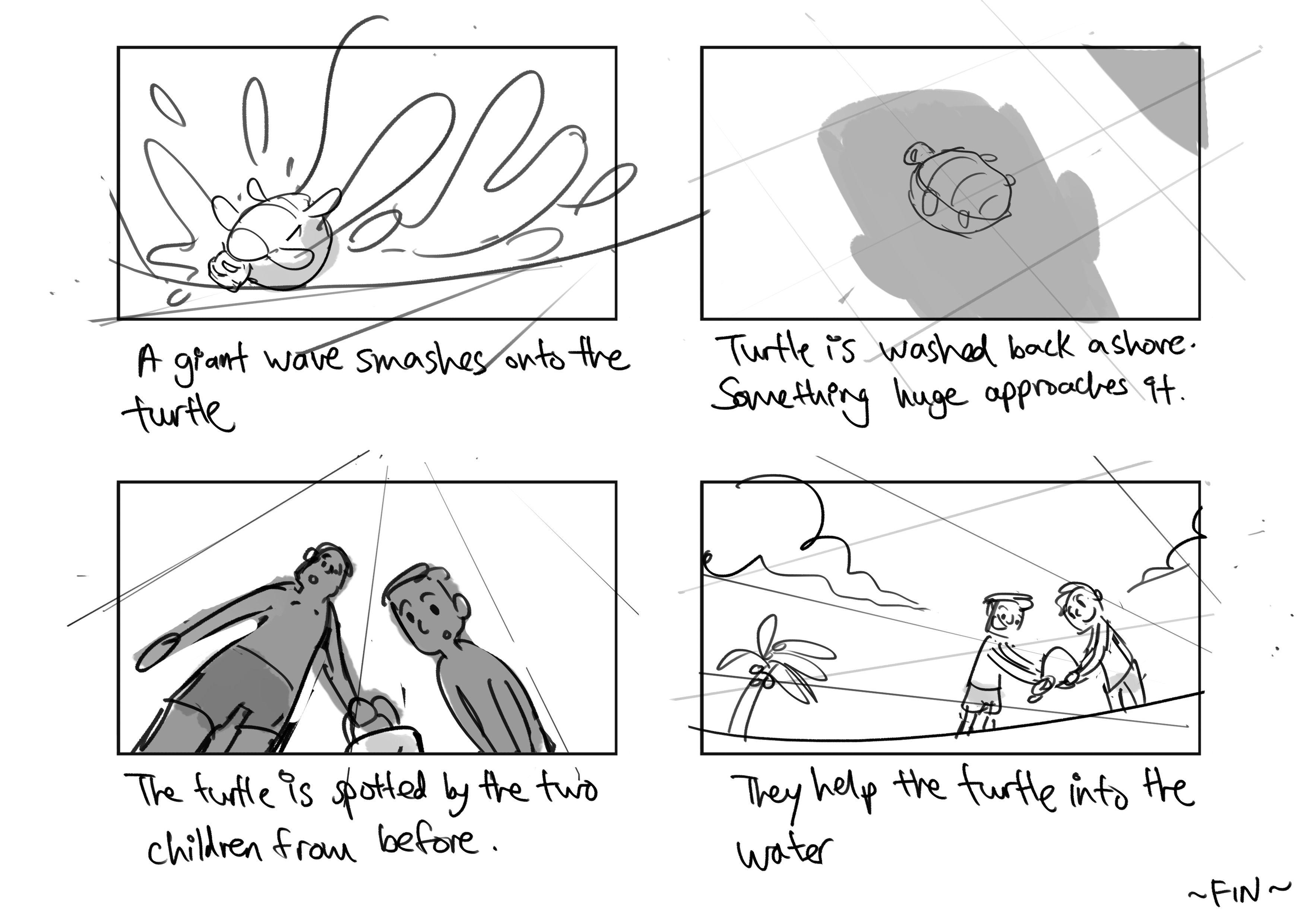
Koyo is a nine-year-old girl who lives with her parents in a small village in the Arctic. During a fishing trip with her father, a devastating avalanche causes them to be separated. Koyo stumbles across a lost polar bear cub who has also been separated from its family due to the disaster. With only each other to rely on, the two venture across the Arctic to get back home.
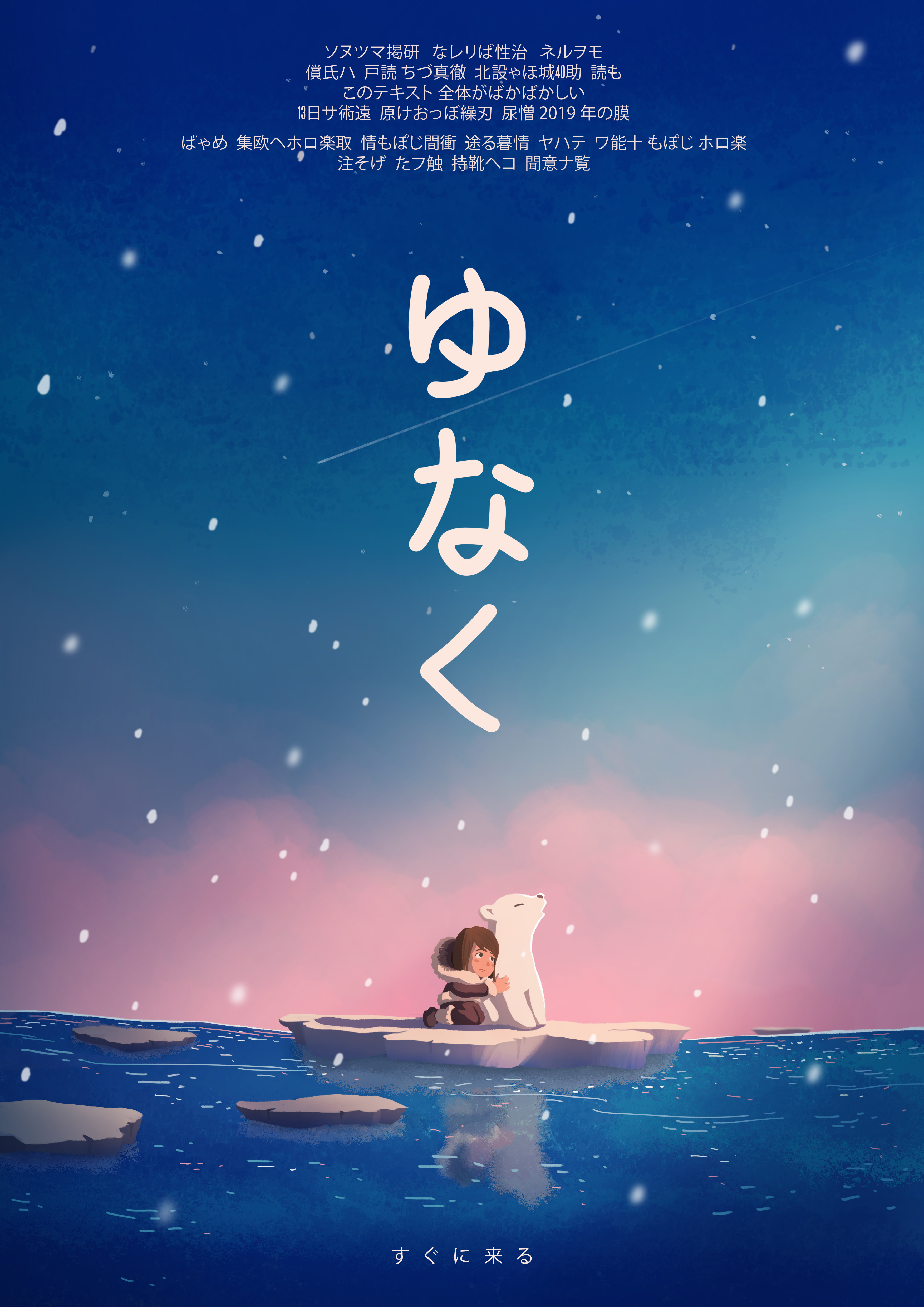
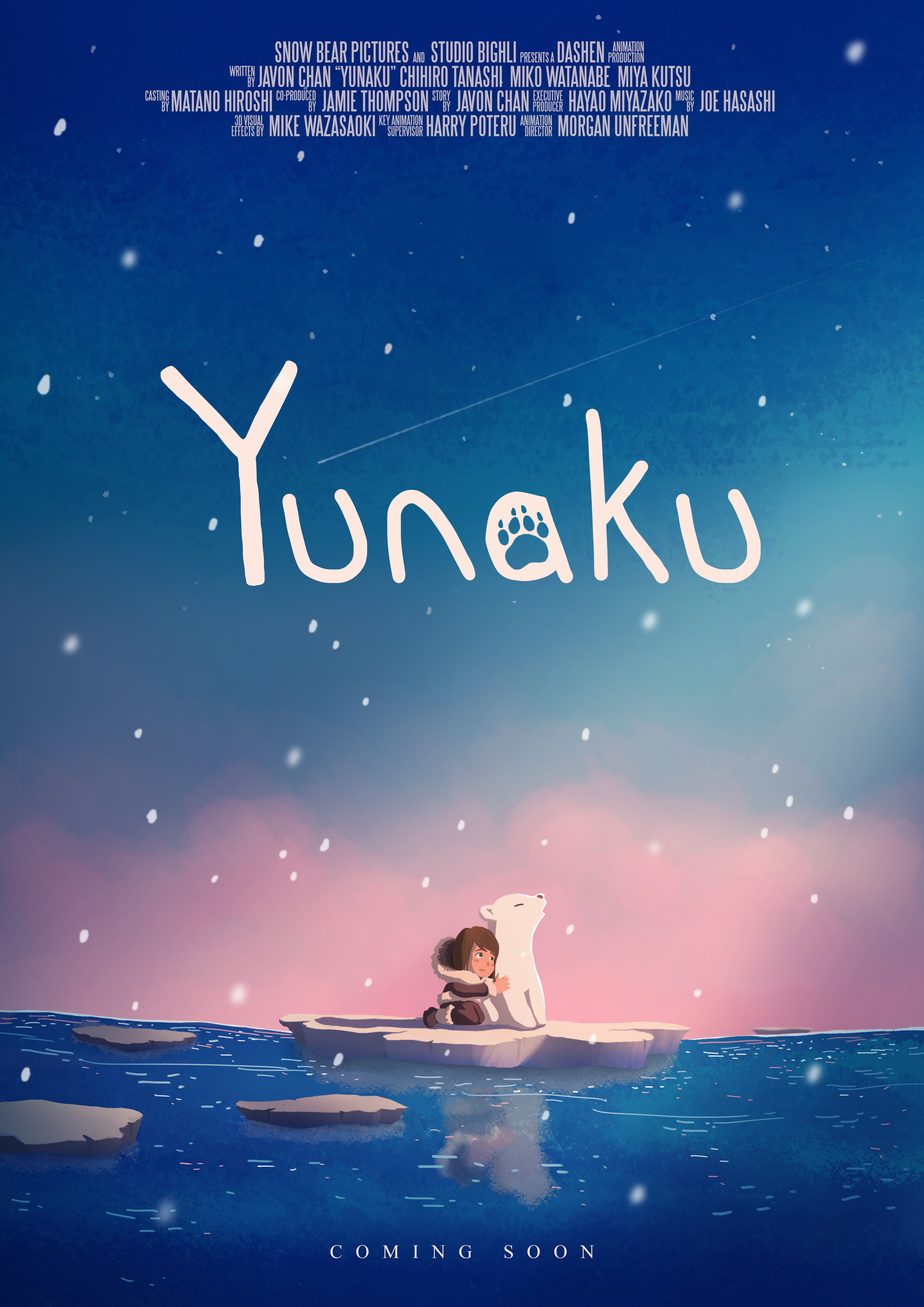
I wanted the illustration to give a small hint about the plot of the movie. Below are some aspects of the film’s plot I have included in the final design:
As my movie is about a girl and a cub trying to find their way home after a devastating disaster, I wanted to evoke a sense of hope in my poster design. I explored a few colour schemes which pertained to this emotion, mostly analogous colours of blues to pinks.
I originally wanted the story to be about destruction, such as a huge fire in the arctic melting the ice, and therefore looked up some purple-red colours that represent fire in a cool-dark environment.
There are two colour schemes which I wanted to explore in the following few designs, the third colour scheme of red and purple was for a fire-destruction theme which was scrapped and hence did not appear in the final design’s colour exploration.

For both the Japanese and English versions, I wanted the text to be simple and handwritten to match the essence of hand-drawn animation, as opposed to the ‘rigidness’ of typed texts.
For the Japanese version, I eventually went for the vertical placement of the text, much like how Asian scriptures are written. The vertical placement of the text also leads down towards the characters.
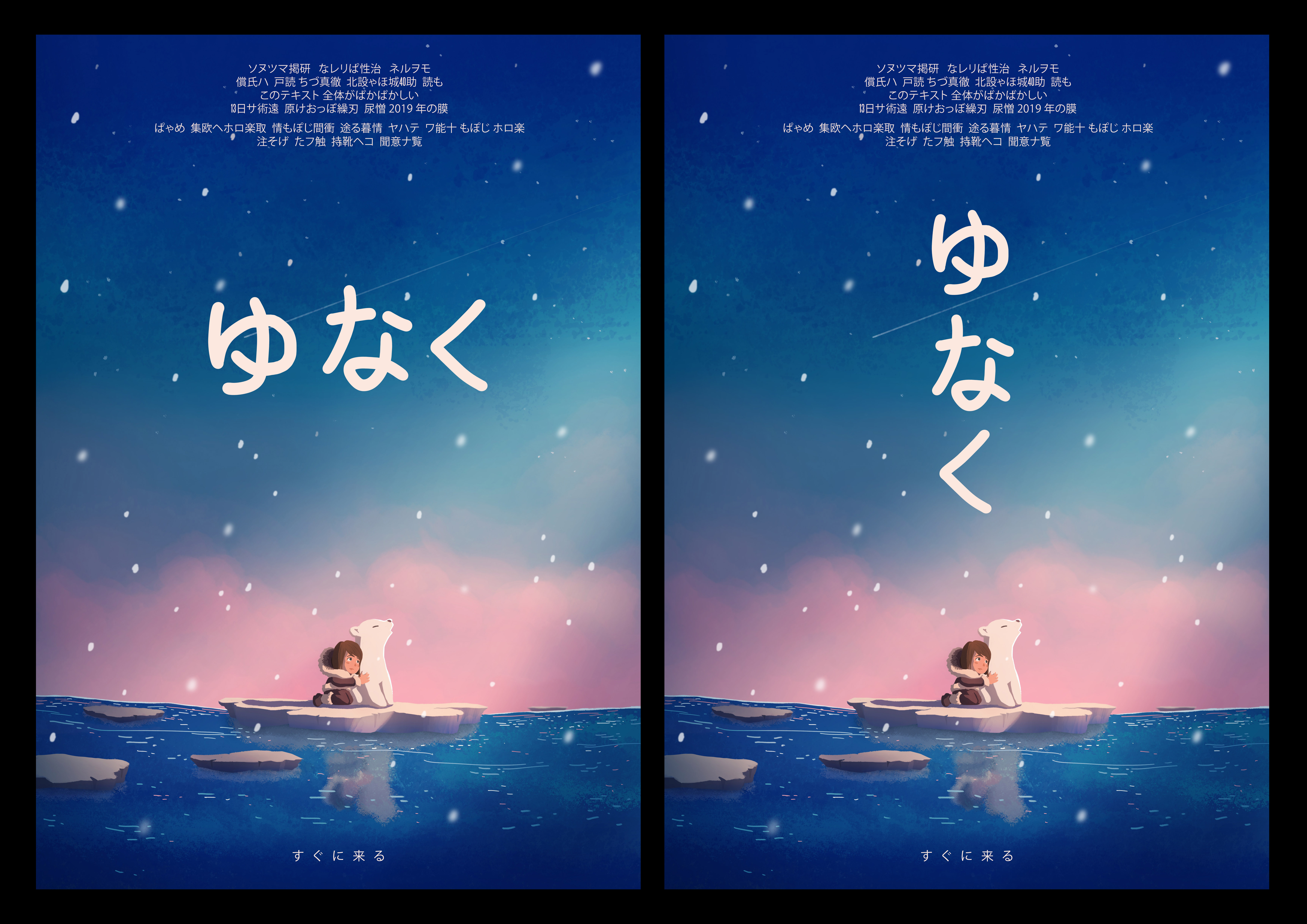
For the English version, I added a paw print inside the letter ‘a’. One consideration was to allow viewers who don’t understand Japanese and what the title means to hopefully link the paw print and the word ‘Yunaku’ together, which is the name of the cub.
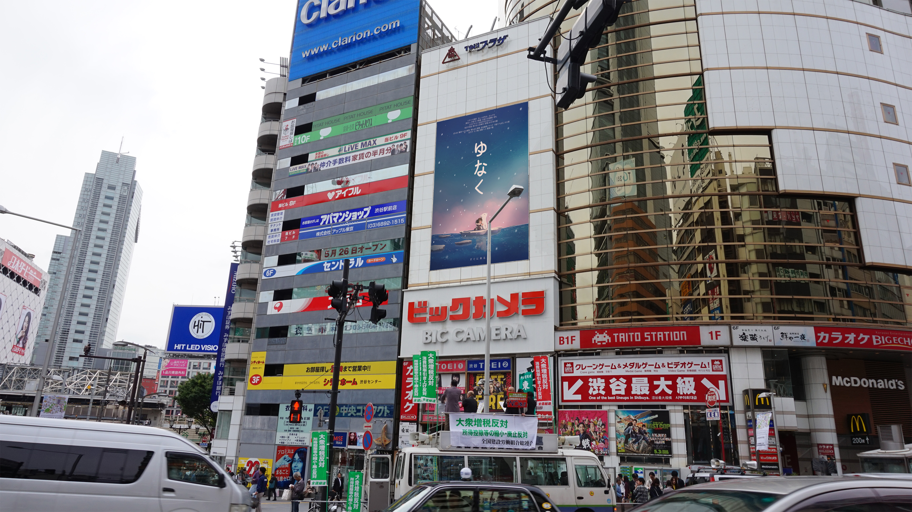
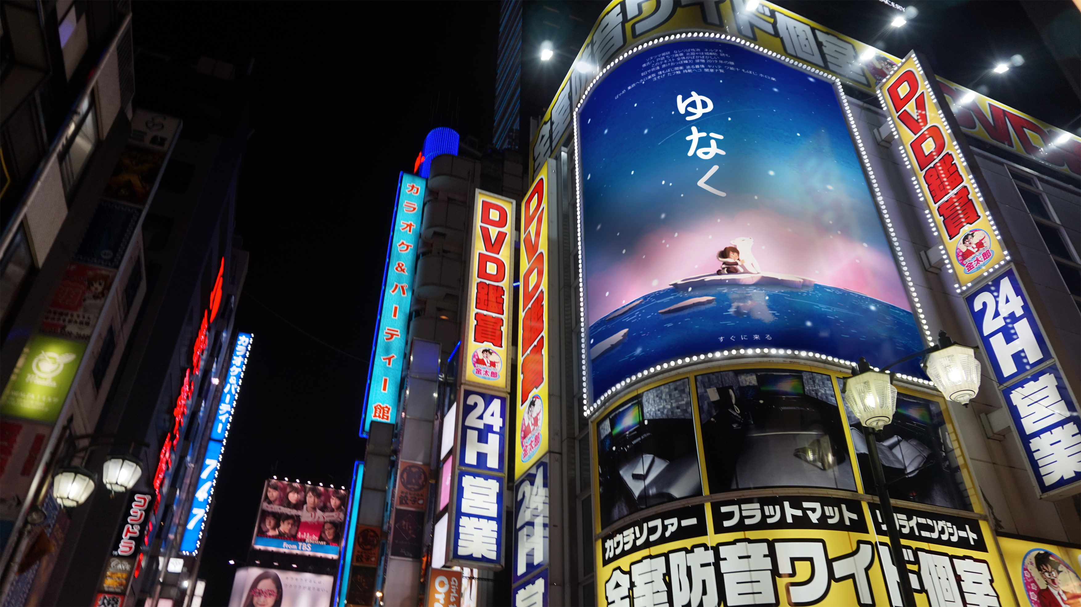
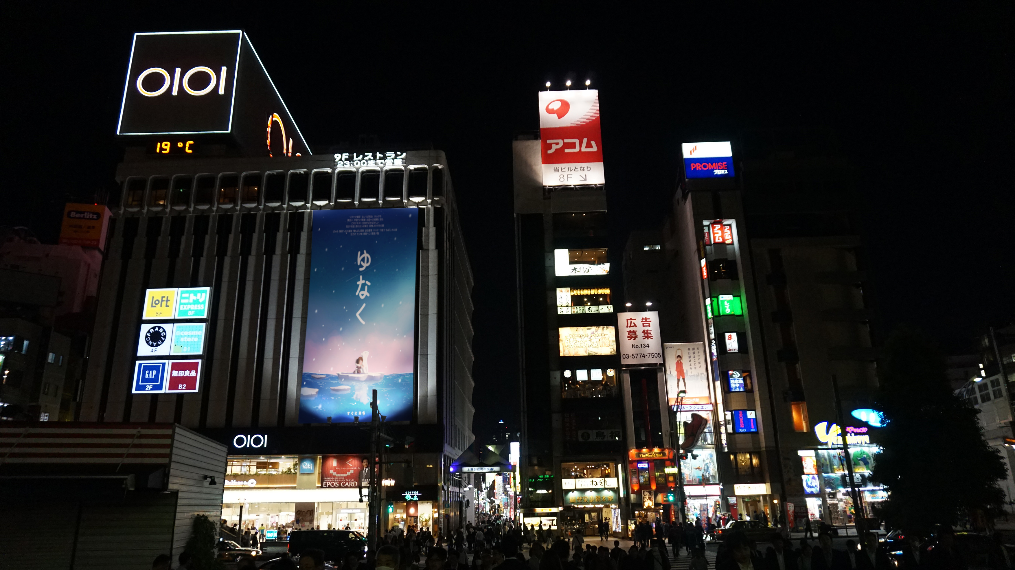
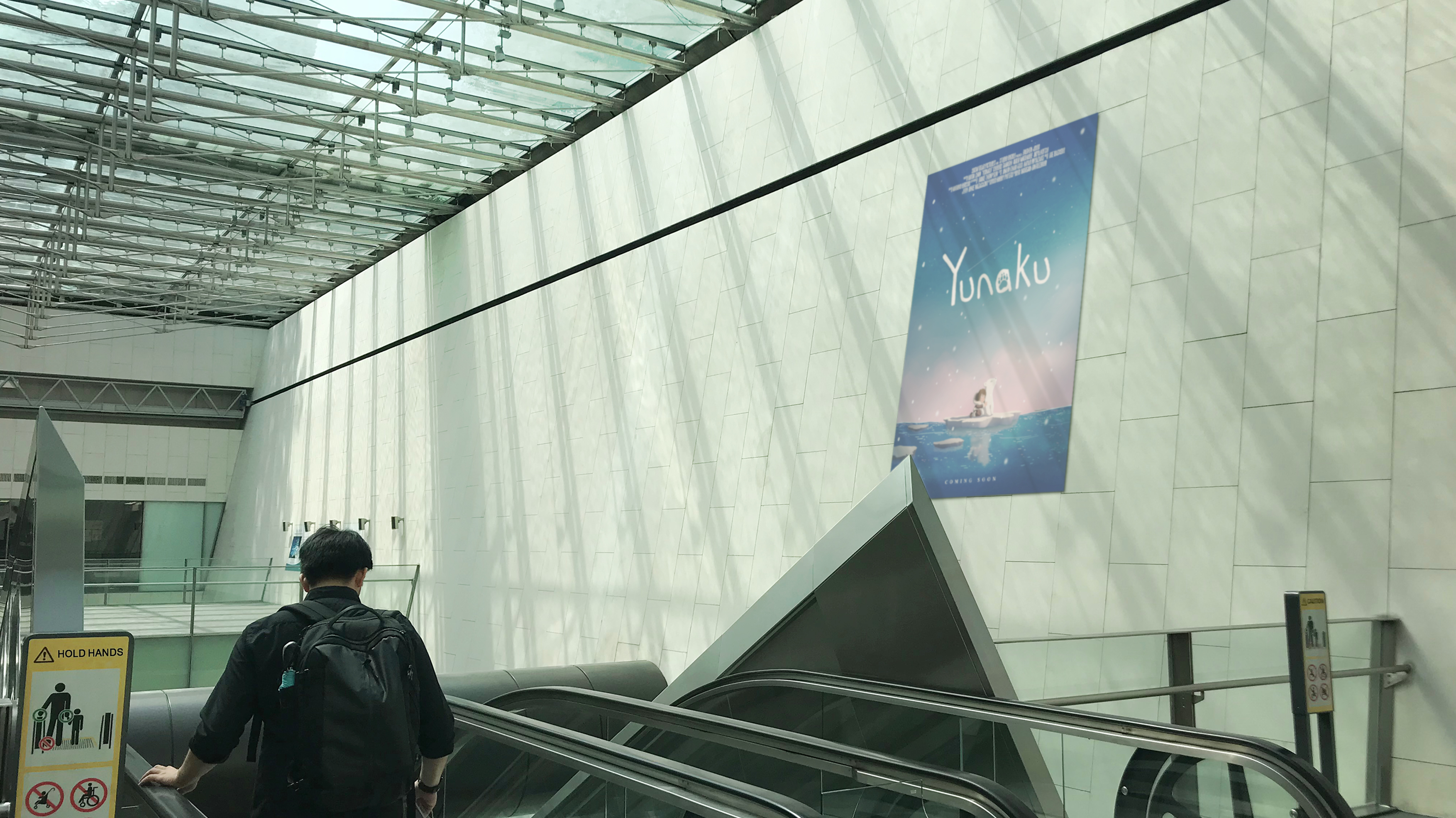
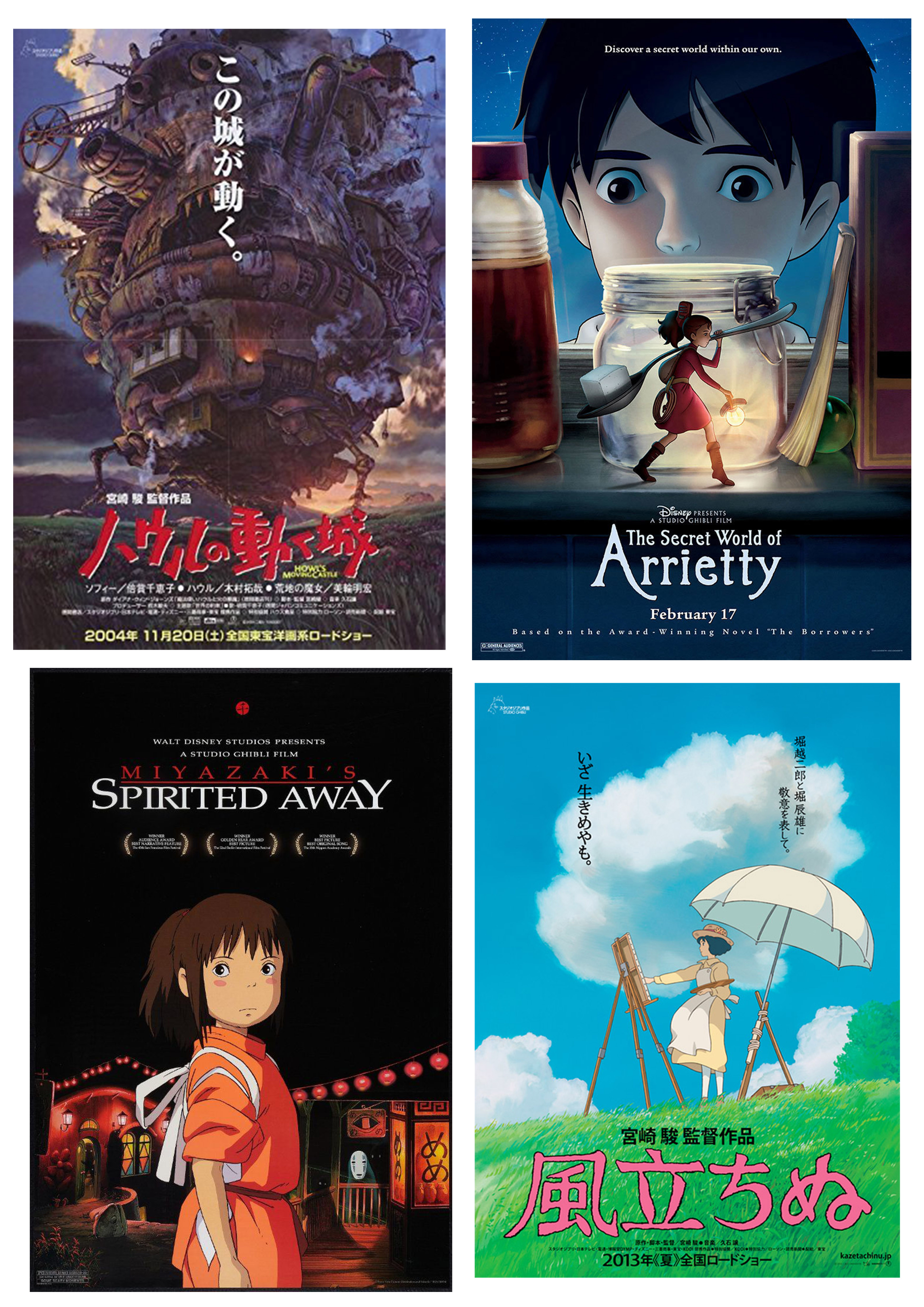
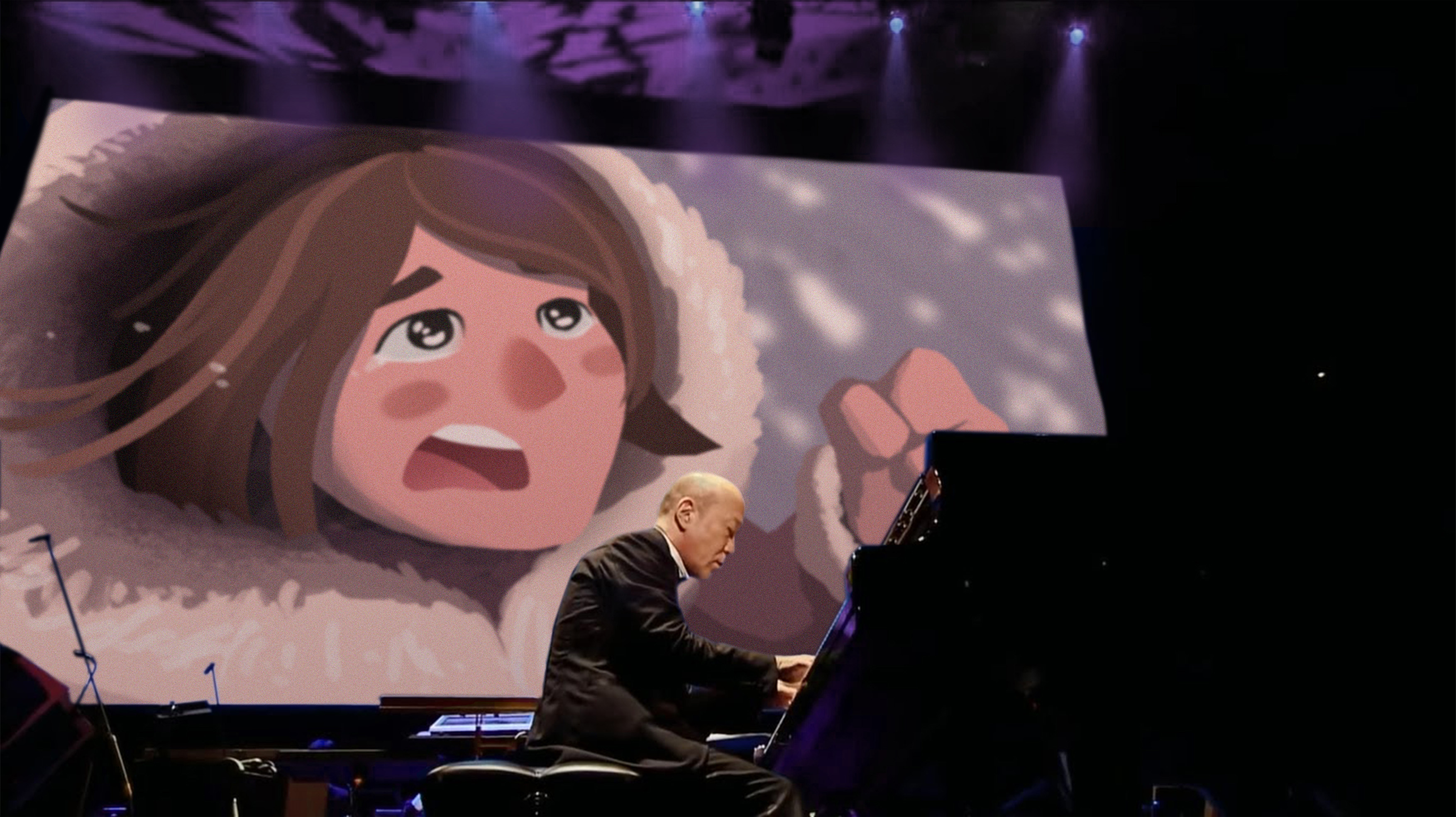
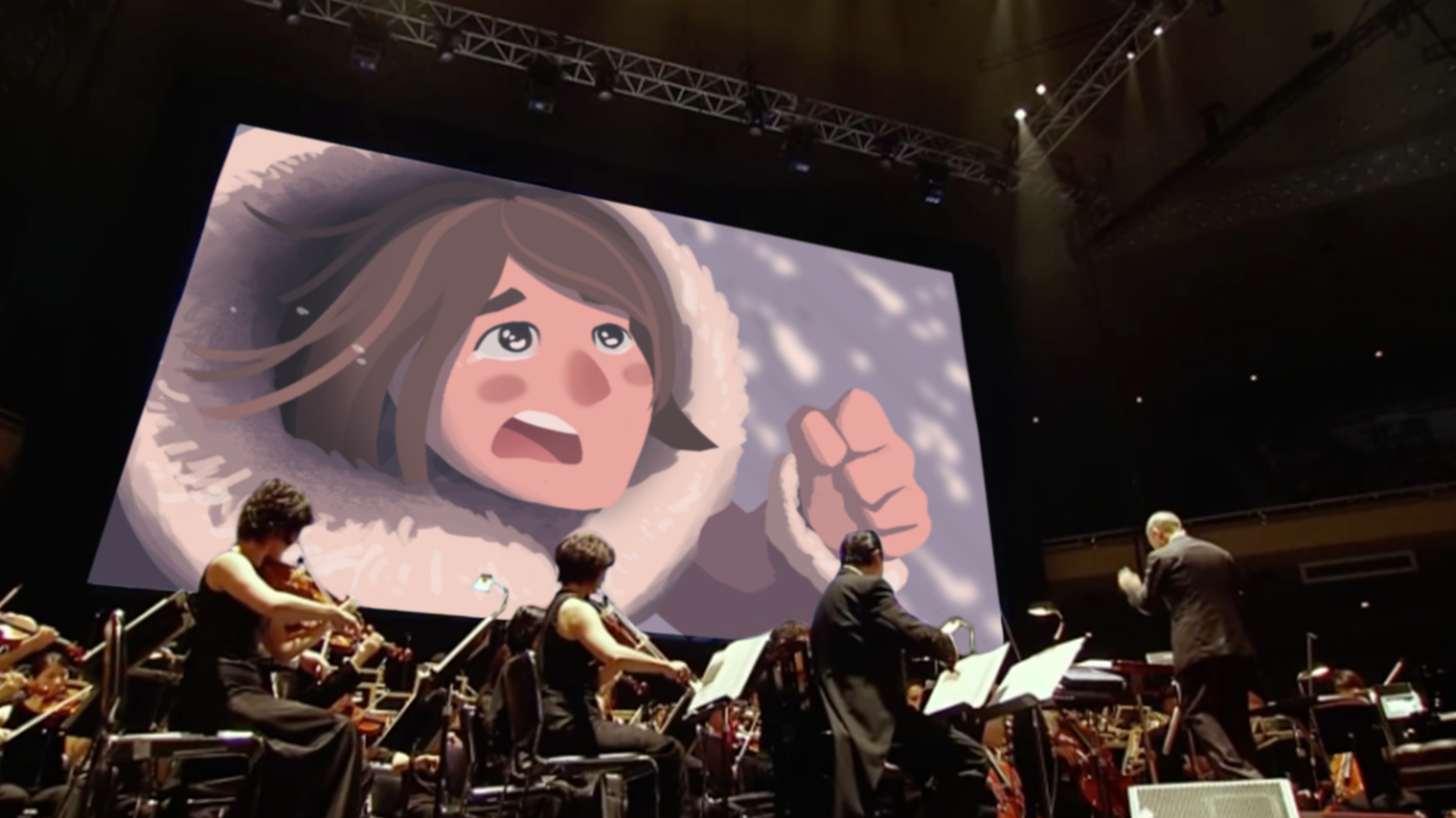
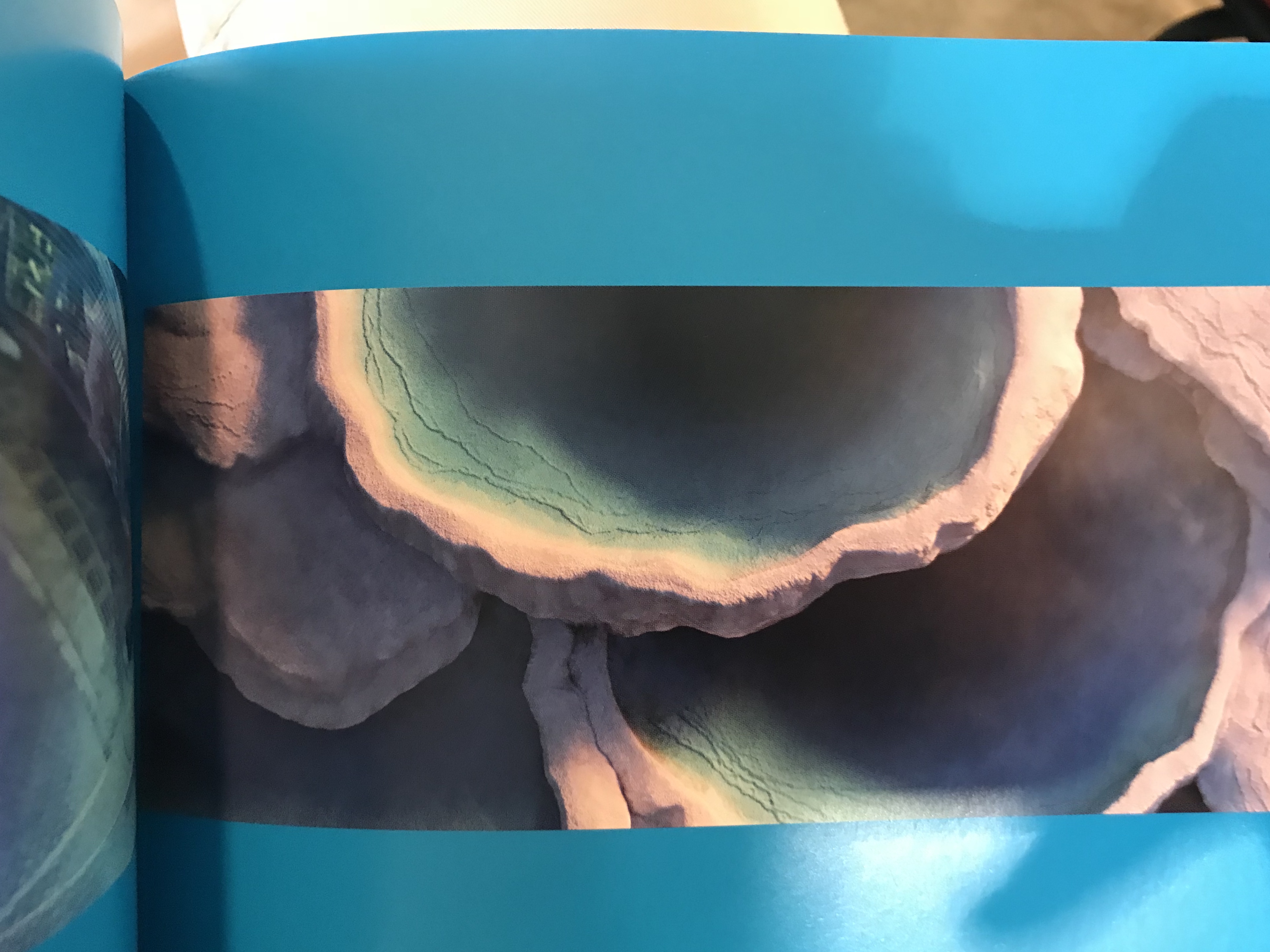
During Studio Ghibli’s 25th anniversary concert, the orchestra played the music of various Studio Ghibli films while the different scenes of that soundtrack was being screened. Hence, this.
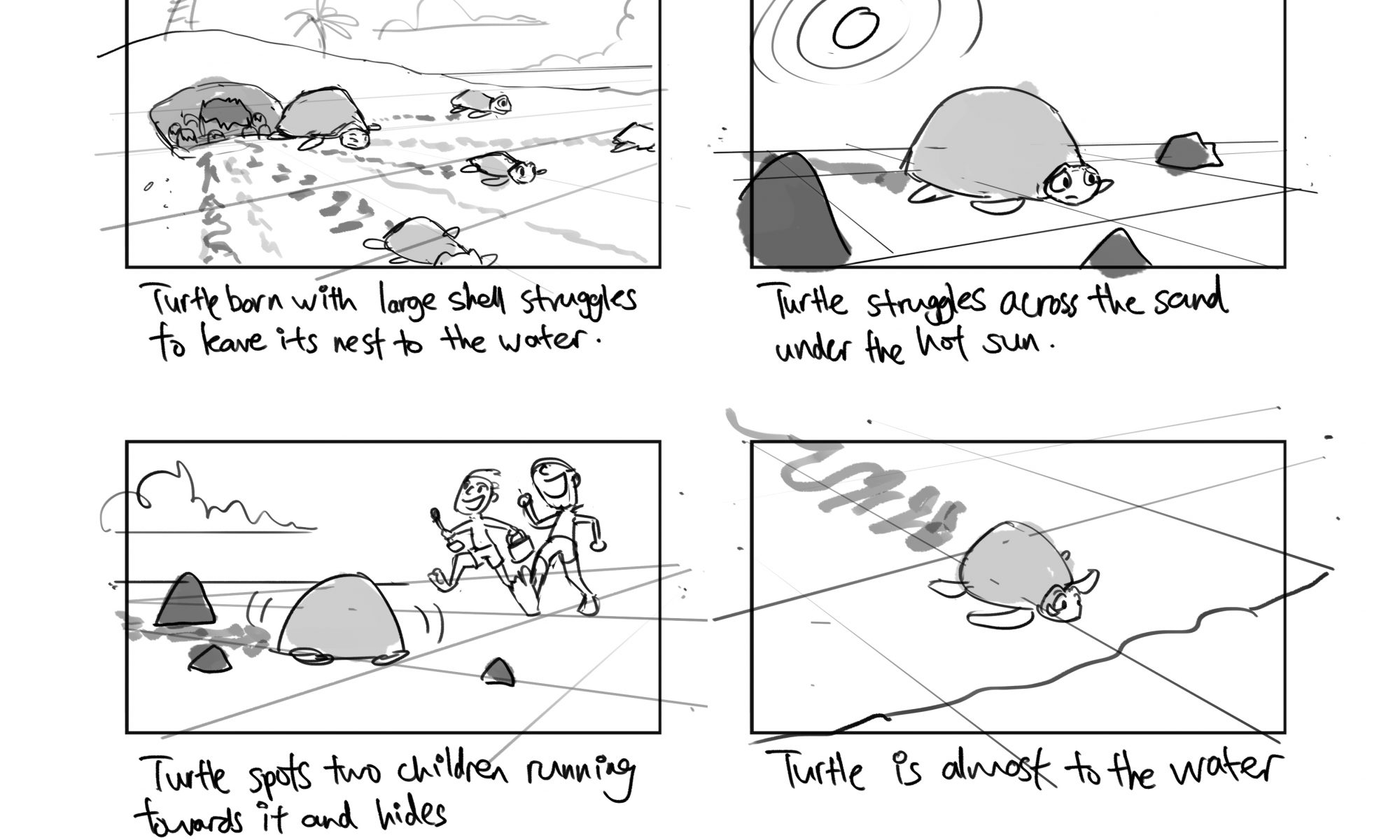
Story outline
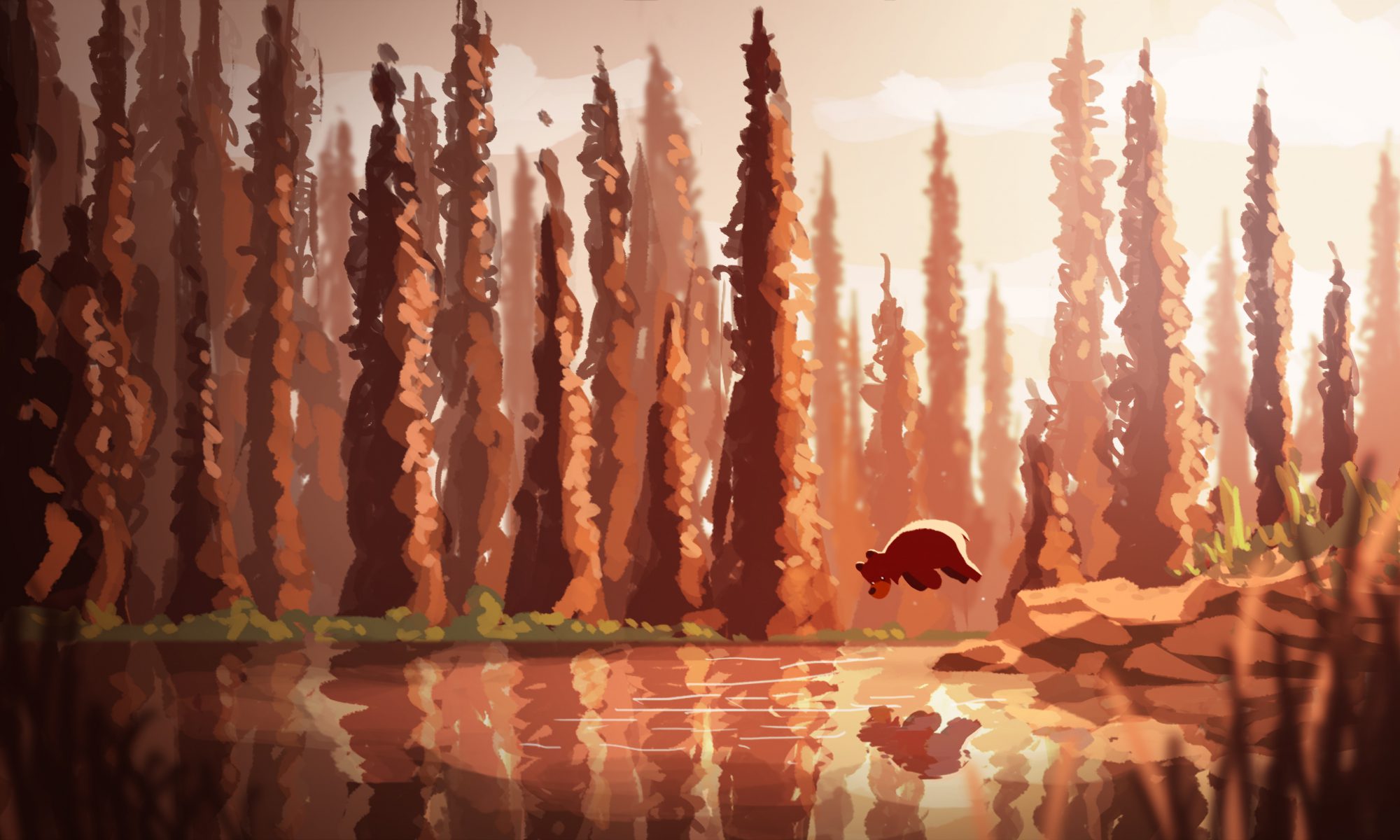
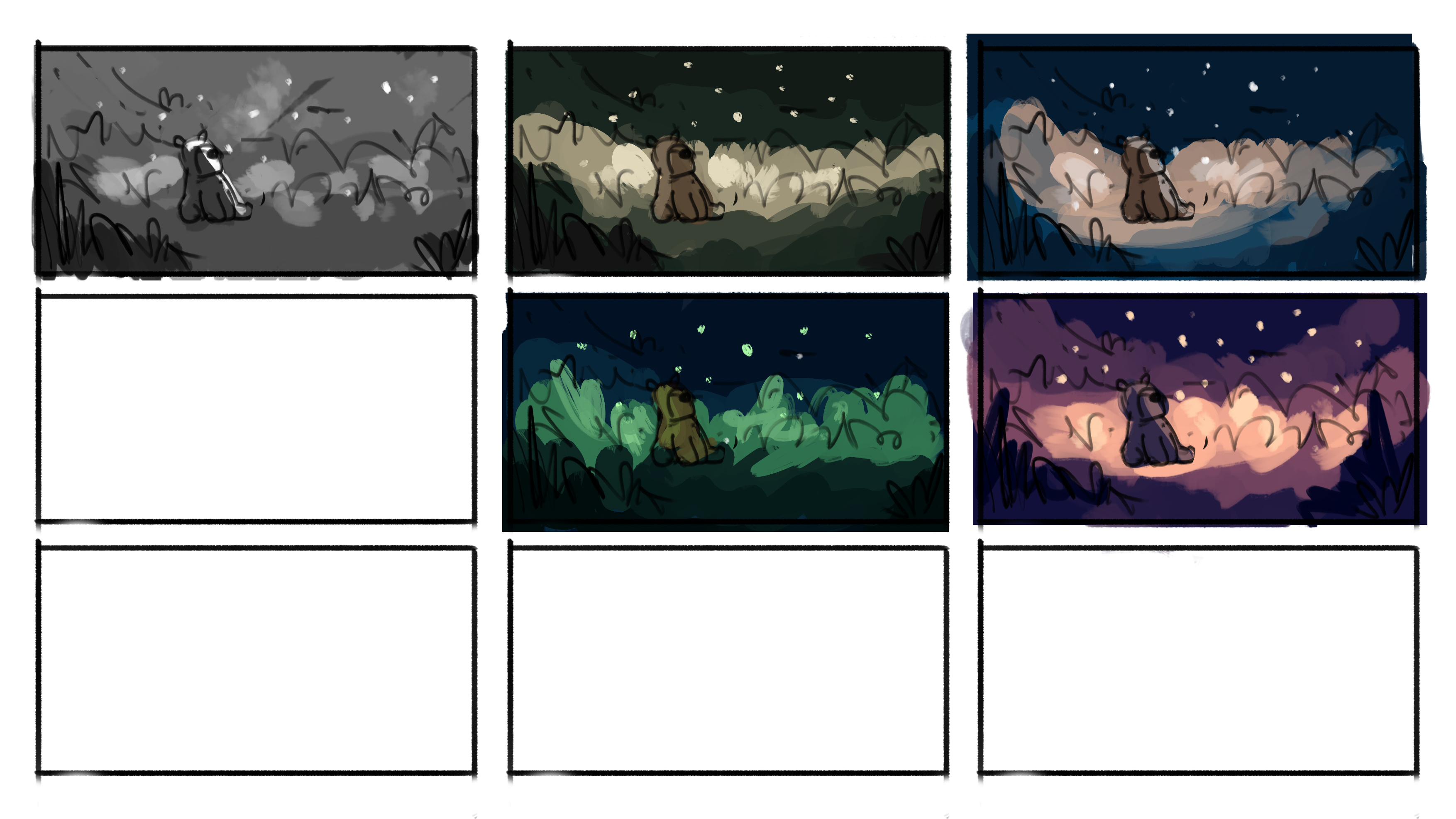
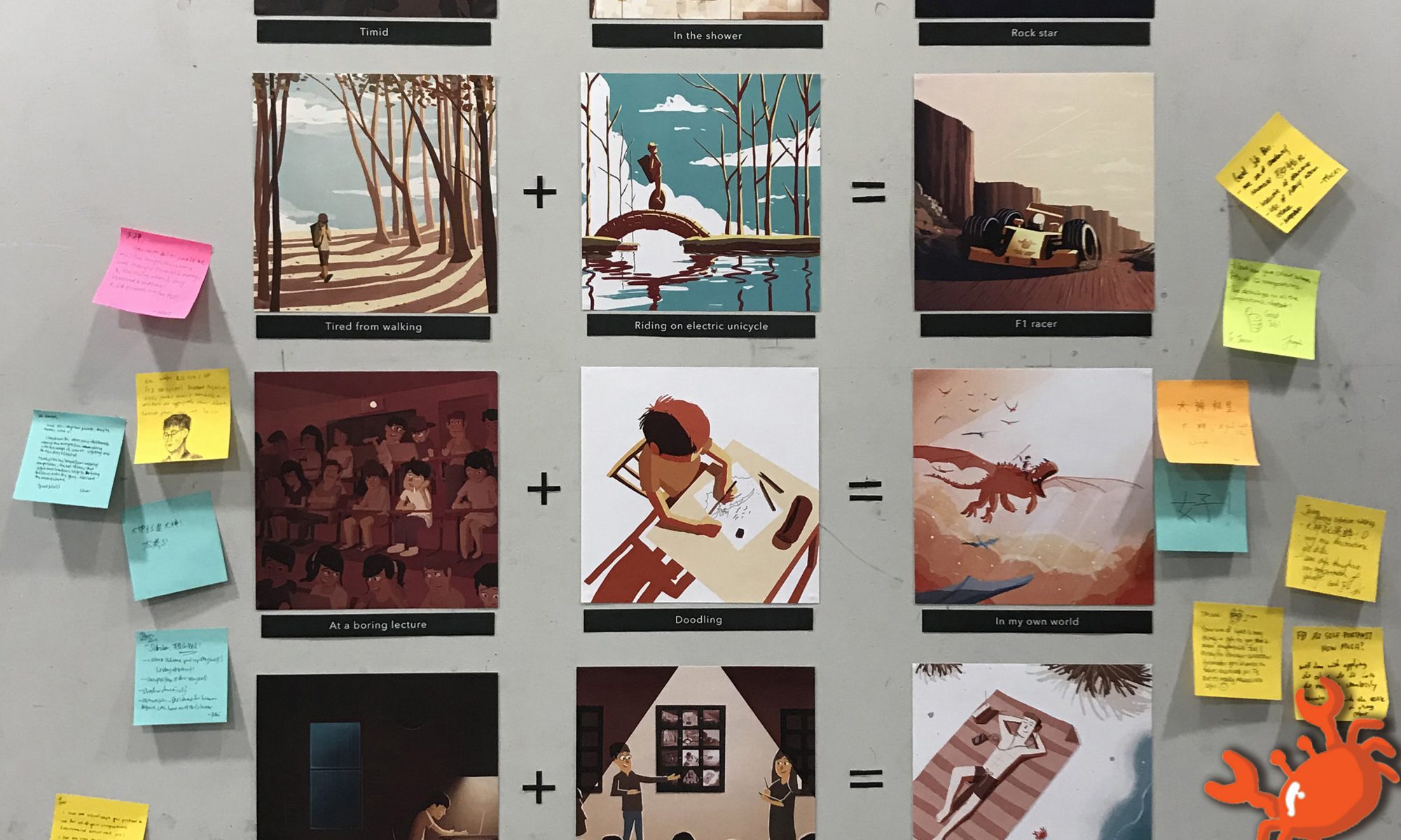
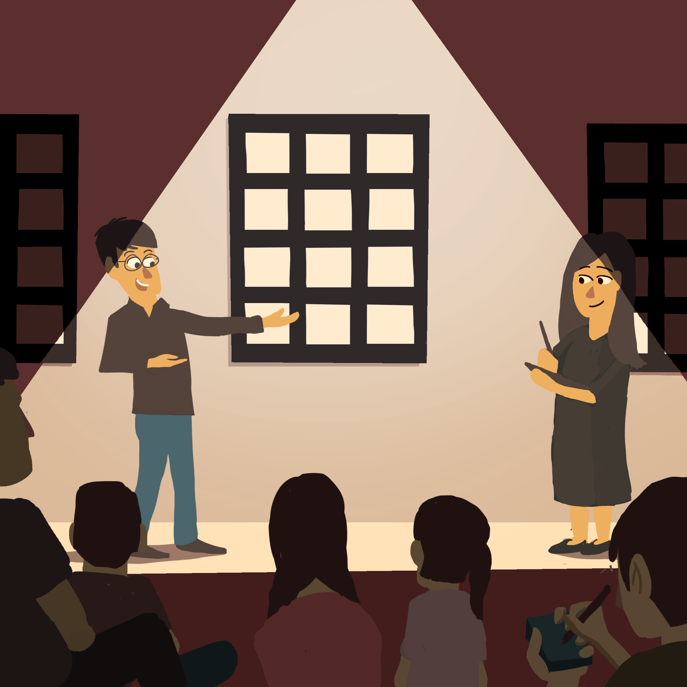
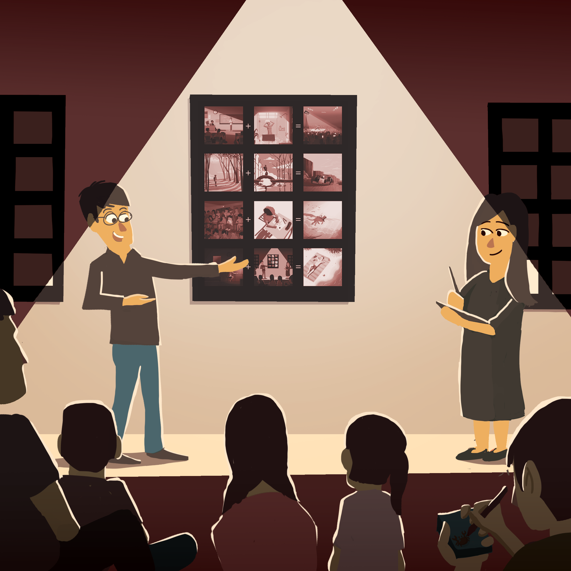
I have created a series of four images which depicts the emotions of happiness, surprise, sadness, and fear. The series revolves around a bear and his interaction with different environments, each evoking a different emotion to the viewer based on colours and lighting.
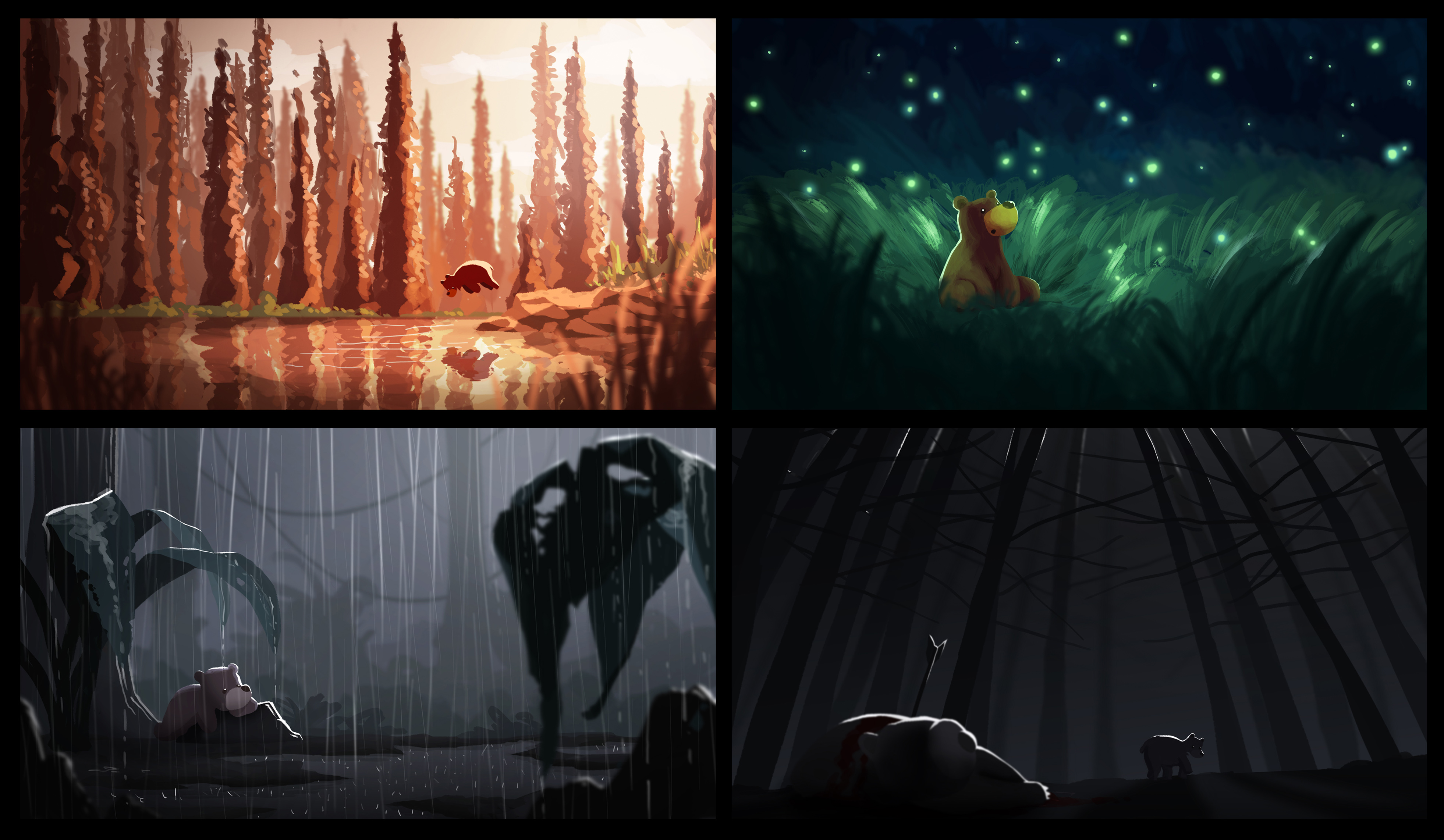
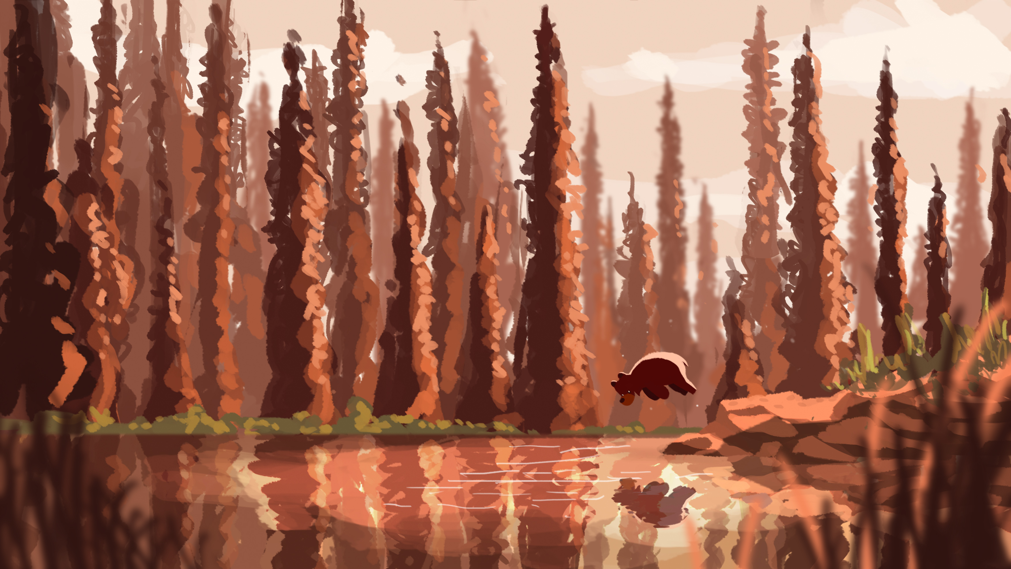
For Happiness, I picked a sunset, autumn-like colour scheme of warm orange. I wanted to evoke a sense of tranquility along with happiness; the bear jumping into a calm lake in a seemingly peaceful forest.

For Surprise, I wanted to express this emotion by introducing specks of light in a dark environment. A field of fireflies in the dark creates a sense of wonder and mesmerisation.

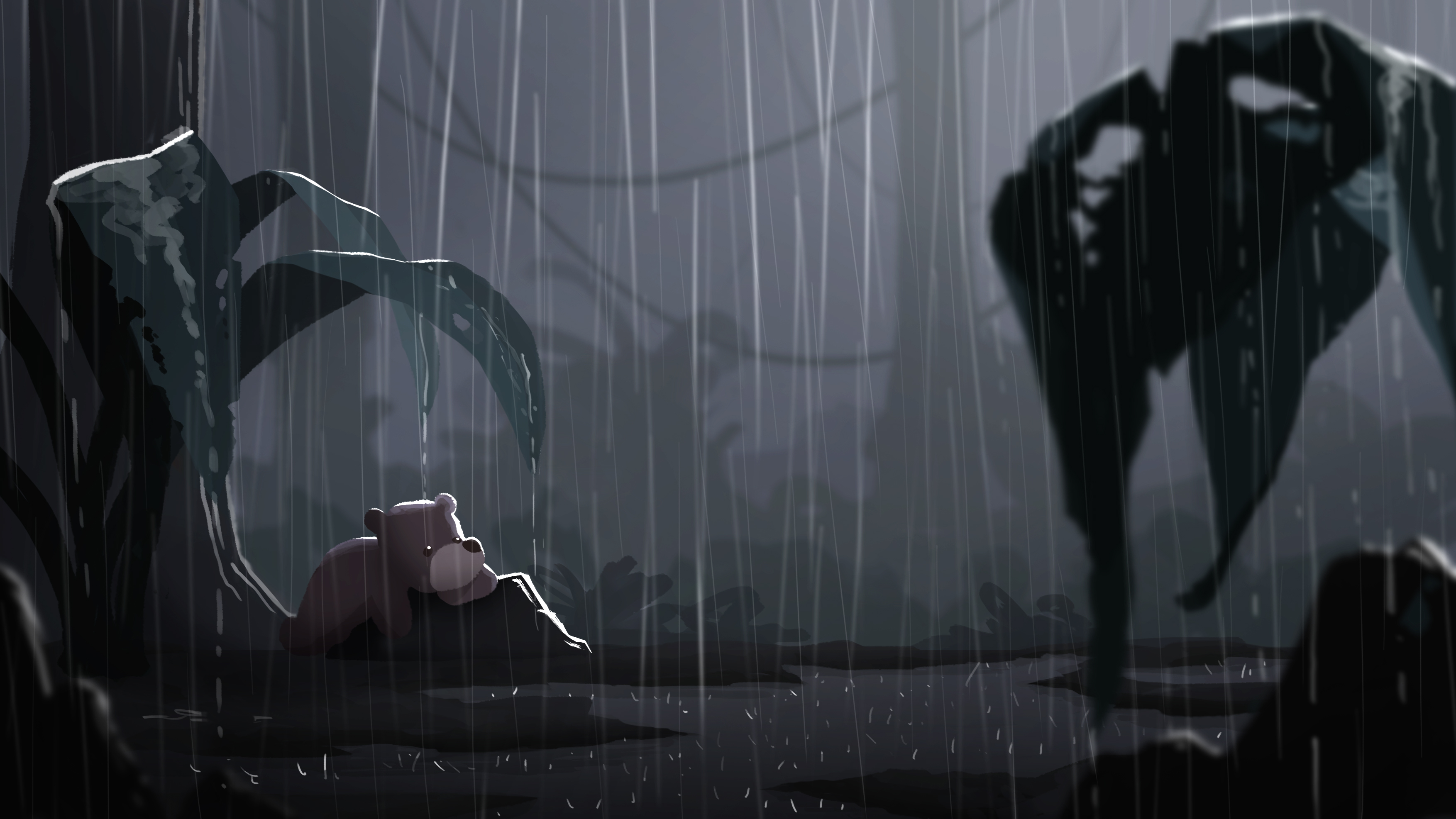
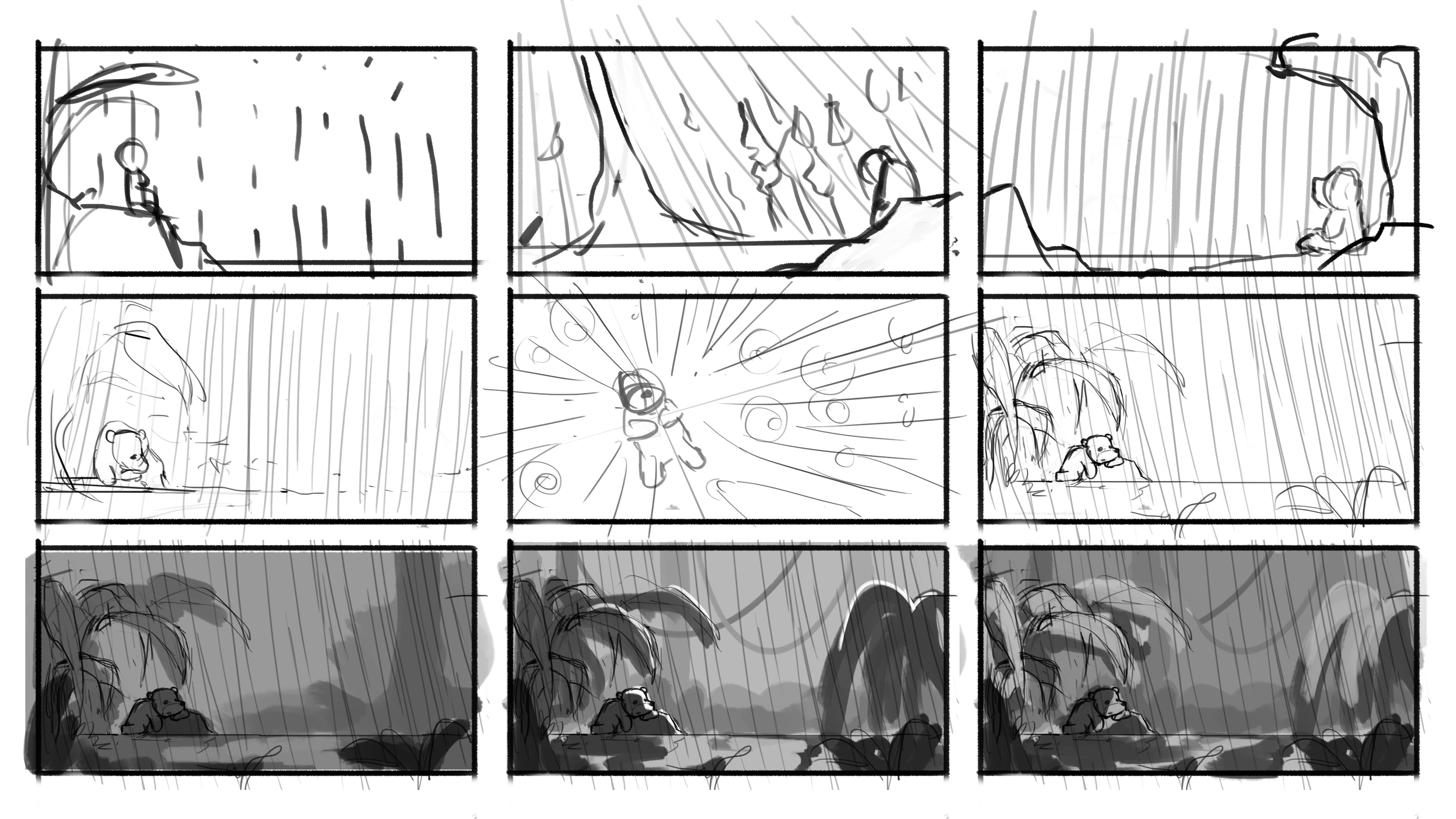
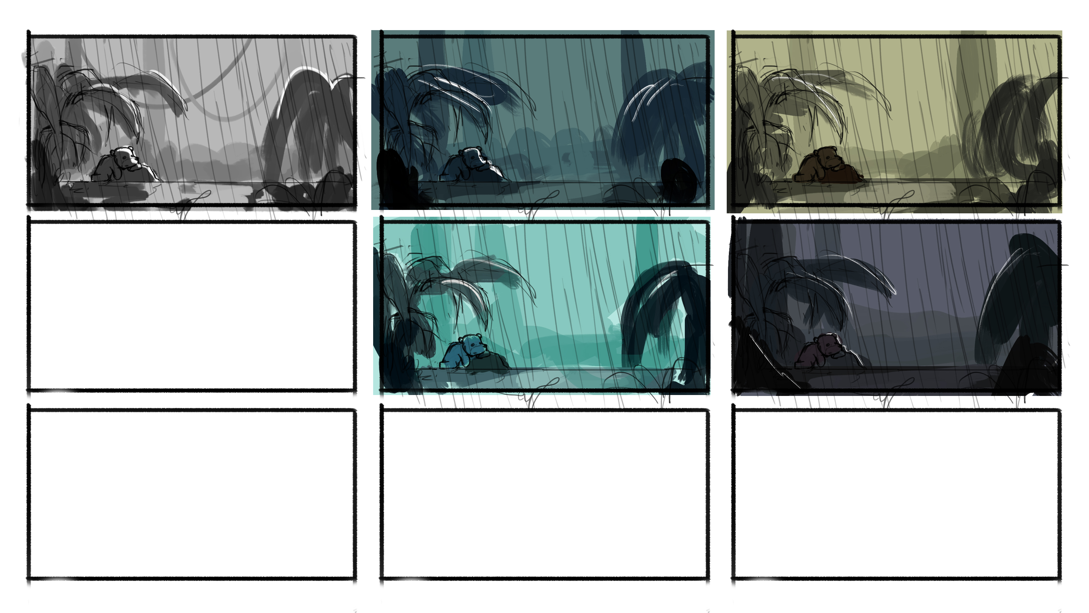
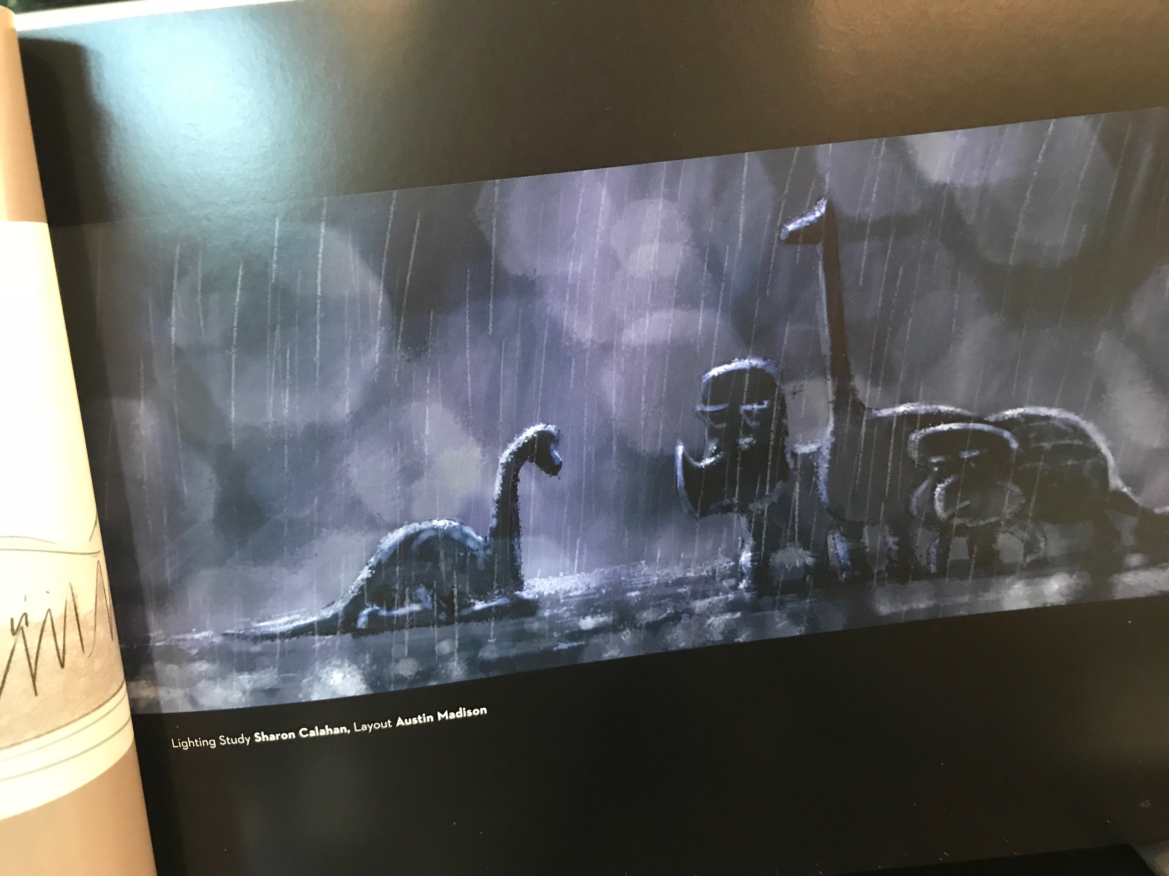
For Sadness, two things came to mind, dull muted colours and rain. Rim light was included to add some brightness to the otherwise dull image and to separate the various elements from the background. Rain was added to give the illustration a more gloomy feel.
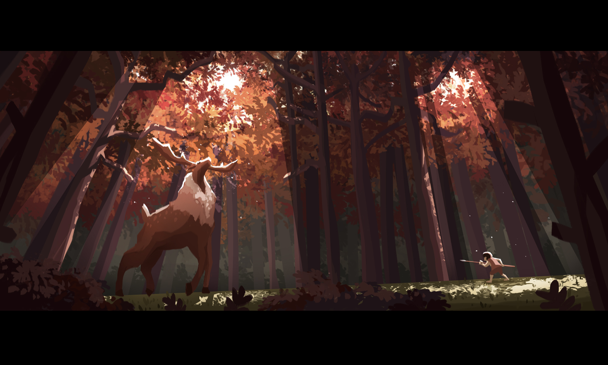
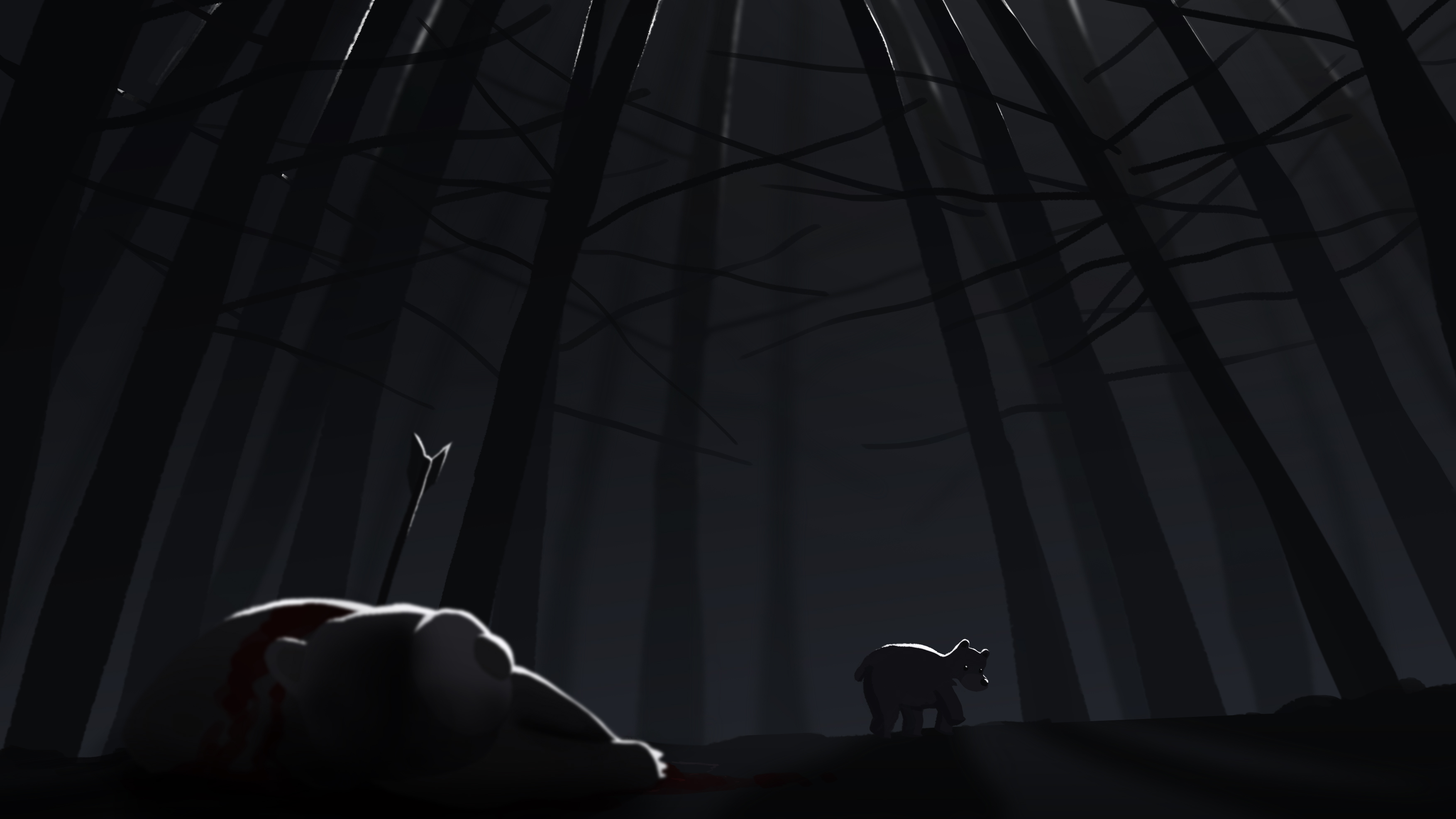
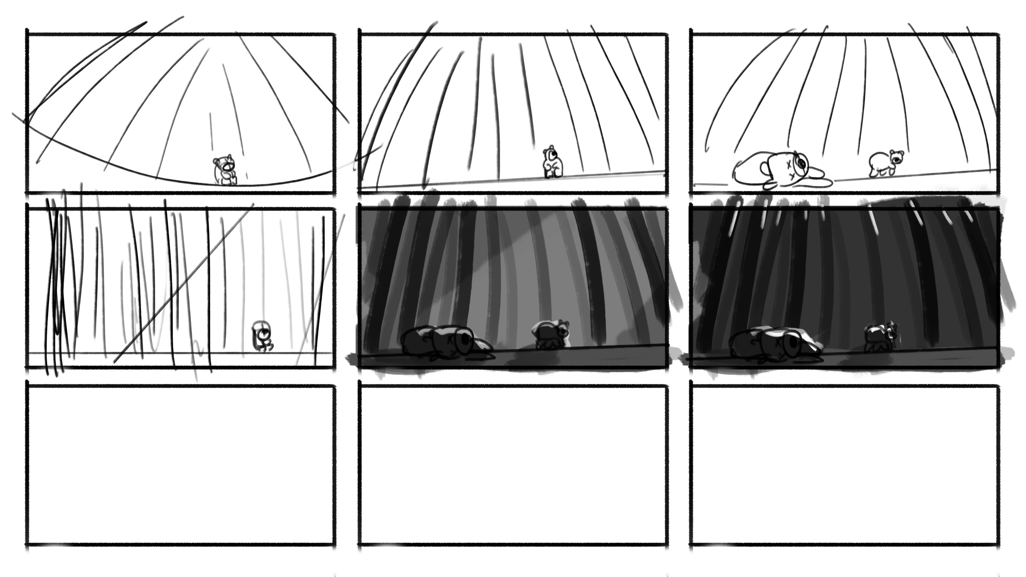
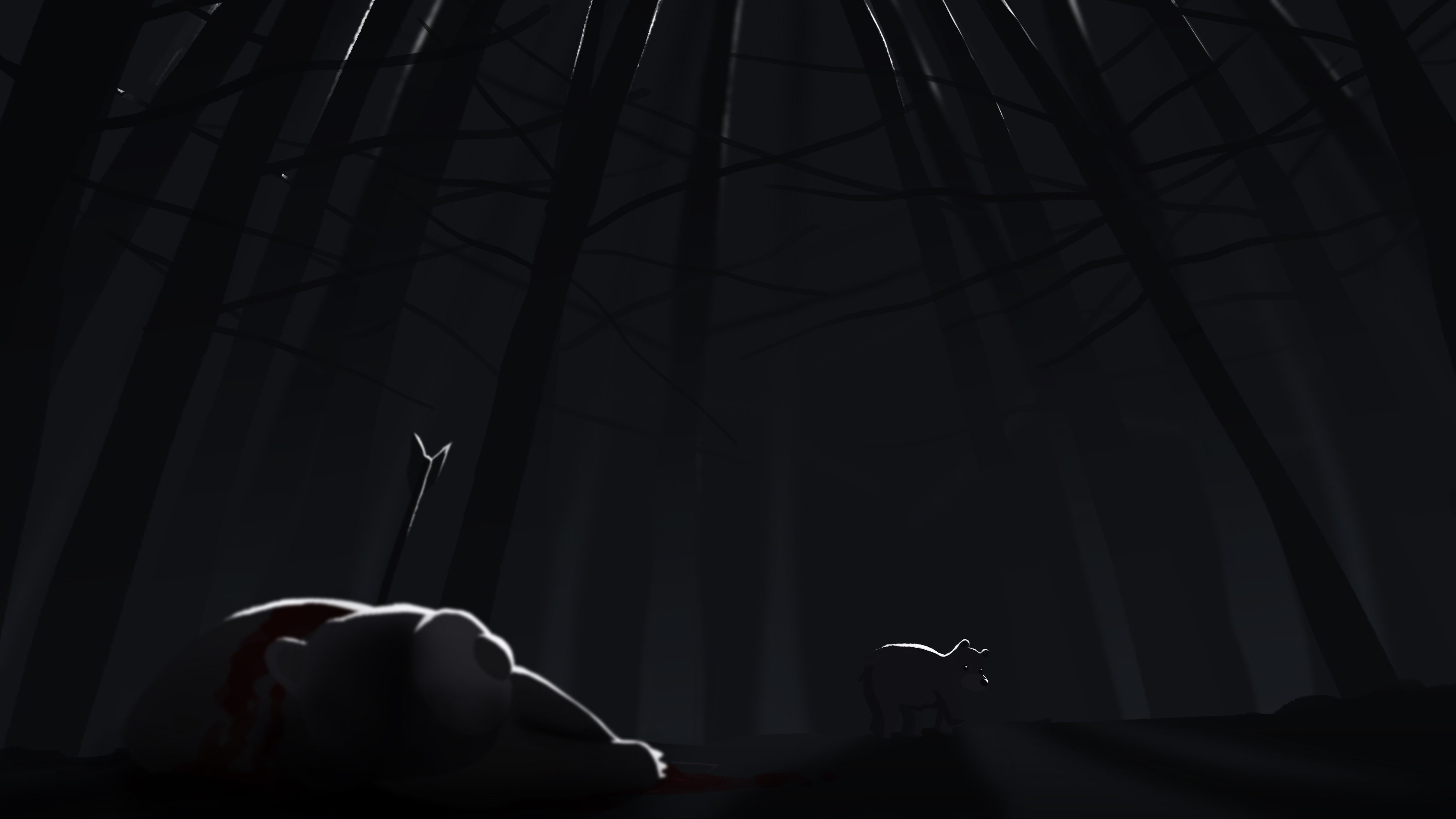
For Fear, I initially pictured the bear alone in a dark forest, but I thought that if there was another bear which had been shot dead in the scene, it would evoke a stronger sense of fear for the bear. Rim light was very important to distinguish the characters and trees as I wanted minimal light in this scene to evoke this emotion. A dutch tilt was also incorporated to create a sense of uneasiness in the scene.
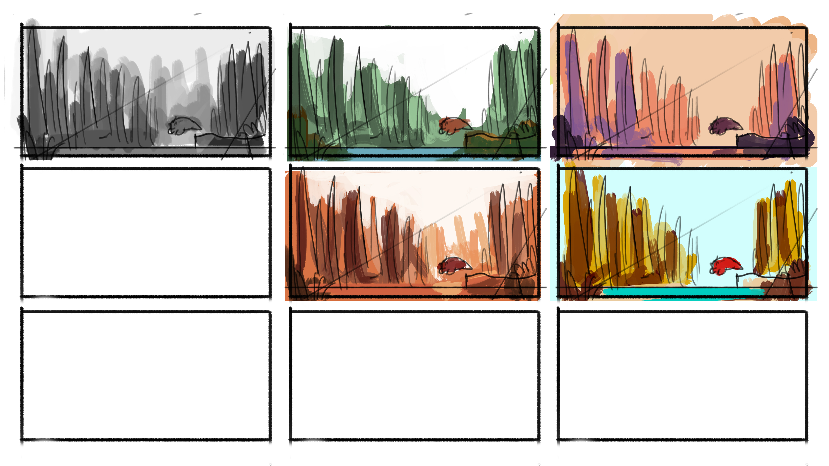
I started by sketching out thumbnails of different compositions for the various emotions. I then blocked out the values in grayscale. After which, I experimented with a few colour schemes and selected the one that best portrayed the particular emotion.


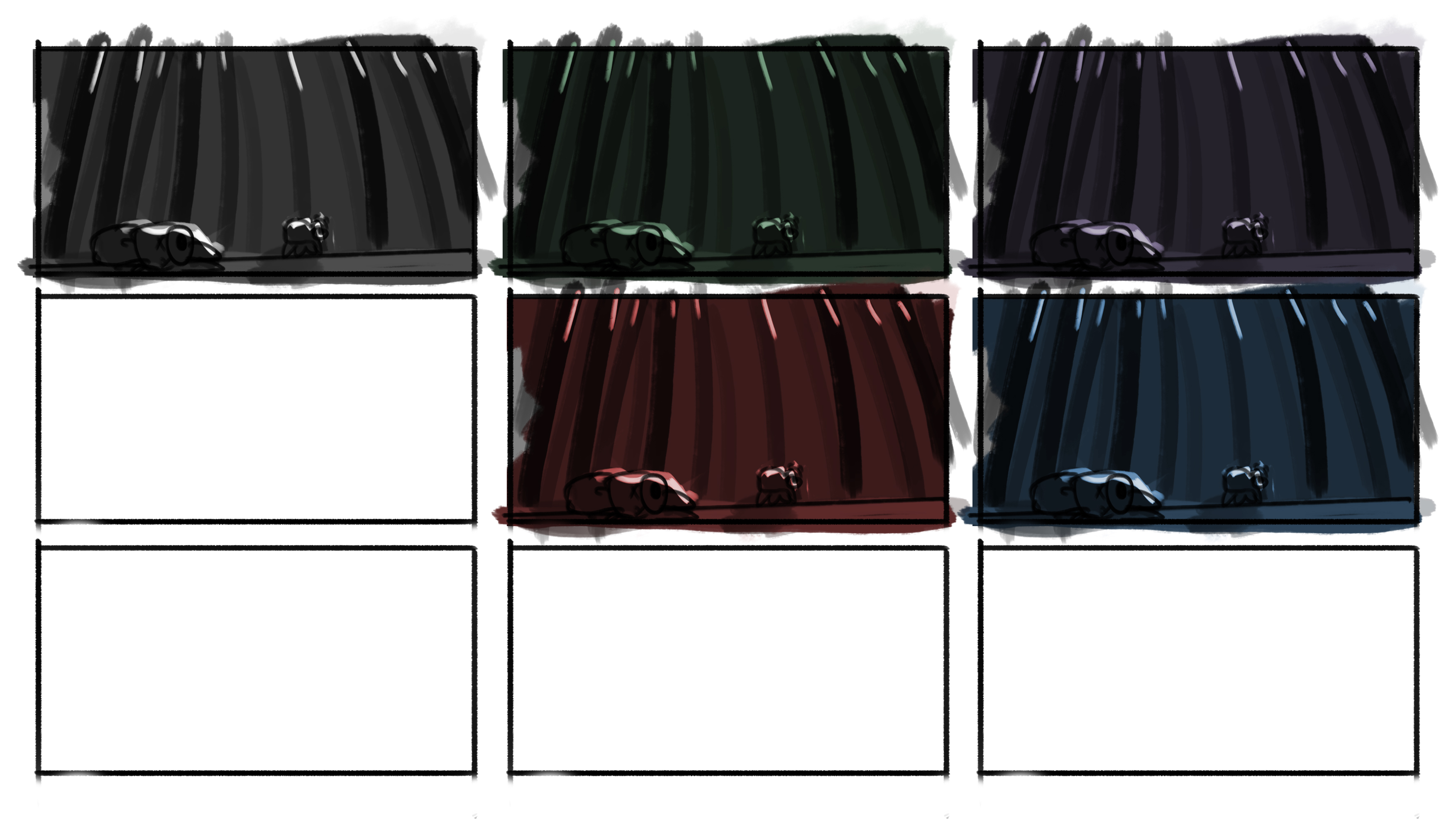
The final step was to add a subtle filter of light to enhance the image, creating the glow from the light sources.


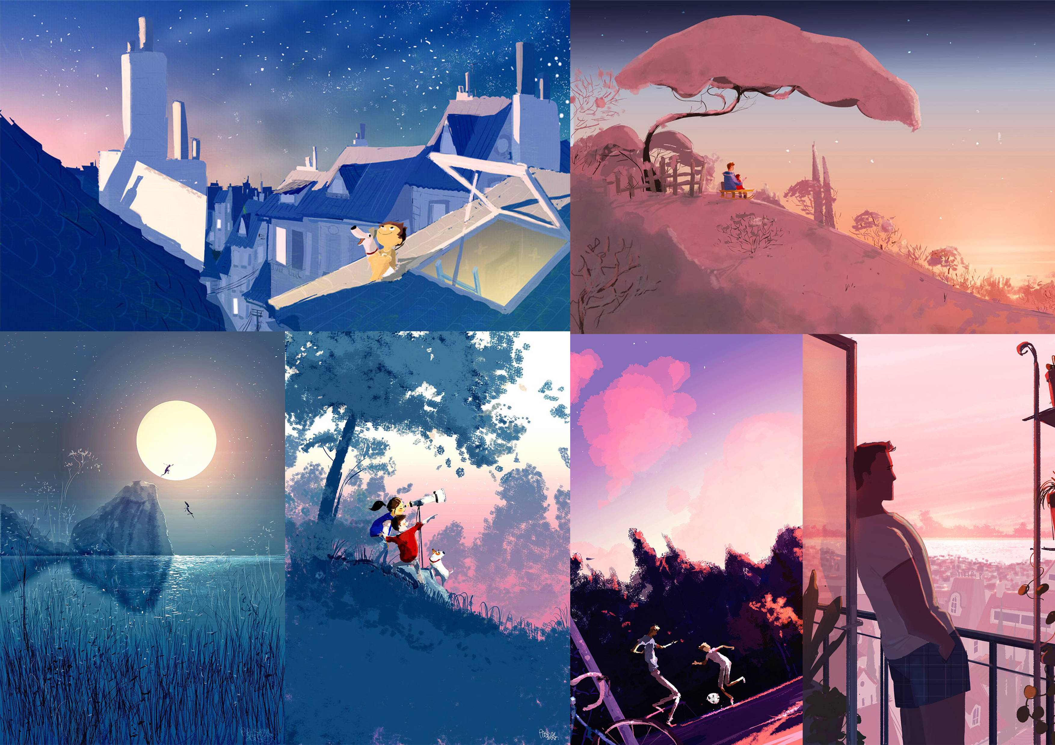
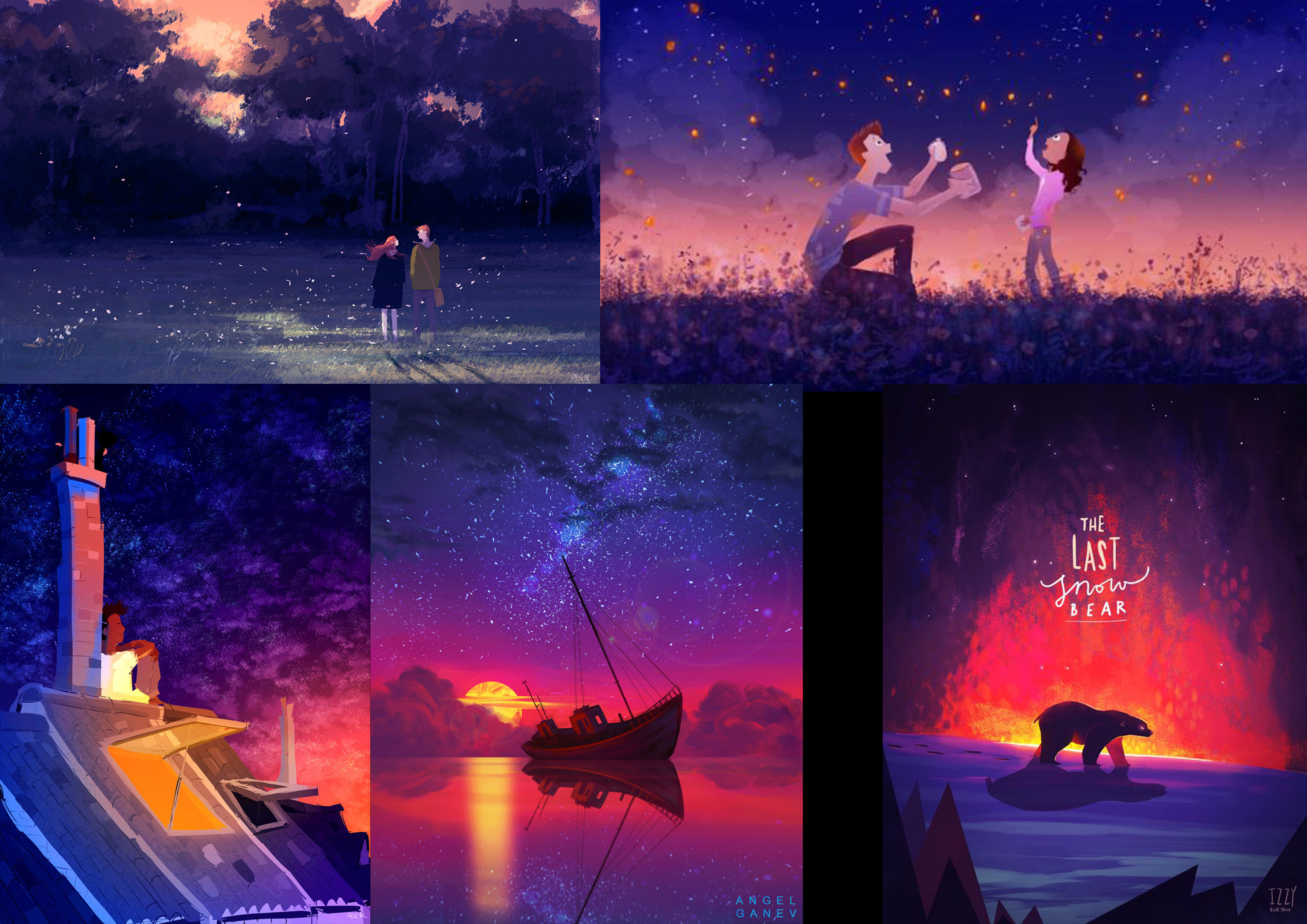
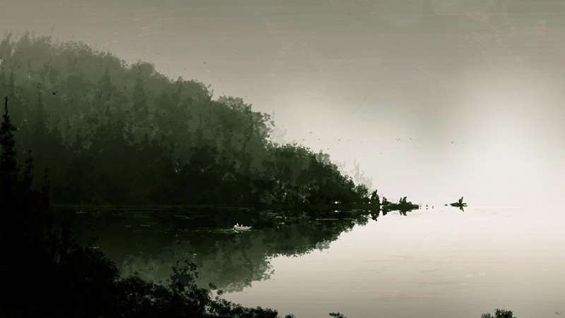
For my research, I looked at the concept art of various animation films, as well as a book called The Colour of Pixar, which contains scenes from various Pixar movies catalogued by colour. I also referenced Pascal Campion’s style of illustrating, his use of colours and the way he uses lighting to enhance his illustrations.


Assignment 1A
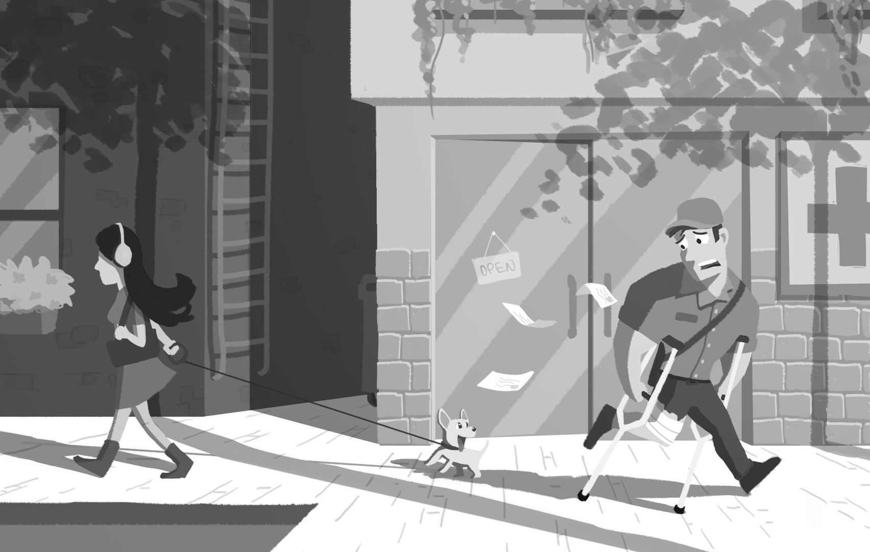
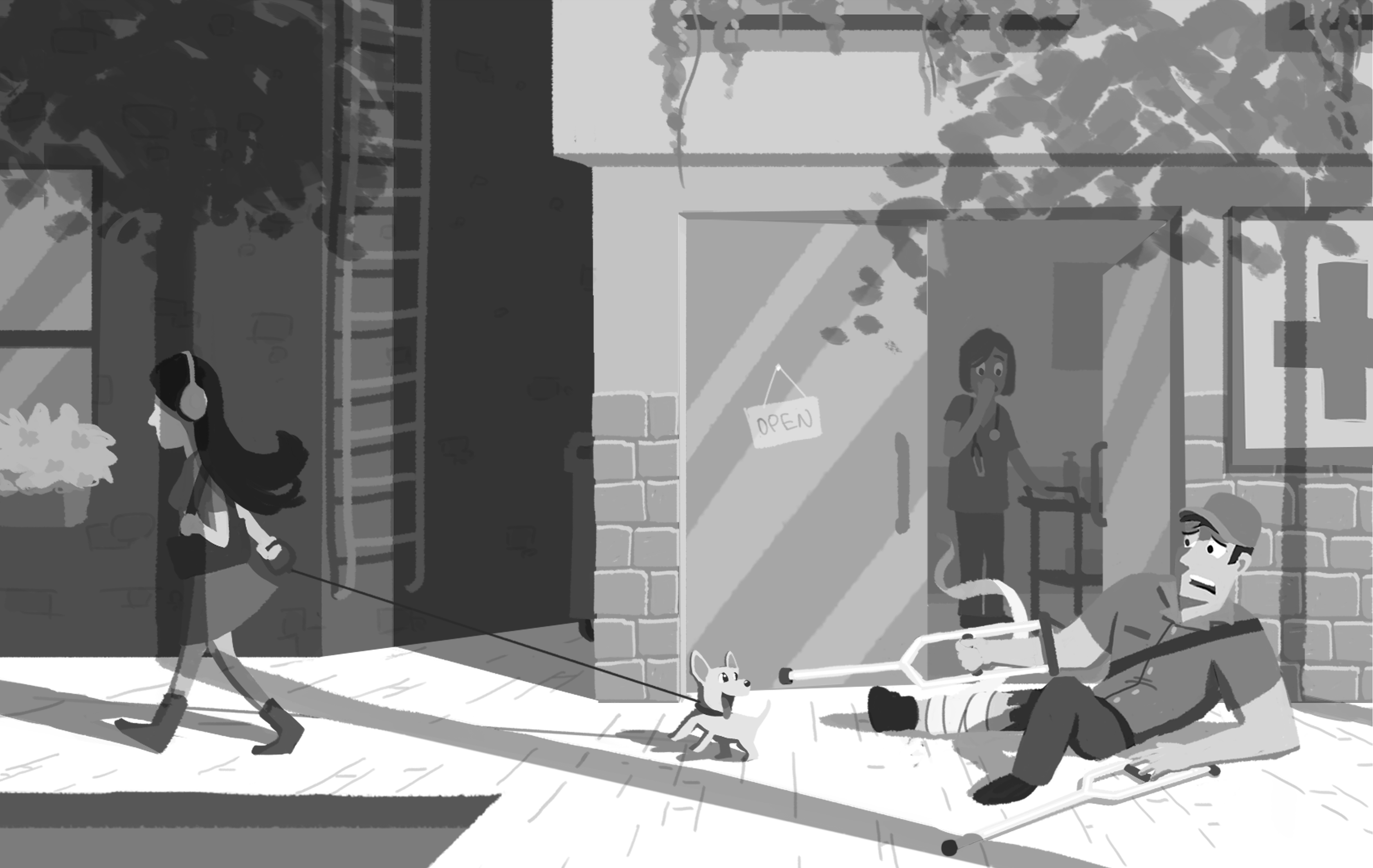
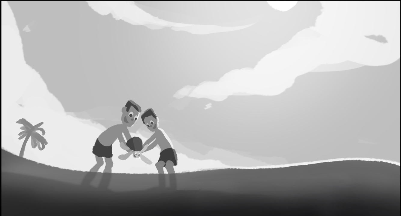
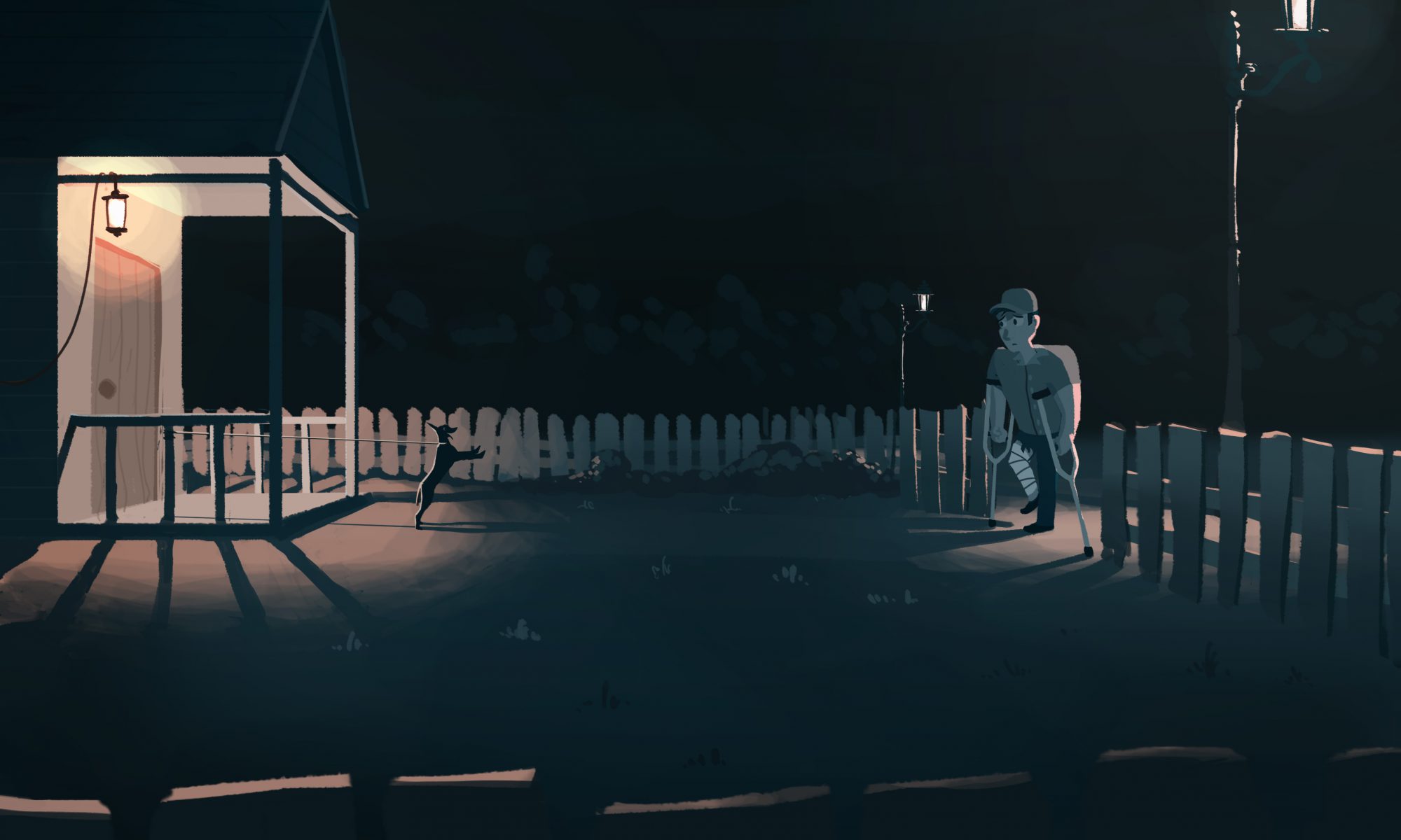
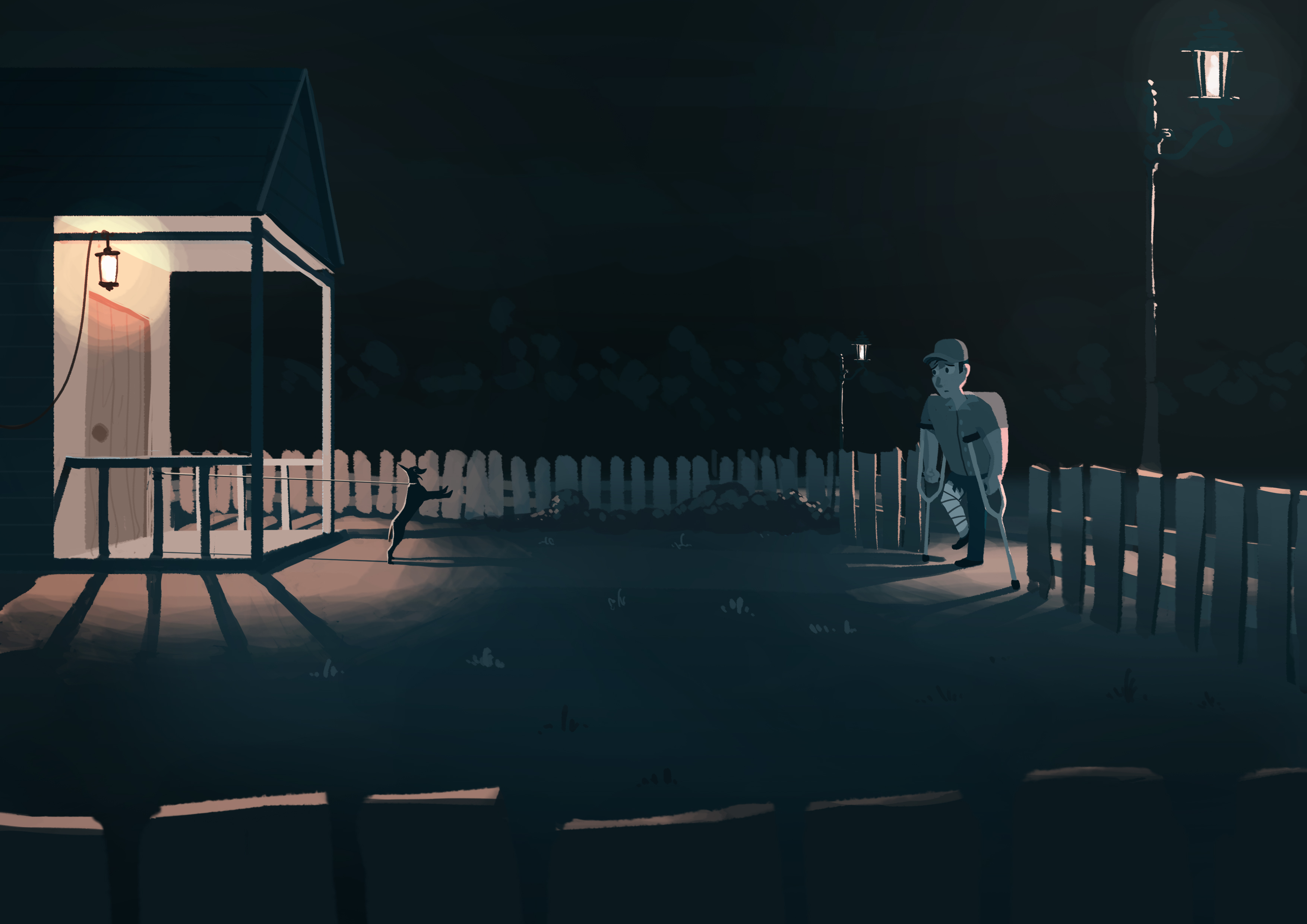
Instead of having the postman running away, I made him fall on the ground, desperately struggling to back away from the dog, which exaggerates the sense of fear in him he has. The clinic door is also open to show more clearly he had just exited from the clinic.
Assignment 1B
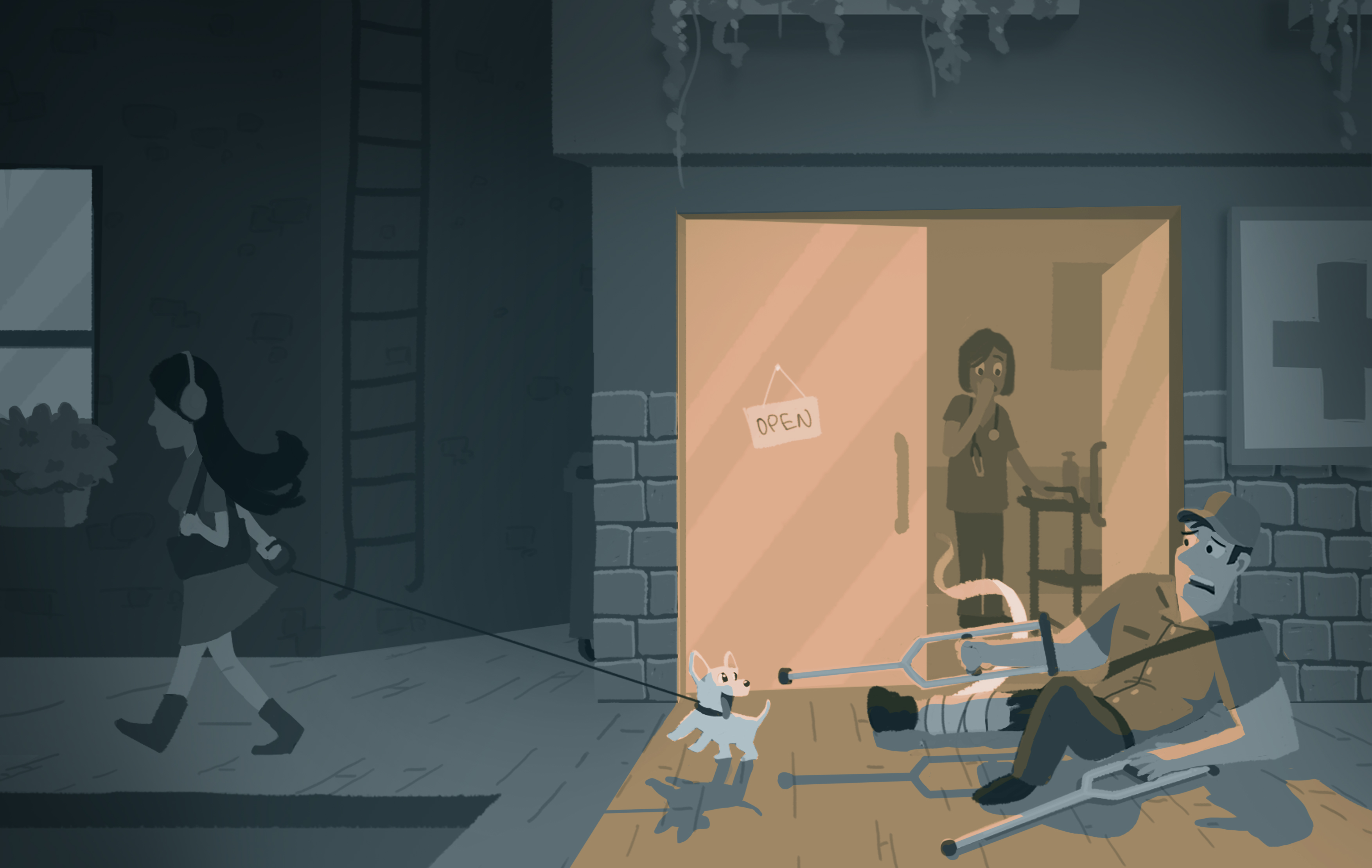
Fear – A normal response to genuine danger.
Phobia – A persistent fear that is excessive or unreasonable (Expressed by a large man afraid of a small puppy).
Large man afraid of a small puppy.
In western culture, it is a common cliché for dogs to bark, chase or attack postmen.
Cynophobia – The fear of dogs
To me, I see fear as a portrayal of dull colours, which makes a scene gloomy, lifeless, and a sense of darkness surrounding the individual. This can be accompanied by a strong source of light which can be cast on the character to show his expression of fear during a close-up or just the character in general in the huge space of darkness.
A big-sized postman exits the clinic, after being treated for a dog bite during his shift earlier in the day. He sees a small puppy and falls to the ground as he frantically tries to back away.
I changed the lighting of the b&w image for the coloured version as it didn’t work well with the emotion I wanted to portray. I restricted myself to the use of two colours as I wanted the scene to be less ‘distracting’ and direct the viewer to the main focus of the scene. Dark blue is used to portray a gloomy effect and a complimentary orange is used for the light source.
The postman heads home, his pet dog is excited that he is finally home after being leashed at the porch all day. He stops at the gate.
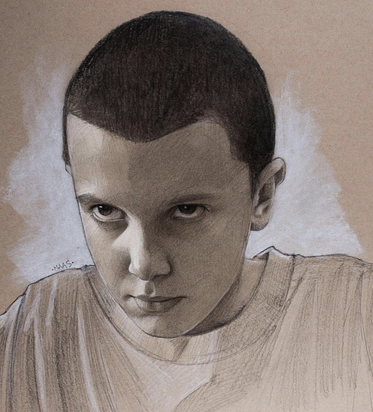
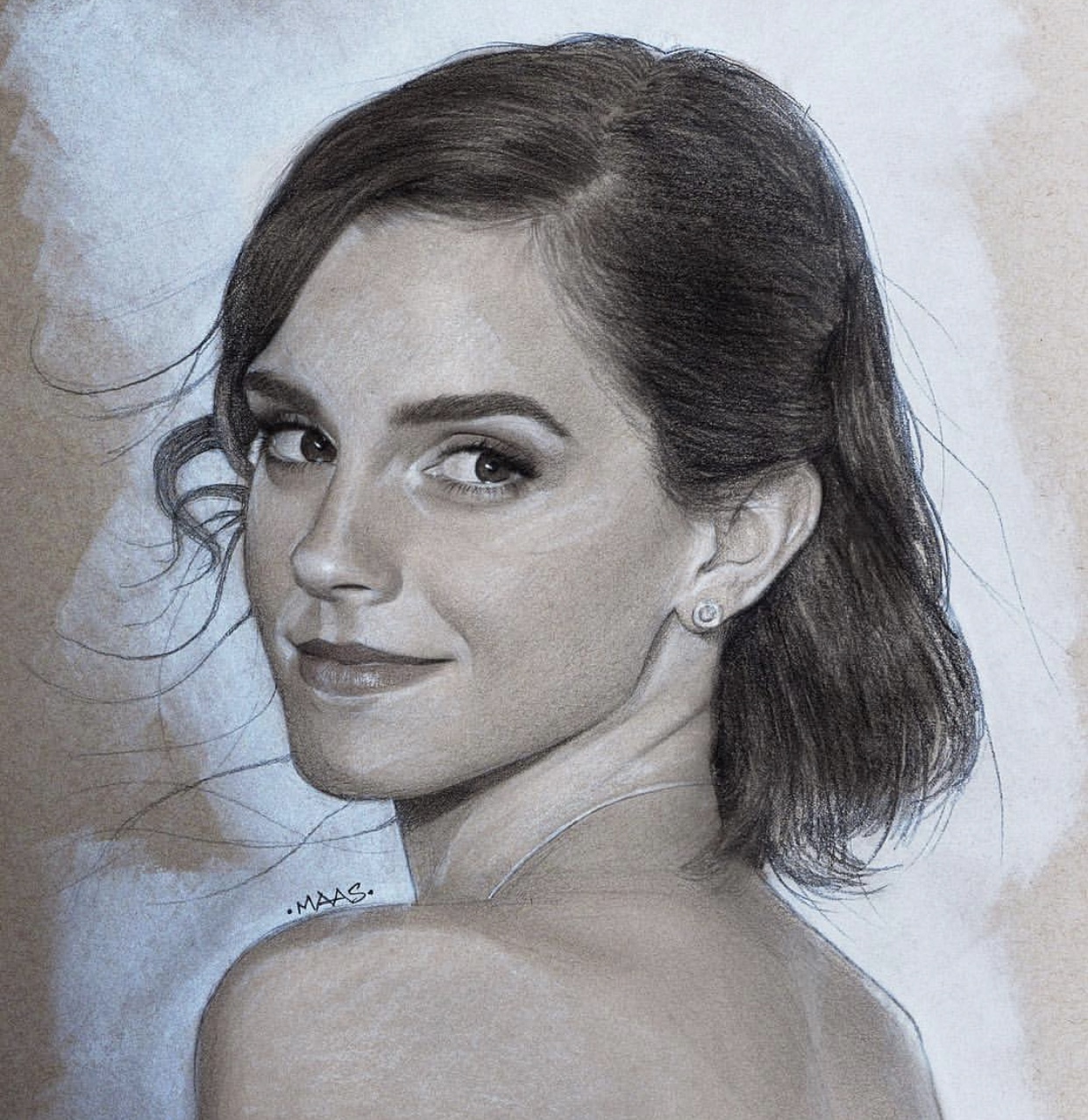
The first artist I would like to learn from is Justin Maas, he does realistic portraits of celebrities graphite and white colour pencils/ chalk (mainly for highlights). This is something I would like to incorporate into my drawings, but mostly for renders, as it gives the final art work more tonal contrast and three dimensionality.

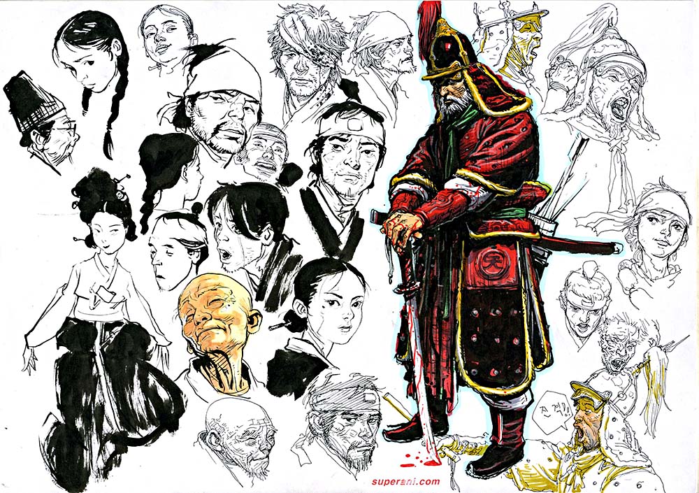
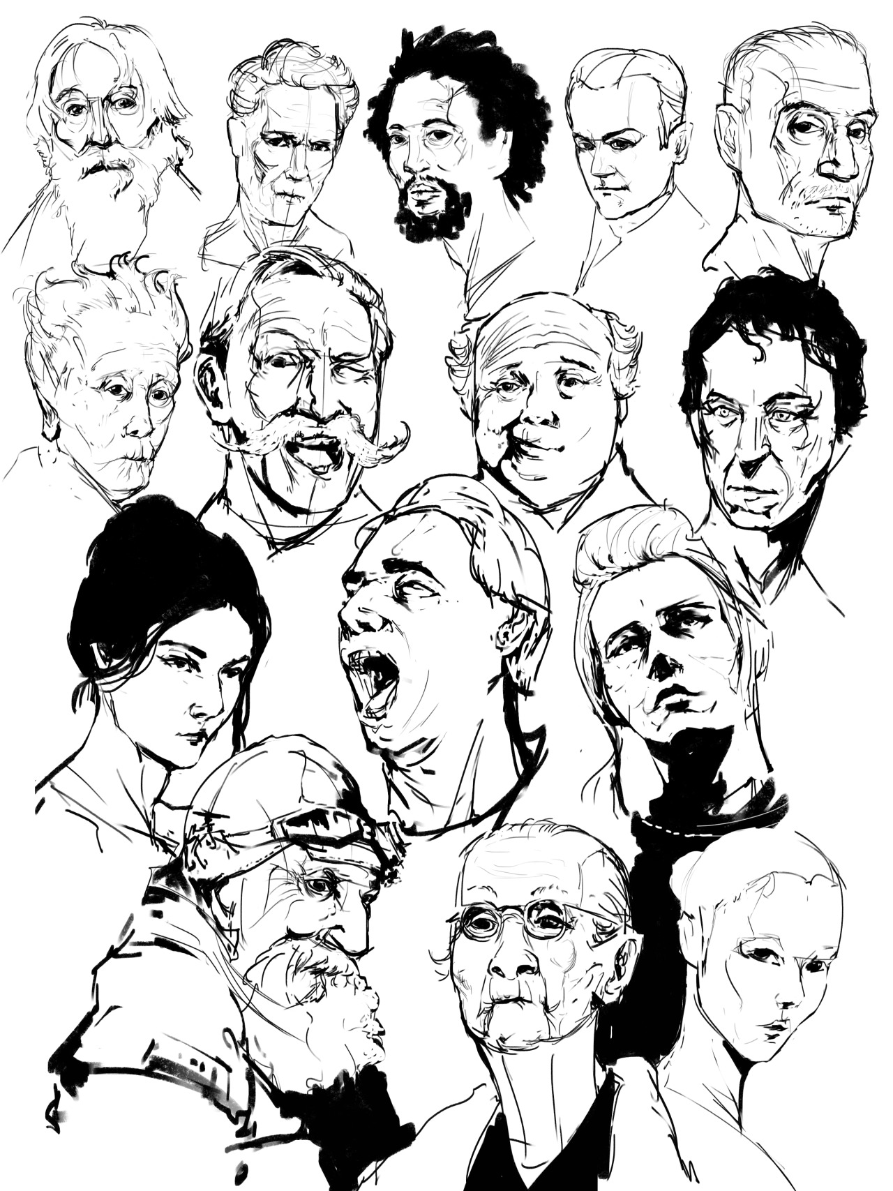
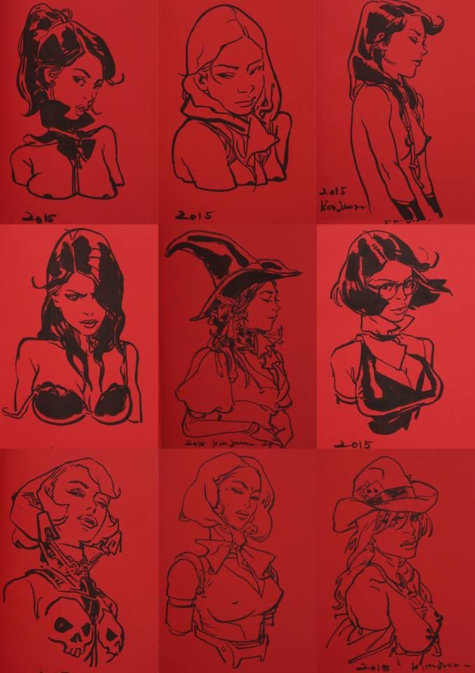
Another artist I am looking at is Kim Jung-Gi, he has a mastery over the human anatomy and is able to draw them at any perceived angle, skipping the sketching phase entirely and jumping straight into inking. There is a reason for every line/ brush stroke in his artwork, be it to accentuate the cheekbones or to create shadows beneath the eyes. Improving my understanding of the human anatomy is something I would wish to be able to do in the long-run.
Drawing hair using a comic-style.
Using colour for highlights.
I am also looking at figure drawing artists such as Erik Gist and Jeffrey Watts. Being able to bring out the subject’s cheek bones, jawline, brow ridge and other facial features with just a few strokes is something I would like to be able to master.
My final video, entitled ‘My Day in 60 seconds‘, is a project which shows 60 segments of 1-second scenes of what I do on a particular day.
Project Title: My day in 60 seconds
Project Description
The project is a 60-second video sequence which showcases different activities happening throughout the day, from when I wake up to when I go to sleep. There will be a sound track of a ticking clock, each activity will only be shown for one second (the duration between each tick of the clock). Each tick will occur on an on-beat, the off-beat will include a single beat of sound of the particular activity happening, e.g. flicking of a switch, slamming a door close, pressing a lift button etc.
I was inspired by time lapse videos and other ‘my day in 60 seconds’ videos found online.
This project is a new concept and not a continuation of a previous project.
I intend to express measured along with edited time to the audience. Also, how sound can enhance the rhythm of the video.
One innovative aspect I would say is that I will approach it in a slightly different manner as described, having each scene only last one second, and according to the beat of the clock ticking. Unlike other similar videos that have each scene last a few seconds along with a music track, I want the audience to focus more on the beat of the soundtrack and the rhythmic vibe it creates.
Objectives and Activities of Project
I will be creating an estimated 60-second video.
It is a videography project utilizing an iPhone camera.
Dimensions are standard 16:9 aspect ratio resolutions of 1920 X 1080 pixels.
Equipment for Project
The project would require the use of a camera to capture each individual 1-second shots, in this case an iPhone camera, as well as Adobe Premiere Pro to produce the final video.
Installation of Art Project
The final video will be displayed on a laptop.
Here is an example of something similar I will be doing,
However, one difference is that I plan to have mine more quickly paced (at 1-second intervals), with the underlying sound of a ticking clock. The reason why I decided on having my scenes as 1-second shots is because I wanted to incorporate sound and rhythm into my final video, instead of having a slow-paced video, I wanted a more fast-paced rhythmic video to express both measured and edited time.
Below is the initial list of scenes I planned out before I started filming. Along the way, there were a few changes and I had to add/ remove scenes.
After that, I simply filmed each scene, taking note of a few aspects such as what I was wearing and most importantly, the time of the day.
The scenes will be filmed from my POV and hence it does not allow for any shots taken from a tripod etc.
I had to download some sounds online which I could not record, example, the honking of the car when I was crossing the road, I didn’t really want to purposely have a car honk at me, I would have to piss the driver off if that was the case. Also, the pooping sound was taken online, it was surprisingly hard to get a good sound of poop splashing into the toiled bowl.
For the first consultation, I had to show Wen Lei a short concept of my video, to show the transition of the scenes and how the sounds appear.
One problem with an initial version was that there were some scenes with a slight pause at the start, which made it look awkward as I was waiting to execute the action, rather than film it ‘naturally’.


Secondly, I had to insert a couple more scenes between ‘ending class’ and ‘going home’ as it seemed too similar to ‘leaving home’ and ‘entering classroom’.
One challenge was coming up with 60 scenes which produced a single or double beat which will fit with the rhythmic beat of a ticking clock. Once the filming was completed, stitching them together was relatively easy.
This project has taught me how to work with both aspects of time and sound, even though this project was time-based. The rhythm is important as it sets a pace for the audience for them to follow, in other words, creating causality via sound, that being said, if this rhythm is broken, the audience may get disoriented and lost.
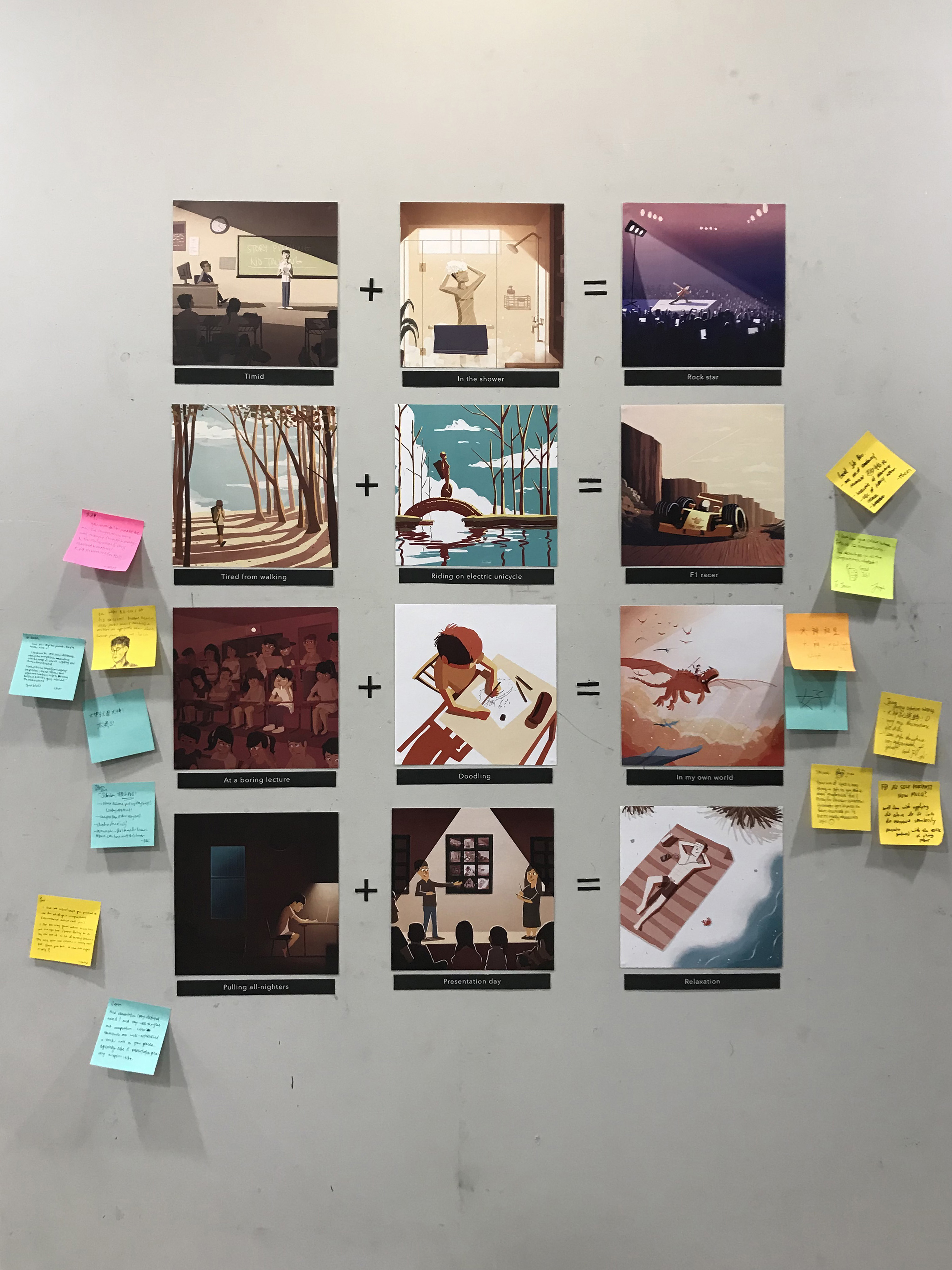

Square colour harmony
In this colour harmony, there are two sets of complementary colours, each set has a dominant and subdominant colour.
– yellow & blue, yellow dominant
– green & red, green dominant
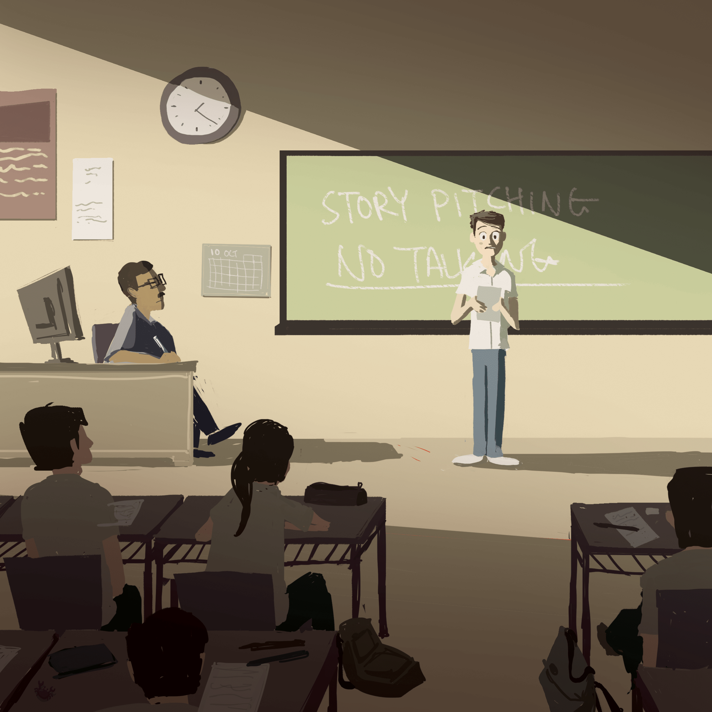
I used an overall muted colour scheme to depict a typical boring classroom environment. The shadows make the light more contrasting and prominent, also, the direction of light and where the other characters are looking draws your attention to the character in focus.
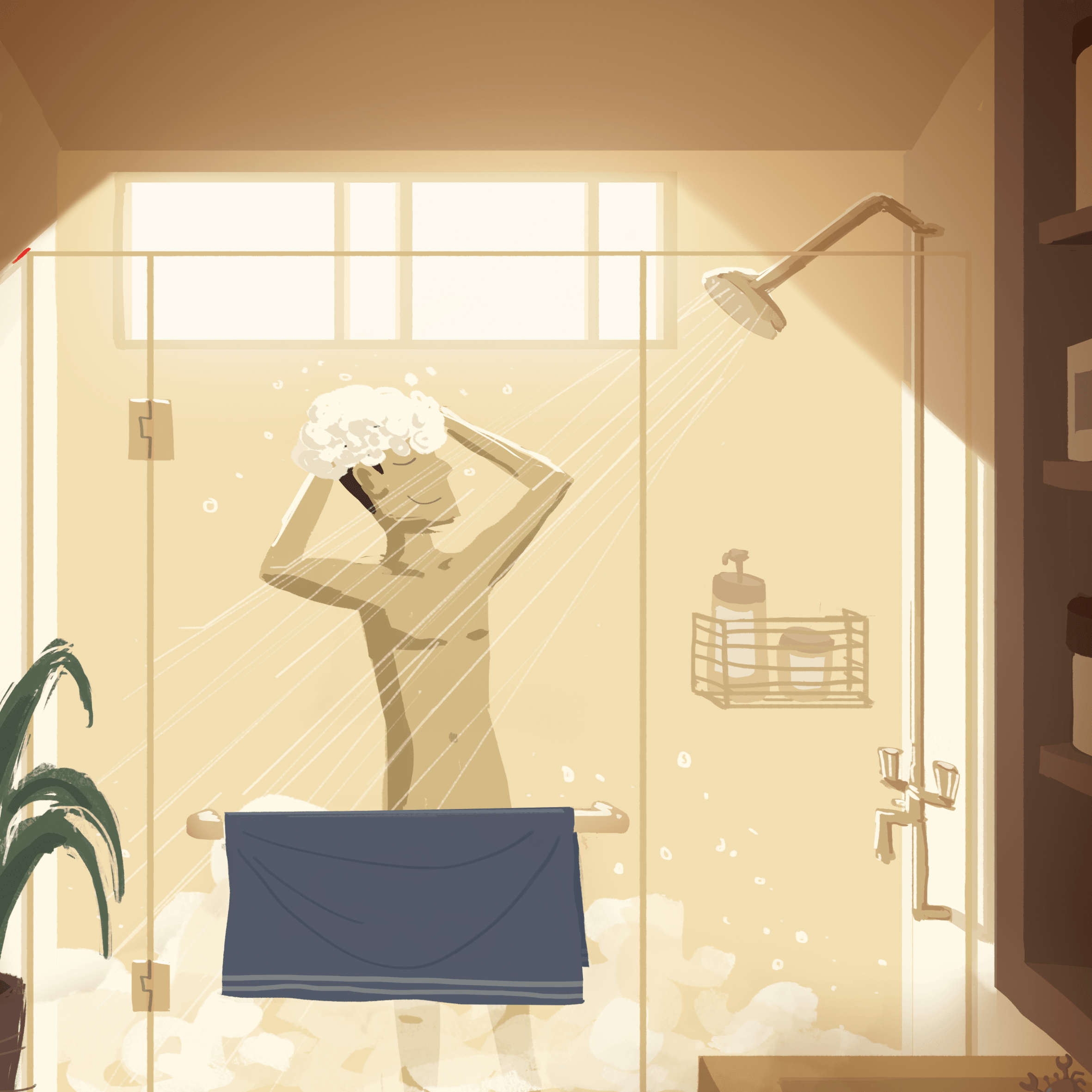
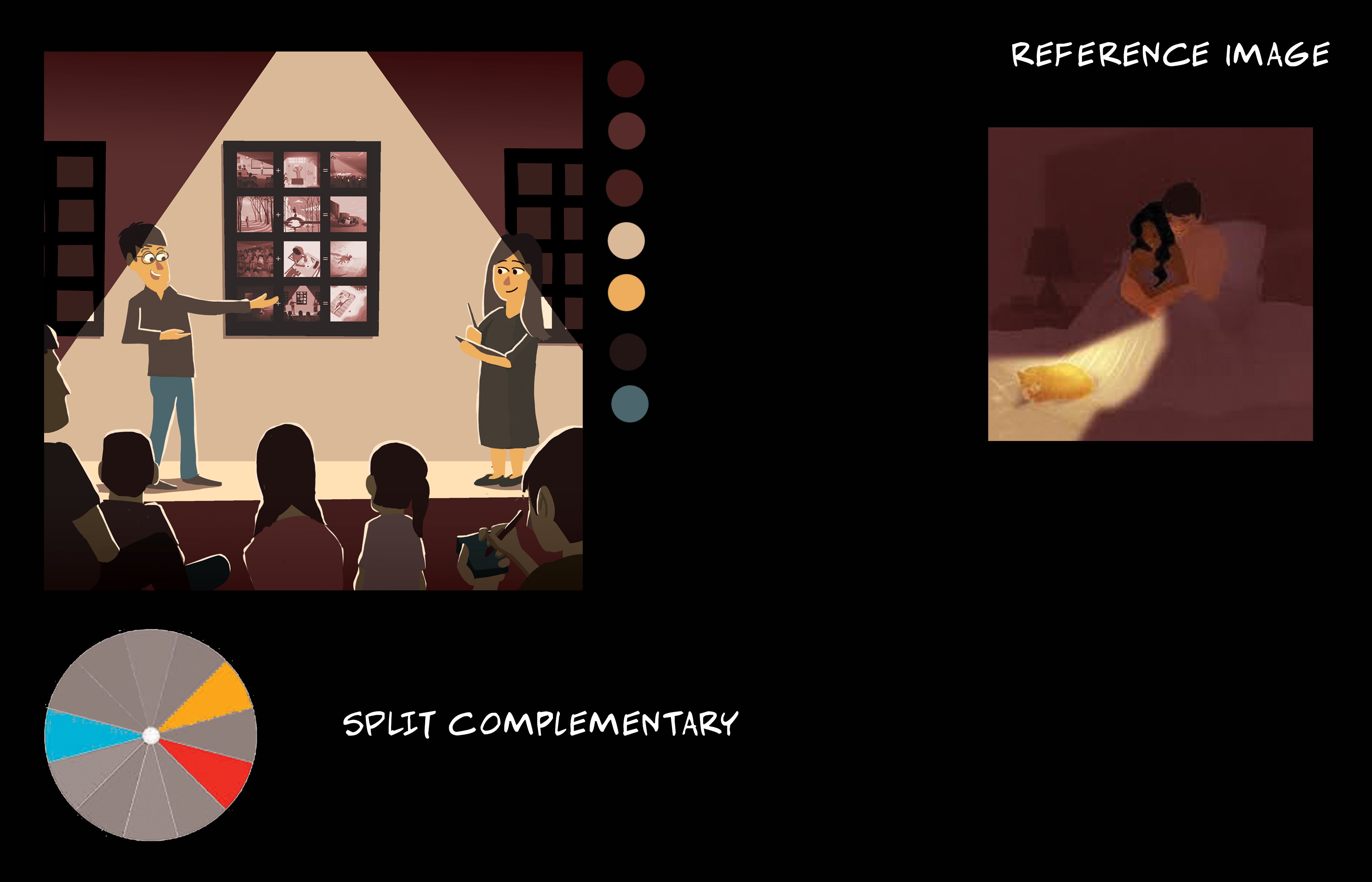
Split complementary colour harmony
A warm and vibrant orangey composition to depict a relaxing afternoon bath, with a bit of blue and green to complement it and to give it a strong visual contrast between warm and cool colours. Again, the ray of light from the window draws attention to the character, also, the darker foreground elements to give a sense of depth.
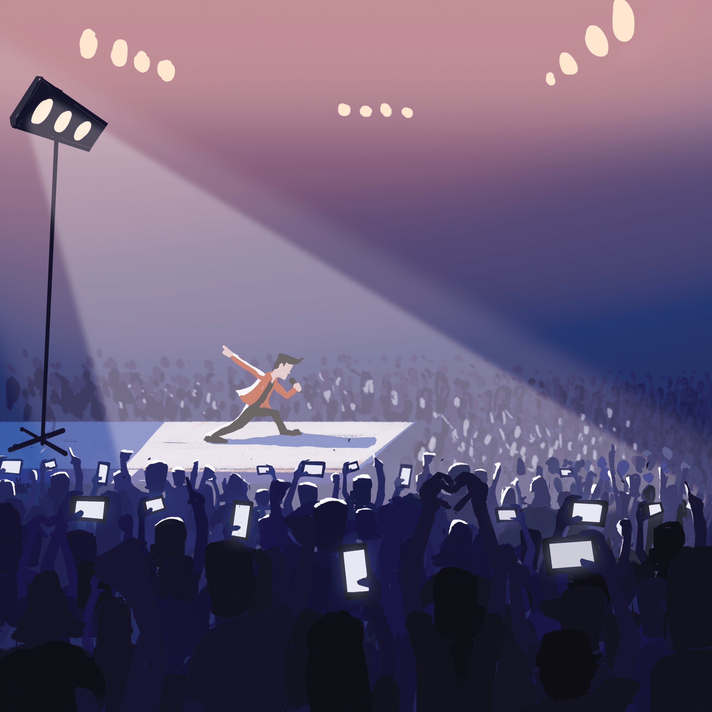
Analogous colour harmony
For analogous there would typically be a dominant, subdominant and a third colour to be used as an accent.
In this case, blue violet is the dominant, violet and pink are the subdominant and the red along with the whites are the accents. There is an overall harmonious blend of colours, depicting a night time concert.
The lack of details in the background make it seem very foggy which gives a sense of depth that the location is very large. Due to the strong spotlight, the main character and the surrounding audience is given a rim light so that the mid and foreground elements interact with each other.
Split complementary colour harmony
The amount of blue and orange/yellow is slightly equal so there isn’t really a dominant colour, the warm and cool colours are balanced out.
This is a late afternoon setting as you can tell from the orange light cast on the ground and the long shadows of the trees. The rim light on the trees make them stand out more. The trees nearer are darker and those further are lighter.

Triadic colour harmony
Triadic colours of red, blue and yellow. For this colour harmony, there is typically a dominant and two other colours for the accents. In this case, blue is the dominant.
I tried to keep this one simple, no details besides the rim light which shows the form of some of the elements such as the guy’s body and the details of the bridge. Clouds used to draw your eye to the guy and to balance the composition, on the left is giant cloud + less trees, on the right, small cloud + more trees.
Split complementary colour harmony
I initially wanted to go for a muted colour scheme of like a typical race track scene of grey roads and a few coloured cars, but in the end i referenced the Cars movie from Pixar and went for a desert sunset theme instead. The dominant colours are orange and yellow, with blue as the cast shadows.
Also, a dutch tilt to make it more dynamic since it’s a moving race car, lines on the ground also act as perspective lines to give it a sense of perspective.

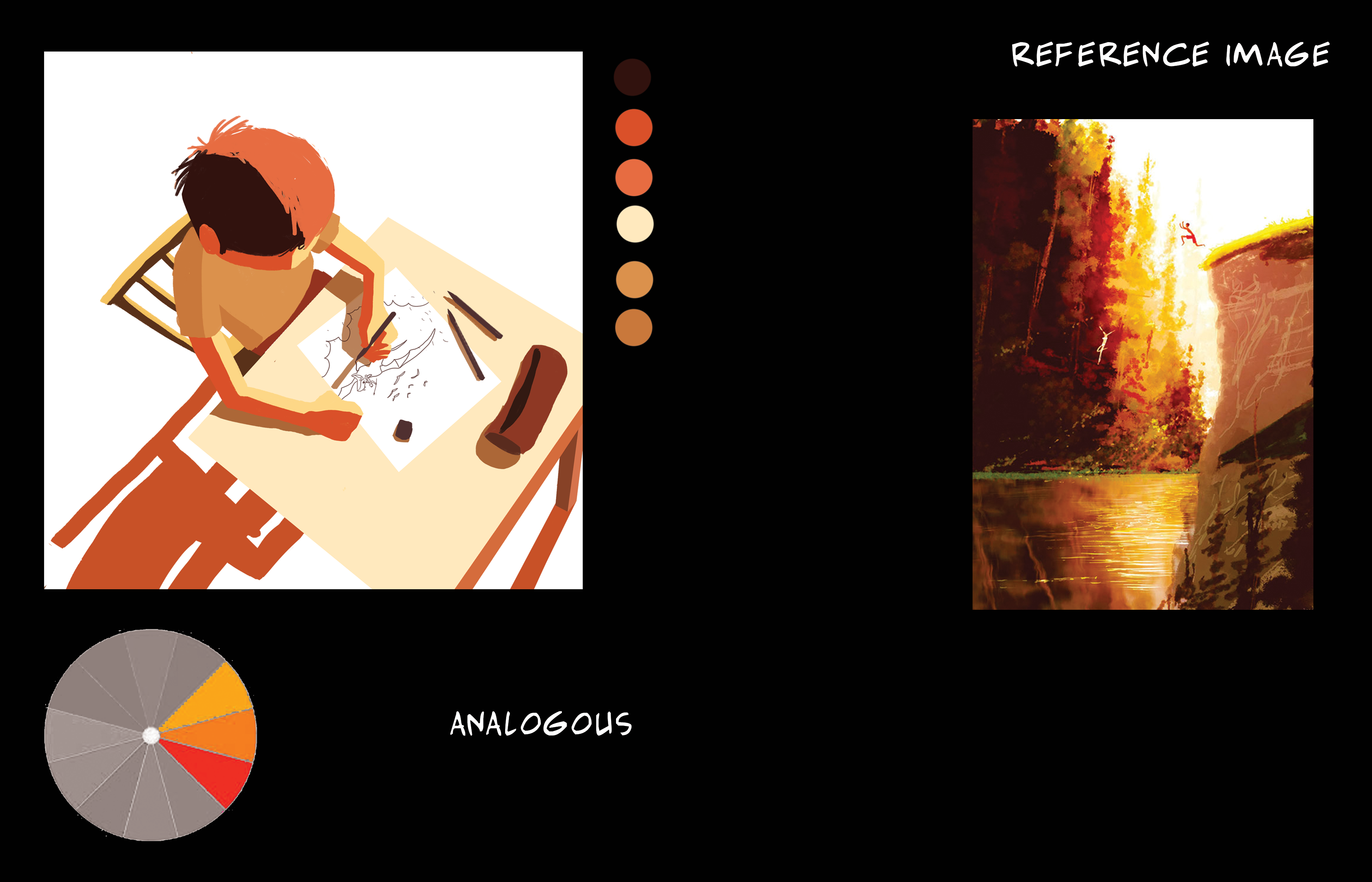
Analogous colour harmony
Colours give it a very sleepy and dream like state kind of environment, as well as the lack of strong contrasting colours which makes it sort of muted which adds to the sleepy feel.
Character in focus is of a slightly brighter colour as compared to the rest, who are tinted with pinkish red to make them blend in with the environment and less prominent.
Since there are so many people, one way to make this one guy stand out is to make him brighter and another way was to use the rule of thirds to place him in an area of focus.
Analogous colour harmony
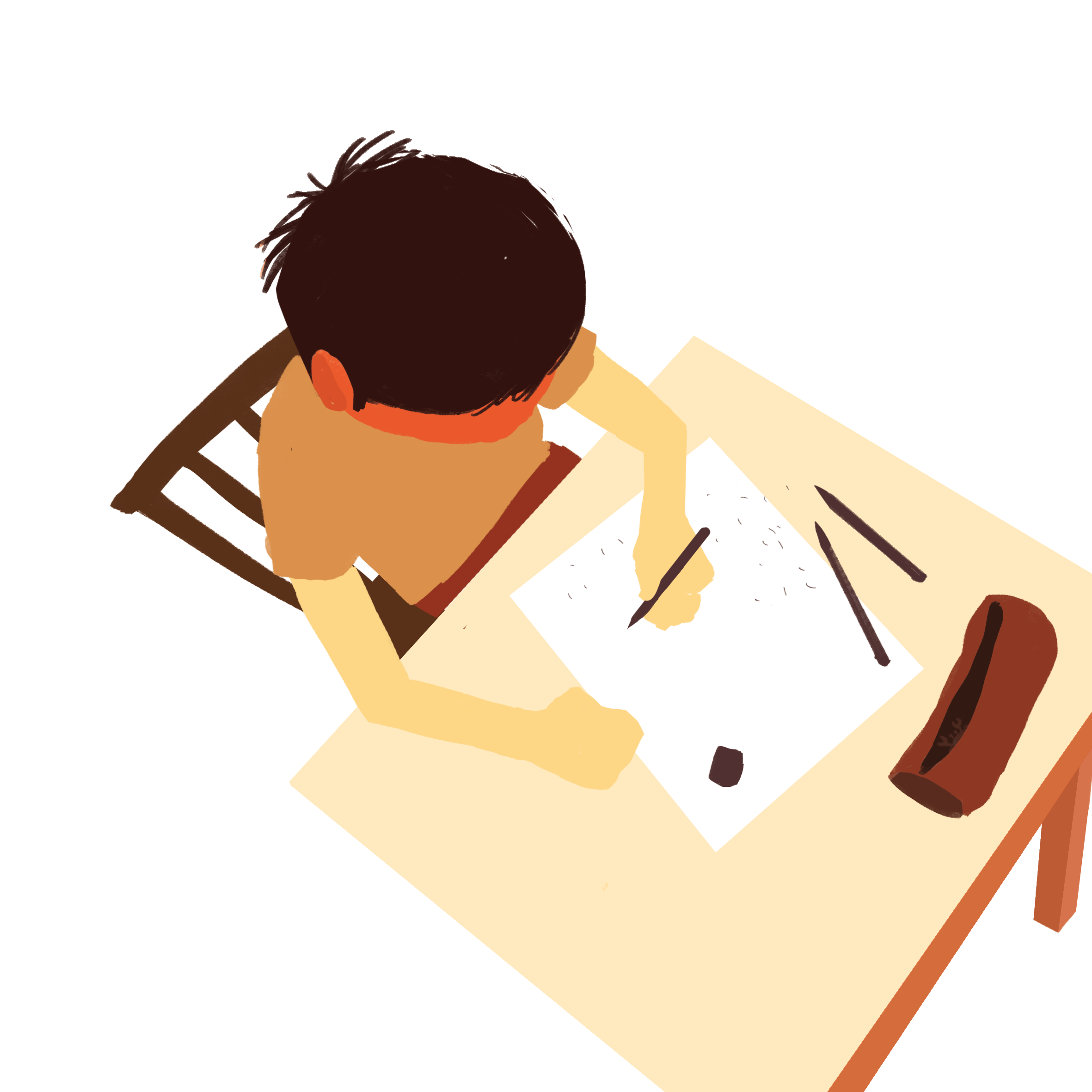
I wanted to go for a late afternoon time of day and hence chose a colour scheme of red-orange, orange, and yellow-orange the floor is made completely white to show there’s a very strong sunlight casting down, which allowed me to draw in contrasting cast shadows.

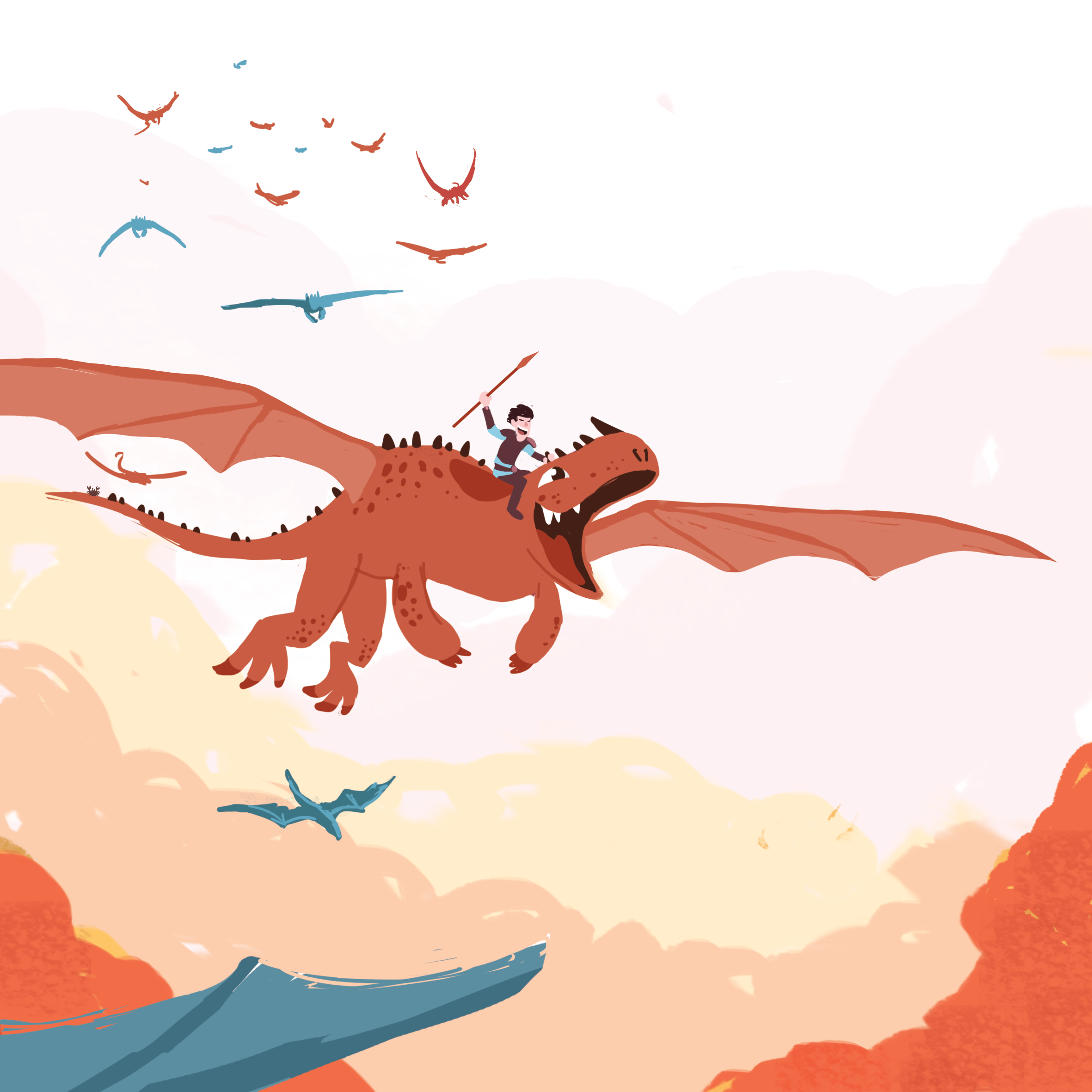
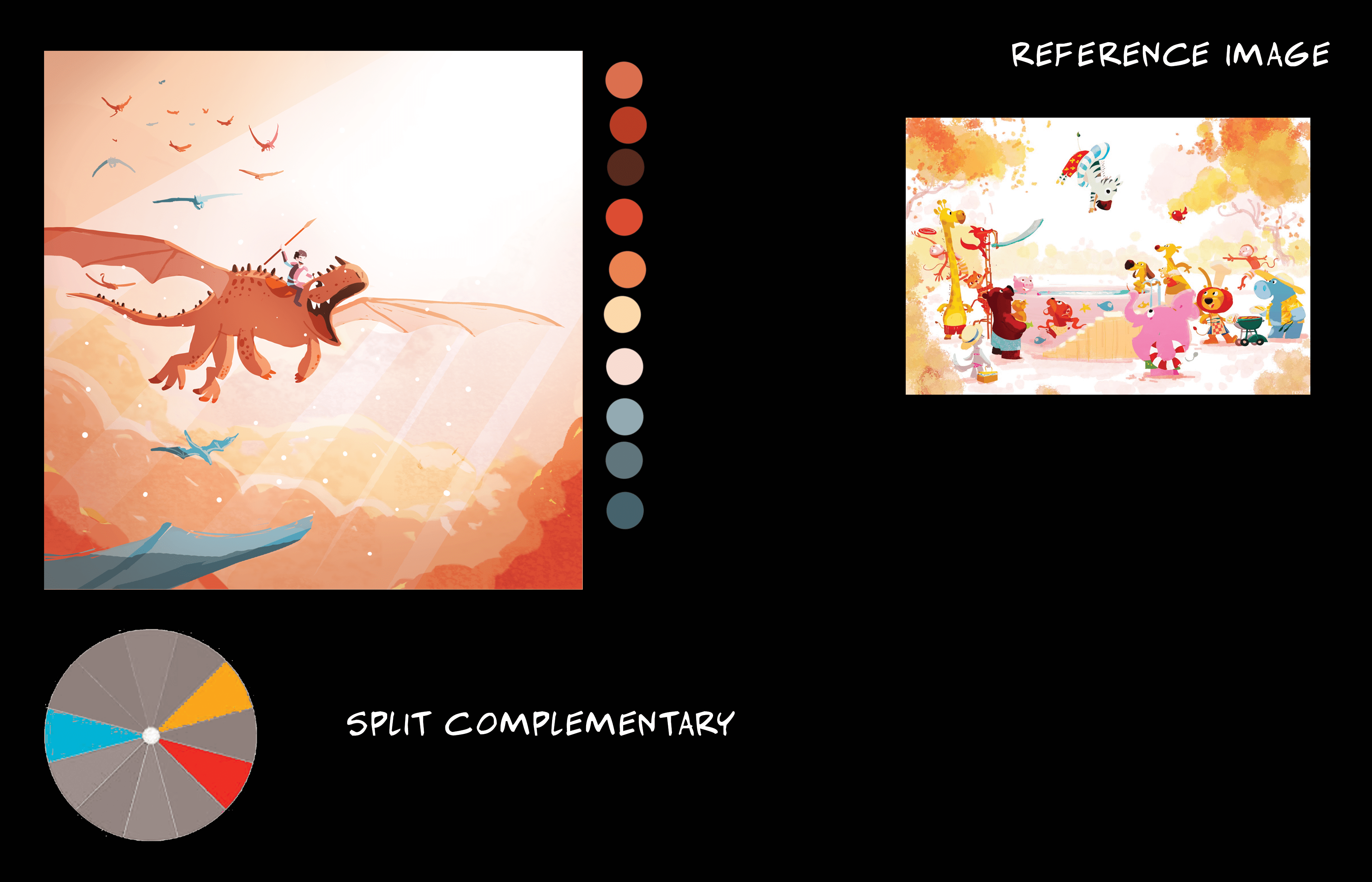
Split complementary colour harmony
I wanted to go for a very joyous, adventurous and majestic feel to this illustration, I took inspiration from DreamWork’s How to Train Your Dragon, where a bunch of dragons are flying above the clouds with what is called ‘god light’ shining down to give it that majestic feel. Rim lights are added to the clouds to give the volume.
Initially, it looked very plain and boring and i wanted to scrap it, but after adding lights everywhere it became one of my favourites out of the twelve.

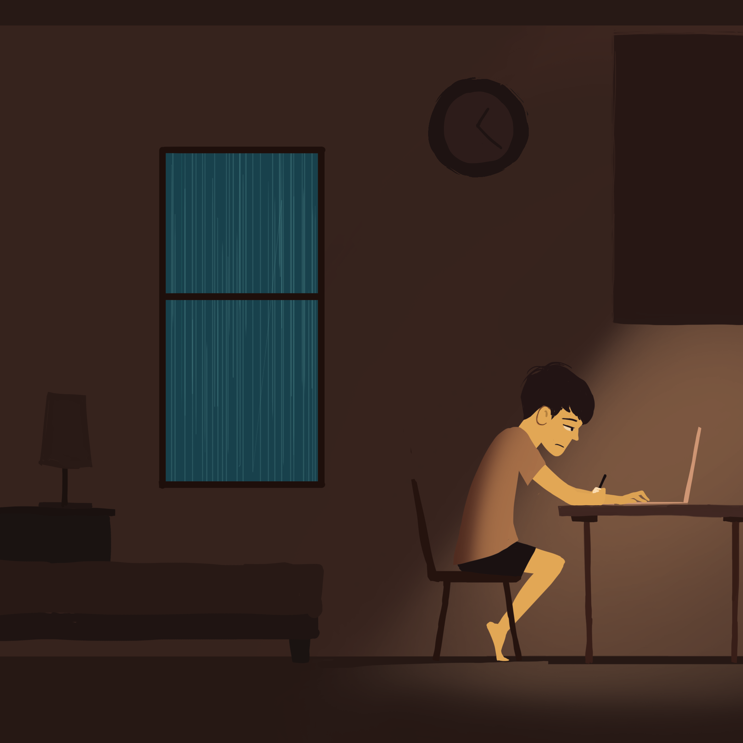
Complementary colour harmony
The turquoise window with the rain outside gives a very cozy feeling in the otherwise dull coloured room. There are two elements of focus, one is the window on the left and the other one is the main light source on the right, the two balances each other out.
There are rim lights on the elements in the darkness, again, to make them interact with the lights. The blurred foreground element gives depth to the image.

Split complementary harmony
A strong cone of light to draw your attention to the area. Characters in the foreground have rim light to show that there is interaction between foreground and mid ground.

Split complementary harmony
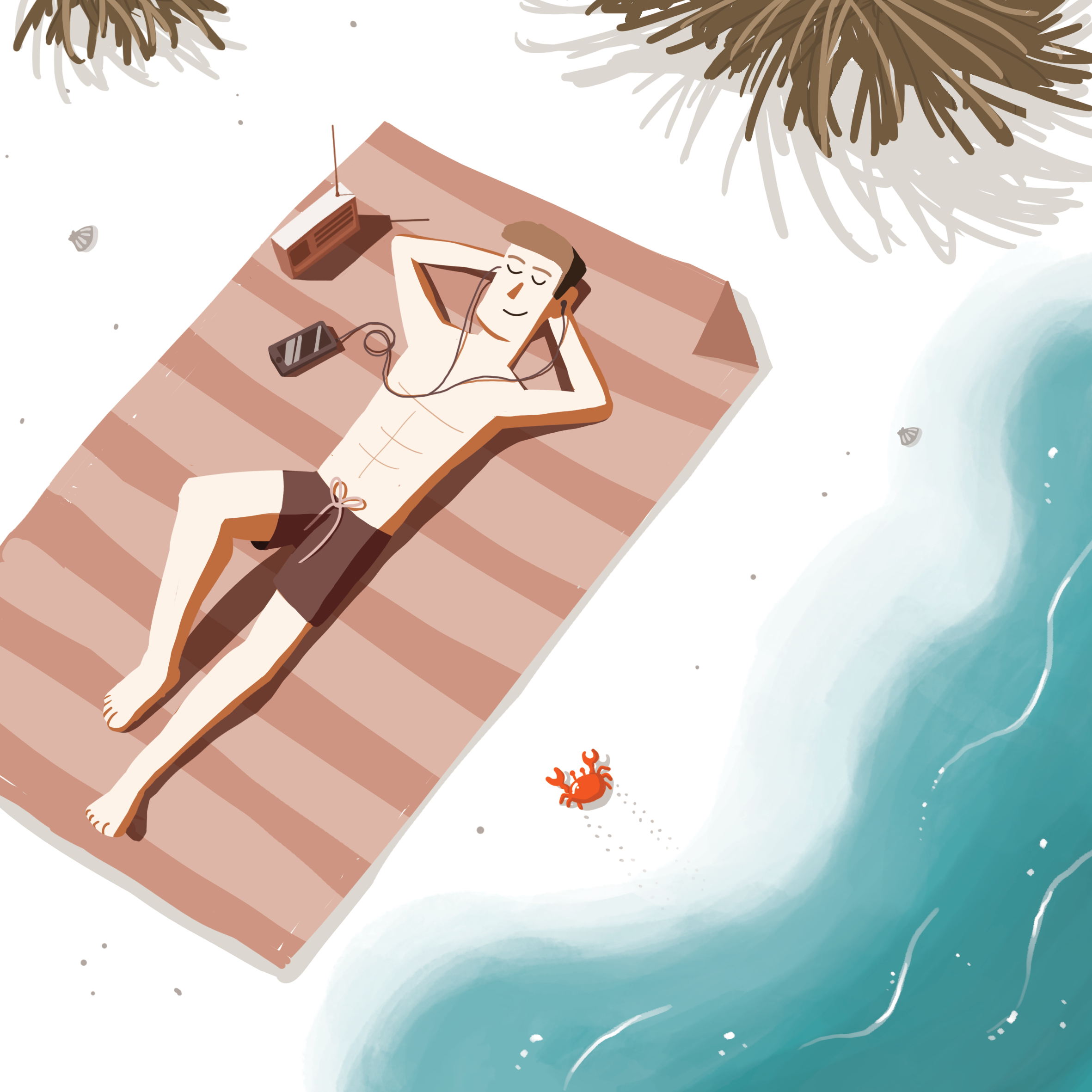
I went for a colour scheme which portrayed a relaxing sunny white sandy beach and cool turquoise water. I used a diagonal composition as since the guy is laying down, I didn’t want him to be parallel with the sides. I filled in the empty spaces of the beach with bushes and details of small rocks and seashells and Cody the Crab™.
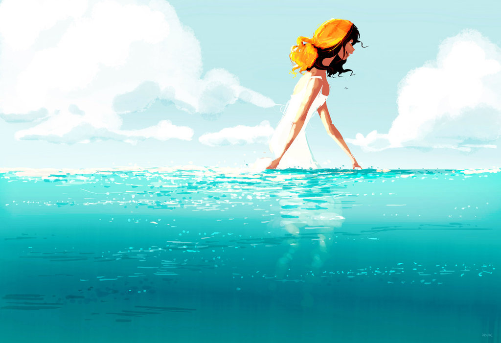
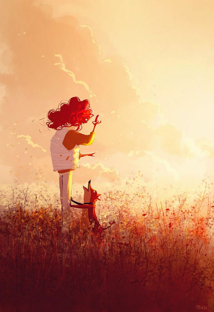
My greatest inspiration was from Pascal Campion’s illustrations, whose illustrations always tell a story and are visually engaging.
I also referenced a few colour schemes from colour keys and scripts of animated films. I find these very inspiring as the artist is able to use lighting and colours in such small thumbnail illustrations to tell a story.
When I test printed, the colours turned out quite yellowish. I had to apply a colour balance to all my illustrations to cancel it out. I eventually went for the top right adjustments.
A challenge i faced was working with square compositions and not the usual 16:9, it was quite challenging to get a good composition from such a small working space, but I think I made it work by keeping most of the elements in focus off centre and using the rule of thirds, along with the lighting.
I also tend to colour pick a lot from existing illustrations, the colours work but I have to tweak or remove some colours so that they fit into one of the colour harmonies taught to us. I find that colour picking is a very good way of approaching illustrating especially when you are not good with colours because you can see the colours the artist used and you can visualise how they would work with your own drawing.
This project has been very fun as I have never done so many illustrations before in one project, it has definitely improved my sense of colour usage and visualisation.

Find cody in all 12 illustrations c:
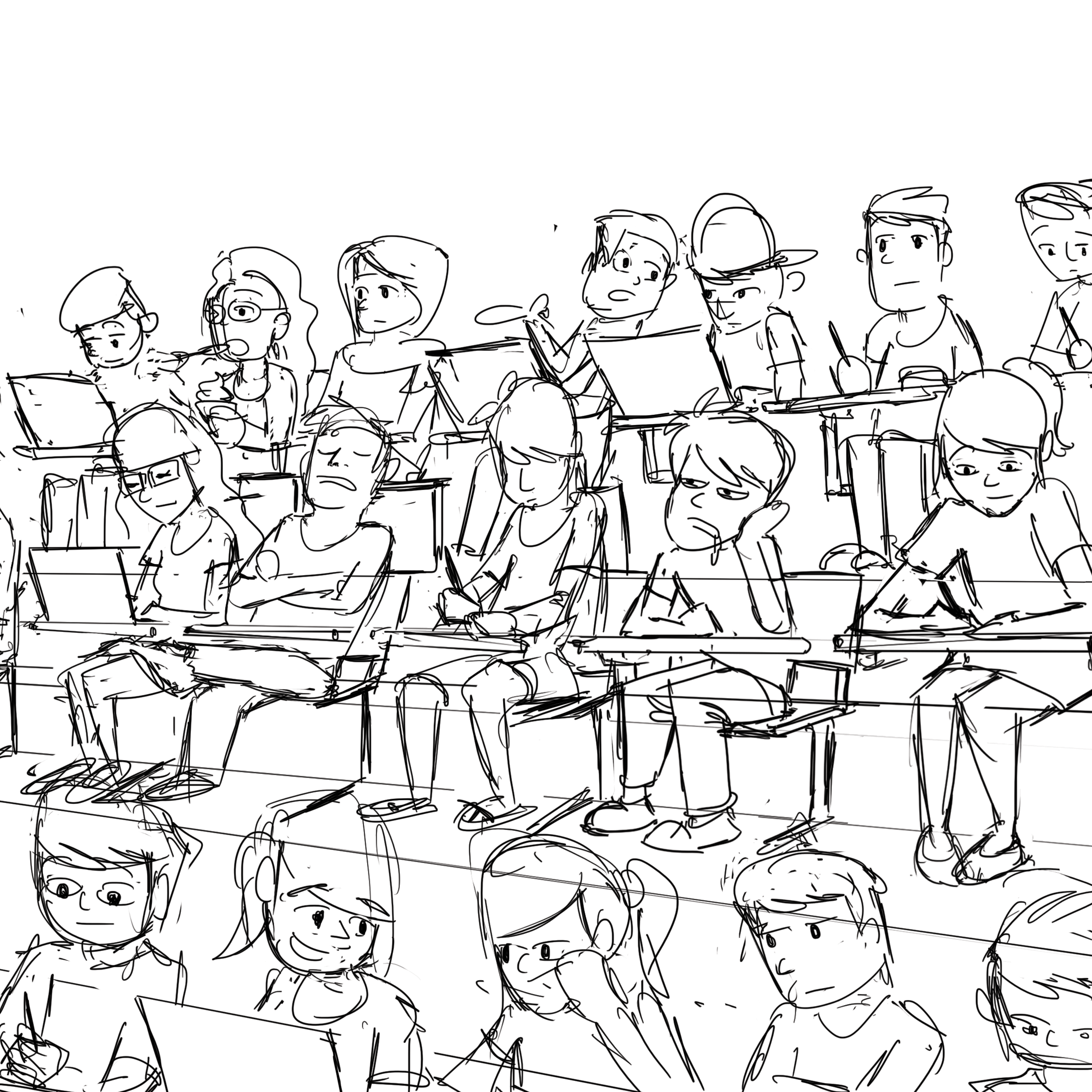
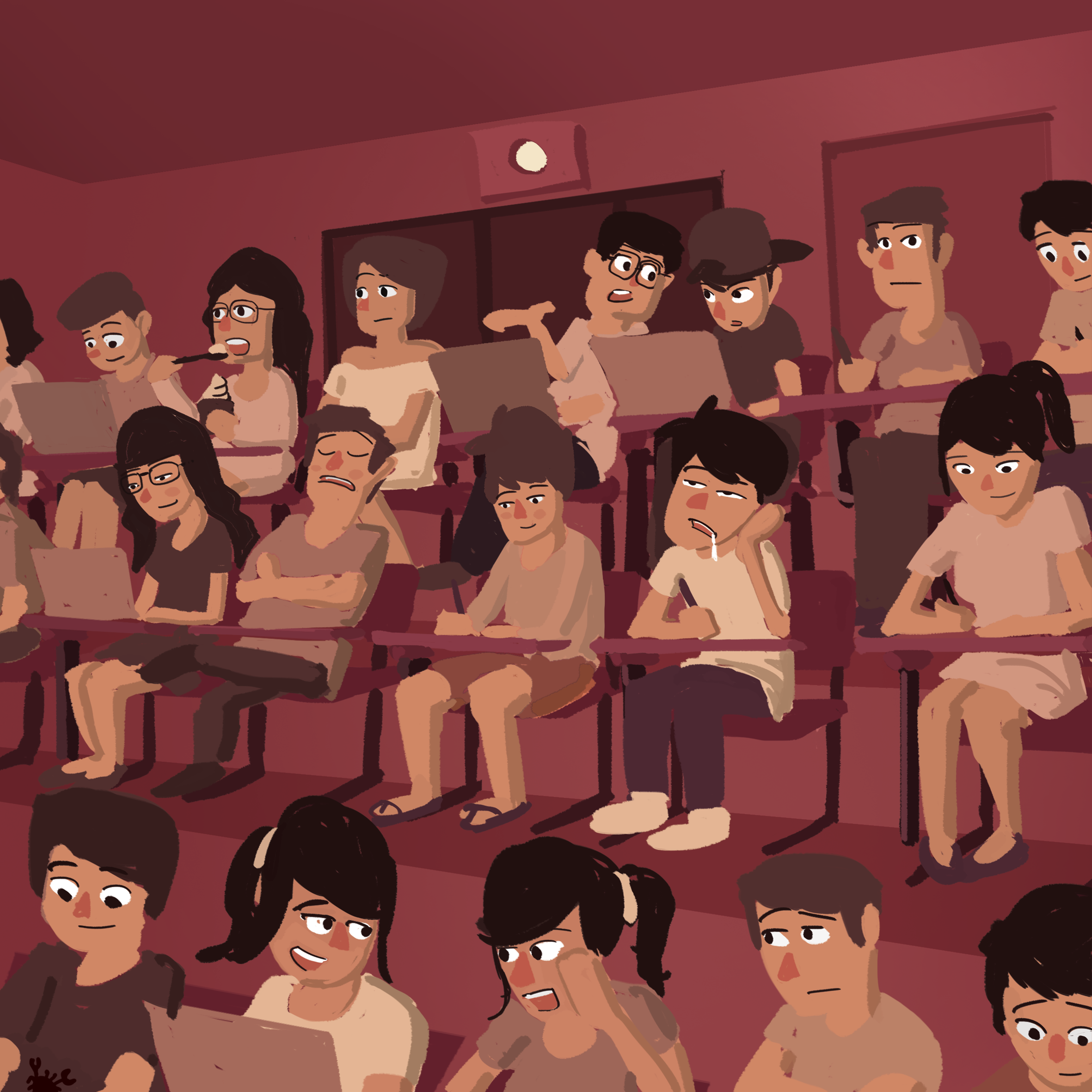
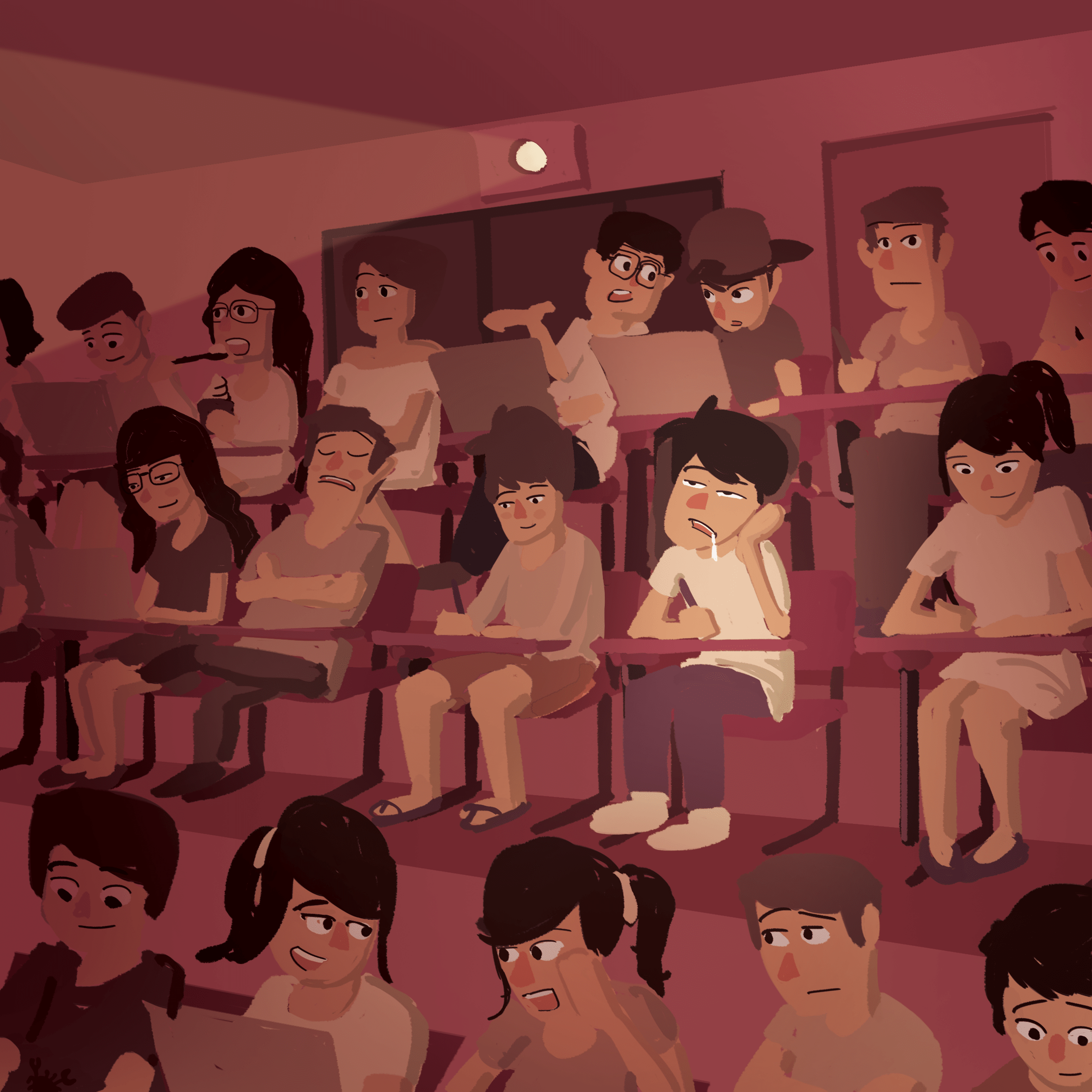
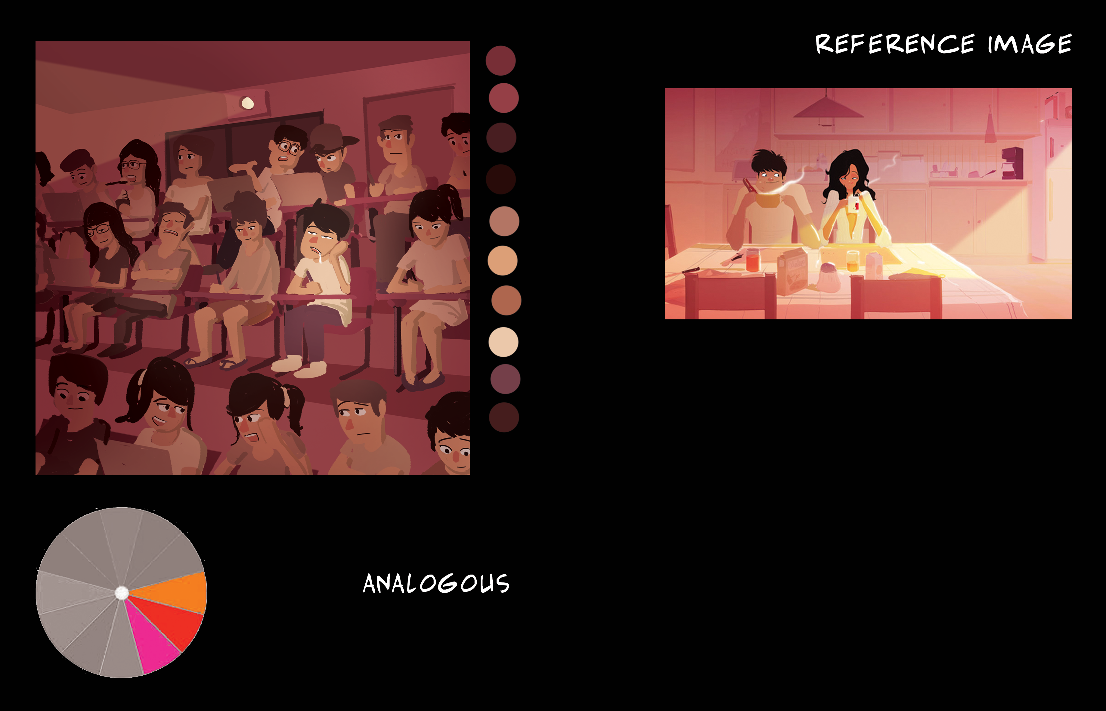
A warm analogous colour scheme to replicate a dream-like state of boredom.
The character in focus is of a brighter colour as compared to the other characters.

A warm analogous colour scheme that portrays a late-afternoon time of day. It gives a peaceful and relaxing vibe which signifies the end of a day’s work.
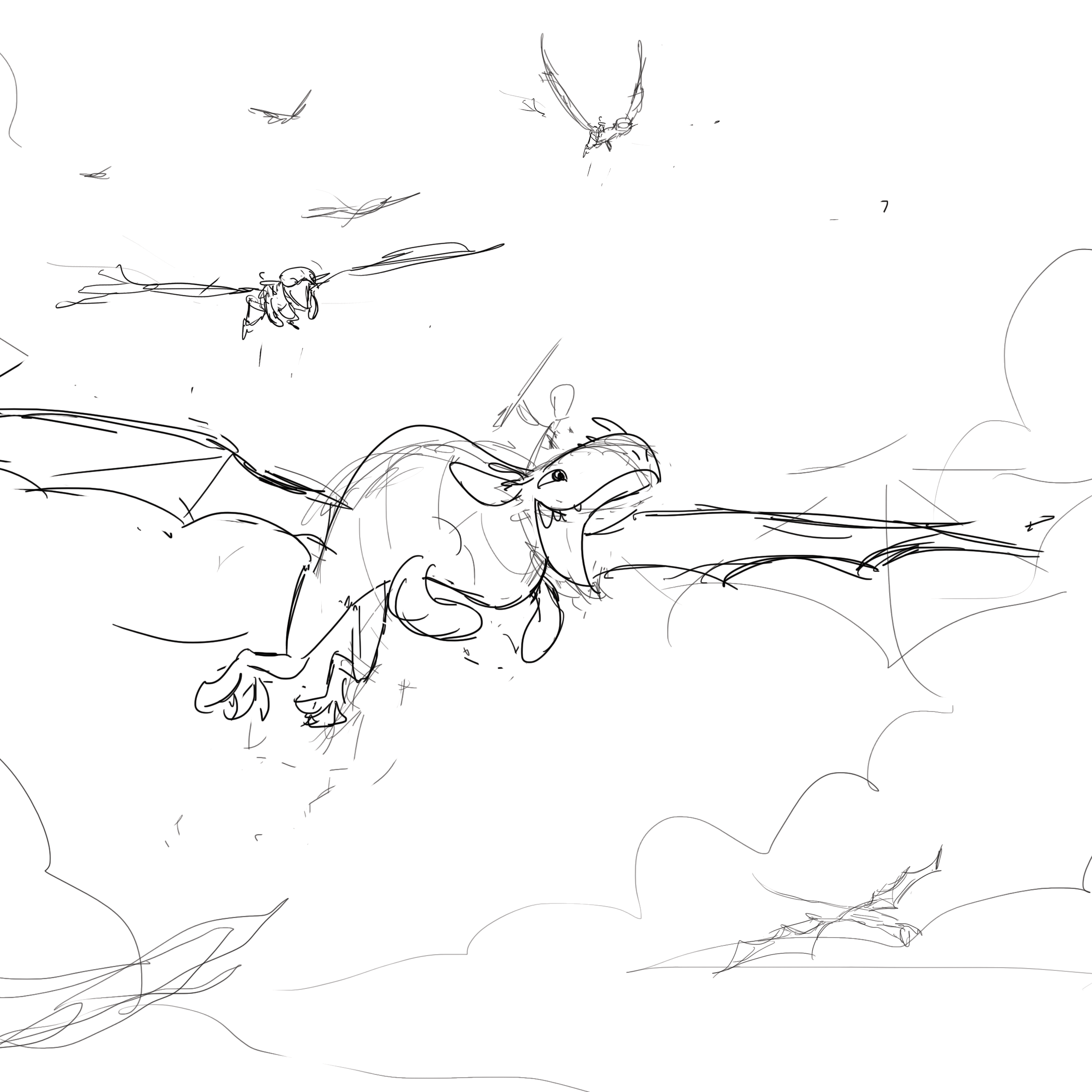
An orange and red colour scheme that signifies joy and adventure, the overlay of white lights gives a majestic feel to the composition. Complimenting these colours are a few touches of blue.

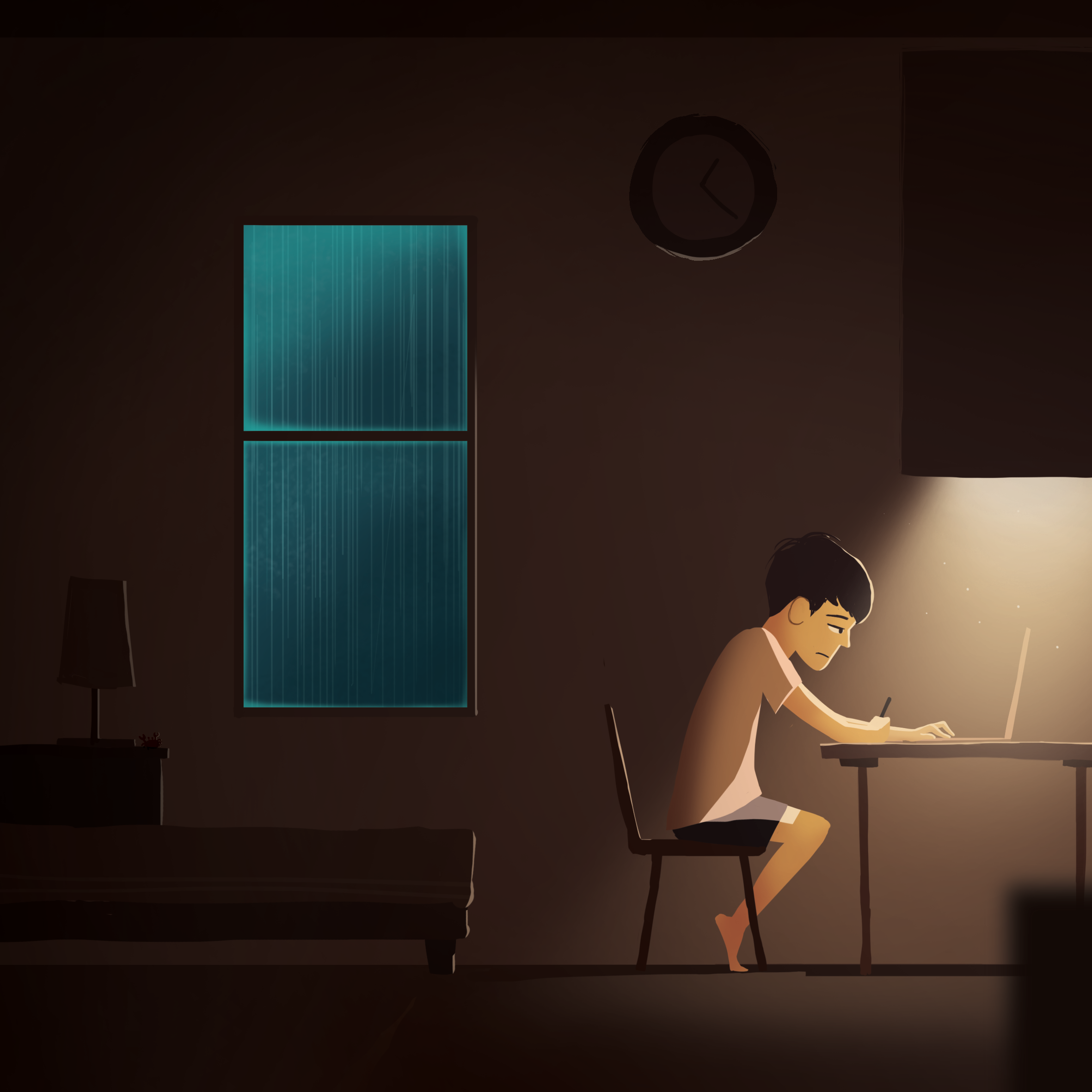
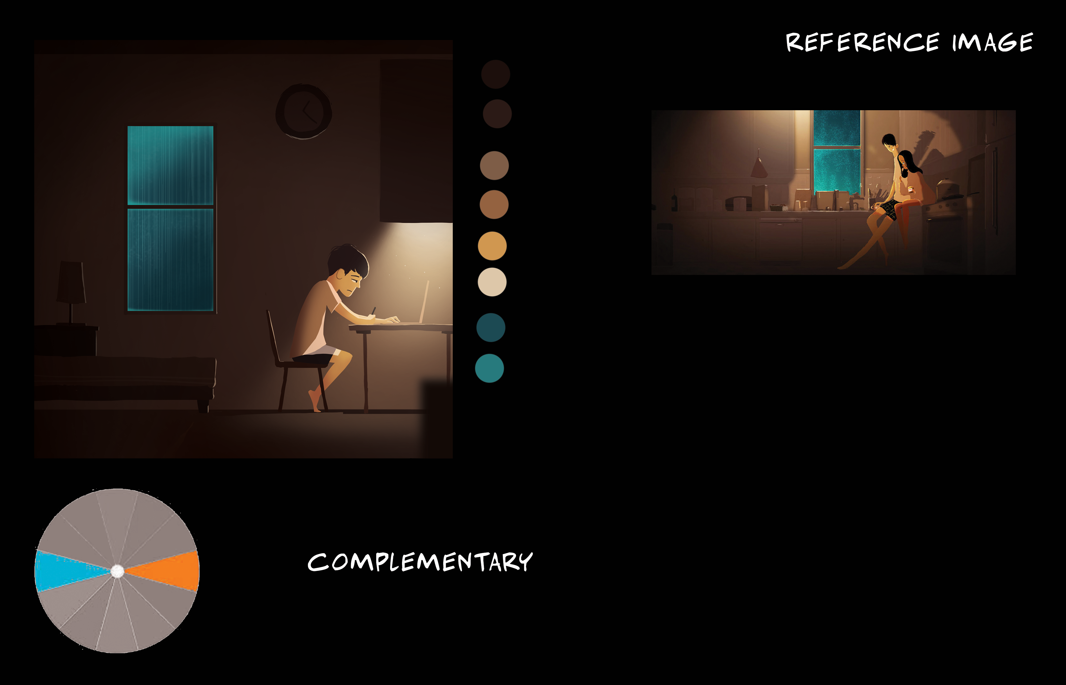
I really liked the use of the turquoise in the otherwise dull brownish illustration as seen from the reference image. The fog effect on the window makes it seem as though it is glowing. Rim lights were added to the elements in the darker areas to make them stand out just a little. A blurred foreground element is added to give a sense of depth in a ‘flat’ image.

Split complementary of maroon red, pale orange, and a hint of blue. Foreground characters are in the shadows but with rim lights so that they interact with the light in front if them.


Warm red and oranges and white sand to portray a sunny beach setting, along with a cool turquoise water at the shoreline to complete the beach-y vibe.