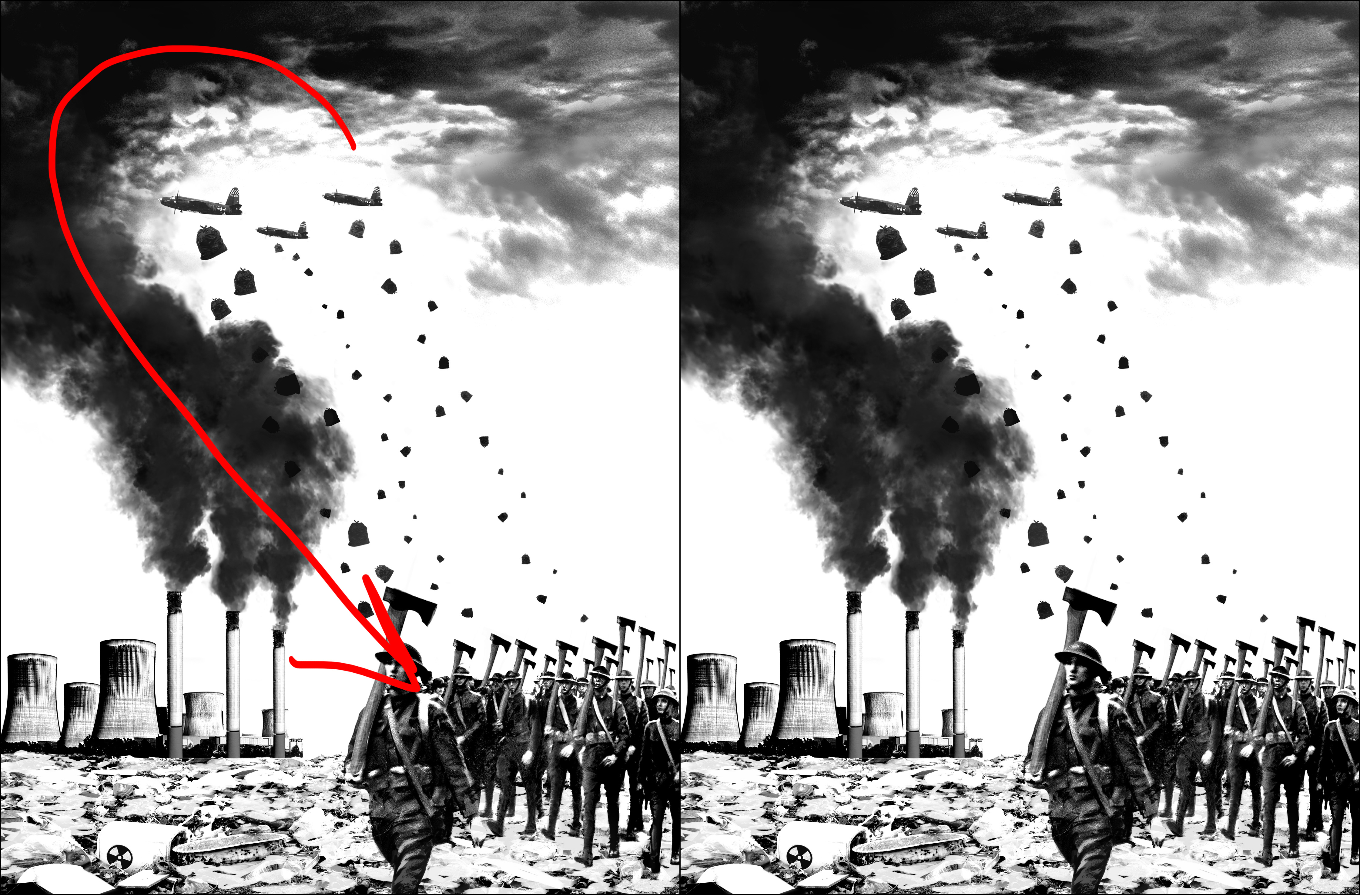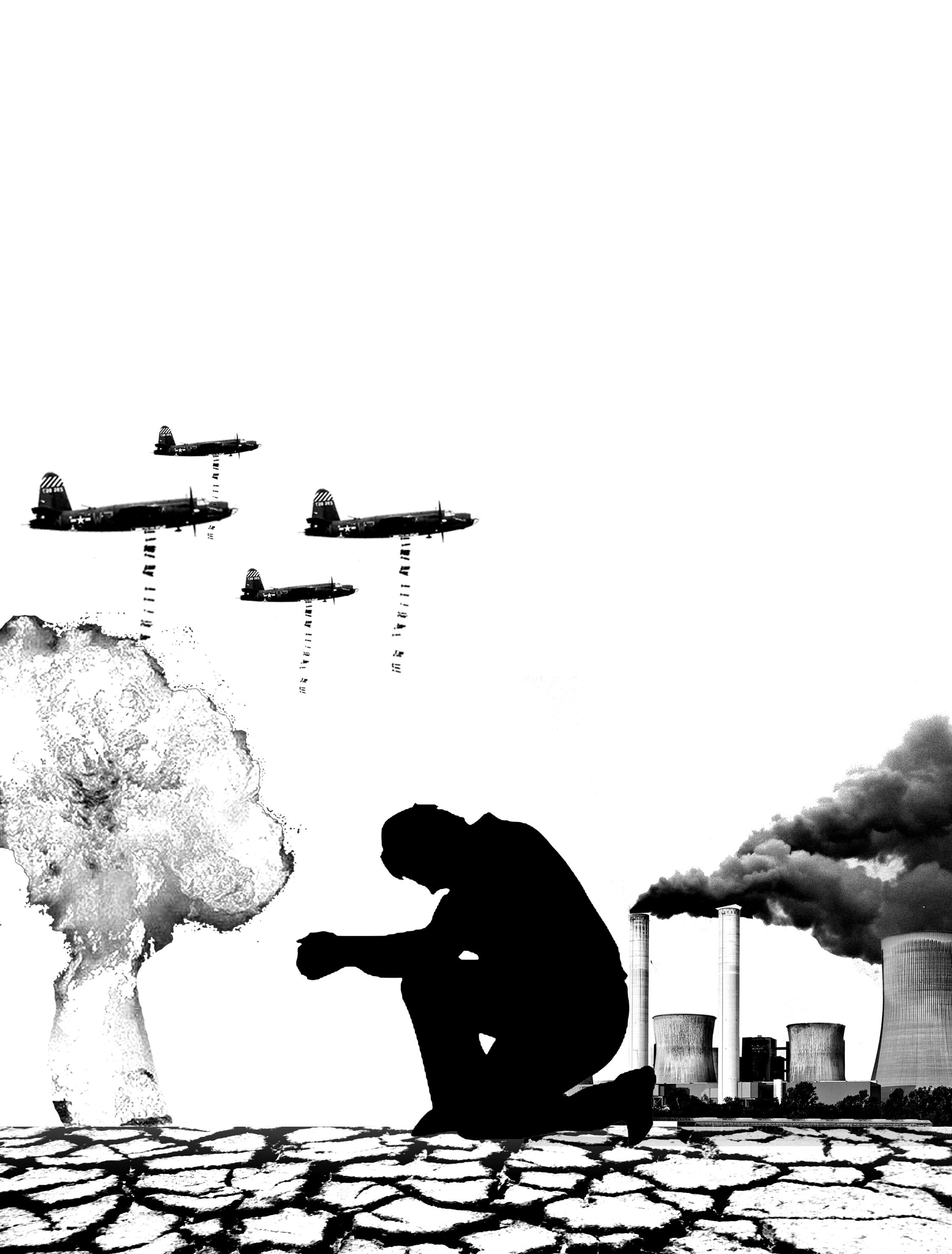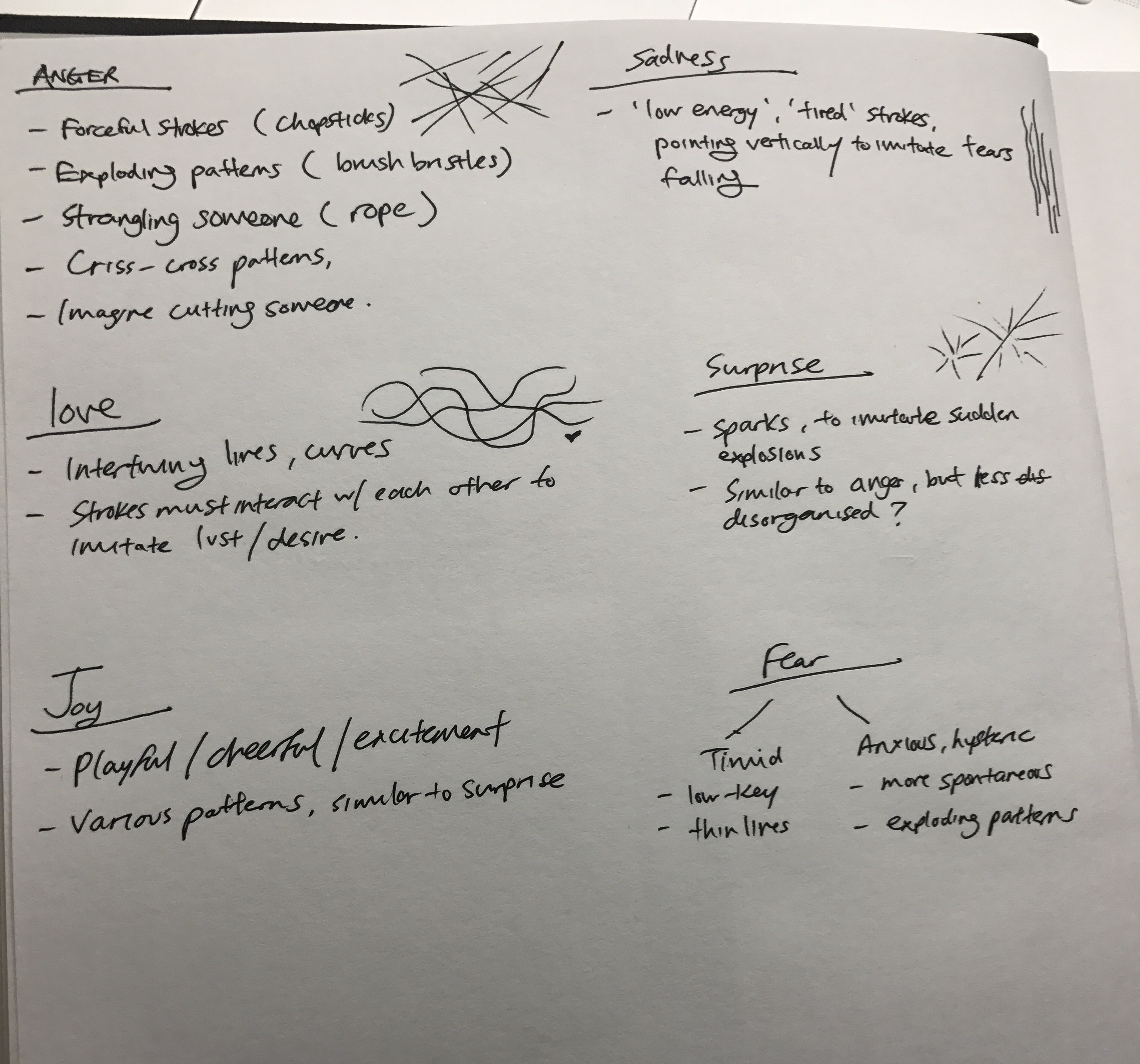
Process parts 1-3 can be found here:
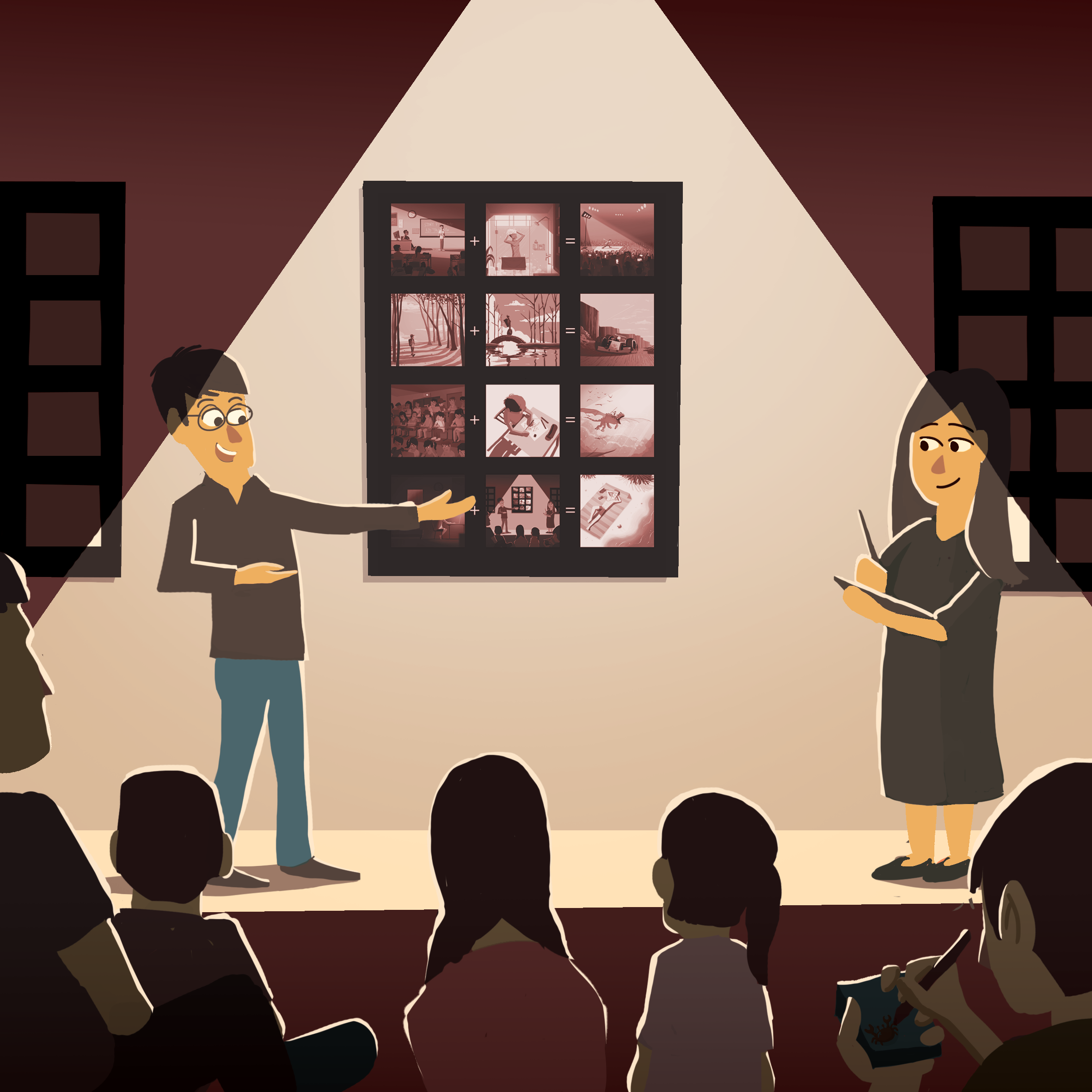
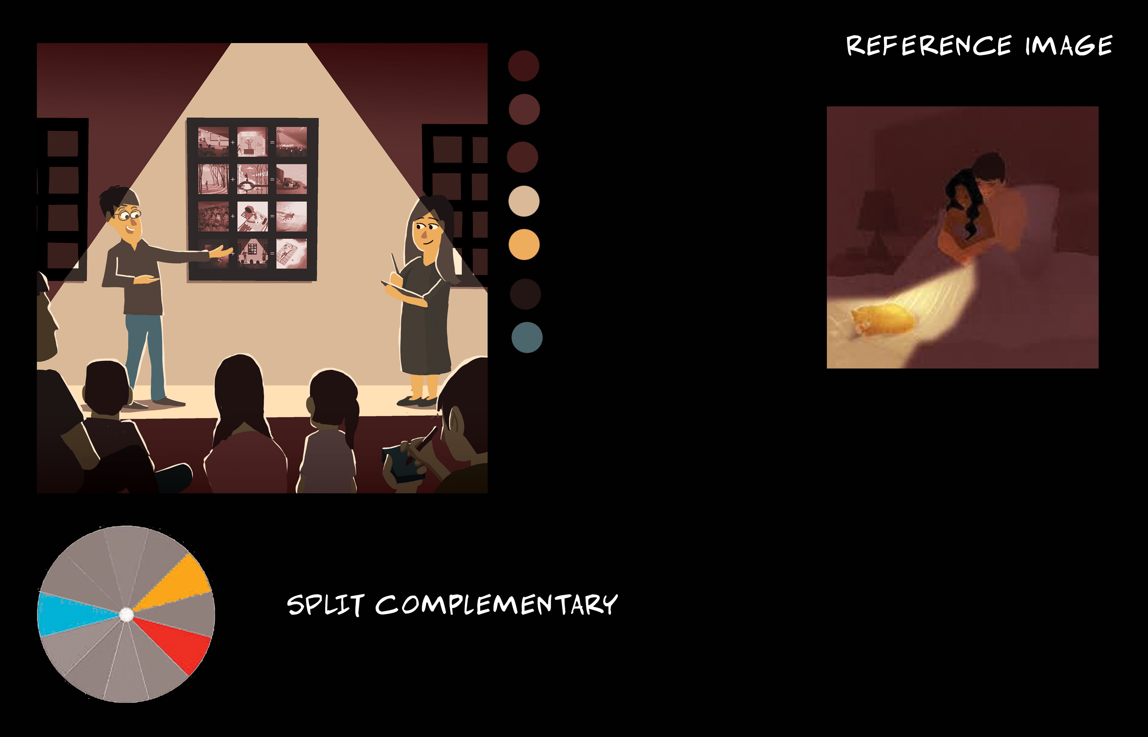
Presentation
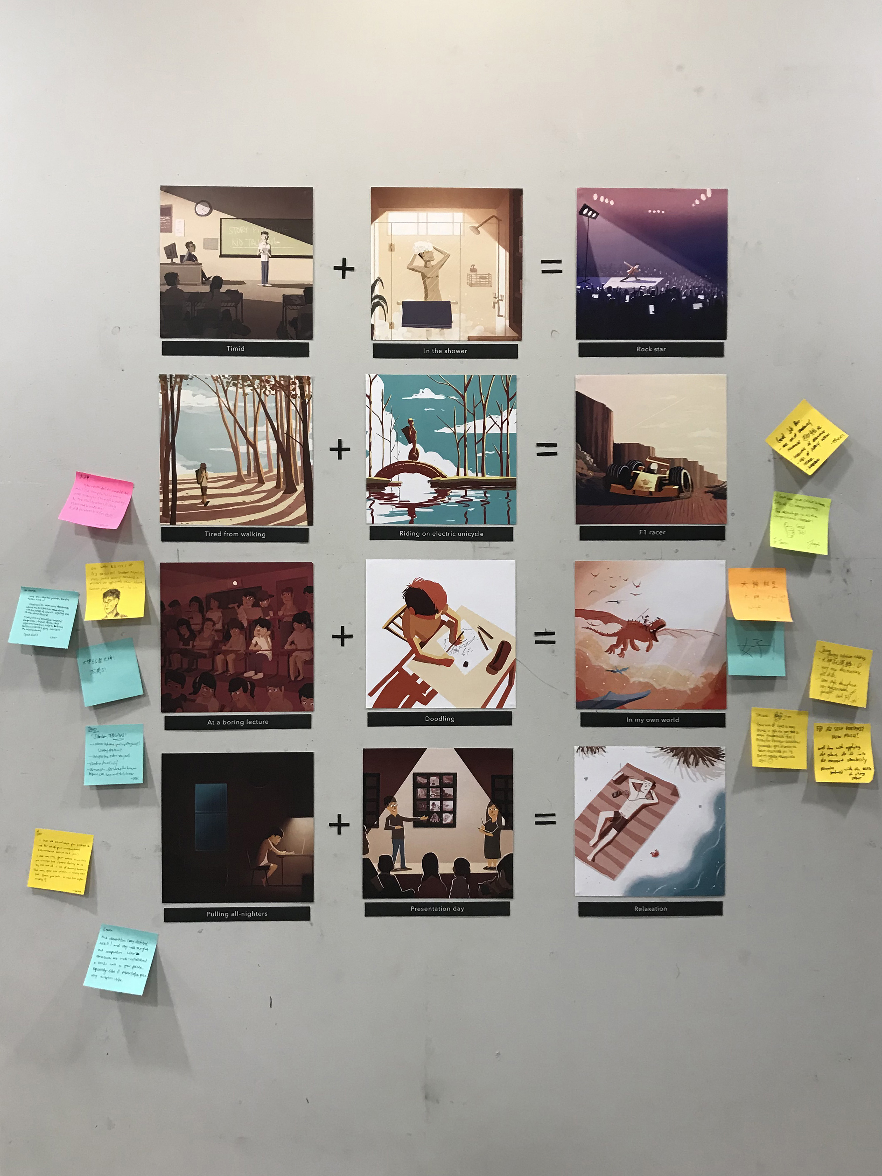
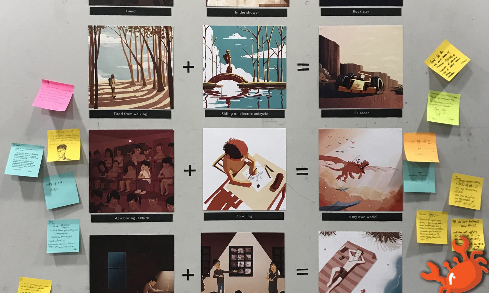
Equation 1
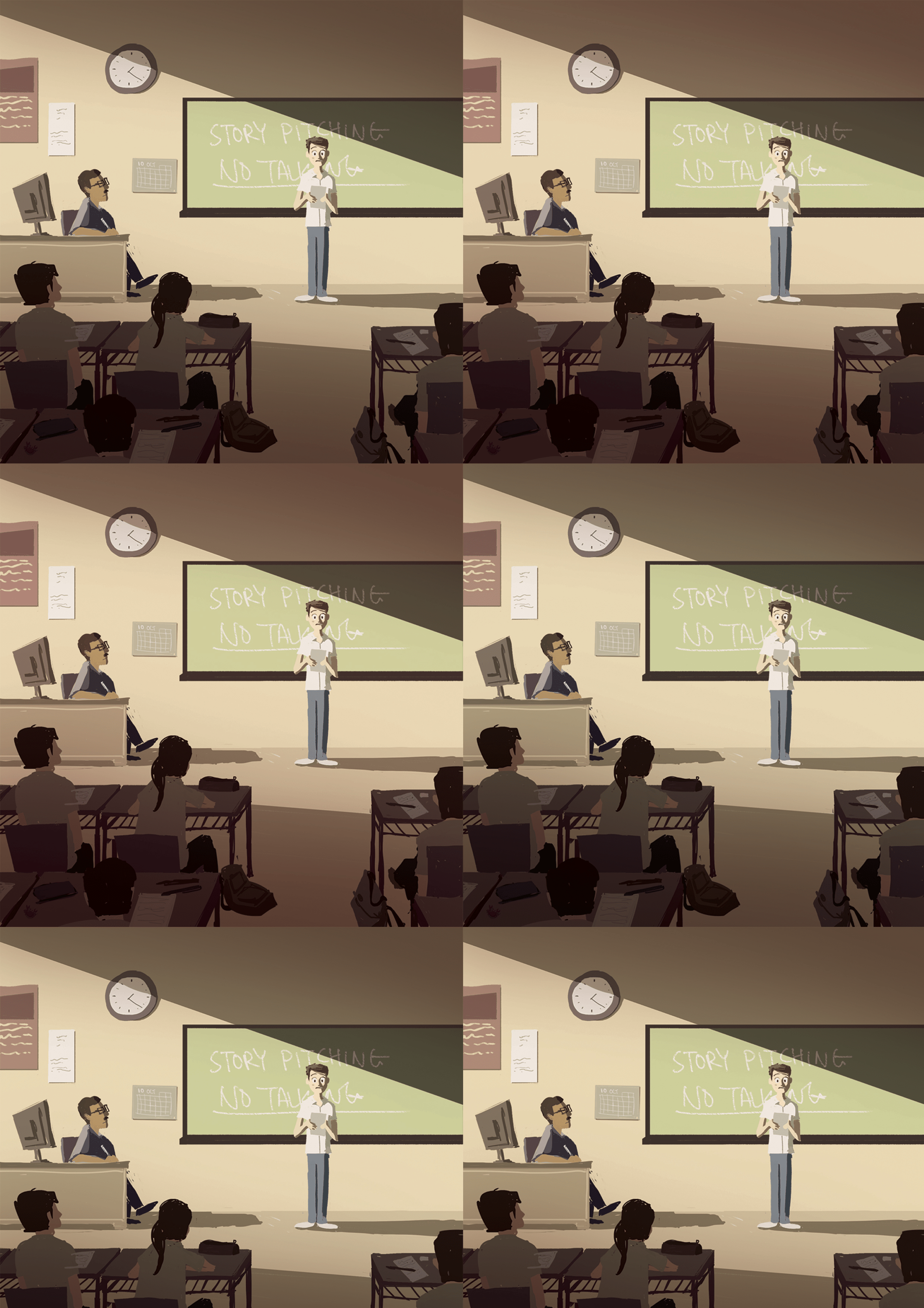
When a timid person is alone, he tends to be more expressive.

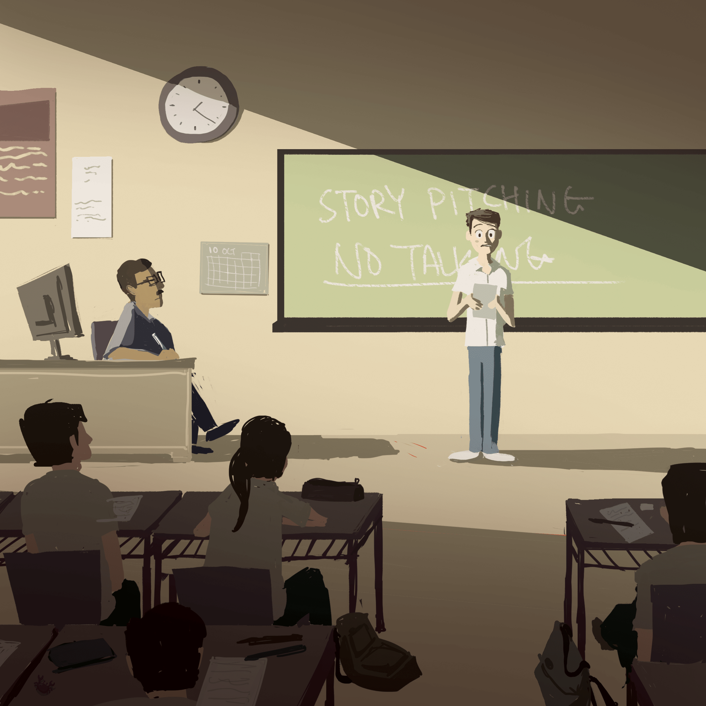
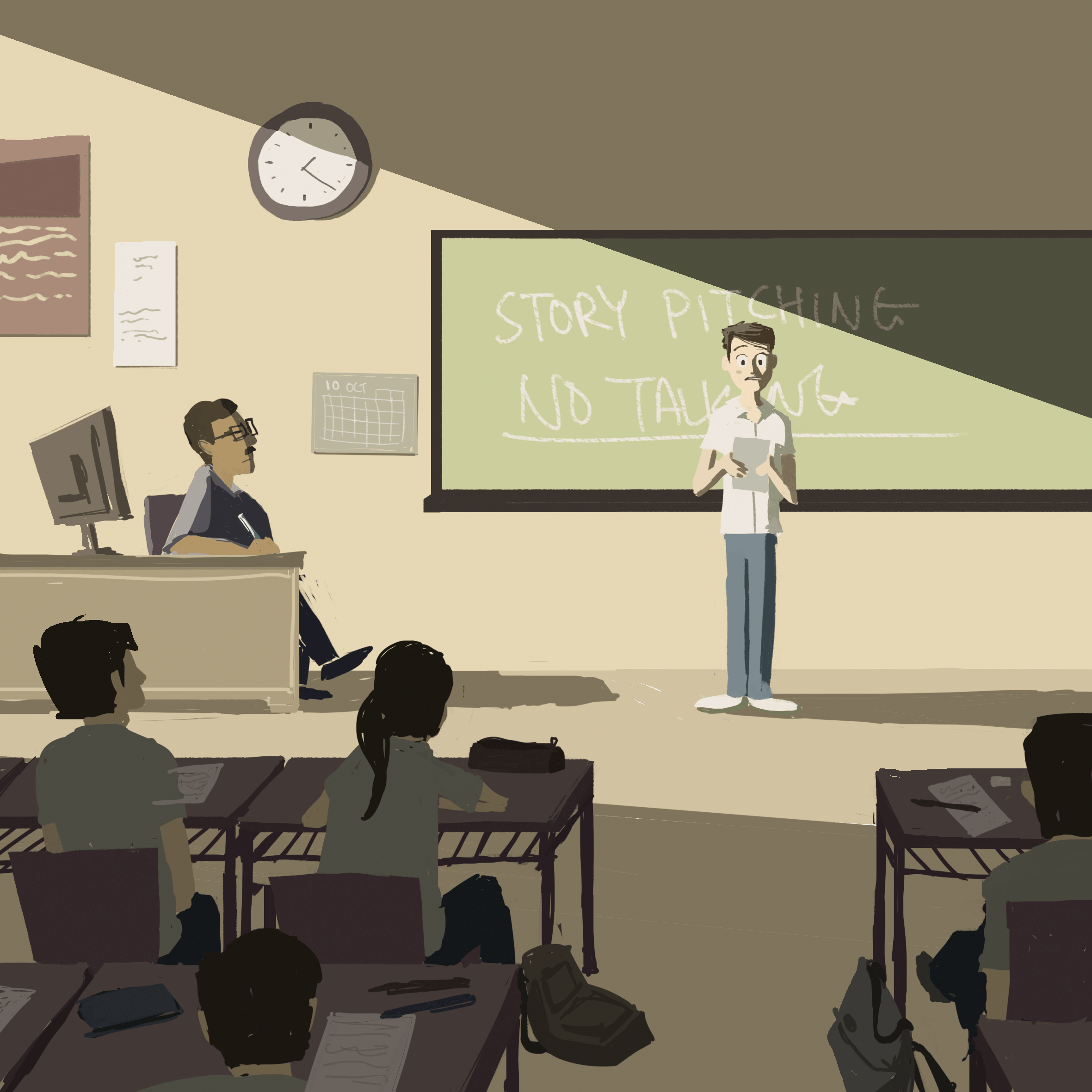
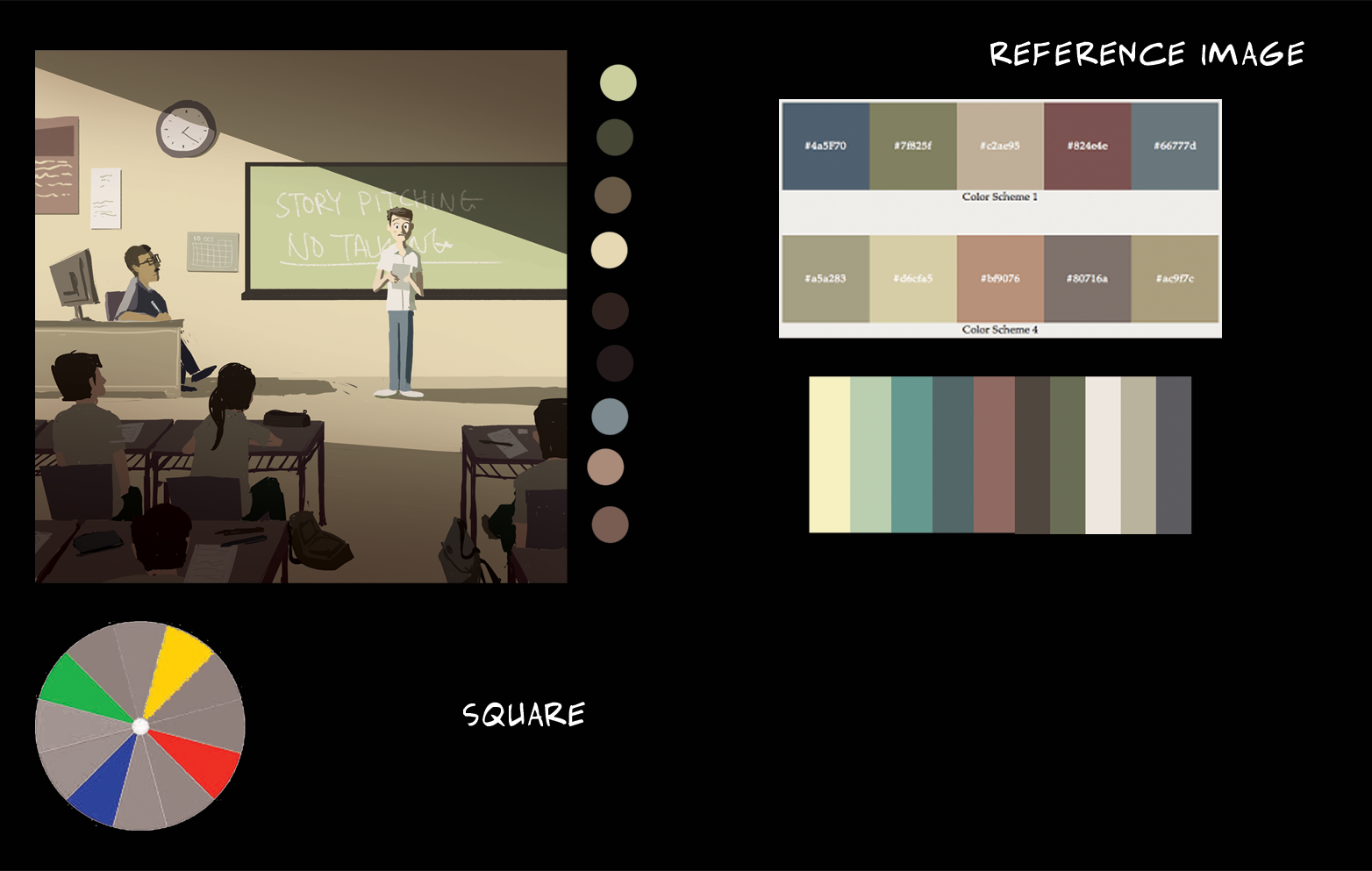
Square colour harmony
In this colour harmony, there are two sets of complementary colours, each set has a dominant and subdominant colour.
– yellow & blue, yellow dominant
– green & red, green dominant
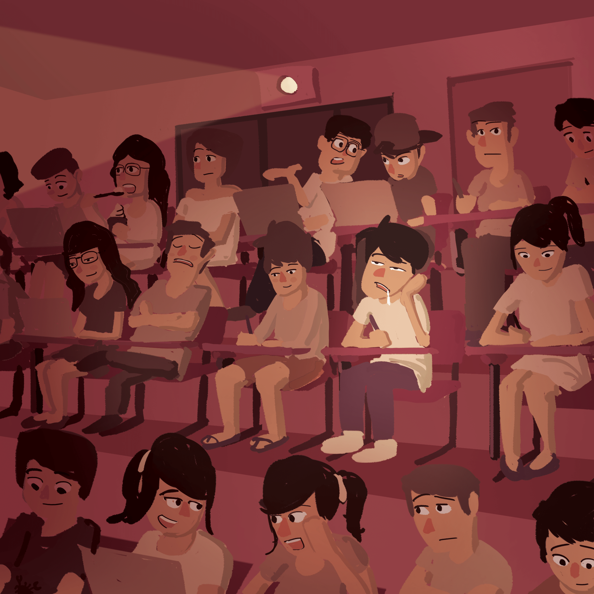
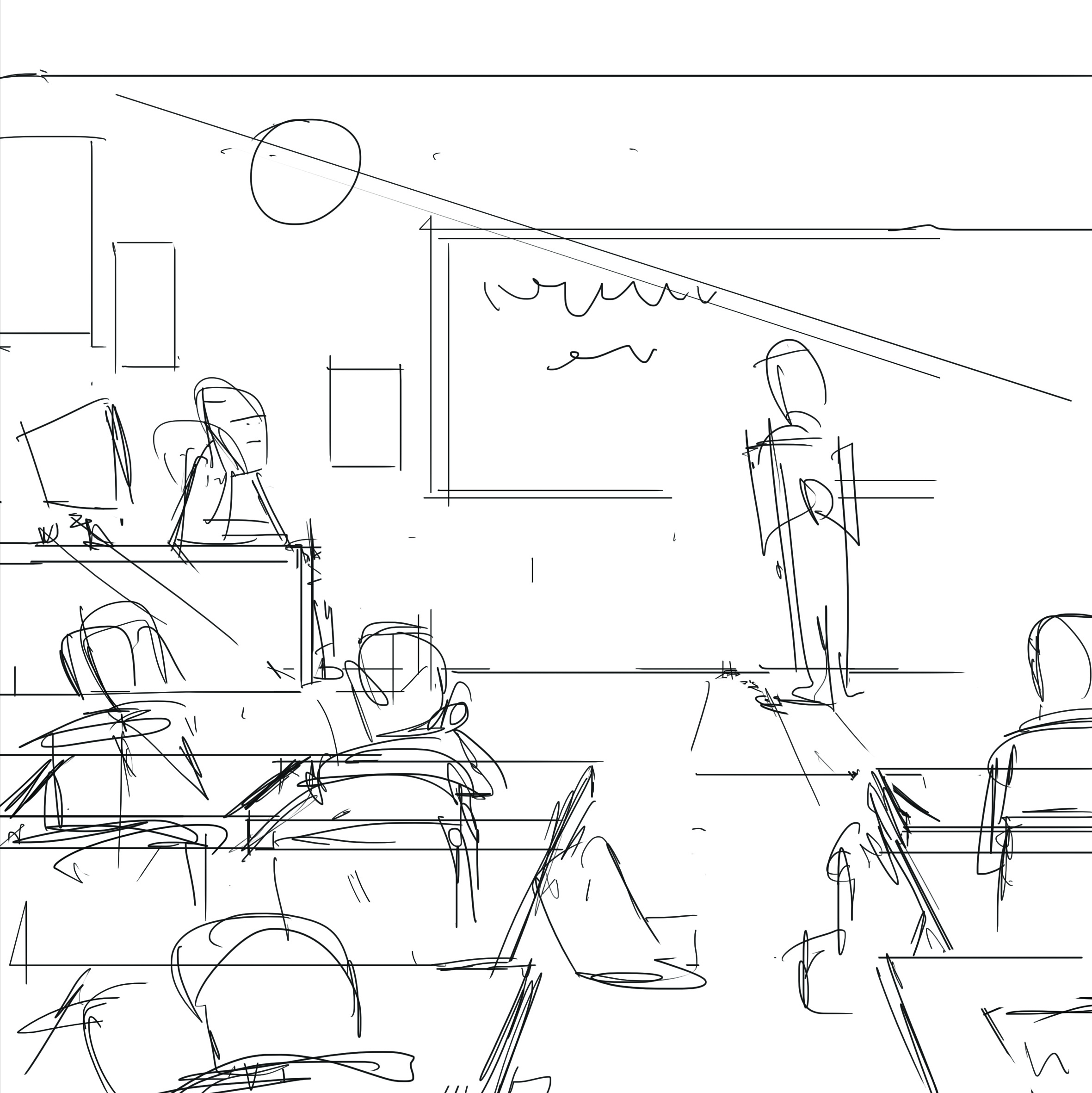
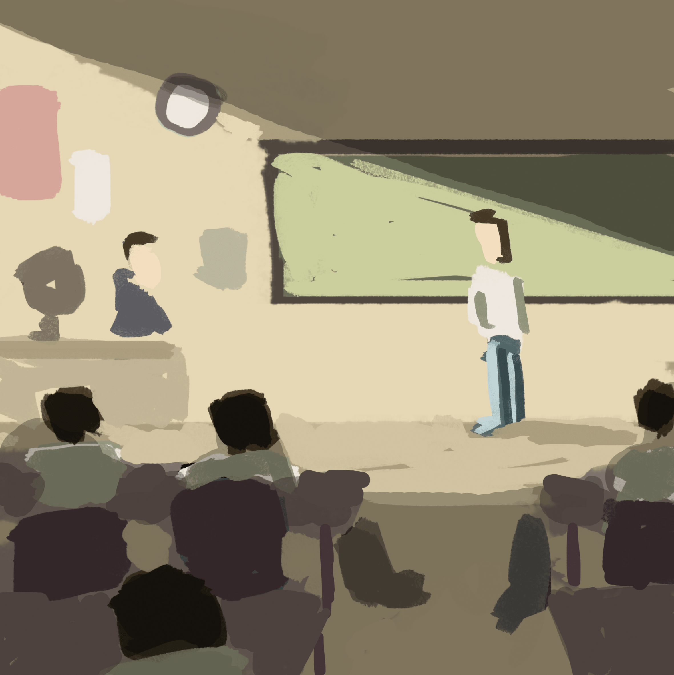
I used an overall muted colour scheme to depict a typical boring classroom environment. The shadows make the light more contrasting and prominent, also, the direction of light and where the other characters are looking draws your attention to the character in focus.

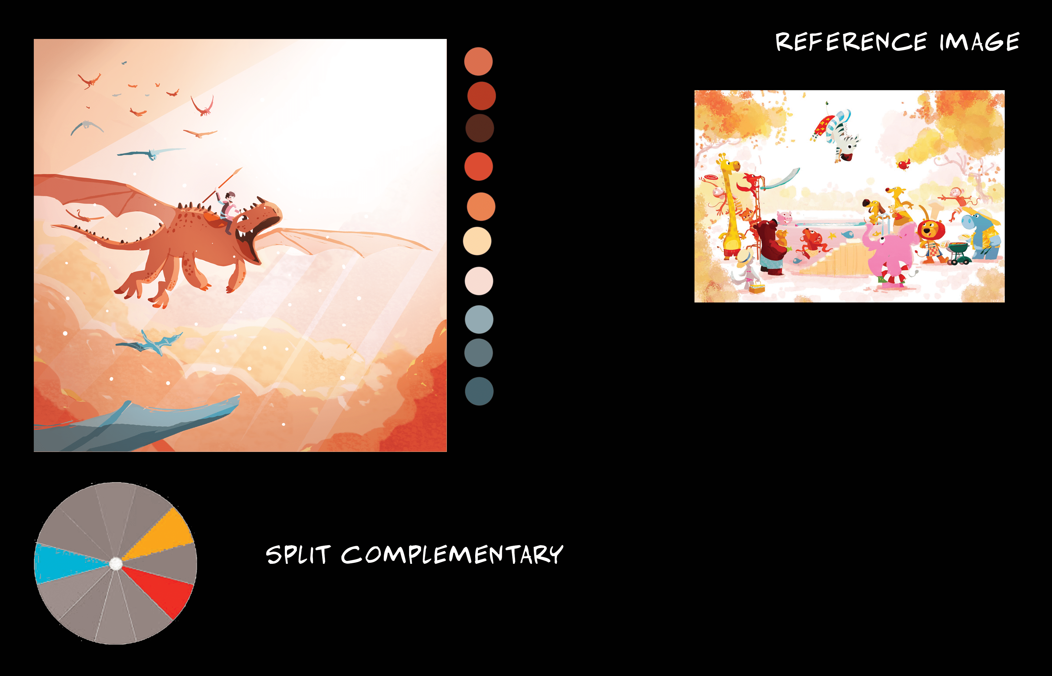
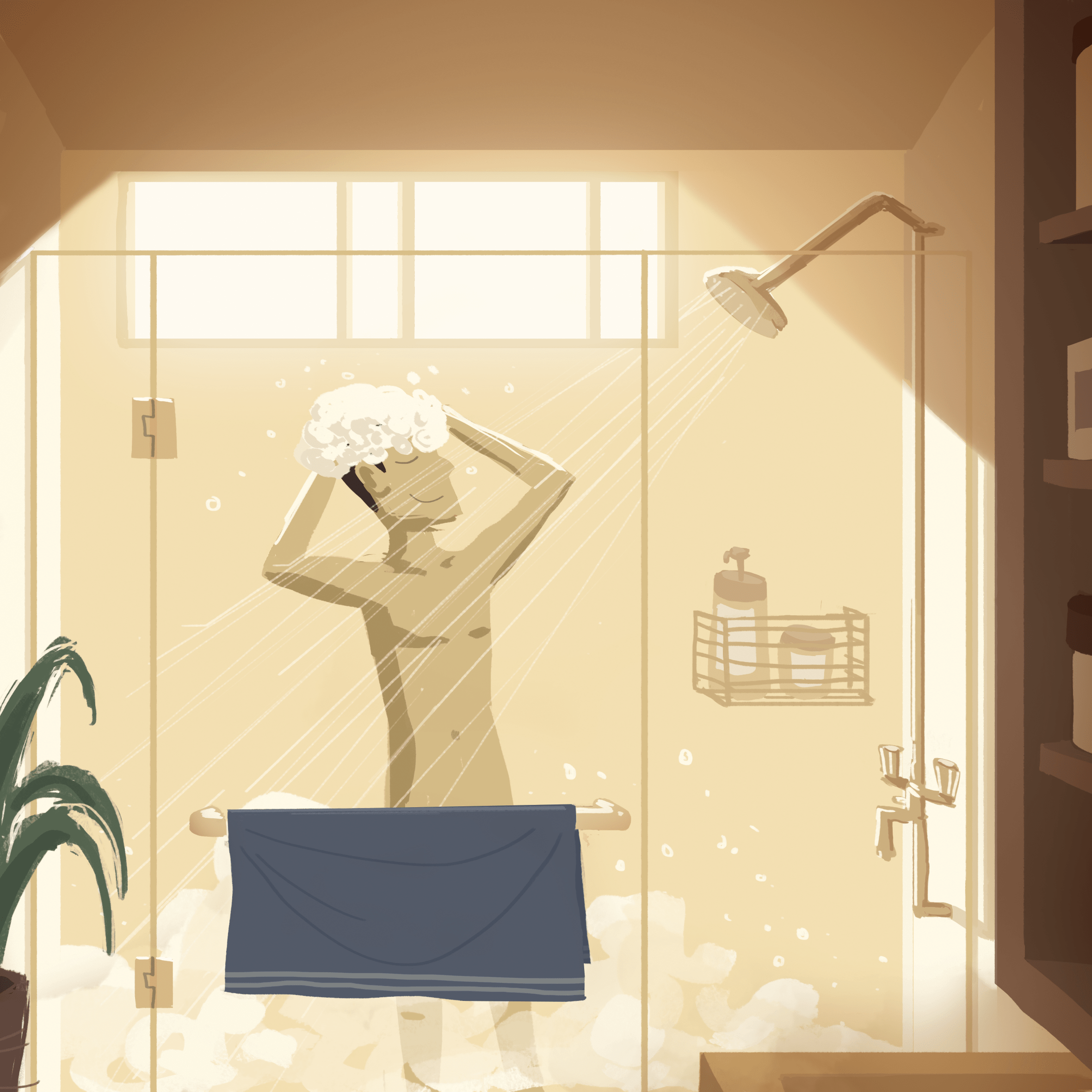
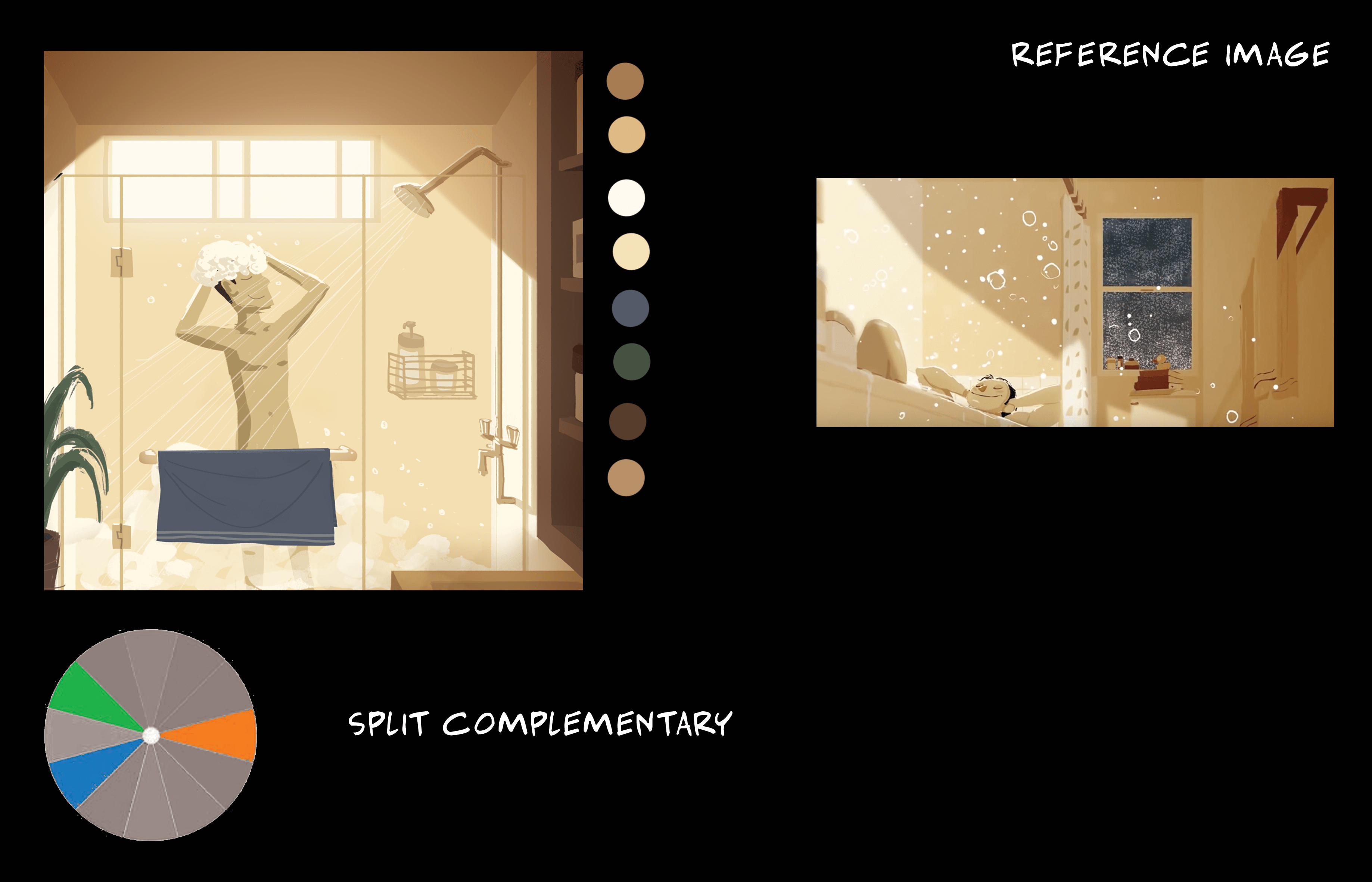
Split complementary colour harmony
A warm and vibrant orangey composition to depict a relaxing afternoon bath, with a bit of blue and green to complement it and to give it a strong visual contrast between warm and cool colours. Again, the ray of light from the window draws attention to the character, also, the darker foreground elements to give a sense of depth.
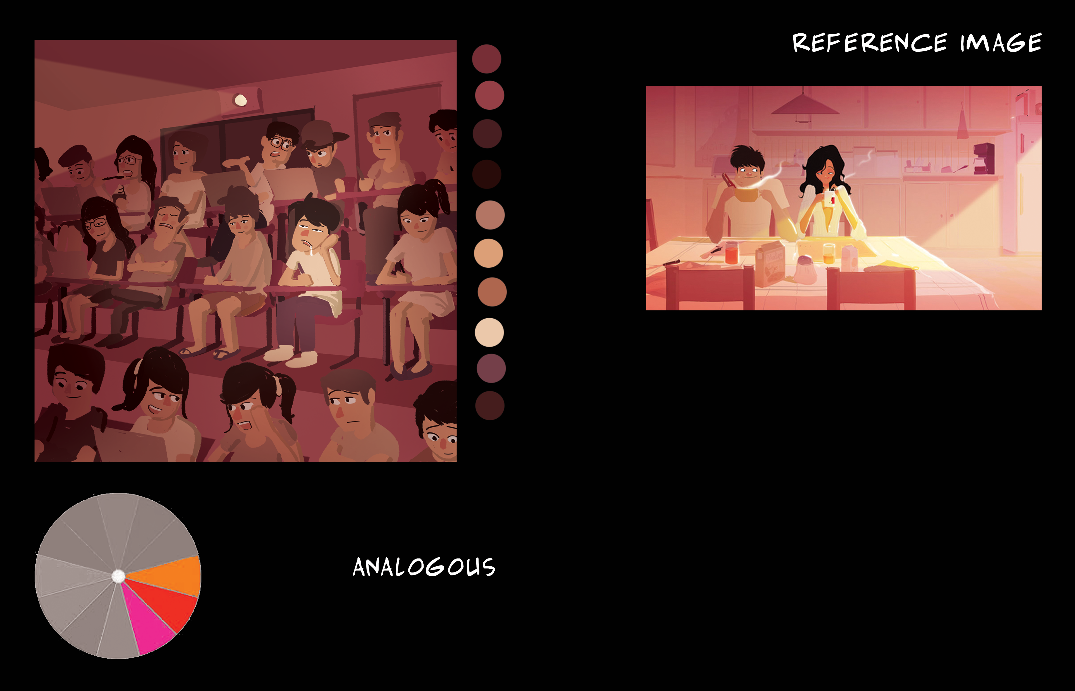
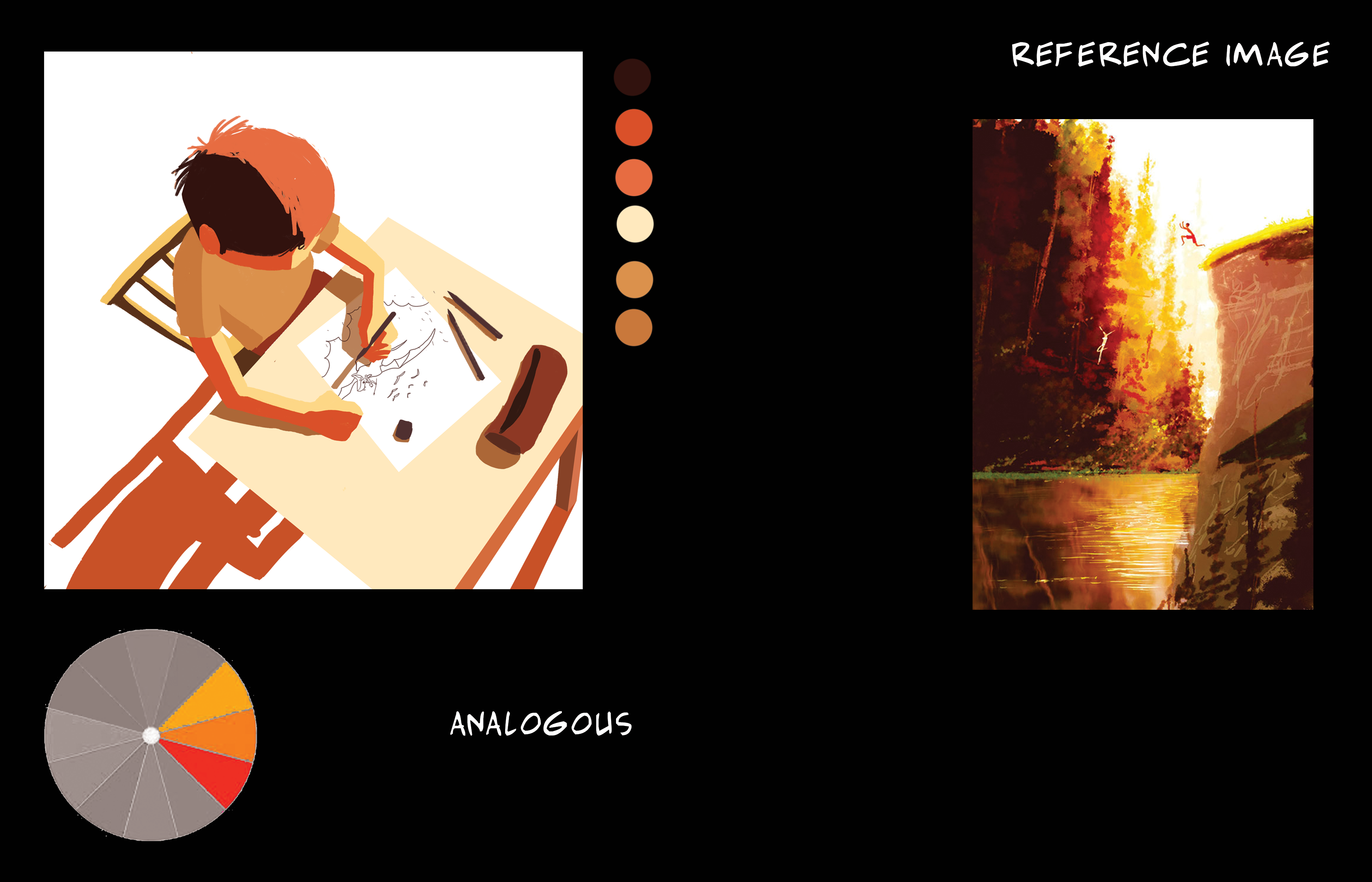
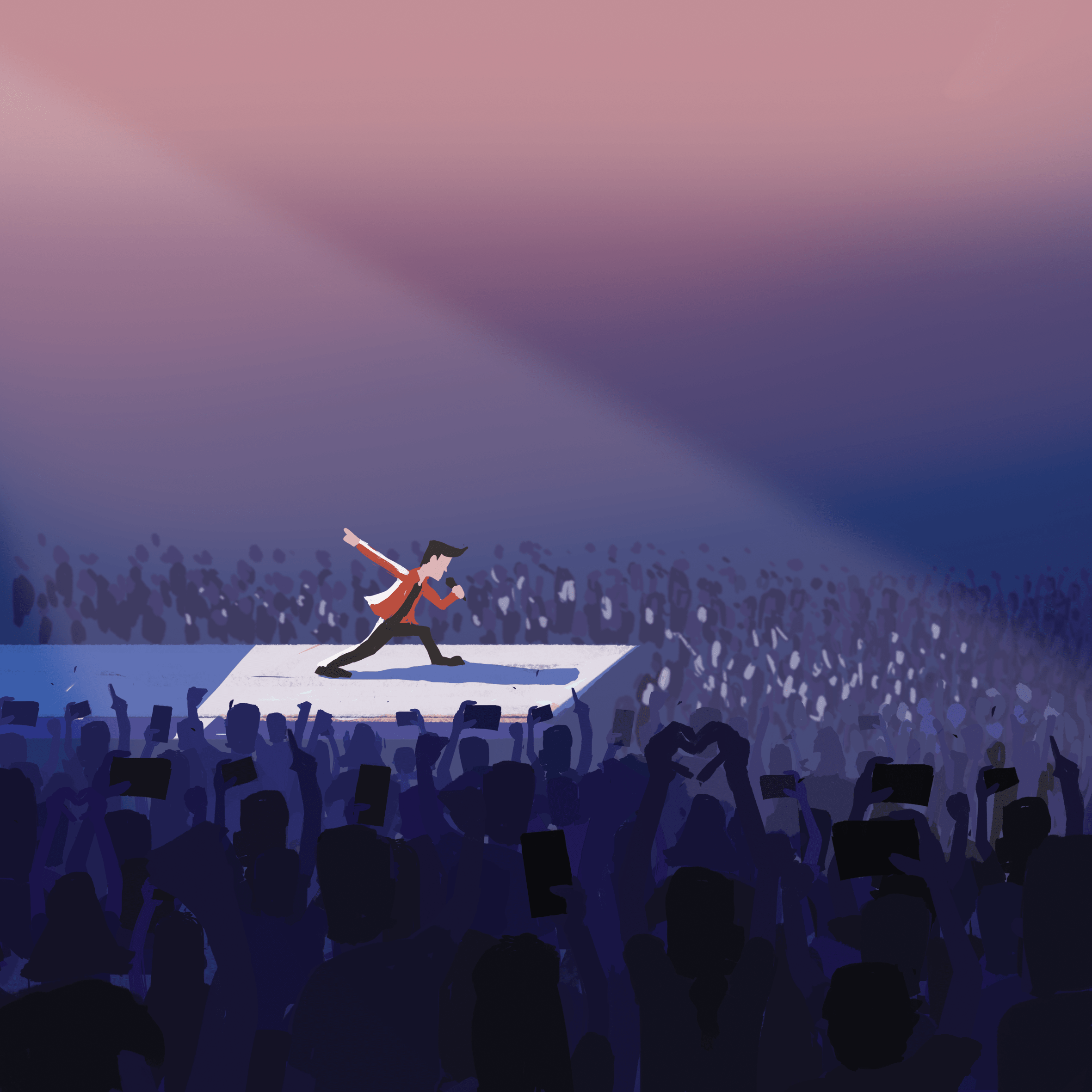
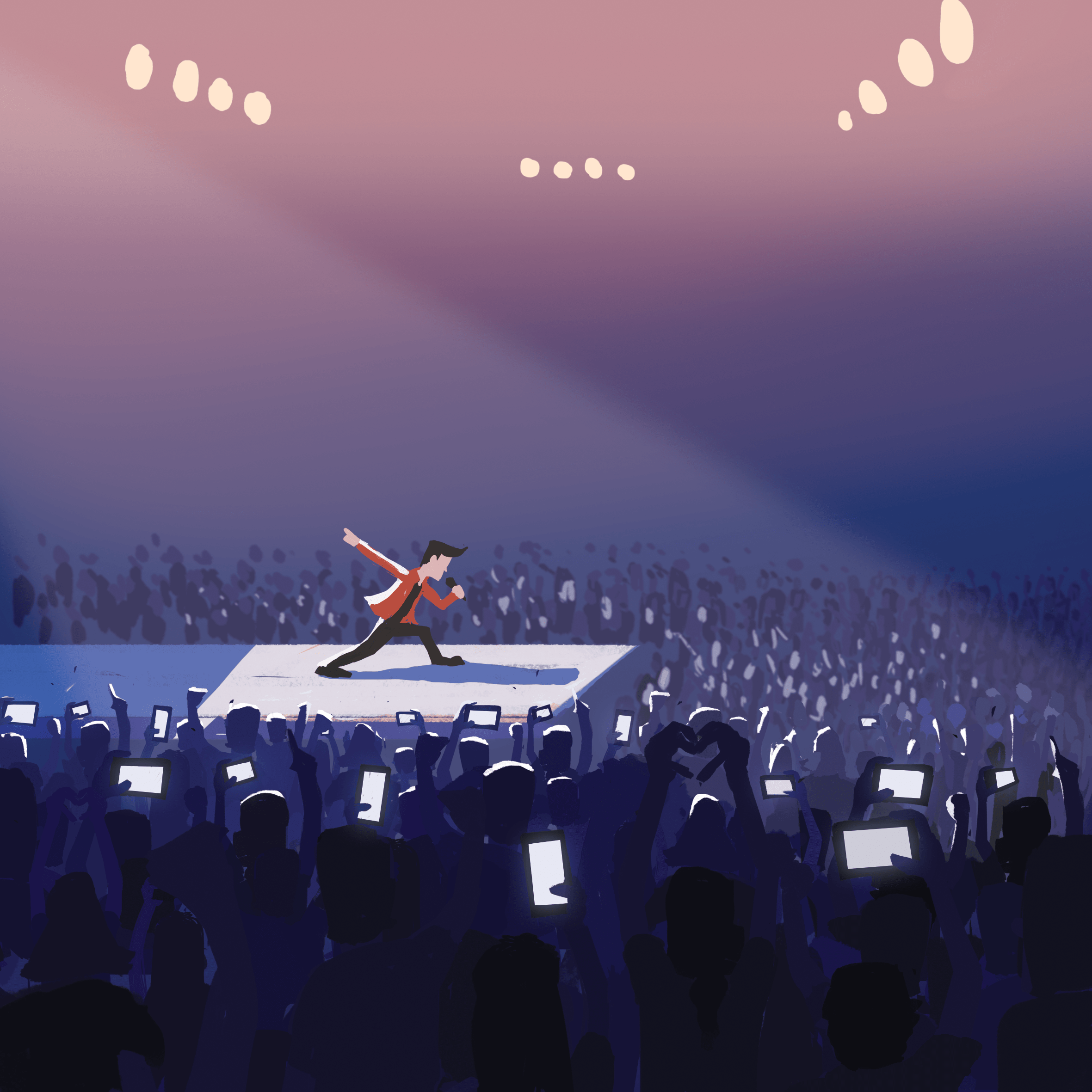
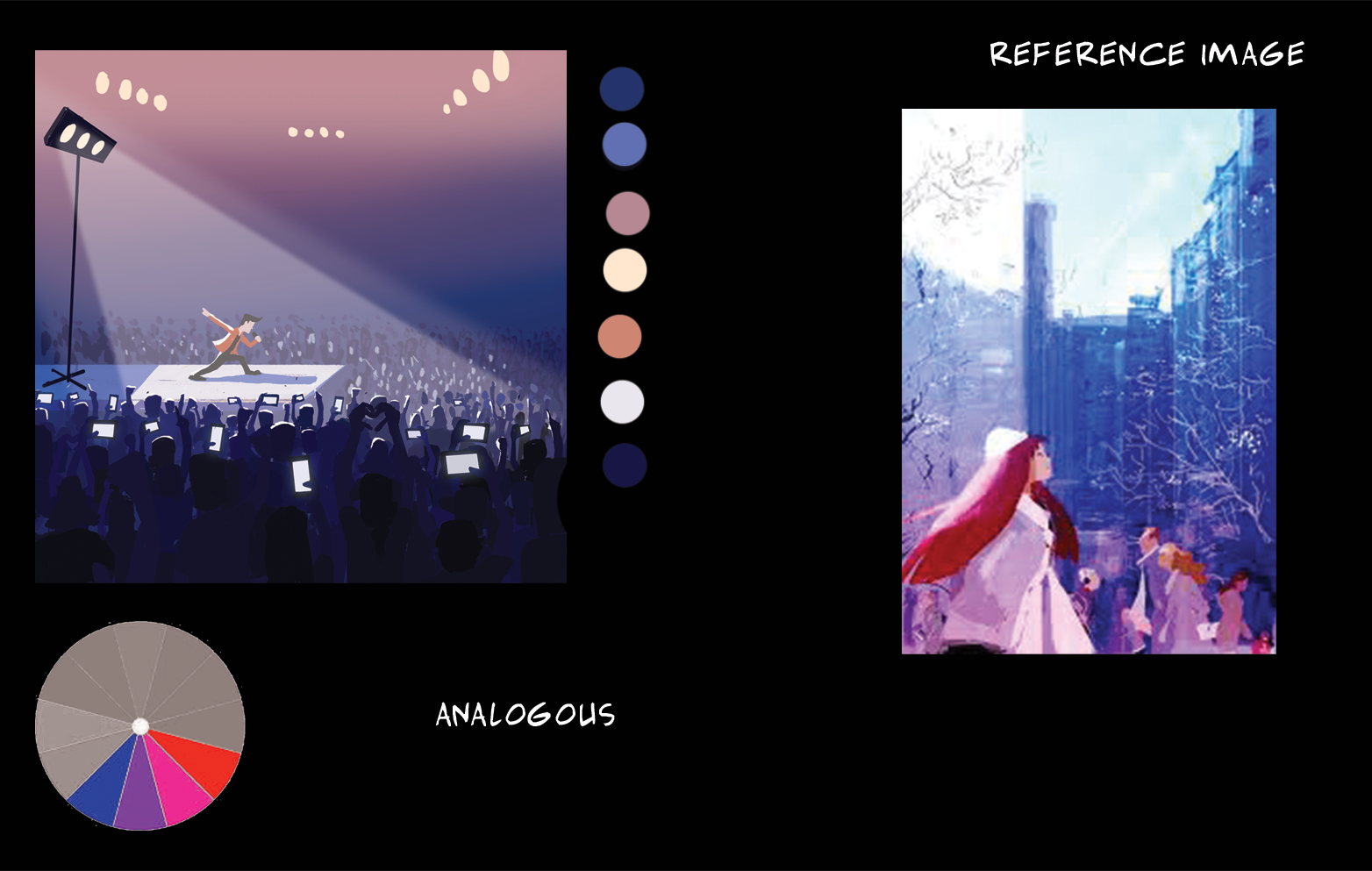
Analogous colour harmony
For analogous there would typically be a dominant, subdominant and a third colour to be used as an accent.
In this case, blue violet is the dominant, violet and pink are the subdominant and the red along with the whites are the accents. There is an overall harmonious blend of colours, depicting a night time concert.
The lack of details in the background make it seem very foggy which gives a sense of depth that the location is very large. Due to the strong spotlight, the main character and the surrounding audience is given a rim light so that the mid and foreground elements interact with each other.
Equation 2
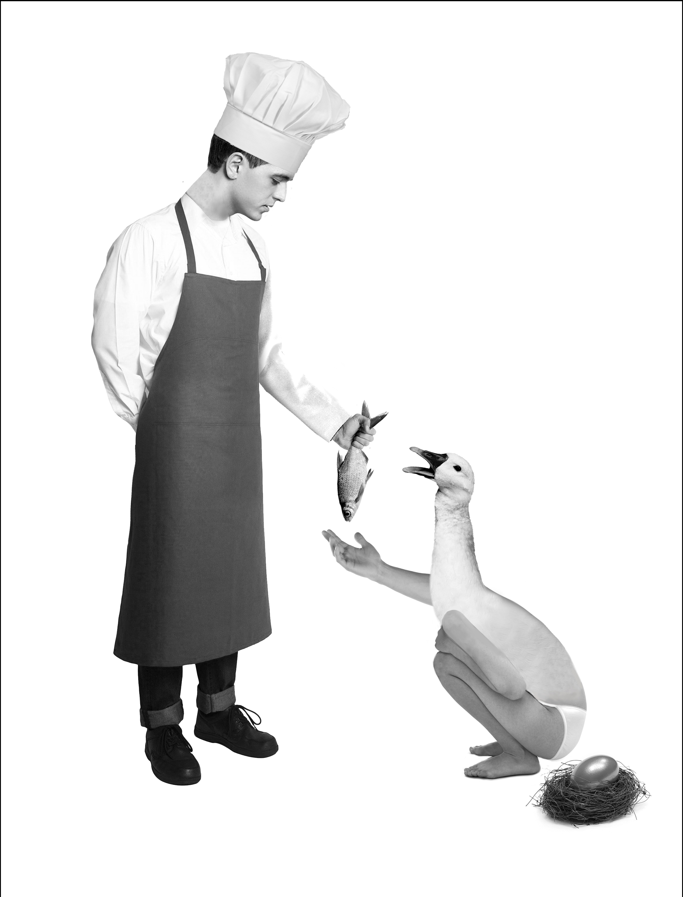
Because I own the Lamborghini of electric unicycles. endangering lives since 2017.
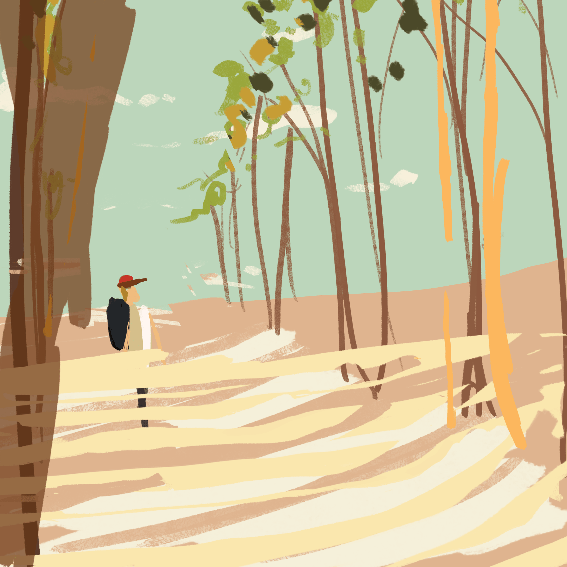
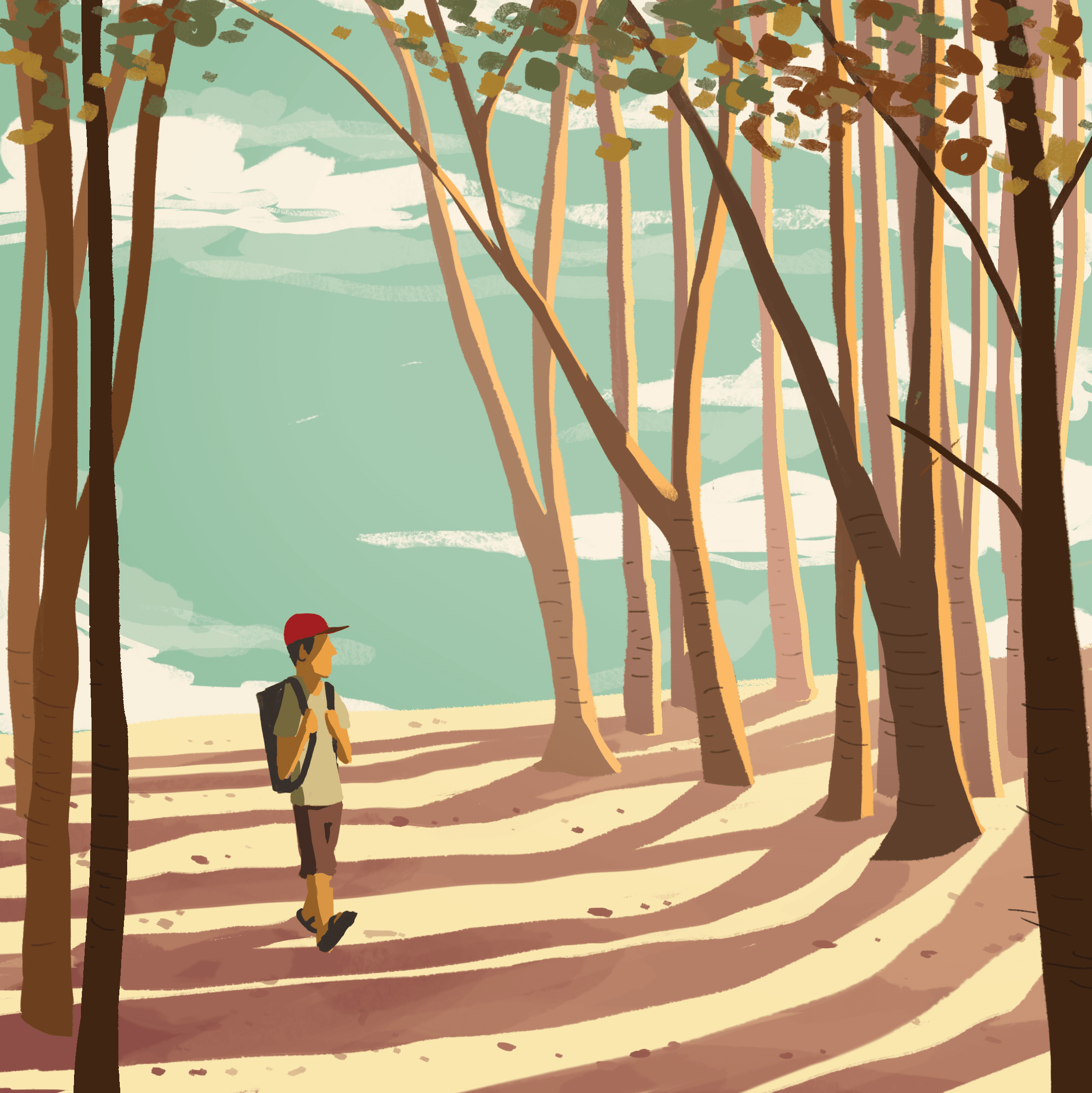
Split complementary colour harmony
The amount of blue and orange/yellow is slightly equal so there isn’t really a dominant colour, the warm and cool colours are balanced out.
This is a late afternoon setting as you can tell from the orange light cast on the ground and the long shadows of the trees. The rim light on the trees make them stand out more. The trees nearer are darker and those further are lighter.

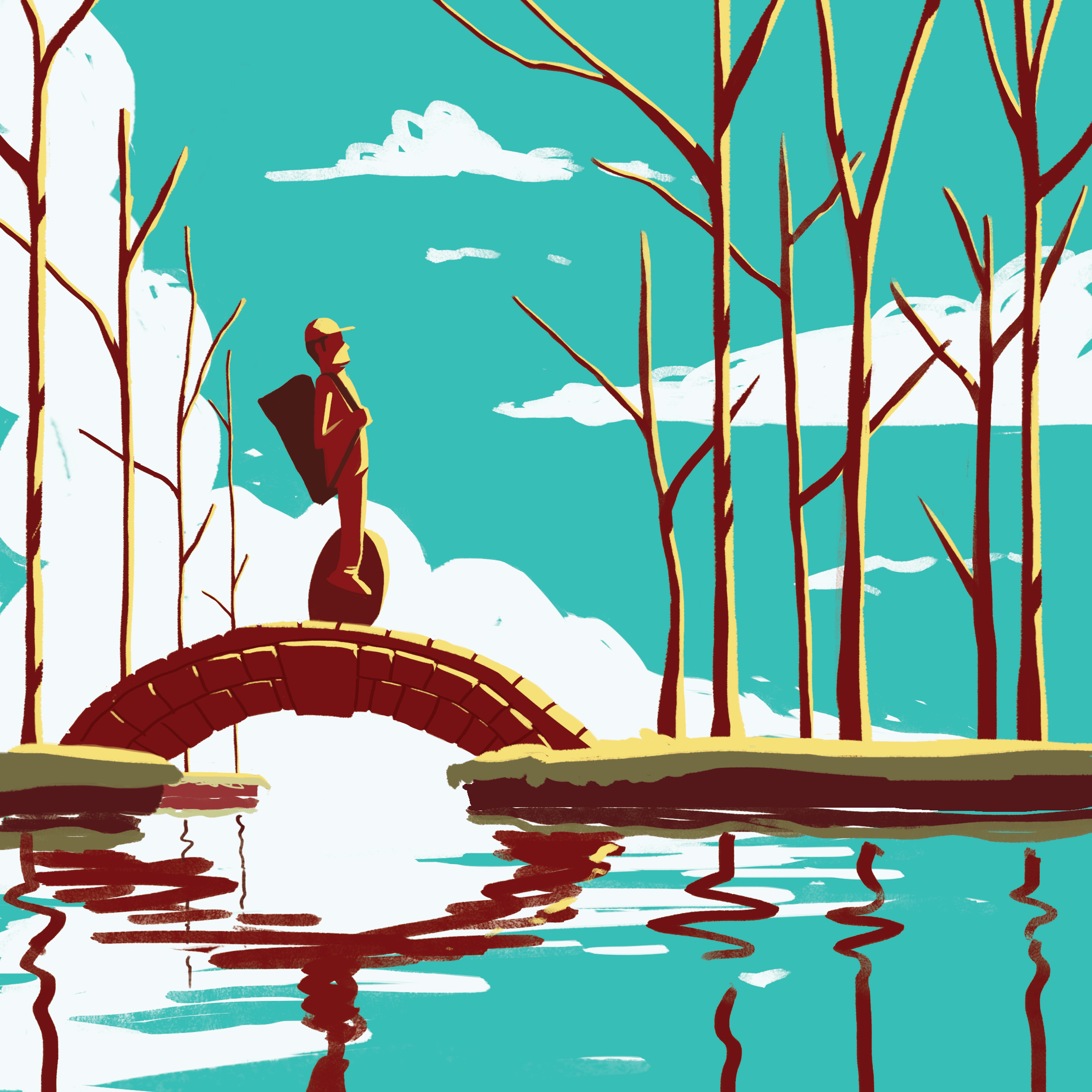
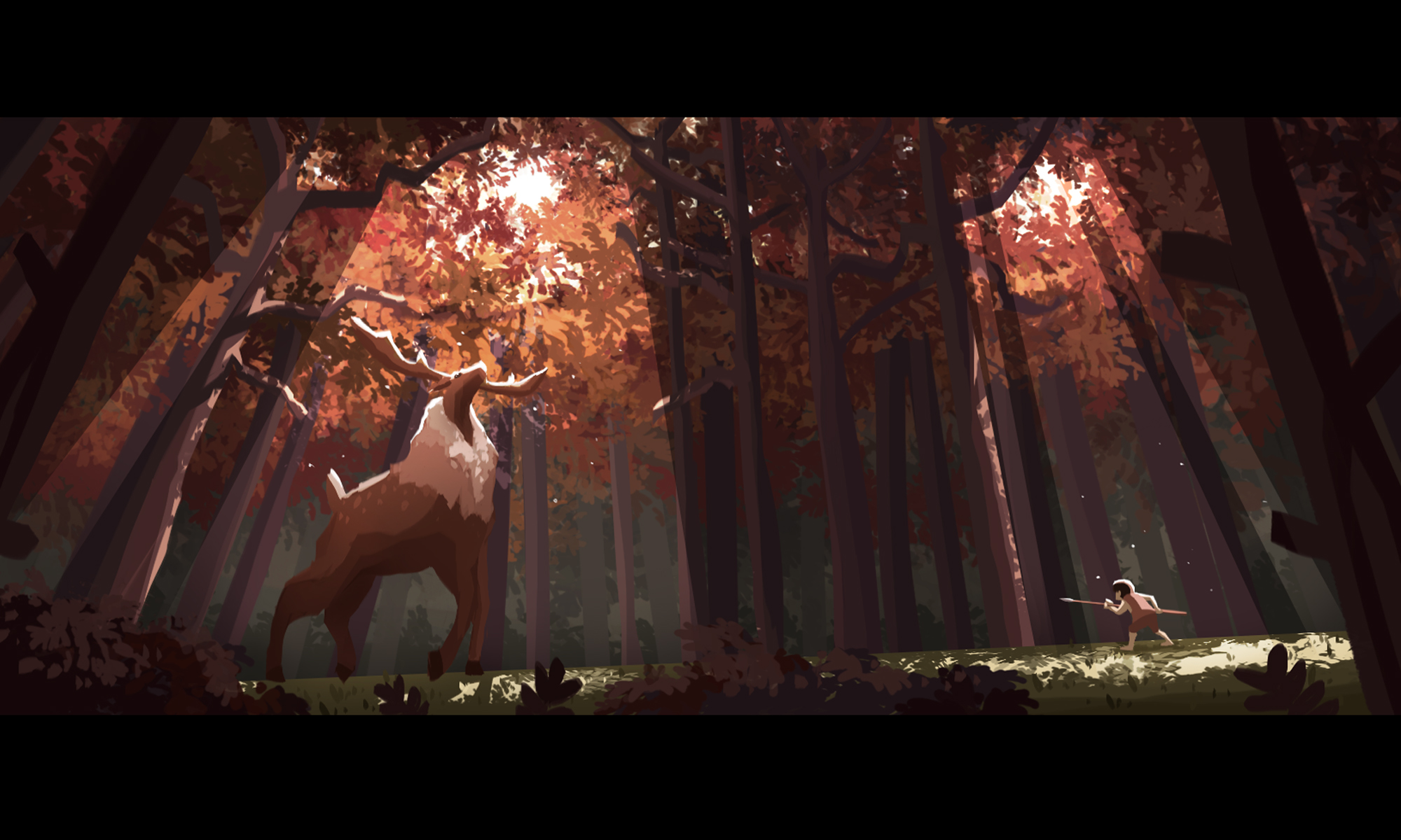
Triadic colour harmony
Triadic colours of red, blue and yellow. For this colour harmony, there is typically a dominant and two other colours for the accents. In this case, blue is the dominant.
I tried to keep this one simple, no details besides the rim light which shows the form of some of the elements such as the guy’s body and the details of the bridge. Clouds used to draw your eye to the guy and to balance the composition, on the left is giant cloud + less trees, on the right, small cloud + more trees.
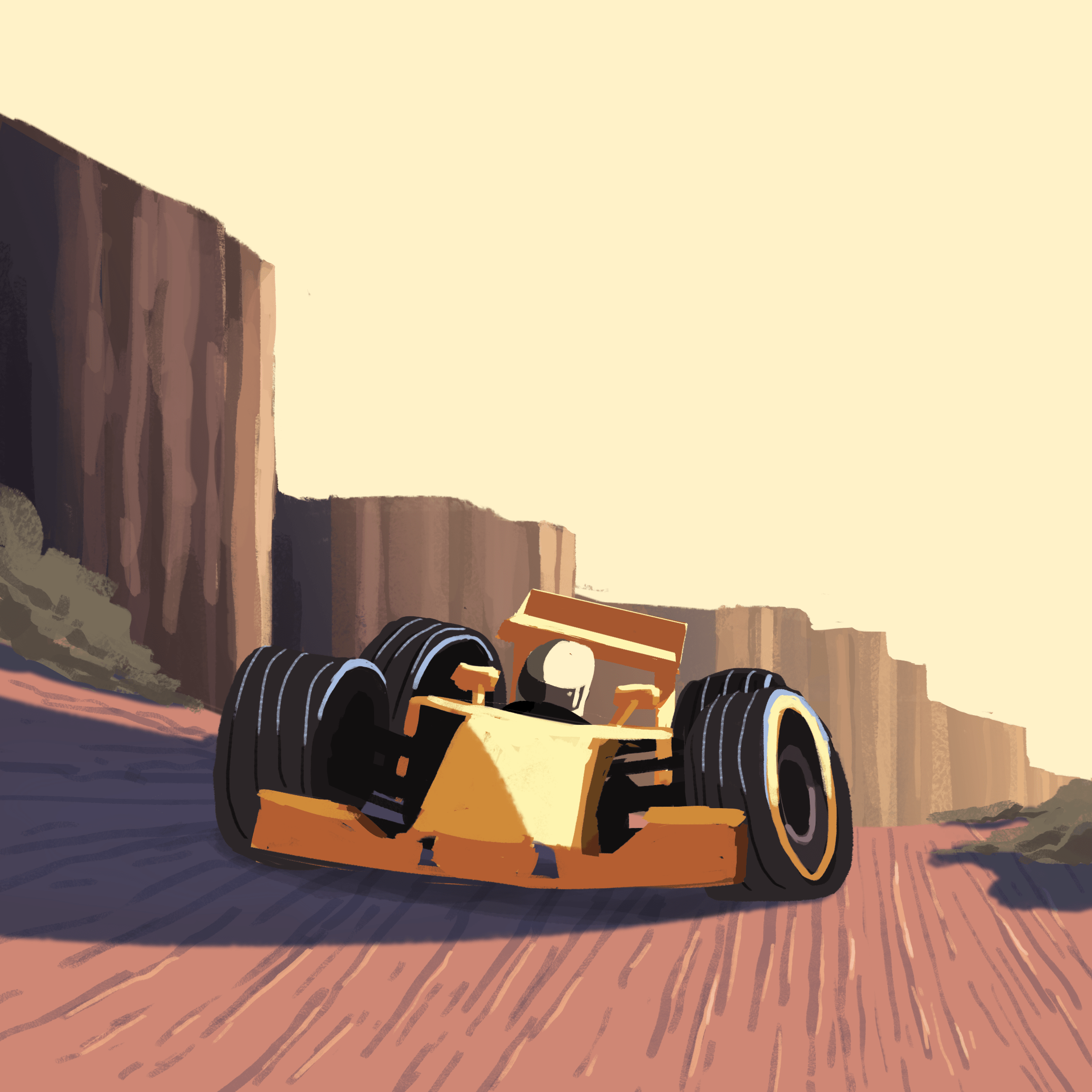
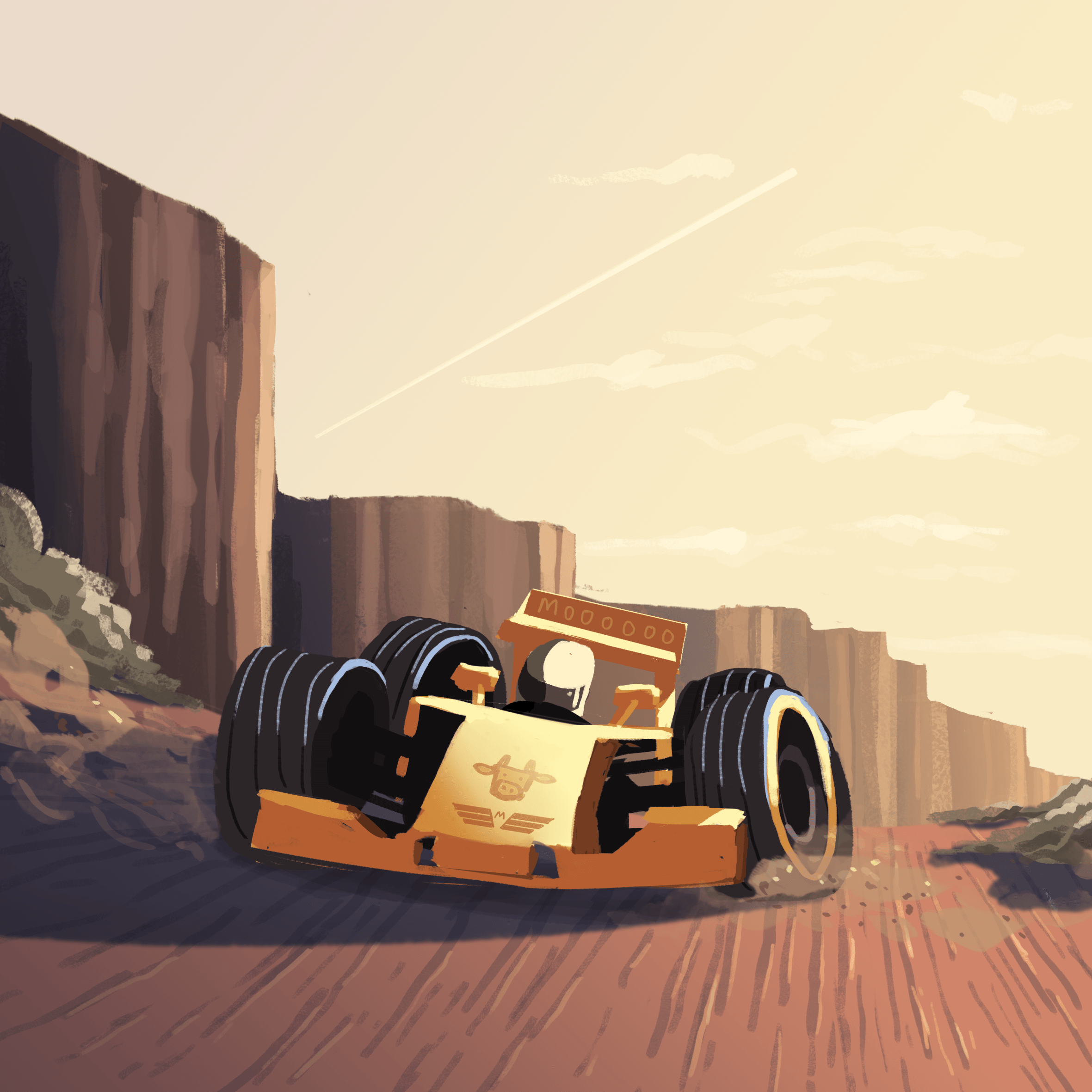
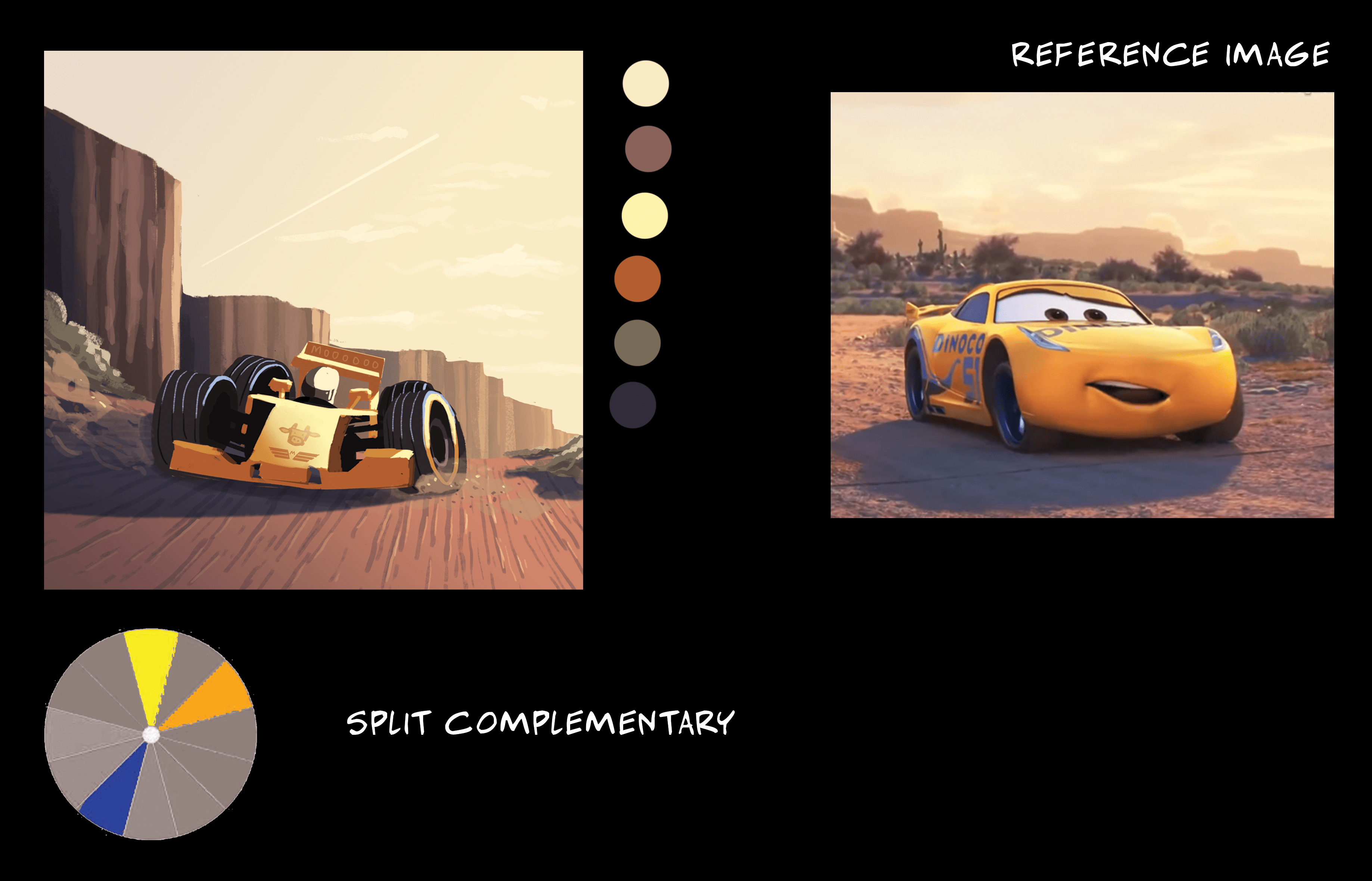
Split complementary colour harmony
I initially wanted to go for a muted colour scheme of like a typical race track scene of grey roads and a few coloured cars, but in the end i referenced the Cars movie from Pixar and went for a desert sunset theme instead. The dominant colours are orange and yellow, with blue as the cast shadows.
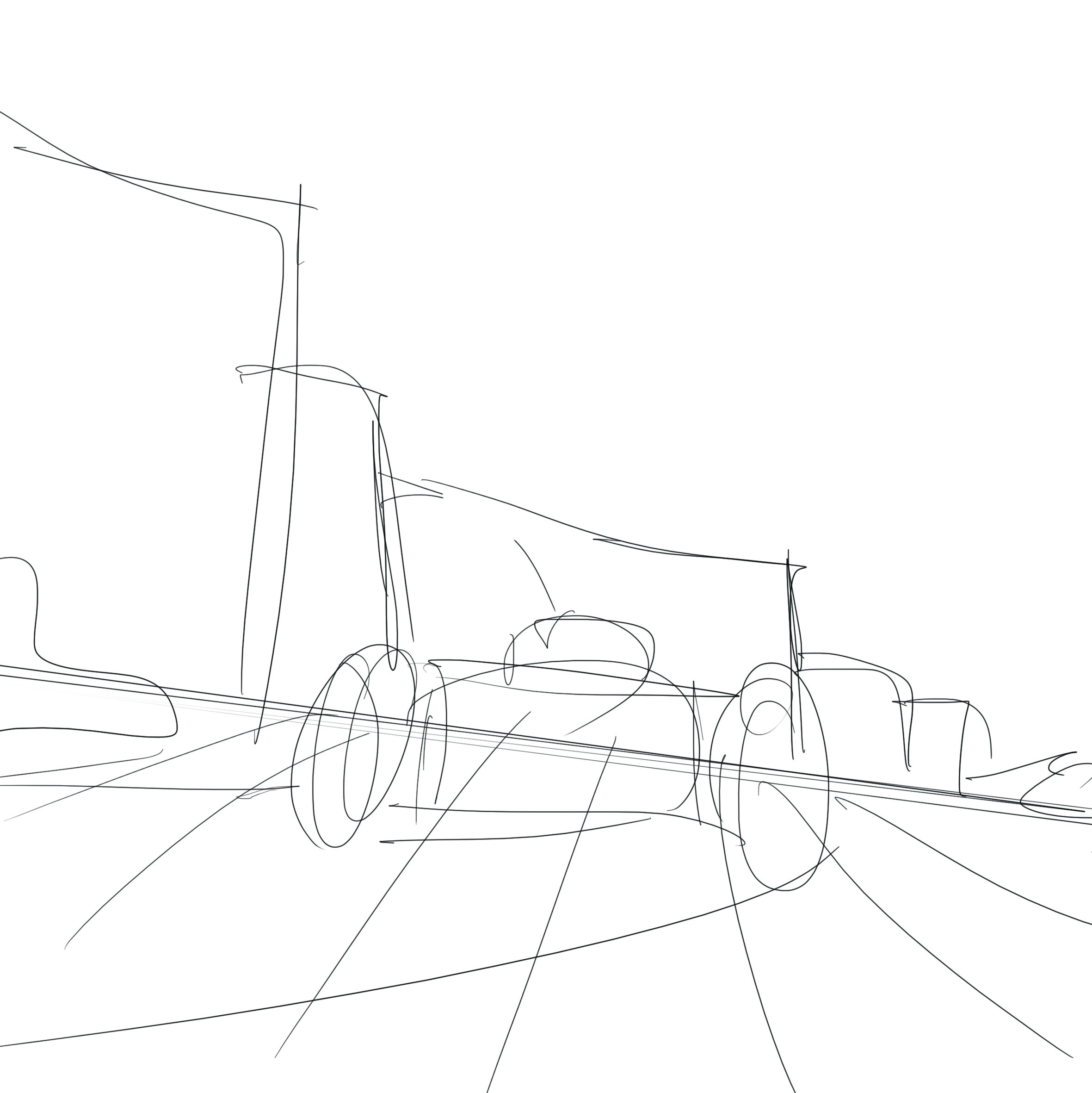
Also, a dutch tilt to make it more dynamic since it’s a moving race car, lines on the ground also act as perspective lines to give it a sense of perspective.
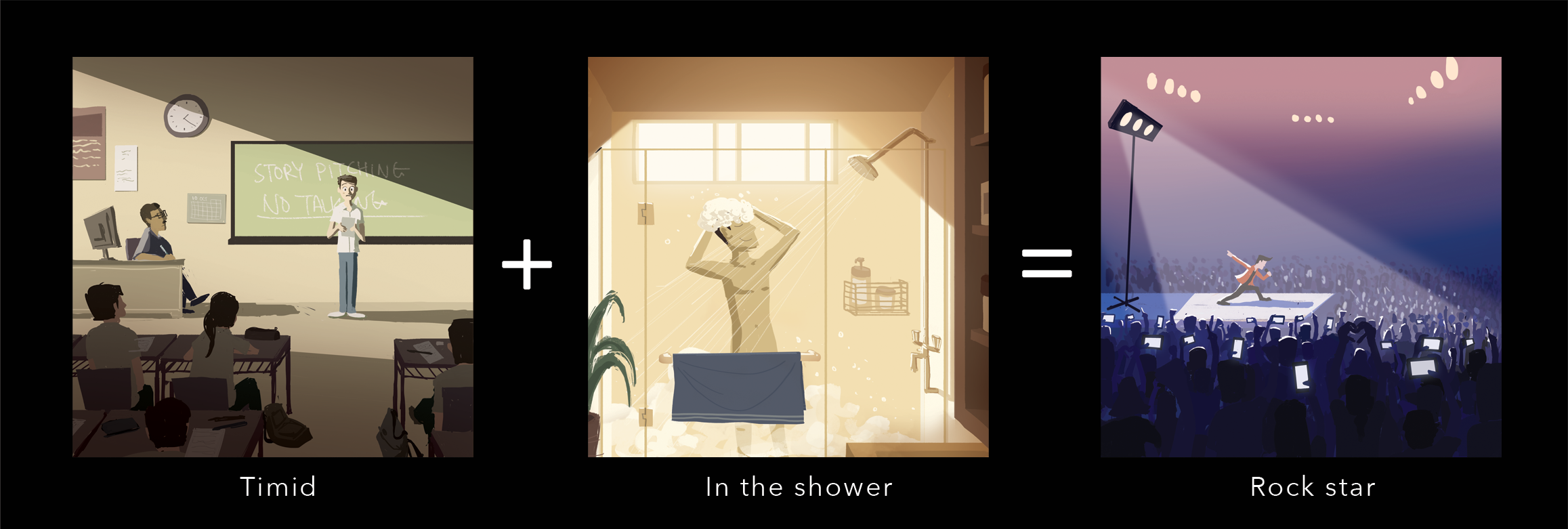
Equation 3
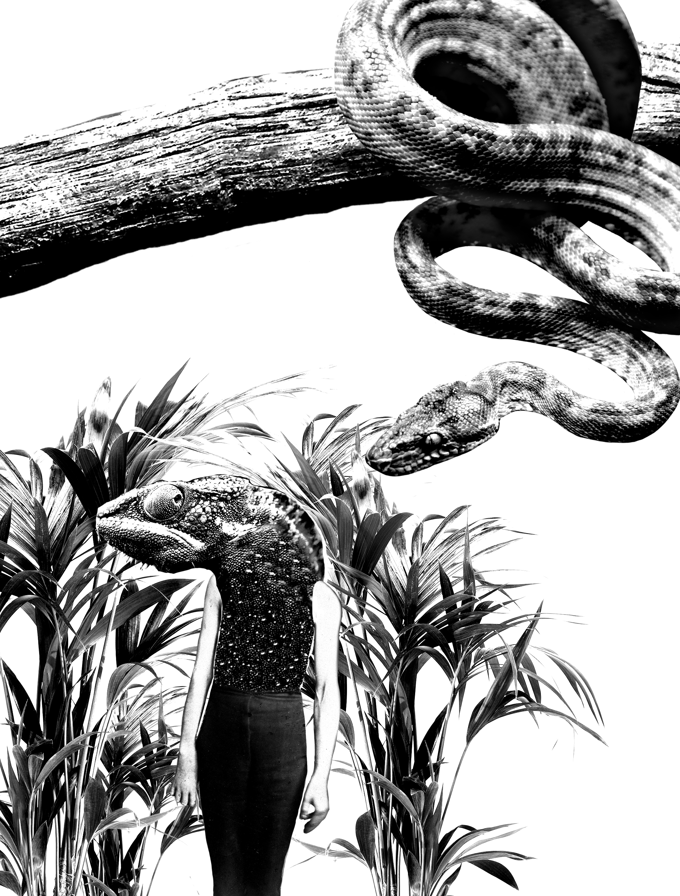
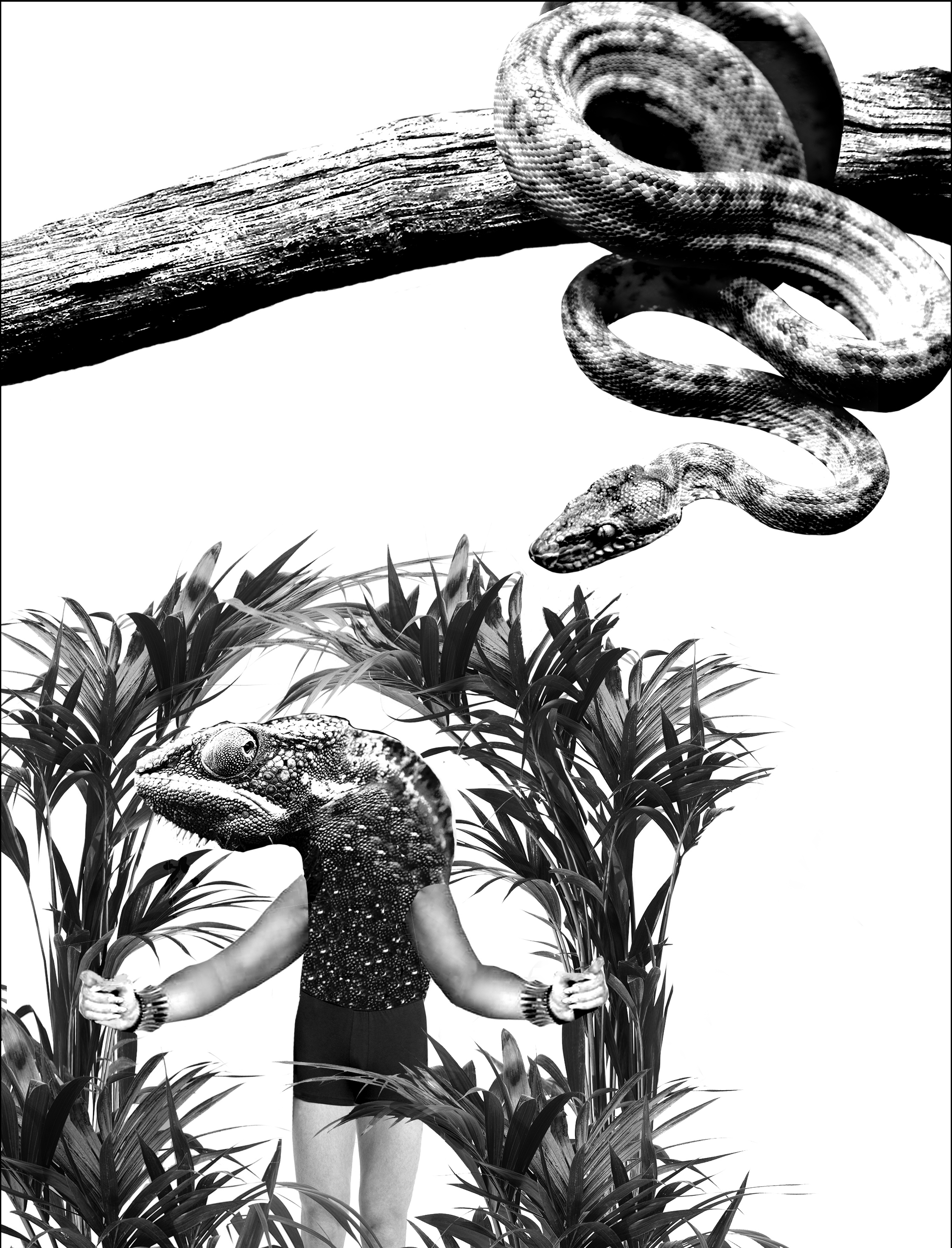
Drawing and daydreaming in lectures, mostly Art History, nothing against you Prof. Walsh.

Analogous colour harmony
Colours give it a very sleepy and dream like state kind of environment, as well as the lack of strong contrasting colours which makes it sort of muted which adds to the sleepy feel.
Character in focus is of a slightly brighter colour as compared to the rest, who are tinted with pinkish red to make them blend in with the environment and less prominent.
Since there are so many people, one way to make this one guy stand out is to make him brighter and another way was to use the rule of thirds to place him in an area of focus.
Analogous colour harmony
I wanted to go for a late afternoon time of day and hence chose a colour scheme of red-orange, orange, and yellow-orange the floor is made completely white to show there’s a very strong sunlight casting down, which allowed me to draw in contrasting cast shadows.

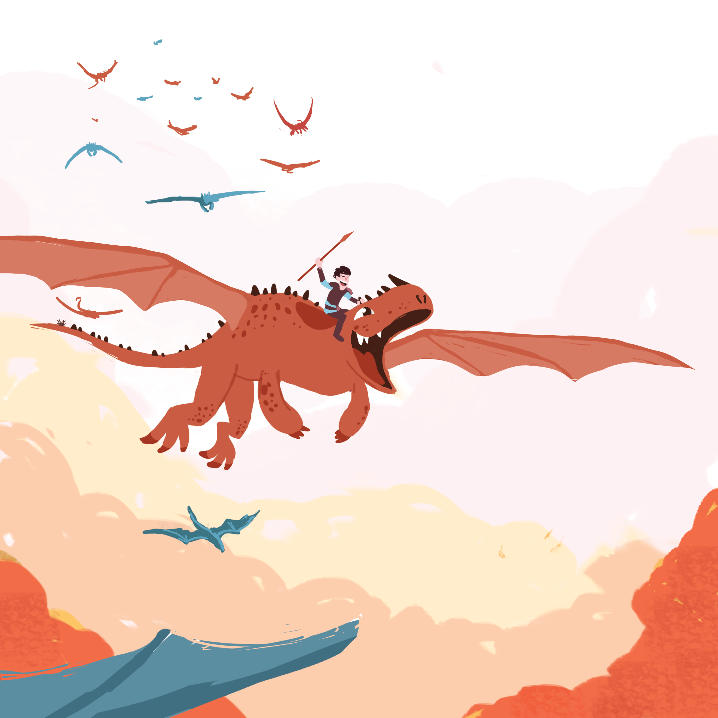
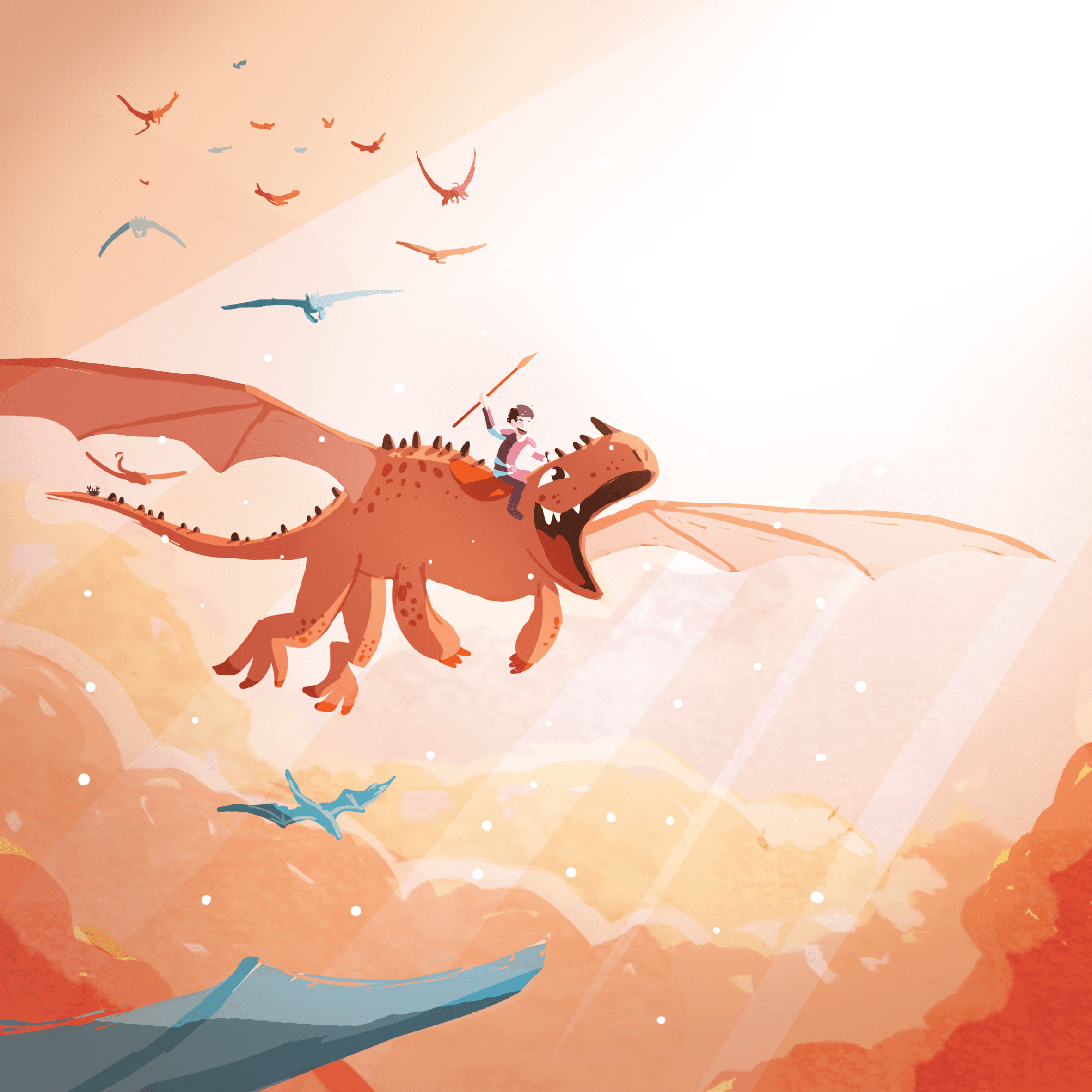
Split complementary colour harmony
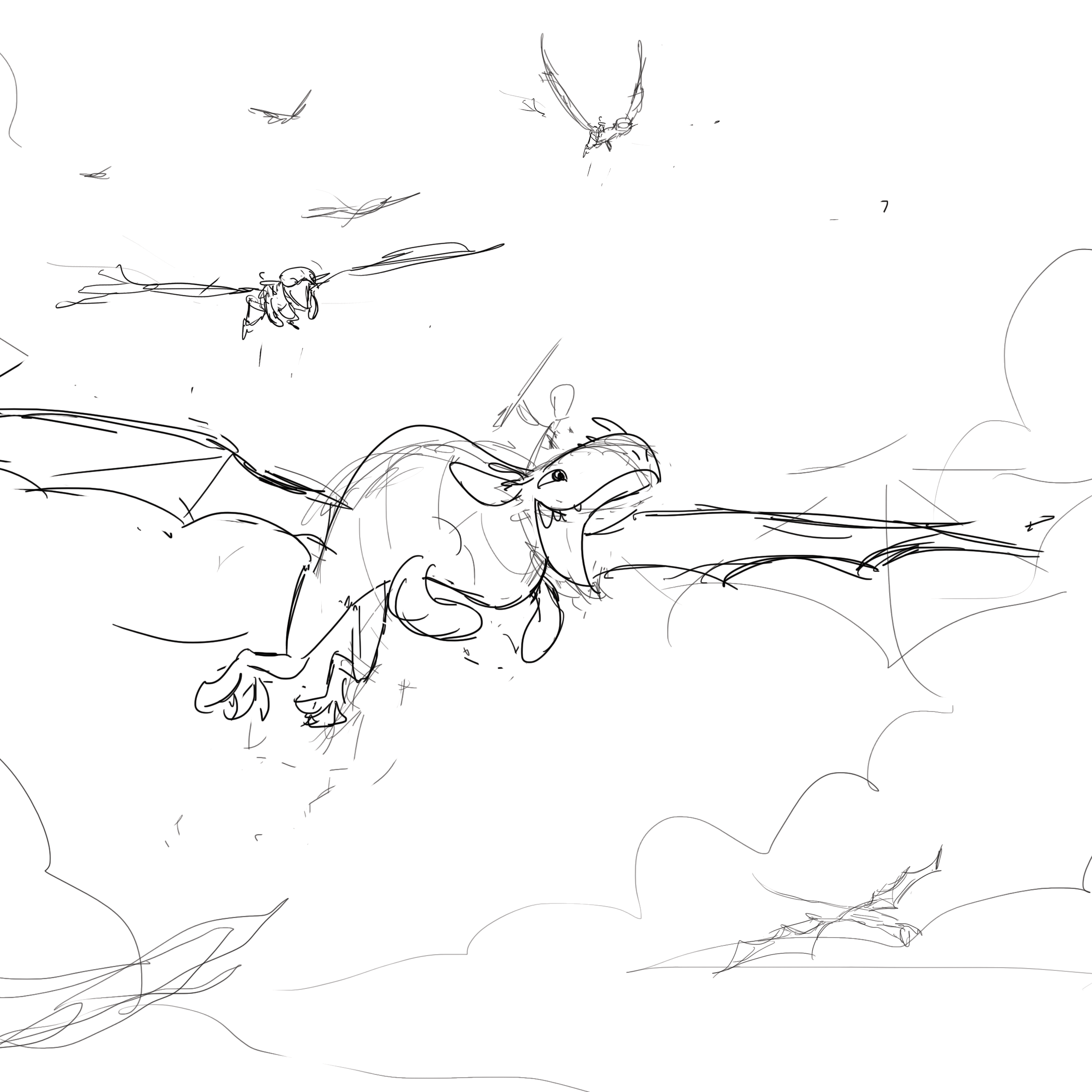
I wanted to go for a very joyous, adventurous and majestic feel to this illustration, I took inspiration from DreamWork’s How to Train Your Dragon, where a bunch of dragons are flying above the clouds with what is called ‘god light’ shining down to give it that majestic feel. Rim lights are added to the clouds to give the volume.
Initially, it looked very plain and boring and i wanted to scrap it, but after adding lights everywhere it became one of my favourites out of the twelve.
Equation 4
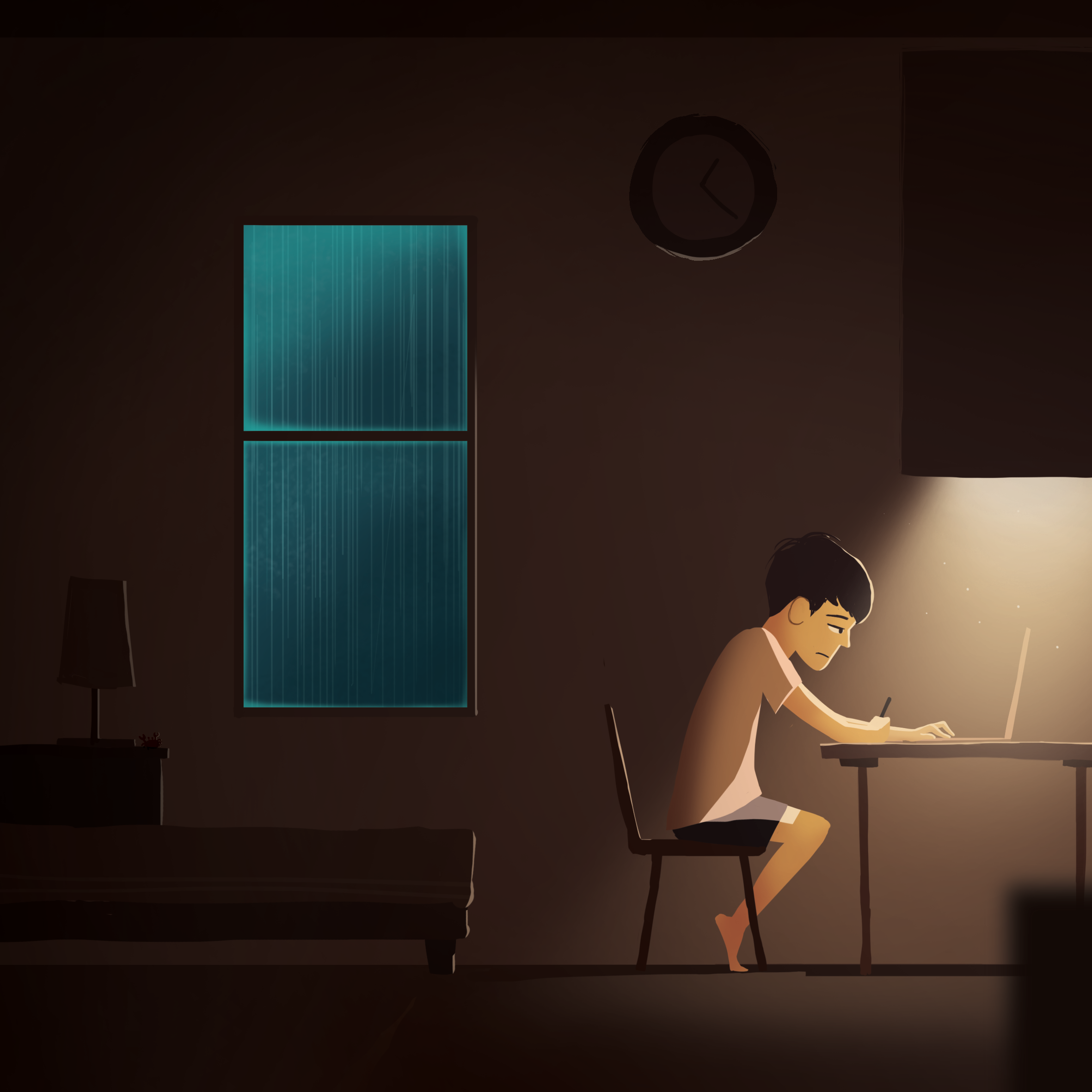
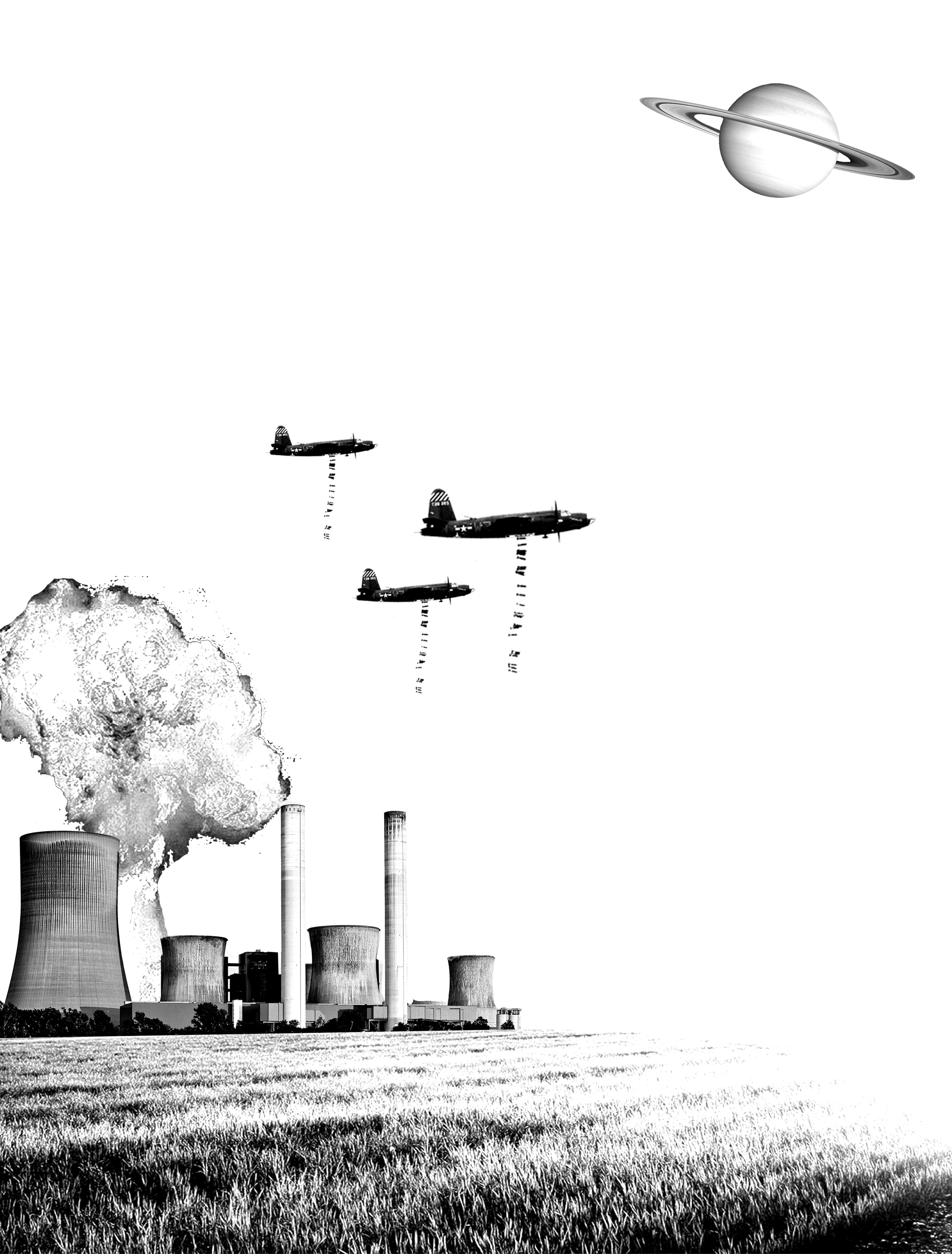
I don’t pull all-nighters, it’s just for the sake of this equation :p

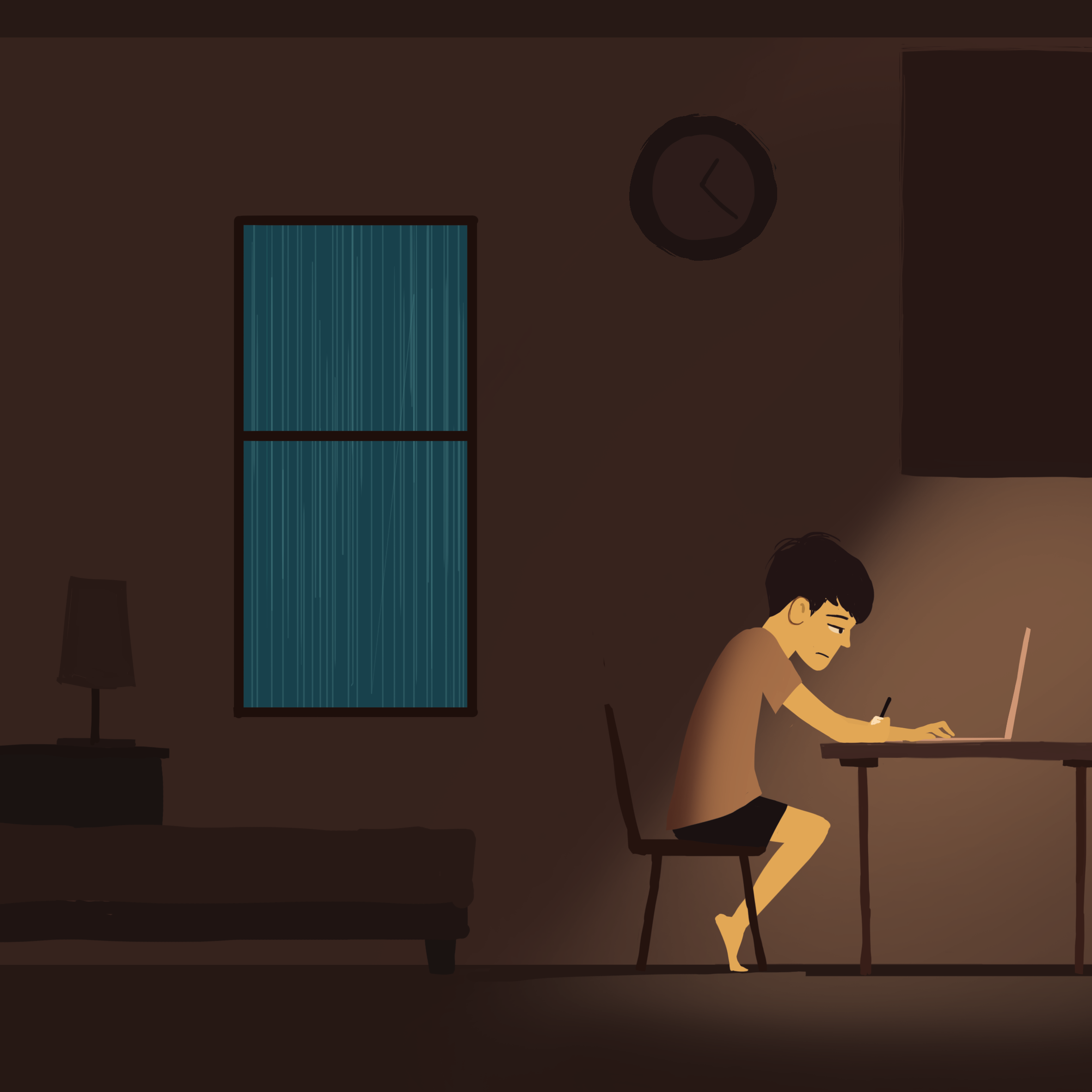
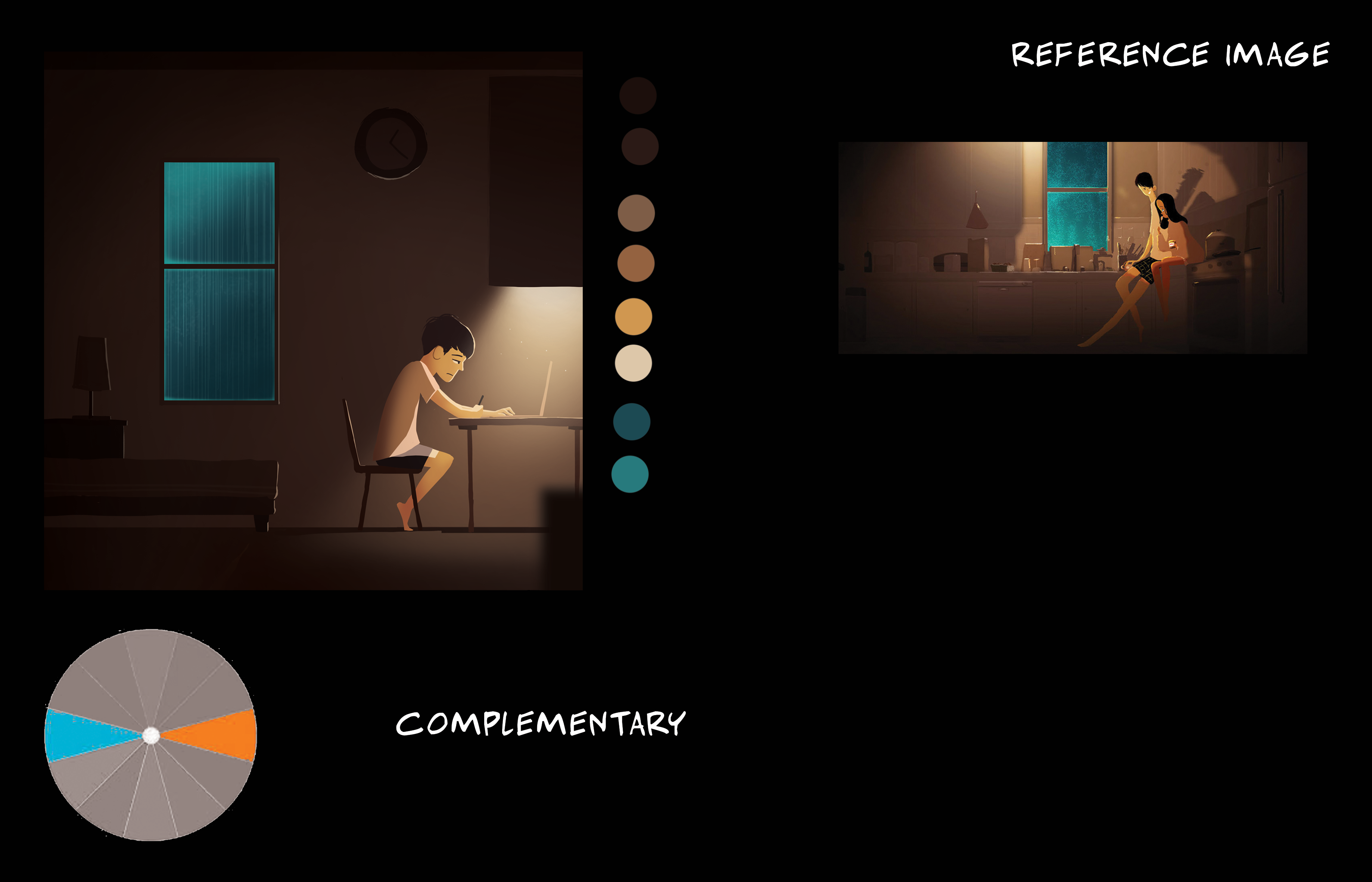
Complementary colour harmony
The turquoise window with the rain outside gives a very cozy feeling in the otherwise dull coloured room. There are two elements of focus, one is the window on the left and the other one is the main light source on the right, the two balances each other out.
There are rim lights on the elements in the darkness, again, to make them interact with the lights. The blurred foreground element gives depth to the image.

Split complementary harmony
A strong cone of light to draw your attention to the area. Characters in the foreground have rim light to show that there is interaction between foreground and mid ground.

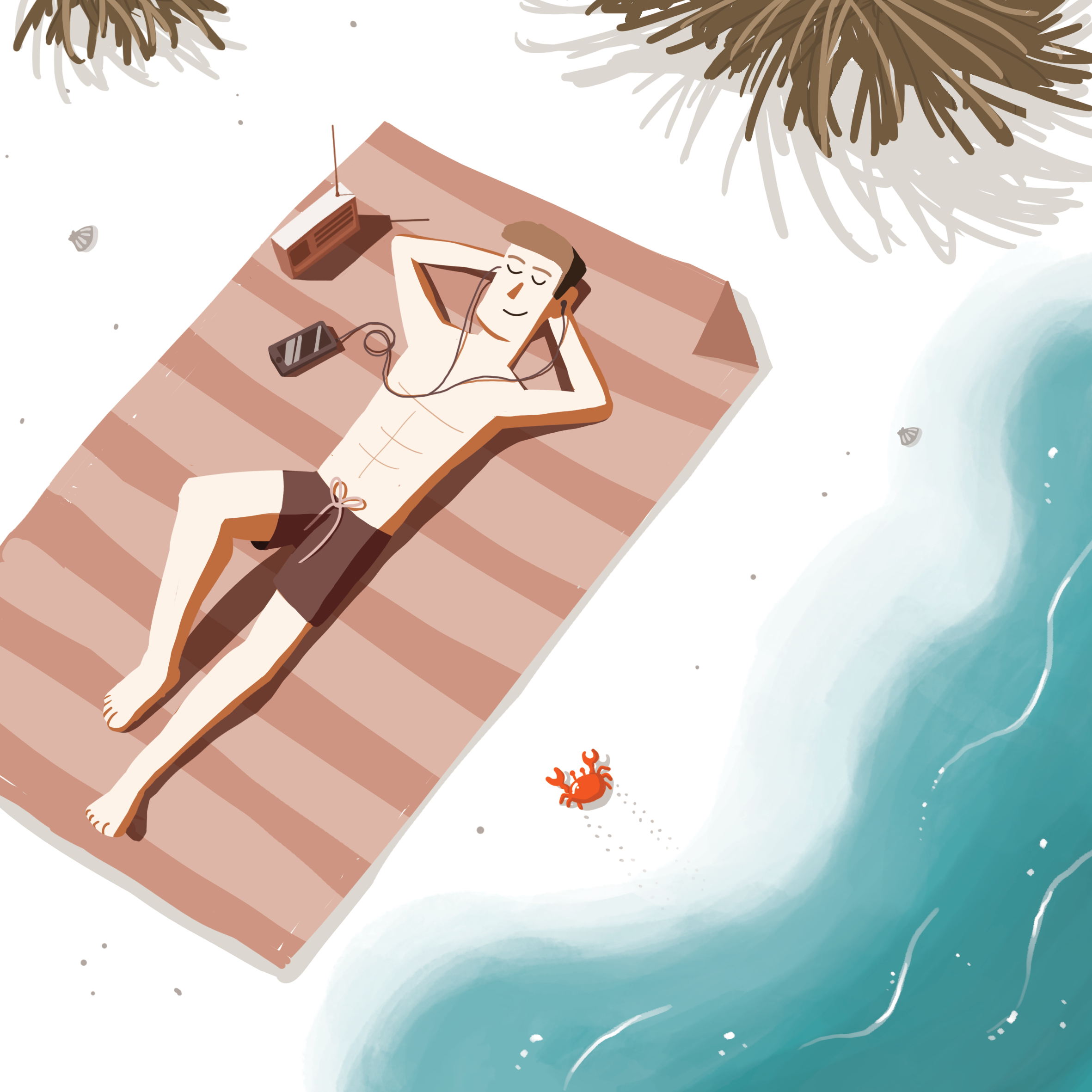
Split complementary harmony
I went for a colour scheme which portrayed a relaxing sunny white sandy beach and cool turquoise water. I used a diagonal composition as since the guy is laying down, I didn’t want him to be parallel with the sides. I filled in the empty spaces of the beach with bushes and details of small rocks and seashells and Cody the Crab™.
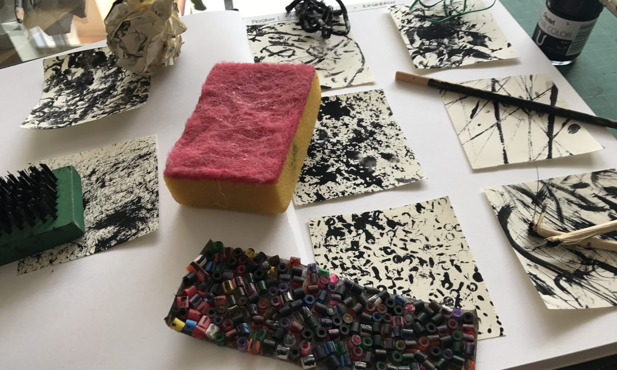
Research and references
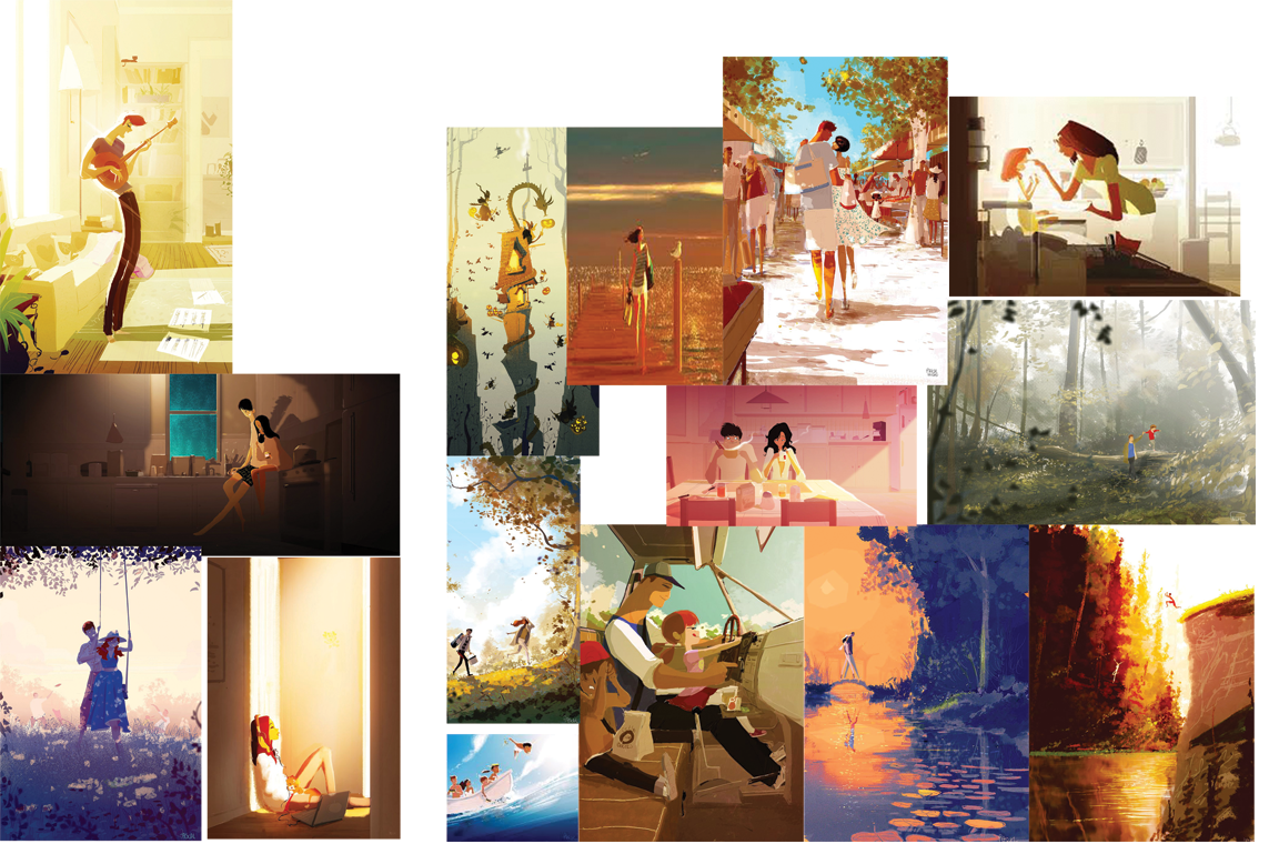
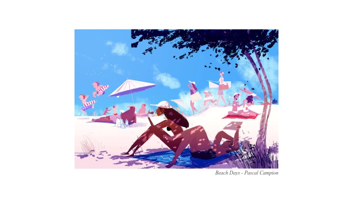
My greatest inspiration was from Pascal Campion’s illustrations, whose illustrations always tell a story and are visually engaging.
I also referenced a few colour schemes from colour keys and scripts of animated films. I find these very inspiring as the artist is able to use lighting and colours in such small thumbnail illustrations to tell a story.
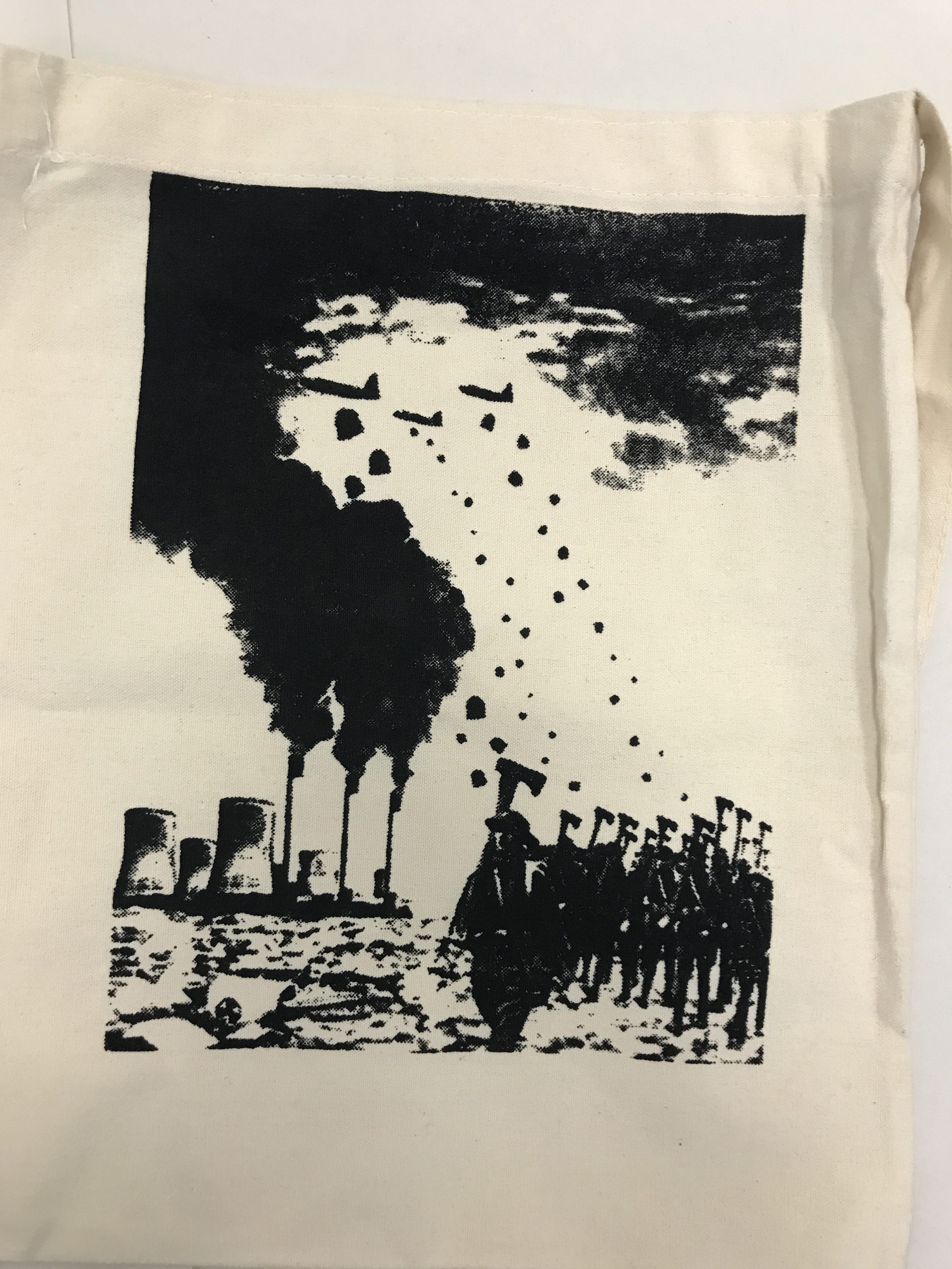
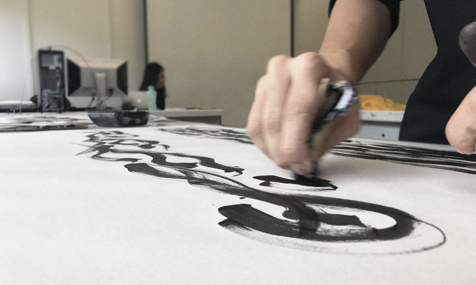
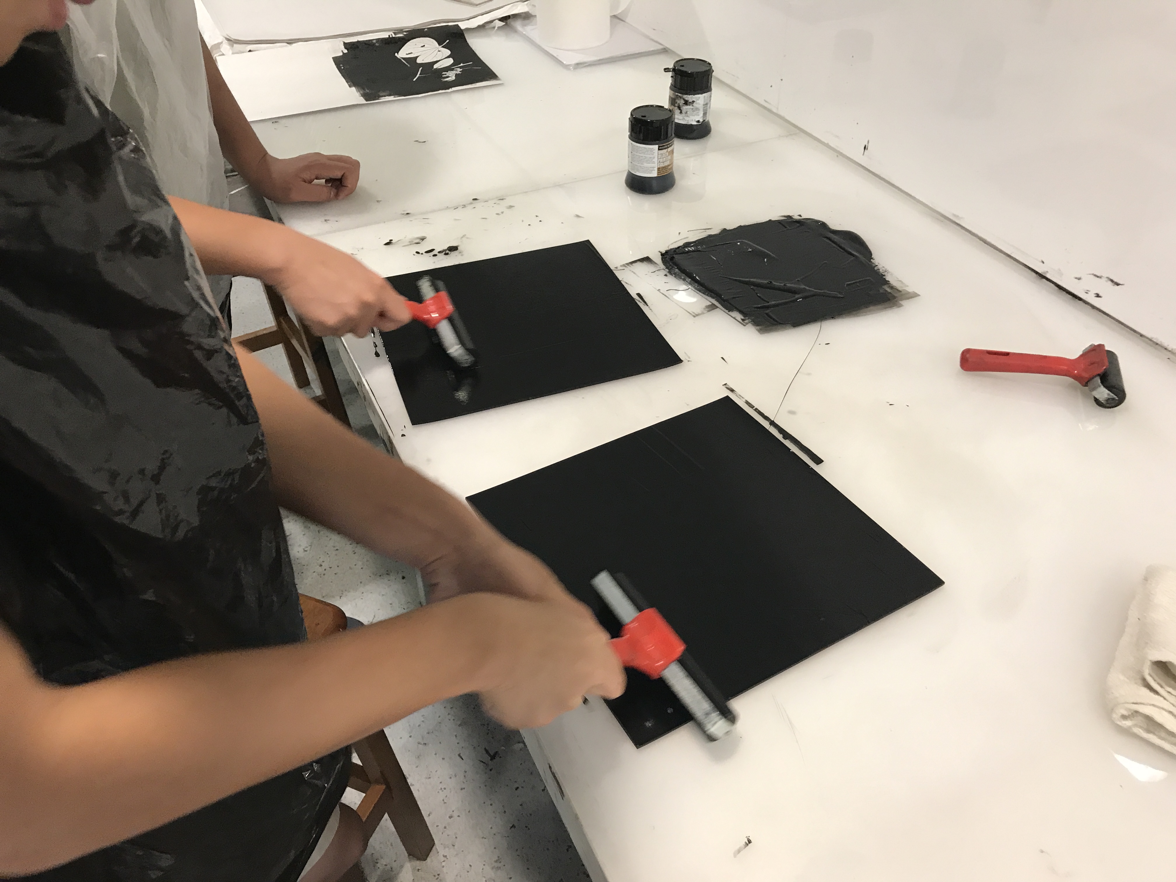
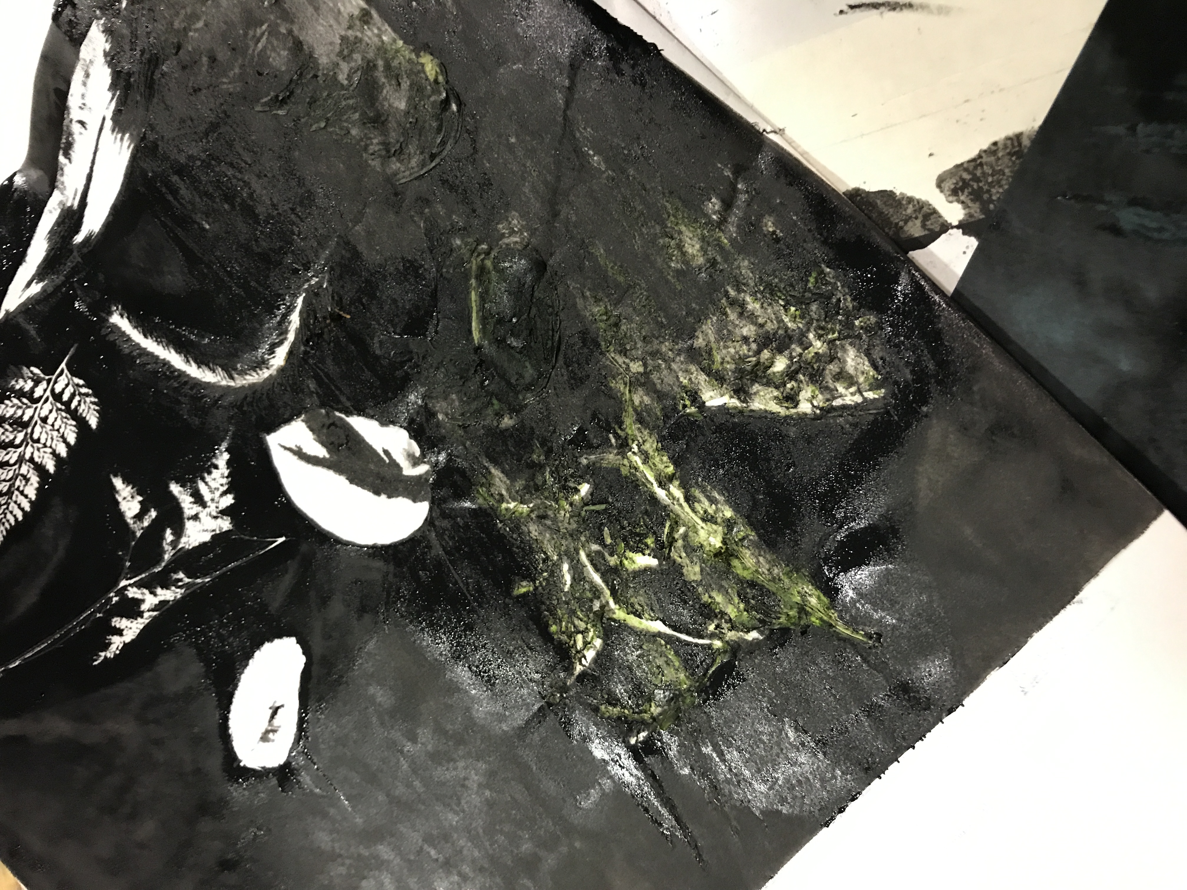
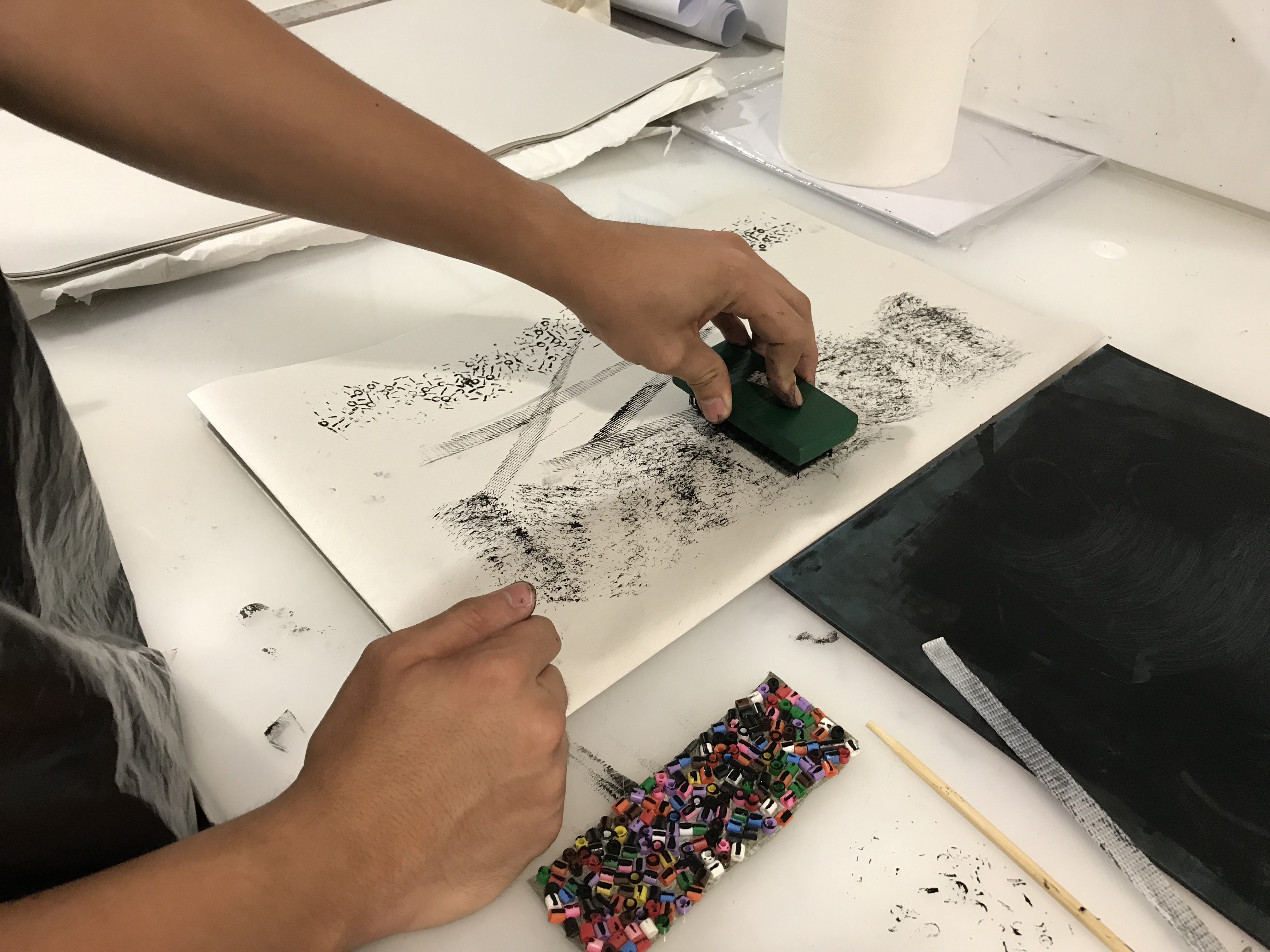
Printing
When I test printed, the colours turned out quite yellowish. I had to apply a colour balance to all my illustrations to cancel it out. I eventually went for the top right adjustments.
Conclusion
A challenge i faced was working with square compositions and not the usual 16:9, it was quite challenging to get a good composition from such a small working space, but I think I made it work by keeping most of the elements in focus off centre and using the rule of thirds, along with the lighting.
I also tend to colour pick a lot from existing illustrations, the colours work but I have to tweak or remove some colours so that they fit into one of the colour harmonies taught to us. I find that colour picking is a very good way of approaching illustrating especially when you are not good with colours because you can see the colours the artist used and you can visualise how they would work with your own drawing.
This project has been very fun as I have never done so many illustrations before in one project, it has definitely improved my sense of colour usage and visualisation.

Find cody in all 12 illustrations c: