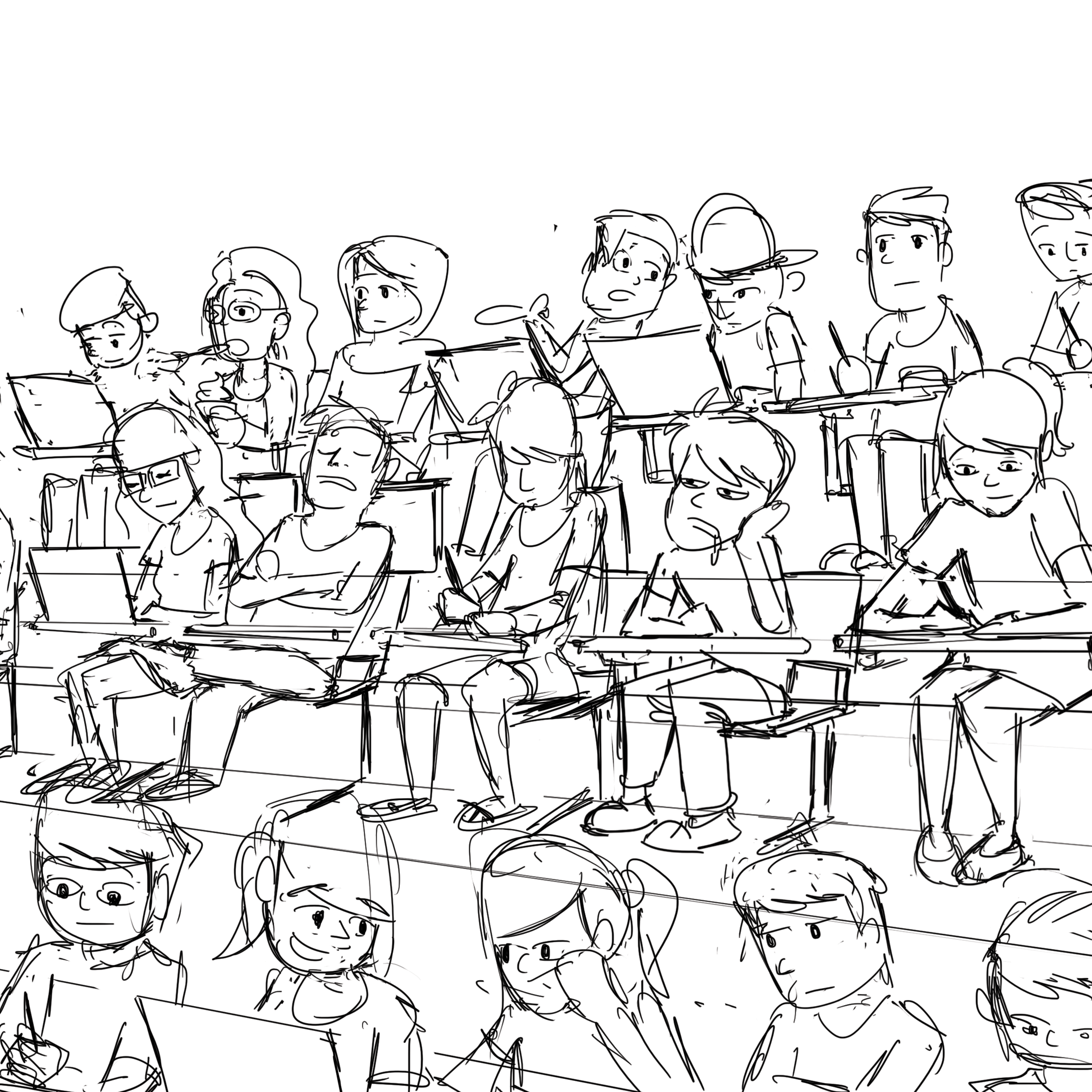
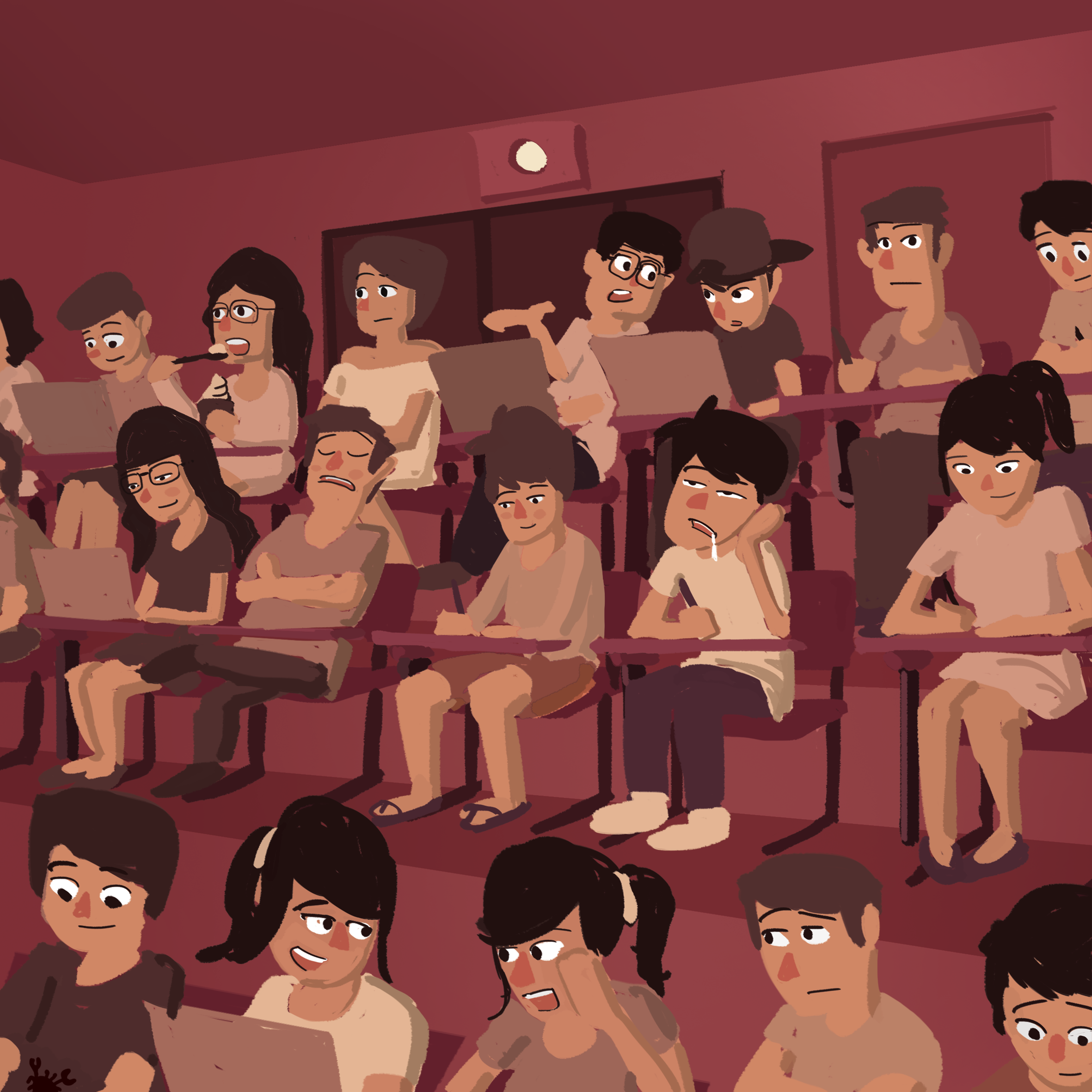
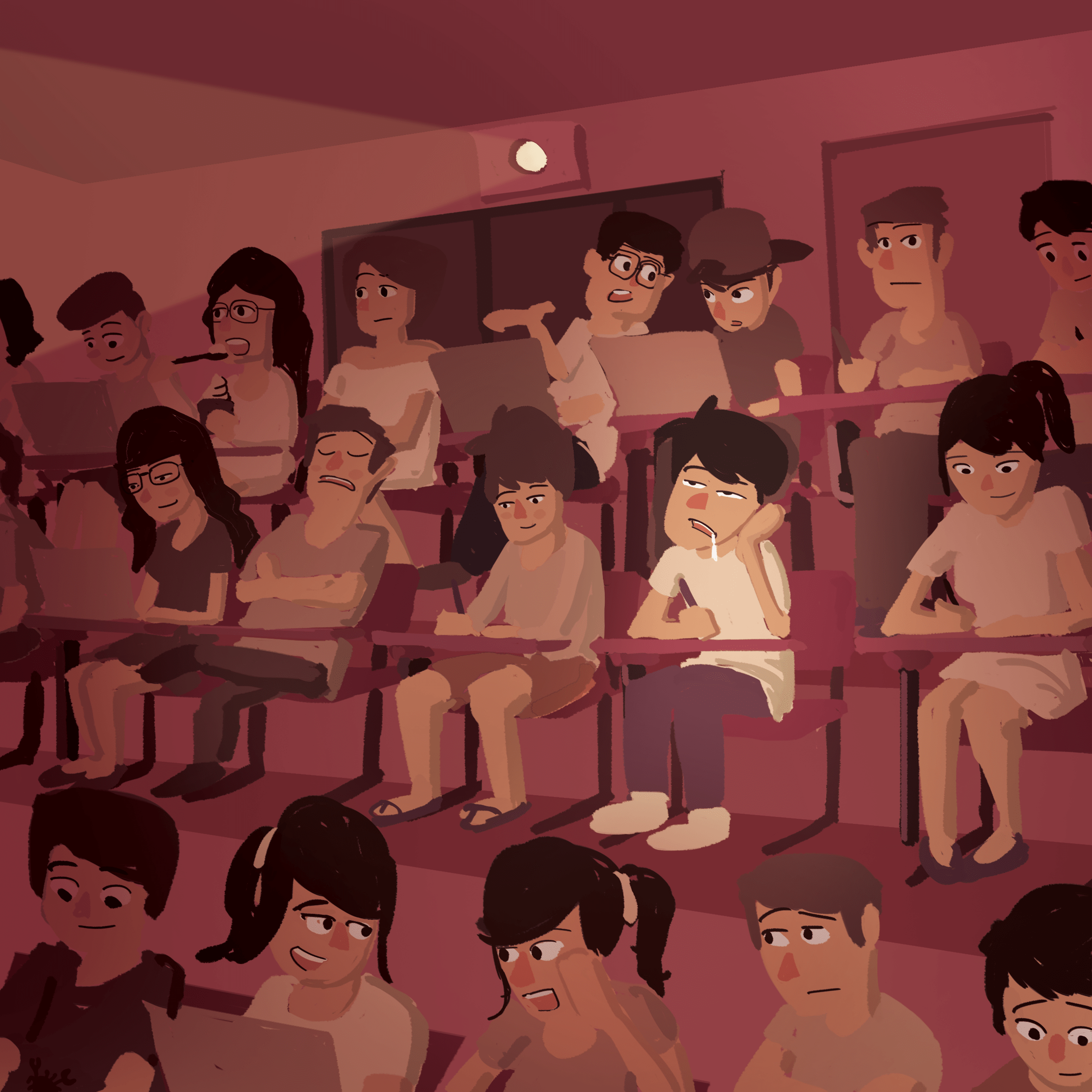
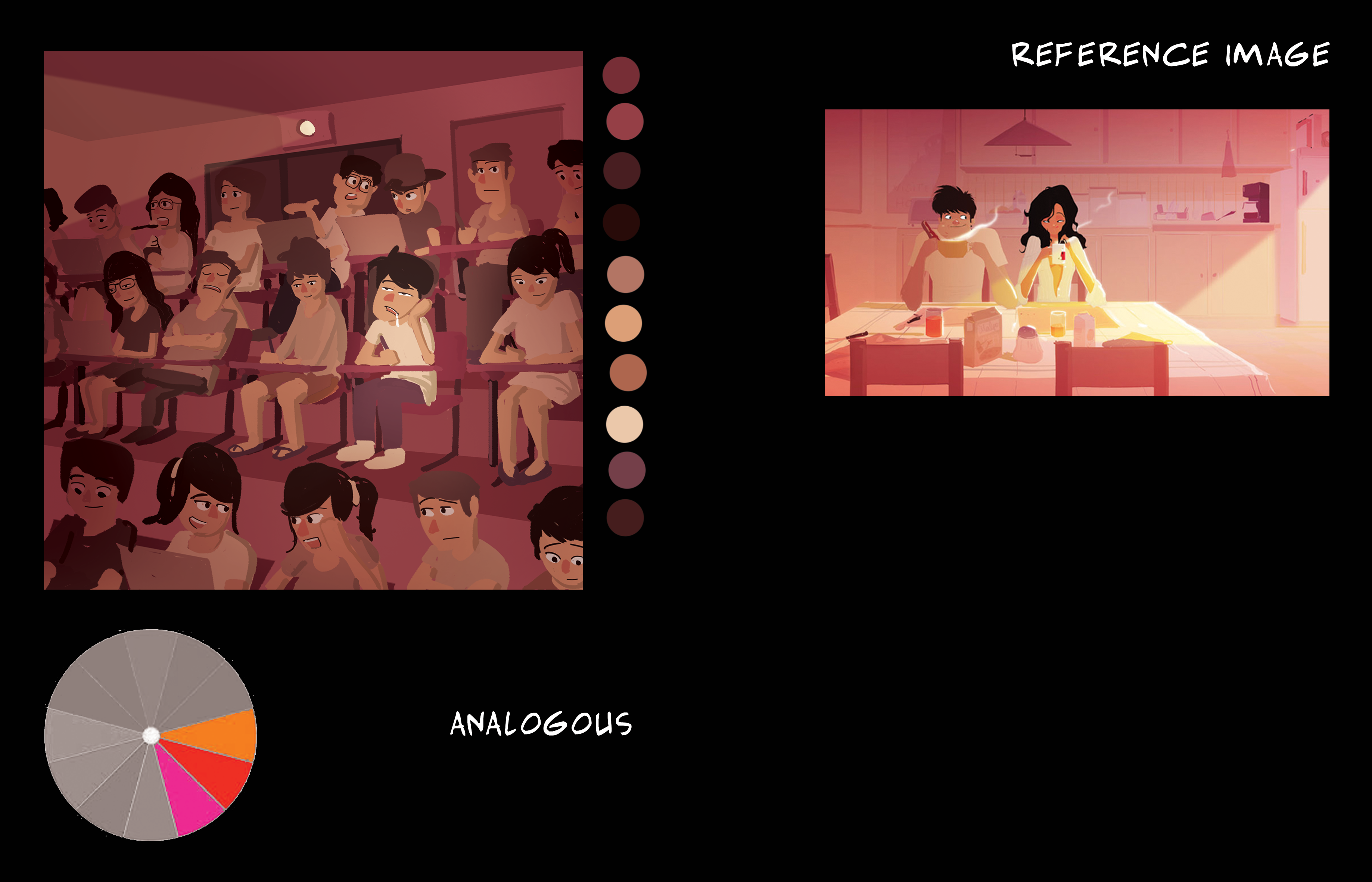
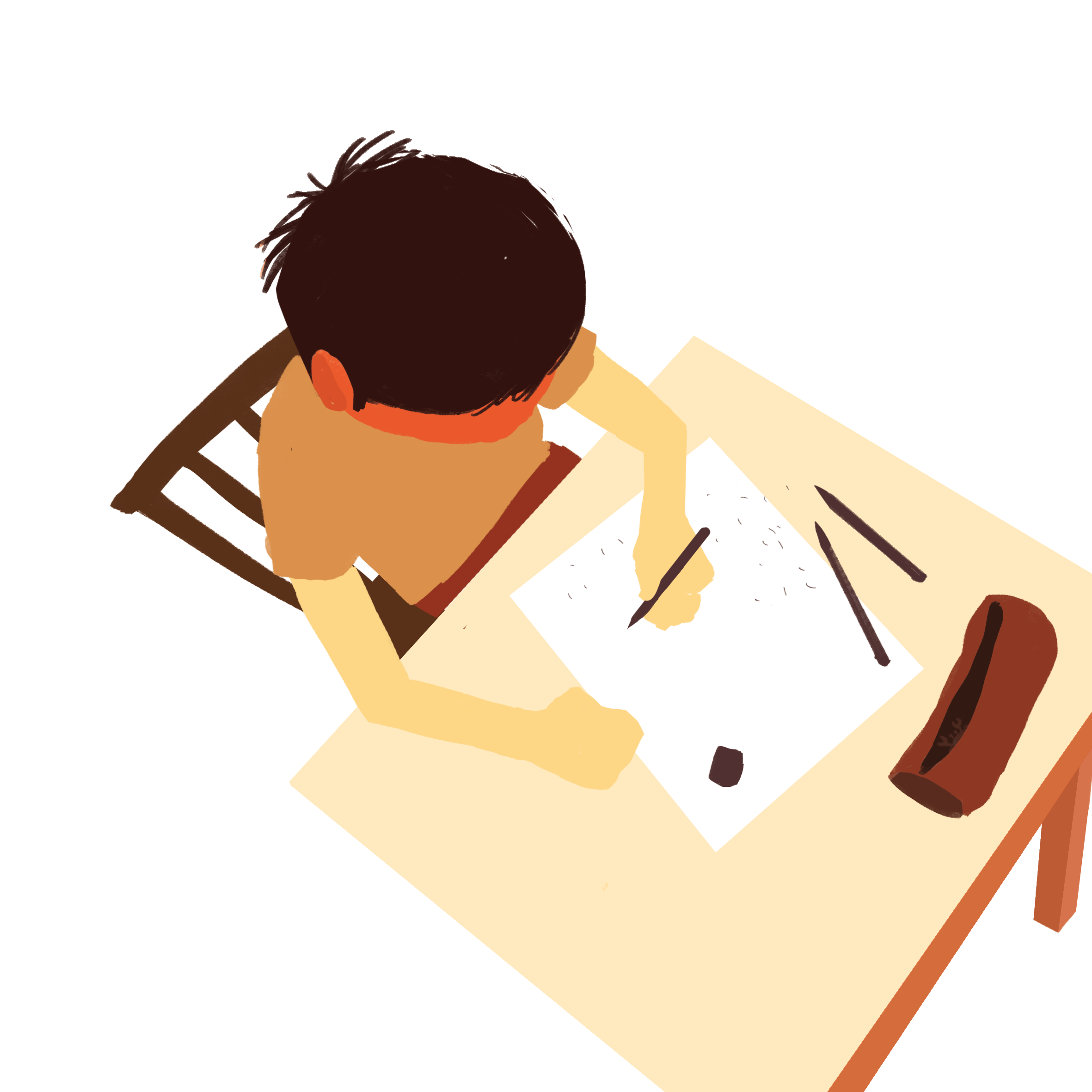
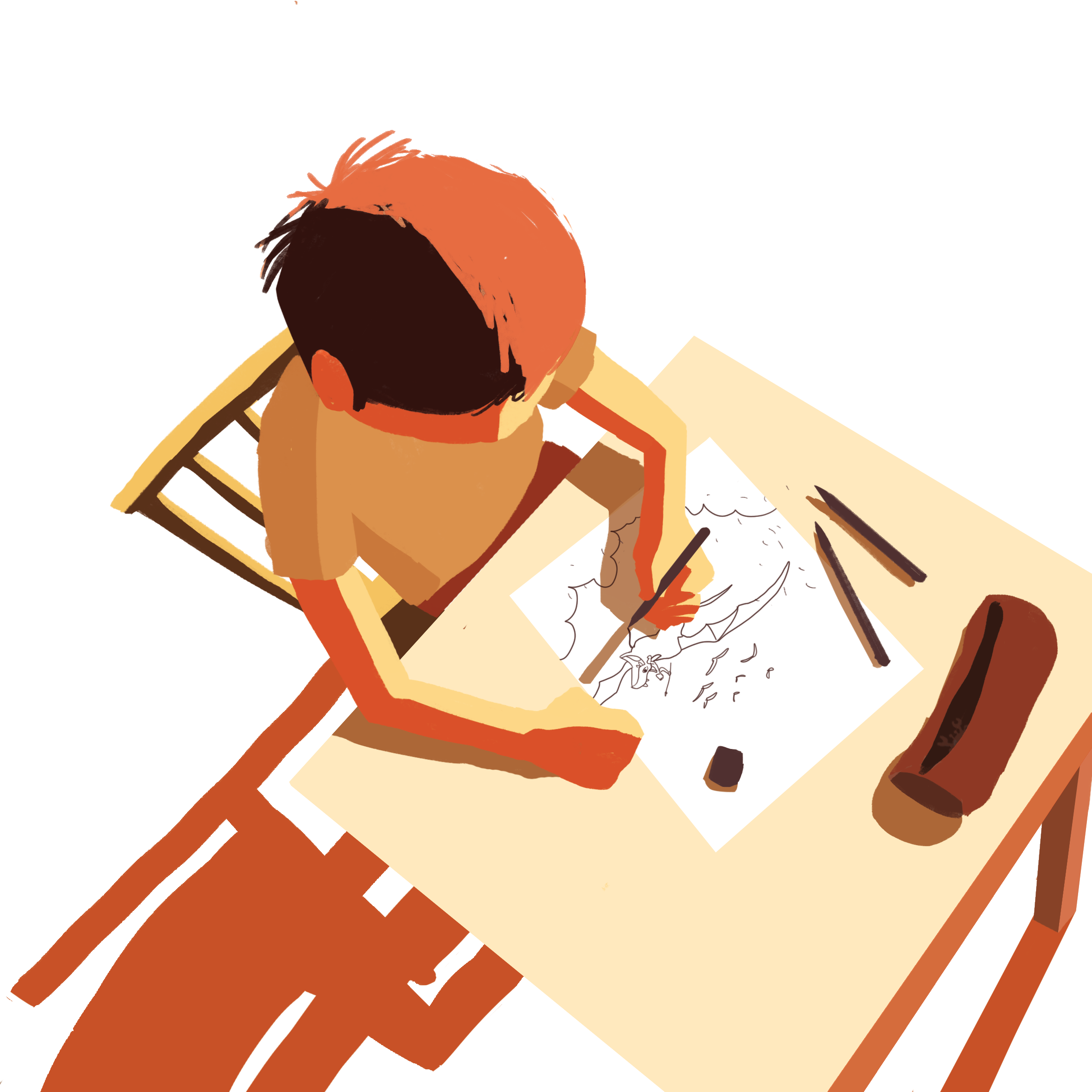
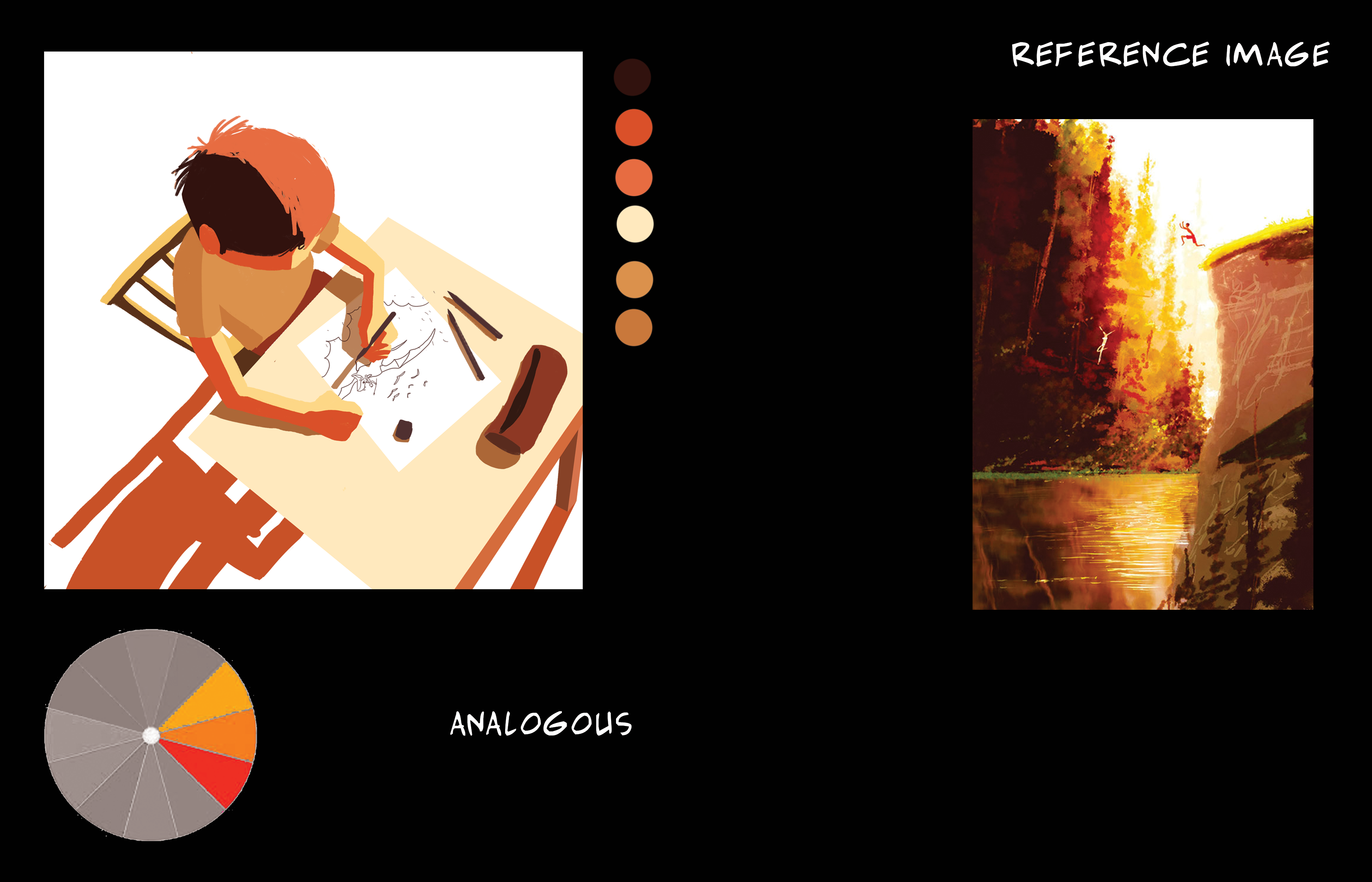
SketchColoursFinishedColour scheme and reference image
A warm analogous colour scheme to replicate a dream-like state of boredom.
The character in focus is of a brighter colour as compared to the other characters.
composition 8
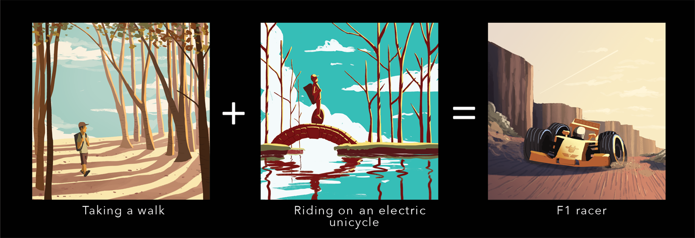
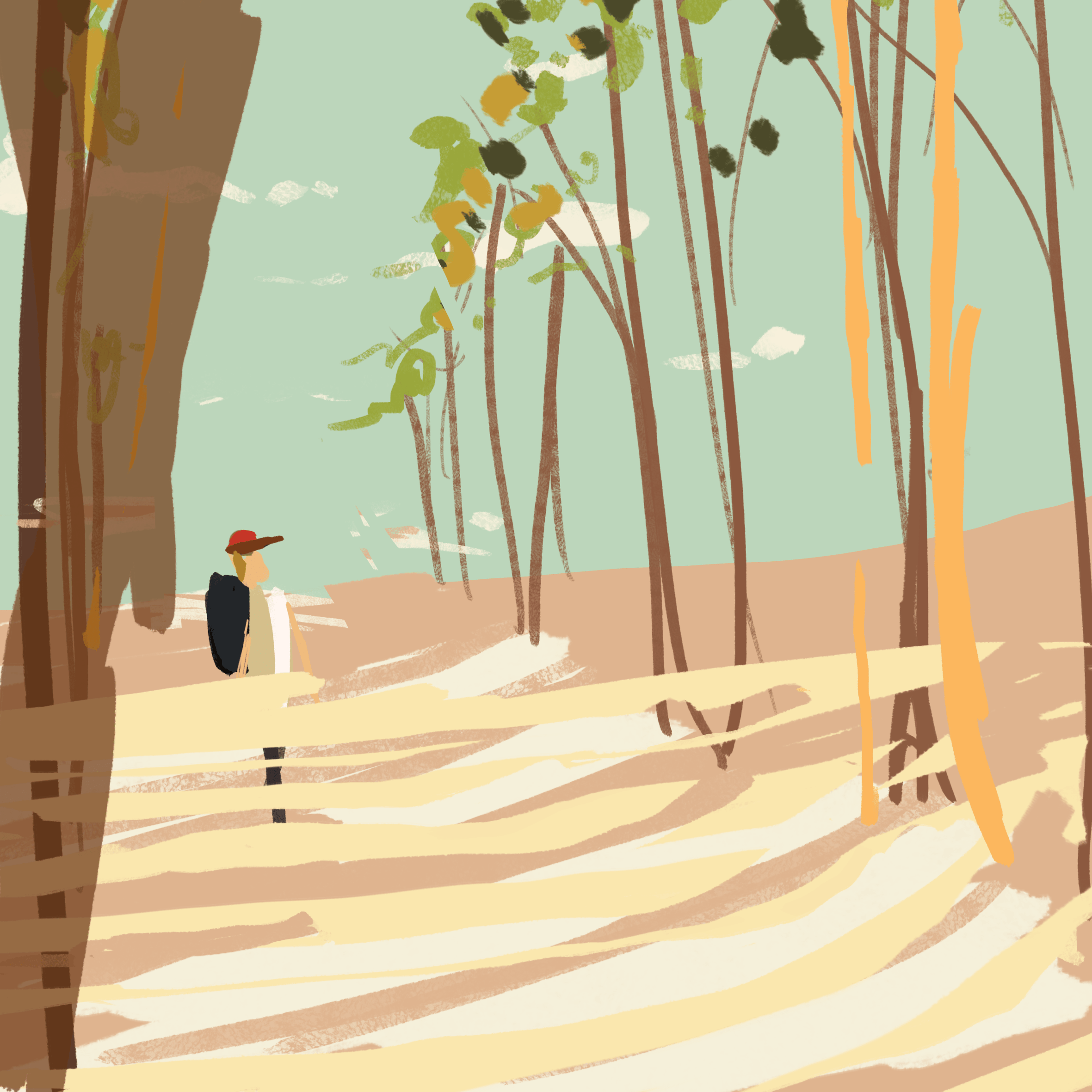
SketchColoursFinishedColour scheme and image reference
A warm analogous colour scheme that portrays a late-afternoon time of day. It gives a peaceful and relaxing vibe which signifies the end of a day’s work.
composition 9
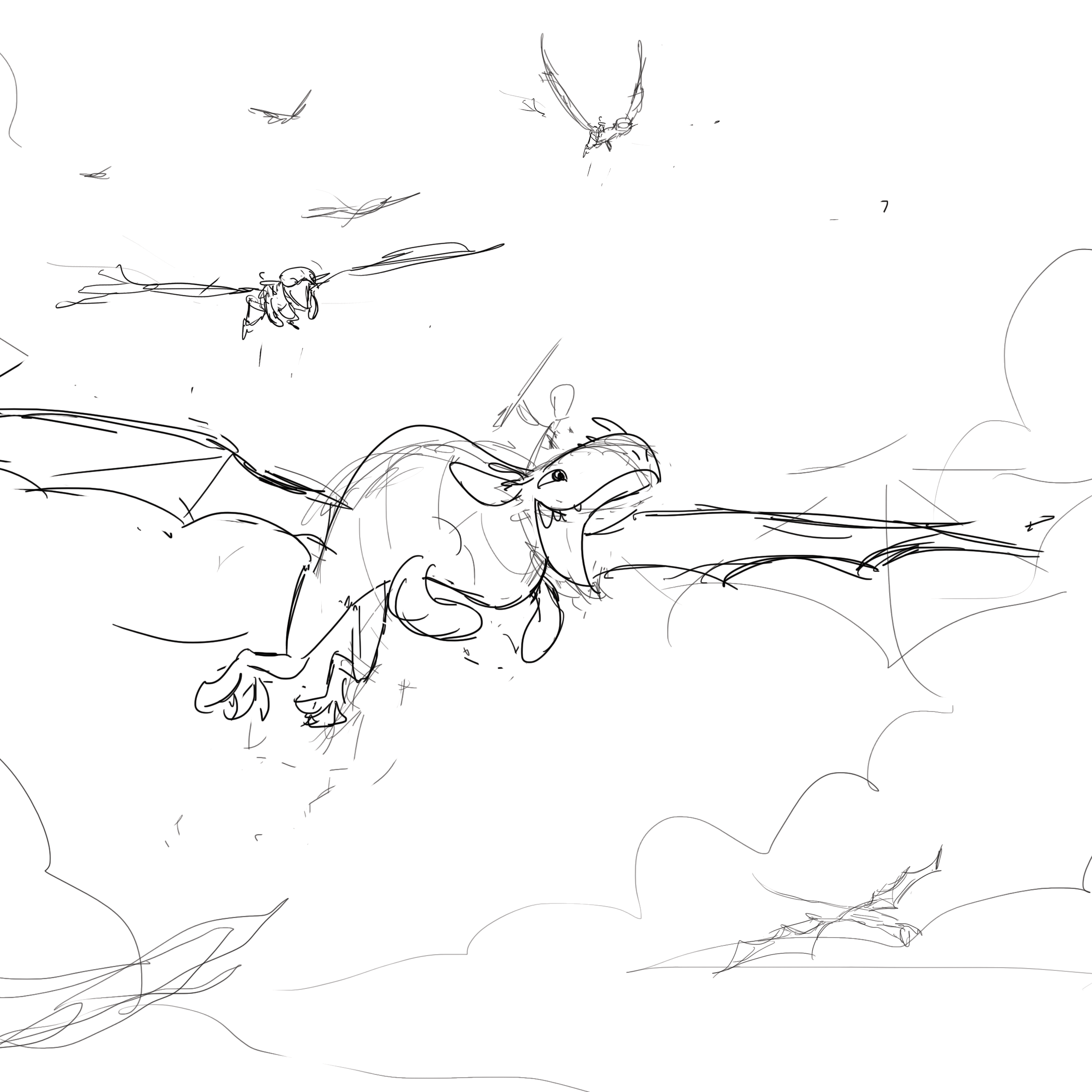
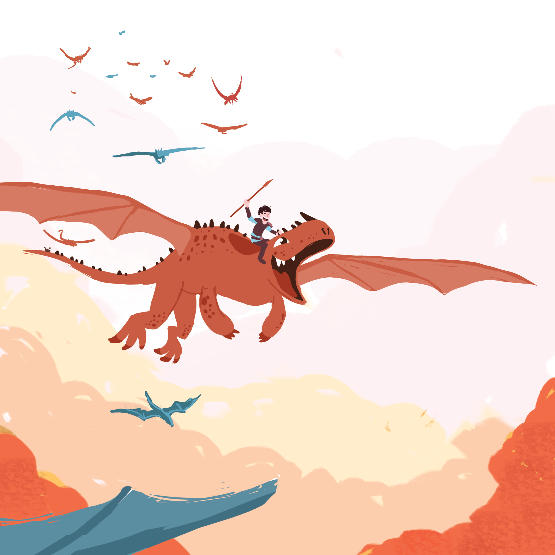
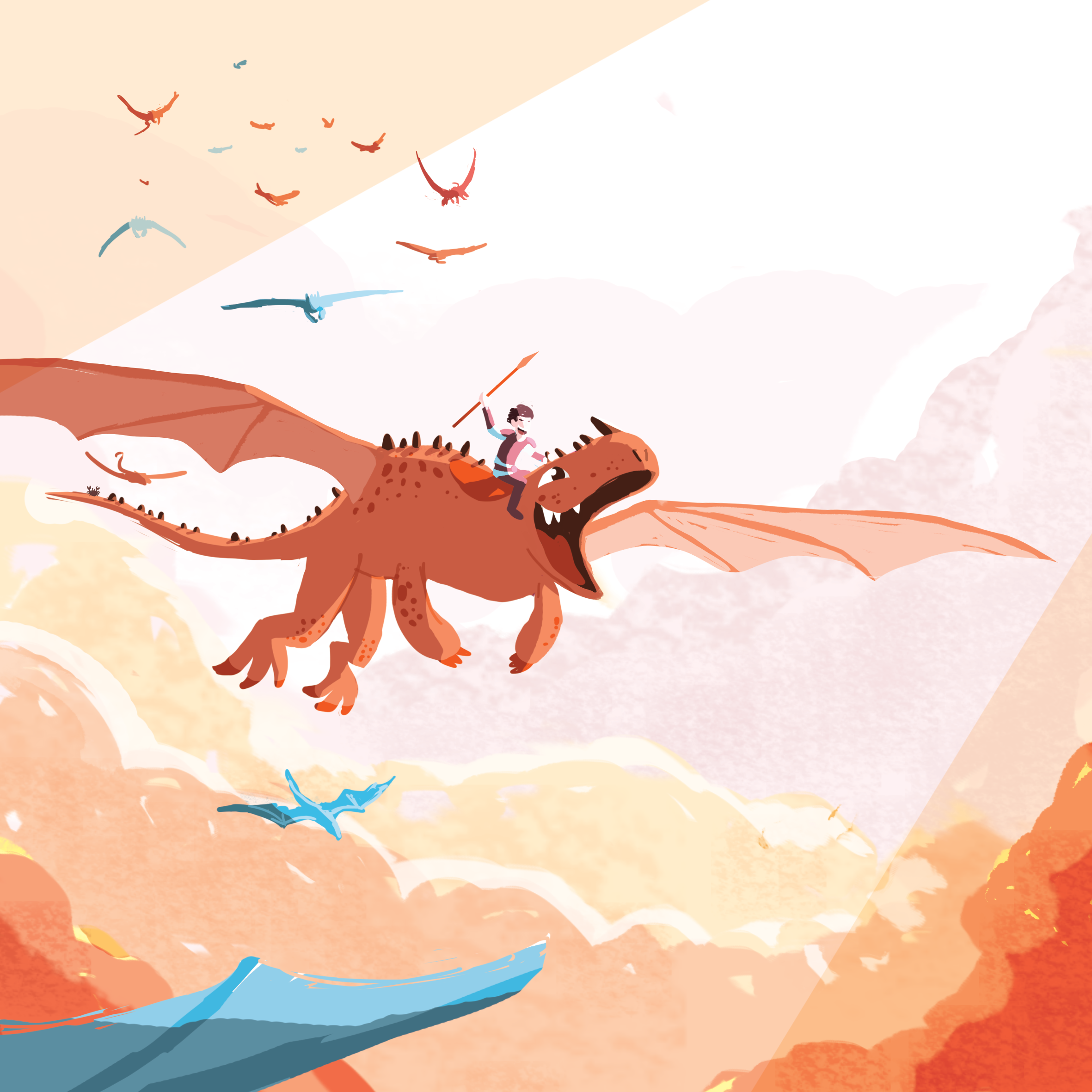
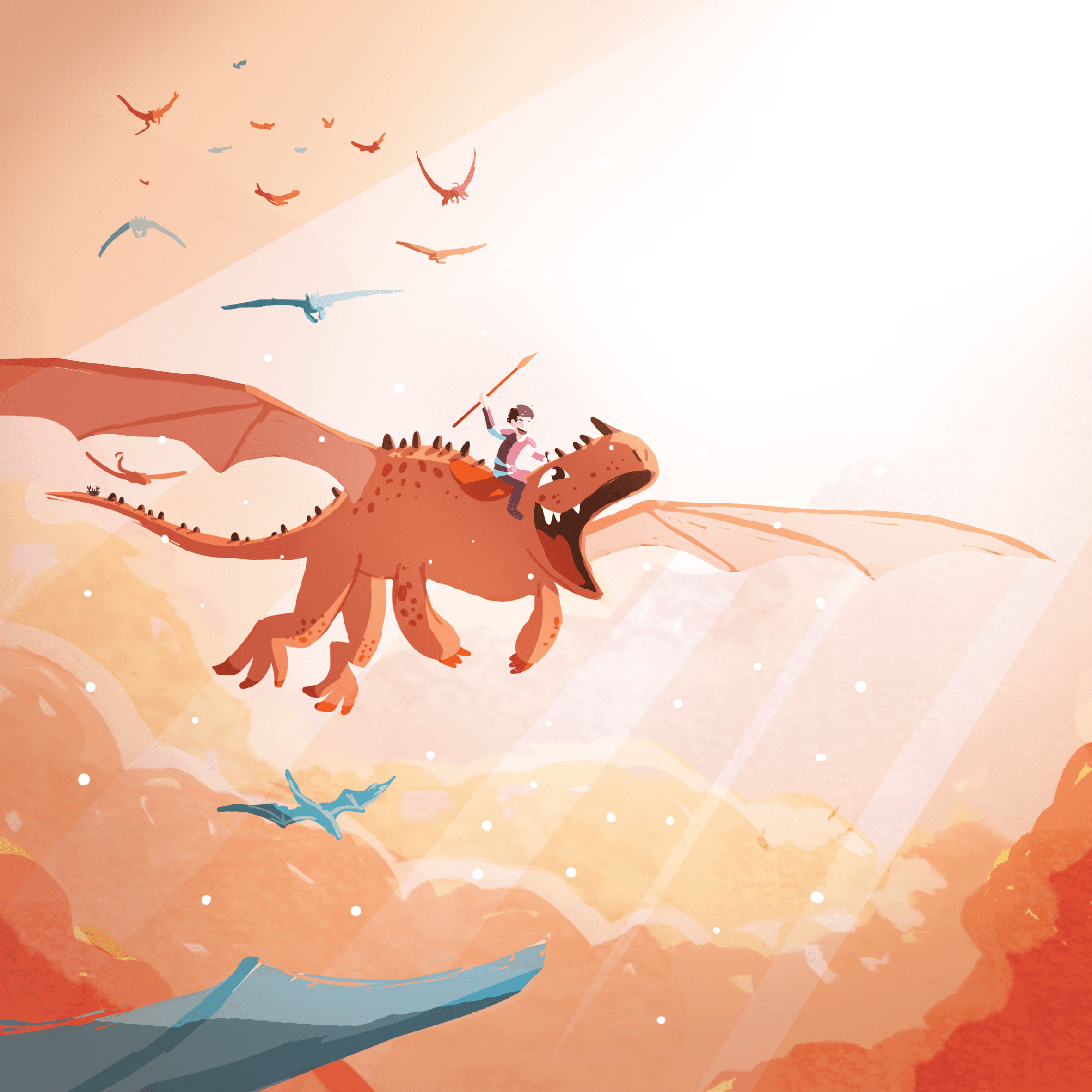
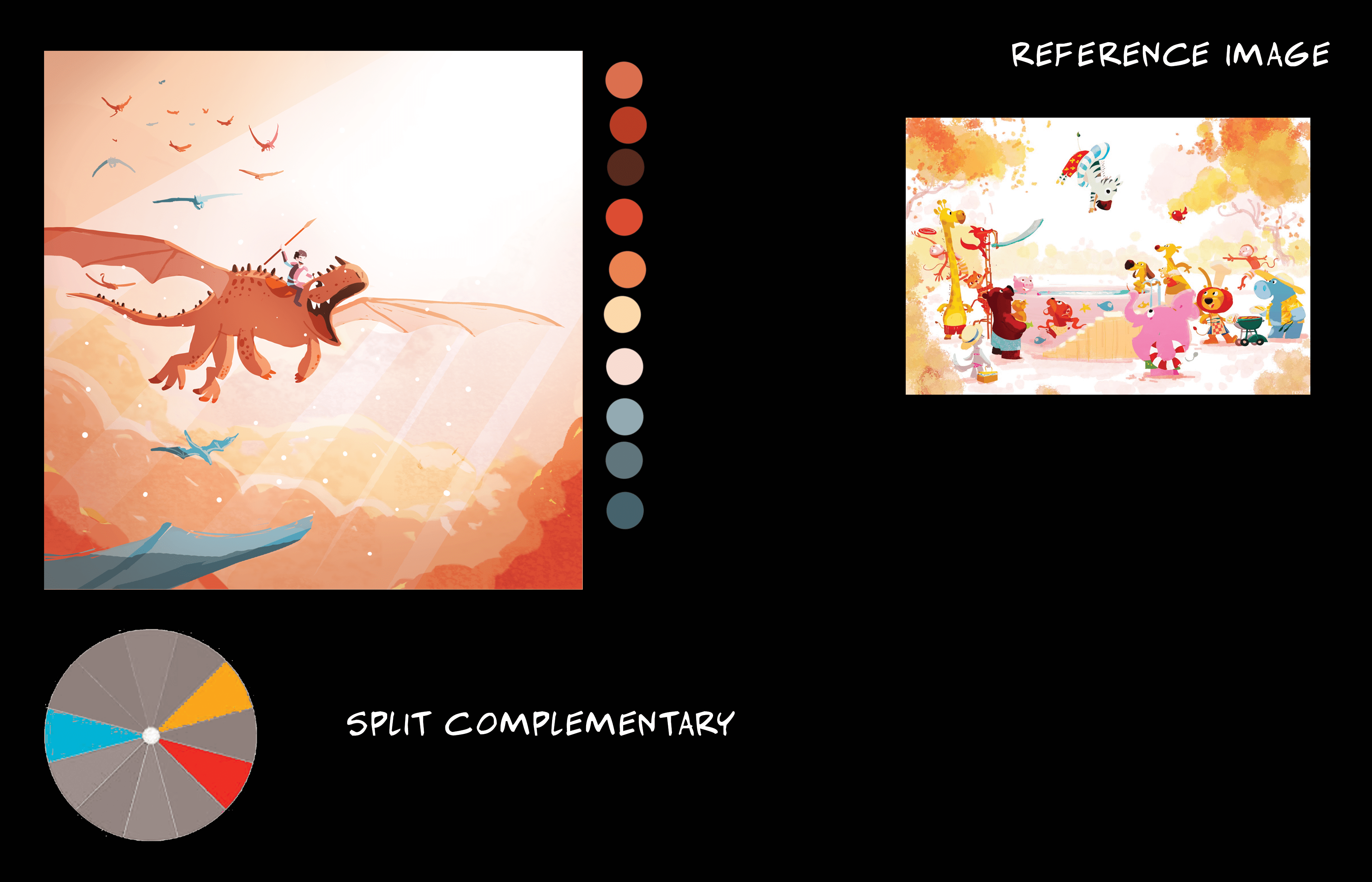
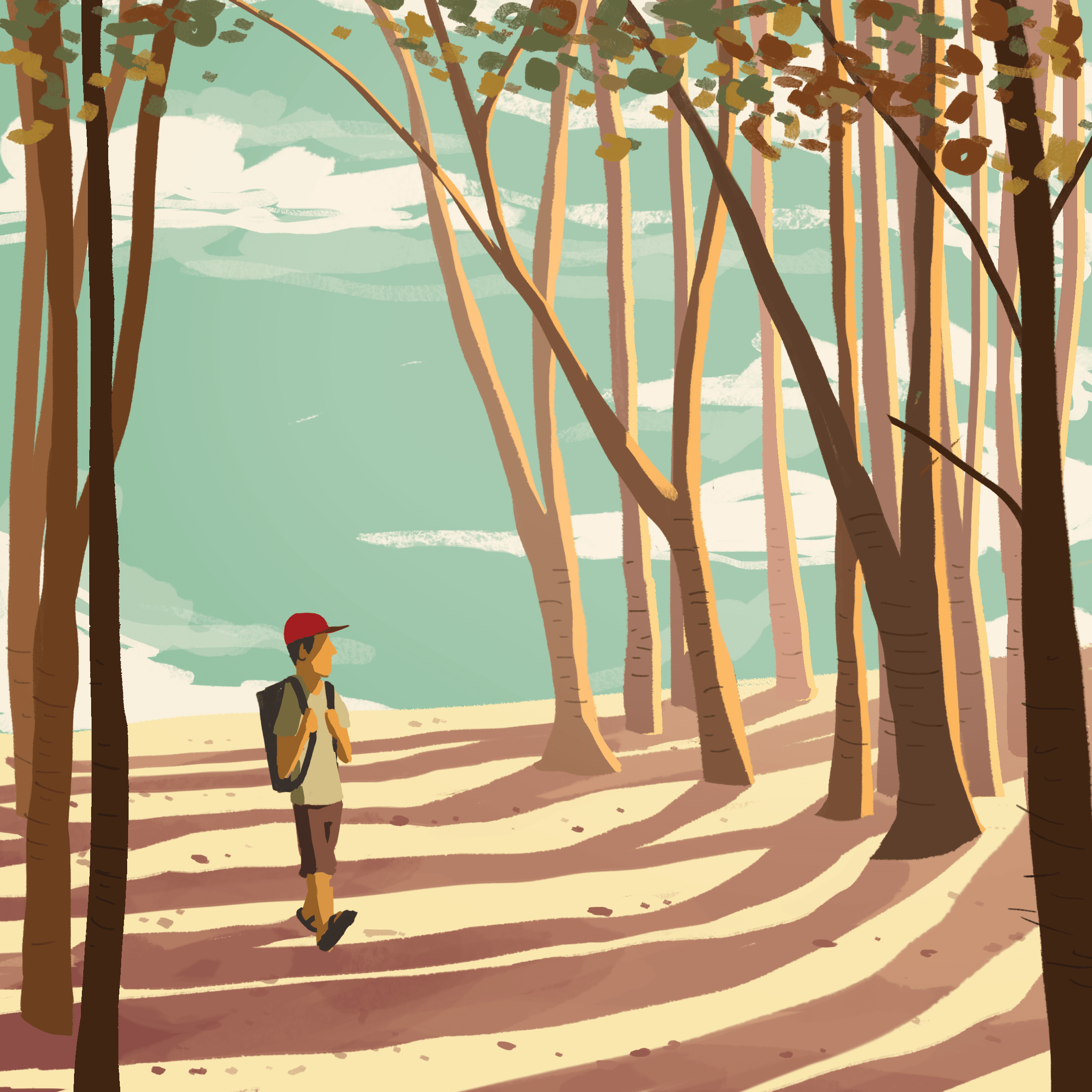
SketchColoursColours 2FinishedColour scheme and image reference
An orange and red colour scheme that signifies joy and adventure, the overlay of white lights gives a majestic feel to the composition. Complimenting these colours are a few touches of blue.
EQUATION 4
Equation 4
composition 10
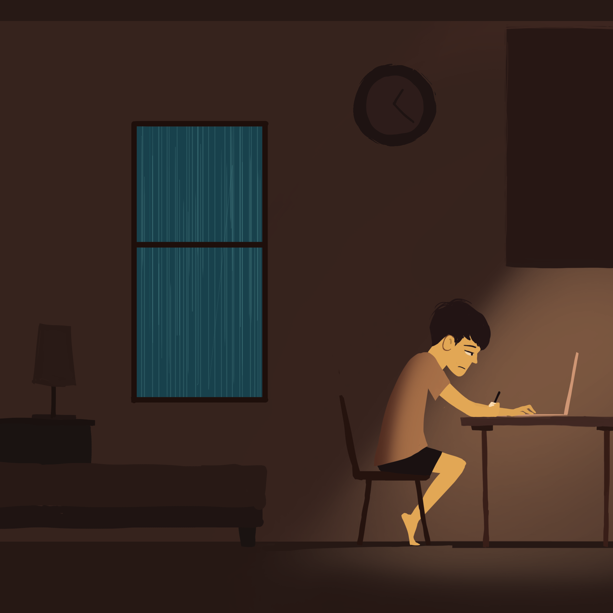
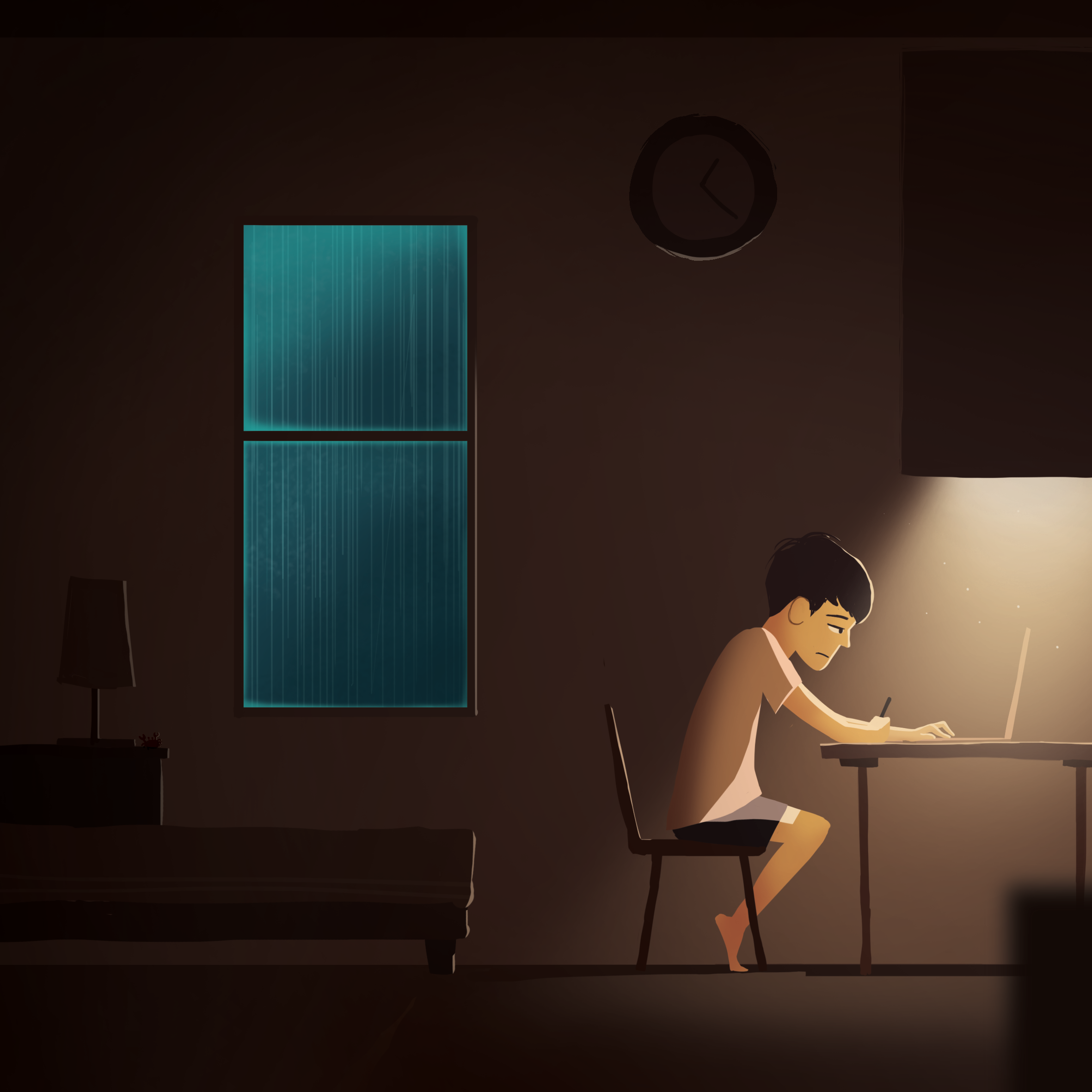
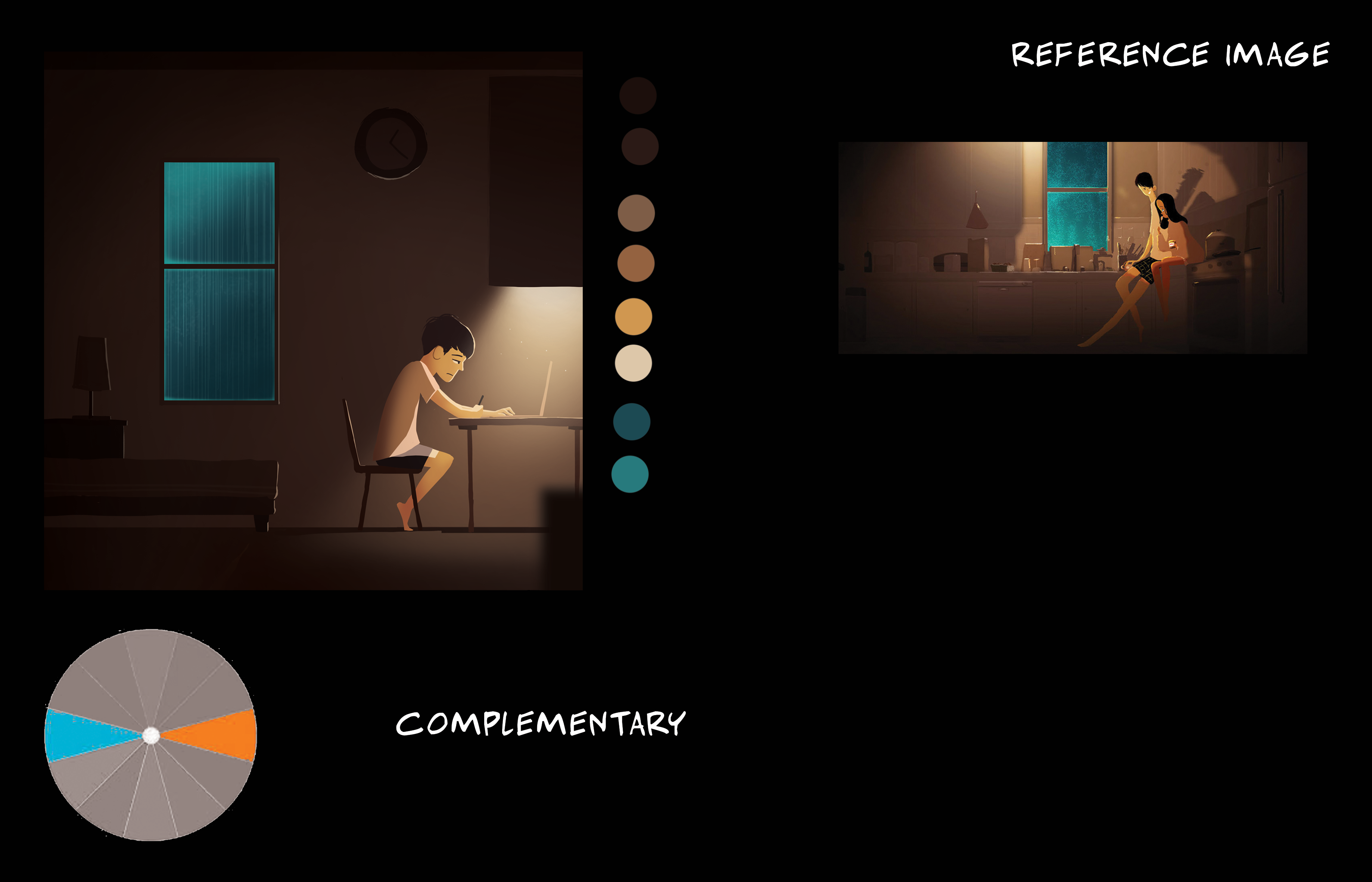
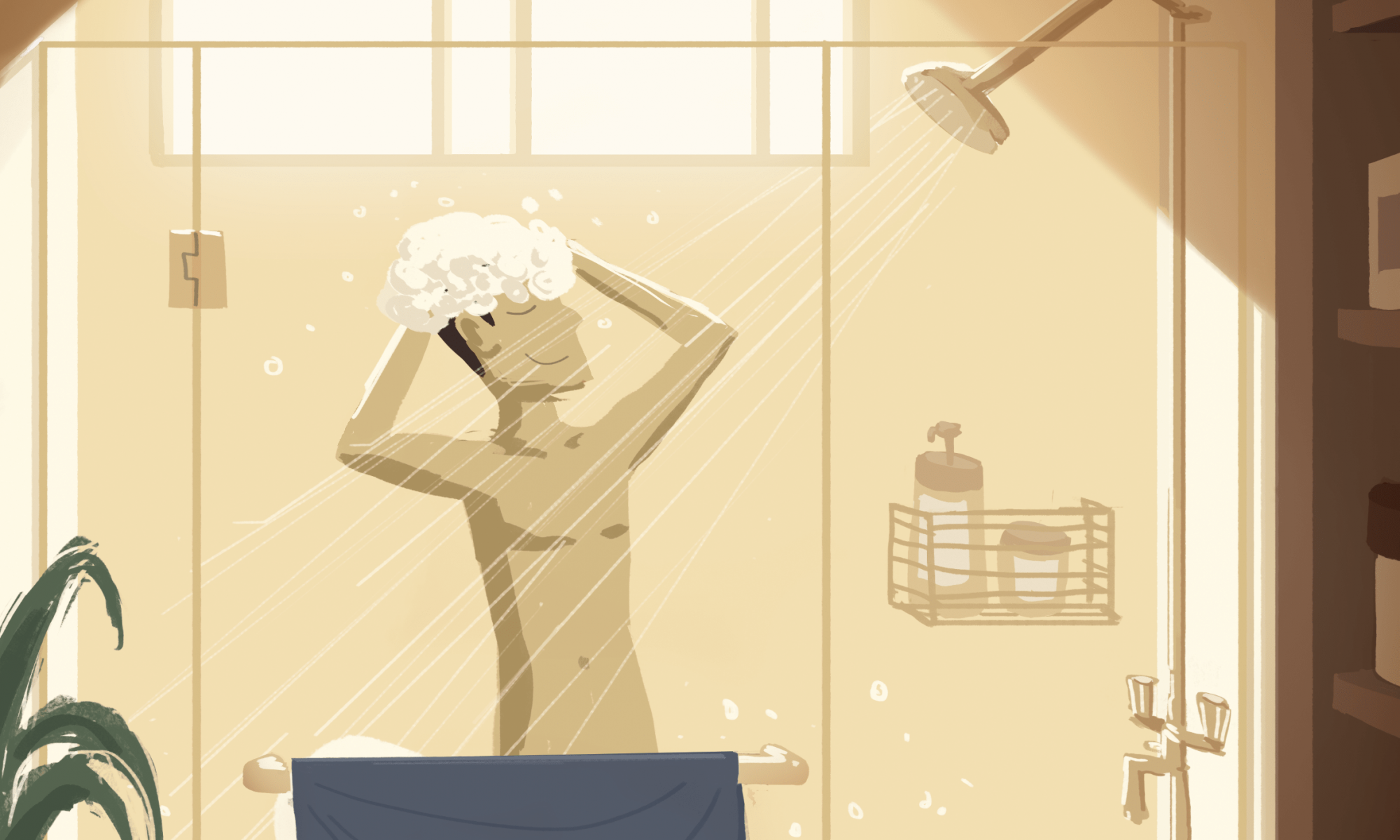
SketchColoursFinishedColour scheme and image reference
I really liked the use of the turquoise in the otherwise dull brownish illustration as seen from the reference image. The fog effect on the window makes it seem as though it is glowing. Rim lights were added to the elements in the darker areas to make them stand out just a little. A blurred foreground element is added to give a sense of depth in a ‘flat’ image.
composition 11
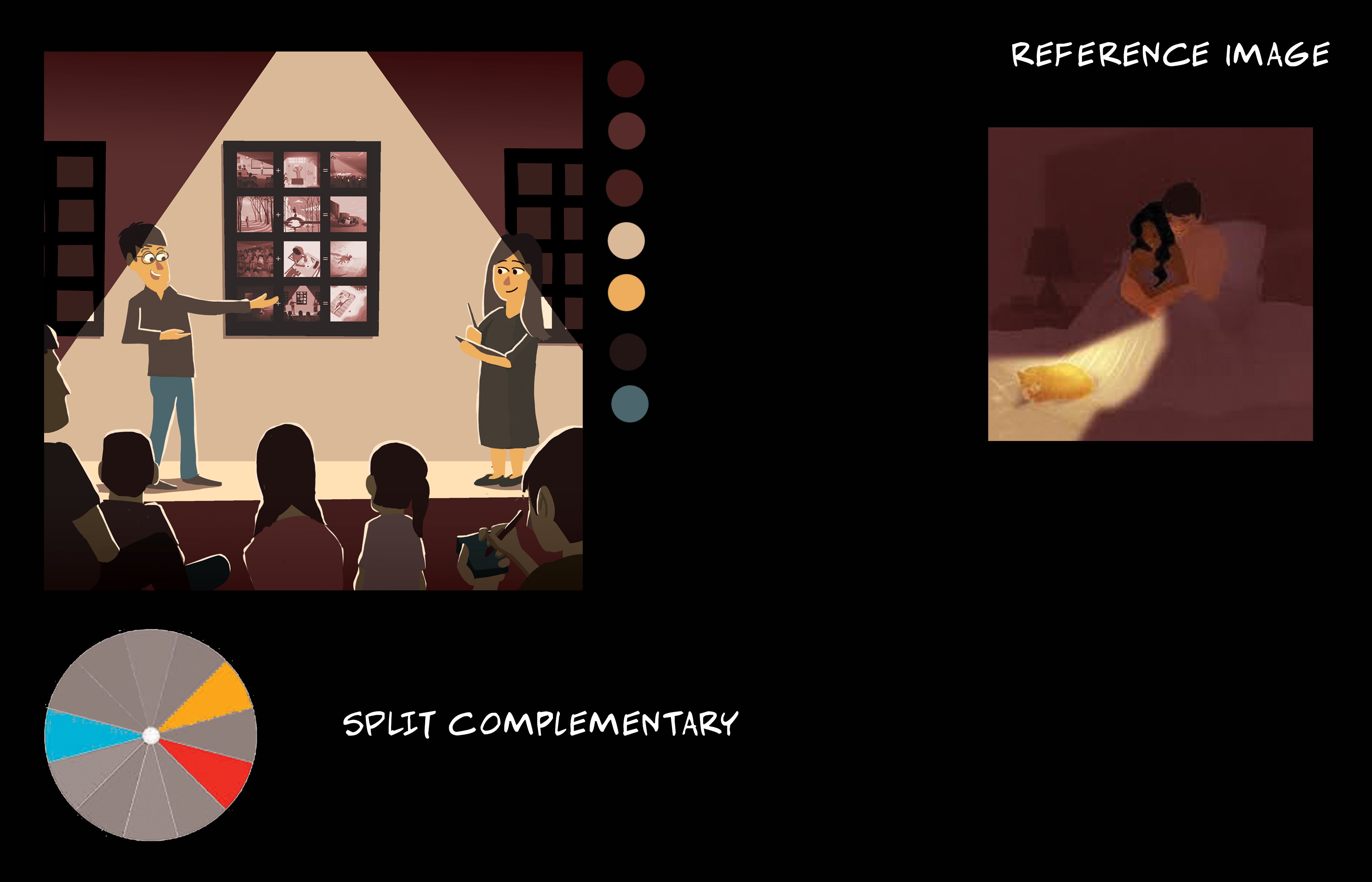
SketchColoursFinishedColour scheme and image reference
Split complementary of maroon red, pale orange, and a hint of blue. Foreground characters are in the shadows but with rim lights so that they interact with the light in front if them.
composition 12
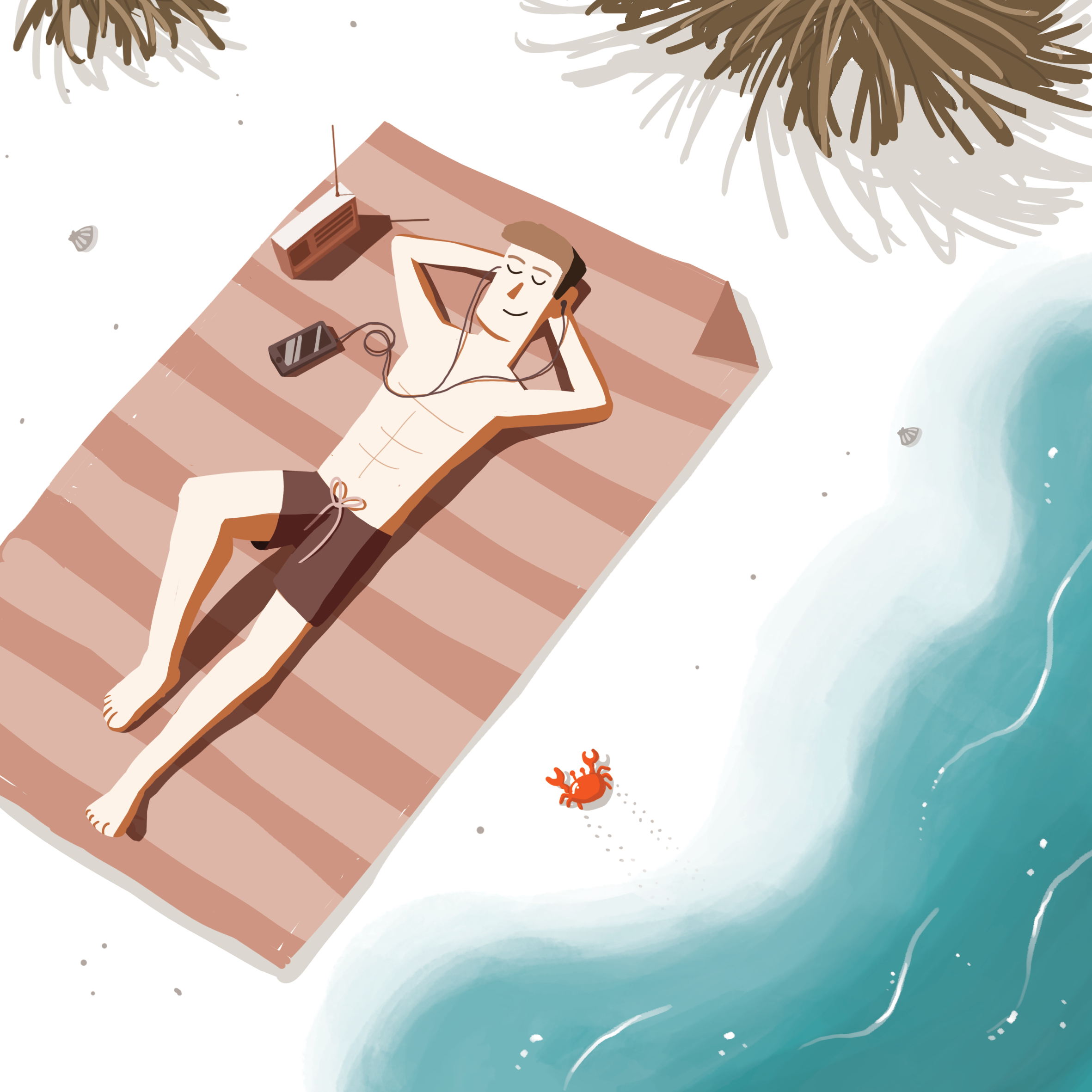
SketchColoursFinishedColour scheme and image reference
Warm red and oranges and white sand to portray a sunny beach setting, along with a cool turquoise water at the shoreline to complete the beach-y vibe.
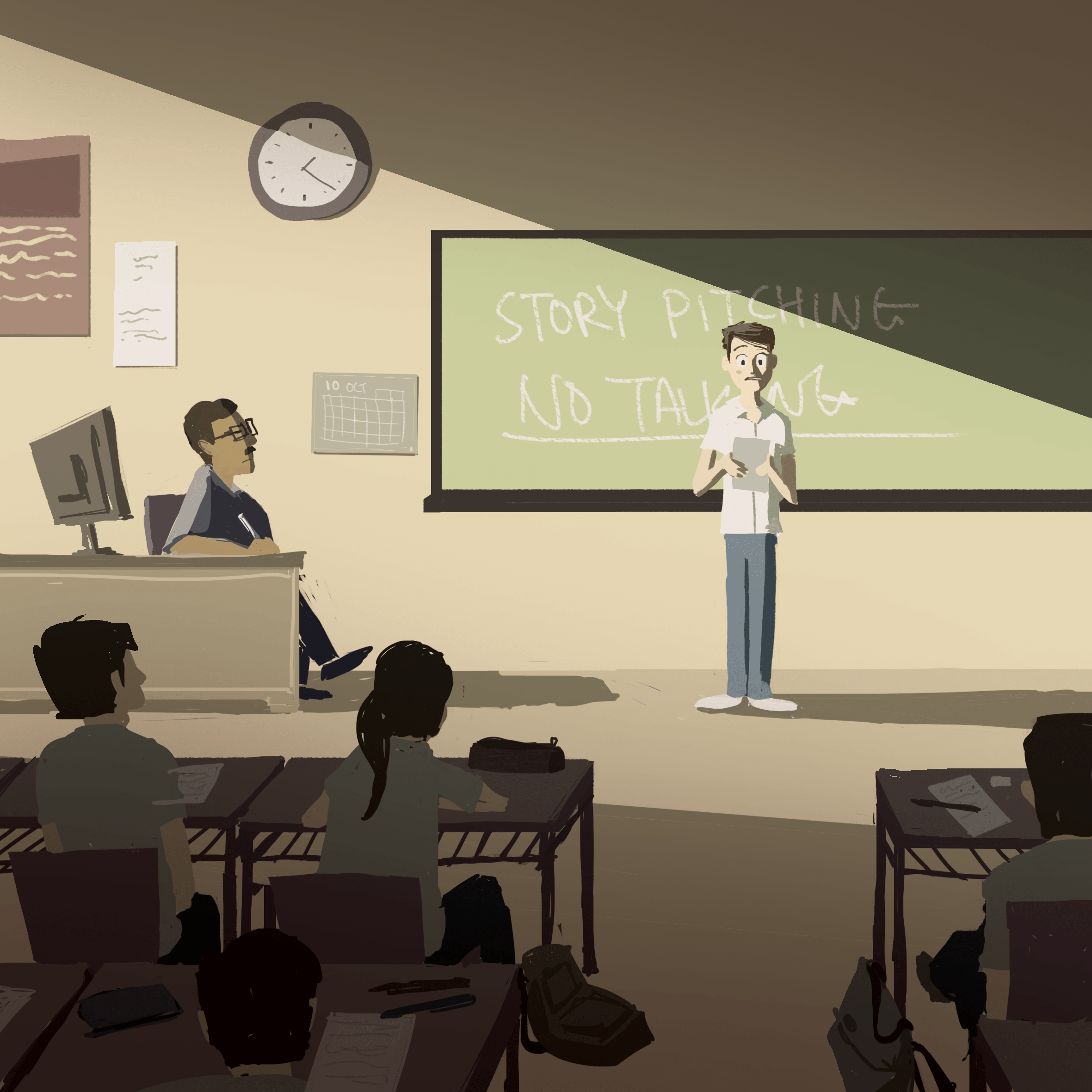
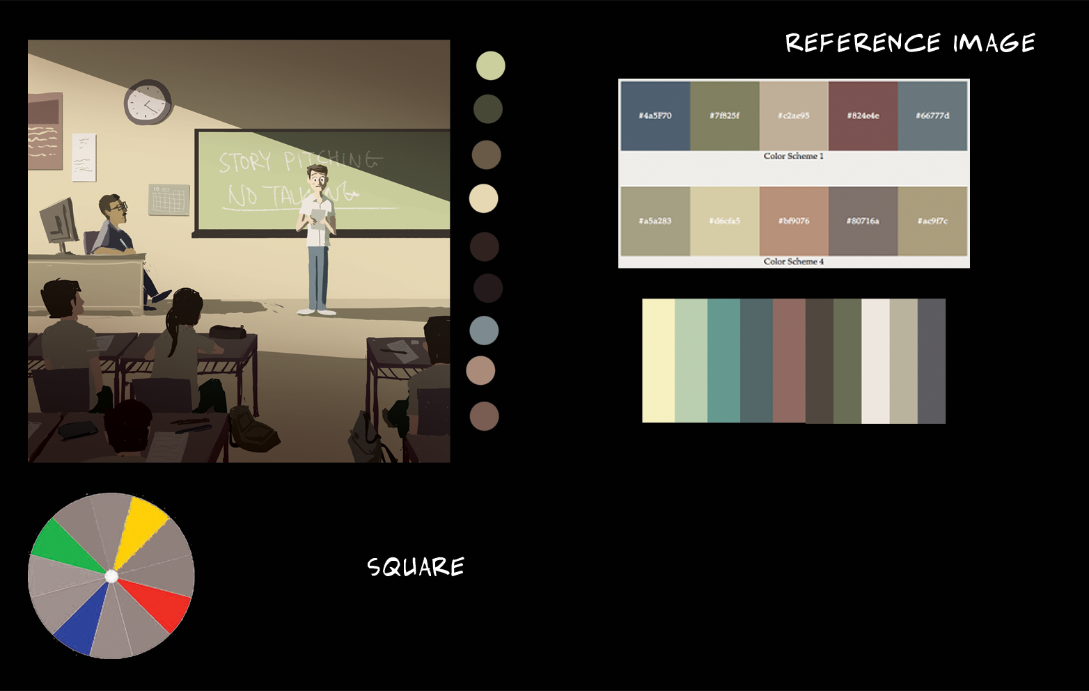
During consultation, Joy suggested that the foreground could be slightly more red so that the greens in the foreground will not take too much attention away from the prominent green chalkboard.
After consultationColour scheme and reference image (muted colours found online)
Square – Two sets of complementary colours
Yellow (Dominant) & Blue
Green (Dominant) & Red
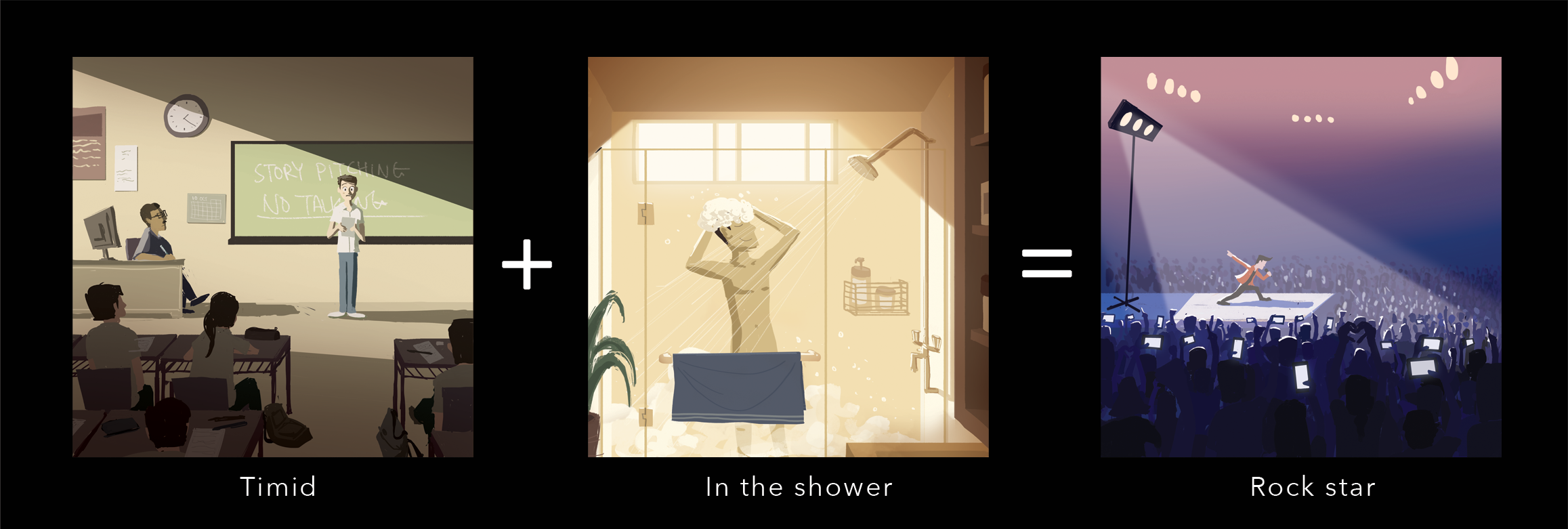
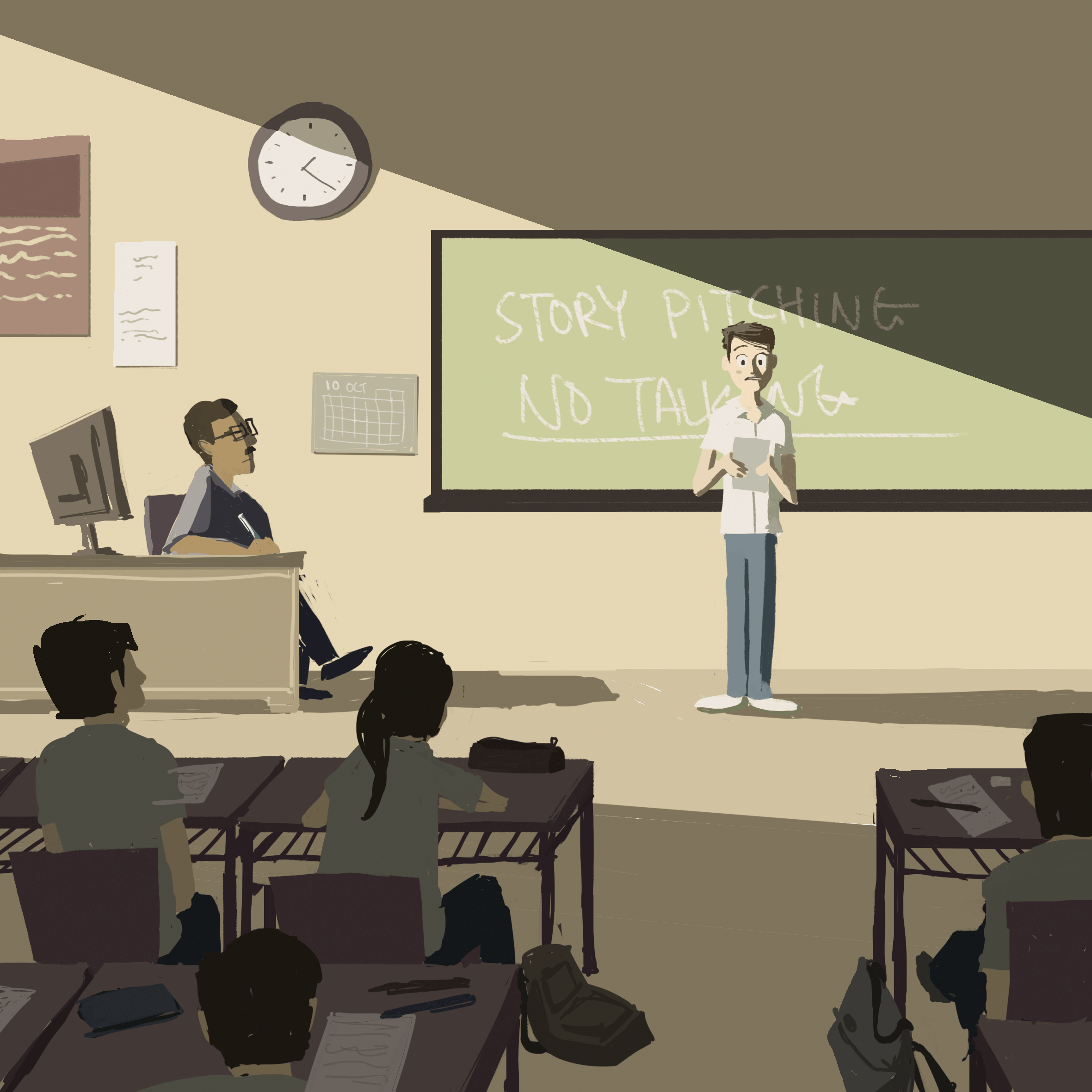
I went for a muted colour scheme to depict a typical ‘boring’ classroom environment. The main character is standing in the light which is shining down onto him, also, the foreground is darker to further draw attention away onto the main character.
COMPOSITION 2
SketchColoursFinished
Colour scheme and reference image
A warm and vibrant colour that reflects a sense of happiness, with a hint of blues and greens to compliment it, which breaks it from the otherwise monochromatic colour scheme, making it more visually engaging. Darker foreground elements create a sense of depth, and the main character is in the light.
COMPOSITION 3
SketchColours
Finished
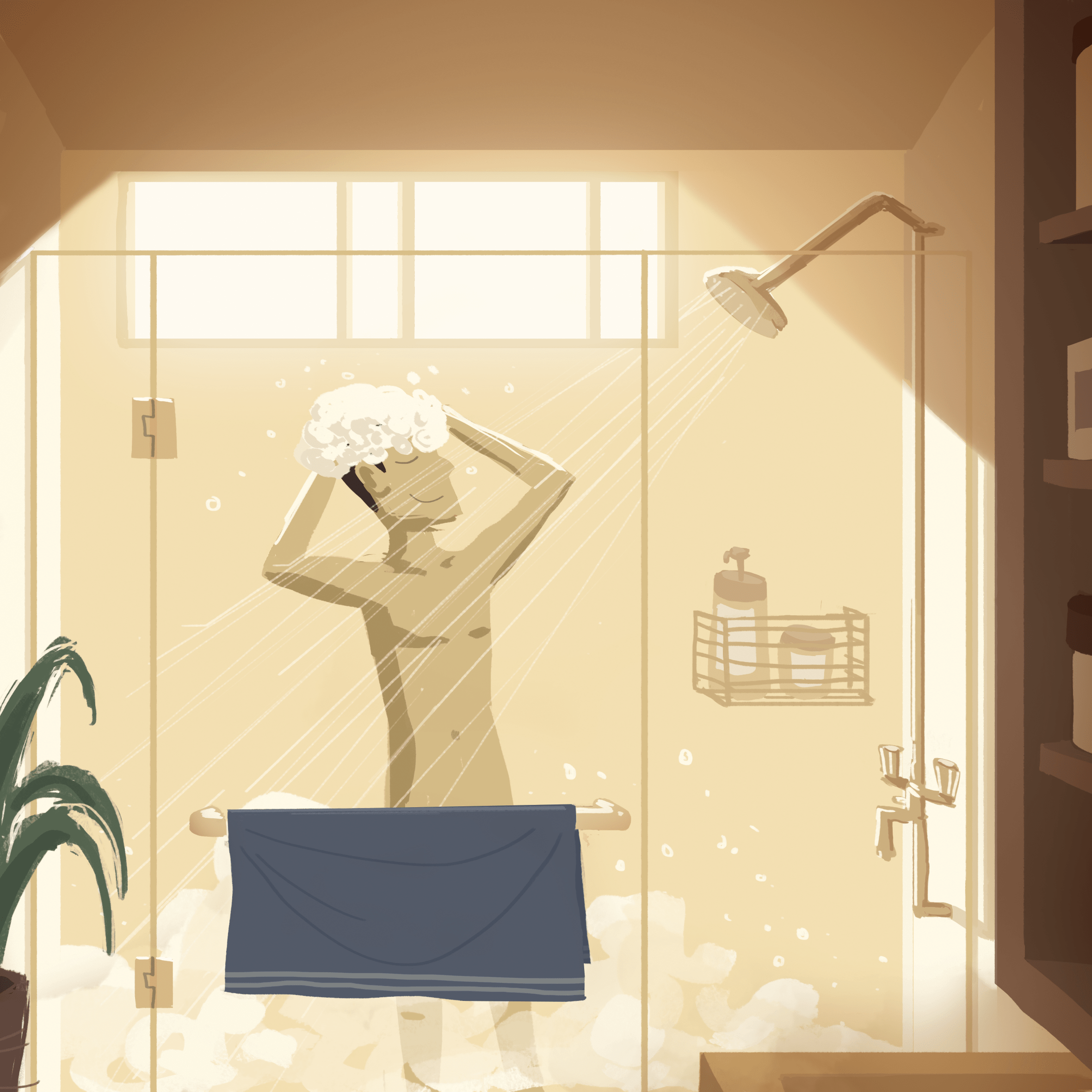
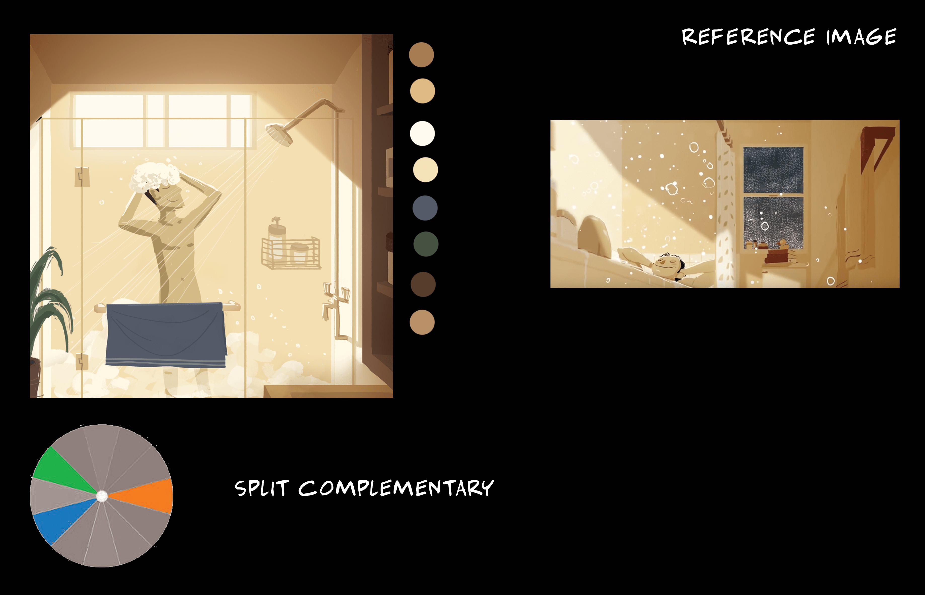
Joy had suggested to add a light stand with light ‘pouring down’ on the stage so that it is similar to the shower head ‘pouring down’ the water. Similarly, the cone of light in the first composition also seem to be ‘pouring down’ onto the main character.
After consultationColour scheme and image reference
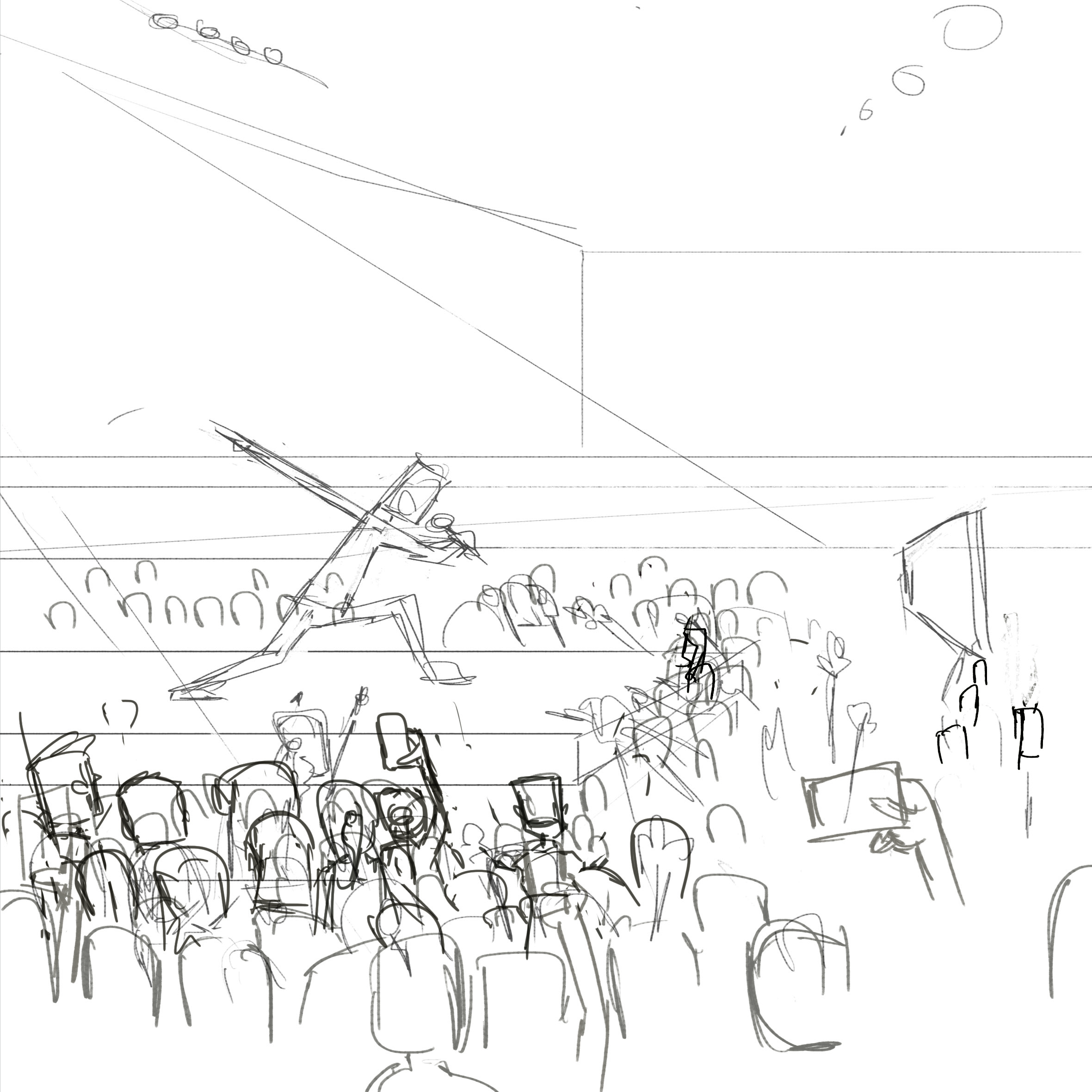
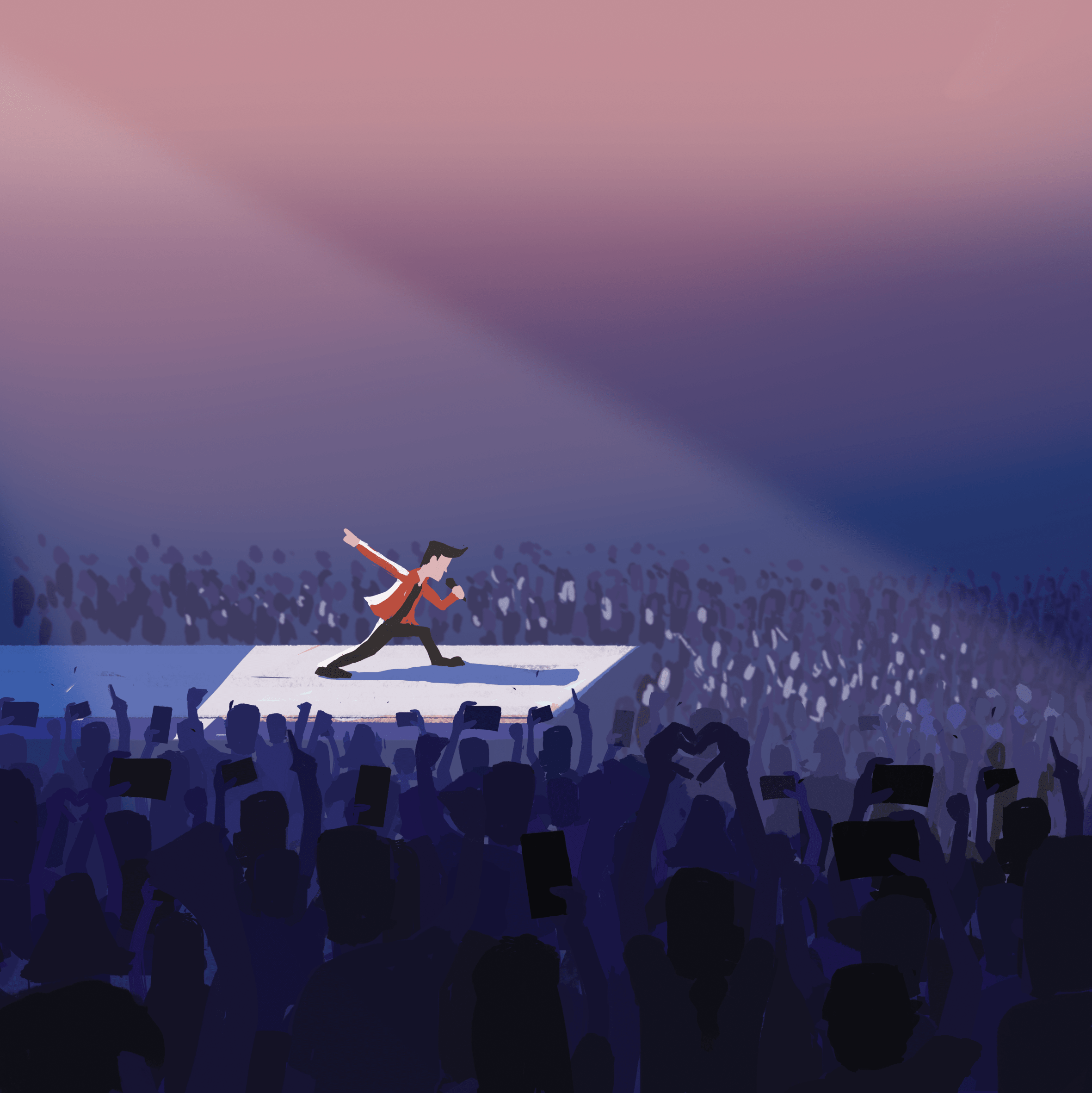
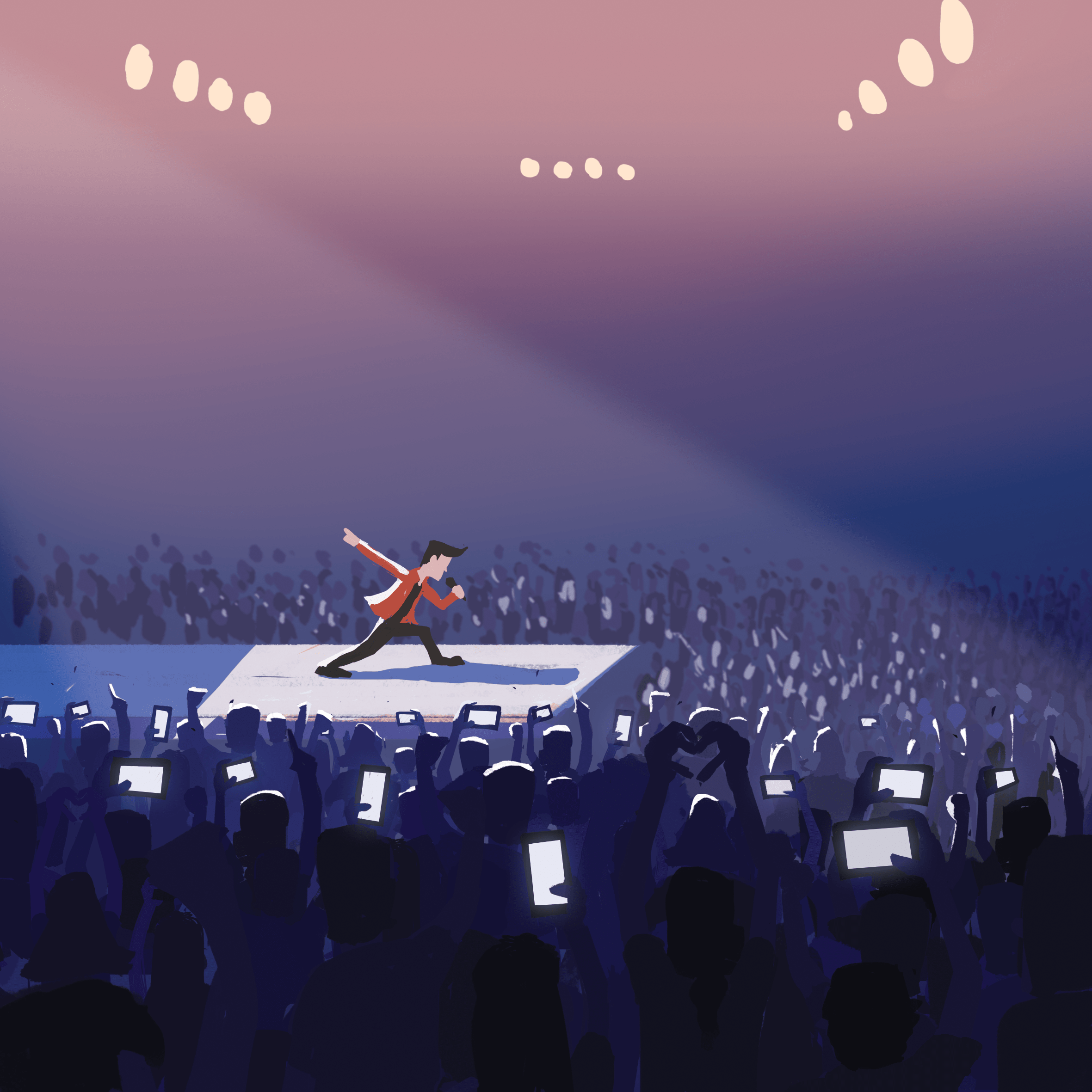
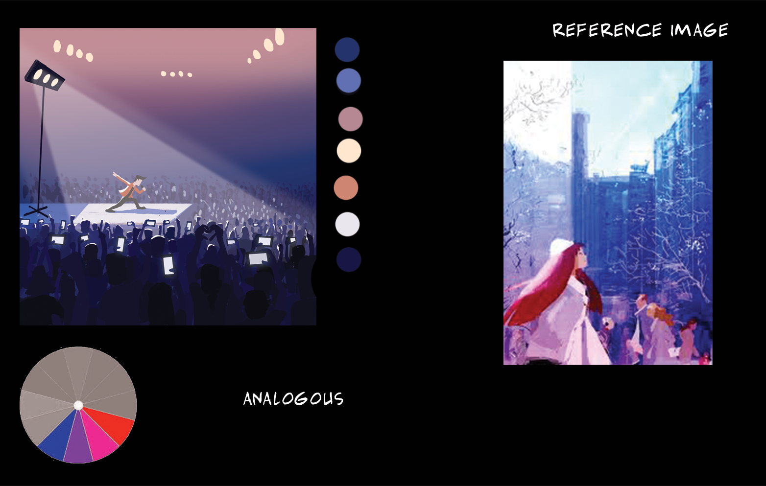
An cool analogous colour scheme of blue-violet-magenta and a little red creates relaxing composition of colours which is easy to look at. It also gives sort of a hypnotic vibe, where everyone in a concert is simultaneously singing along and moving simultaneously to the rhythm and beat of the music. A more detailed foreground and a blurry background gives a sense of depth and vastness of the location.
Process Part 2
Equation 2
Composition 4
SketchColour block-in
Finished
Joy had suggested to make the green leaves more yellow-olive, and the red hat slightly violet, but eventually I made the hat lean towards orange and made the sky less green and more blue to fit into a split complementary colour harmony.
After consultation
Colour scheme and image reference
An orange-yellow colour scheme to signify a peaceful afternoon setting, with a complimentary blue to add a cool hue to the warm colours.
Composition 5
SketchColour block-inFinishedColour scheme and image reference
A triadic colour scheme for a balanced use of colours. The strong yellow rim light and high contrasting shadows gives a strong late-afternoon lighting, as if riding back home after a day’s work.
Composition 6
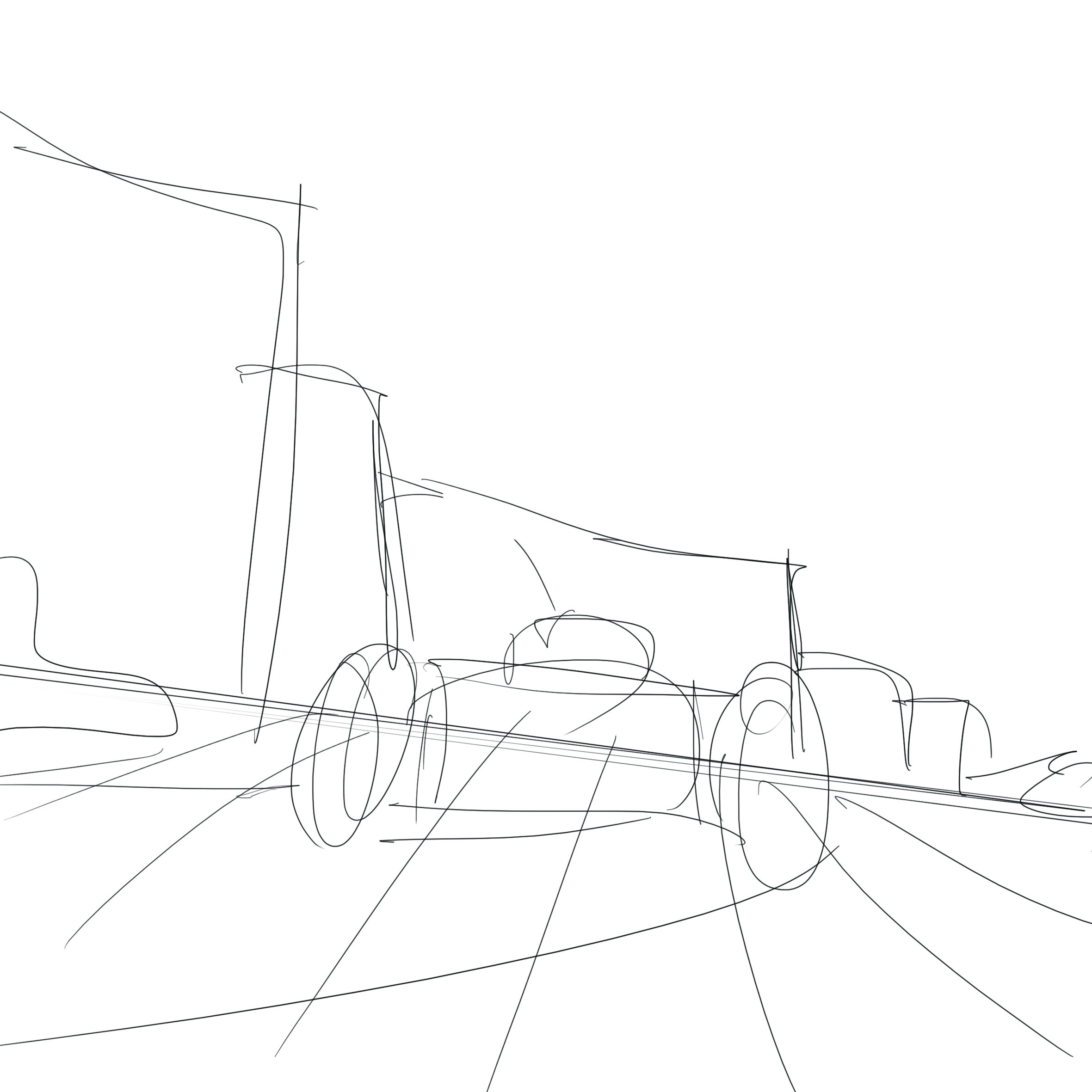
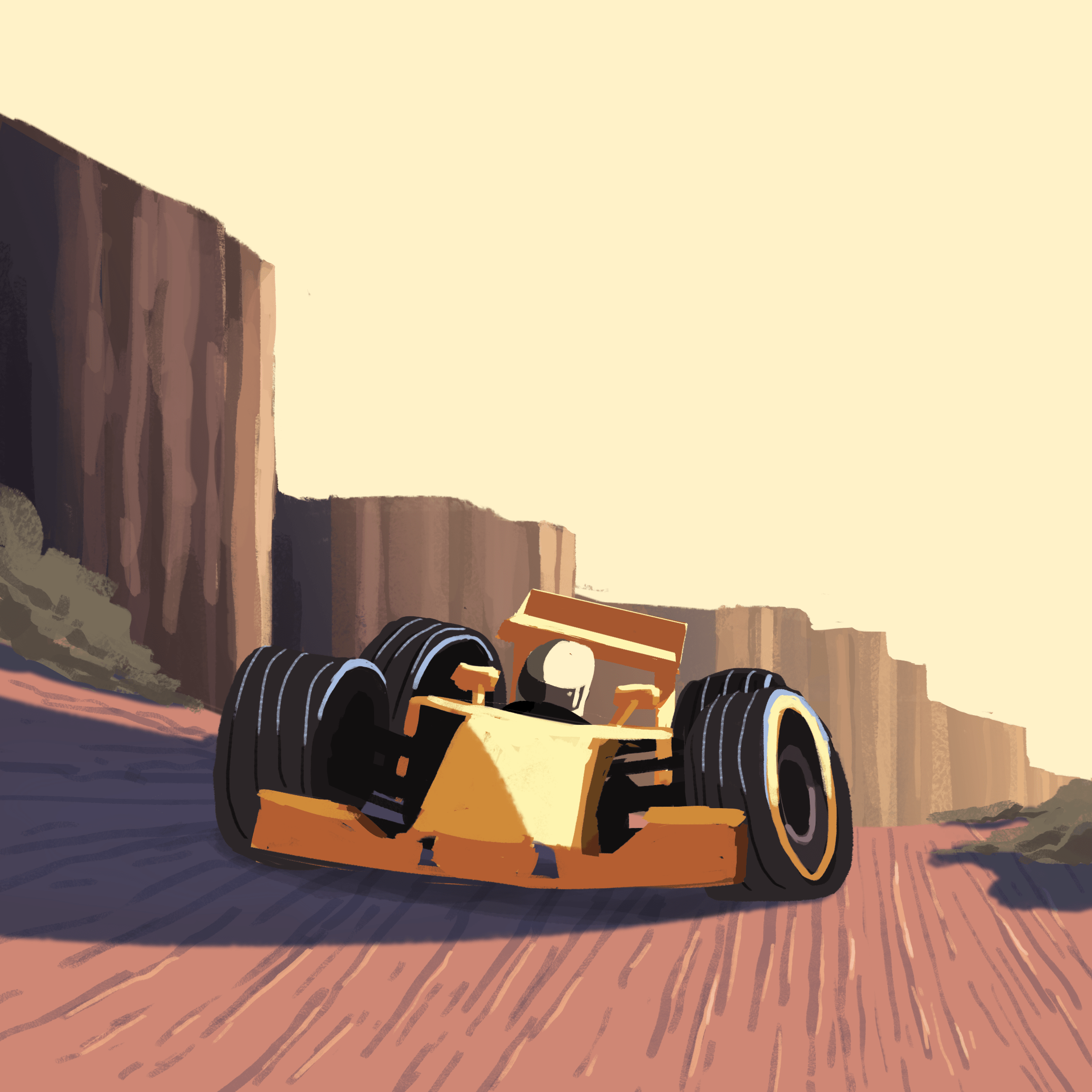
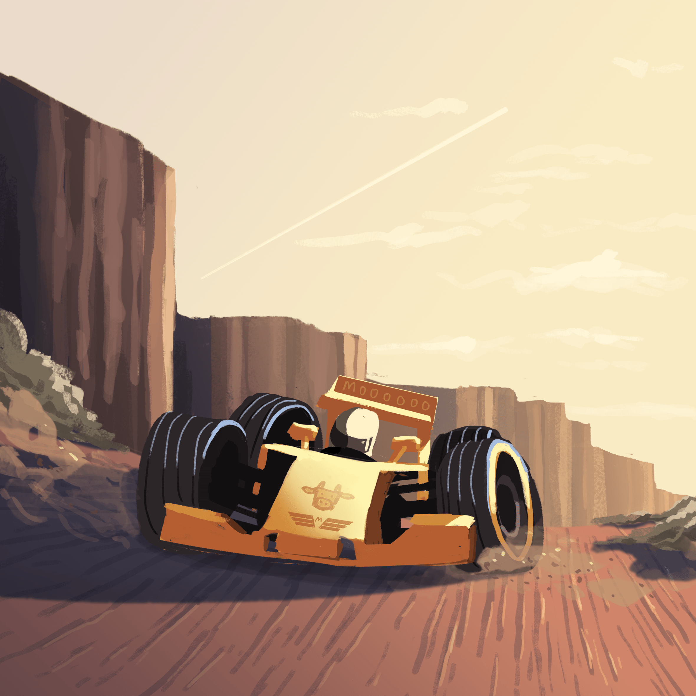
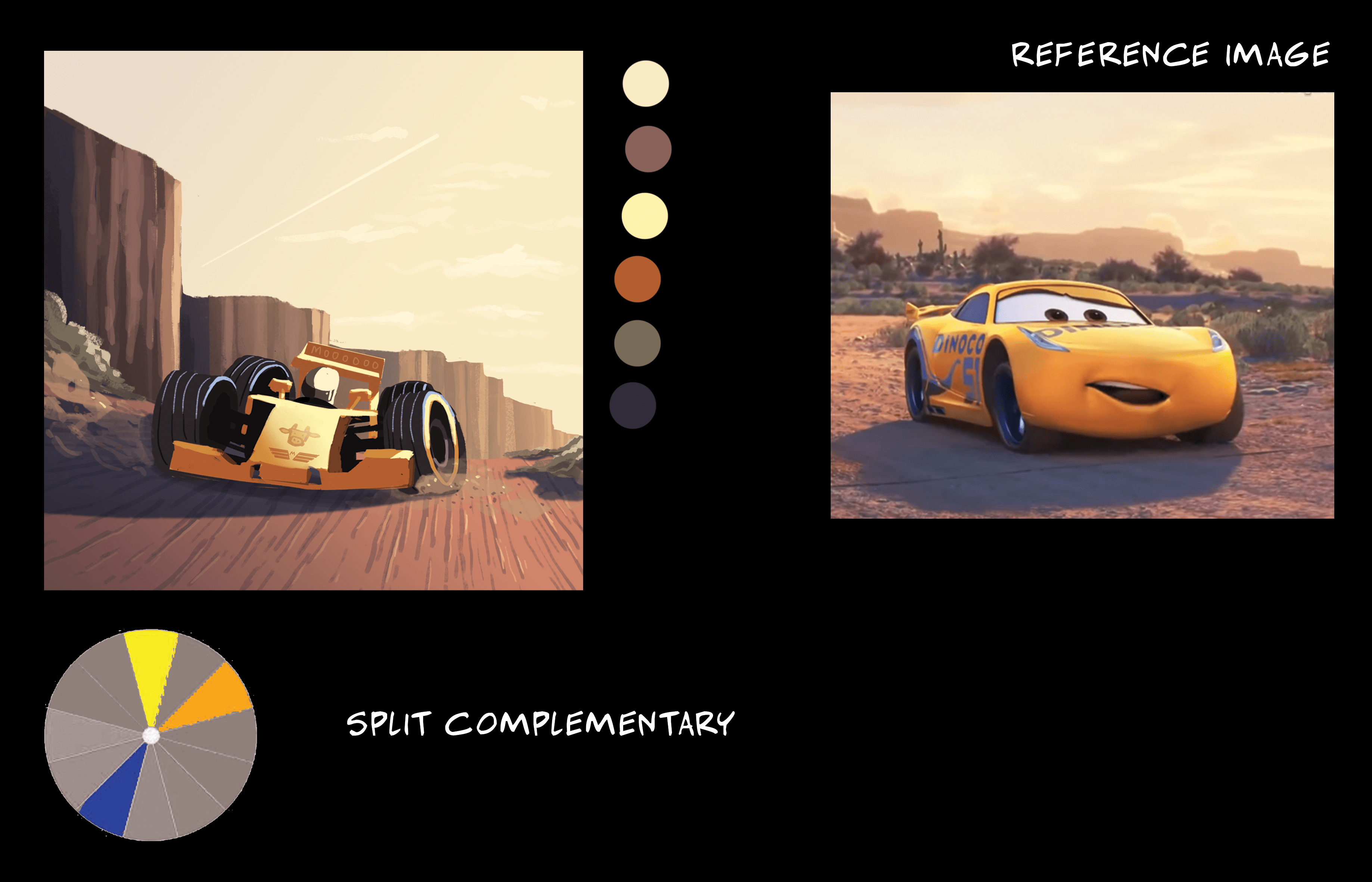
SketchColoursFinishedColour scheme and image reference (From Pixar’s Cars 3)
I had initially wanted to go for a muted greyish colour scheme with reds and greens to represent a race track environment with coloured race cars. But I thought of the outdoor environments from Pixar’s Cars and used that instead. A warm orange with complimentary colours for shadows and a tint of it in the sky, for a peaceful sunset-desert environment.
The following two weeks were spent improving the first two designs, making the tote bag, and working on two new quotes.
In this post, I’ll be covering:
Comments for first two designs from 1st group consultation.
Practising silkscreening & Tote bag creation
Ideation for 3rd and 4th designs, comments from 2nd group consultation.
Comments for first two designs
“Mankind was born on Earth … it was never meant to die here.” – Interstellar (2014)
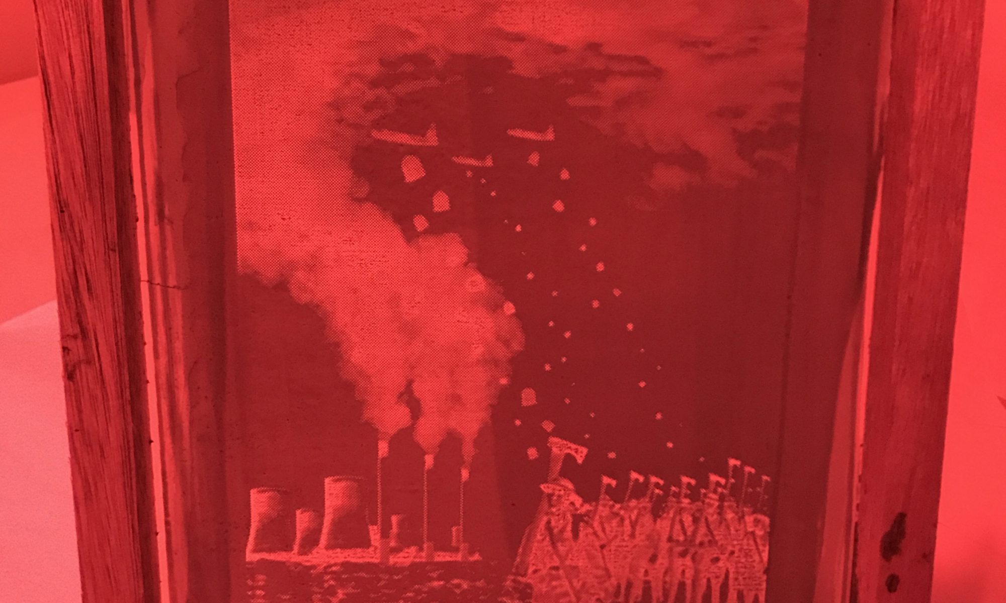
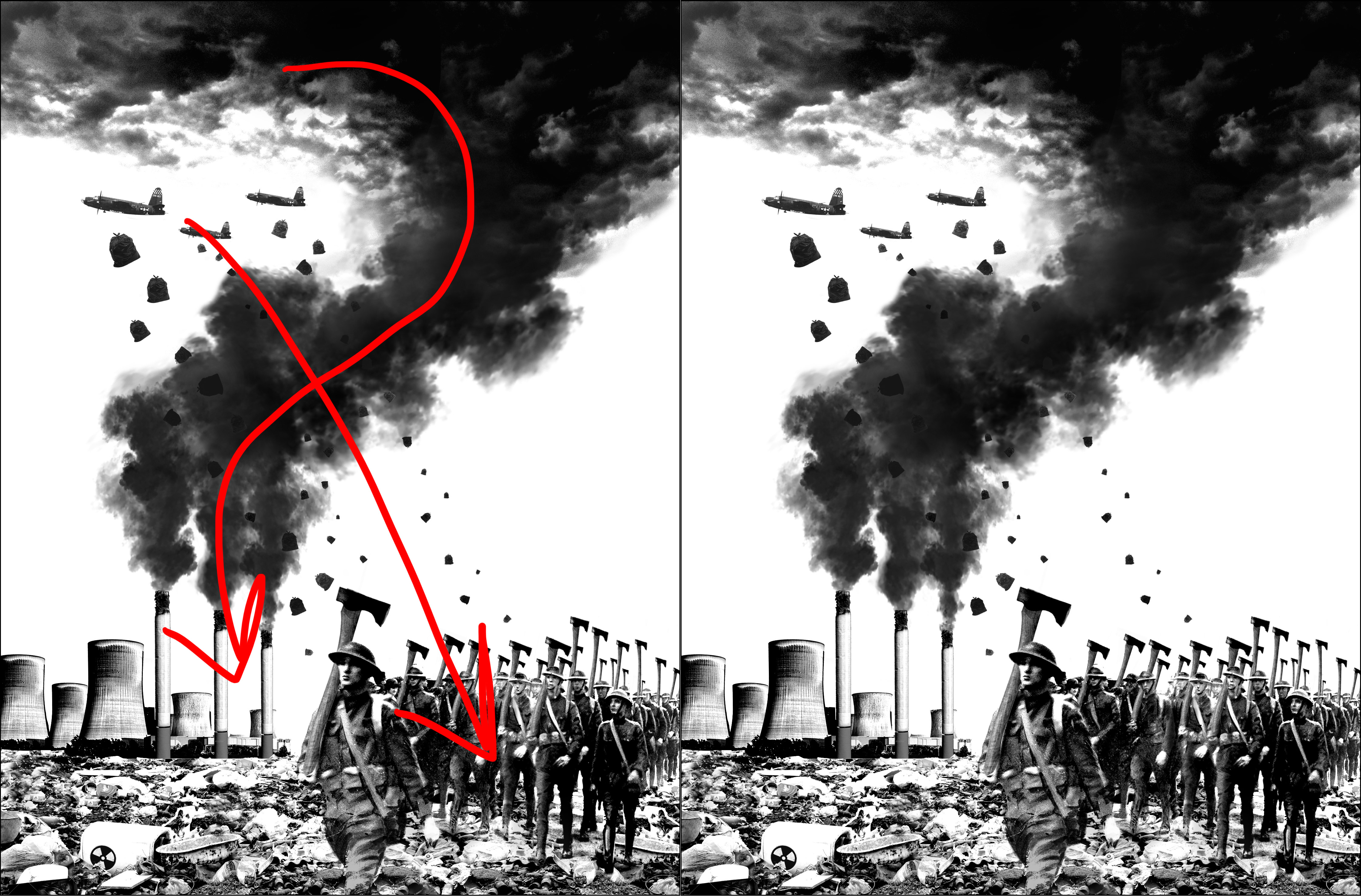
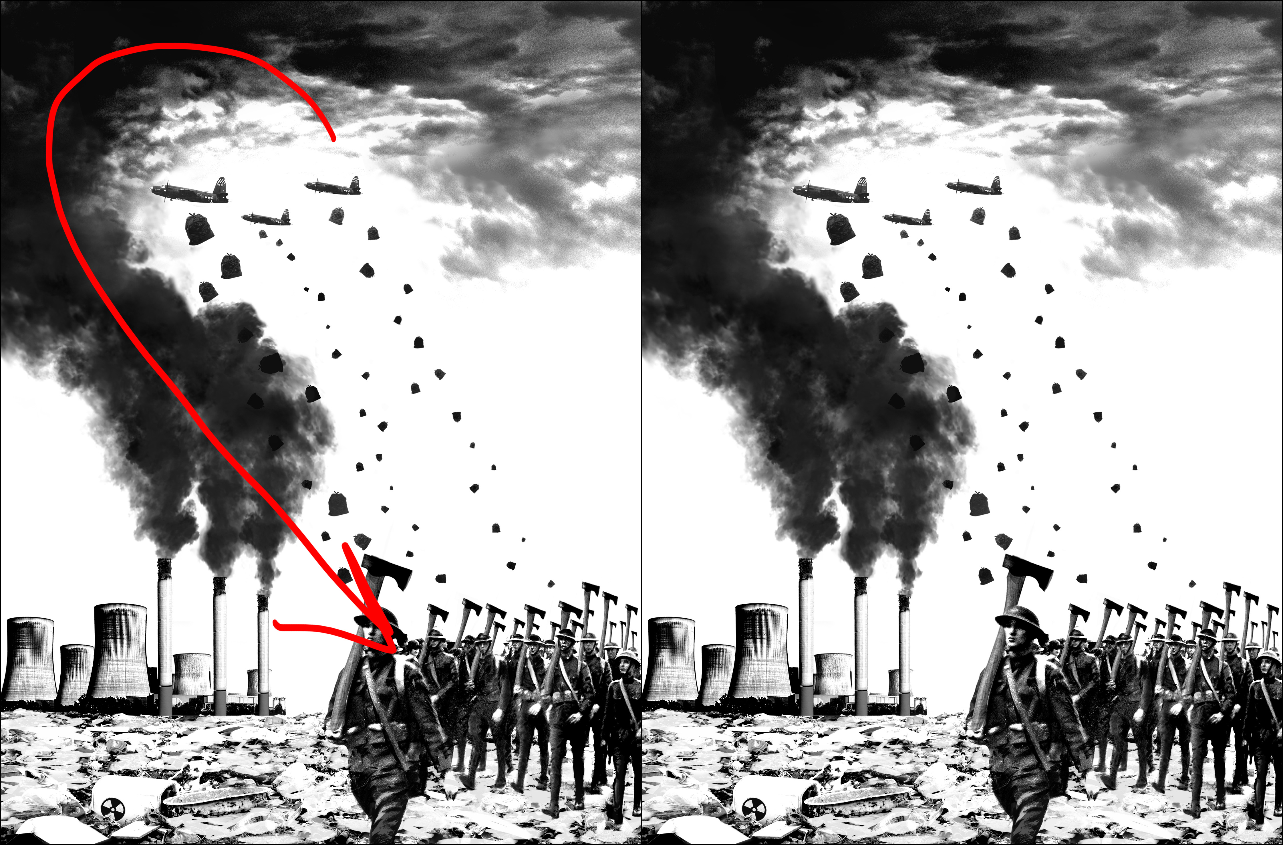
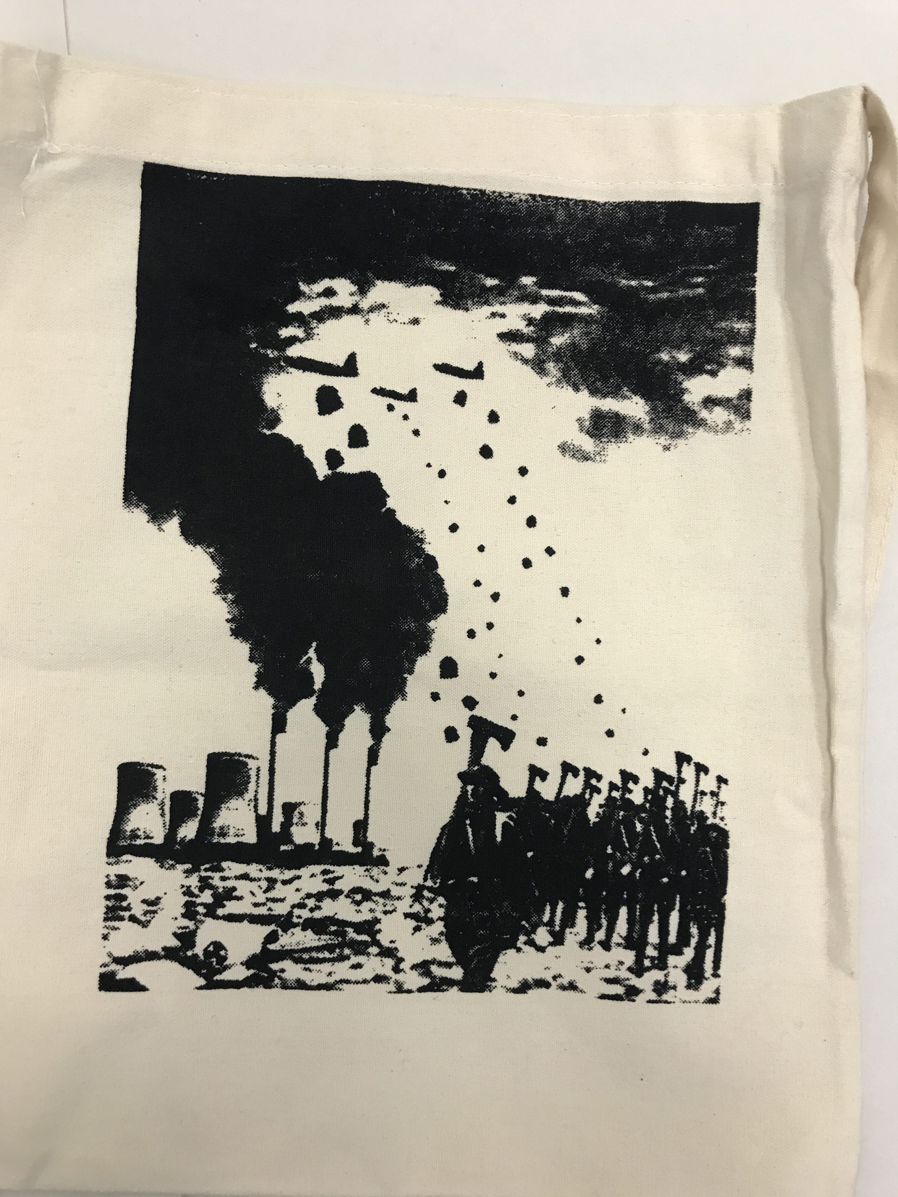
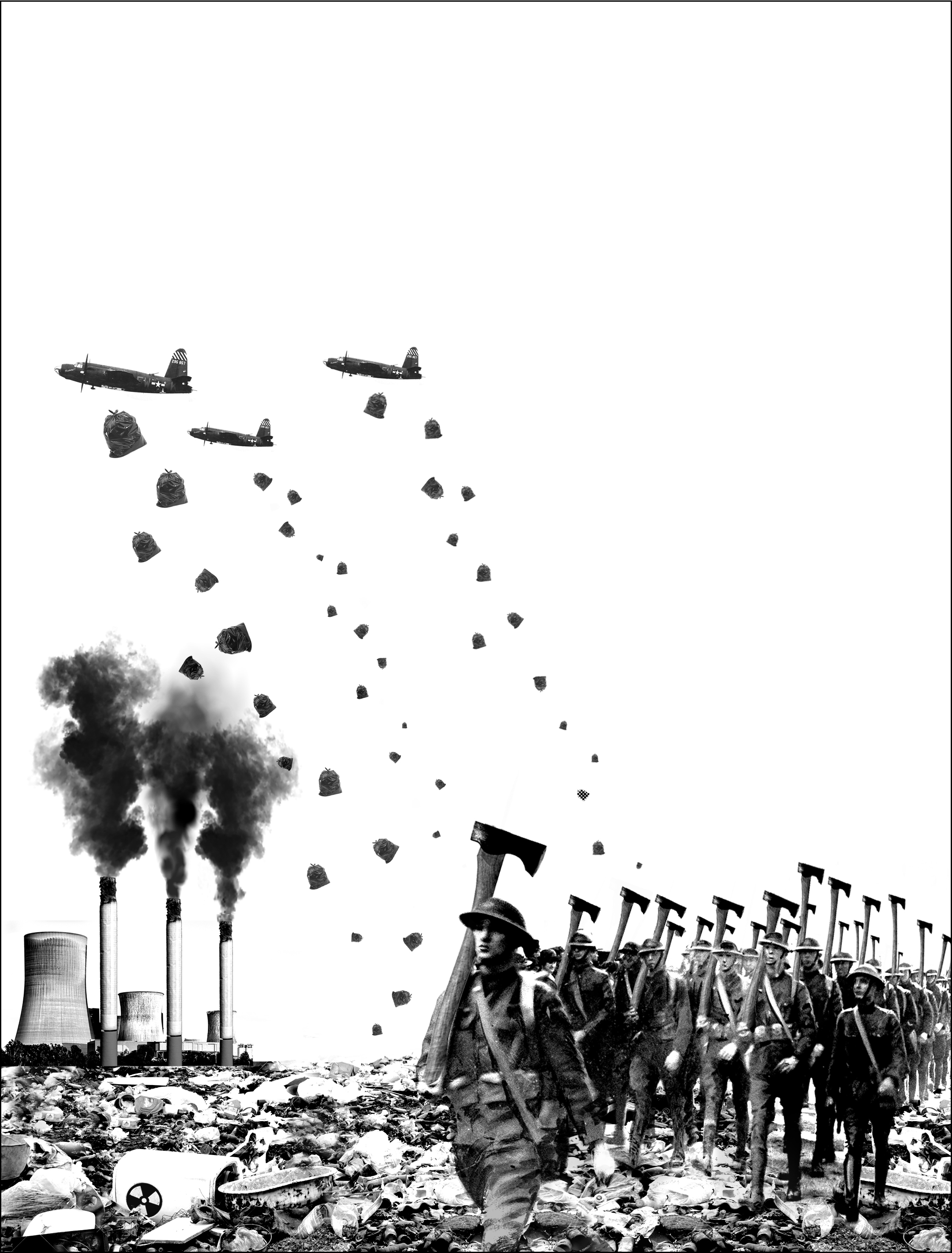
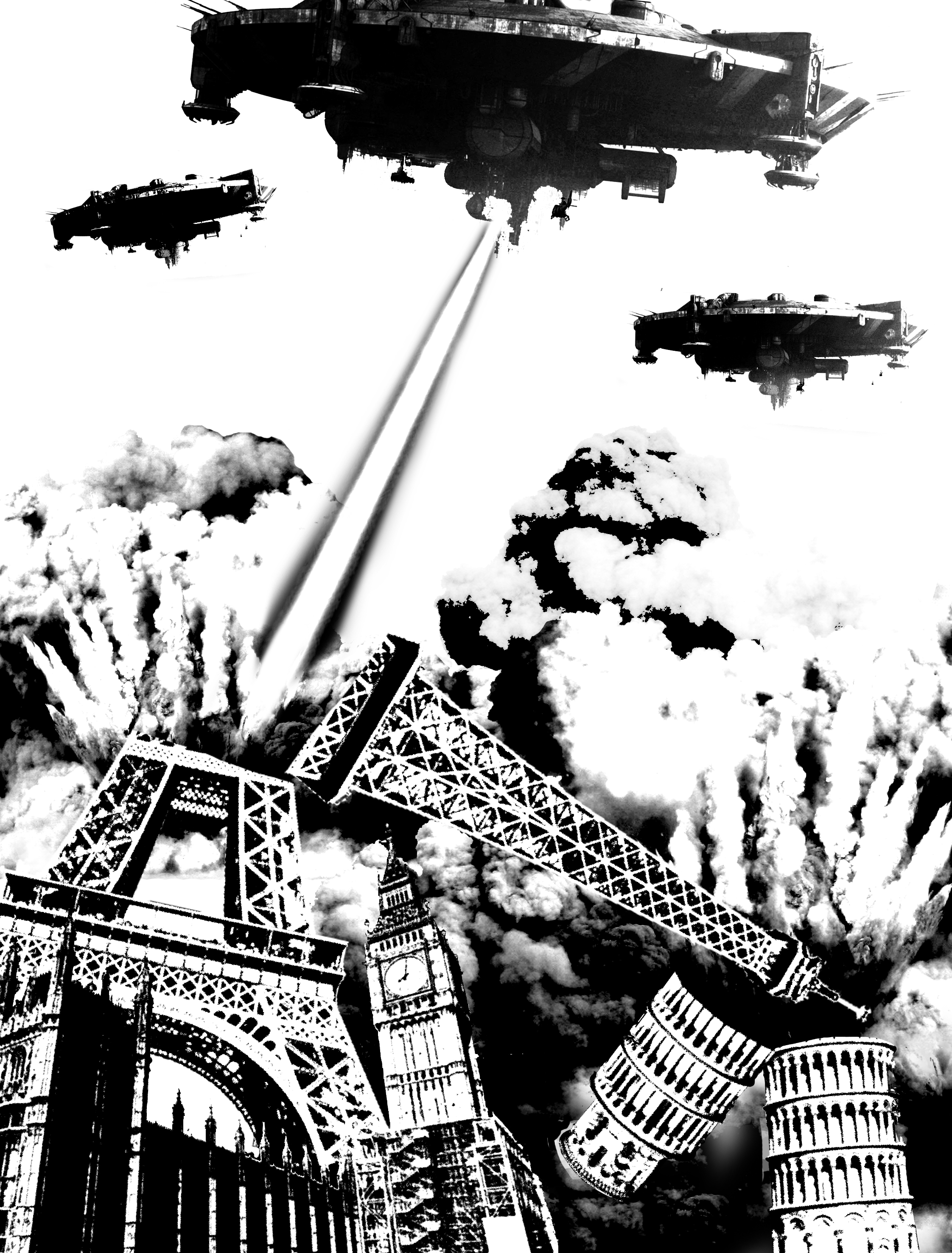
For this design, it was mentioned that the soldiers needed to have more contrast to make them pop out more, the field of garbage on the other hand had to have lesser contrast as they were too distracting. The direction of the smoke also had to be flipped to better direct the viewer’s eye.
Design 1 – BeforeDesign 1 – After
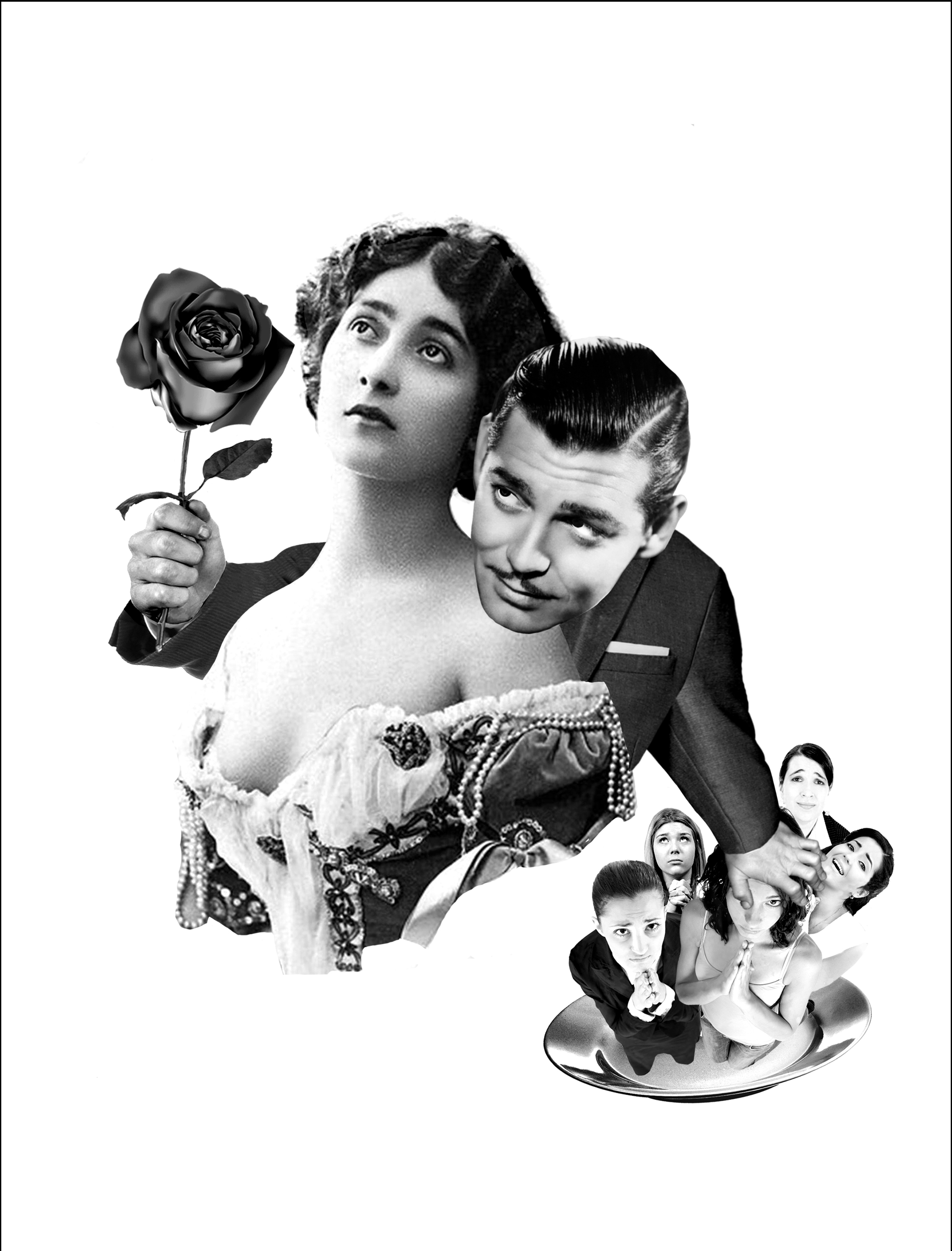
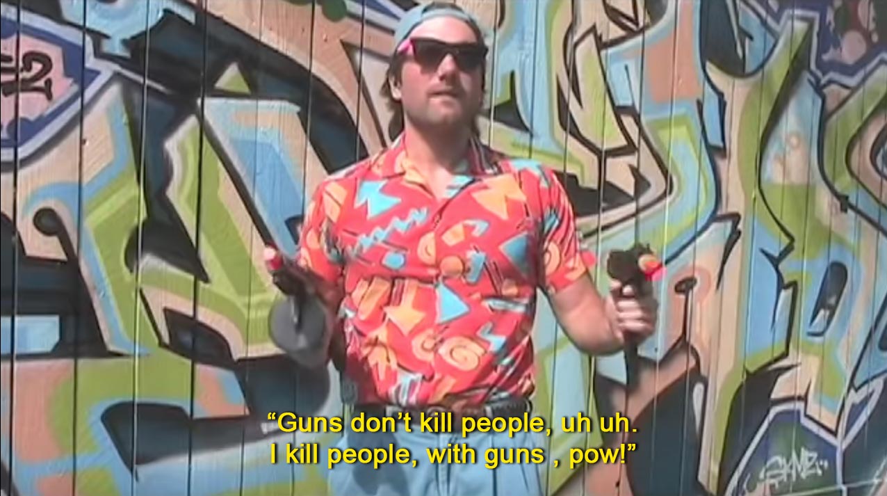
“T-Rex doesn’t want to be fed. He wants to hunt.” – Jurassic Park (1993)
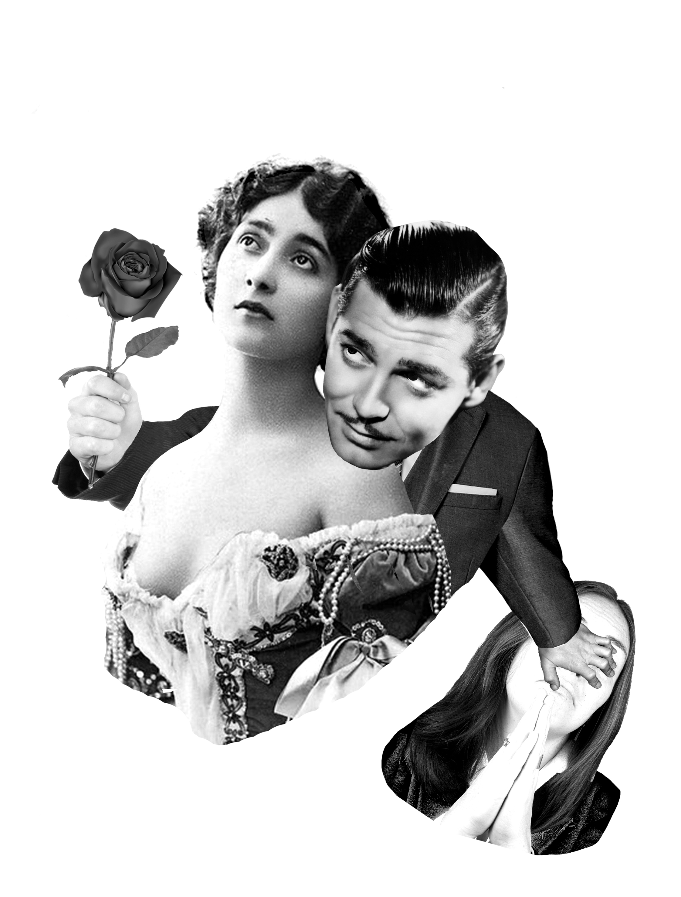
For this design, it is a little unclear that the girl being pushed away is lusting for the man, one suggestion is to replace her with a ‘world’ of women or a plate of women, the latter with reference to food from ‘be fed’. The size of the rose could be bigger so that the audience can focus on the rose and move their attention down southeast.
Design 2 – BeforeDesign 2 – After
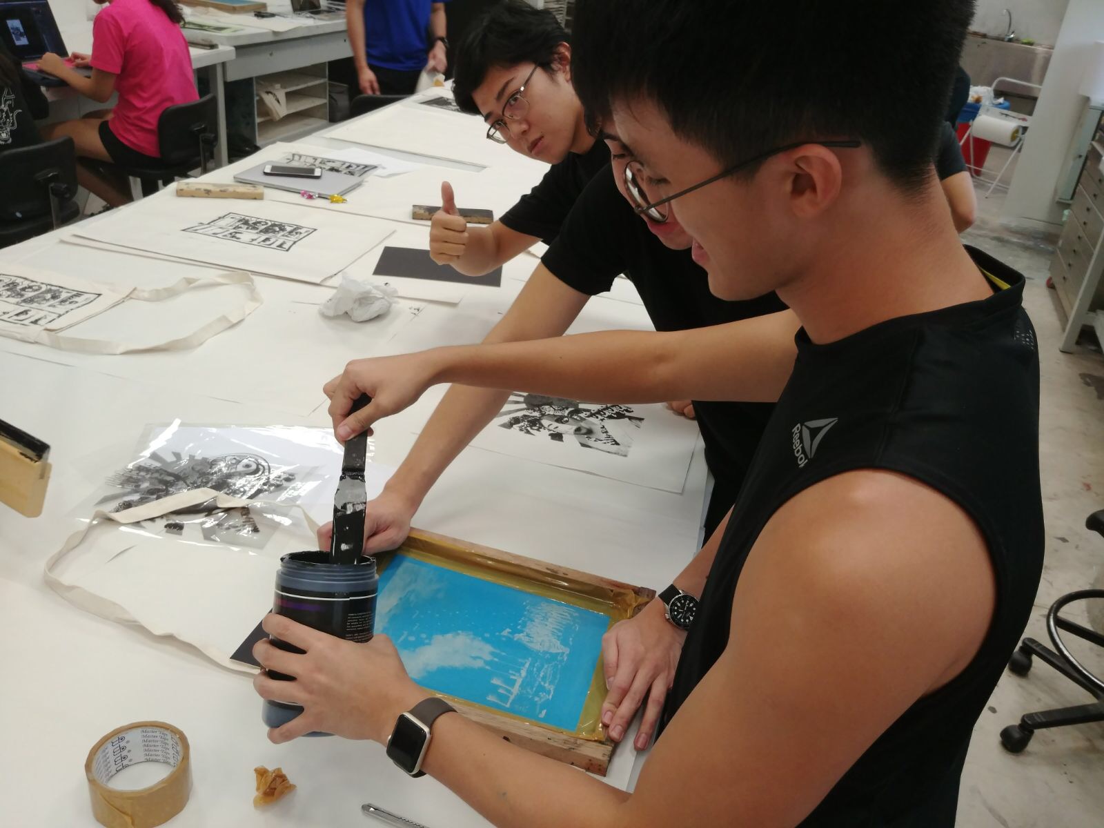
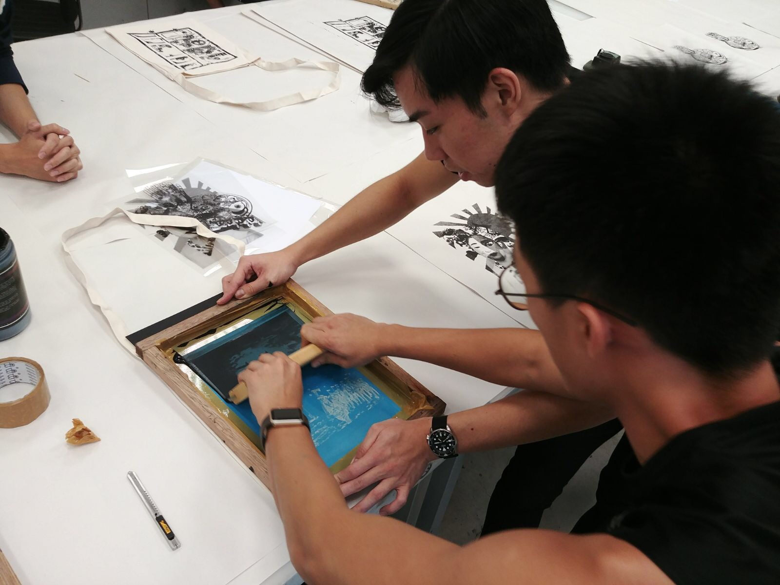
Practising silkscreening & Tote bag creation
Printing onto paperTest print of ‘version 1’ on paper
After practising, we went on to print our final designs during recess week.
Illegal photography in the dark roomApplying ink onto silk screen
Printing on tote bag
Final Product
Didn’t turn out as great as I envisioned (looks a little dark) but I was happy with it, the reduced details of the field of trash worked well; the trash bags look like trash bags, I was afraid it would look like blobs of ink.
Tote Bag
Ideation and comments of 3rd and 4th designs
The week before the deadline, I worked on my final two designs.
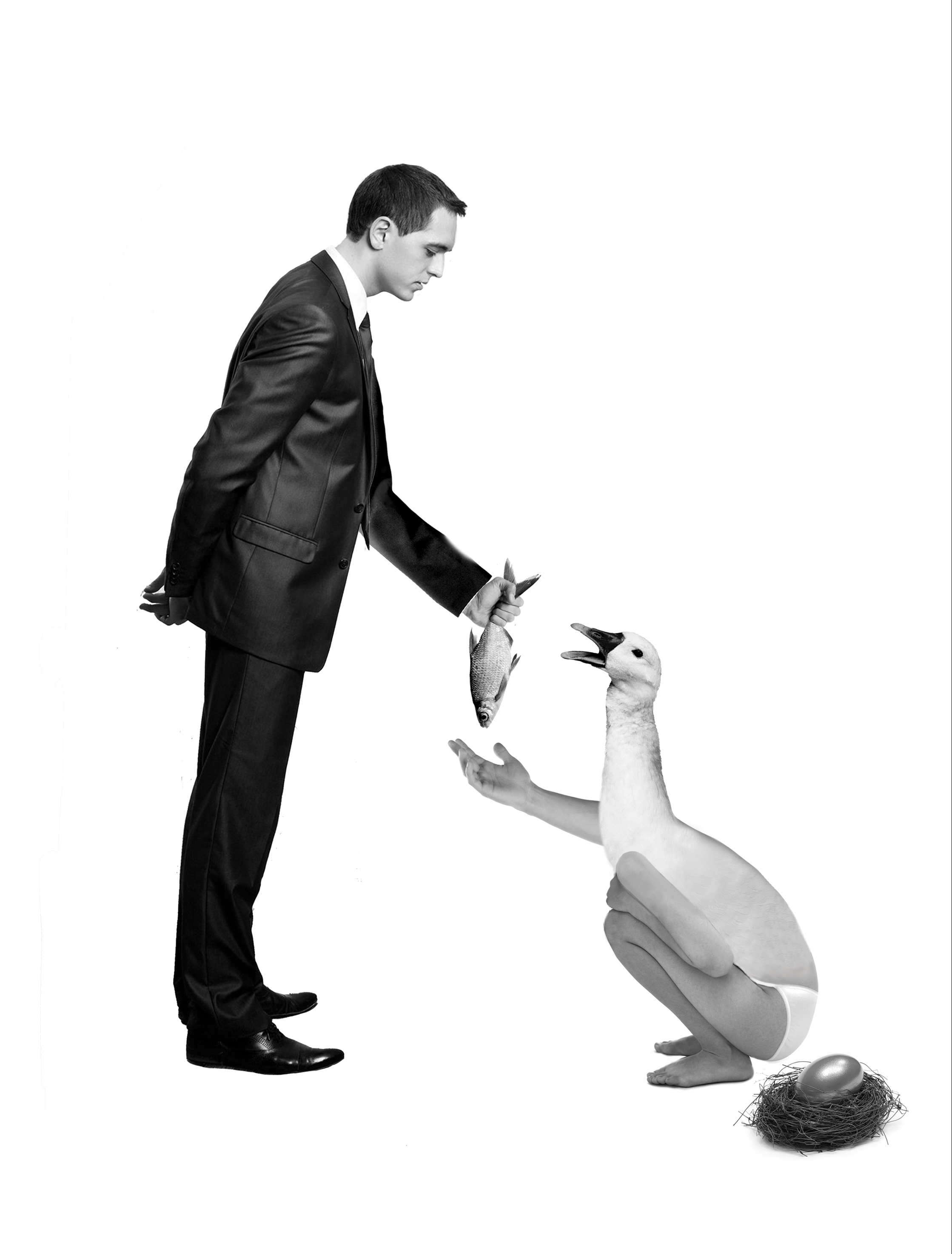
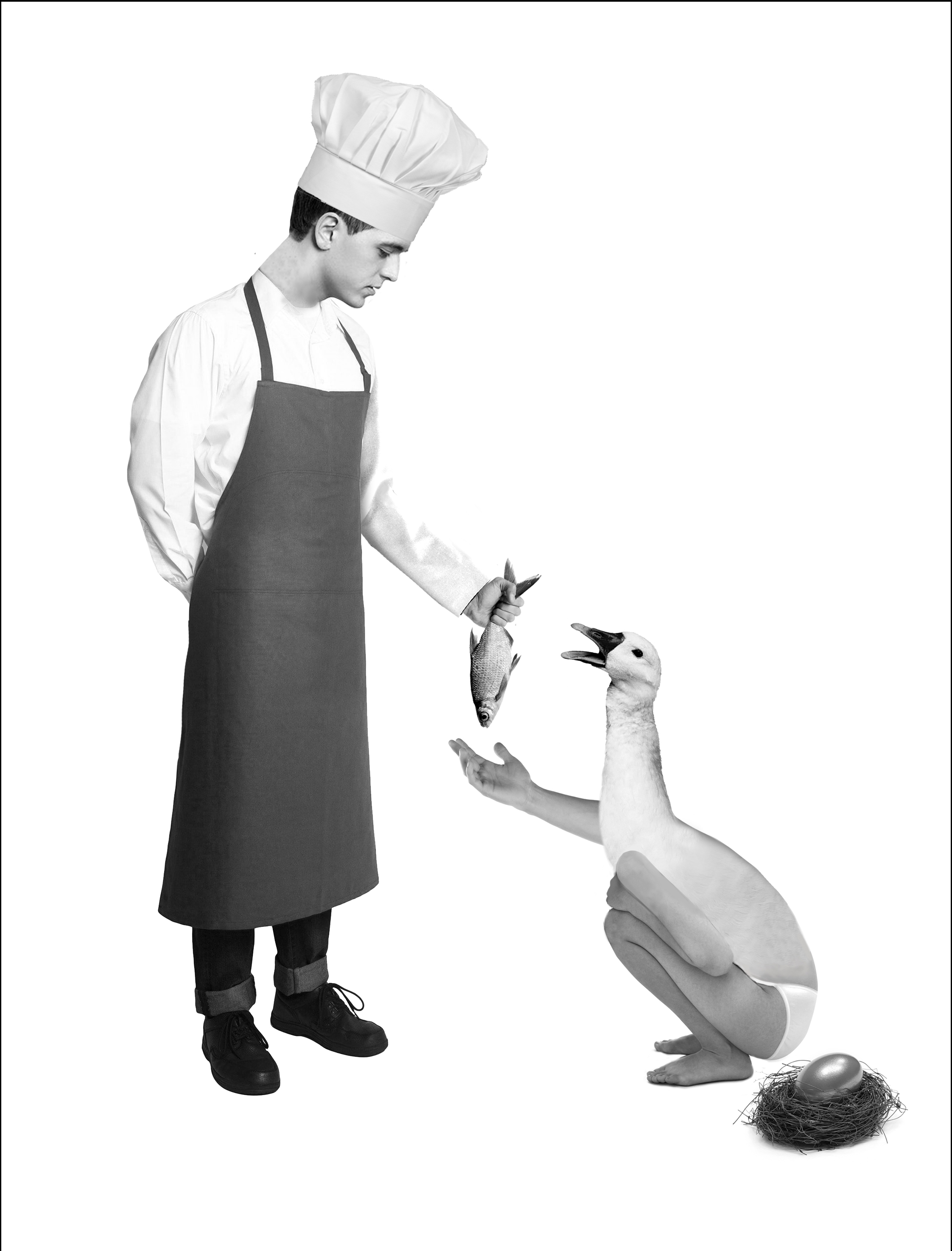
“If you are good at something never do it for free” – The Dark Knight (2008)
For this quote, I referenced the story of the Golden Goose, instead of giving its golden eggs for free to the little boy in the story (I think there was a little boy), I made the goose demand payment for it, in this case, to a man. I deviated from ‘money’ for this quote and used fish instead as the form of payment. I used a chef instead of a business man as it fitted the theme better.
Draft 1Final design
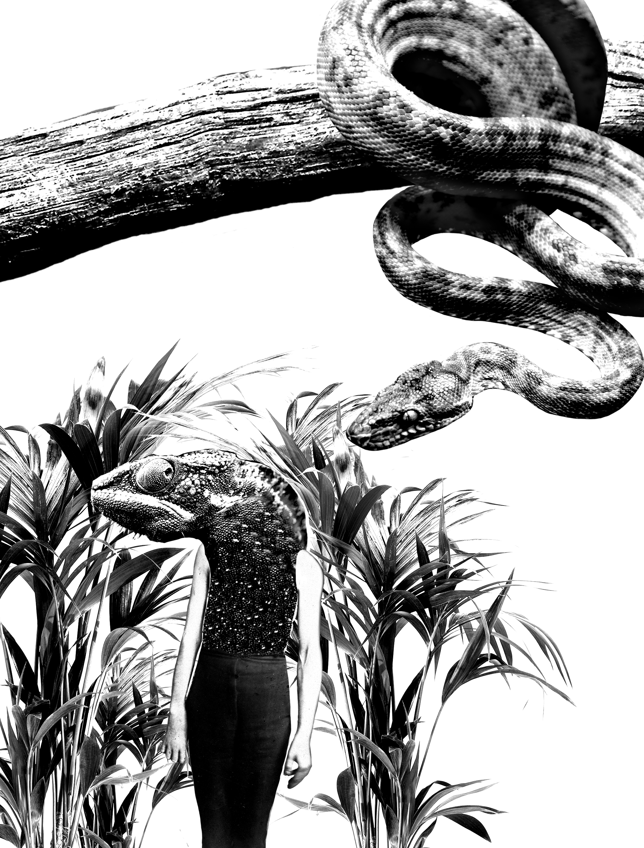
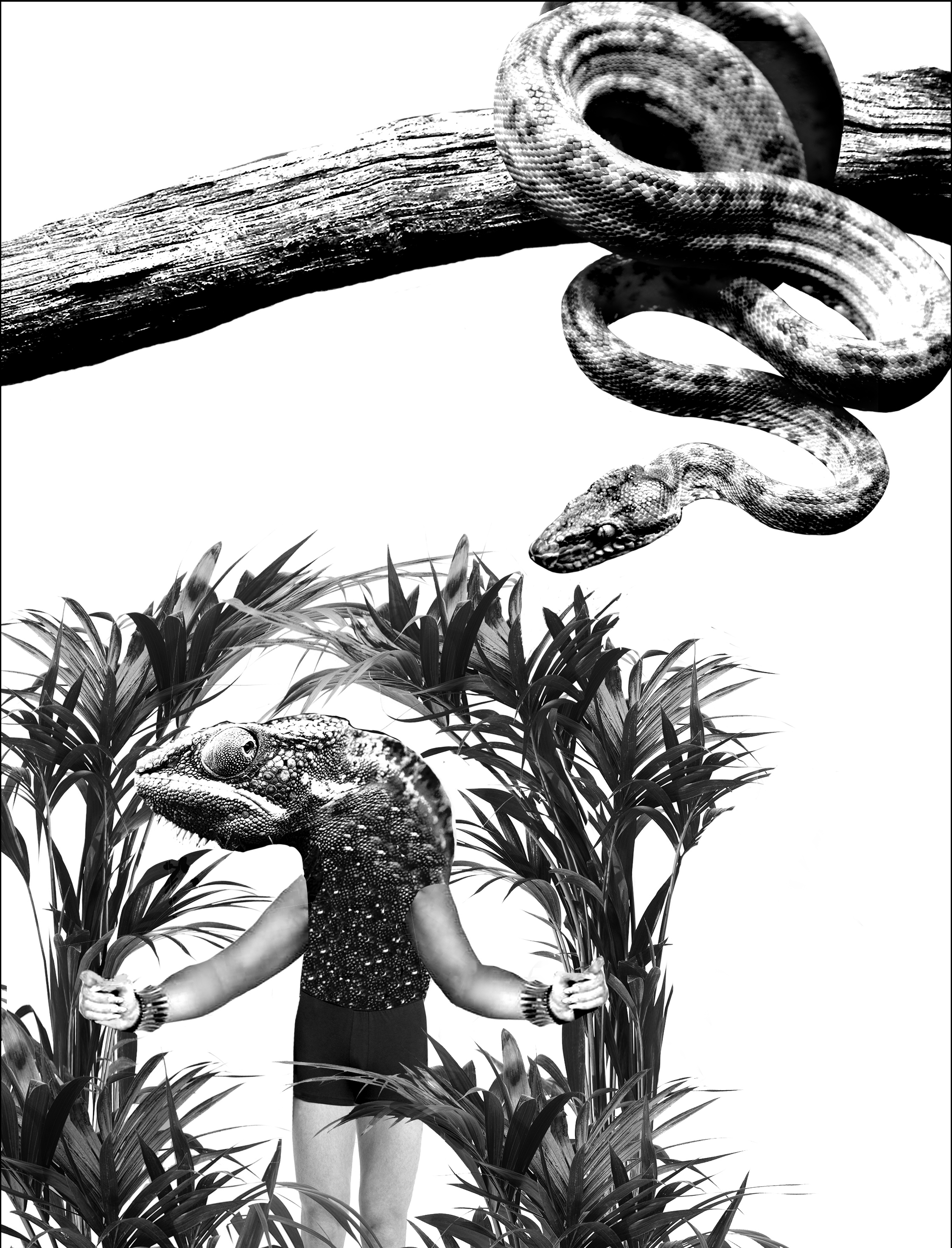
“You are no longer black, or brown, or yellow, or red! You are now green! You are light green! Or dark green!”- Jarhead (2005)
As the quote is talking about soldiers and their camouflage, I went on to use the classic example of camouflaging, chameleons. Comments from the consultation were that the chameleon could stand out more, the plants are interrupting the silhouette, one suggestion is that the chameleon could be holding up the plants. As the snake is not the main focal point, it can be smaller.
For this project, we were tasked to pick four movie quotes and create visual narratives that expresses each quote.
The following are the initial quotes I have chosen:
“Mankind was born on Earth … it was never meant to die here.” – Interstellar (2014)
“T-Rex doesn’t want to be fed. He wants to hunt.” – Jurassic Park (1993)
“They like to get the landmarks.” – Independence Day: Resurgence (2016)
“Good lord, what is it about women with little hats?” – The Imitation Game (2014)
“Mankind was born on Earth … it was never meant to die here.” – Interstellar (2014)
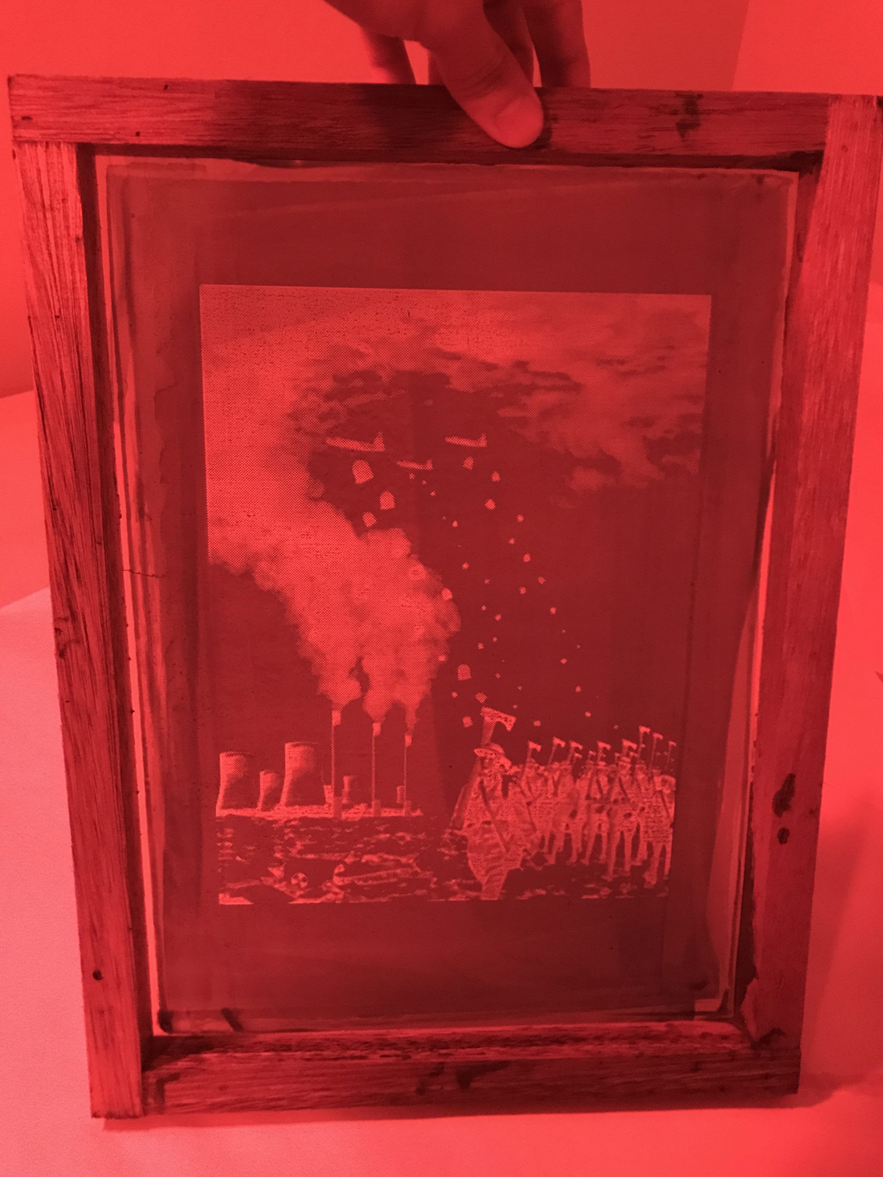
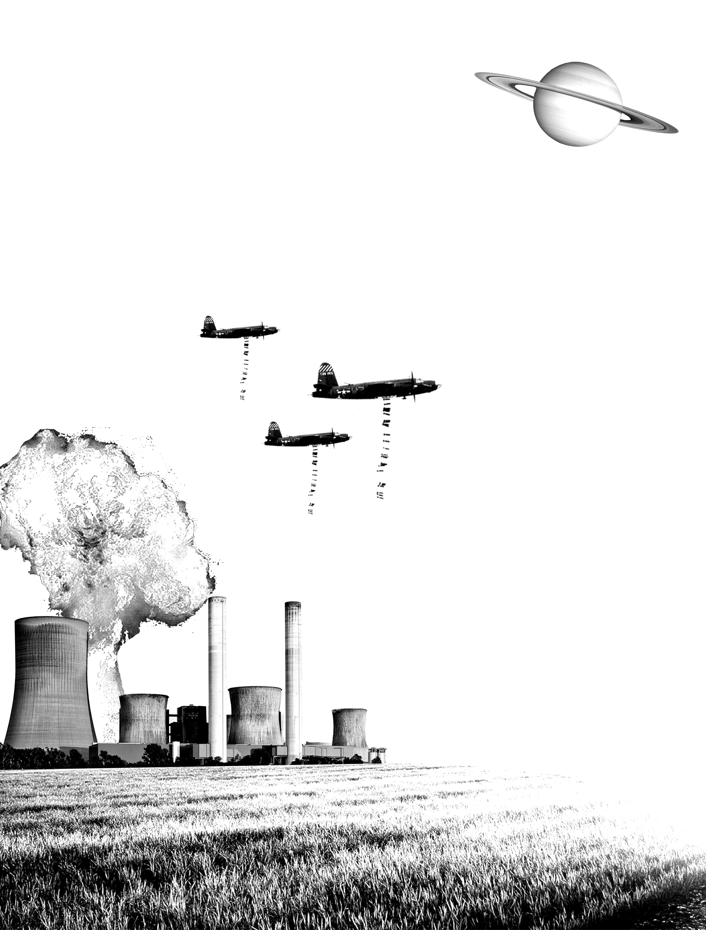
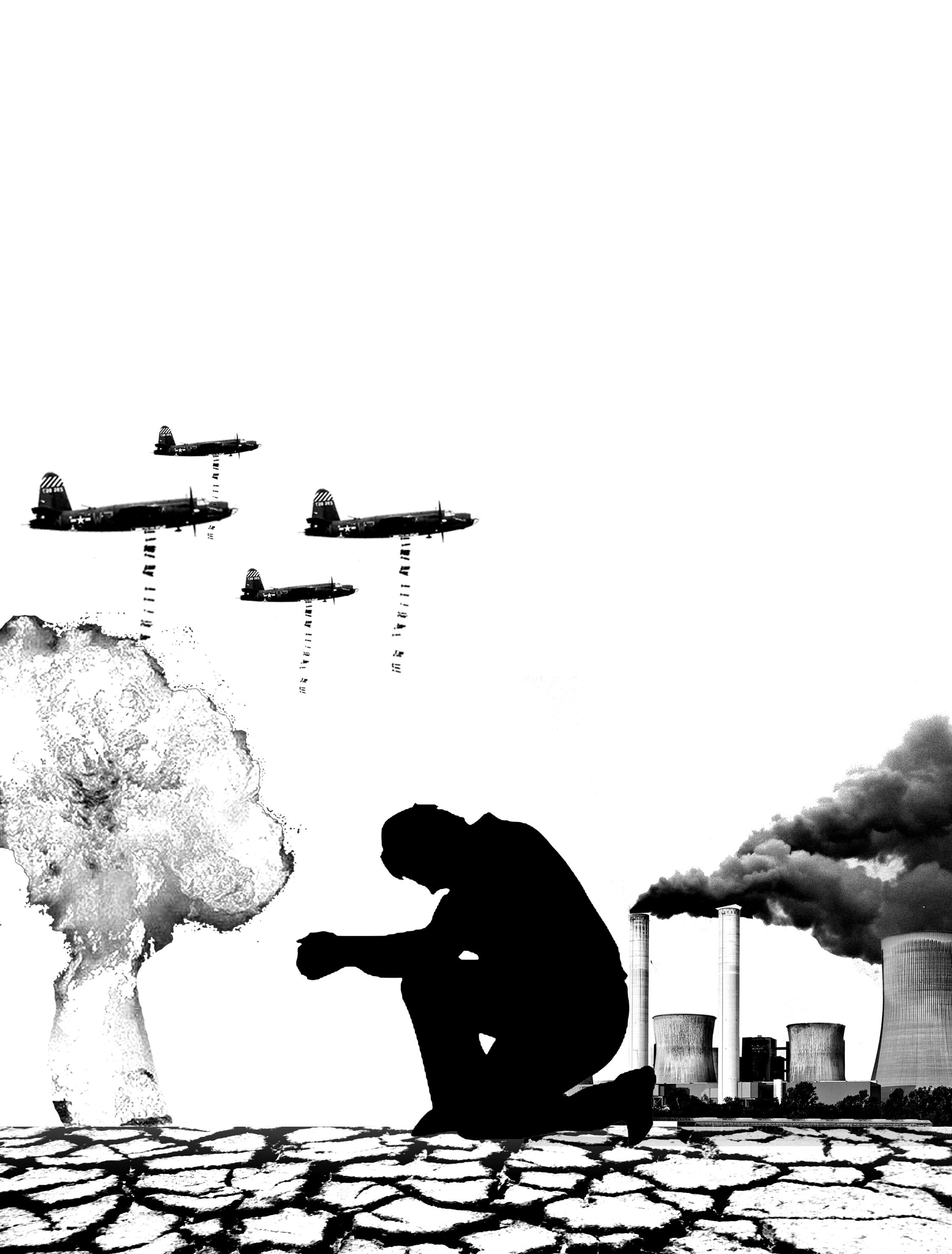
I wanted to go for a somewhat apocalyptic scene, showing dangerous scenarios such as a nuclear power plant explosion and war planes dropping bombs, the crop field was inspired from the movie, which was set in a farm where the crops were infected with blight, threatening mankind’s survival. The planet represents the supposed future home of mankind.
The first draft was too plain and too ‘on the nose’.
Draft 1
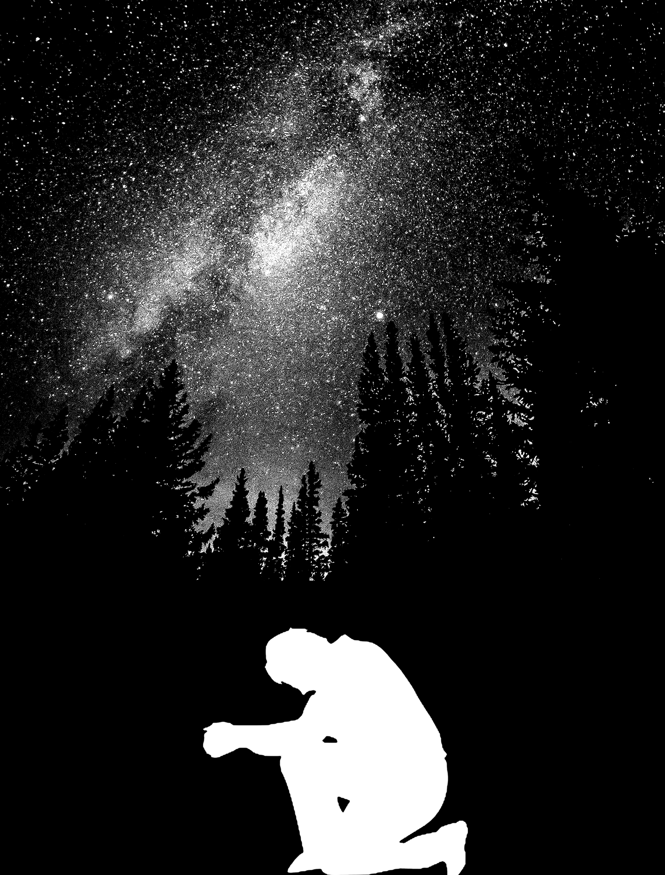
I did a few more drafts, with the addition of the silhouette of a man, his ‘praying pose’ representing the impending death of mankind and him seeking redemption.
Draft 2
The starry night sky implies that mankind will one day move to another planet.
Draft 3
Using the silhouette as the canvas.
Draft 4
Joy had suggested to change some of the objects to interpretations instead, for example, a burning cigarette could represent the chimneys of power plants, both contributing to air pollution. The following are interpretations I have included:
Chimneys of the power plant replaced by cigarettes, both contribute to air pollution.
War planes dropping trash bags, similar to bombs, both destroy the land in their own way.
Soldiers wielding axes, which kill trees like how guns kill people.
However, I had to work on the composition as there was no focal point, and the triangle formed in the middle seemed very awkward.
Draft 5
An improvement on the composition, however, I felt that I could add something more to the sky.
Draft 6.1
When I added the clouds, it seemed that they could merge with the smoke coming out from the chimneys!
Draft 6.2
With the ‘ clouds’ added, I tweaked the composition, applying the rule of thirds (which I wondered why I didn’t use in the first place).
Draft 6.3
Below is the final composition for this quote.
Draft 6.4 – Final Draft
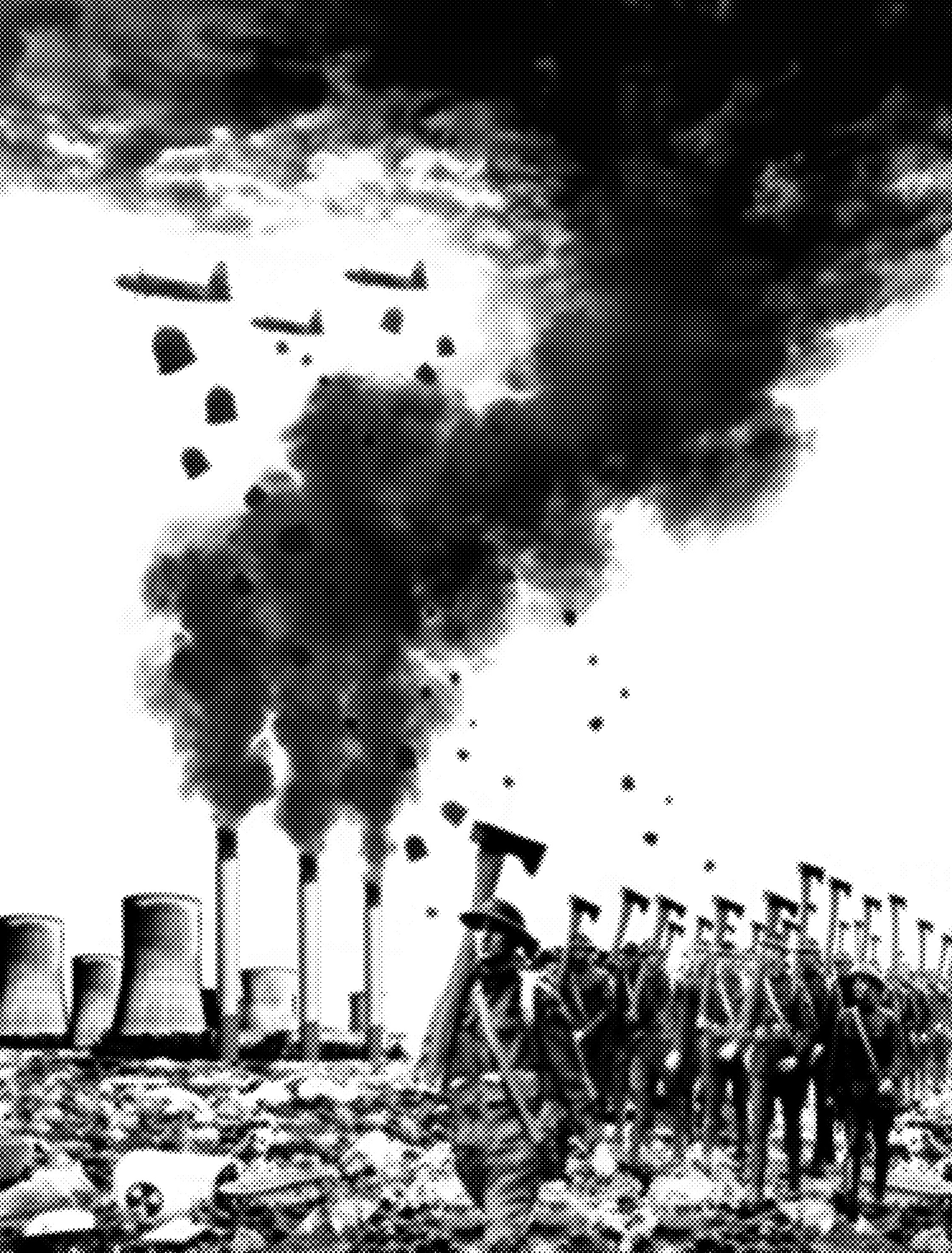
Halftone applied, this will be the image I will be using for my tote bag.
Final image with halftone for silk screening
“T-Rex doesn’t want to be fed. He wants to hunt.” – Jurassic Park (1993)
For my first draft, I applied anthropomorphism to T-Rex, he is rejecting the food in front of him, implying that he doesn’t want to be fed and wants to hunt for his own food. Joy mentioned it was too straightforward, and I should try not to use any of the elements in the quote, for example, I could change T-Rex to something else.
Draft 1
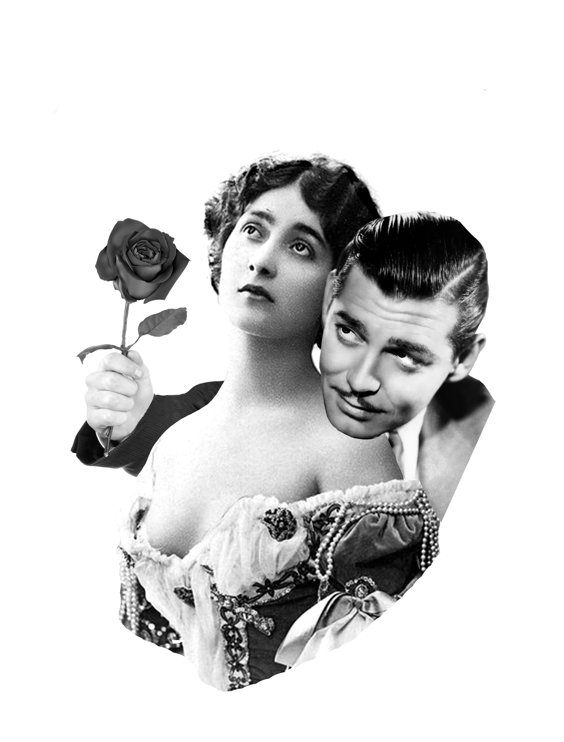
For my second draft, I was inspired by the saying of “Enjoying the thrill of the chase”, which Joy gave me for an example. I have depicted a man (T-rex), wooing (wants to hunt) a girl, but the girl is rejecting him (but he is likes when they play hard to get, i.e he doesn’t want to be fed).
Draft 2
For the third draft, I felt that the “he doesn’t want to be fed” part was not clear enough, hence, I made him pushing another woman away who appears to be pleading for his approval, i.e. he doesn’t want free ‘meals’ coming his way.
Draft 3
“They like to get the landmarks.” – Independence Day: Resurgence (2016)
Just like in the movie and what this quote represents, I portrayed aliens destroying some of the world’s iconic landmarks.
Draft 1
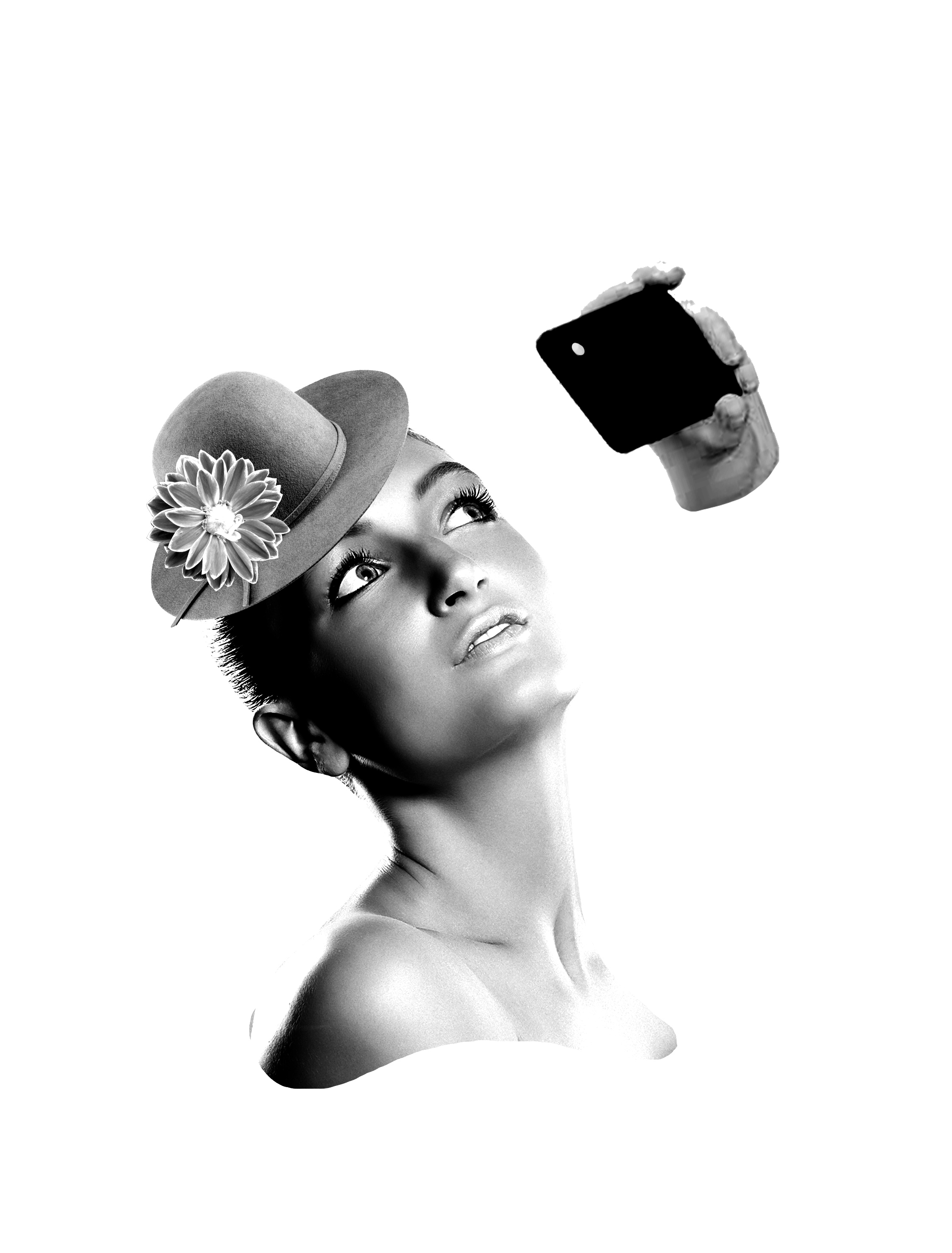
Another way of interpreting this quote will be showing tourists ‘targeting’ landmarks for selfies.
Draft 2
However, I might be scrapping this quote as I am not too pleased with the results.
“Good lord, what is it about women with little hats?” – The Imitation Game (2014)
Honestly, I was focusing on the first two quotes and just put together something for the third and fourth quotes. I will be working on another two quotes in the following weeks, but first, let me take a sel-
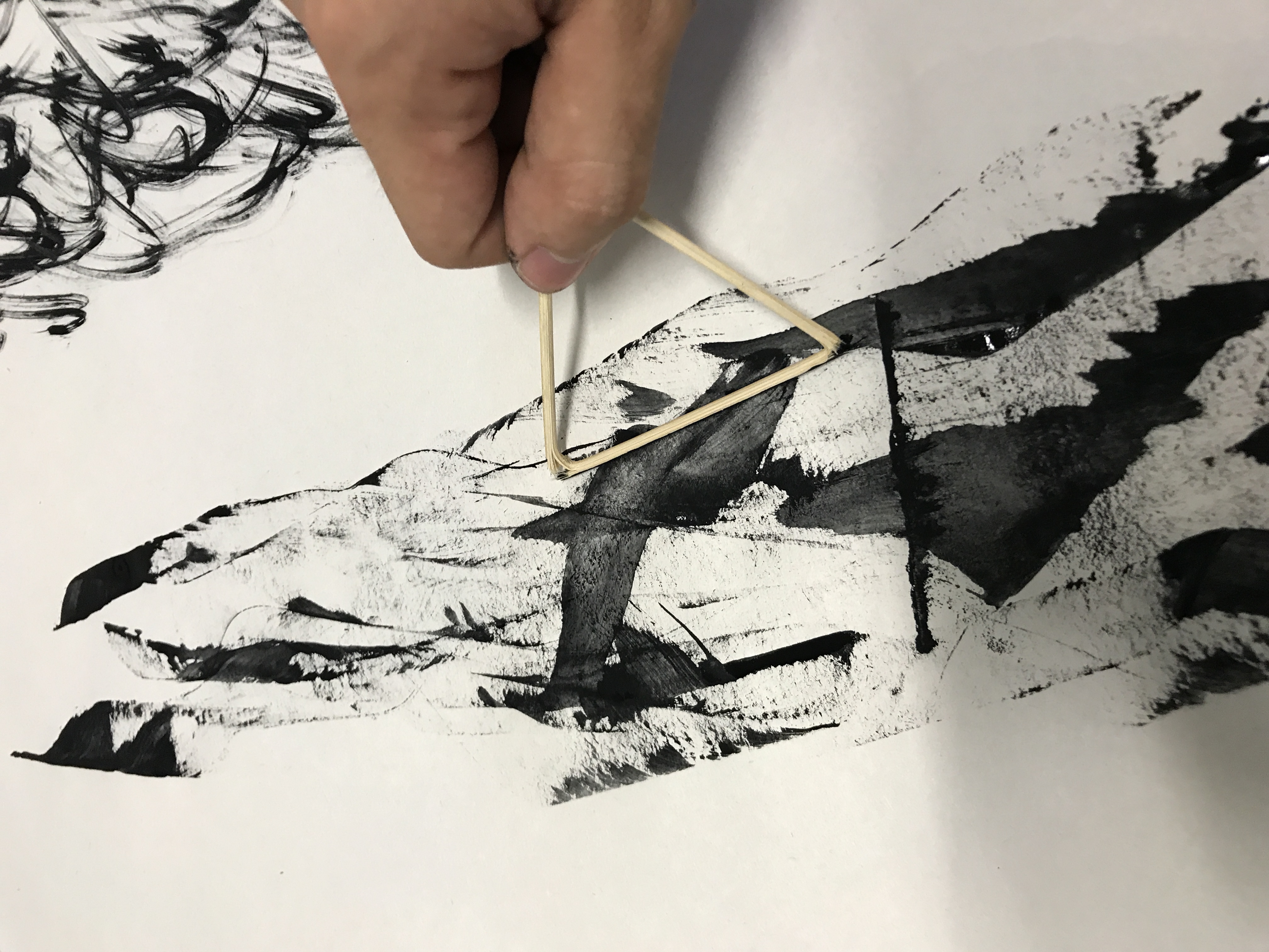
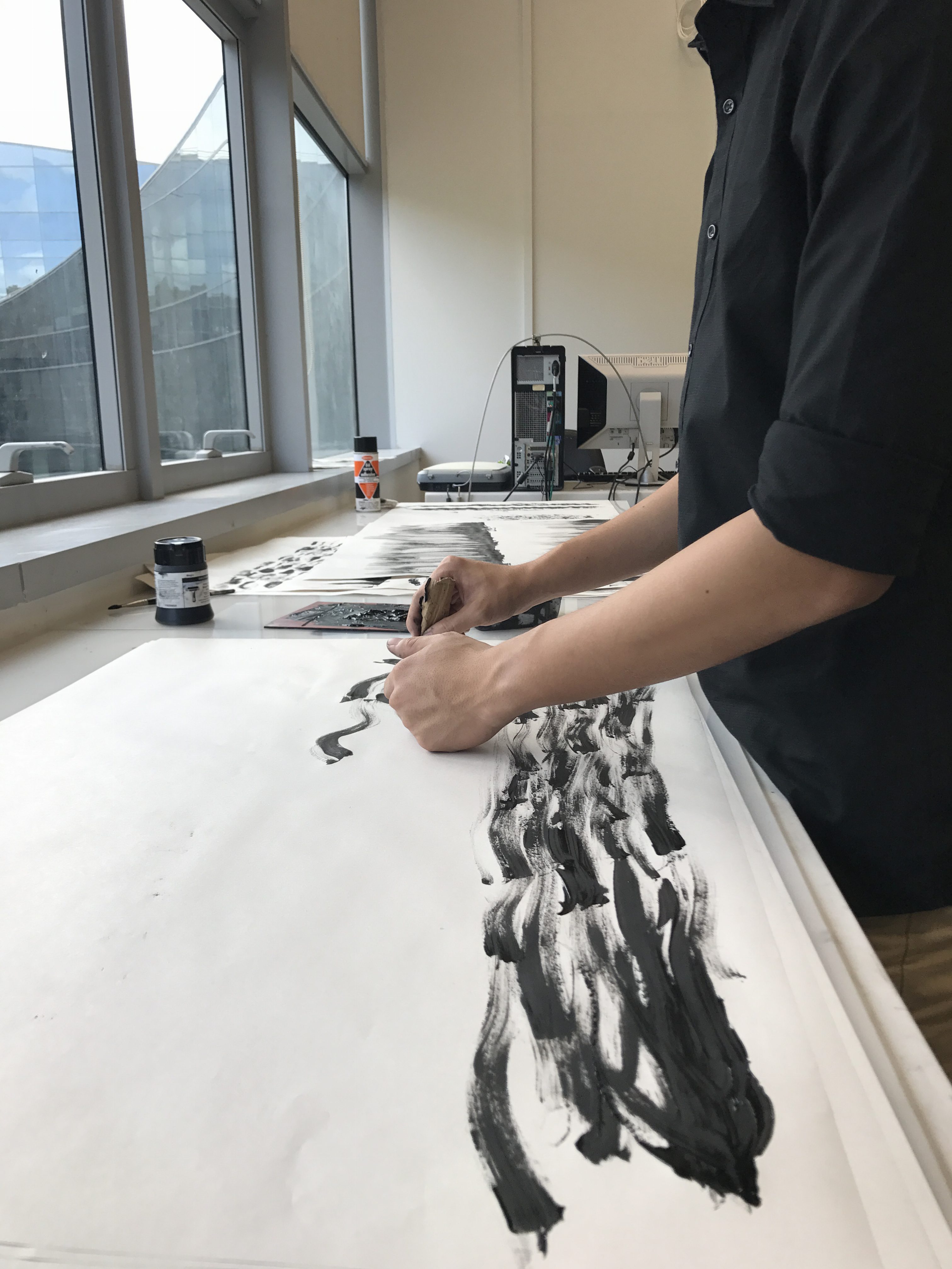
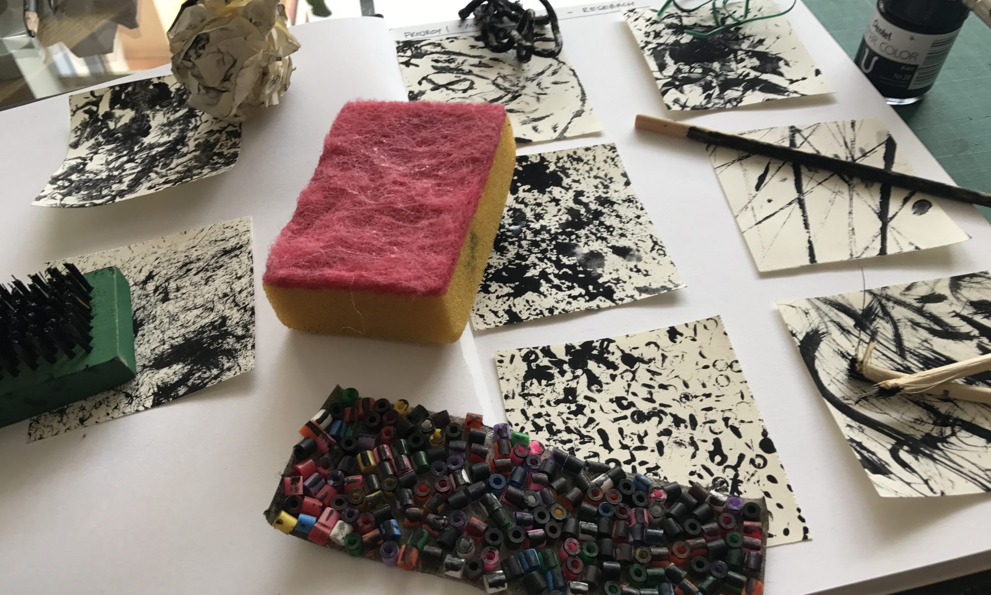
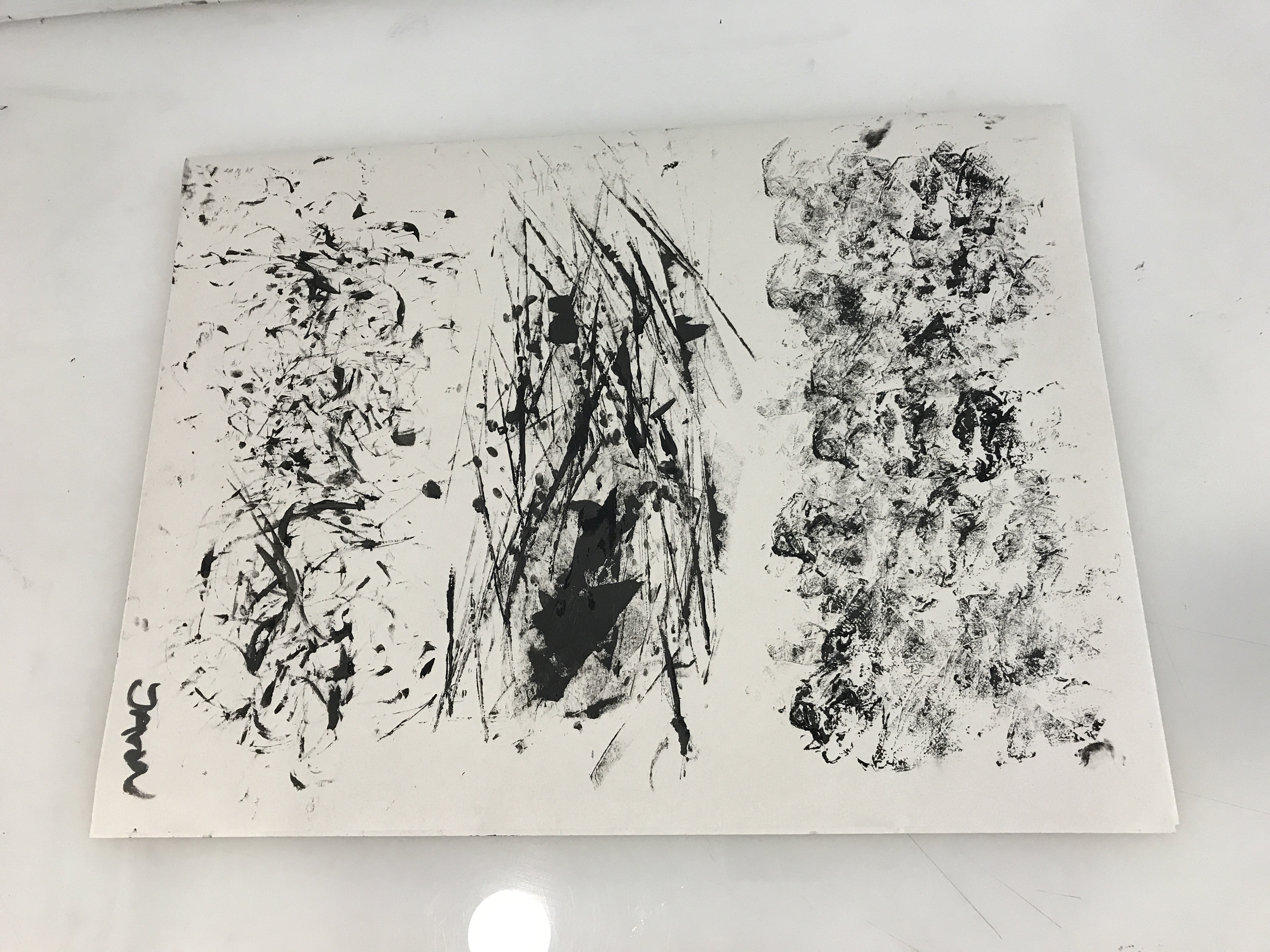
Before the start of this week’s class, I did several different prints during my spare time. They turned out quite well and I saw potential in some of them for my final submission.
Dripping ‘tears’Karate Chop!Exploring different methods of using satay sticksResults of the various prints
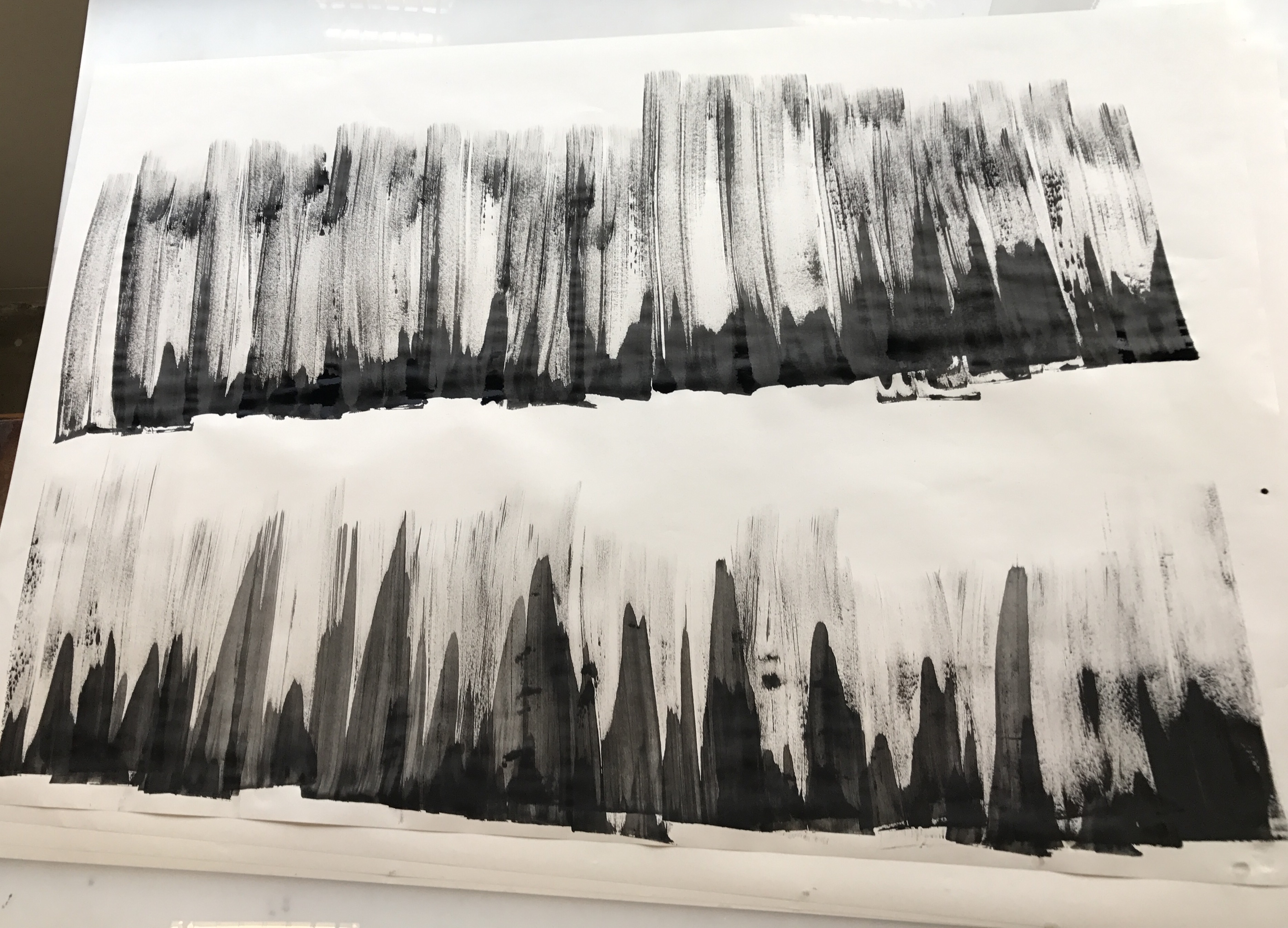
During the consultation with Joy in class, she suggested that I try using different inks, such as Chinese ink, to replicate those prints that I have made previously which I saw potential in. She also suggested making the prints much bigger so that I have more freedom to choose which parts looked better.
UpsizingMore upsizing, using different inks.
After upsizing a few, I actually found that the previous smaller versions of the prints looked better, it was probably because the patterns looked too huge when placed in the viewfinder I created, which was the size our final ‘strips’ were supposed to be. It didn’t work out, but at least I tried it.
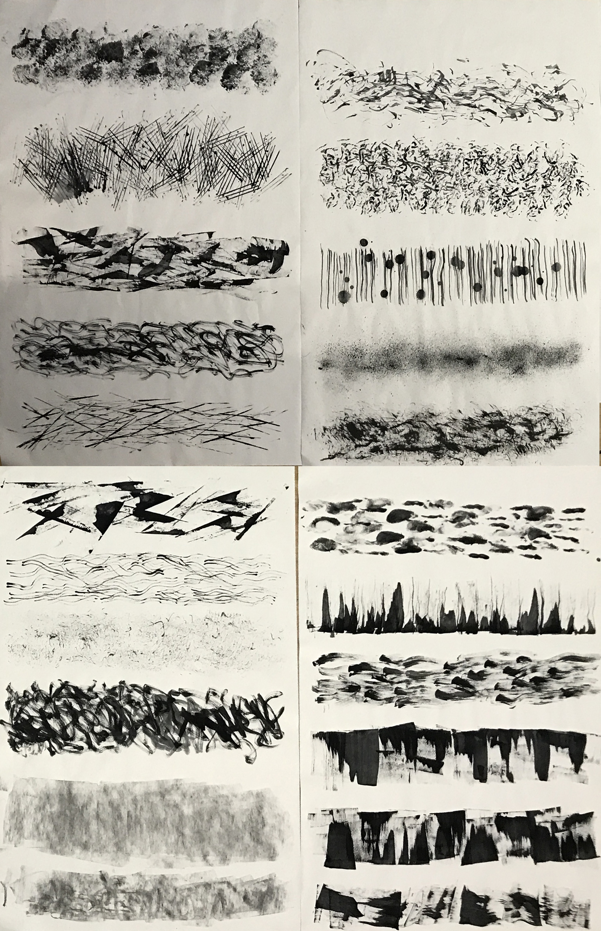
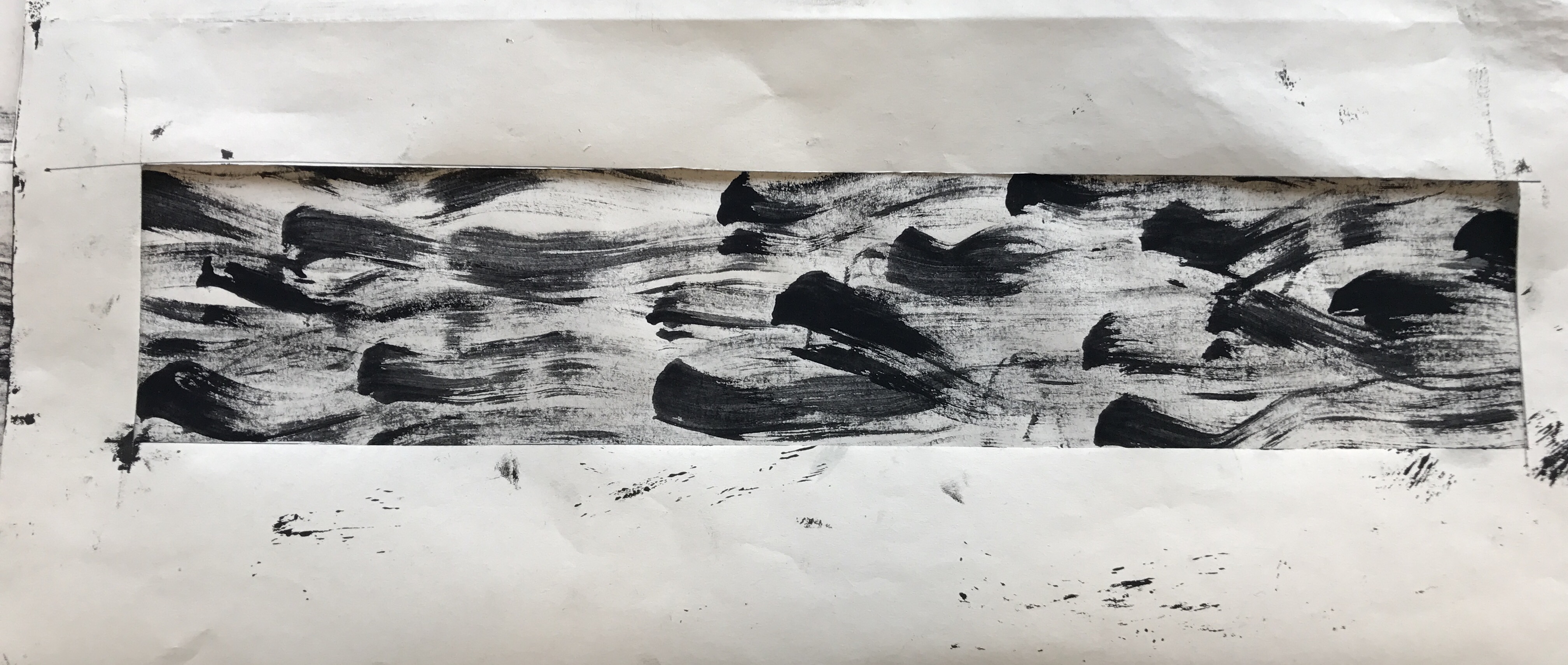
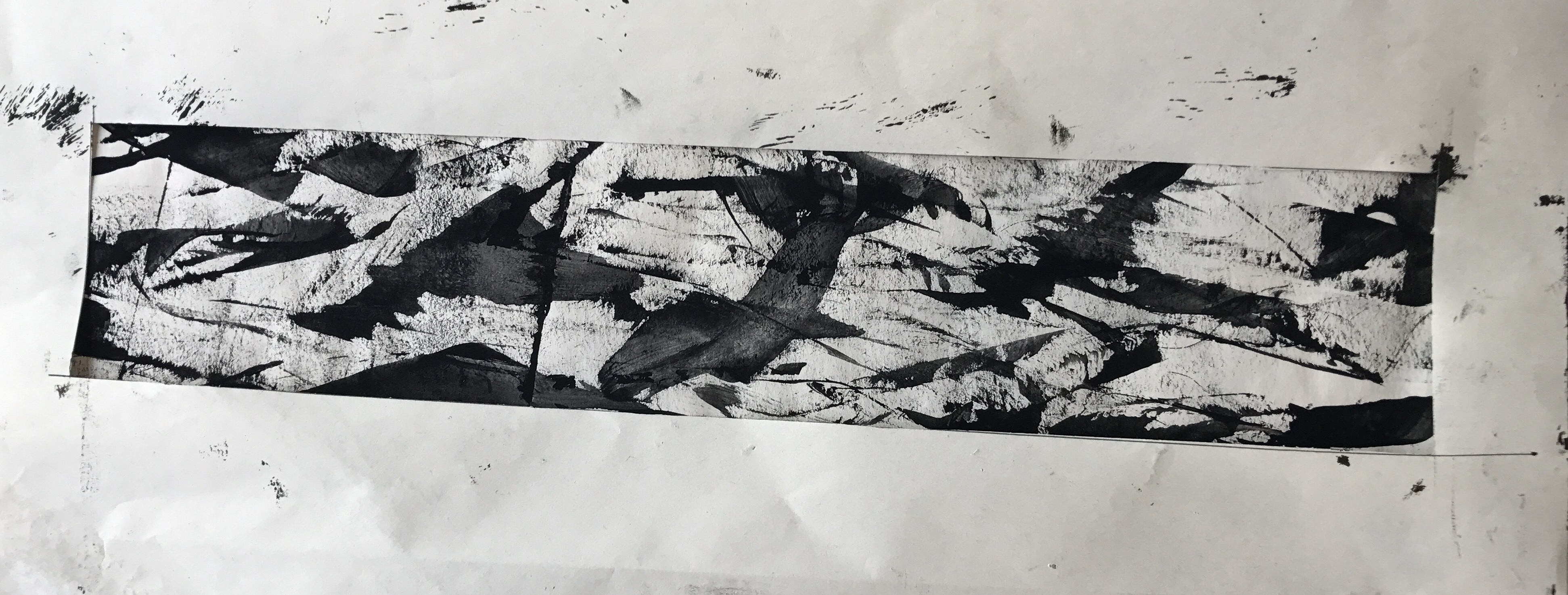
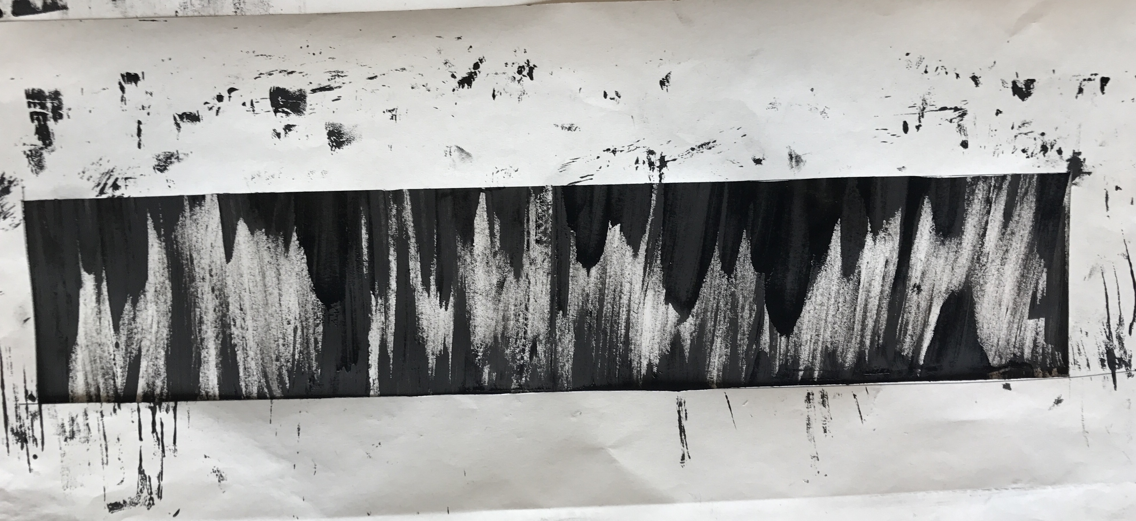
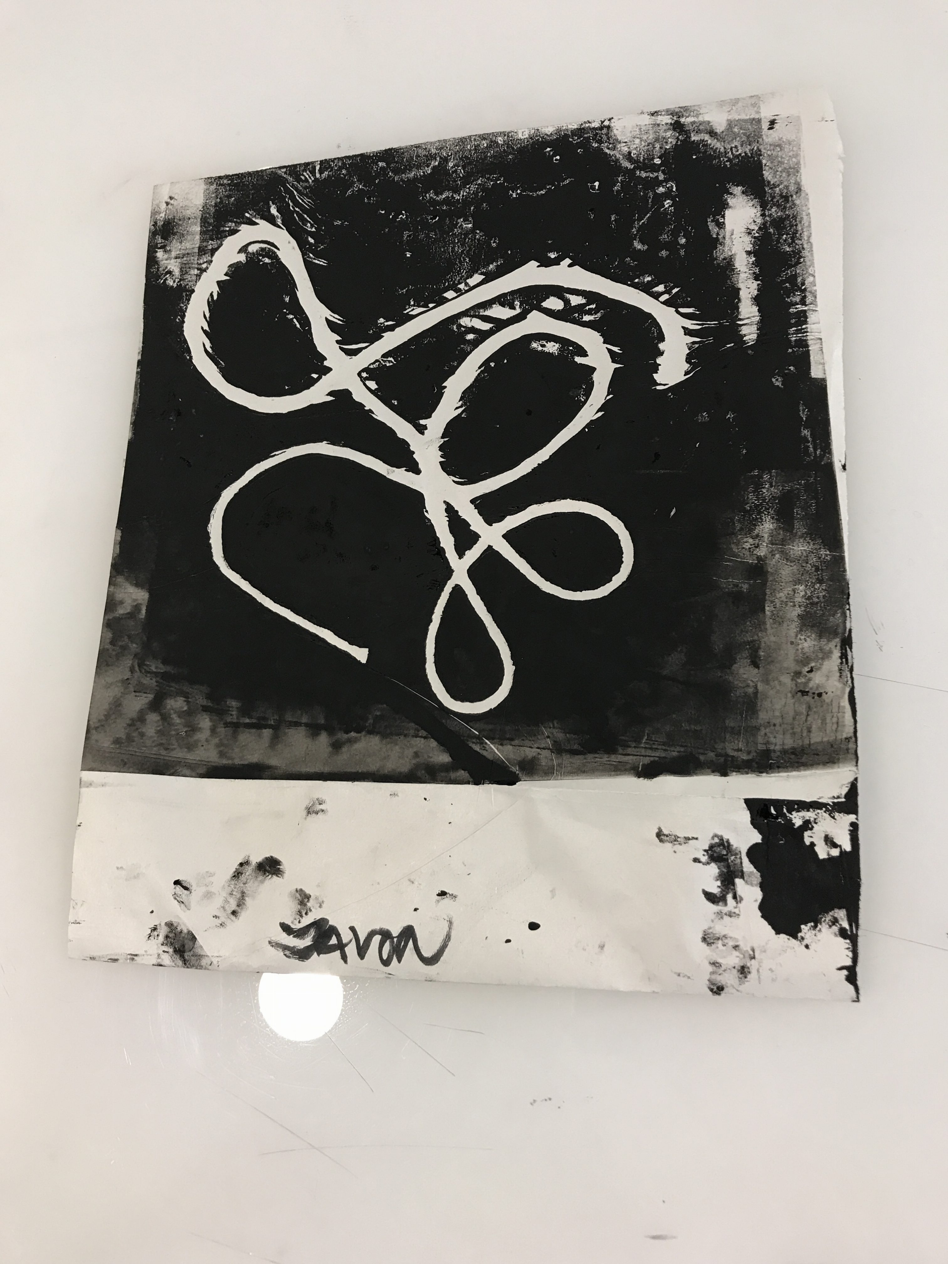
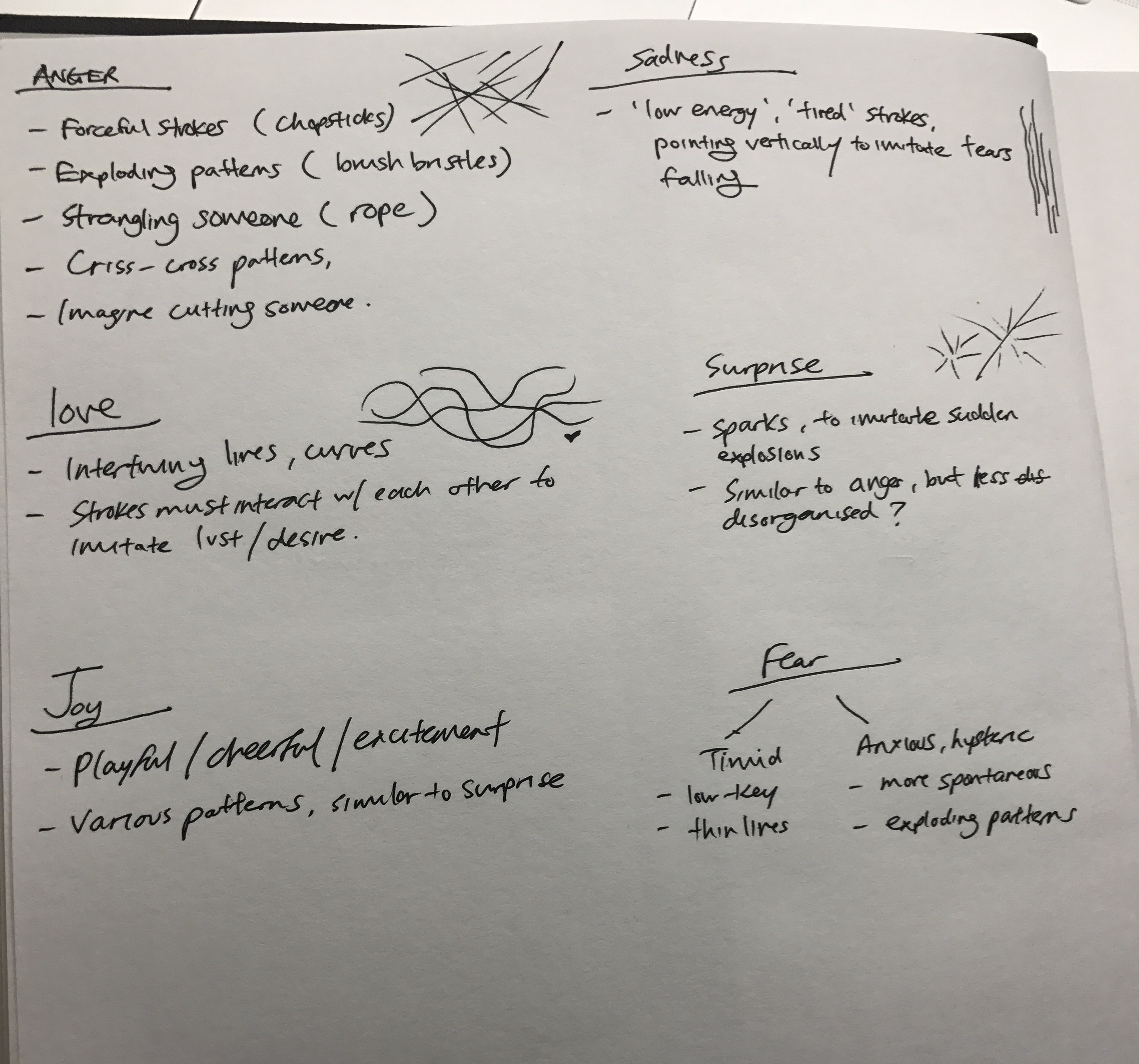
Below are four prints that I found ‘successful’ in displaying some of the emotions.
Joy – More towards cheerfulness and joviality, this print looks like little sprites playfully whizzing through the air.
Anger – Swords swooshing through the air with the blood of those killed trailing along…
Fear – A sense of uneasiness, this looks like a cave where stalagmites and stalactites are closing in on you, the minimal negative space makes it look claustrophobic.
Sadness – Melancholy, this print immediately reminded me of ‘The Starry Night’ by Vincent van Gogh. More specifically, I once heard Beethoven’s Moonlight Sonata in a video online with this painting as the backdrop. You can listen to it here hahaha – https://www.youtube.com/watch?v=iVfPt8jgWOY
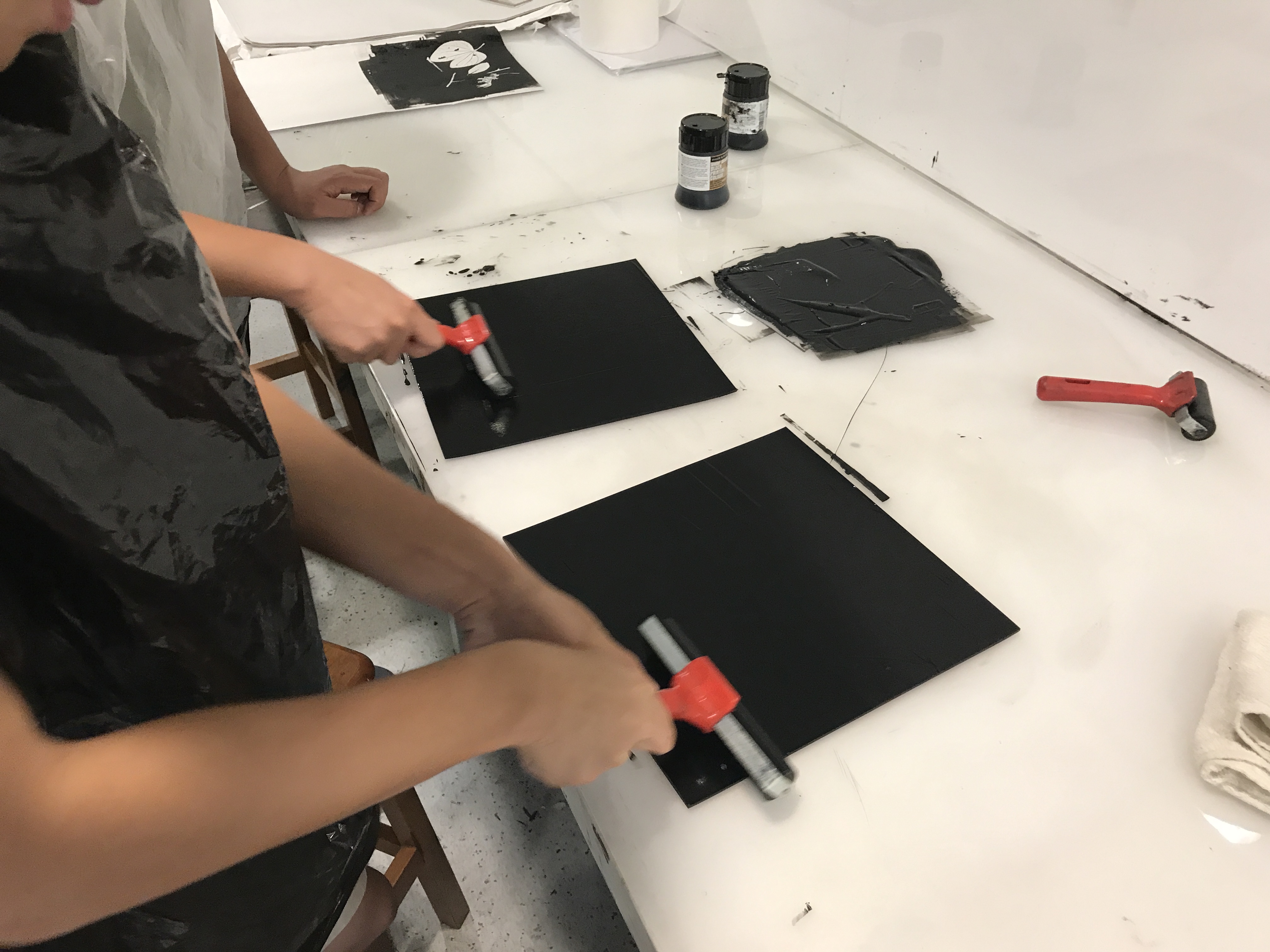
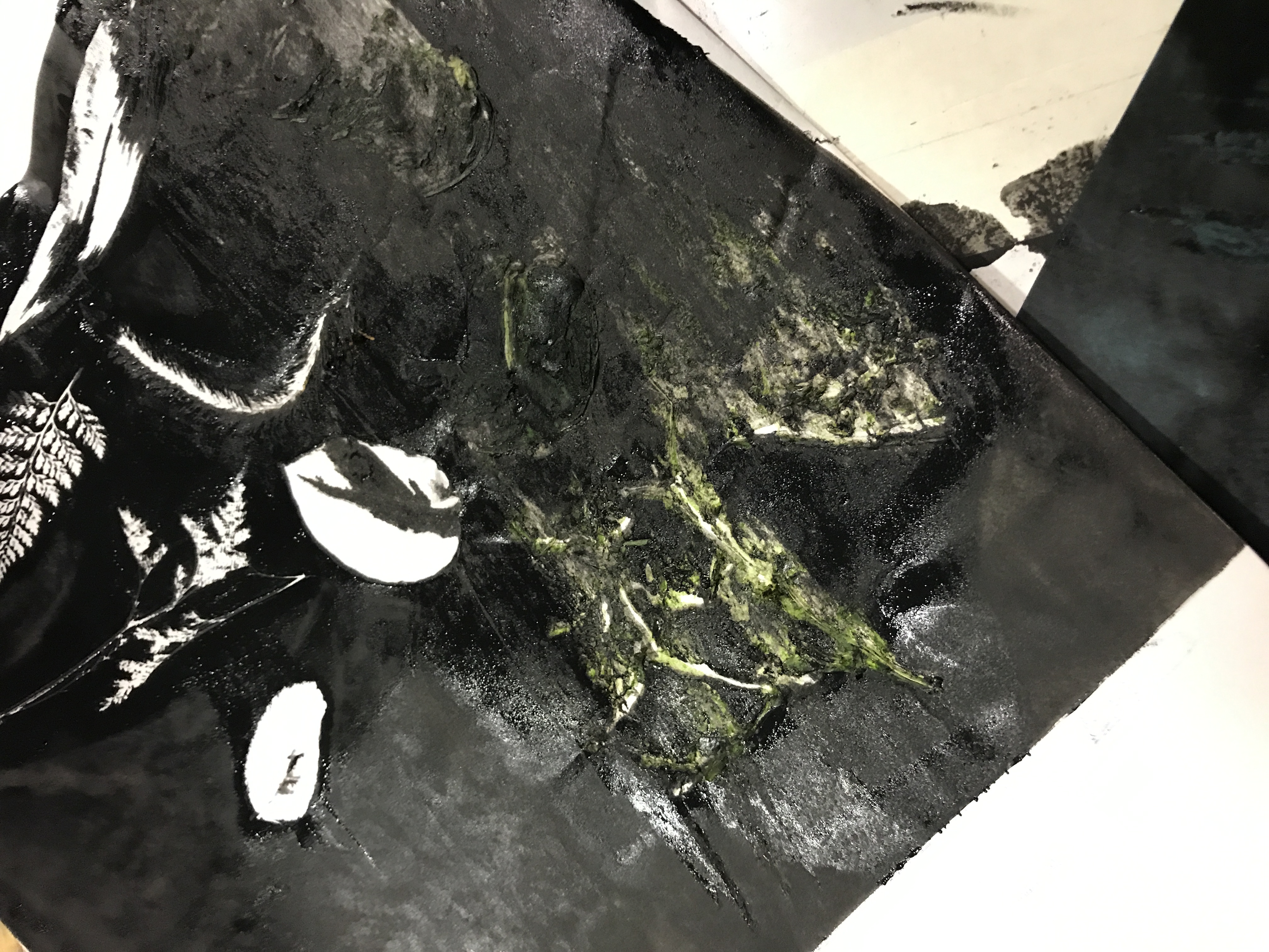
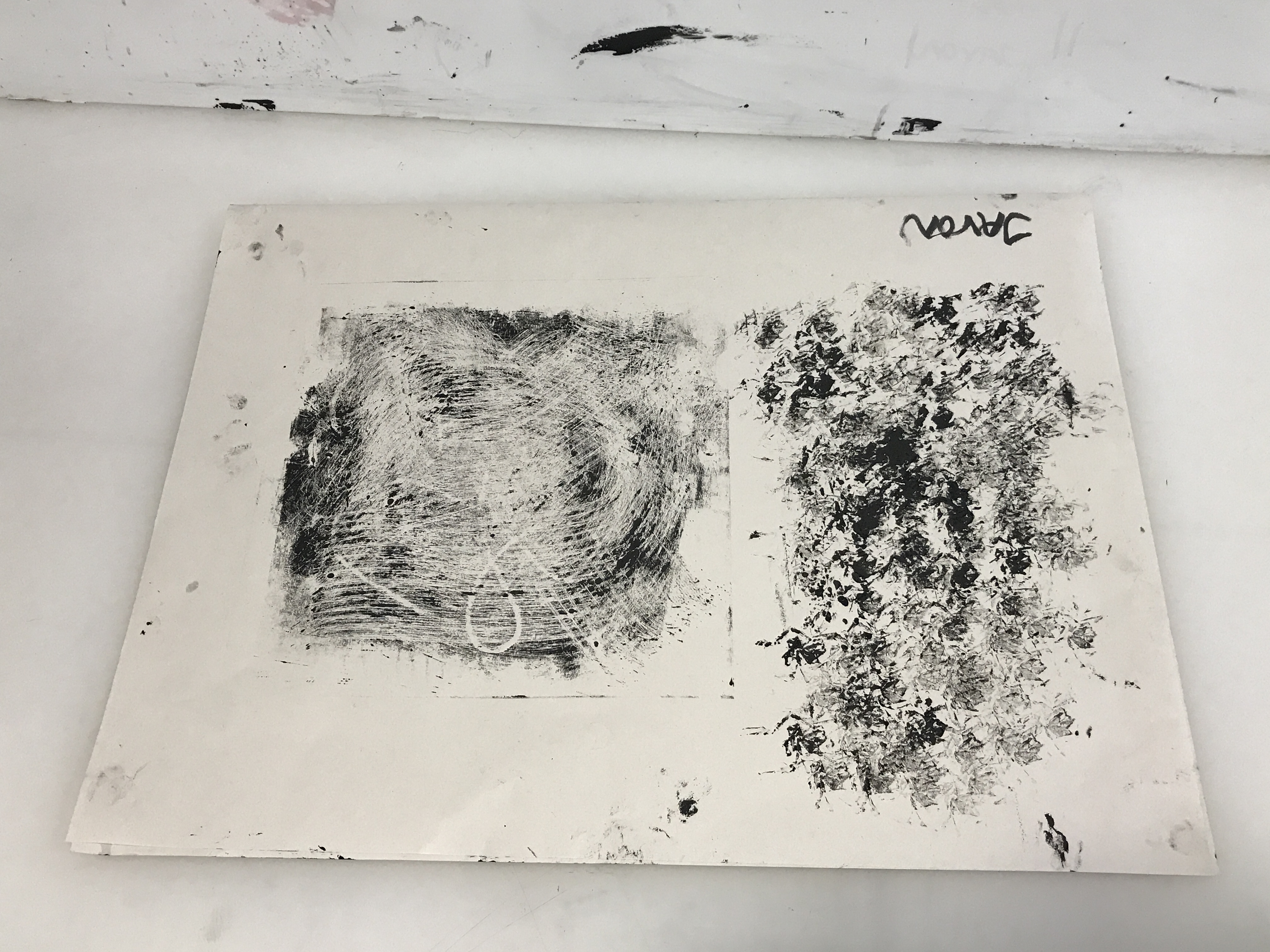
For this session, we were introduced to mono printing, and it was my first experience with making prints using the print machine,
Applying ink for monoprintingArranging leaves onto ink
It did not go quite as planned,
A moment of silenceDelicious
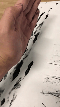
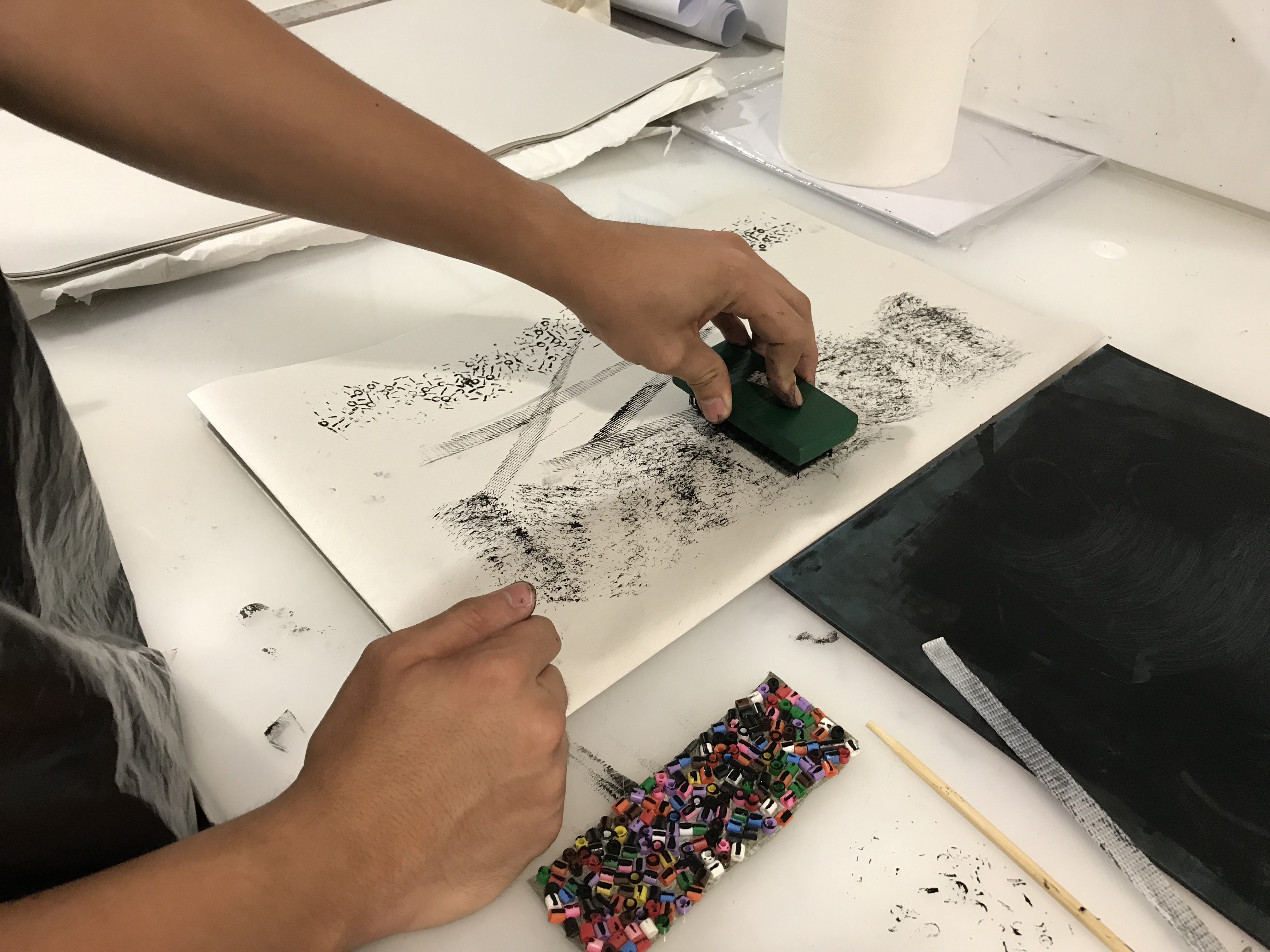
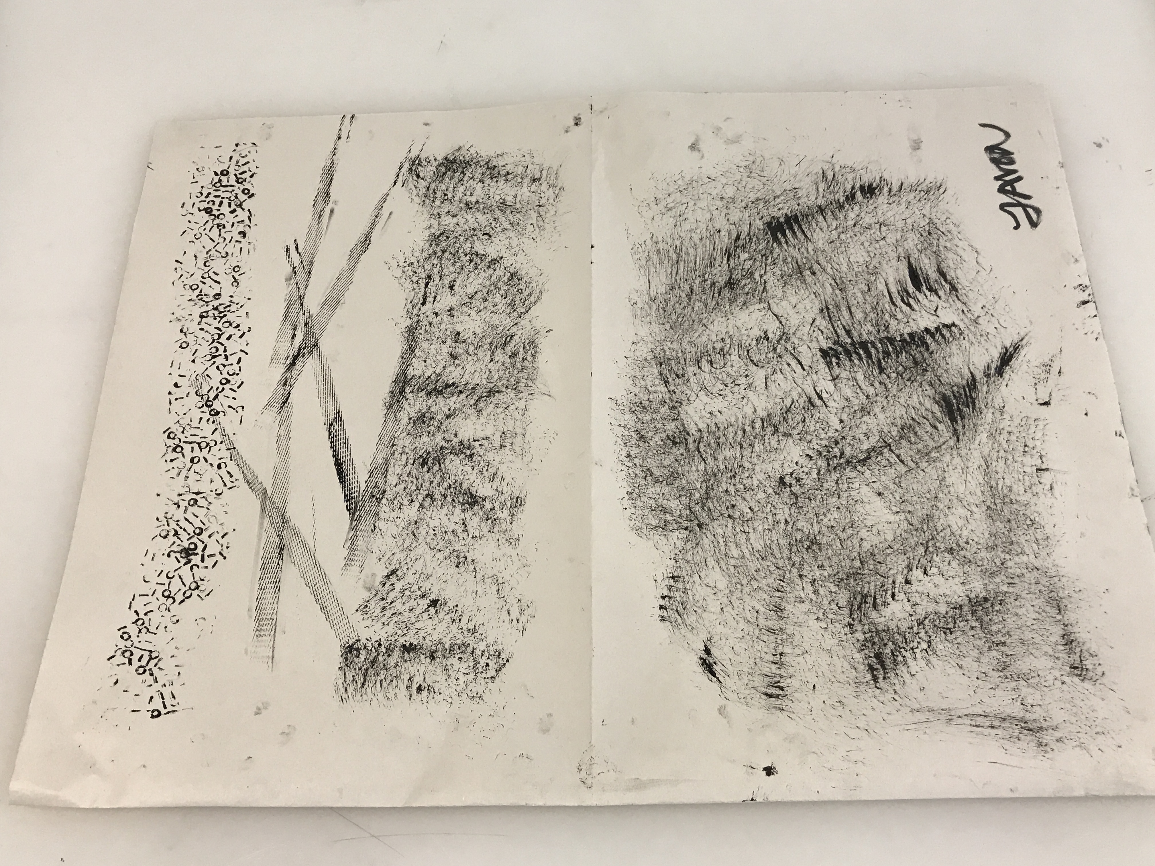
Shortly after, I proceeded with making marks using objects instead,
From polishing boots to dirtying paperMulti-tasking
At the end of the class, I managed to produce a few patterns,
Test Prints 1Test Prints 2Test Prints 3Test Prints 4
Creating the prints by hand was a much easier method and I had more control over how the prints came out.
As I forgot to take home my prints, I replicated what I did in class back at home, and had them added into my visual journal. I initially tried making the prints on regular A4 paper but found it to be too white and contrasting, I eventually went for tinted watercolour paper and it turned out much better.
Various prints with the objects used placed next to them
Below are a few notes i jotted down to aid in my next experimentation with making more prints.