Assignment 01: Human Emotions with Digital Images

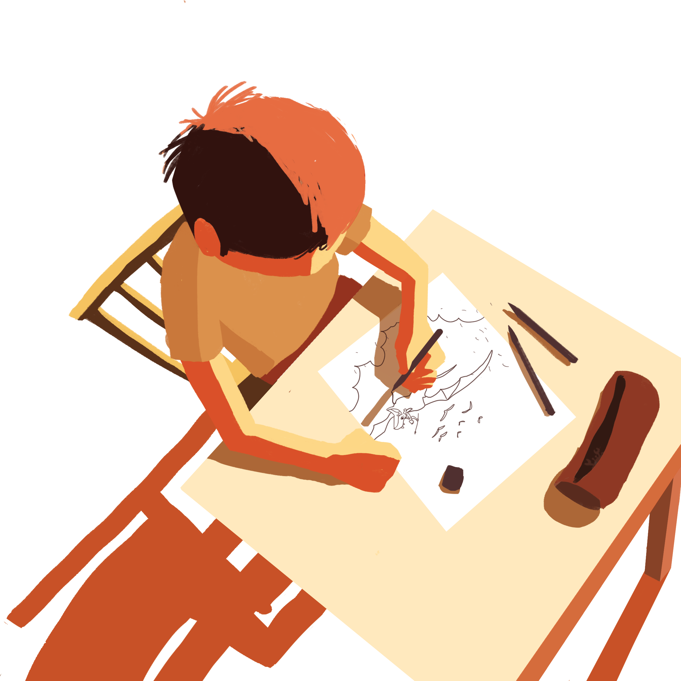
For this assignment, we were tasked to create a series of images that would evoke or express various emotions.

Final Images

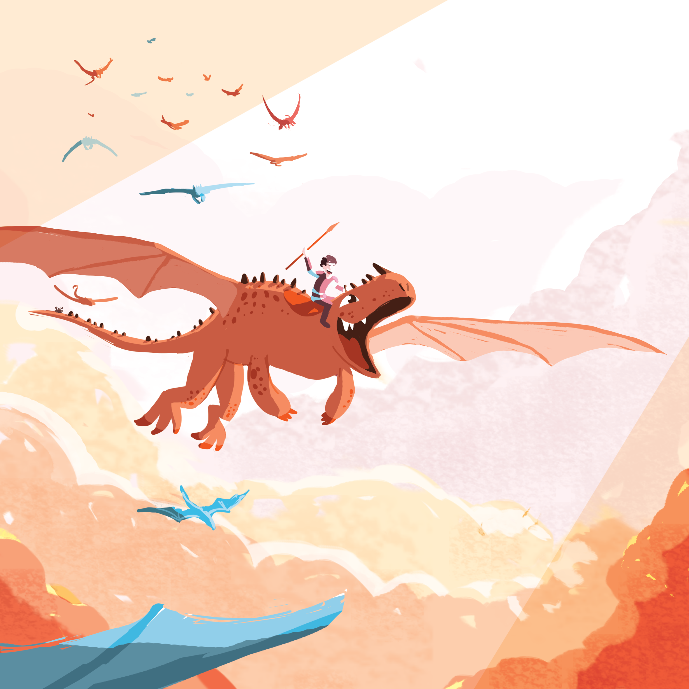
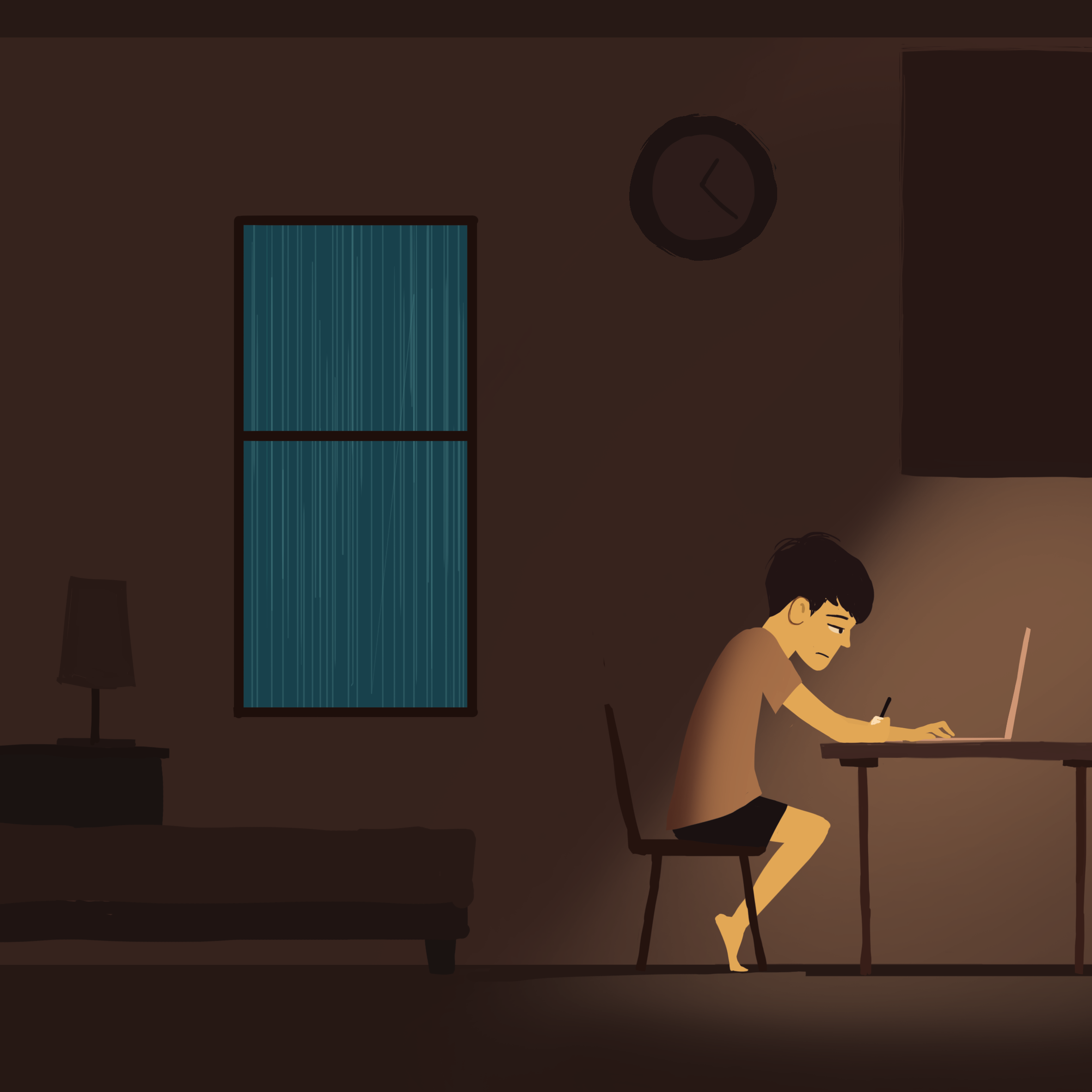
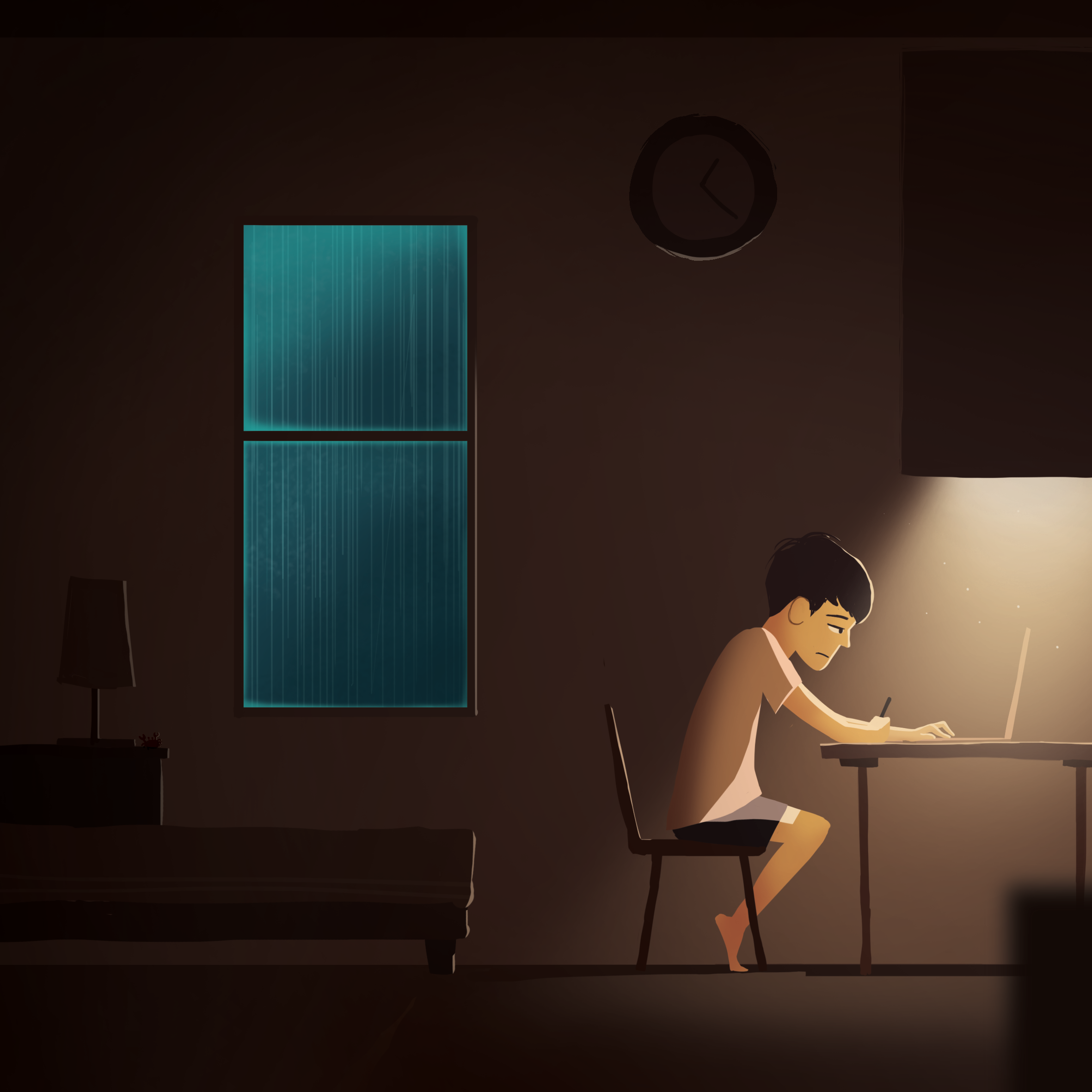
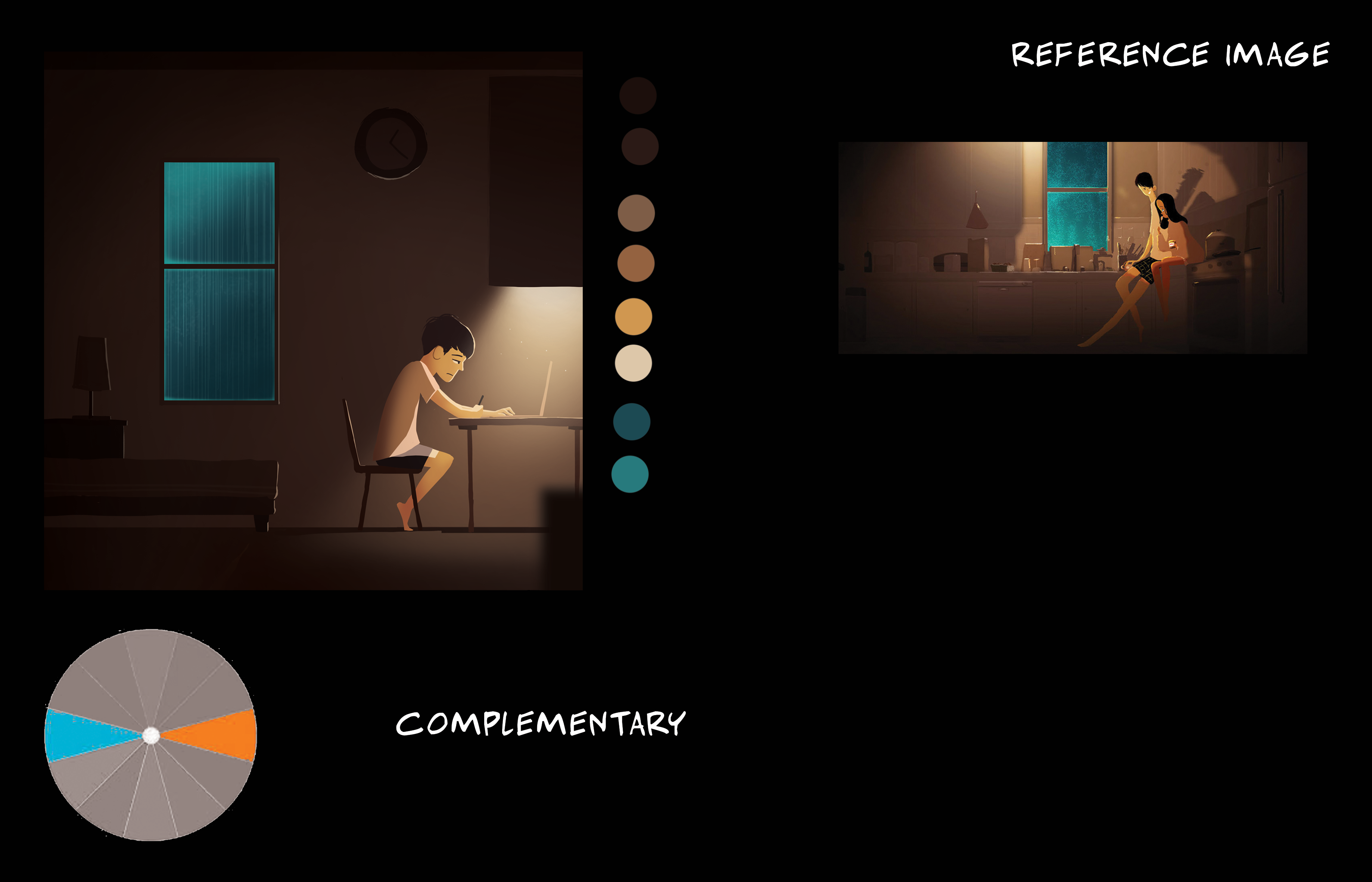
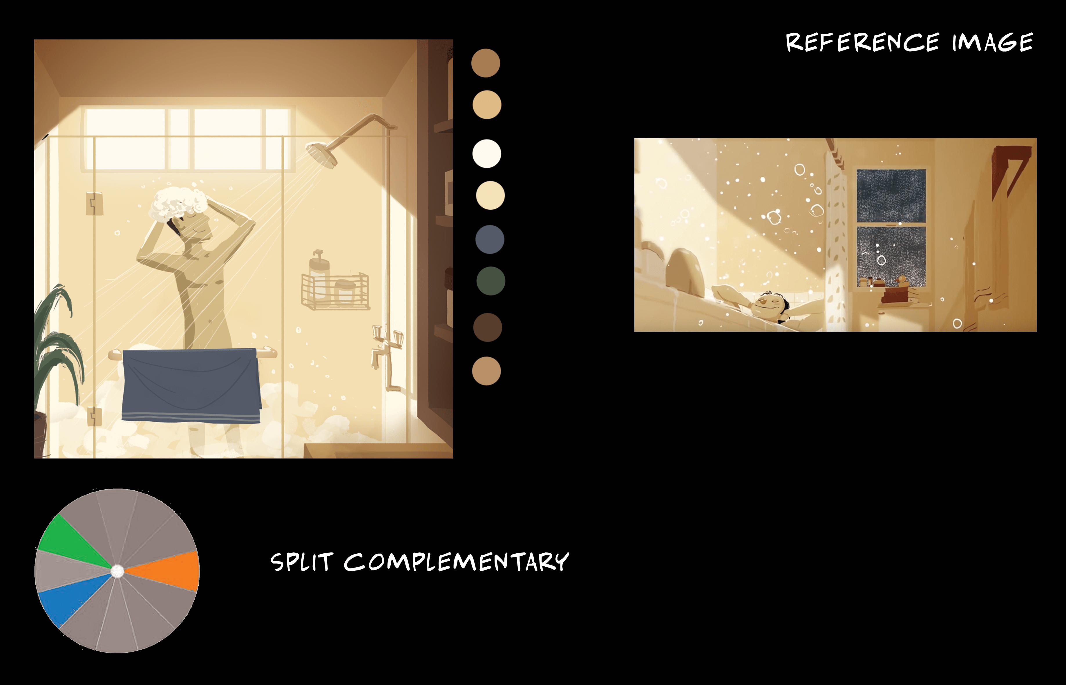
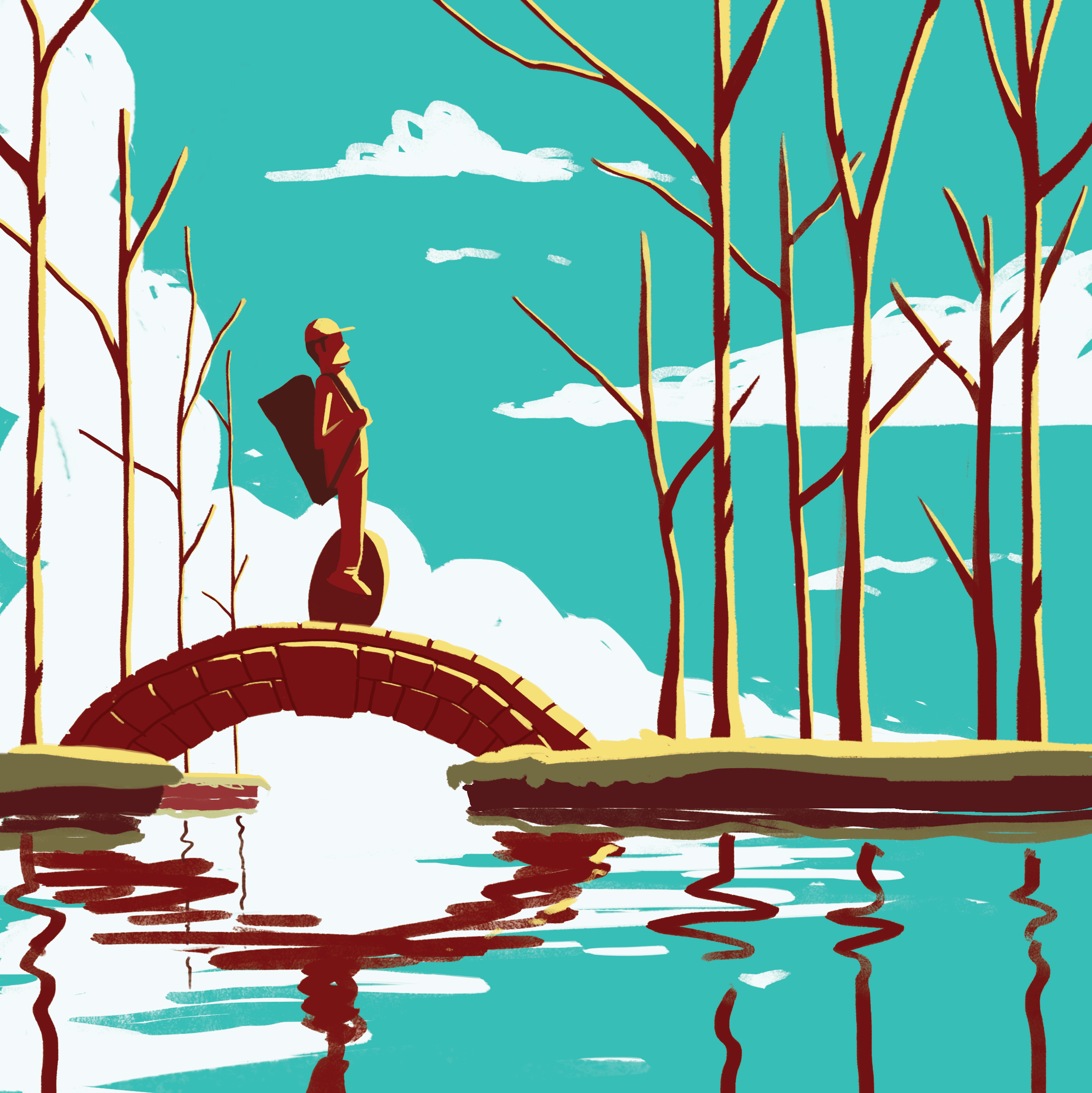
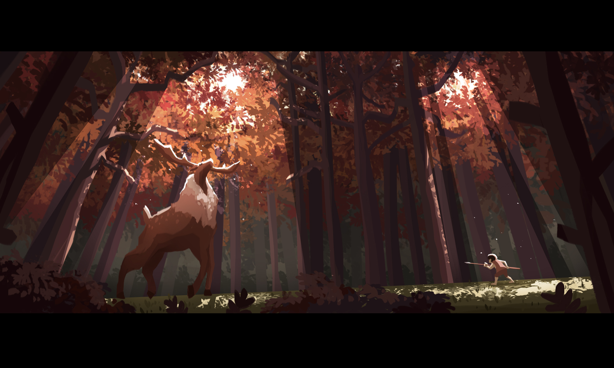
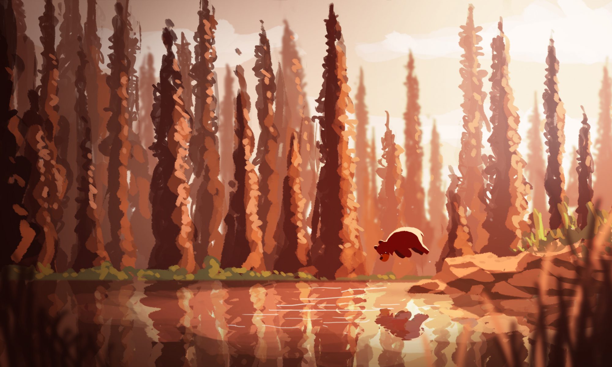
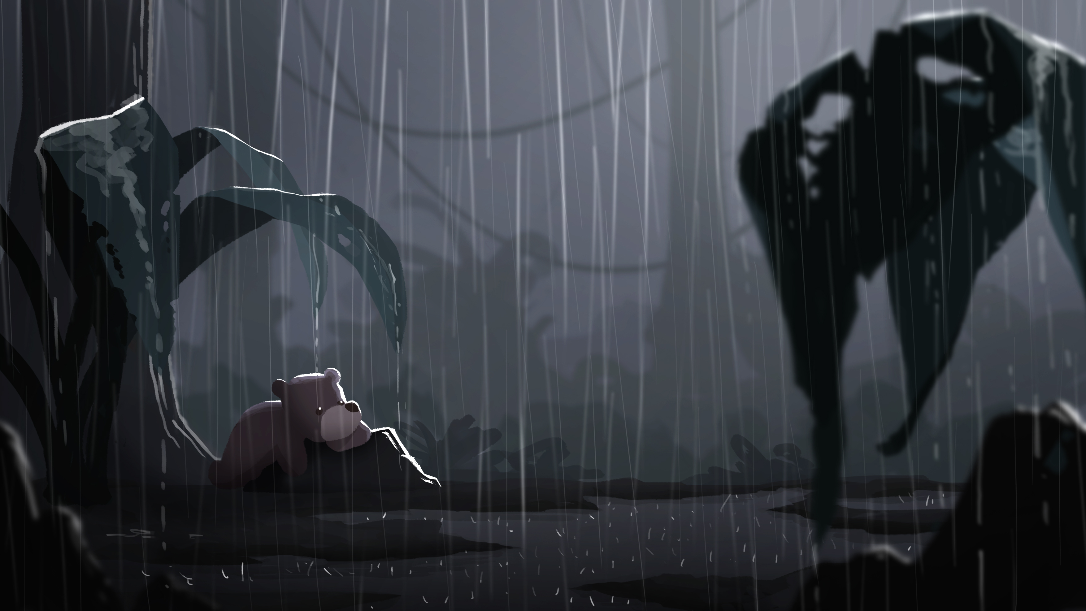
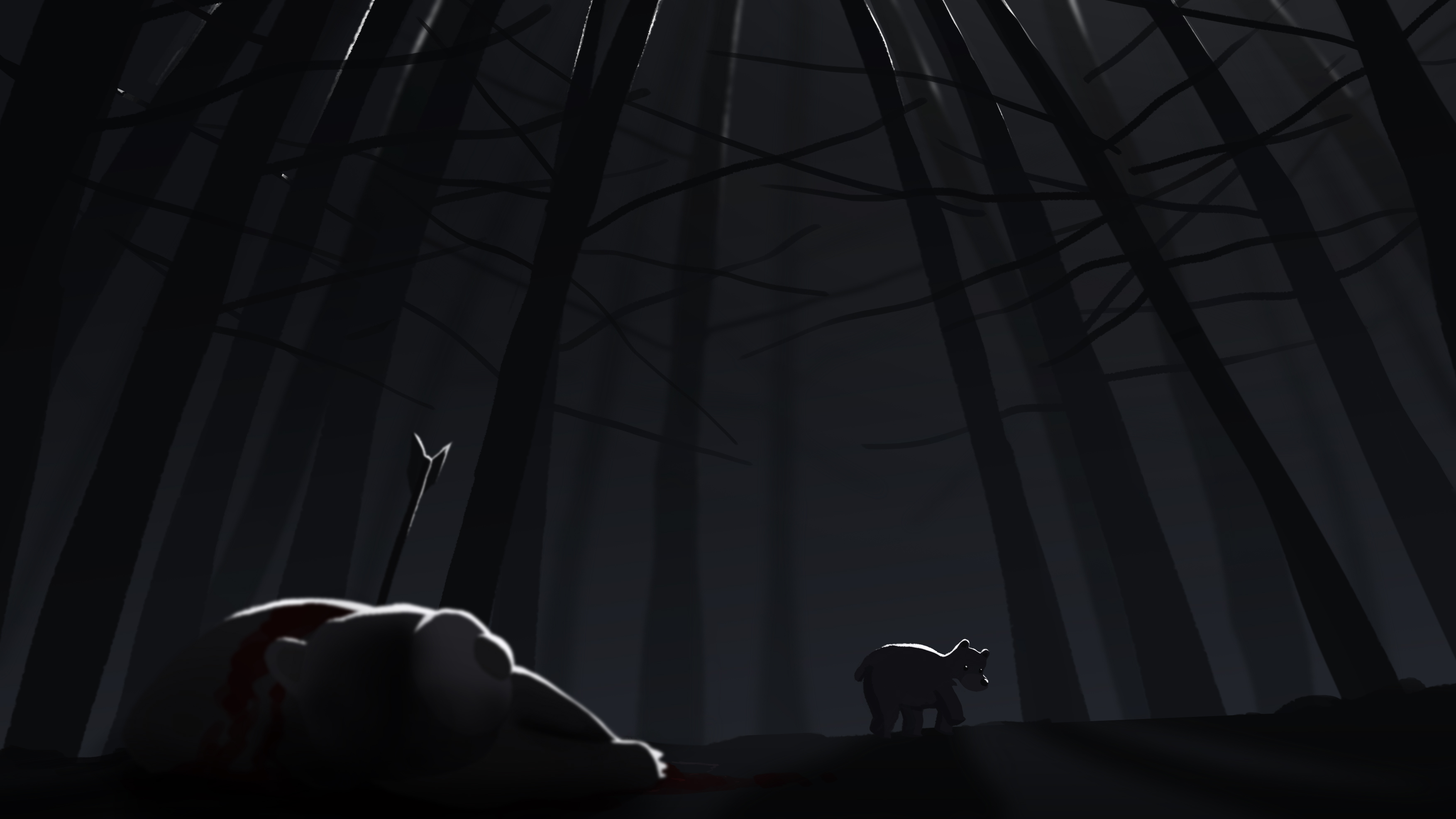
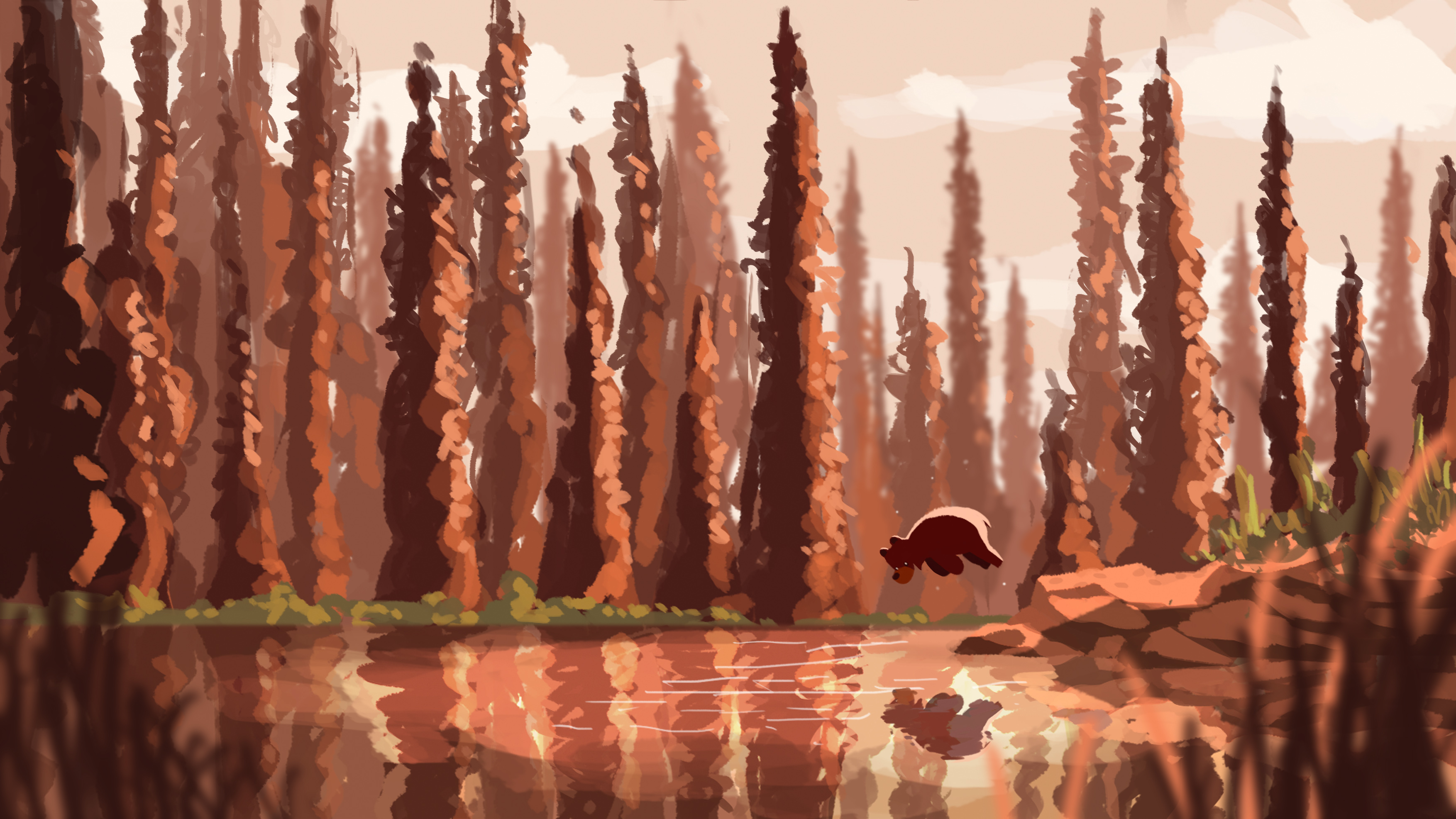
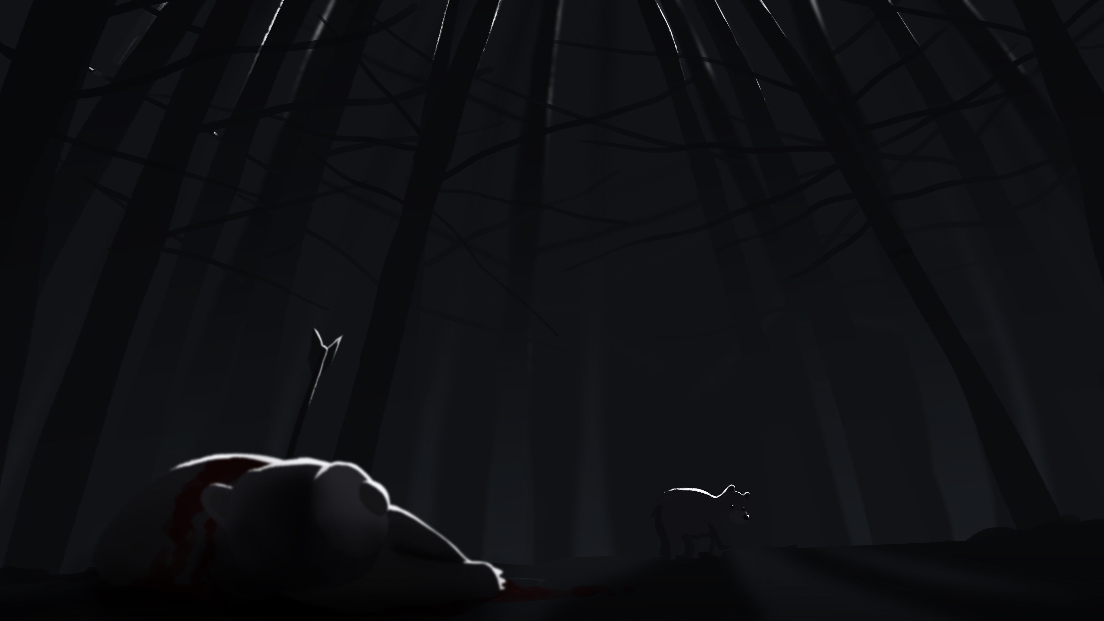
I have created a series of four images which depicts the emotions of happiness, surprise, sadness, and fear. The series revolves around a bear and his interaction with different environments, each evoking a different emotion  to the viewer based on colours and lighting.

Final Images

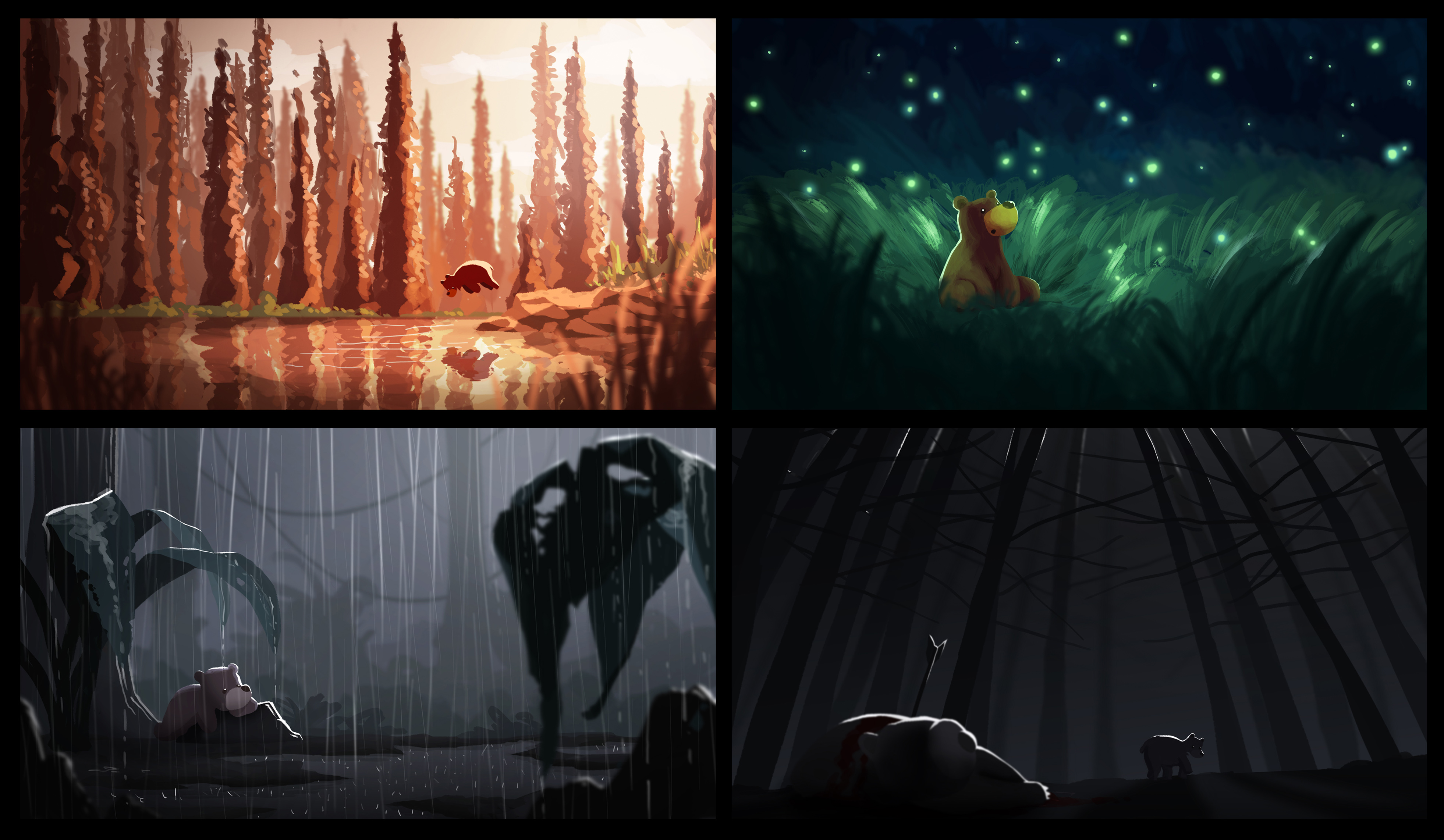
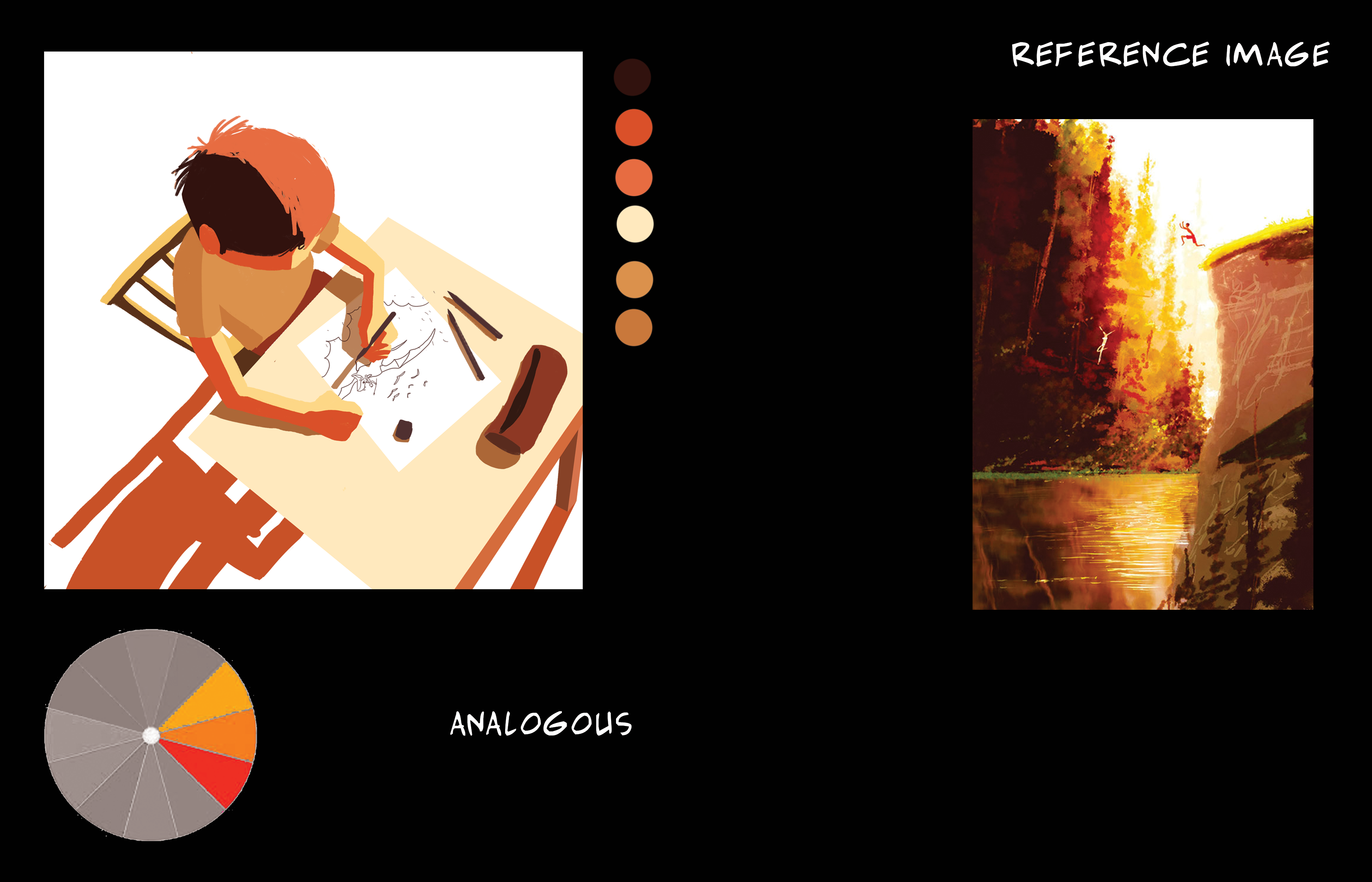
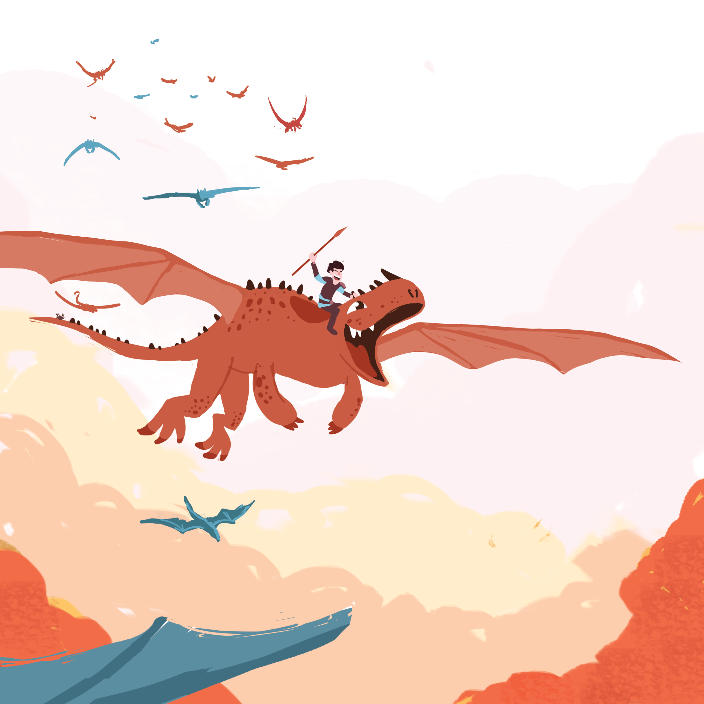
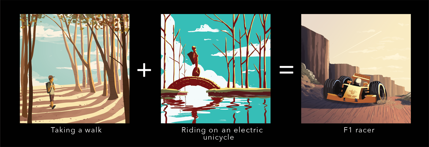
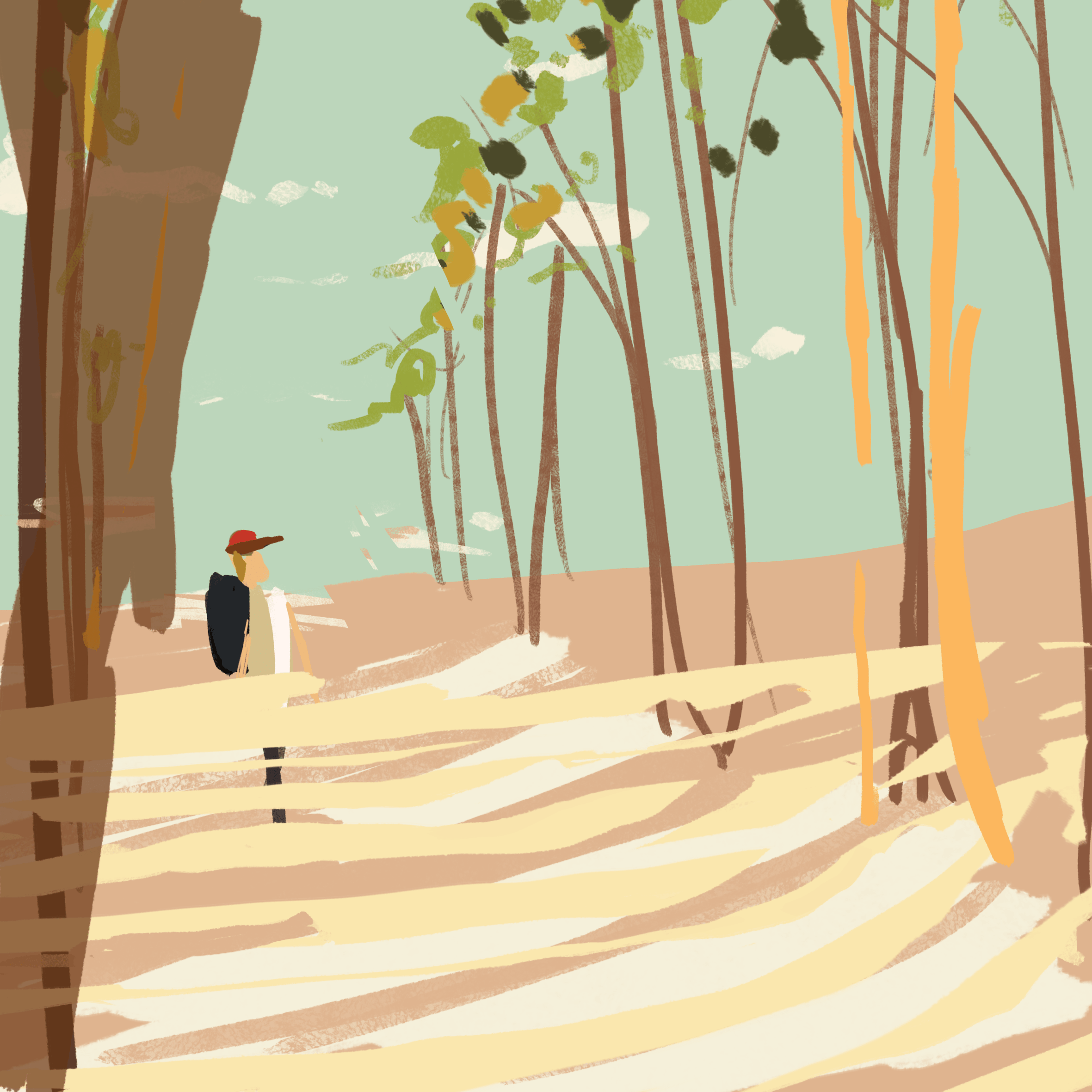
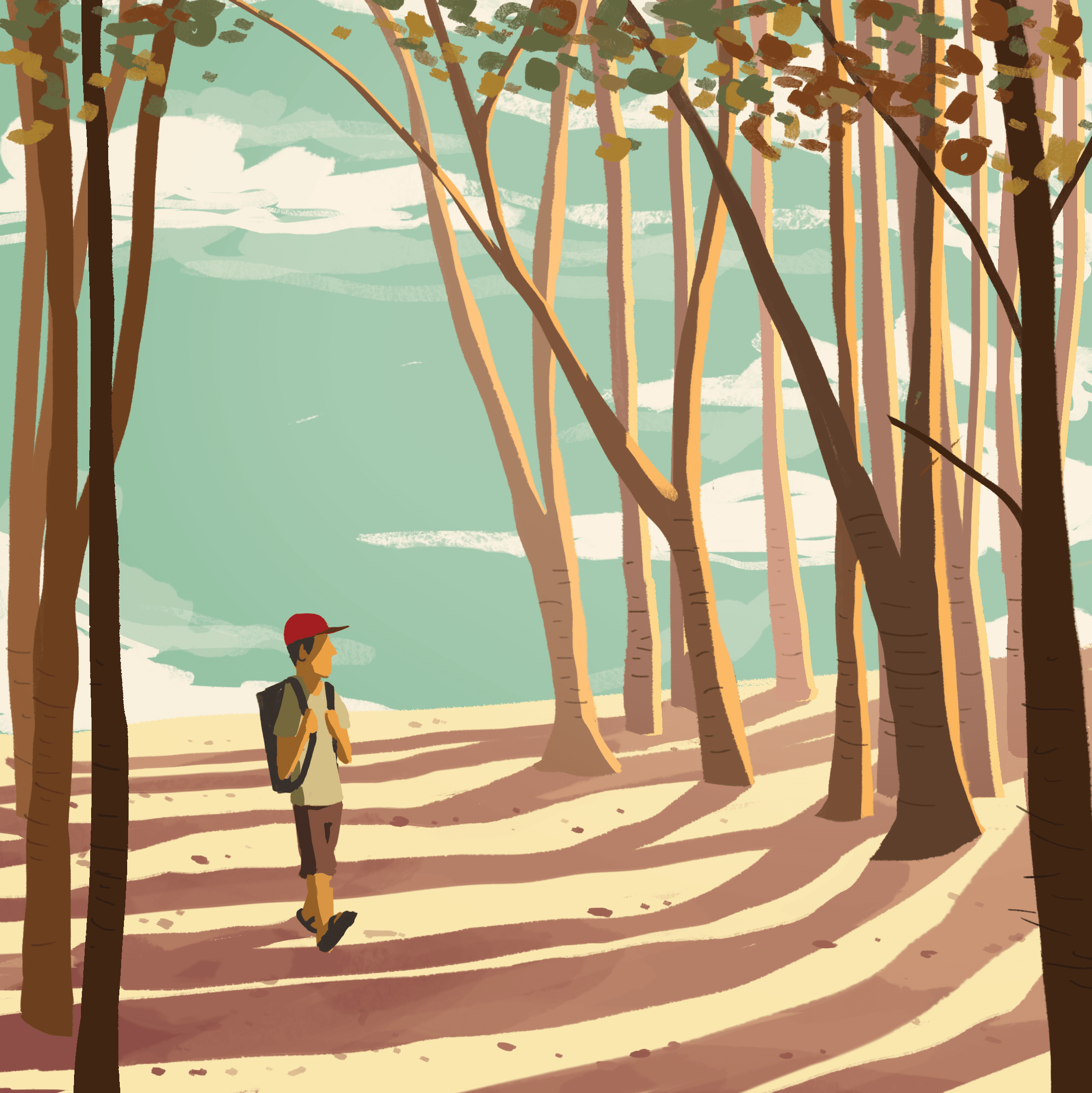
For Happiness, I picked a sunset, autumn-like colour scheme of warm orange. I wanted to evoke a sense of tranquility along with happiness; the bear jumping into a calm lake in a seemingly peaceful forest.

Image 1 – Happiness

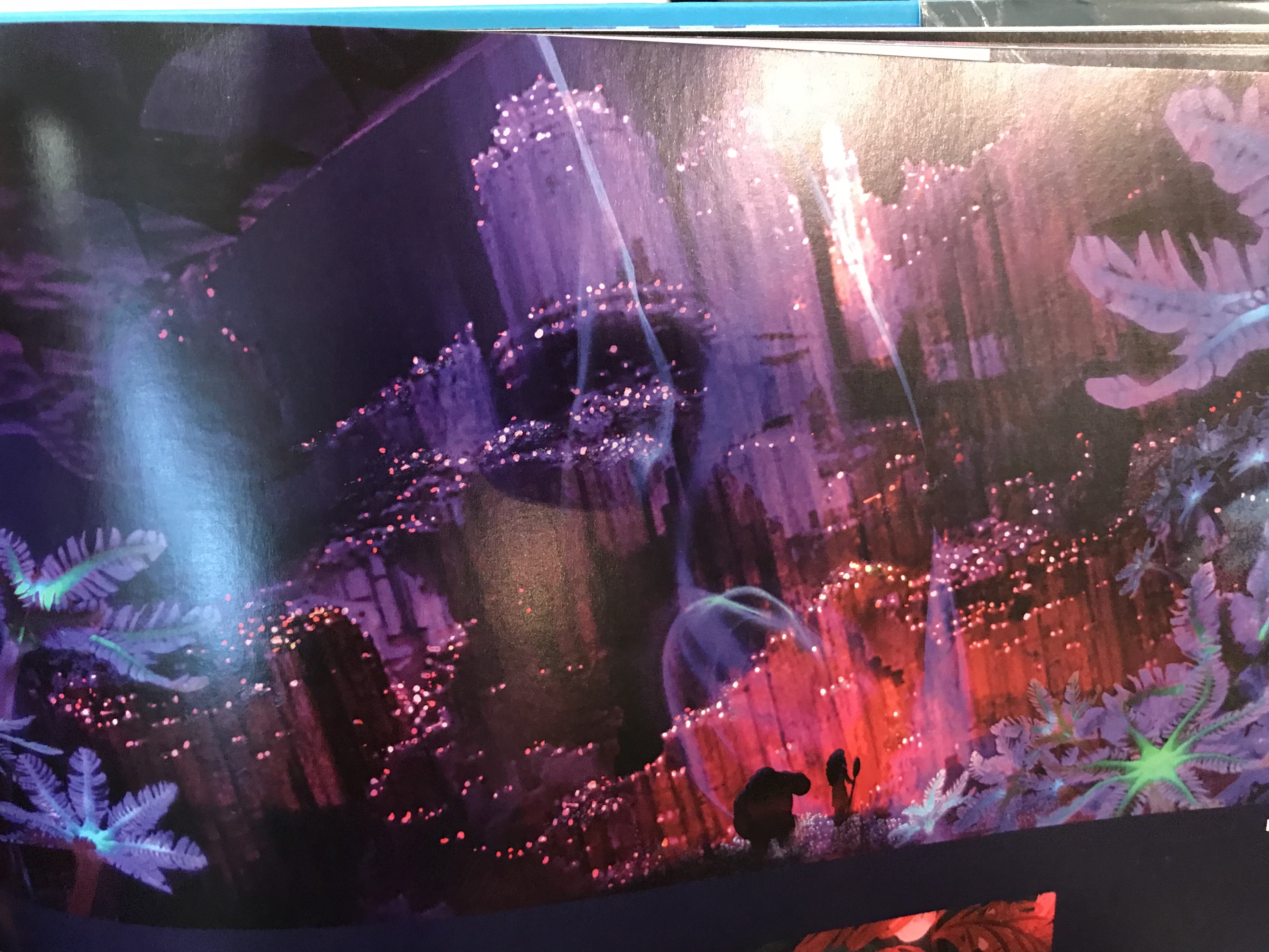
For Surprise, I wanted to express this emotion by introducing specks of light in a dark environment. A field of fireflies in the dark creates a sense of wonder and mesmerisation.

Image 2 – Surprise

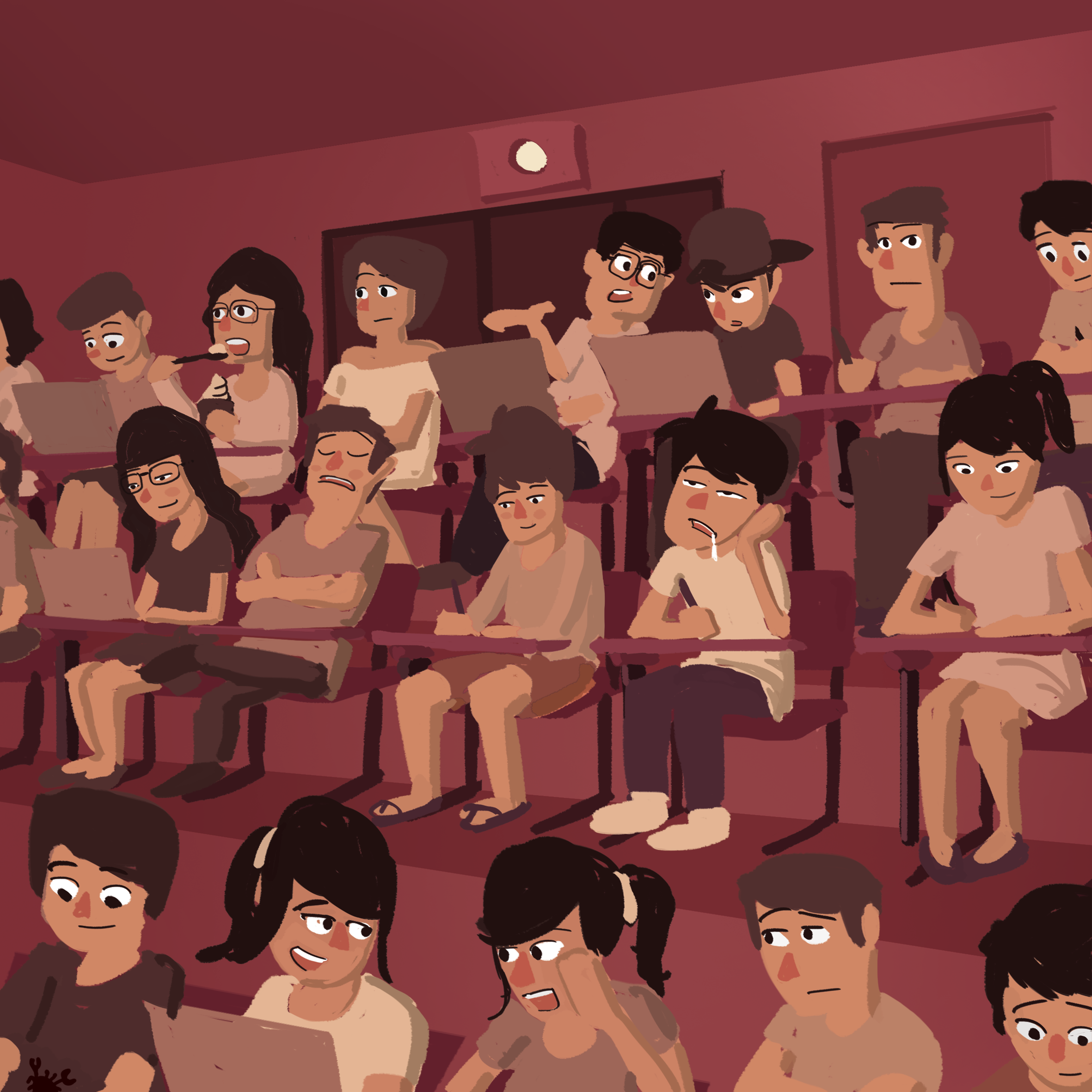
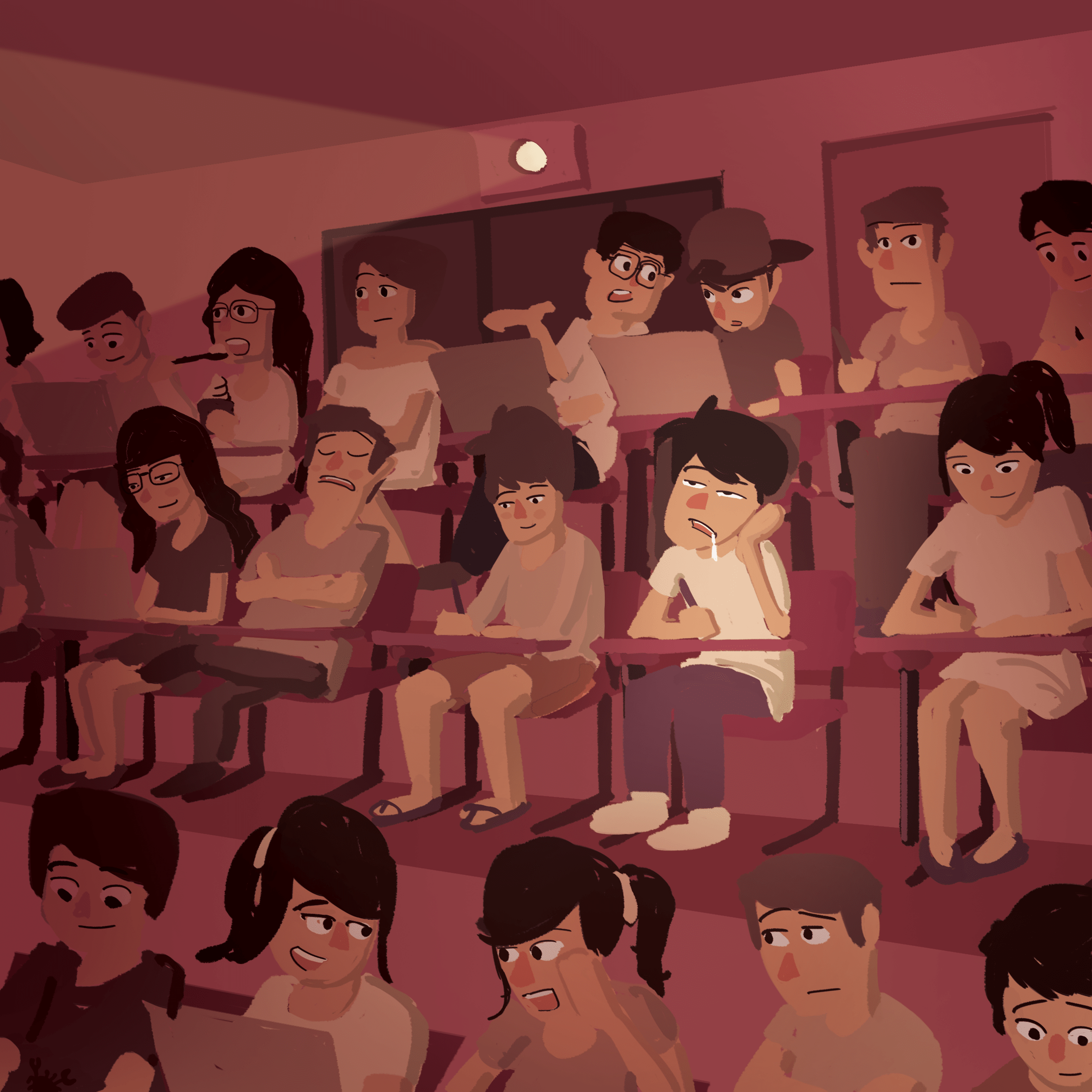
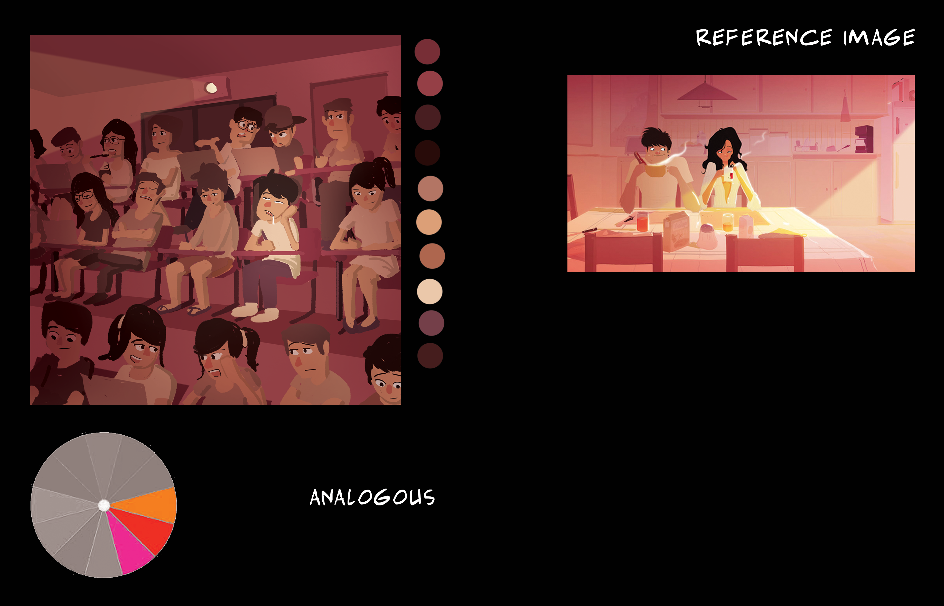
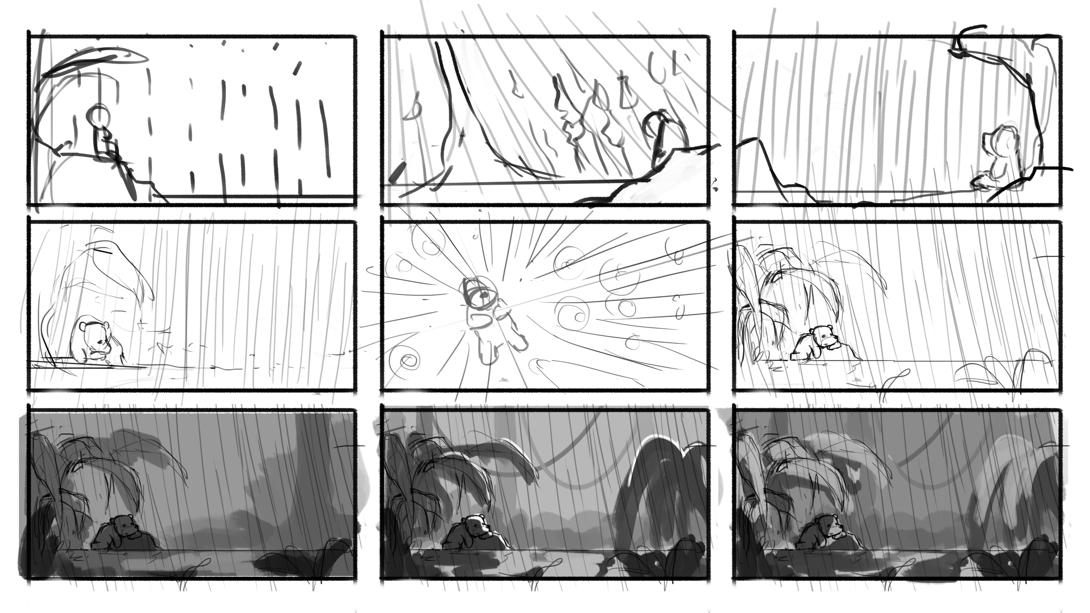
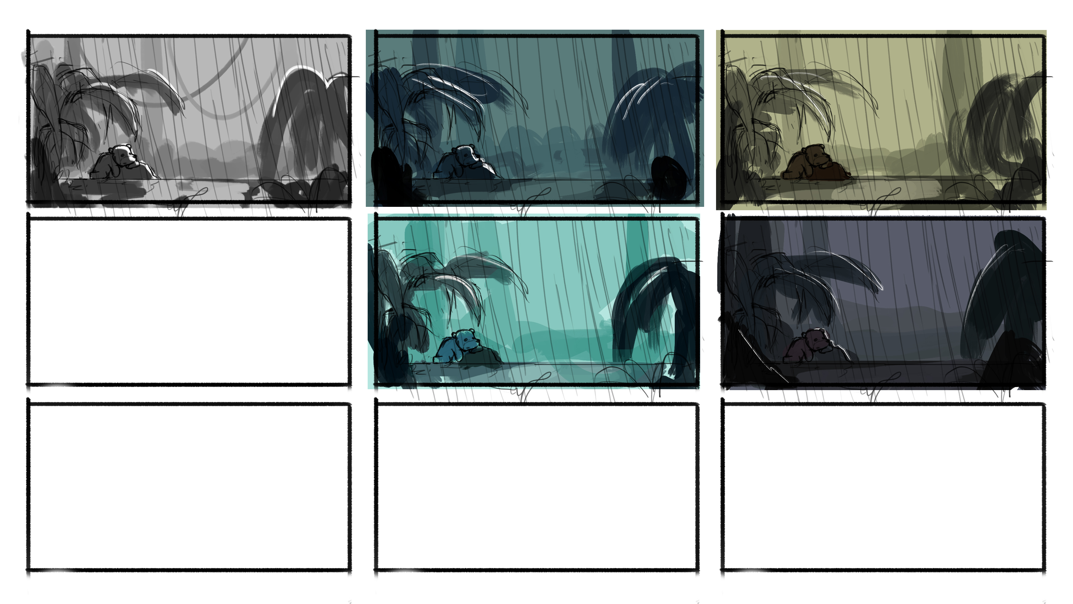
For Sadness, two things came to mind, dull muted colours and rain. Rim light was included to  add some brightness to the otherwise dull image and to separate the various elements from the background. Rain was added to give the illustration a more gloomy feel.

Image 3 – Sadness

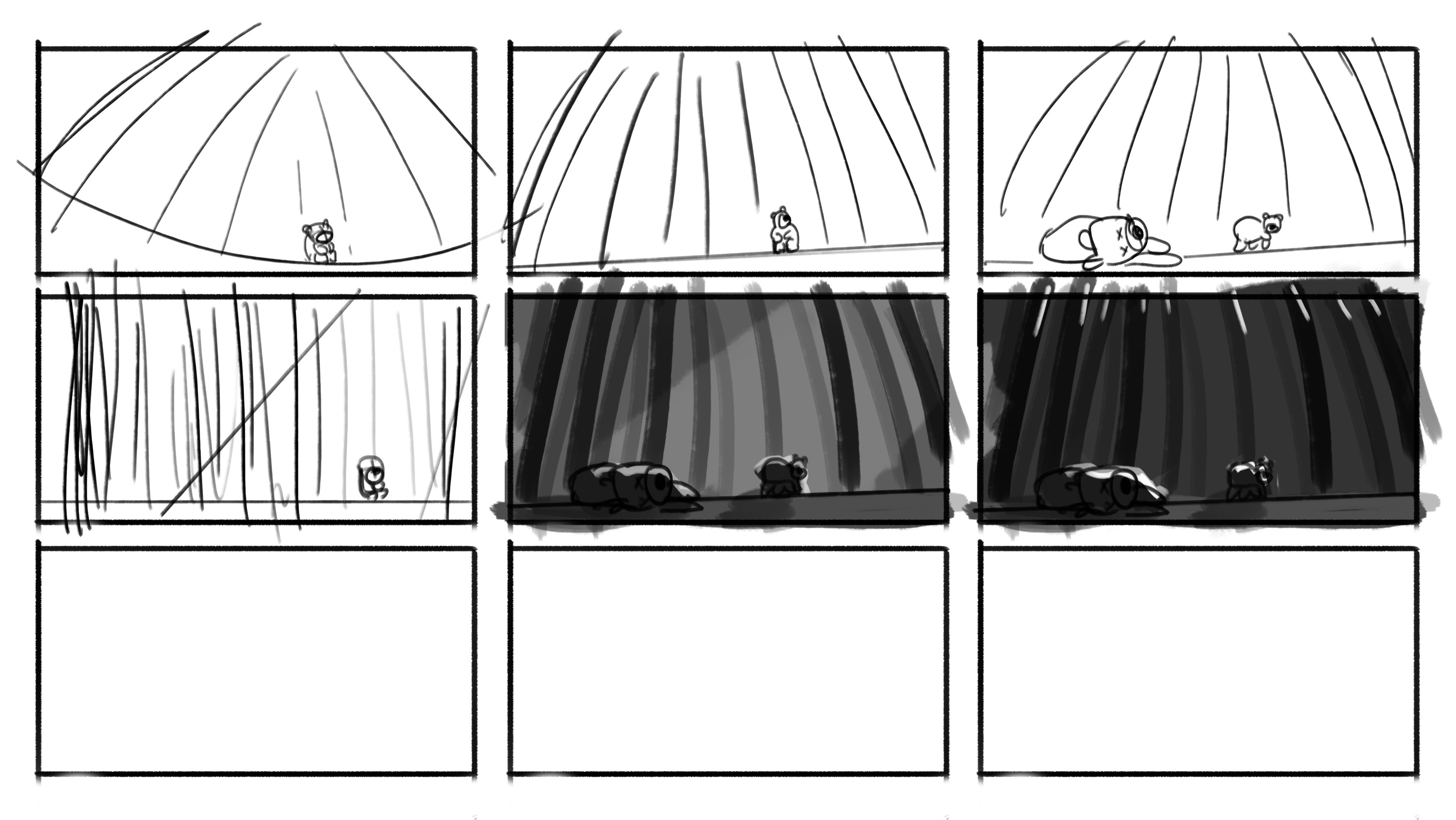
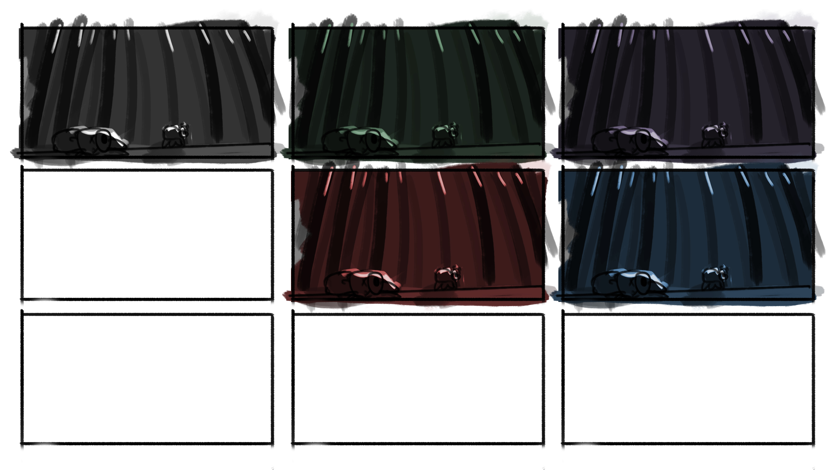
For Fear, I initially pictured the bear alone in a dark forest, but I thought that if there was another bear which had been shot dead in the scene, it would evoke a stronger sense of fear for the bear. Rim light was very important to distinguish the characters and trees as I wanted minimal light in this scene to evoke this emotion. A dutch tilt was also incorporated to create a sense of uneasiness in the scene.

Image 4 – Fear

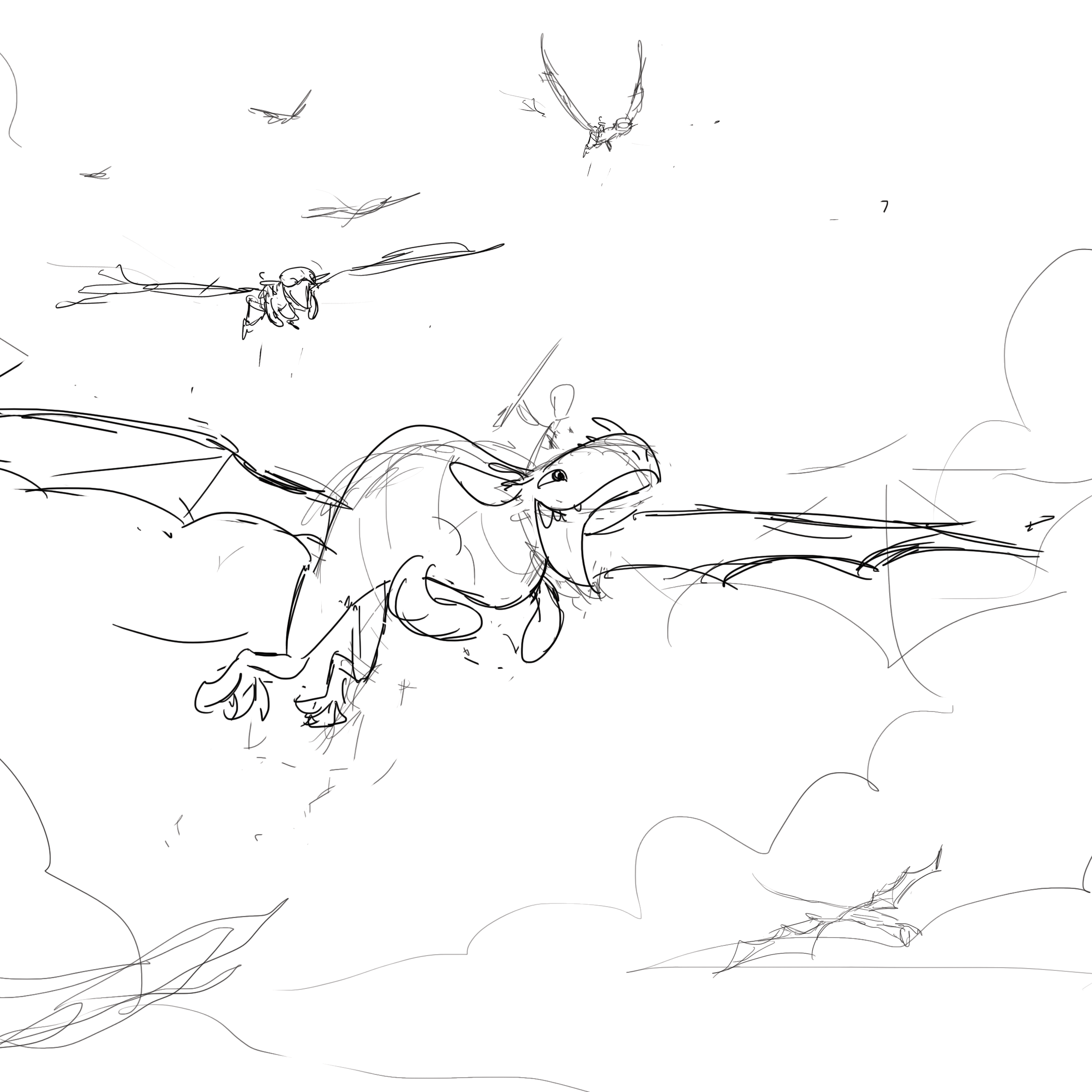
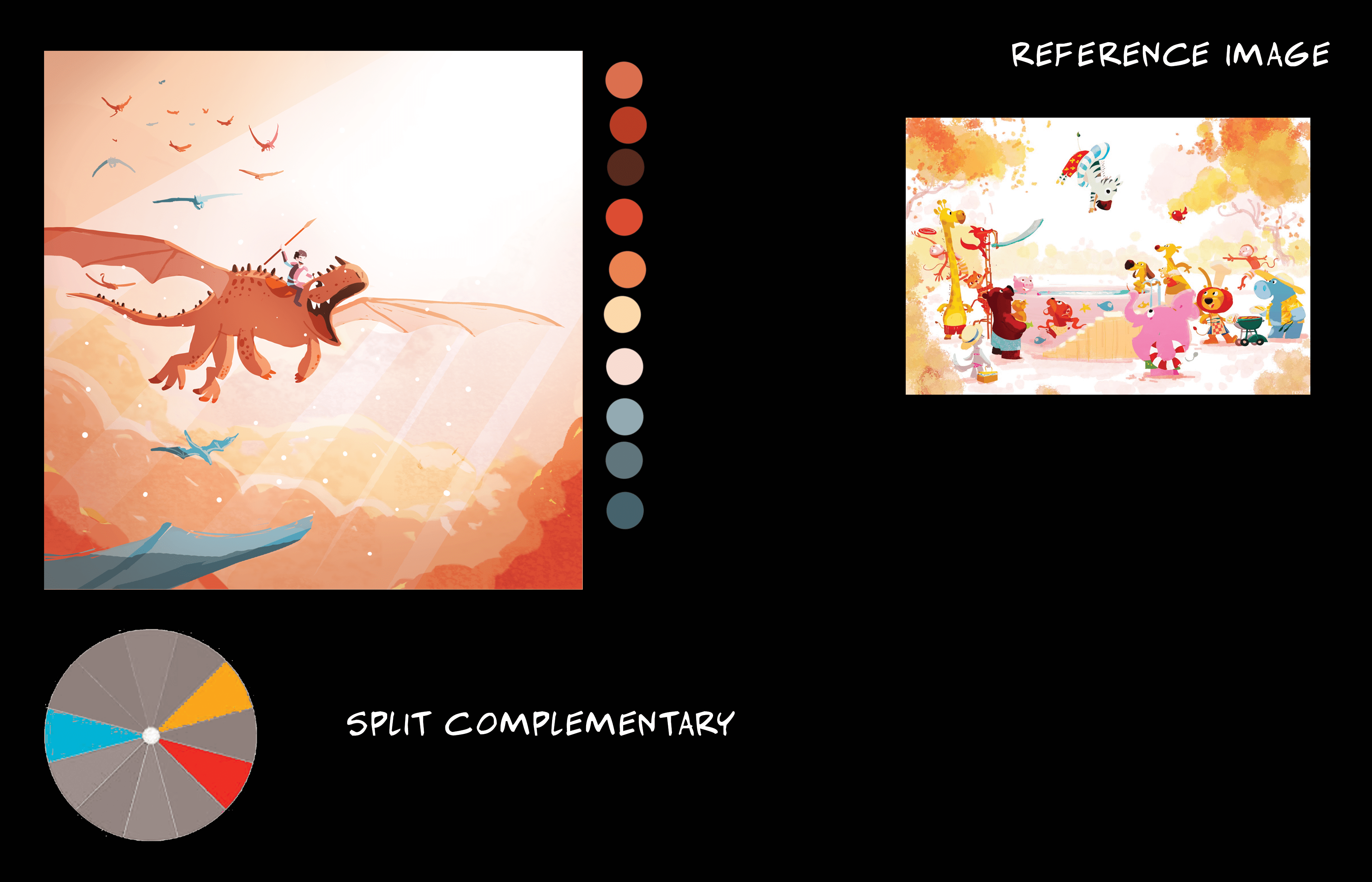
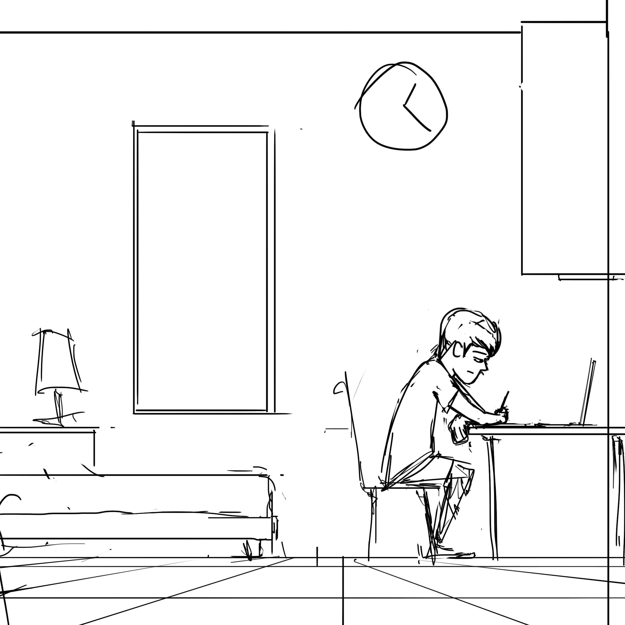
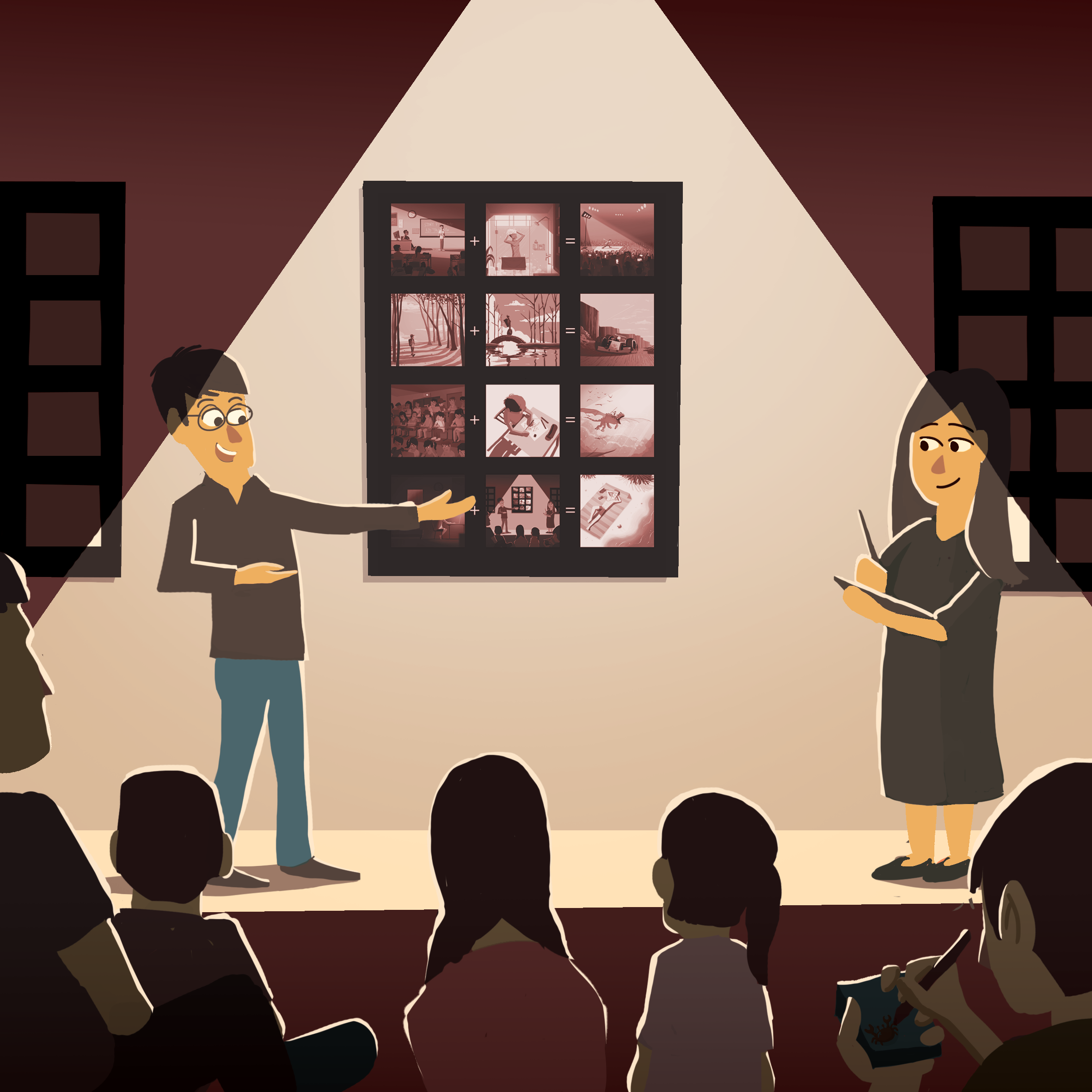
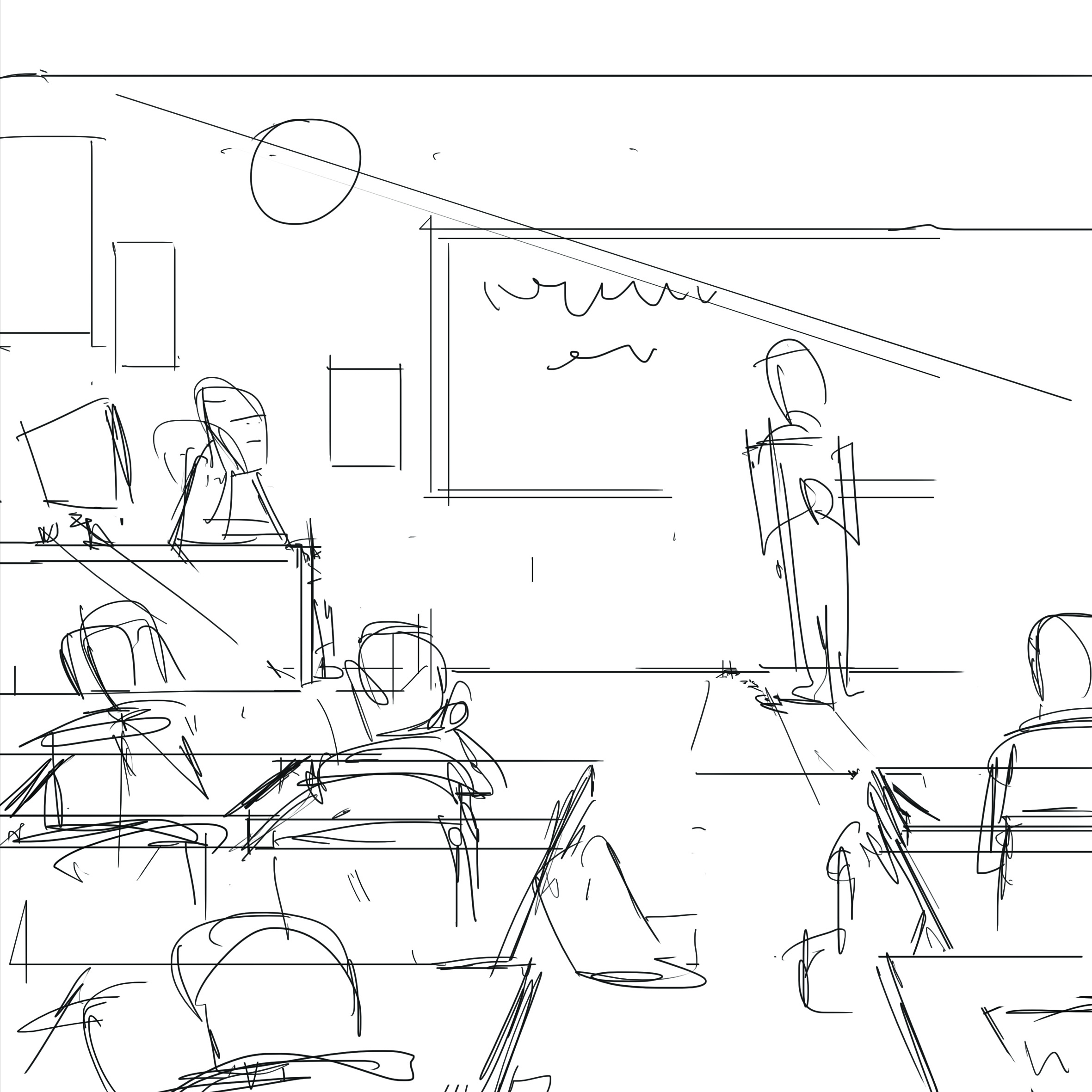
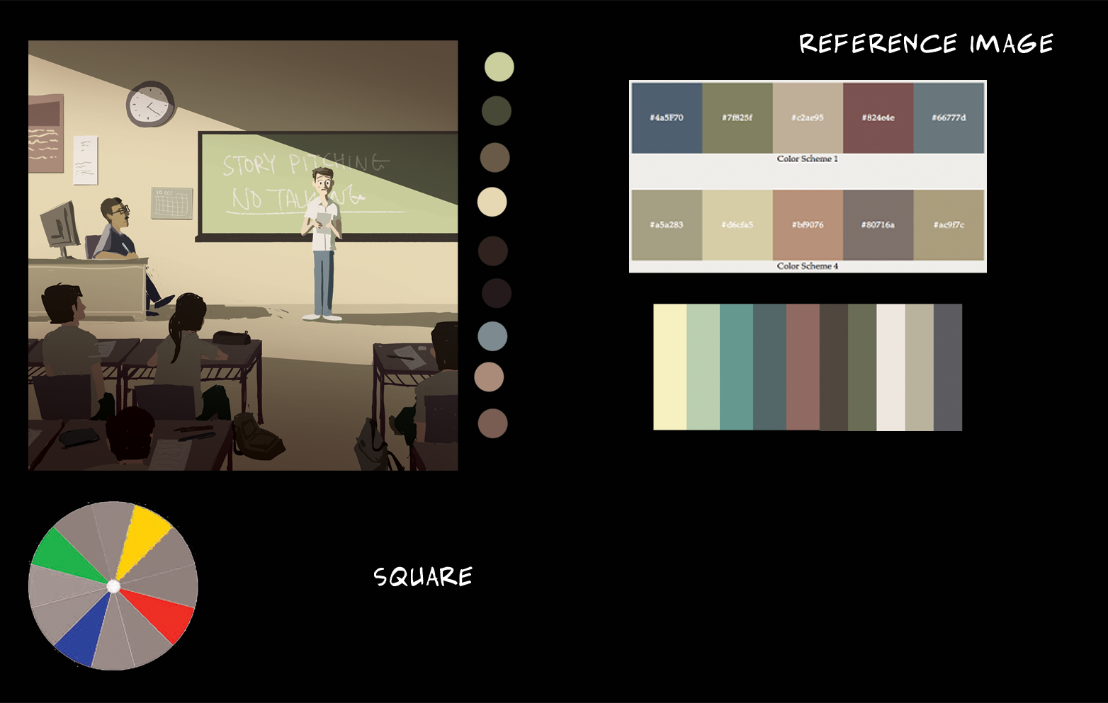
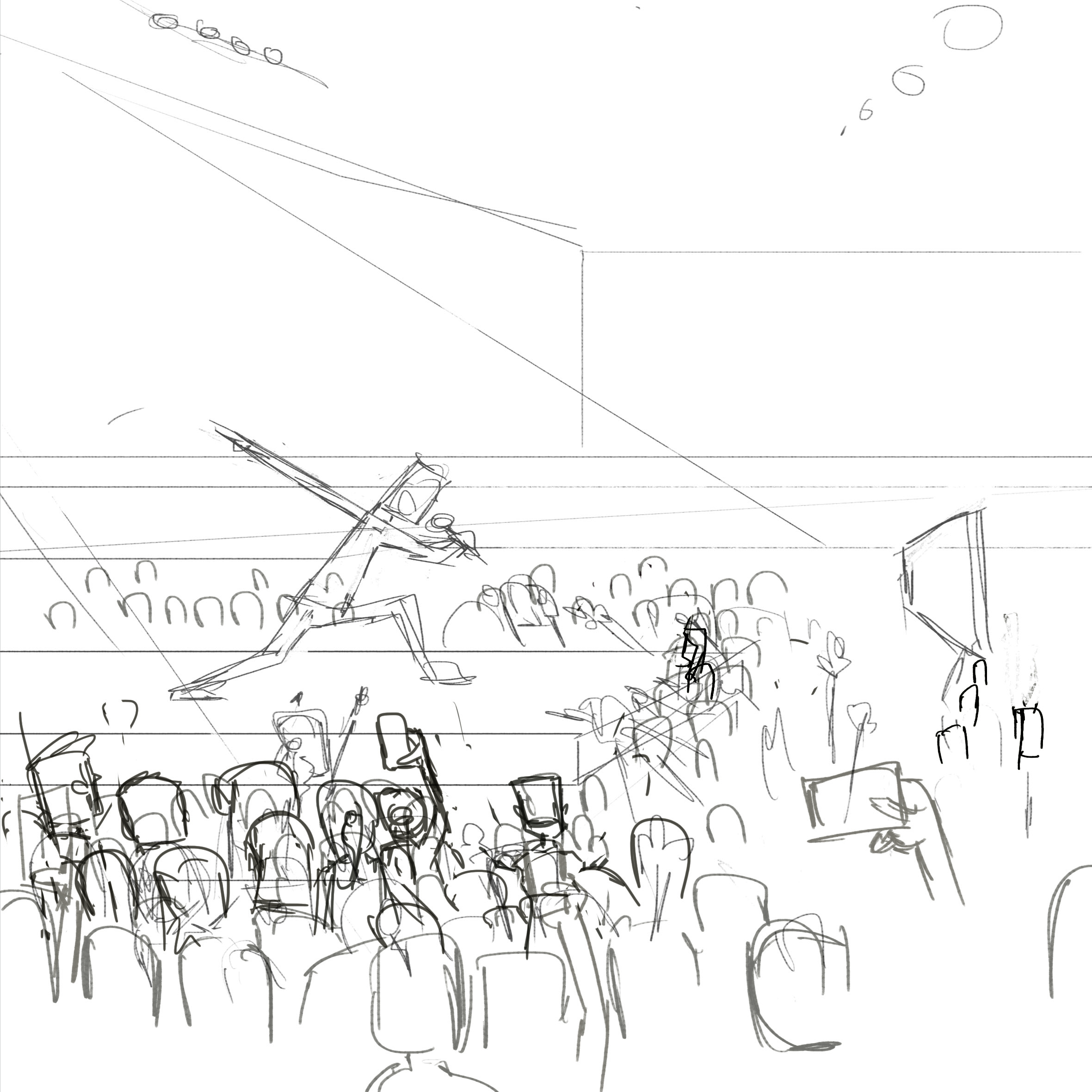
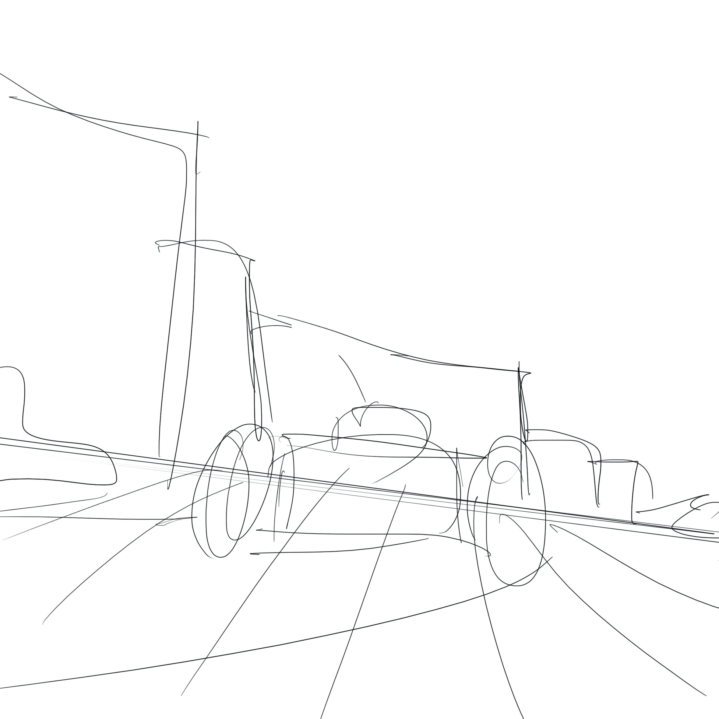
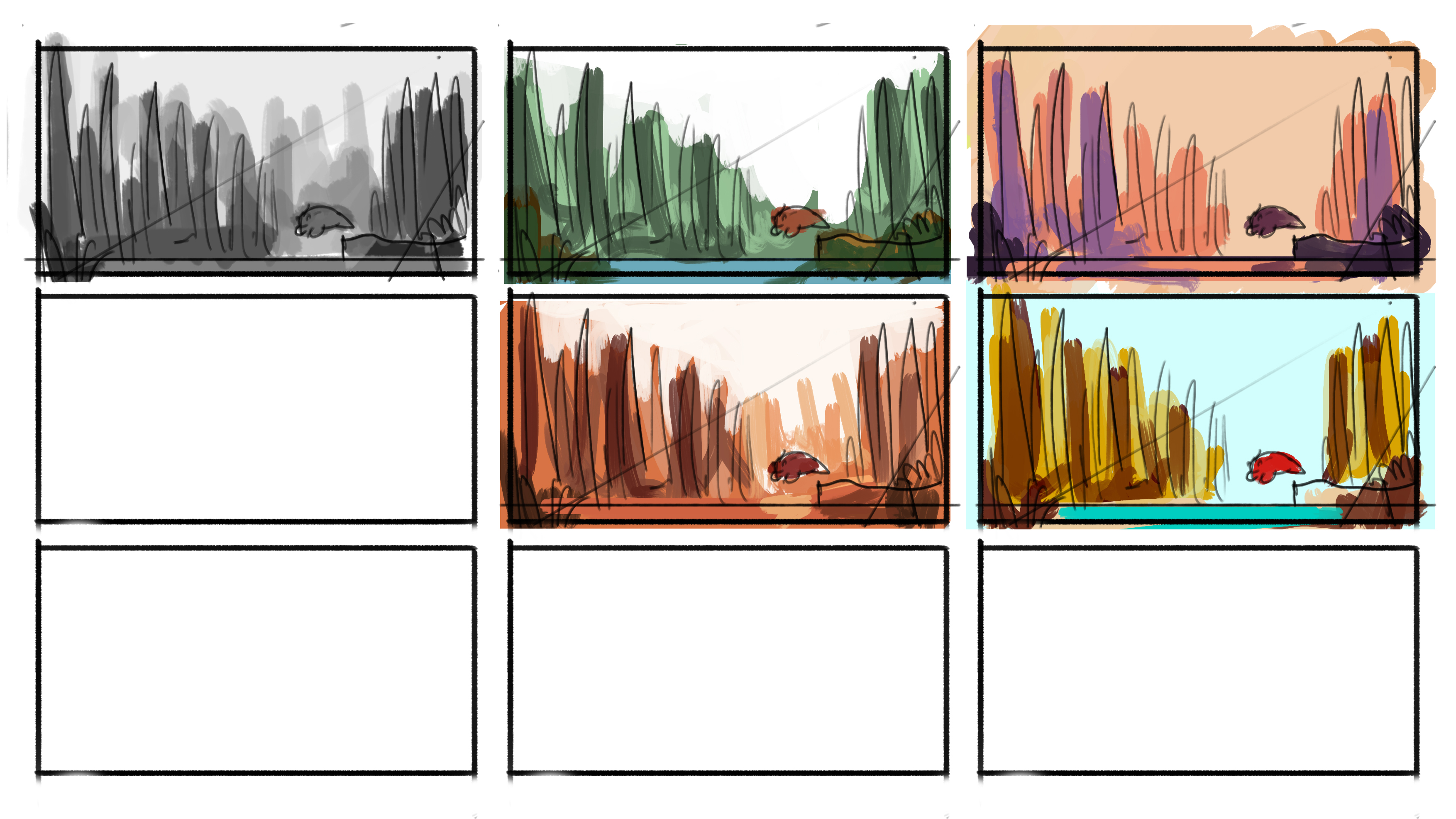
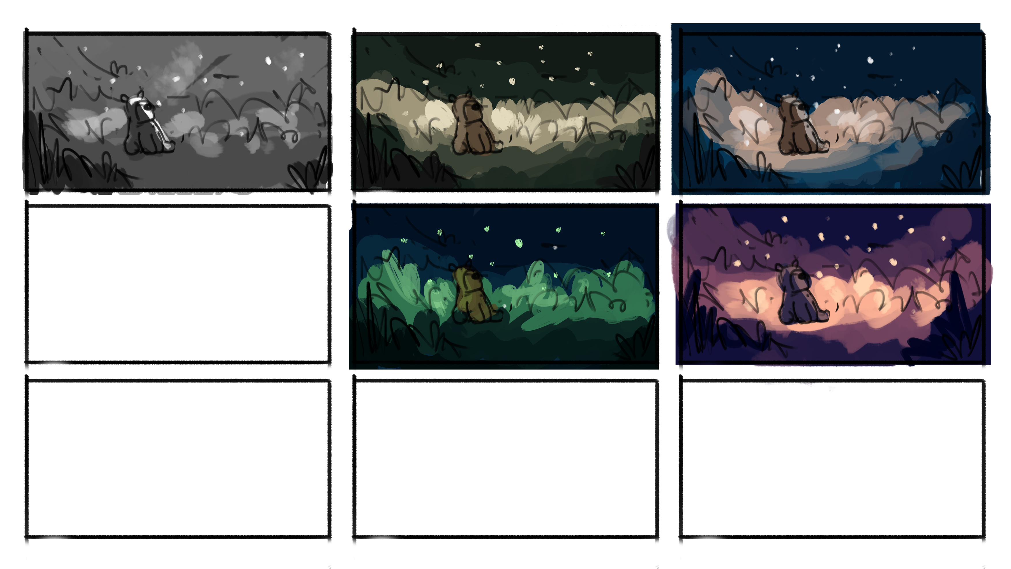
Thumbnails & Colour tests

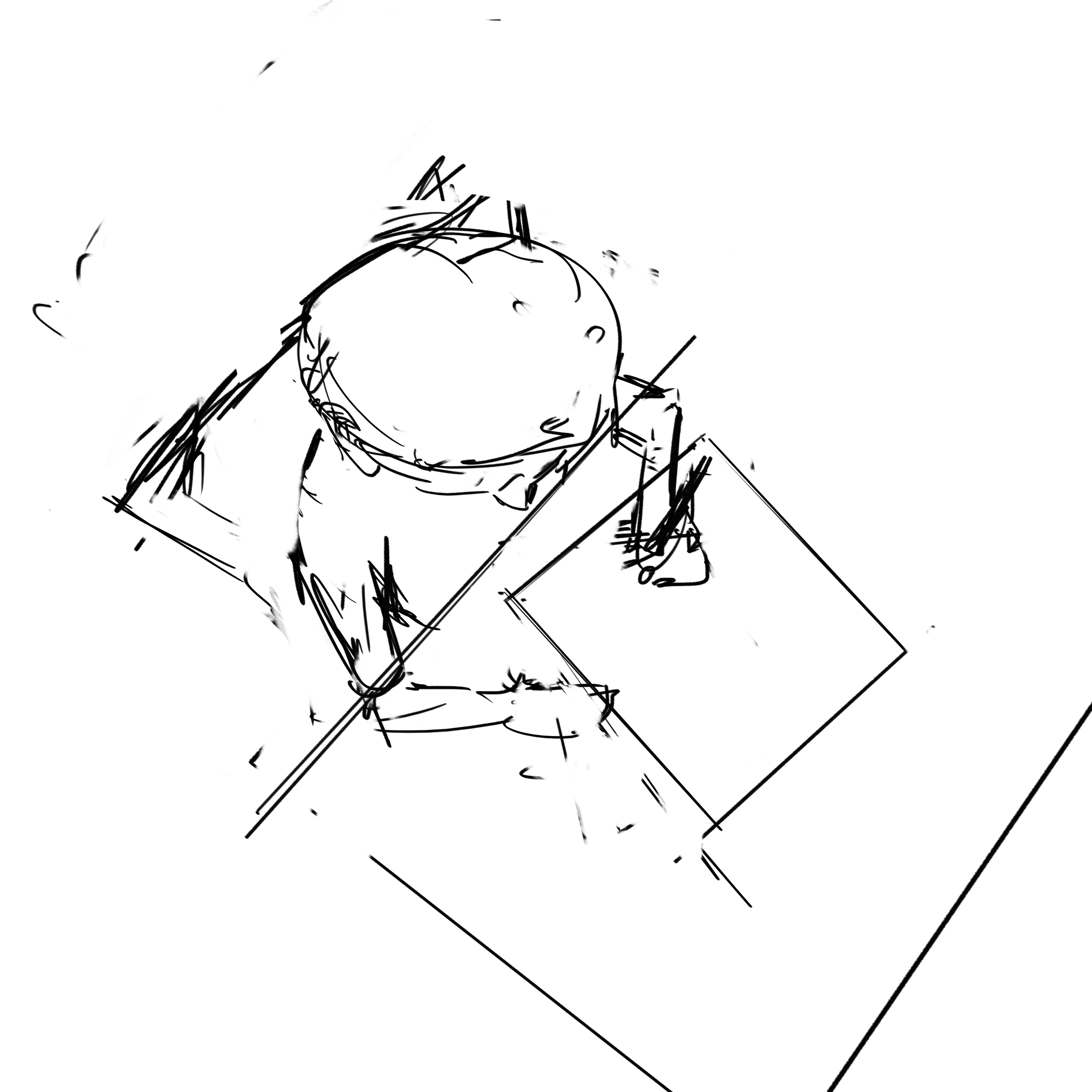
I started by sketching out thumbnails of different compositions for the various emotions. I then blocked out the values in grayscale. After which, I experimented with a few colour schemes and selected the one that best portrayed the particular emotion.
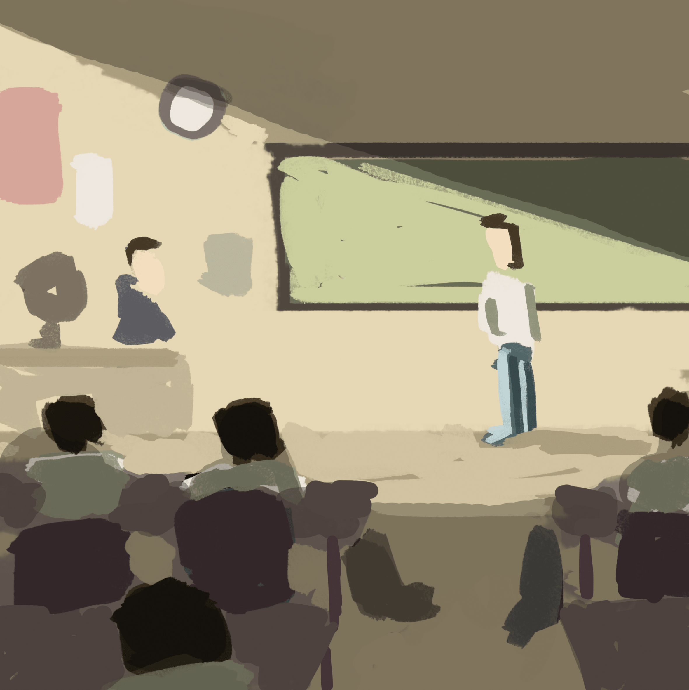
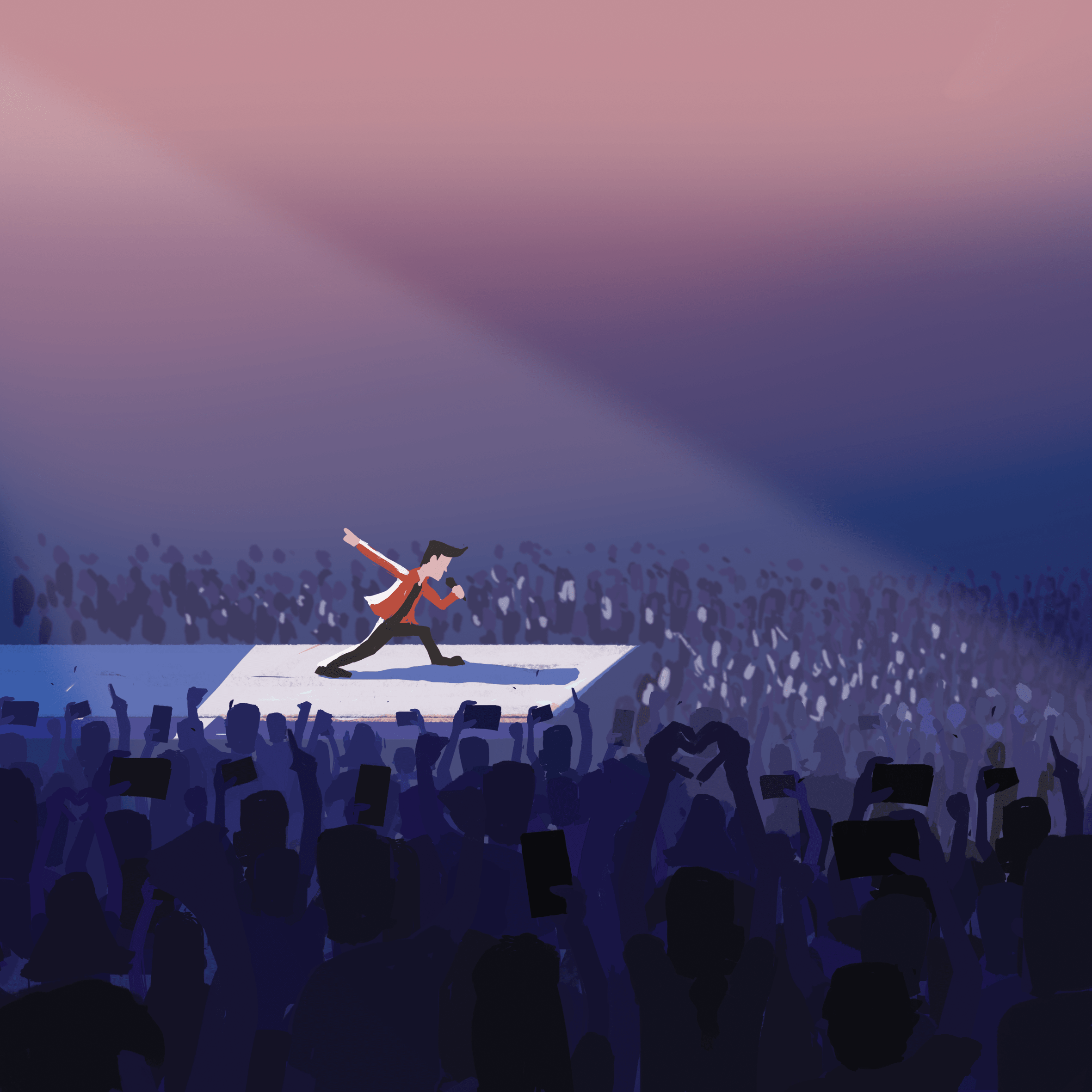
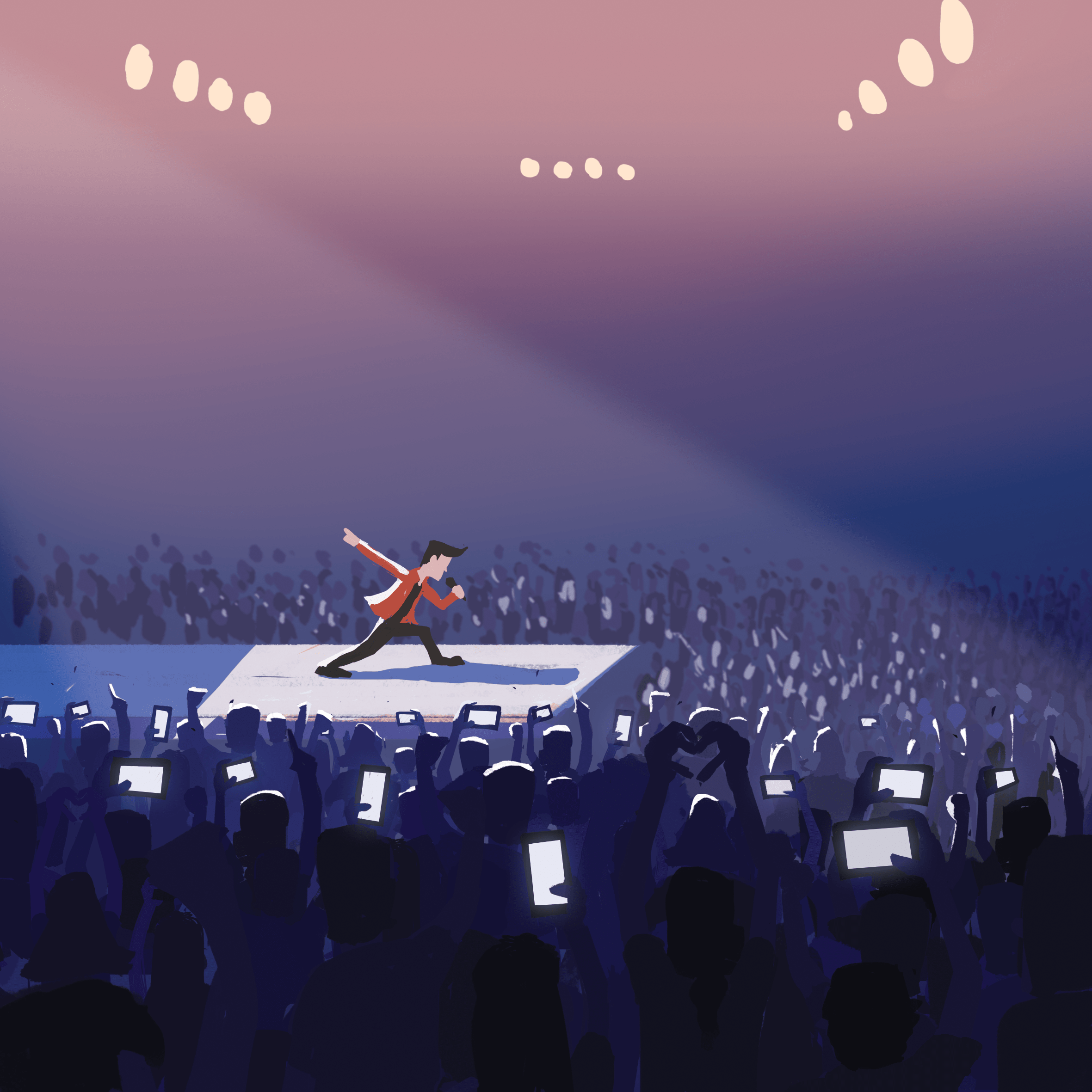
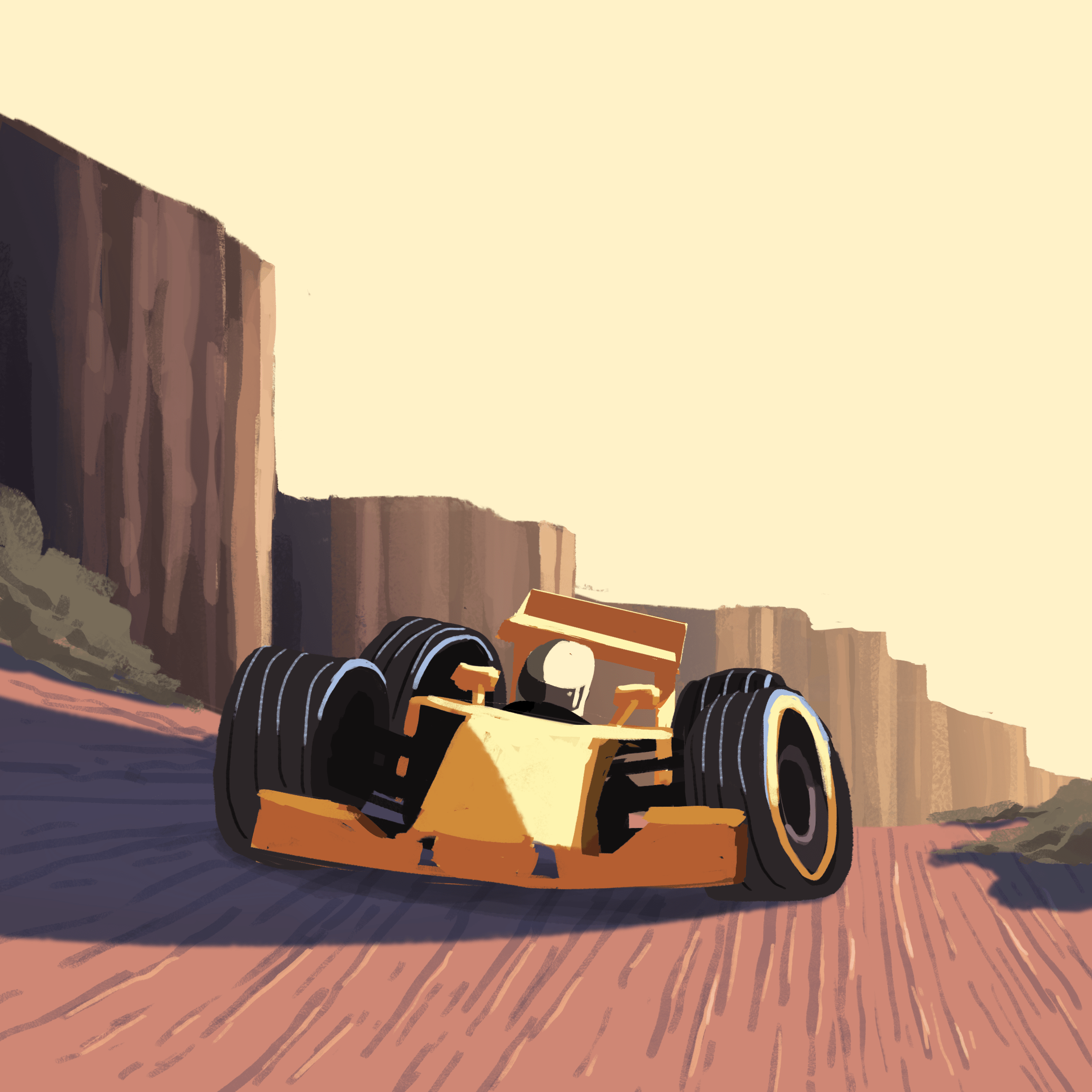
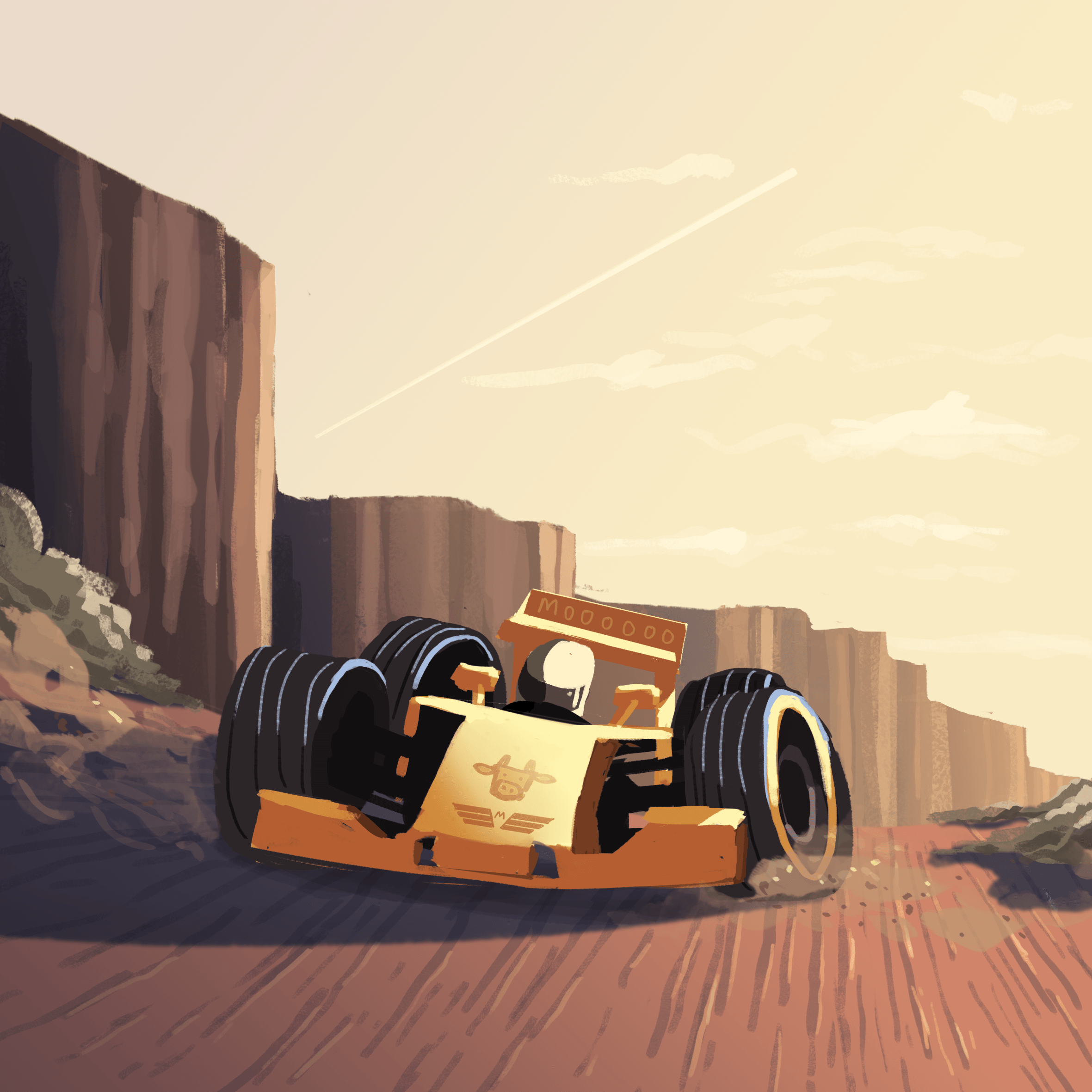
Thumbnails (Happiness)
Colour test (Happiness)
Thumbnails (Surprise)
Colour test (Surprise)
Thumbnails (Sadness)
Colour test (Sadness)
Thumbnails (Fear)
Colour test (Fear)

Final edits

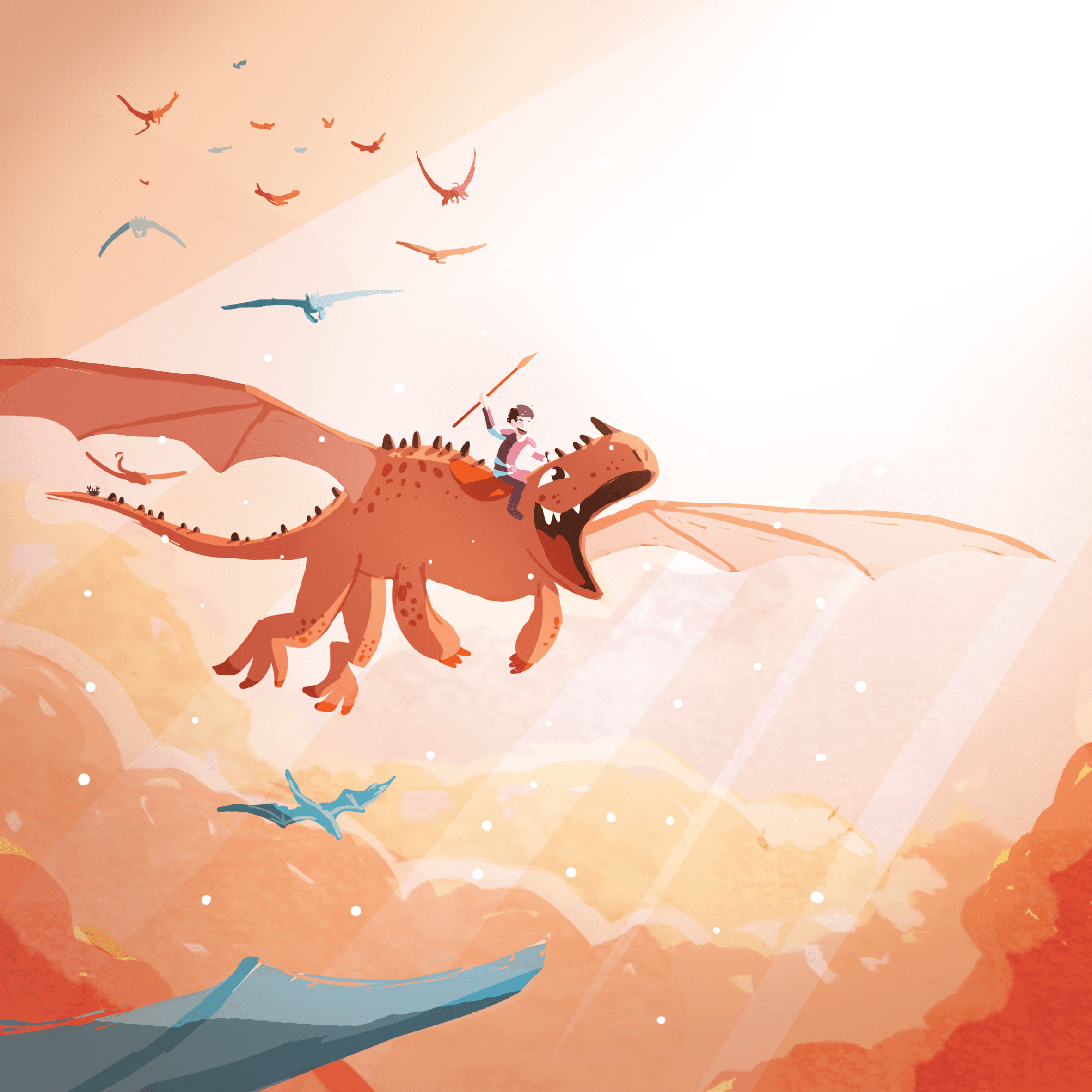
The final step was to add a subtle filter of light to enhance the image, creating the glow from the light sources.

Happiness (Before final edit)
Happiness (Final)
Surprise (Before final edit)
Surprise (Final)
Sadness (Before final edit)
Sadness (Final)
Fear (Before final edit)
Fear (Final)

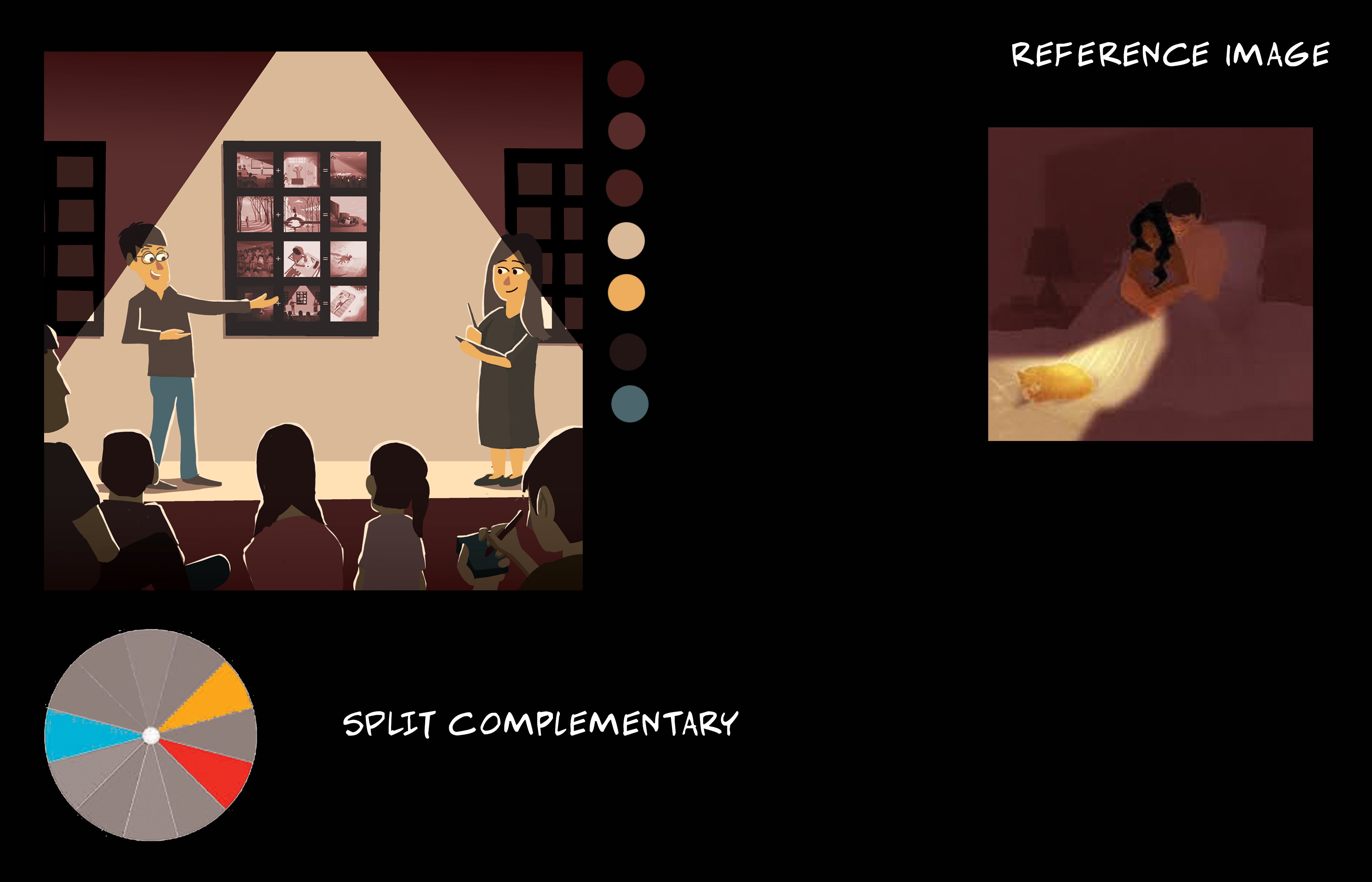
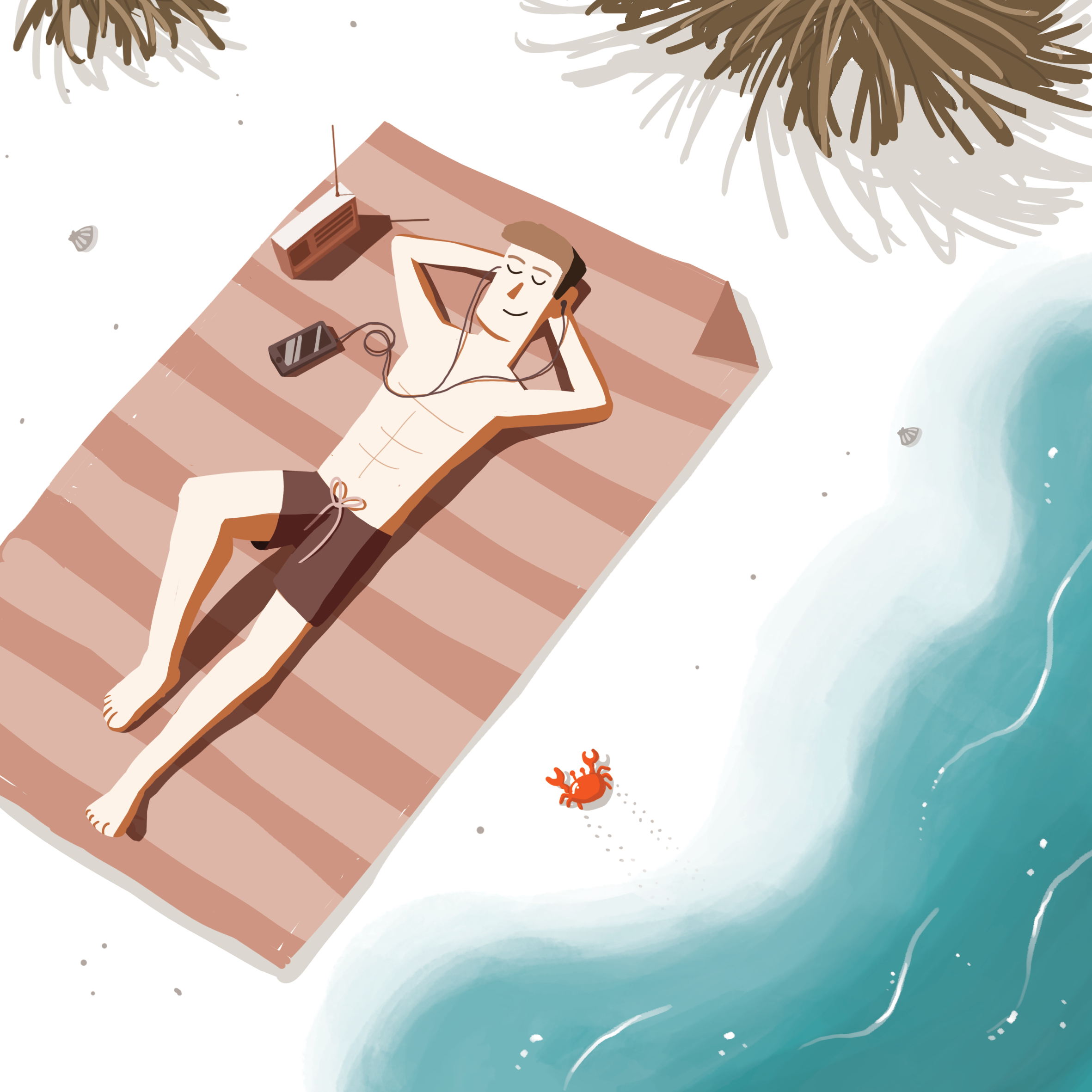
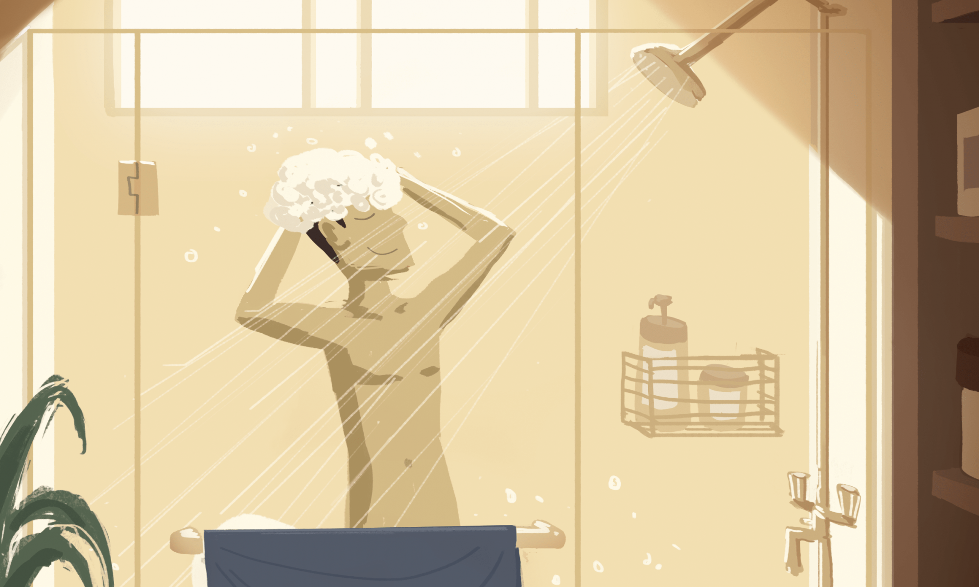
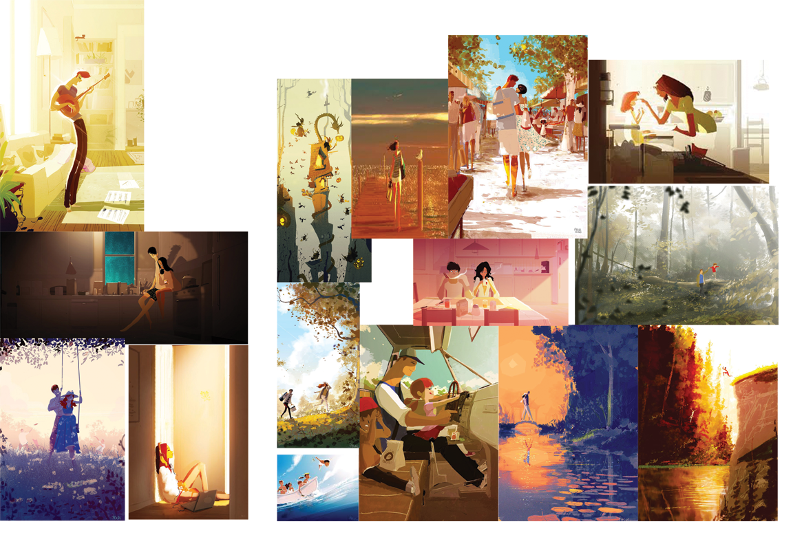
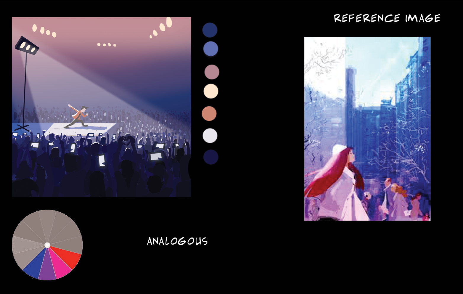
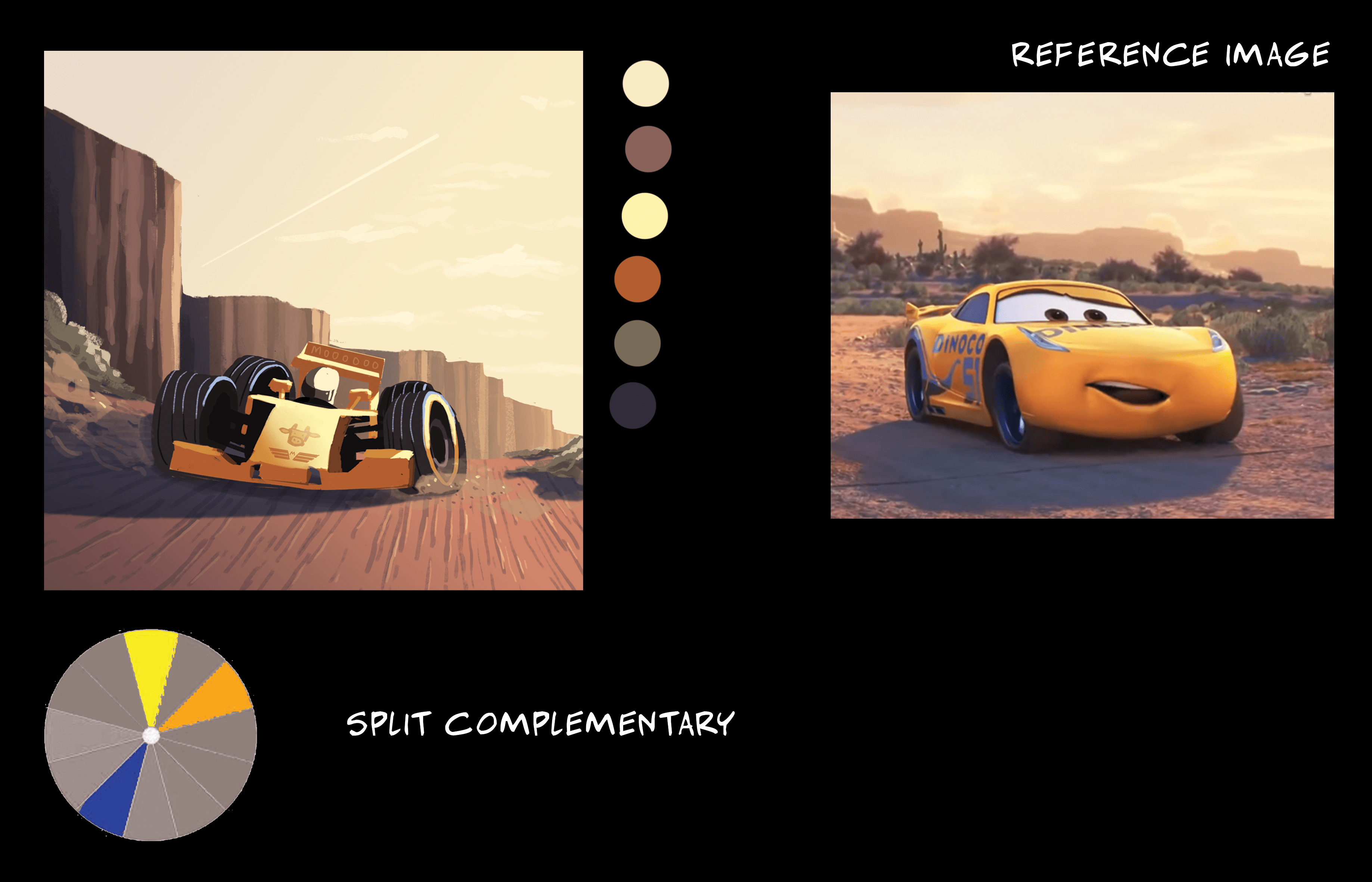
Research and references

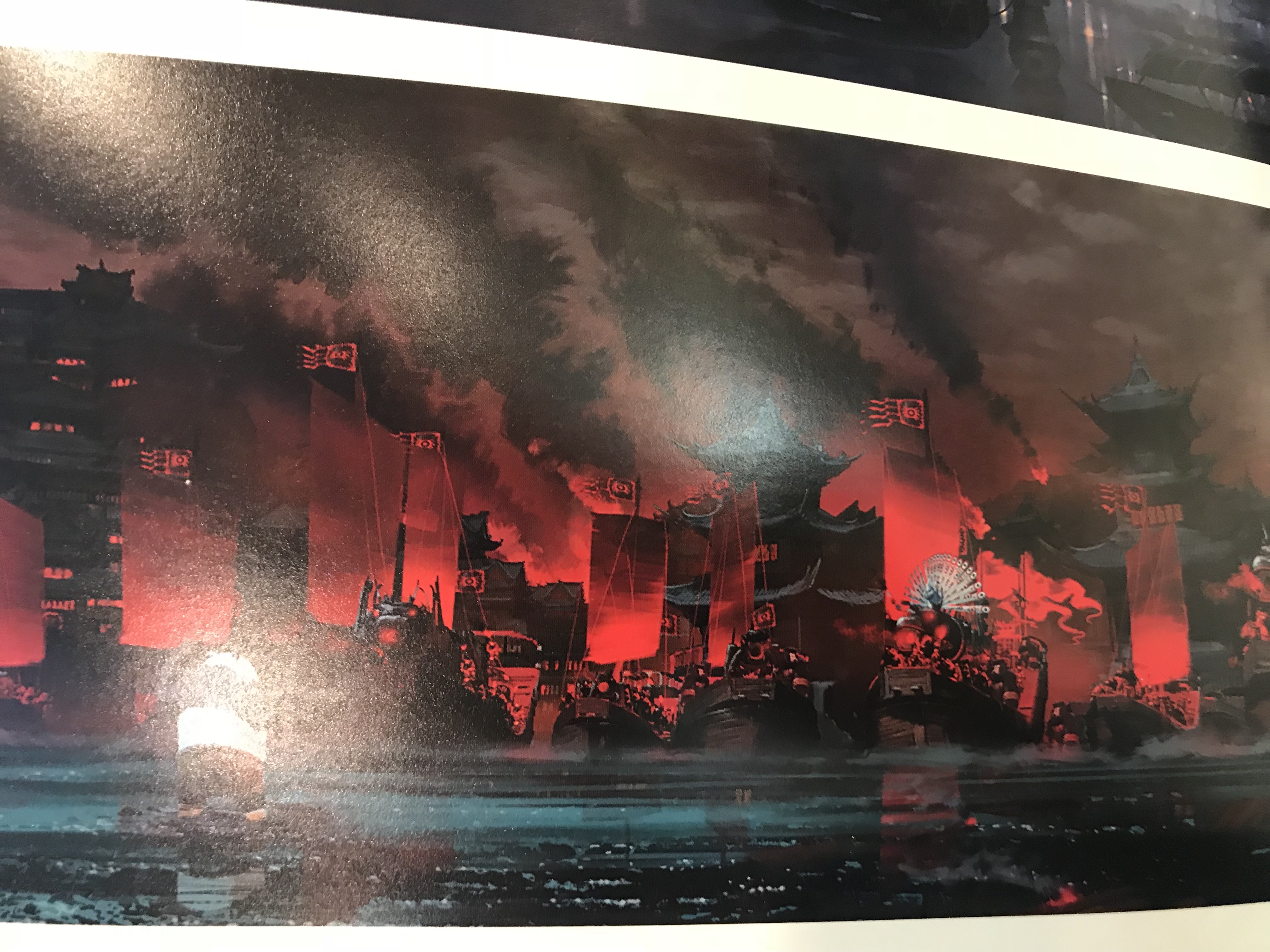
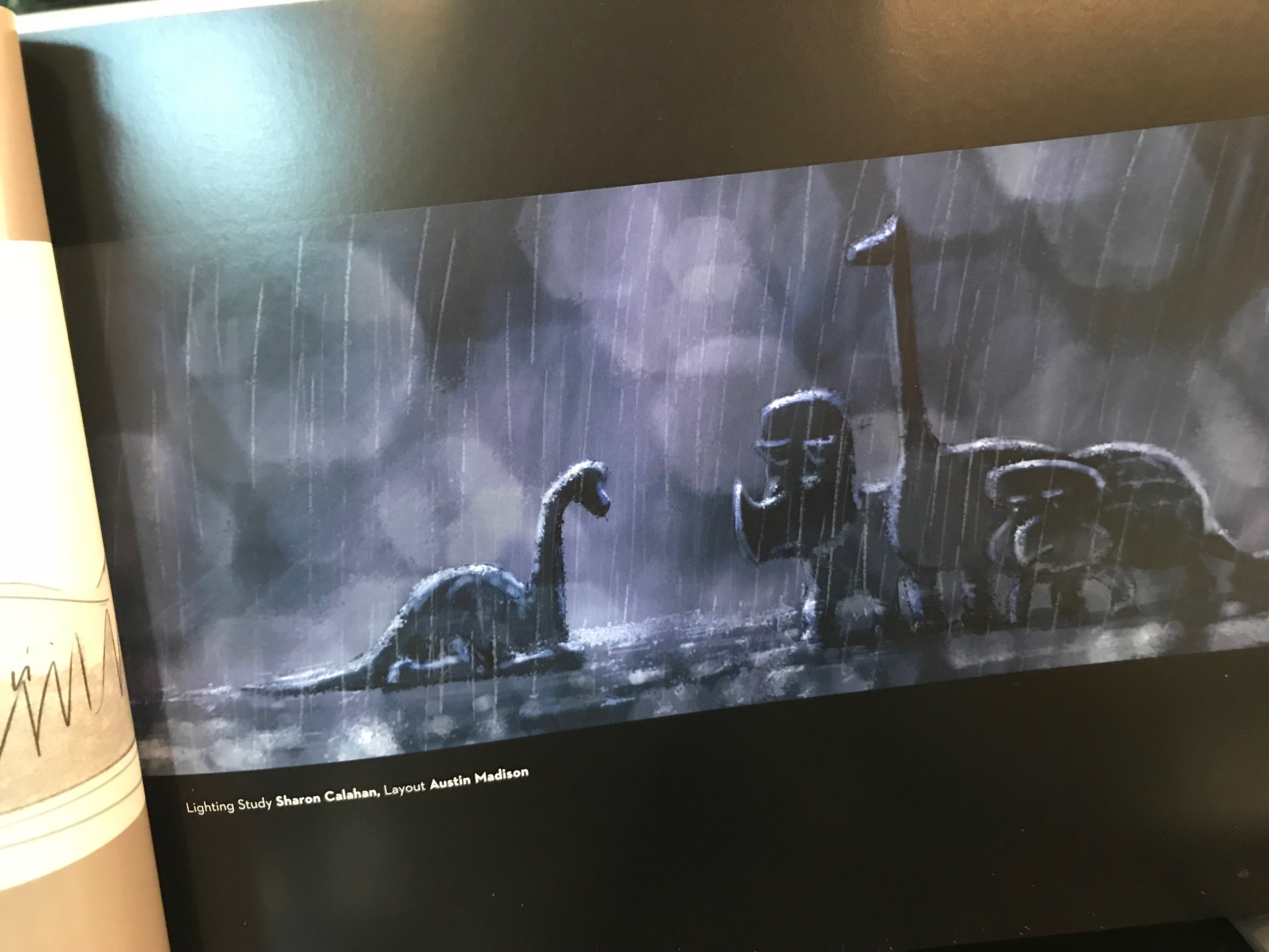
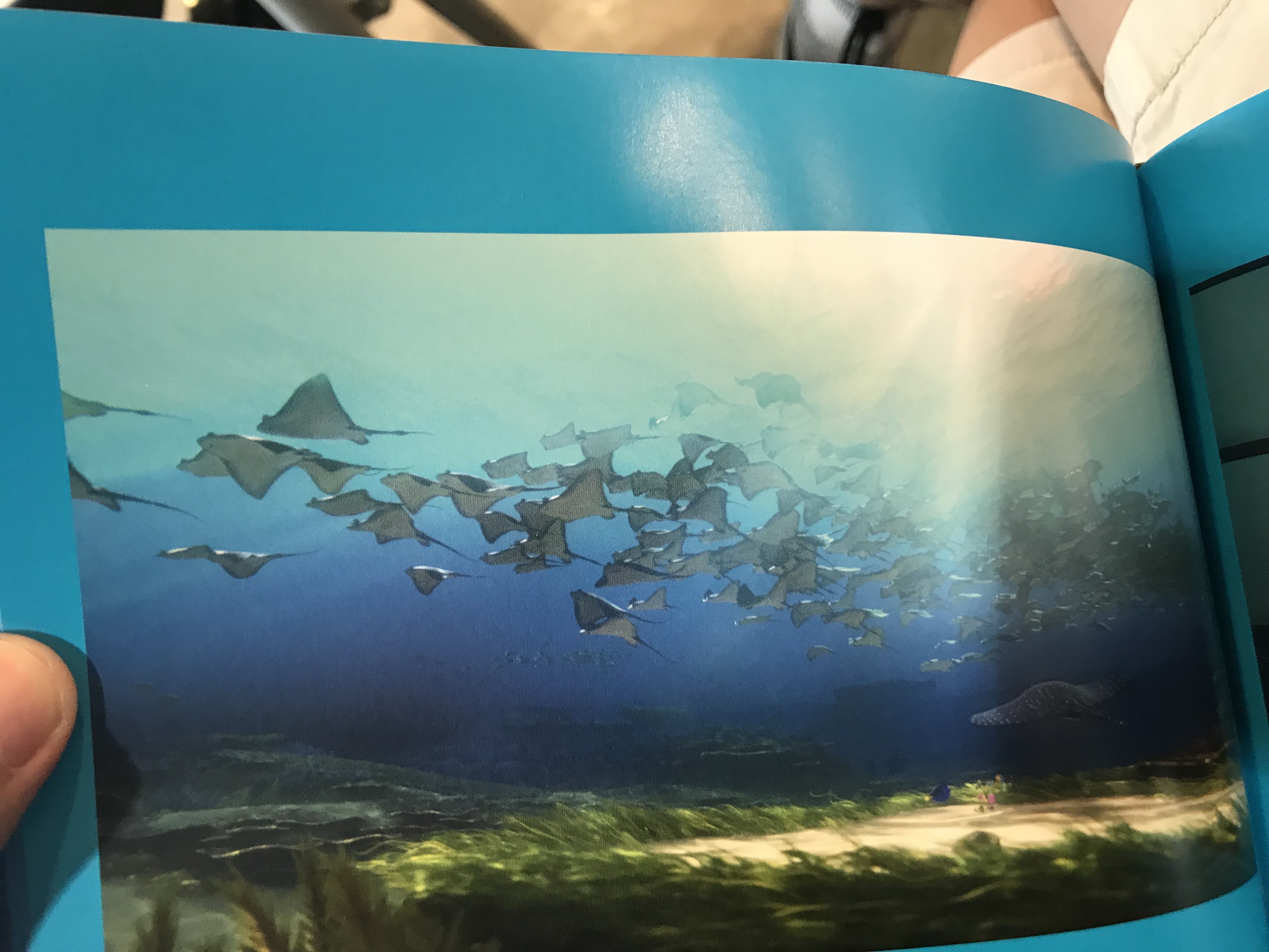
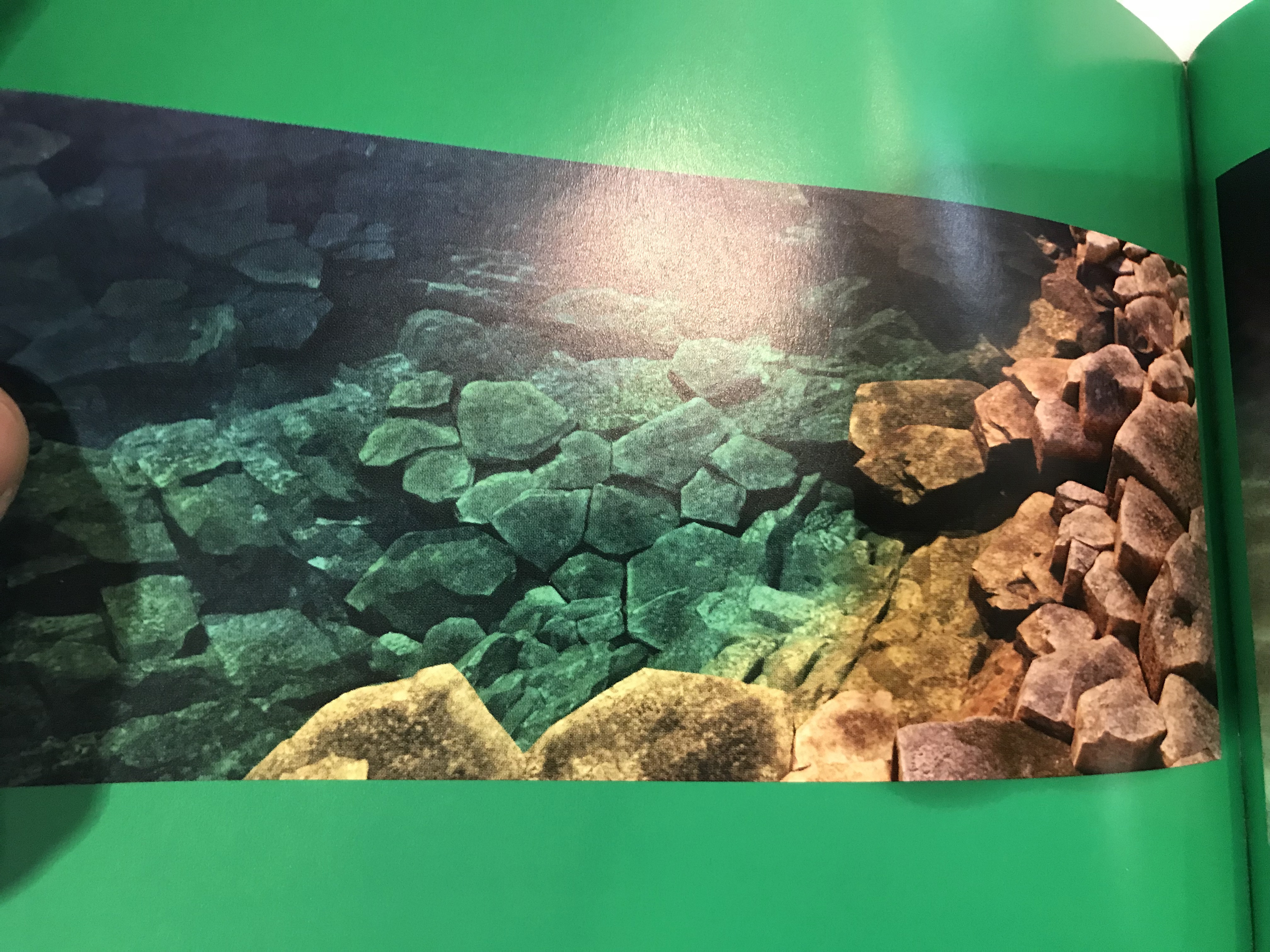
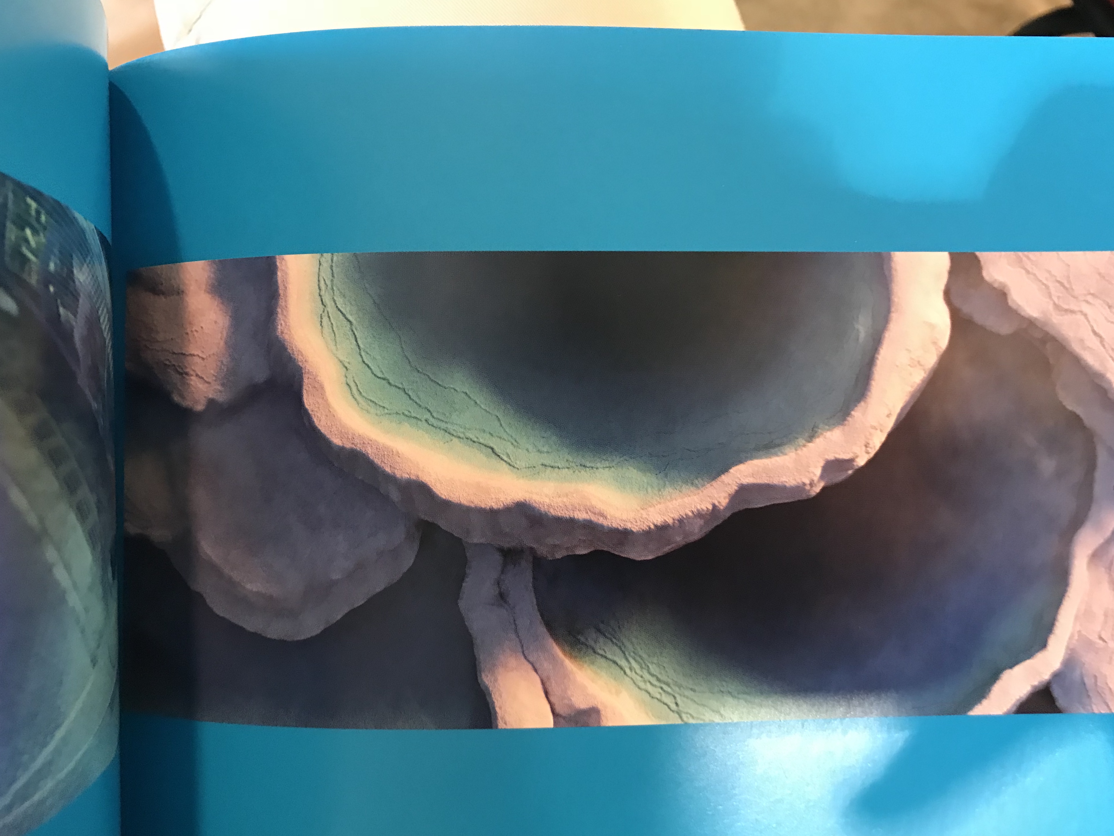
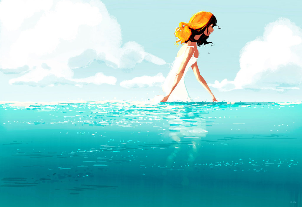
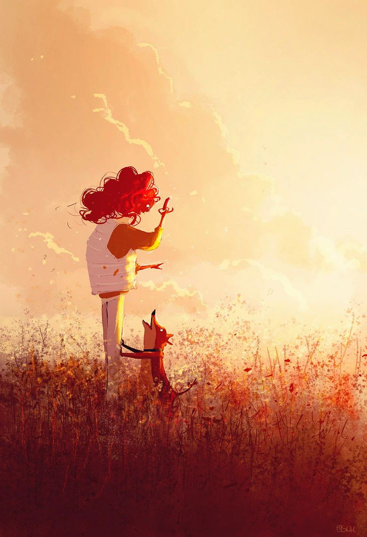
For my research, I looked at the concept art of various animation films, as well as a book called The Colour of Pixar, which contains scenes from various Pixar movies catalogued by colour. I also referenced Pascal Campion’s style of illustrating, his use of colours and the way he uses lighting to enhance his illustrations.

Art of Ratatouille
Art of Moana
Art of Kung Fu Panda 2
Art of The Good Dinosaur
The Color of Pixar
The Color of Pixar
The Color of Pixar
The Color of Pixar
Artwork by Pascal Campion

2D Project 3: Ego in different settings (Process Pt.3)

EQUATION 3

Equation 3
composition 7
Sketch
Colours
Finished
Colour scheme and reference image

A warm analogous colour scheme to replicate a dream-like state of boredom.

The character in focus is of a brighter colour as compared to the other characters.

composition 8
Sketch
Colours
Finished
Colour scheme and image reference

A warm analogous colour scheme that portrays a late-afternoon time of day.  It gives a peaceful and relaxing vibe which signifies the end of a day’s work.

composition 9
Sketch
Colours
Colours 2
Finished
Colour scheme and image reference

An orange and red colour scheme that signifies joy and adventure, the overlay of white lights gives a majestic feel to the composition. Complimenting these colours are a few touches of blue.

EQUATION 4

Equation 4
composition 10
Sketch
Colours
Finished
Colour scheme and image reference

I really liked the use of the turquoise in the otherwise dull brownish illustration as seen from the reference image. The fog effect on the window makes it seem as though it is glowing. Rim lights were added to the elements in the darker areas to make them stand out just a little. A blurred foreground element is added  to give a sense of depth in a ‘flat’ image.

composition 11
Sketch
Colours
Finished
Colour scheme and image reference

Split complementary of maroon red, pale orange, and a hint of blue. Foreground characters are in the shadows but with rim lights so that they interact with the light in front if them.

composition 12
Sketch
Colours
Finished
Colour scheme and image reference

Warm red and oranges and white sand to portray a sunny beach setting, along with a cool turquoise water at the shoreline to complete the beach-y vibe.

2D Project 3: Ego in different settings (Process Pt.1 & 2)

Process Part  1

Artist/ Colour references

Artworks by Pascal Campion


Equation 1
Composition 1
Sketch
Colour block-in
Finished

During consultation, Joy suggested that the foreground could be slightly more red so that the greens in the foreground will not take too much attention away from the prominent green chalkboard.

After consultation
Colour scheme and reference image (muted colours found online)

Square – Two sets of complementary colours

  • Yellow (Dominant) & Blue
  • Green (Dominant) & Red

I went for a muted colour scheme to depict a typical ‘boring’ classroom environment. The main character is standing in the light which is shining down onto him, also, the foreground is darker to further draw attention away onto the main character.


COMPOSITION 2
Sketch
Colours
Finished


Colour scheme and reference image

A warm and vibrant colour that reflects a sense of happiness, with a hint of blues and greens to compliment it, which breaks it from the otherwise monochromatic colour scheme, making it more visually engaging. Darker foreground elements create a sense of depth, and the main character is in the light.

COMPOSITION 3


Sketch
Colours


Finished

Joy had suggested to add a light stand with light ‘pouring down’ on the stage so that it is similar to the shower head ‘pouring down’ the water. Similarly, the cone of light in the first composition also seem to be ‘pouring down’ onto the main character.

After consultation
Colour scheme and image reference

An cool analogous colour scheme of blue-violet-magenta and a little red creates relaxing composition of colours which is easy to look at. It also gives sort of a hypnotic vibe, where everyone in a concert is simultaneously singing along and moving simultaneously to the rhythm and beat of the music. A more detailed foreground and a blurry background gives a sense of depth and vastness of the location.

Process Part 2

Equation 2
Composition 4


Sketch
Colour block-in


Finished

Joy had suggested to make the green leaves more yellow-olive, and the red hat slightly violet, but eventually I made the hat lean towards orange and made the sky less green and more blue to fit into a split complementary colour harmony.

After consultation


Colour scheme and image reference

An orange-yellow colour scheme to signify a peaceful afternoon setting, with a complimentary blue to add a cool hue to the warm colours.

Composition 5
Sketch
Colour block-in
Finished
Colour scheme and image reference

A triadic colour scheme for a balanced use of colours. The strong yellow rim light and high contrasting shadows gives a strong late-afternoon lighting, as if riding back home after a day’s work.

Composition 6
Sketch
Colours
Finished
Colour scheme and image reference (From Pixar’s Cars 3)

I had initially wanted to go for a muted greyish colour scheme with reds and greens to represent a race track environment with coloured race cars. But I thought of the outdoor environments from Pixar’s Cars and used that instead. A warm orange with complimentary colours for shadows and a tint of it in the sky, for a peaceful sunset-desert environment.


Coming soon…

Pascal Campion

Pascal is a freelance artist known for his vibrant digital illustrations, which are based on his everyday life and his family.

An artwork by Pascal Campion