Assignment 1 – Fear

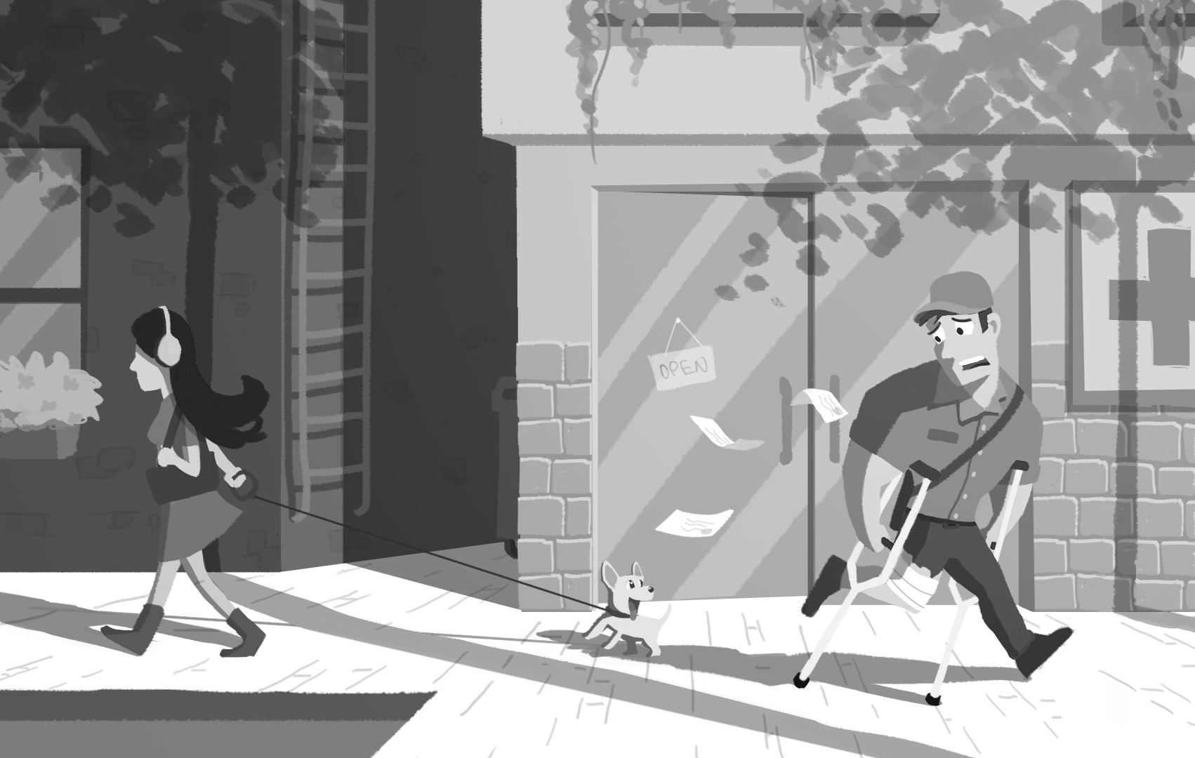
For this assignment, we were tasked to tell a story with a single image that explores fear (phobia).

Final Images

Assignment 1A

Image 1 – Before
Image 1 – After

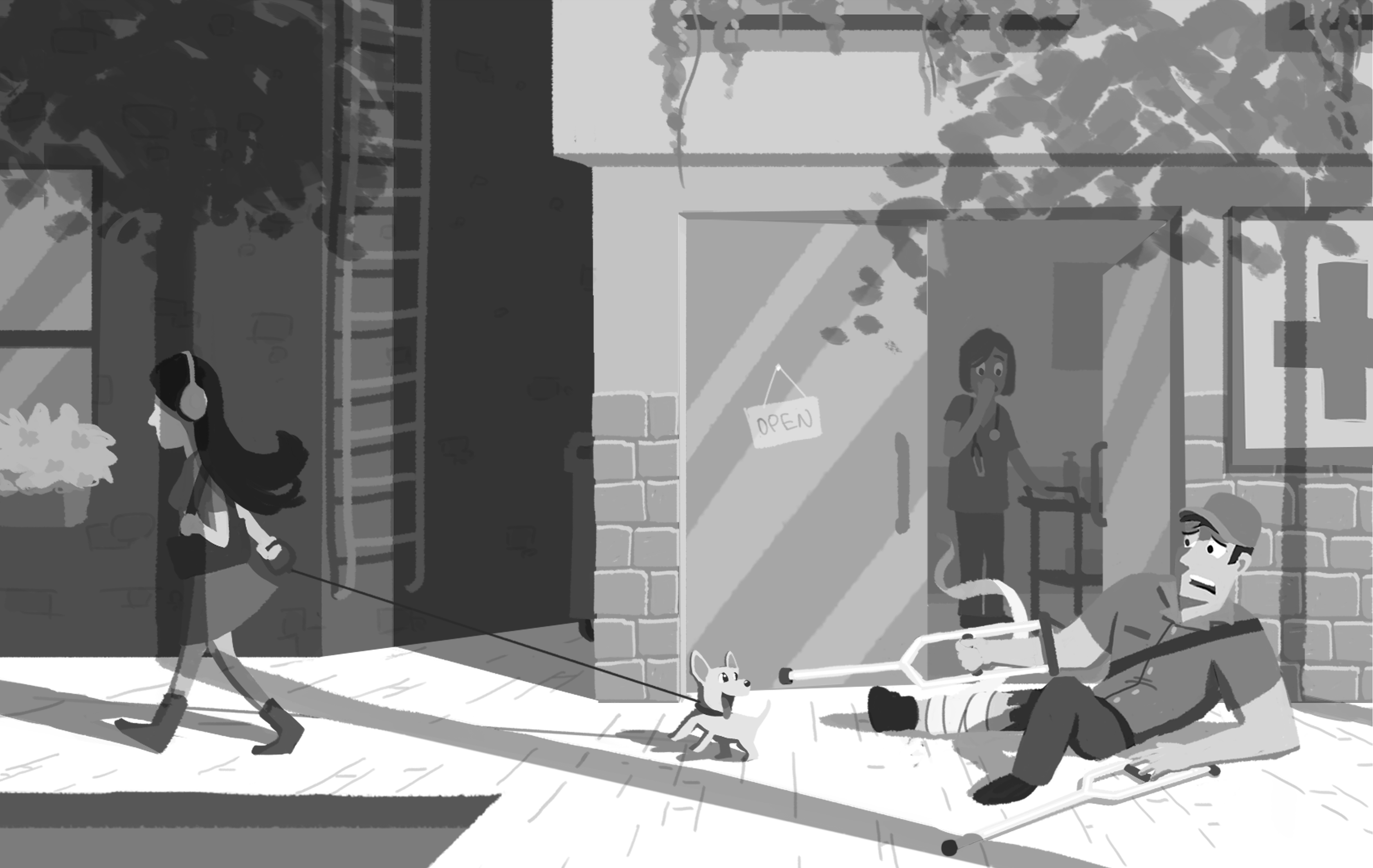
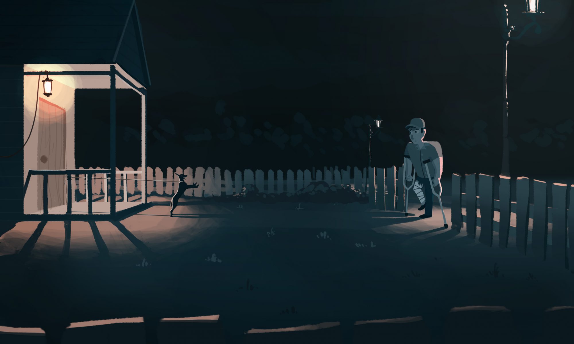
Instead of having the postman running away, I made him fall on the ground, desperately struggling to back away from the dog, which exaggerates the sense of fear in him he has. The clinic door is also open to show more clearly he had just exited from the clinic.

Assignment 1B

Image 2
Image 3

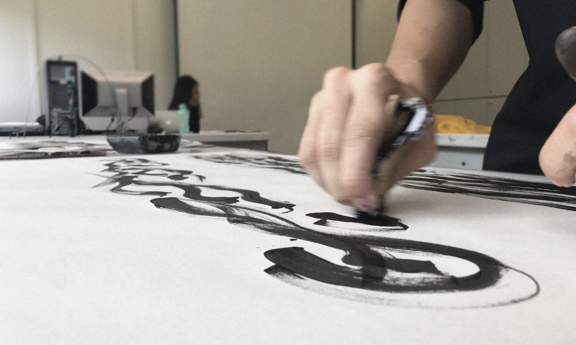
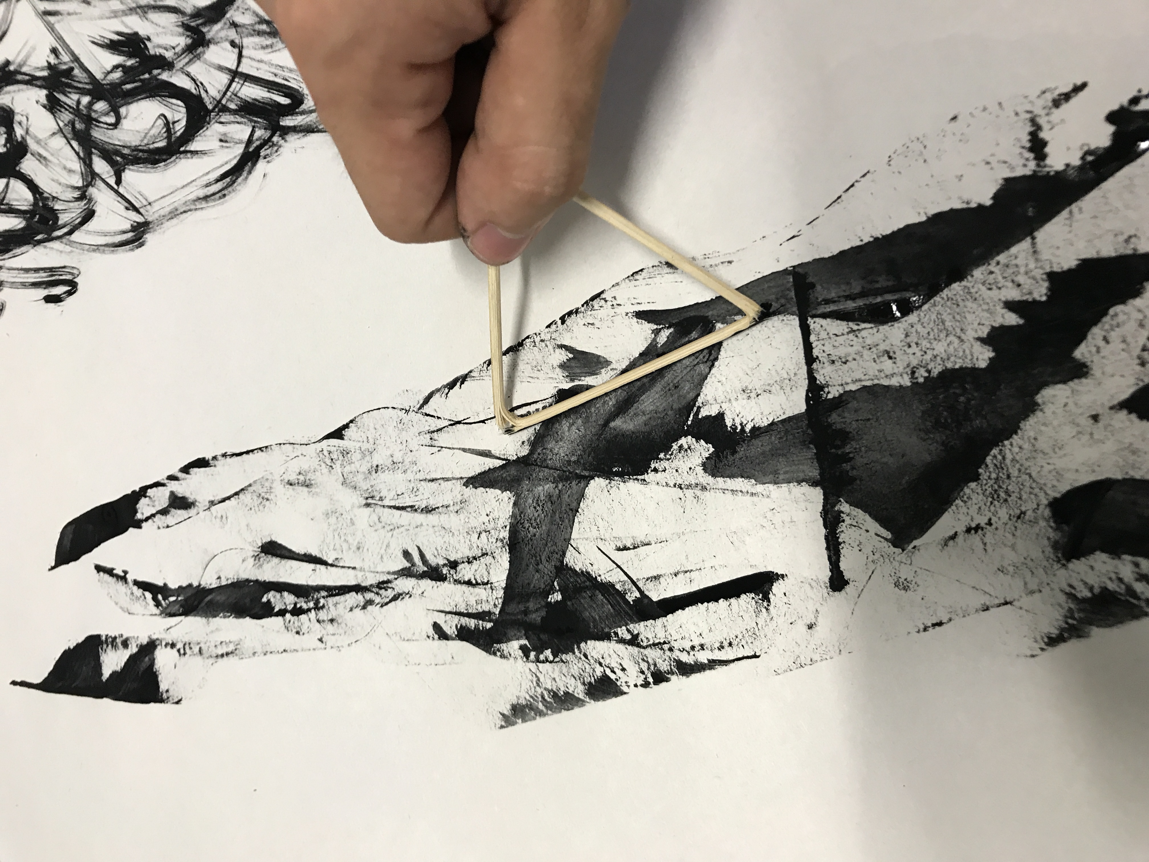
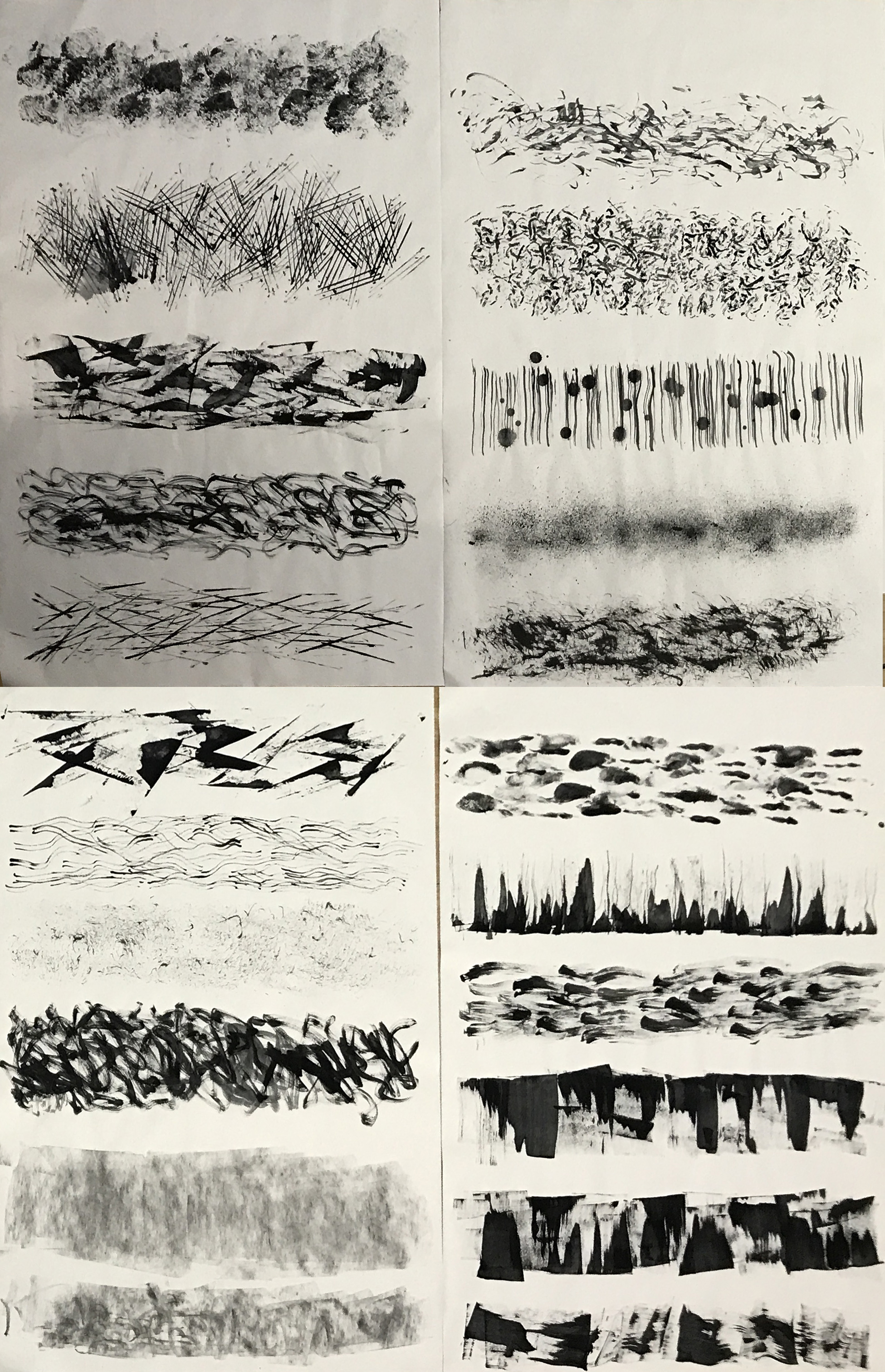
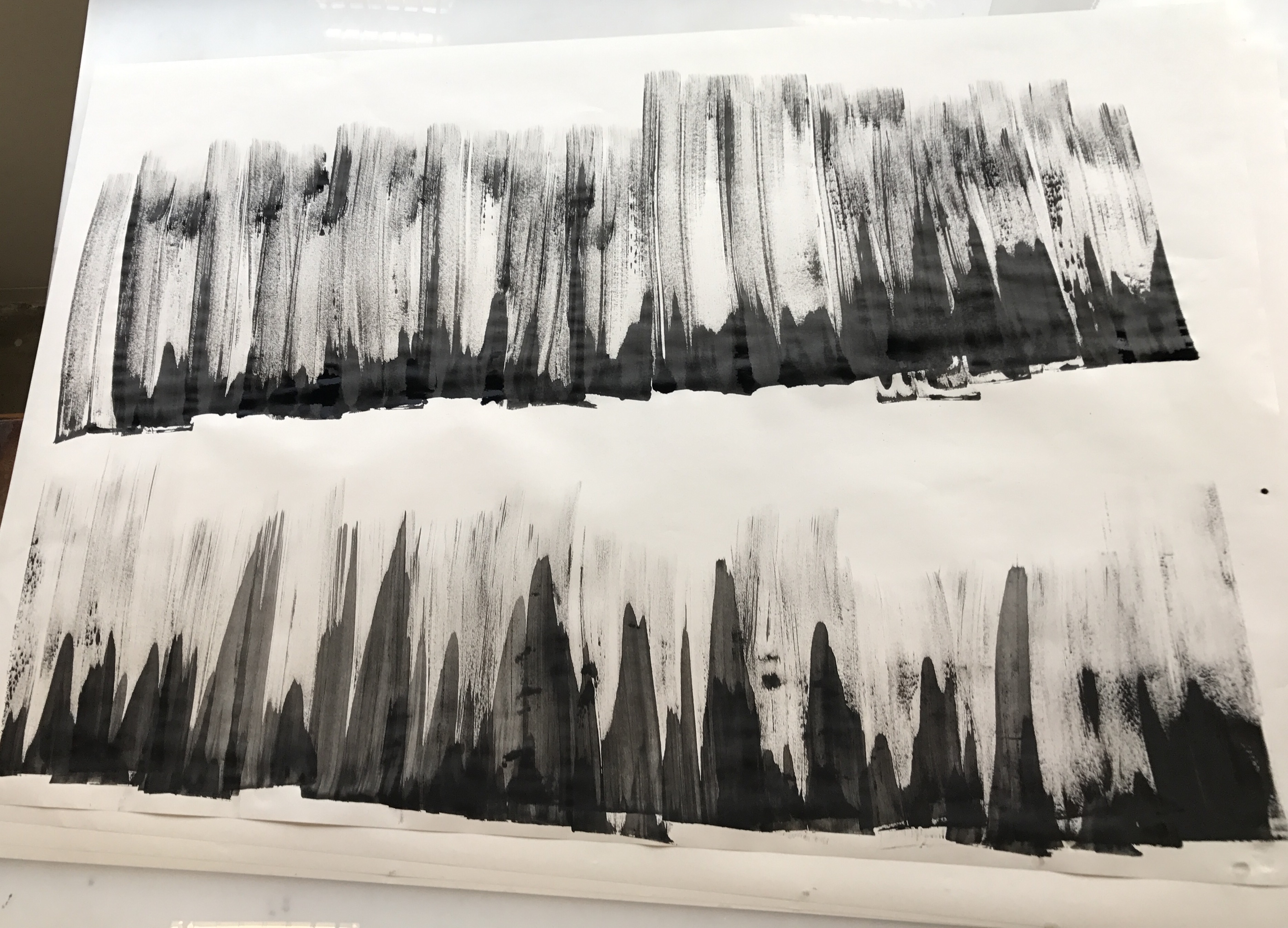
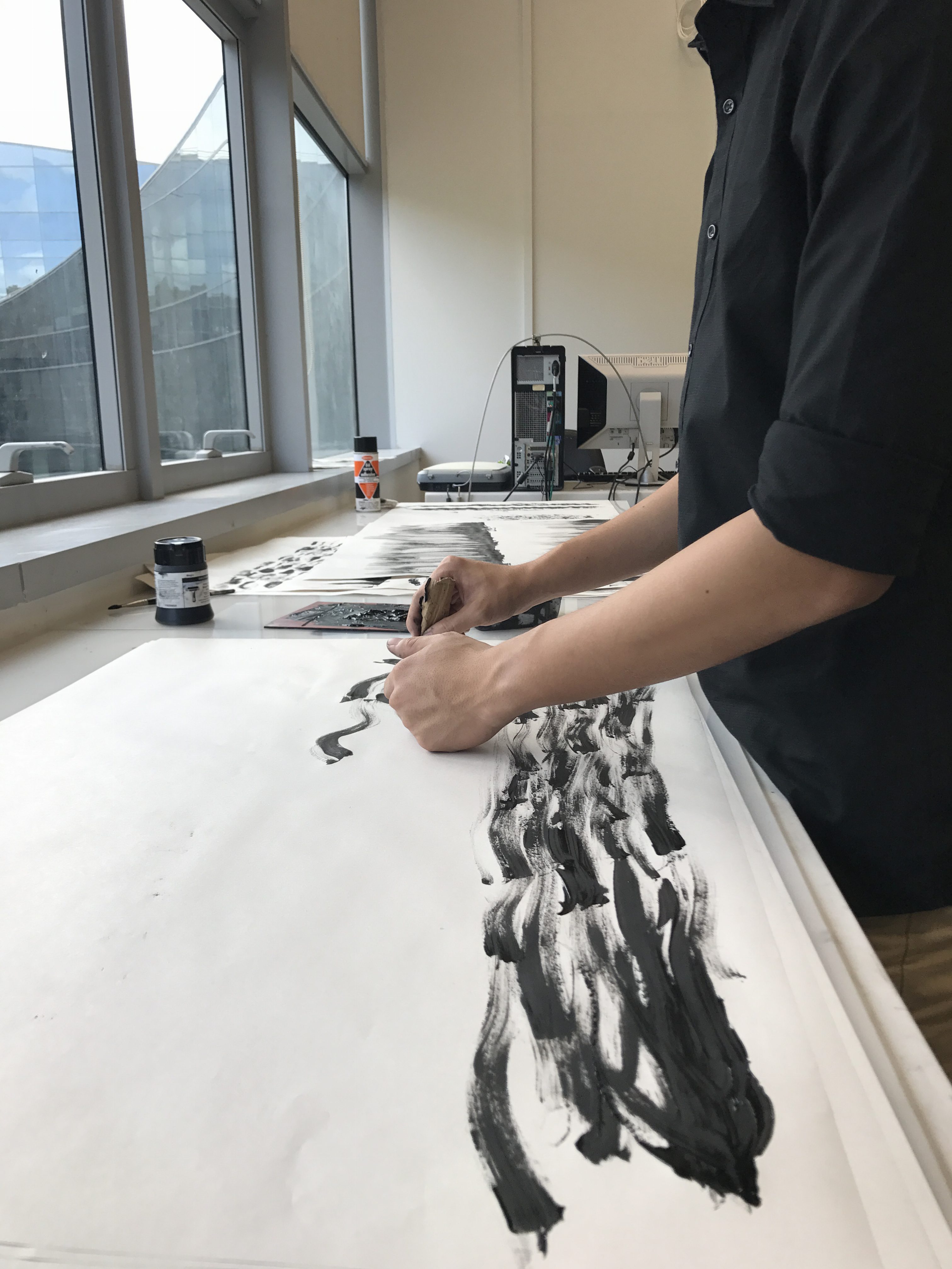
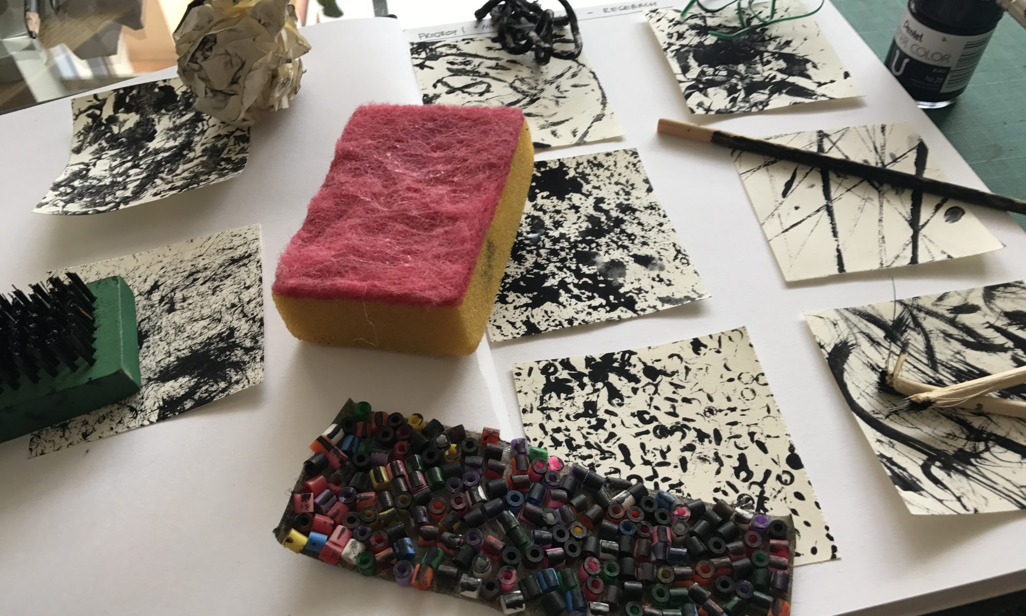
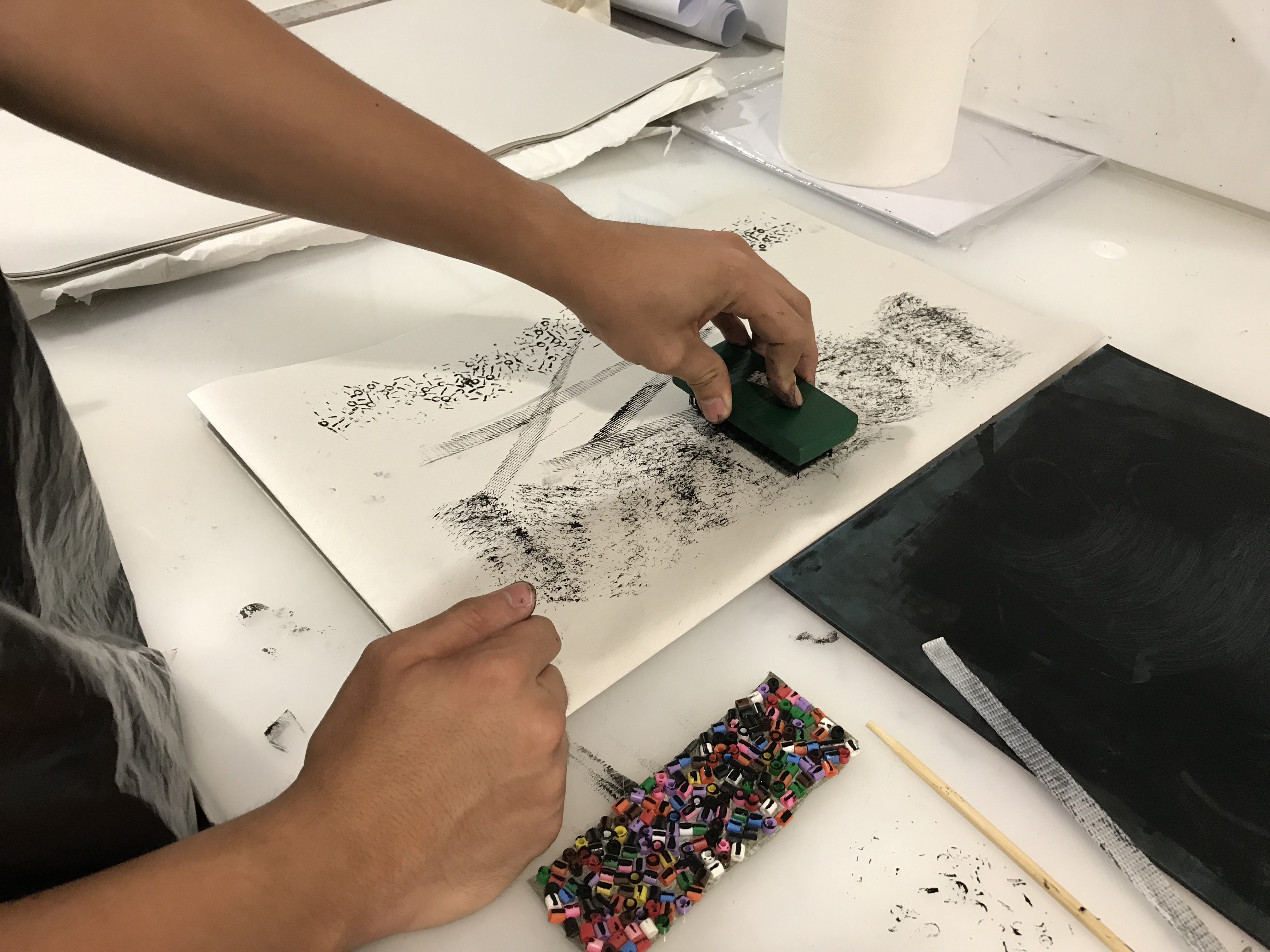
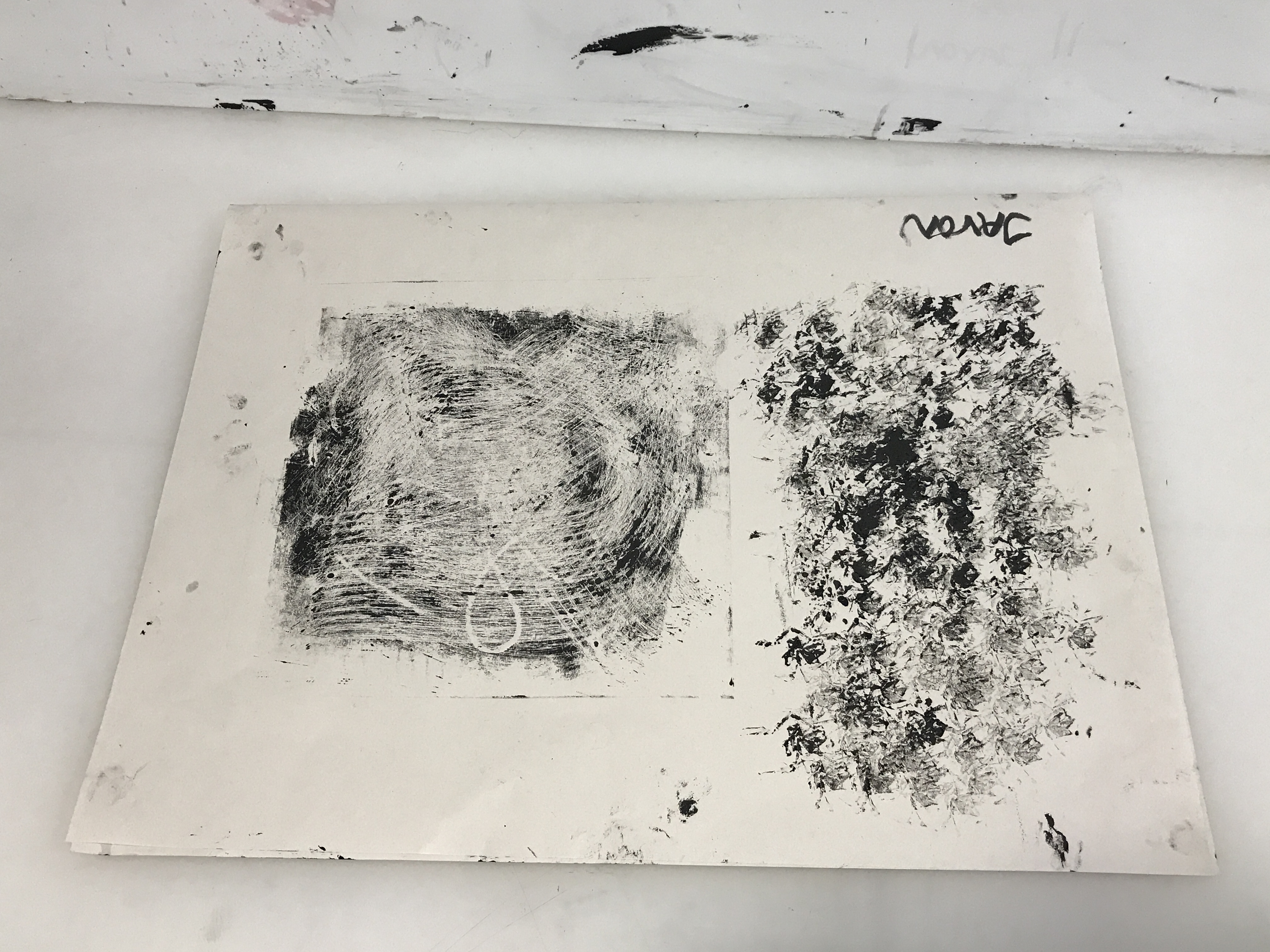
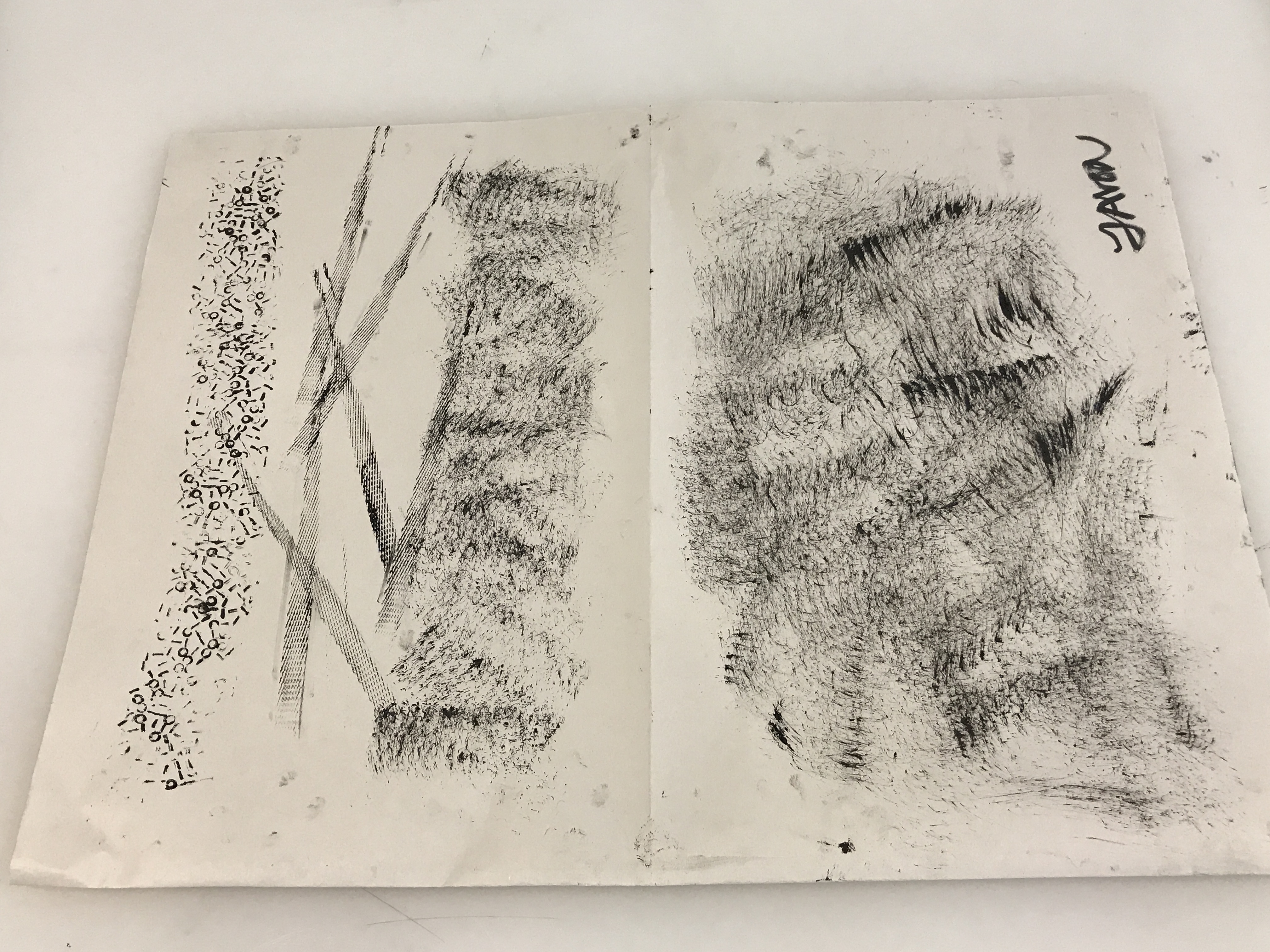
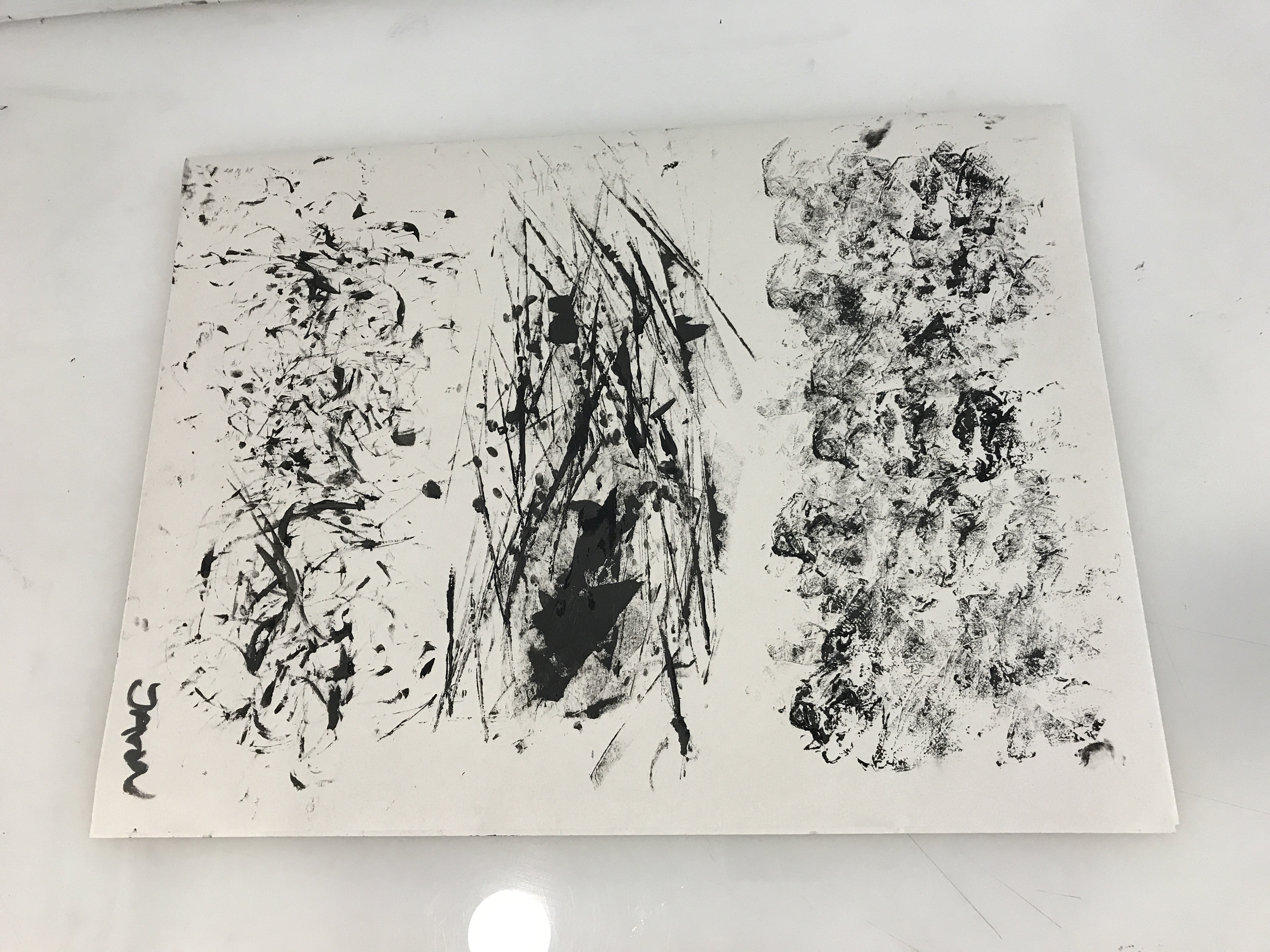
Research and Ideation

  • Fear v.s Phobia

Fear – A normal response to genuine danger.

Phobia – A persistent fear that is excessive or unreasonable (Expressed by a large man afraid of a small puppy).

  • Juxtoposition (Contrasting elements)

Large man afraid of a small puppy.

  • Cultural references

In western culture, it is a common cliché for dogs to bark, chase or attack postmen.

Cynophobia – The fear of dogs

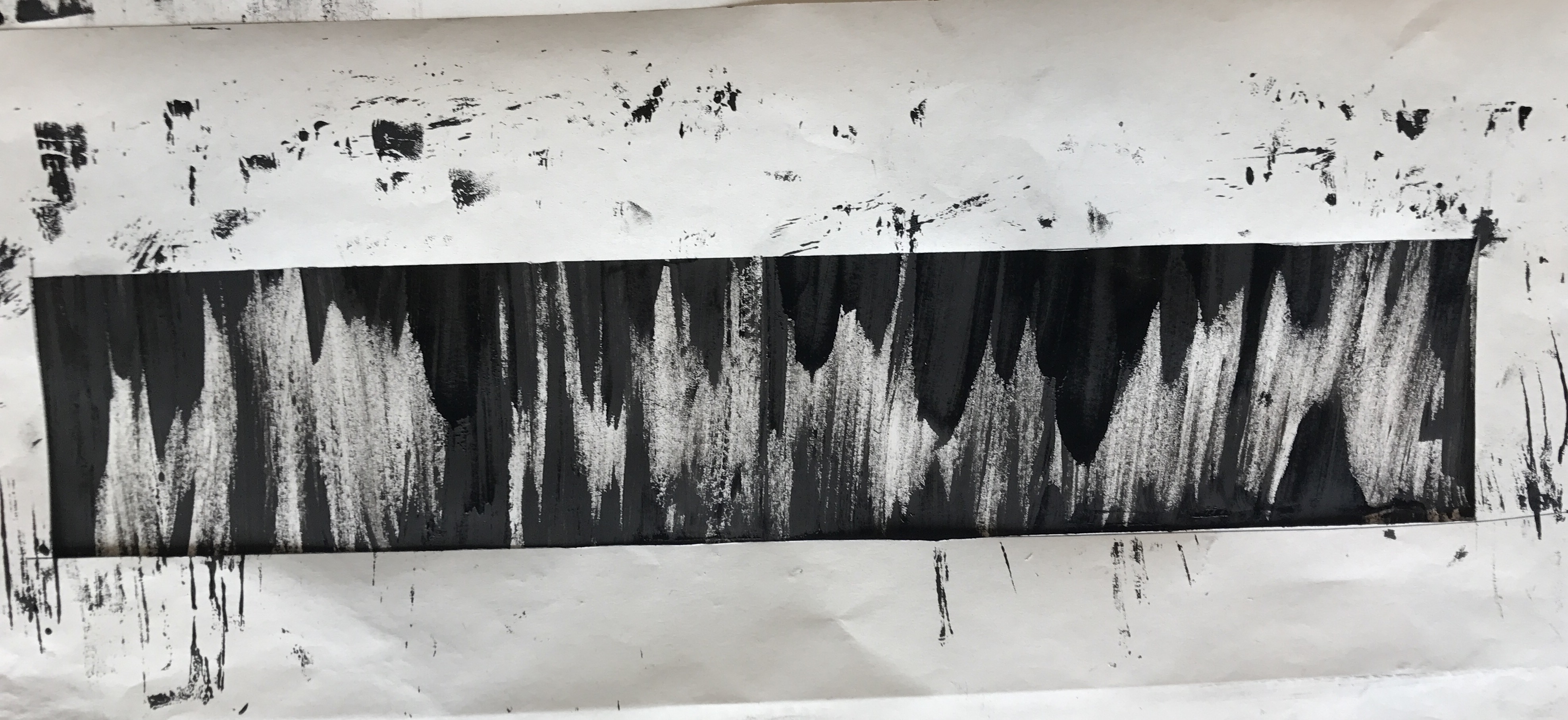
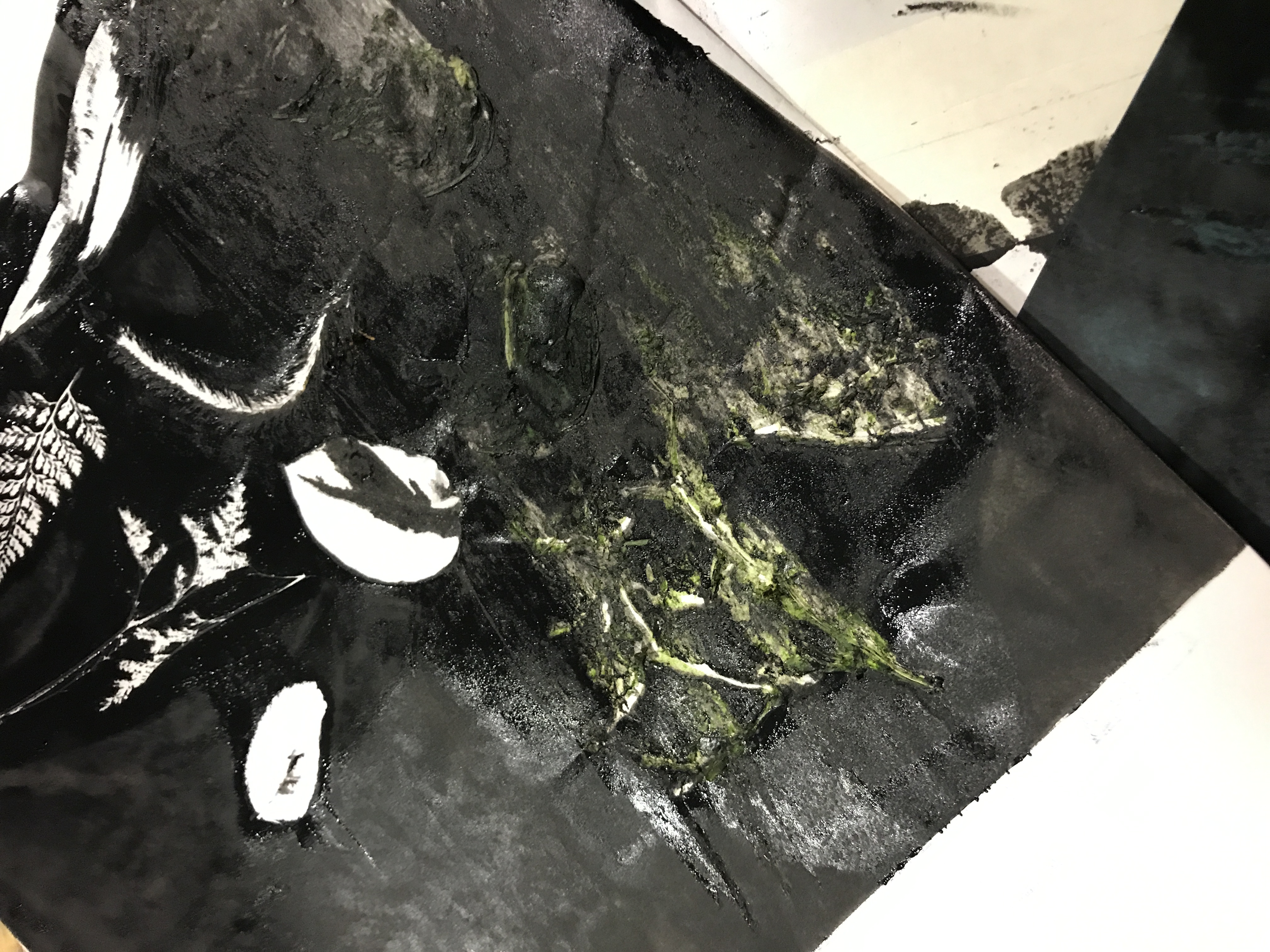
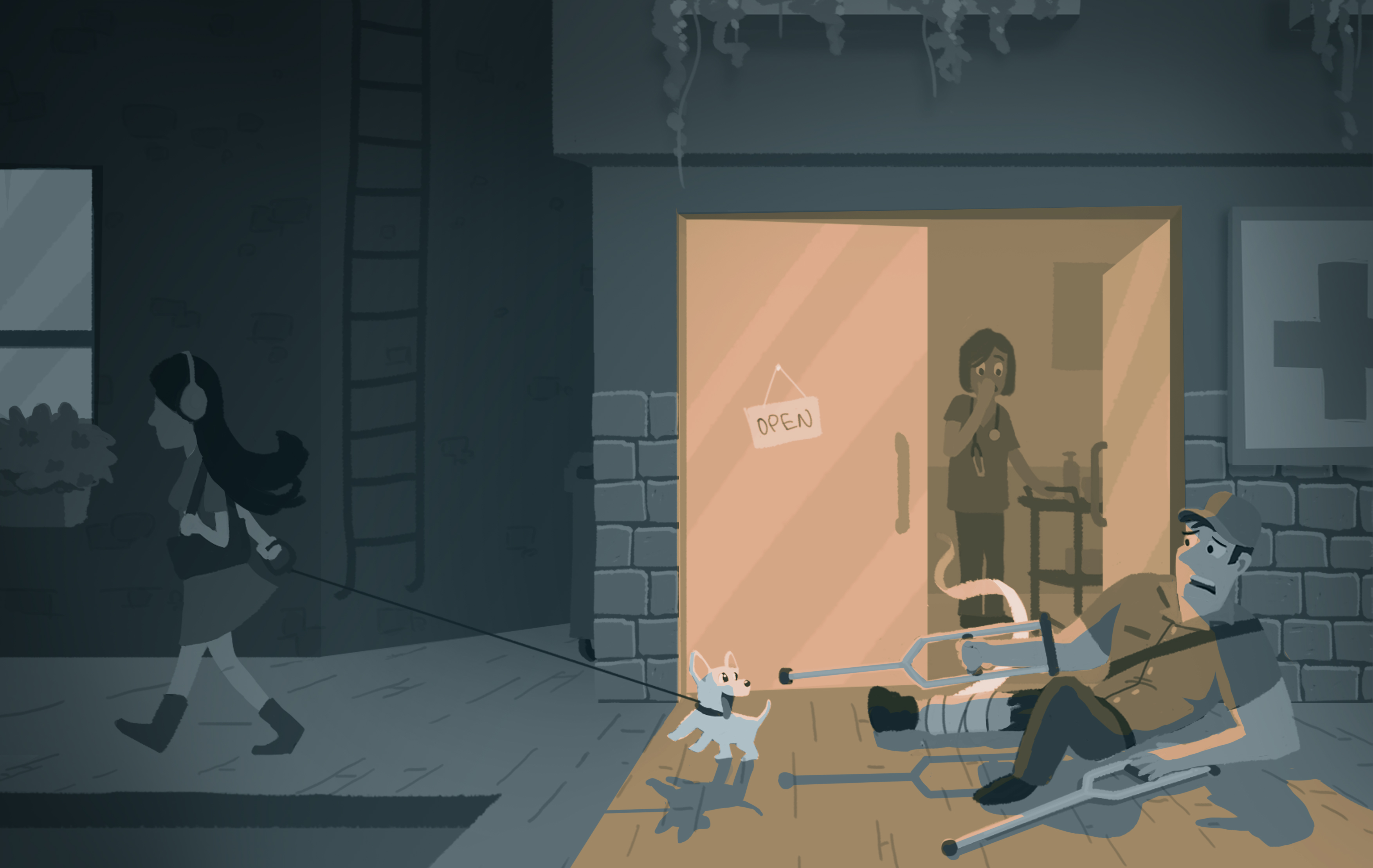
To me, I see fear as a portrayal of dull colours, which makes a scene gloomy, lifeless, and a sense of darkness surrounding the individual. This can be accompanied by a strong source of light which can be cast on the character to show his expression of fear during a close-up or just the character in general in the huge space of darkness.

Image 2

A big-sized postman exits the clinic, after being treated for a dog bite during his shift earlier in the day. He sees a small puppy and falls to the ground as he frantically tries to back away.

I changed the lighting of the b&w image for the coloured version as it didn’t work well with the emotion I wanted to portray. I restricted myself to the use of two colours as I wanted the scene to be less ‘distracting’ and direct the viewer to the main focus of the scene. Dark blue is used to portray a gloomy effect and a complimentary orange is used for the light source.

Image 3

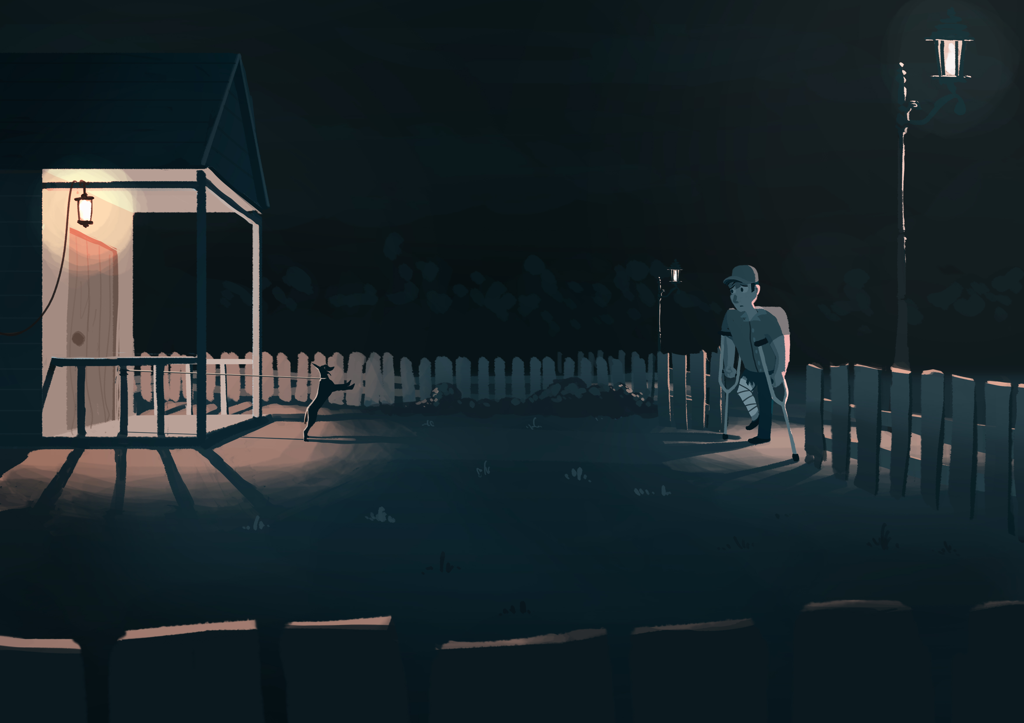
The postman heads home, his pet dog is excited that he is finally home after being leashed at the porch all day. He stops at the gate.


2D Project 1: My Line is Emo (Process Pt.2)

Process – Part 2

Before the start of this week’s class, I did several different prints during my spare time. They turned out quite well and I saw potential in some of them for my final submission.

Dripping ‘tears’
Karate Chop!
Exploring different methods of using satay sticks
Results of the various prints

During the consultation with Joy in class, she suggested that I try using different inks, such as Chinese ink, to replicate those prints that I have made previously which I saw potential in. She also suggested making the prints much bigger so that I have more freedom to choose which parts looked better.

Upsizing
More upsizing, using different inks.

After upsizing a few, I actually found that the previous smaller versions of the prints looked better, it was probably because the patterns looked too huge when placed in the viewfinder I created, which was the size our final ‘strips’ were supposed to be. It didn’t work out, but at least I tried it.

Below are four prints that I found ‘successful’ in displaying some of the emotions.

Joy – More towards cheerfulness and joviality, this print looks like little sprites playfully whizzing through the air.

Anger – Swords swooshing through the air with the blood of those killed trailing along…

Fear – A sense of uneasiness, this looks like a cave where stalagmites and stalactites are closing in on you, the minimal negative space makes it look claustrophobic.

Sadness – Melancholy, this print immediately reminded me of ‘The Starry Night’ by Vincent van Gogh. More specifically, I once heard Beethoven’s Moonlight Sonata in a video online with this painting as the backdrop. You can listen to it here hahaha –  https://www.youtube.com/watch?v=iVfPt8jgWOY


There is still ink in my fingernails.

2D Project 1: My Line is Emo (Process Pt.1)

Process – Part 1

For this session, we were introduced to mono printing, and it was my first experience with making prints using the print machine,

Applying ink for monoprinting
Arranging leaves onto ink

It did not go quite as planned,

A moment of silence
Delicious

Shortly after, I proceeded with making marks using objects instead,

From polishing boots to dirtying paper
Multi-tasking

At the end of the class, I managed to produce a few patterns,

Test Prints 1
Test Prints 2
Test Prints 3
Test Prints 4

Creating the prints by hand was a much easier method and I had more control over how the prints came out.

As I forgot to take home my prints, I replicated what I did in class back at home, and had them added into my visual journal. I initially tried making the prints on regular A4 paper but found it to be too white and contrasting, I eventually went for tinted watercolour paper and it turned out much better.

Various prints with the objects used placed next to them

Below are a few notes i jotted down to aid in my next experimentation with making more prints.

Quick notes for future reference