It was great fun exploring the paper as a 3D object for this project, though my final piece doesn’t really show much, uhm, interesting three dimensional shapes or cuts *cough cough* #budget.
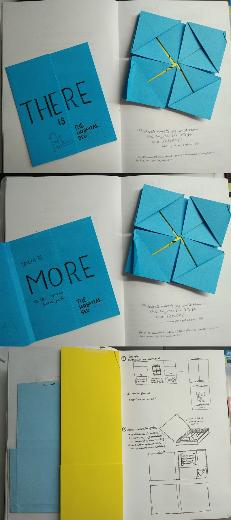
Above is the first round of ideas, where I was really focused on creating an interesting form. However, after asking some friends, one who recently underwent an operation, about what kind of card they would like to receive, it was quite surprising when a couple of them said they would like a simple card. Why? Because hospital bills are expensive enough as is. Additional cost for a card when I’ve just spent a substantial amount on surgery, no thank you. Thus, I added a new parameter to the design: #budget. What they would like to see was something simple yet pretty/cute.
So, the next design emerged:

Eep, what I didn’t realise was that EACH fold costs MOLLA$. Oh dear me. So the origami crane card was not workable. Michael suggested that the crane be scanned/photographed, then printed, to give the illusion of the origami crane. I tried it out, but it proved very difficult because 1) the scans were not very clear due to the raised surface of folds; 2) the quality of the photographs were meh as well; 3) manipulating them digitally wasn’t producing the visual effect of movement and lightness (speediness) I’d envisioned, probably because the original flattened origami was already quite stiff. So I played around with illustrating the cranes at various angles, but it didn’t work out very well either.
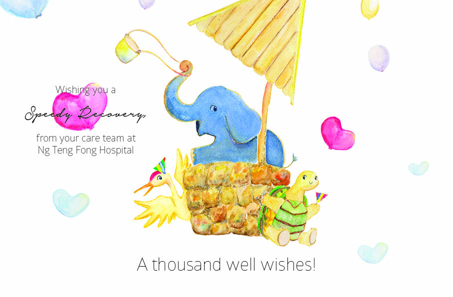
As such, I went back to re-evaluate the concept, re-analysing why the crane had to be there. My original intention was simply because the form was clean and elegant and it could be folded into a card. Fortunately, Charmaine had said shared about the Japanese myth, where folding 1000 origami cranes will grant a wish. The hospital, too, is wishing for the speedy recovery of their patient. Thus, I found it quite apt to convey that wish: packing in symbols of well wishing (elephant, crane, tortoise, wishing well (pun wasn’t deliberate…at first)). Also, because their discharge is a joyous occasion, the card should be lively and energetic as well. Finally, due to financial restraint, the cuts/folds should be kept to a minimum.
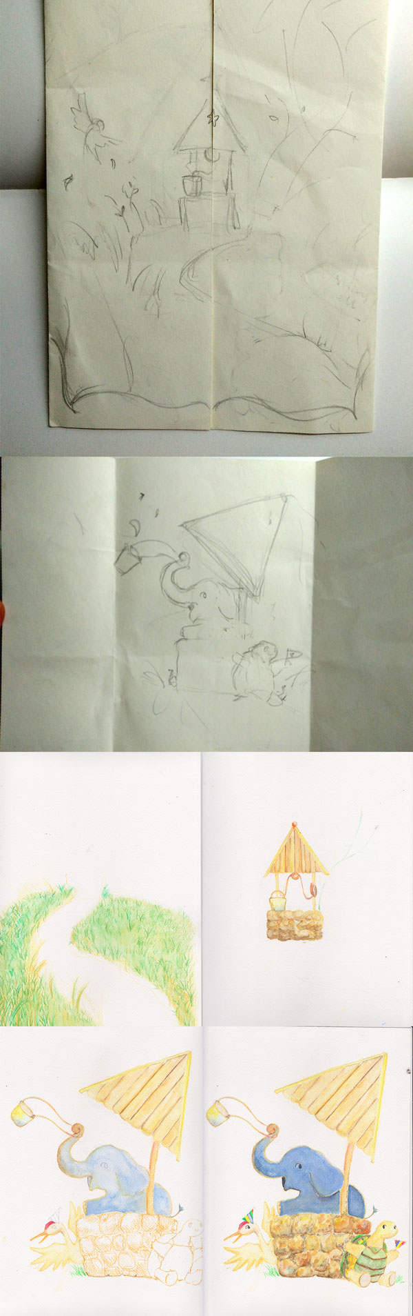
And thus, the celebratory animal welcome started! After drawing and colouring it, the image was scanned and edged out individually, then compiled in Photoshop as an image. Text and image was put together in InDesign. Looking back, I should have just compiled them all in InDesign, it would have been so much less laggy, and adjusting things would have been much easier. But I got so caught up with editing in Photoshop it slipped my mind. It would have been so much more efficient (and less laggy) though. Oh well. #learnsomethingneweveryday :>
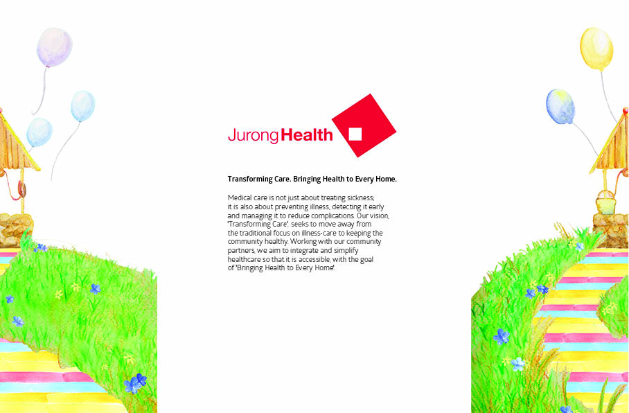
That said, the final printed version is here! Teehee:)