The case of Helvetica

After learning more about the circumstances and inception of Helvetica, I feel very sorry for its state right now. It was made to be neutral, clear, and its ideal, in some sense, was to be the solution for the world. And it was. Major corporations everywhere used it, and signages used it, and posters used it, and practically everything used it.

And that, is the essence of le problemo Helvetica faces today. Its awe-inspiring quest to be the solution, ironically, became the problem. Its neutrality, which stood at the core of its birth, was useful to practically everything: advertisements, clarity, impact etc, but the extensiveness of its use started to twist and paint and dye (or die?) the neutrality that was ever so important to the typeface. In fact, if I recall correctly, one of the ladies in the movie commented on how she had interpreted Helvetica as the font that supported/fueled the Vietnam war. And she isn’t alone in the awry misinterpretation of the typeface. So jaded has the public become to the onslaught of Helvetica in all its weights and uses that more often than not, it just…is.

On a side note, I confess to never having like Arial in sizes above 10pt. I don’t really know why. I’ve avoided it since wayyy back unless absolutely necessary: e.g. when the teacher specifically requests that it be in Arial, 12pt, no less. (cringes inwardly) So I’m not sure where I stand on the Helvetica love-hate continuum, because I’m not (consciously) familiar with Helvetica… yet.

On the other hand, the movie also presented the opposite view. The view of the Modernists, upon whom Helvetica elicits the oohs and aahs, the flutter-me-bys of gazing upon perfection. And I think, if used correctly, Helvetica can still do that. I’m not too familiar with the beautiful counterform they talk about (Painterface will teach me soon, I believe… #apprehensive). But I hope I’d understand what they mean by just how “solidly it sits in its counterform”, and how “the counterform makes the letters, not the other way around” means as well! Then again, due to the love of using grids then, I suppose I can understand that intellectual and mathematical delight of things falling in exactly the right place. Mmhmm~

Just to sate the curiosity of the similarities and differences between Arial and Helvetica, this site by Mark Simonson might be of help! I’m currently just staring at this example of Rates (Helvetica) vs Rates (Arial), and am slowly understanding, a wee bit, what Helvetica’s “solid counterform” might mean.

And as a side-dish to Arial v Helvetica, one might be interested in this too: “The Scourge of Arial”. Quite the dramatic title.

Well then, until next time!

Art Nouveau: a way of life

Perhaps one of the reasons why Art Nouveau is so interesting is because of its philosophy, that art should be “a way of life”. Truly living out their philosophy, the reach of the movement did not stop at what was traditionally known as “art”, but extended also into architecture (cue Victor Horta), posters (cue Jules Cheret), and even…fashion? Okay, I’m not too sure about what art nouveau fashion entails, but Google has directed me to Jean Philippe Worth, who designed the dress below:

tumblr_nfbmnlbtlo1qf46efo1_500

(Click here to find out more about art nouveau and art deco fashion) The dress is quite in line with what we learnt! It exhibits beautiful, flowing lines in its cut, from shoulder to waist to hip and all the way to the little train at the back, which is also seen in the floral designs that wrap elegantly around the dress, hugging the figure yet flowing almost effortlessly into a gorgeous swooshy-ness! (is this the dress version of a whiplash?)

1231-0

And certainly, one can never discuss Art Nouveau without mentioning Alphonse Mucha. Such fantastique. By the way, I couldn’t help noticing some of the similarities in the flowing dress design of Mucha’s work and Worth’s designs. They’re so pretty~ Mucha’s work pretty much epitomizes the whiplash (and the ideal feminine beauty?), and influences of Japonism is quite evident in the rather flat plains of colours and black outlines of figures. His work still retains the Western academic realism of the figure’s form though!
And to end of, just sharing a little cute poster of his:

It made me rethink my impression of Nestle.

Alfons Maria Mucha's Art Nouveau decorative paintings, advertisements and illustrations [dvdbash]

Thought-provoking Tuesdays

Tuesdays tend to be the days when I feel like my mind and body are worked to its limits. Perhaps because I’ve got three full lessons (two of which are core modules, 3 hours each) crammed into a day. And also because Mondays tend to be content heavy. And Wednesdays too. So Tuesday is the day of romping through the thickest part of the jungle, brambles and all, with insufficient rest.

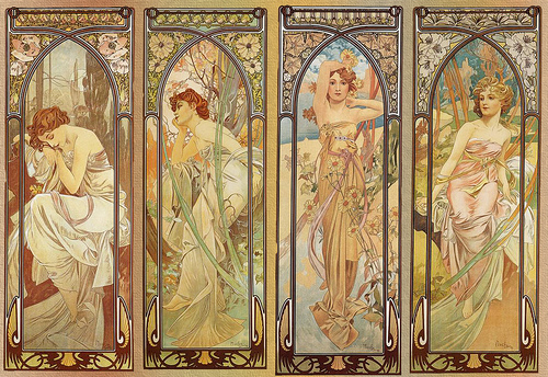
But it is also the day when Astrid introduces us to the depths of history, not solely constrained to graphic design, because design is never separate from society or the time it was set in. In fact, it has proven, so far, to be a reaction to something. Take William Morris and the Arts and Crafts movement, for example. Morris was reacting to the ugliness of mass produced goods. Similary, Art Nouveau was also a reaction against academic art. And today, as Futurism and Dadaism was introduced to us, we learn that the former was rejection of the past, paired with a love for the technological advances they saw and foresaw. Likewise, the latter, Dadaim, does not stand detached from everything and anything, contrary as it is, but is set during the world wars –a time of great chaos and turbulence– which is arguably reflected in the style. The International Typographic Style (ITS) as well, developed as a means to solve the mess leftover from war in an neutral and objective manner, exemplified by its highly mathematical and logical approach to design.

Before I ramble on though, I have a Mind and Meaning quiz tomorrow. Which is why my brain right now feels a little bit like potluck, with part of me fresh from a graphic design lecture, and another part of me trying to recall information from Mind and Meaning.

One of the more recent lectures discussed basic psycholinguistics: the brain, left/right hemisphere dominance, how the brain processes language, and which hemisphere seems to be more involved with logic/math while the other more concerned with creativity/expression. Lateralization (or dominance). Not complete control. The hemispheres don’t solely do one or the other. (I’m troubled when people say “the left hemisphere is for logic, the right for art”. I’d prefer if they are aware of the nuance that should come with it. When I was much younger, I read a book on the brain -which I positively loved-. It told me the same things: left hemisphere for logic/science/math, right hemisphere for creativity/music/the arts. No disagreements then. But somewhere between then and now, articles and stuff everything all beg to differ. The hemispheres aren’t independent entities, otherwise, like the lecturer says, it’ll be like “having two brains instead”. Okay end of rant.) Back to the original topic, we also learnt that the convention (i.e. for most people) is that the left hemisphere is where language processing takes place. Regardless of the form of communication -written, spoken or signed-, they are processed in similar areas. The form of input is different, but the meaning conveyed is the same. Hence, to understand language requires some rather complex mind acrobatics of logic that happen to (for most people) sit in the left hemisphere. Now here comes the crux of this post: what if the input is form?

During one of our lectures today (typography or graphic design), we talked about El Lissitzky who uses shapes, numbers and a limited palette to develop “a language to form instead of letters” (quoted from lecturer) because of the wide audience he was reaching out to (i.e. both literate and illiterate populations). Here are a couple examples of his work:

el01 el04

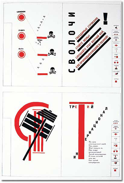
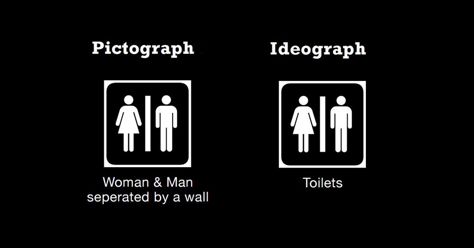
Here, you see type as image, type taking form not as letters and alphabets, but becoming a system where meaning can be graphically communicated. Just like written language, one has to read it, but in this case the image is mostly iconic to what it conveys, much like sign language. In a sense it is like emojis as well! Though emojis are much more emotive (and they recall the days past of pictographs).

So here is the crux of the whole post: since the saying is that this is a “language of form”, does this mean that it is also being processed in the left hemisphere?

As a “language of form”, it is more iconic than arbitrary. Yet, it must be processed to be understood. (This is on the assumption that the graphics are meant to communicate and are not for a purely aesthetic purpose, in which case, it’ll be like listening to a conversation in a language one doesn’t understand, and meaning gets thrown out the window and prosody is processed much like music.) Extrapolating this, would this “language of form”, which is art, be processed similarly to how one interprets a mathematical graph or scientific diagram? (and another question: do we process these graphs and diagrams with the left

Here, the lines between “art” and “science” are being blurred. Certainly, the hemispheres do not function separately, they can communicate via the corpus callosum (yes, I’m taking the chance to revise for tomorrow’s quiz right now, thanks for putting up with it), identifying what is seen, what is could mean, and finally what the meaning should be. Then again is there a false dichotomy between the arts and the sciences? Or are they two sides of the same coin, both vital to our interpreting, understanding and discovering the world? Language itself can be considered both an art and a science, anyway. And both are equally interesting, no?

Well. I might not have made much sense (yet again). Maybe I should go and check the terms I’ve used hahahahahaha but if you’re like me and functioning on less than optimal sleeping hours…

Yes, you do understand, don’t you! 🙂

Then again, a round of applause for you! Most people aren’t particularly interested in this topic, so reading ’til the end is a feat? And my writing is probably more of an obstacle than anything else. Apologies. *bows* pray I’ll be more organised/structured while writing next time!

Bye!

The intersect between Survey of the History of Graphic Design and Linguistics

That said, as I try to reconcile the information from the classes yesterday, I’m reminded of how amazing people are. Consider how mankind has managed to transmit knowledge learnt from generation to generation. It’s why we have cars today, because our ancestors made tools that have been handed down and developed over time! During History of Graphic Design (DV2003) taught by Astrid Kensinger (who is also teaching Typography I), she spoke of the start of graphic design in pictographs and ideographs, both symbols to represent objects/things and ideas/concepts respectively. Evidently, this was a huuuge leap in thought for mankind.

In the beginning, people carved past events, their hunting expeditions, tales of epic hunts on walls. It was a narrative of sorts, of someone and something. One can understand from the art on the wall that a “gigantic bear attacks hunters”.

Then, it became more stylised. We might start getting symbols for hand, paw, teeth. So the action can be conveyed in writing as “gigantic bear attacked hunter with paw and teeth”. More specificity can be expressed through these simpler symbols. Ideographs, symbols that convey concepts and ideas further enrich the written language. So we can express “gigantic bear attacked hunters unexpectedly”. Intangible things like emotions can also be expressed, such as “hunters were surprised, raised spears and fought”. Chronology, past, present and future ideas might also be expressed! Symbols might even be put together to form a new meaning! Like 木, 林, and 森; wood/tree to forest.

Please note that I am not expert in the development of these things, okay! The above is how I understand petroglyphs, pictographs and ideographs. In fact, the written word could be far more complex and elaborate, like the Cuneiform below:

cuneiform and it's translation
cuneiform and it’s translation

Astrid mentioned that people who could read and write such as scribes, were the elite, and considered magicians of some sort. Being literate was power. Well, given how complicated their writing system is, it’s understandable.

Oh! Here’s a really helpful presentation online that distinguishes pictographs from ideographs. (It’s where the featured image is from)

I think this really ties into HG1001 Mind and Meaningbecause how do we look at words, read them, and actually understand what it means? The word is merely the vehicle through which we understand an idea, which is why “happy” can be expressed as 开心, 楽しい, onnellinen, ευτυχισμένος, سعيد. (Google translate was used for quite a number of the above translations: Chinese, Japanese, Finnish, Greek and Arabic), which (I assume) means about the same thing, just in different languages. Fascinating!

That’s about it for now. Class will start soon.

さようなら!

A few more cool ideographs from the Internet:

ideograph 2

ideograph 1


Privacy Policy