What is Zika?
The chief concern over Zika is its impact on fetuses in the form of microcephaly, transferred from mother to child during pregnancy. Microcephaly is a condition where the a baby’s brain does not develop properly or does not continue developing after birth, and therefore has repercussions on motor and mental development. Second, is its relation to the increase in GBS. There is no cure or vaccine for any of the three conditions.
Here are a couple sources about Zika in Singapore, its effects, GBS and microcephaly.
Target audience: Young adults to adults, people who are at the reproductive stage in life and may be considering raising a family now or sometime in the foreseeable future. It is of great importance for them (especially the ladies) to be aware of the risks, as well as know of preventive measures that lower the chances of getting infected.
===== Potential slogans =====
- “Psst! Zika.”
- Psst! is often used to get someone’s attention, and it has a similar sound to ‘z’ (the difference between unvoiced [s] and voiced [z]), which thus gives unity to the sound of the slogan, a
- Bar Zika /(to be said with vehemence)
- Zero Zika
- Based on the Brazilian slogan. Alliteration.
- Zika the Zealot
- Inspired by alliteration. Seems to be able to translate into a narrative, but may be more for children instead. However, the target audience best suited to combating Zika are the adults, who are in positions where they can act, be it to lessen potential spawning areas or supporting/encouraging other adults to take preventive measures, or instructing children to do the same.
- Zika Wipeout
- An extension of the “Mozzie Wipeout” slogan/campaign
===== Concept for posters =====
Juxtaposition; of what we do know, and what we do not yet know

This concept was inspired by the above images, where Lego pieces were used to re-create highly iconic art pieces. The point here is that even though the square pieces created a blurred effect, we are still able to identify it. Similarly, although we don’t know everything about Zika yet, we know its form, we know its impact. It’s not a clear image, but we know enough: enough to know that it cannot be taken lightly.
The most literal adaptation of this would be a similarly blurred image of a mozzie, which is the complete opposite of the super high definition image of Aedes mosquitoes we currently see. Actually I get really uncomfortable with these hyper close-ups of insects in general… so maybe I haven’t been looking at those posters in great detail…? But the follow up for these campaigns were good though! So I didn’t miss out on anything. (I think. Shh.)
===
Narrative; Zika the Zealot
-in the form of a collage/scrapbook/illustration
A series of compositions that follow a mozzie’s quest for blood. Even with an illustrative approach, depending on the style chosen, it can serve as a method of pointing out what preventive measure people may take to reduce the risk of getting bitten. As it has a narrative sort of flow, situations that locals may find themselves in can be simply depicted, and handy suggestions can be conveyed through the posters.
The colour palatte will probably be limited so as to allow the content of the poster to separate itself from that of comics, as well as easily highlighting the areas of focus for the composition.
===
The Shock Factor
Many anti-smoking campaigns in the world depict the consequences of smoking on our bodies.

 They shock, instill fear, in the hopes of spurring one to act.
Could this also be used in regards to Zika?
I feel that what is most terrifying about Zika that we know about right now is its effect on babies. Microcephaly can range from mild to severe. In the worst cases, the child may die as a result of those congenital defects and/or infections.
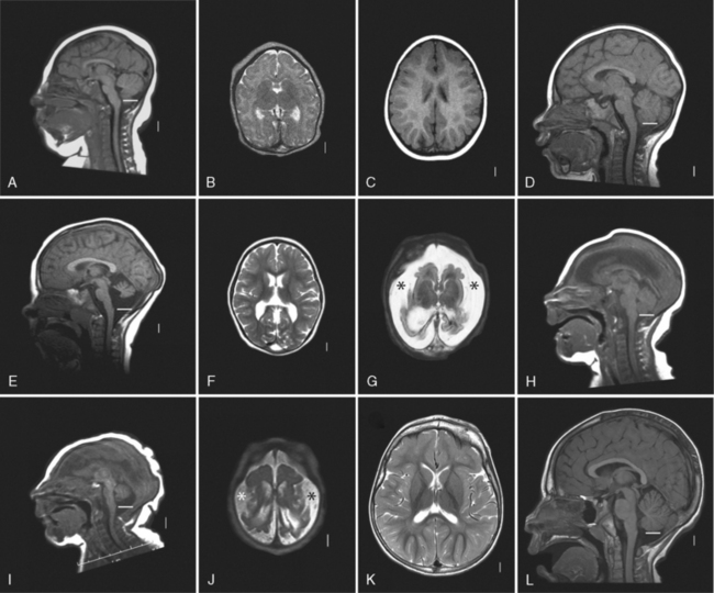
I’m not very sure about where this one will go though. (it has a high chance of being inappropriate) This MRI scan compares the brain development of different congenital defects, microcephaly included.
Yupp that’s about it for now!
===
Heya! Came back with another idea which I’m thinking about developing. Just this afternoon, a friend mentioned that Zika doesn’t seem to be that significant, and some people who do catch it are just given a few days worth of MC and drugs for their symptoms. This is an understandable path of thought, though, because the effects of Zika on a developed person is not evident. There are several studies which indicate that there are perhaps some effects, but these are inconclusive at the present time.
However, as someone who knows a number of couples who are planning to have children, some of whom are already pregnant, and one who worked in a Zika-zone until recently, their concern for the unborn child is definitely warranted. Even so, it isn’t completely up to them to ‘protect’ the child. They may be doing everything in their power, but the greatest ‘shield’, their greatest defense comes in the form of everyone putting in effort to stamp out the spread of Zika, even if it doesn’t affect us directly.
Hence, the slogan inspired by this goes as such:
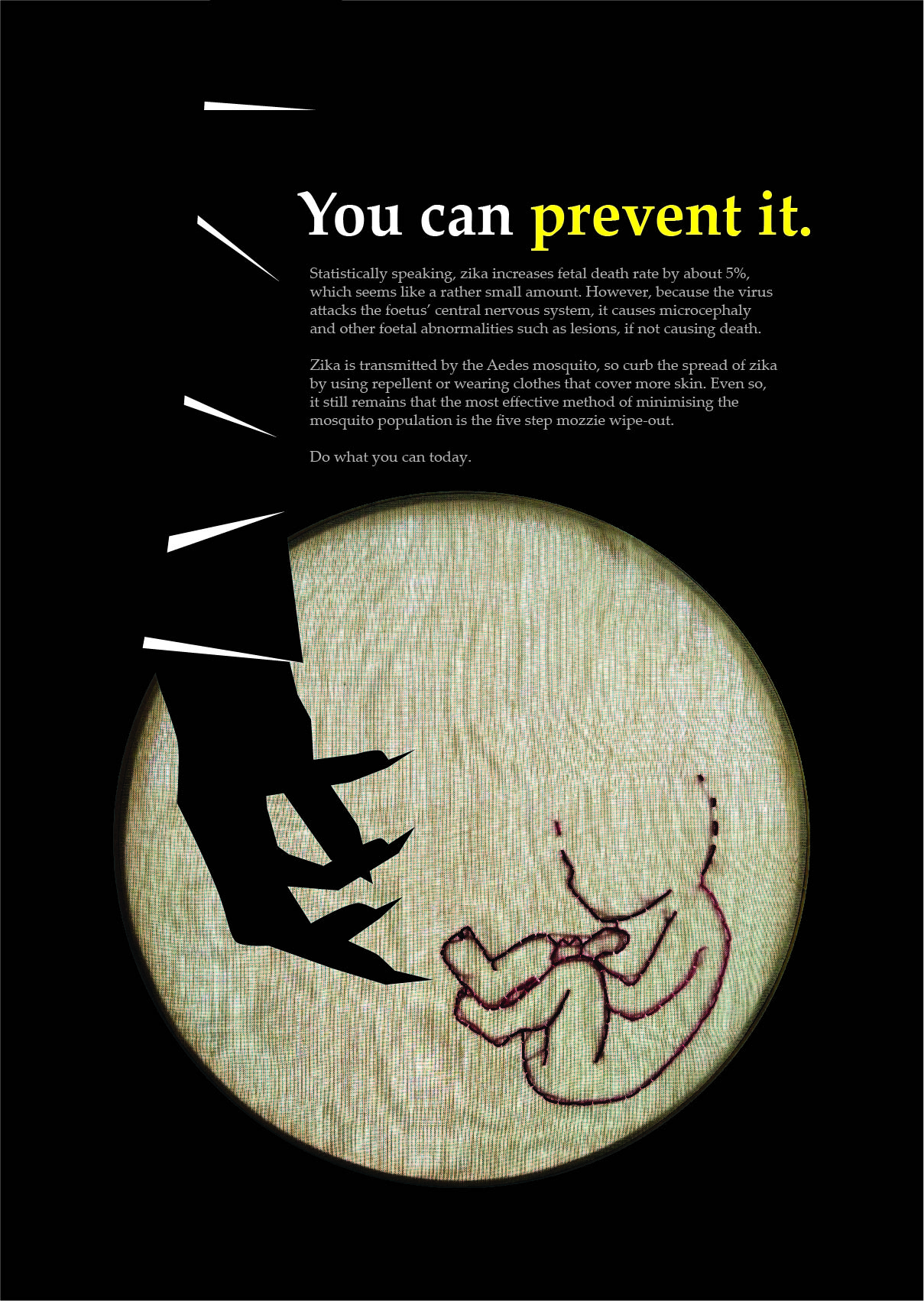
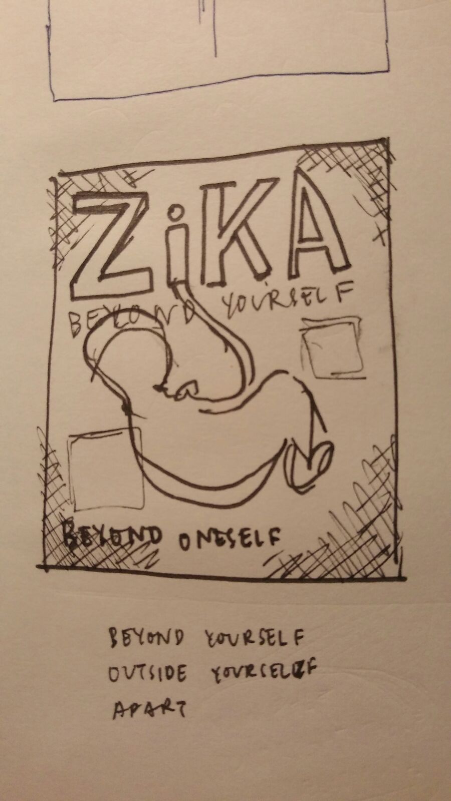
ZiKA: BEYOND YOURSELF
the point being that it is more than just ourselves, but that in regards to Zika, we are motivated by concern for others. For the mothers-and-fathers-to-be, family and friends, even people completely unrelated to said people, the motivation is the safety of the unborn child: a person apart and distinct from ourselves, still in the womb yet facing the threat that is Zika.
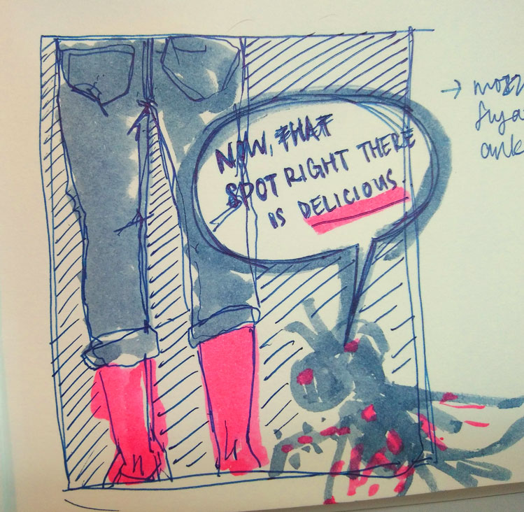
Here’s a preliminary sketch!

Anyways, I’ve just bounced the idea off Marianne, and she’s told me to work on the composition. Seems like the work’s been cut out for me hmm~
===
Now that the direction has been set for discussing the effects of Zika on an unborn child, I proceeded to become more familiar with the specifics. Most horrifyingly, there are sources which link Zika not only to microcephaly, but to other birth defects as well as stillbirths as well. According to Everyday Health, “The abnormalities seen in the ultrasounds of pregnant women with Zika included microcephaly, hardened calcium deposits in the brain, a breakdown in brain tissue, brain swelling, and poor growth of the fetuses.”
“It looks like Zika is inhibiting development of the brain, not just [associated with] small head size, and it’s associated with stillbirths… That’s why I called it the virus from hell, because it really is something terribly evil happening that’s blocking the brain of the unborn baby.”
— Peter Jay Hotez, MD, PhD
Regardless of which trimester the mother is in, the virus seems to have developed a way to attack the foetus’ central nervous system, and also seems to affect the placenta during the third trimester as well.
Perhaps the only silver lining we do have in this situation is the fact that 71% of pregnancies proceed normally! Though that does mean that for pregnant women infected with Zika, 3 in 10 pregnancies do meet some kind of complication…
===
more progress to come /soon/