
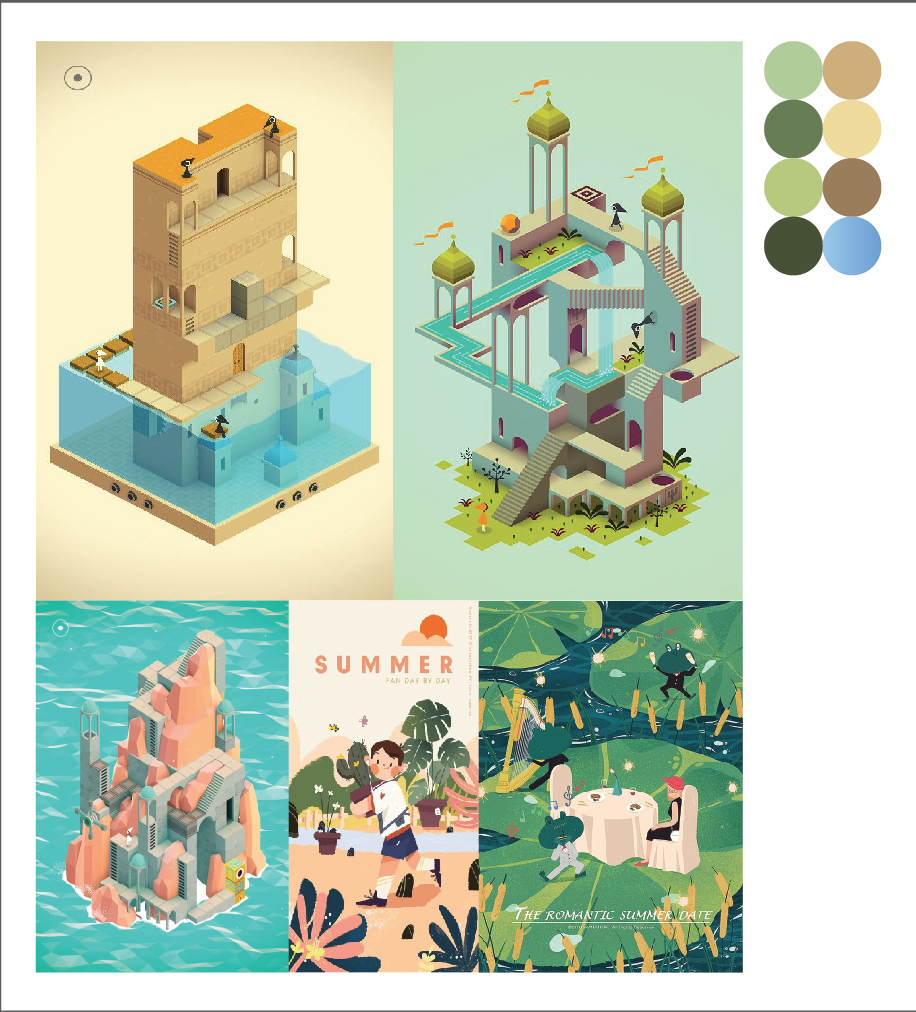
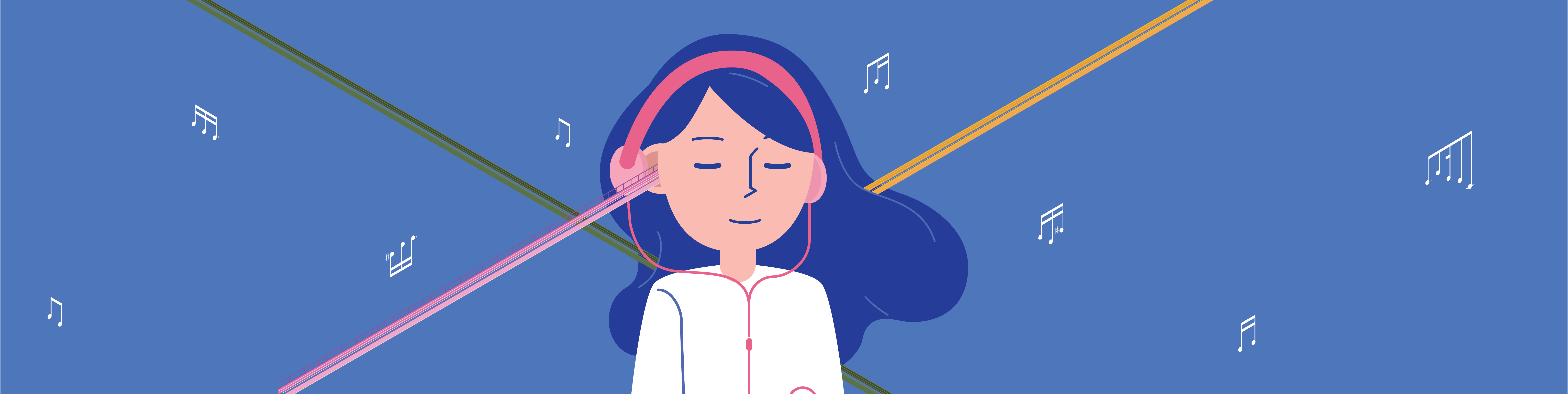
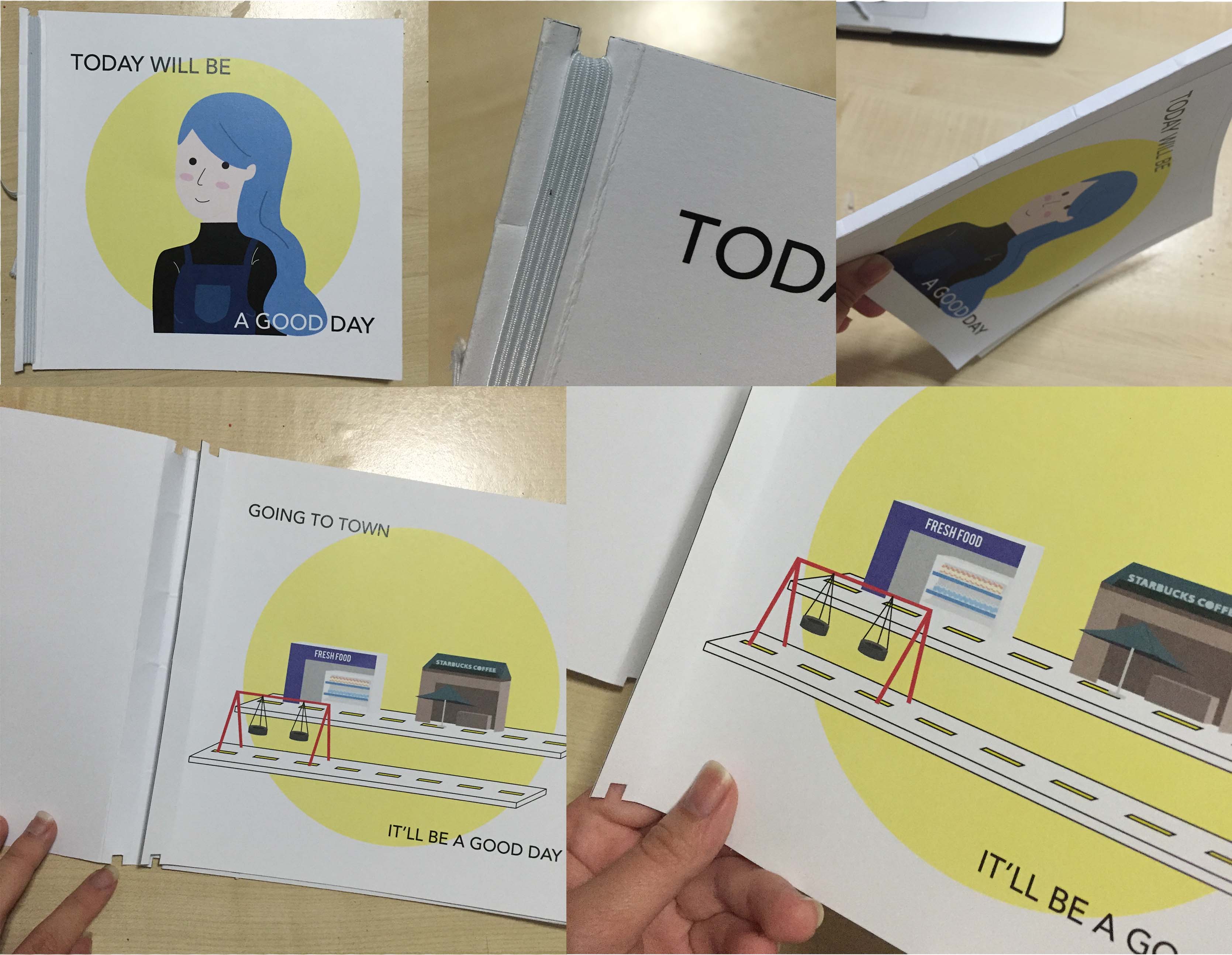
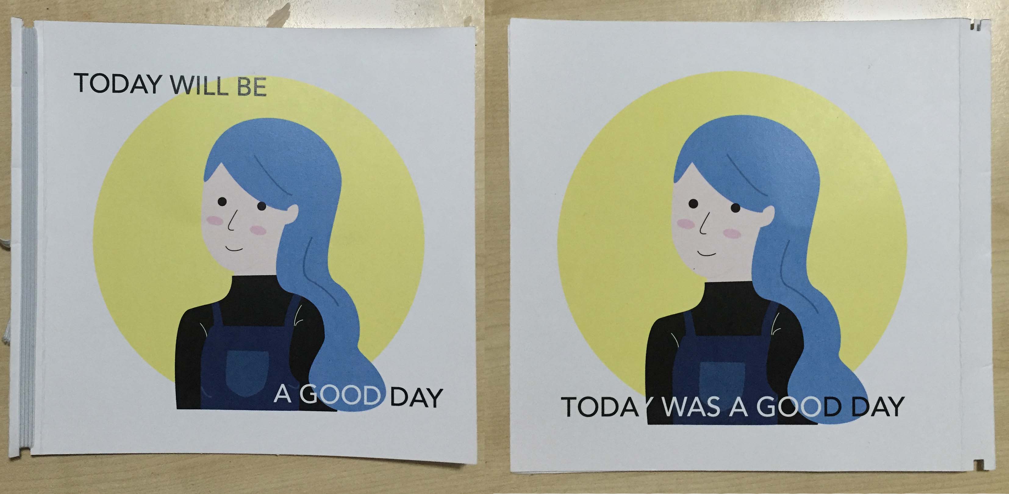
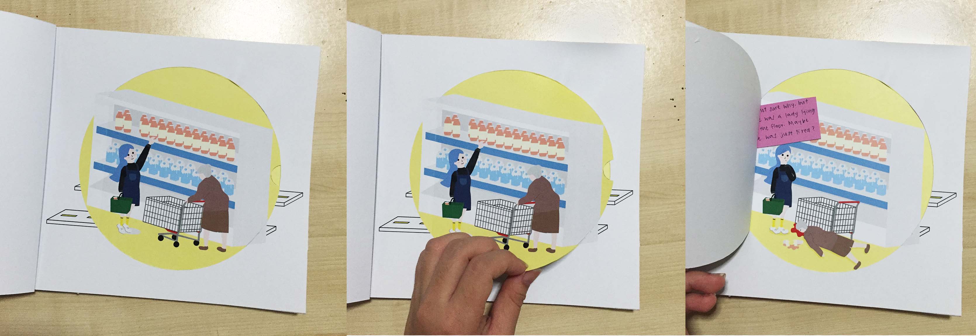
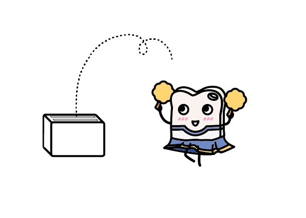
CONCEPT
The phrase “Roller coaster of emotions” can refer to a situation or experience that alternates between making you feel excited, exhilarated, happy, sad or disappointed.
Since music allows for an immersive experience where the user enjoys a wide spectrum of emotions depending on the genre, this project is a visual exploration on the effect music has on us and how it may soothe, sadden or excite in reaction to the dynamics and beats in music.
REFERENCE VIDEO
We were inspired by this video and the idea of music as a journey with obstacle courses.
EXECUTION
Different genres of music will be represented in the form of different landscapes that the roller coaster cart travels through. The colour scheme and architecture of the roller coaster ‘s trail would correspond to the mood and beats of the music. For example, jazz music would be represented as a slower, scenic outdoor roller coaster.
We had a total of 4 different scenes:
- Nature
- City
- Highway (transition scene)
- Upside down landscape in the sky
We decided to design the landscapes in an isometric manner versus a flat style because it would add more dimension and depth to the overall aesthetic.
PROCESS
Each illustration started with drawing out rough blocks of different shapes, sizes and height before adding on the track route.
After that, various elements such as windows, tiles, stairs and signages would be added to the blocks to transform it into buildings and architecture.
Lastly, background elements such as plants, clouds and people were added to fill in the rest of the canvas.
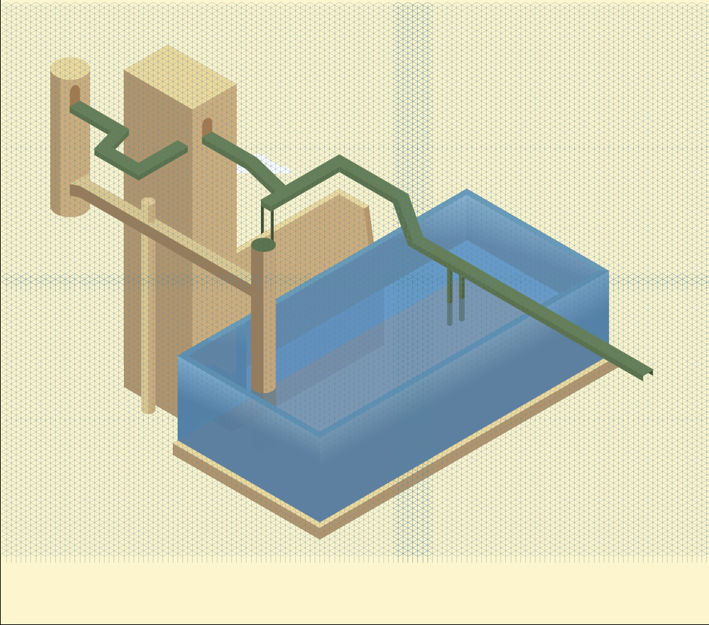
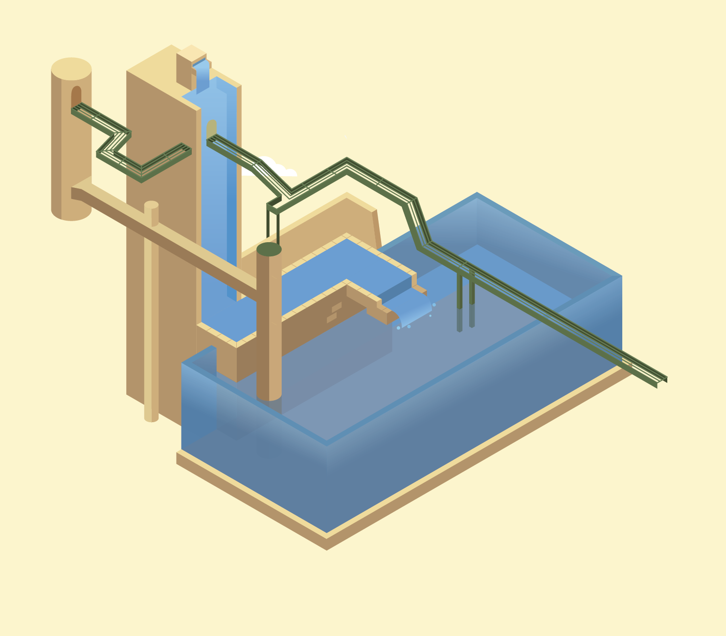
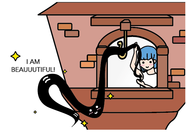
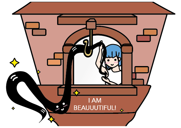
Scene #1: Nature
Illustration Process
Music: Sergey Cheremisinov – Closer To You (http://freemusicarchive.org/music/Sergey_Cheremisinov/Charms)
Mood/Scene: Calm/Nature
Moodboard/Colour Scheme:
Process:
There wasn’t any extreme ups and downs in this track because it was supposed to reflect a calmer mood. Instead, the track goes straight in one direction before gently descending.
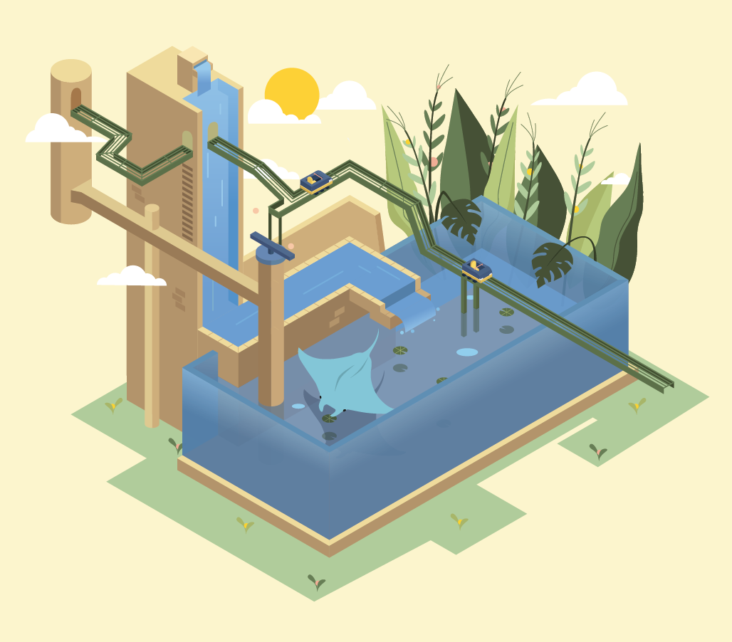
Final:
Plants were added to emphasise the nature theme and to make the landscape more scenic and calming.

Scene #1: Nature
Animation Process
Animation list:
- Roller Coaster
- Tracks
- Clouds
- Sun
- Plants x26
- River
- Fountain
- Stingray
- Bubbles
- Lotus leafs
- Balancing Beam &
- Pink Balls Bouncing x2
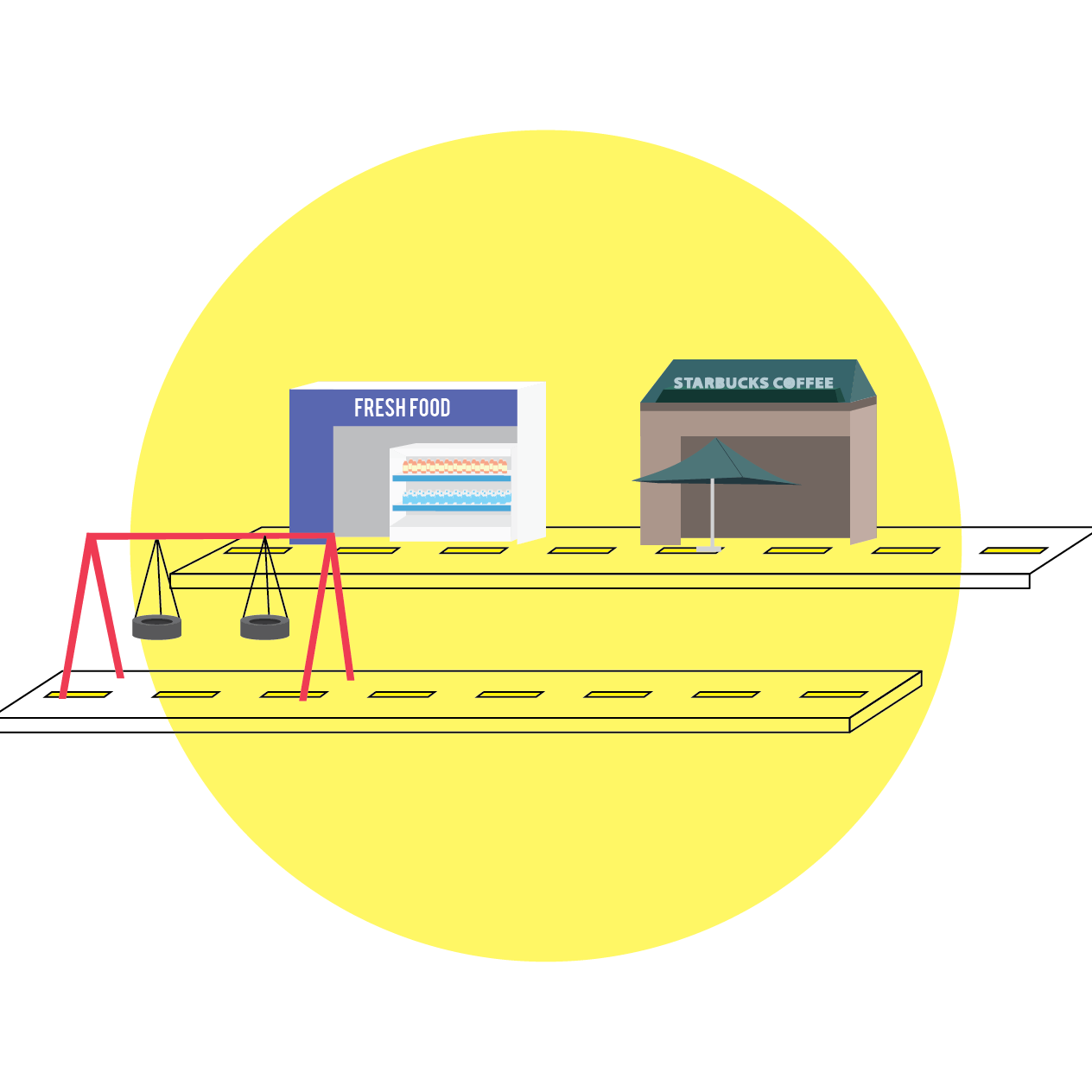
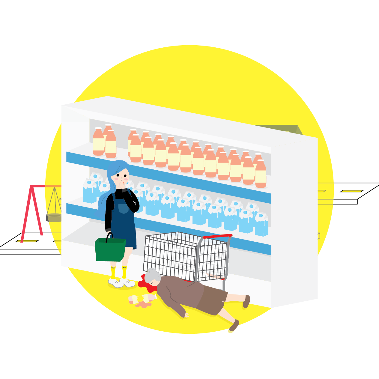
Scene #2: City
Music: Midnight Stroll – Ghostrifter Official
(https://www.youtube.com/watch?v=DHo1pPMvXdM)
Mood/Scene: Busy/City
Moodboard/Colour Scheme:

Process:
This was supposed to contrast with the previous calm and scenic landscape.
The buildings are stacked and interlock with one another, making for a more crowded looking landscape. The track has sharp ups and downs and the tracks overlap at one point as well. The exit route is triggered by traffic lights.


Final:
A large amount of background buildings and some human figures were added to make the scene look like a bustling city.
Scene #2: City
Animation Process

9) Clouds
10) Sun
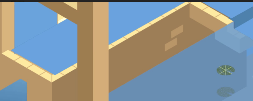
Scene #3: Highway (transition scene)
Illustration Process
Music: Sergey Cheremisinov – Train (http://freemusicarchive.org/music/Sergey_Cheremisinov/Charms)
Mood/Scene: Tranquil, Anticipation
Moodboard/Colour Scheme:
Process:
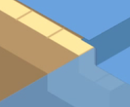
This was a transition scene between the busy city landscape and the next dreamy city in the sky. The is supposed to be a sort of highway to the sky.
A gradient was applied to the highway.
![]()
Final:
The colours get darker and stars were added in nearer the end of the canvas so make the transition to the next scene smoother. A light pink outline were added to the buildings to make it seem more twilight-y.
![]()
Scene #3: Highway (transition scene)
Animation Process
Scene #4: Upside down City in the Sky
Illustration Process
Music: Gymnopedie No 1 – Satie
(https://www.youtube.com/watch?v=bLbxSHFHPuk)
Mood/Scene: Surreal, tranquil, quiet
Moodboard/Colour Scheme:
(same moodboard as the previous scene)
Process:
The first draft was drawn and flipped to make sure it could fit into the canvas.
After that, details were added into the bottom half of the architecture before it was duplicated and flipped.

Final:
The structure was flipped and drawn floating in the sky to make it seem more unrealistic and surreal.
There are floating crystals containing star particles in it. There is also an hourglass that activates the yellow lever which subsequently brings the roller coaster up to the track that exits the canvas.

Scene #4: Upside down City in the Sky
Animation Process
Scene #5: Final Scene
Illustration Process
This is meant to tie together the whole video and to bring across the point that the roller coaster route and the landscapes are meant to be a representation of the way we feel or experience different moods of music.
Scene #5: Final Scene
Animation Process


Music
Animation Process
Music was edited for the MAN version of the video.
Sound effects such as birds, subway, space sounds were added in to enhance the respective moods of each scenes.
CHALLENGES: Illustration


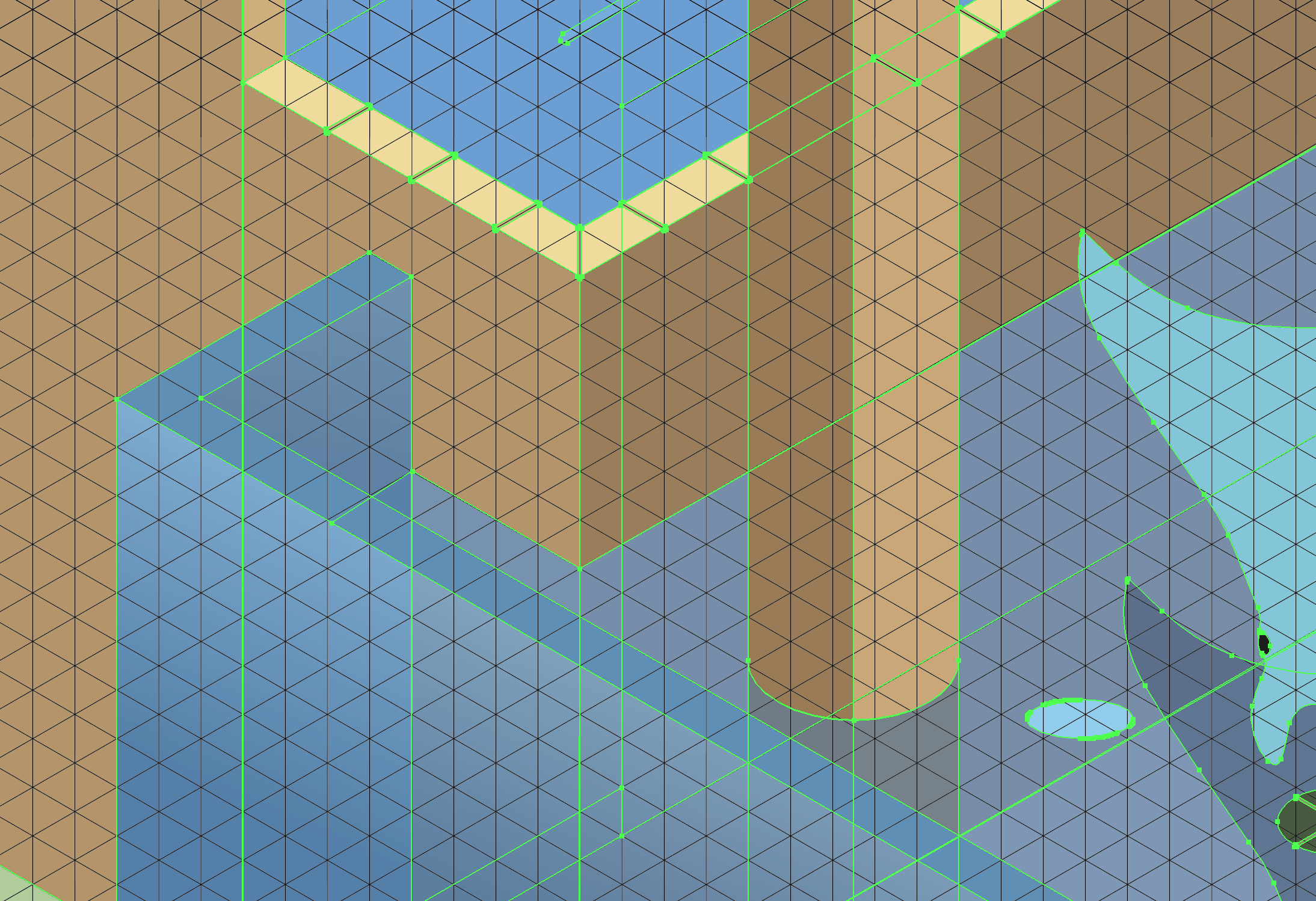
The main challenge in designing the landscapes were adding in the smaller elements such as windows. Because isometric designs tend to be very neat, adding in details to the illustrations was very tedious because of the need to align to the grids. Eyeballing these details without adhering to the grids would look messy and awkward.
CHALLENGES: Animation
Problem #1:
A lot of the buildings started causing problems once they were imported into after effect. First of all, the buildings, tracks and elements had to be separated into different layers. However, because the landscape was illustrated in a 3D space on after effect, the 3D camera angle would cause the different layers to shift during the video. This would cause weird overlapping issues or unwanted gaps in between them.
(gaps in between the water and the platform – they would continuously shift through the duration of the video)
Solution:
To play with the Z axis of each elements to ensure each elements don’t fall under the same plane.
Problem #2:
Roller Coaster needs to be in 3D in order for it to be animated around the tracks.
Solution:
Using Cinema 4D renderer to extrude it into 3D form but will eat into the rendering time of each individual scene.
Problem #3:
After effects don’t read Gradient well, causes intense lag when previewing.
Solution:
Rasterize the gradient layers in Ai.
Problem #4:
Roller Coaster is not smooth when travelling from one location to another.
Solution:
Easy ease in and out while at different check points.
FINAL
With the process out of the way, here are the final videos!
Elphie Version (without music)
Media Art Nexus Version (with music)
That’s all folk! Thanks for reading this post!


