Life and Death: Documentation

PROPOSAL

Programme Purpose/Objective

The main purpose of this installation is to allow participants the chance to take a step back to evaluate their lives so far. The installation aims to evoke recognition of the fast-paced lifestyle Singaporeans have in general. It also allows participants to reflect on the qualities of their life experiences and authentic connection they have with the things that truly matter in life. It also questions them on the meaning of their lives so far – if they were to die in this instant, what sort of legacy would they have left behind, and would it be something they could be satisfied with?


Programme Rationale

Singapore is a fast-paced society and there is rarely any time for people to slow down and truly appreciate life. We thus felt it was necessary to remind participants to take a breather and rethink the value of their lives.


Programme Details

The installation comprises 2 rooms, both of which are expected to work independently as well as together. The first room is a narrative recreation of Singapore’s fast paced life, and will end in the ‘death’ of the participant. This is followed by the second room which allows for the participant to do a self reflection of his/her death.


Artistic Direction

Life experiences differ from person to person, and we wanted to be as inclusive as possible to whoever that would be viewing it. The installation thus has a mixture of both literal and abstract elements. This allowed us to create a more poetic narrative that was more flexible, allowing participants to slip into the character portrayed.

We will be making use of sound, videos, voice overs and props to create the desired atmosphere. To ensure that participants are able to understand the installation, we decided to make only the voice over explicit while the rest of the mediums will be kept abstract.

Room 1

As mentioned earlier, the first room is a narrative re-enactment of Singapore’s fast-paced lifestyle. The room is set up with 3 projected screens adjacent to one another.

In this room we use the metaphorical representation of water as life and merge it together with scenes of the protagonist’s life. The protagonist is never explicitly shown, allowing participants to insert themselves into the narrative and relate the events with their own lives.

The three screens are played in sequence and document the growth of the character from a toddler to a teenager to a young adult respectively. Interlaced with the scenes of the character’s growth are scenes of coloured water droplets being dropped into a tank full of water. The water represents life, and the different coloured droplets represent the memories, experience and feelings associated with each growth stage.

The first screen narrates the toddler stage. The tank of water starts of transparent to represent the character’s innocence and purity. Her first memories, which are represented by yellow droplets are seen penetrating the surface of the water before spreading outwards. The screen then shows clips of a young kid playing with toys and having fun in the playground. The screen then fades back to the now yellow water in the tank.

The second screen starts playing as the first screen continues showing the yellow colours fusing with the water. Red droplets are added into the yellowed water, and is then overlapped with scenes of the character’s slow submission to teenage pressure and rebellion. She is stressed from studying and is too absorbed by commitments which result in negligence of her family. The screen fades back to the water, which is not a mixture of yellow and red. The water is now turning darker and murkier, symbolising the chaos and impurity in her life.

The final screen starts playing as the second screen continues showing the yellow and red tainting the water. This is overlapped with scenes of the character descending into a downward spiral in her life. She starts smoking, and is increasingly distant with her family. She is then seen fainting as the fast pace of her life has finally caught up with her and her health. She dies, and only realises the important things in her life during her last moments, when it’s already too late for her to change anything.

The screen turns black. Black is an irreversible colour, which means that the addition of other colours will not change it. Her life is over, and there is no turning back.

Room 2

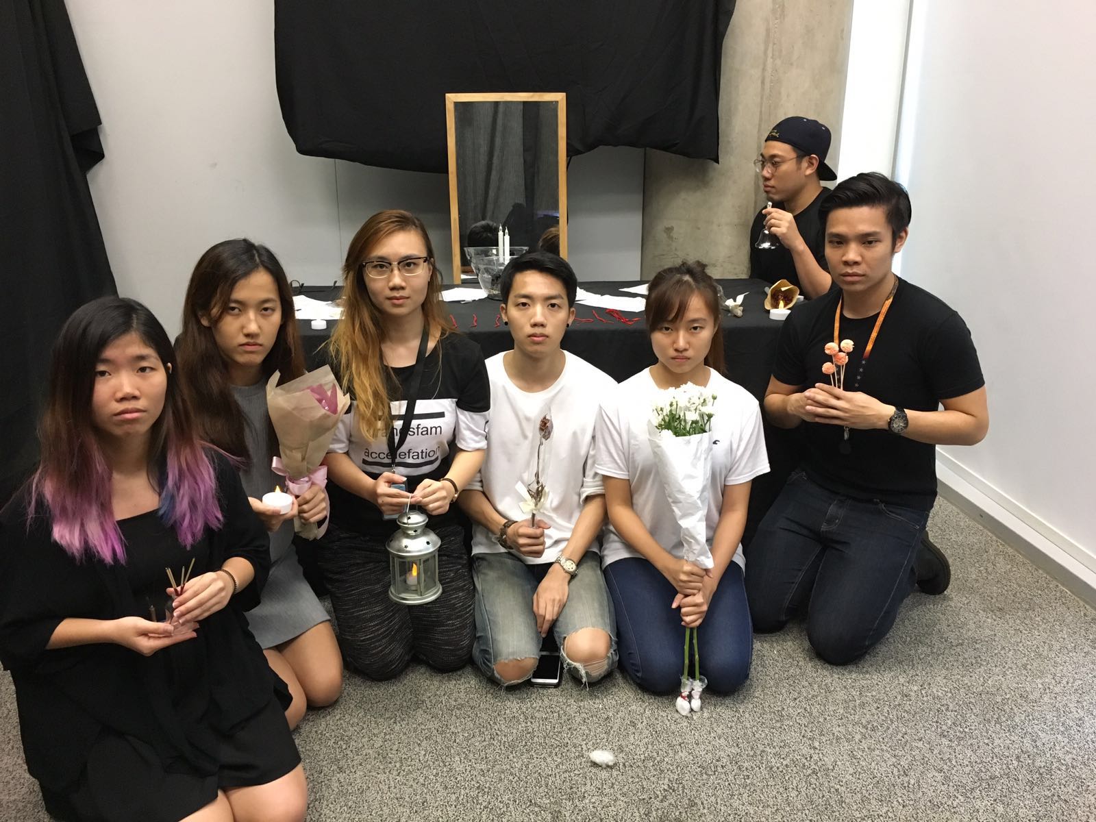
While Room 1 focuses heavily on using videos, Room 2 shifts towards the usage of props and performance to create a reflective mood for the participants.  In this room, a mock ritual for the dead has been set up.

The room is darkened as much as possible, and a table is setup at the end of the room. On the table lays different objects that are related to death. They include red string, candles and flowers commonly used for offering. In the center of the table lies a dirtied glass bowl. This is a connecting element for the 1st and 2nd room, and is representative of an empty life vessel. Life, symbolized by water, has been drained out, and only the ugly stains of the black contaminated life has been left behind.  Behind the table stand a mirror that reflects the face of those who enter the room, and is meant to prompt participants to look at themselves and self-reflect.

As participants enter the room, a short performance is also put up. A male and female stands on either side of the table. They have a short dialogue about the character in the previous room.

Dialogue

Female: She didn’t have to die this way.

Male: But at least she was doing what she loved

Female: But what does that amount to?

Male: Have YOU lived a fulfilling life?

Female: Or are you just chasing after happiness that is only temporary?

After this short dialogue, an usher will come in to encourage participants to have a silent self-reflection for a duration of 1 minute. The narrative her is kept short as the main highlight here is the participants’ own involvement in the room.


Target Audience

Students of the School of Art, Design and Media and NTU aged 19-30.


Research Paper

For this project, we aimed to tackle and address the issue of leading a fulfilling lifestyle in a modern context. We observed that many youths face the similar issue of being overwhelmed by school work and other commitments, and often had little quality time with things in life that truly mattered. (BBC, 2007)

In our research, we came across one particular trend that had a huge impact on our artistic direction.

Due to high societal pressure and escalating suicide rates, the ‘Near Death’ movement has become increasingly popular in South Korea. This movement aims to address this issue by giving participants the chance to detach themselves from their fast paced lifestyle to reflect on their lives. As such, multiple ‘Fake Funeral’ services have been conducted across the country.. In this particular one, they are lectured by a philosophical guru and invited to write out their own eulogy. After that, they will be placed in a coffin for 30 mins to experience death. The act of being enclosed creates a deafening space of endless darkness, and the atmosphere allows the participant to evaluate their lives from a objective and detached point of view.  A lack of self reflection usually leads to people feeling lost and depressed, and this death meditation in the enclosed space forces them to look within themselves for answers that they have been seeking, but thought they didn’t have.

Another work we came across was Christian Boltanski’s The Heart Archive. Occupying a space in a museum on the uninhabited island of Teshima in Japan, this artwork collects heartbeat sounds from all around the world. Participants are invited into a room where they listen to the sounds of their own heartbeats through a headset. After that, their heartbeats recordings are saved and used in subsequent set ups of the art piece. The heartbeats are immortalized, and remain as fragile remains of their existence on earth.The work makes one contemplate on bereavement and what we remember during our existence on earth. As you take part in the installation, it evokes a sense of uncanniness which acts as a mirror of what lies ahead and our nonexistence in it.  The artwork questions the impact left behind by each individual whose heartbeat sounds have been recorded, and we believe the fragile and faint nature of the recordings makes one ponder on the meaning of their lives, and how many people they have impacted. It also relied heavily on symbolism and non-literal ways of portraying the theme, which we found interesting.

We believe these two artworks were greatly valuable and conveyed an important message. We thus decided to reference these two particular artworks/movements in terms of artistic style and content.

Bibliography

Life in the fast lane ‘speeds up’. BBC. BBC News, 2 May 2007. Web. 4 May 2007. “Fake Funerals in South Korea.” Vice. Vice Japan, n.d. Web. 21 Apr 2016.

Demetriou, Danielle. “Boltanski’s hearts don’t skip a beat.” The Japan Times. The Japan Times, 6 Aug 2010. Web. 4 July 2013.

Waters, Florence. “Christian Boltanski: The Heart Archive, Serpentine Gallery, review.” Telegraph. Telegraph, 12 Jul 2010. Web. 6 Aug 2010.


Artist Statement

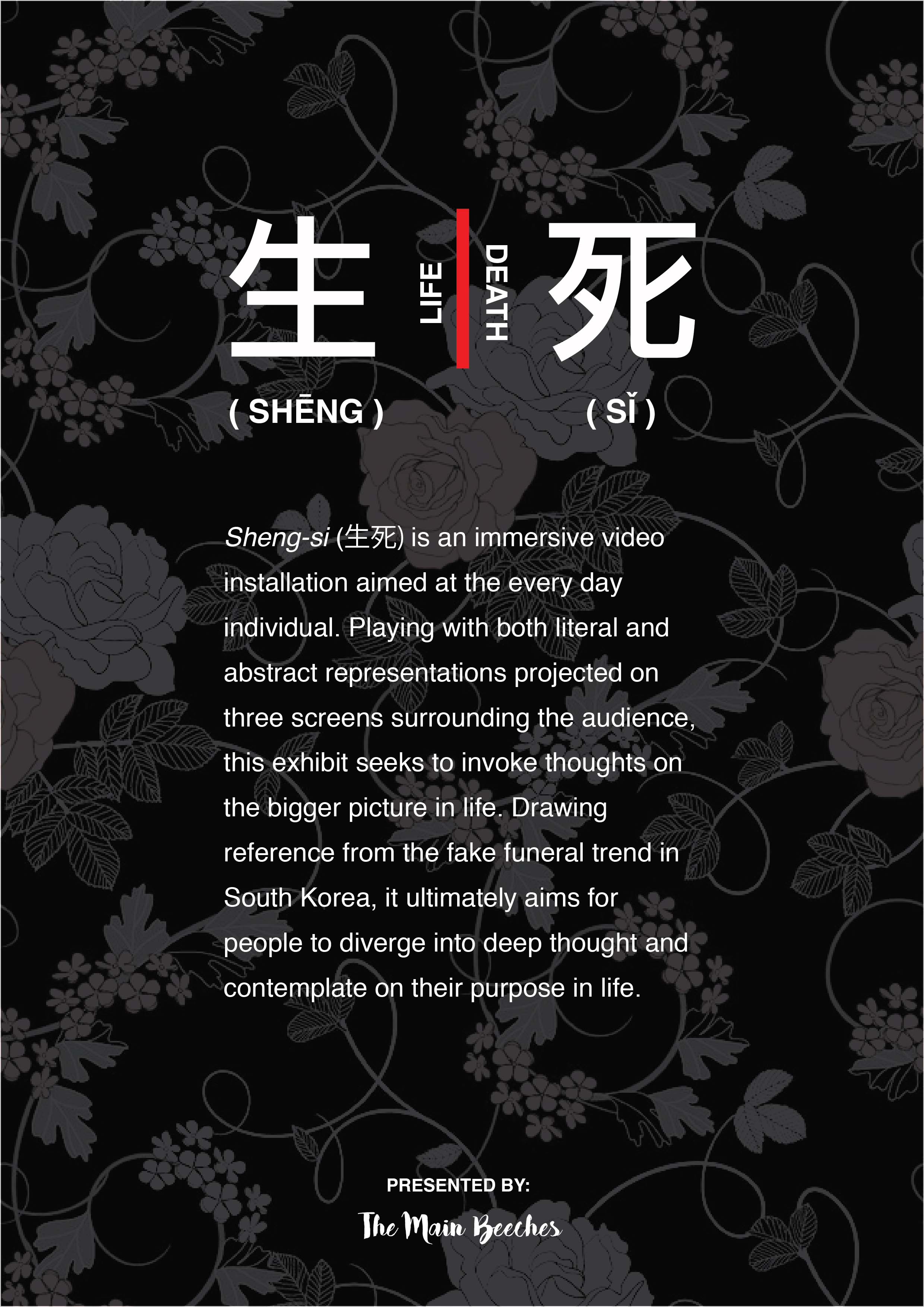
Sheng-si (translates to Life and Death) is an immersive video installation aimed at the everyday individual. Through a series of video projections and an interactive performance, it addresses the the issue of a fast-paced lifestyle through a series of literal narrative scenes and abstract imagery. Drawing reference from the fake funeral trend in South Korea, Sheng-si ultimately aims to take participants through a renewal on their view of life and their purpose.


Group Artist Statement

Print


Reflection

For this project, I was mainly involved in pre-production. Because of the size of our group, there were a lot of challenges during the planning and conceptualisation of the installation. Because we had a total of 6 people, it was very hard for us to consider and include everyone’s input.

Our ideas changed a lot over the couple of weeks we had for this project. Our initial train of thought was to make it much more abstract because we wanted our installation to be very open to interpretation. For instance, we initially took inspiration from Christian Boltanski’s work, and wanted to have a dying heartbeat in the first room, while the second room would be more closely set up as a place of mourning with groups of flower petals and candles placed all around the second room. However, after consultation we decided to make it more accessible and understandable. Addressing the concern of whether or not participants would be able to understand our message, we eventually settled on using a mixture of abstract and literal elements. While we felt the previous idea was more poetic, it would have been harder for audiences to understand our message. We thus modified our content in a way that it would keep in line with our artistic direction of being metaphorical and symbolic while still being easy to understand and digest.

Overall, this project really gave me insight into planning a artwork with both the artist and audience in mind. This meant that the artists’ vision was achieved while still consciously taking into consideration the audience’s enjoyment and audience experience.

There was also a lot of trial and error involved in the process of planning our content and set up. The good thing was that we were a big group, and there were always a lot of suggestions for what we could try next.
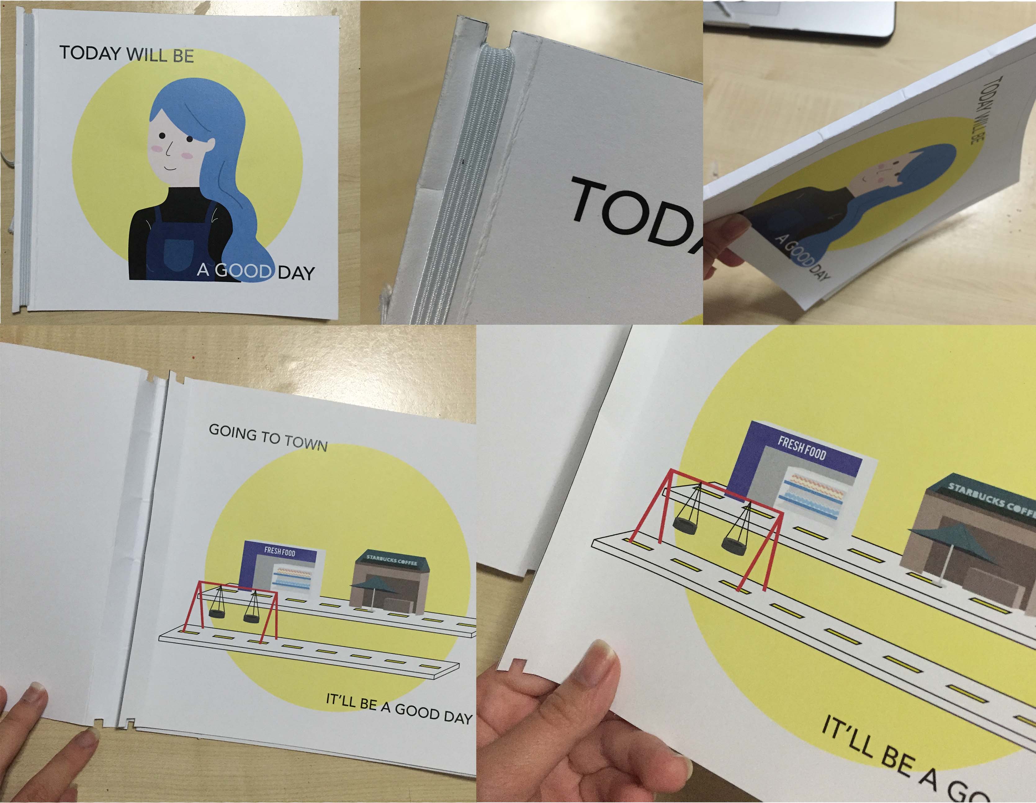
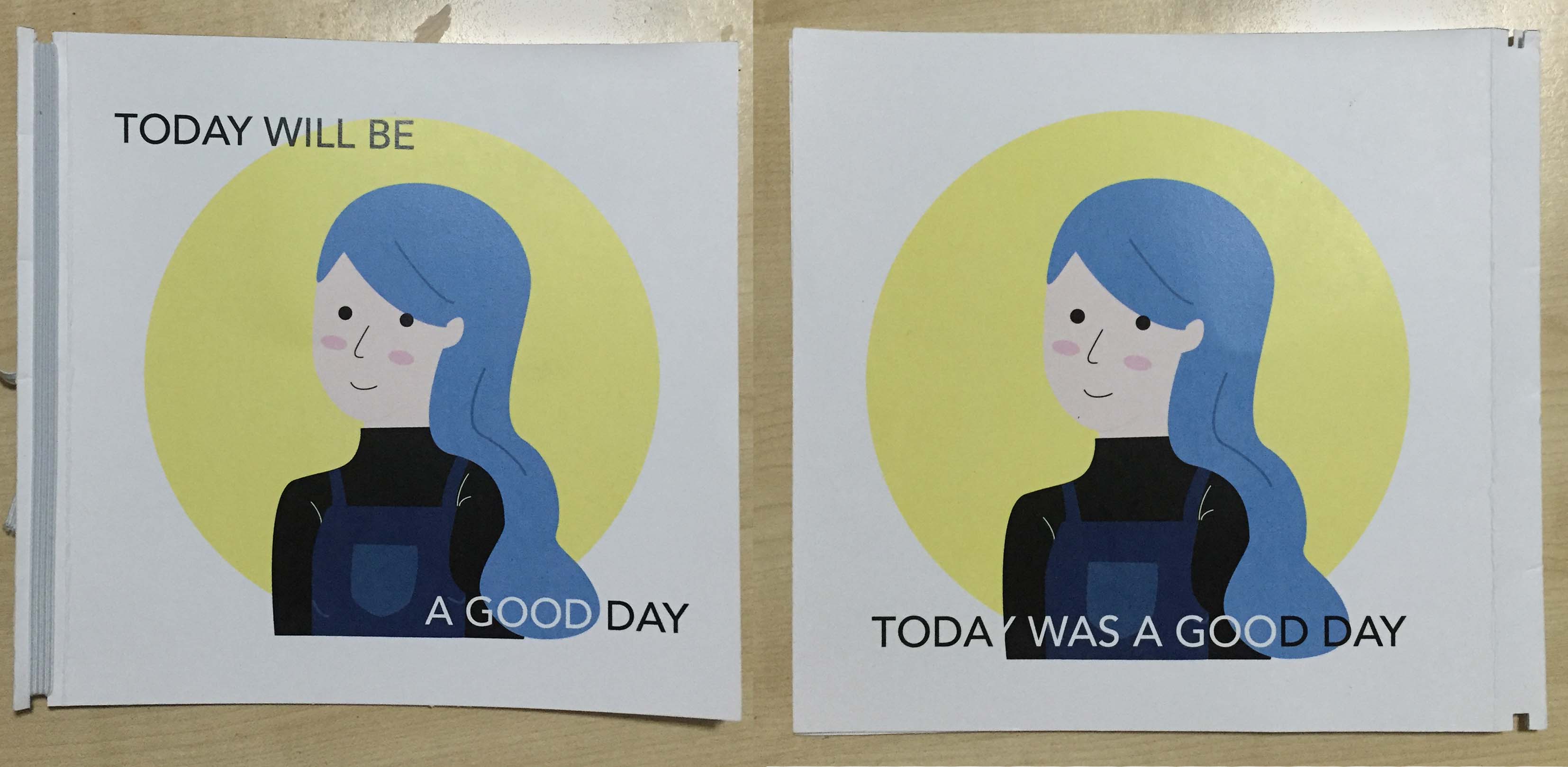
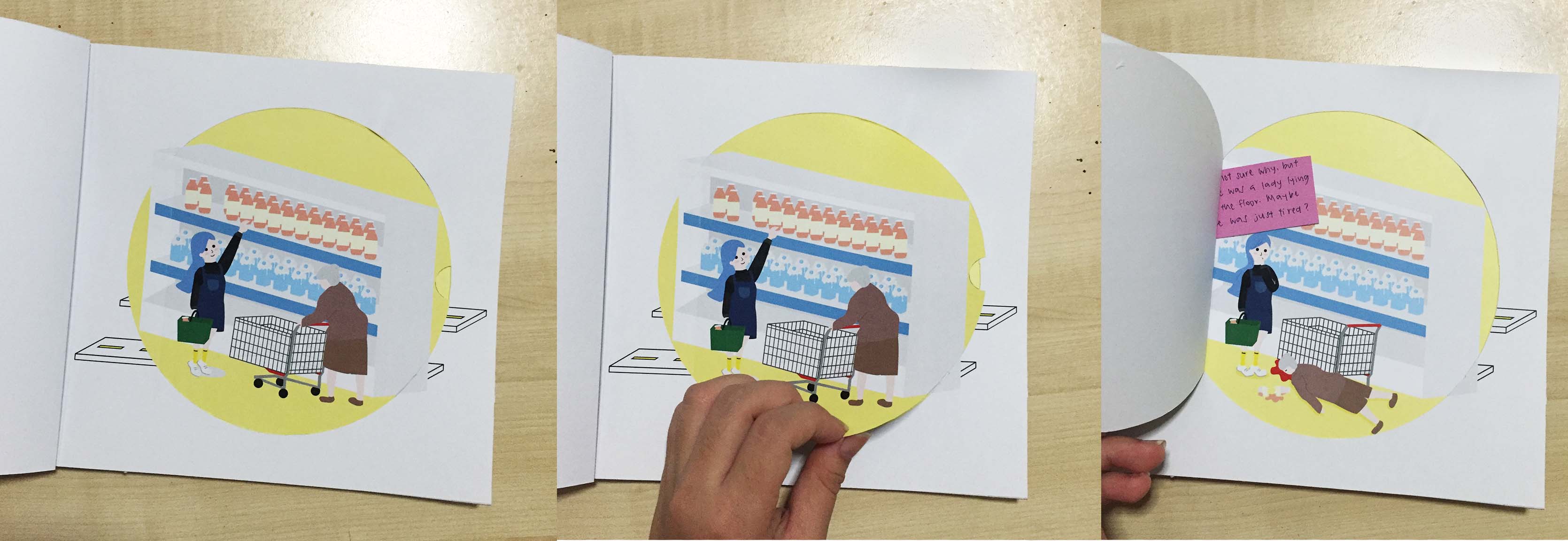
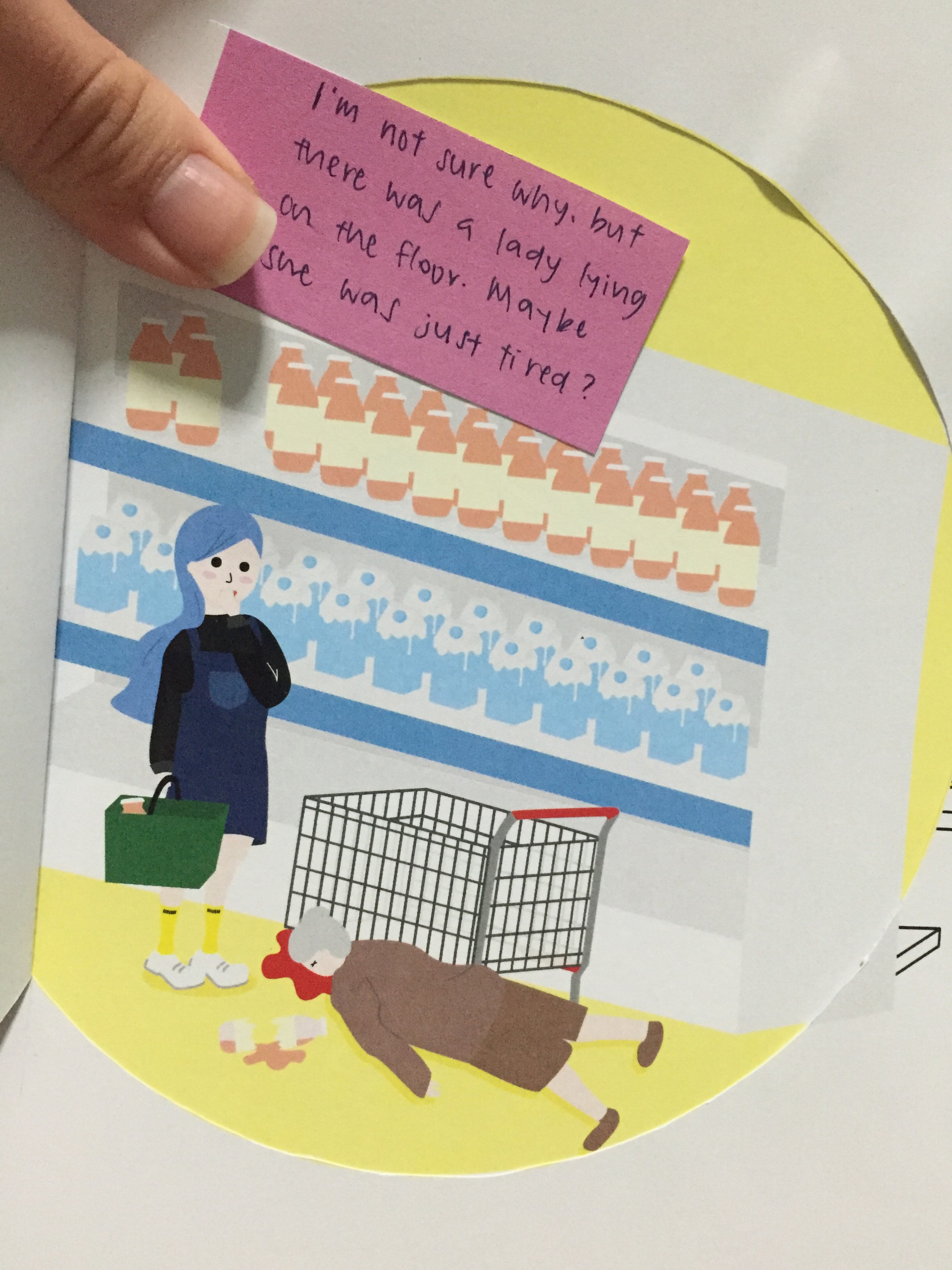


Final Installation


Process

(To ruyi: I know you were worried about our mental health, but don’t worry. You don’t have to be!)

File_000

File_004


File_003

File_001


Art History // Relfection & Final Thoguhts

*Reflection will be right at the bottom of the page!

Proposal
(click here for original proposal post)

Chosen subject: Indian Buddhism

Group Mates: Chio Jo Inng, Alfred Yeo, Evangeline Ng, Lu Jia Xian

Museum Visited: Asian Civilisation Museum
Chosen Object: Gateway Bracket with four shalabhanjikas

File_001 (1)

Identified by her bosom and buttocks, the person identified in the sculpture is Yakshi.

We decided to appropriate this particular sculpture that we saw at the Asian Civilisation Museum.

Yakshi was traditionally considered a goddess of fertility because of her figure. However, in modern context, such a voluptuous body would be linked to the idea of sexuality rather than fertility and baby making.

As such, we thought it would be interesting to remove Yakshi from her past context to bring across the exploitation of a woman’s body for sexual purposes. To make this point stronger, we decided to create a FHM cover featuring Yakshi.


Additional Comments

After the presentation, I thought I should address some questions that Sujatha mentioned.

Although most local magazines don’t have double covers (the back is usually reserved for advertisements), we felt it was necessary to have two different versions of our cover page.

Front Page:FINAL NAOMI-01


Back Page: FINAL NAOMI-02

We felt that audiences would have different thoughts and interpretation on the dressing style when the identity of the figure was changed. We thus wanted to play around with the irony that Yakshi would be seen as fertile and child-bearing (and generally positive thoughts), while Naomi Neo might be slut-shamed for having the exact same body and dressing. We felt that this was in line with our aim in conveying the idea that the same object/form could be interpreted very differently depending on the context of the culture & audience.


Artist Statement

The image shown is a modern interpretation of the Indian Buddhist Goddess, Yakshi. Traditionally associated with the idea of fertility and nature in ancient India, she was identified through her large, round breasts, small waist and large thighs and hips. These days, the voluptuous body that Yakshi possesses may be interpreted in a totally different way. In the modern world, sexual objectification of women have become much more commonplace, and a voluptuous body such as hers may be seen as a tool of pleasure in the eyes of men. It is no longer associated with the idea of being fertile or baby conceiving, but instead as means of sexual gratification.  As such, we decided to remove Yakshi from her traditional context to show this shift in perspective towards the well-endowed body. To effectively bring across the point, we placed her into a modern piece of media that portrayed women in a more provocative manner that man would find sexually attractive.

The ambiguity created in the poster is also intentional, and meant to make viewers question the state of modern female sexuality in media; is the woman’s sexuality being subverted as part of a man-made construct, in the same way religion is sometimes criticized as a man-made construct? Or is the Yakshi/model exerting power with her sexuality, in the same way a goddess attracts worshippers? Just as how we have no idea if the models in FHM covers are happily and willingly doing their job, and as we have no idea if Yakshi is an influence or a result of influence, the state of female sexuality in the modern day is in a state of undefined flux.

Known for featuring the ‘hottest’ women on the planet, FHM was our choice of medium on which we would appropriate Yakshi. To localise it, we designed a Singaporean FHM cover featuring Yakshi in the form of Naomi Neo, a popular blogger known for her voluptuous body and outspoken attitude about sexuality. As such, we have created an artwork that appropriates Yakshi as a social statement and reflection on how much the meaning of a woman’s body have changed over the years.


Bibliography

  1. Manipulating Cultural Idioms.Sirhandi, Marcella C.. 1999. “ManipulatingCultural Idioms”. Art Journal 58 (3). [Taylor & Francis, Ltd., College Art Association]: 40–47. doi:10.2307/777859.http://www.jstor.org.ezlibproxy1.ntu.edu.sg/stable/pdf/777859.pdfRepresented in sculpture since approximately 200 B.C.E., the yakshi has always been conceived as a voluptuous creature with large globular breasts, small waist, and exaggerated hips and thighs. Bhattacharya’s female fatale, entwined by the vine that signifies her tie to nature, has tubular arms that echo the essence of the creeper. Her partner, emerging from the center of the flower, is literally the spirit of the plant-a common definition for yaksha/yakshi
  2. Unclothed sensual, feminine figure as one of the most canonical motifs of Indian art.“ART HISTORY AND THE NUDE: ON ART, OBSCENITY, AND SEXUALITY IN CONTEMPORARY INDIA”. 2004. “ART HISTORY AND THE NUDE: ON ART, OBSCENITY, AND SEXUALITY IN CONTEMPORARY INDIA”. In Monuments, Objects, Histories: Institutions of Art in Colonial and Post-colonial India, 237–67. Columbia University Press.http://www.jstor.org.ezlibproxy1.ntu.edu.sg/stable/10.7312/guha12998.13.Over different periods and genres, the voluptuous feminine body in sculpture came to be endowed with a variety of meanings. The figures came to be read as symbols of growth, bounty, and fertility, as the embodiment of a divine maternal spirit, or as classical literary ideals. In the process, the sexual form moved from its initial primeval association with nature and fertility rites to its later, more complex divine and aesthetic connotations.
  3. Interacting Like a Body: Objectification Can Lead Women to Narrow Their Presence in Social Interactions. Saguy, Tamar, Diane M. Quinn, John F. Dovidio, and Felicia Pratto. 2010. “Interacting Like a Body: Objectification Can Lead Women to Narrow Their Presence in Social Interactions”.Psychological Science 21 (2). [Association for Psychological Science, Sage Publications, Inc.]: 178–82.http://www.jstor.org.ezlibproxy1.ntu.edu.sg/stable/41062184.Sexual objectification occurs when a person is viewed as a mere body that exists for the pleasure and use of others (Bartky, 1990). This treatment targets women more often than men. For these reasons, women are theorized to willingly participate in their own objectification and become preoccupied with appearing as “good objects” (Fredrickson & Roberts, 1997).Drawing on these ideas, we predicted that when objectified, women would try not only to appear as good objects, but also to behave like ones.
  4. Contemporary Indian Art: A Question of Method. Sinha, Ajay J.. 1999. “Contemporary Indian Art: A Question of Method”. Art Journal 58 (3). [Taylor & Francis, Ltd., College Art Association]: 31–39. doi:10.2307/777858.http://www.jstor.org.ezlibproxy1.ntu.edu.sg/stable/pdf/777858.pdfTaking reference from contemporary Indian art, much of which centres around adapting Indian cultural symbolism, was an important stepping stone in our process. Ravinder Reddy and other contemporary Indian artists’ works subvert or transform the meaning of traditional religious figures such as Kali and Yakshi into modern-day works into modern-day contexts, which served as an inspiration for our project.


Final Product

c7a21fa3-7cdf-4186-ac7e-927498f58fea

Interview with Yakshi on her ever-changing roles (click on image to expand):

7f666c99-7fcc-4482-9b42-51578586bb33

Cover & Back Page:

FINAL NAOMI-01FINAL NAOMI-02


Reflection

I think this last project was a very appropriate one to close Art History with. Armed with the visual analysis skills we had learnt throughout this module, it was really fun to try interpreting and re-interpreting different artworks.

While visiting the ACM we came across the Yakshi sculpture and immediately realized that someone who did not know who Yakshi was could interpret the body in a very different way. Taking her out of context and just looking at her body visually, one would see her voluptuous figure and associate her with being seductive instead of being fertile.

We thus settled on the idea of appropriating Yakshi into an FHM cover. Because we aimed to show how perceptions change based on the identity of the body, we wanted to merge Yakshi with another figure who was know to be sexy. We settled on Naomi Neo, a famous local blogger who is voluptuous and known to dress provocatively. We also used FHM because the ladies that appear on the cover are deemed as desirable and sexy.

Even to a non-art person, the presence of a sculpture might be associated with some sort of deeper meaning and purpose, and placing the head of Yakshi on Naomi’s body would imply this supposed purpose. Upon removing the head, however, that purpose is removed and the body merely becomes one that is provocative and scantily clad.

Making use of our research material, we formatted a mock interview with Yakshi. We felt that it kept in line with our cheeky tone and helped strengthen our message.

All in all, I really learnt the importance of both visual and contextual analysis because they really do influence the way in which you understand the image. This is one take-away that definitely applies to more than just art history, and it’s a skill I hope to keep for a long time!

TODAY WILL BE A GOOD DAY // The Journal of an Optimistic Girl


To start things of, let me talk about my main inspiration, which was the second project for 2D and 2D II.

Here are the photos for reference!

Untitled-3Nursery Rhymes – She had so many children she didn’t know what to do.

2D PROJ 2 FINAL-01Happiness from the POV of a lover.

The underlying theme for my POV project was rather dark, but I wanted to try pushing the boundaries even further in an even funnier way.


I thus came up with the idea of doing a fully narrative book from the POV of the main character. I don’t have a name for her, but my friend said it seemed like me (since i can be rather oblivious and clueless too)!

To work with the juxtaposition of her happy character with the darker theme, I decided to make her a very very veryyyyyyy obliviously optimistic and happy-go-lucky character that unknowingly brought death and doom with her wherever she went. I though the best way to represent this POV narrative was through a personal journal, so that’s what I went with in the end.

(I realised i forgot to take a picture of my initial sketches before i attached them into my sketchbook, so i’ll just be including my digital images)

Process Work

To start things off, I did my cover page first. Since this project was supposed to be an extension of a previous project, I decided to draw a slightly grown up version of the blue-haired girl I had used in my POV project.ZINE OSS POST-02

I removed the black lines and added a nose to make her feel more matured.

I actually had a few problems drawing my characters because i’m not very good at visualising, so I ended up taking a few reference pictures and tracing it with the pen tool on illustrator!

ZINE OSS POST-04

These were used for the staircase drawing in my last page!


One of the bigger issues I had was a continuity issue in the pages. This was my original map in the book:

ZINE OSS POST-03

To communicate the idea that these places were visited in sequence, i placed the map behind each pages’ illustration.


Map-03

I didn’t like it though, and I thought it made the composition unnecessarily messy.


Test Print/Mock-up

Binding:

Binding

I did an elastic-band binding. Basically, the cover page and all individual pages have a cut out at the top and bottom of the page. The front page and back page sits on one long piece of paper and is separated by the book spine. The individual pages are aligned and placed into the cover pages, which acts as a sort of folder. The cover is closed with the pages inside, and the elastic band is fitted into the nooks at the top and bottom. The tension of the band then holds everything in place.

For this binding, it was very important for me to choose paper as thick as possible so that it could withstand the strength of the elastic band.


Cover Page

(Left: Front Cover | Right: Back Cover)

Page 2 File_007

My pages were initially two square pieces of paper stuck together with a flap. I realised later on that it felt very clumsy and messy.


Final Product

After printing, I decided to do away with the map in the individual pages. As mentioned earlier, I thought it didn’t go very well with the composition.

I then decided to make the place resemble places in NTU, and I think this helped (even just a little) to communicate the idea that these places were visited on the same day, and in sequence.

New Map:

Untitled-2-11

The ‘Fresh Food’ place is actually Prime, and the pink building is Hall 8. The main character starts at North Spine before proceeding back to her hall.

Untitled-2-09

The stairs’ and door’s colours were made similar to the ones in Hall 8.


Final final finalll product:

I’m sorry I don’t have any pictures of me assembling the book!

Binding took about 1 hour or more to do because I had to cut out all the individual nooks on each page. To give you a better idea of how i layout my pages, here are some pictures!

The extra space at the left of the page is allowance for the nooks and elastic band!

ZINE PRINT (FINAL)-05ZINE PRINT (FINAL)-12The cover page was printed on one continuous piece of paper (within A3). The center space in between the nooks was the book’s spine.

All my pages were single sided to keep in line with the journal theme. The pages are supposed to be added in when something new happens to the character, and it thus doesn’t make sense for the pages to be double sided. Also, the addition of the flap would make it too thick and bulky.

ZINE OSS POST-05

I also changed the way I pasted the flaps on top of my pages. Instead of cutting out a circle on the top page and pasting the rest of the page down, I decided to DIY my own ‘die-cut’, and left enough space on the left side of the page for it to be inserted into the binding.

The elastic band i used was a smooth one with no ridges that I found at artfriend (thanks joy for the tip!!!)


and TA-DAHHHHHH THE FINAL ZINEE


zine-small


Here is the soft copy version with the main character’s musing/thoughts!


On the left is the happy part (top of flap) while the bottom is the more catastrophic side of events!

Untitled-2-01

Flaps-01

She reaches the top shelf for her fruit juice but it is instead knocked down and it hits an old lady, killing her. Instead of showing concern, she just genuinely wonders why the old lady would ‘sleep’ on the floor of a supermarket.


Flaps-02

She decides to grab some coffee after her marketing errands (as seen by the plastic bag on the table), and muses about how much she loves her coffee. In her dazed mode, she accidentally lets go of her coffee, spilling it over another student’s laptop. The student is noticeably distressed before she spills the coffee, and is in shock as his laptop goes haywire after she spills the coffee. Of course, she is oblivious to all this!


Flaps-03

After her coffee, she decides to walk back to her hall since it’s not too far away. She’s glad she doesn’t have to wait and squeeze into the shuttle or public buses to get back to her hall, and is using her phone on her walk back. A student on a bicycle attempts to avoid hitting her and is instead flung from his vehicle. Again, she is completely clueless and is (presumingly?) looking at cute animal videos on facebook.


Flaps-04Here, she is approaching her hall room. She is perspiring due to the hot water, but still has a smile on her face because that’s just the type of person she is. She smiles and always chooses to be positive :). One of her fruit juice unknowingly drops out of her plastic bag, and the guy climbing behind her trips and falls, dropping his laptop casing with him. She turns back and is concerned about him. However, she doesn’t realise it’s her fault, and merely thinks he was just taking a short break from climbing the very steep stairs. 

Untitled-2-02

Despite all that happened, she is still totally oblivious (haha)! She starts and ends everyday with a positive and happy mindset, which is why the back cover says “Today was a really good day”.  I added some extra strokes of blush on her cheeks because she’s flushed from being so happy.  (๑•͈ᴗ•͈)


Conclusion:

I was really really happy that I had the chance to do this project! It definitely gave me the chance to further flesh out my ideas and I really enjoyed creating the narrative. I’m glad I got the chance to develop my characters and style and I look forward to more exploration during the holidays!

To end off, I would really like to thank Joy for always being so encouraging! I really learnt a lot this semester, and I feel that Joy’s encouragement and constant feedback really helped to push me further along in my design journey! I had more courage to explore what I wanted to incorporate in my style and I appreciate that so so much so THANK YOU JOY!!!

ヽ(◕◡◕❀ฺ )ノ   ヽ(◕◡◕❀ฺ )ノ   ヽ(◕◡◕❀ฺ )ノ

Visual Response Proposal

Chosen subject: Indian Buddhism

Group Mates: Chio Jo Inng, Alfred Yeo, Evangeline Ng, Lu Jia Xian

Museum Visited: Asian Civilisation Museum
Chosen Object: Gateway Bracket with four shalabhanjikas

File_001 (1)

Identified by her bosom and buttocks, the person identified in the sculpture is Yakshi.

We decided to appropriate this particular sculpture that we saw at the Asian Civilisation Museum.

Yakshi was traditionally considered a goddess of fertility because of her figure. However, in modern context, such a voluptuous body would be linked to the idea of sexuality rather than fertility and baby making.

As such, we thought it would be interesting to remove Yakshi from her past context to bring across the exploitation of a woman’s body for sexual purposes. To make this point stronger, we decided to create a FHM cover featuring Yakshi.

That’s all for now!


support #bosombuddies y’all