Objective: to create six compositions containing your name, portrayed in creative typefaces that represent a certain characteristic of yourself.
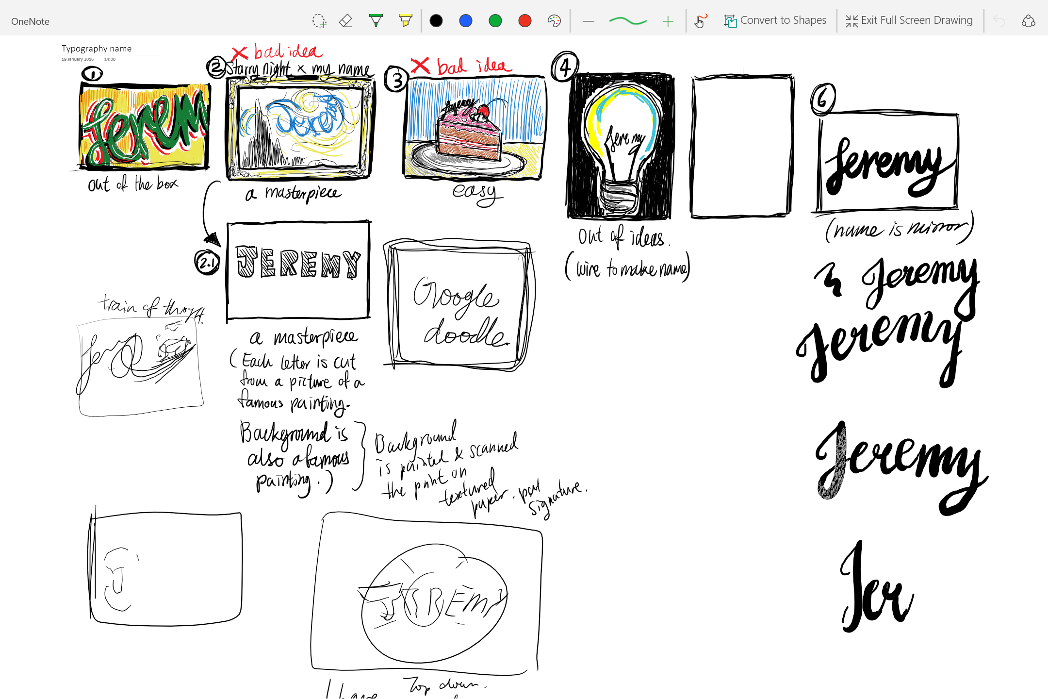
Initially it took awhile to decide on what characteristics of myself i wanted to portray.
- i am narcissistic
- i love to draw
- i am a potato
- i am not a morning person
- i am a cut above the rest
- i am easy
- i think out of the box
- i am a masterpiece
- i am short
- i am out of ideas
Eventually i decided to choose these 6:
- i am narcissistic
- i am a cut above the rest
- i am short
- i think out of the box
- i am a masterpiece
- i am out of ideas
When suddenly…

So, after a few more rounds of thinking I eventually chose the following:
- I am narcissistic
- I am a masterpiece
- I am out of ideas
- I am not a morning person
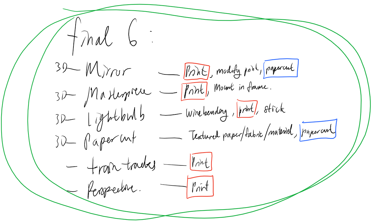
And I came up with the following final compositions:
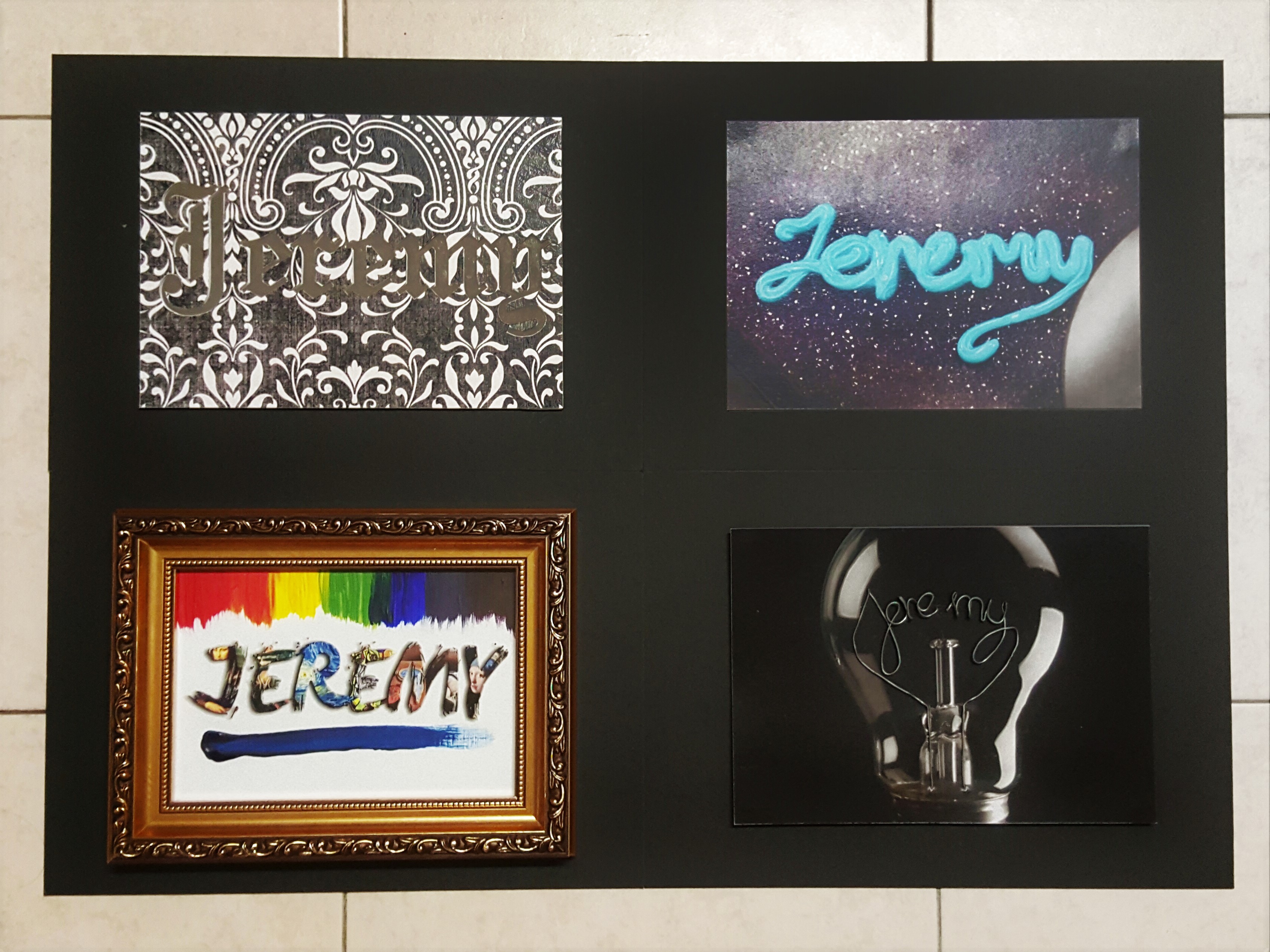
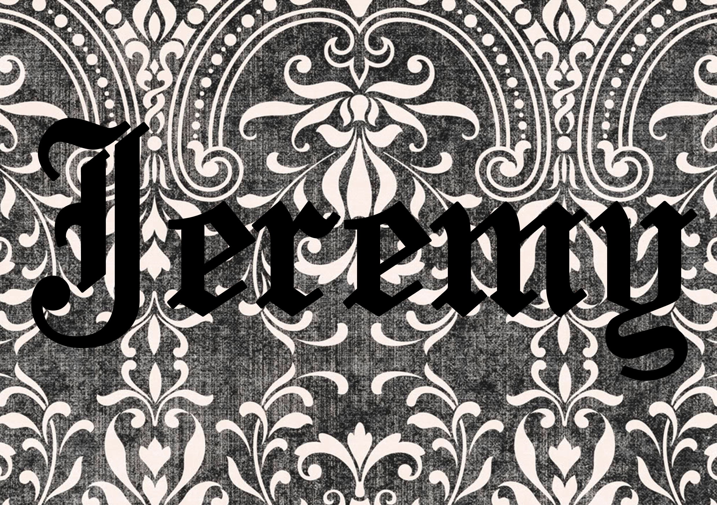
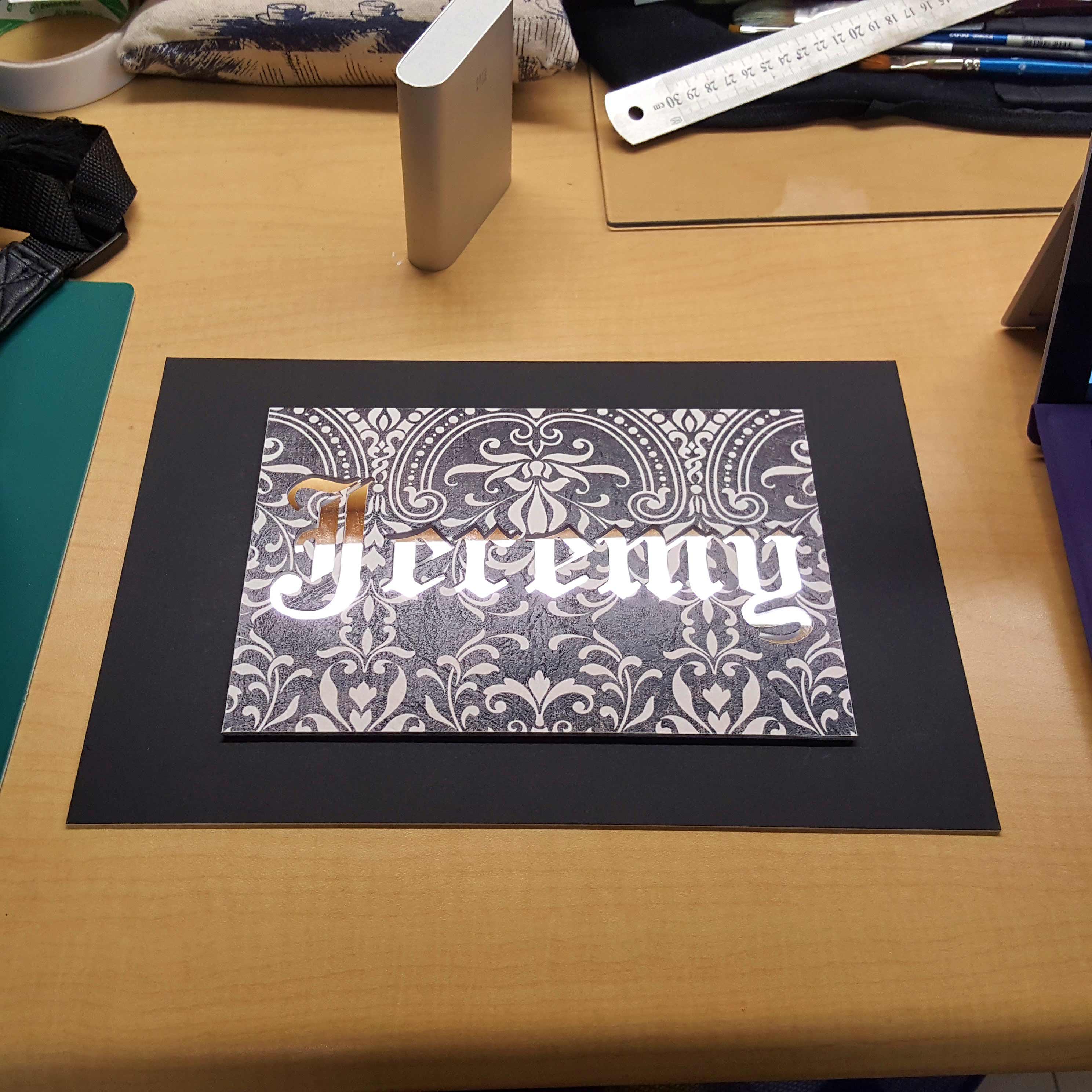
- I am JEREMY and I am narcissistic.
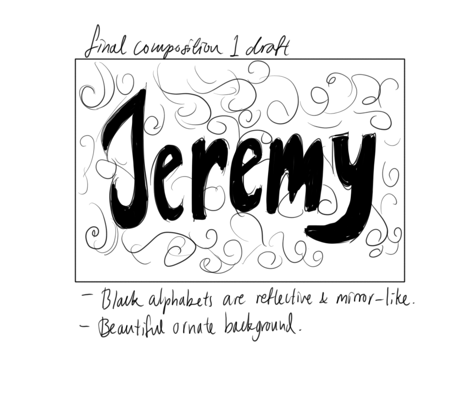
I decided to use a mirror surface acrylic to give an illusion of a mirror. Then I planned to cut out my name from the background and overlay it on top such that the mirror would only show through my name.
Visual reference:
Initial draft: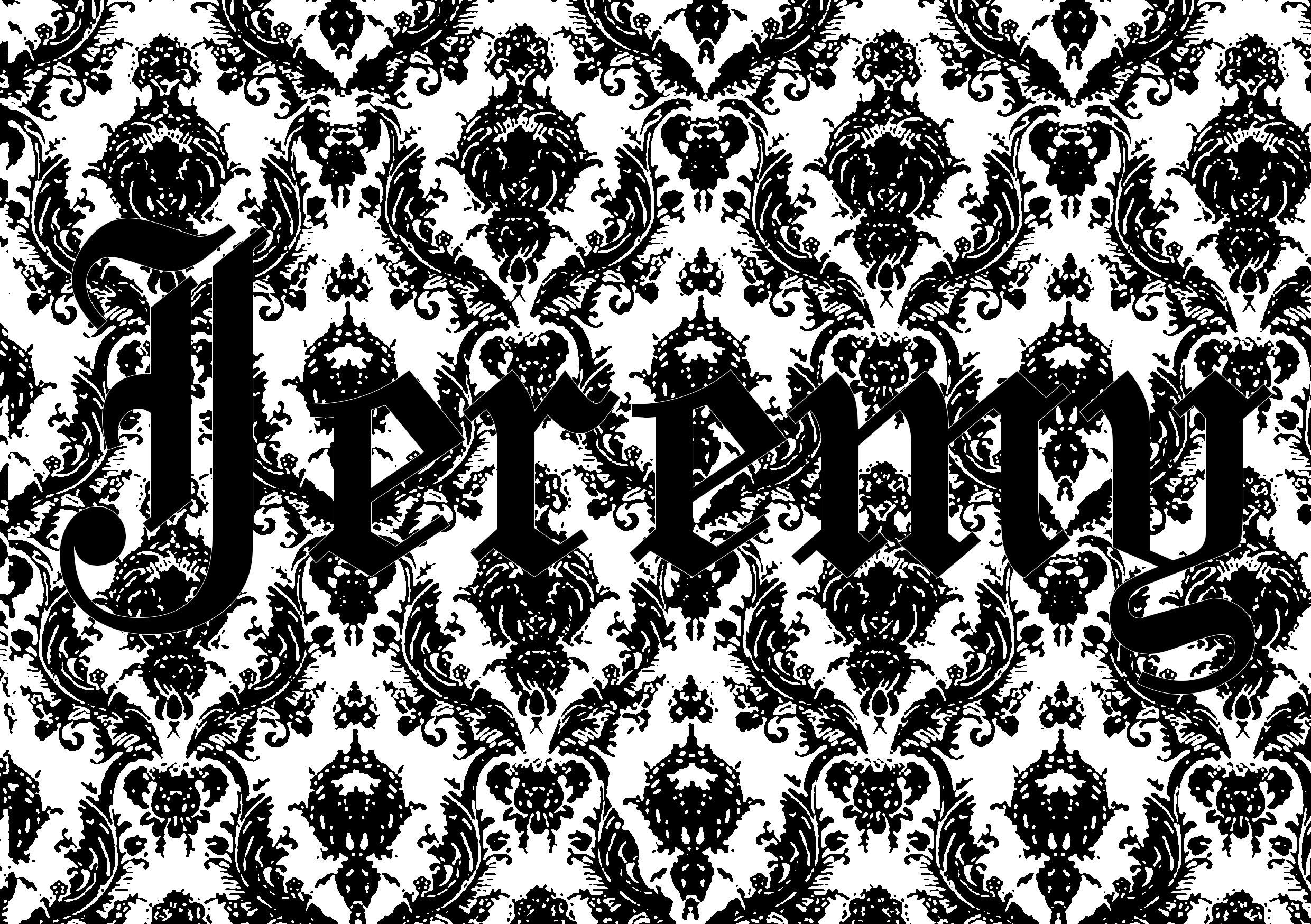
Final output for print:
Final product: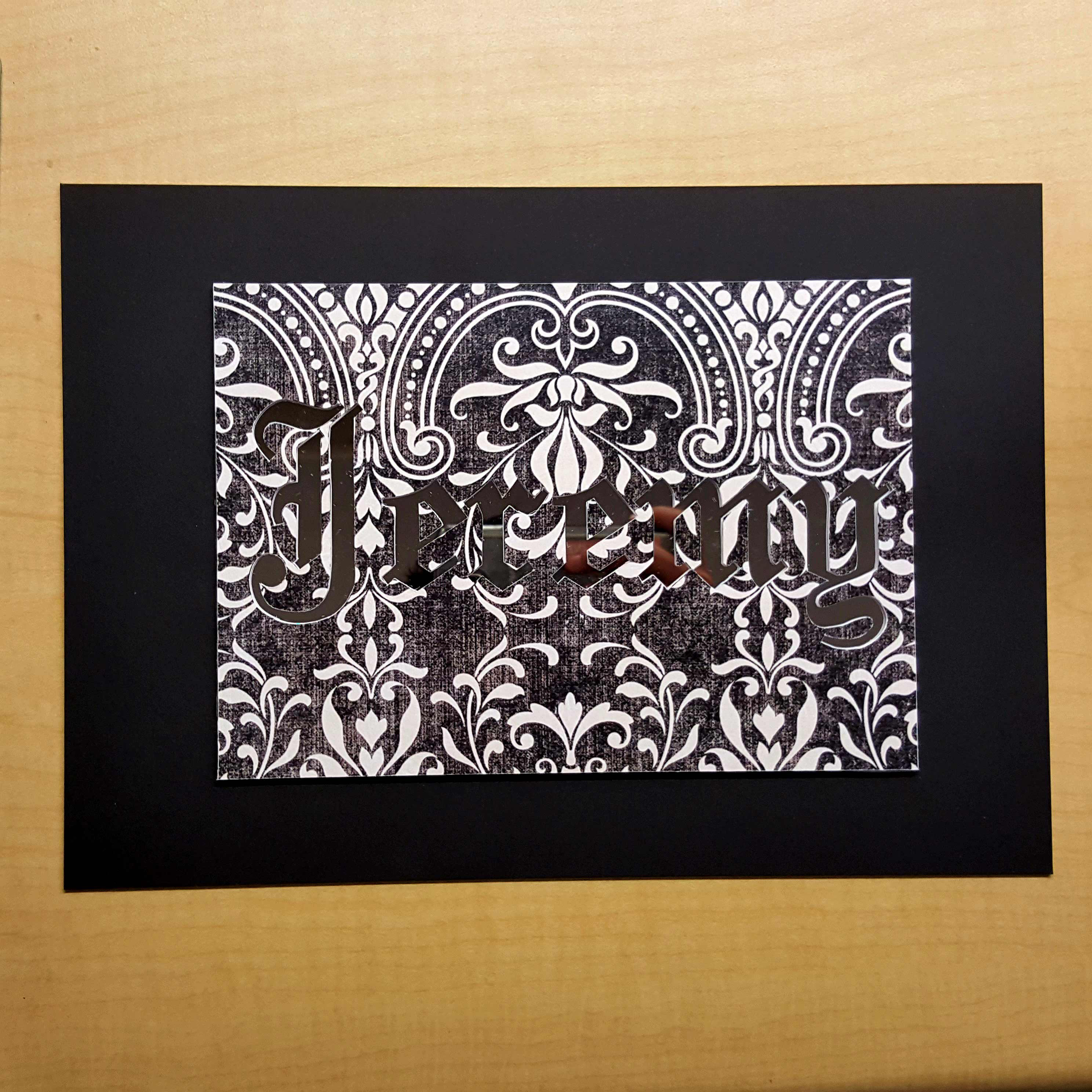
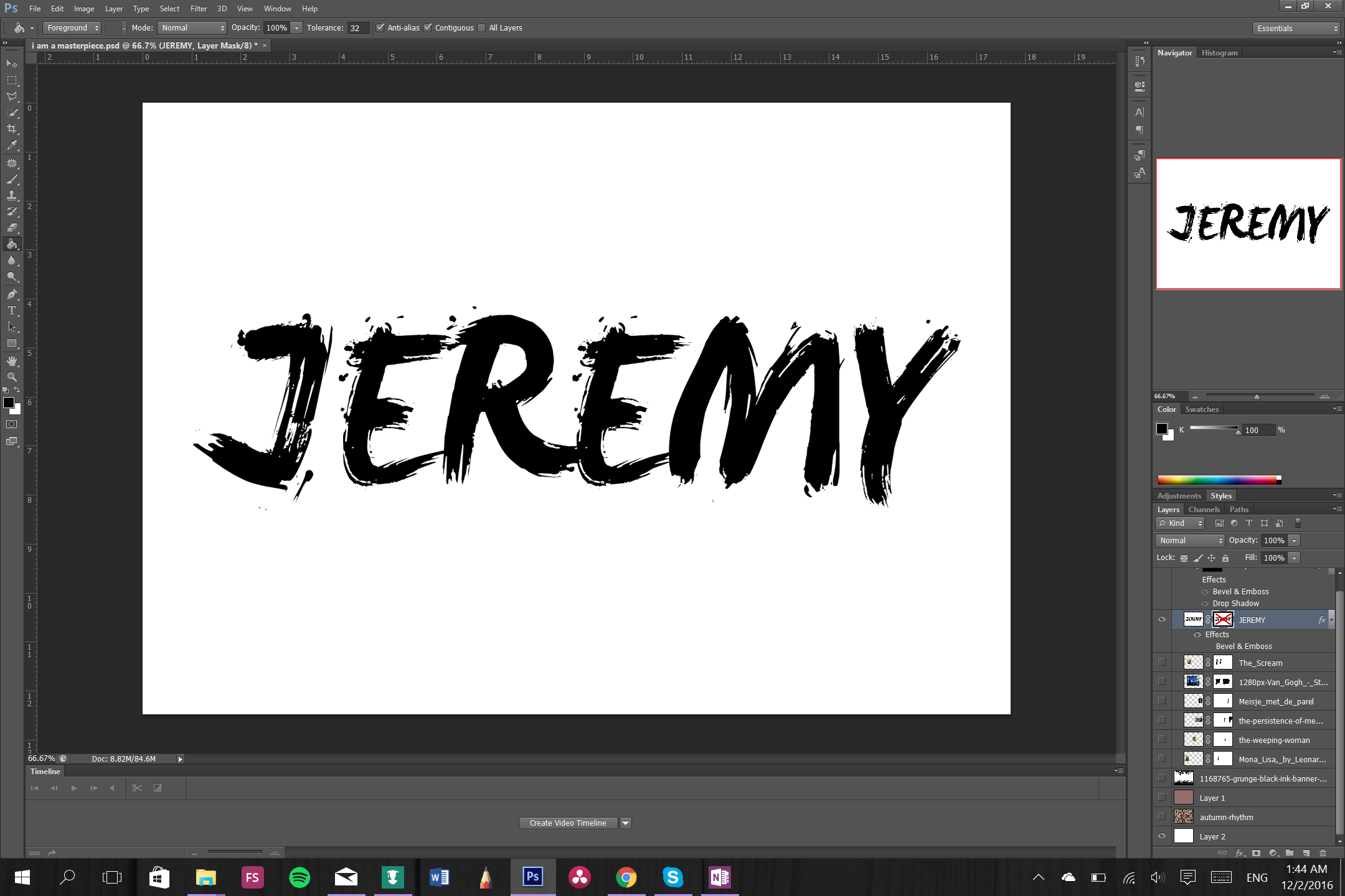
2. I am JEREMY and I am a masterpiece.
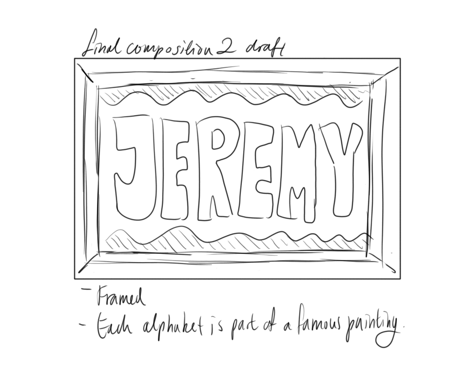
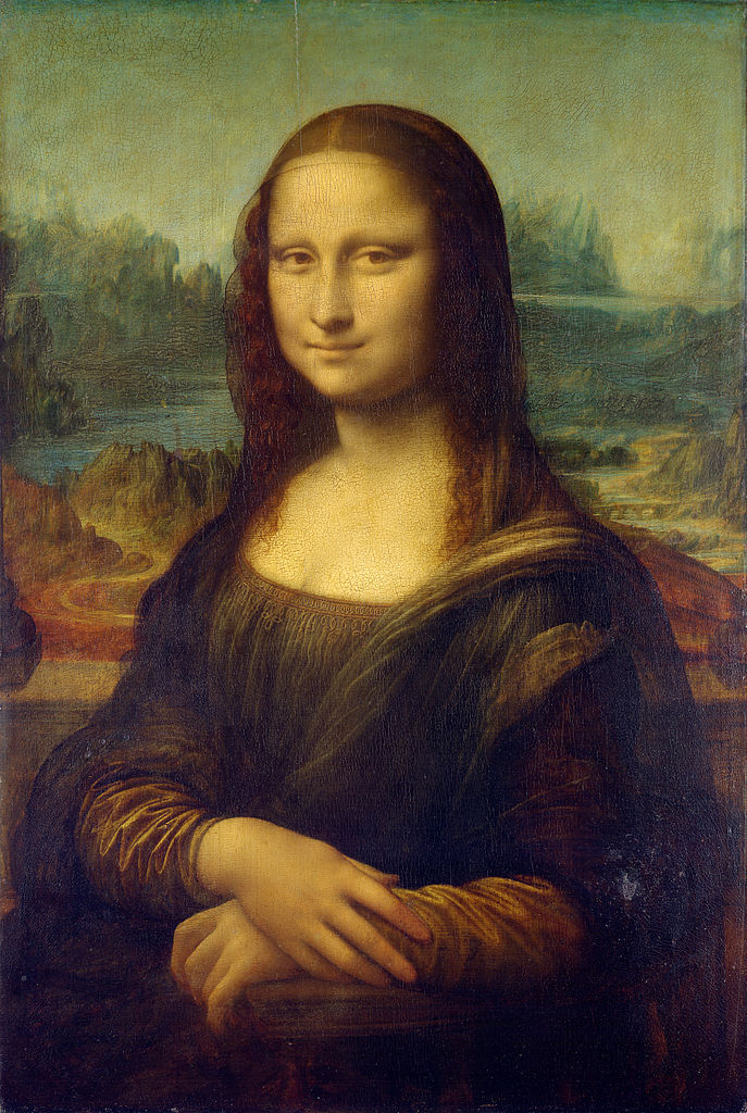
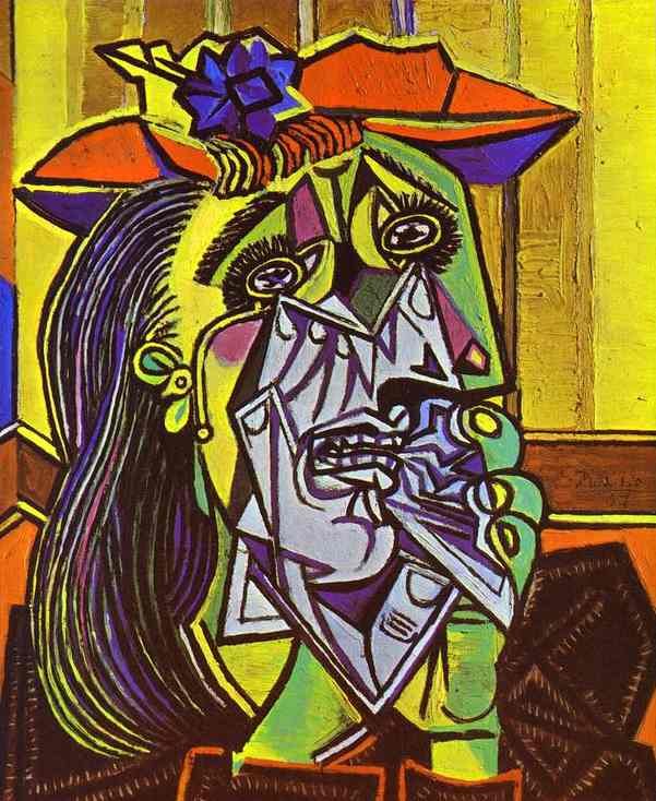
Famous paintings included the following:

Step-by-step font masking process in Photoshop:
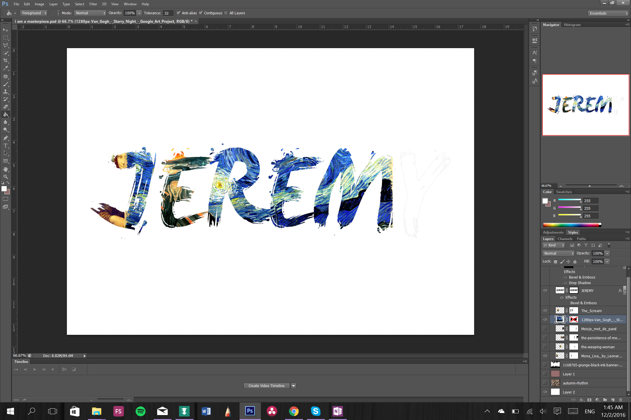
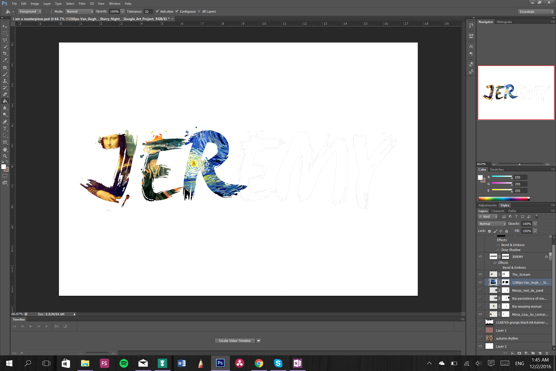
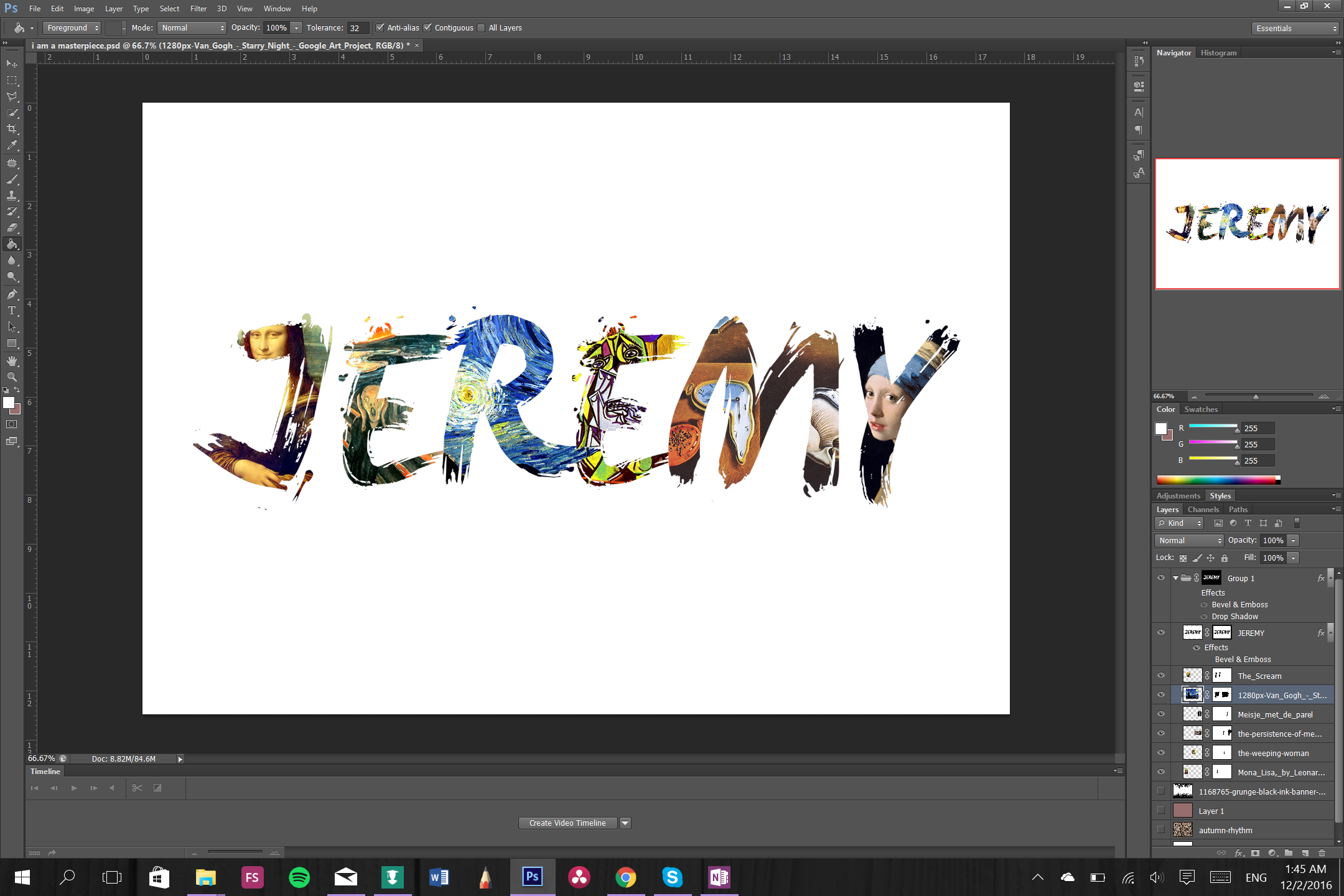

At first I had no idea what to do with the background so I toyed around with the idea of having abstract expressionist art flank the white space behind my name.
Several drafts:
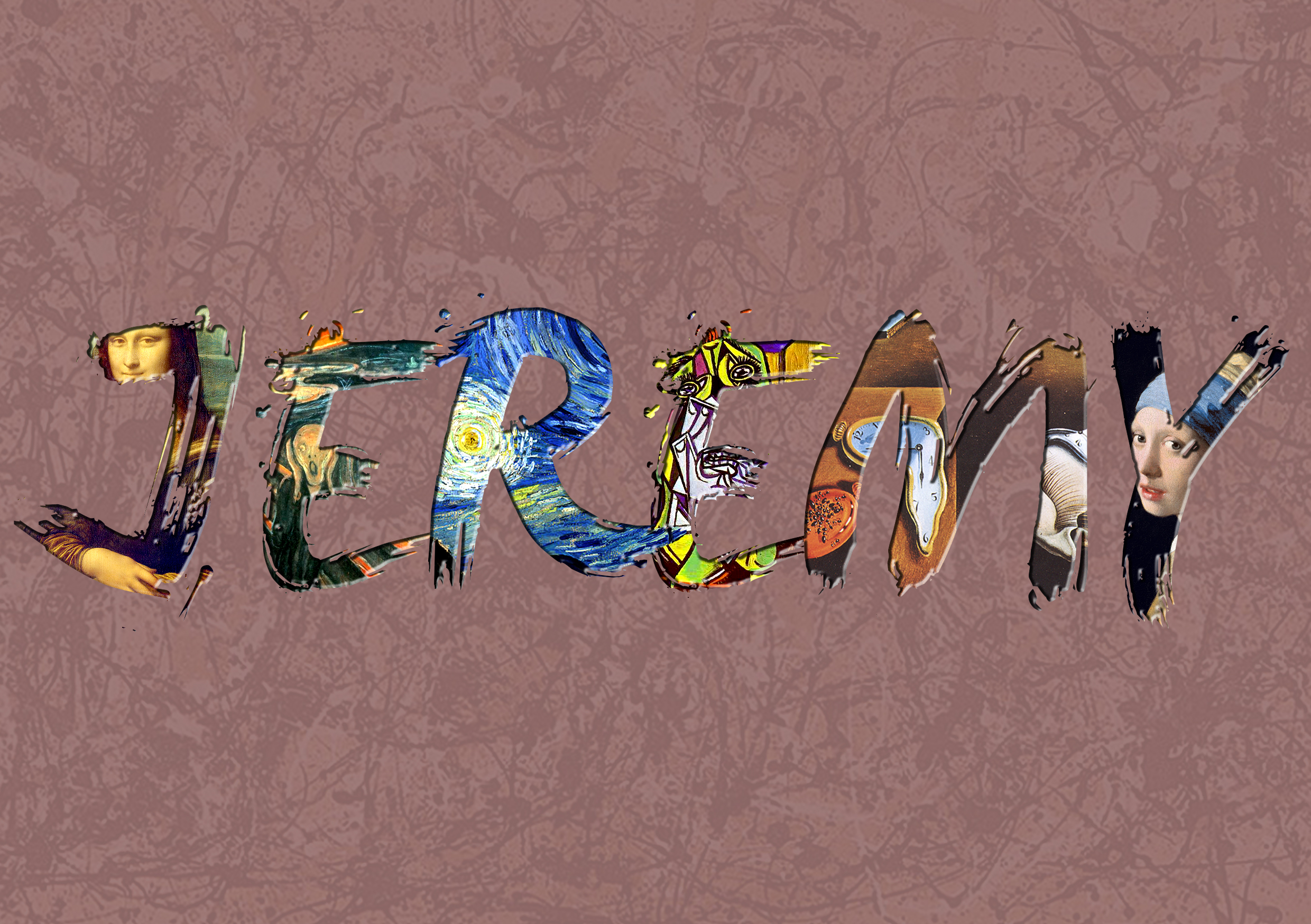
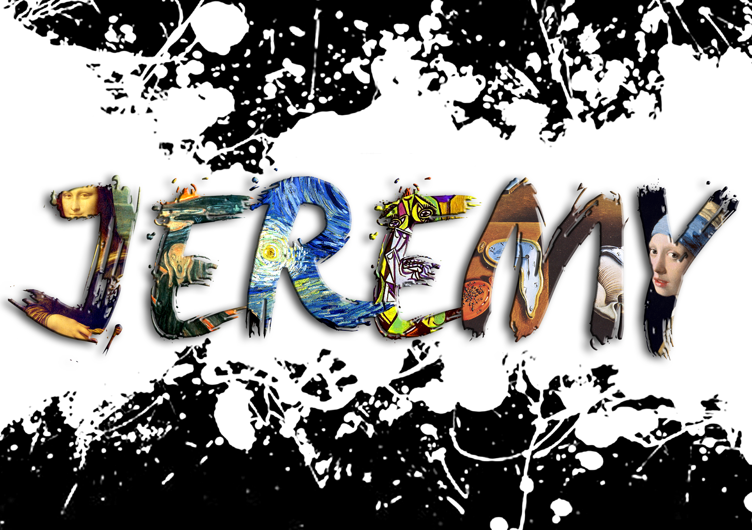
Eventually i decided to leave it plain and printed it out. Then I used actual acrylic paint to paint over some patterns to add colour and actual paint texture to the composition.
Final product:
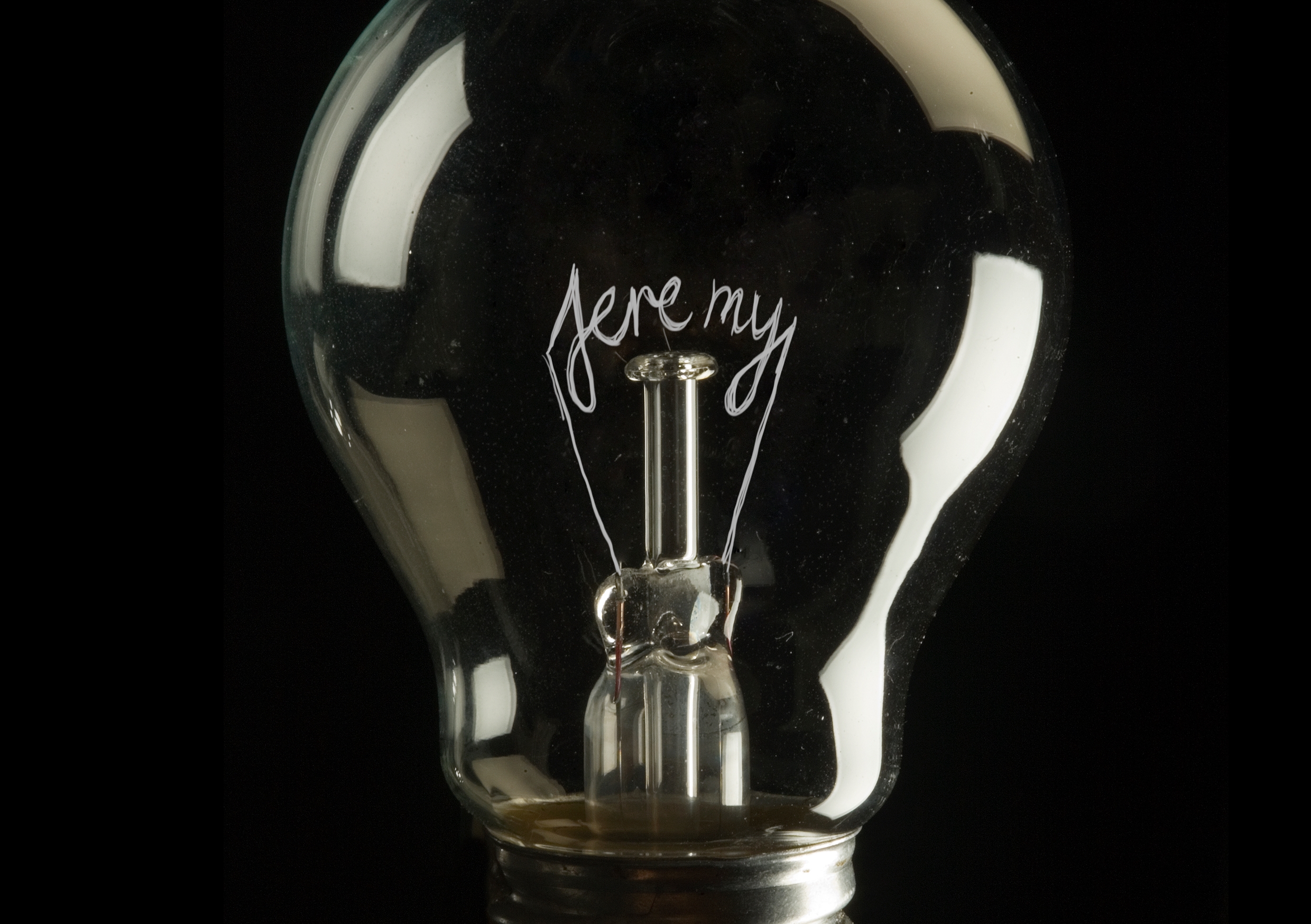
3. I am JEREMY and I am out of ideas.
 Blown light bulb as a representation of the lack of ideas. The tungsten is obviously broken and that kind of represents me on a daily basis when I try to think of new and creative stuff but fail to do so. Meh.
Visual references:
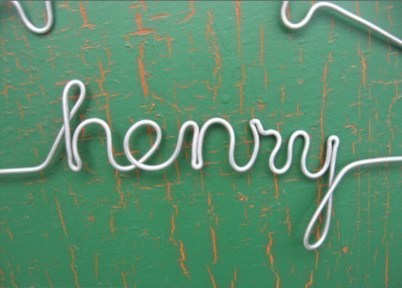
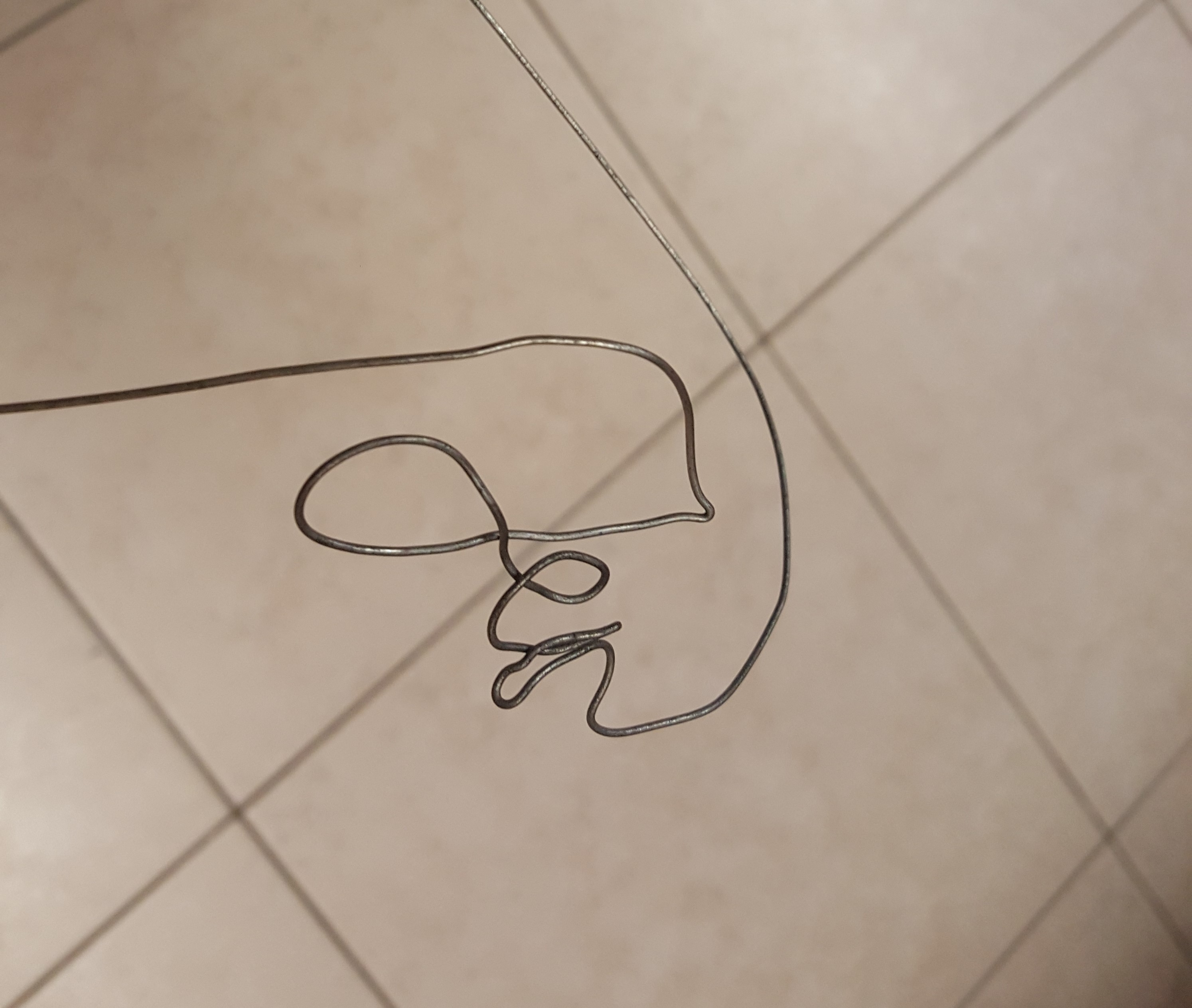
Bending a wire into my name by hand is a lot harder than I thought and it took me a couple of tries to get it right.
Failed attempt:
After I got the hang of it things took a turn (pun intended) for the better.
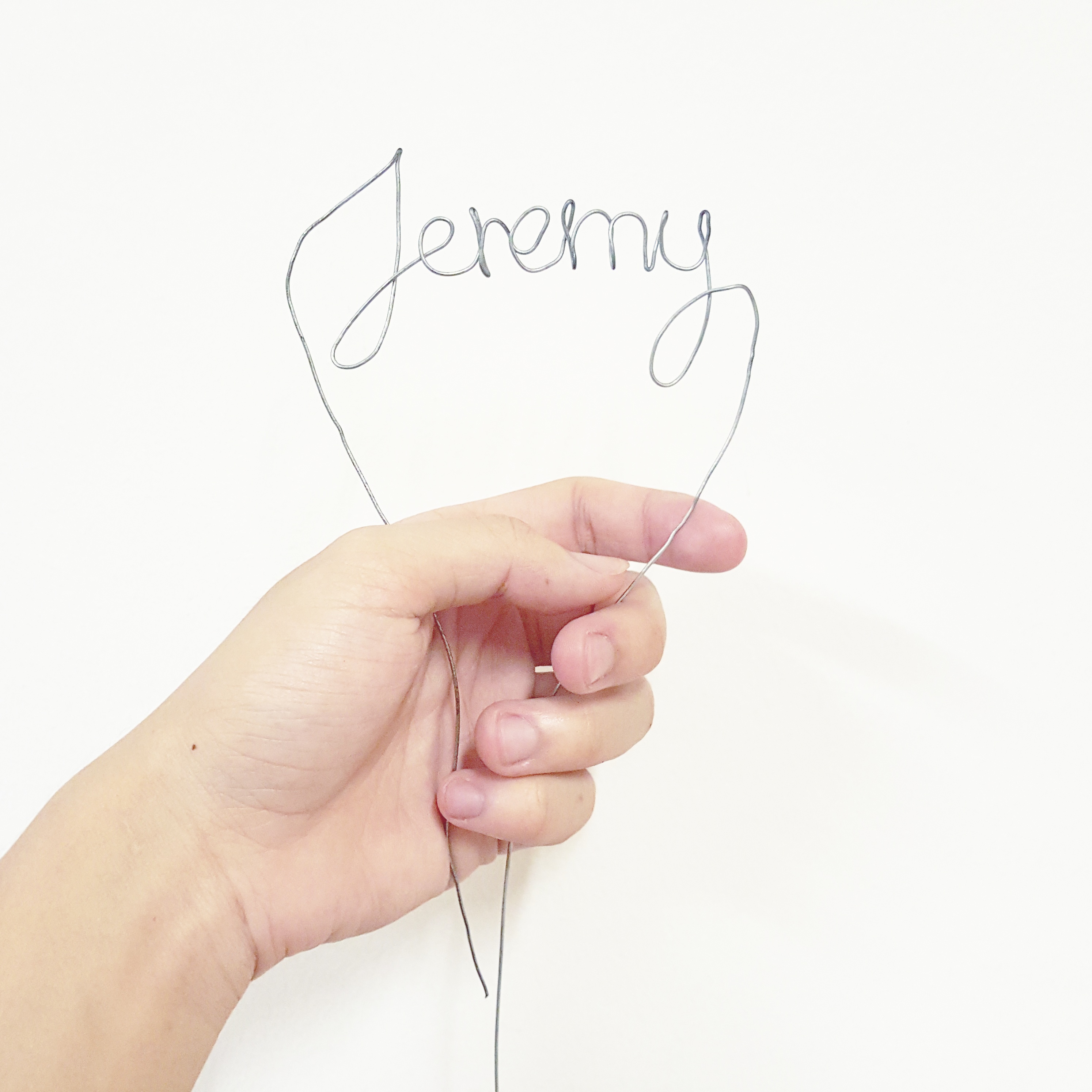
For the light bulb portion i Photoshopped the tungsten out of an image of a light bulb.
Initial mock-ups:
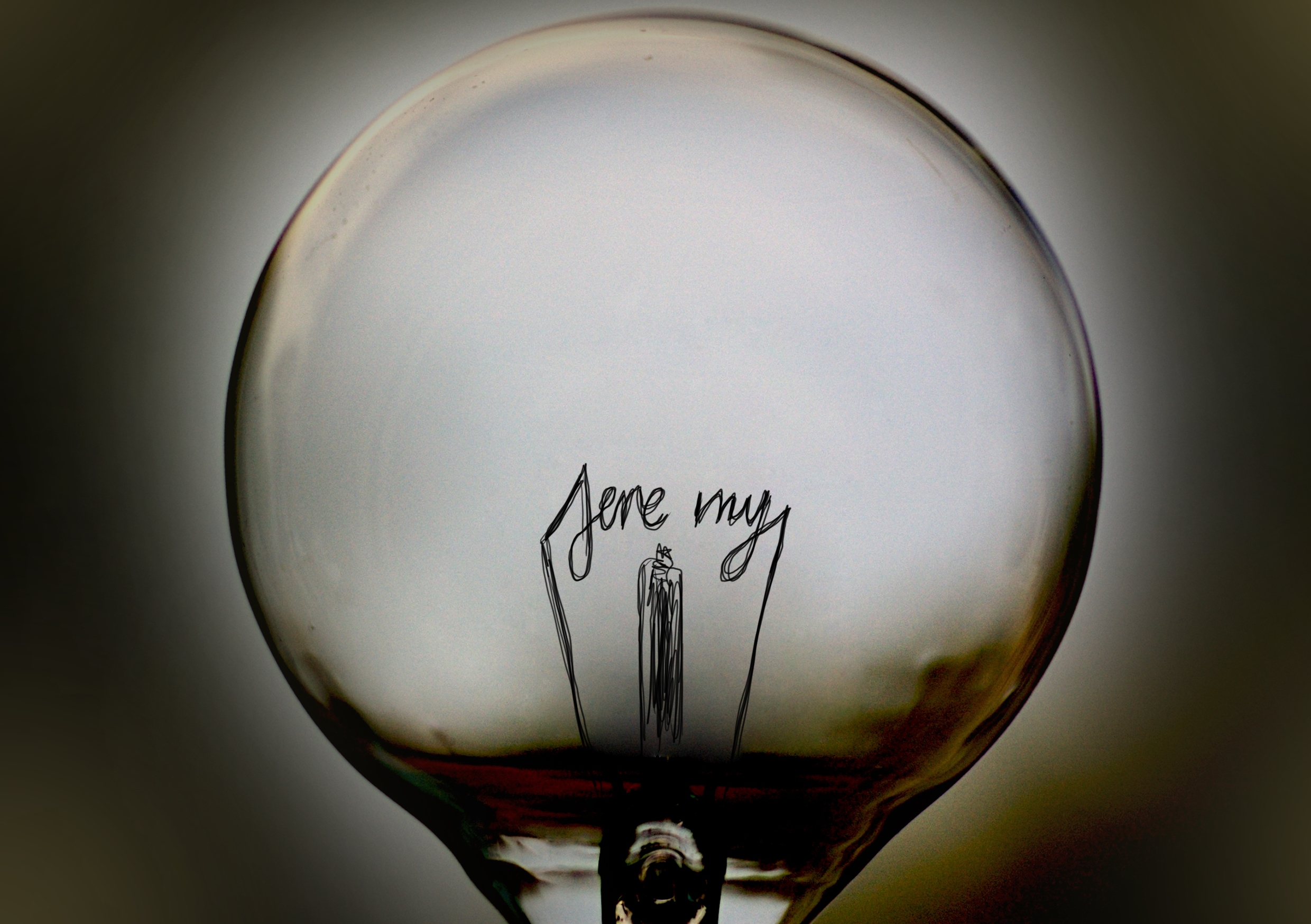
I went with the latter composition.
Final product:

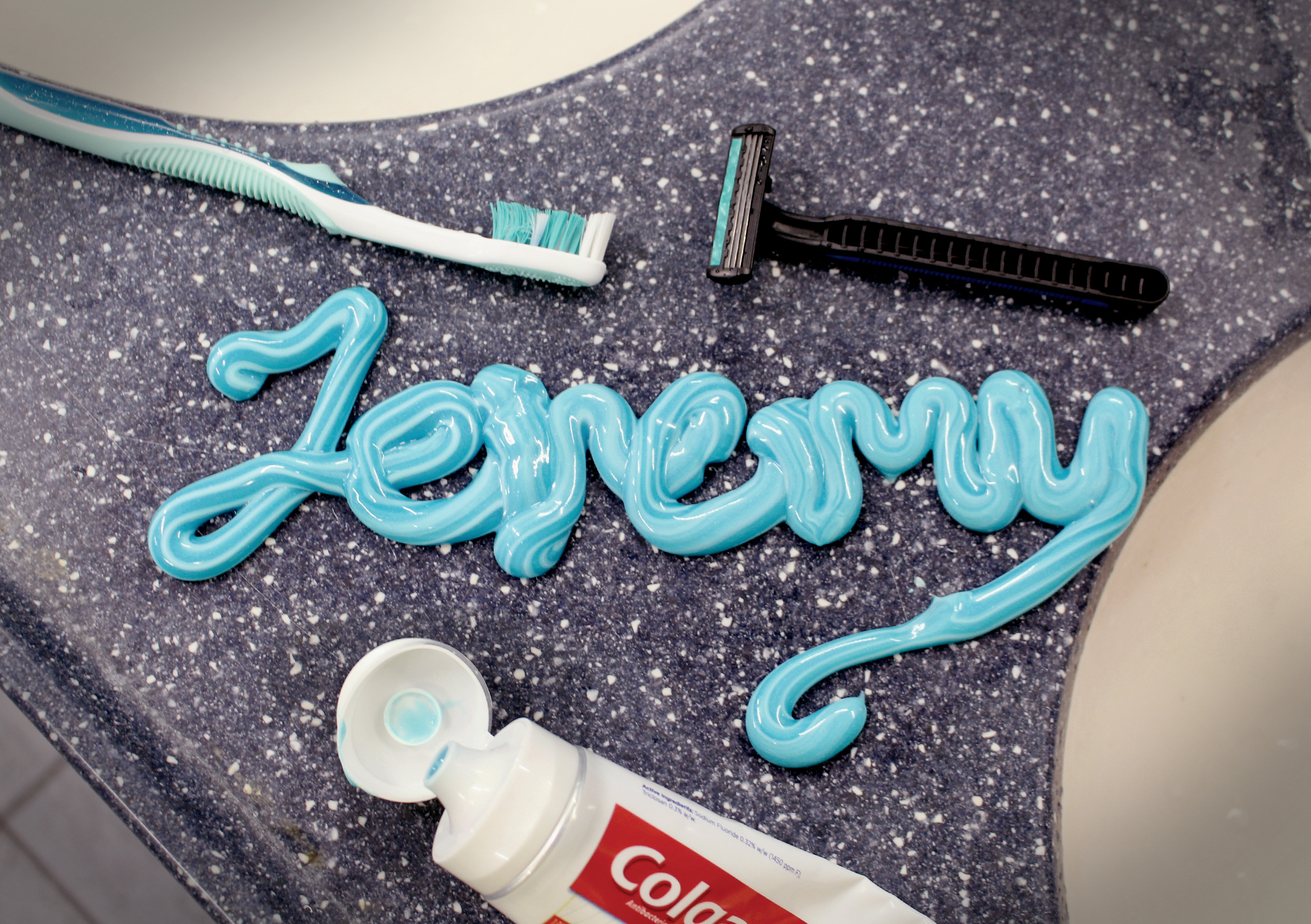
4. I am JEREMY and I am not a morning person.
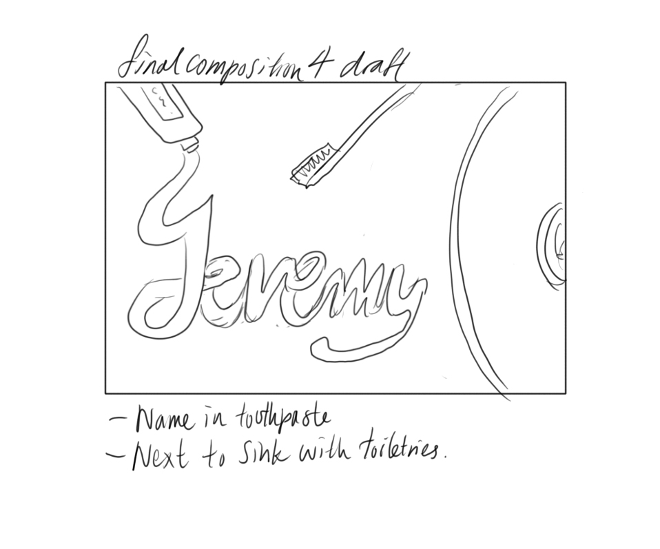
This was inspired by the not very uncommon scene in the morning where I would try to brush my teeth in the morning with my eyes barely open yet. I would attempt to squeeze toothpaste onto my toothbrush but have it land on the sink somehow. Clearly I am not made for waking up early.
Visual references:
Initial stage:
After editing:
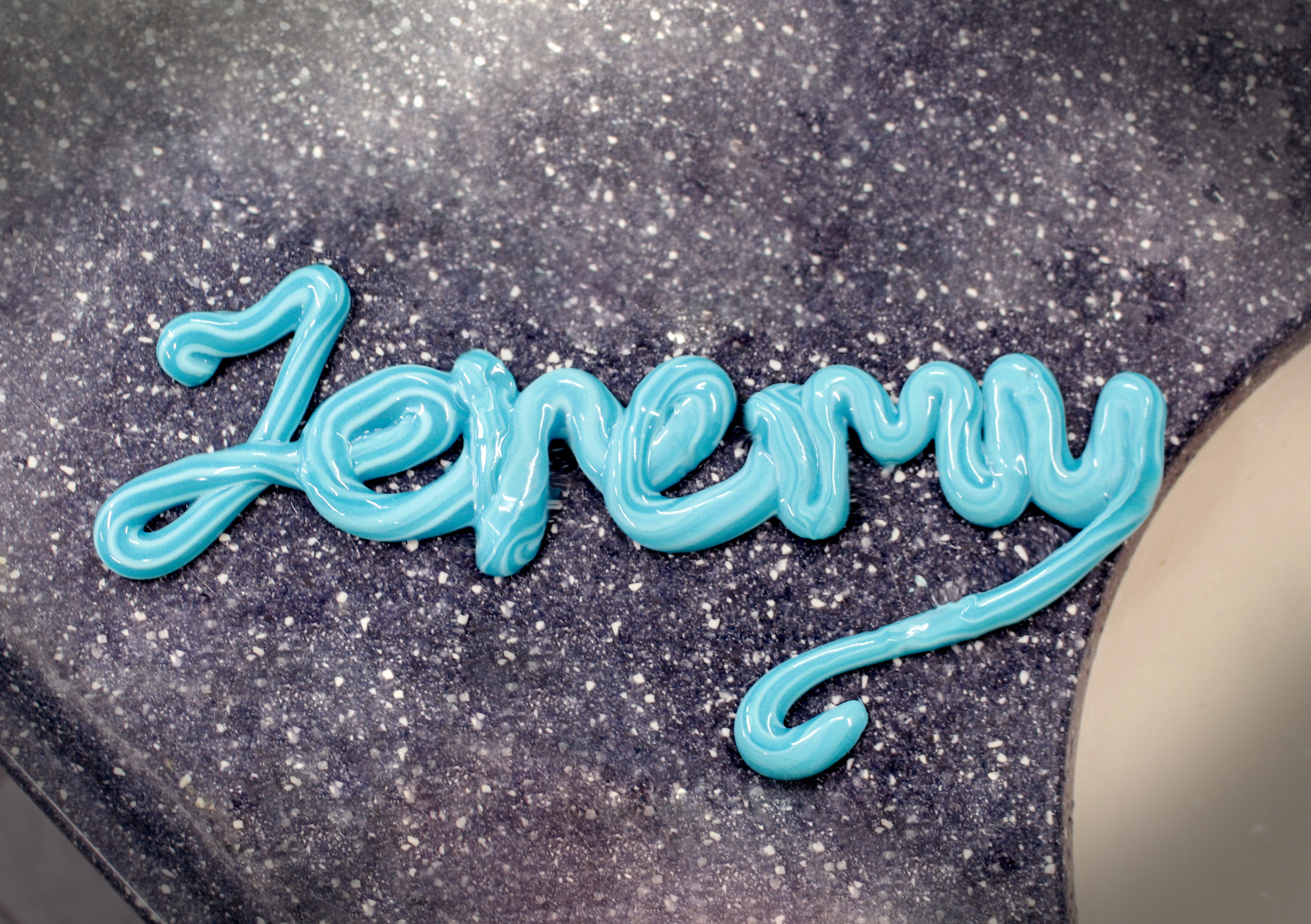
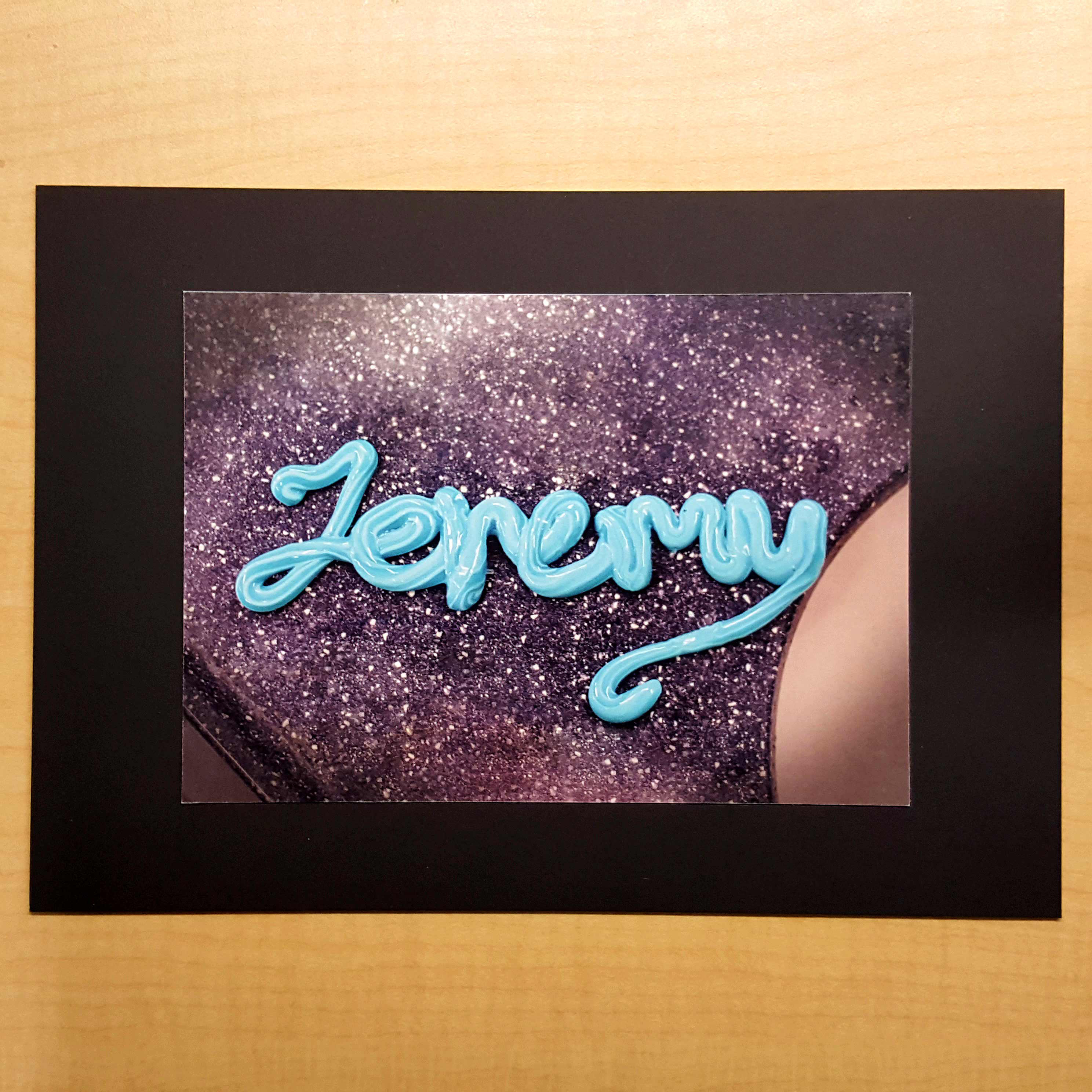
Final product:
Afterthoughts:
This project was really fun for me as I tried to explore different creative ways of expressing my characteristics through the use of typography. Though the workmanship could have been a bit better, I feel good about it 🙂