For the final assignment of this semester we were supposed to create a small A5 sized zine of 8 pages (2 sheets of A4 paper front and back) of our previous works as an exercise and introduction to publication making and book binding. It was my first time being introduced to Adobe InDesign, the software that we used to create our zine. It was a fun and interesting experience as I managed to learn a lot about composition and text arrangement in publication design that I found extremely practical and useful in future.
Initially, I had a few ideas:
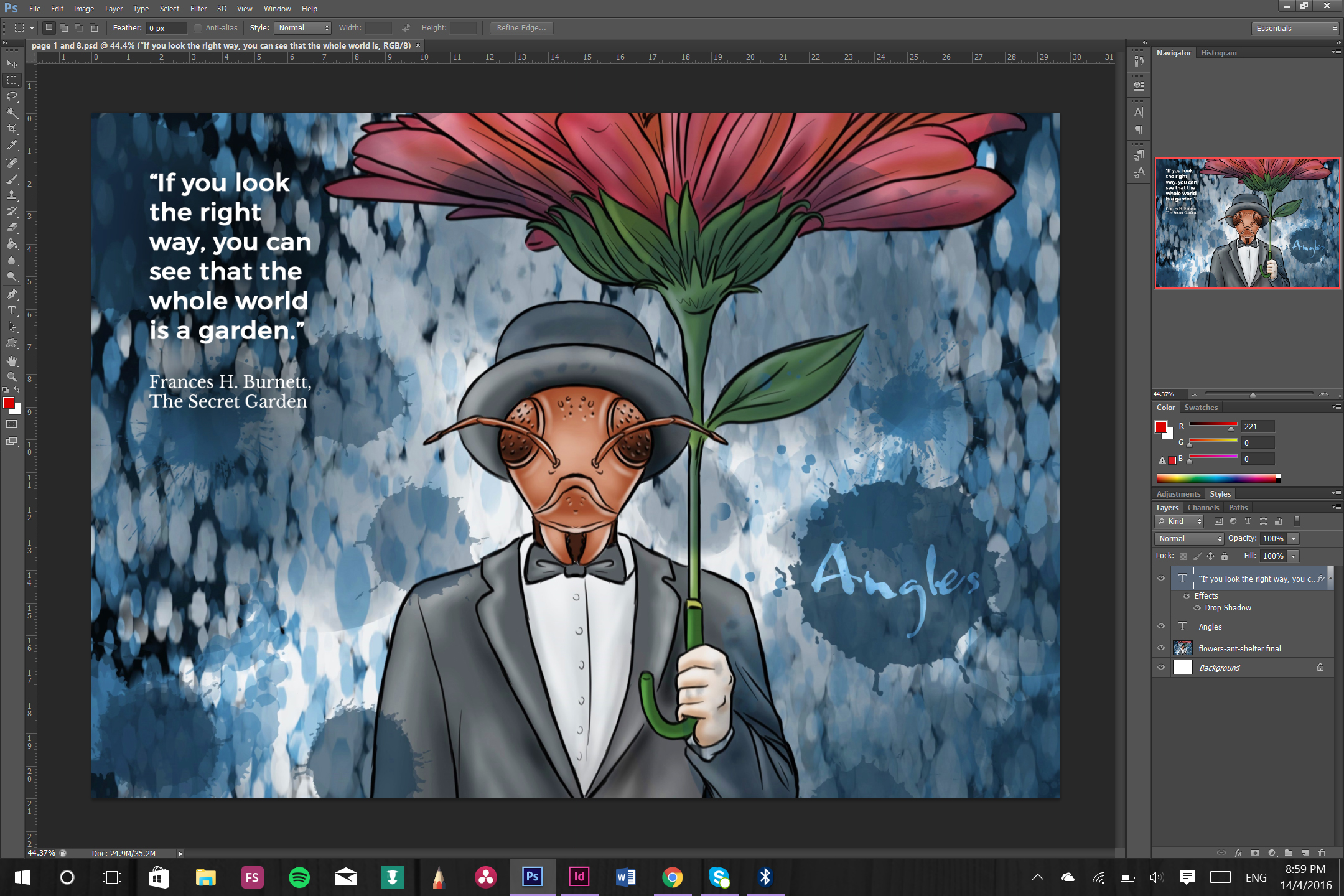
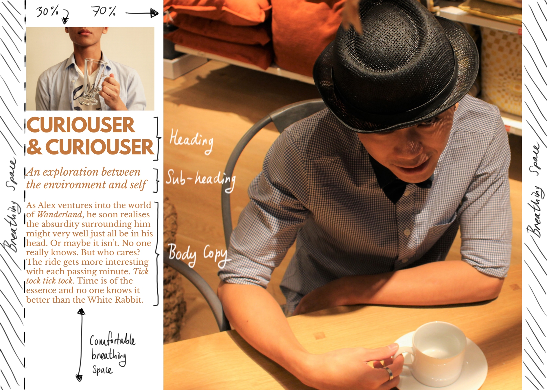
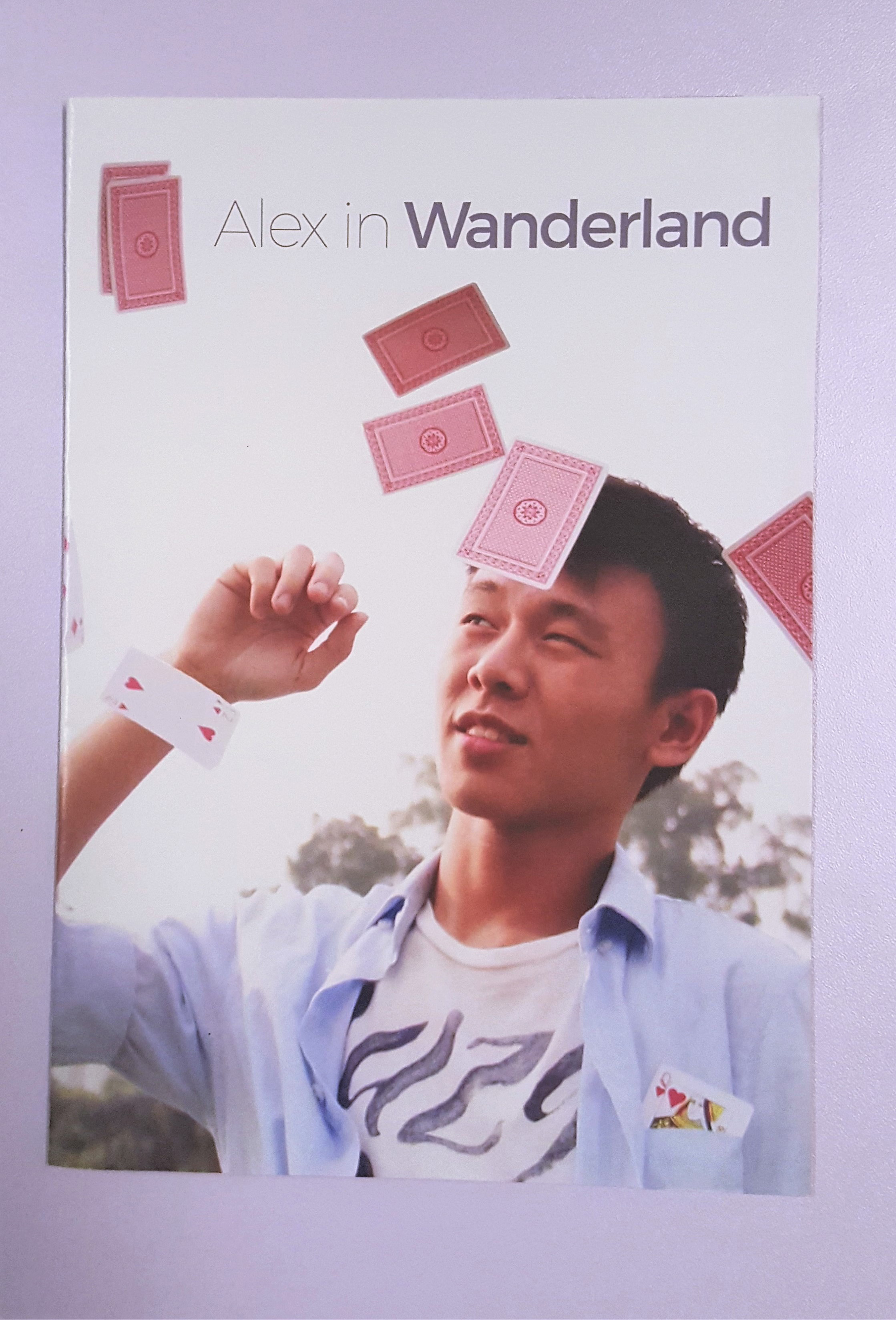
Then I realized it didn’t look too nice and decided to go with my 4D project that i did last semester, titled “Alex in Wanderland”.
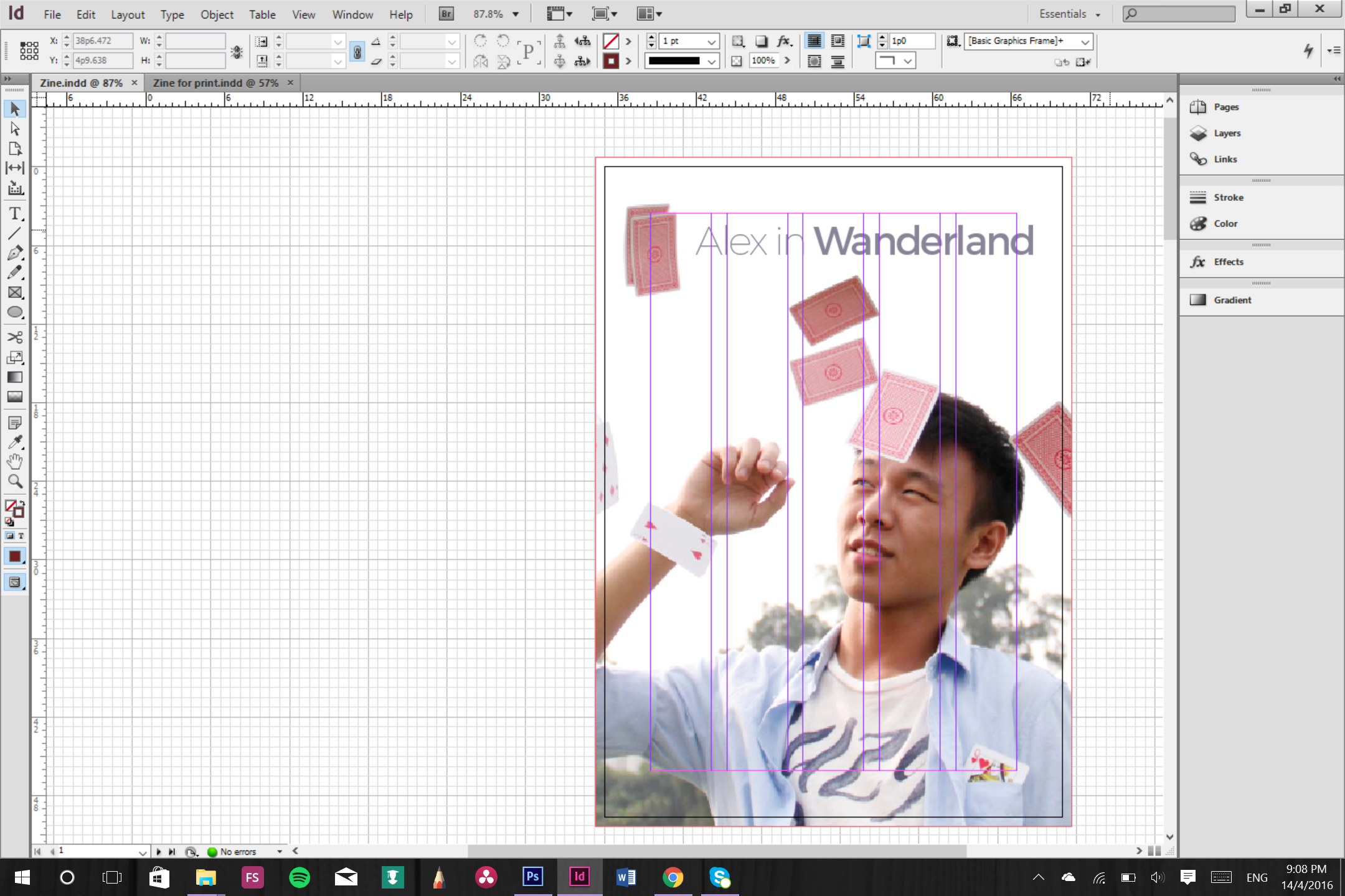
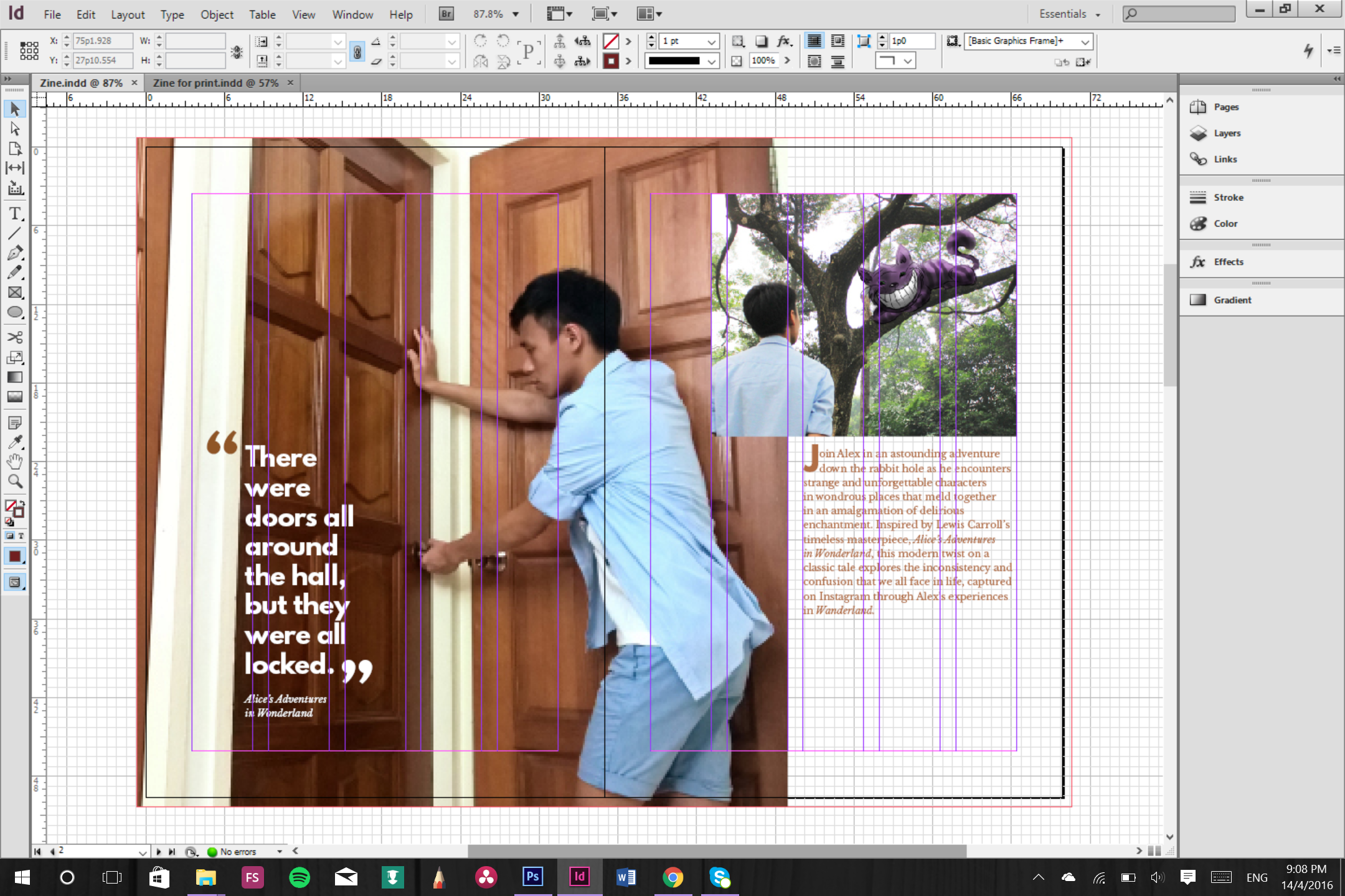
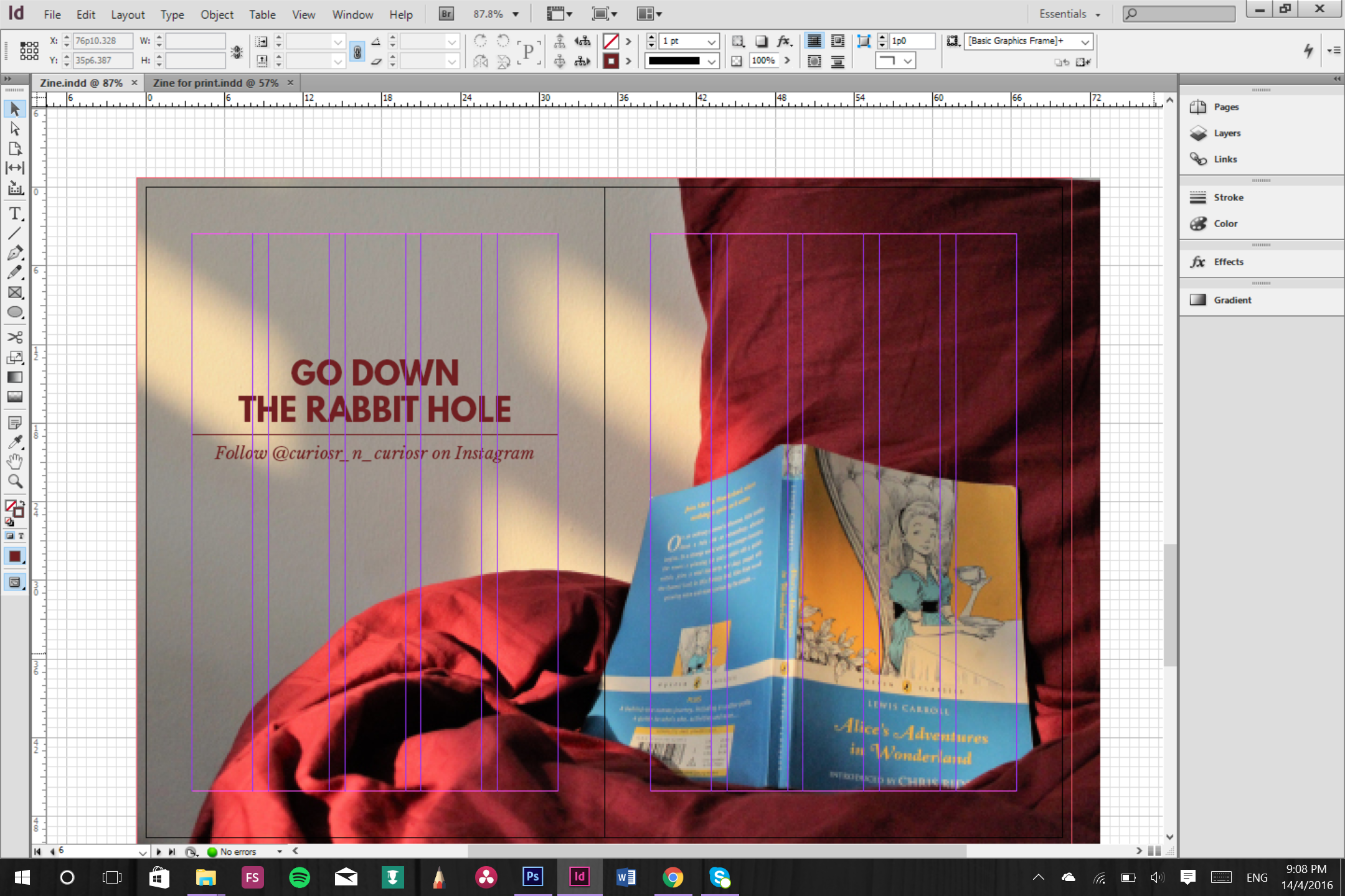
Aligning the text the the columns helped to create a sense of uniformity and helped to establish aesthetic consistency. Also, the image hierarchy and text hierarchy in a spread allows readers to determine the main focus and guide them visually in reading the information presented in the spread.
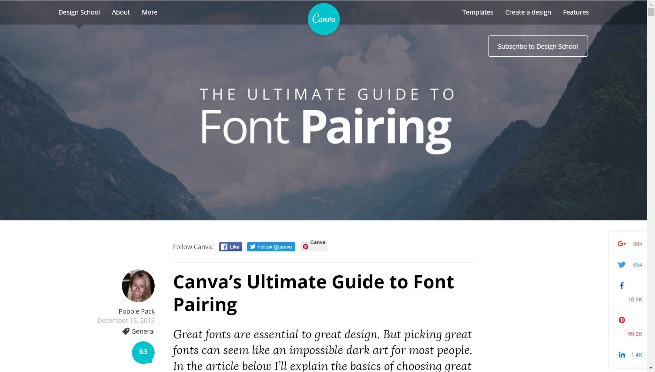
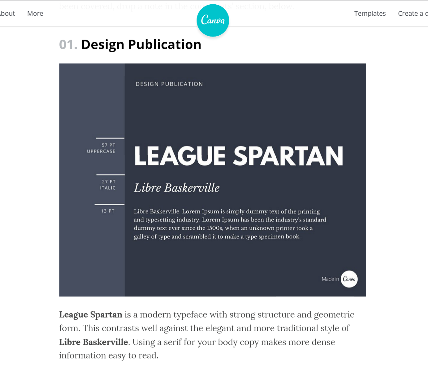
For the text, choosing the right font was a challenge for me as I had little experience with font pairing. However, I came across this webpage that was very useful in helping me select fonts that pair well together in a visually pleasing way.
I felt like I hit an epiphany in typography or something. It was amazing.
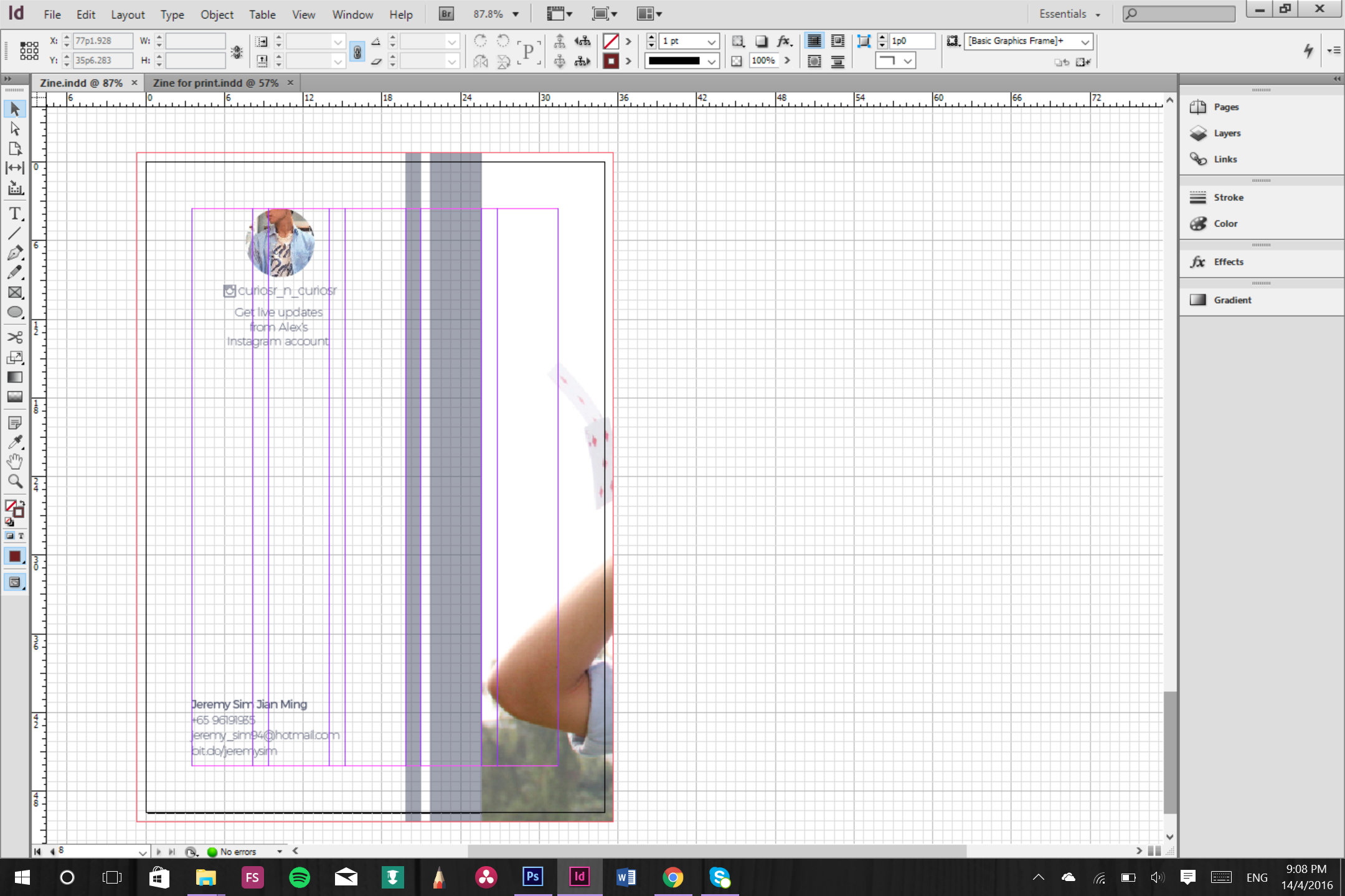
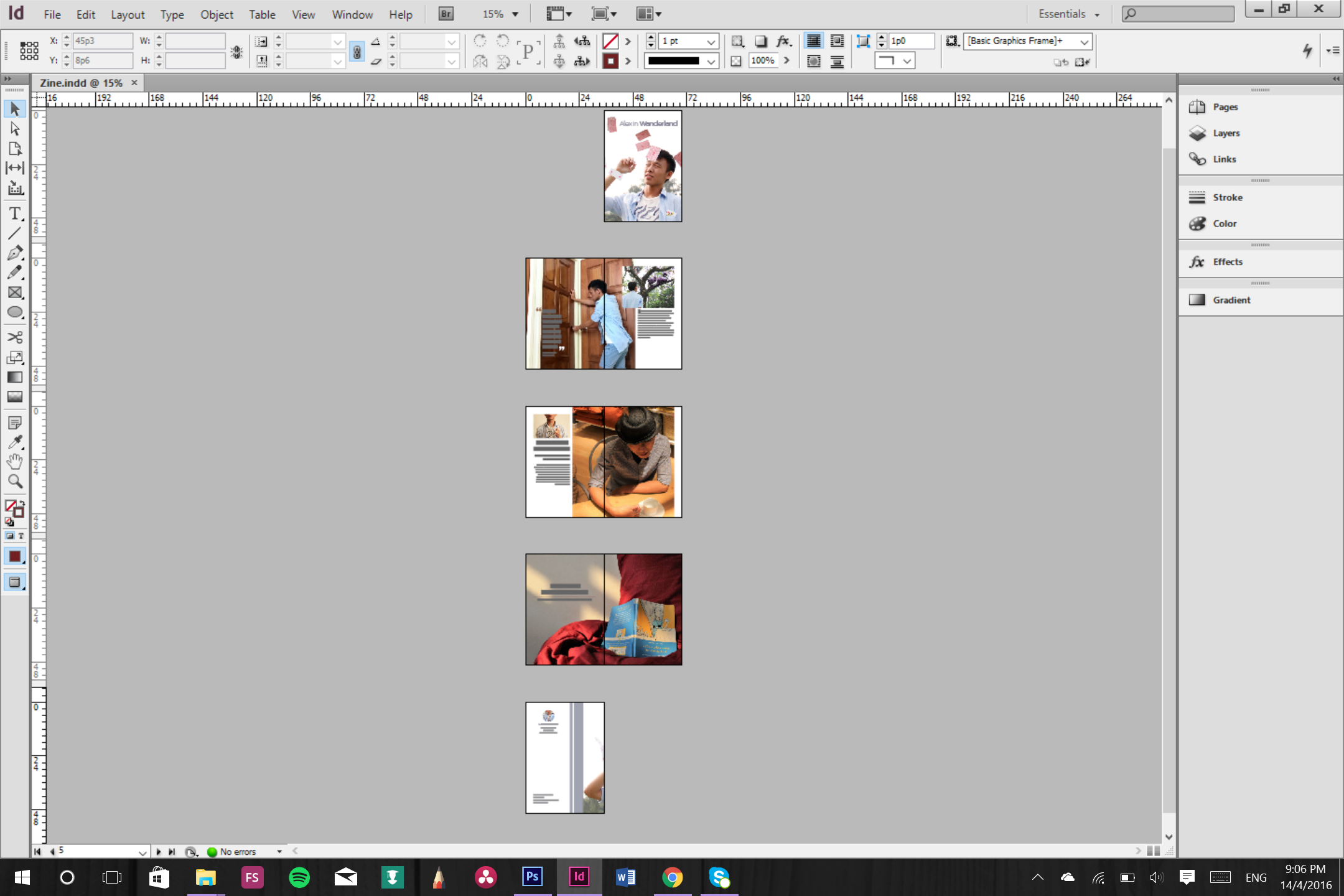
After that I had to rearrange the pages in InDesign such that i could saddle stitch it properly.
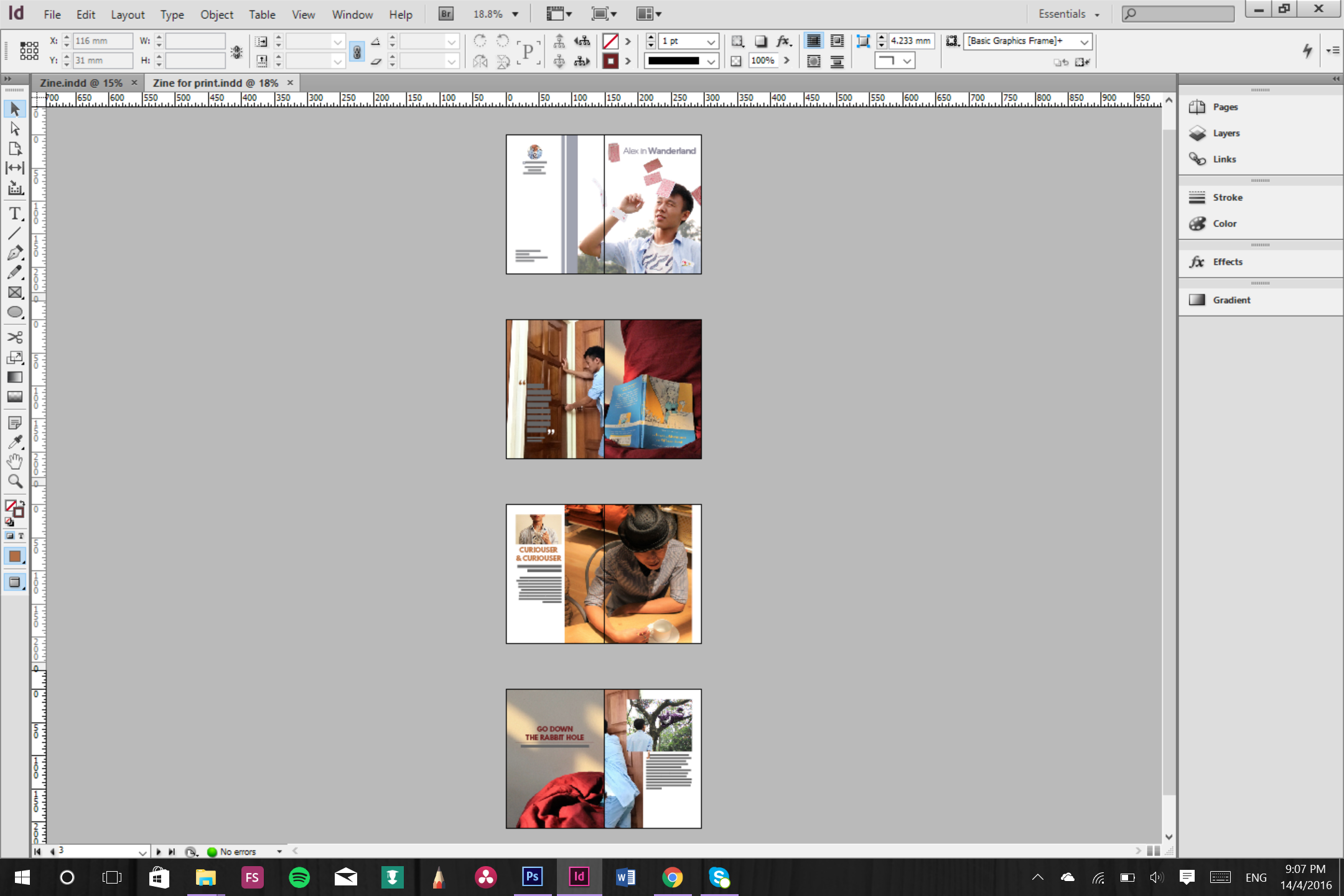
After that decided to do some test prints.
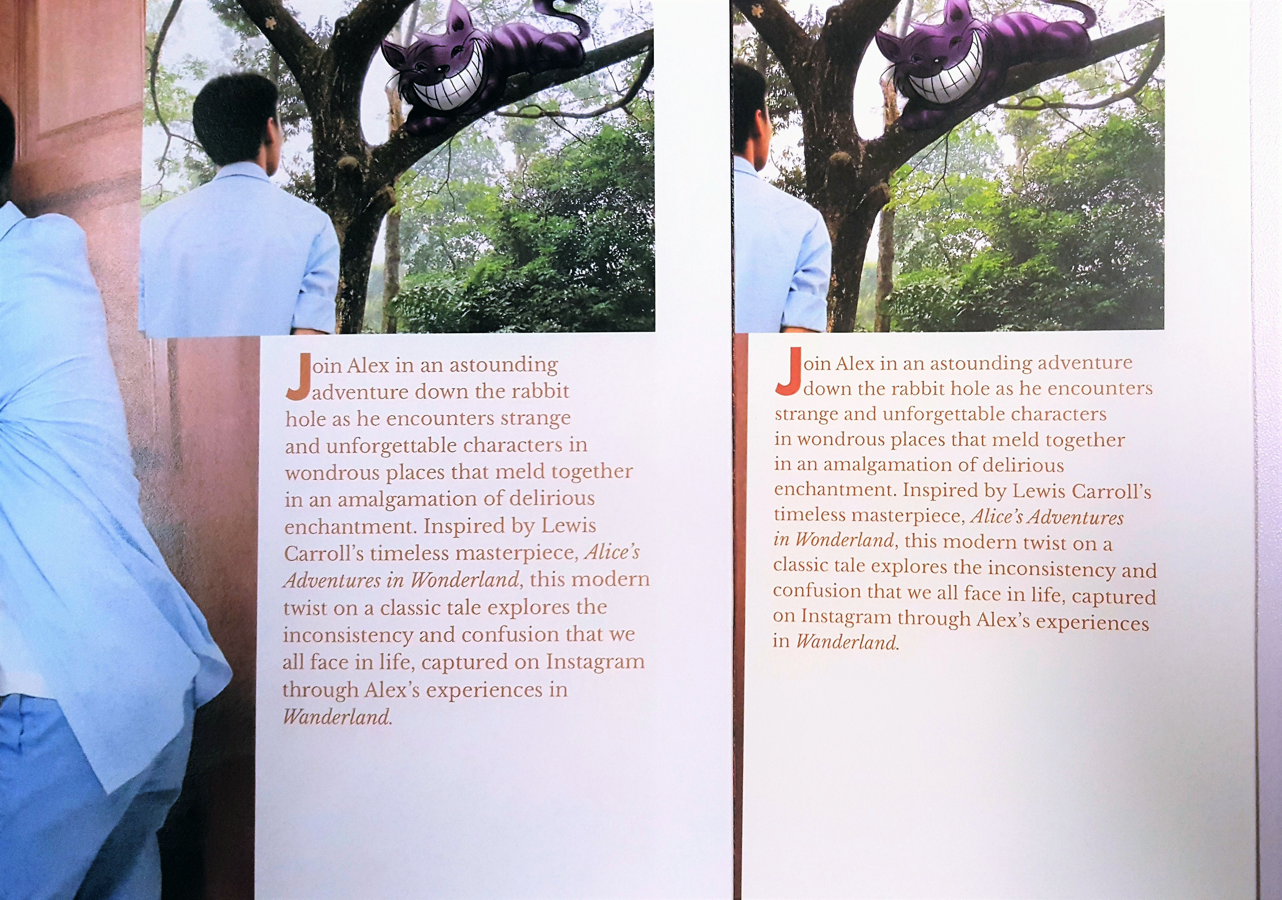
I then sent it for printing on 157 gsm glossy photo paper.

Reflection:
I really learnt a lot from this project. I felt like my sense of visual design has improved and i want to continue fine-tuning my design sense.