For this semester in VC, the brief was titled “The Water Project” and was meant to be an exploration of concepts directly or indirectly related to water. The first step to tackling the brief was to construct mindmaps to visually map out ideas that could be used in relation to the given topic.
For the first two weeks, we worked in groups to discuss and present our ideas and then split into our own individual projects later on. The presentation slides to my group’s presentation slides can be found at the following links:
Week 1:
https://docs.google.com/presentation/d/1v0QbLIt5fjIbrF-d5fVmgkGzQX6nBAT_KZPTrf9Bvi0/edit?usp=sharing
Week 2:
https://docs.google.com/presentation/d/1ocMWrykbjuvFqkPmflOrZjIMyF0J21eA9_CrL1pInyM/edit?usp=sharing
Subsequently for our own individual ideas, we had to present them in class as well the following weeks. My presentations for my initial individual ideas can be found at the following links:
Week 3:
https://docs.google.com/presentation/d/1_wzYgbKawqiIMDTyqePrwtrsrh1qntb1RTR_9ESHaOU/edit?usp=sharing
Week 4:
https://docs.google.com/presentation/d/1A2gUi3Nbm0QbXJP8k5QUH5OgRIf2ugbU0ZBmzFpVEg8/edit?usp=sharing
Long story short, here’s my initial idea:
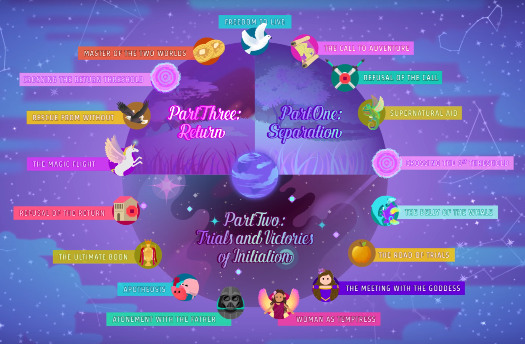
As seen from the slides above, the idea I was very much toying around with was the flood myth and the use of Joseph Campbell’s Monomyth Theory in narrative storytelling, explained in his book titled “The Hero’s Journey”. The theory basically suggests that hero narratives take on on a very basic story arc and structure and can be broken down into the elements and roles that make up that structure.
I wanted to see how I could apply this idea to a branding project where I would use the idea of a narrative to sell a product that had roles that were found in flood myth narrative structures. I researched a bit for water related narrative storytelling in advertising.
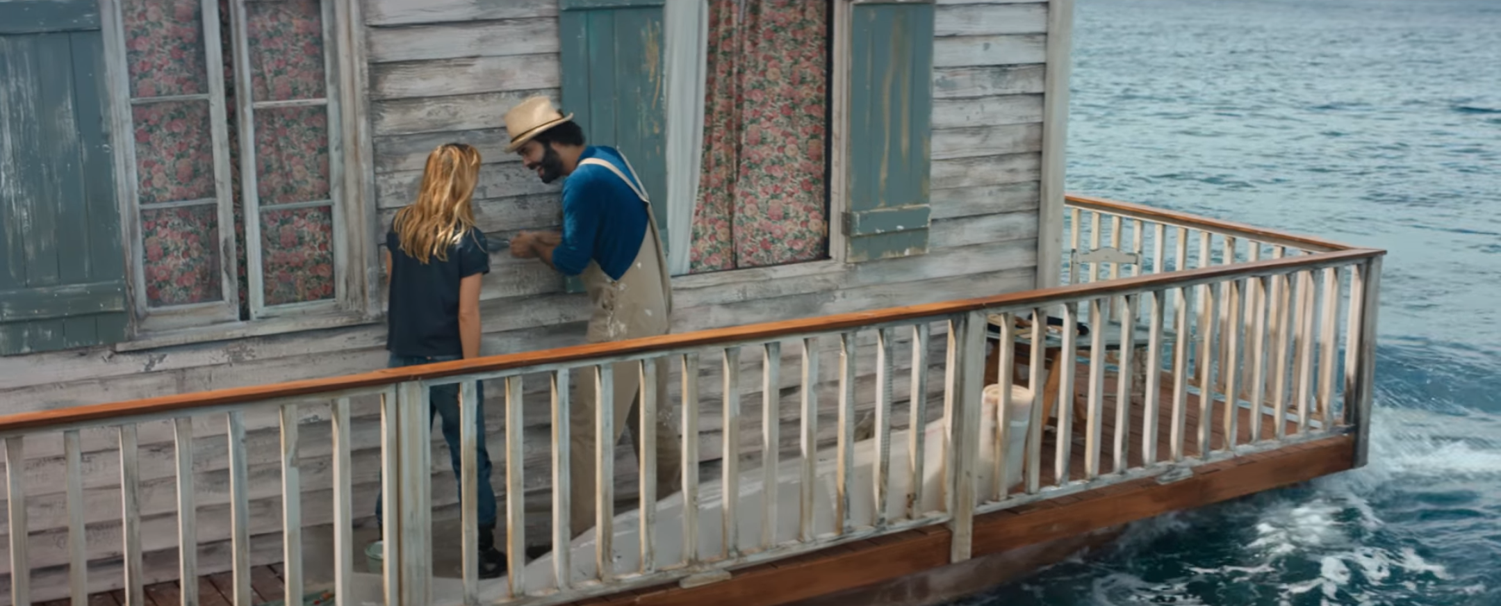
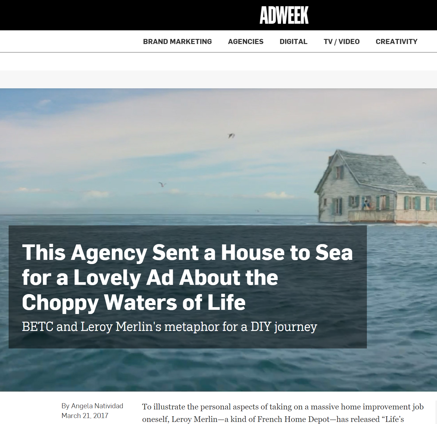
I also did a bit of research into narrative and metaphor based advertising in general to get ideas about how i could apply the Monomyth Theory to my project.
BUT.
Halfway through the researching and the ideation process, my entire project took a completely different turn and I decided to start from scratch, as the original idea was not concrete enough. I decided to do something else that had more meaning.
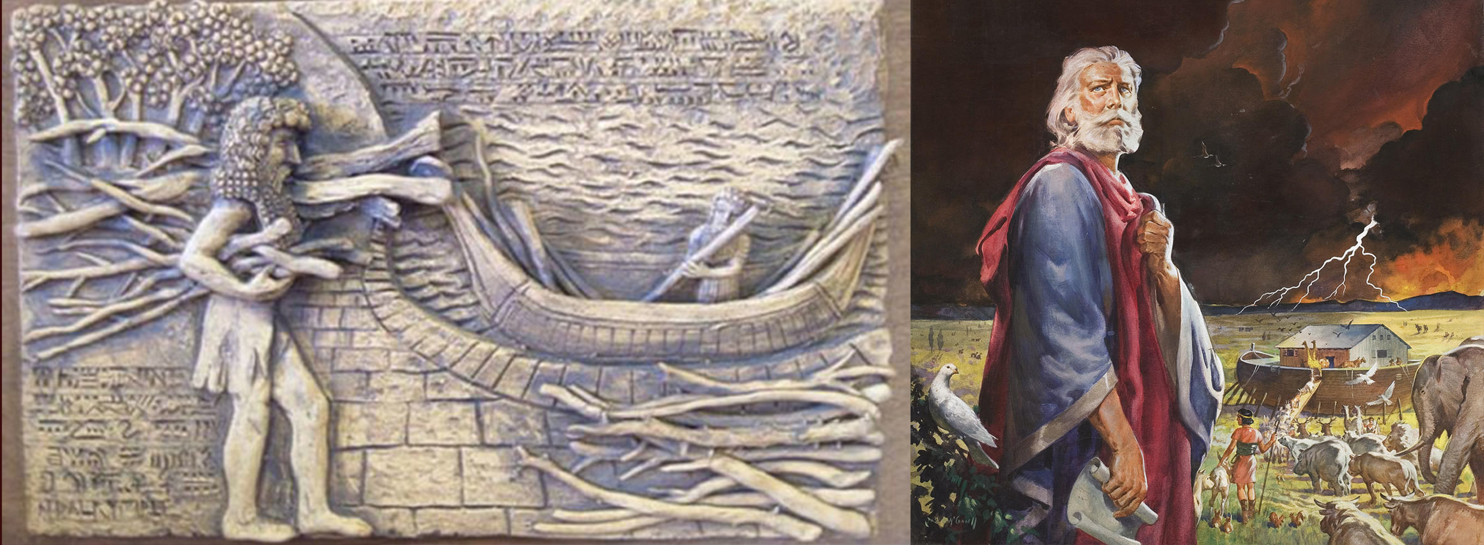
I started re-looking at the “The Hero’s Journey” and thought about the concept a bit more. In every case, a hero always steps up whenever there seems to be some sort of hurdle in the way. For the flood myths, it was either Noah in the story of Noah’s Ark or Utnapishtim in the Mesopotamian Flood Myths who stepped up to save the creatures of the earth from the worldwide destruction of the flood sent down by angry deities.
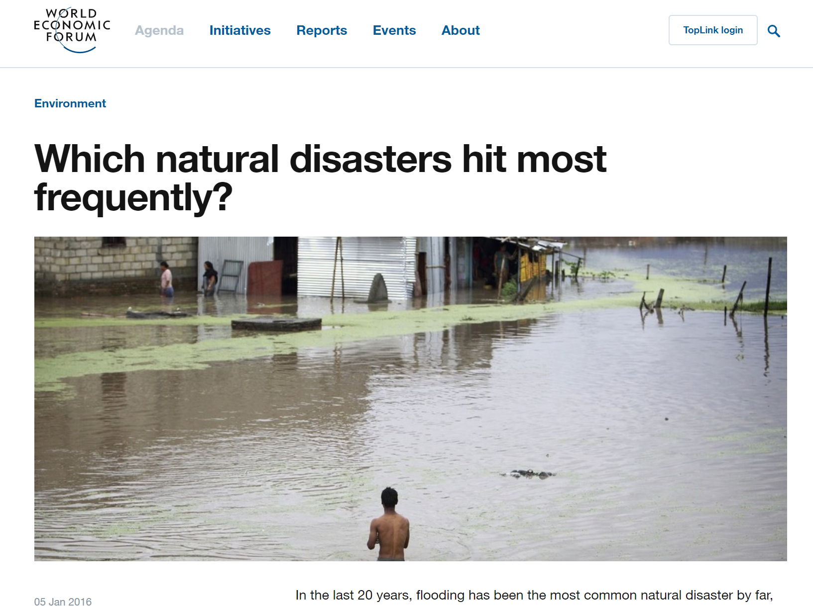
I looked into how natural disasters affect people all over the world. I realised that many times we are such passive consumers of news relating to disasters like these. We read, we feel sad and have sympathy for those affected but most of the time we do not do much else.
I then decided to create something that could let people help others in need easier and be the hero in the narrative. “Step up and #BeThatHero” became the campaign slogan.
Research:
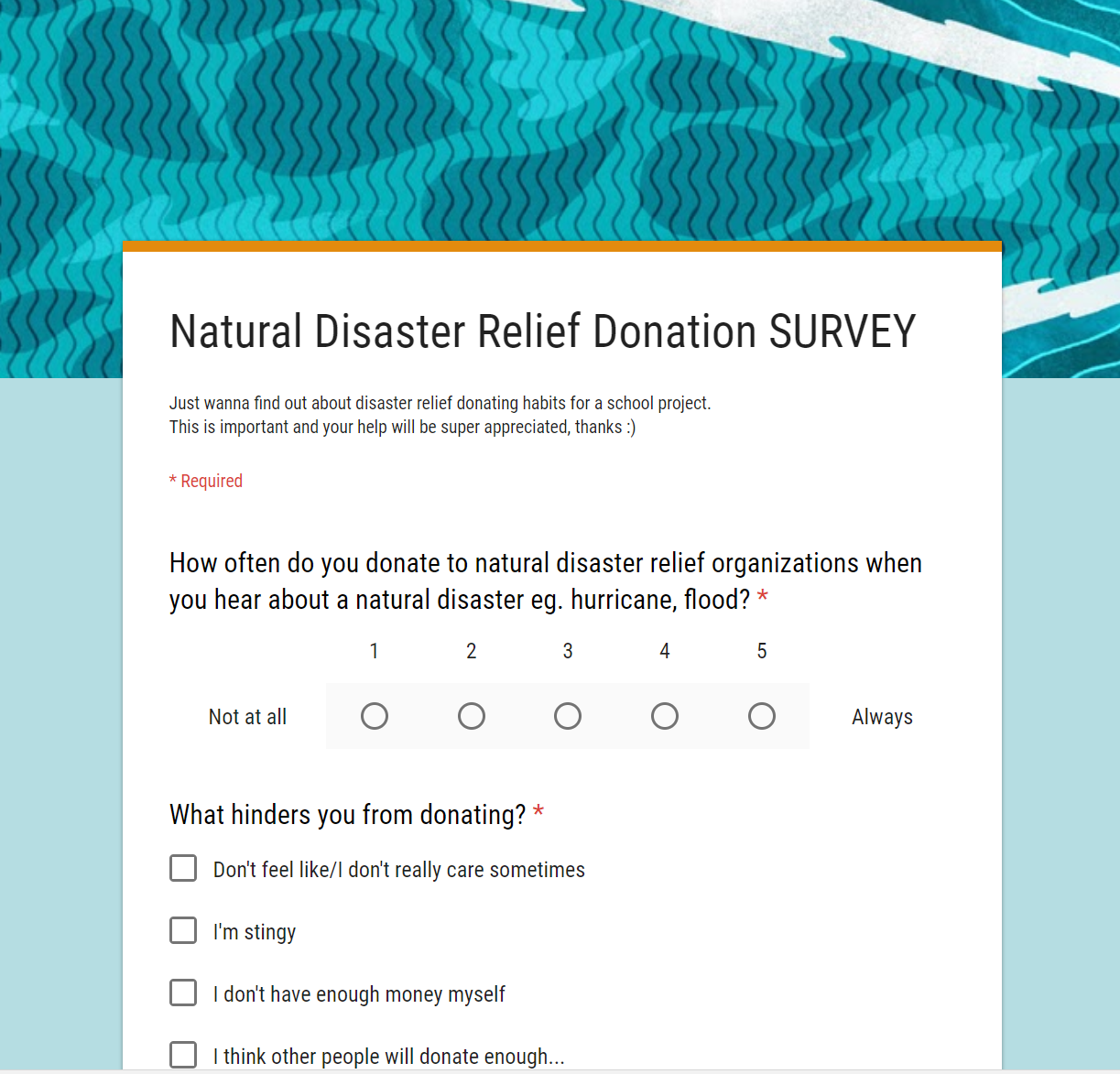
Before I could continue, I had to do a bit of research so I conducted a survey with over 200 people to gather some information. I also did a little research on the statistics of natural disasters. These statistics would later appear in my infographic.

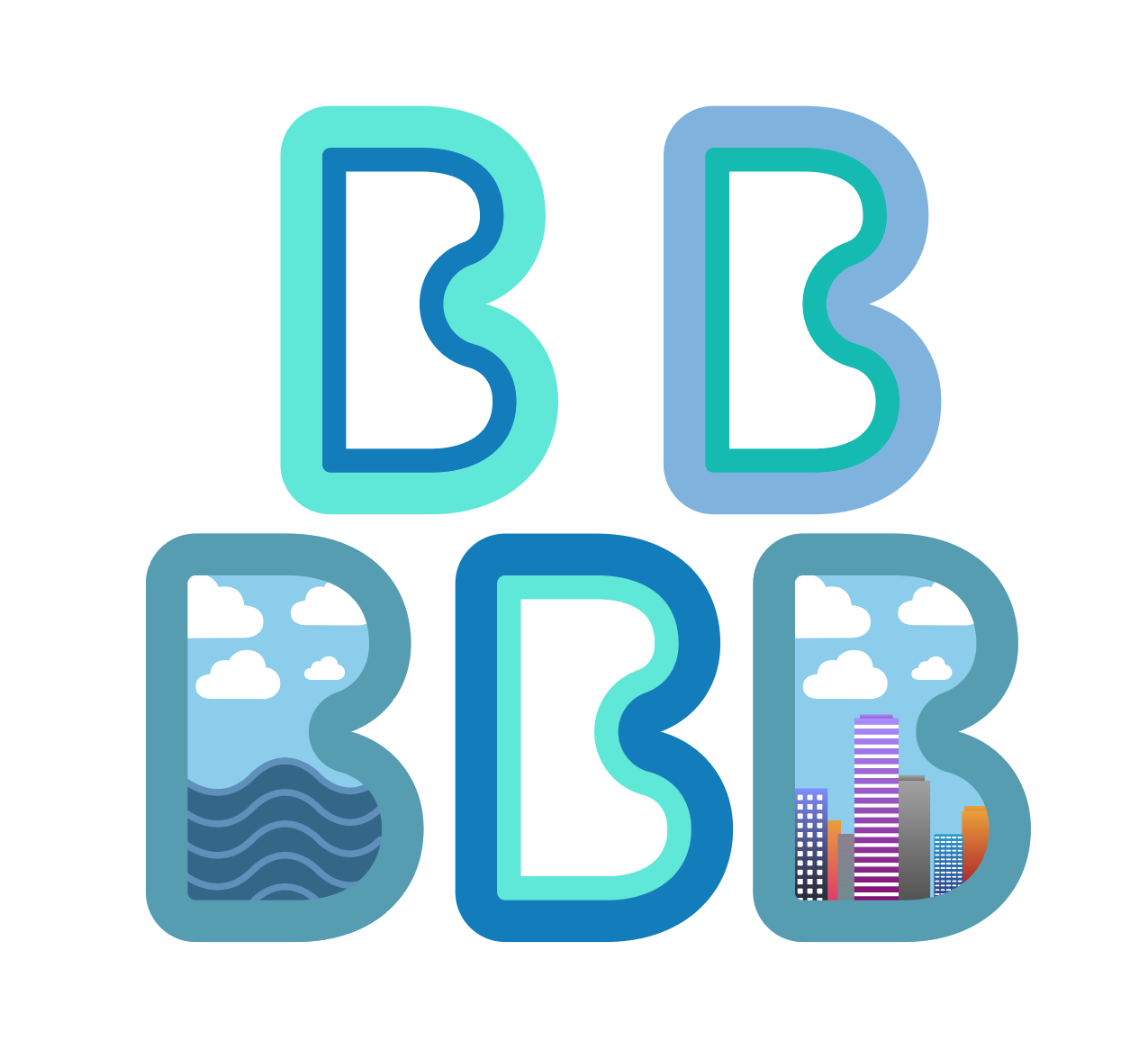
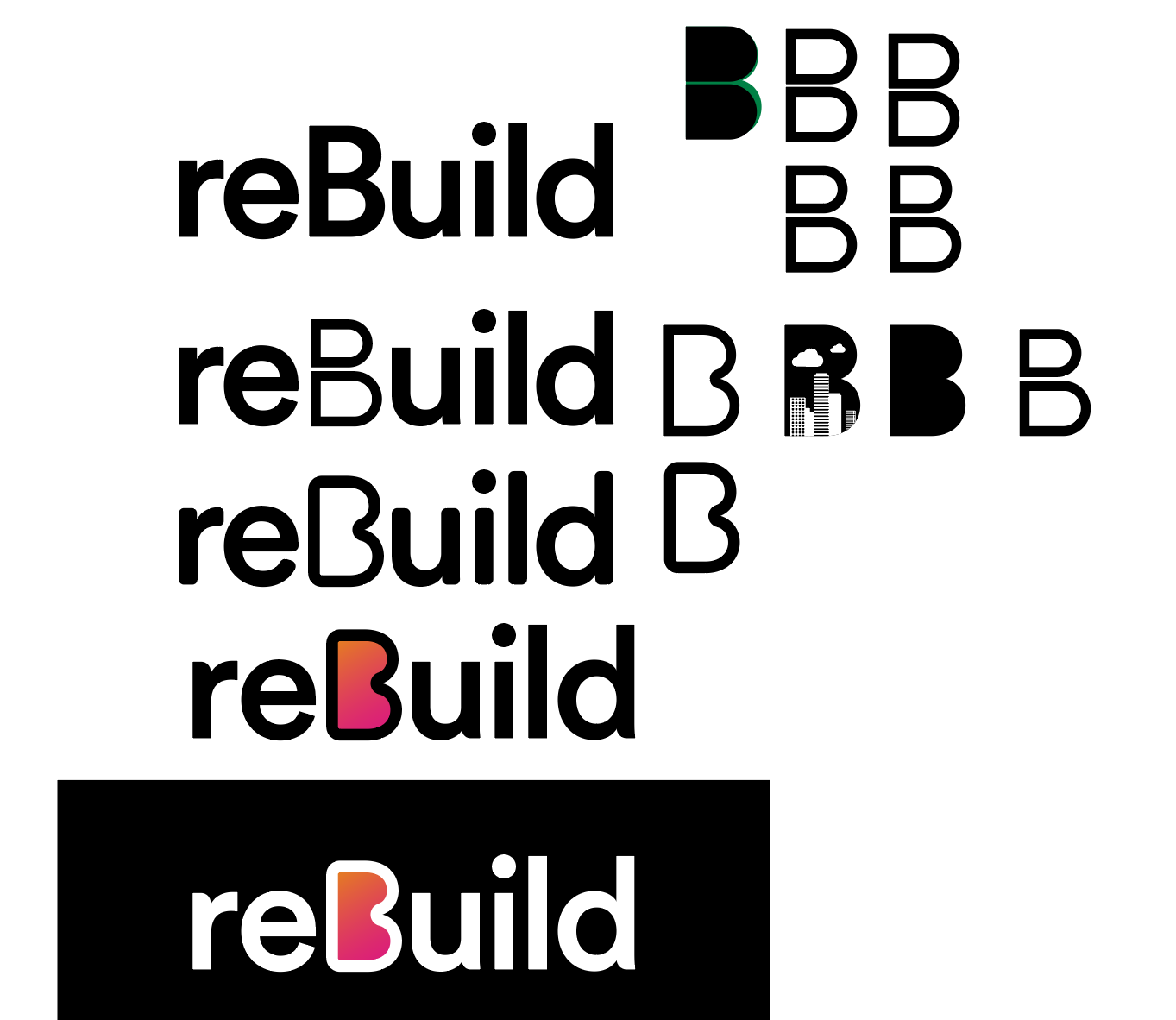
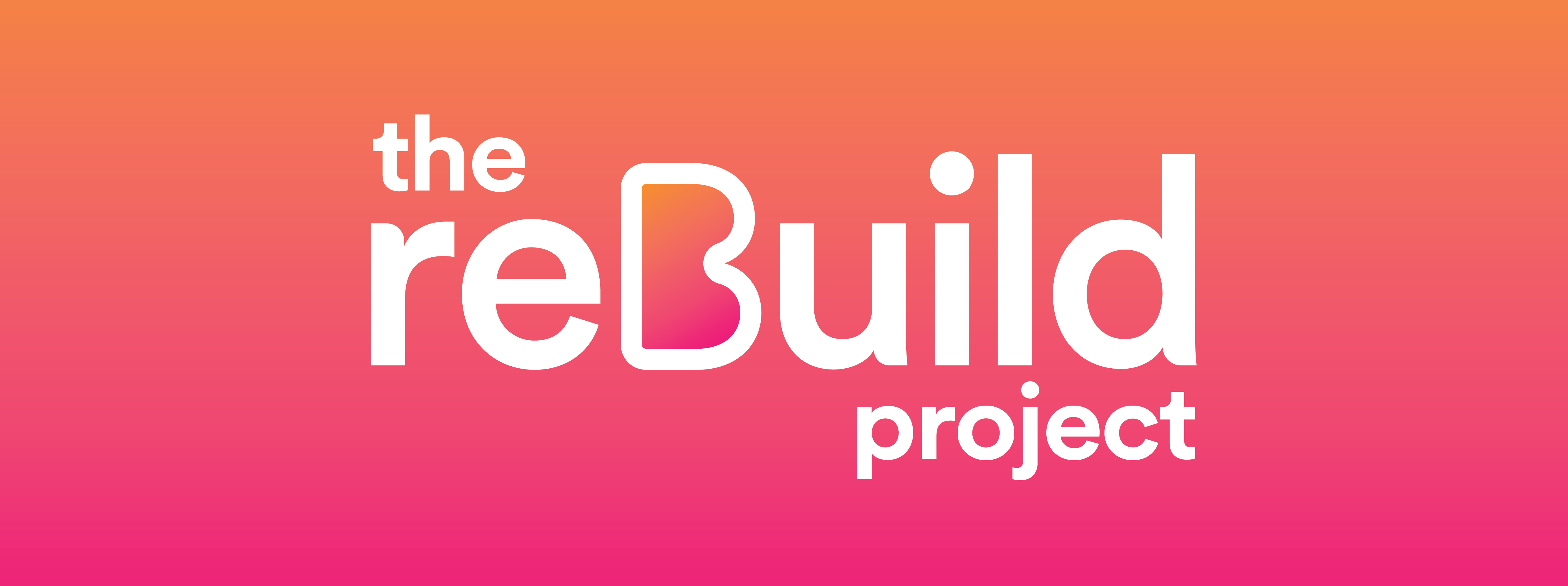
Logo Design:
I started by thinking of the name and designing the logo and thinking about how I wanted the B to be the main focus to emphasise on the “Build” part of the is project, eventually settling on “The reBuild Project”. I also played around with some colour schemes ans eventually decided to the pink to orange gradient as I thought it was representative of a dawn of a new day which was suitable for the project about crisis relief.
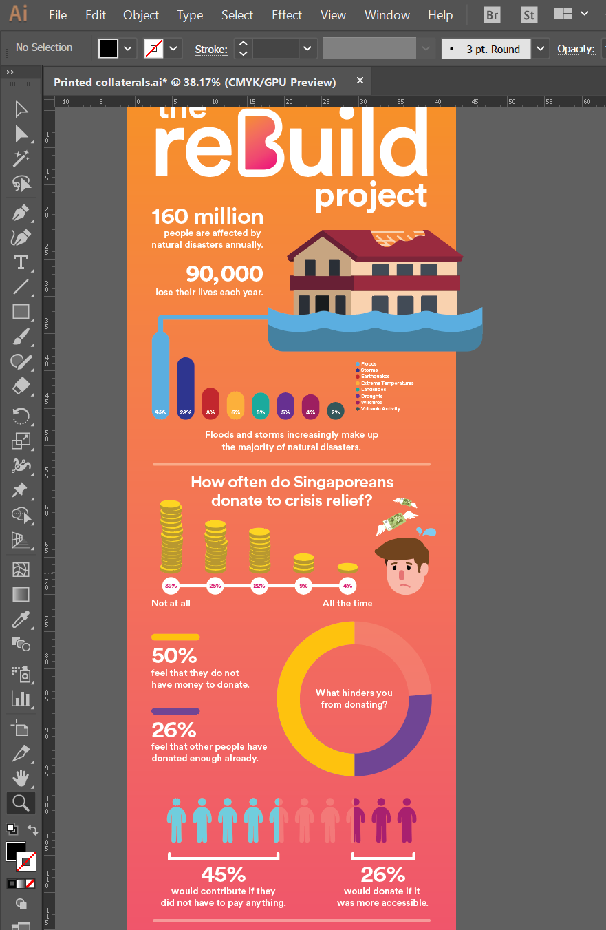
Infographic Design:
After constructing the entire infographic, I was contemplating if I should print the entire thing out as a banner but after doing the measurements, if the width of the banner were the length of an A4 paper the entire banner would stretch about 1.5m! Seeing how this would make little sense to print out and hard to display, I decided to rearrange the infographic to fit into a brochure, which would make more sense and would be easier to distribute to people.
In addition to the infographic I did a series of three posters as well for print.
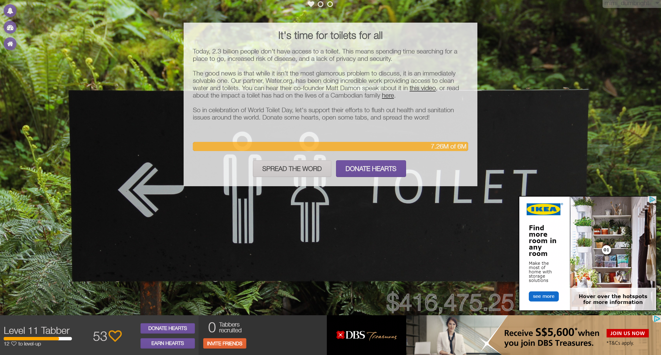
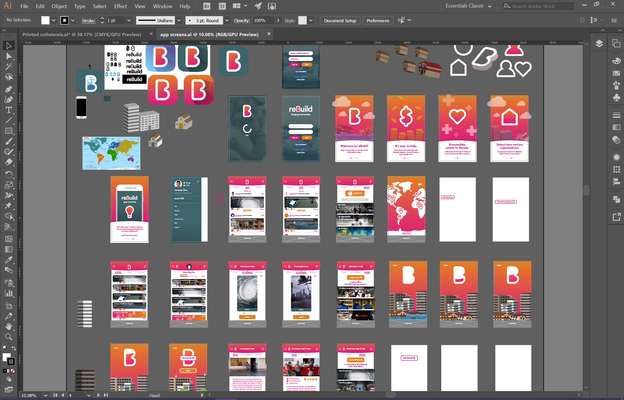
App Design:
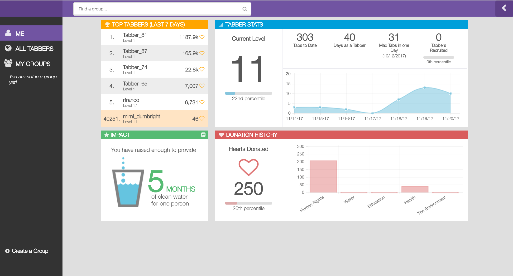
Next I proceeded to construct the app that was the main deliverable. I took inspiration from Tabs for a Cause, which is a browser extension that allows people to accumulate hearts and generate money through adsense every time they open a new tab in their browser. The hearts would then be used as a currency to donate to causes from around the world. I thought the concept was a brilliant one as users need not pay anything. I wanted to see how I could reinterpret this concept for my project through an app, but also including a social aspect where people can be updated of others’ activities.
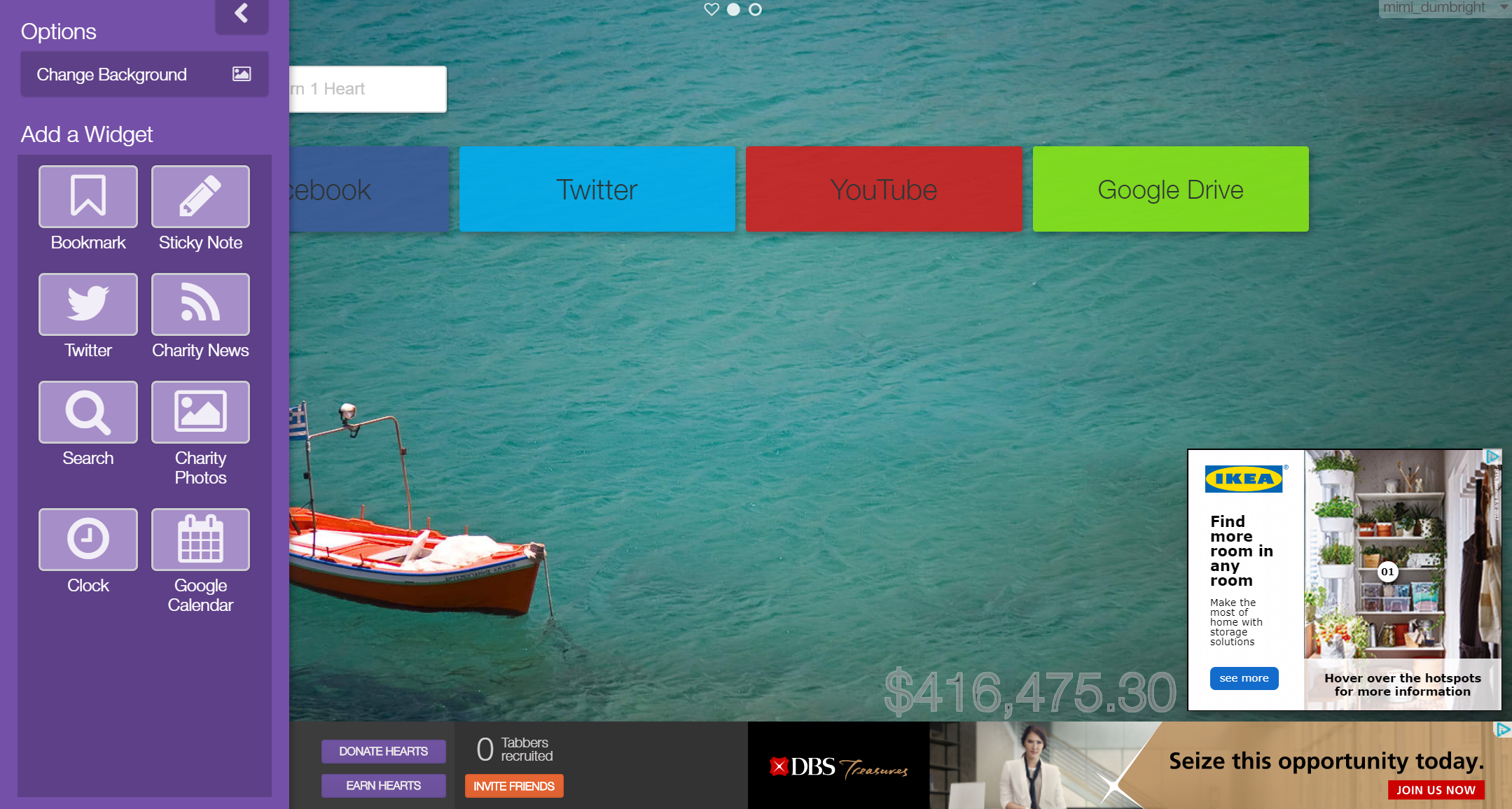
I found this really inspiring and the concept a really convenient and a good way to encourage people to donate to humanitarian causes.

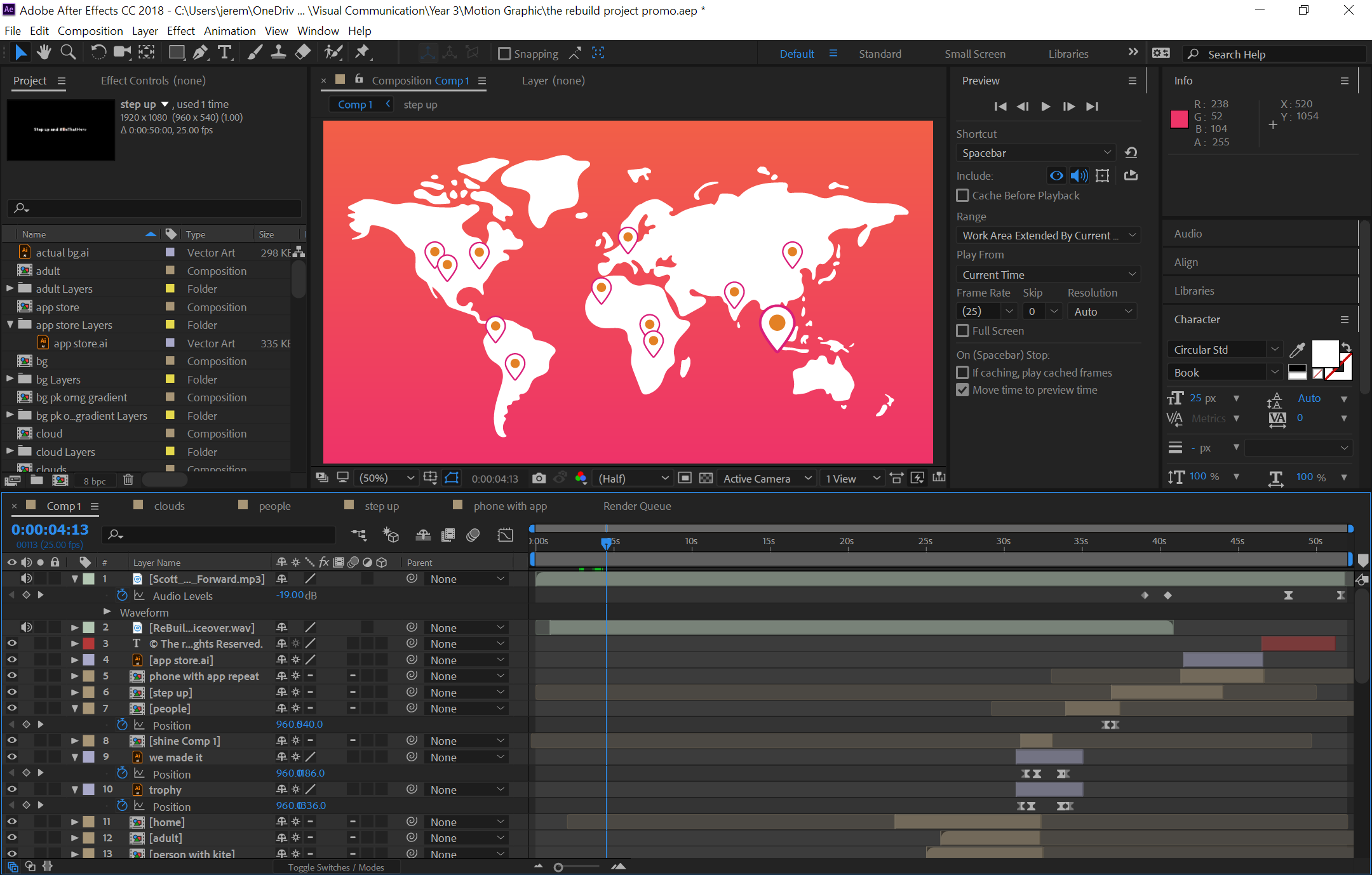
Motion Graphic Design:
After designing the app the last deliverable was to create a motion graphic video ad to promote the app and the campaign. I got my friend to help me do the narration for the video.
Reflections:
Throughout this entire project I felt like i struggled quite a lot, especially at the initial process where it got very conceptual and abstract in terms of ideation. I feel like I am a person who cares too much about the end product but not about the idea or process behind it. Nanci kept reminding us about how people didn’t buy what you do but rather why you do it. For me, in the first part, there was a lack of the “why aspect” and I was too caught up in going straight to the design without thinking the concept through enough. Eventually I overcame that and I felt that it was a good learning experience.
For me, the “why aspect” became making it easier for people to help people. And by doing that, one can already be a hero to those in need. It was about making contributing fuss free, convenient but still very much helpful and beneficial to those receiving aid.
This project helped me to work on my design process as a designer and I daresay I went on my own “hero’s journey” through this process 🙂