
For my zine, I wish to focus on the crimes committed in Clarke Quay.
According to my research, the top 3 crimes committed in Clarke Quay are: violence, molestation and theft. Hence I wish to commentate on such serious issue with a lighter tone and linked it to fashion.
The tone I was going for is a more sarcastic tone. Clarke Quay is known to be a place for sloppy activities, hence I decided to do a high fashion magazine here instead of a normal look-book.
Sample Shots


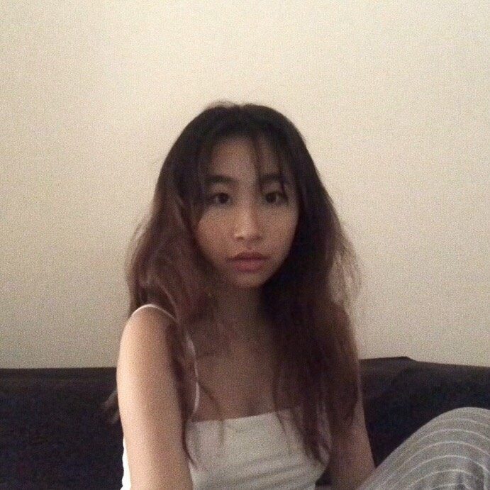
Cover Page

For my cover page I wanted something that is eye catching and suggestive. Hence, I picked this picture of Desiree staring directly into the camera, her eyes suggesting something panicky and tense. I wanted her to wear red to bring attention to her.
Violence Spread


I wish to bring light on the alcohol in this spread and also the resemblance of a fight to a war, which is why the army hat and top. I then digitally added on bruises. The way my model, Ray, is being portrayed, is from a worm’s eye view. It is as if he is taunting the viewers. I also want to bring out the laze and the dependence in posture when one is under influence. The bridge in the background is a bridge called the “Red Bridge”, which is a hot spot for people to drink before heading to the clubs.
Theft Spread

I wish to bring focus to the locks and chains on my mode, Eugene’s body, which is why he is wearing a dull color to push the silver and gold forward. Most theft cases happen inside the clubs, however since we are not able to shoot inside, we did it directly outside. There was a police sign outside Zouk, which is one of the most popular clubs in Singapore, and was bringing light to these crimes. Also, this spread has the most expensive outfit among the 3.
Molestation Spread


I want my model, Desiree to stand out in this spread. This is because in most cases, girls try not to bring a lot of unwanted attention to themselves, however, that is the opposite to what I want. Hence, I dressed her up in vibrant colors and shot her pictures in the middle of Clarke Quay where it has the most number of people. I want her outfit to cover as much skin as possible and tried to tie the colors of her outfit to the pink and purple background of Clarke Quay. I want her to look soft in the picture and have empty spaces around her to make her seem more in the open and a a sense of voyeurism.
The Final Layout
I wanted to put titles and descriptions like a how they did it in fashion magazines, hence, I took inspiration from Vogue, Bazaar Harper and there high fashion magazines. I added on comments on the outfit they wore in a sarcastic tone to comment on the purpose and recommend other fashion pieces to aid with the people who would want to wear these outfits next time.