History Of Graphic Design: International Typographic Style: Helvetica

International Typographic Style is a graphic design style that emerged in Russia, the Netherlands, and Germany in the 1920s and was further developed by designers in Switzerland during the 1950s. The style is also associated with a preference for photography in place of illustrations or drawings.

The typeface I will be exploring about is Helvetica. The principles of the International Typographic Style are: cleanliness, readability and objectivity. The principals are obvious in the type face Helvetica:

Helvetica was created by Max Miedinger and Eduard Hoffmann in 1957 and was meant to be simple and clean—a set of letters that would disappear to let the words speak for themselves

As time goes, this font has gained massive amount of popularity. The neutrality of Helvetica was designed specifically not to have much impact or evoke any meaning. Due to this, its usage is very versatile and adaptive for different types of projects and web designs as seen online nowadays.

In my opinion, this font is both classic and modern, conservative and edgy, elegant and relaxed. Its sleek  and modern lines are easy to the eyes and suitable for an untrained eye. It is almost it introduced a new era with a new look, which was opposite of all the kitschy, fancy, decorative typography that covered corporate materials and advertisements in the past.

History Of Graphic Design: Industrial Revolution Camp: Graphic Reactions Reflection

Art Nouveau is an international style of art, architecture and applied art, especially the decorative arts. It was a reaction against the academic art of 19th century architecture and decoration. It was often inspired by natural forms such as the sinuous curves of plants and flowers. The Art Nouveau had a sense of dynamism and movement, often given by asymmetry or “whiplash” curves, and the use of modern materials, particularly iron, glass, ceramics and later concrete, to create unusual forms and larger open spaces.

The Leaders of Art Nouveau:

Whiplash was a very distinctive style that was present in the artworks during the Art Nouveau style. The rhythmic curves and lines provides a sense of dynamics and motions in the still art. It was a flick of the wrist, a sensuous curve, a freedom from restraint, and its sinuous flowing line is considered a metaphor for artistic freedom.

I believe that the reason why the movement was so widely spread and explored was because it symbolizes unrestricted freedom the artists were trying to achieved during that period of mass production and rigid academic art. This style breaks away from artistic norms and traditional expectations. As the First World War encroached, opulence and ornament were shunned in favour of sleeker, mass-produced forms. But its avant-garde originality would still influence designers and artists for decades to come.

History of Graphic Design: To Bauhaus & Beyond (Dadaism)

Dadaism is an artistic movement in modern art that started around World War I. Its purpose was to ridicule the meaninglessness of the modern world. Its goal was to cast doubt on the power of language, literature, and art to represent reality, which they felt was absurdly chaotic and not re-presentable.

Examples of artists and their works:

  • Marcel Duchamp. “Fountain” is a readymade sculpture produced by Marcel Duchamp in 1917: a porcelain urinal signed “R.Mutt”.

Reflection:

I really like this movement as the artists really tries to question what exactly is art and also pushing the boundaries of conventional art forms. Dadaists saw art as a pretentious luxury, so they set out to change the context in which art was to be experienced, this change caused a mixed reaction and went against the standards of society and the art industry. With the combination of lack of sense and it’s strive to make a change in the art world, it often caused the pieces of art to be very controversial.

For example, my favorite work will be “Fountain” by Marcel Duchamp. This work has gained the society’s attention, but comes with a mix of negative and positive reviews. The Fountain was just a urinal placed in well-known museums along side other master pieces. Many thought it to be inappropriate but Duchamp wanted to use these readymades as his art medium was because he wanted to explore how society would react and also constantly trying to push the boundaries of what art can be. He wanted to see what kind of emotions the his art can create with the viewer’s own perception of art.

Typeface: Sans-serif

What is the serif font?

In typography,  serif fonts has decorative lines or taper added to the beginning and/or end of a letter’s stem, which creates small horizontal and vertical planes within a word. This is different from another typeface which is equally as popular as the serif fonts: the sans-serif fonts. This font removes the decorative aspect of the serif font and creates a more minimalist appearance to the font.

The origin of the font is still obscure and unknown, some say that the Roman letter outlines were first painted onto stone, and the stone carvers followed the brush marks, which flared at stroke ends and corners, creating serifs. However other theories suggest other wises that serifs were devised to neaten the ends of lines as they were chiseled into stone

How the serif font make us feel?

The serif fonts have became one of the most prevalent for display of text on the print. After years of changing and perfecting this font, the Serif fonts settled to give the eye a curve to hug. The Serif Fonts is design to make reading in prints easier, making reading easier for humans to process and distinguish the letters apart with the serif attached to them. The main moods most associated with serif typefaces are stable, mature, practical, classic, elegant, formal, confident and established.

Serif fonts are a great choice for brands that wish to portray a trustworthy, established, and reliable appearance. This is because serif typefaces date back to the 18th century, companies that utilize serif fonts are often seen as more established, serious, and traditional. This font implies heritage and great loyalty of the brand.

Some may argue that this font only suits the print and not the web, however this style actually helps guide the flow of letters, words, sentences, and paragraphs because serifs can help “push” you from one letter to the next.

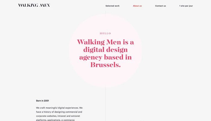
Examples of Serif fonts on web pages:

In conclusion, Serif fonts are more traditional while Sans-Serif fonts have a more modern feel which is why a lot more brands are changing their logos, eg. Google, HSBC, Yahoo etc. for that cleaner and more trending feels. From my research, I feel like Serif fonts are a great choice for more traditional businesses as there is already an attached mood and feeling on this font but brands do not have to limit themselves and push boundaries when it comes to using fonts.