
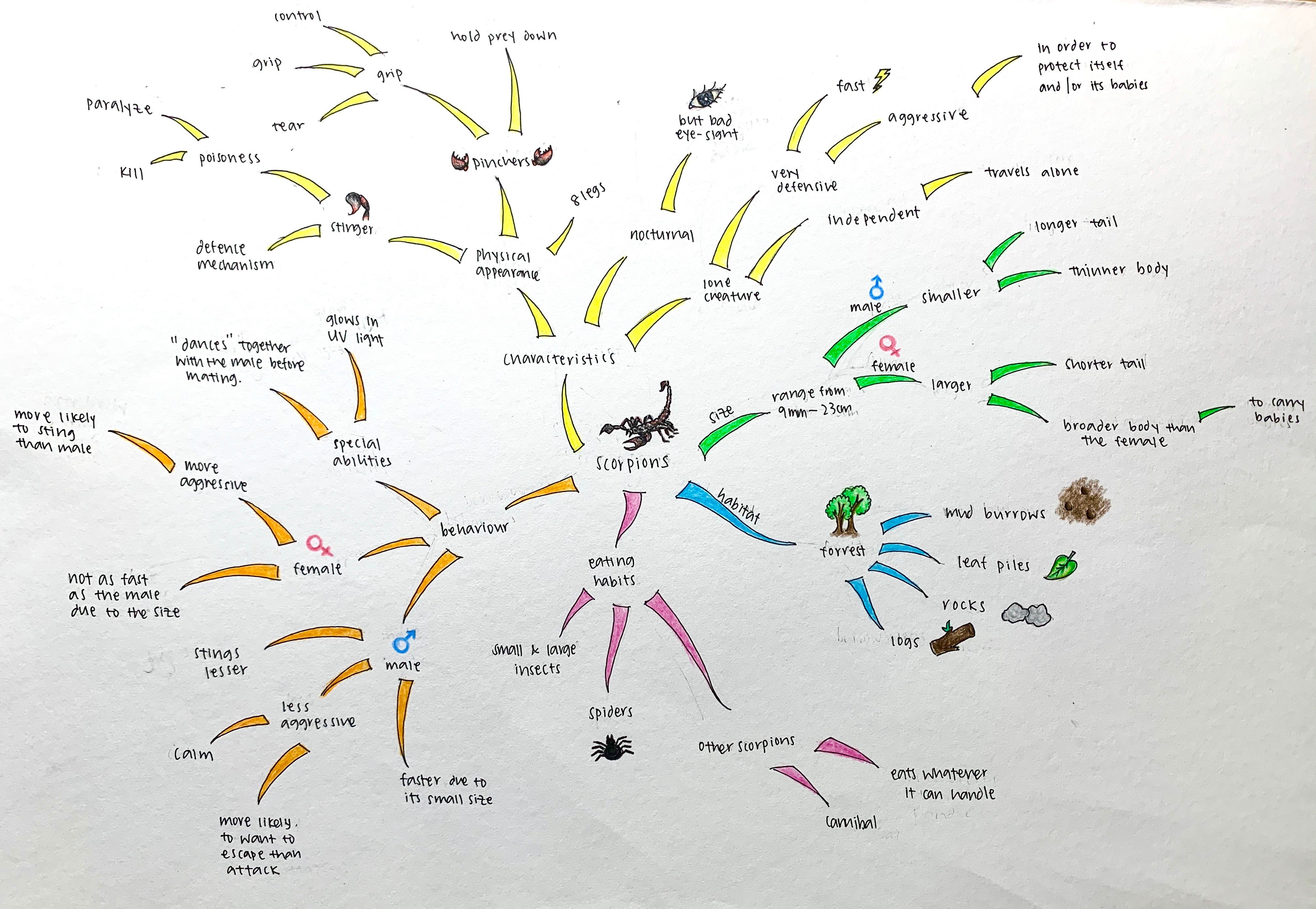
My mind map:
Mood boards:
Assignment 6:
There are 2 posts filed in Research (this is page 1 of 1).
Animal:
Scorpion
Initial Inspiration:
What inspired me to pick a scorpion is from a show called “Locked up”. It is a show about female prisoners in Spain and how they try to survive day to day against all the abuse from the male guards. One of the prisoners kept a scorpion as a pet as she resonates a lot with the characteristics of a scorpion. The rest of the prisoners then use the scorpion as a symbol of survival.

Research on Scorpions:
Scorpions are found on all major land masses except Antarctica and New Zealand. They have eight legs and are easily recognised by the pair of grasping pedipalps and the narrow, segmented tail, often carried in a characteristic forward curve over the back, ending with a venomous stinger. Scorpions range in size from 9 mm / 0.3 in to 23 cm / 9 in. Female scorpions are broader and are more aggressive than males. The female scorpions are are more likely to sting too as they tend to be more protective especially when they are carrying their offsprings.

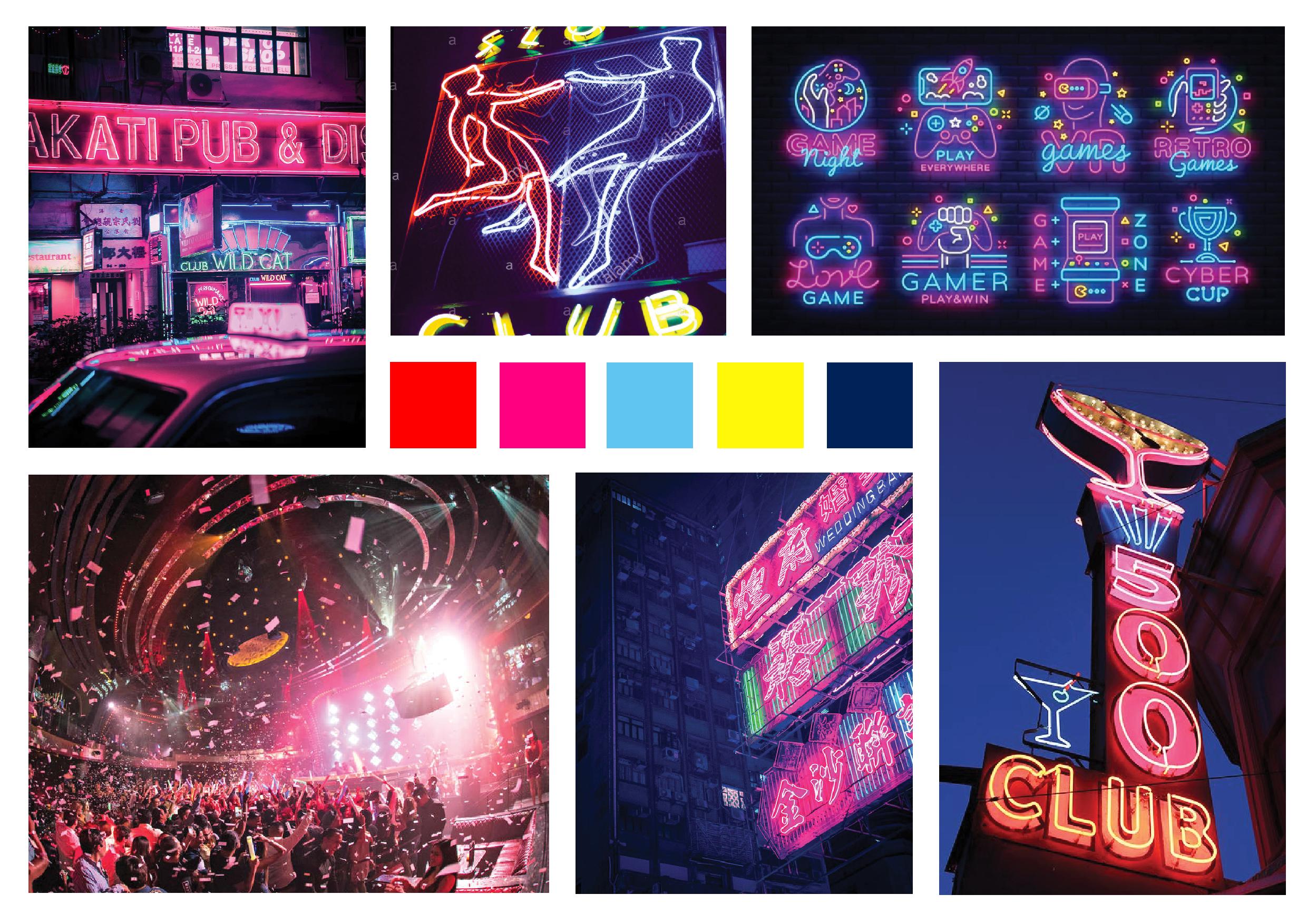
Brand/ Logo Research:
![]()
Initial Sketches:
These are my sketches.


Graphic Form:
For my final 3 logos, I really want to show the characteristics of the female scorpion as I am fascinated by their behaviour. The two Yin-Yang logos are to show balance between the male and female scorpions in the world and it also to evoke the view of two scorpions “dancing” when before they mate. To make them different, I decided to fill in one of the scorpion to indicate the female species as it shows it is full and carrying offsprings.
There are further descriptions in the PDF.

These are some of my extra sketches before ending up with the final 3 logos.
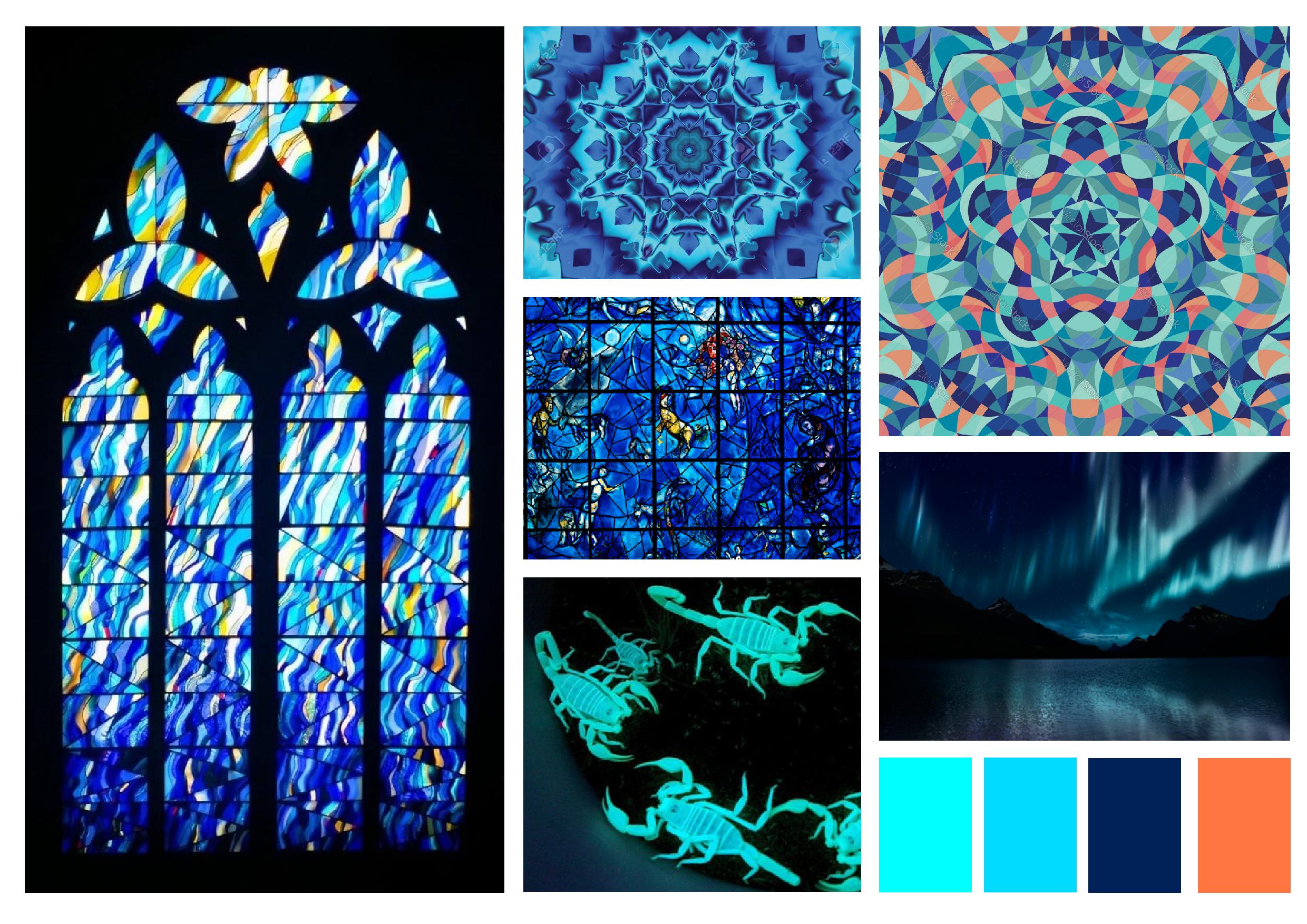
Colour Study:
The description of colour choice is stated in the PDF. I tried colour study for my initial scorpion logo and the other one, I added a circle at the back to show more depth in the design. View PDF descriptions for more information.
Logo with circle added behind:


Initial logo, without circle at the back:


I decided to go with the logo with the circle at the back because I feel like it gives me more depth and looks better with the colours. I also like how the additional circle at the back looks make it seem like a burrow hole and the scorpion being inside the hole.
This is my final colour studies:


Final:
I decided to choose the red logo because I wanted my logo to suggest a subtle form of danger and alertness but also alluring. I also like how the gradient of the red which guides the viewer’s eyes and the way it emphasises that the tail with the sting is the most dangerous part. I feel like this logo can be used for games, clothing brand etc.