Final Brochure

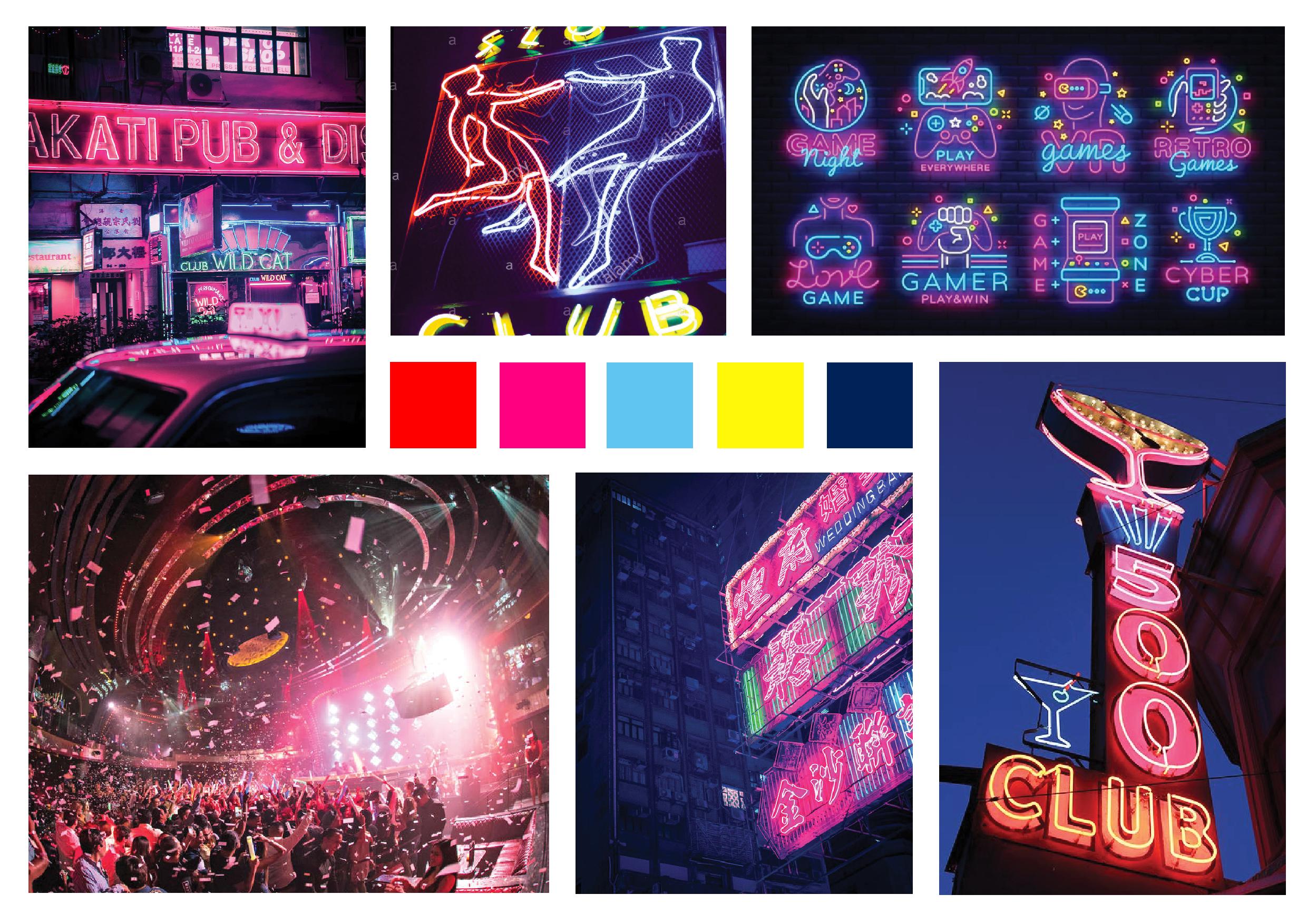
I wanted my brochure to be vibrant, fun and interactive, while maintaining design coherence with my poster. I want to depict my scorpion dancing with a pop up mechanism and the background whirling to mimic  the colourful background in Ariana Grande’s “God is a Woman” music video (which was my initial inspiration).

Reference Folds and Mechanism

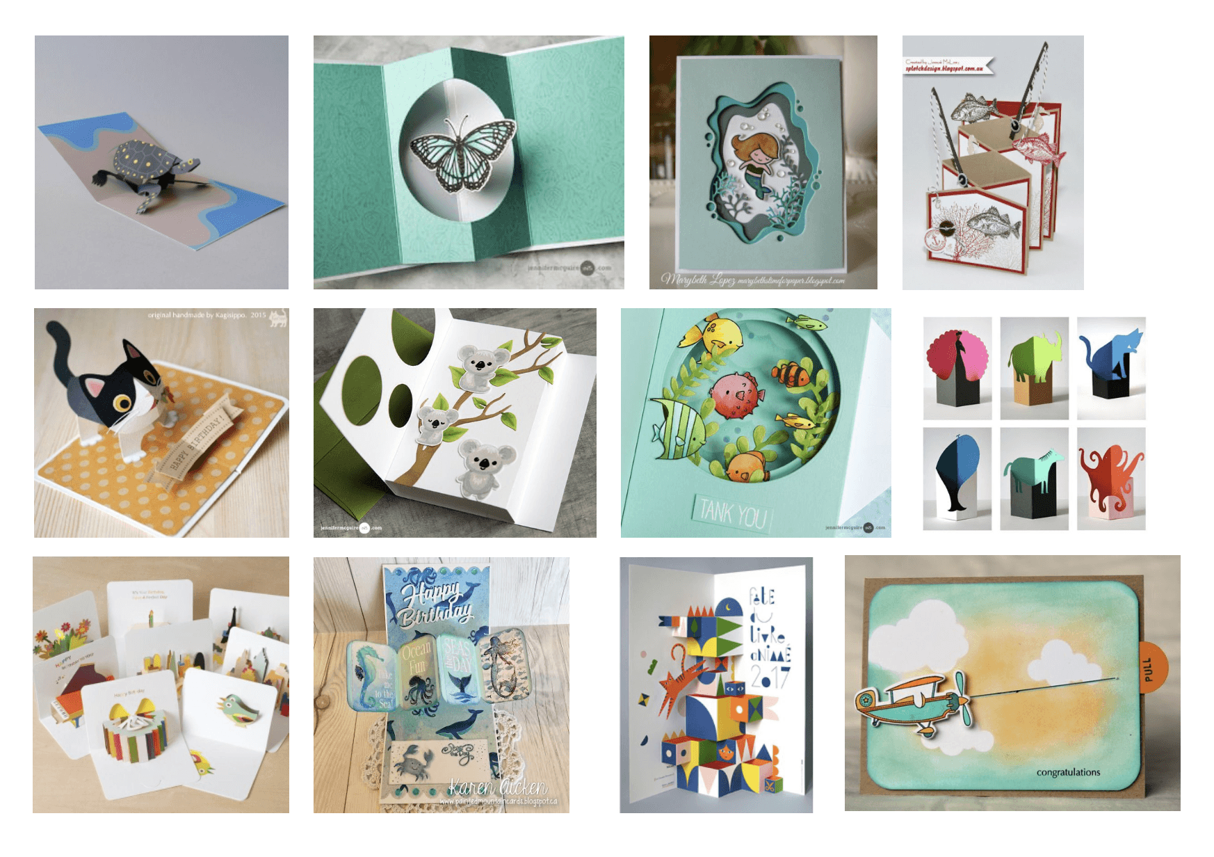
What caught my eye was definitely the (first row, second from the right) spinning butterfly as I feel like it can depict my scorpion spinning and “dancing”, hence I went forward to search more about this mechanism.

Card Fold Mechanism Guides

Brochure Concept #1

I tried to do something simple and not too complex so that I could focus on typography.

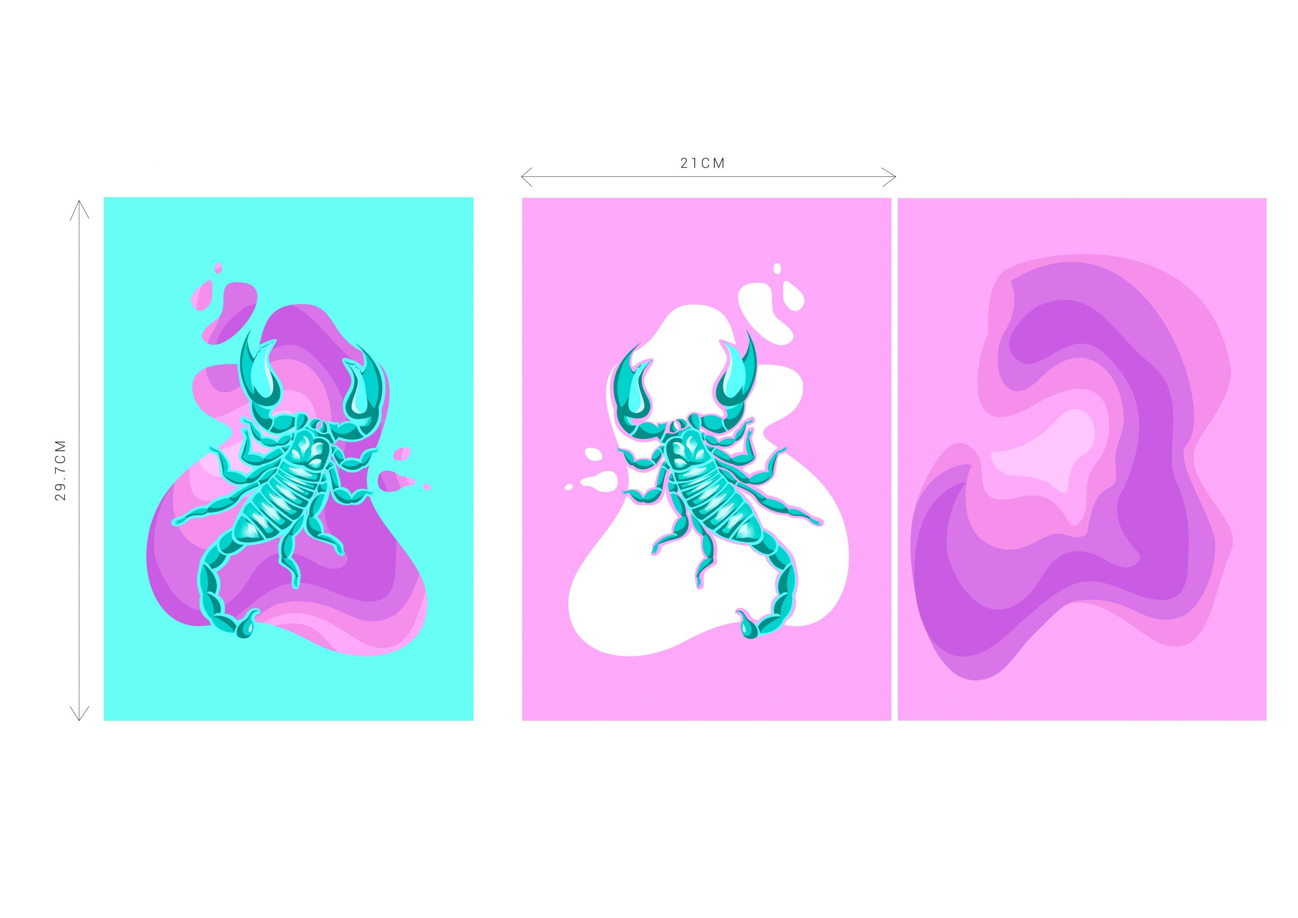
However, it looks quite boring.

Brochure Concept #2

I decided to make it smaller and add in some mechanisms like a spinning scorpion that is attached to a thin elastic band and a turning circular background.

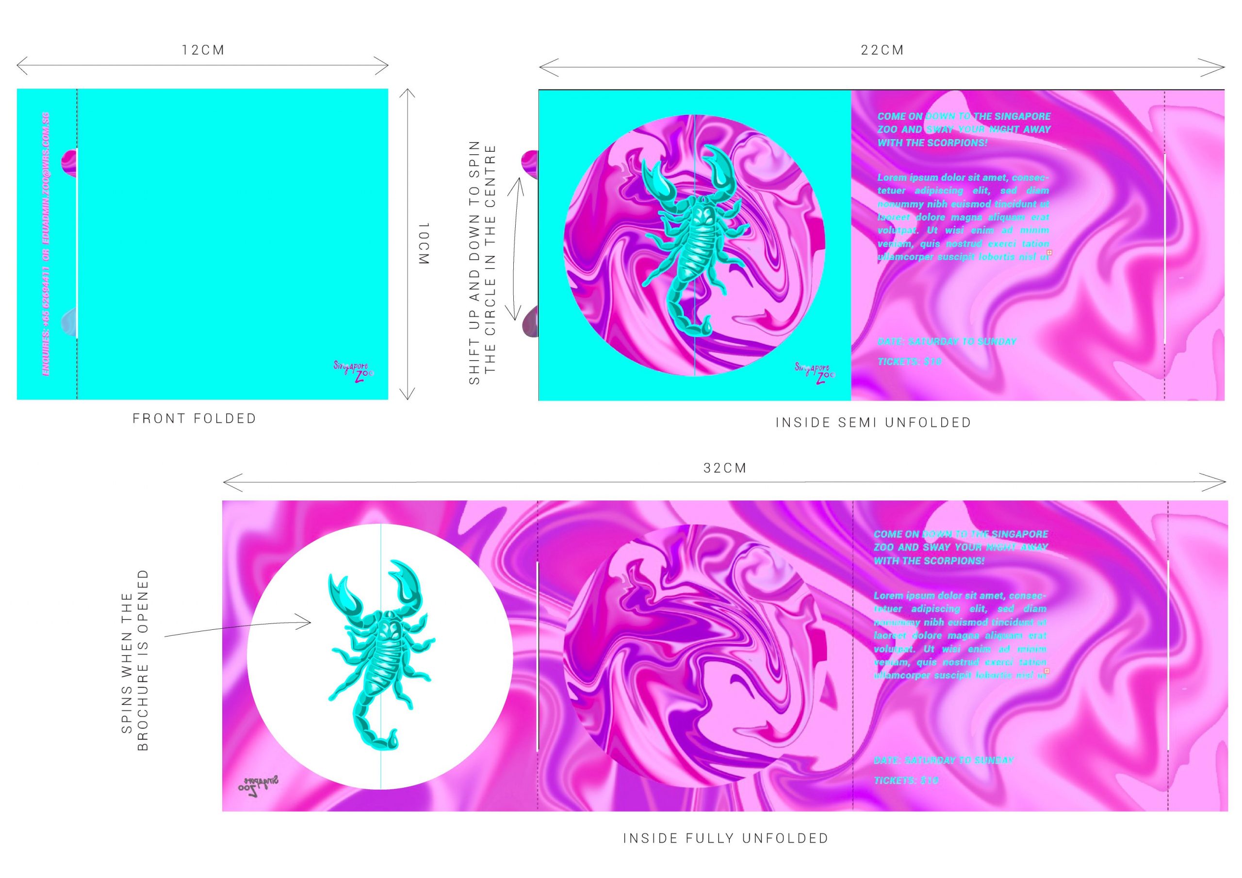
However, after consultation, it was brought to my attention that there is lack resemblance to my poster especially in terms of typography. Furthermore, it looks a little plain and hard to understand.
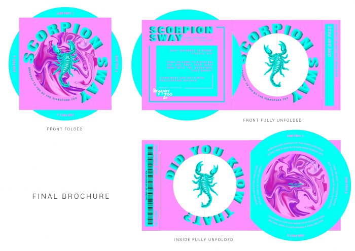
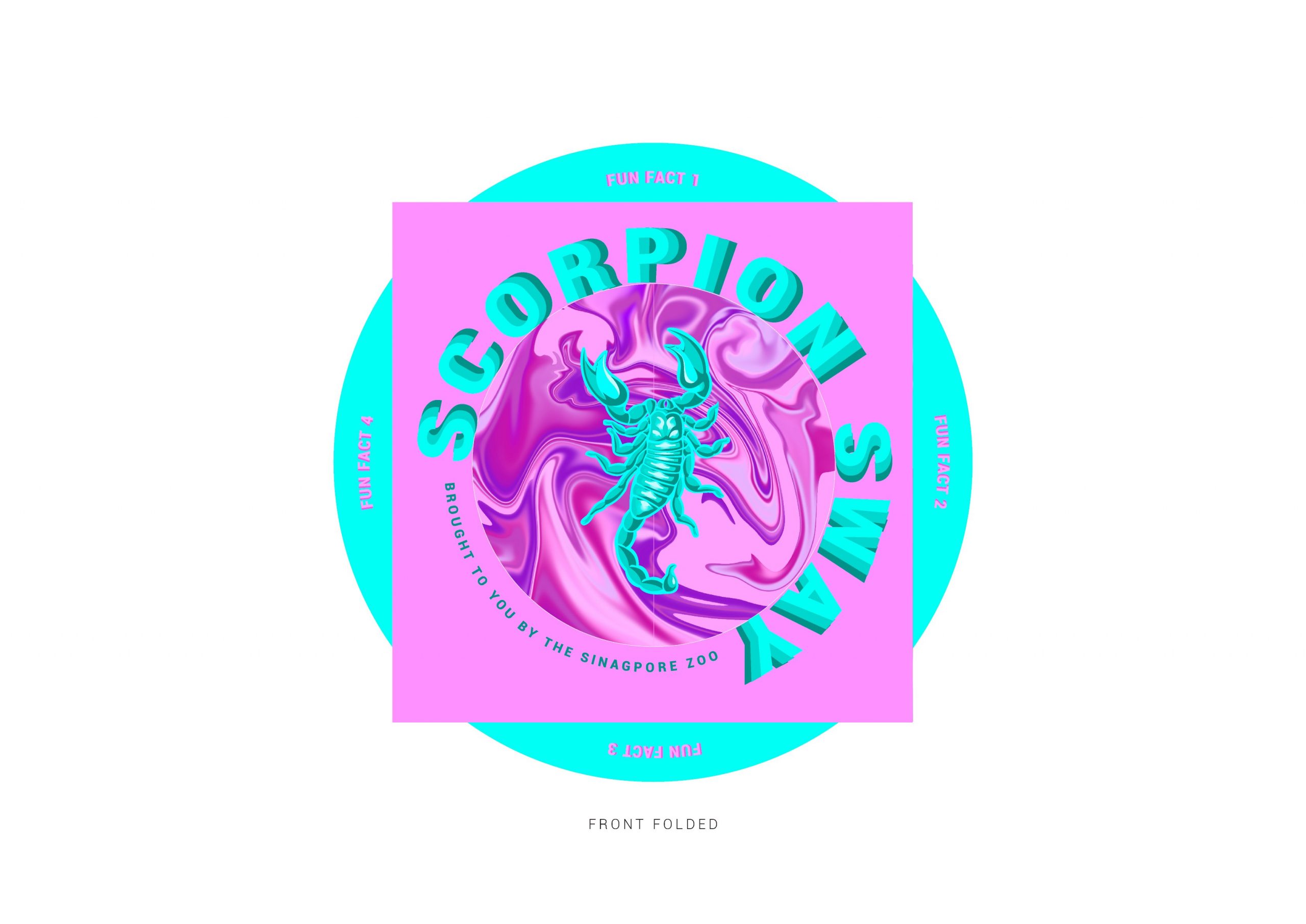
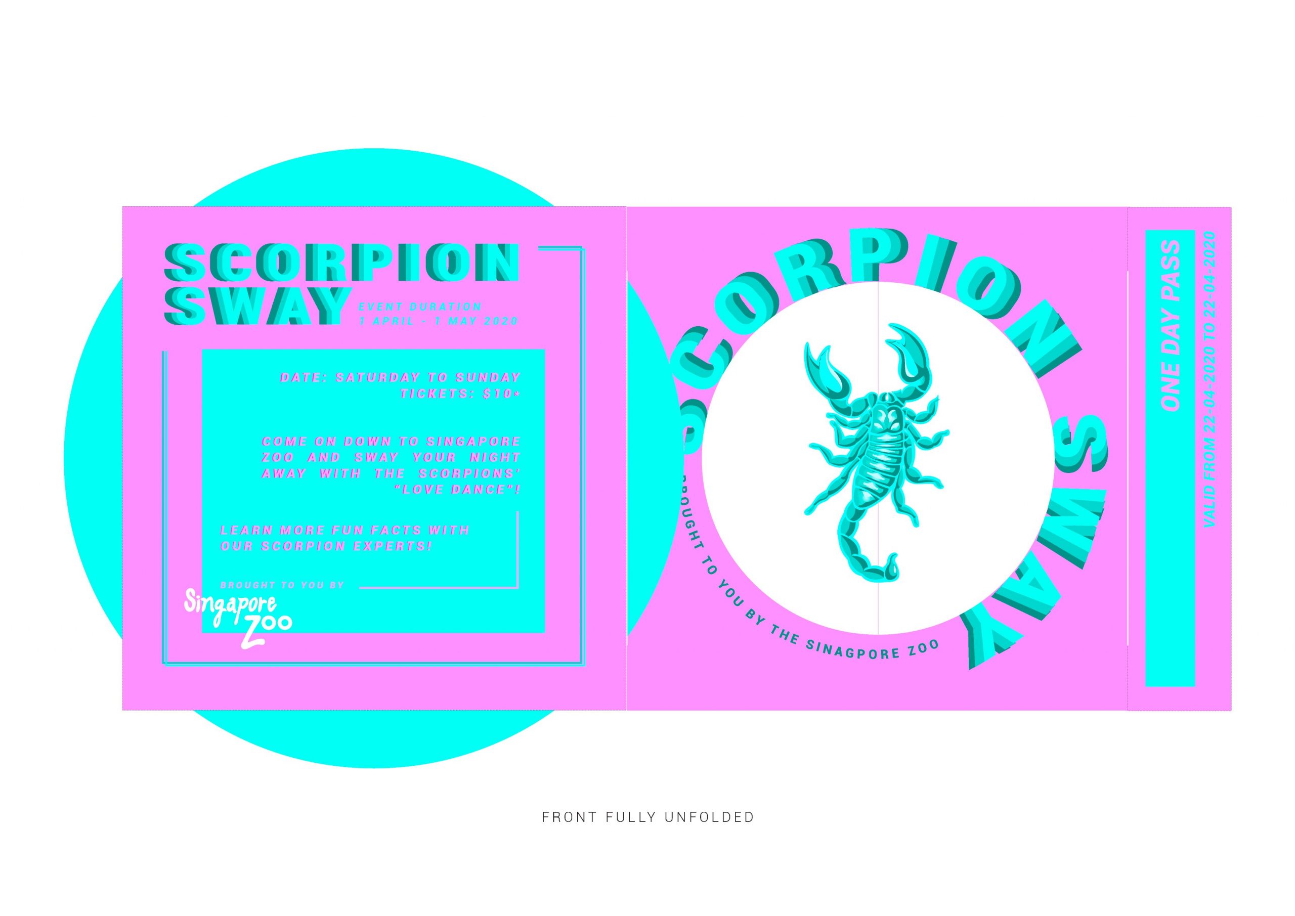
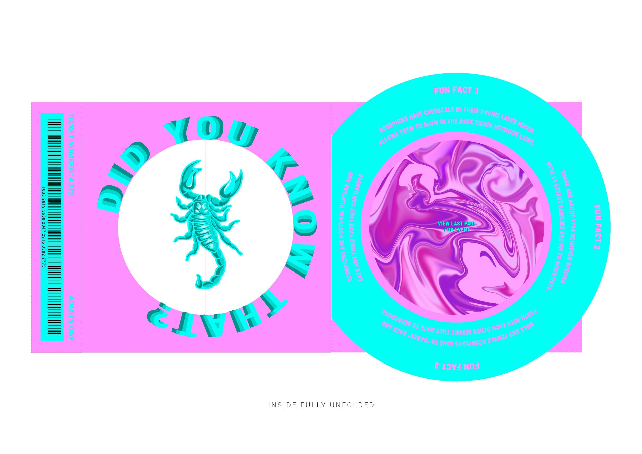
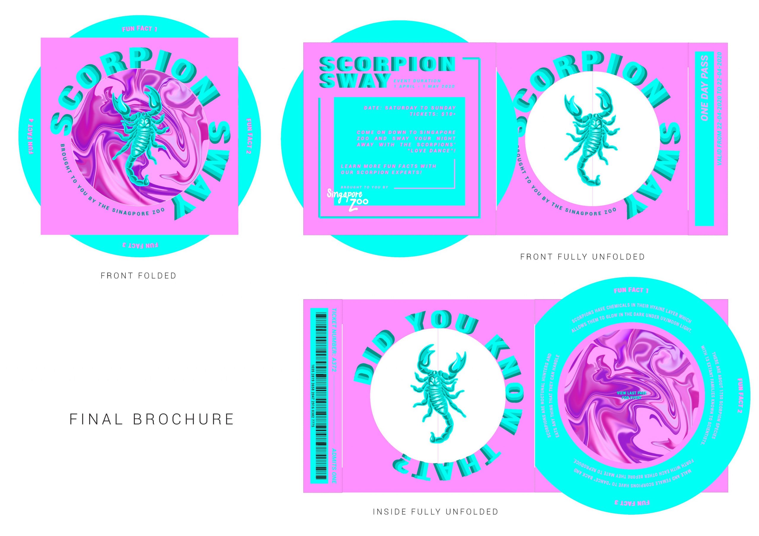
FINAL BROCHURE

Click here to view PDF version

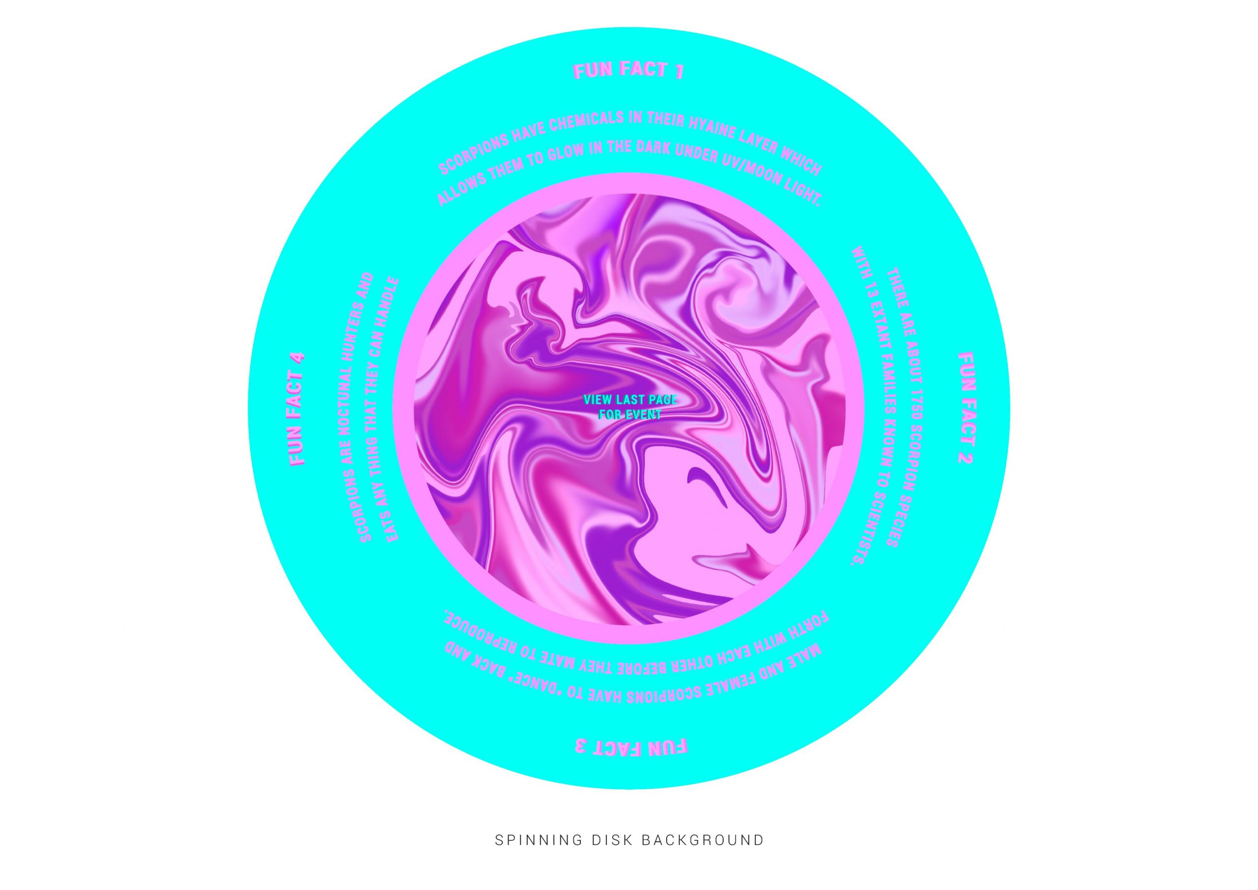
I decided to keep my design simple but also fun and vibrant at the same time. I decided to reduce the number of folds and keep the spinning scorpion (to depict it “dancing”) and turning background mechanism (to show that the background is swirling).

The turning turquoise background also acts as a hook to hold the brochure close.

Final Brochure Spread

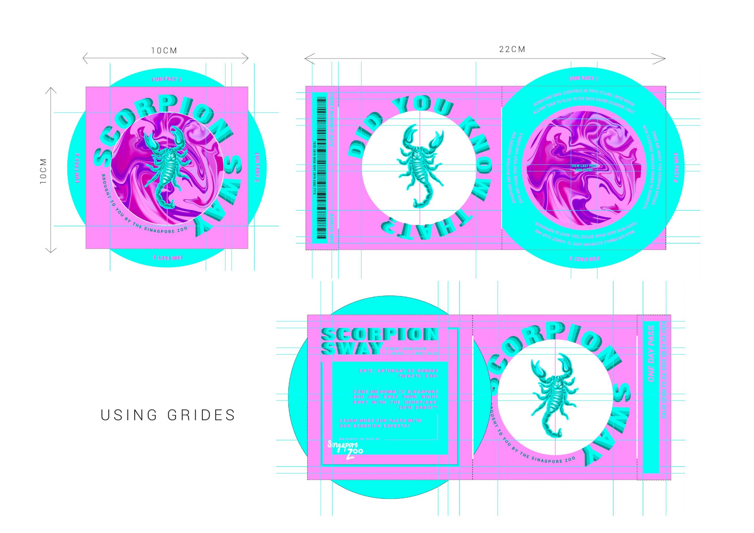
Final Brochure with Grids

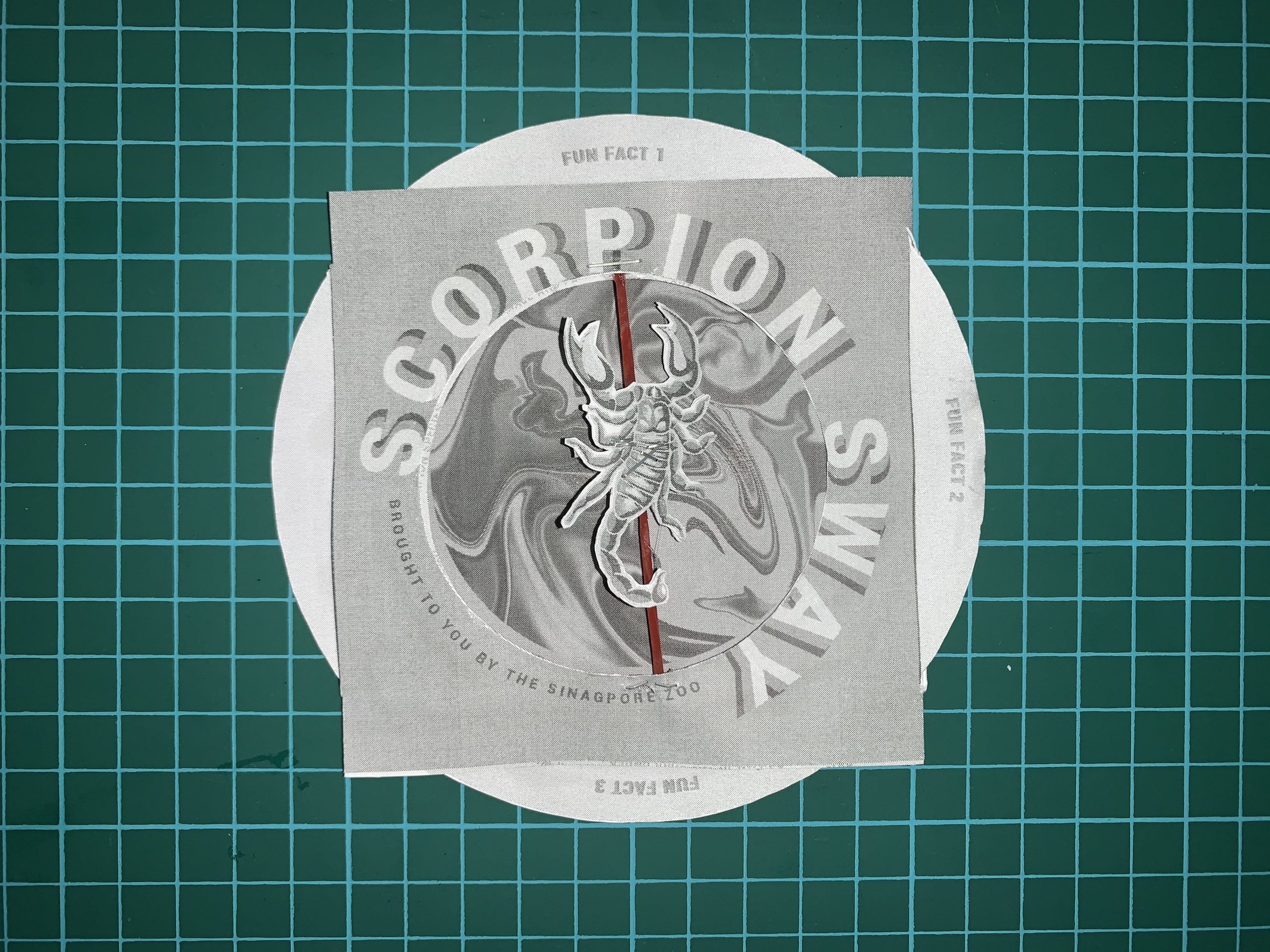
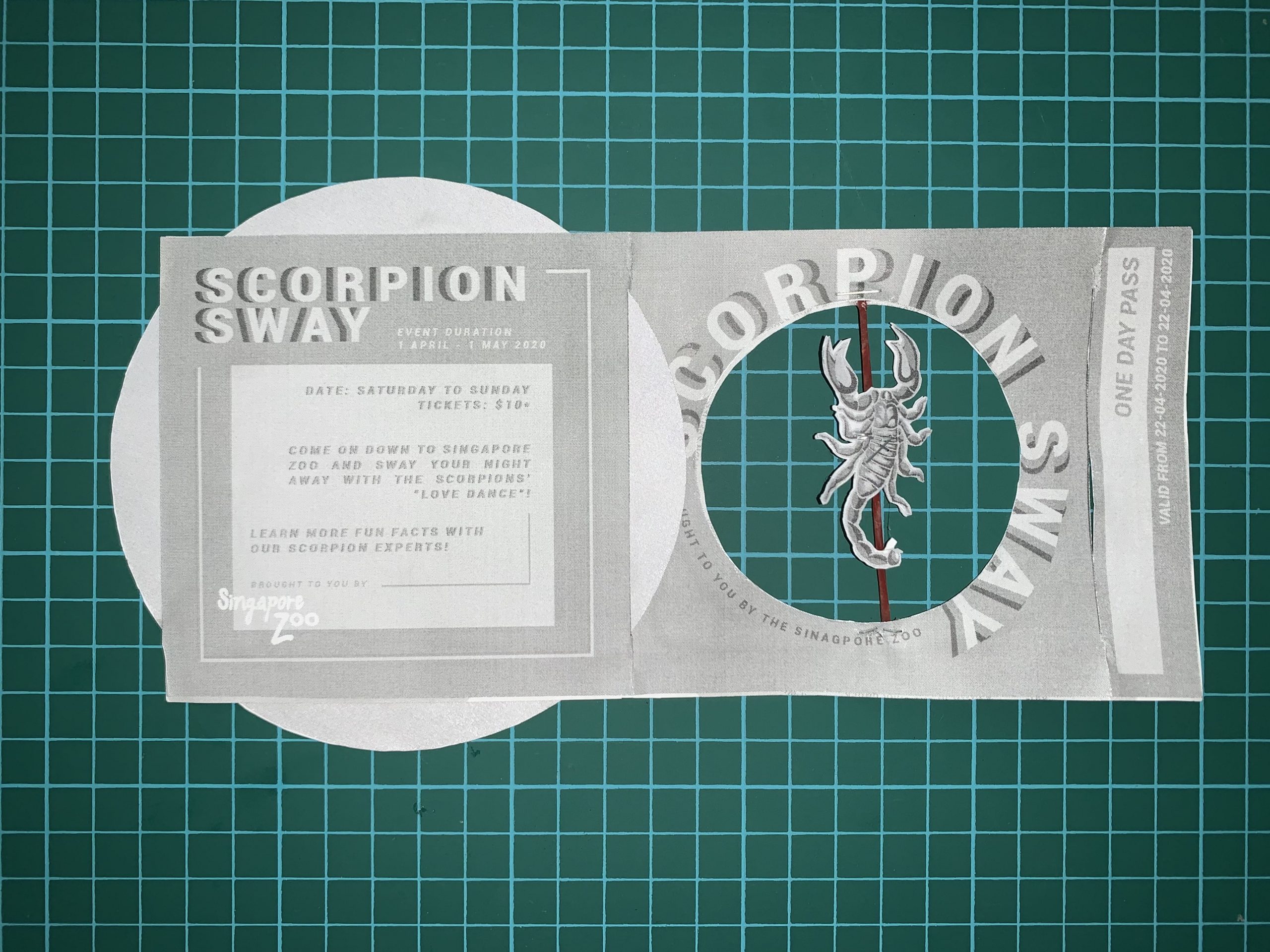
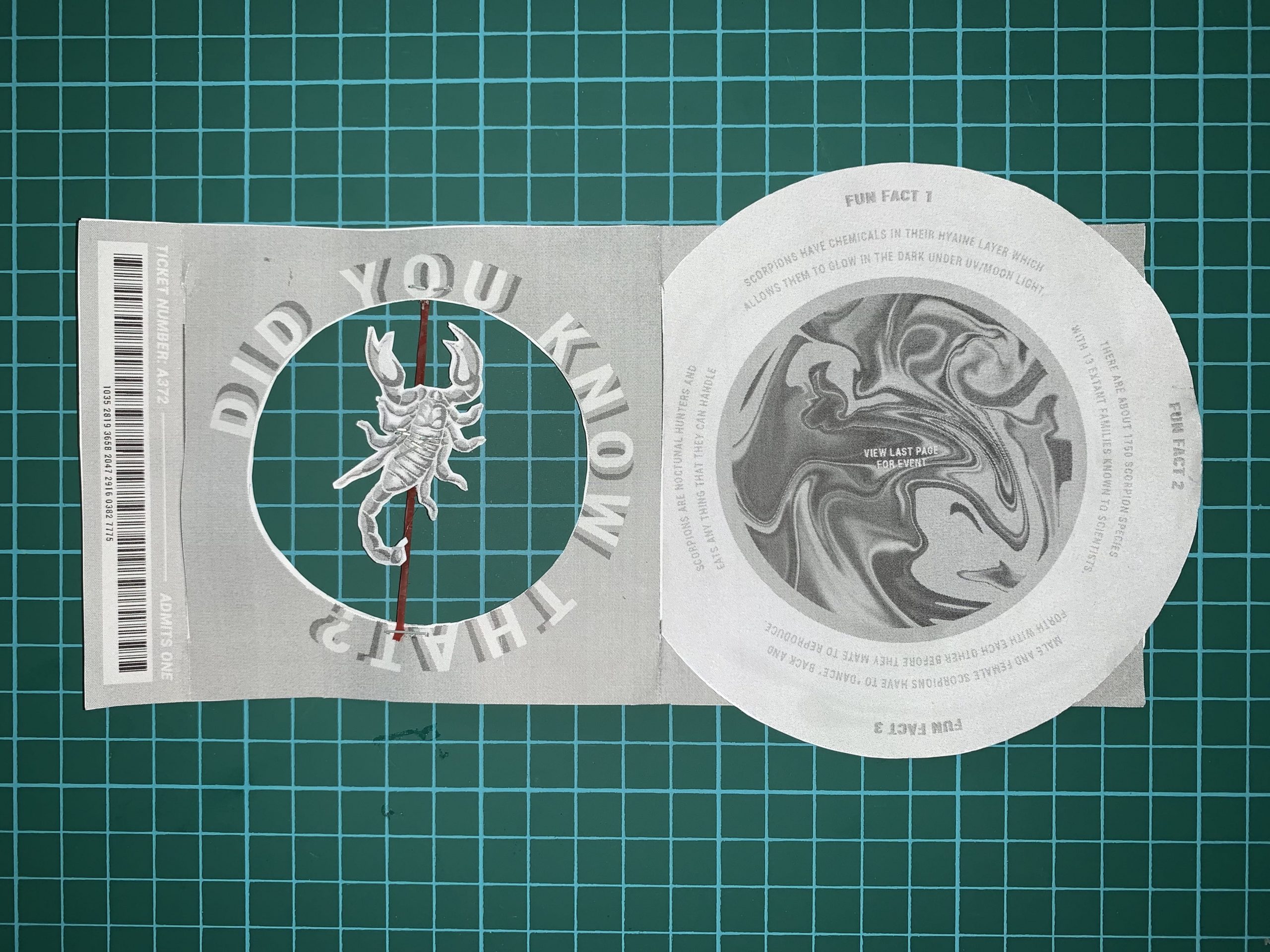
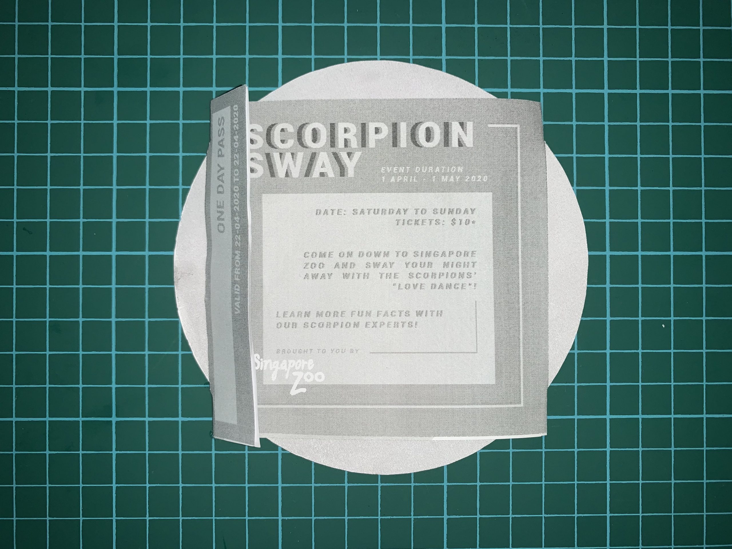
Brochure Construction Sample and Mechanism Testing

I did not have any thinner elastic band so I had no choice but to use a rubber band. I know my construction is a little wonky but the paper I printed on is a little thin to my liking.

Since this is just a sample construction, I just want to show how the brochure is being folded and how the mechanism should work.

Front view (folded)

Front view (unfolded)

Inside view (unfolded)

Back view (unfolded)

Mechanism testing


Singapore zoo poster

IDEA #1 CONCEPT:

The poster is suppose to depict the glow in the dark characteristic of the scorpions when under UV light and also dance characteristic before the male and the female mates. The scorpion body will be blue and they glow blue in colour when in the dark. The main atmosphere the poster should create is a fun, loud and party like style.

Mood board for Idea #1

I picked inspiration of neon signs from night clubs because it symbolises partying, dancing and having fun.

These are the references I have found.

I prefer the more detailed scorpion as I want the main empathise to be the scorpion. I then test out a few compositions with the grids as guidelines.

Final poster for Idea #1

Feedback:

However, after consulting with Professor Lisa, she suggest that it would be better if I can merge the colours from idea#1 with the concept of idea #2 as it will be more vibrant and really shows the movement of the scorpion. Hence, I decided to take that route.

IDEA #2 CONCEPT:

The poster is suppose to depict the dance characteristic of the scorpions before the male and the female mates. The poster should also depict the rich glowing turquoise body of the scorpion when it is exposed to UV light. The main atmosphere the poster should create is a fun, vibrant and elegant style.

Main reference:

Ariana Grande’s “God is a Woman”


Testing Typography and Scorpion Placements

Using guide lines:

FINAL POSTER FOR ASSIGNMENT 2


Assignment 1 – Graphic Form: Scorpion

Animal:

Scorpion

Initial Inspiration:

What inspired me to pick a scorpion is from a show called “Locked up”. It is a show about female prisoners in Spain and how they try to survive day to day against all the abuse from the male guards. One of the prisoners kept a scorpion as a pet as she resonates a lot with the characteristics of a scorpion. The rest of the prisoners then use the scorpion as a symbol of survival.

Research on Scorpions:

Scorpions are found on all major land masses except Antarctica and New Zealand. They have eight legs and are easily recognised by the pair of grasping pedipalps and the narrow, segmented tail, often carried in a characteristic forward curve over the back, ending with a venomous stinger. Scorpions range in size from 9 mm / 0.3 in to 23 cm / 9 in. Female scorpions are broader and are more aggressive than males. The female scorpions are are more likely to sting too as they tend to be more protective especially when they are carrying their offsprings.

Brand/ Logo Research:

Initial Sketches:

These are my sketches.

01_20 Sketches


Graphic Form:

For my final 3 logos, I really want to show the characteristics of the female scorpion as I am fascinated by their behaviour. The two Yin-Yang logos are to show balance between the male and female scorpions in the world and it also to evoke the view of two scorpions “dancing” when before they mate. To make them different, I decided to fill in one of the scorpion to indicate the female species as it shows it is full and carrying offsprings.

There are further descriptions in the PDF.

02_Graphic Form

These are some of my extra sketches before ending up with the final 3 logos.

extra sketches


Colour Study:

The description of colour choice is stated in the PDF. I tried colour study for my initial scorpion logo and the other one, I added a circle at the back to show more depth in the design. View PDF descriptions for more information.

Logo with circle added behind:

Initial logo, without circle at the back:


03  Colour Study testing

I decided to go with the logo with the circle at the back because I feel like it gives me more depth and looks better with the colours. I also like how the additional circle at the back looks make it seem like a burrow hole and the scorpion being inside the hole.

This is my final colour studies:

03_Colour Study final


Final:

I decided to choose the red logo because I wanted my logo to suggest a subtle form of danger and alertness but also alluring. I also like how the gradient of the red which guides the viewer’s eyes and the way it emphasises that the tail with the sting is the most dangerous part. I feel like this logo can be used for games, clothing brand etc.

04 Final


Thoughts on ‘The Society of the Spectacle’

I felt that DeBord was definitely trying to critique on the contemporary consumer culture and the quality of life. The world we live in are much more divided that united and the mass media has definitely been fuelling to this problem. He suggests that there is a deviation in life, in a society that is always consuming, material, knowledge etc, life does not seem to be about “living” but about “having”. Then, the “job” of spectacle imagery ; to convey these messages, the people’s needs and wants, and just the societal progress in general.

In the passage “the society of the spectacle”, I agree with Guy DeBord when he stated that “the spectacle subjects living human beings to its will to the extent that the economy has brought them under its sway.”. A spectacle is suppose to be a scene that is visually striking and impactful, in my opinion, for it to be effective, I believe it should depict or comment on the situation in society. When situations in current society are being brought to light, viewers will be able to relate to it easier. Thus this might ignite a fire of situation reconstruction, and causing a revolutionary uprise of the reordering of life.

Although Guy DeBord states that “the spectacle cannot be set in abstract opposition to concrete social activity”, I feel like, if possible, the spectacle further venture and the opposite of what the universe depicts because it can be used to deliver ideal reality we are seeking but yet to have. This way, the spectacle does not have to be just a still image that has been frozen in time, it can be timeless and overturned through revolution.


Thoughts on Lev Manovich’s The Language of New Media

After reading into Manovich’s book, I actually find myself agreeing with Manovich that database is just a continuous loop between the user input and the computer’s algorithms. The lack of a cause-and-effect trajectory does in fact makes the works look like just a collection of items where each item having the same level of importance as the other. When this happens, it does not matter whether or not additional information is added in as it does not have much of an effect on the work. This is when narratives comes in and provide some sort of flow and excitement to the data. In today’s day and age, everyone has really short attention span, which is why if the work is unable to catch the viewer’s attention within 10s, the viewer moves on. It is important to include the narrative as without it, it will be just a slide show of a bunch of boring information. Hence, I agree that the narrative engages the viewers and intrigues them to want to know how it starts and ends and at the same time able to communicate whatever data the database wish to communicate.

What intrigues me most is that in this digital age, where technologies assist instead of restrict, it is possible to create difference interfaces on the same material with new media. This creates something revolutionary in which the new media object consist of one or more interfaces to a database, hence creating a multidimensional immersive experience that is different from the traditional art with a single interface constructed. Hence, with this new formulation, as stated by Manovich, the user of a narrative is traversing a database, following links between its records as established by the database’s creator.

Another thing brought up is that the words “interactive” and “narrative” have been loosely coined and defined causing them to seem all-inclusive, many people then do not understand that there are criteria to meet in order to consider the work a narrative work. Theorised by Manovich, interactive narrative can then be understood as the sum of multiple trajectories through a database. However, apparently according to literary theorist Mieke Dal, merely trajectories are not enough. He states that narratives requires both an actor and a narrator, text, story and fable, and its content should not be a series of connected event caused by the user. However, I feel like that is little too specific and a narrative should just be a series of event with at least one climax. I feel like there is a possibility to have multiple actors and the content should be a collection of event experienced by the users which is what the use of interface is for and making the work interactive between the computer snd also potentially other players. However, that is just my own thought as I believe that a narrative can be multidimensional and does not have to be that restricted by these “rules”.

Lev Manovich’s “The Database” from The Language of New Media