I then pour plaster into it and then waits for it to harden:
1. a portion of plaster-of-paris and half the volume of water
2. Pour into my Latex
3. Leave the plaster to harden
4. I then sand and refine your plaster replicas if necessary
I then had to make the silicon mold. These are the instructions:
1. Build the formwork around leaving a border of 5mm all round
2. Ensure the formwork is leak proof by sealing with ample amount of glue
3. Pry open both Part A & Part B buckets use separate chopsticks to stir well before “dripping” into yellow plastic cups.
4. Use separate yellow plastic cups with line markings to fill with equal amounts of Part A & Part B from yellow & blue buckets respectively.
5. Transfer both Part A & B mixture into white cup & stir well with separate chopstick till homogeneous
6. Pour
7. Leave to set overnight for at least 6 hours
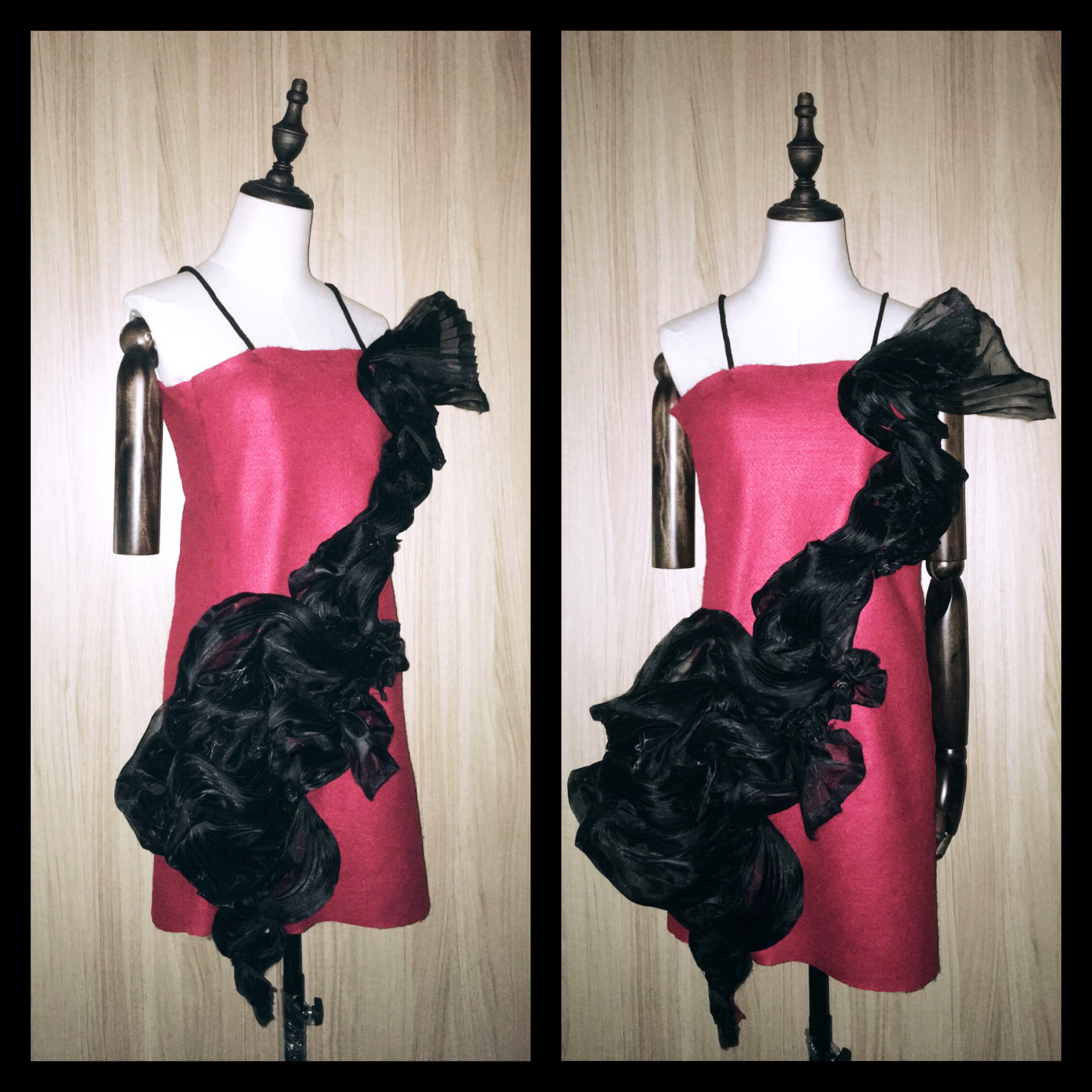
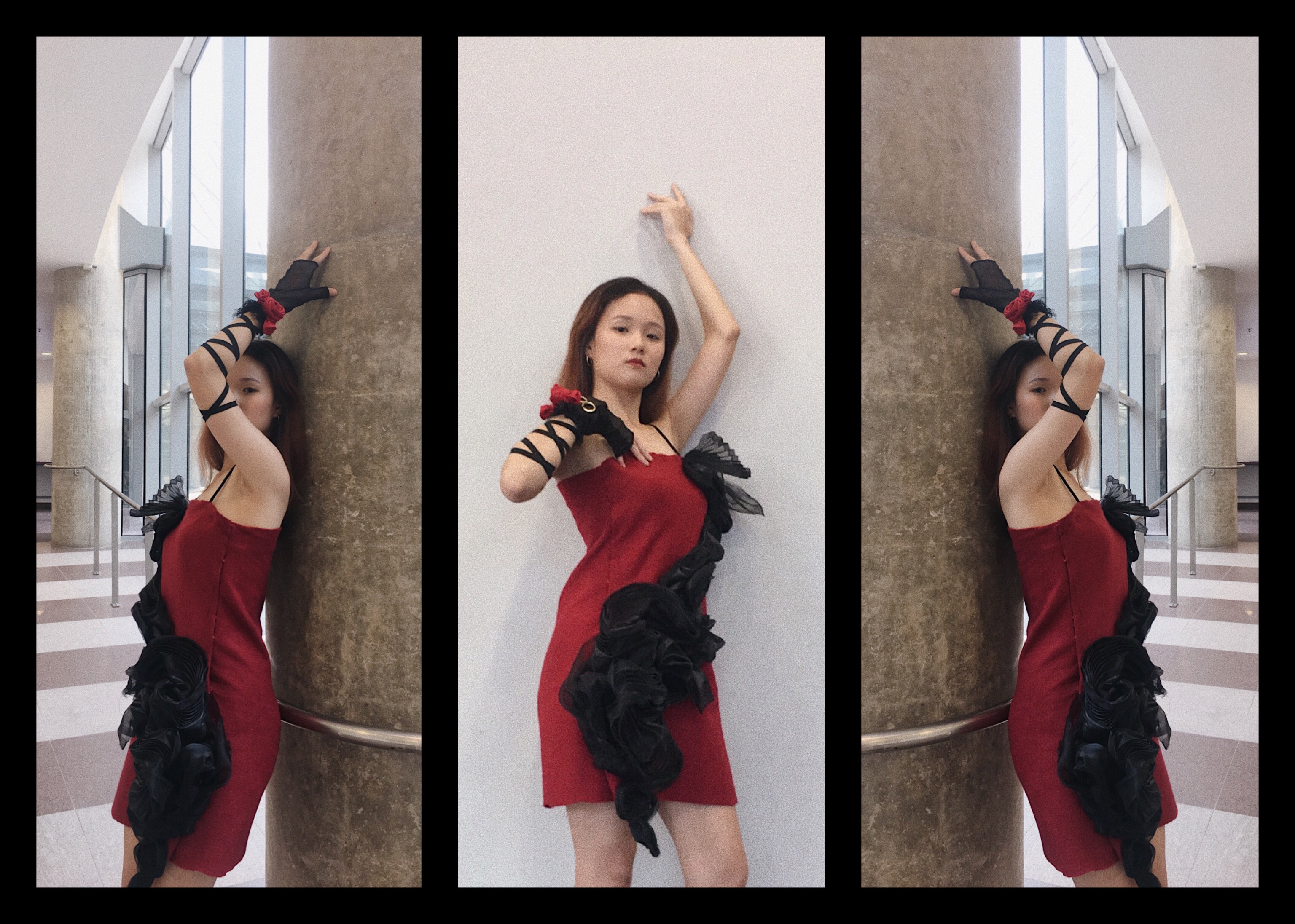
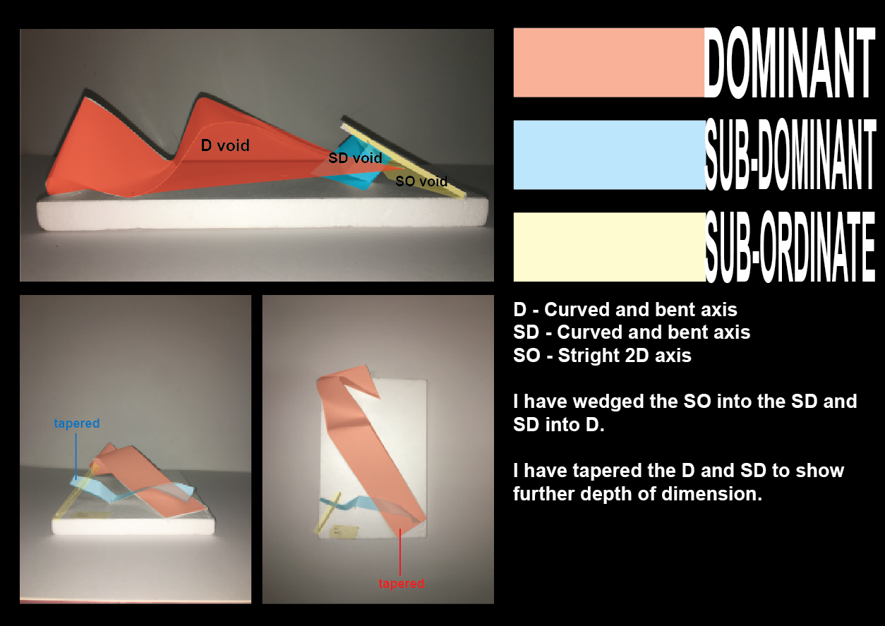
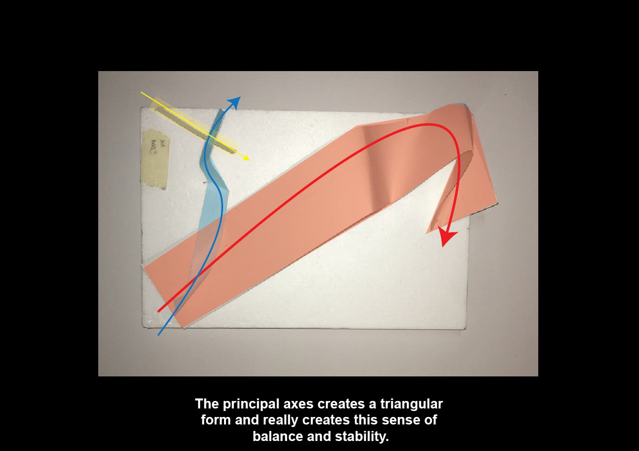
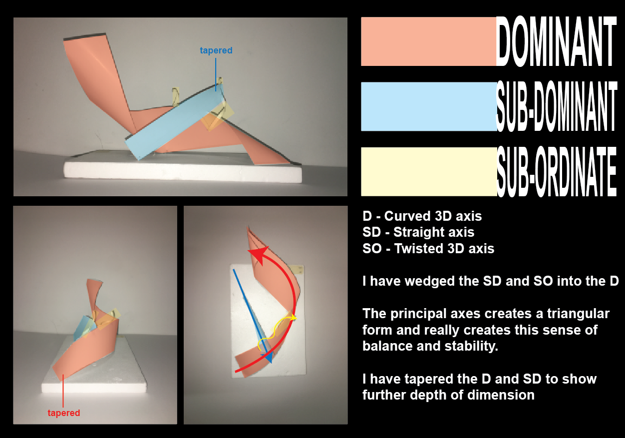
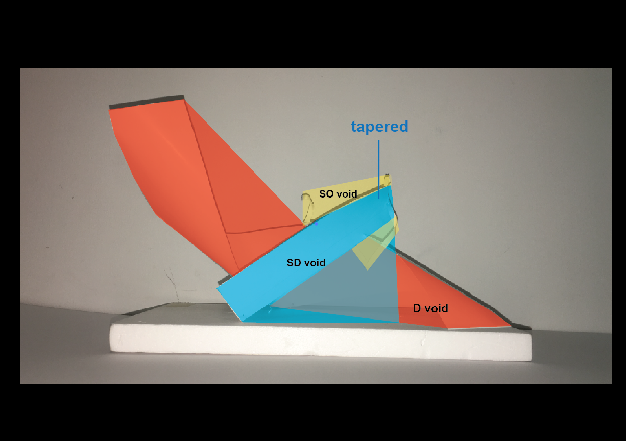
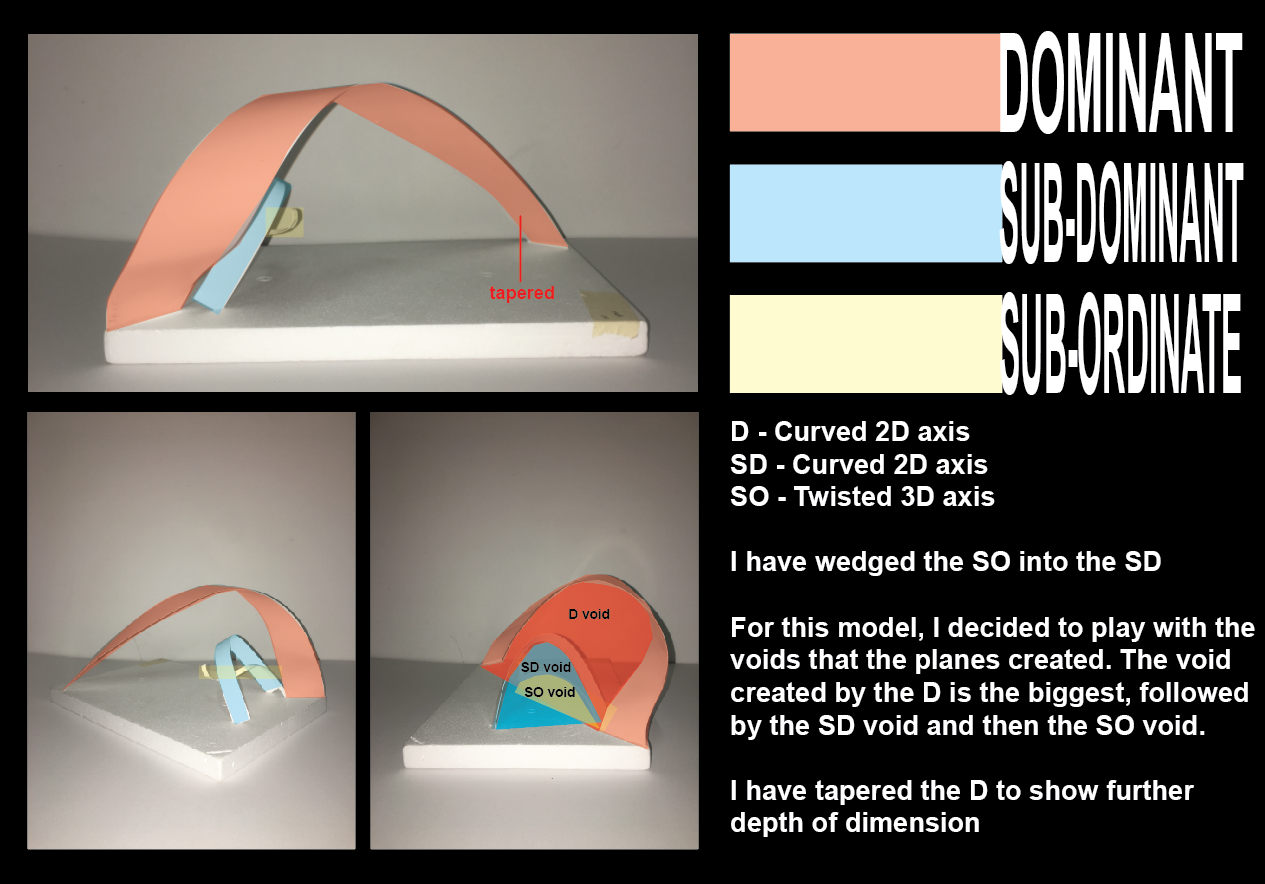
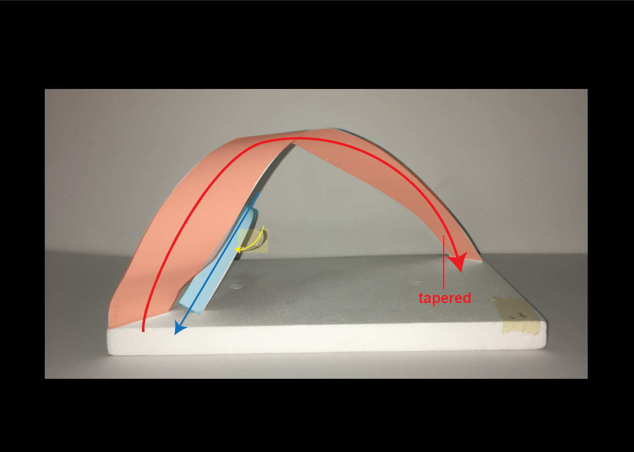
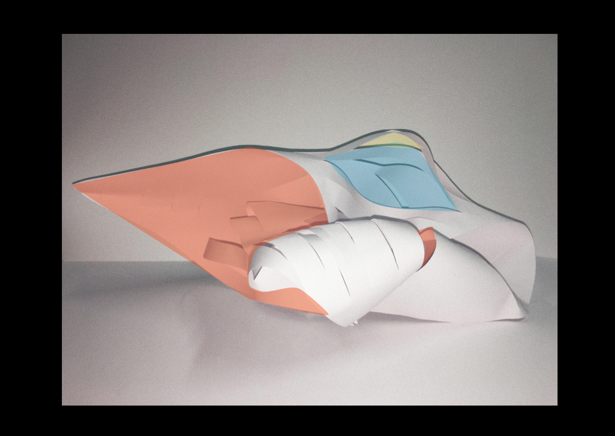
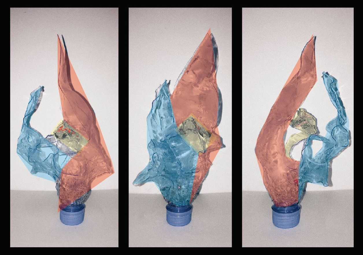
For my design, I really wanted to incorporate the idea of planes. Hence, I settled with planes with curved/ twisted and bent axes.
I wanted my design to have a heavy bottom and a top that is light and almost flying, to show the attribute of a cigar fume. Additionally, I want the design to have lots of flow-y curves that are intertwined (curve/twisted axis) and very layered to suggest the puff. Together with that, I want the curves to be created with sharp folds within (bent axis within the curve axis) to suggest the multi layered red wine.
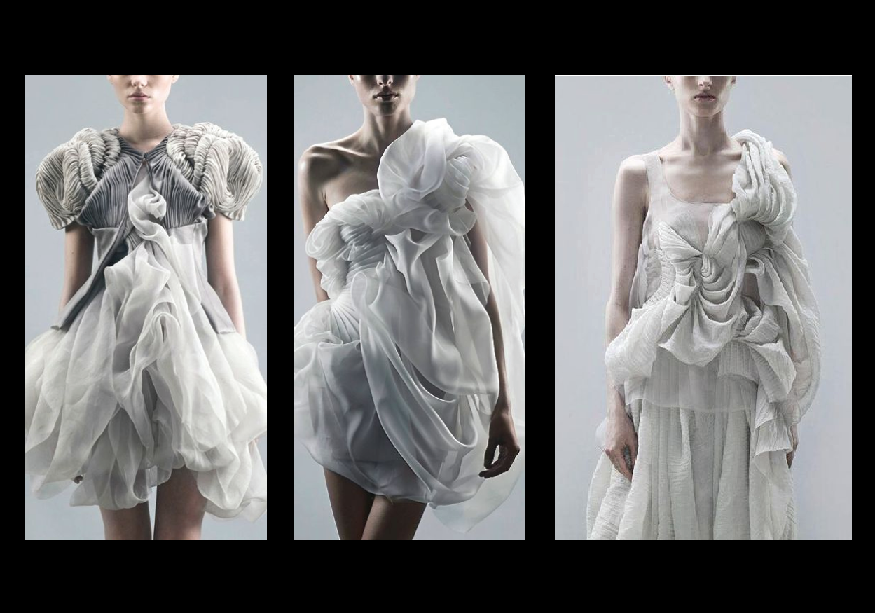
Designer inspiration:
Yiqing Yin S/S 2011
Lan YU Haute Couture F/W 2014
Materials:
For material, I decided on organza as it has a stiff finish like the red wine scent and also is translucent, which reminds me a lot of cigar fumes. In addition, when light hit the organza from different angles, it shows different tones of grey and black, it is as if it is multi-depth, just like red wine.
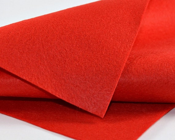
As I want the design to pop from the body and seem like as it is just a cloud passing by in front of the body, I decided to pick a more dense and flat material, which is felt.
The Making:
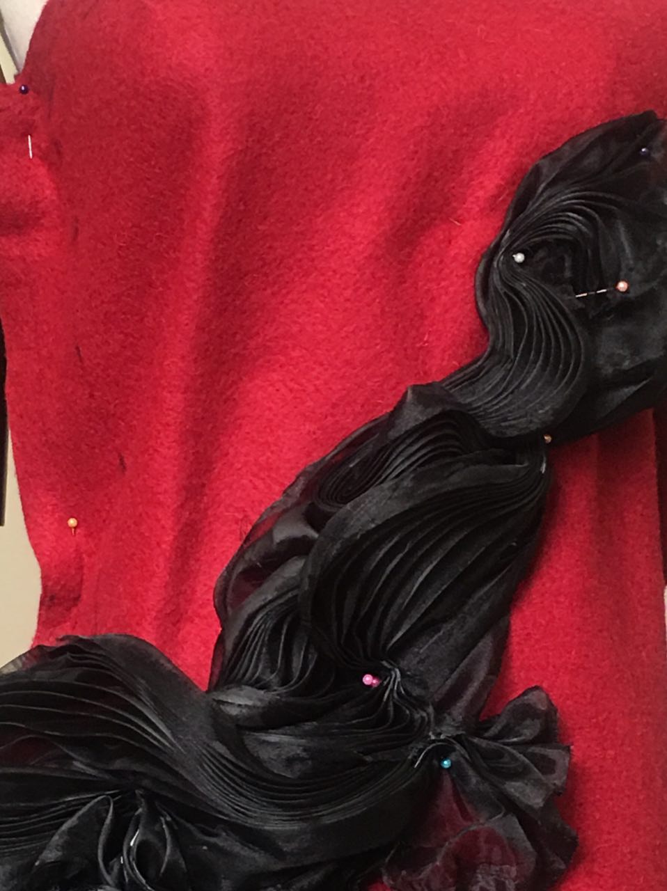
To create the sharp folds on the organza, I folded two paper molds and place the organza in between. I will then use an iron to steam the papers, which contained the fabric. As organza is made from polyester, it will settle into the shape of the molds when under moisture and heat.
After that, I remove the pieces and attached them temporary onto the mannequin with pins to create the form.
That was when I realize that even after I steamed the organza, the folds does not hold. Hence, I went on to coat the folds with stiffener and hair spray. After that, I hand-stitched the organza onto the felt and add the straps.
And, I’m finally done.
Final Piece:
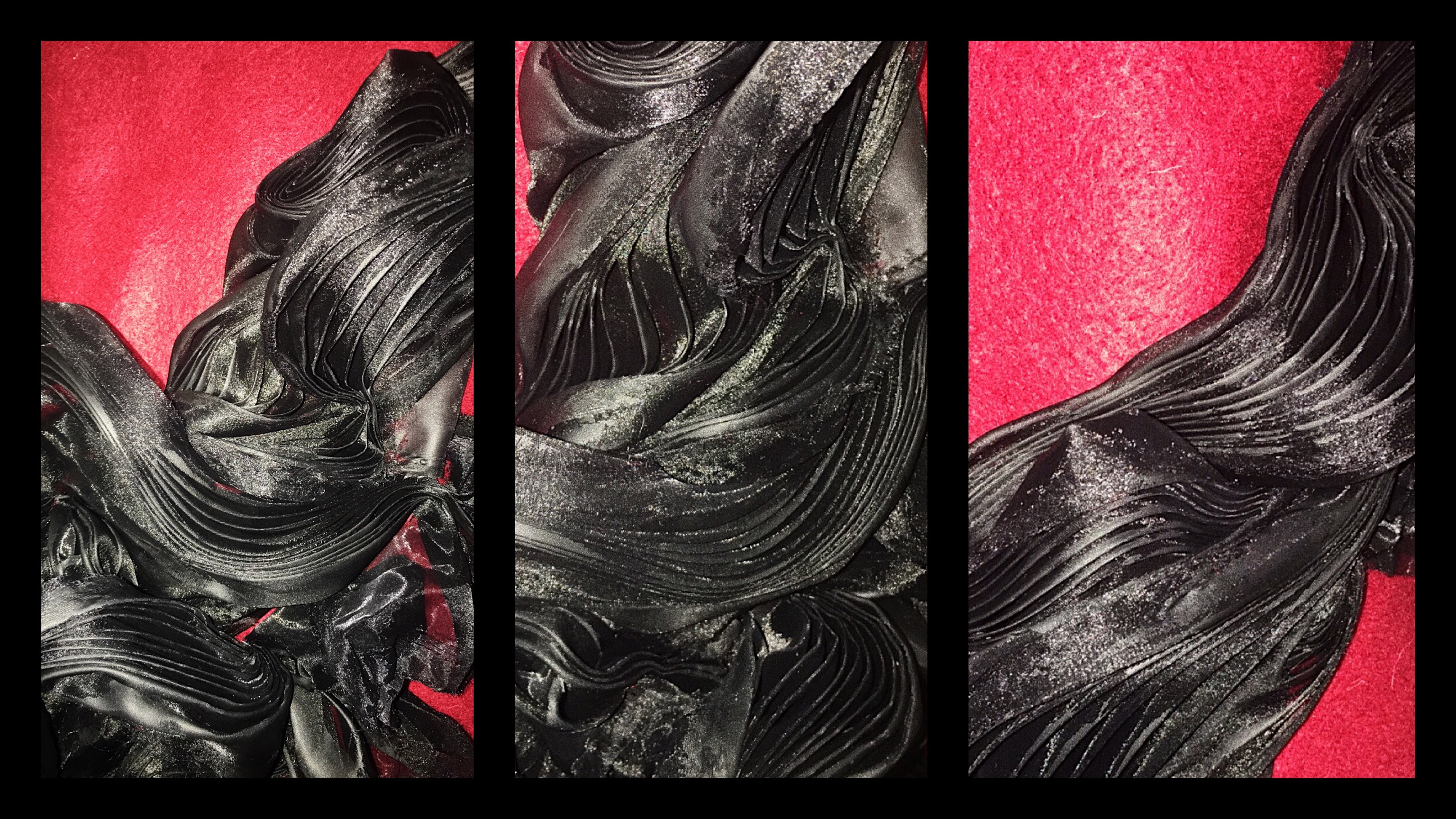
Close up on the curves and folds.
Organza also behaves differently under flash, which adds on to the mystery and the depth of the material.
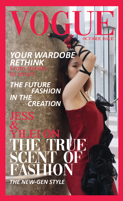
Magazine shoot:
Fashion Show:
Model: Rachel Ng
Together with my dress, it is paired with my group mate Yi Lei’s glove. And as it is a collaborate effort, my dress carries most of the Dominant and the Sub Dominate features while Yi Lei’ glove carries most of the Sub Ordinate feature of this fashion collection.
The scent I was trying to show was the flow-y scent of cigar fumes.
Dominant – Red
Sub Dominate – Blue
Sub Ordinate – Yellow
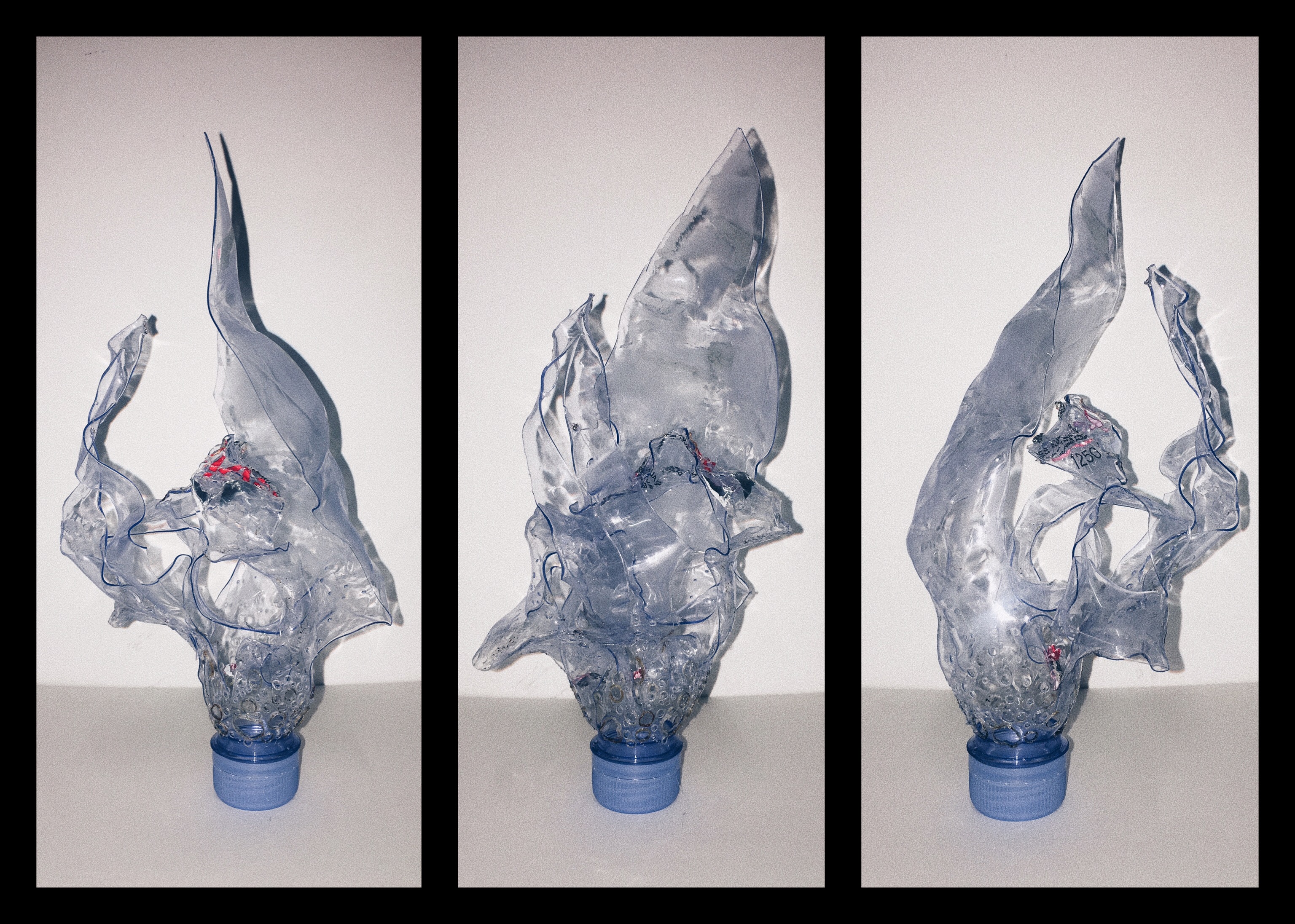
The translucent Evian bottle really allowed some overlapped areas to have a darker colour, which was really interesting. I also sanded some parts of the bottle to make it foggy and more translucent.
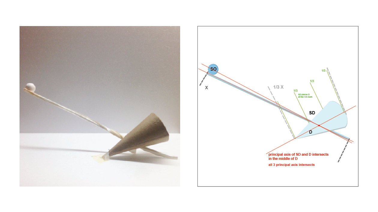
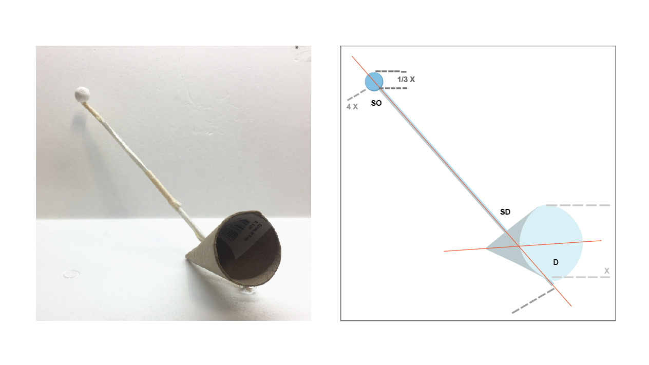
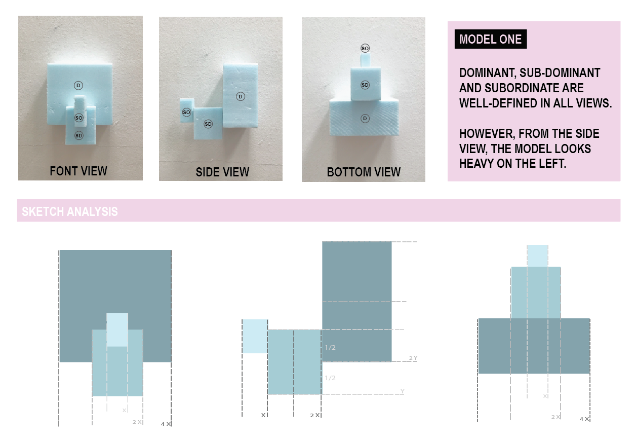
I wanted to create a more dependent composition, in which the long cylinder and sphere will topple over if it is not for the cone to balance the composition.
The small sphere balances the composition to ensure that the cone does not make the product look heavy on the left.
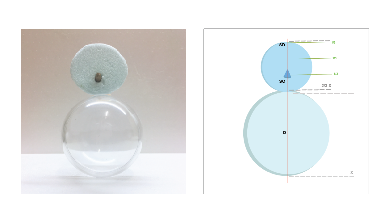
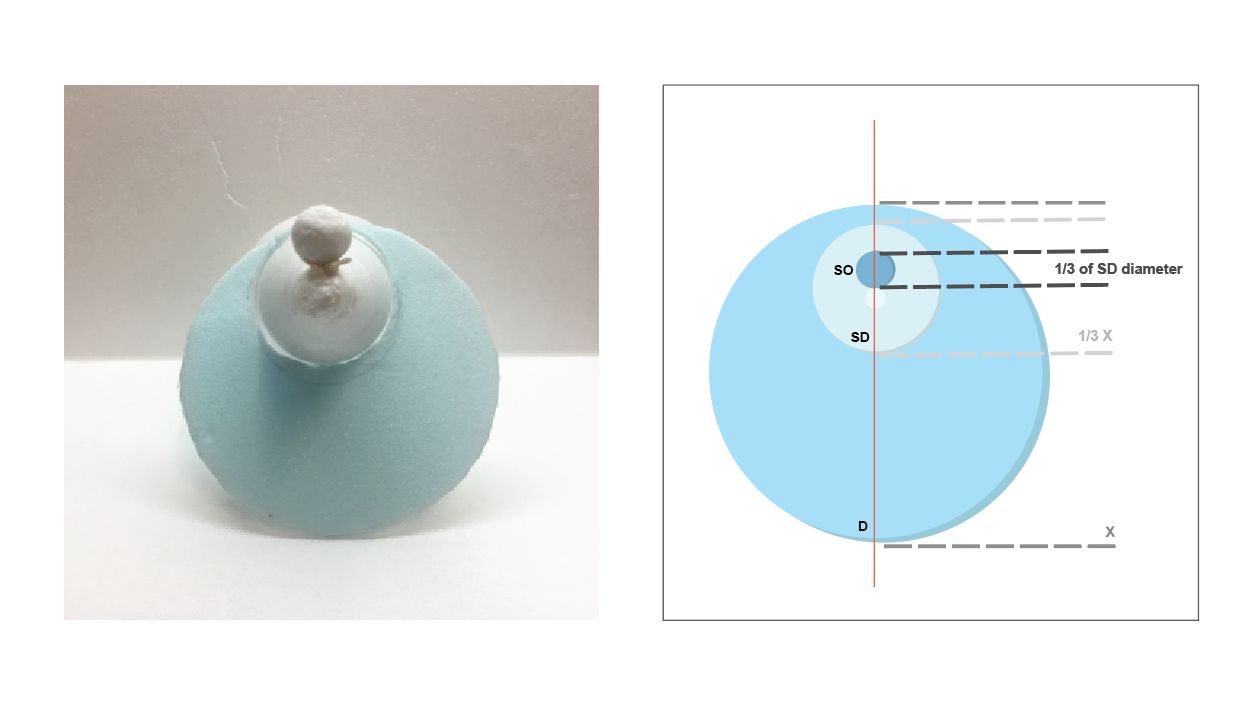
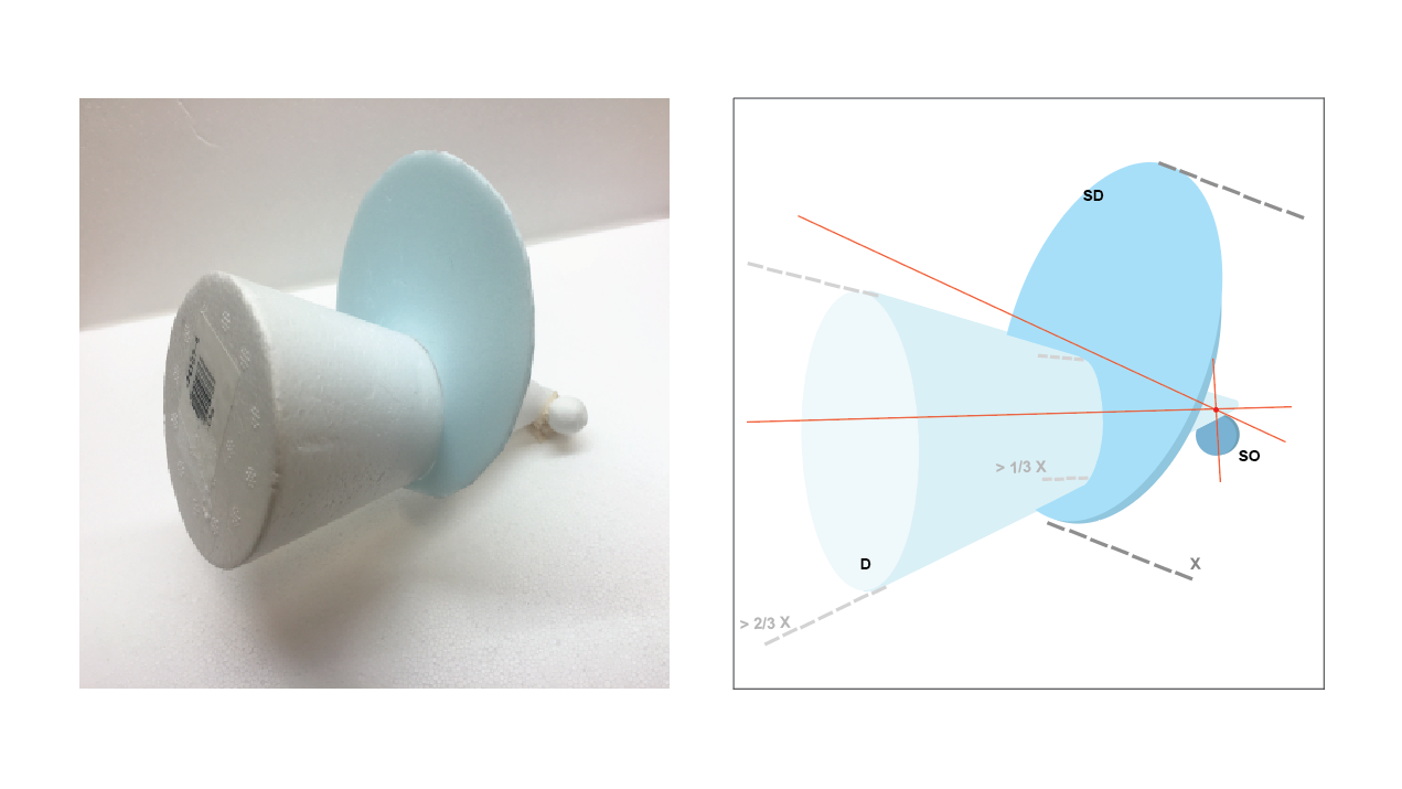
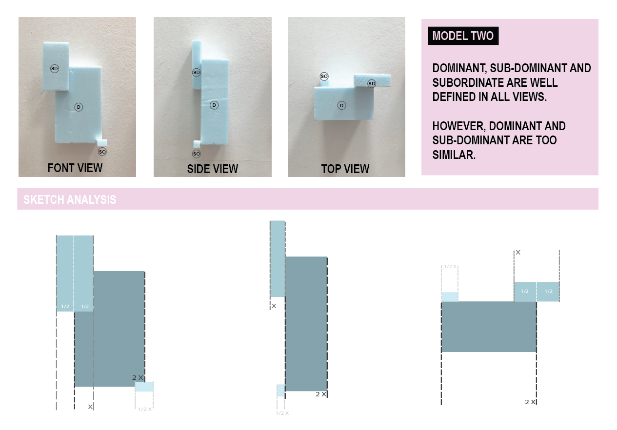
MODEL TWO
Dominant: Sphere
Sub-Dominant: Cylinder
Sub-Ordinate: Cone
FRONT VIEW
SIDE VIEW
I wanted to show a zig-zag composition, coming from right-to-left from the cylinder and left-to-right from the cone.
The D, SD and SO is very obvious here.
This model interest me as it looks stable and interesting at the same time.
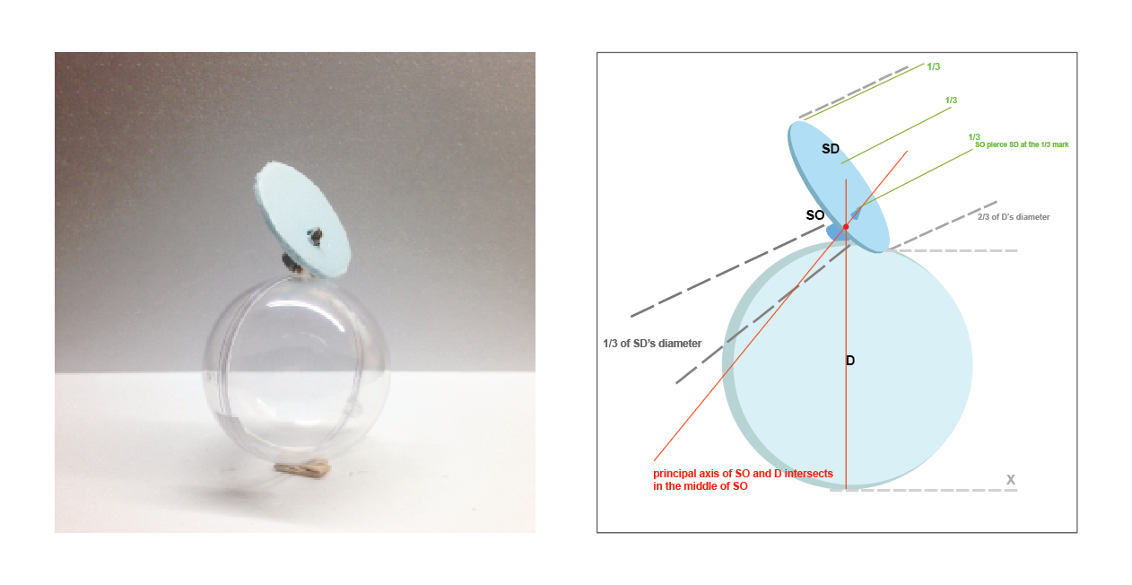
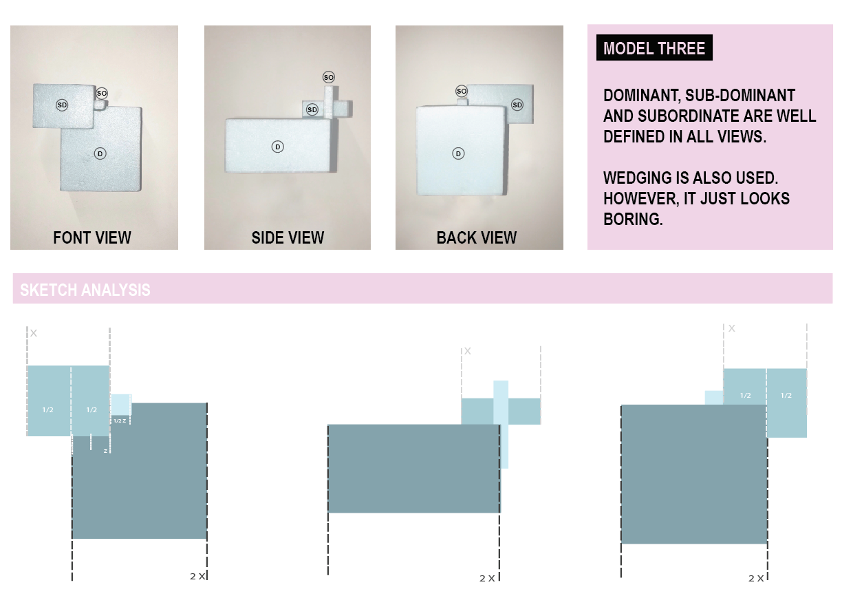
MODEL THREE
Dominant: Cone
Sub-Dominant: Cylinder
Sub-Ordinate: Sphere
FRONT VIEW
SIDE VIEW
OTHER VIEW The cone is precarious in relation to the base cone but is being propped up by the cylinder, hence the overall balance becomes a Dependent composition, in which the composition looks stable and sturdy.
The D and SD switches also between the front view (D-cone, SD-cylinder) and side view(D-cylinder, SD-cone).
However I find this composition boring compared to the previous two.
BRAINSTORM
FINAL MODEL
I decided to settle with Model Two.
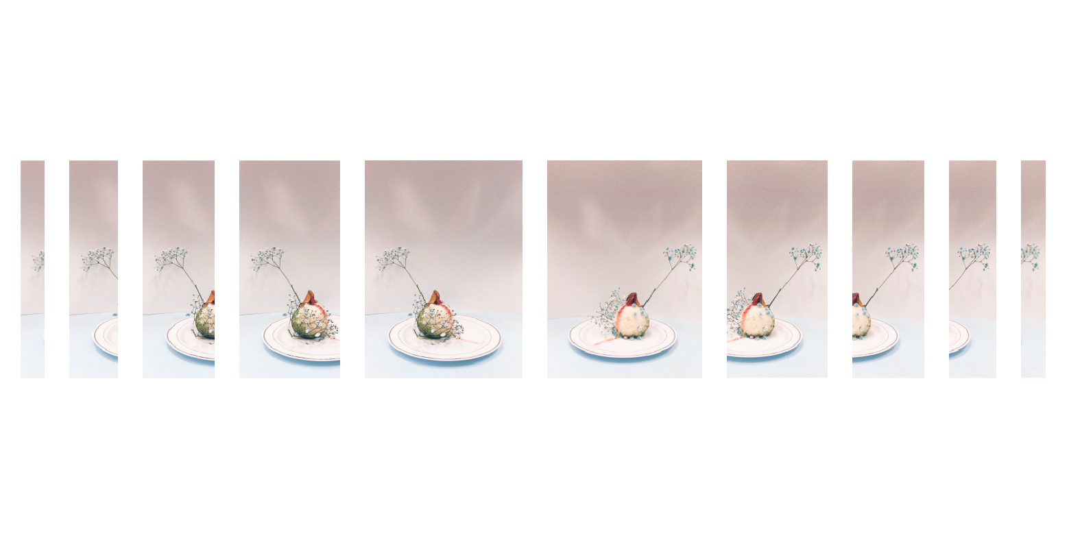
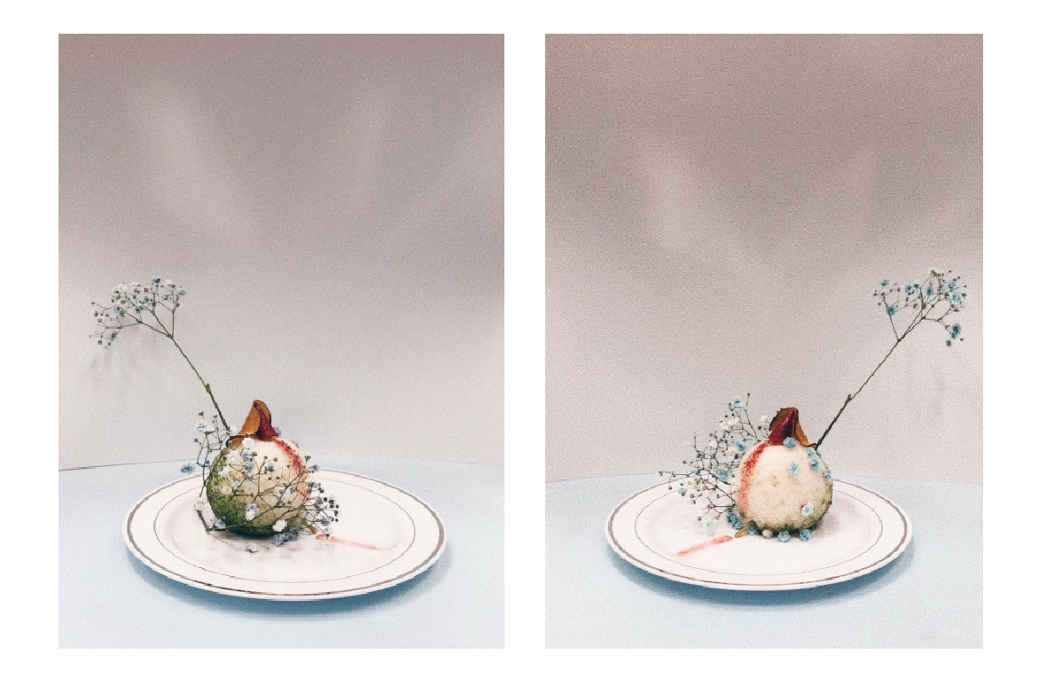
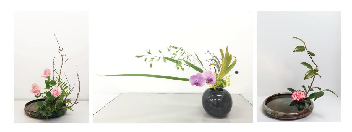
The brunch with the baby’s breath is to off set the balance of the composition, which was greatly inspired by asymmetrical Ikebana.
Rice with matcha powder as sphere, fried tapioca dipped in metallic red as cone and fried potato slice at cylinder.
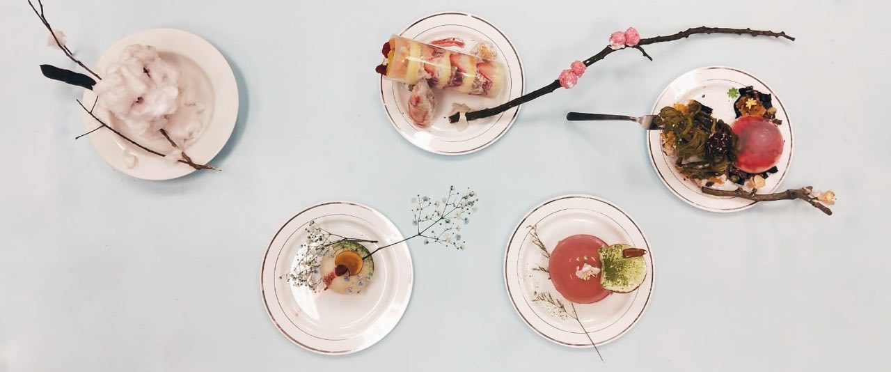
Story:
The idea behind this is actually inspired by this Disney princess called Elsa who turn everything she touch into ice. However, for mine, I wanted to switch it.
The pink cone is actually a girl. The pink trail from the plate to the top of the rice suggest her traveling up, leaving that pop of colour against the cold, plain white colour. The white plate is to suggest the previous season, which is winter, together with the white rice suggesting snow like appearance.
Her trail, her touch has turn the cold, dead winter into something more alive. A new season, spring. Which is the fresh start of growth from winter. To suggest the progress from winter to spring, I added the matcha and the baby’s breath. The pink trail is leads straight to the branch of baby’s breath, which really guides the viewer’s eyes in the transition from winter to spring (white plate to the bunch of baby’s breath).
The metallic dipped tapioca actually emphasizes that important touch of the SO in the whole composition.
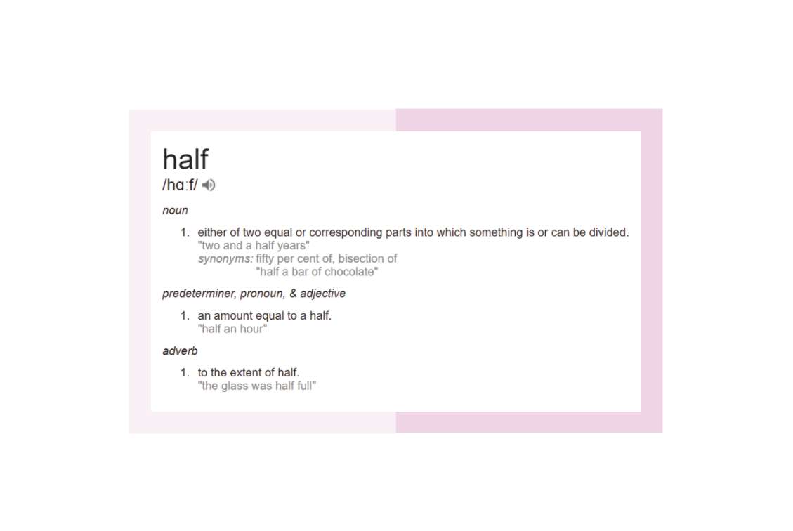
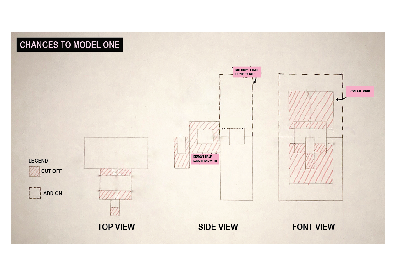
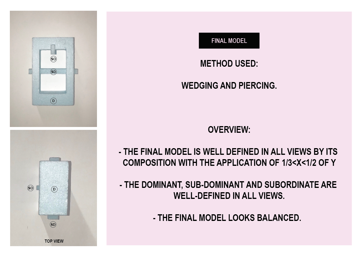
I looked up the definition of “half” and it basically means dissecting something equally into two. Hence, I decided to play with length, width, void and lastly, the density at the end.
MODEL ONE
MODEL TWO
MODEL THREE
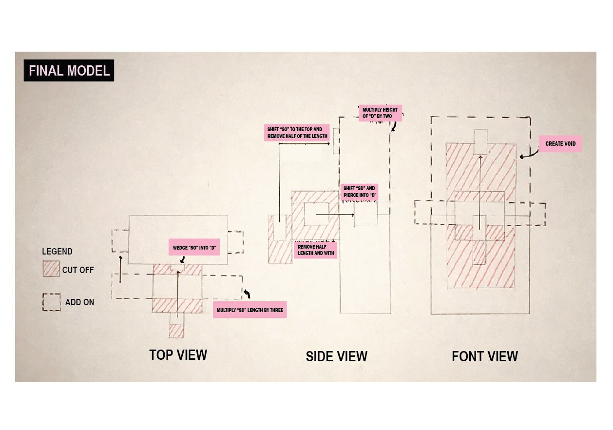
I decided that I like Model 1 the most, so I made some changes to make Model 1 better. I then decided to play with void and half the void.FINAL MODEL
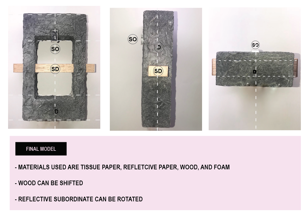
I really wanted to play with texture and the density of the materials I used. The texture of rough cement versus the smooth wood.
Also, the density of wood [800kg/m^3] is roughly half of cement [1600 kg/m^3], again playing with the idea of “half”.
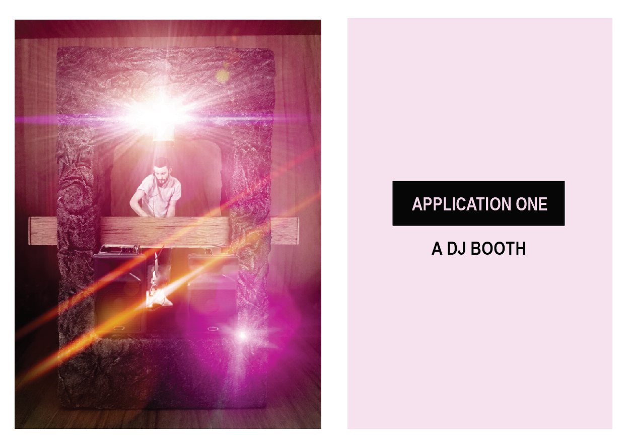
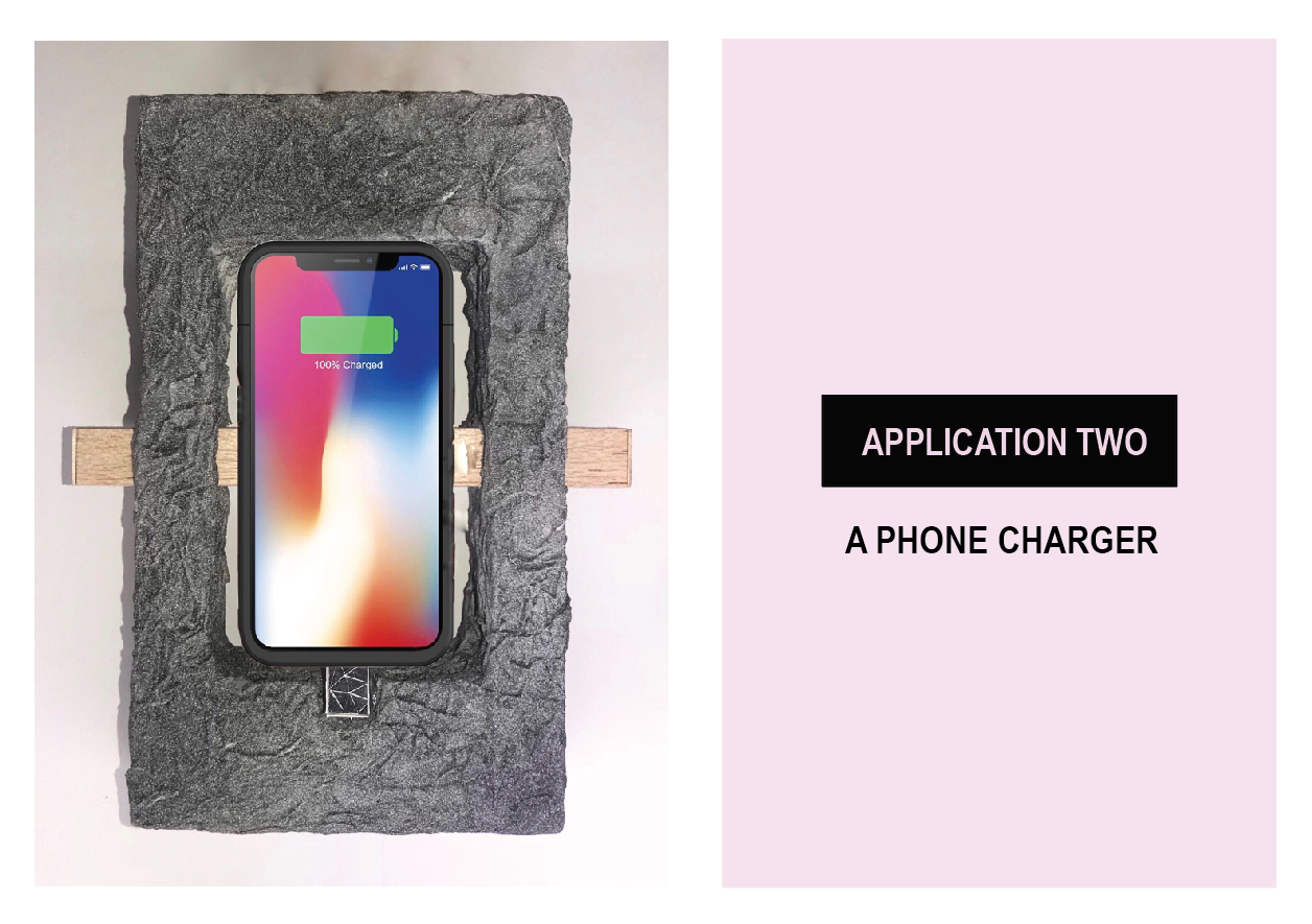
APPLICATIONS
There are two applications: large scale and small scale. Large scale is a DJ booth and small scale is a phone charger.


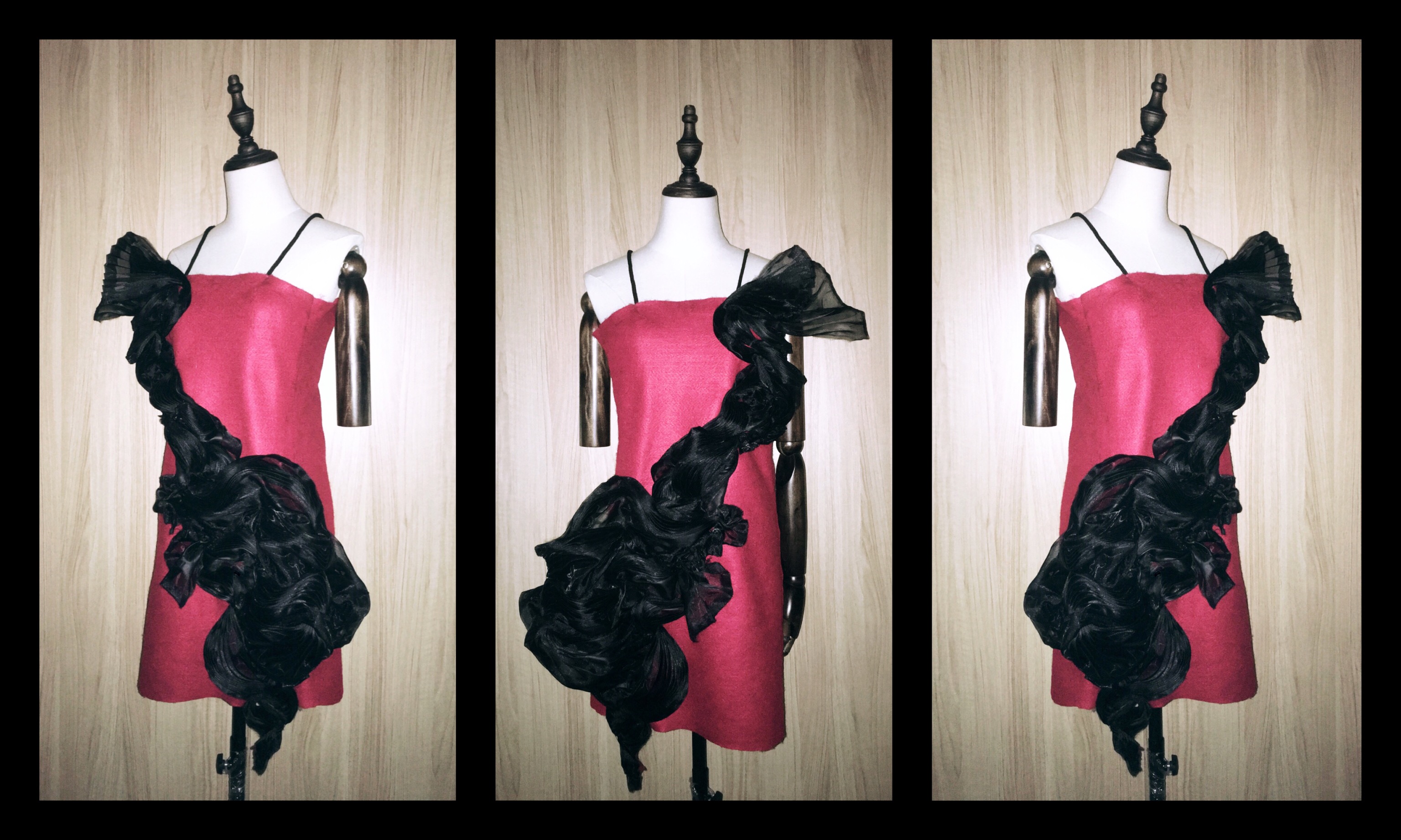

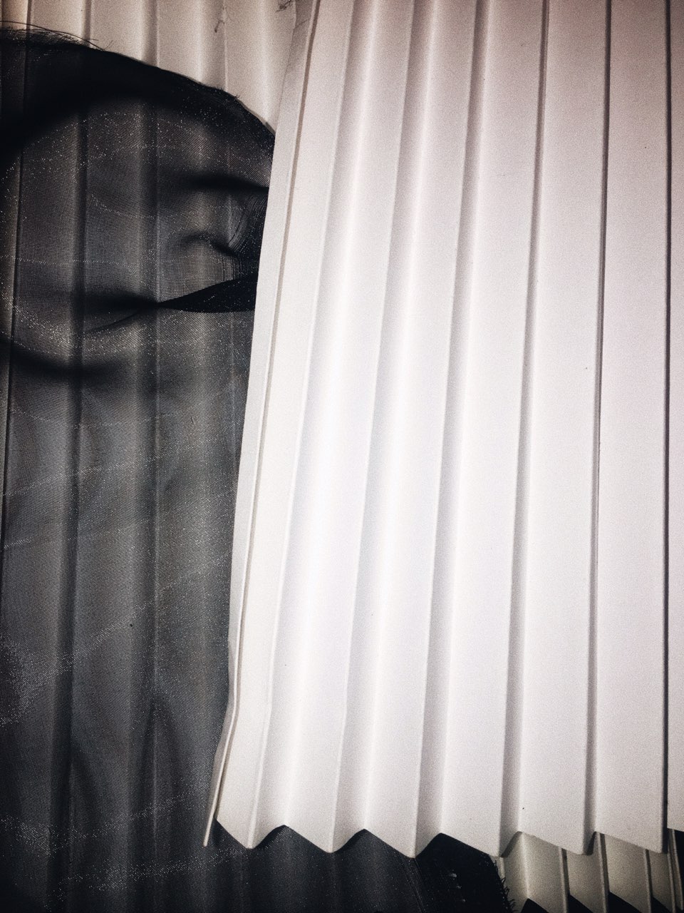 To create the sharp folds on the organza, I folded two paper molds and place the organza in between. I will then use an iron to steam the papers, which contained the fabric. As organza is made from polyester, it will settle into the shape of the molds when under moisture and heat.