Media censorship is something that not only exists in Singapore but the whole world. Movies in Singapore are given ratings (G, PG, PG13, NC16, M18, R21 and NAR (not allowed for all ratings)). In music, an example is Katy Perry’s song being banned due to homosexuality. Some video games are also censored. Television and publications are all controlled by government-controlled companies, MediaCorp and Singapore Press Holdings (SPH) respectively. I am aware that Singapore is only partly democratic but what if we achieve full democracy in expressing our opinions and ideas? Media censorship is essential to protect those who needed it. For example, preventing younger audiences from being exposed to extreme violence and harsh language. However, I think some of these censorship has gone as far as altering the original intent and purpose of the creator. For me, as a creator, I would feel offended if someone alters something I made. Censoring some of it may defeat the purpose of why I made it in the first place. My point here is not about abolishing the idea of media censorship. I am not against it. Media censorship has its negative and positive sides. I’m just curious to know what will happen if one day, everyone is able to express themselves freely without restrictions and the current state of media censorship.
Final Piece:

The Statue of Liberty is an icon of freedom who is behind a jail cell which symbolises the restriction we have. The raised fists are symbols of solidarity. The coming together of people who express themselves freely. The hazy background represents the uncertainty whether media censorship will be any more changes in media censorship in the future. The red cross on Liberty’s mouth is another representation of the restriction we have in voicing our opinions. The raised fists are holding different objects. The microphone represents the freedom to express oneself by speech. The pen represents the freedom to express oneself through writing.
I used lino-cut for the main scene inside the jail cell. The haze, Liberty and the fists are all lino prints. The jail cell itself and the bars are paper cuts. I wanted Liberty to be yellow at first because I personally think that yellow looks awesome on black paper. My mind was set to use black for the background to emphasise that the jail cell is dark and that the future of media censorship is uncertain. Instead, I used complementary colours, green and pink. Initially, I wanted to use red for the raised fists but it doesn’t really show in black paper so I chose the next best alternative which is pink. I also wanted to use white or grey for the haze effect but it’s not available. The jail cell is dirty, old and run-down to show how old the issue is. Media censorship has been there ever since media itself existed. I used charcoal to make the cell look dirty and texture to make it look run-down. I used the one-third rule for the main elements with Liberty in the middle. I used lines for the haze effect in the background.
Difficulties:
This is my first time trying to print different colours using only one lino pad. Now that I think of it, I could have used different lino pads for the different objects in my art piece to make printing easier. OH WELL. It took me quite a number of test prints to get the result that I’m satisfied with. First, I applied green paint on Liberty and printed it. Then pink on the raised fist. This came to be a challenge because it is difficult to apply the paint on the fists without it being accidentally applied to Liberty as well. So I had to use tissue paper to wipe off all pink paint that were accidentally applied on Liberty and the haze. I did the same thing for the haze, wiping off the orange paint from Liberty and the raised fists. One wrong print and you have to start back to square one. It takes a lot of time and patience to get the result you want or at least satisfied with. Another difficulty is the limited choices of colours. I wish there were more choices but what can we do.
Learning take-away:
I learnt how to make do with what we have given the limited colour choices. It is also okay sometimes if things do not turn out as planned as it may look better. Same thing goes as with any lino-cut prints. Patience is key. One wrong print and you’re back to square one.
THE lino pad:


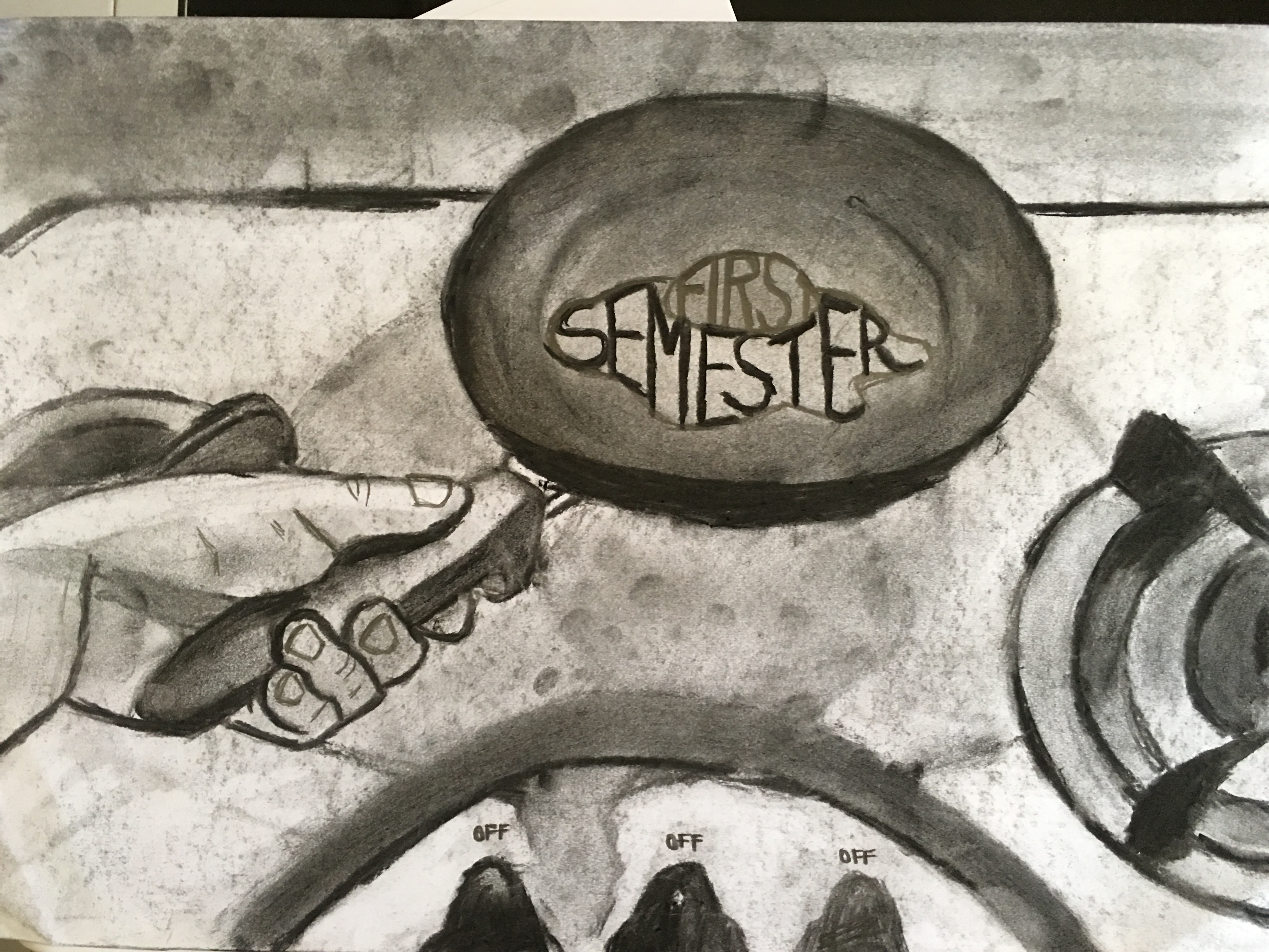
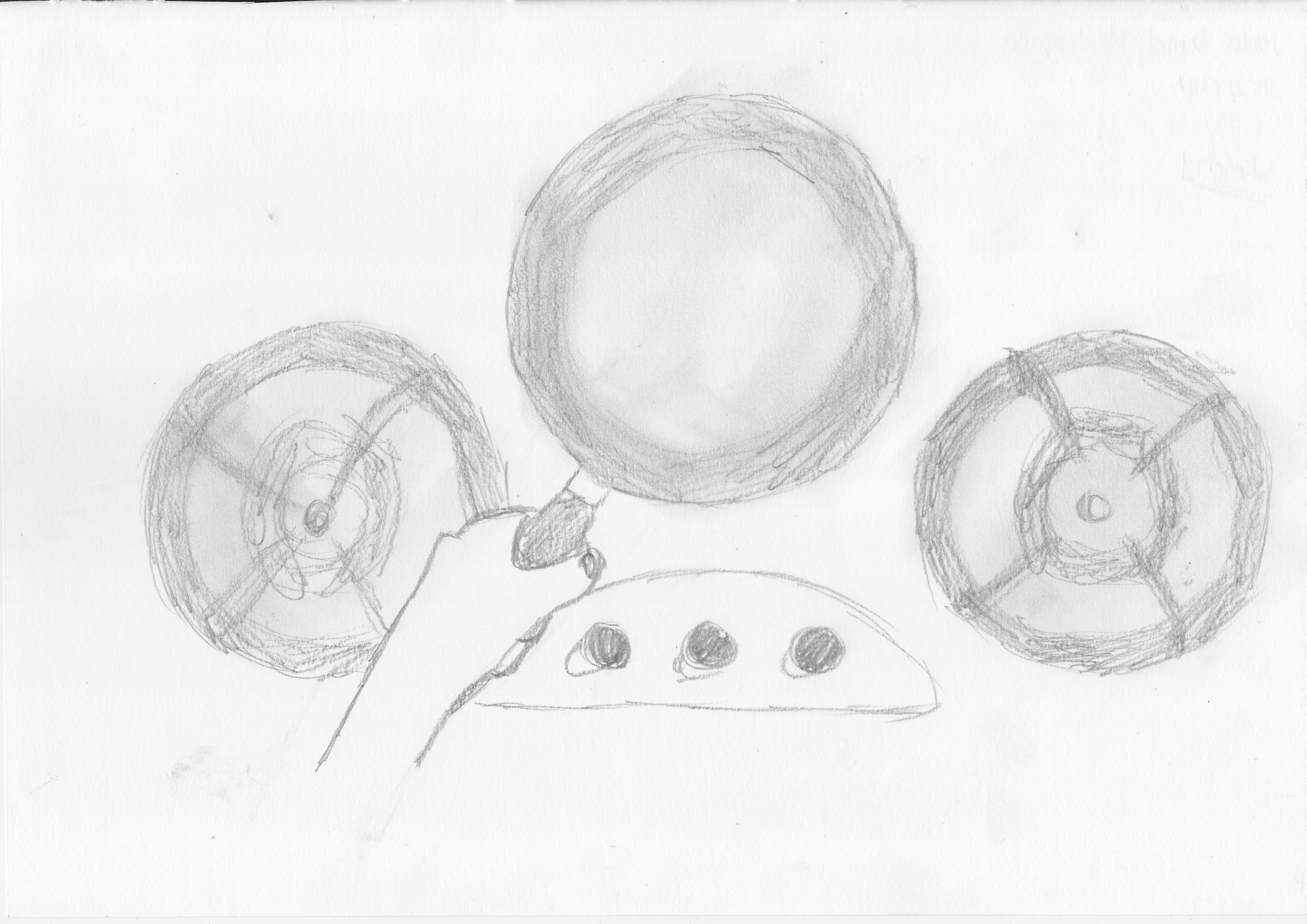
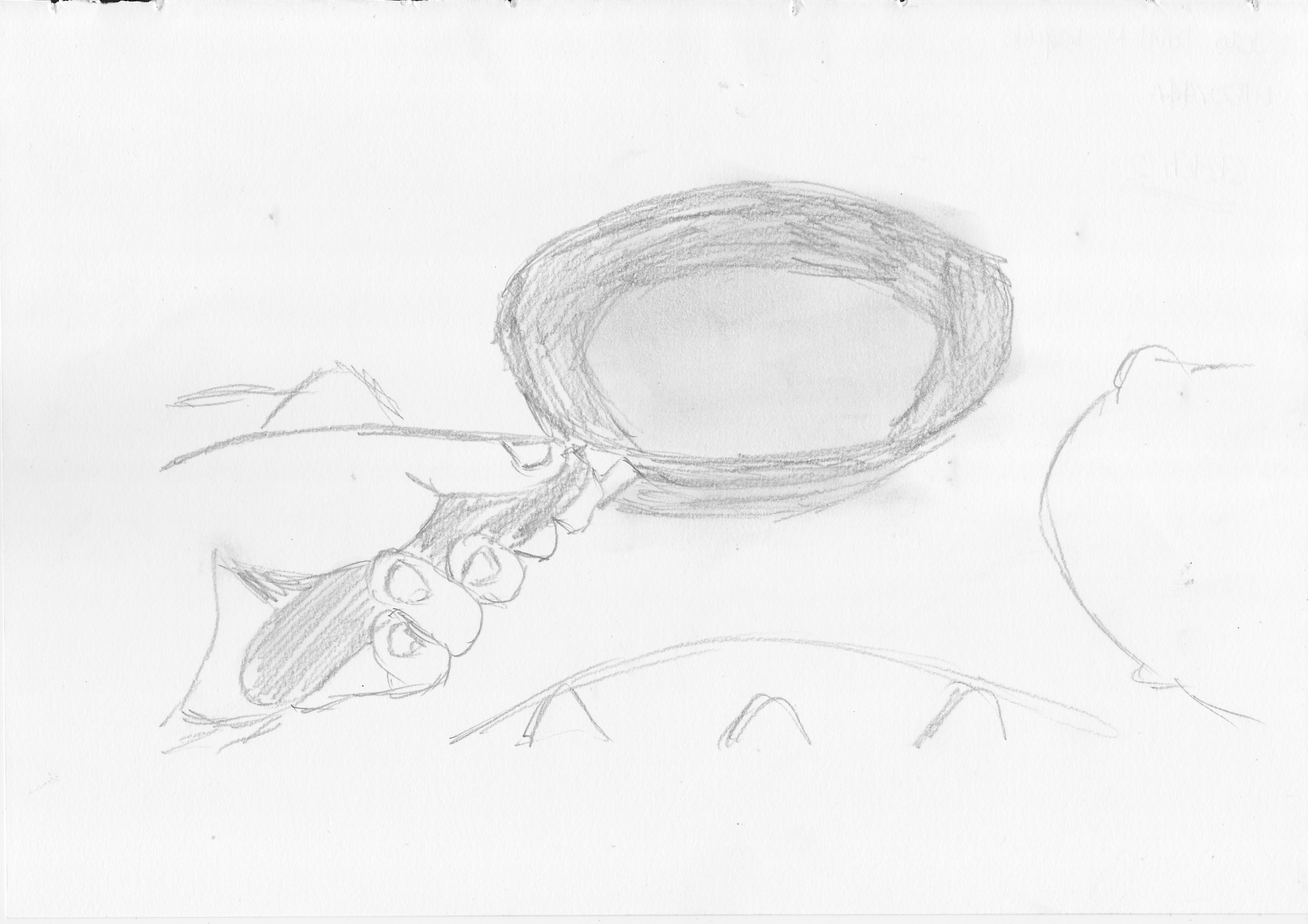
Test prints:
This is me trying to test print using yellow acrylic paint. Obviously, it did not turn out well.

Trying out different colours. I also tried test printing two colours at the same time. These were all printed in one go.


Test printing in black paper.


 .
.