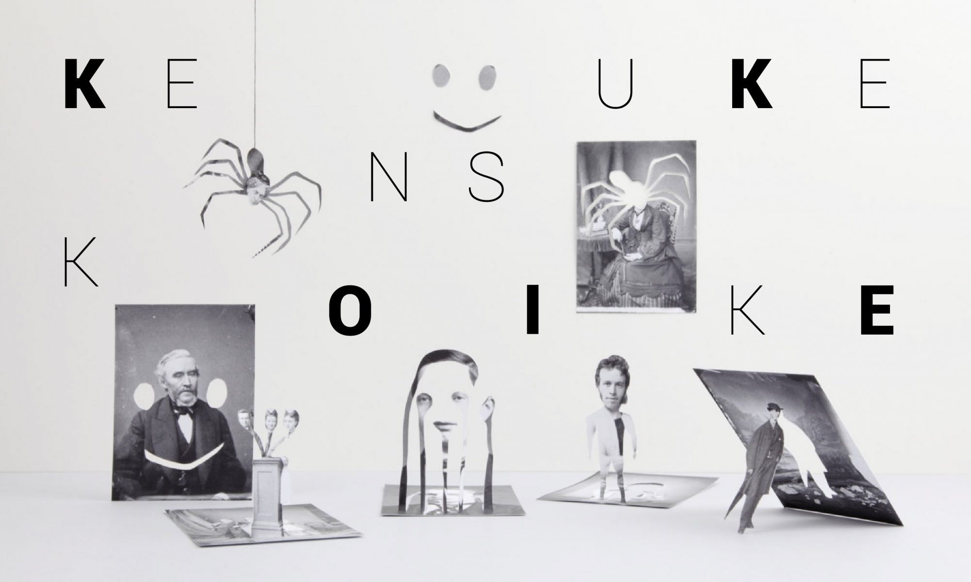
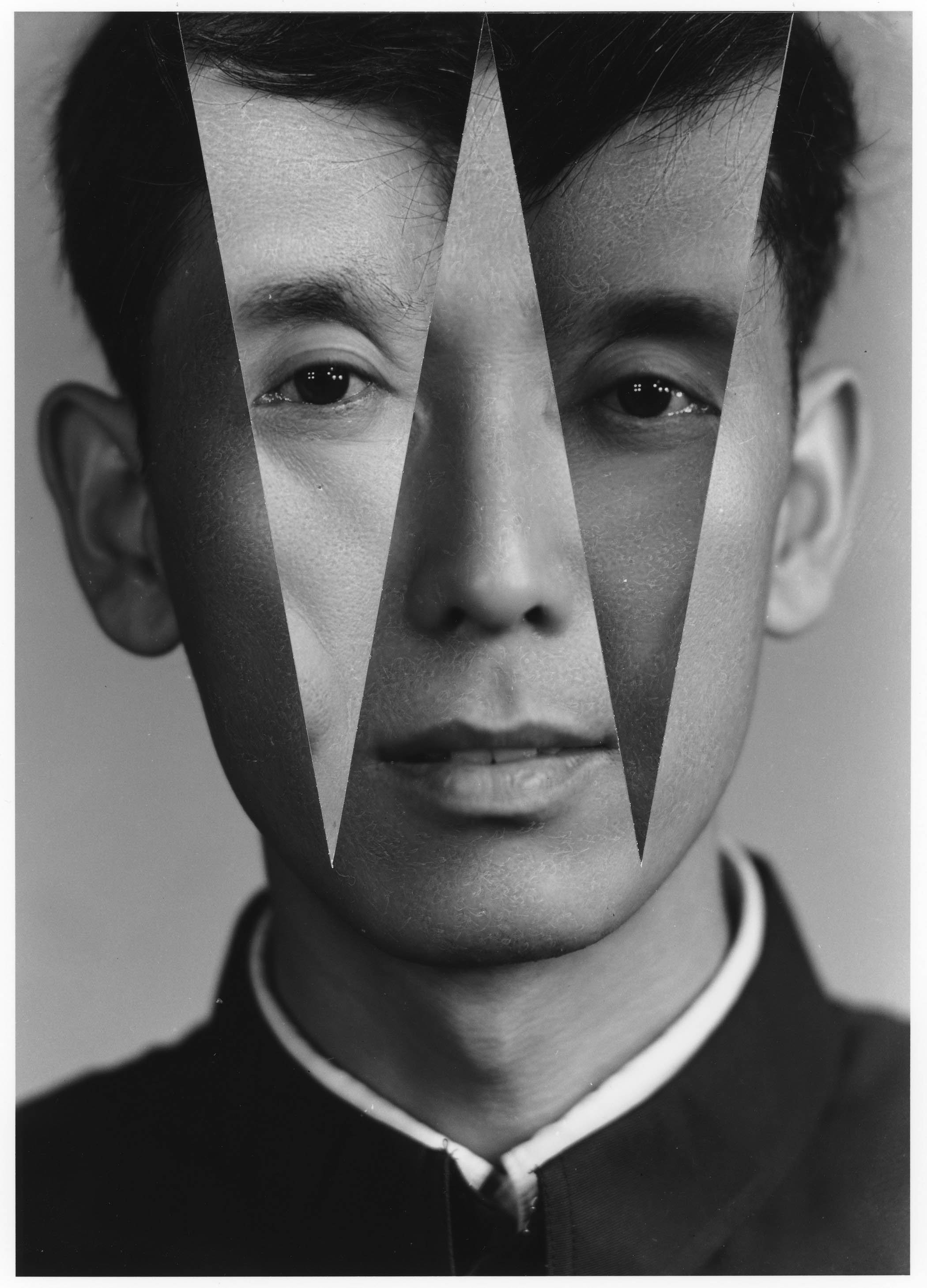
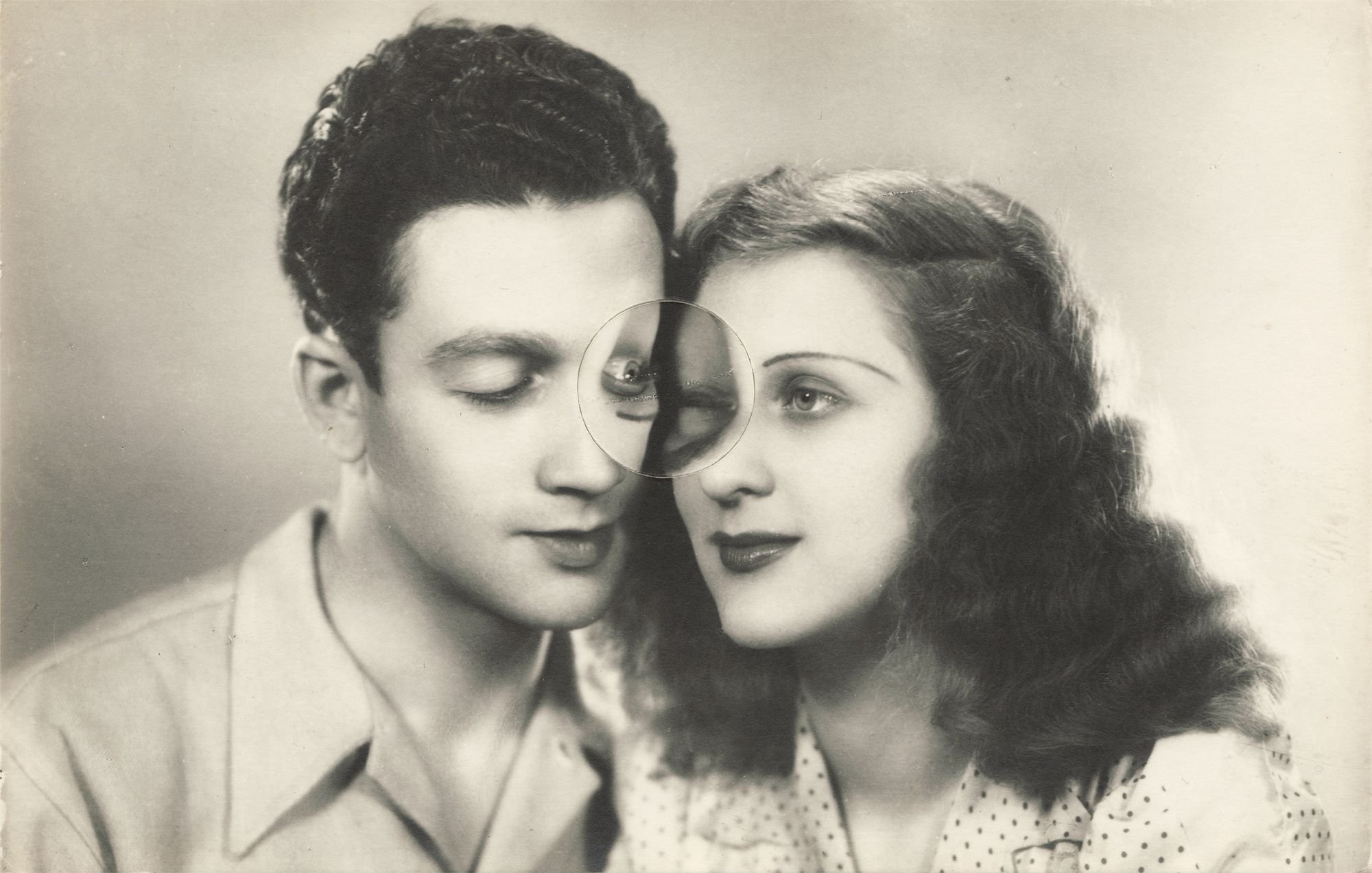
Kensuke Koike is a Japanese contemporary visual artist based in Venice who works on a variety of different mediums. Although he does installations and sculptures, he is most well known for his collage art where he deals with the deconstruction and reconstruction of the works. He was first inspired by the vintage photographs he found from flea markets and hence started exploring the possibilities of manipulating images from such photographs and postcards. From combining different images, he eventually moved to ‘single image processing’ where he manipulates a single image to discover the outcomes he can get from it.
The beauty of his works lies mainly in the creation process and hence he usually documents and uploads them onto his socials. I first discovered his works from Instagram when I was scrolling through my explore page and I thought that his works were so intriguing to me. They were fascinating with an endearing goofy surreal twist to me which made me want to see more of his works and how he applies his creativity to them. Despite the simple manipulation, he is able to produce results that I would never have imagined. The enchantment of seeing how someone was able to look at the same image in a different perspective from me was really captivating.
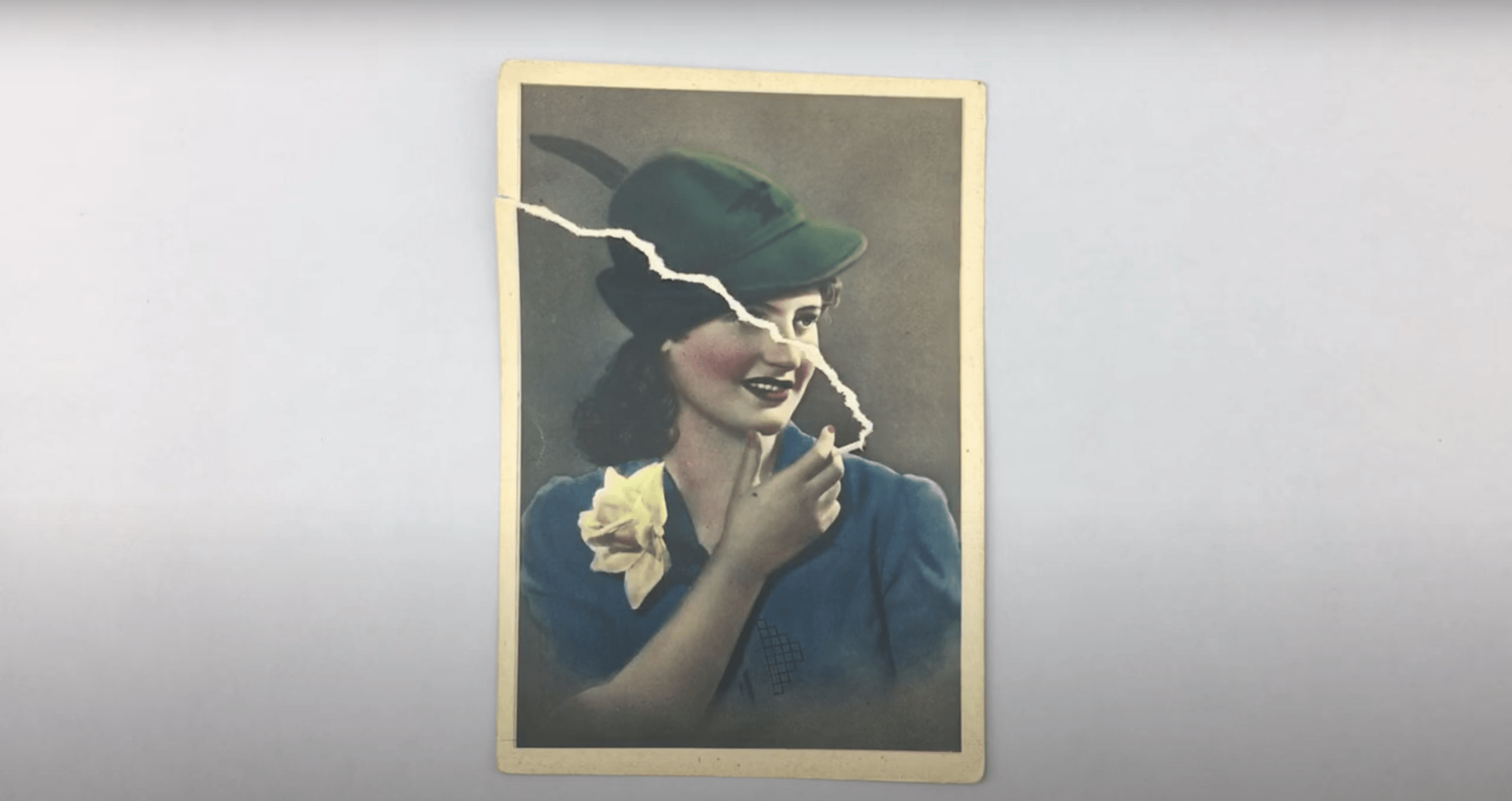
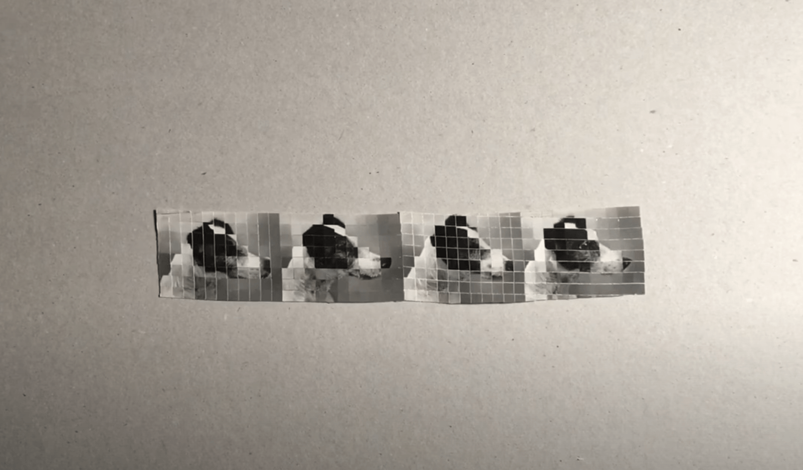
From Project “No More, No Less.”, a collaboration between Kensuke Koike & Thomas SauvinNothing Special Happened Today, 2013
NOTHING ADDED, NOTHING REMOVED/
A lot of times in our creative process, we tend to view the idea of having a single theme or concept as being too restrictive for us to develop our ideas. As a result, we often have the tendency to bring in other ideas to create over-embellished works. After seeing Kensuke Koike’s works though, I think all the more we should allow ourselves to be open to explore within a single theme when faced with restrictions. This might not necessarily mean taking the minimal way out, we should also make sure to be precise in addressing the target issue while learning how to think out of the box. I thought that this practice was really helpful to adopt to keep me reflecting upon how I can approach a concept in different ways while pushing me to think creatively.
Cordroc’h. (2019, May 30). Kensuke Koike, Deconstructing and Reconstructing Photography. Pen Magazine International. https://pen-online.com/arts/kensuke-koike-deconstructs-photos-to-reconstruct/ INTERVIEWED KENSUKE KOIKE. (n.d.). BEYOND PHOTOGRAPHY – The Leading Experimental Photography Platform. Retrieved October 2, 2020, from https://www.beyondphotography.online/interviewed-kensuke-koike
LensCulture, K. K. |. (n.d.). Nothing Added, Nothing Removed. LensCulture. Retrieved October 2, 2020, from https://www.lensculture.com/articles/kensuke-koike-nothing-added-nothing-removed Milosevic, N. (2013, July 5). Kensuke Koike | Widewalls. Widewalls. https://www.widewalls.ch/artists/kensuke-koike
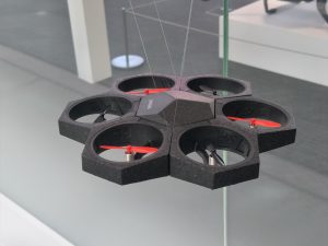
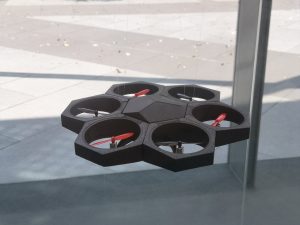
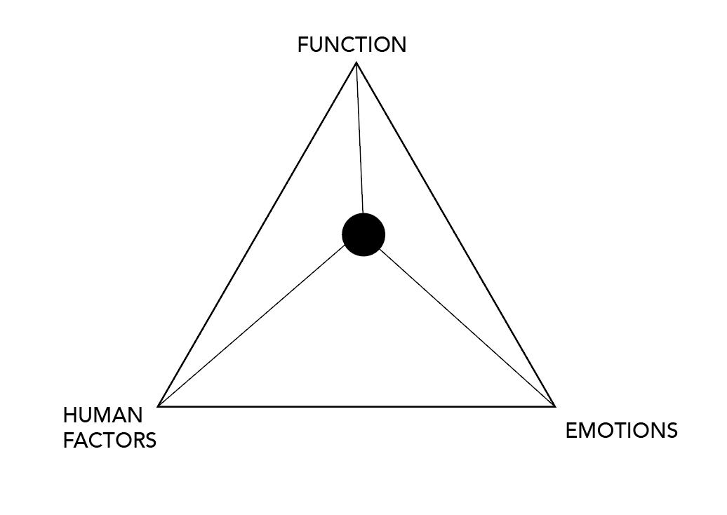
The product that caught my eye was this Airblock drone for education. I always thought that drones were interesting especially camera drones because they allow you to film a beautiful view and magnificent wide angle scenery. However, I always felt that the designs of drones could be improved to improve the safety of the machine because the exposed propellers are extremely dangerous and intimidating so the moment I saw this drone, I was drawn to it. The design allowed the propellers to work to its potential yet has protective walls around it for easy handling. On top of that, the overall design gave the product a really interesting look almost like a honeycomb look. Hence to me, this product fulfils the maximum potential of the function, emotion and human factor.
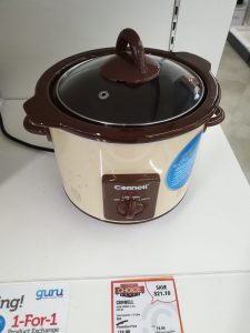
For this slow cooker, I would say that it leans more towards the emotion part, since to me the design looked more retro and would seem to evoke more sentiments for buyers to be interested in purchasing the product. In terms of function and human factors, I do not think it was really lacking in it as it would definitely function nicely as a slow cooker with the design to adjust different pressures and the design caters nicely to human usage as well with the handles for ease of handling.
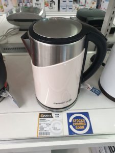
For the kettle, I felt that it caters more towards the function . The design allowed for a large water capacity and also the sleek design allows for a maximisation of space. While it serves its function, I felt that it was lacking in the human factors and emotion sector as it felt very rigid design wise. I also felt that more details could be in the design in order to score for the human factors, for example the spout could have a lid to prevent dust from entering.
For the first item that I took interest was this slow cooker. Amongst the trend of having steel and slivery appearance on the exterior, this slow cooker retained a very retro look with the browns and the beige colours. It brings a sense of nostalgia and as if the food was slow cooked in a pot lit by charcoal rather than gas.
The second item was this kettle and I really appreciate how minimal it looks. I really like the sleek design that it is just a simple cylinder with a handle that curves perfectly to the kettle. Apart from the fancy kettle designs available in the market now, seeing something so simple was really pleasing to my eyes.
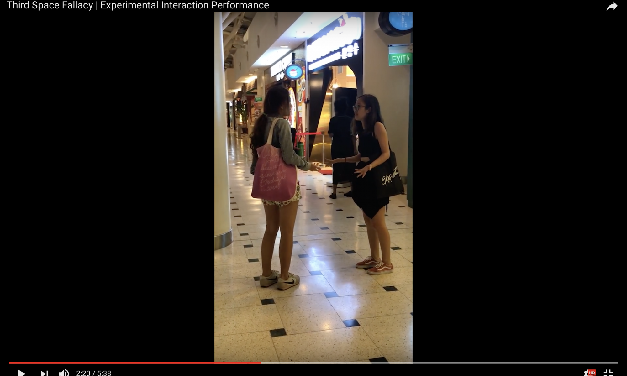
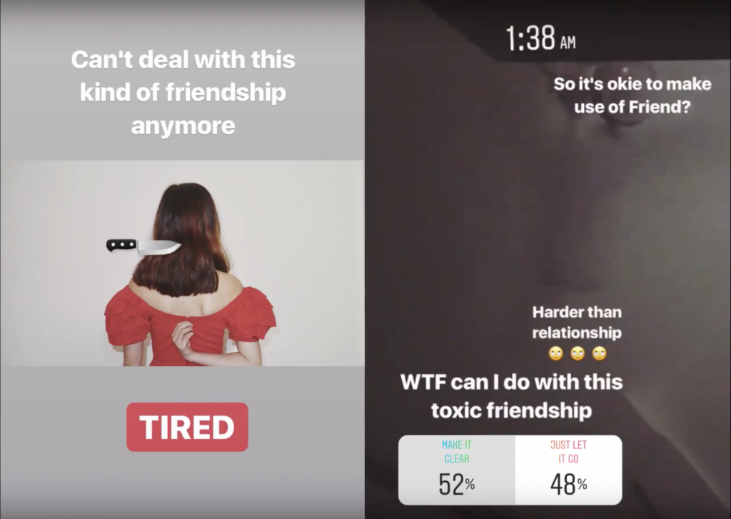
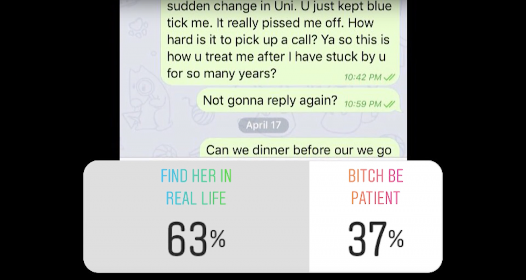
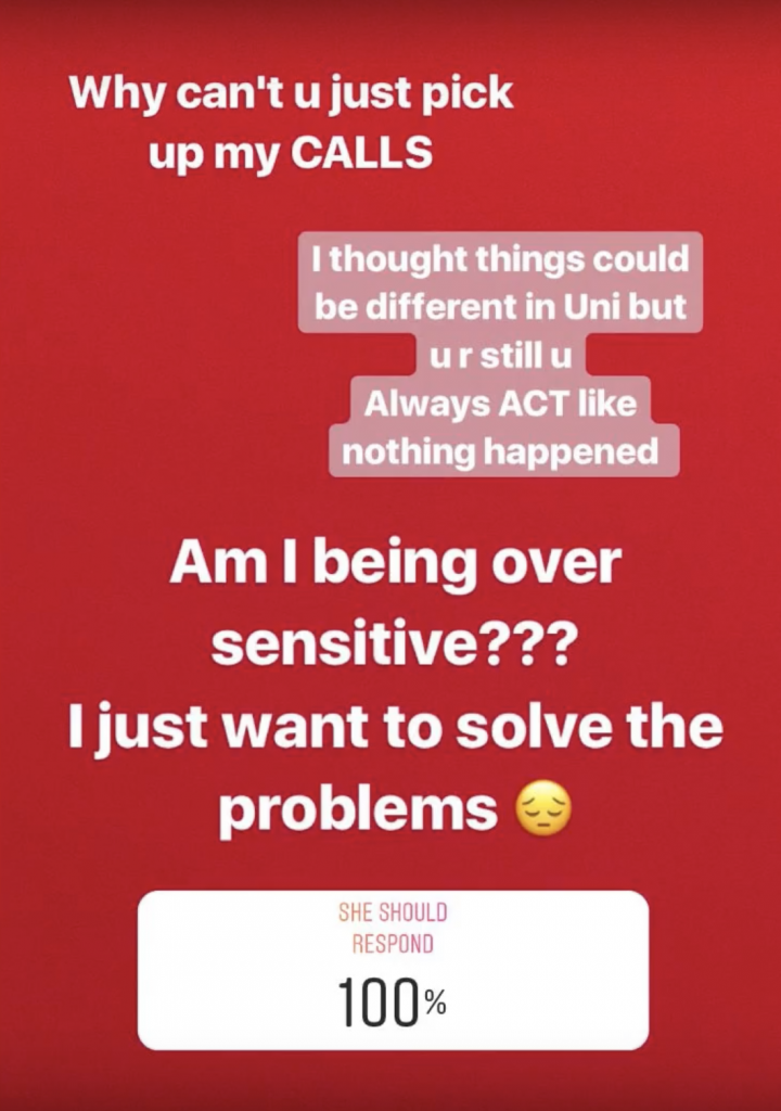
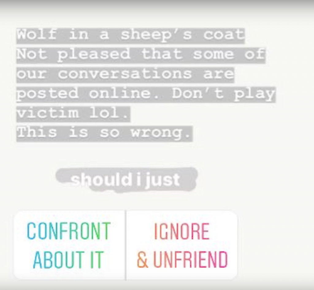
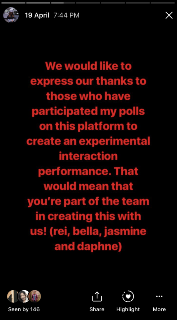
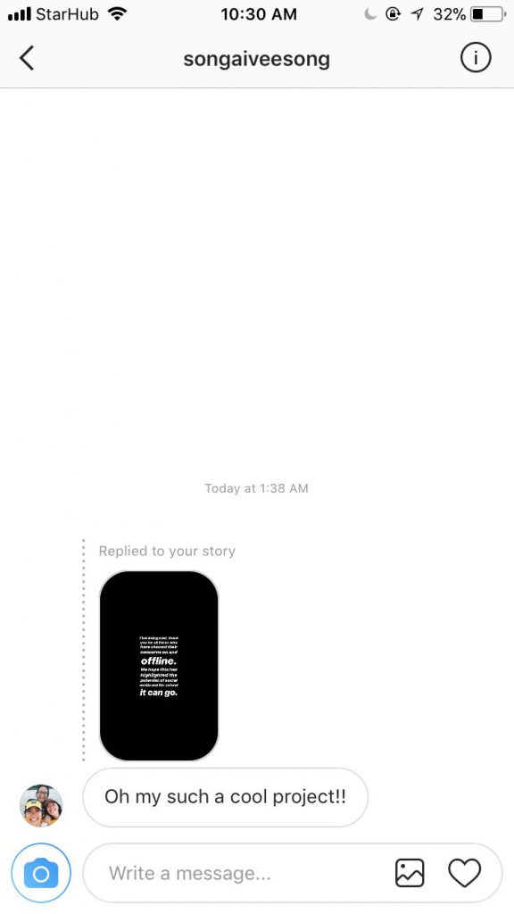
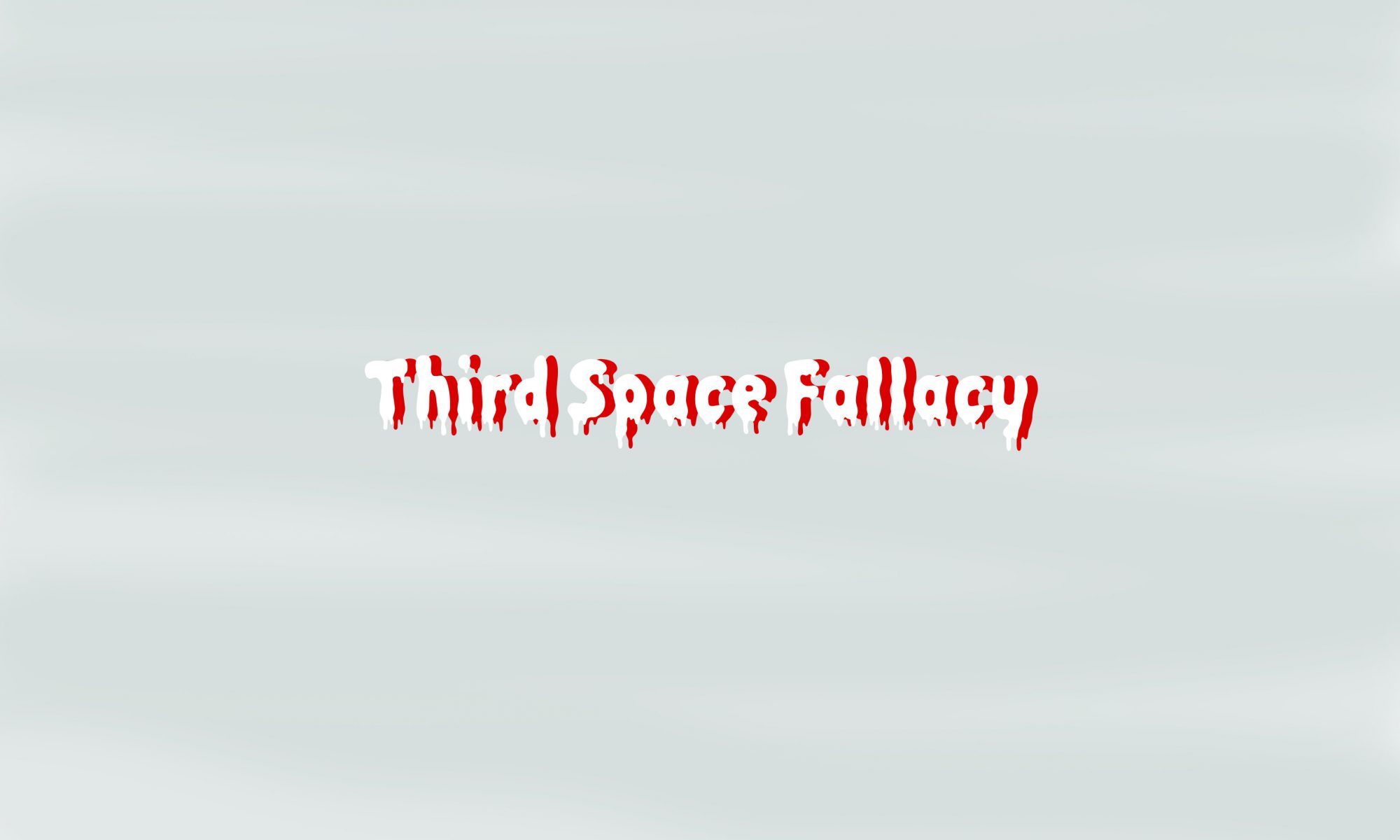
For our final project called ‘Third Space Fallacy‘, we decided to set the context as a drama fight scene between two girls from our group, Bella and Daphne. Before we carried out our performance, which is the actual day of the fight at Jurong Point mall, the girls were each posting on their Instagram accounts, building up the tension and to spread awareness of their drama to their friends around in a subtle way. They would post contents such as screenshots of their ‘planned’ conversations and emotional posts to hint at their rocky friendship, while inserting some polls here and there to ask their online audience for ‘help’ for the next move.
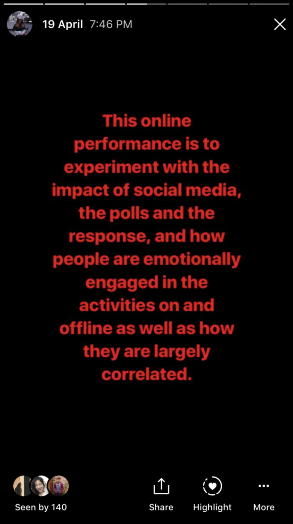
What the audience did not know was that, whenever they made a poll or replied to their stories, they were indirectly affecting the choices of the two girls. We wanted to reflect this about real-life situations were people would turn to social media to get advice about their problems and sometimes, the opinions of these people actually fuel negative effects and result in tragedy unimagined.
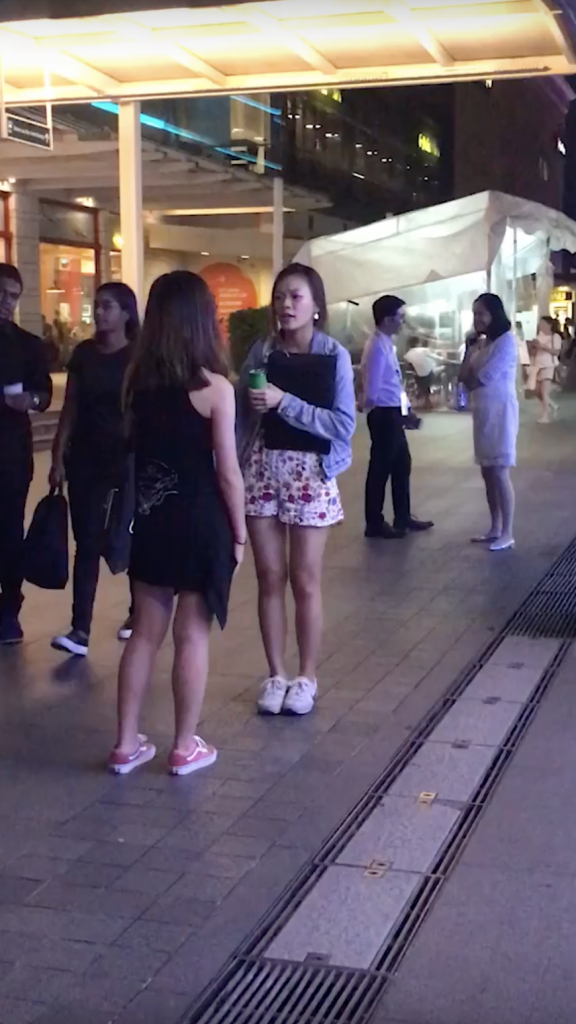
Similarly for this case, we found out from the polls that they led to a conclusion to their fight, which result in Bella having to confront Daphne about their fight. We then bring the situation to Jurong Point mall, where an actual fight scene between the two girls occurred and it is even captured on camera. We note down that the people around them during the ‘fight’ actually stole a few glances at them during the process, recording their response to the performance.
On top of that, we also created a fake story, along with a fake Instagram account to leak to some of the online audience that we would be carrying out our previous plan of playing games at Changi Airport to gather greater involvement from the audience in our current project. We soon realised that during the polling period, many amongst the online audience actually felt emotionally involved in the drama because they thought it was real. While some replied with casual comments, most people actually private messaged the girls to check up on what exactly happened with a concerned tone. We wanted our project to exactly reach this stage of uncertainty, where people might actually believe that the ‘planned’ drama was real.
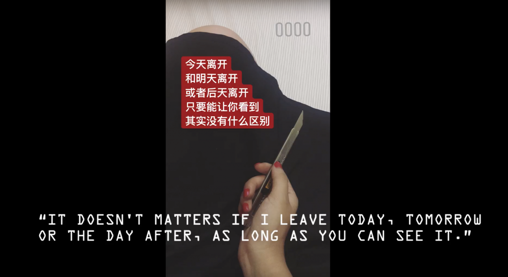
From there, we made a fake news kind of trailer to convey the entire planned performance, ending with a result that was voted by the online audience unknowingly, which was Bella’s ‘death’.
We wanted to make use of Bella’s third space death to convey a message that online and offline comment matters a lot. While the people voted in the polls and replied to their posts, they are unknowingly making a choice for the parties involved and this actually led to someone’s death. There has been many articles whereby people get affected by what they see online and resulted in so many tragedies and we wanted to bring that message across.
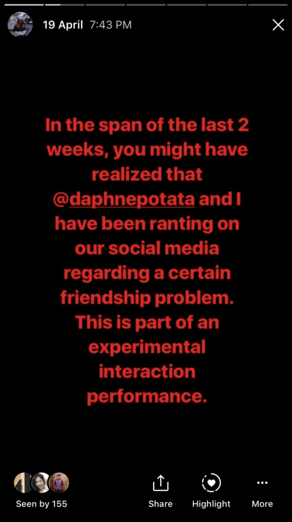
When we were done with the trailer, Bella and Daphne released on instastory about how this was a performance for our final project, apologising for any misunderstanding and clearing the air.
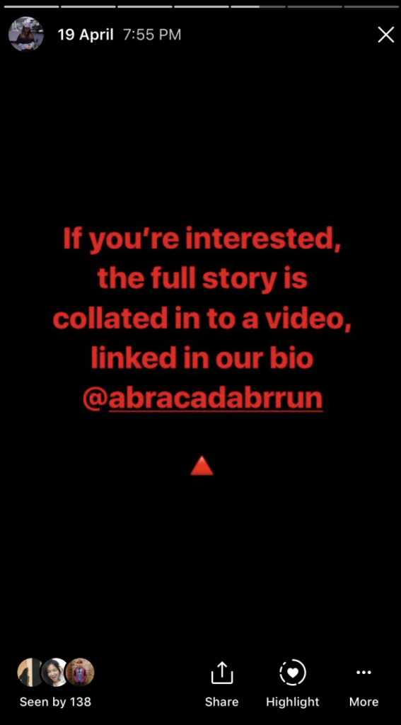
We then posted the link to our youtube trailer on our fake Instagram account so that the people who followed us there would also be notified of the outcome of the actual performance.
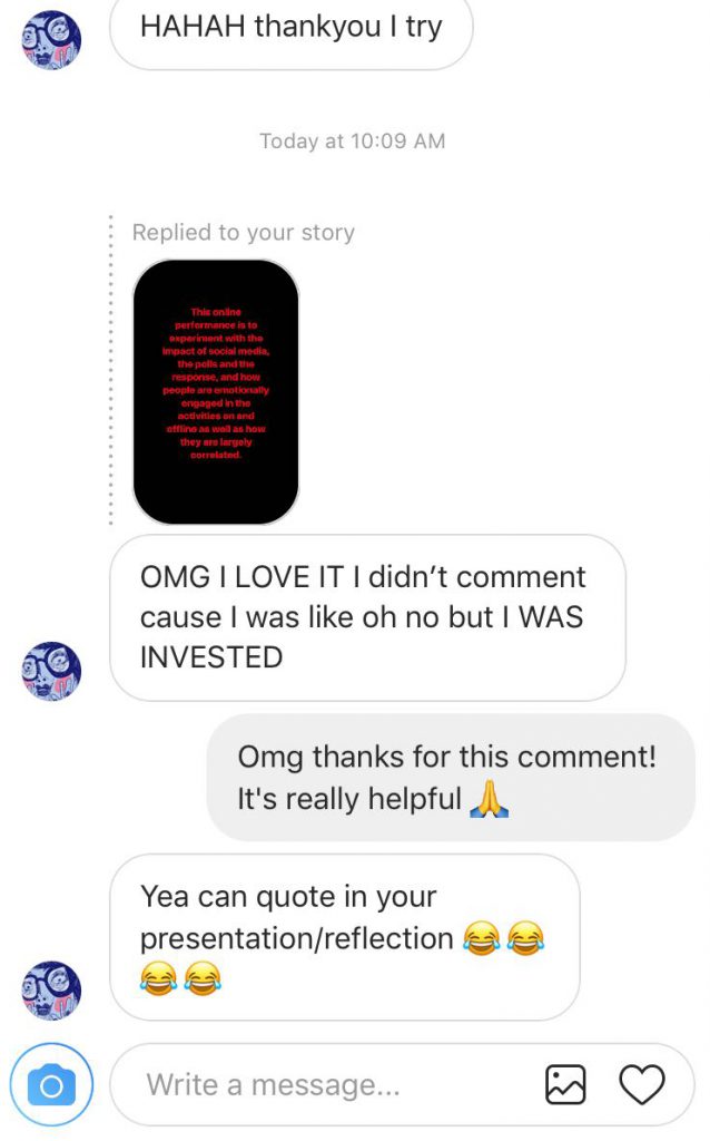
Afterwards, Bella actually sent us screenshots of what her friends messaged her regarding the project.
I felt like it was really interesting to note how many people felt so emotionally involved in this fake drama, along with the responses we collected. The whole process felt like a collective experience, because we gather responses from the online audience about the drama, there were also people who came up to the girls in real-life to ask about the issue, and we also noted responses from strangers at Jurong Point mall where the ‘fight’ took place. It was a success to us that many thought that it was real which was something we wanted to achieve from blast theory. The lines between reality and fictional is blurred and it made an impact in not just Bella’s and Daphne’s life, but the others who were involved indirectly as well, making them involve in this ‘game’ which came in the form of a friendship drama.
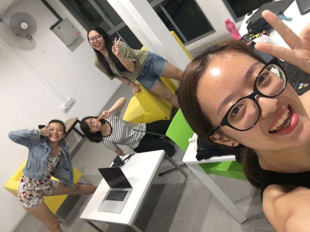
Last but not least, thanks to the team who made it all possible!!
A Third Space Fallacy is an experimental interaction performance on third and first space that combines the responses collated on the third space through Instagram polls and stories to curate the next move in a friendship conflict between two girls (Bella and Daphne). To make the entire performance as real as possible, both girls had to put up an act in the span of 1 week in the first space, when questions arises from the people around them. Also, to stage that this is not part of our project for Experimental Interaction, our group have created another Instagram account @abracadabrrun, collating uninformed decisions made by our followers, which is part of the narrative of the death of Bella.
We initially wanted the project to take place at Changi Airport, where we would make use of Instagram polls for our online audience to decide on the various missions to be carried out with real life audience like a game to eliminate our group members. However, upon further discussion, we felt that albeit the game can involve both online and offline audience in the fun, it was lacking in emotional investment whereby it would just be a game and nothing else. Audience involved would not feel a certain connection to it and it would be more of enjoyment solely for us, the group members. Thus, we came up with the above idea, hoping to make use of the idea of uninformed choice, and to get the audience emotionally and physically involved in a ‘realistic’ drama fight scene.
When I first heard about this project, I felt really apprehensive because I was really worried about my digital skills. I tried using photoshop before in the previous semester but it was like simple cut and paste work that I just attempted but I have never tried doing proper illustrations on the software at all. Furthermore, this time we had to use indesign which is yet another software that I was not familiar with at all. Hence, I was naturally very worried if I could produce a work even by the end of the semester.
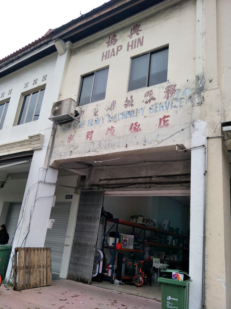
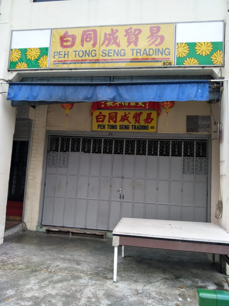
Worries aside, we started out by first selecting a location that was unfamiliar to us. Initially I thought I could do on the east side since it’s more like my comfort zone but we had to explore somewhere totally opposite of that. In the excel sheet, I initially decided on two rough locations-serangoon and Little India. However, eventually I went to beauty world because it was somewhere I was always curious about ever since I heard about the affordable yet yummy burgers in beauty world centre. I went ahead and travelled to beauty world along with my classmate, Esther, to explore the surroundings.
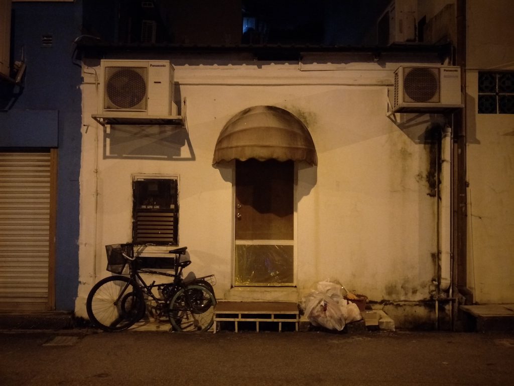
Initially, I really expected a pretty hip looking area since I heard about the burgers. I expected to see a mall with plenty of new starting businesses selling those hipster food you would see on the internet nowadays. However, to my surprise, the area had a few malls no doubt, but the malls looked like they were there for an eternity. The malls looked like they have been there for a pretty long while and the amount of people in the malls were also quite little. Although there were a few malls in the same area, the interior looked relatively similar. The same scenario could be seen in those malls where only very few stores were opened for business and there was no crowd either and the malls were generally quite quiet. I took a few shots and I do admit I kind of like the peacefulness I get from the malls, brings me back to the old Singapore a little and I liked how it felt.
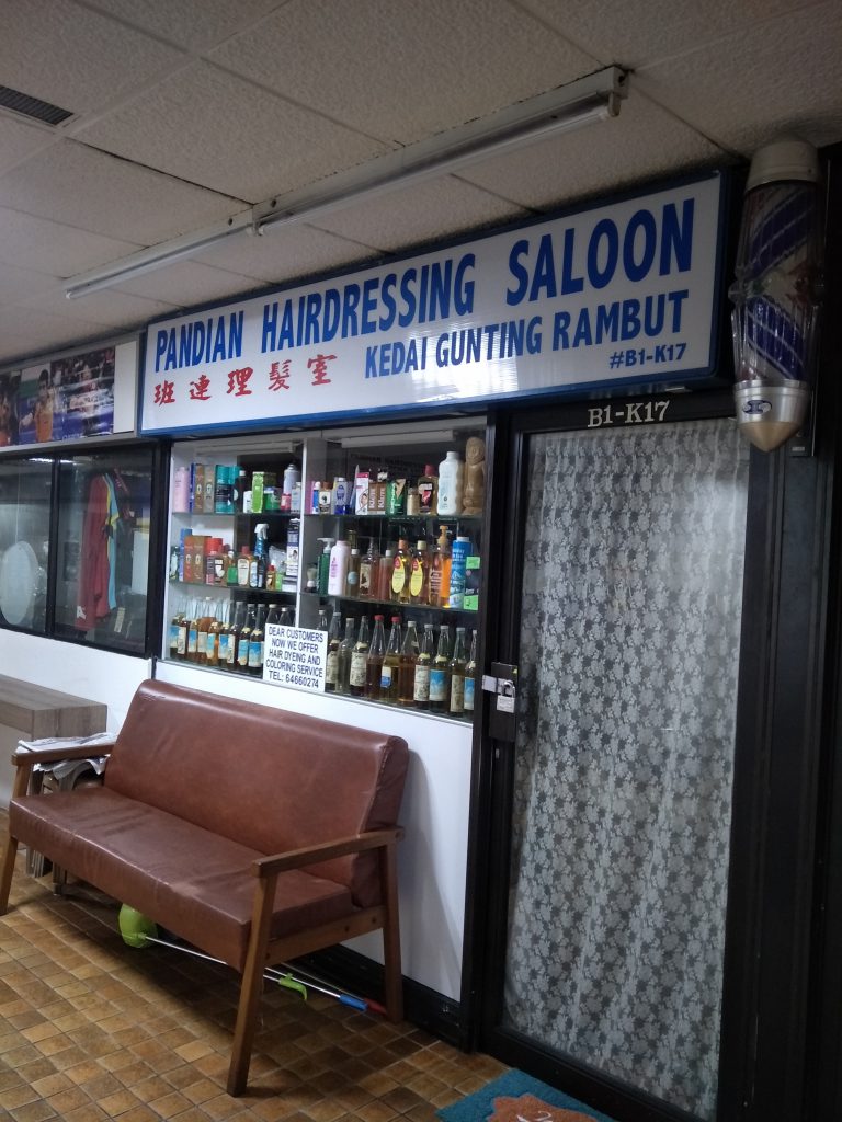
Some shots from beauty world!
Old fashioned barber’s poleArea around beauty world
The only thoughts I could gather was, how I wish all these stores could stay there permanently and there never has to come a day where they have to move out the area for some new residential plannings. The way how things in the mall looked like they came from awhile back makes me feel like time has temporary stopped the moment I enter, and I really liked the feeling. In particular, I always like to see the old-school barber’s pole, especially the ones that lights up, brings back some really nostalgic feelings. From there, I wondered what I could express in my zine regarding my exploration at beauty world. Since what I saw when I went to beauty world differed from what I expected, I thought I could express in my zine a contrast between the old and new. Something along the lines of how they can both coexist and stand out in their own ways for my zine. However, when I went to consult Shirley for this, she questioned how this was related to my personal experience because it felt like I was simply documenting the area rather than showing an interpretation of it. At that moment, I felt like it was hard to go anywhere with beauty world so I decided at that moment to change my location.
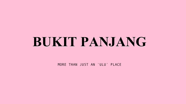
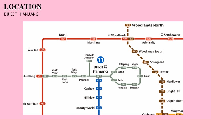
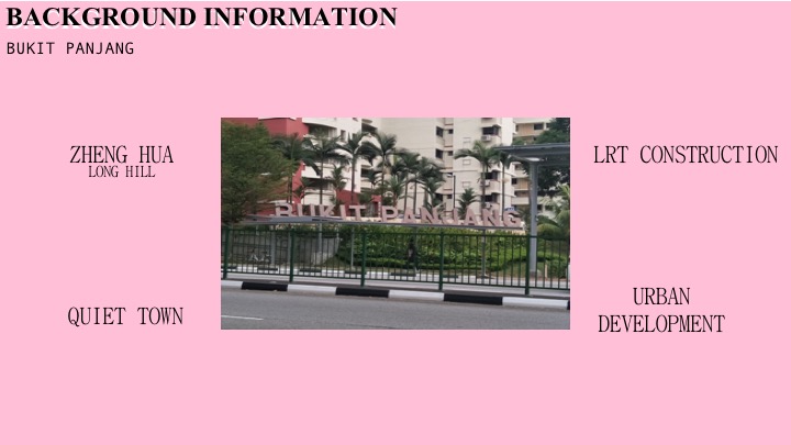
I did not have a clear idea about where was suitable because I rarely travel and the places I am more familiar nowadays would be the extreme east and west. I was talking to a friend and she brought up Bukit Panjang as a ‘rising star’ since many changes were taking place. Obviously, I did not know where it was until I looked it up on the MRT map. It was at such a central area, leaning slightly towards the west. The only way to get to Bukit Panjang MRT was only through the downtown line, either that or you have to take MRT to Choa Chu Kang and then change to LRT to reach Bukit Panjang. Honestly, despite the downtown line, the Bukit Panjang MRT still felt very inaccessible for me, it was literally like in the middle of nowhere. Thankfully, my friend recommended a bus which I could take to reach Bukit Panjang from Boon Lay bus interchange to save the hassle of changing MRT lines, but it was still a really long journey ahead. However, since I have never been to Bukit Panjang before, I thought I would go ahead and explore to see what ideas I could get from a new area.
On the same day, I briefly explored Bukit Panjang and the surrounding areas, and I also went to different places such as Cashew and Chinese Garden. I took the weekends to also explore Paya Lebar and MacPherson, just to expose myself to different areas to gather more ideas for the zine.
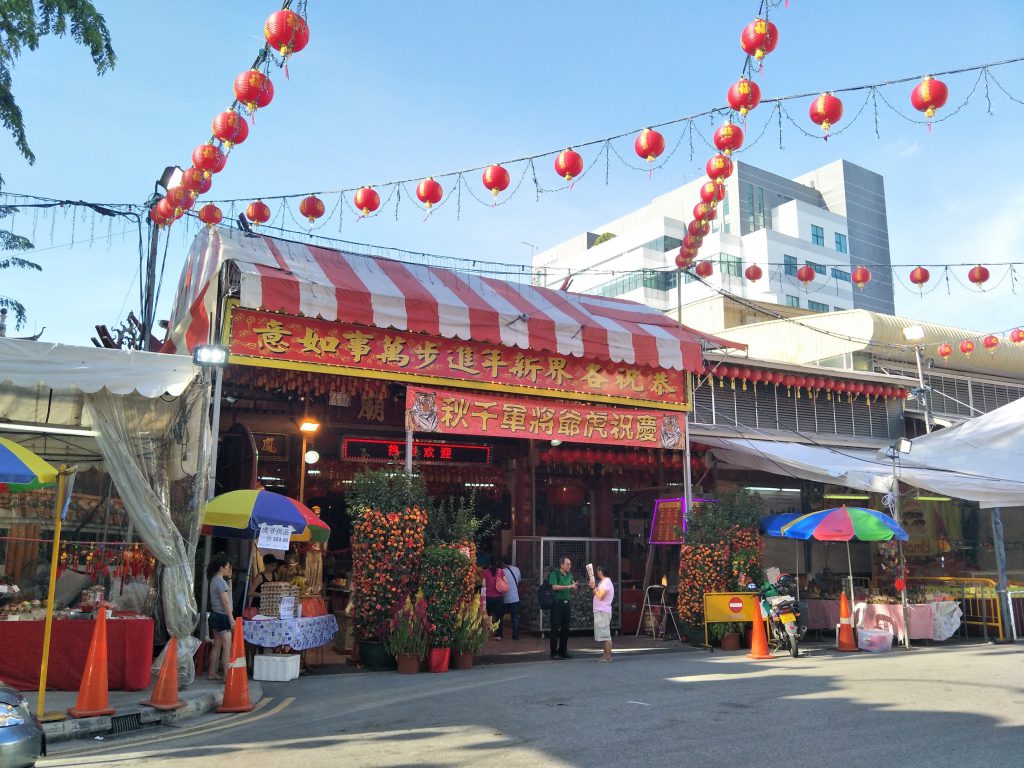
A temple at MacPhersonPaya Lebar area
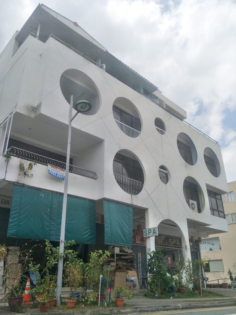
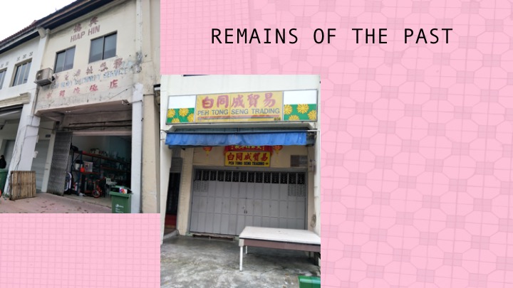
New condominium in Bukit Panjang, a contrast with the old architecture there
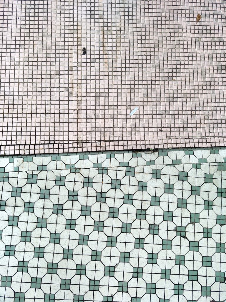
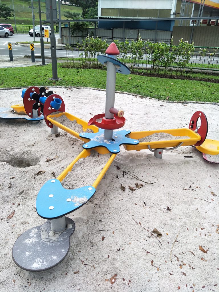
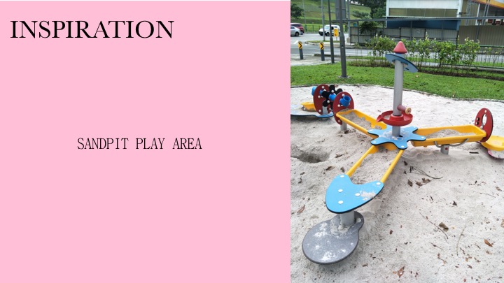
Some shophouses nearing CashewVery pretty and retro looking tilesSandpit playground near Cashew
I brought my discoveries to show Shirley, however it felt like I had too many ideas ongoing all at once. Since I was not sure what I wanted to do for my zine and I explored so many places, it was delaying my time from actually focusing on what I should do. Hence, at that moment, Shirley knew I had to decide on a location at that point of time and just go for it rather than still considering a whole lot of places. I eventually decided on Bukit Panjang’s playgrounds to work on after I got the inspiration from the sandpit playground near Cashew and I moved on from there to gather images of playgrounds in Bukit Panjang.
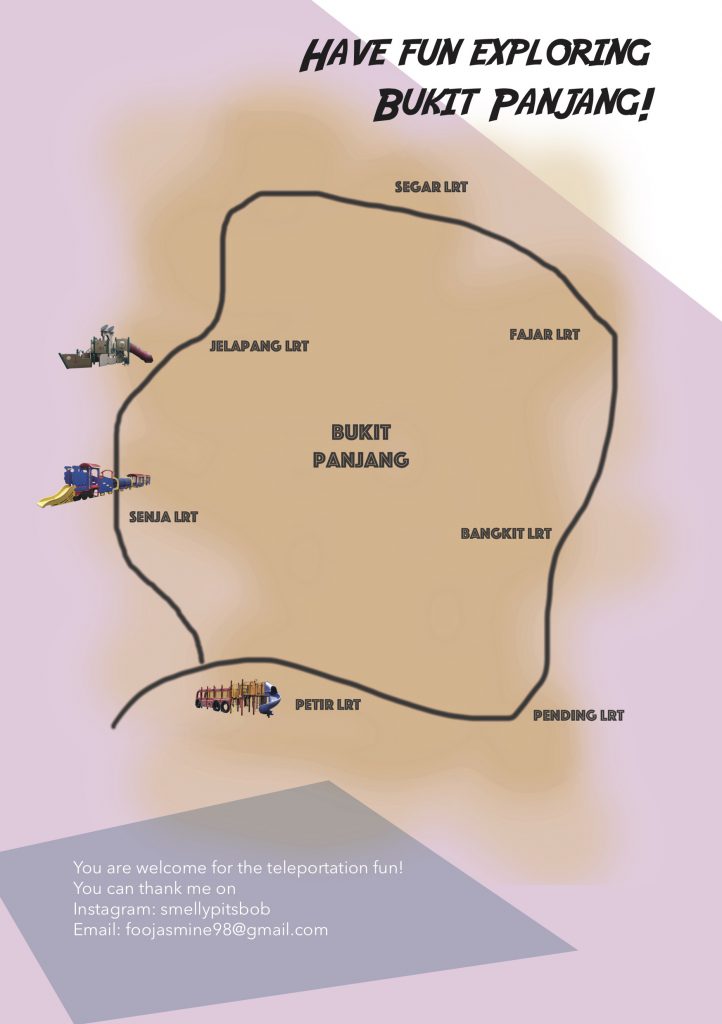
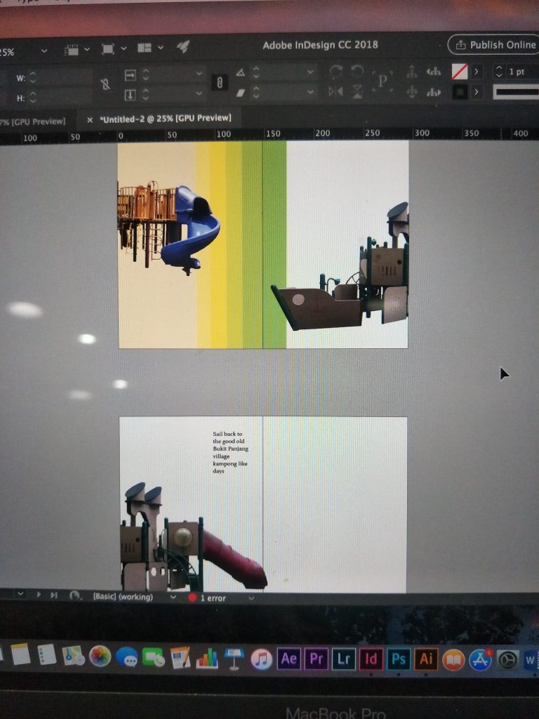
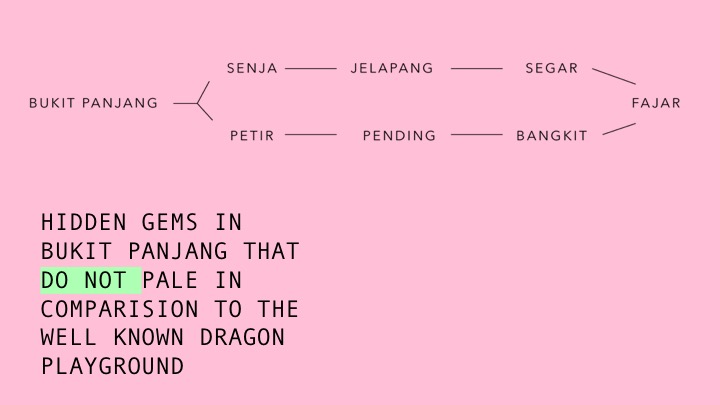
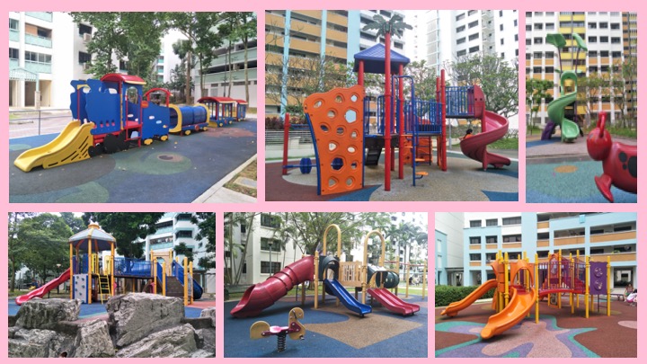
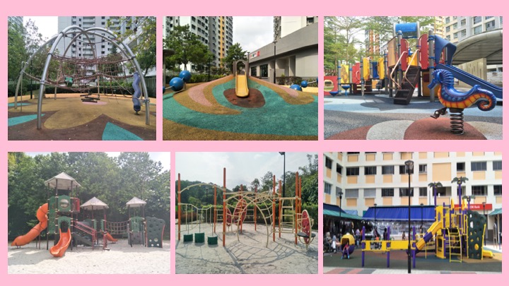
This time, I felt more reassured because I was working along a direction rather than moving aimlessly. My goal at that point of time was clear, which was to gather images of interesting looking playgrounds in Bukit Panjang that were uniquely Bukit Panjang. Hence, I made a second trip back to Bukit Panjang and this time I decided to move along the LRT line since it was all in the Bukit Panjang vicinity. On the MRT map, I actually moved along the right side of the LRT line, which starts from Senja LRT to Petir LRT. I decided to walk, following the LRT tracks and photograph any playgrounds I come across. This whole process was really exhausting to be honest, I spent around five hours trying to finish the whole journey and finding certain playgrounds that I researched to finally get a collection of the photos of the playgrounds.
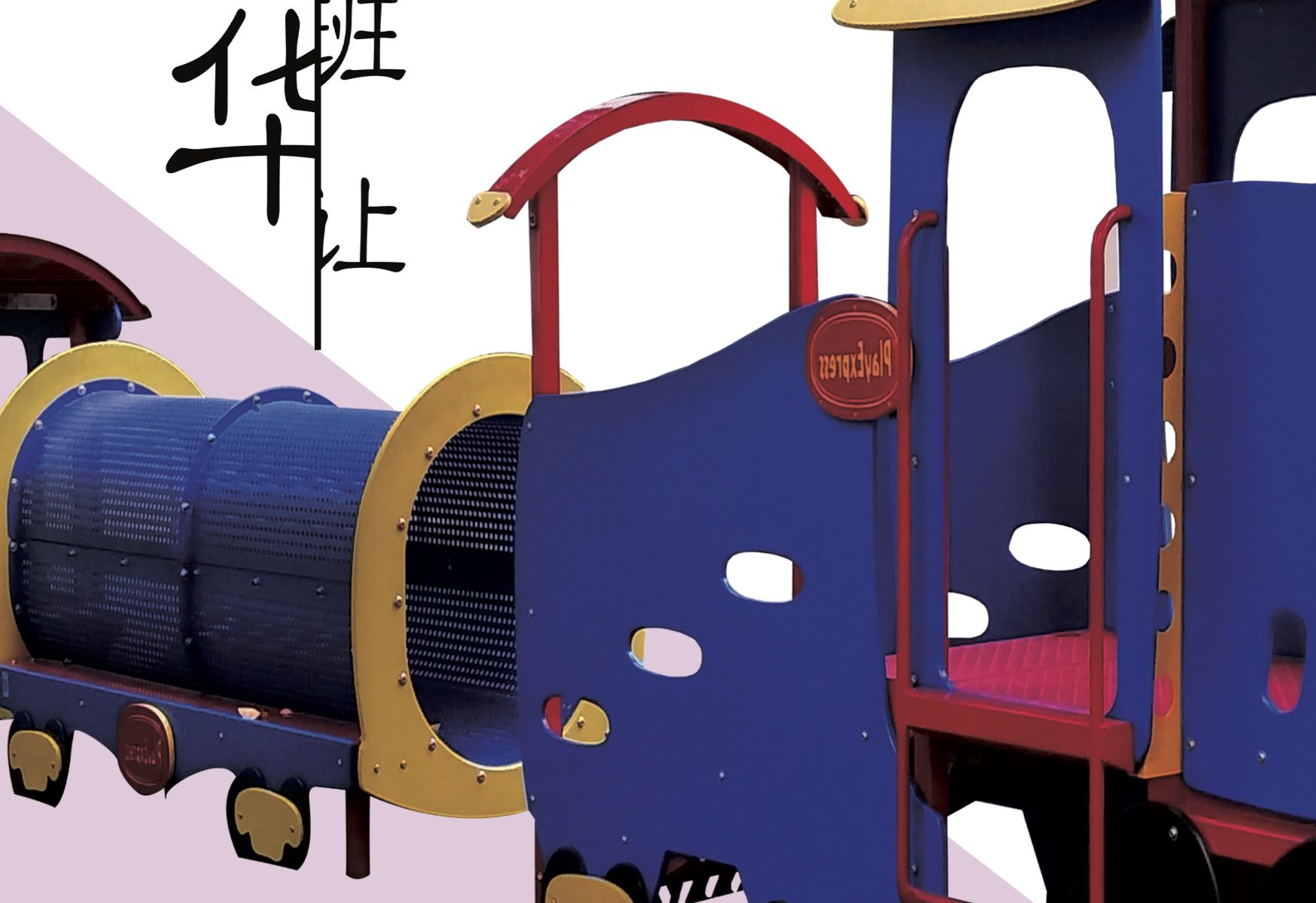
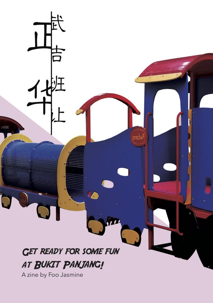
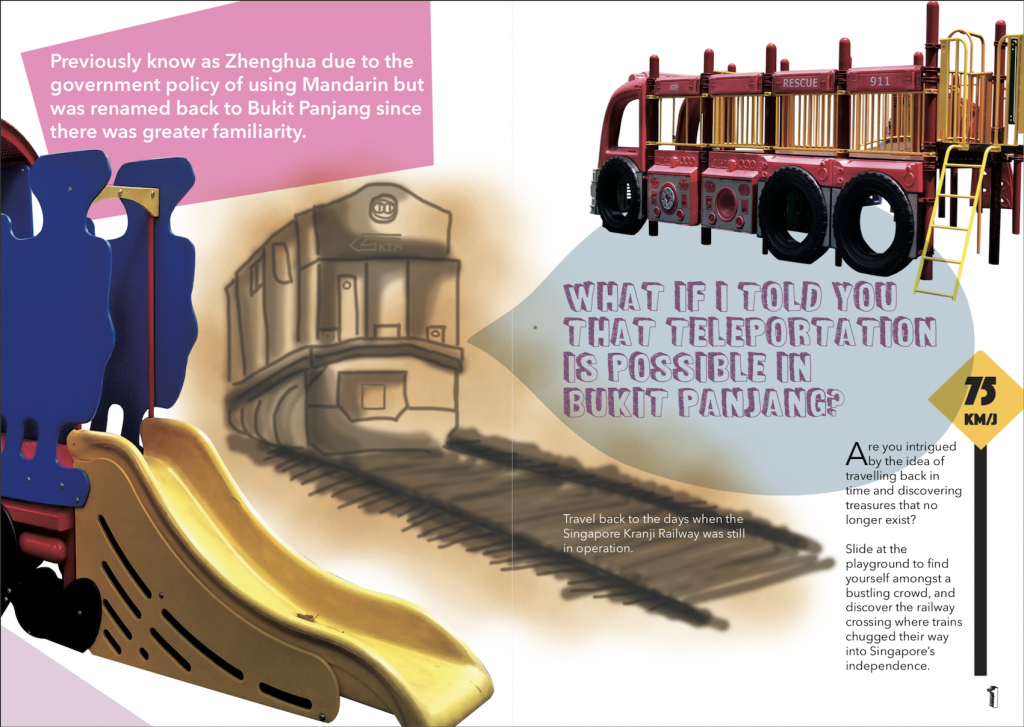
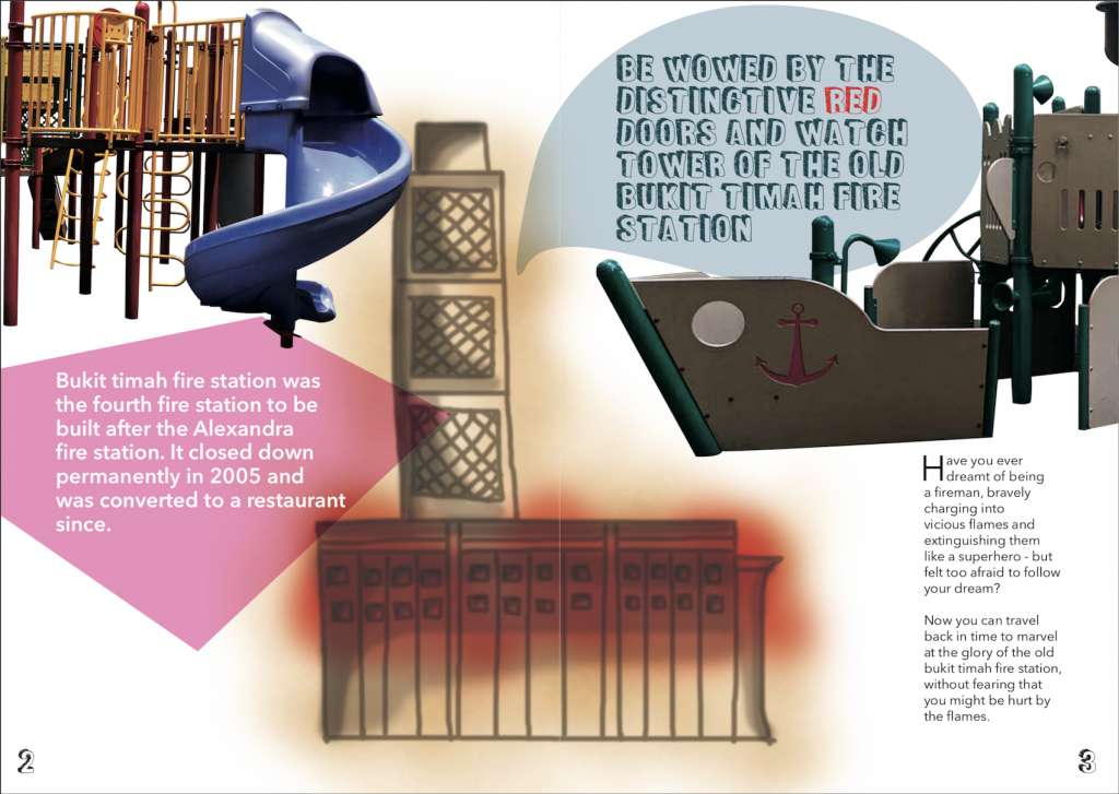
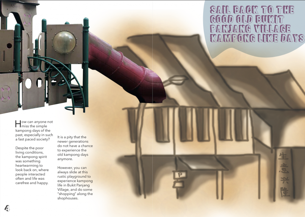
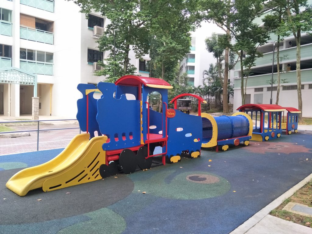
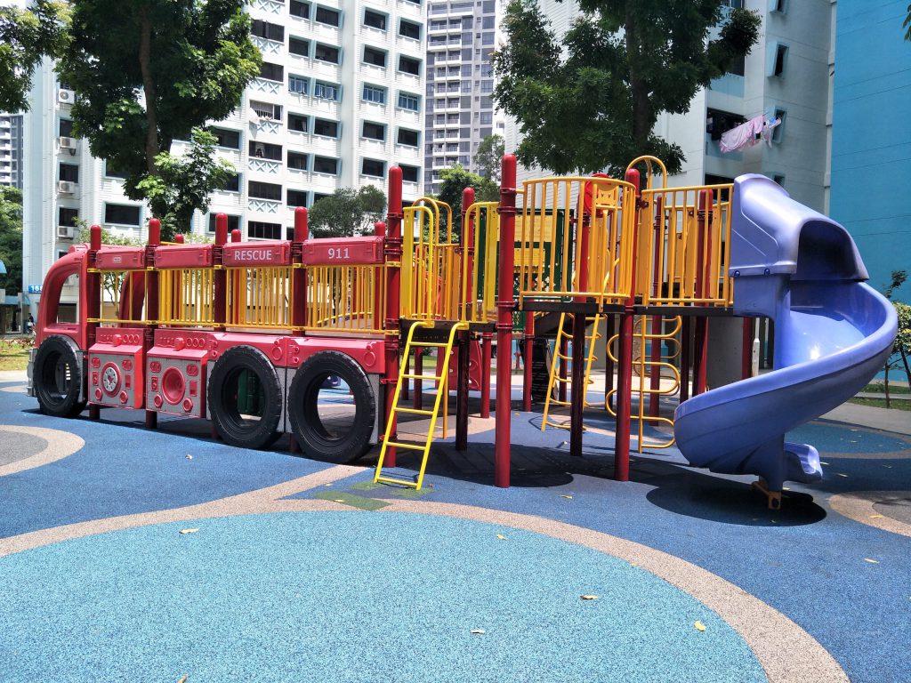
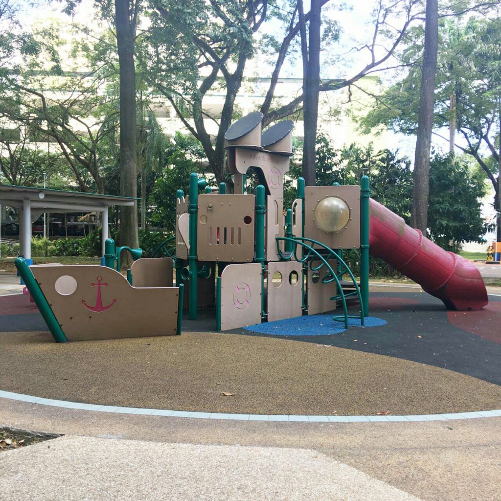
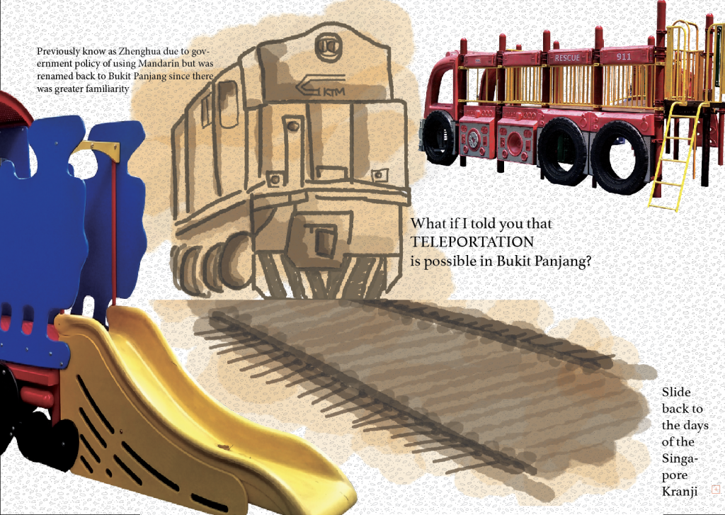
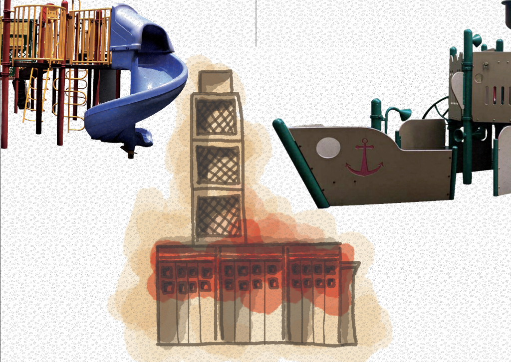
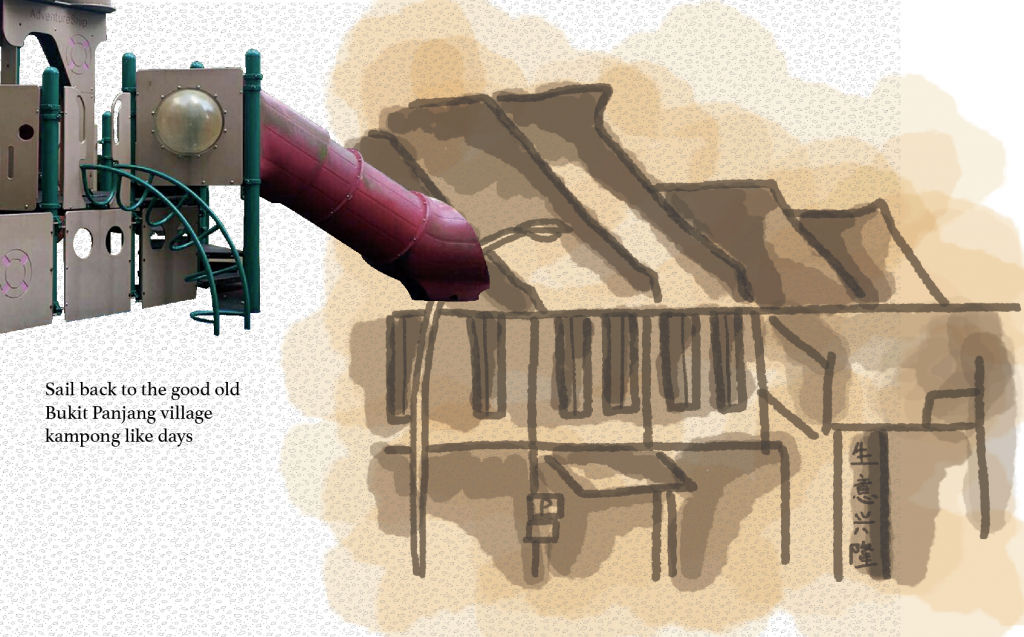
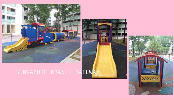
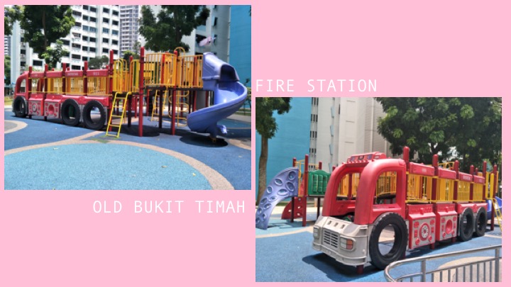
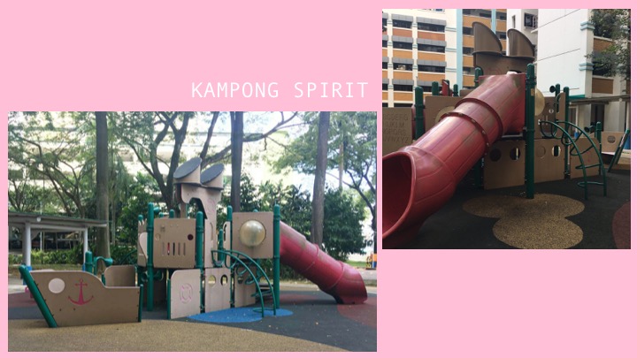
From there, I was trying to come up with an idea for my zine and while I was working, an idea came across my mind to make a teleportation theme. I thought it would be quite interesting since Bukit Panjang indeed changed a lot from the past from what I researched, hence I thought about how the playground could be a channel where teleportation takes place. From my observation of the playgrounds I took photos of, I also realised that three of them were more outstanding in a sense that they looked more unique to Bukit Panjang in my opinion because it is a design I have never seen elsewhere. The three playgrounds were transportation themed, with one being a fire truck, one being a train and one that was a ship. With this, I decided I could play with the playgrounds and connect it to the past of Bukit Panjang with my teleportation theme. I read up online and there are a few who actually shared blogposts about how much Bukit Panjang has changed and they are reminiscing certain memories from the old Bukit Panjang. People also replied to the posts and commented about how they shared certain sentiments as well in relation, hence this all the more proved to me that making a zine to allow teleportation seemed like a logical and fun idea which could be relatable.
My zine will hence be like a fun guide book to introduce people about the three playgrounds and how each of them can allow teleportation back to a time period to experience how life was in Bukit Panjang in the past.
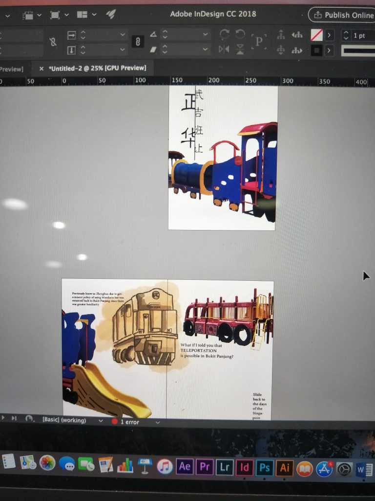
I started with the idea of each playground occupying a page, so that the playground is halved at every page and continues to the next to give an explanation about it along with some illustrations. I cropped the images of the playgrounds out to fix the composition in place first. I also tried to do some illustrations on photoshop which are supposed to be the ‘memories’ part of the zine. The zine becomes a narrative where readers can follow one playground and be brought back to a point in time to old Bukit Panjang and experience- be it the Singapore Kranji Railway days, the old Bukit Timah fire station or the kampong days in Bukit Panjang.
I then added the illustrations and tried to experiment with the colours.
This was how the composition looked initially, I really liked how the illustrations turned out but it was an issue bc the background white was not removed so I had to redo the illustrations. I redid the illustrations for so many times I can’t even keep track haha. Shirley also commented that it looked quite boring and plain so she helped to add some shapes for more interesting composition and colours.
From there, I edited more and came up with the final composition that you can see over here.
The final composition has a plain white background because I felt that the colours of the playground which were primary colours were too overpowering for me to add more colours in. There was initially a texture layer on the background however I eventually removed it for the final because it came out looking weird in patches on the pdf so I knew it would not work out despite the fact that I already arranged it to the back of the work. I wanted each playground to bring out a certain type of experience for the reader to travel back to the past and I wanted it to be a fun zine to look at. The colours on the final work is very loud and eye-catching and I thought it worked well with the concept of playgrounds to convey the idea of fun. I also added a map at the back so that people can locate the playgrounds if they want to experience the time travel themselves.
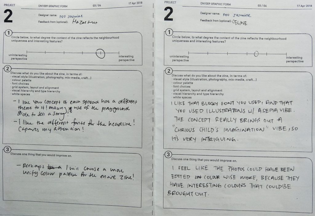
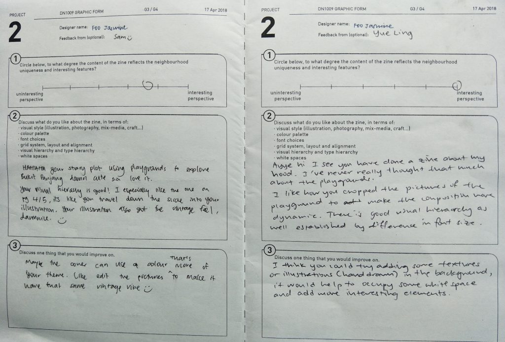
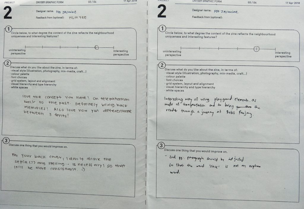
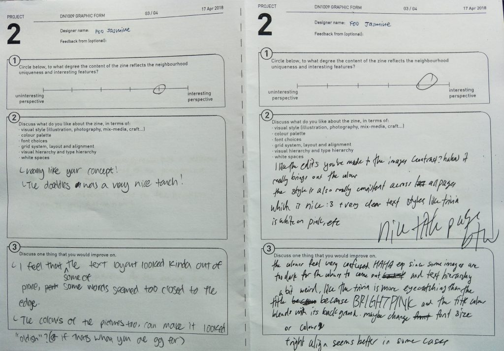
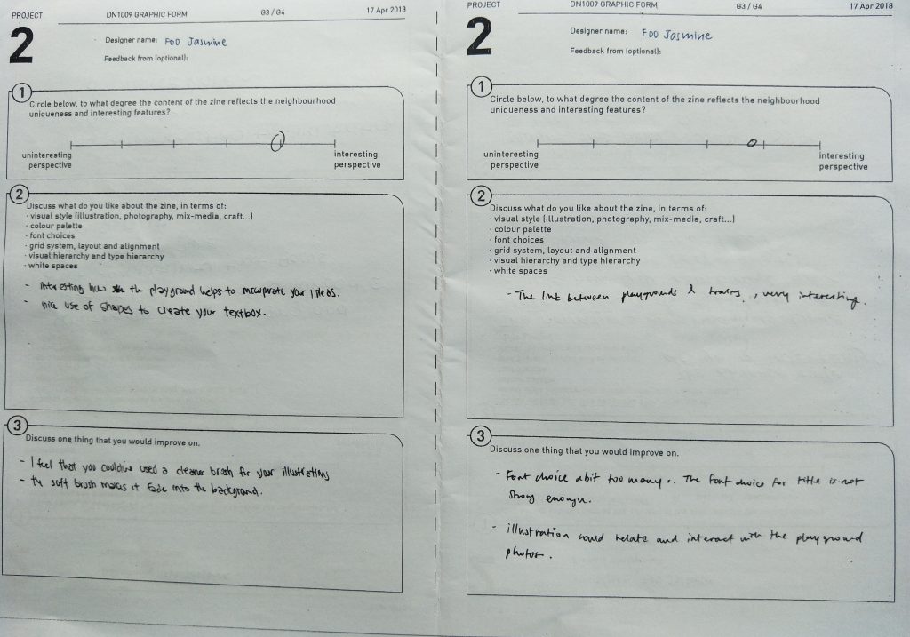
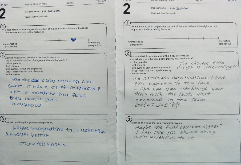
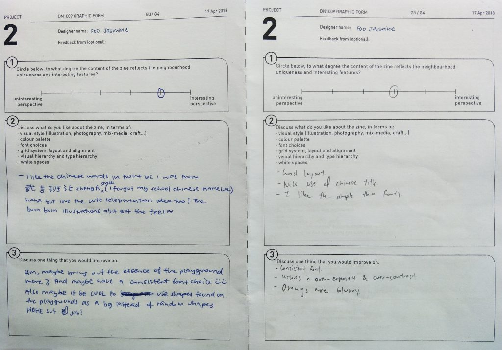
FEEDBACK:
Thank you to the classmates for all the constructive criticism!! If I were to make amendments to my zine, I would probably redo my illustrations and make them neater. I would also reconsider the font types and sizes and probably choose a colour scheme to follow throughout the zine to make the zine look more colourful without that many empty white spaces.
Here’s the end of my locale zine process, hope you had fun reading!