When it comes to social broadcasting, we can see the many changes that it has come to adapt and grow throughout the years. Many artists have experimented with the medium, using it to produce works and attempting to push the boundaries where it involves a greater audience and it becomes a work which encourages active interaction. Although it may seem like there are plenty of explorations done with social broadcasting already, I still see the potential of going further, using social broadcasting as a platform to connect with the possibility of this third space evolving into something as common as the first space for everyone.
It is important to trace back to the history of social broadcasting to show the progress that was made thus far. It dates back to artist challenging the norm of traditional television broadcast as referenced from Randell Packer’s blogpost titled Social Broadcasting: An Unfinished Communications Revolution. There was a sentence which I particularly liked and thought it was truly revolutionary for that idea to be generated. He mentioned that the exploration has resulted in participatory work, leading to changes to the definition of ‘broadcasting’.
“Broadcasting not as a monologue, but as a dialogue.” -Randell Packer’s blogpost titled Social Broadcasting: An Unfinished Communications Revolution.
The idea of a dialogue rather than a monologue meant that more than one person would be involved and this was rather intriguing to think about. An example would be the Wipe Cycle by Frank Gillette and Ira Schneider, which allowed the audience to immerse themselves in their video installation and influence the work with their participation. This concept of being more than just a one-sided way of conveying information was really new and it was a thought that was never pondered upon. This gave the audience a fascinating experience that they never had before. From there, the concept kept expanding and this was crucial to the further advancements that were made from there. Another crucial change to note was also Videofreex, a pioneering video collective, which eventually examined the idea of interaction through their work whereby they hacked the television channels and promoted communications amongst the audience.
“This simple exchange of homespun programming essentially transformed the medium of television into an interactive medium of two-way social broadcasting.” -Randell Packer’s blogpost titled Social Broadcasting: An Unfinished Communications Revolution.
In order to sum this up, I quote from Randell Packer about how the notion of broadcasting shifted, and it became far more interactive than it was before.
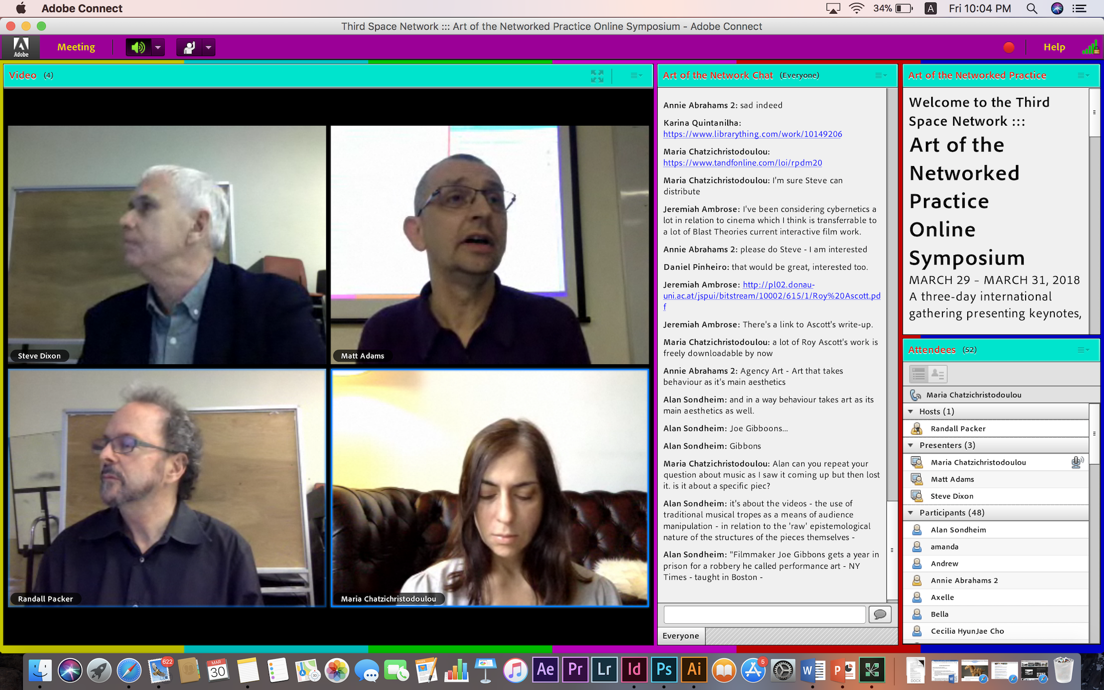
Moving on, I would like to bring in points mentioned from Maria Chatzichristodoulou in the symposium on the first day. She talks about works which makes use of broadcasting to create collaborative art, mentioning works from various artists, to highlight how the idea of being live at the same moment with others allows active transmission of ideas and also records the ability of both parties to respond at that moment.
She talks about ‘Hole in space’ by Kit Galloway and Sherrie Rabinkwitz which was previously discussed in class. It was a public communication sculpture where a large screen was situated in two different countries each, allowing people from the two different locations to meet and communicate. They showed excited responses because it was captivating that this kind of broadcasting was possible. This piece is definitely evident of how social broadcasting allowed high levels of audience participation and relies heavily towards the interactivity in the work.
Another work by Paul Sermon called ‘Telematic dreaming’ also shares the same concept. Two strangers were allowed to interact, despite one being on a screen and the other on a real bed. Conversations went on between the two parties as they engage in social broadcasting.
Annie Abraham’s work titled ‘Shared Still Life’ involves sharing the third space with others on their webcams to show the happenings in reality. It explores communication and exchange of ideas with others in real life, about how it may not be fully comprehensive.
“This was a piece about connectivity that was as fully functional in connectivity’s absence, as it was in its presence.” -Maria Chatzichristodoulou, If not you not me. Annie Abrahams and life in networks.
I would also like to mention about the Station house opera at home in Gaza and London work in 2016. This piece allowed artists to occupy each other homes and social spaces for them to wonder over how life would be if they were in the same space together while live streaming in the process. This allows interactivity between the two parties as if they were physically next to each other in the space.
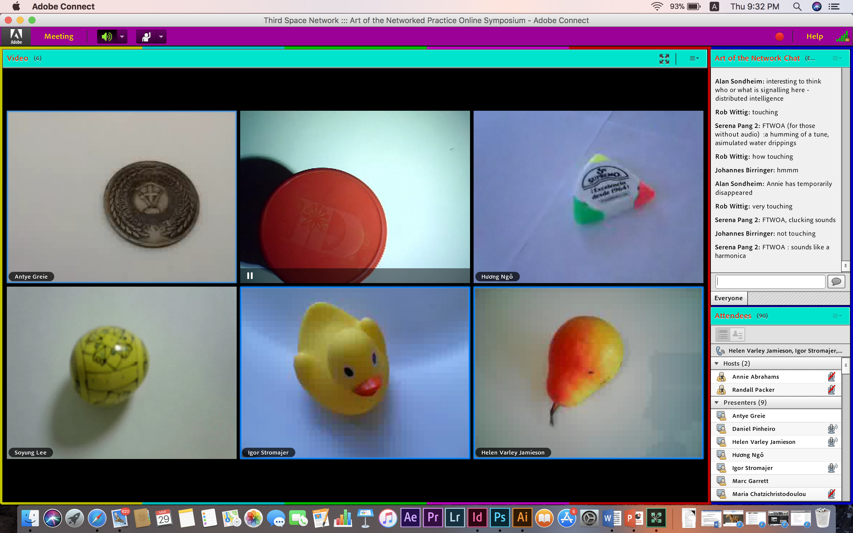
These examples really stretch to present collaborative art forms making use of social broadcasting to make the most out of it. Continuing, the performance by Annie Abraham during the symposium also projected her usual style of testing the limitations and presenting it on her social broadcast performance itself. The project titled “Online En-semble-Entanglement Training” starts with her team saying latencies and the word ‘excellent’ with a covered screen.
Start of Annie Abraham’s performance with covered screens
Numbers were constantly thrown out and the screens were revealed.
Screens get shown
There was silence then followed by sounds such as humming, clapping and sounds which seemed to come from the clicking of the tongue. This continued to actual sounds that sounded like ‘ah’, along with some noises from the dripping of water and the harmonica.
Objects started to be shown as the sounds of harmonica plays in the background
The different individuals then started to make comments whereby some were repeated. Examples of the comment includes
“Take me to your leader”
“I’m sorry I’m afraid I can’t do that”
“The machine repeats when its told”
“What’s the point, you belong to devices”
“Being perfect is kind of constant”
“Resistance fully supports you as our leader”
“어디야?” (where in korean)
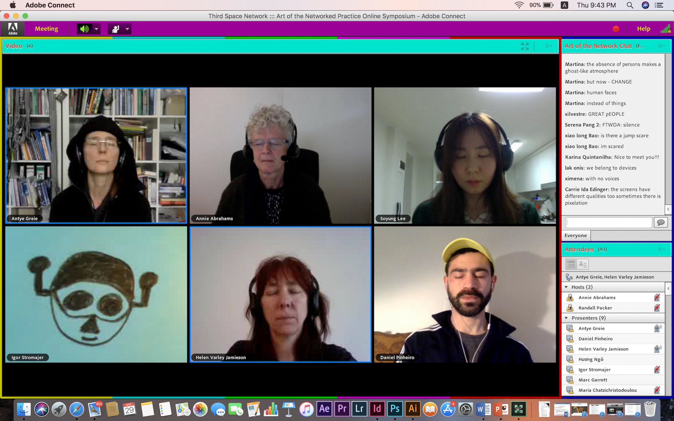
After this, the cameras show all the members’ face, with their eyes closed as they stop reciting the comments. They also had their earpieces on, as if they were imagining this whole performance in there head and are now listening.
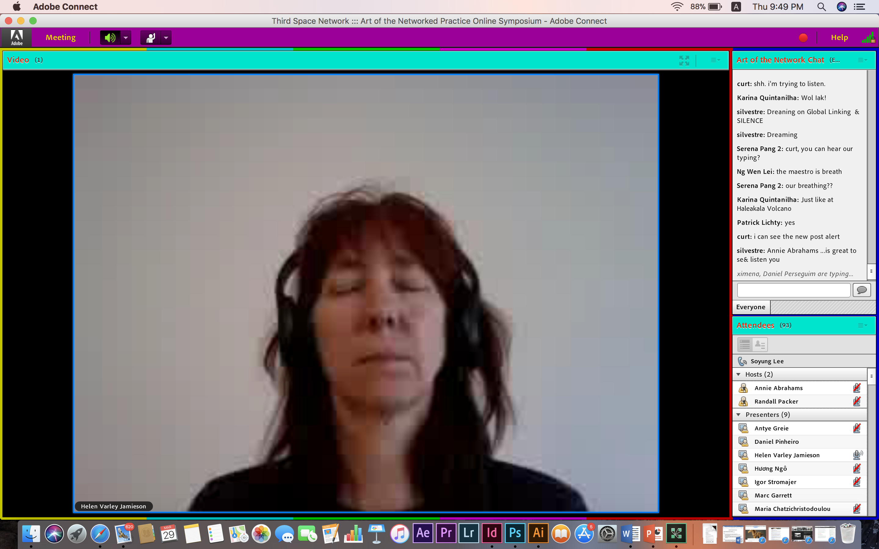
Screens show their faces with their eyes closed, silence observedAll screens went out one by one, leaving Helen as the last one left
One by one, they opened their eyes and shut their cameras off until only one member was left, and the performance ends. Apparently the protocol given for the part where the different members threw out comments was to choose 15 political phrases each. The performance showed how different individuals would interact without any interference with her rather general protocol instructions and also how Annie Abrahams played with the possible obstacles in the process.
“We all have one subject, in fact. Mine is communication and the difficulty to communicate at all. Everything I do is around that.” -Annie Abrahams
As mentioned by Annie, she makes use of the online platform to perform negotiation and working along the interruptions in the third space to produce a work that displays human interaction socially with others, allowing us to reflect upon the essence of this third space.
Going back to the point where I believe that the potential of social broadcasting can be pushed, I want to mention about Blast Theory which was shared by Matt Adams in the second day of the symposium. Blast Theory is a group which focuses on creating interactive art such as performances and interactive games, with great emphasis on the participation part on the audience.
For their work “Kidnap“, it involves kidnapping audience who had granted prior permission for this action to be carried out and keeping them for 2 days in their secret room, with a live webcam in the rooms for the audience to interact with the online users.
“Once you put a bag on your head, it all becomes very real” -One of the member from the audience who was kidnapped
This created an experience for the audience who were kidnapped because it felt very realistic as they combined performance with this concept of social broadcasting since it was not an actual kidnap.
Their game called “Uncle Roy all around you” was also a rather interesting piece since it combines social broadcasting with the structure of a game. It involves interaction between street players and online players to eventually find Uncle Roy. Both the street players and online players have to work together and converse in order to solve the game. The game eventually also ends of with a question to the players, “Do you want to meet a stranger?” and this brings confusion as to whether it is a serious question since it feels like it is part of the game, hence playing with the relationships created as they get involved in the work. For a general idea of the game, click here .
I particularly like this work because I feel that this work is the epitome of a breakthrough in explorations of the concepts of social broadcasting. This incorporated both social broadcasting and gaming together so perfectly since games was a good approach to allow interactions between different parties. In comparison to social broadcasting where the interactions only involve communicating, I feel like bringing the idea of games into this would make social broadcasting a lot more enjoyable since it feels like there is a mission to complete together with the other parties.
Discussion about Blast Theory works
To conclude, I do feel that the idea of social broadcasting is constantly being challenged and pushed by artists. Communications via the third space are constantly altered to fit into different categories, hence I believe that social broadcasting can reach out to even more areas which can bring a new light to social broadcasting itself.
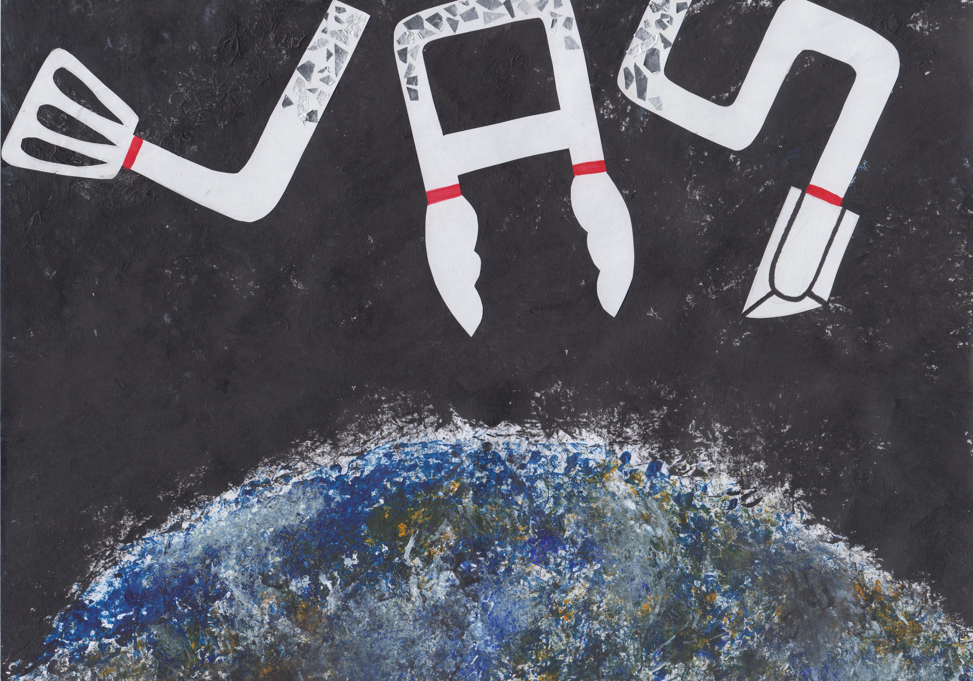
This video shows the process of me writing all sorts of qualities I wish I possess in the eyes of others on a mask, to eventually wearing the mask and framing the camera at an angle as if taking a selfie. The action of wearing the mask shows how my alter ego may not be completely representational of who I am as a person, or even completely different because it hides my whole true identity since my whole face is covered. In different situations, the alter ego I possess may be different and I wanted to show how open the choices are when this identity we show is virtual. We can choose to be any kind of person we want to over the net, we can claim certain facts as we deem fit and it might just evolve into an assumed truth despite the fact that it is probably not.
The performers are so occupied by their interactions, that they don’t have time to negotiate their image as they normally would on the Internet and so, almost without being aware of it, they show their vulnerabilities and doubts, their messy and sloppy sides, their “hidden code”.
-Annie Abrahams, Trapped to Reveal – On webcam mediated communication and collaboration
Annie Abrahams is a Dutch performance artist who focuses on video installations and internet related performances. She is particularly interested in portraying and expressing the idea of how performers are incapable of controlling their actions, or maintaining their social identity in the artwork.
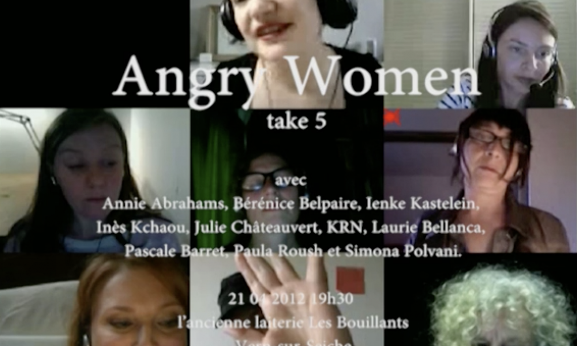
In Angry Women, she got a group of women to vent their frustrations in front of their own webcams but on a platform with other strangers. In the video, the women can be seen talking at one point, then screaming and shouting. The timing as which this occurs to different individuals on the webcams varies however. They are alone together, and angry together.
Annie Abrahams intent on disentangling the entanglements in order to better understand the nature and quality of the third space environment we increasingly find ourselves in.
-Randell Packer, Disentangling the Entanglements
I felt like what Professor Randell Packer said about Annie Abraham’s work really reflected the nature of the piece. We are constantly putting out this face that we want to be seen online unknowingly and Annie Abraham’s work serves to exactly force the performers to express their true identity on camera and to disclose our true inner personality.
It is not that messy because I only got this laptop recently for the new semester so it’s still quite new! I was too lazy to change the default background, plus it actually looks quite nice with the mountains and pink hues so I just left it as it is since it was quite pleasant to my eyes haha! I usually tend to open my window in the minimise form because I do not like the look for the maximised window because then I would not be able to see what is on my background, or any document I need on my desktop. I like to keep the documents neatly arranged because seeing it all over the place drives me crazy haha! They are all documents for my graphic form class by the way. I also have my youtube tab on the most often to listen to music!!
I think what my desktop says about is that I’m quite an organised person, I do not like to see the icons at the right side misaligned or in a mess, it kind of confuses and annoys me. It probably also shows how insecure I am because I do not like to maximise my windows. Maximising my windows to the fullest makes me feel like I am unable to see the rest of my things and it gives me a rather uneasy feeling knowing that I am unable to see everything.
I feel like there is just so much to say regarding our digital identity because it is something so relevant to us right now in this time and age. We all hide behind social media platforms with an identity that we put forth on the web for everyone all around the world to see.
If we choose how we present ourselves, and we choose who we present ourselves to, don’t we risk just falling into a collective just-so-story about who we are and what we ought to believe? This is why so many of the chapters to follow are about authenticity in various forms—authentic selves, authentic relationships, and authentic communities.
–D.E. Wittkower (A Reply to Facebook Critics)
How do we truly know someone if all we might know of them is only a part of them that they choose to show? What is worse is that the part that they show might not even be close to who they are because that is just how free we are on online platforms, we have the power to decide whatever we show!
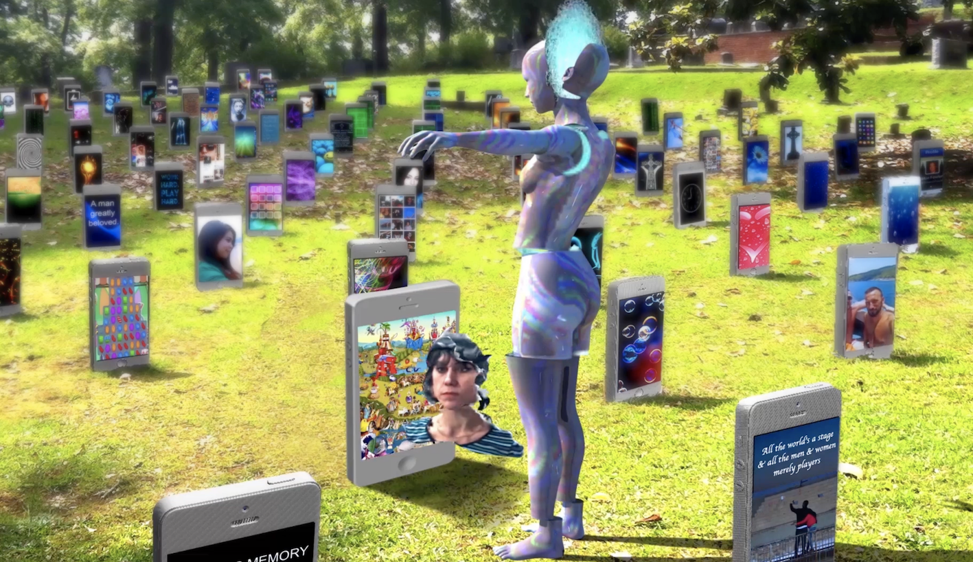
In Carla Gannis’s work ‘Until the End of the World’, she questions about the hybrid nature of identity, of how our identity online and offline intersect in this time and age. The creation of the video was inspired by a film by Wim Wenders where a woman is addicted to watching her dreams in a small handheld device, hence Carla Gannis converts it to be more applicable to the current age to discuss about the digital identity politic issues. In the video, imagery of the mobile phones can be seen and there is some sort of narration that goes on in the background to narrate the changes as time passes from year 4545 to 5555 to 6565 and so on.
screenshot of the video from Carla Gannis Source: http://carlagannis.com/blog/prints/until-the-end-of-the-world/
There was this particular scene which I felt was quite thought-provoking to me. The phones are buried on the ground and it resembled tombs on a cemetery and I wondered if this was meant to convey the message that we are all trying to portray a certain side of us online that we bring it to our ‘deathbeds’ because that is how we want people to remember us as. Then again, this is just something that came across my mind haha!
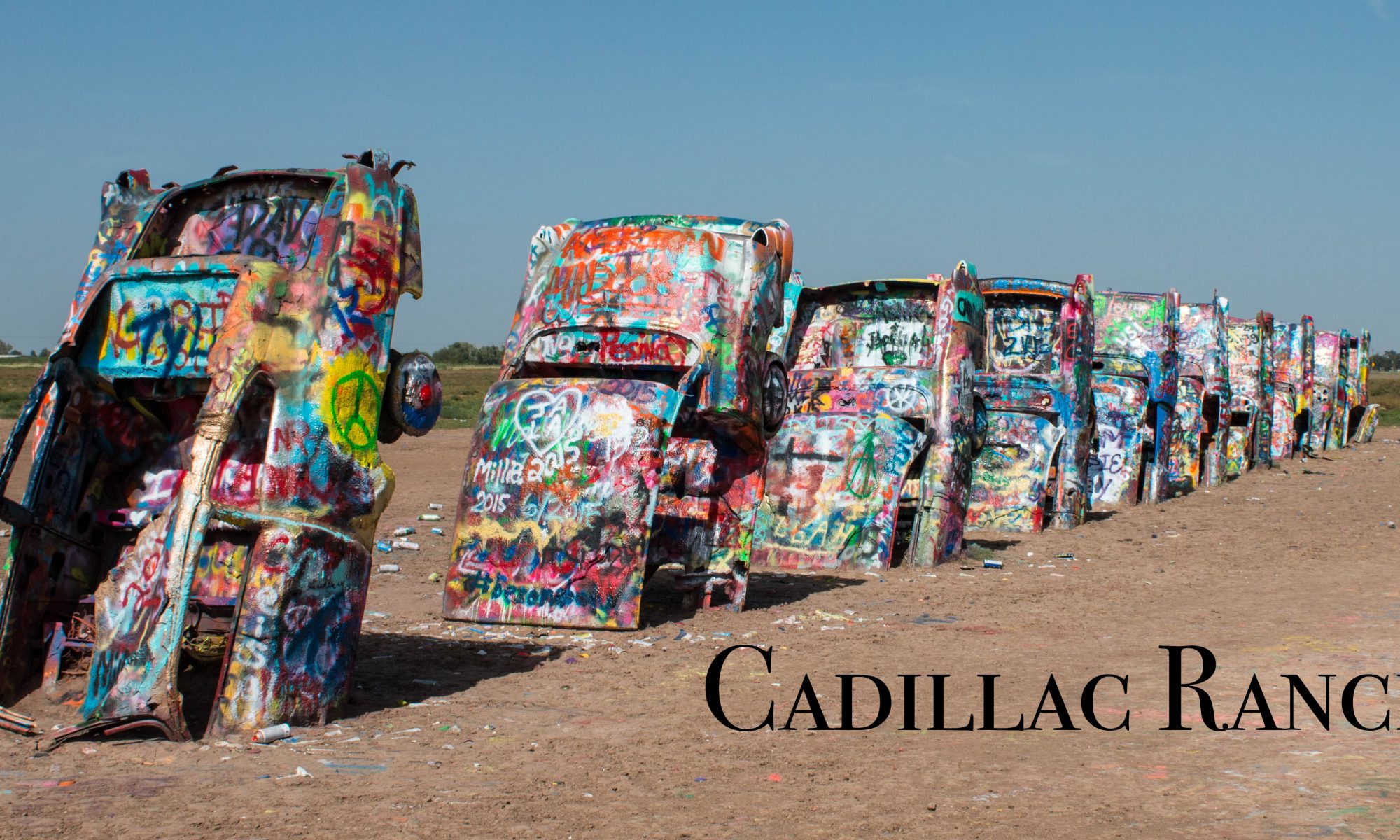
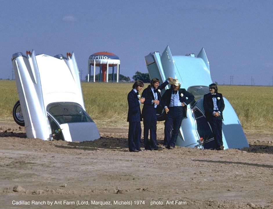
Cadillac Ranch (1974) is an installation commissioned by Amarillo billionaire Stanley March 3, and created by the Ant Farm. The Ant Farm is a group of artists and architects from San Francisco which produced experimental artworks. Ant Farm uses different art forms such as architecture, performance, sculpture, installation and graphic design while documenting all these on camera in order to spread critical criticism about the American culture and mass media.
About the artwork itself, Cadillac Ranch shows 10 Cadillac vehicles of different models, buried halfway into the mud in a straight row, at an angle similar to the angle of the Great Pyramid of Giza. The 10 different car models serve to show the changes in the tail-fin from 1949 to 1963. The cars were however vandalised with spray paint as they were left there, but Ant Farm would regularly go back to repaint the cars.
“Ant Farm presented a wonderful alternative model where you can love cars and critique them, where the assassination of JFK can be deconstructed, celebrated, and shuddered at, where private passions and public issues can hit a kind of merge lane”
It was to talk about materialism and fame as well, a homage to the rise and fall of the tail-fin as an icon of postwar American consumer excess. The purpose was to make a statement about innovation in a technological era, the American dream and the ridiculousness of consumerism. The founder of Ant Farm, Chip Lord, had a particular fascination for the Cadillac tailfin as a design motif of American futurism, utopianism, desire, seduction and pure style. What initially was meant as a roadside art piece was cleverly tweaked in its meaning to represent the values of the American society.
When I first got the project brief I had a headache really. Shirley wanted us to think of jobs that did not exist in order to make the composition more interesting. But because I had to think of jobs that did not exist, it was really really tough to be honest. My brain was so fixated on jobs that are already on the market and it was just so difficult to tell myself to look apart from those and think of something else. I spent the following week thinking about jobs everyday and I finally managed to come up with a few. I started by thinking about what I am interested in, hopefully to follow that path and think of jobs that do not currently exist yet.
Things I like to do? Things I like??
-painting,drawing,crafting
-biology
-dancing
-makeup
-eating
-sleeping (haha)
-vegetables
-touching soft plushies
-something magical
However I soon realised that this would be of little help for me to think of new jobs because as much as it helps me to focus on a certain aspect, it also limits the boundaries of the job I want to create. I then continued to think about the jobs and came up with these below.
JOBS THAT DO NOT EXIST??!?!!? (or just jobs that I can think of in general that seems less common T_T)
-rollercoaster tester
-shoelace tie-er
-cute cartoon destroyer
-nostalgist
-bedtime storyteller
-paw palmist
-sanitary pad tester
-professional skater
-space chef
-dead flower dissector
-pressed plant collector
-robotic surgeon
-firecracker lighter
-unicorn rider
Initially from this list, I had chosen the four I wanted to do because they were my initial ideas. They were namely the bedtime storyteller, pressed plant collector, shoelace tie-er and paw palmist. From here, I started to do sketches to show Shirley how they would look like, trying to incorporate the elements of that specific job.
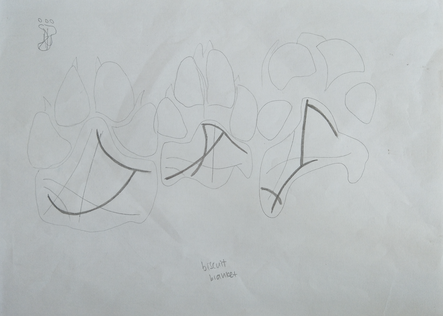
1. Dog paw palmist
Sketch for dog paw palmist idea
I thought that the idea of palmistry was really interesting so I was thinking about how it would be like if we were able to read the paws of dogs to tell their future. However, upon researching, I realised that palmistry follows a certain way of reading the palms according to the different line paths on our hands and this would mean that there is a standard line to read even for different hands. This also meant that if I wanted to portray palmistry on the paws and make my name visible and easy to read, it would be quite difficult since the line should technically be located at the same place. On top of that, I was not sure if it was possible to actually read the dog’s paw so I eventually gave the idea up although I really liked it and felt like there was a possibility to develop the idea.
2. Shoelace tie-er
Sketch of shoelace tie-er
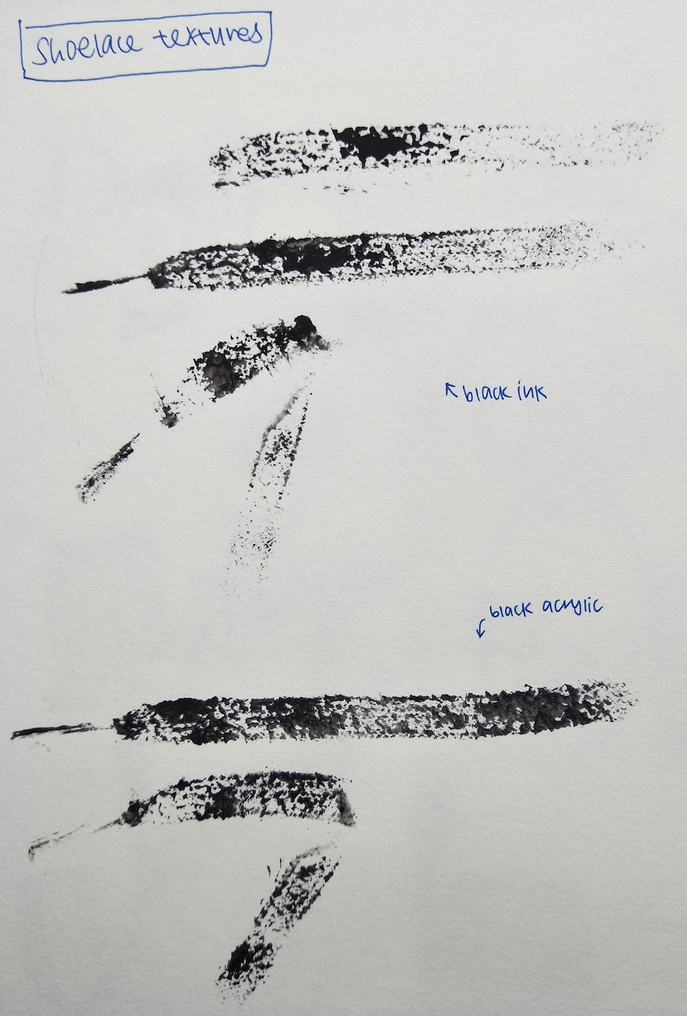
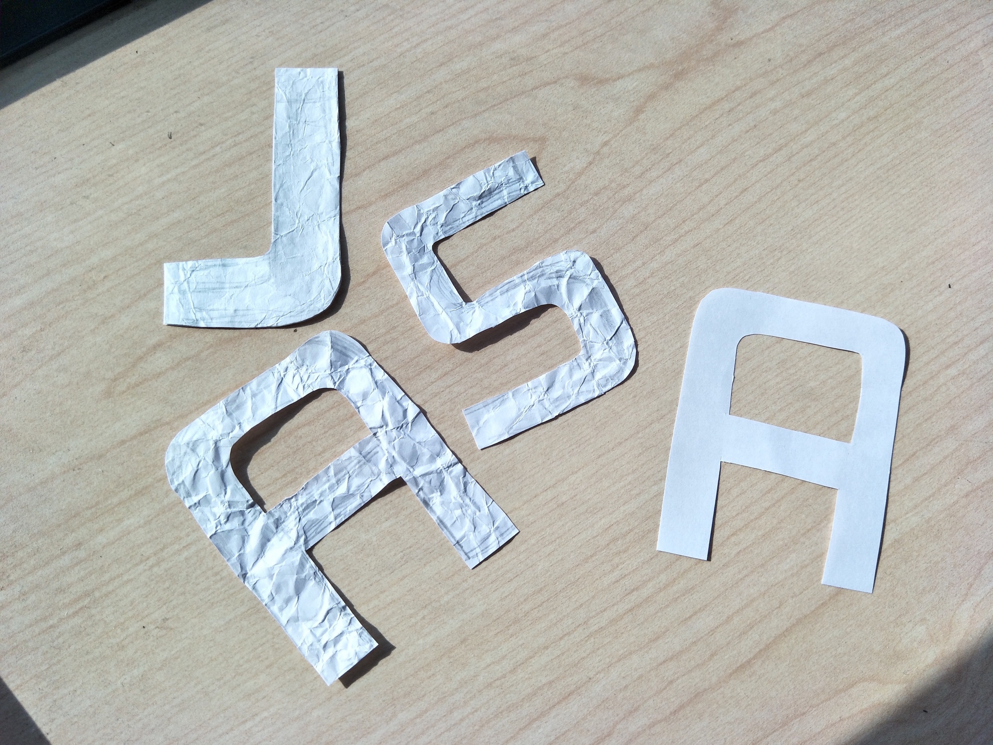
This was like first ever idea and I was just thinking of jobs that seemed redundant and useless which obviously does not exist. So I thought of a shoelace tie-er, a person who works to attend to people when their shoelace comes loose. For my sketch, I decided to use shoelace to form my name and even included the formation of the imagery of a shoe to add in the element of ‘tying’. However, I realised that there were a lot of typography made using shoelaces already and they all gave off that cursive looking font which I wanted for this work. Eventually I just felt that this was not going to work because there was little for exploration, although Shirley suggested that I could improvise and add on additional elements such as the shoelace holes, but I tried it and it just did not look like how I wanted it to. So eventually I gave this idea up anyway 🙁
I tried to make the shoelace go through the holes instead but….nope.Printing of ink on shoelace to paper for textures
I even tried using black inks to try and imprint the textures of an actual shoelace for this piece, the prints came out pretty well, but I just thought it would not be any different from the other shoelace typography I saw eventually so I just gave up the idea in the end.
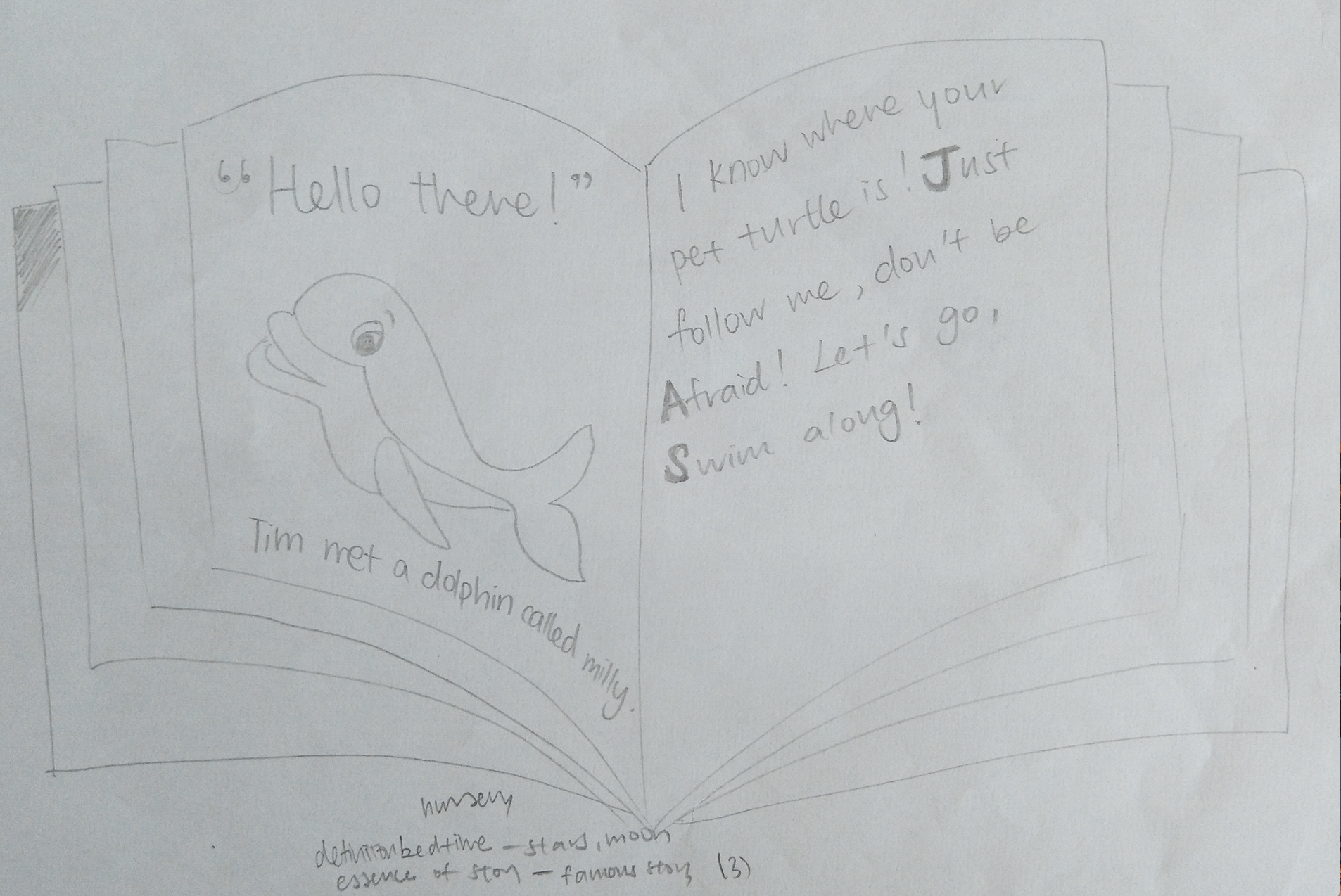
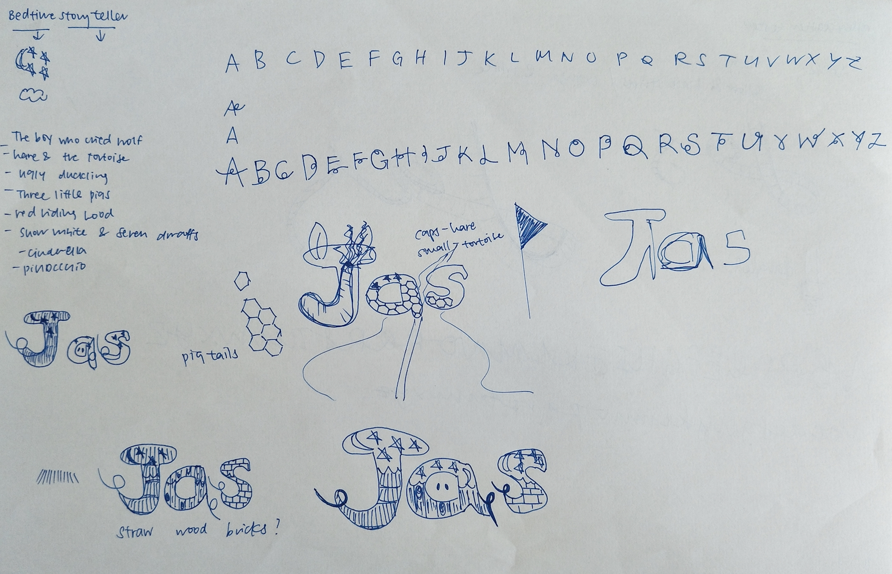
3. Bedtime storyteller
Sketch of bedtime storyteller
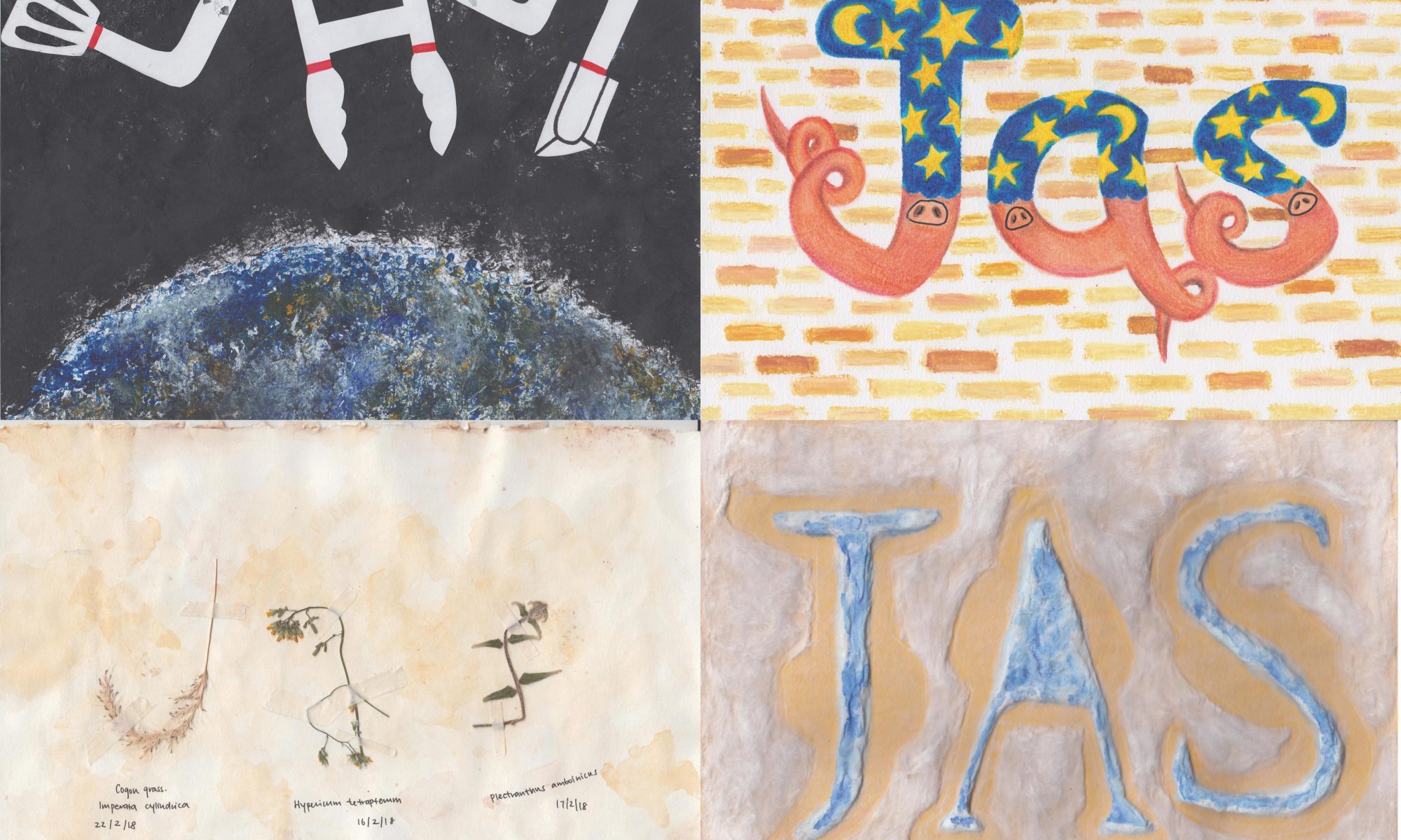
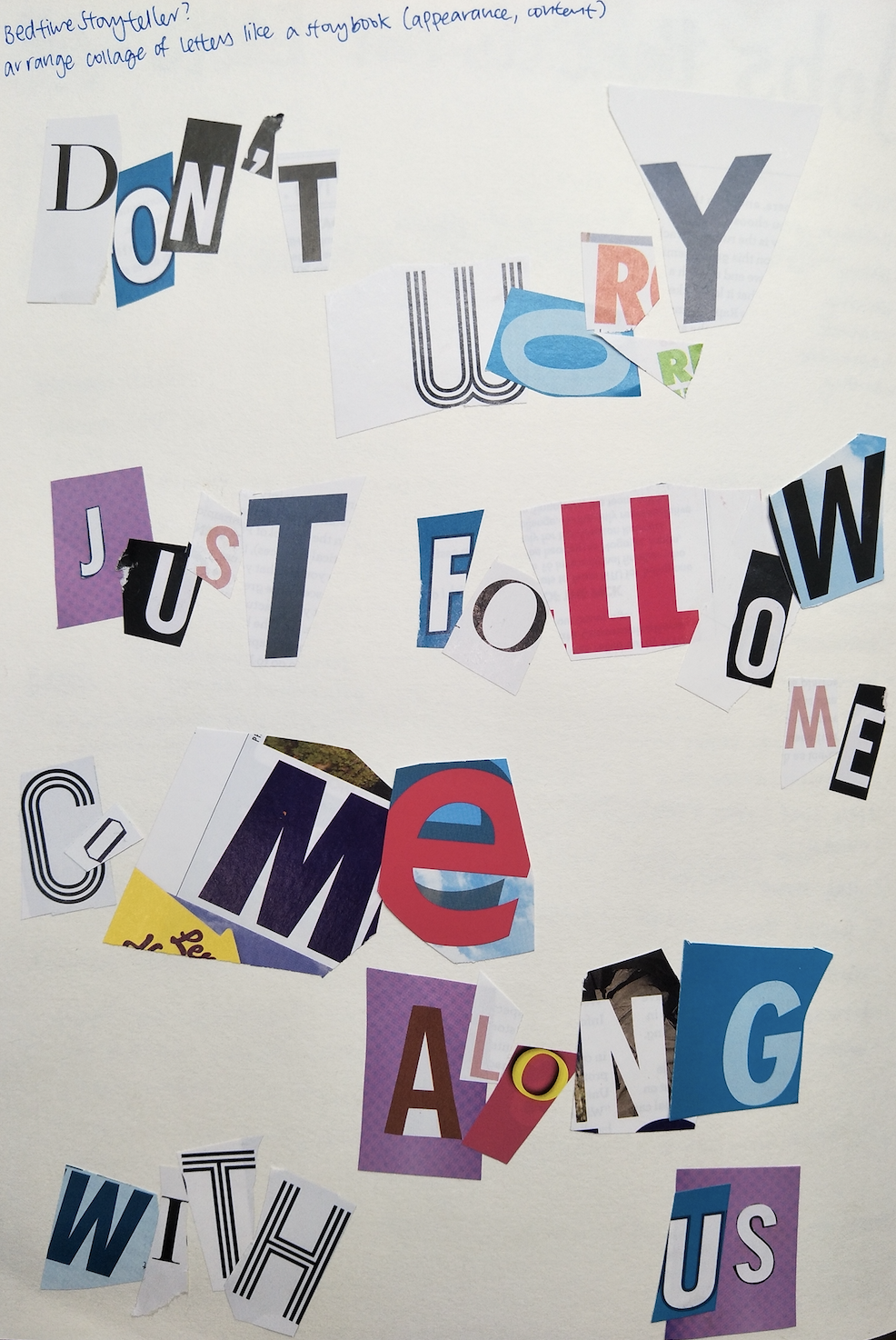
My idea of a bedtime storyteller was a role to help busy parents help coax their child to sleep. I thought about how I could possibly portray it in terms of a storybook concept, highlighting the alphabets that formed my name within the chunk of words. I later thought of using the method of collage, inspired by dadaism, to create the different alphabets to give it a comical yet possibly childlike look (with the help of the content of the text as well).
I cut out different alphabets from different places and put them together in a collage style, portraying a paragraph of text that sounds like its from a child’s book
However, I later realised that I was probably doing it wrongly because there would not be a certain font for my name specifically and we were supposed to incorporate elements of the job INTO our names itself rather than just putting the imagery. After consulting Shirley about this idea, I thought that the job was still feasible to work out and so this idea stayed YAY.
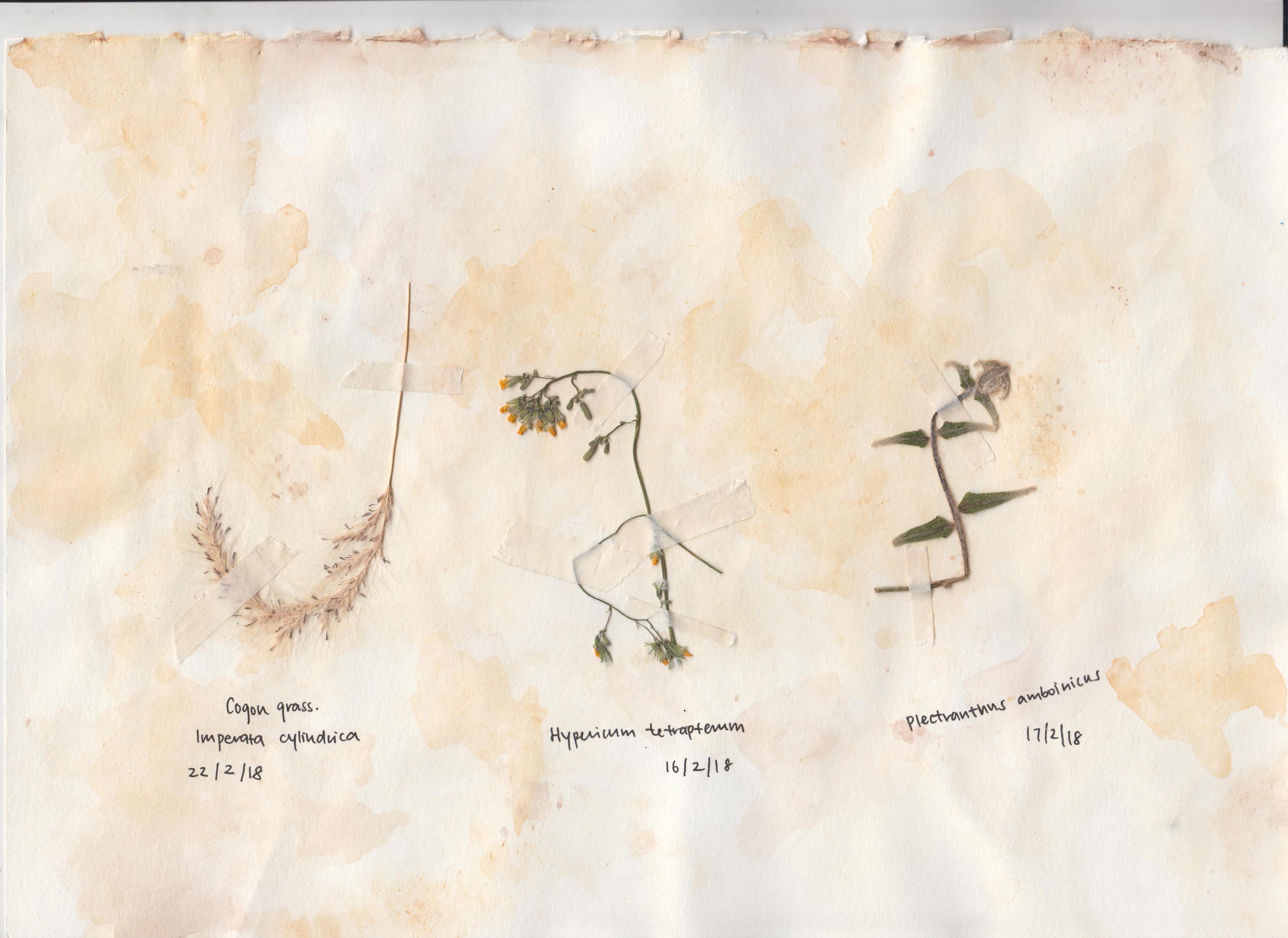
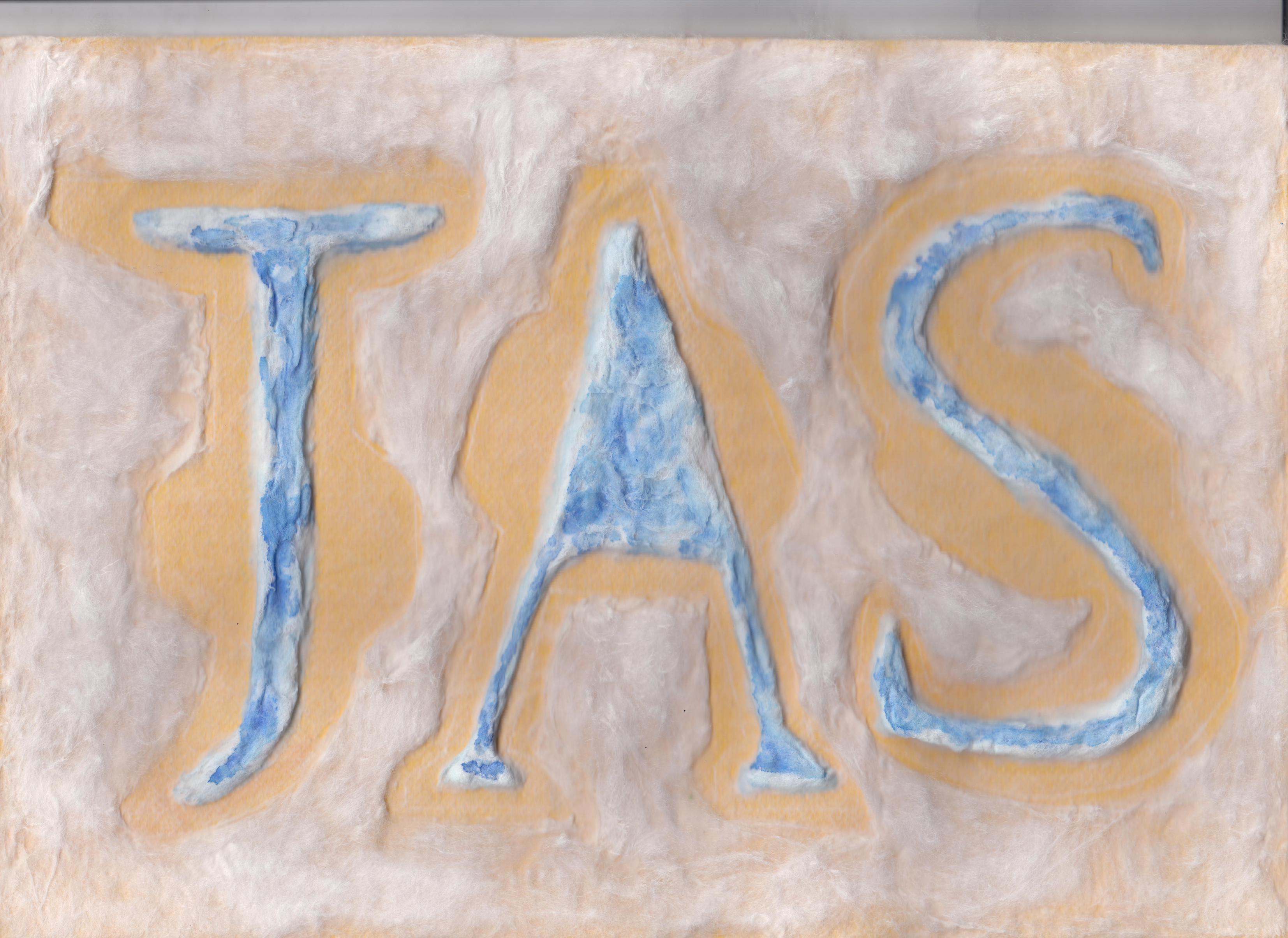
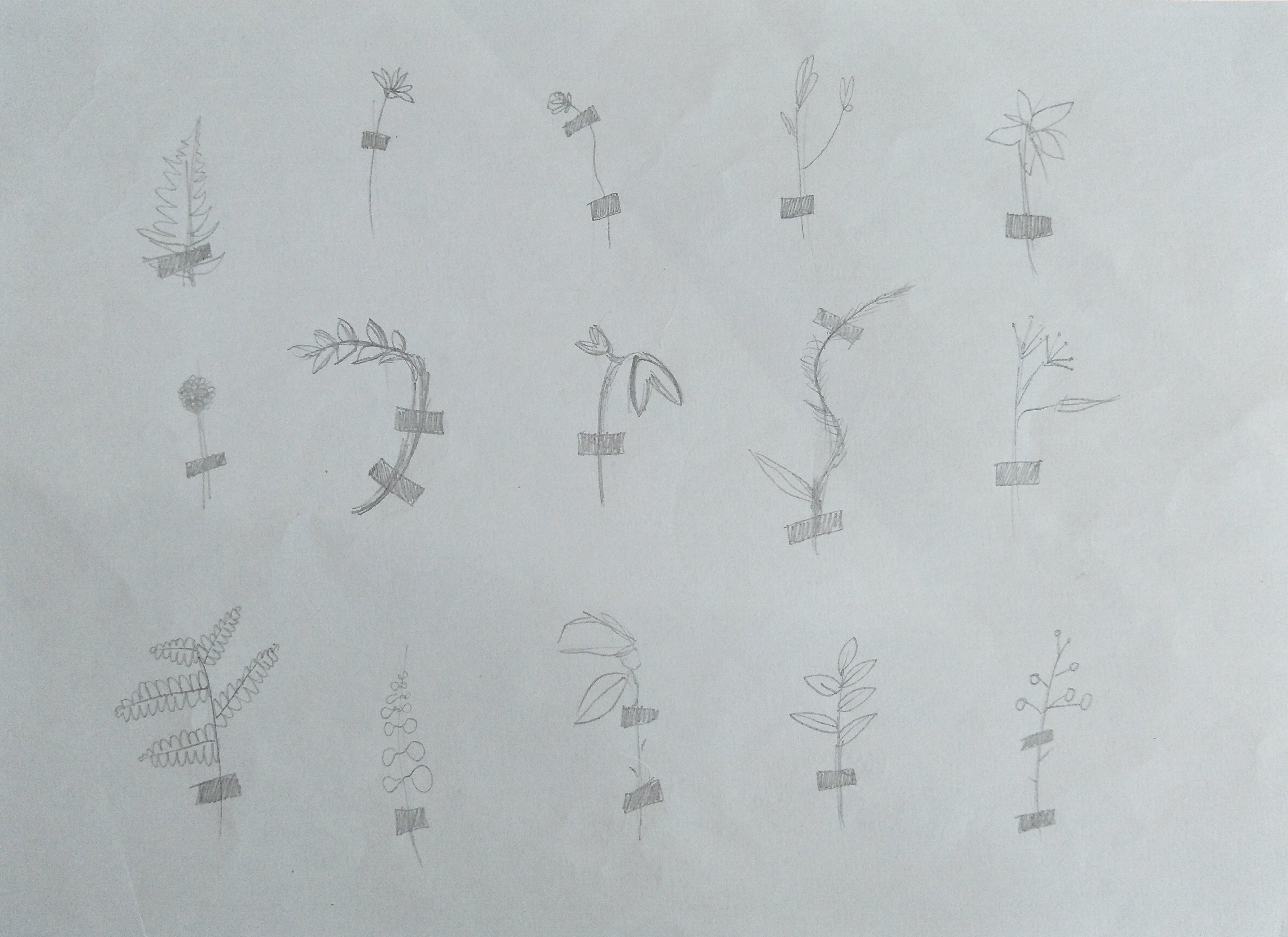
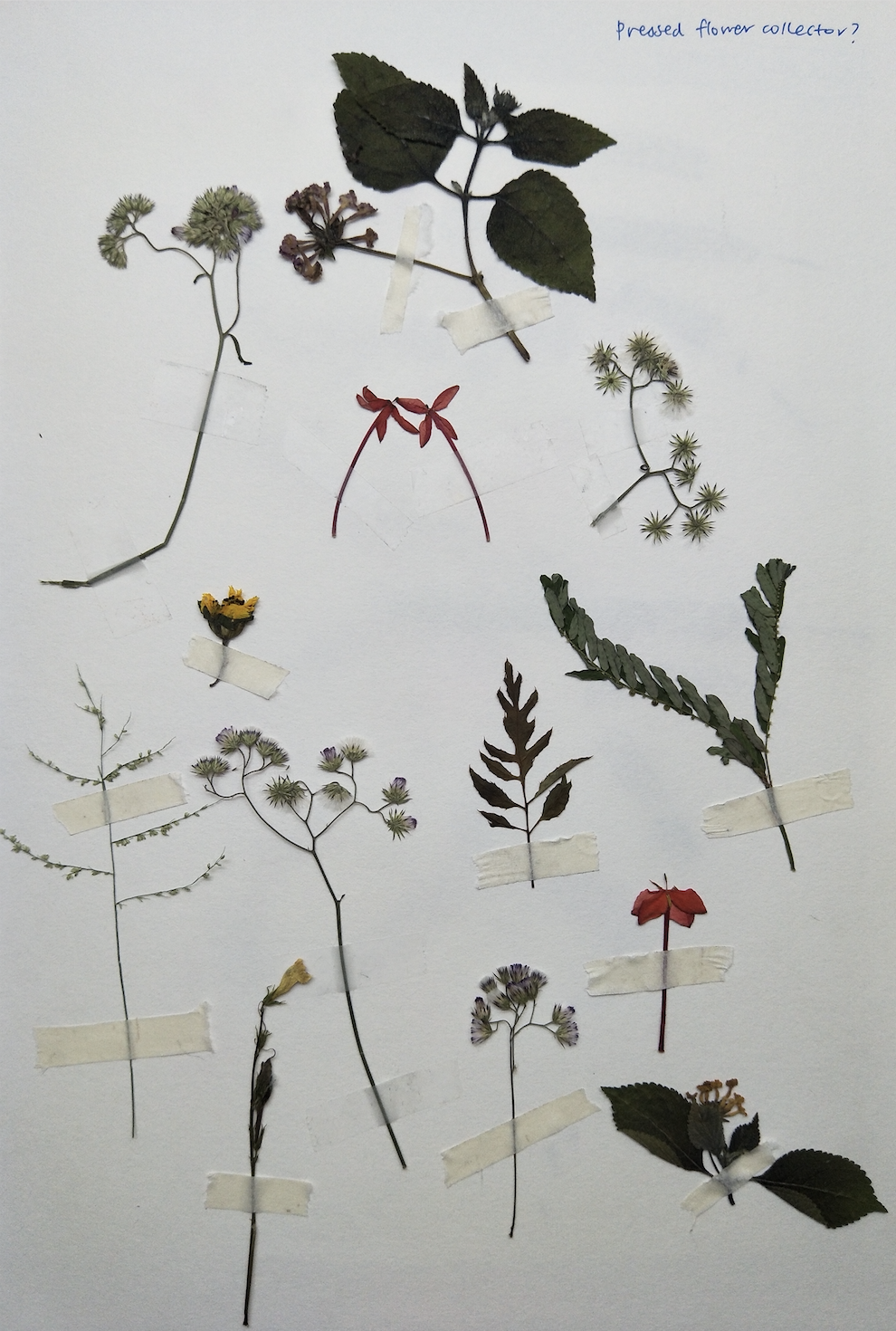
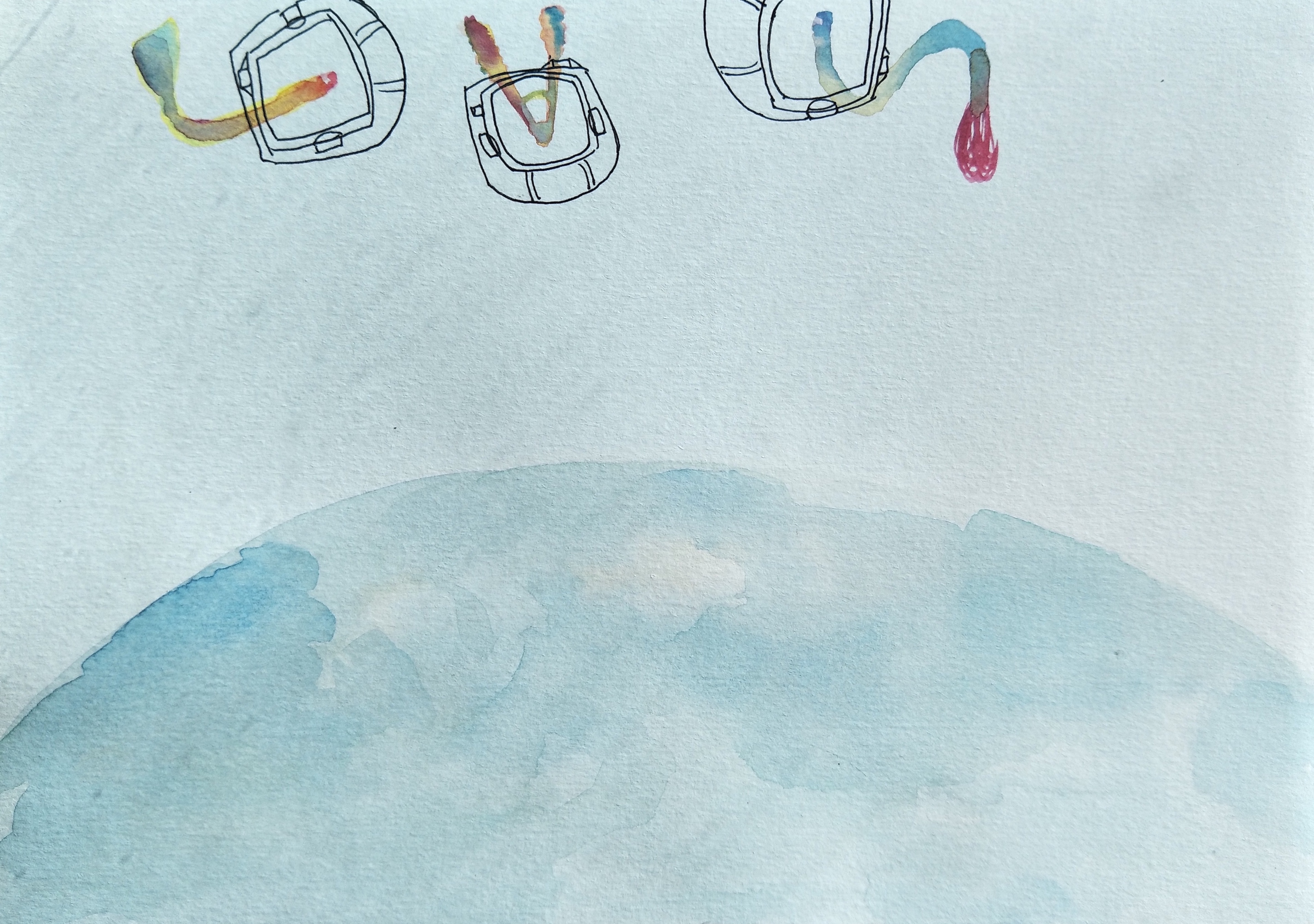
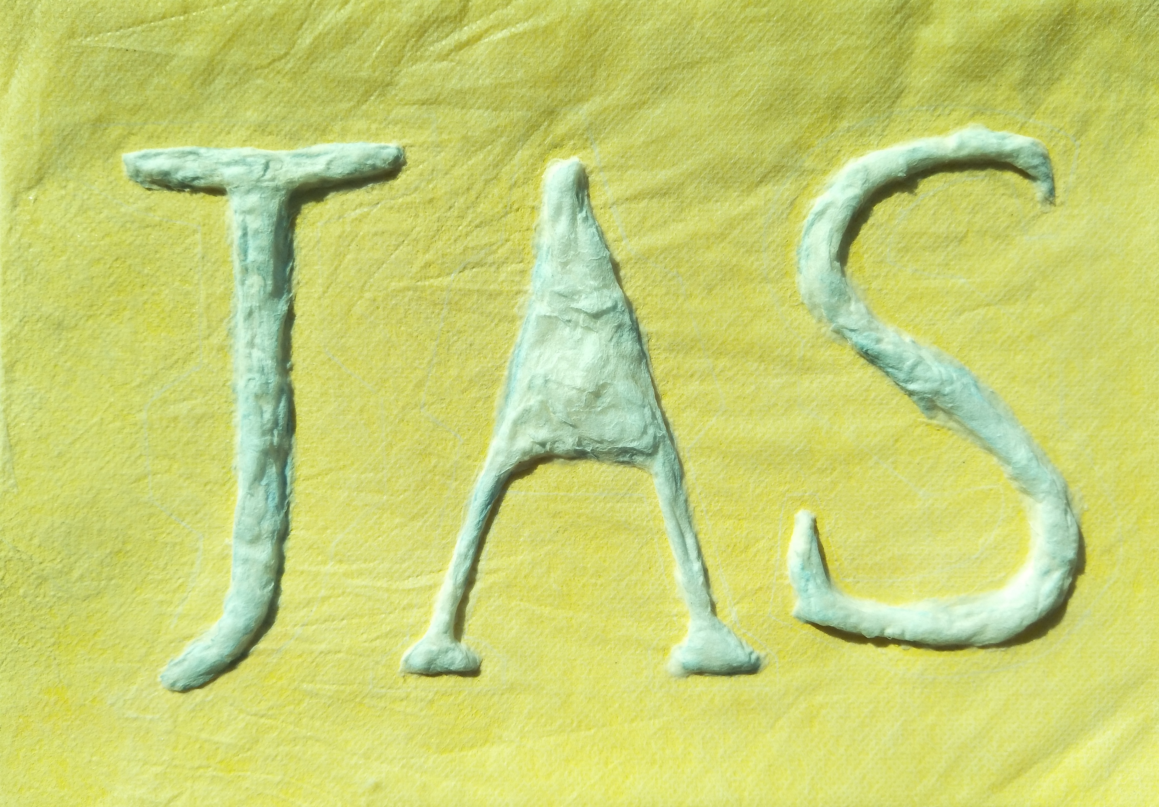
4. Pressed plant collector (Initially pressed flower collector but I thought that would be a very narrow scope so I decided to include ALL plants after)
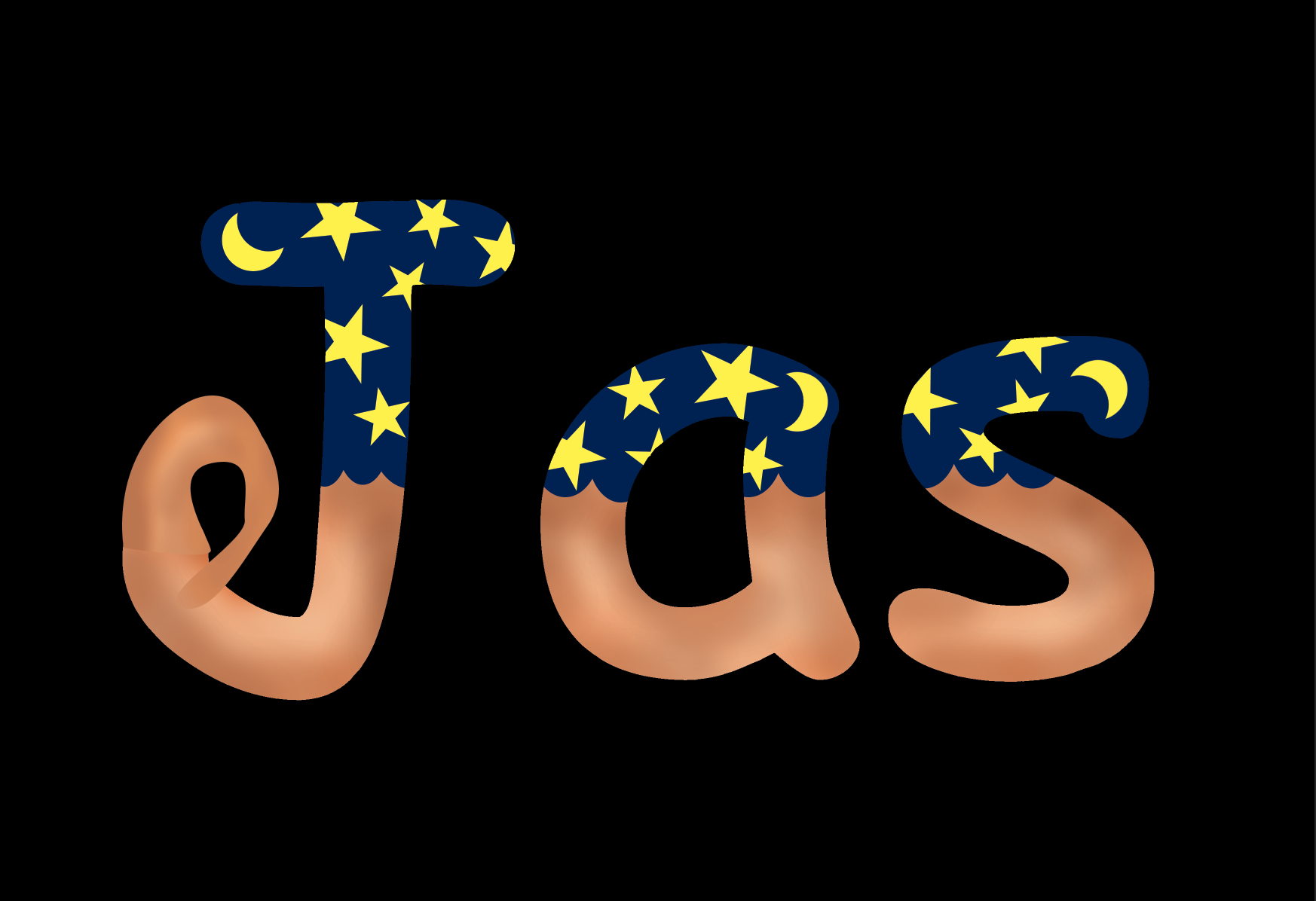
Sketch of how the pressed plants would look like pasted in a book, forming my name in the middle ‘JAS’
I really like the look of dried pressed flowers so I thought it would be interesting to try this idea out. It is also a relatively simple concept, where I just paste the plants into alphabets too signify my name. The tape should not be of an outstanding colour as well so as to not steal the attention of my name in the middle.
Process of drying the plants
Shirley mentioned that this idea was feasible and interesting due to the minimal elements but yet was able to convey the nature of the job easily so I decided to keep this idea but go more in-depth to develop this concept later on.
So till this point I only had TWO out of FOUR jobs confirmed, which was the bedtime storyteller and the pressed plant collector. Throughout the next week, I did more sketches and tried to come up with more ideas to see if they were better. I did some sketches about rollercoaster tester, bedtime storyteller, space chef, sanitary pad tester, animal manicurist and dog’s optometrist.
Rollercoaster tester:
Sketch of how a rollercoaster tester typography would look like
I liked the idea of the rollercoaster tracks but I felt like it would be quite plain and if I were to add additional elements like the safety belts, it would probably be too messy. I wanted to try and use the pattern brush in adobe illustrator to recreate the tracks, but sadly it did not work out so eventually I had to give this idea up as well.
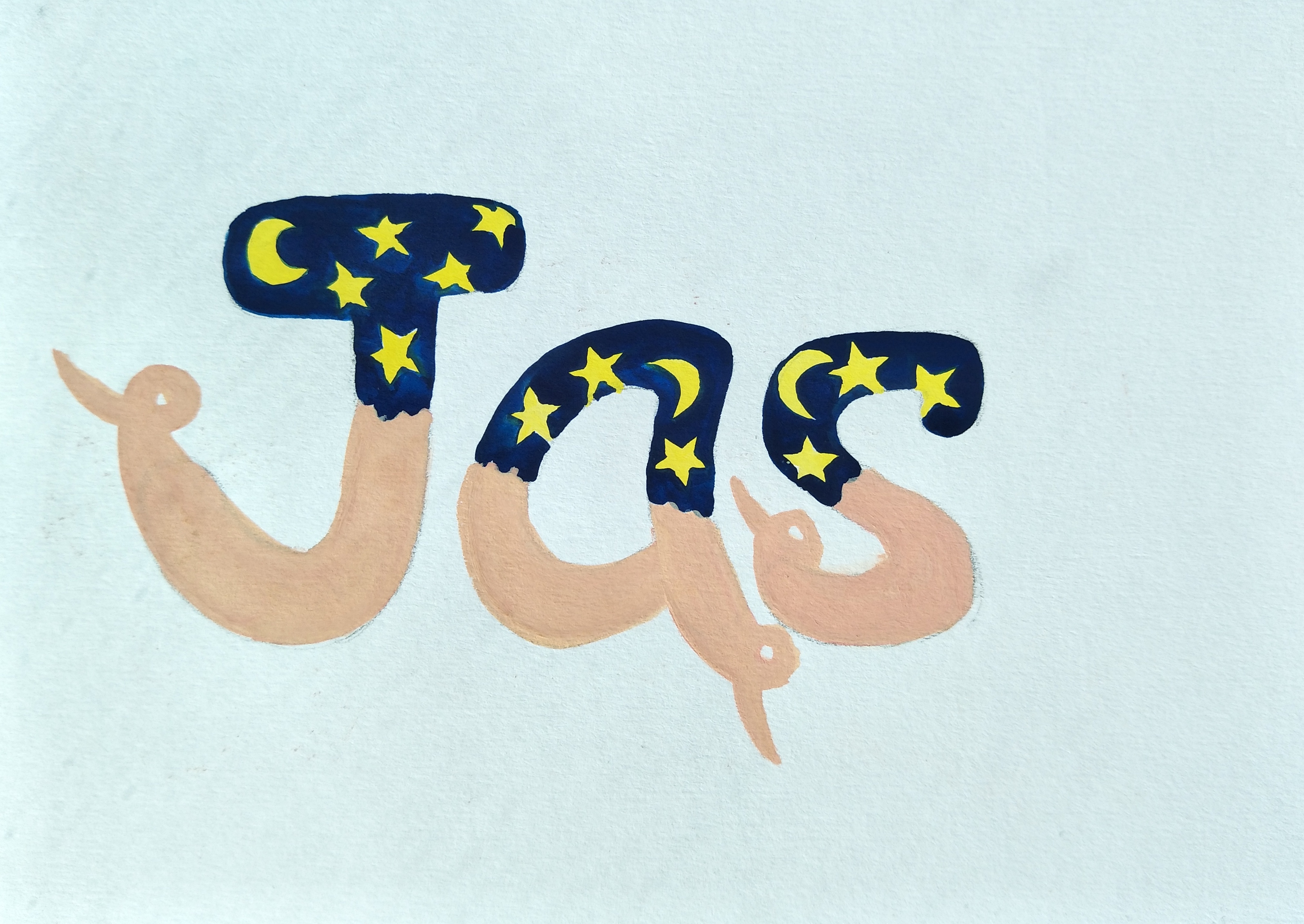
Bedtime storyteller:
Thinking about the concept to focus on for bedtime storyteller|experimenting with fable stories|experimenting with the jobs possibility?
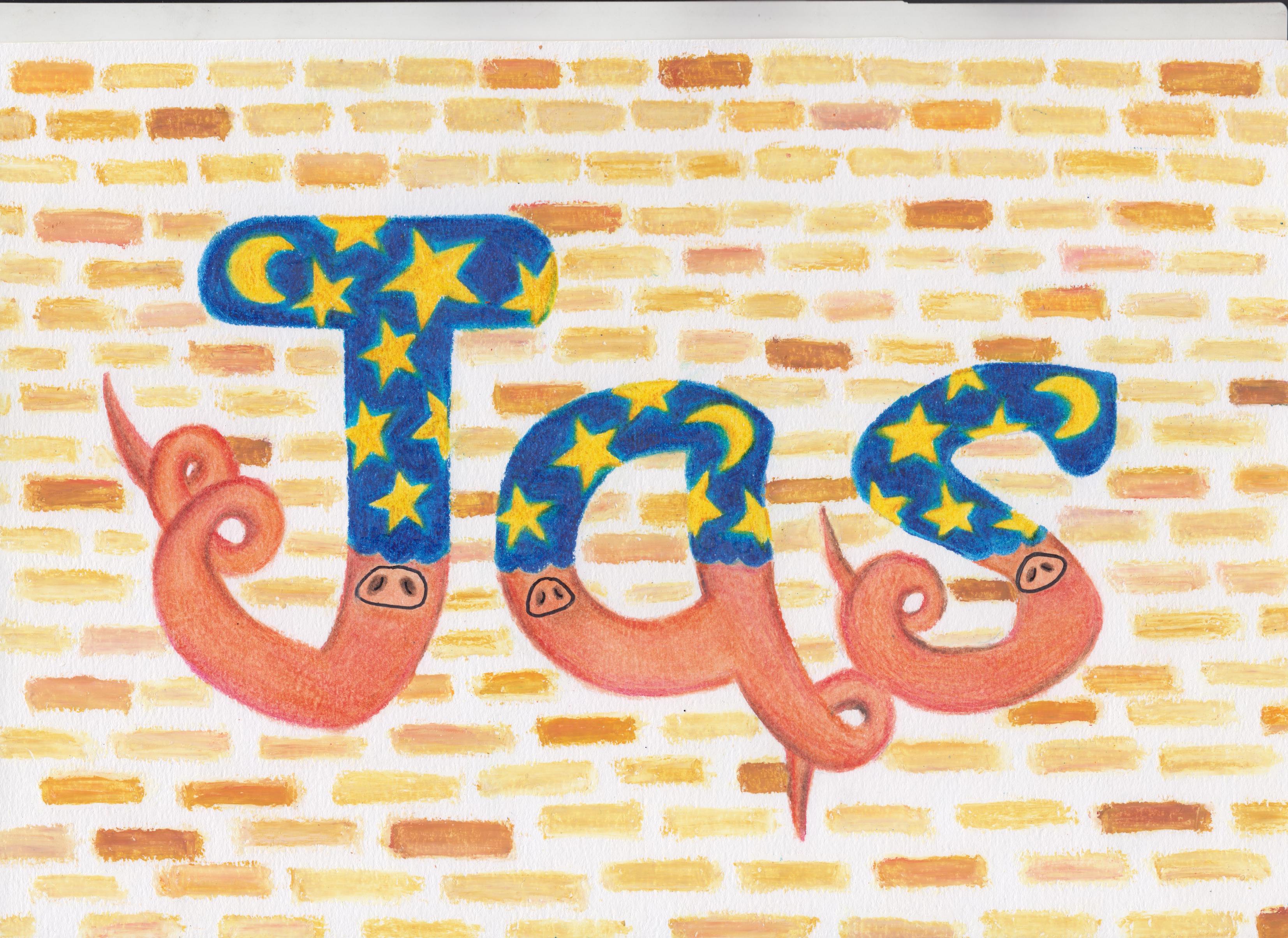
This idea was confirmed but I just had to brainstorm how I wanted to incorporate the idea of ‘bedtime’ and ‘storyteller’ into my fonts. I decided to go with the comic sans font because it gave off a more child-like vibe due to its bubbly appearance. In order to portray bedtime, I decided to add elements such as moon and stars with a dark blue backdrop to depict the effect of night time for half of my letters. I was thinking of what story I wanted to incorporate into my work so that it can bring out the nature of the job yet not complicate things. Eventually I settled on the story of the ‘Three Little Pigs’ and added the elements of the pig’s nose and tail into each alphabet. I wanted to use the three materials which the pigs used to build their house-straw, sticks and bricks as the background. After consultation with Shirley, she thought that it would be good if the background would be just a single material to not over complicate the work. So I decided to go in with a brick background ultimately. I will elaborate more on this as I share my final completed work.
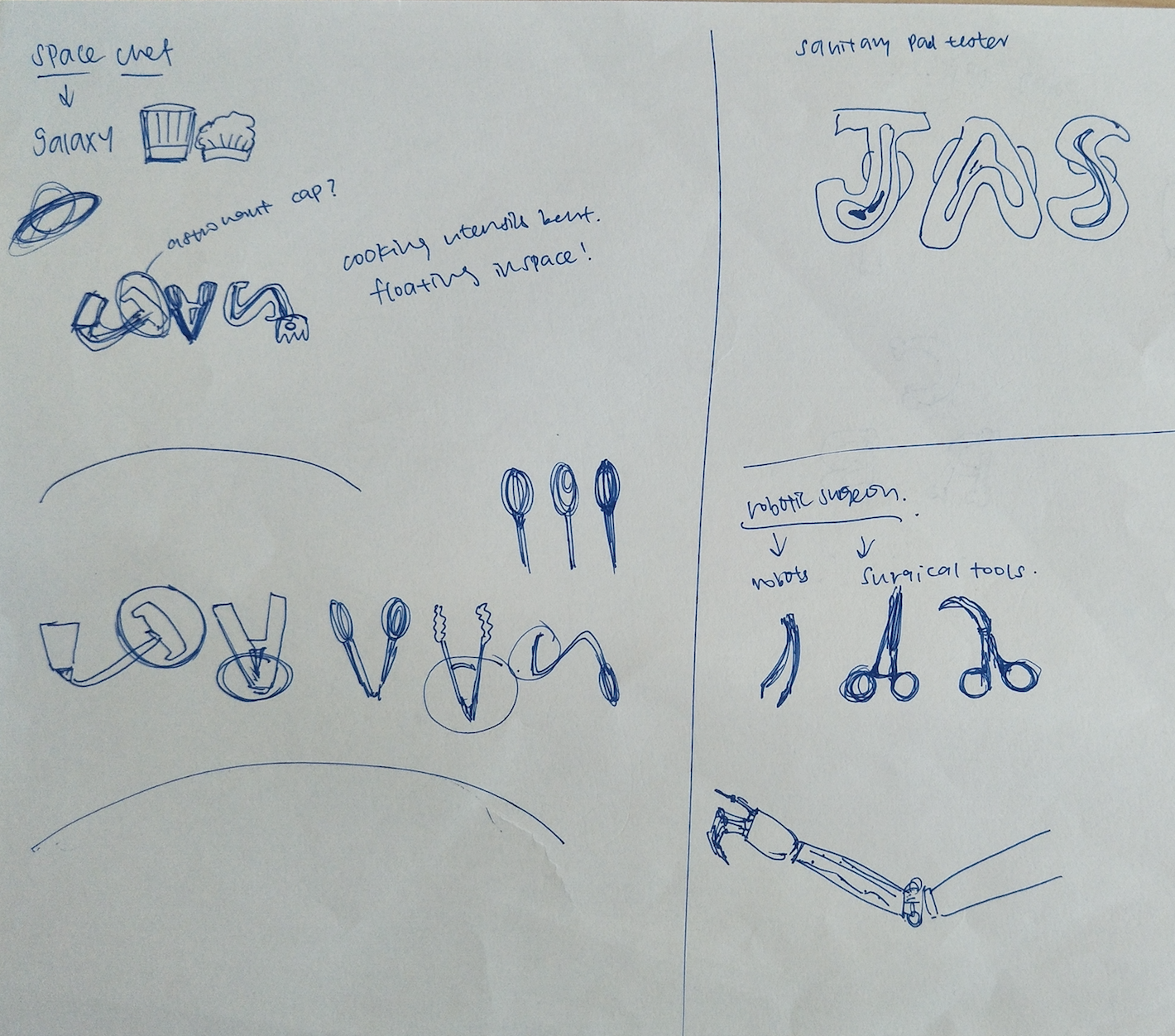
Space Chef/Sanitary pad tester/Robotic surgeon:
Sketch for space chef, the different utensils, sanitary pad tester and robotic surgeon
Space chef: I gained interest in this job because I felt like it would be a job whereby the elements can be quite easily identified and it also sounds like a really interesting job to have. I was thinking about the different utensils used in the kitchen and how they could be bent to form the letters. However, we were supposed to include the elements into the letters itself so from here I actually made adjustments which will be explained later on.
Sanitary pad tester: This idea dawned on me one day and I thought about how nice it would be to do this, something that I can do to help other women, to test out the durability and holding power of the sanitary pads.
Robotic surgeon: With the advancements in technology, I was thinking about having a job that is similar to plastic surgery for humans, but in this case for robots. As u can see, I tried to form my name using the surgical tools. However, later I felt that it was quite difficult to execute because of the difficulty to identify and show the essence of the job in my name.
Animal manicurist:
Sketch of animal manicurist and dog optometrist concept
The idea of manicurist came across my mind so I just thought I will jot it down to see if the concept was able to develop. I tried using the nails to form my name as you can see in the sketch above. However, I eventually scrapped the idea because it would be weird if the composition was made up with painted nail clippings of animals and I just did not see that working.
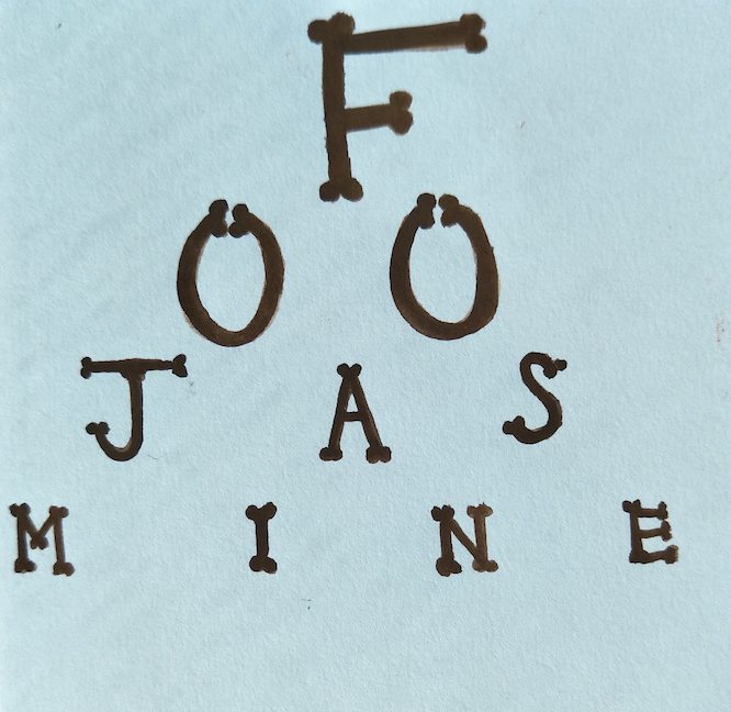
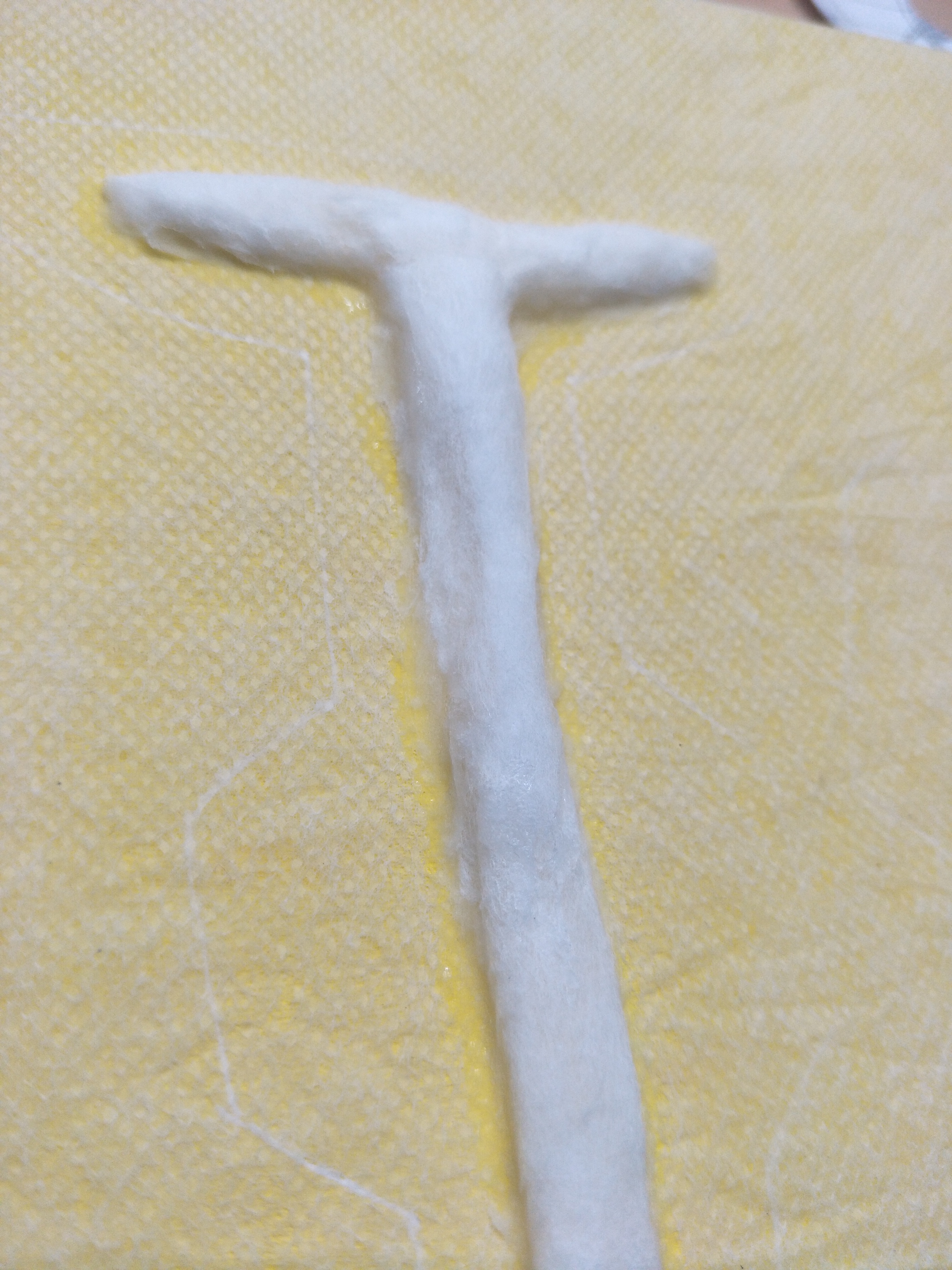
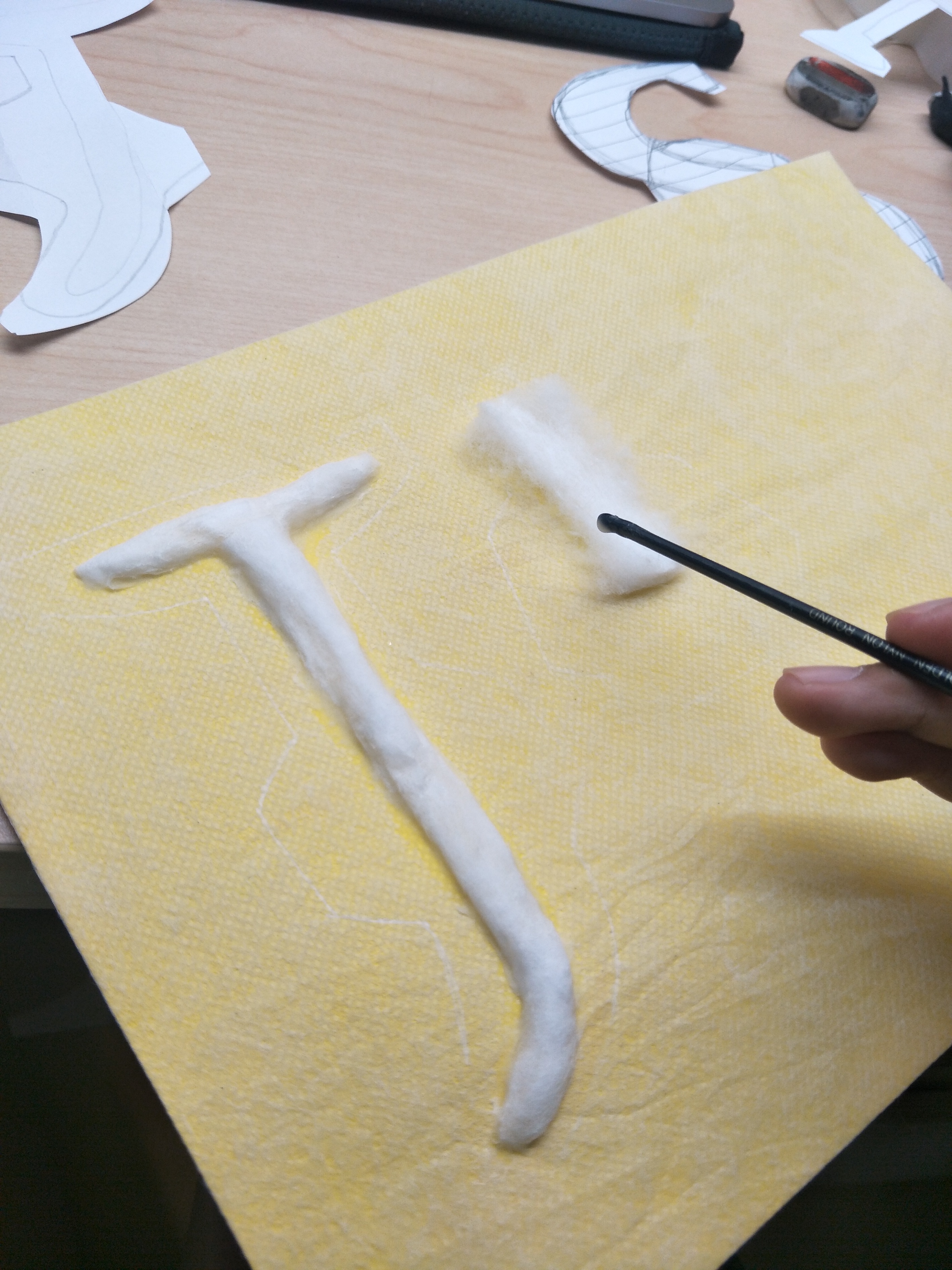
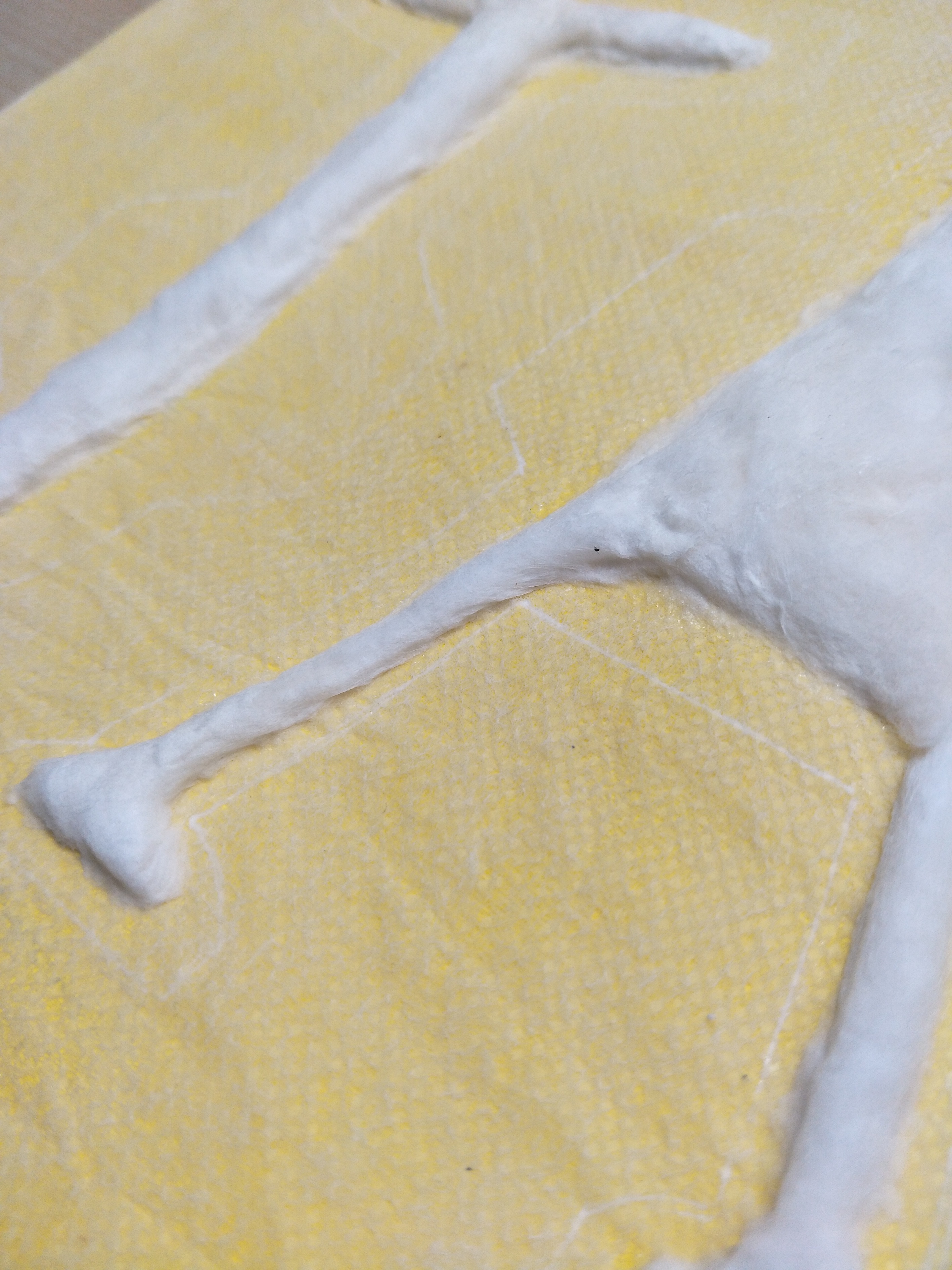
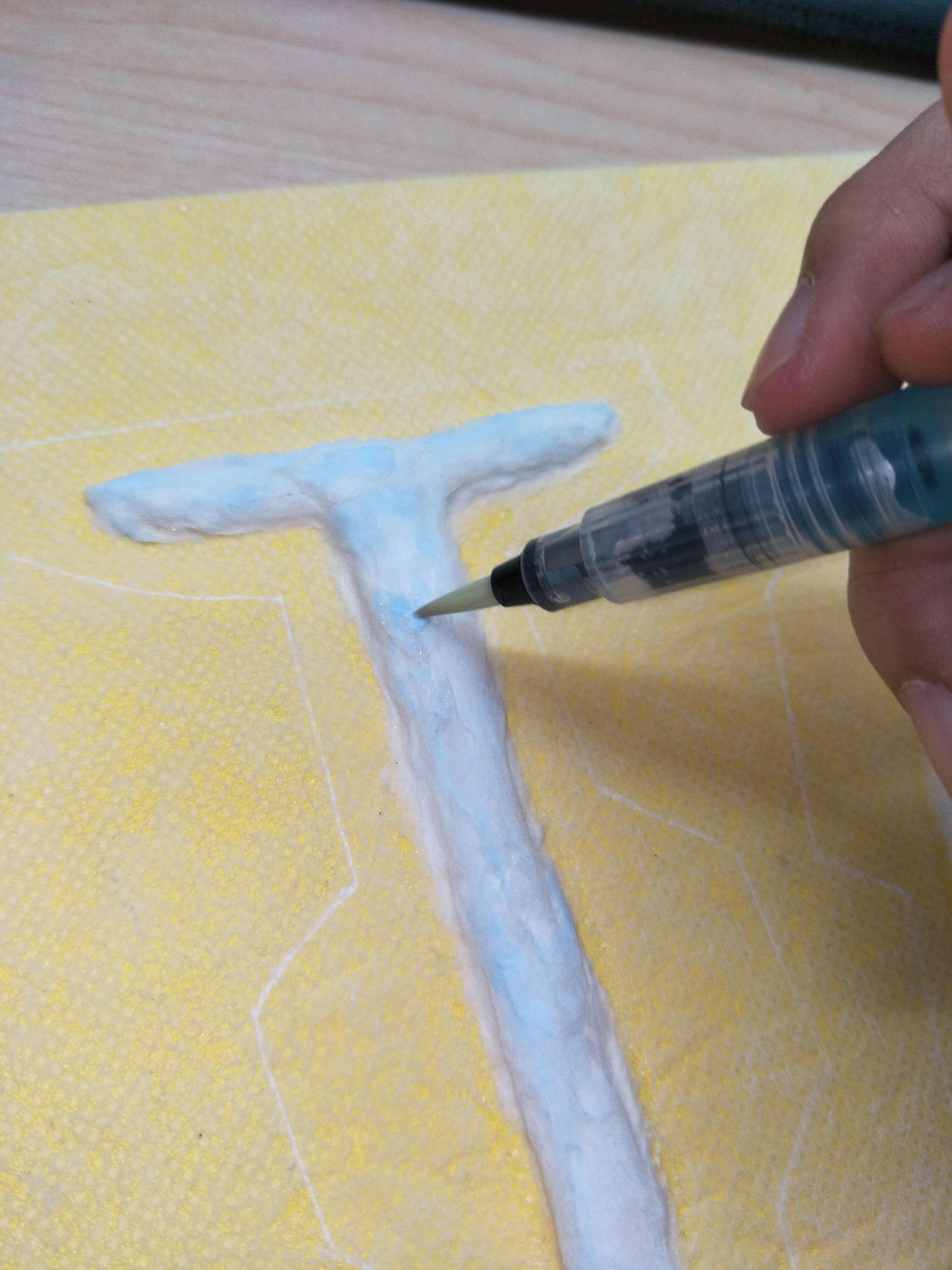
Dog optometrist:
Poster colour painting to test out how the job as a dog optometrist would work out
I made use of the shape of the dog’s bone to form into my name to look like the board that is used to test our eyesights. I thought it was kind of cute but it was also kind of too plain for my liking so I scrapped this idea off as well.
At this point, I had to make a decision to choose the four jobs I want by now and I eventually settled for space chef and sanitary pad tester as the other two jobs, other than the confirmed bedtime storyteller and pressed plant collector. I had in mind a way to execute them and I thought that they were pretty interesting and unusual jobs.
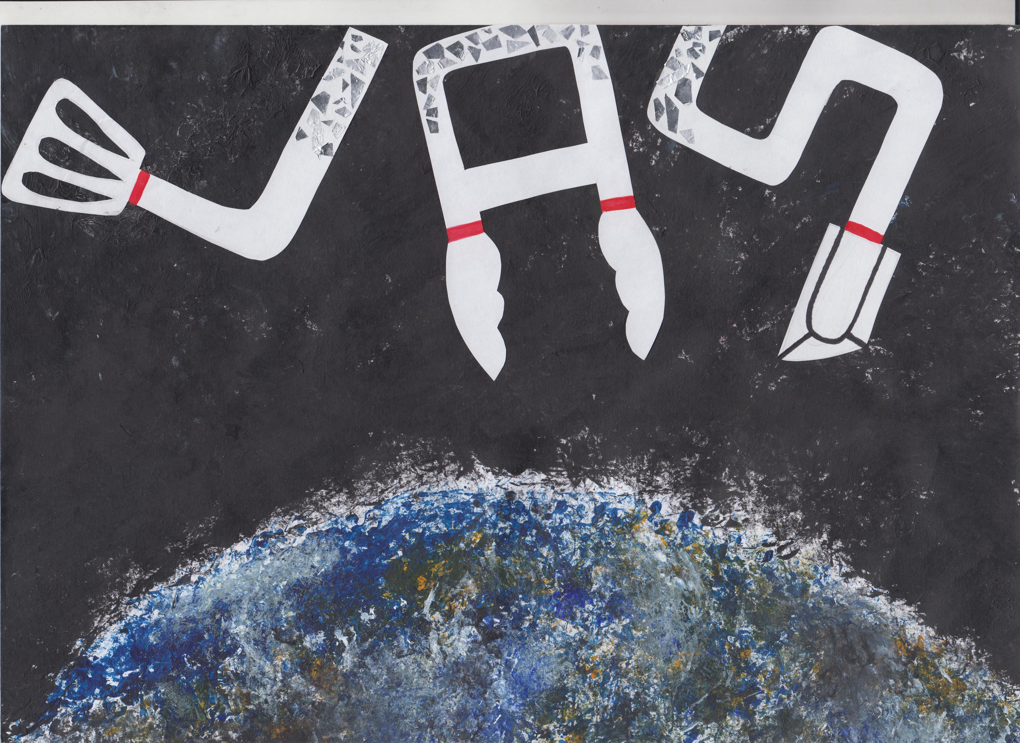
Space chef:
Poster colour painting of how my space chef job would look like
I used poster colour to do up this painting, with the Earth at the bottom of the work to show that this scenario is in space itself. The alphabets are floating and I wanted to make the them galaxy coloured but it did not work out well, the details of the kitchen utensils could not be seen as well. I then added the helmet of the astronauts to each alphabets to show that they are floating in space. However, this needed more improvements such as choosing a specific font to work on and to try incorporate the essence of an astronaut into the letters.
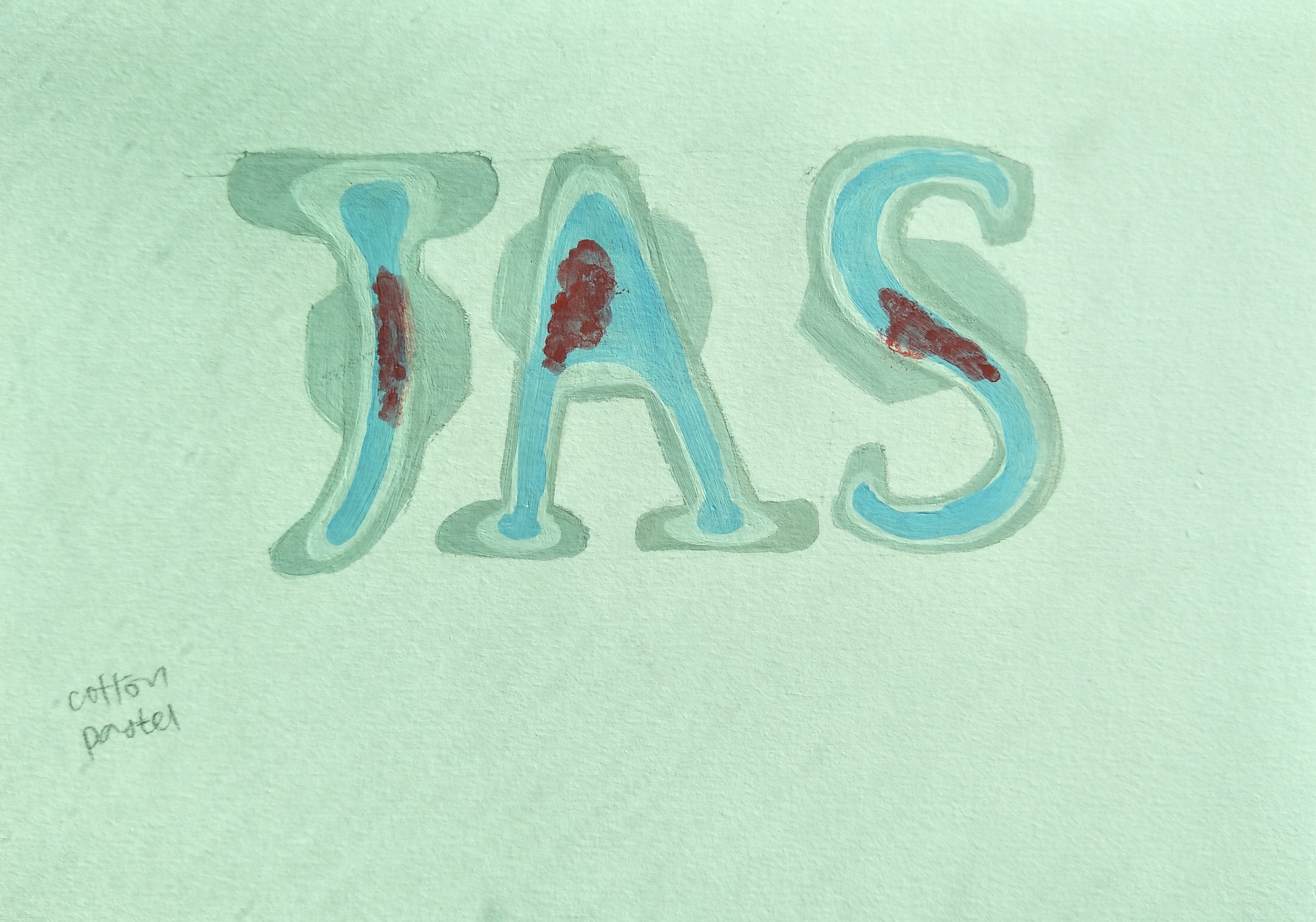
Sanitary pad tester:
Initial try to represent sanitary pad tester
Initially when I thought of sanitary pad tester, I thought of blood and I came up with this. But Shirley said that it looks like a murderer instead so I opted for another way of representing it.
Poster colour painting for sanitary pad tester in my next try
Shirley suggested that I used the serif font in our previous consultation so I went ahead and made the letters each look like a sanitary pad themselves with wings. The look of the ‘blood’ was a little weird so Shirley said to get rid of it and to just use blue liquid as the testing liquid instead. Shirley also mentioned to get a background which could be cotton to represent the lining of undergarments.
Bedtime storyteller:
Poster colour painting of mock-up of how the letters would look like
I combined the look of night time with the pig’s tail in the alphabets for consultation and see what parts I can improve on.
From here onwards, it was about making adjustments till I get the final piece of work.
1. Space chef
Cut out alphabets
I chose the copperplate font for my space chef job because it gave off this outer space look with the slightly fat characters which almost has a squarish structure to it. Initially I wanted to do cutouts of the letters, then crumble them for texture and add white paint and ‘chop’ the alphabets onto the space background I did. However, the effect did not turn out as opaque as I wanted it to and the texture felt pointless to me so I decided to re-cut the alphabets and just paste them as how they are.
Final outcome!
I do not have a lot of photos recording the process of making this but basically I just stamped black paint for the background using newspaper to give that almost like galaxy looking sky with empty spaces looking like specks of stars in the sky. I also used the same method to stamp the Earth at the bottom and I thought that the technique gave the look of the Earth a more interesting take because of the textures created. I then cut out paper for the alphabets, with the essence of kitchen utensils in each letter and pasted it on the black background. When I look up astronauts outfit, they all seem to be wearing this puffy white suit with a helmet so I thought that the white alphabets would make sense in this case. I wanted to make the alphabets look bit puffed up too but I was worried that the font would not be as visible so I decided to not include that. Instead, I added the red lines that was commonly found on the space suits and I also added aluminium foil to the top of each alphabet to signify the shiny part of the helmet. The alphabets was also arranged in a manner to look like they are floating in space so the orientation is in a more playful formation with the ‘S’ going out of the frame itself.
2. Bedtime storyteller
Experimentation with different materials to get different textures (top to bottom: crayon freehand, acrylic with stencil, crayon with stencil)
I tried to make a stencil for the bricks and experimented with acrylic and crayons. In the end I decided to use crayons for the bricks because it gave a more realistic looking texture. I then decided at this point to use only colour pencils and crayons for this piece of work since it was on bedtime storyteller and it would mean its very child-like so using materials such as colour pencils and crayons also hold this feeling of a child to me.
My initial piece that I did using crayons and colour pencils
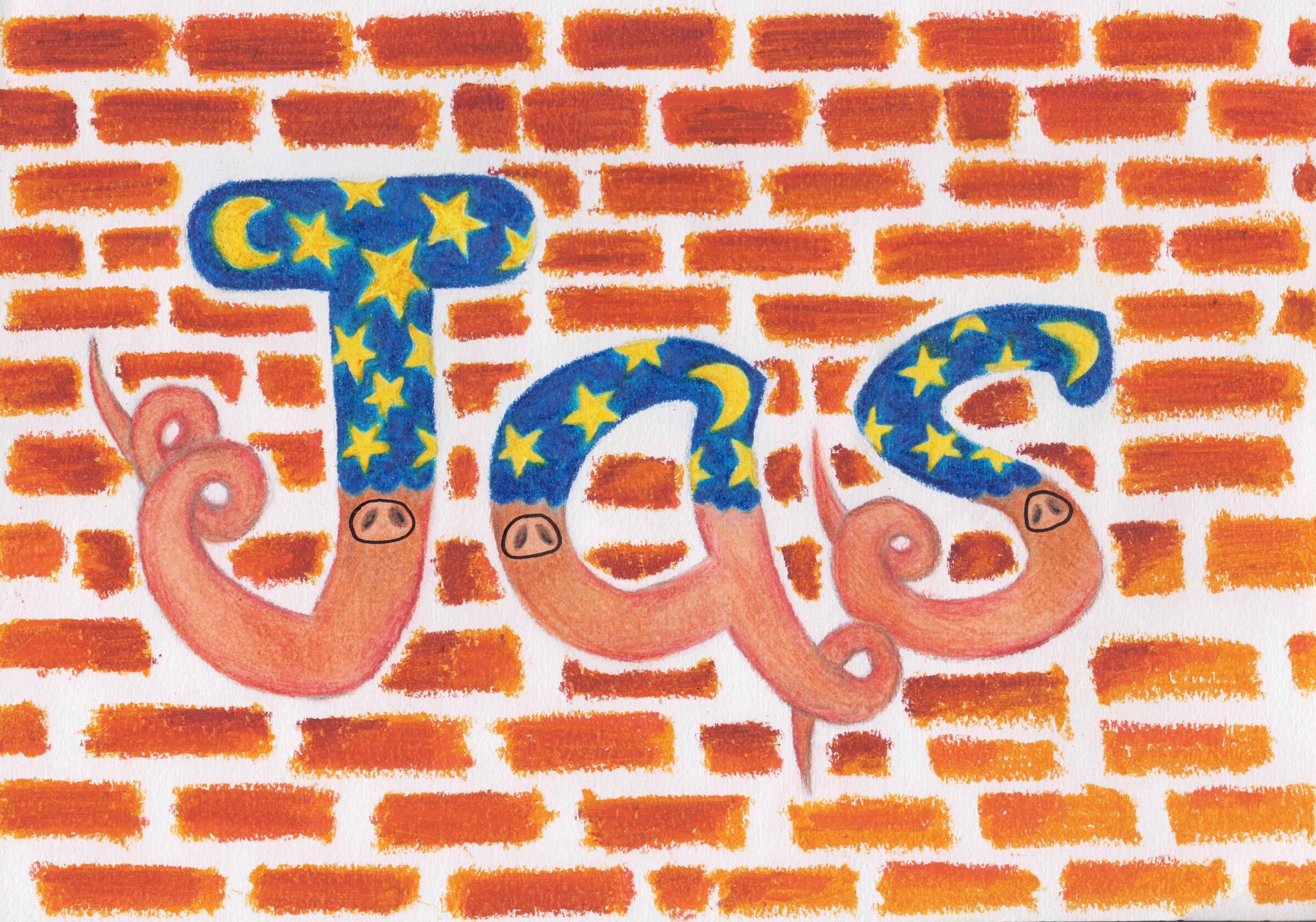
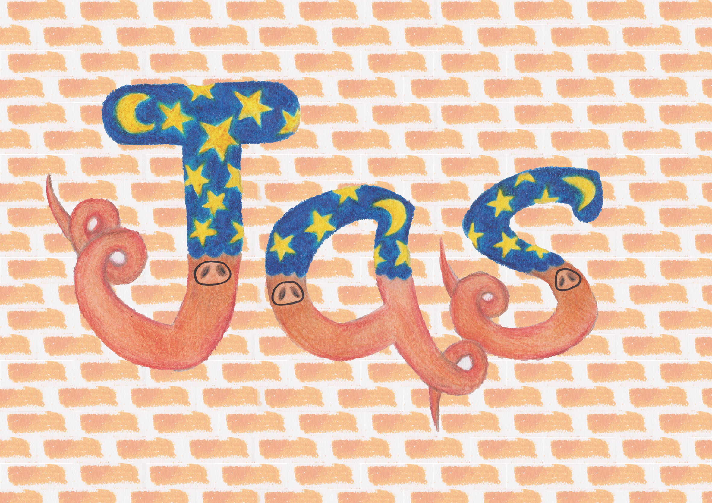
I also added the pig’s nose on each alphabet to make it more obvious that its pigs. The look was very outstanding but the background colour was quite similar to the bottom of my letters, the colour of the bricks was also too saturated that it stole the attention from the letter itself so Shirley suggested I change up the background digitally to make the colour at the back more muted.
After editing in photoshop
I took out the letters and cropped out one brick and duplicate it for the entire background. I then tone down the opacity of the background to give this more muted orangey shade. However, I was not fully happy with how this looks because I used one brick and duplicate it many times, it gave a very structured look to the background. The brick was also slightly slanted and I just felt like it could be better. I also tried using photoshop to create the letters as shown below but I just felt like it was taking a really long time and there was no textures as a result of it.
I tried using photoshop to create the letters
So I decided to just redo everything by hand, making sure to tone down the bricks in the background. So TA-DA!!
Final outcome!
This was the final look and I played around with the shades to give the bricks more definition. The letters were able to ‘pop’ because of the contrasting tones with the background as well, so I was quite happy with this one and how it turned out eventually.
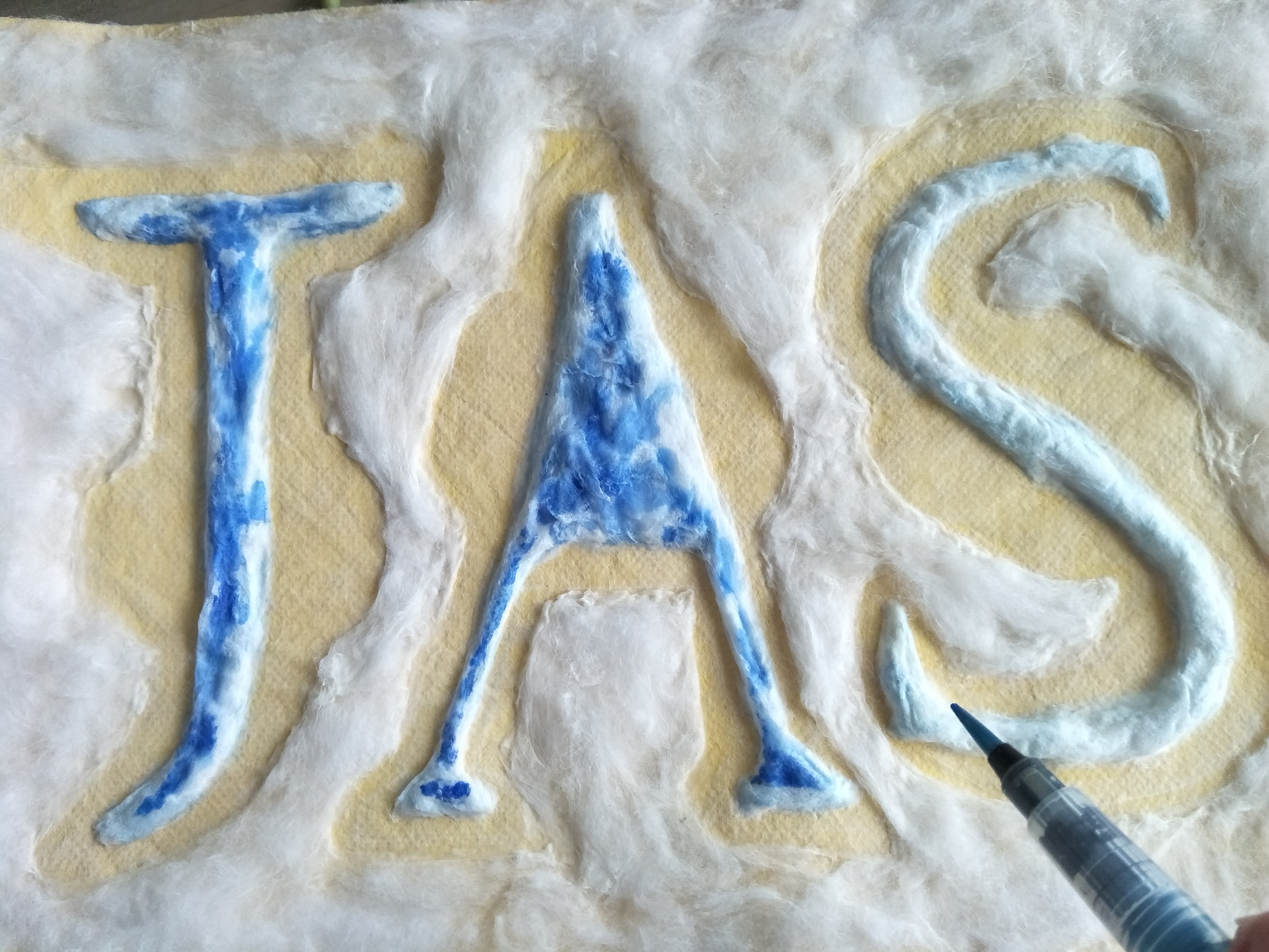
3. Pressed plant collector
From the start when I did the composition to show Shirley, I stuck a lot of other plants and flowers around my name itself. However, it felt like the colour of the plants and the thickness overpowered the main focus in my work. So she told me to remove them and just focus on forming my name ion the middle of the work.
How it looks like initially
This was how it looks like after I removed the surrounding unnecessary plants but I had to paint the paper so that it will look like paper that has been kept for awhile and turned yellow. I went to search on how antique paper looks like and I tried to recreate the effect with two shades of poster colour namely yellow ochre and vandyke brown. I also tore the paper out from a sketchbook so that it will look like it came from a collection and was torn out from the book.
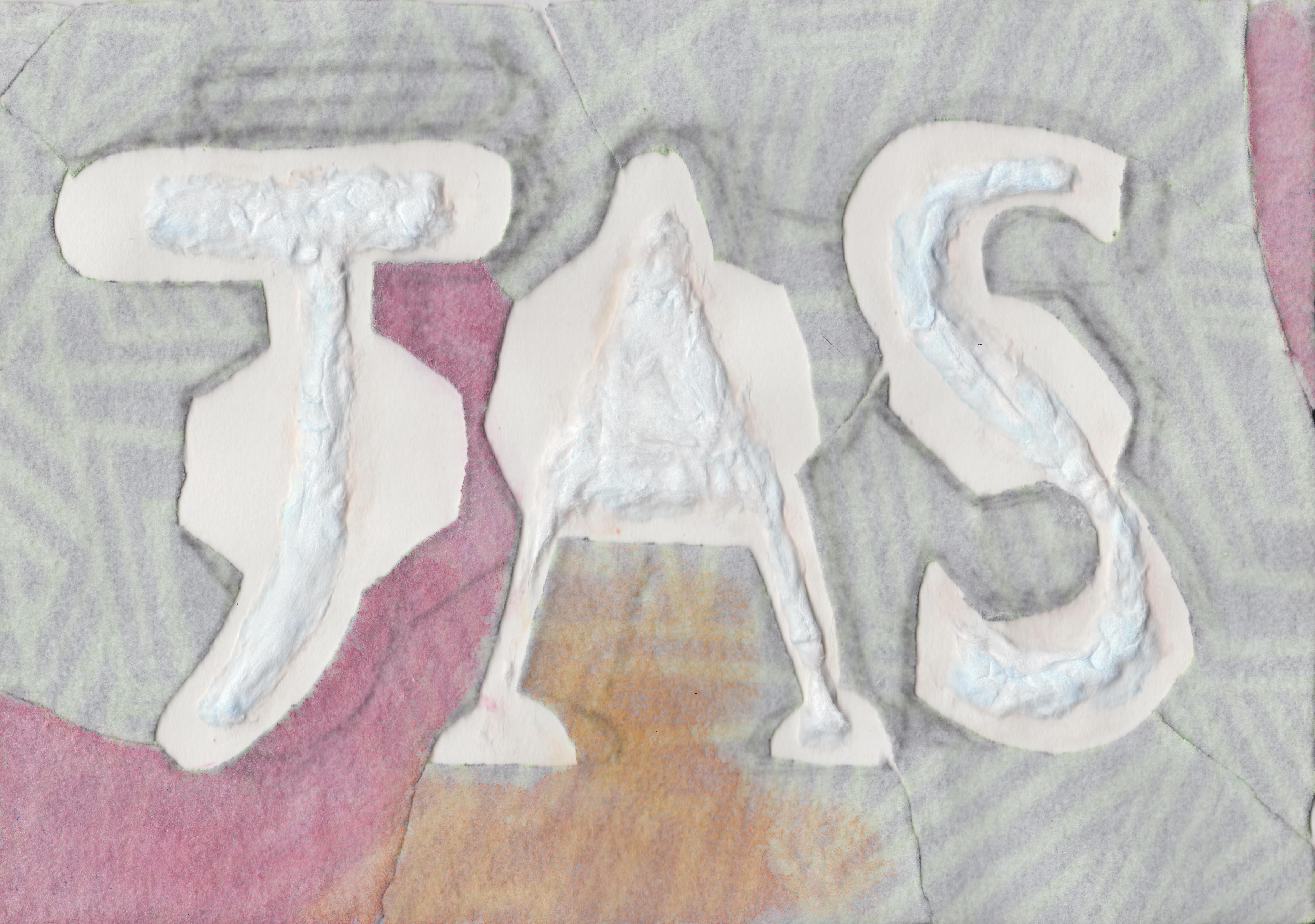
Final outcome!
This was how it looks like eventually! It took a really long time to do the background because the effect of old paper is not so jarring, there needs to be the build up of brownish tones to eventually create patches on the paper that would look more realistic. The paint also dries lighter than when first applied so there was a need for reapplication many times to get the look I wanted, which looked good enough like old paper but to not steal the attention away from the pressed plants. I also darkened up the edges where it looks like it was pulled out from a notebook to signify the rusty staple bullets that were used to bind them together. I then googled for the names of the plants one by one and recorded it in a manner with the scientific name and the date I collected them. I intentionally made the last line bit slanted so that the composition would not be so straight and it would also feel more like a real torn out page from a book of pressed plant collection.
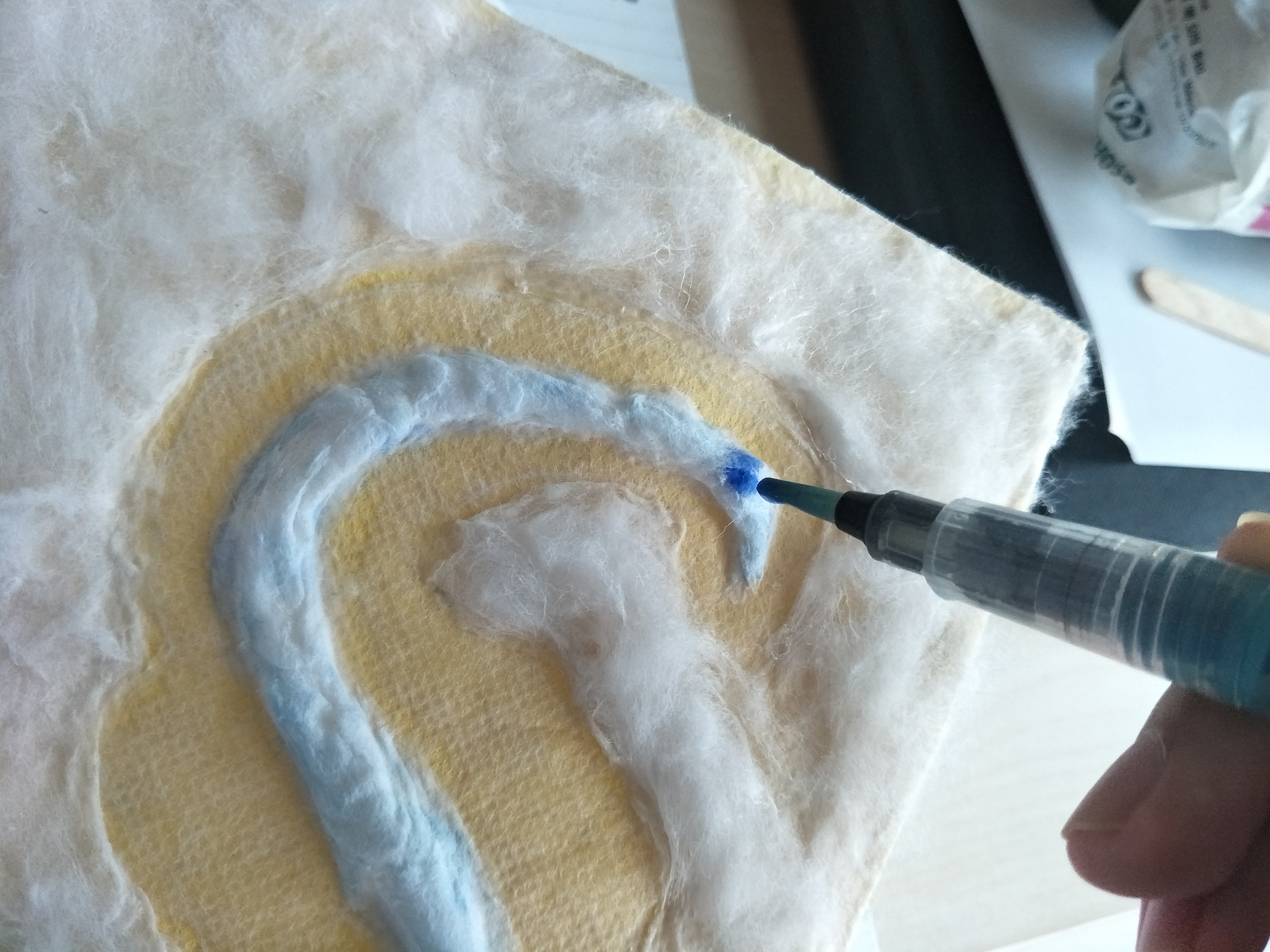
4. Sanitary pad tester
How it looks like at first, with the use of negative space to form the pads
I thought that it would be quite literal if I directly formed the shape of the pads so I decided to play with the use of negative space, forming a border around the alphabets to give it that sanitary pad shape. Shirley suggested a cotton background in pastel colours so I got some cloth and tried to paste it up, however, after consultation it felt like if this was how its going to look in the end with each section of the cloth coloured ink a different colour, it might take away the attention of the name itself. Hence Shirley suggested that I use the same technique of what I did for the middle of the alphabets but to form the entire border around the paper so that the background would be less focused on. Thus I then redid the work and started with painting the base paper yellow to give it a more happy vibe. Then I layered this cloth that was from a high heel bag on it because the cloth had a texture that was similar to the ones from real sanitary pads.
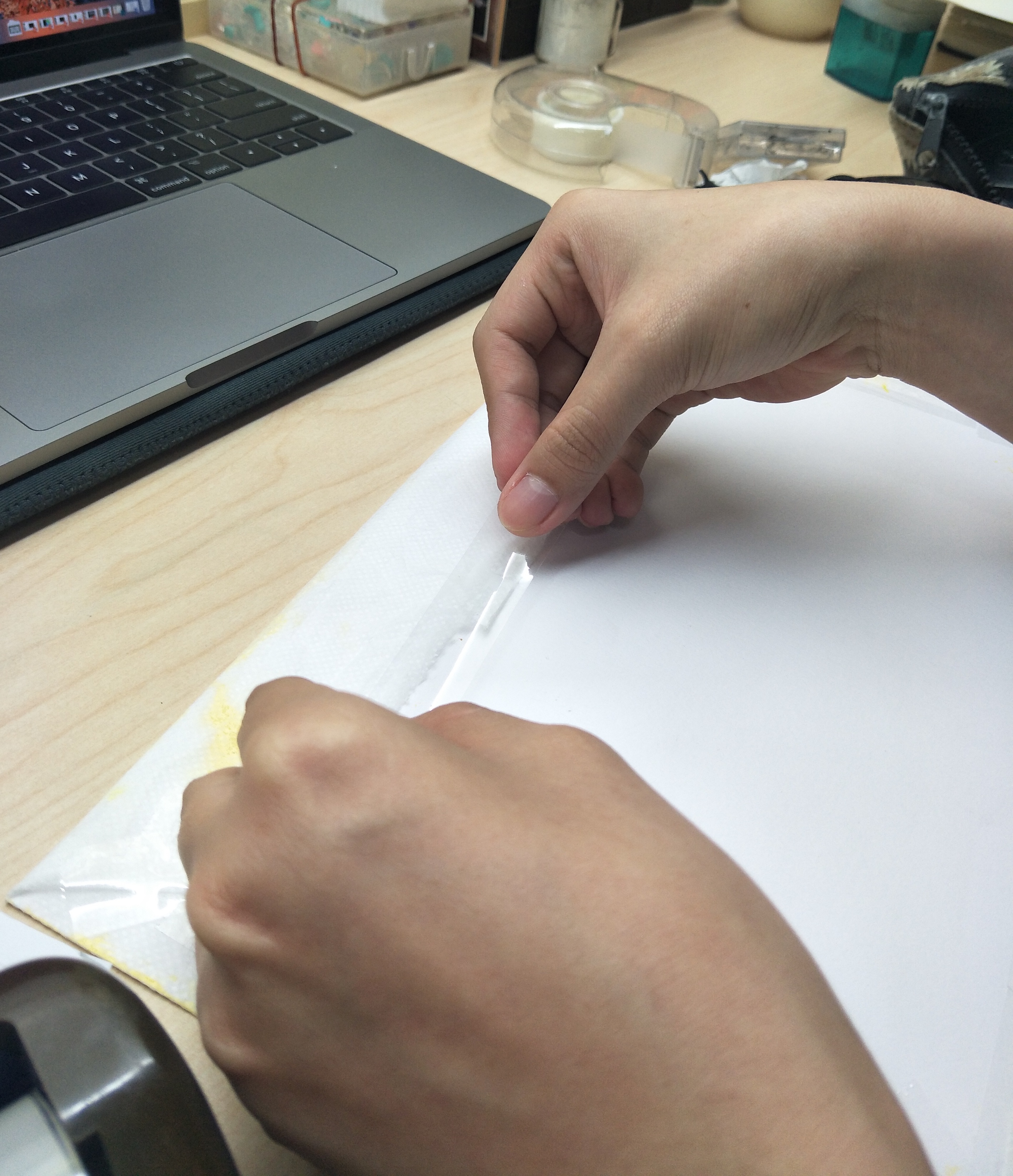
Taping the cloth to the paperHow it looks like with the clothI started to use glue and cotton wool to form my name which is the inside of the padsHow the letter looks like
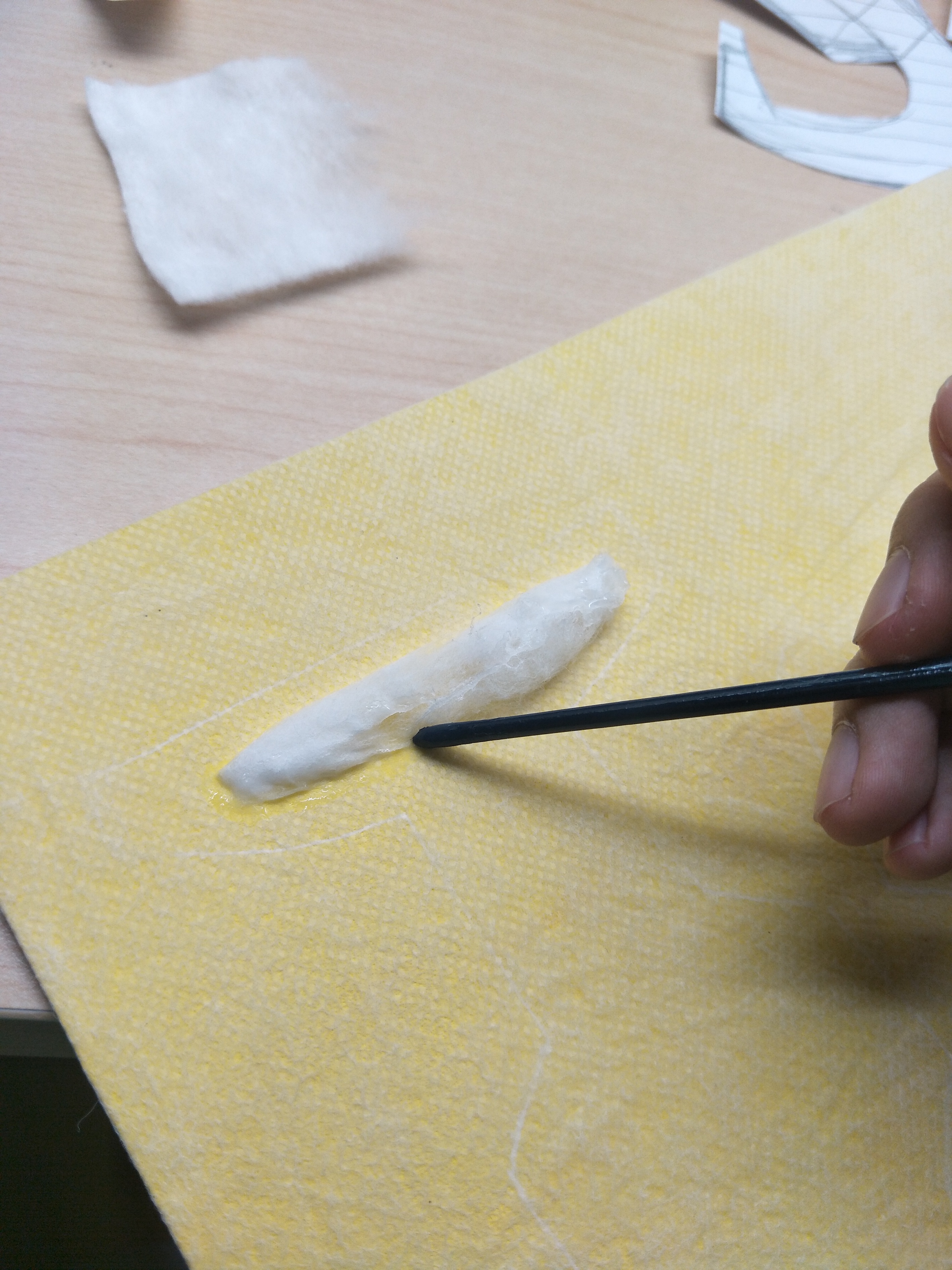
Process of gluing the cotton downHow the completed ‘A’ looksColouring the insides with a light blue colourHow the completed alphabets look like on the clothPasting up the background with more cotton woolAdding the blue tester liquid onto the letters
Final outcome!
I made up the shape of the sanitary pad using the negative space and this was how it turned out. I was a little disappointed at how the blue tester liquid spread out on the cotton itself and how it made the pale blue of the insides less visible. However, because of that, it also showed the characteristic of a sanitary pad of how it absorbs and spread out. This was particularly tedious to do because I had to put glue before sticking on the cotton wool and the cotton just keeps sticking everywhere which made the process a lot harder. There was once where I started to do the background and the cotton just keeps clumping together and it looked really bad so I had to scrap that off and redo again to get a more even coating.
FINAL FOUR!
This was how it looked like in the end, I am quite happy with the results considering that the process of ideation and actually doing it took a really long time. There was a lot a lot of experimentation involved which took up a lot of time because then you have to judge and see if it looks good and suits the job you wanted to portray. Although all my works are done by hand, I would really like to explore and learn how to use illustrator and photoshop properly so that I can do more digital works instead. However, I do also appreciate the actual texture of the material when its done by hand. Overall, I would say that this project seems simple initially but it is really not how I would imagine it to be. It requires a lot of thinking and trying to pick out the essence that would make more sense to portray the jobs chosen. However, I guess the challenge is necessary in order to grow and I will definitely be putting in effort to learn the various digital softwares for my works.
Prior to the start of project one, I did some research on two artistic movements, namely Dadaism and Russian Constructivism.
For Dadaism, it is an art movement in the early 20th century which was a reaction to World War I. It is considered a nonsensical kind of art style which was meant to question the purpose of art, the role of art and the role of the artist. Dadaism also shows mockery to the materialistic and nationalistic attitudes by creation of works to question about artistic creativity. There were works created using ready made objects and this was relatively easy to understand and achieve the goal of dada artists, which was to really question the purpose of art in society like what is considered art. If the art piece which is the readymade object is already made by someone else, then would exhibiting the object itself be considered art? Even if it is considered art, what value would it serve and what message does it bring across? With little to no manipulation of the object by the artist, what then is the role of the artist in regards to the ‘art piece’ itself?
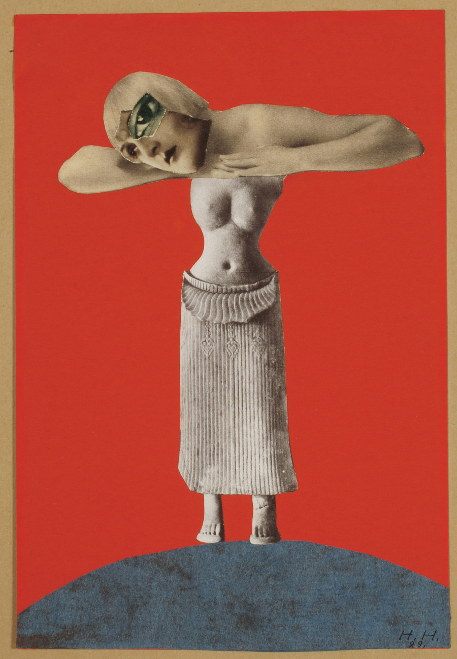
When we talk about dada, we definitely have to look into artist Hannah Hoch regarding her art styles. I was trying to research about her techniques to see if I could apply any of it into my work. Hannah Hoch is a famous German DADA artist and she was one of the starters of photomontage. For her works, she mainly talks about the issue of gender and figure of woman through her photomontages, allowing her to gain popularity in the art scene. She was able to cleverly use unrelated images of cut-outs from magazine or newspapers to combine them into an art piece to create meaningful works. One of her more famous works would be ‘Cut with the Kitchen Knife Dada Through the Last Weimar Beer Belly Cultural Epoch in Germany’ in 1919 which opens a discussion about gender issues in the post war Weimar Germany.
Cut with the Kitchen Knife Dada Through the Last Weimar Beer Belly Cultural Epoch of Germany by Hannah Hoch Source: http://theartdaily.blogspot.sg/2010/03/hannah-hoch-cut-with-dada-kitchen-knife.htmlOne of the works by Hannah Hoch Source: https://www.huffingtonpost.com/2014/01/14/hannah-hoch_n_4591557.htmlAnother example of Hannah Hoch’s work Source: https://www.huffingtonpost.com/2014/01/14/hannah-hoch_n_4591557.html
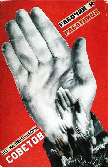
Moving on to Russian Constructivism, it is actually an artistic and architectural philosophy. It was the last and most influential modern art movement to actually flourish in Russia in 20th century. The main focus of Russian Constructivism is to replace composition with construction. There were hence creation of works to carry out fundamental analysis of materials and forms of art, leading to design of fundamental objects. The point of the art was to demonstrate how the materials would actually behave to form an artwork according to the type of the material.
Gustav Klutsis – Workers, Everyone must vote in the Election of Soviets! – 1930 Source: http://www.arthistoryarchive.com/arthistory/constructivism/
I’ve heard of DIY (Do-It-Yourself) so many times unlike DIWO (Do-It-With-Others), so when I was first introduced to the concept of DIWO, it seemed like something almost impossible to achieve. Imagine a huge group of people contributing their ideas all at once, I can only picture a chaotic mess. However, I was given the opportunity to look into Furtherfield, which changed my mindset entirely. Furtherfield is a non-profit organisation started by Marc Garrett and Ruth Catlow, whereby they create an online platform for individuals all around the world to work together to create something extraordinary. Unlike the DIY culture that focuses solely on the individual, DIWO stresses on the importance and significance of collaboration and sharing amongst different creatives. Making use of free and open software technology, they create a platform to expand one’s creativity by establishing connections with others.
Due to the introduction of open source technology, artists are able to better themselves and their works through a more elaborate research in collaboration with other artists.
-Randell Packer, IEEE POTENTIALS’s article
As I’ve mentioned before about open source, DIWO also shows relation to that. Rather than working alone, artists are able to discuss concepts with others and go through the process with others.
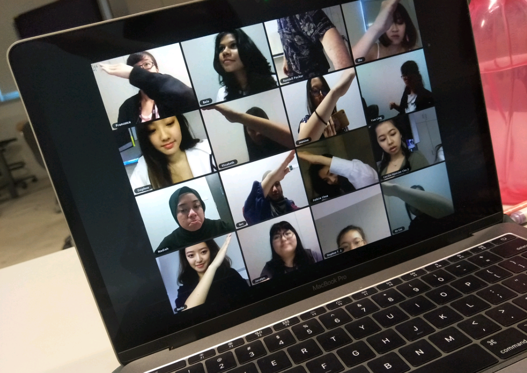
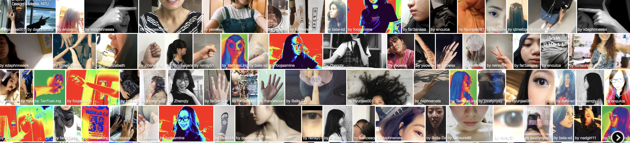
Screenshot of my social broadcasting video Source: My social broadcasting video
Going back to the first ever micro-project that we did, it shows how we can make use of the third space to converse with other people who may not be physically with us, hightlighting the possibility of interaction between individuals at different locations and different timezone.
From Telematic Embrace micro-project Source: Taken from my phone
Bringing back some concepts from our micro-projects which I thought were appropriate to this idea of DIWO, similar to the telematic embrace project, DIWO provides a sense of intimacy and hence encourages the sharing and negotiation between users to create a piece of work with their collaborative efforts. DIWO allows effective communication amongst different parties, raising their awareness towards others.
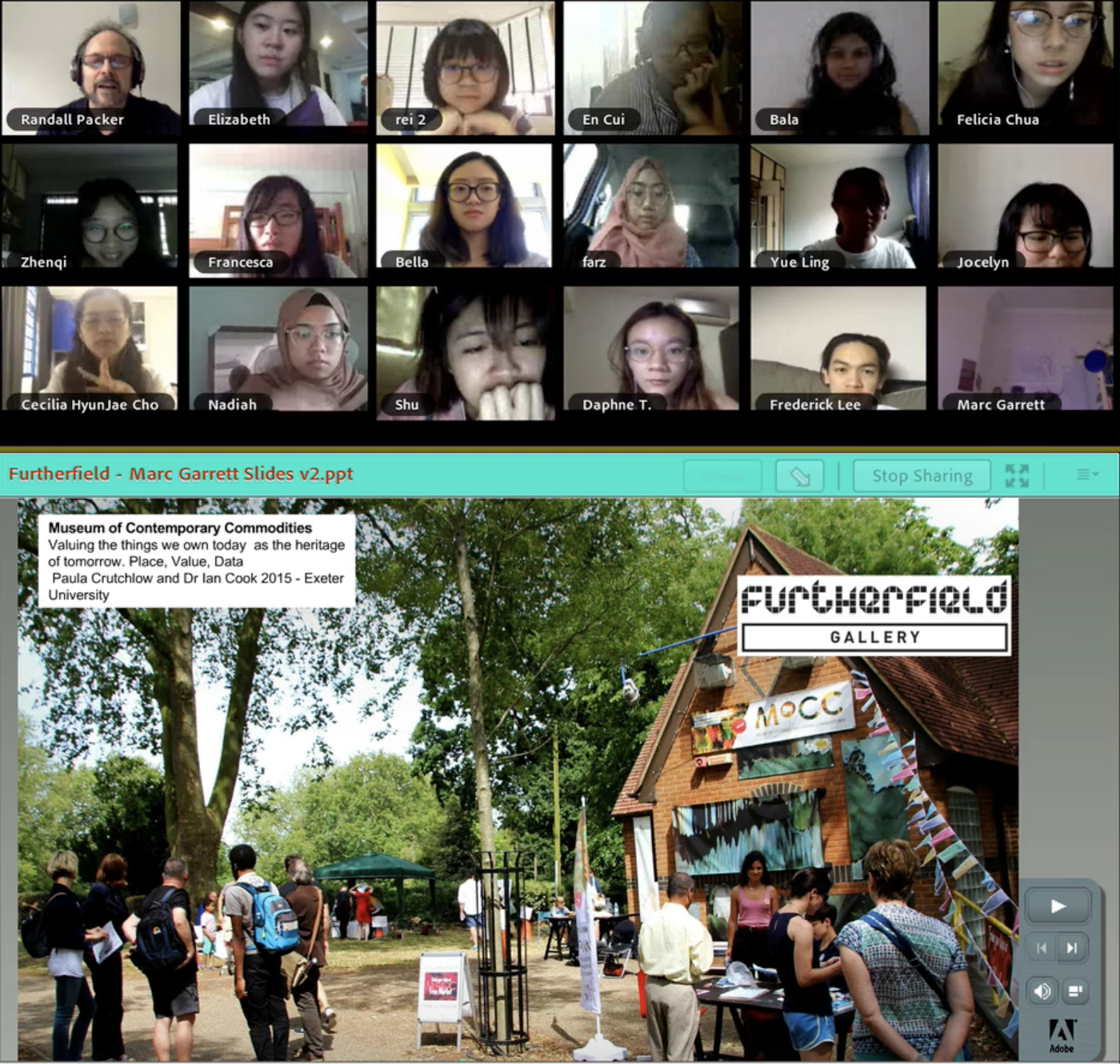
Hello World installation Source: http://christopherbaker.net/projects/helloworld/Screenshot of the flickr group uploads Source: OSSScreenshot of the adobe connect with Marc Garrett Source: https://vimeo.com/255880481
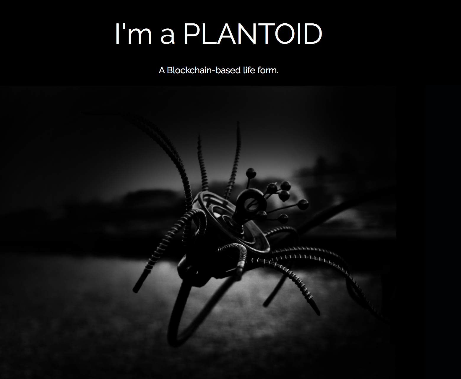
Although I was unable to attend the adobe connect on the actual day, I did look through the recorded video and found some points mentioned by guest Marc Garrett which I thought was extremely familiar and relatable. Quoting from Marc Garrett, he mentioned that DIWO is a “collective experience” and that it becomes a challenge of working with others, rather than only about ourselves. Individuals are also given the freedom to explore. These pushes an outcome of “Art for a better society” as mentioned by Randall Packer, allowing artists to venture outside their comfort zone and explore with different materials to create something new unlike their usual style, making full use of the advantage of working with others. The collaborative effort will in turn allow them to create outstanding unique pieces of work like the plantoids with BlockChain, as mentioned by Marc Garrett.
Plantoid, a Blockchain technology where different plants are created due to a combination of different interactions by different people Source: http://okhaos.com/plantoids/