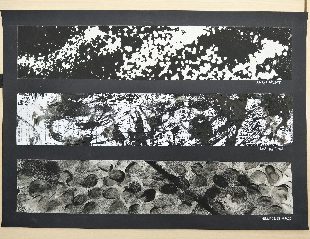
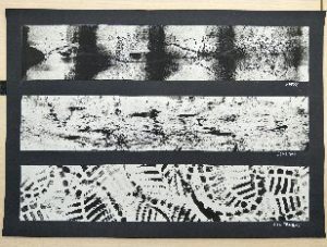
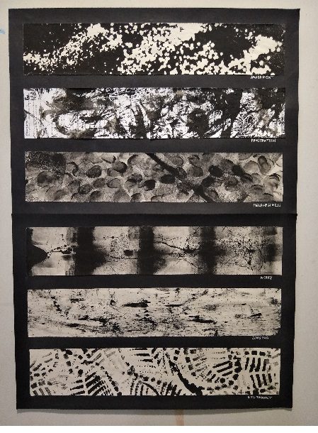
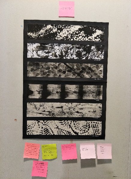
To read more about the research i did prior to this project, click here https://oss.adm.ntu.edu.sg/jfoo018/ego-research/
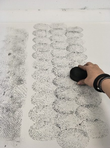
When I first got the project brief for this third project, to be honest I was really really worried. Although I did enjoy myself doing the digital compositions for project 2, I was not sure if I was ready to create more digital works for project 3 because I know I am still not familiar with Photoshop or Illustrator software. Thankfully project 3 allowed the use of traditional mediums like PHEW SO THANKFUL HAHA. Despite that, I was still quite confused about what I wanted to do for my four rows because I always felt like I am not a very creative person, and I was very unsure about what exactly am I supposed to produce visually for my four rows. At times like these I really appreciate the consultations with Joy so much HAHA. She was able to help me organize my thoughts and guide me towards producing my final piece of work.
I remember when I first started out, I thought about creating a character to symbolize myself in all four rows. I felt like representing myself with a human would be too straightforward, so I was thinking of using an animal to represent myself instead. I chanced upon a picture of a tiger and I remember thinking like that was so cool haha and I suddenly thought that it might just be suitable to use a tiger since I was born in the year of Tiger. I decided then to just go ahead with using a tiger to represent me in all four rows, recording down the growth from a baby tiger to an adult tiger.
I then tried to brainstorm of the different situations I was placed in, and I eventually came up with four different settings namely:
-when I am working
-when I am with my friends
-when I am with my family
-when I am alone
The settings would flow in a way with increasing intimacy to my deepest of emotions. I thought that the settings I decided on seemed very generic but it could also be a good opportunity to explore the emotions I felt that would separate me from the norm, putting my own experiences and heartfelt feelings in every row. I also spent a really long time to come up with the imagery I wanted to go along for each of the rows.
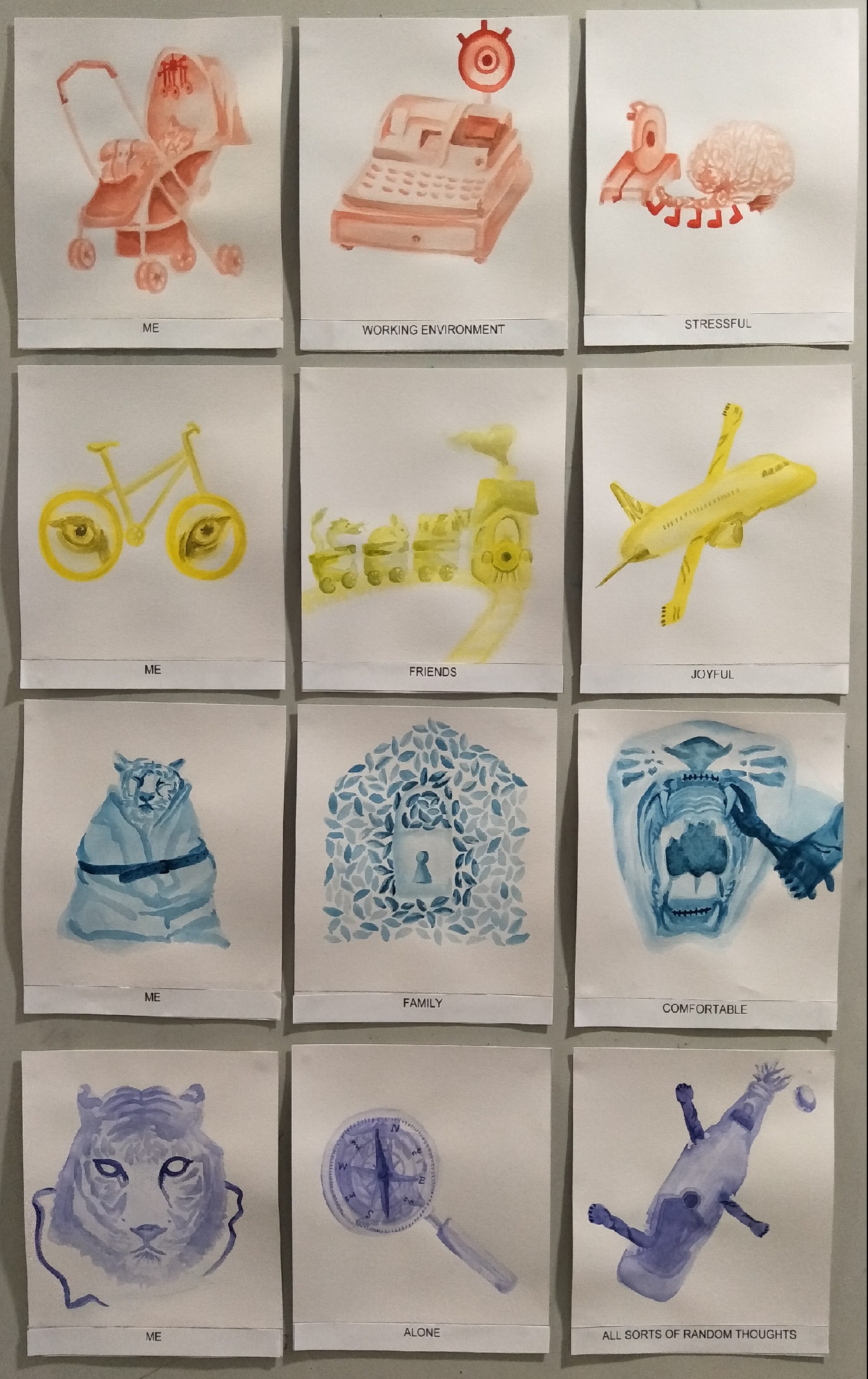
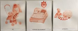
To start, my first row was
ME+WORKING ENVIRONMENT=STRESSFUL
I also decided to use the colour red for this row to bring out the tension.
ME:
I wanted to represent it with a baby tiger in a pram, with a dangling mobile cot toy above it. The baby tiger imagery was there to show how small I feel when I am in a working environment because of all the pressure I face at work and also to show growth in my next few rows. I later then replaced the items dangling on the toy with eyeballs to further heighten the tension and to show a relation with my next two boxes in the same row.
WORKING ENVIRONMENT:
Initially I wanted to just portray it with a bunch of computers to represent the working environment but I thought that it would be too direct and there would be a lack of meaning in this box so I decided to pull in my experience from my last job at a restaurant. I was working as a cashier and there was once when the cashier system broke down, and since the customers were not able to fully understand the situation, they eventually put the blame on me because I was the only one standing behind the cash register. I still remember that immense stress that fell on me as the customers all stared at me, waiting for their orders to be taken. Bringing this into context for this box, I represented it with a cash register, replacing the customer display with an eyeball to bring out the tension. I also purposely painted a non-realistic eyeball as a human eyeball would be quite irrelevant and awkward compared to the rest of my compositions, while the cartoon-ish eyeball would provide a more generic blend in for the work.
STRESSFUL:
I was thinking about what would be involved if I felt stressful and I thought of the brain. I wanted to depict the brain breaking apart but I figured it would be quite hard to tell that it is a brain as it would seem like messy chunks of random things due to the brain’s natural wavy texture. This might seem a bit dark but I later came up with the idea of having a brain march towards a machine cutter as if seeking suicide to represent the immense stress I felt. This surprisingly turned out well and since the machine cutter looked like an eyeball as mentioned by Joy in my first consult, I decided to let the imagery of eyeballs repeat in each box for this row to show relevance. This also explains why the items in the toy for my first box were replaced with eyeballs.
Here’s how my first composition for the first row when I first started!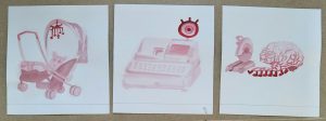
Eventually, I changed from using poster colour to watercolour to give it a clearer look, and tried to make the contrast in the work more obvious. I also replaced the items in the cot toy as eyeballs, so here’s my final first row!
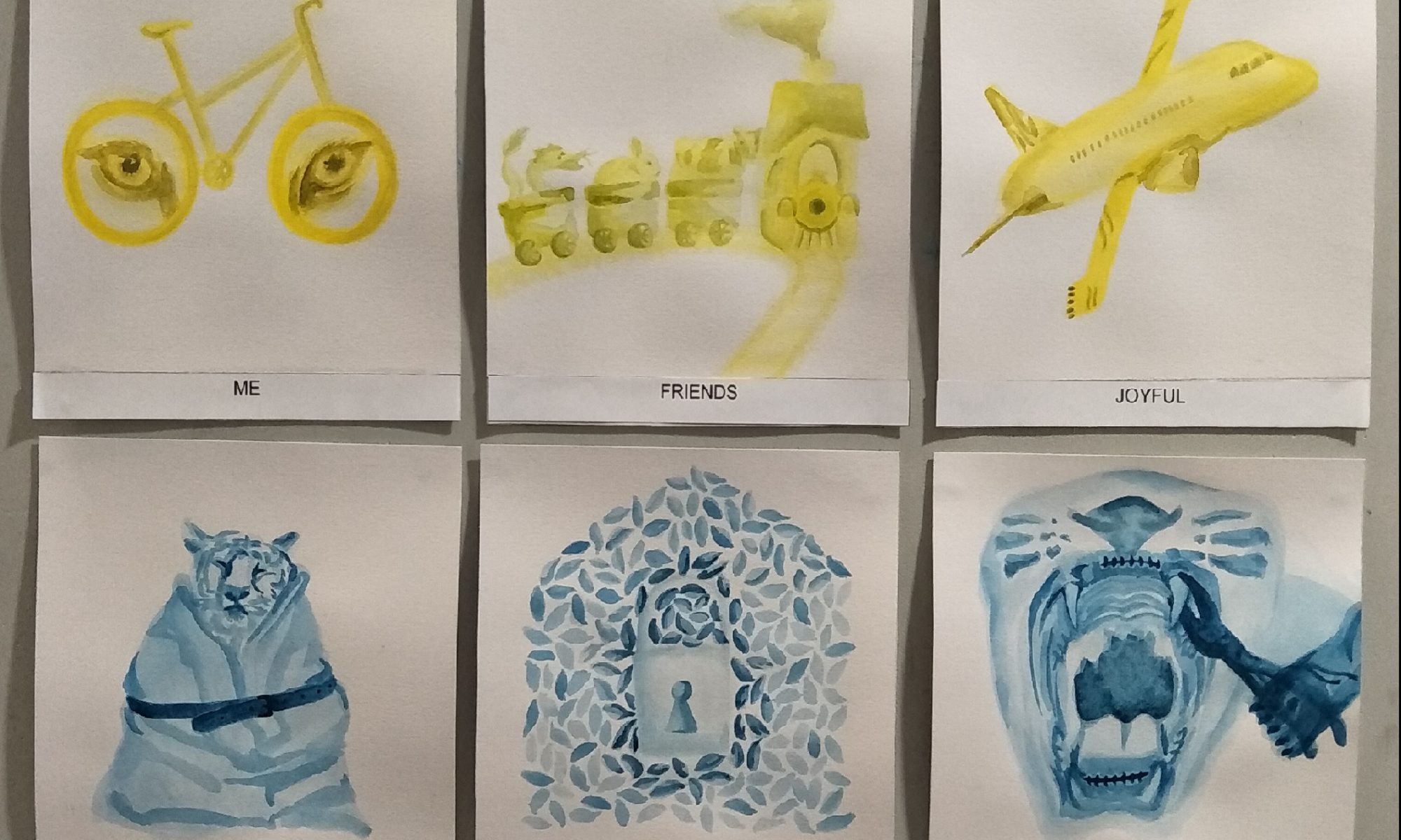
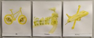
Secondly, it was
ME+FRIENDS=JOYFUL
For this row, I went ahead with the colour yellow to bring out the liveliness when I am with my friends.
ME:
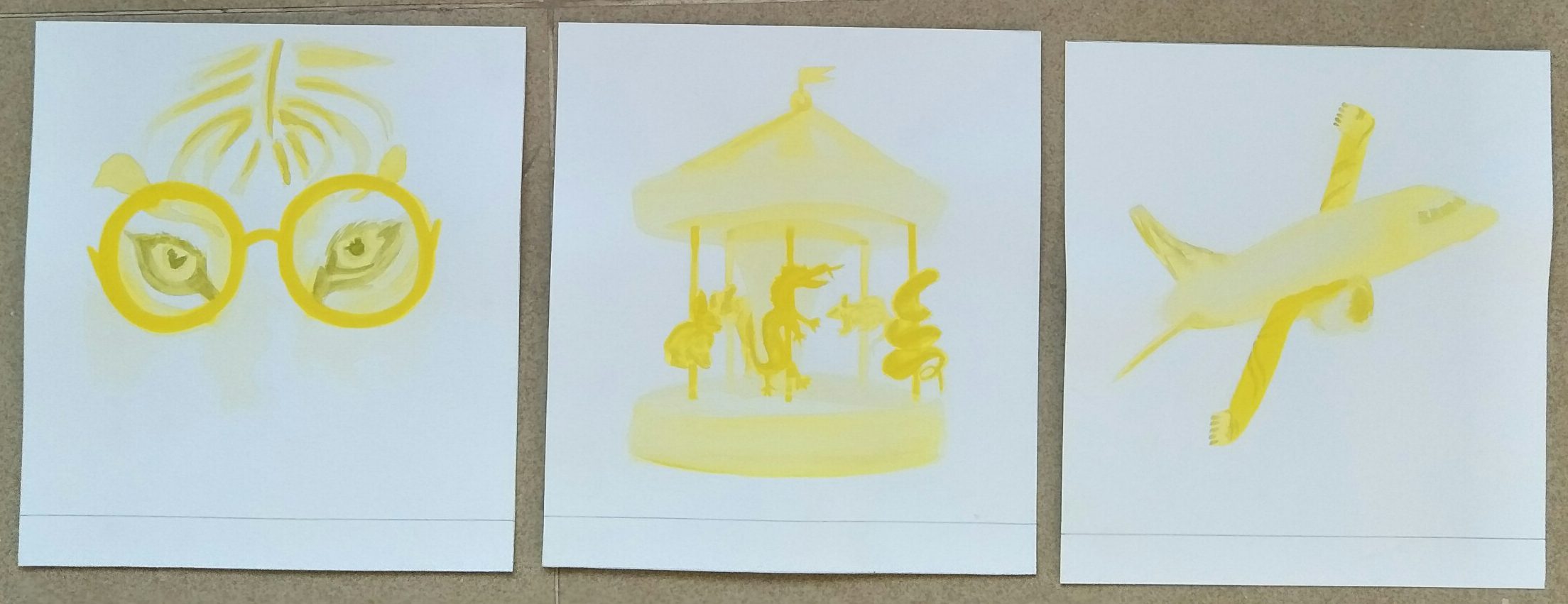
Since I wanted to record the growth of a tiger, the tiger being represented here can be seen as an older version of a tiger compared to the baby tiger in the first row. However, I used only the eyes in this composition. Initially it was a painting of a pair of tiger’s eyes wearing a pair of round geeky spectacles to represent the teenage years of the tiger like a studious tiger. However, my next two boxes in the row had something related to transportation modes, and it prompted Joy to suggest that I could probably come up with something related to a transportation mode in my first box as well. In the end, it hit me that a bicycle has two wheels as well and I thought I could use this in my work.
FRIENDS:
I thought for a really long time about how I could portray friends in this context and I came up with the idea of a carousel, where there would be animals surrounding the zodiac of tiger on the carousel itself. So I went ahead to paint a carousel, with animals such as the rat, ox, rabbit, dragon and snake. However after consulting Joy, she felt like the animals seemed to be floating around on the carousel and thought I could improve on it, working along the direction of transportation modes as well. I then decided to change it to a setting of amusement park train rides, reducing the number of animals from five to three, sitting in carts following the front of the train instead.
JOYFUL:
I wanted to express the feeling of happiness when I am with my friends for this box. So I was thinking what can tigers NOT do? Tigers can climb on trees and swim, so what would they hope they could do that would make them really happy? This led me to think about…. (LAME JOKE APPROACHING)…Tiger Airways!! So i rode on this idea and did an illustration of a plane, replacing the wings of the plane with real tiger paws.
My first try for this row!

After improvising, altering my first two boxes to something related to transportation modes. The common theme of transportation modes can also be seen as a representation of independence in my teenage years.
Third, it was
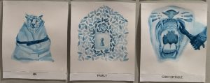
ME+FAMILY=COMFORTABLE
I used the colour blue to express the feeling of security when I am with family.
ME:
I wanted to show a tiger that looked like it is very snugly and pleasant so I thought of painting a tiger wrapped in a blanket with a face that looks like it feels comfortable being in that situation. Since I wanted to continue the concept of having a overarching theme in each of my rows, I thought I wanted to focus on the concept of security in this row. Hence, I added a belt around the blanket to bring out that point.
FAMILY:
I wanted to keep the illustration simple and easy to understand so I was thinking about the habitat that tigers live in and I wanted to incorporate that with the shape of a house that we are familiar with. In the end I came up with the idea of painting leaves into the shape of a house, and in order to add in the element of security, I left a space in the middle in the shape of a padlock. I later then further emphasized the padlock by adding in details such as the keyhole. The padlock was also meant to look like a door for the house in that sense.
COMFORTABLE:
I wanted to express the comfort in a way such that because the tiger is now under the protection of its family, it does not have to go and look for its prey by itself anymore. So I thought of a tooth extraction, with an illustration showing a tiger’s mouth wide open, having a canine tooth extraction with a pair of extraction forceps. The element of security is also represented here as braces on the other teeth. However after consultation, Joy thought that the act of extraction seemed more painful than comfortable, hence I added the tiger’s paw to make it seem as if it is a voluntary extraction.
The final outcome for this row!
Moving on, last but not least!
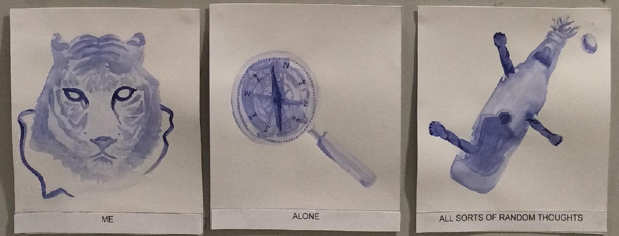
ME+ALONE=ALL SORTS OF RANDOM THOUGHTS
I used purple to signify the spiritual awareness I am experiencing for this row.
ME:
I had to show a full grown tiger for the process of growth but I thought that there was no point in me just painting a full face of a tiger, there would be no meaning in this work at all. I wanted this row to express a feeling of how when I am alone, I can truly be myself at ease, and experience all kinds of emotions be it positive or negative. Hence, I decided on the imagery of a tiger mask to show the revelation of my inner self. The eyes of the tiger on the mask are hollowed out to give the idea of a mask and to also make it relatable to anyone.
ALONE:
I took the longest to think about the imagery for this row because I just could not come up with any visuals to accompany the concept that I had in mind. I thought of many different ways, I even tried to follow the concept of my first row by repetition of one item (like the eyeballs) in all three boxes but I just could not come up with the illustrations and I realized I should not use that to guide me for fear that I might get led away from the original narrative I was trying to portray. After thinking for really long, I eventually came up with the idea of a compass as I wanted to explain how being alone is always a good time for some soul-searching to find out if I am heading towards the right path. I decided to incorporate the image of a magnifying glass because it also goes in handy with the theme of self-exploration. I decided to add a faint wash of the image on the bottle cap of tiger beer in the background of the magnifying glass as well, to add in the tiger imagery and also to show relation to my next box in the row.
ALL SORTS OF RANDOM THOUGHTS
I wanted to express how, when we are alone, we think about everything, be it positive or negative. Hence I decided to represent it with a pop of a beer bottle, specifically TIGER BEER (the amount of puns HAHA) However, rather than painting the logo of the Tiger beer on the bottle, I decided to add tiger paws once again, which looked like they were emerging or breaking out from the bottle to show the feeling of ‘release’. I wanted this row to express the idea of letting out all emotions and just identifying who I am as a person.
Here you go for my last row!

HERE’S HOW EVERYTHING LOOKS LIKE ALL TOGETHER!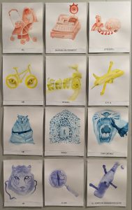
Initially I wanted to give it a wash of split complementary colours, just so that the background would not look as plain, and to also hopefully bring out the contrast in the main focus. However, after consults, Joy and my classmates thought that it was fine to just leave it as it is with the white background as it would not steal the attention away from the main emphasize in the work so it might actually work better in creating a focal point. Thus I eventually left it as it is and I am glad I did not add the background colours as it might really confuse the audience about the main focus in the work.
Overall, I would say that I have learnt a lot from this project. There was a lot of self discoveries and linking back to my thoughts, emotions and experiences as I embark on this project. I also learnt a lot about colour theories and harmonies that I never knew about, especially since I worked with monochromes harmony, I got to understand the use of certain colours in terms of evoking a certain emotion. I never really knew the impact of colours until project 3 came along to be honest. Now I am able to understand that a lot of thought actually goes into choosing the colours for different things especially in branding and advertisements.
It was also a challenge to think out of the box and be creative with my expression of certain generic terms. I had to constantly tell myself to think of other methods and ways of representing the same idea I wanted to bring across. It was really tough and I remember taking a really long time to generate the illustration I wanted for the last row. However now looking at it as a whole, I think I am quite happy with how it turned out concept wise, it was able to bring across the narrative I had behind each row.
Lastly! To sum up my experiences after doing all the three projects, I think it made me realize the importance of experimentation. It also tells me how sometimes exploring with different elements could help to formulate the final piece. I can not stress this enough but ever since Project 2, I find myself being more able to think out of the box and I really appreciate this skill and wish to work on it even more. This has trained me to think differently from the norm, coming up with more creative and interesting works. Overall, although 2D was a lot of work, it also gave me a lot of opportunities to grow and I am so thankful to Joy for guiding me in all three projects till completion! I am done with 2D!!!