So here’s Draft 1 of our 4D Assignment 2
Click on the link below to view
"we've got nothing to lose but everything to gain"
Preface: The First Line.
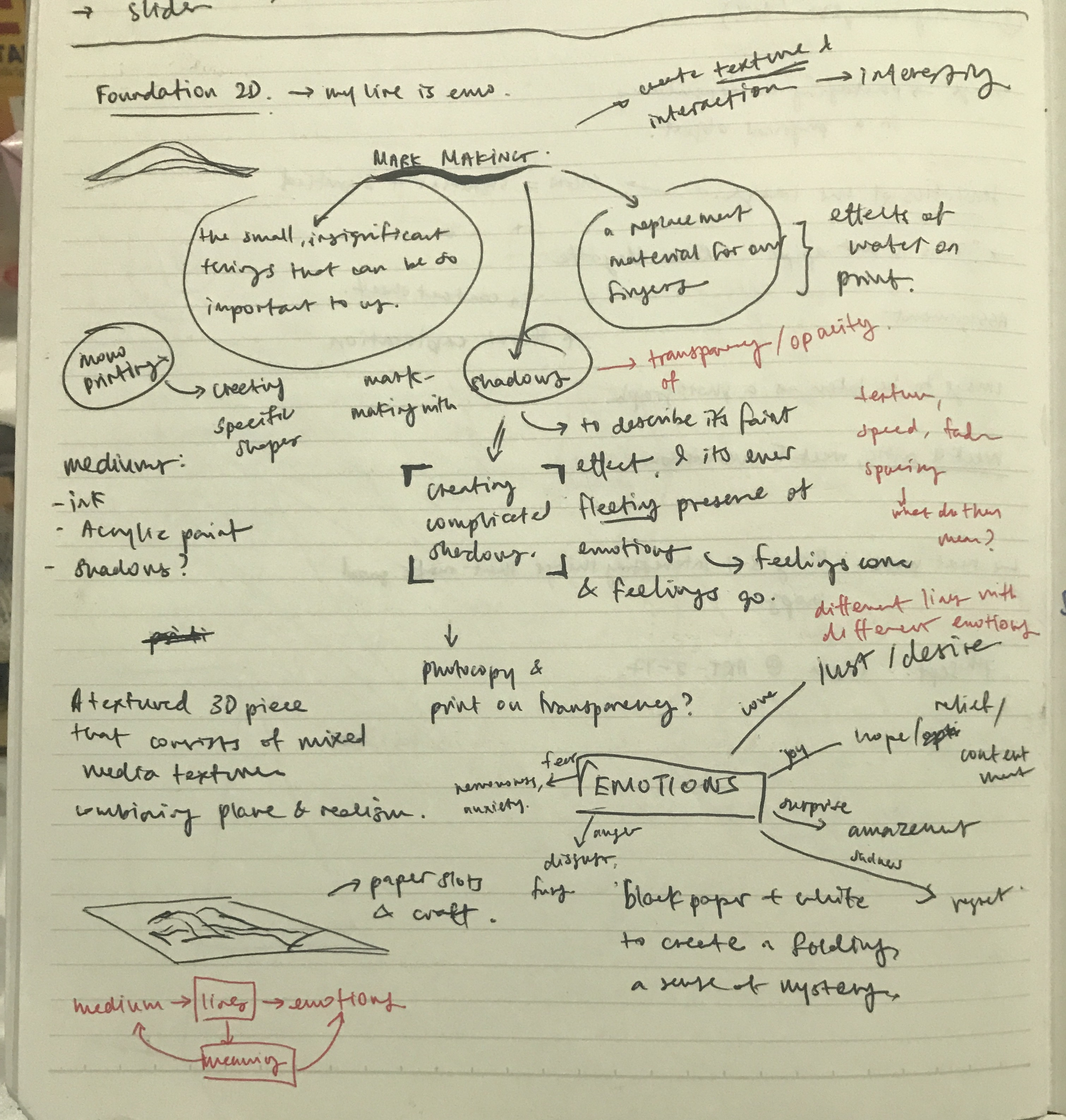
Our first brief for Assignment 1 was to interpret emotions using lines through mark making techniques. Sounds pretty abstract right? It definitely was for me but I thought to just take things one step at a time and hopefully it’ll all start to make sense at the end of the day (which it did, but more on that later).
To be honest, it took awhile for me personally to reach the stage of research since I kinda skipped this part and went straight to the process (oops!) but I did come back to it in the end! So for the purpose of understanding and reading my process for this assignment in a chronological order I thought I’ll post this first, followed by my process and final work!
As a started on my research, I wanted to be objective with what I was reading up on and so I broke it down to a few aspects:
Which I hope this post covers or at least attempts to 🙂
Research: Lines and their Representation.
As an element of design, lines are fundamentally building blocks of design and are essential to everything we create and see. However as referenced from Steven Bradley from his article on Vanseo Design, (link: http://vanseodesign.com/web-design/points-dots-lines/) He suggests that the fundamental chracteristics of a line is its ability to connect or unite, be it invisible or visible. Which intrigues me to think beyond mark making. He gave the example that two dots on a the same plane have a connection even if that connection, the line in between, cannot be seen. (Mindblownnnnn ~ But I’ll get back to this thought again)
Simply put, a line connects two points and is also the path of a moving point. It can vary in direction, thickness, implied or literal and depending on the variation, express and mean different things. Below is a page from my notebook as I researched into various lines and its meaning, as referenced from (link: http://vanseodesign.com/web-design/visual-grammar-lines/)\

Research: Emotions and their Definitions.
Having figured the first part of the project brief (what’s the deal with Lines) I moved on to the next part- Emotions. This was when I started the entire process of unpacking the emotion and building that personal connection of what it meant to me, which helped alot in generating ideas during my process.
To begin, I shortlisted a few emotions I was interested in to work with then searched for the dictionary meaning of it:
Lust : strong sexual desire ; speaks of strong passion
Sensual : of or arousing gratification of the senses and physical, especially sexual, pleasure
Hope : A feeling of expectation & desire for something to happen.
Amazement : great surprise or wonder
Frustration : upset or annoyed as a result of being unable to achieve something ; prevention of progress, success or fulfillment of something.
Hurt : cause pain, suffer pain, cause distress to.
Anxiety : Worry, nervousness or uneasy about something with an uncertain outcome.
Exhausted : very tired, completely used up (resources)
Next was examining what each of the meaning means to me and building that personal connection that I wanted to express through lines. below is a quick rough sketch from my notebook of this process. I’ll talk more about it in process.

Research: Artist References/ Inspiration
Jackson Pollock
One of the first names that pops in when I think of the idea of abstract art is the great Jackon Pollock. A leading artist in the movement of Abstract Expressionism which focuses on spontaneous, subconscious creation of paintings. Artists in this movement can vary in style but it is the dynamism of Pollock’s painting that attracts me.
(Disclaimer: The analysis of Pollock’s painting below are solely my own opinion and what I think of it!)
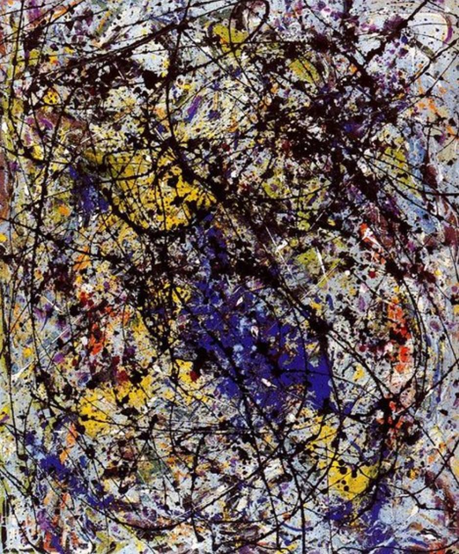

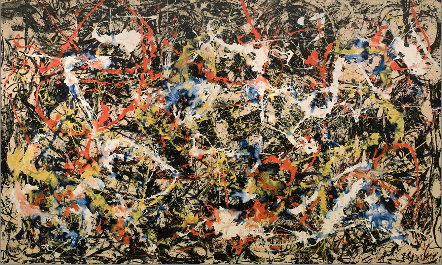
In his paintings of Convergence (1952), Reflection of the Big Dipper (1947) and Mural (1943), we are able to see the difference in brush strokes and line weight that brings about different emotive languages. The large quick strokes and drips of paint with uneven thickness in Convergence seem to show a short, quick outbursts of energy amidst the background of short messy lines. The unplanned, messiness also creates a sense of spontaneity. In Reflection of the Big Dipper, Pollock used a myriads of tools including sticks and knives, even adding different materials like sand, broken glass, and coins to his canvas. The long diagonal (fairly) strokes of black paint dripped in this painting also shows movement but much gradual and feels more tamed. These paintings are in stark contrast with Mural that is make up of wavy, curved strokes all lined up vertically creating a natural systematic pattern. The strokes used are also thicker consistent compared to other piece. The overall artwork evoking a sense of calmness due to the vertical rhythmic pattern yet the rough wavy lines seem to show uneasiness.
Generally Pollock’s paintings and style demonstrates that how lines can be varied and constructed in space to evoke strong emotions.
Sharon Arnold
(link: http://www.trianglesforteeth.com/)
Sharon Arnold is an american artist famous for her paper cut installations that goes beyond the canvas and looks awe-inspiring. Below are pictures from her series called “Nixe, Chimaera, Muff”. That is inspired by Folklore and Mythology.
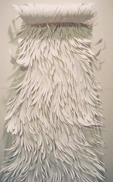
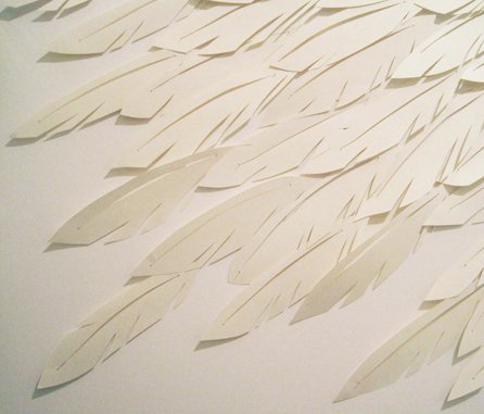
Her use of the common medium of paper to recreate the texture, and different features of characters from ancient stories such as fur, hair, feathers seem to juxtapose the idea of what’s familiar and known to us (paper) in contrast to a creature that exists only in Man’s imagination.
I really like how Sharon is able to use the medium so skillfully and tactfully to effectively communicate the intent of her art piece.
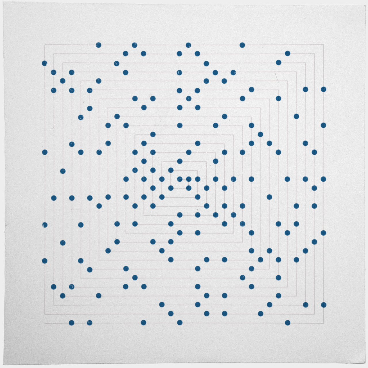
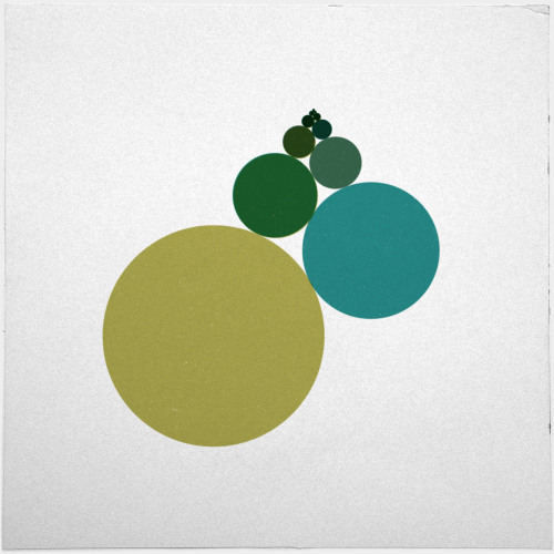
Geometric Patterns
A series of geometric designs from various artists. I like how the use of lines is able to create optical illusions and a stability with movement.

Research: Conclusion
I think at the end of doing research, I find that it helps to build a better context of what I am actually creating, so that every experimentation is done intentionally and objectively rather than for no rhyme or reason 🙂 so YASSS!!
Process: A Bumpy Start
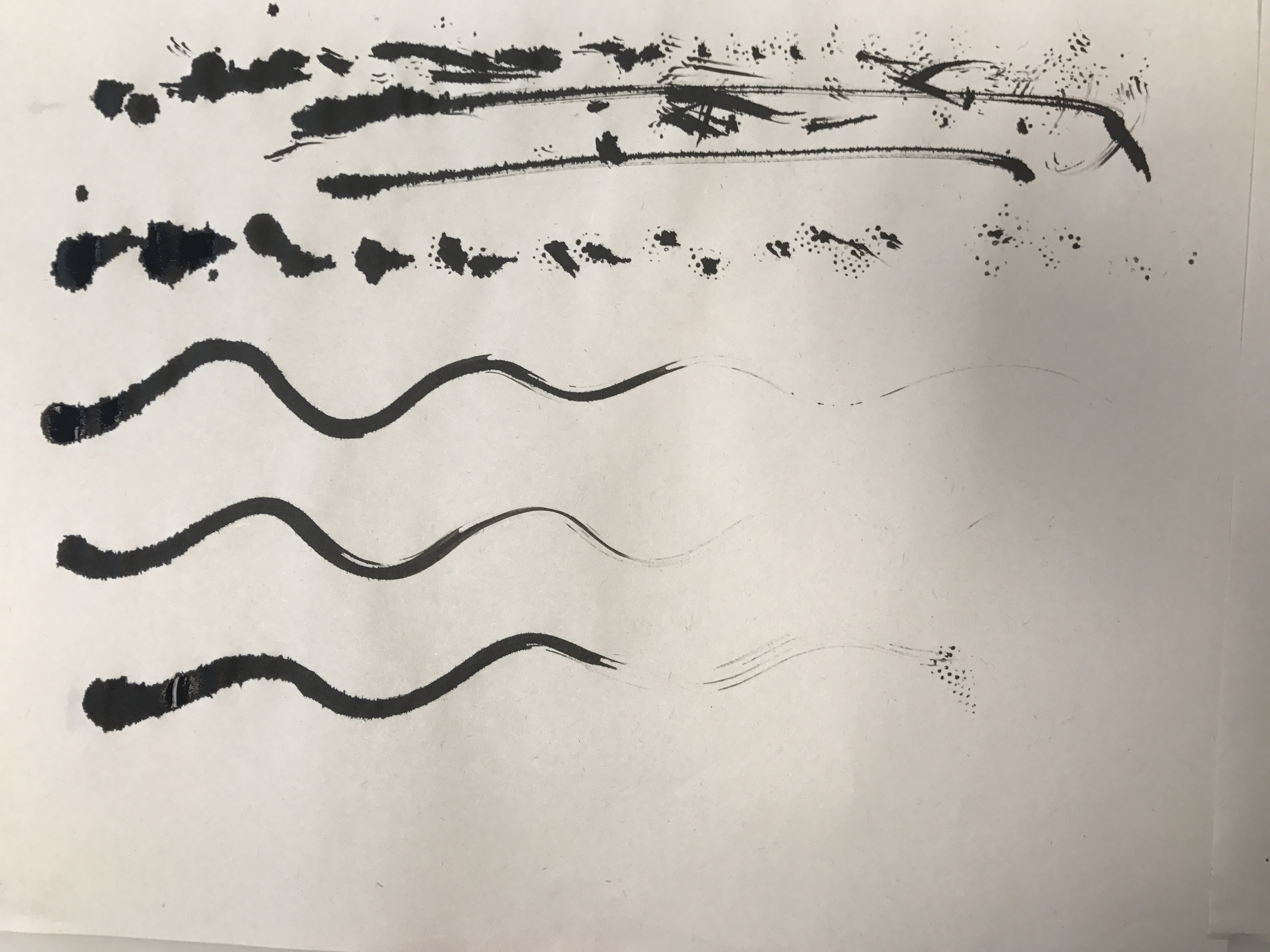
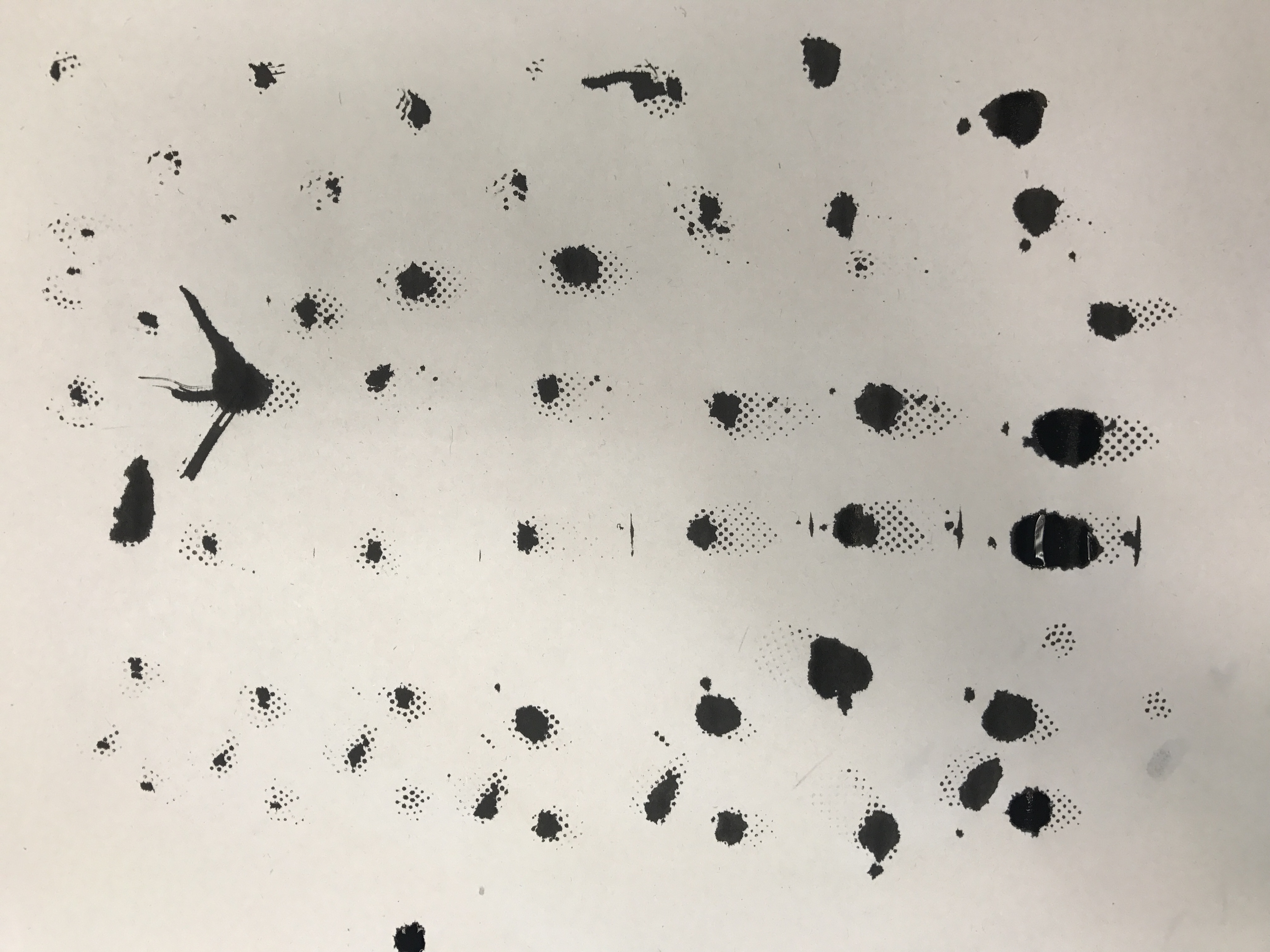
This was actually how I started with this assignment, using weird tools to do mark making. The end result was interesting but yet I wasn’t able to properly incorporate it into my final work as it was done without direction so it kinda went all over the place.
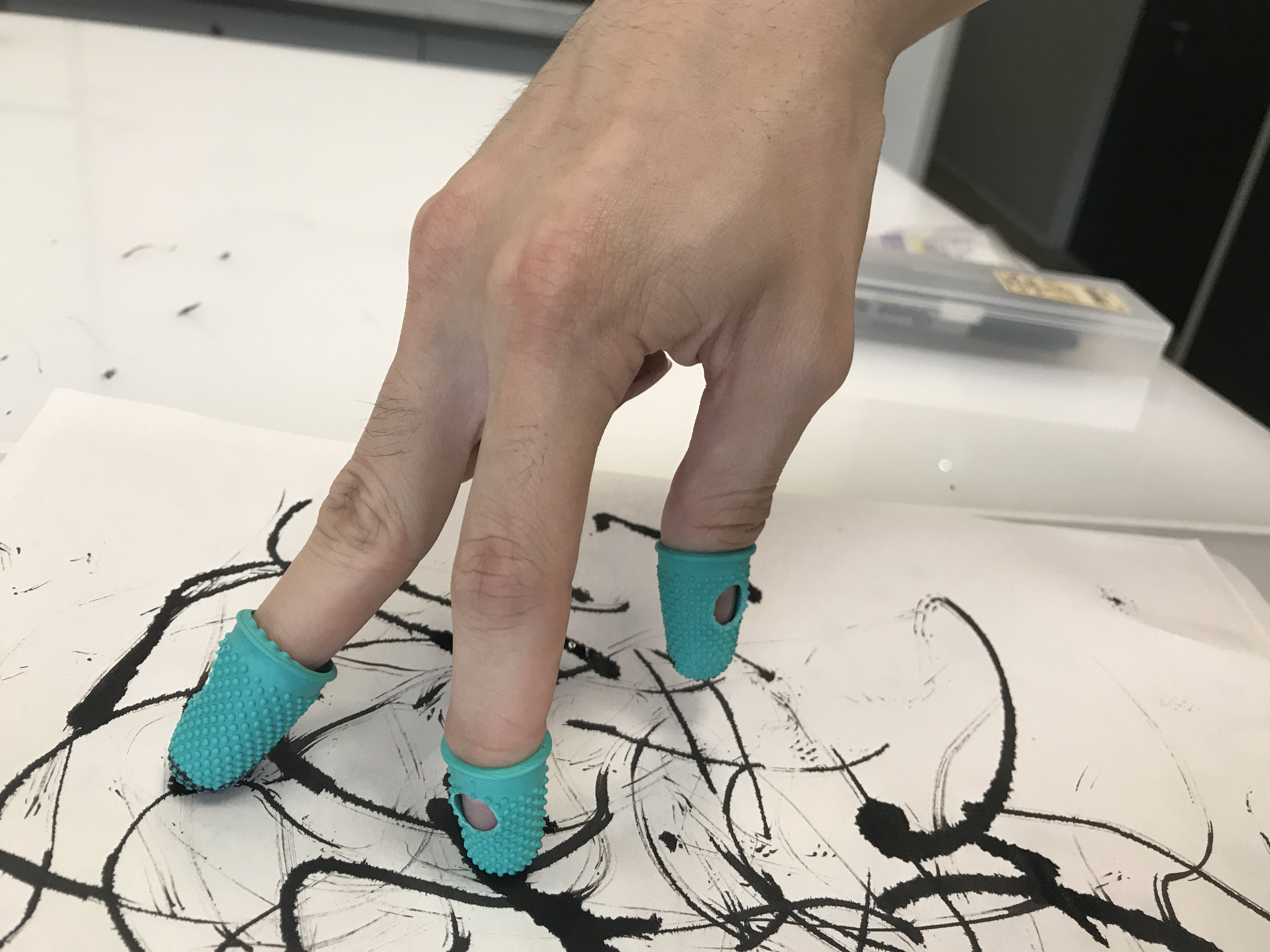
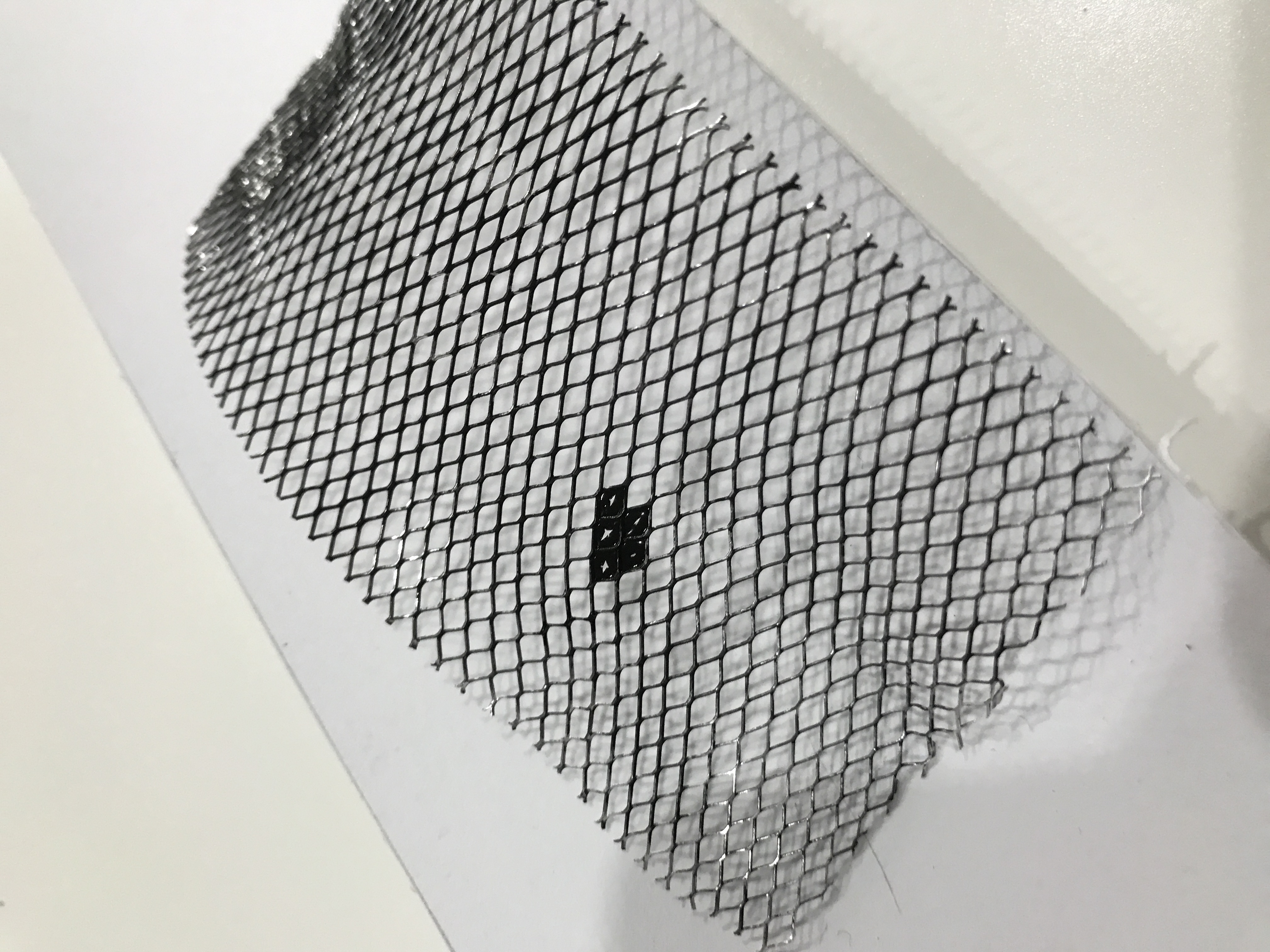
The first was using rubber finger stalls and ink to make marks. The idea was to replace our human fingers in the way we touch and feel, and in a sense challenge how like our fingerprints are all unique and different, would the mark we make still be unique if we use a similar tools? I wanted to expand the idea further and explore using different types gloves to do mark making, but thank God I didn’t. (this when I went back to do research and realised I was on the wrong track)
LESSON LEARNT: DO YOUR RESEARCH.
Regardless, I thought I’ll just include the photos below:
The idea is to use different types of markings with the finger stalls ranging from Dots, strokes or even using it as a brush as shown below.

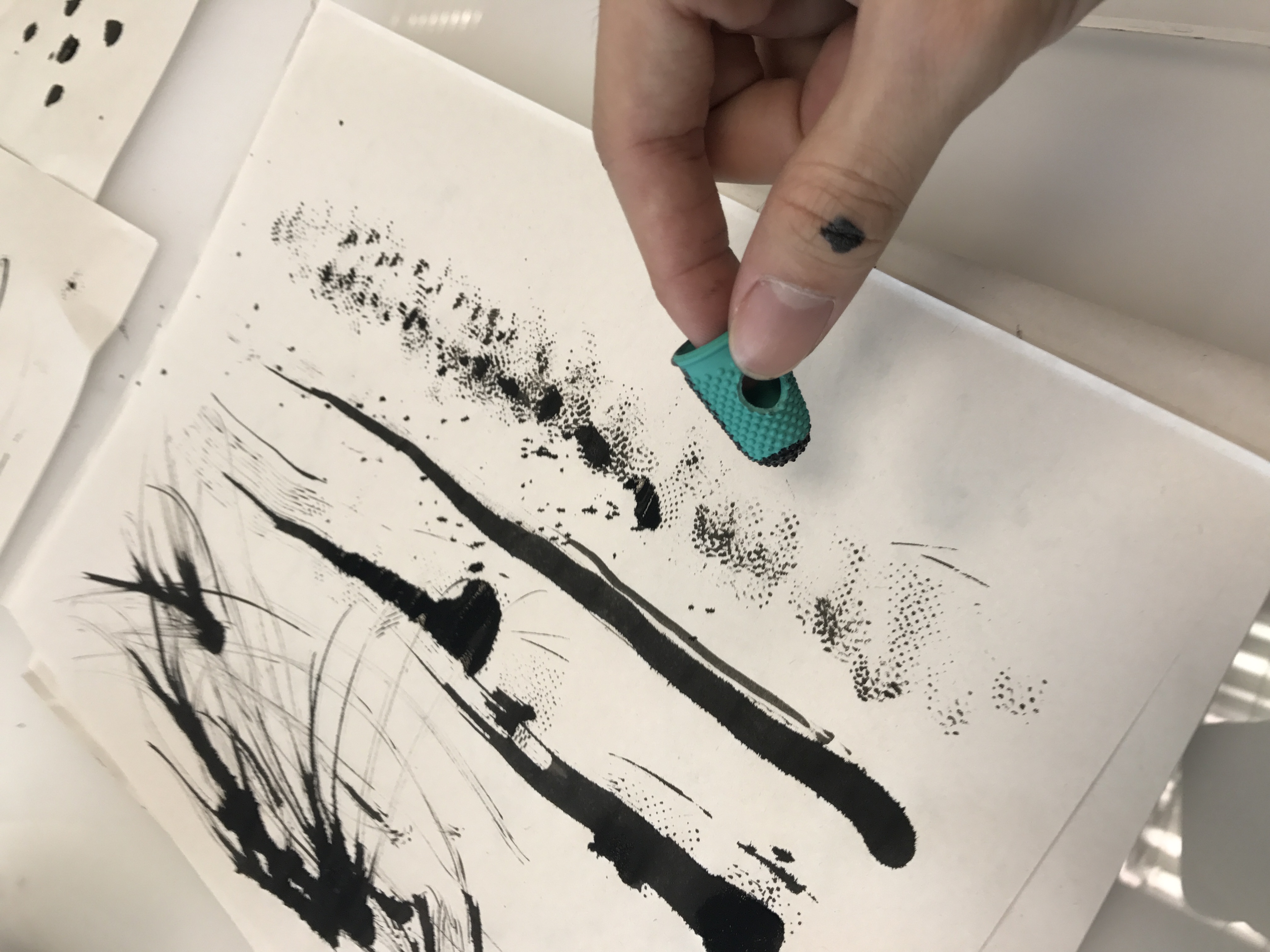
And here are the final results
Process: A New Start
So BACK afresh from research and starting over, I started unpacking the different emotions and combining them with different mediums to see how i can communicate the emotions visually. This was when I had also shortlisted my initial 8 emotions to 6 which are as follows:
Lust : strong sexual desire ; speaks of strong passion >> MYSTERY?
Hope : A feeling of expectation & desire for something to happen. >> IN THE MIDST OF DRKNESS?
Amazement : great surprise or wonder >> INSPIRATIONAL, WONDER, AWE STRUCK?
Frustration : upset or annoyed as a result of being unable to achieve something ; prevention of progress, success or fulfillment of something. >> A ROUGH PATCH
Hurt : cause pain, suffer pain, cause distress to. >> WEAKNESS, FRAGILTY
Anxiety : Worry, nervousness or uneasy about something with an uncertain outcome. >> THE UNKNOWN
In the midst of going back and forth between the process and research, I was able to brainstorm many ideas and then decide which to pursue and develop further. Below is another except from my notebook:
After narrowing the ideas that I wanted to pursue, it was time for experimenting and executing. Attached are some photos from the process of experimentation.

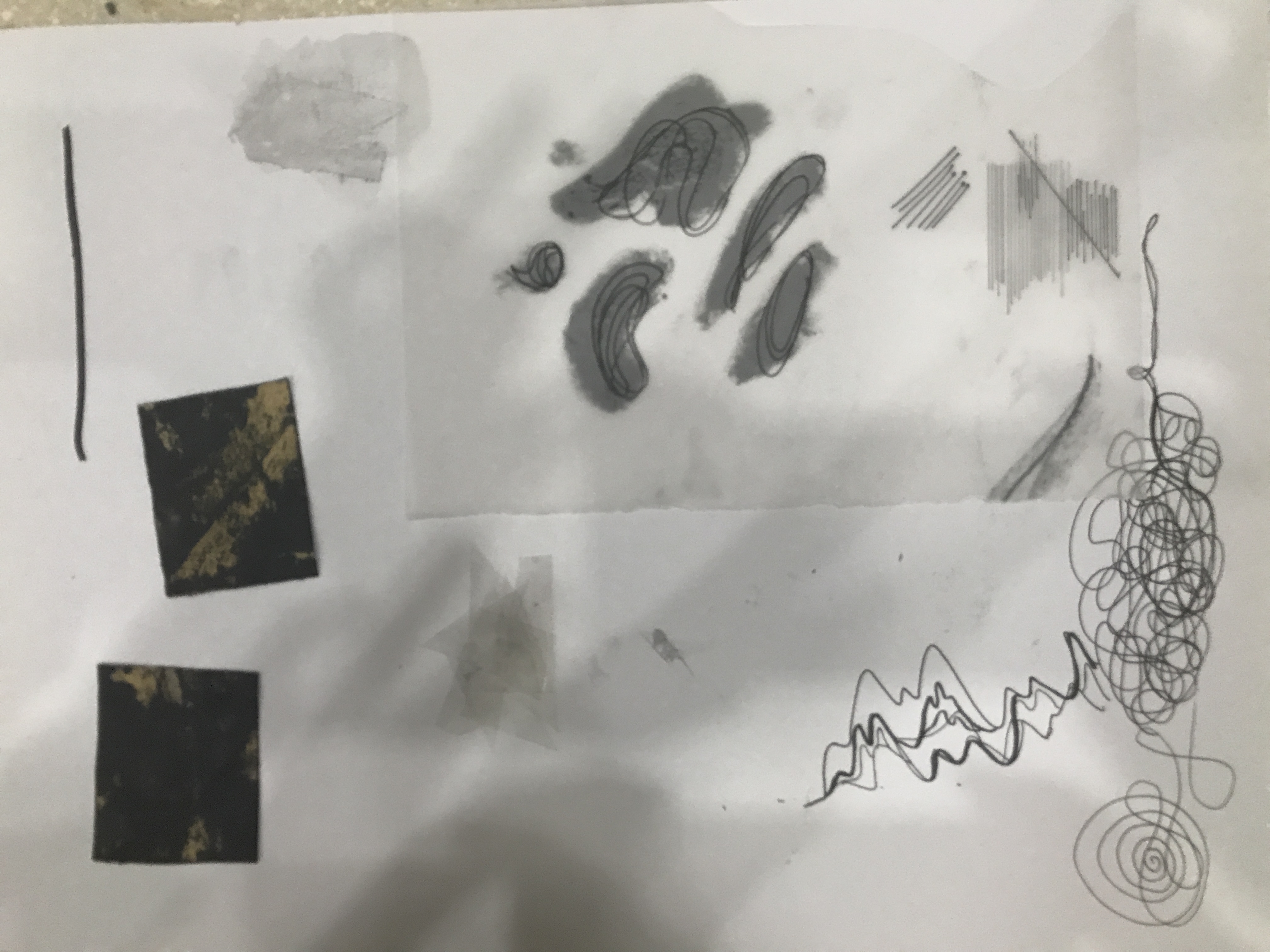
The next process was putting some of the ideas into prototype to see how they’ll look in the final piece.
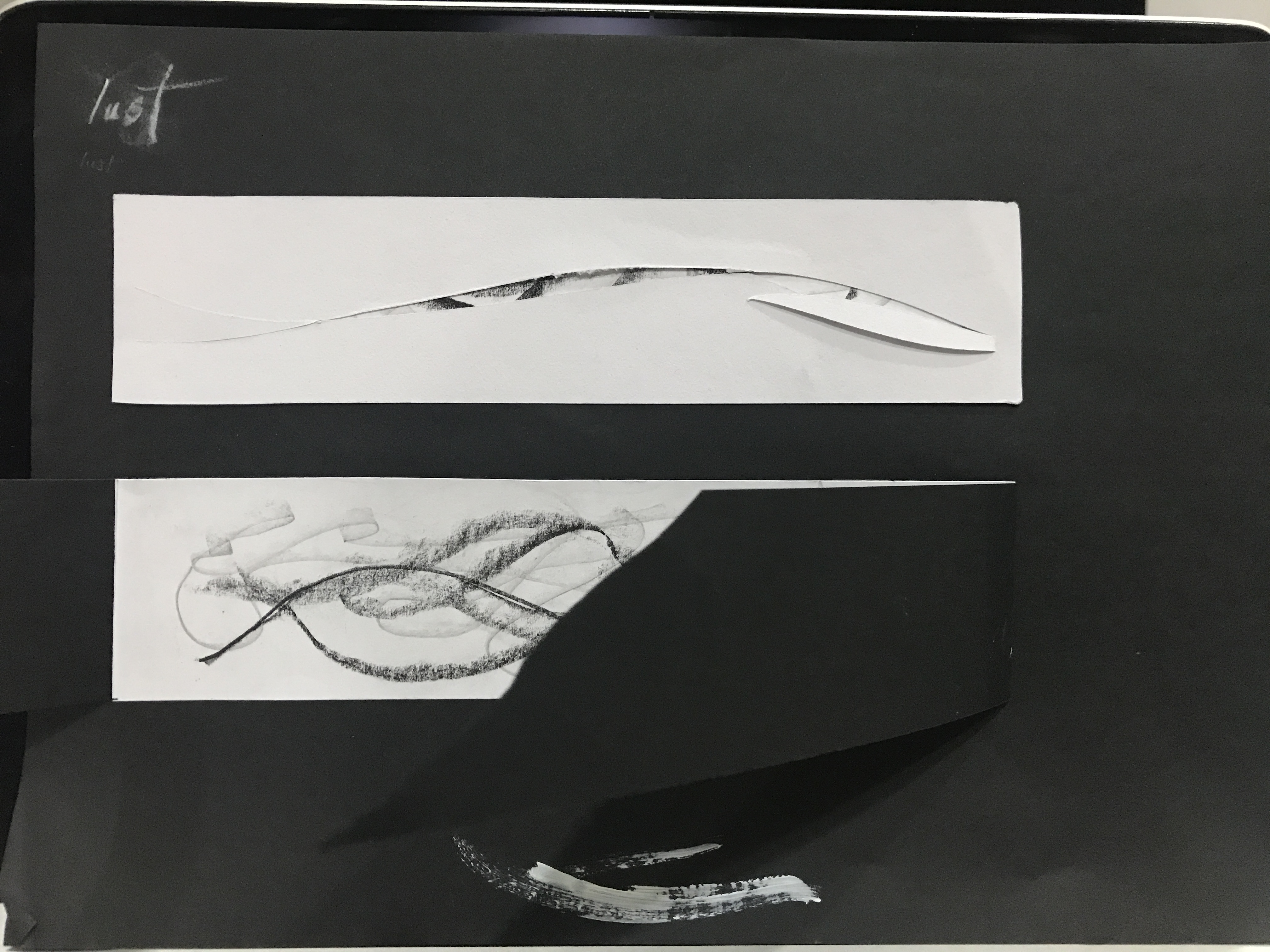 Exploration into the idea of Mystery in Lust- The above idea suggests slits to be made, revealing a hidden layer beneath made up of varying line weight of pencil, charcoal and china markers in a wave like motion.
The bottom idea suggests a form of reveal where it invites the viewer to physically ‘remove’ the outer layer of the art piece to reveal what is hidden beneath, to demonstrate the idea of “undressing”, that speaks of lust of the eyes. The former idea is modified and included into the final piece.
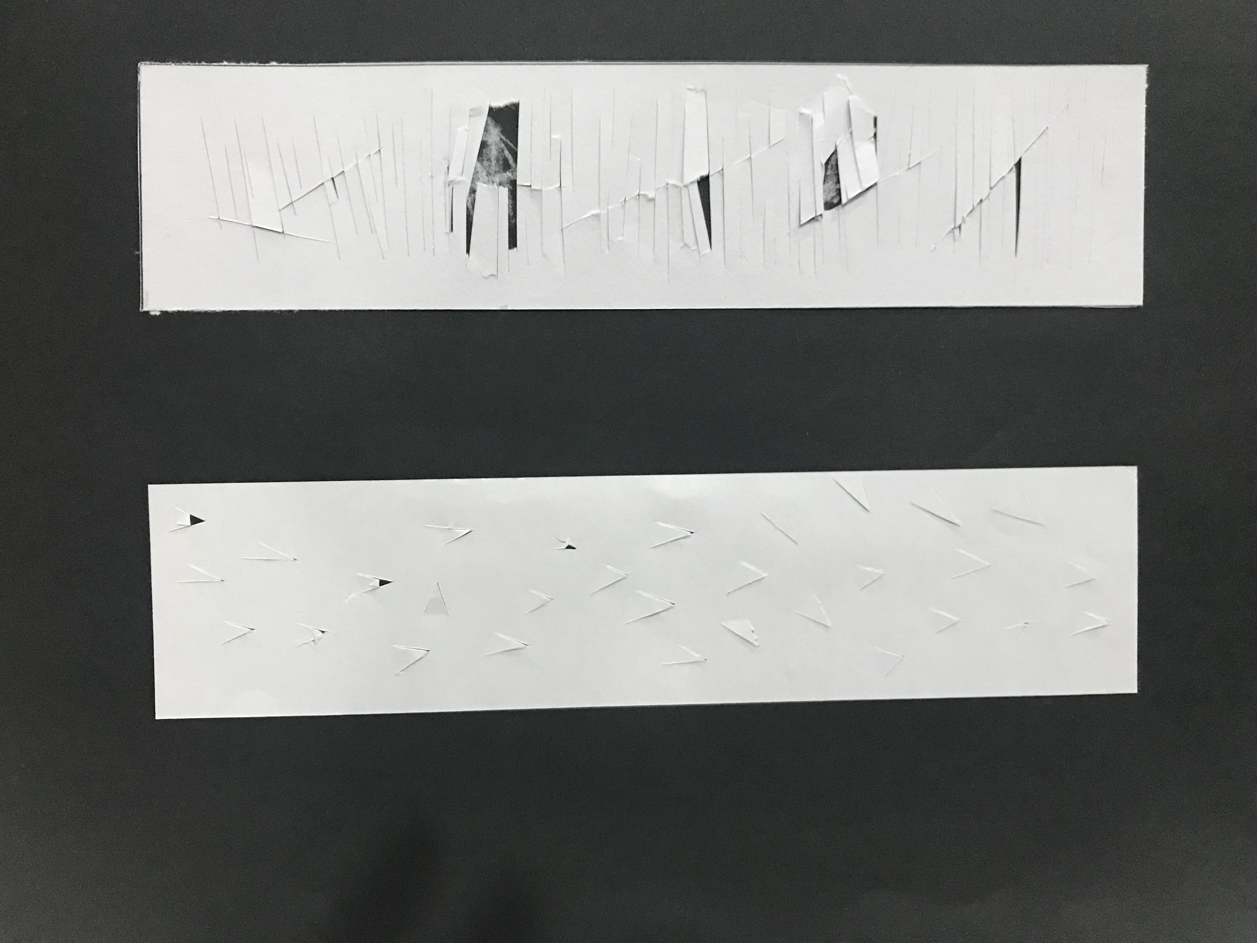 For Hurt, the above idea seeks to illustrate the idea of pain beneath. As seen from the vertical cuts coinciding with the sharp diagonal cuts to reveal a hidden layer beneath.
The second idea explores the idea of the saying “Hurt people hurt people” with cuts forming sharp thorns capable of causing paper cuts. Both ideas were eventually scrapped as it is too similar to the idea from Lust.
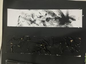
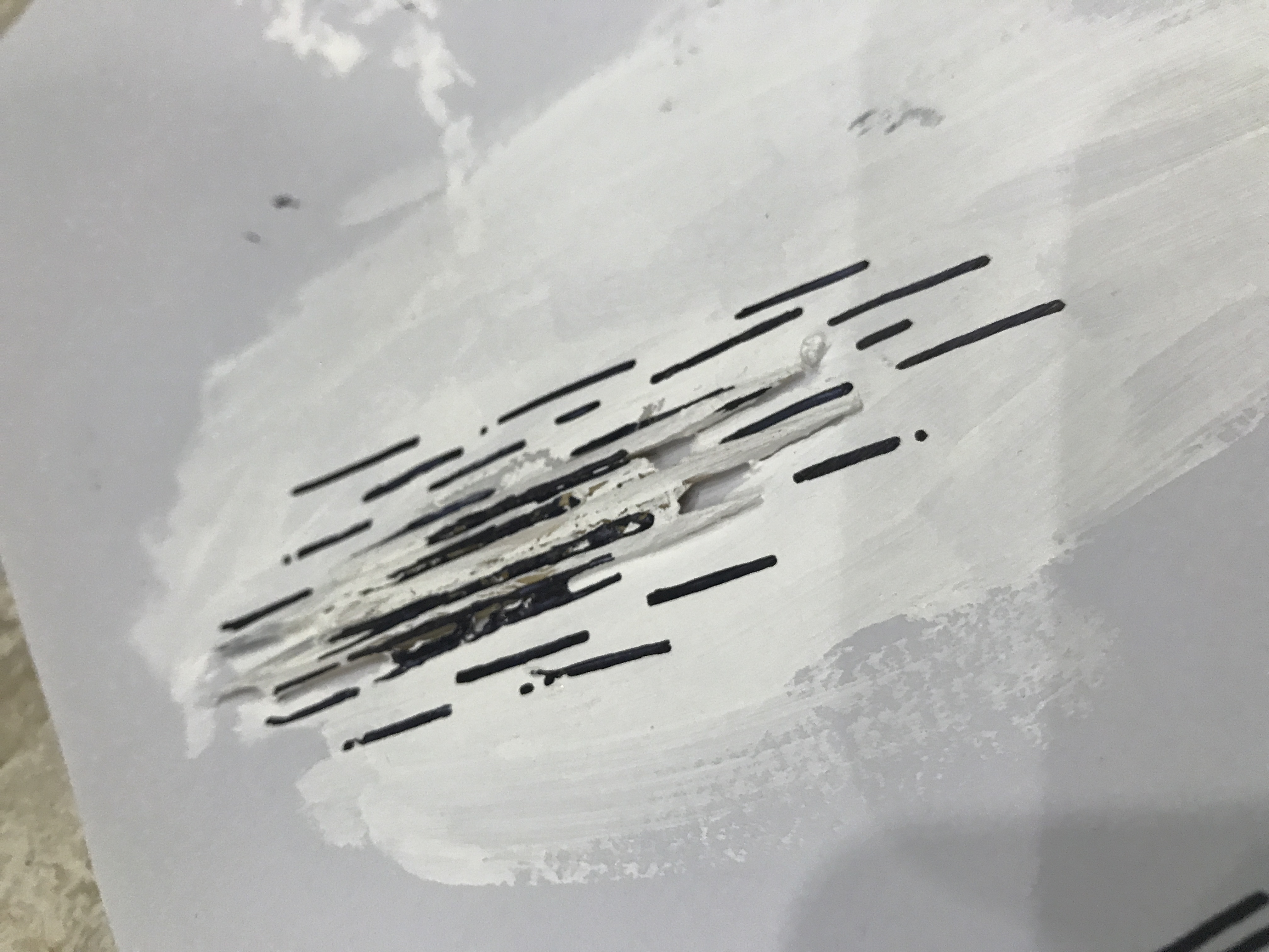
Through unpacking the definition of Frustration, I wanted to explore the idea of annoyance at one self and as a result being stuck at a rough patch. The above idea uses sandpaper with ink to create short quick strokes on the paper to show the exasperation one feels. The coarse sand texture from the sand paper also gets transferred onto the paper, creating the literal illustration of a ‘rough patch’.
The second idea uses craft tape that is intentionally creased and paste onto the paper to create sharp lines that are jarring. The use of medium also reminds that sense of frustration when one uses tape and it creases. The piece was then painted black.
The two ideas were combined for the final art piece after consideration.
Process: Coming to the end
A quote from Picasso, “it took me 30 years to do that masterpiece in 30 seconds.” Nobody creates great work in an instant. I think sometimes we are such an instant generation and we expect things to come up fast but thats not the case for creativity. It takes time to develop and grow. Its not so much of the end result of having the best art piece but being patient with ourselves during the process to learn, develop. Just a quick reflection before revealing my final pieces.
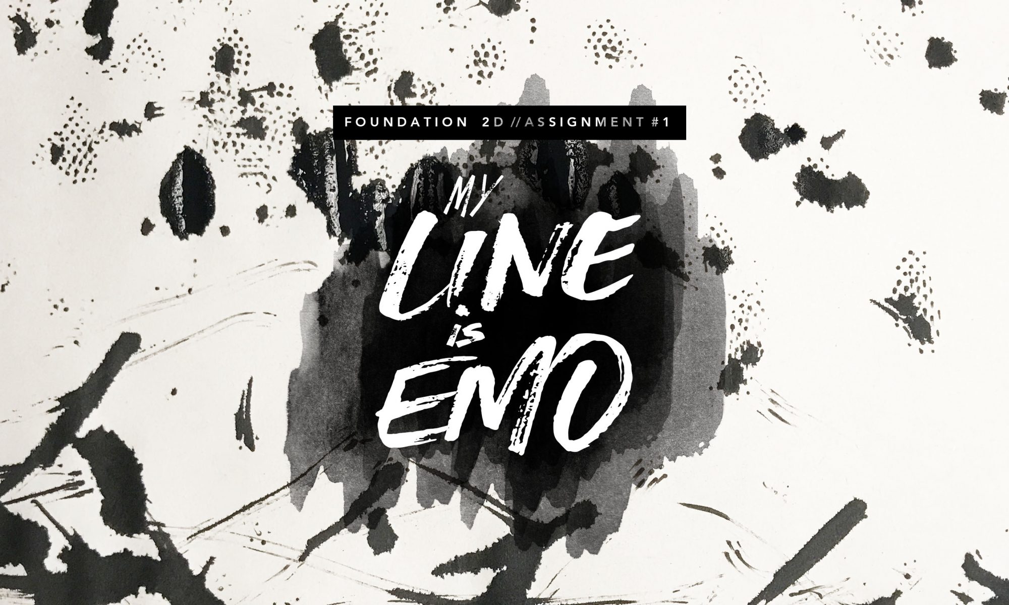
Final: My Line is Emo
The final six emotions I decided to explore are: Lust, Exhaustion, Hurt, Anxiety, Frustration and Hope
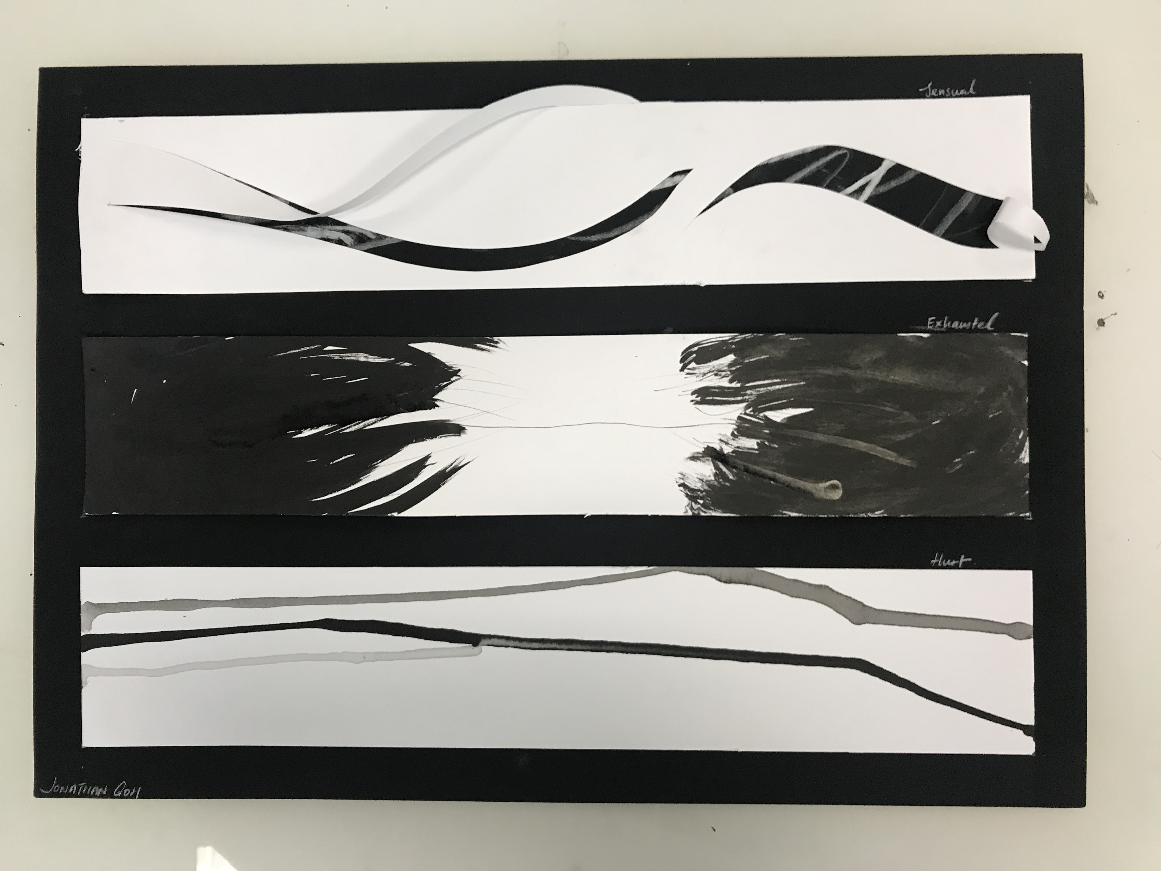
Lust : strong sexual desire ; speaks of strong passion.
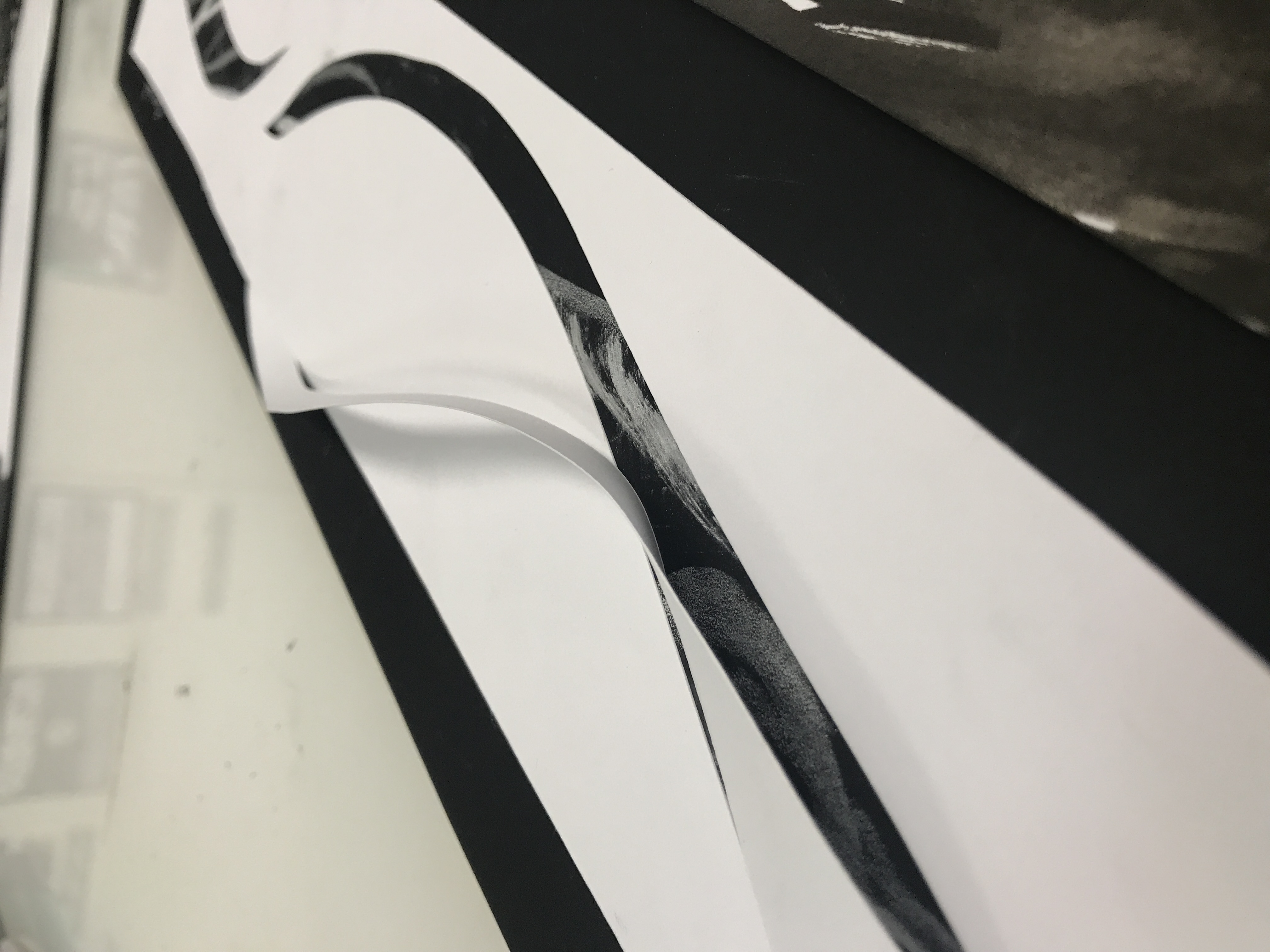
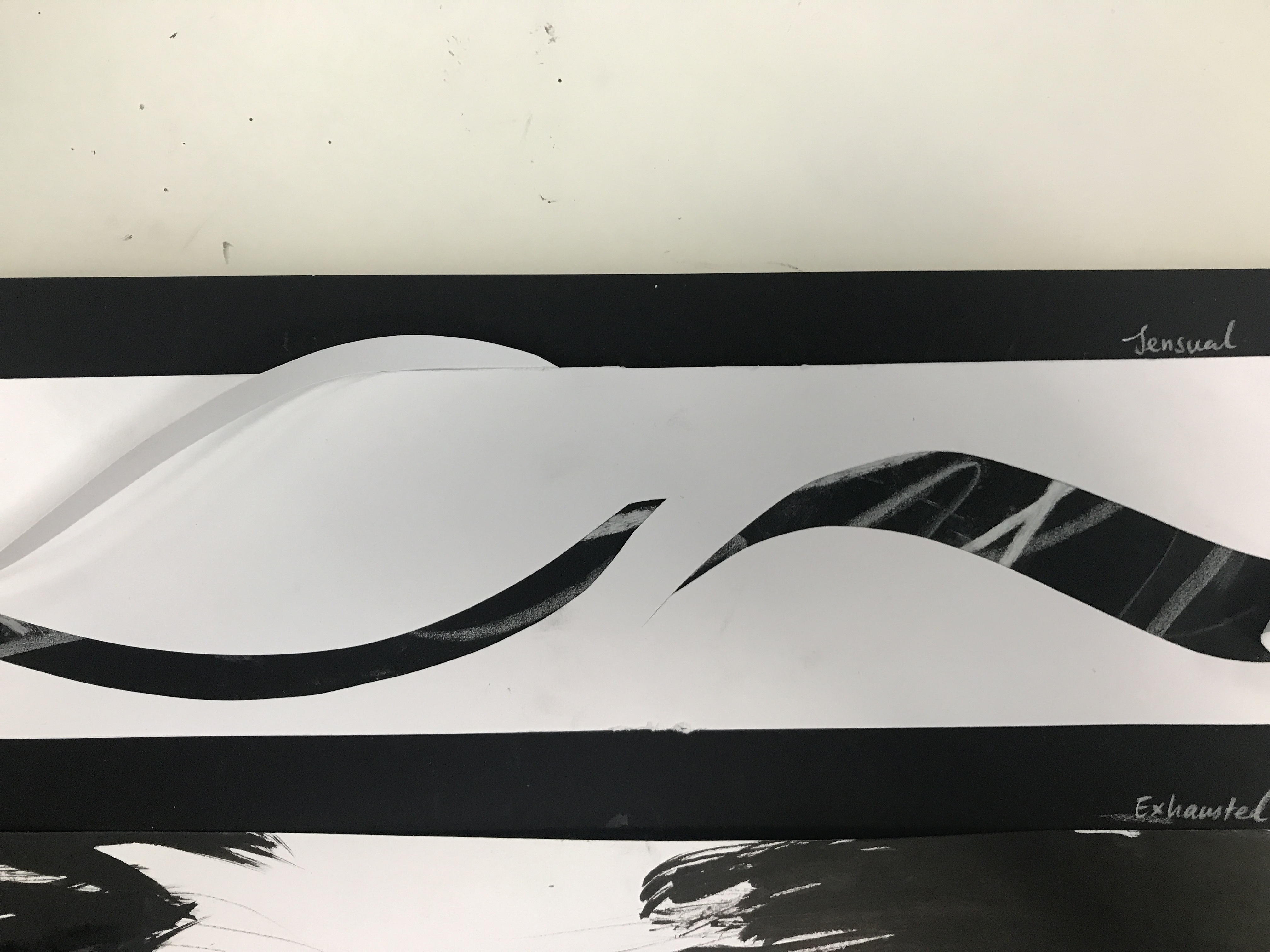
As mentioned previously, this piece aims to show the idea of mystery within passion. Using strong curve cuts to form slits on the front layer, this reveal a hidden layer that can only be seen from the small slits made. To further accentuate the curves on the front layer, paper folds from the slits made were made to form a 3D curvature that pops up.
The hidden layer is made up of White Colour pencils, and chalk to form a series of wavy lines of varying thickness and weight, to illustrate the fluctuation of our desires- strong and passionate for a moment, indifferent the very next.
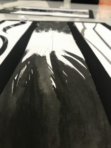
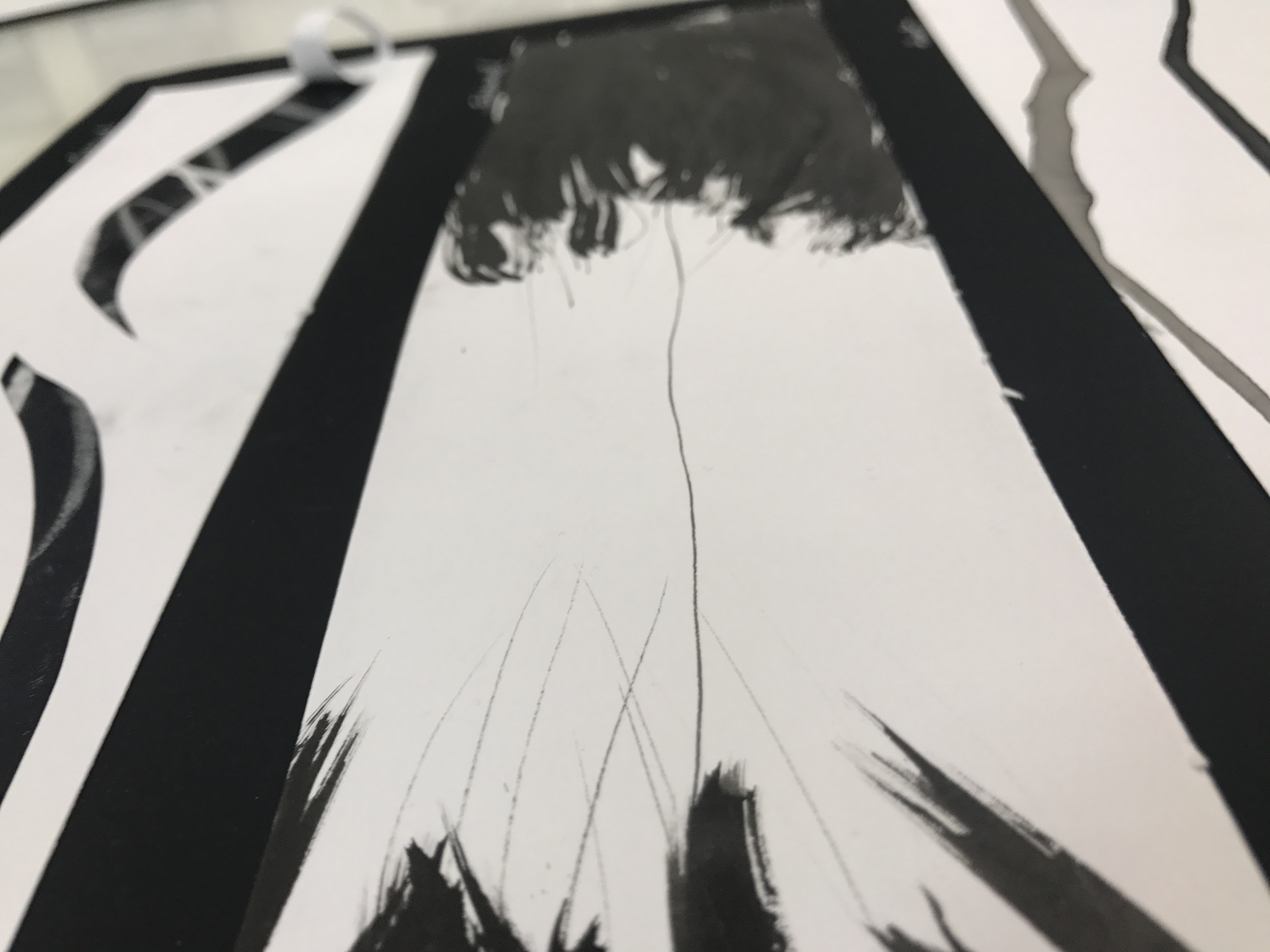
Exhausted : very tired, completely used up (resources)
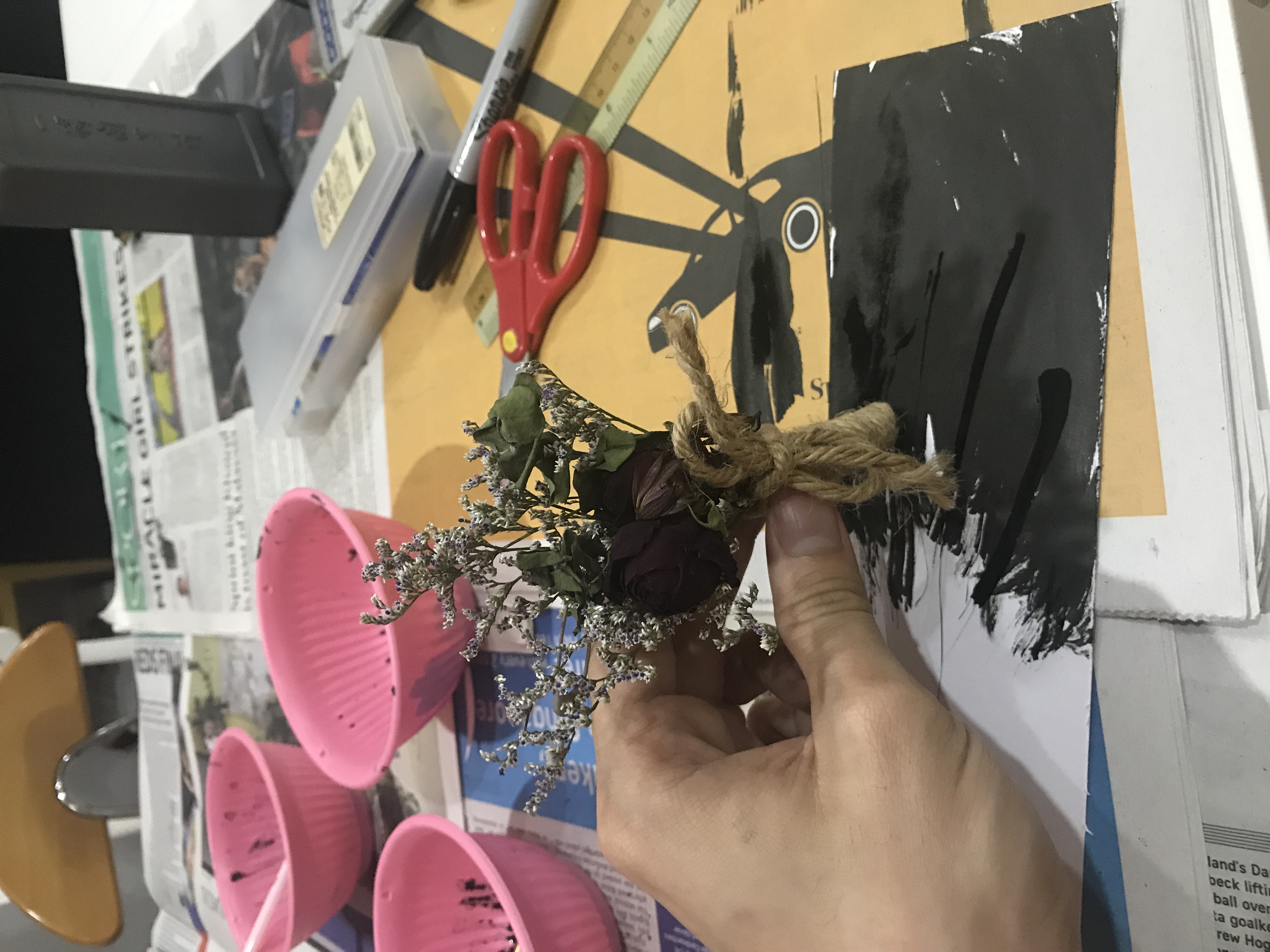
Created with brush and ink with the use of a tooth pick and a wedding corsage. The idea behind this piece is to symbolise the abrupt depletion of energy as a result of being stretched as shown from how the thick brush strokes quickly transit into a thin, wavering line on both sides. The thin, dry brush ends of the strokes resemble hands that are stretching out, reaching for the thin line, pulling on it, illustrating the definition of being “stretched thin”.
The reason why I decided to incorporate the use of a wedding corsage was as during the preparation for my Brother’s wedding, I was heavily involved and in the aftermath I felt extremely exhausted. The corsage brings to reminder the weariness and I wanted to include it as a mark making tool within the piece as a form of reminder of the same emotions I had felt.
Hurt : cause pain, suffer pain, cause distress to.
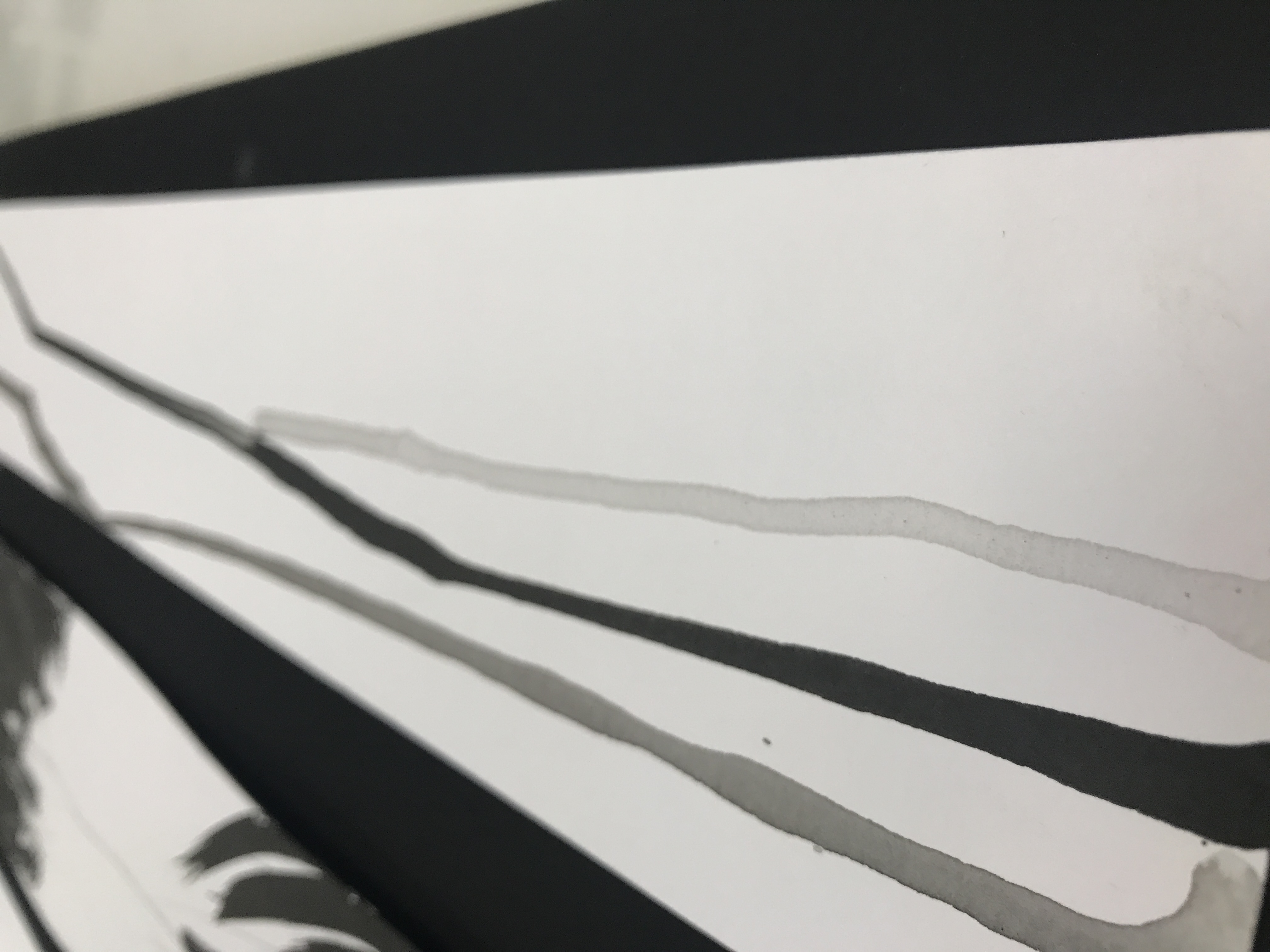
For this piece, I decided to use tears to explore the idea of fragility as a facet of hurt as it is often viewed as a manifestation of hurt and pain.
The final work was created by dripping three drops of a mix of ink and water (varying in concentration) from one end of the paper and allowing it to flow from one end to the other to symbolise tear drops rolling down. The result is three lines , varying in colour tone that spans across the paper. The unevenness of the line weight and direction of the ink illustrates a sense of frailty in the line. Akin to the weakness we feel on the inside when we are hurt.
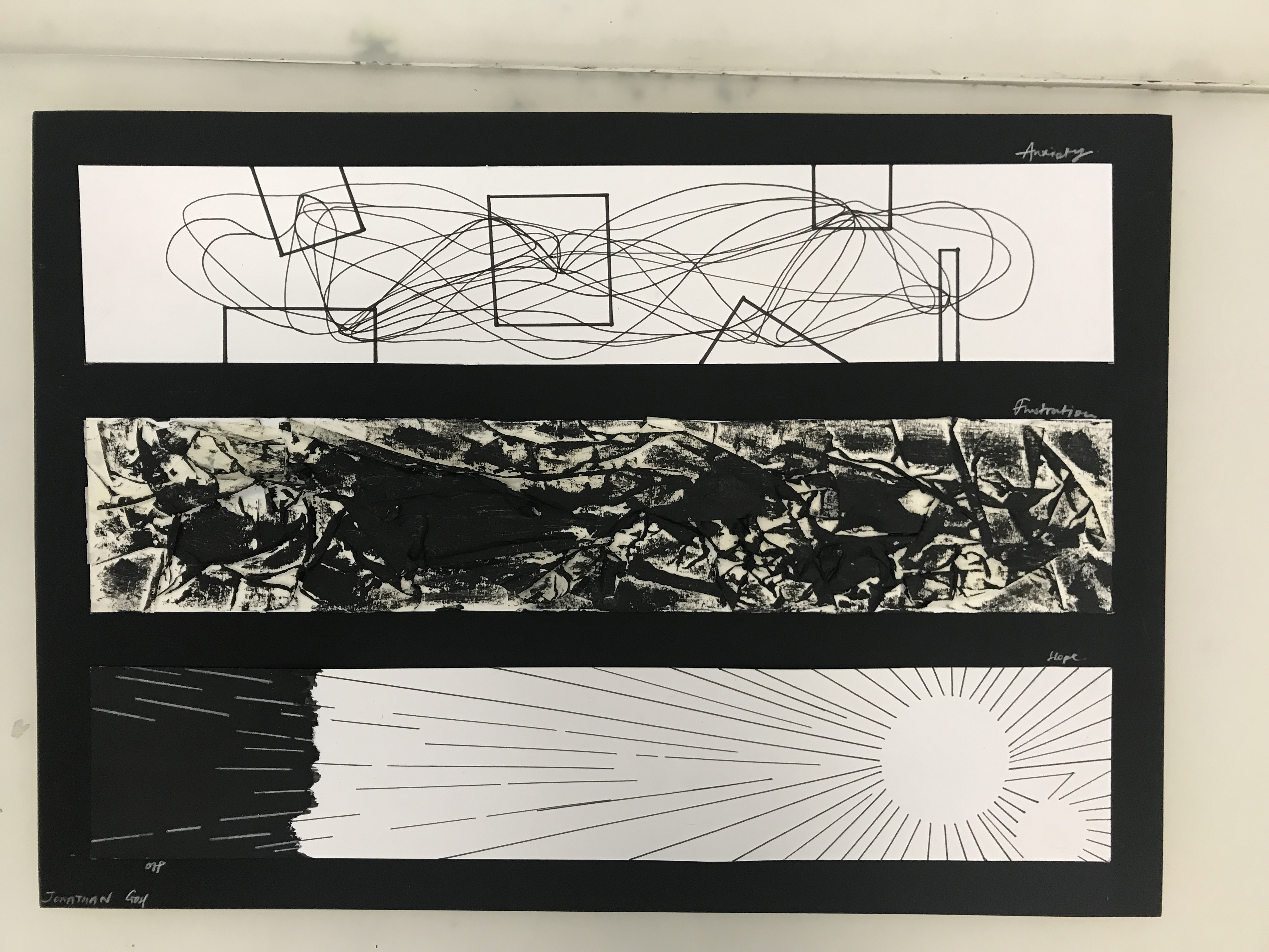
Anxiety : Worry, nervousness or uneasy about something with an uncertain outcome.
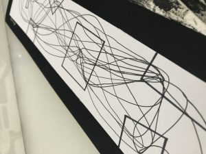 This work serves as a pictorial representation of the inner workings of the mind through understanding my interpretation of anxiety to me.
When I feel anxiety, it’s often an amalgamation of thoughts that seem to be grounded in reason. Yet at the end of the day, it becomes overly exaggerated and are simply thoughts that keep going round and round reaching no conclusion.
The lines in the work represent our thoughts. Long continuous lines serves to represent our mind that is always at work, always filled up with worries of some sort. To illustrate the frontal lobe of the brain (that controls reasoning), geometric shapes were used due to its even-length sides and rigid shape.
The end product is a series of lines to go back and forth in a series of cycles between the geometric shapes to create a type of ‘mess’, much like how when we are worried and nervous, our thoughts go all over the place. These worries and fears are very much grounded with reason, yet they seem to achieve nothing at the end of the day but cause more worry, as seen from how the lines are continuous cycles between the shapes that has no distinct start or end. That seems to suggest a never ending cycle of worry and more worry.
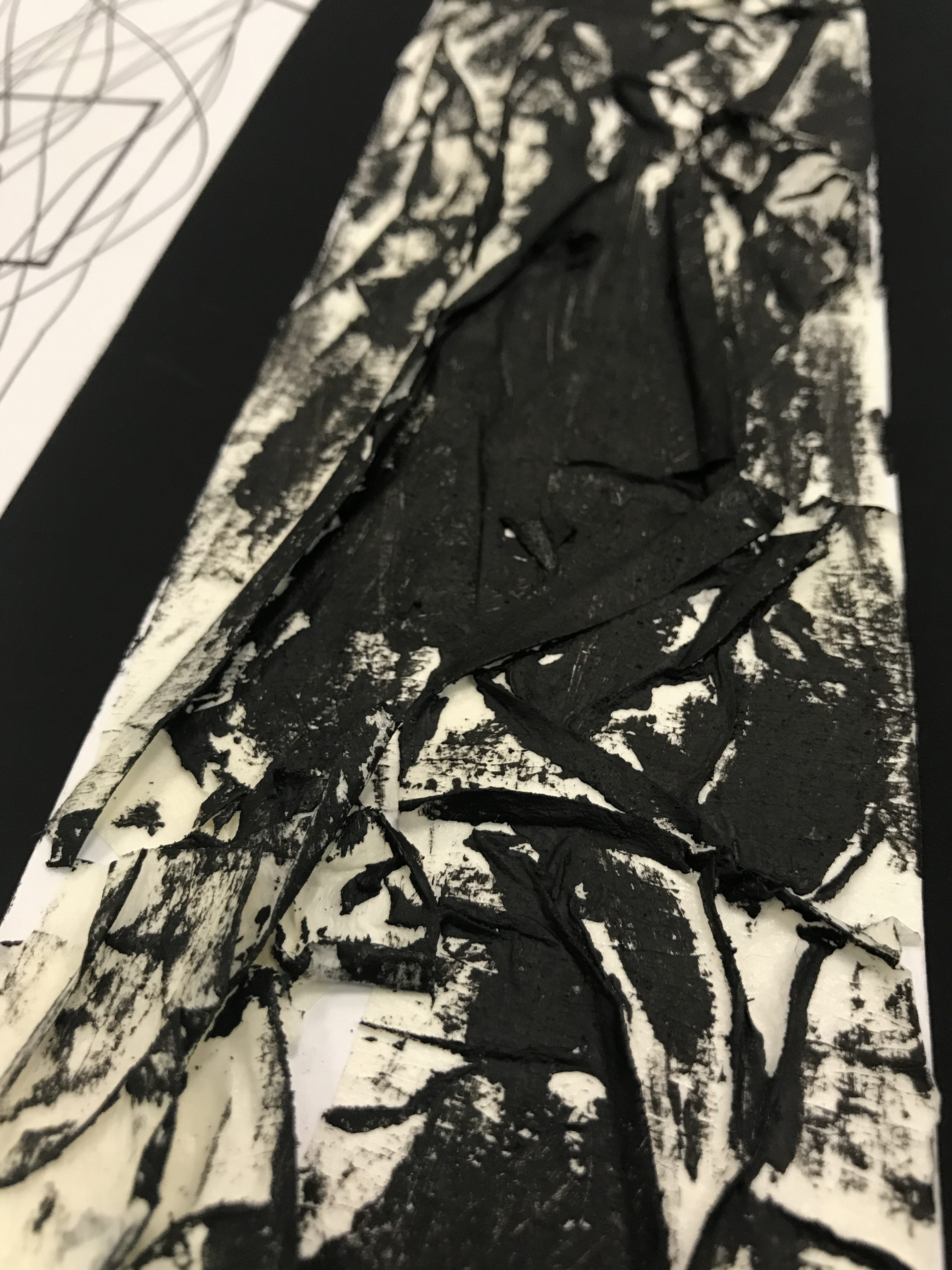
Frustration : upset or annoyed as a result of being unable to achieve something ; prevention of progress, success or fulfillment of something.
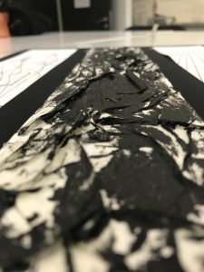
As explained earlier, Frustration explores the thought of annoyance at one self and as a result, being stuck in a rough patch. The final piece is created using masking tape pasted with creases on paper, then using sandpaper with ink to create strokes on the masking tape surface.
Through the combination of these two processes, it is found that that black paint strokes made by the sandpaper accentuates the sharp lines formed by the creases creating a strong contrast of the jarring lines. The coarse sand texture from the sand paper also gets transferred onto the surface.
The end result of merging two ideas created a layered texture piece that is an interpretation of the rough patches in frustration that engages viewers not just visually but also through sense of touch.
Hope : A feeling of expectation & desire for something to happen.
Hope speaks of positivity and carries an inclination towards something good. As such, I wanted this piece to reflect a fairly light mood. The idea behind this piece is the intangible yet powerful strength of Hope. In the light of tragedy when darkness seems to overwhelm, it is only with Hope that embodies that strength to pushes back against dark times.
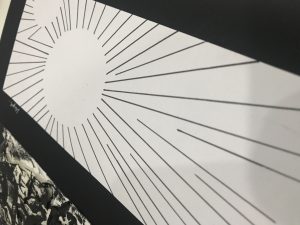

Lines radiating all around creates a silhouette of a circle. The use of these geometric patterns symbolise the stability and secureness we find in hope. While the silhouette illustrates the intangible nature of Hope. The strong lines that radiate out coincides with the back patch at the end of the paper, gradually overpowering it.
Final: My Line was Emo
Some final thoughts, while the assignment may have felt long arduous, it was really just a journey of stretching and getting uncomfortable to train our senses to be more acute and in tune with our emotions. For me, the process of unpacking the definition of an emotion thereby establishing a personal connection or revelation with it has been one of the most memorable moment of the assignment.
Lastly, Thank you for reading and being part of my research, process and final piece 🙂