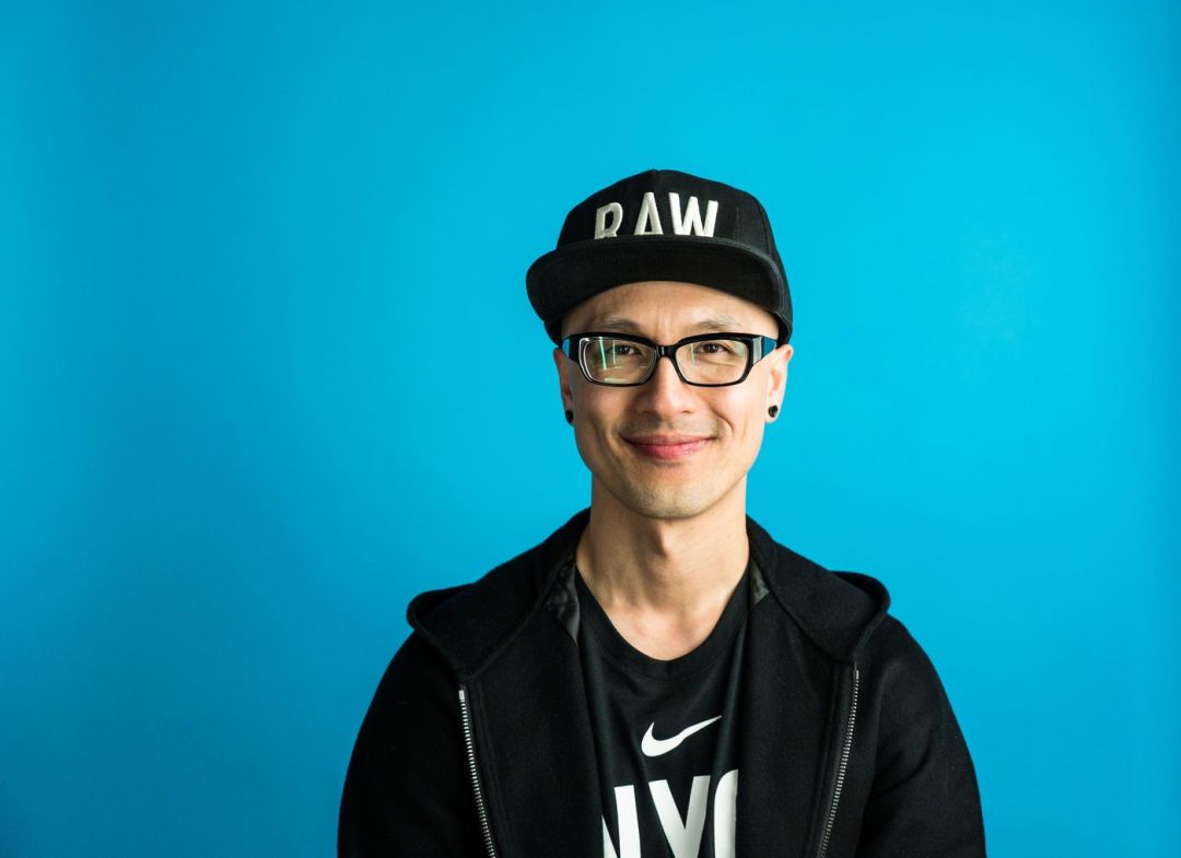
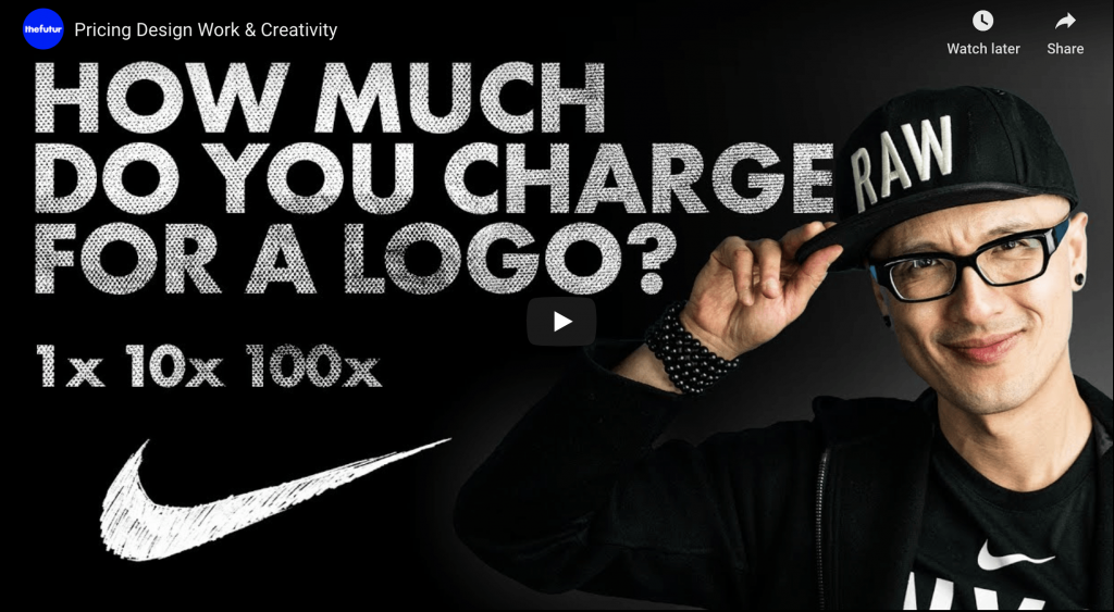
An award-winning director, designer, strategist and educator, Chris Do wears many hats (both literally and figuratively). As the Co-founder and Chief Strategist at his own design consultancy Blind, he develops effective strategies and powerful identities to help brands connect with their audience. On the other hand, he is also CEO of theFutur an online education platform that aims to disrupt the private design education industry by leveraging on media platforms, social networks and capitalising distance-based learning tools.
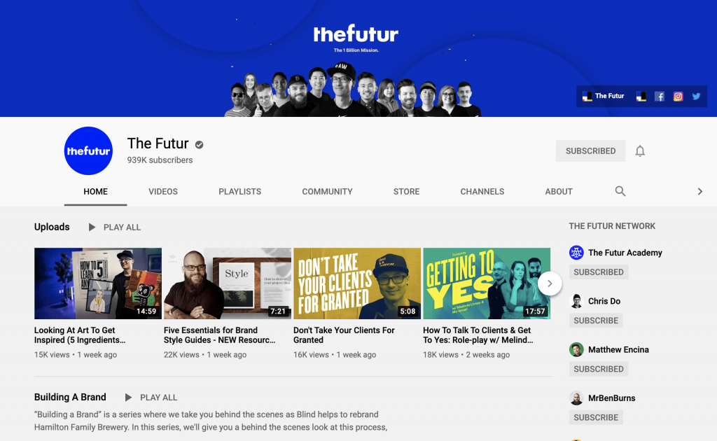
Screen shot taken from thefutur.com
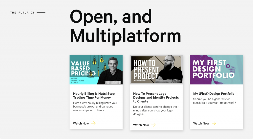
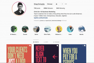
Screenshot from Blind.com/work
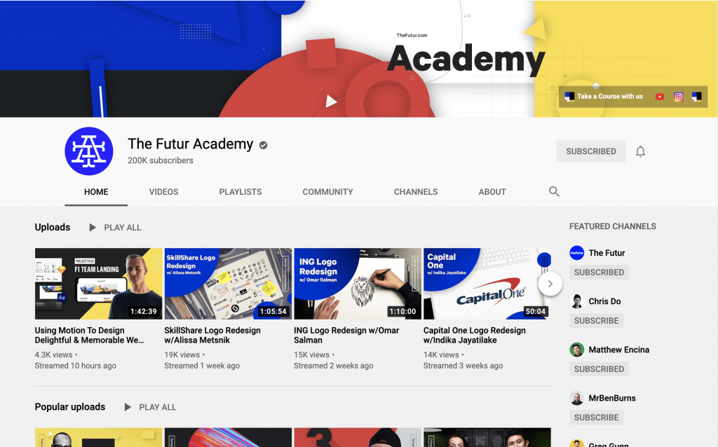
This is especially timely in this time and age where content is king and we are bombarded by myriads of digital content on a daily basis, yet in this sea of information, Chris Do is able to identify existing gaps and carve out a niche market for himself within TheFutur. He establishes his credibility based on the work he has done, and as a disruptive thinker that reshapes the creative industry (such as his value-based pricing model for creatives). He is also able to further scale his platform by spinning off to alternate channels such as TheFutur academy with a focus on design technical skills.
What I admire about Chris is his ability to reinvent himself as a creative by leveraging his position as a designer and educator in the industry. And he does so by effectively combining his passion for teaching and love of his craft to create new platforms that help him to further cement his position as a thought leader and allows him to build his audience. Effective personal branding in a nutshell.
As I prepare to graduate and enter the working world, the videos and content produced have been deeply insightful in nudging me to think further and beyond the field of design but to also consider the business of the industry and my own personal branding.
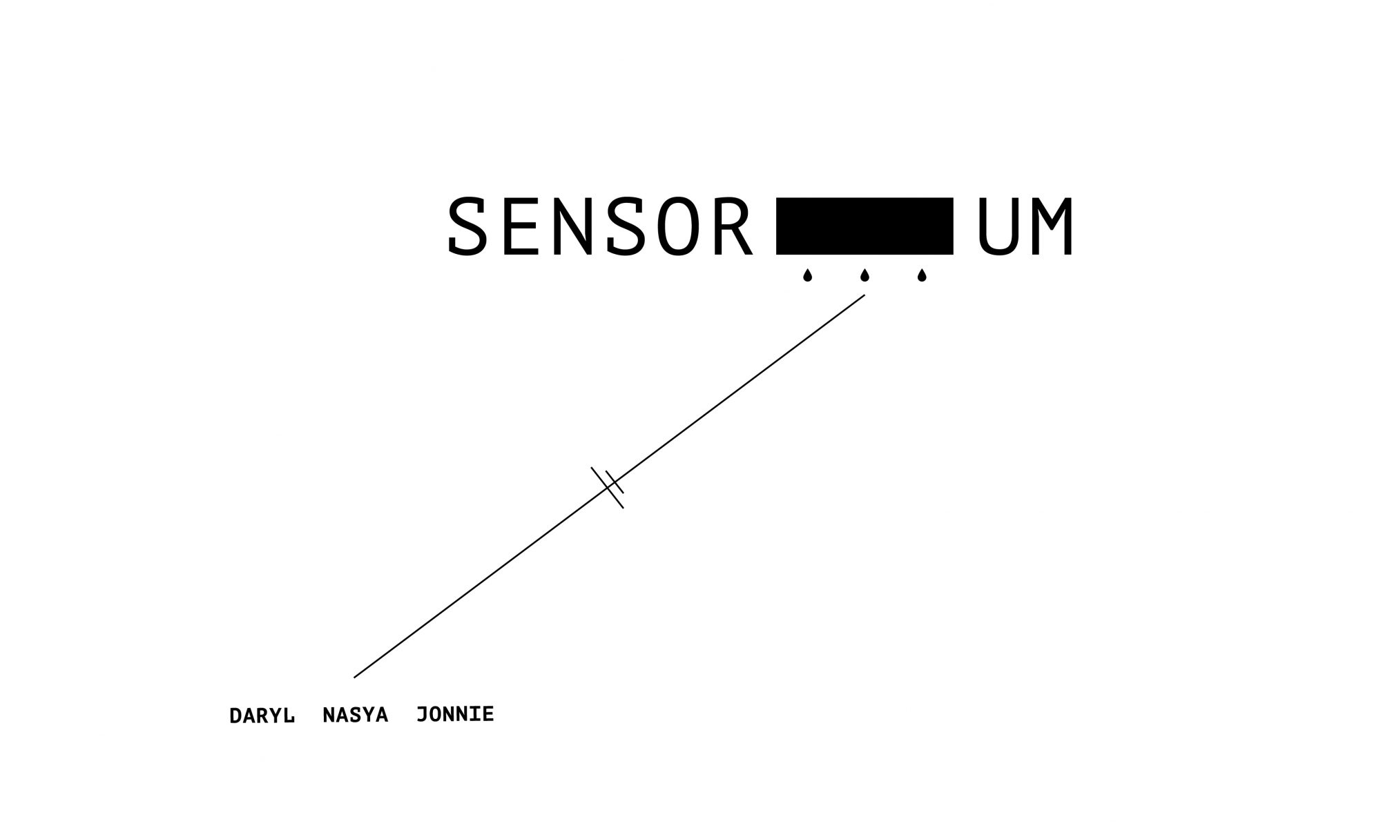
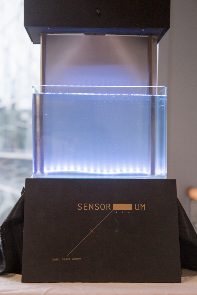
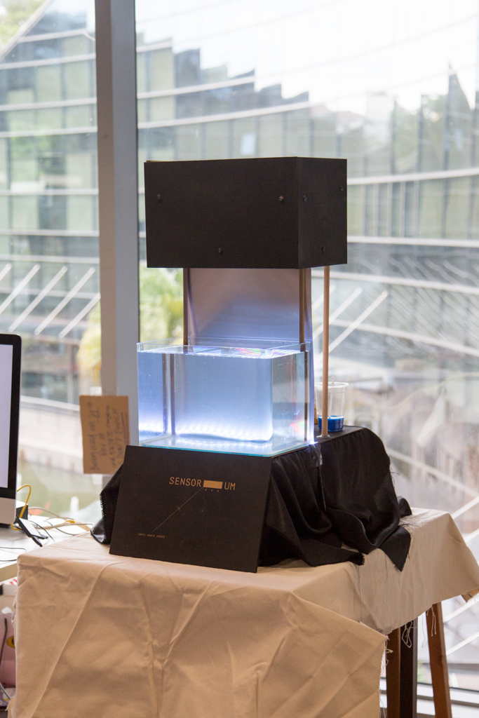
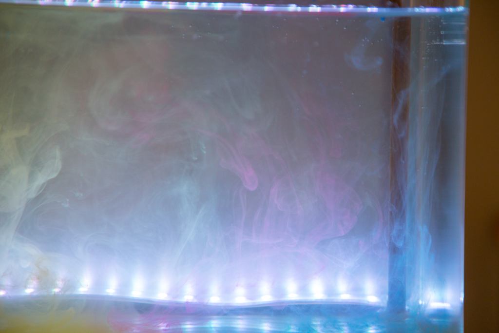
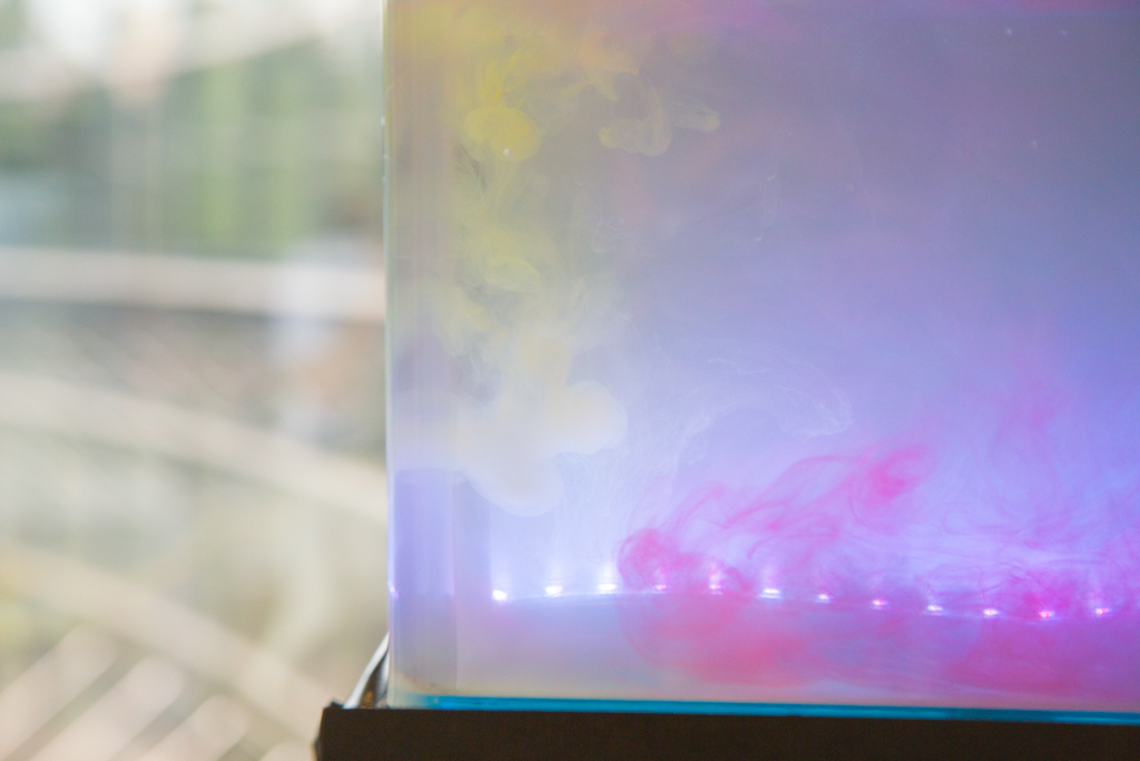
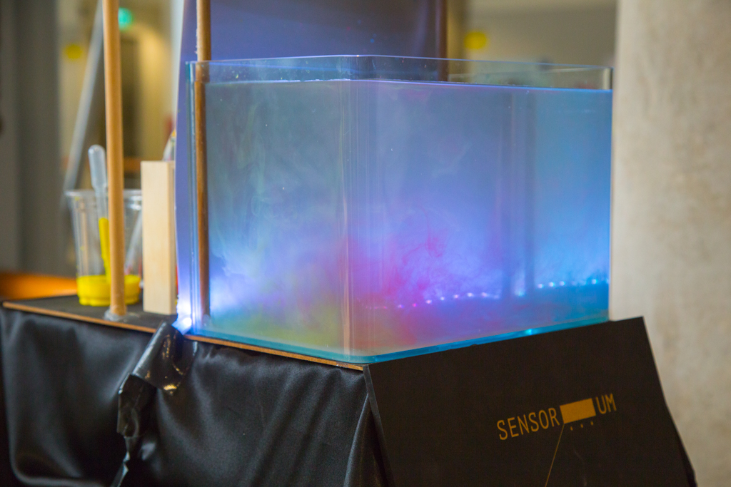
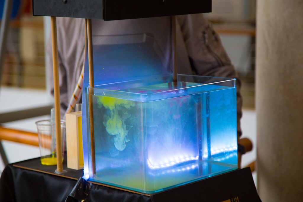
Sensorium questions the interstices between our senses that we often take for granted through the sensory phenomenon known as “Synesthesia” – a condition where a stimulation of one sensory or cognitive pathway leads to automatic and involuntary experiences by other senses. In short, an experience of a single sense is now simultaneously perceived by other senses resulting in confusing outcomes for the individual with this condition.
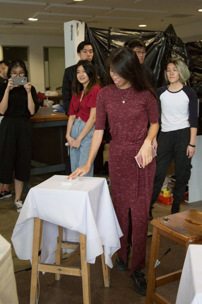
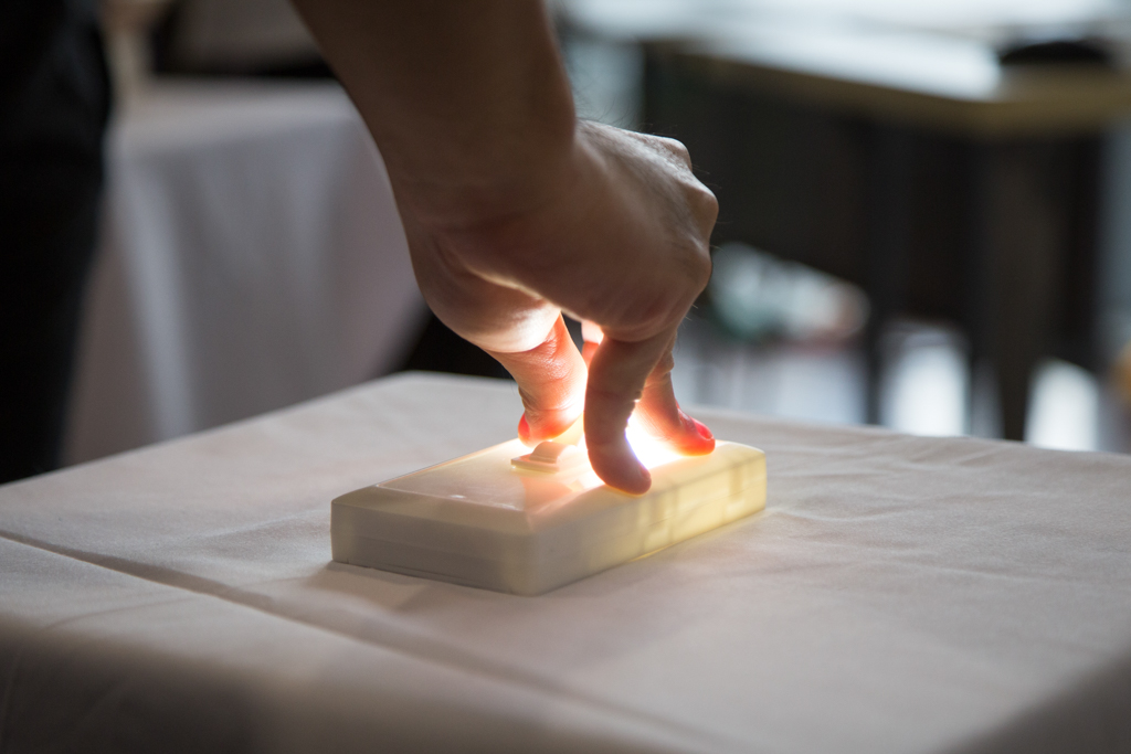
In this installation, we aimed to make this gap more aware by recreating this condition by allowing visitors to experience a similar disassociation between their senses by creating a sense of unfamiliarity with objects that they are familiar with interacting. This “sensory overload” is created through the unfamiliar and different sounds heard and coloured “ink-drops” seen dripping into the tank when interacting with the objects on the stools.
Concept – artist references
We were also inspired with artworks that engaged different senses and emitted sounds. Through interaction some of our references are as follows:
Lenses by Hush
A installation that converts light sensors and refractions to sound.
Synesthesia Installation
Another installation that plays on the idea of engaging different senses in the form of Synesthesia.
In our initial ideas, we were focused on using lights and sounds to create the experience of Synesthesia but a closer study into the condition, and consultation with Lei, we decided to go with something more tactile and allow the installation to be more object-driven. Settling on the sense of touch, sight and sound.
Objects used and sounds that corresponded:
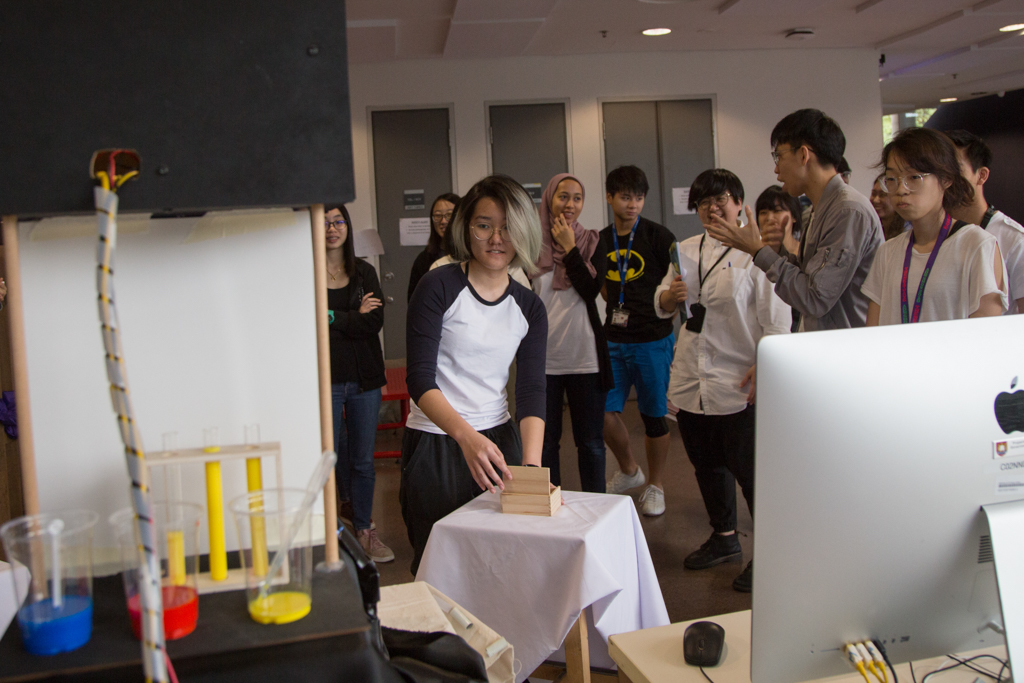
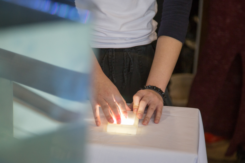
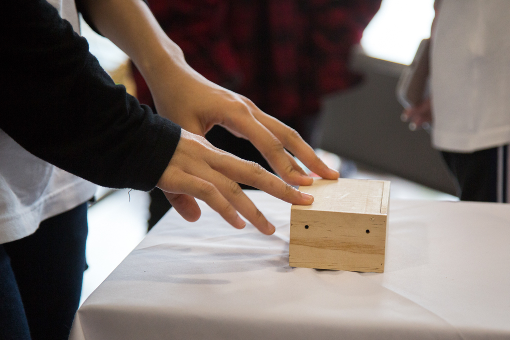
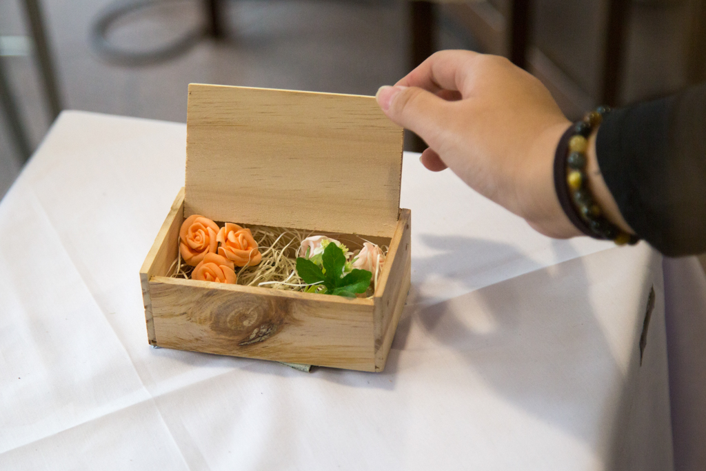
Box with Lid (with flowers on the inside) – Thunder
Chair – Cat meowing
Light switch – Toilet flushing
As for the sounds we chose, we followed what Lei suggested about considering the “textures of the sound”. To further elaborate, it was like how for the box with lid (with flowers inside), the expected sound would be something very soft and soothing. Whereas for that we used the sound of thunder, which sound texture wise was very loud and harsh to further juxtapose for dramatic effect. For the sitting on the chair, it is expected to be associated with feelings comfort, yet we used a cat meowing sound which sound texture wise was very sharp, to throw the audience off and bring a certain element of shock and discomfort to them. As for the light switch and the toilet flushing, we felt that the “click, click” sound of the light switch turning on and off felt very rhythmic and repetitive, as such threw in the sound of toilet flushing as the texture of the sound felt very random and the swooshing sounds felt like a good contrast.
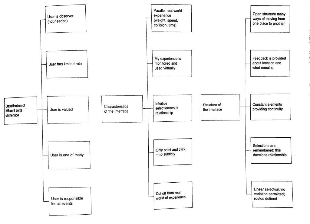
Characteristics of interface
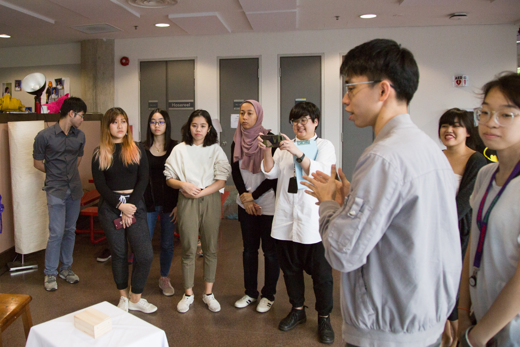
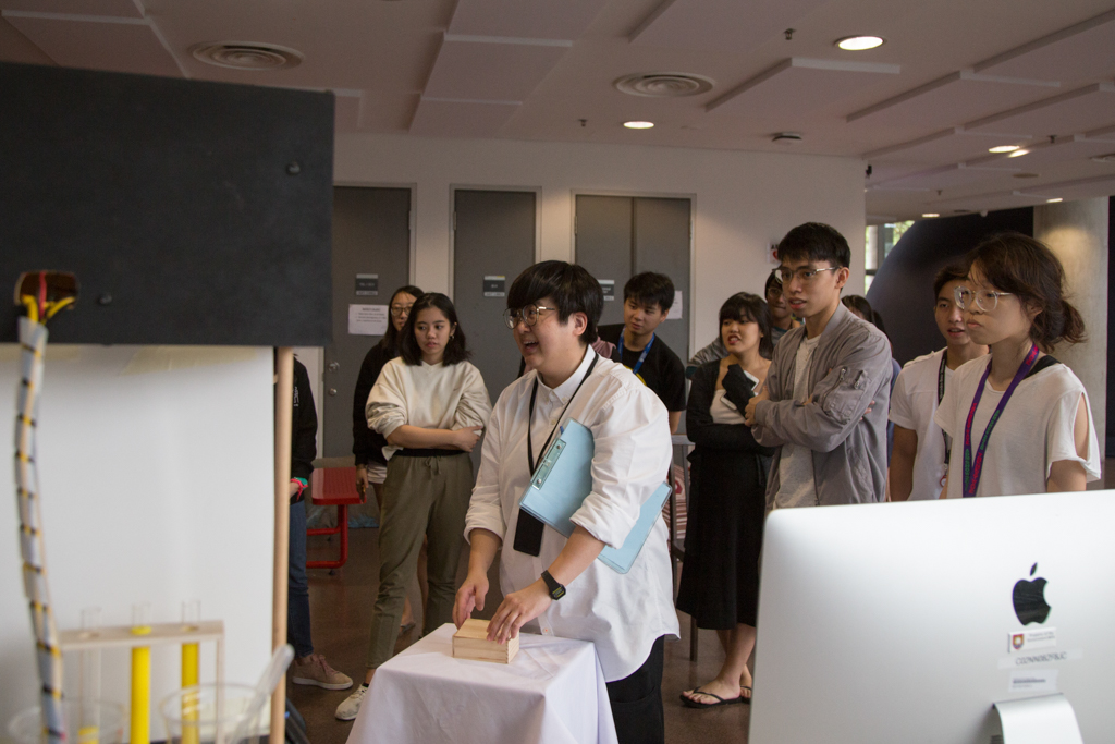
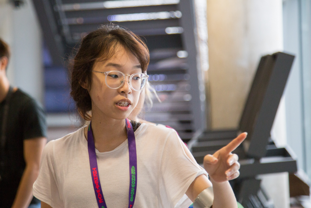
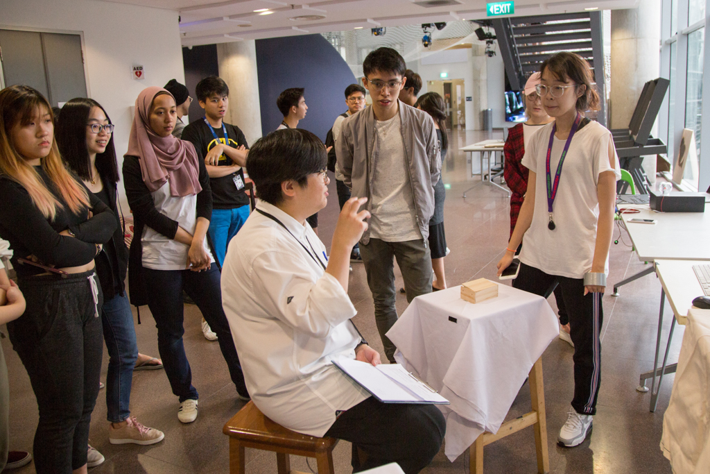
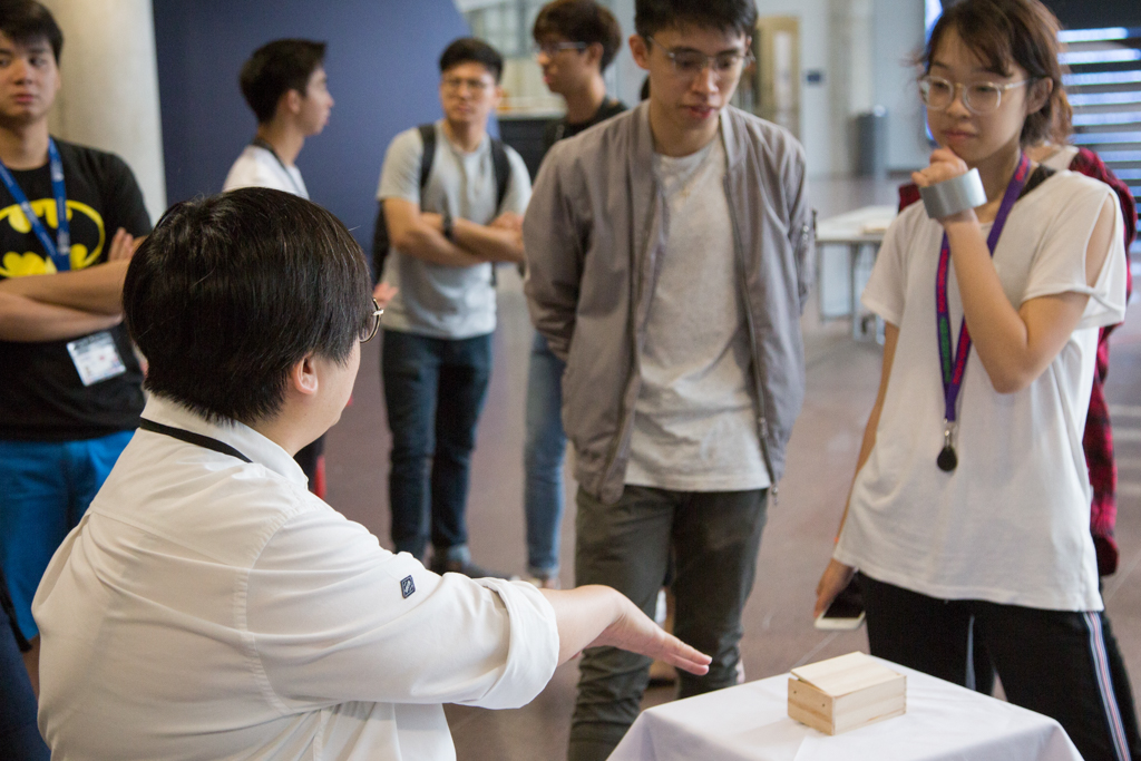
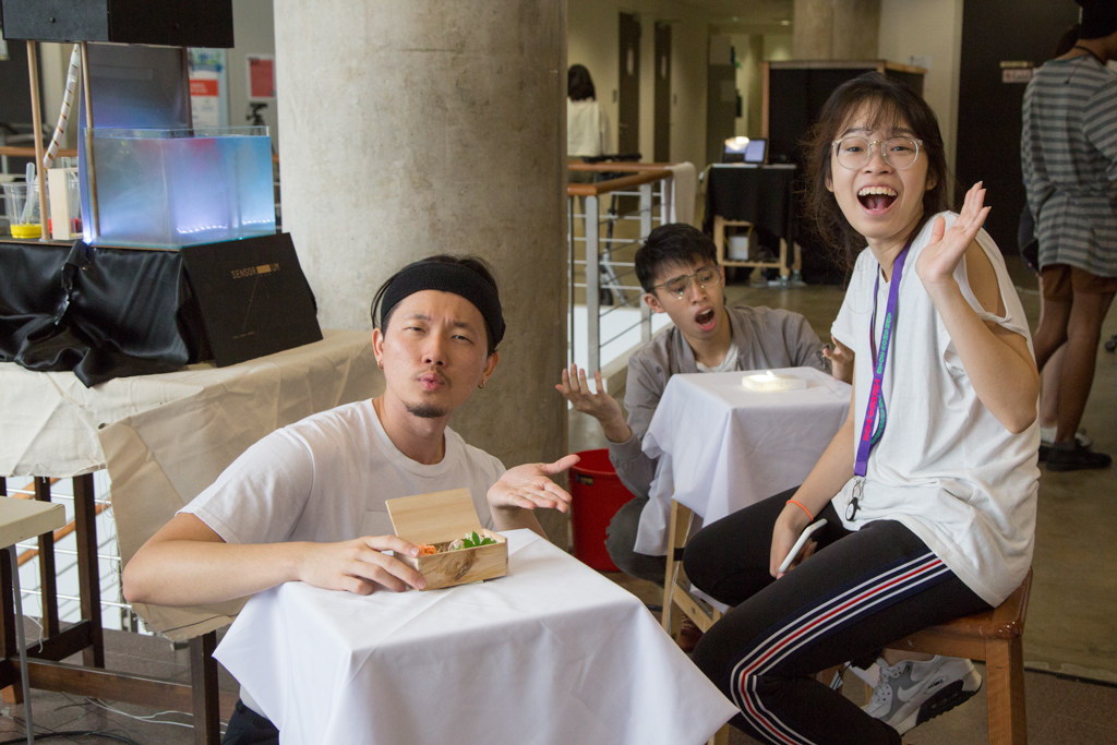
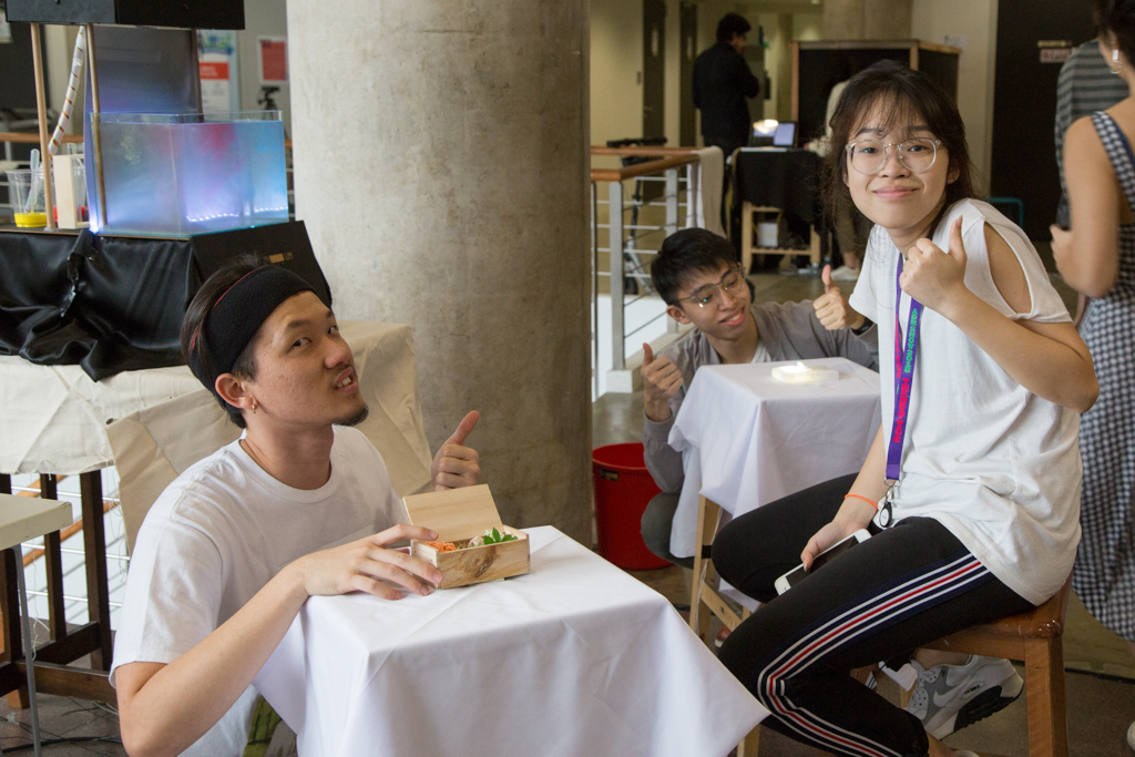
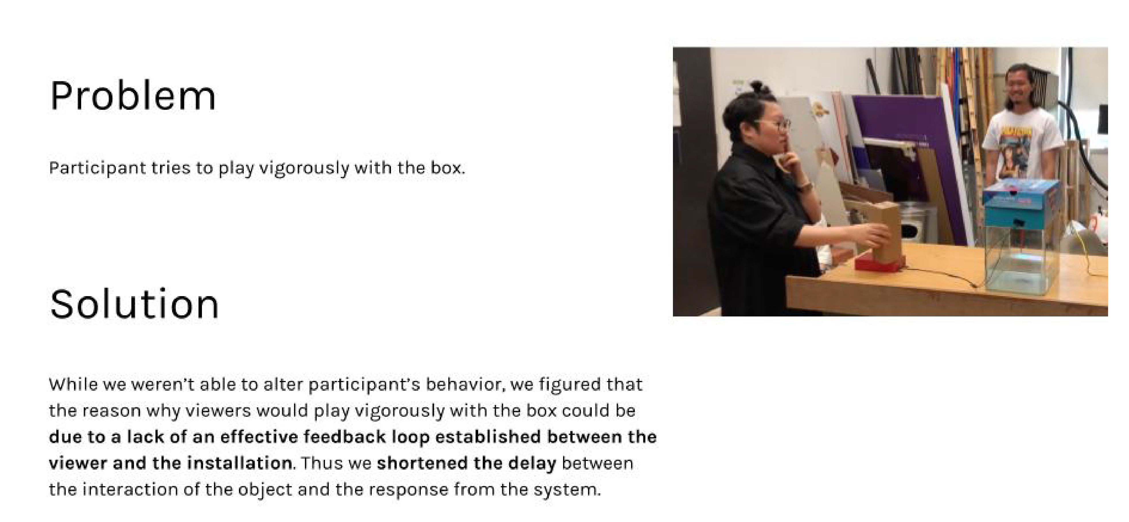
As Sensorium is ultimately a participatory-driven installation, the viewers are in integral aspect to this installation. Thus on the continuums of interactivity, we would place “Sensorium” close to the zone or High Interactivity, where the viewer’s actions and feedback will ultimately determine the outcome of their experience with the installation.
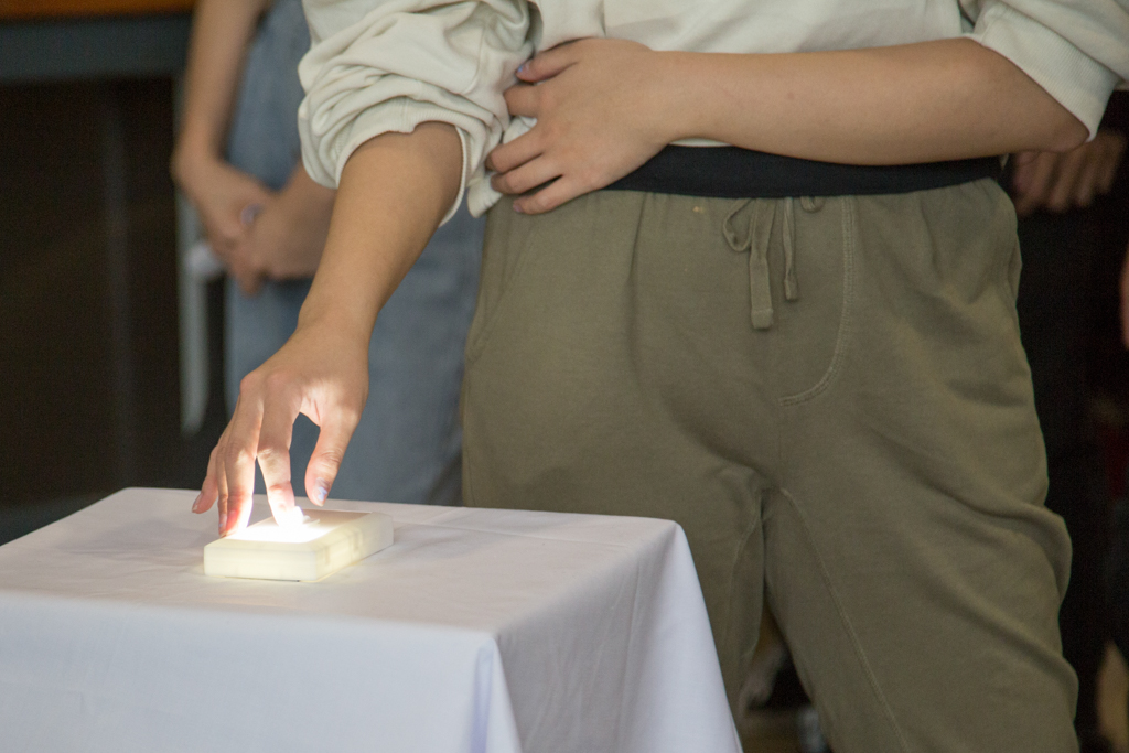
Also, based on the characteristics of interface, we would view Sensorium as having its interface “parallel real world experience”. The nature of Sensorium plays on the disassociation between what viewers think they know and what is actually presented to them. As such our interface would be one that is very much based on real world items and objects. For example, in Sensorium a box with a lid, a chair and a light switch are selected as our main objects that viewers would interact with. These are common everyday objects that the viewers are familiar with its function and working. We then based the activation of the feedback loop based on these interactions. Thus, the sounds and ink drop will only appear as the viewer opens the lid, sits on the chair and flicks on the light switch . Thus we feel that Sensorium’s interface is one that parallels the real world in order for viewers to be intuitive in the way they interact with this installation.
We were also intentional to do our best to hide the LDR systems within the interface so as to not lose the “magic” created for the viewers.
TECHNICAL DESCRIPTIONS
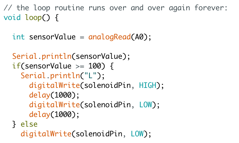
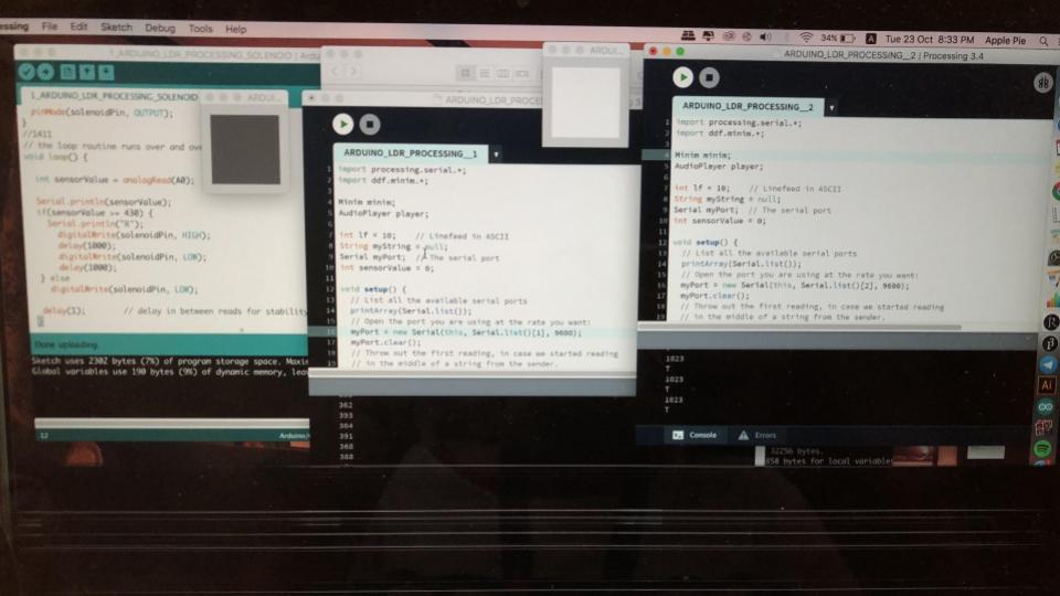
For each object, we had to instruct our code differently based on the values read from the LDR (SensorValue). For instance, for the sitting on the chair, our requirement was that only if SensorValue <= 50 would the condition be true and hence turn the solenoid and sounds on. This meant that only when someone sits on our chair and the light value dips below 50 will the condition be true. For the other two like opening the box and flipping the light switch, our condition was if SensorValue >= 100 because only if the LDR senses light, i.e box opening and also light turning on, will the condition be true, and the solenoid and sounds turn on.
We used what Lei thought us about Serial.println( ) in our code! Each object had different integers for Serial.println(_), as a form of communication between Processing and Arduino. Basically if for an object sensorValue>=100, Serial.println(L) is true. This integer “L” is then sent over to Processing and plays the chosen sound. We used Processing instead of an MP3 Shield because Processing could simultaneously take in three codes from Arduino and yet play all three different sounds at the same time. We made use of the minim library on Processing to play the sounds easily!
For Arduino:
For Processing:
some challenges and how we overcame them
To add on, we also ended up choosing objects that were more dynamic (opening box and flicking light switch), rather than just purely the action of picking up and putting down.
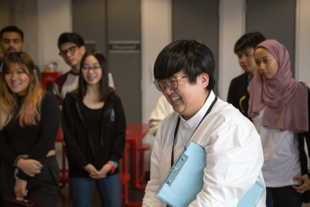
INDIVIDUAL ROLES AND REFLECTIONS
Jonathan – Head of Setup, Logistics and Concept
I think there weren’t huge challenges faced in this project but rather many small glitches and problems that occured throughout the process such as the technical aspect of getting the sounds to work. I was initially supposed to handle that area and we resolved to using a MP3 shield to play the sounds provided for the installation. However, the MP3 shield did not work alas due to some faults in the hardware and software. We decided to use processing to solve the issue in the end as Nasya had found a method to utilise it for our project.
There were many hiccups in the set ups as well. From the parts of getting the LDR to work during the set ups and how the droppers would actually run out of ink quite often.. but generally I think we were able to work around the limitations and created a very interesting and fun experience for our viewers. We were cracking our heads to come up with a strong disassociation between the objects and sounds but realised that an association could always be created regardless and that is actually a human condition as well – the tendency to draw connections and create associations. The experience created by the objects and sounds added a dimension of humour that we didn’t think it would bring and I thought that was quite interesting. 🙂
Daryl – Head Hardware, Arduino Technician, Aesthetic Advisor
When we first started the project, we were bent on created a big and extraordinary auditory visual experience in relation to synesthesia. However as we progressed through the project, we learn that synesthesia is more of a day to day experience which synesthetes have. Thus we worked towards the idea of giving everyday objects a different response in dissonance to the objects in question which we finally chose, the chair, a box and a light switch.
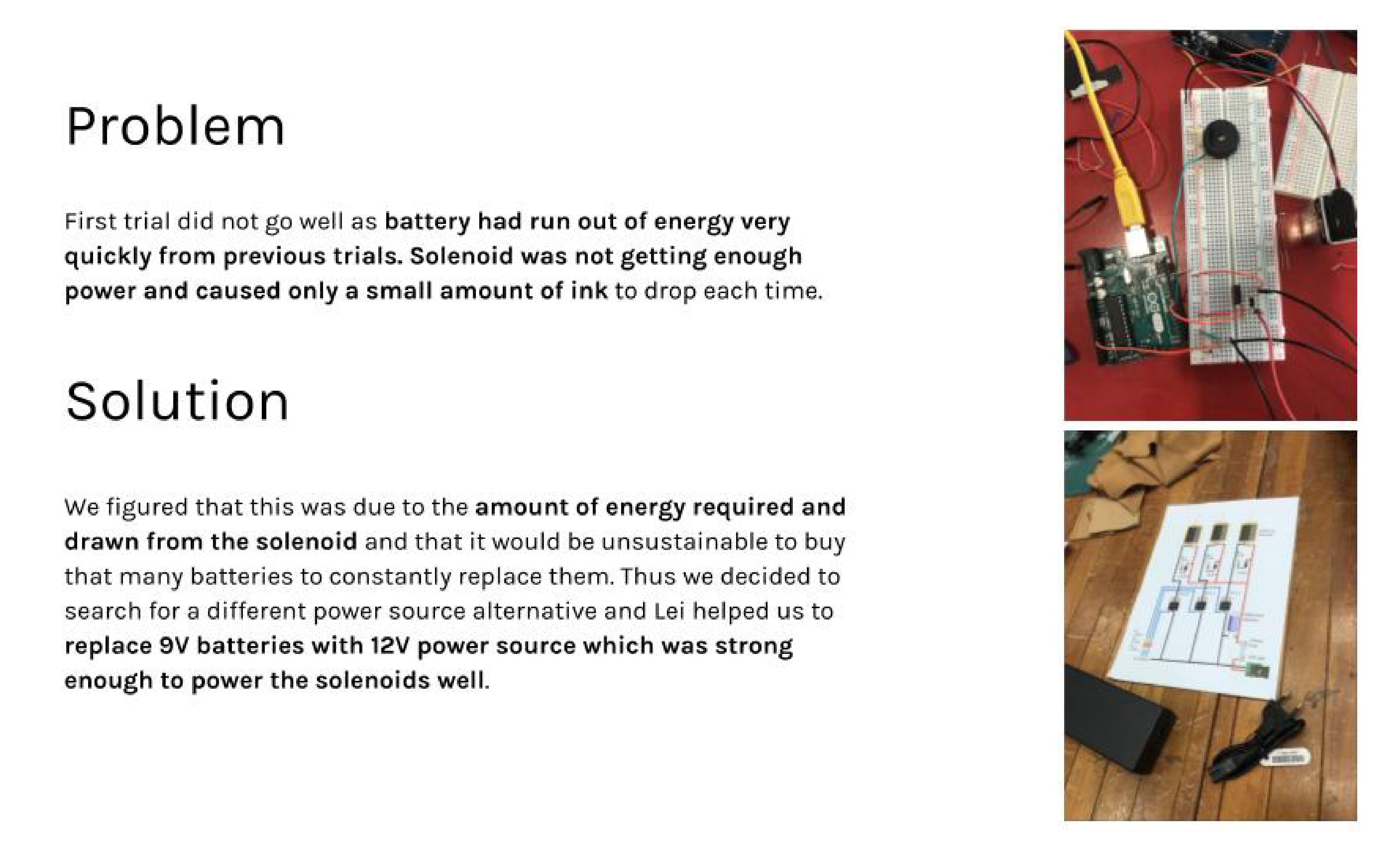
We encountered many little hiccups during the conceptualisation of Sensorium. Problems such as circuitry issues (we almost fried Nasya’s Macbook), programming issues, and also a lot of debugging be it in the software (Arduino, processing) or hardware (droppers, solenoids, mechanisms, we had to find the correct inks to use too).
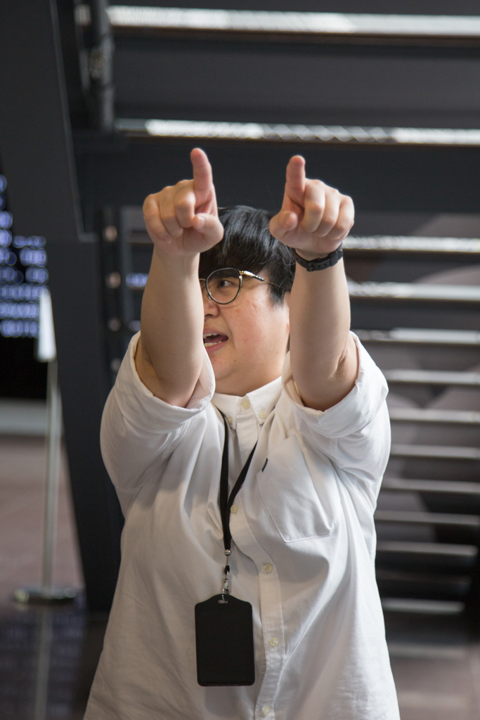
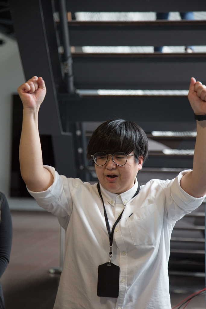
We completed the project in the nick of time, and we were so happy that it all came together at the end. When our audience were testing and playing with Sensorium, creating the sounds and Ink clouds simultaneously it almost blew our minds. It actually turned out better than we expected. I feel that Sensorium has fulfilled its purpose: to create dissonance in everyday objects and their expected responses and thus portraying what a synesthete could potentially experience in his or her daily life.
Nasya – Head Programming, Processing Maestro, Arduino Extraordinaire
Overall the project felt like one very smooth journey! Each member owned their role and as such Sensorium was pieced together very nicely. I was quite amazed at how far 13 weeks got us, from knowing nothing about Arduino to being able to code according to what our project required. I remember initially it was very hard to code stuff due to just unfamiliarity, but as the weeks passed, it was easy to grow more accustomed to the coding language and be able to get Arduino and even Processing done. Here’s some work-in-progress! Could really see the improvements coding wise 🙂 A lot of the final codes were adapted, improvised to suit our needs and based on earlier codes that we learnt from class and from the Arduino Project Book!
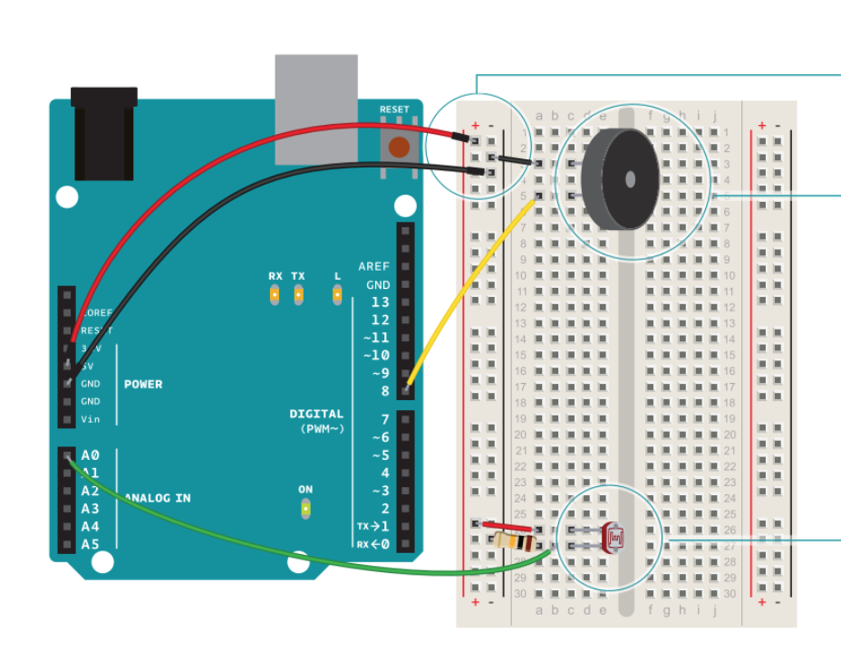
Started off very simply with just the LDR being the input and having the buzzer as the output. (and we were very excited at that point that it was working)
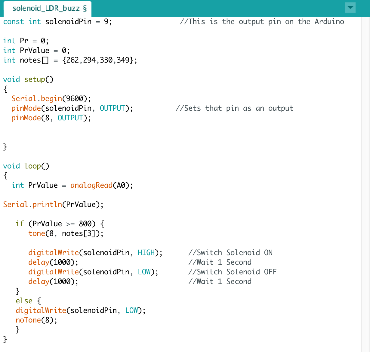
Here’s our code from the initial buzzer and LDR adapted to fit the solenoid!
Here’s towards the end when we realised we needed a way to play the sound together with the solenoid movement thereby replacing the buzzer. Managed to get it to work with processing and we were ultra excited!
It was great that there was a progression, a growth toward our code, in that we did not suddenly write out a code overnight but rather it was based on looking through our code weekly and tweaking them to suit our project needs. Overall because of consistent work we managed to do the project well!
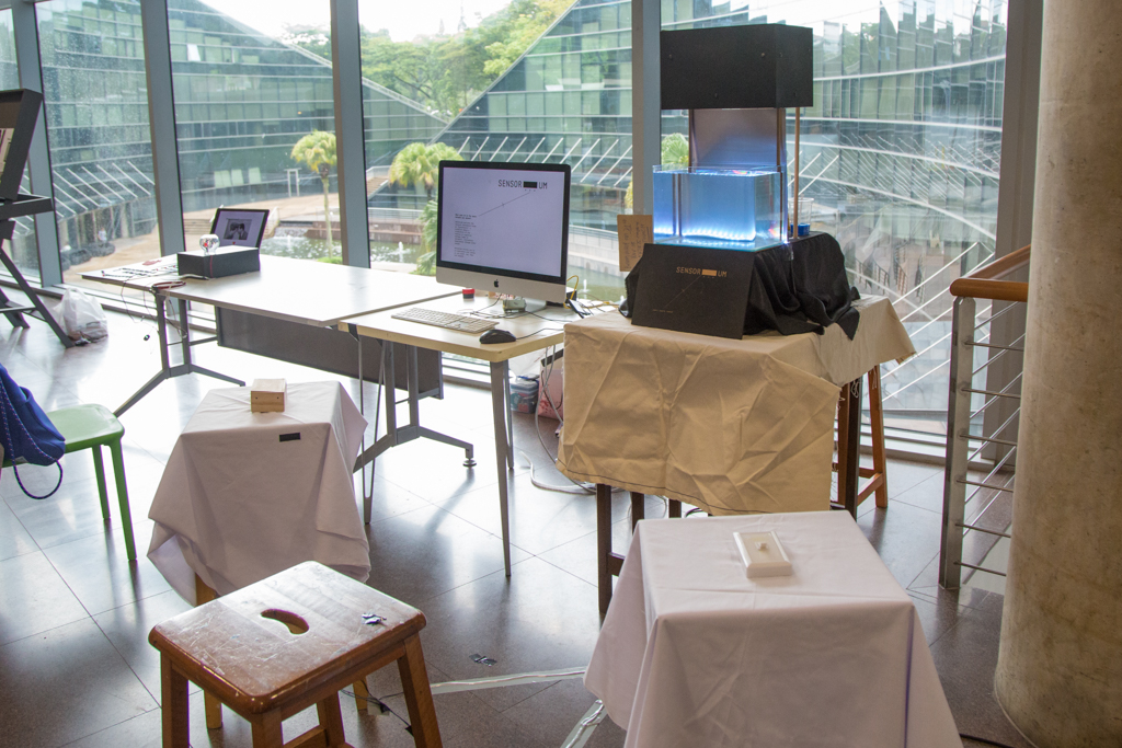
Lastly as a bonus, here’s the behind-the-scenes/ inside-the-box of Sensorium.
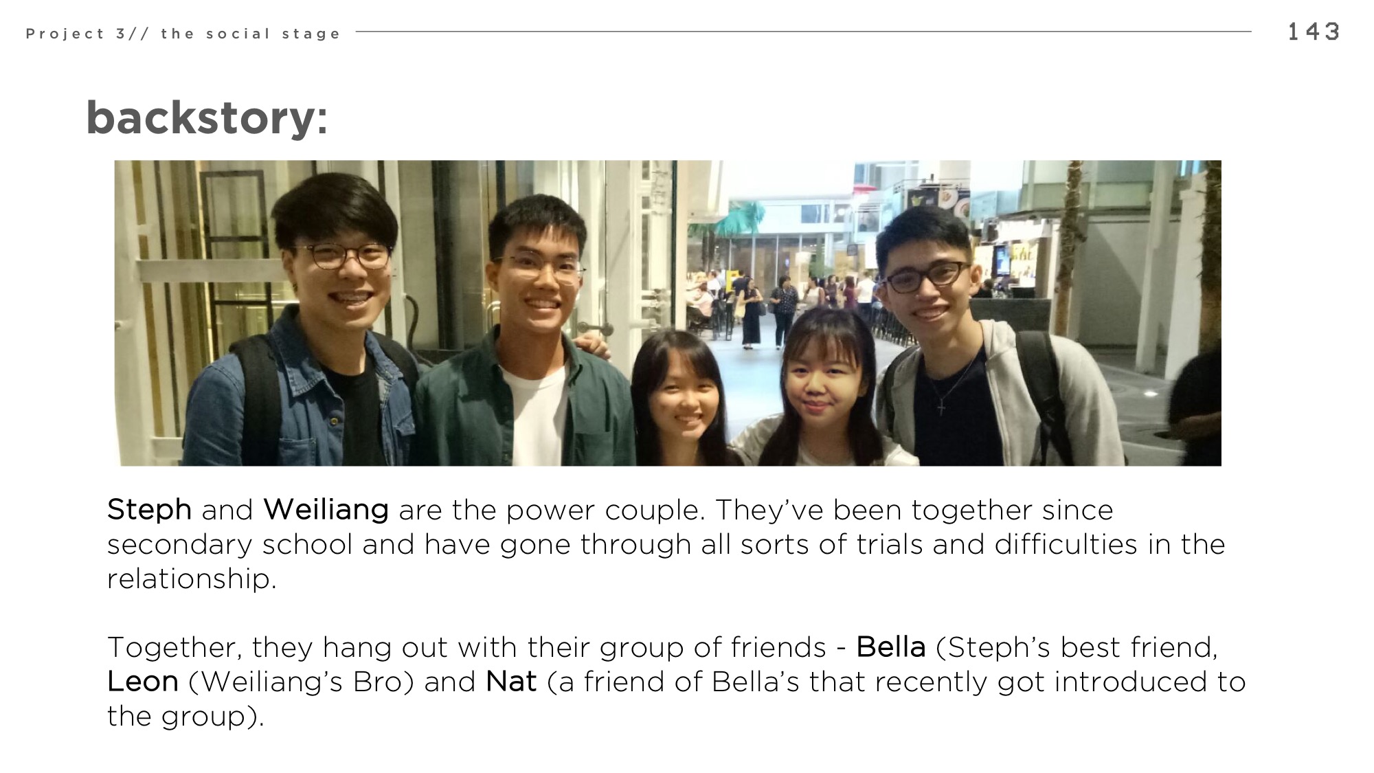
by Jonathan Goh, Tiffany Ng, Loke Mun Mun, Zafirah
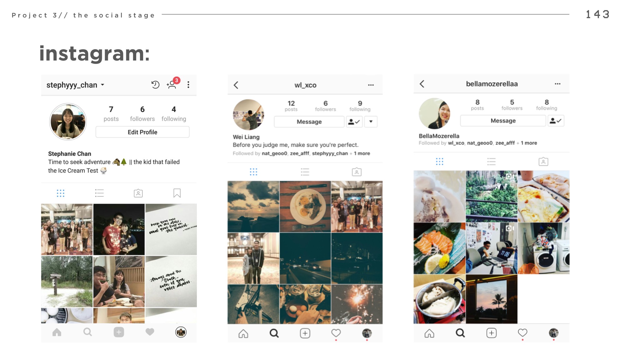
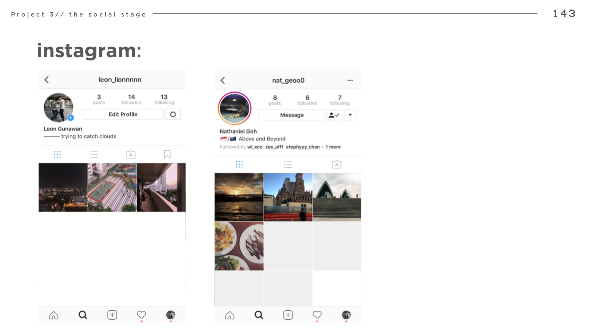
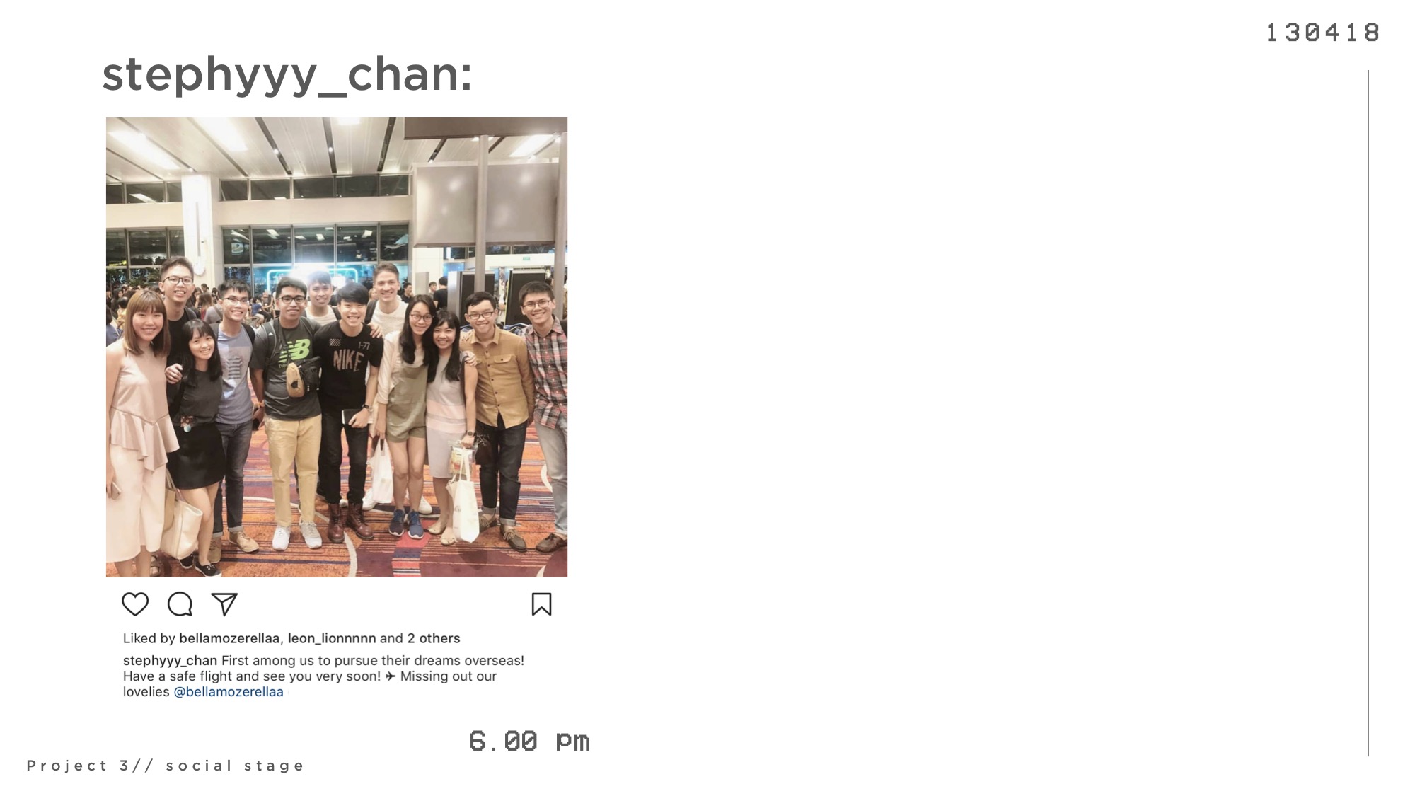
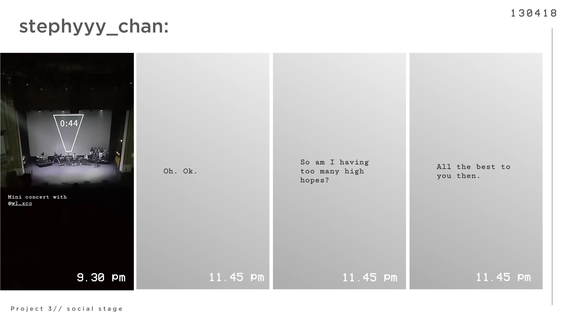
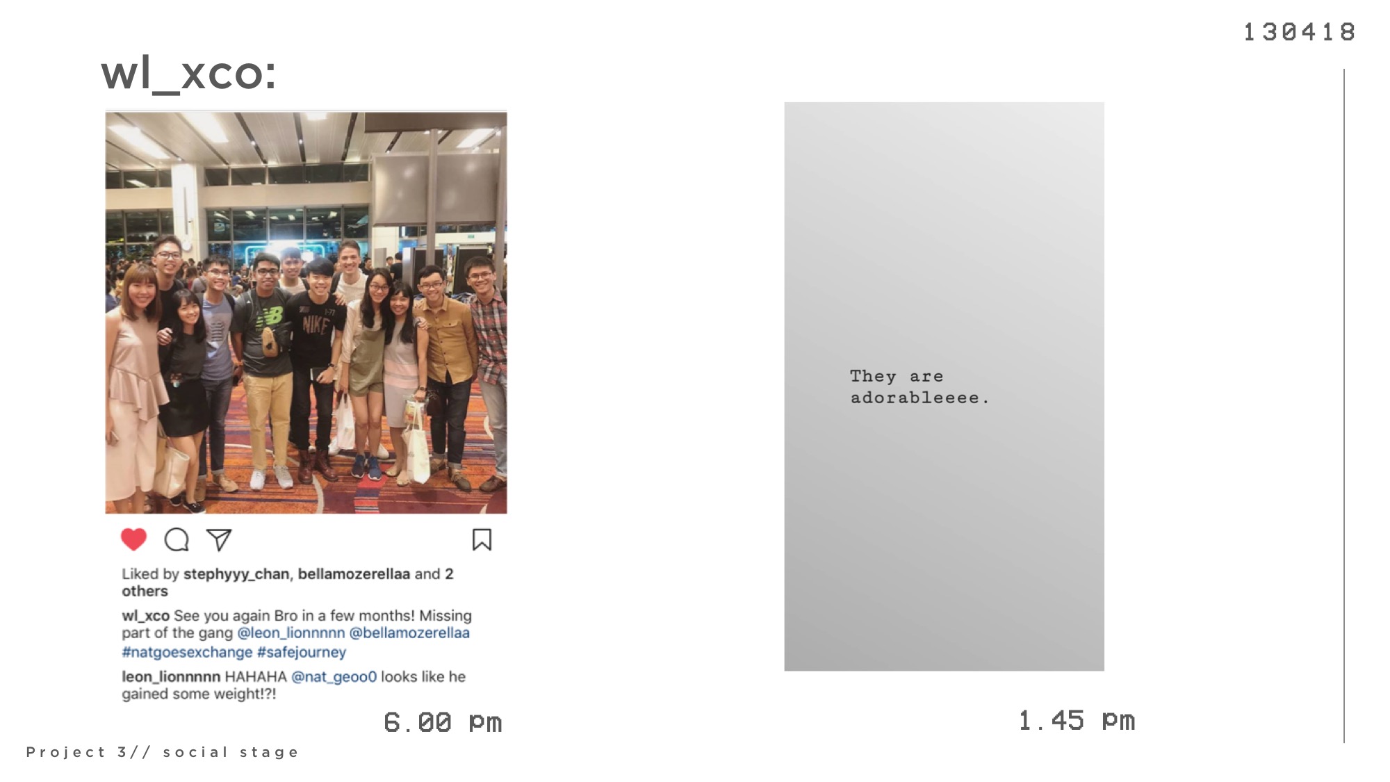
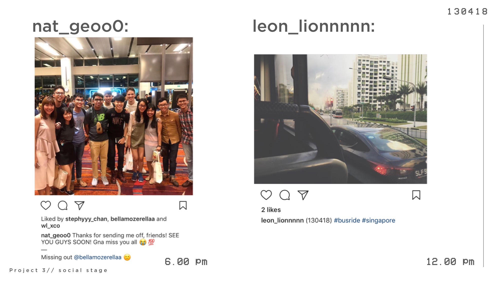
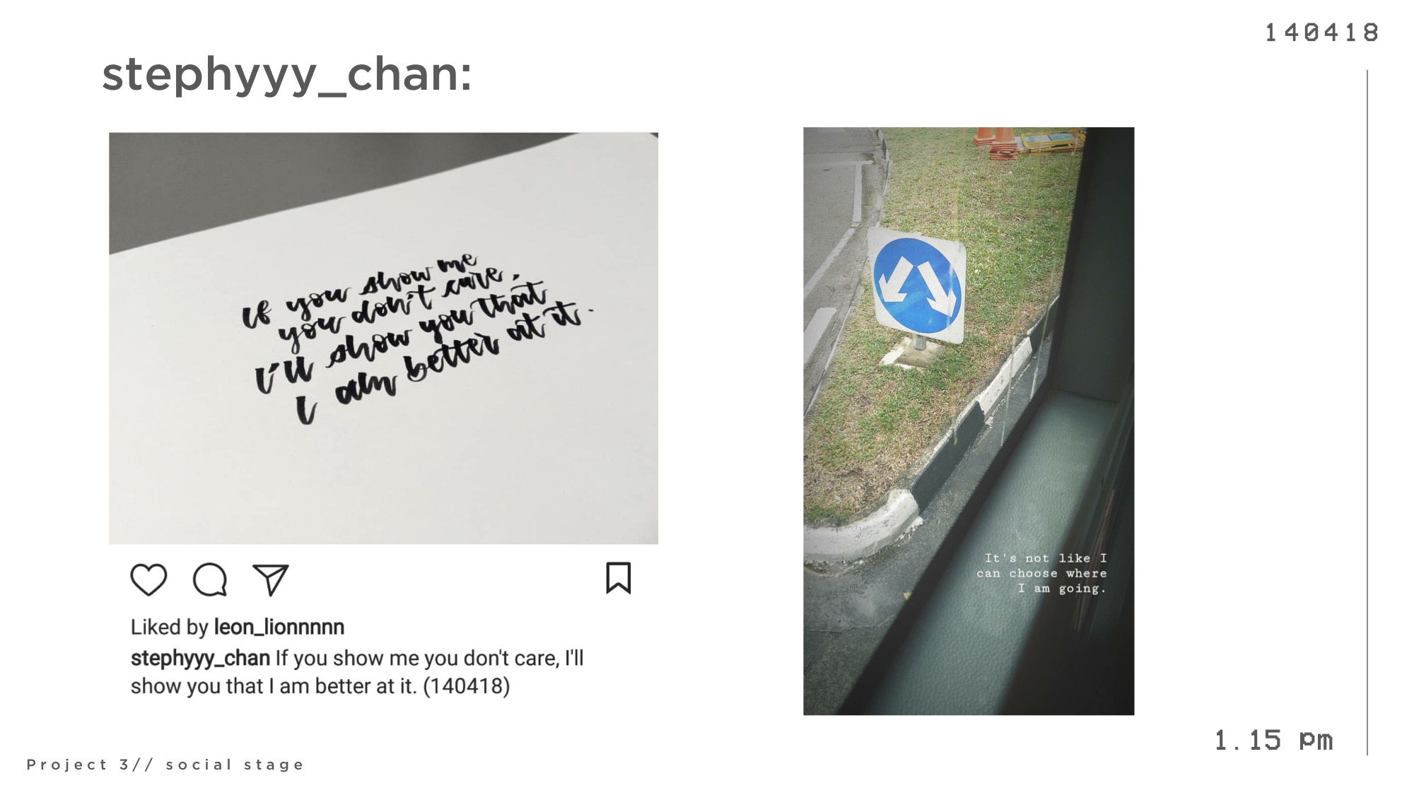
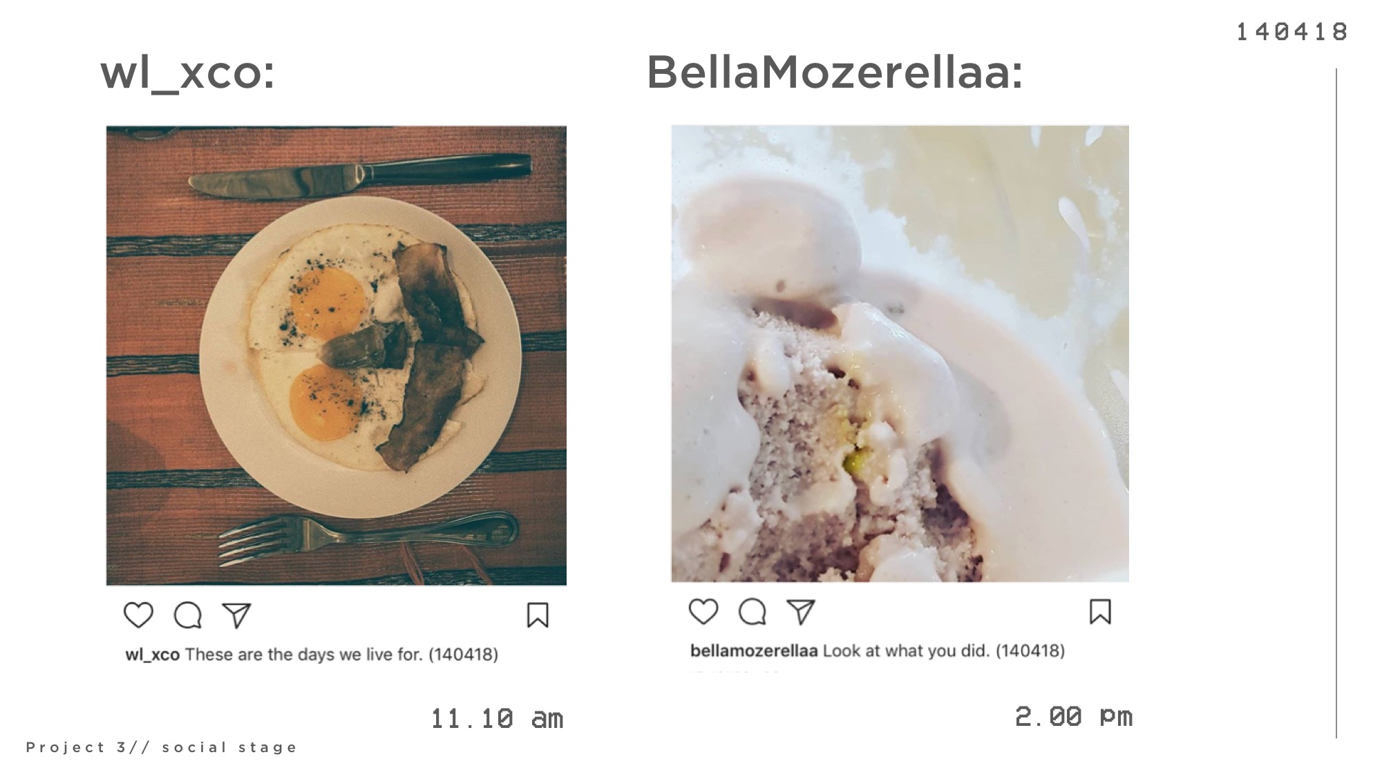
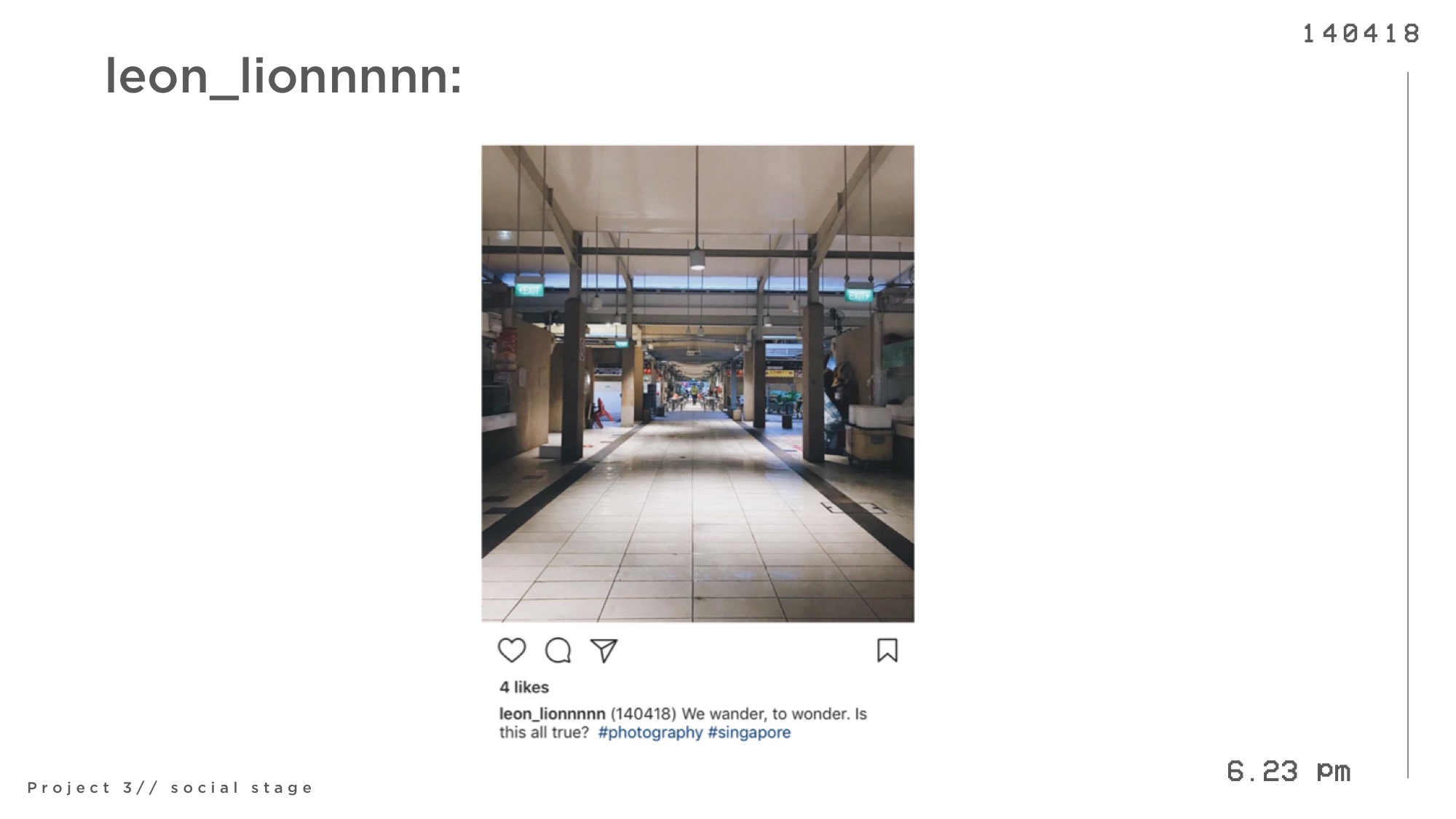
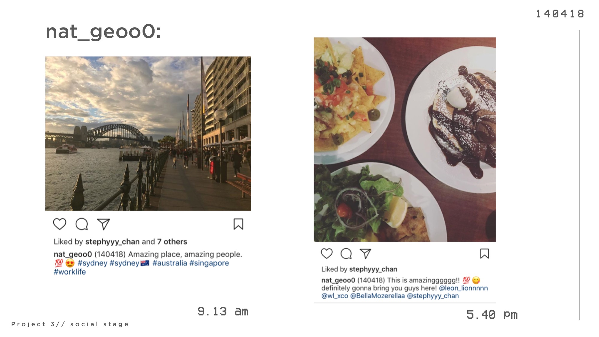
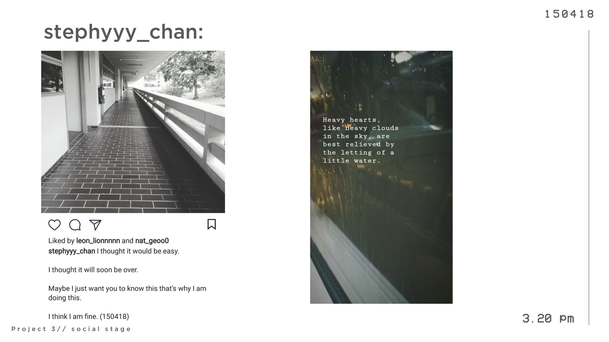
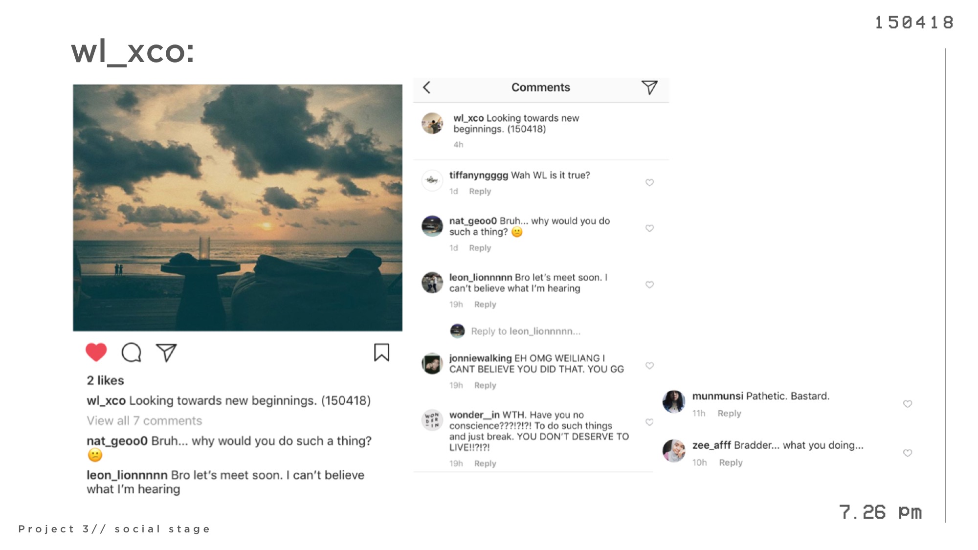
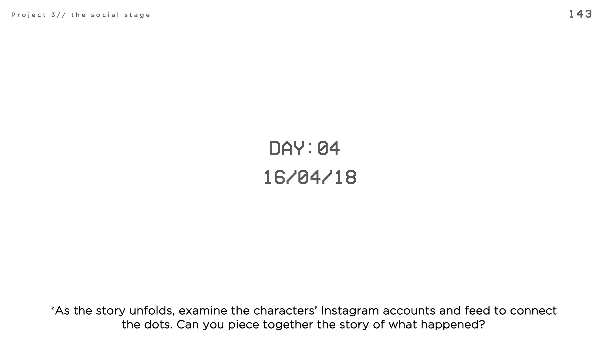
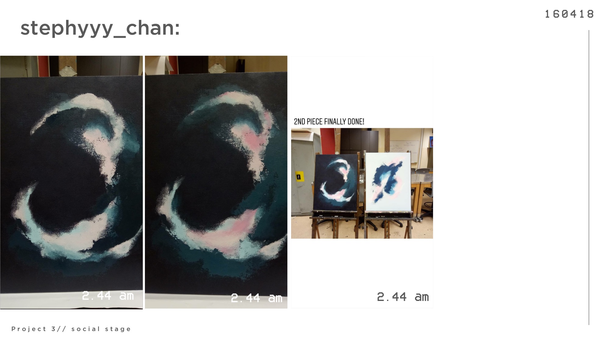
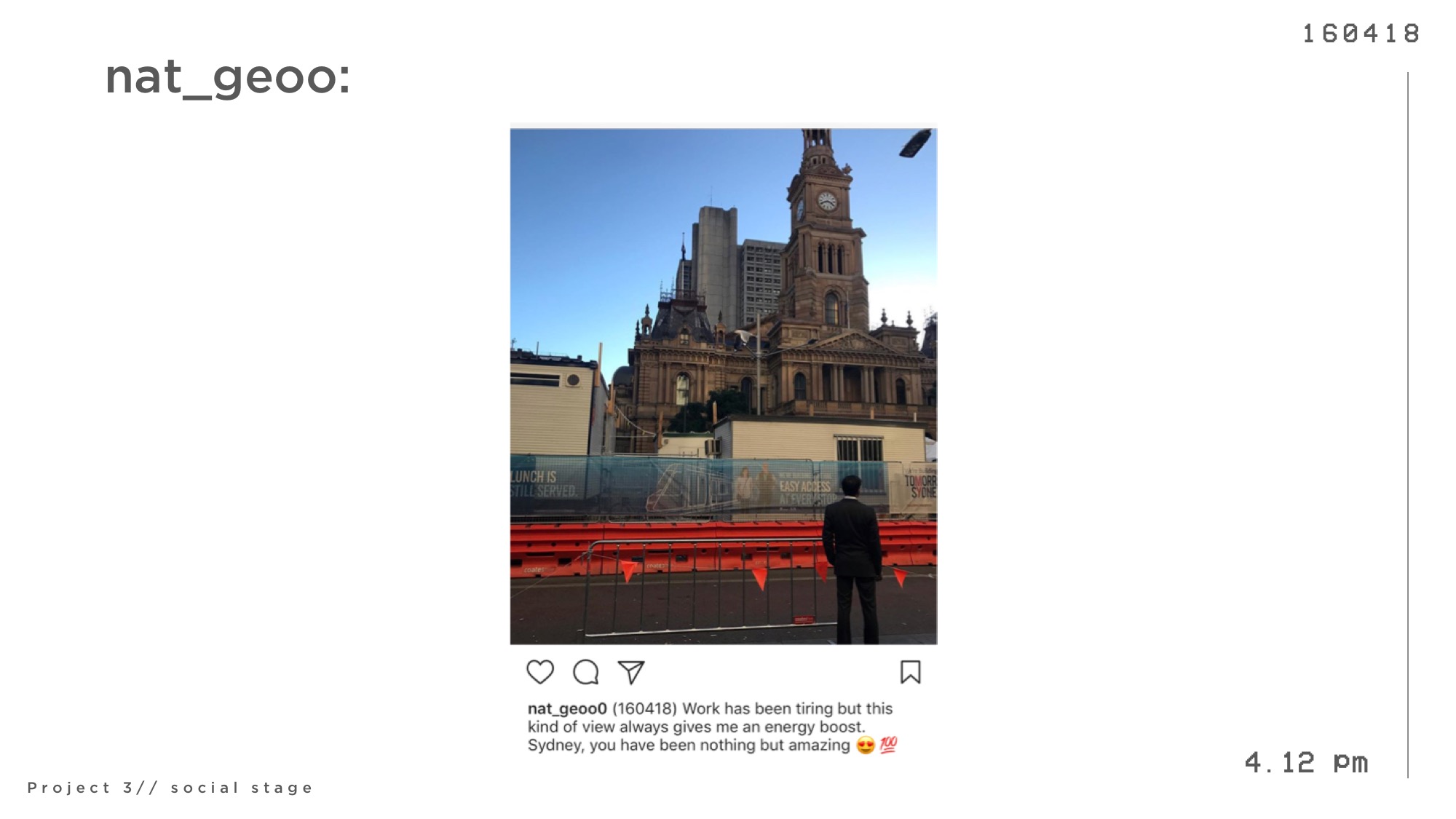
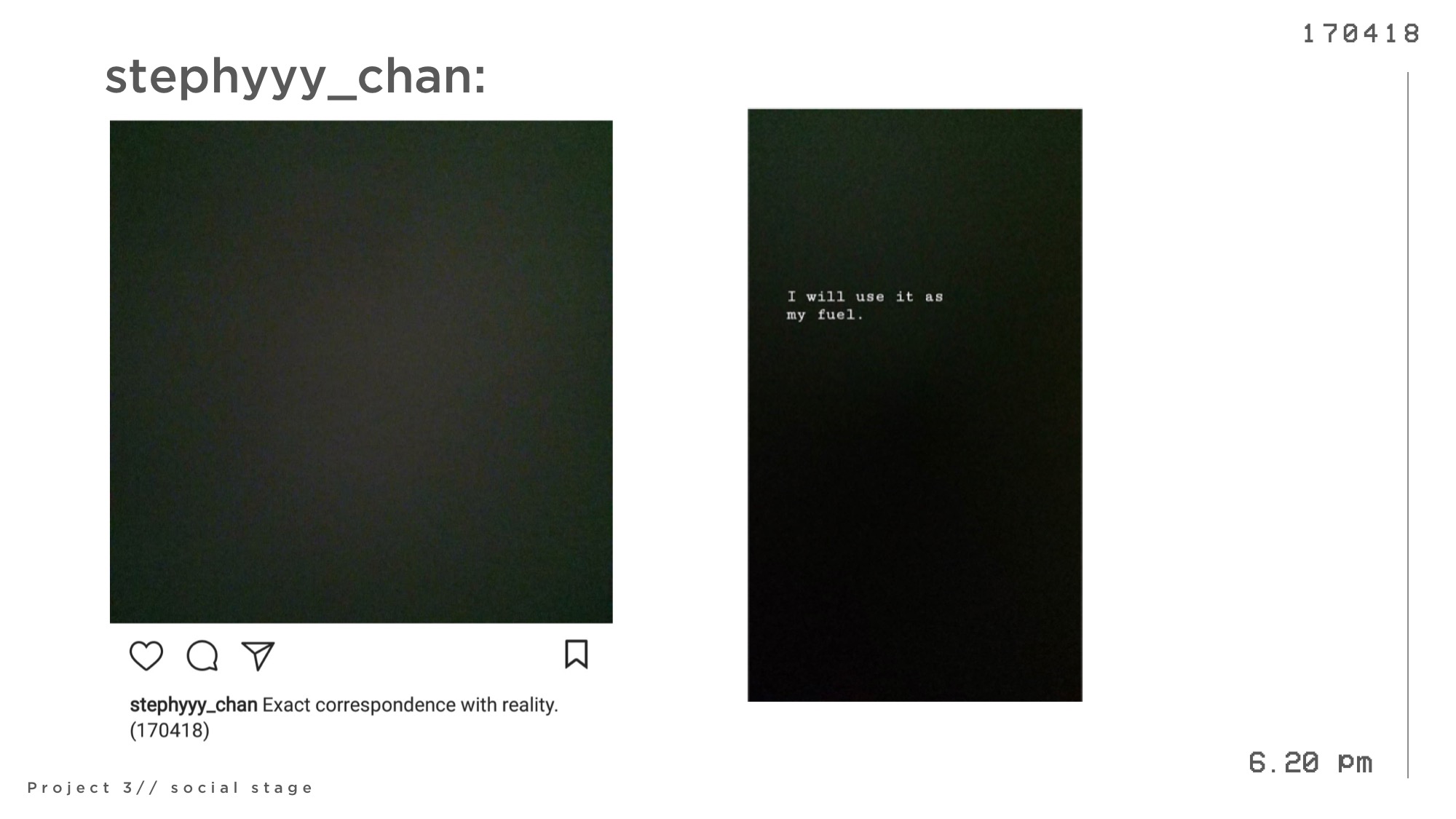
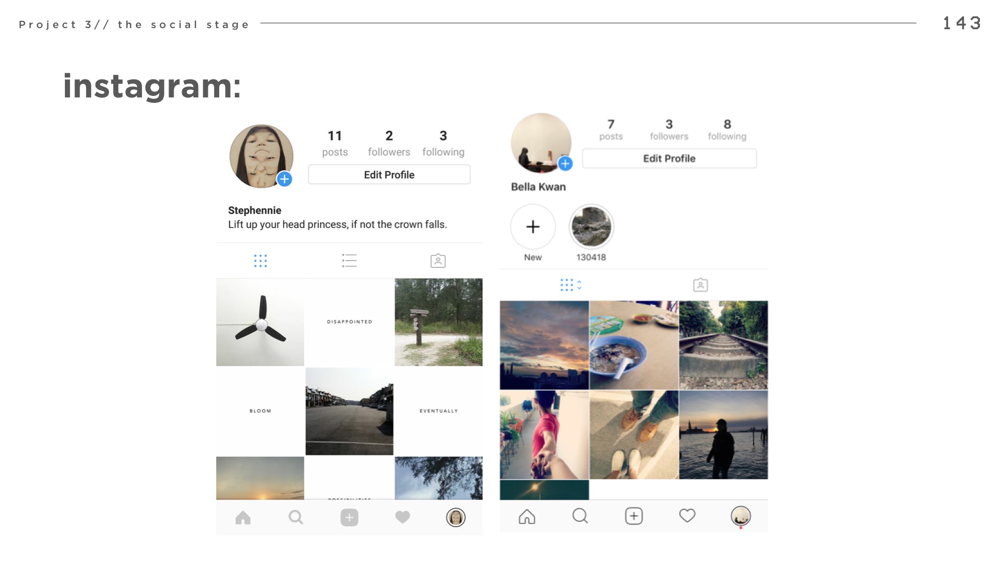
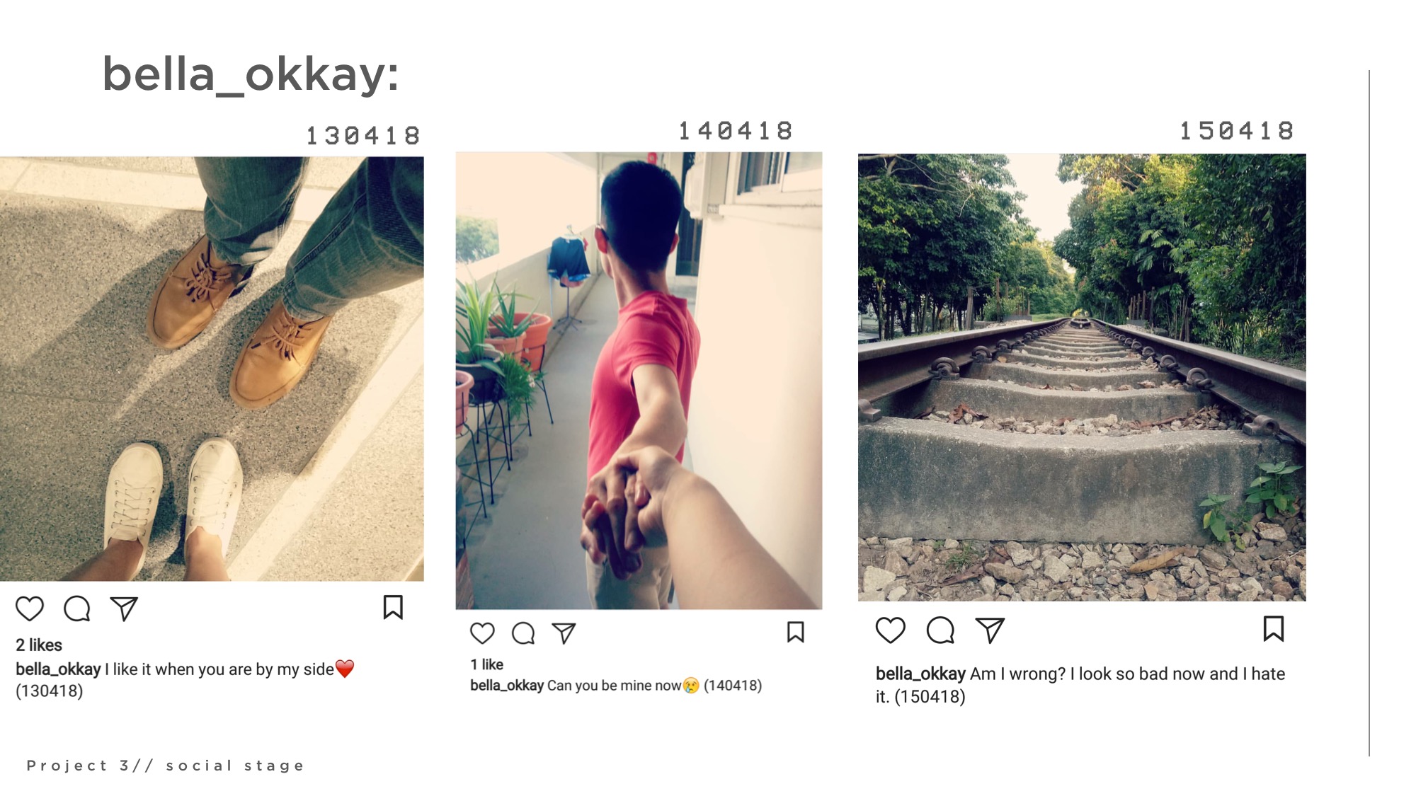
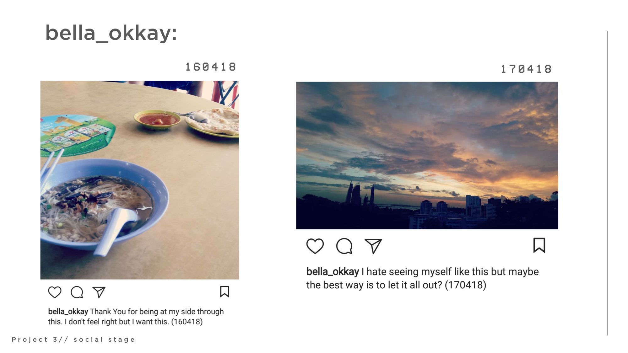
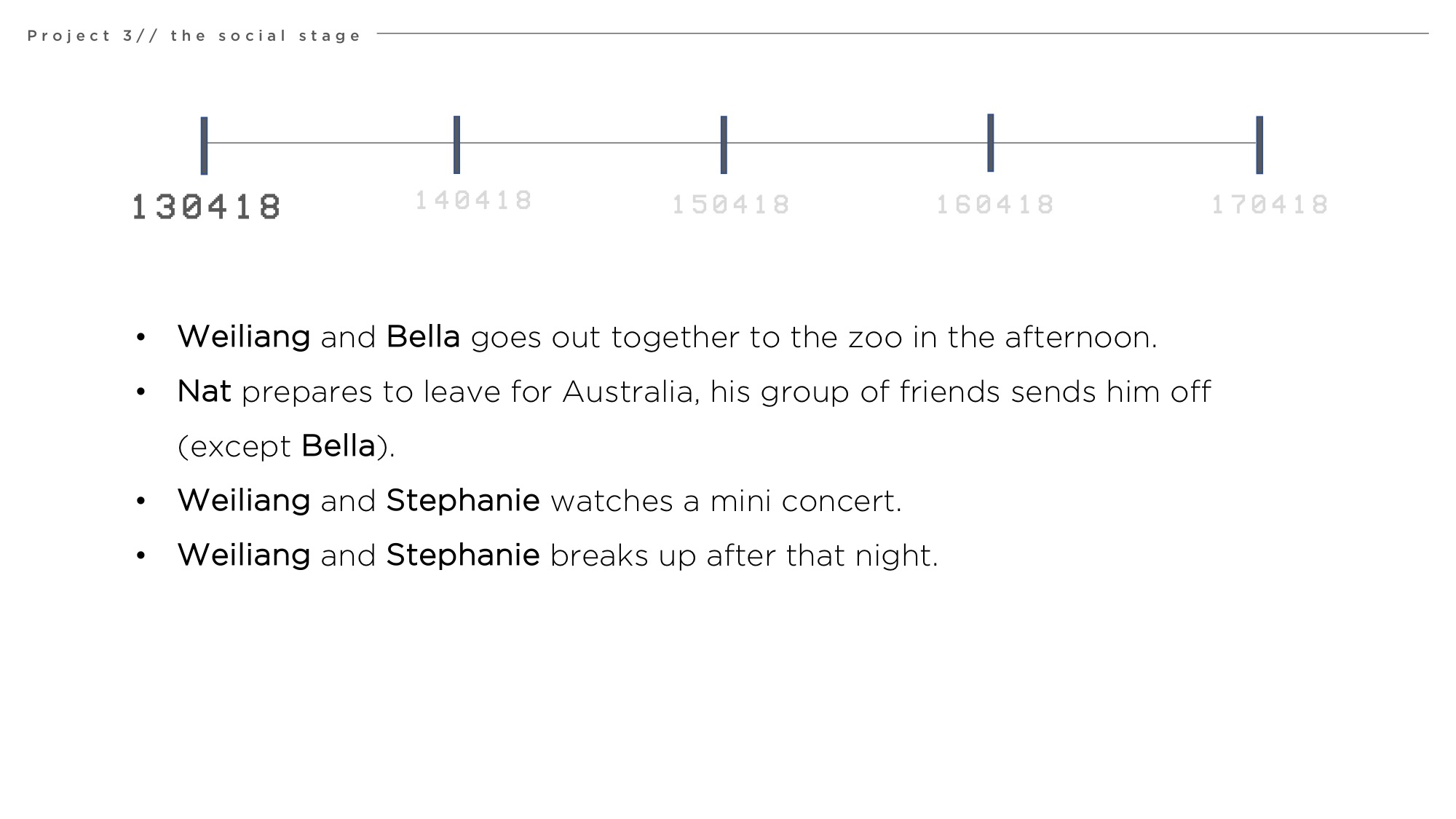
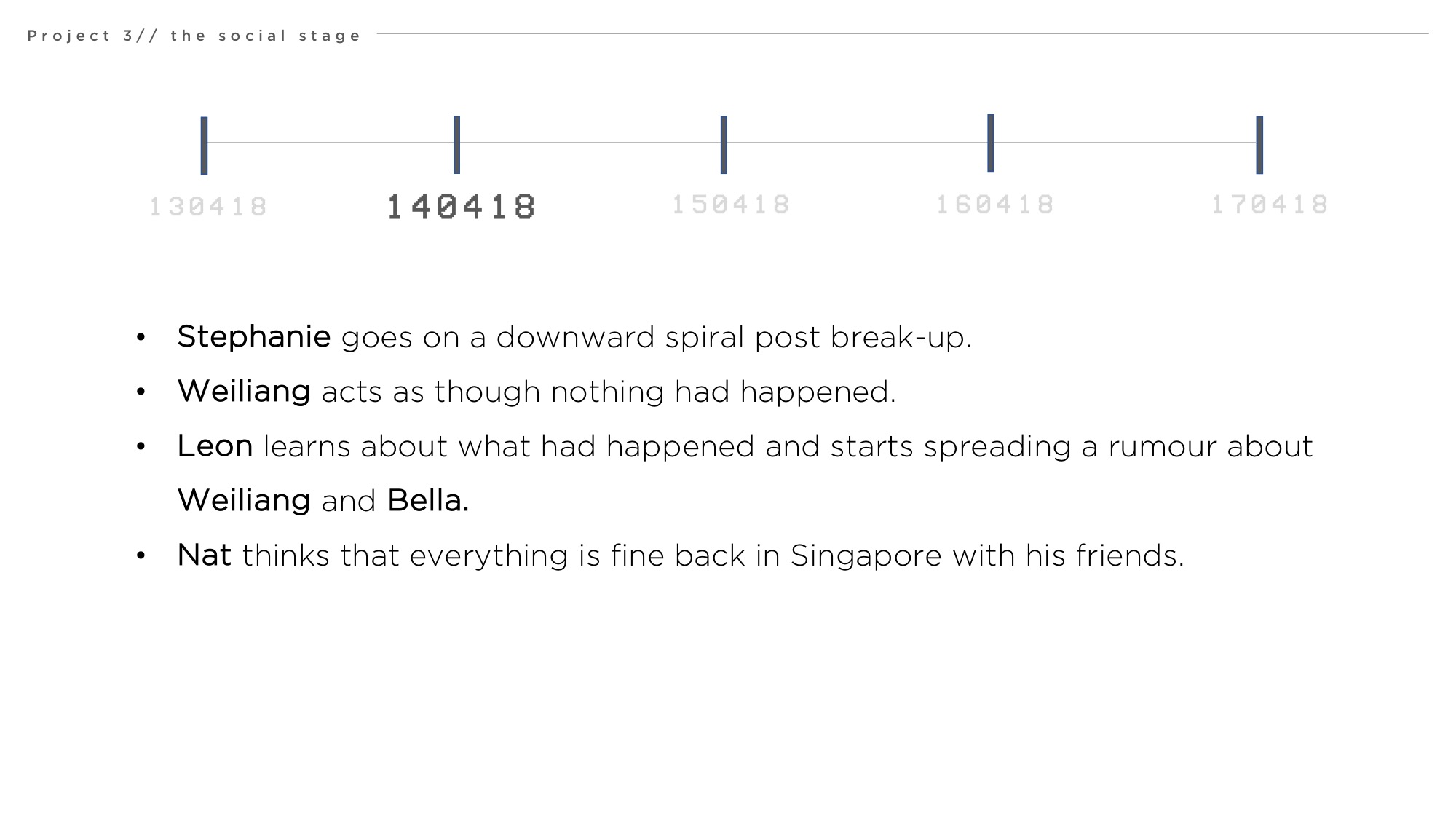
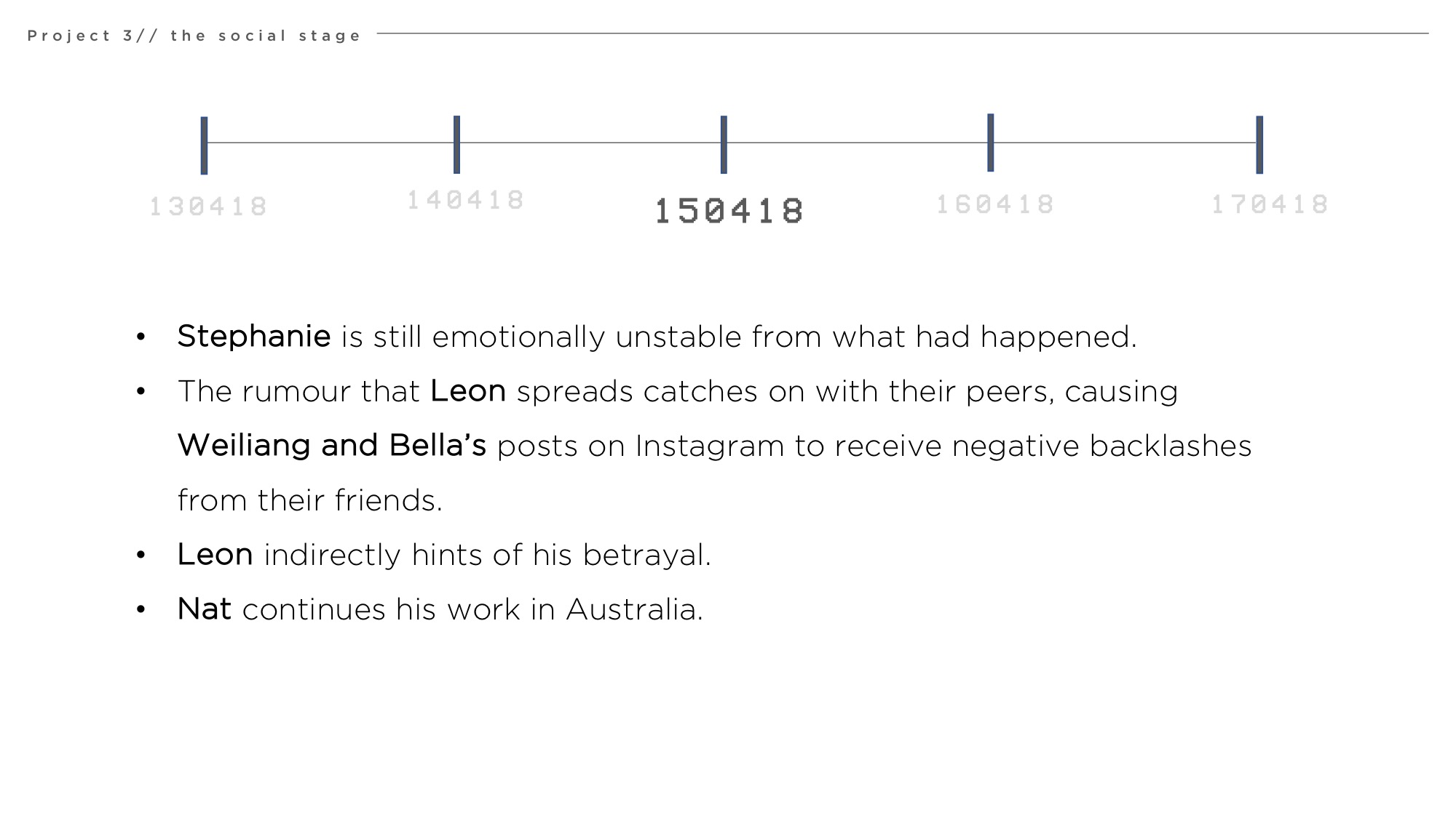
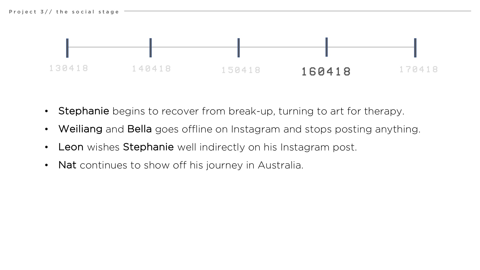
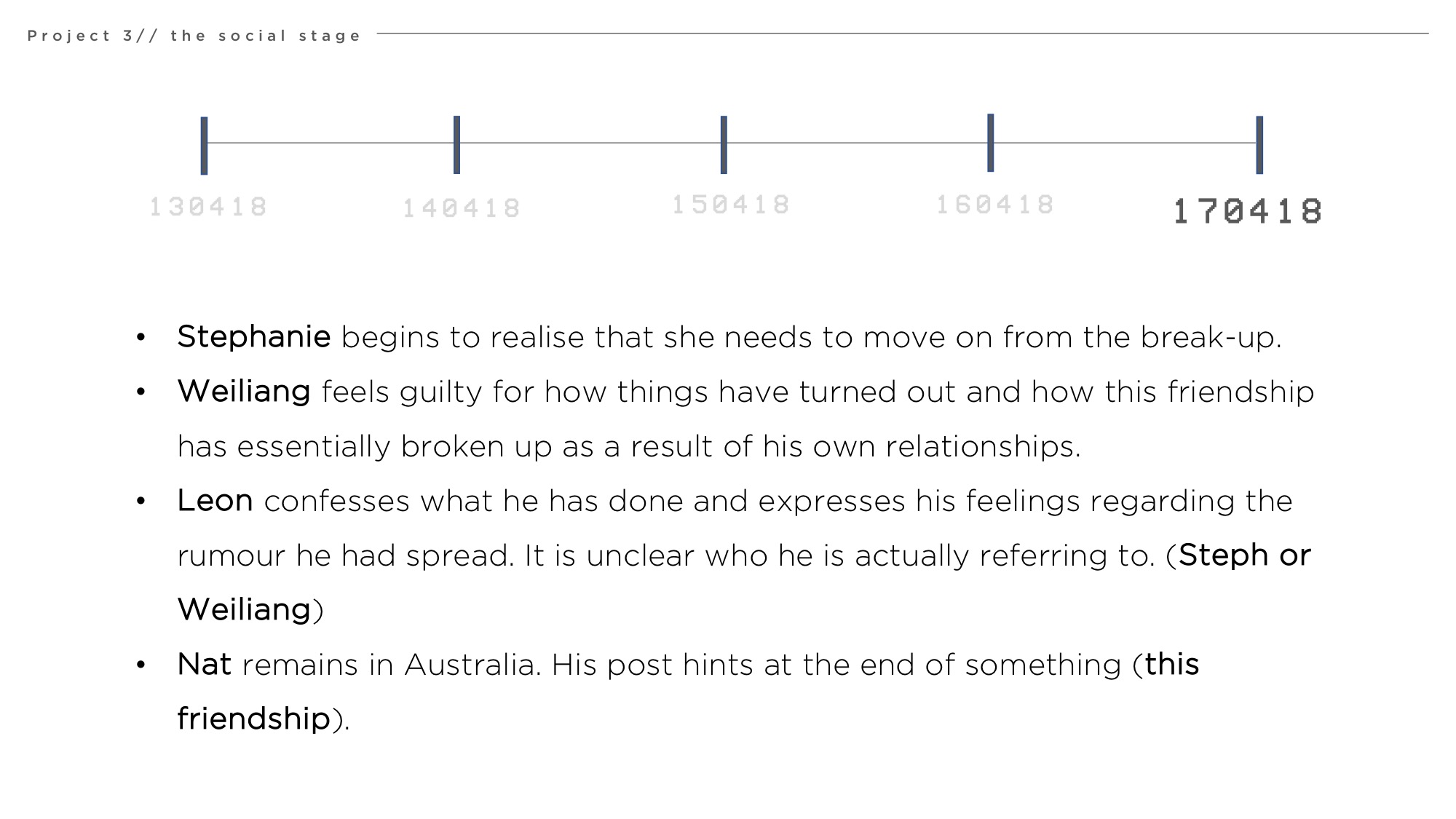
For this assignment, we were tasked to create and tell a narrative story through social media platforms and we decided to use Instagram as our chosen platform.
We wanted to focus on the idea that social media are actually platforms where we share bits of information of ourselves, but never the full story. We show but never tell and we keep things cryptic and abstract, as though we are hiding a secret life. It is often the push and pull between what we want others to find out while hiding what we don’t want them to know.
Audience (friends/peers) are then tasked with piecing these information together and drawing their own conclusions of the “story” or “gossip” whichever they determine it to be.
With our narrative, we have attempted to play on these elements to allow audiences to experience the journey of connecting the dots through such cryptic posts by playing a character in the story. This provides audience a window into the world in which the narrative take place and piece the story from a different perspective.
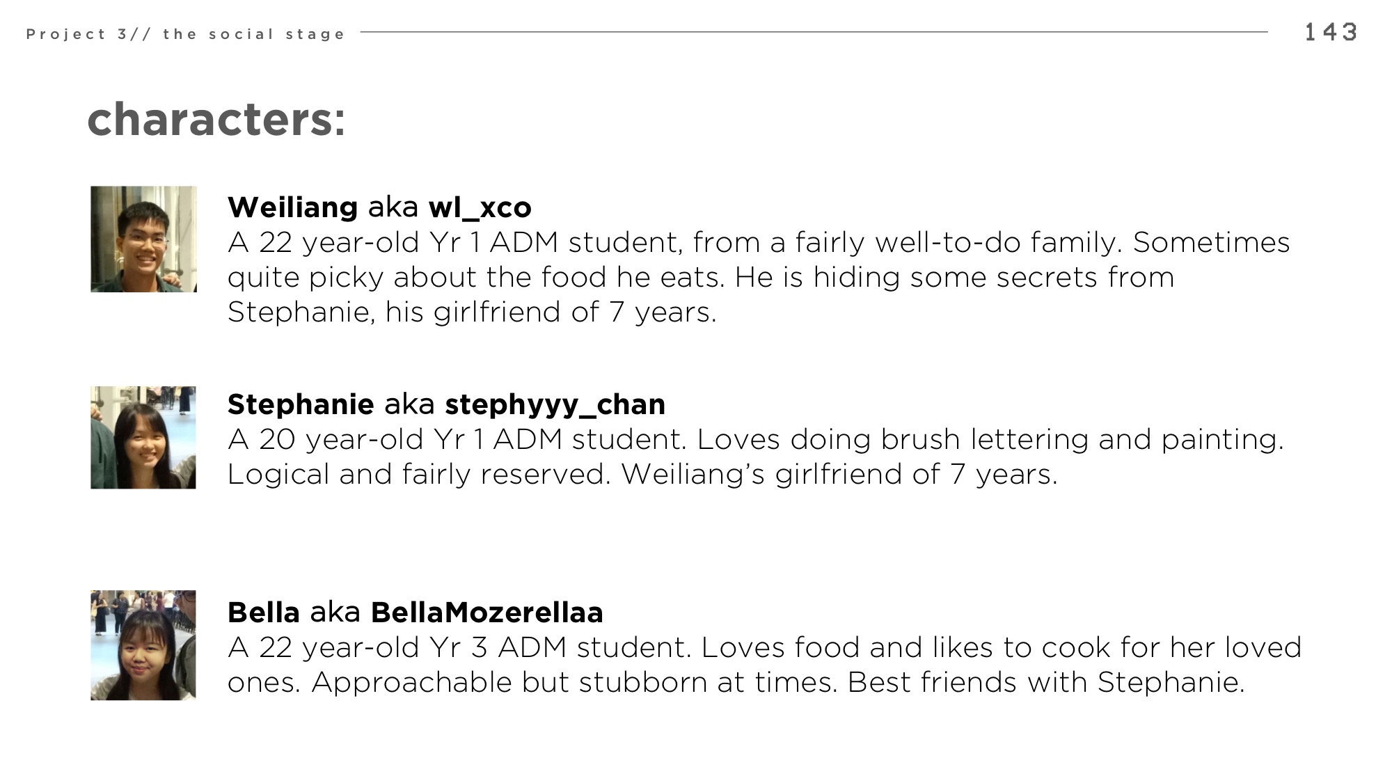
We decided to host our story instagram due to its features that allows us to show:
Immediate events (through instagram story)
Cryptic, abstract statements by characters (through instagram posts)
Engagement between characters (through instagram comments and likes)
A double-life (through the creation of private accounts)
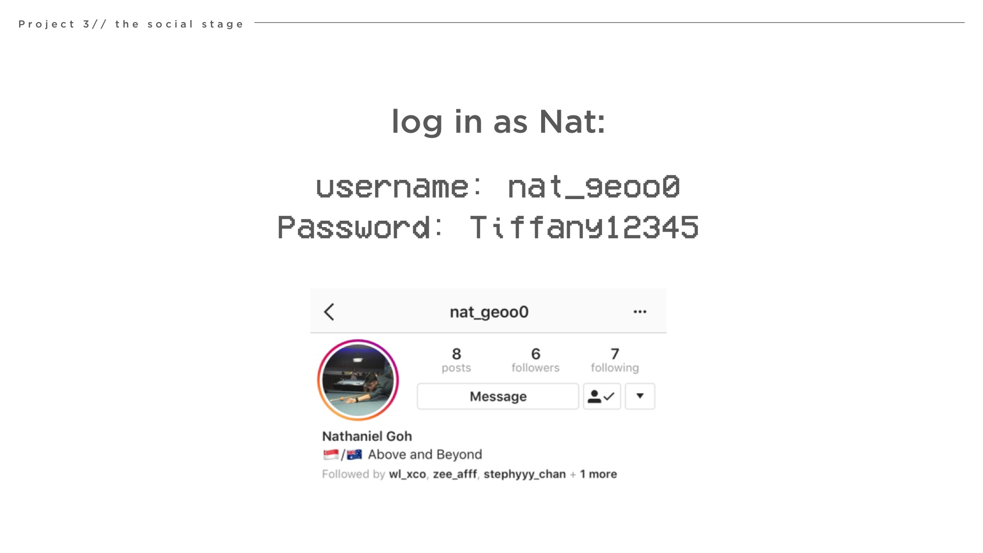
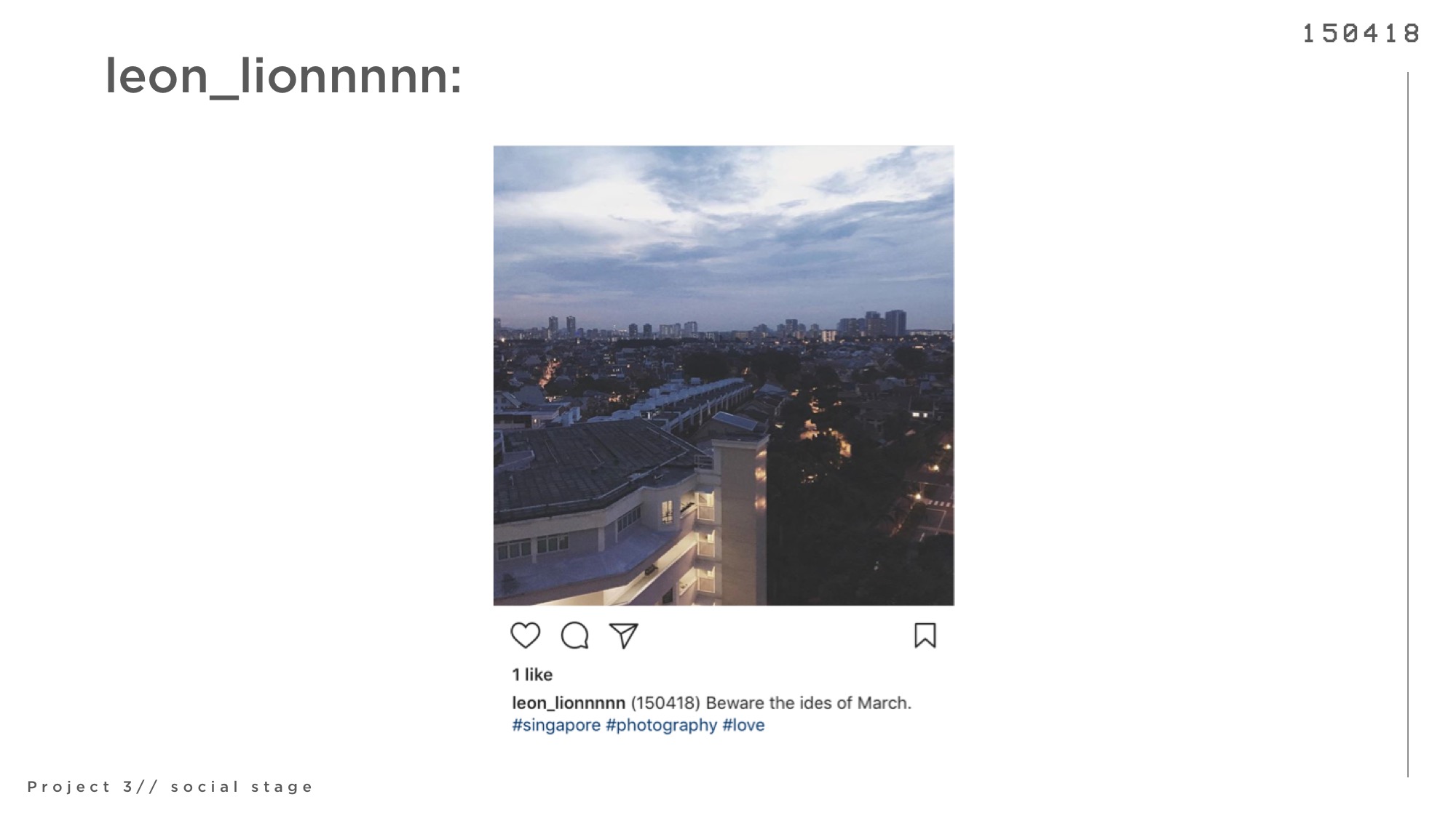
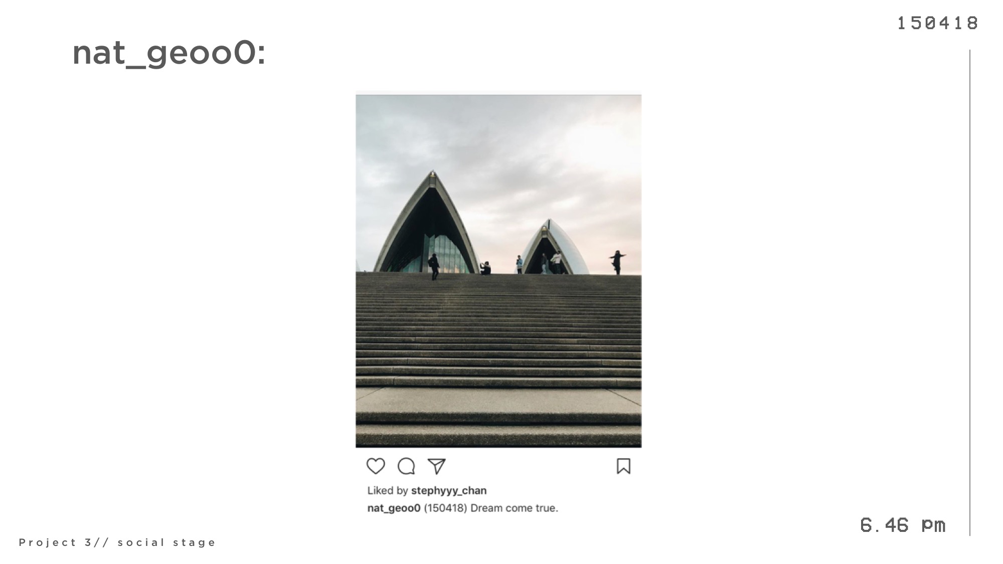
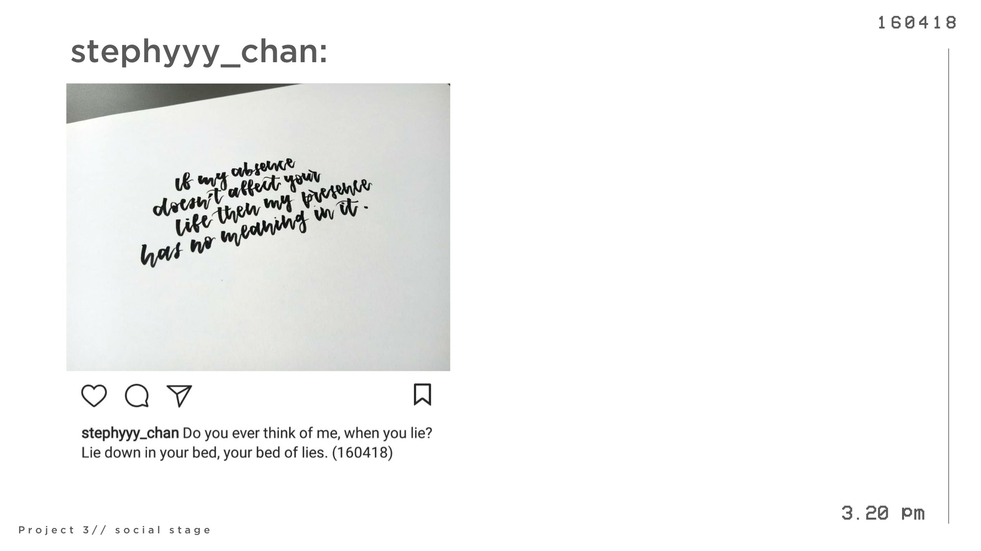
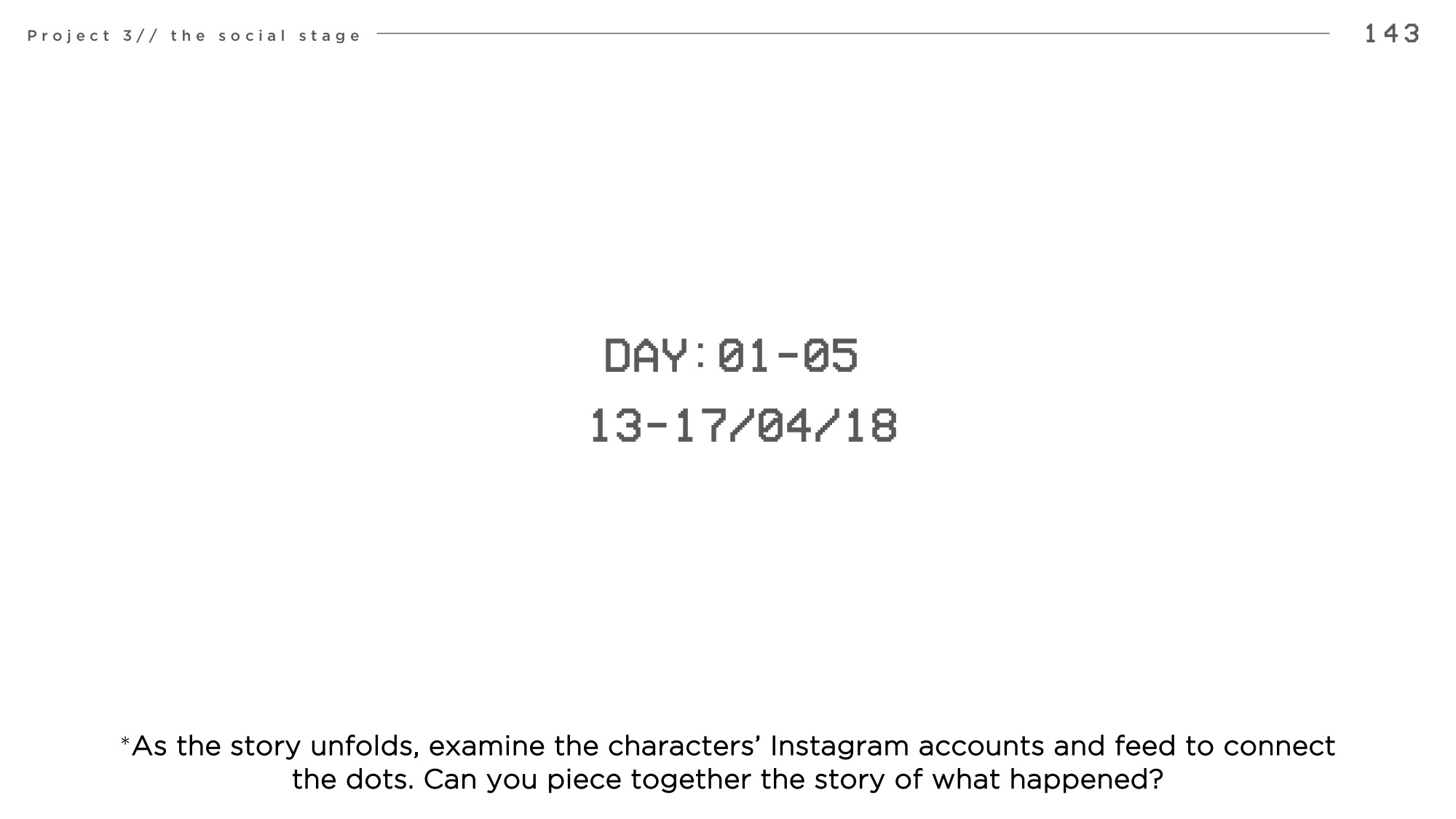
As you go through the following slides, take some time to read through the characters’ instagram accounts and posts. Read their caption, or even search them on instagram to find more details about them.
Try piecing together a story of what you think happened.
Before reading the reveal to find out the truth and intention behind every posts. Enjoy!
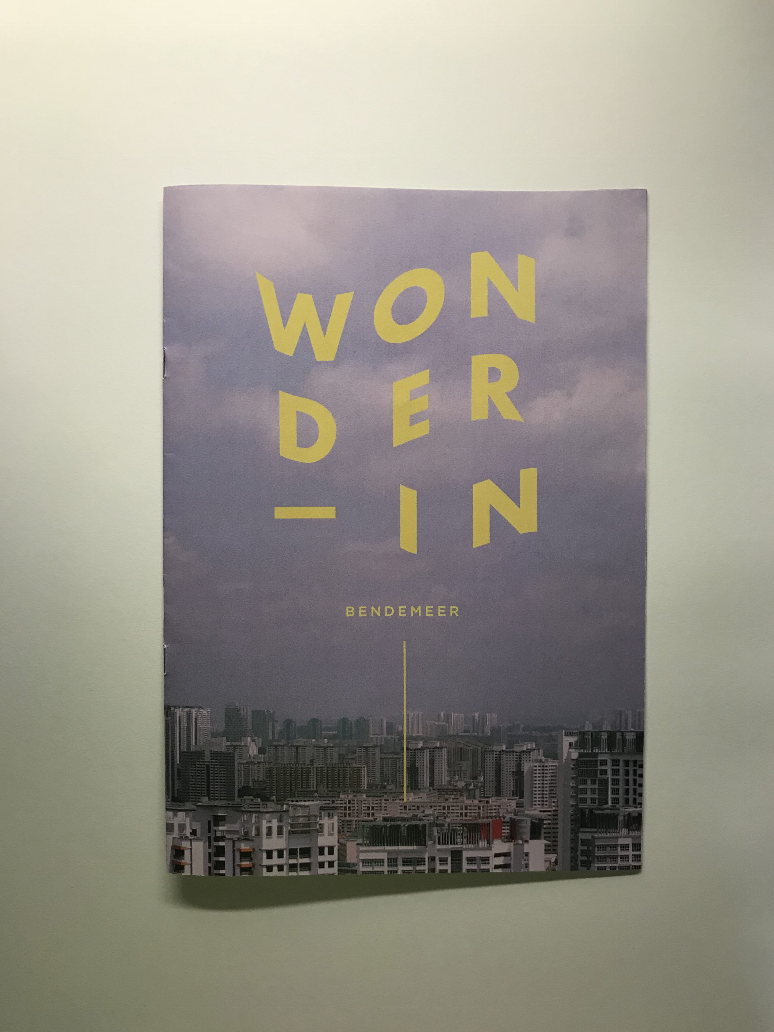
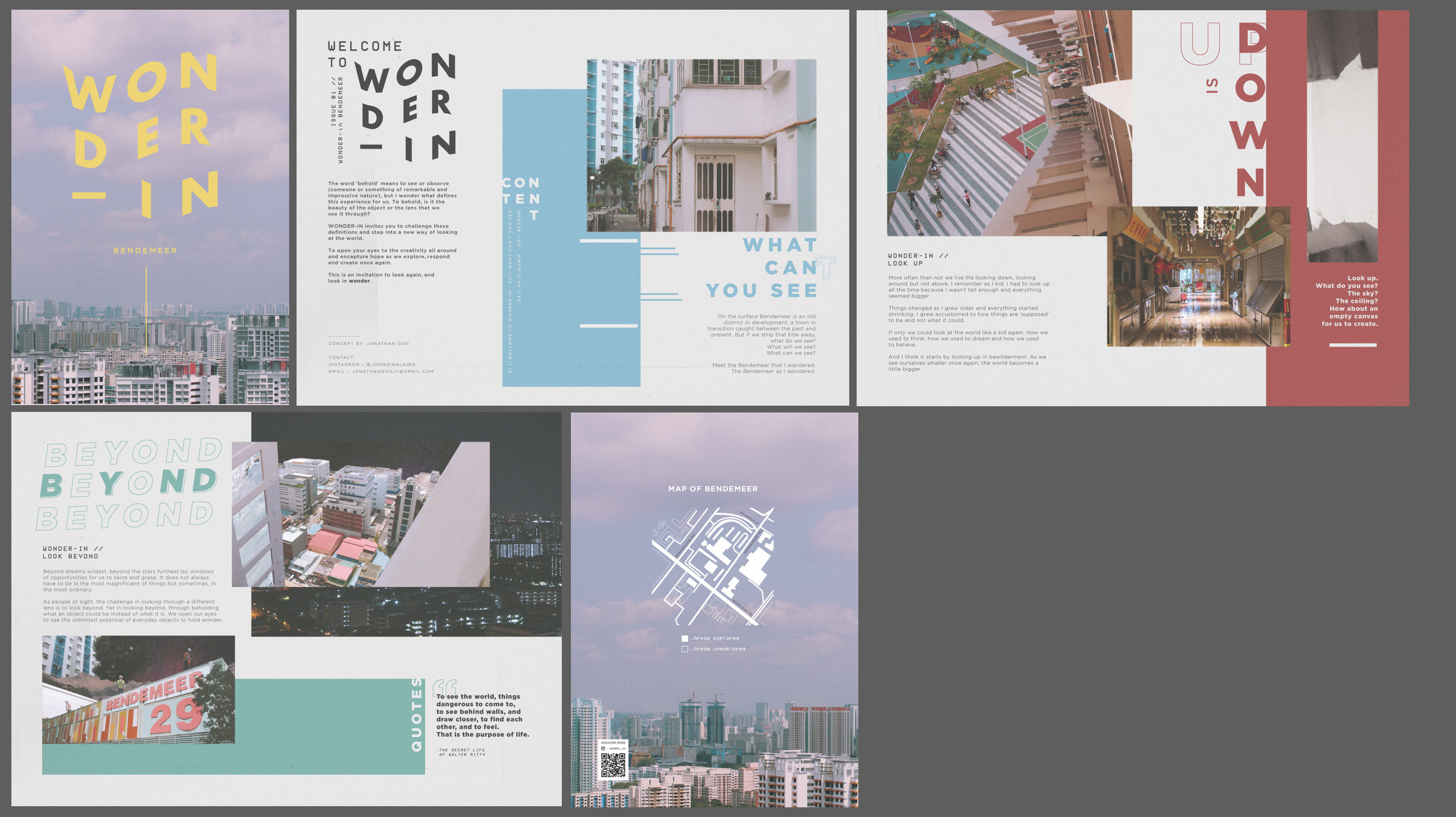
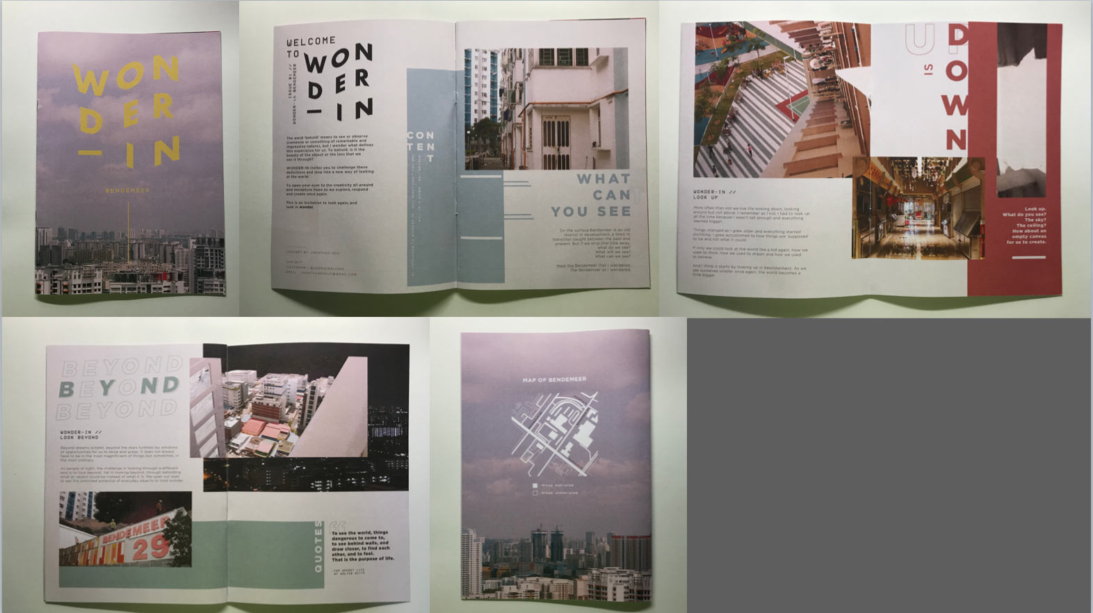
In case you missed it, here is the finalised layout for the zine!
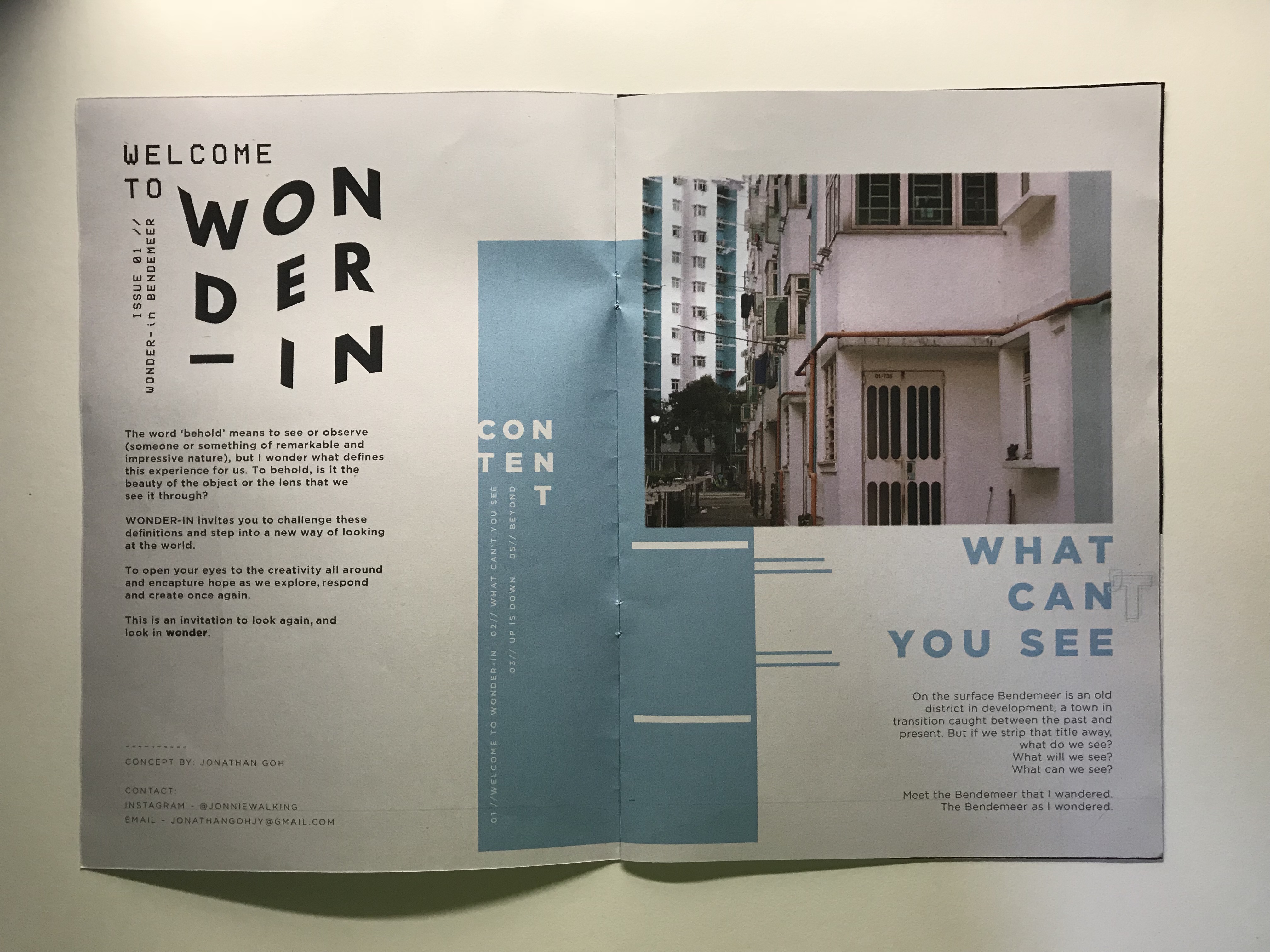
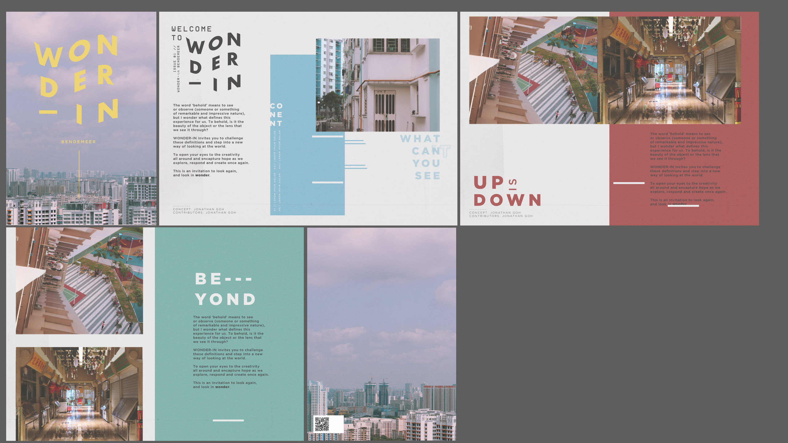
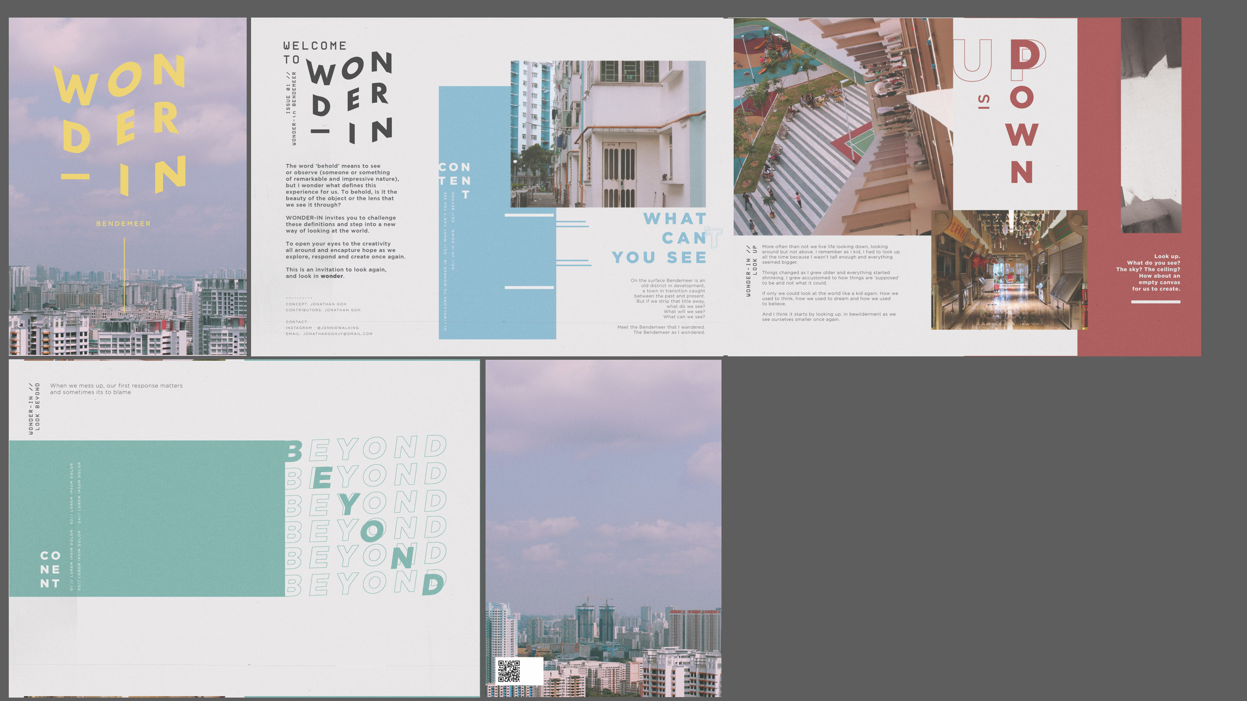
CONTENT.
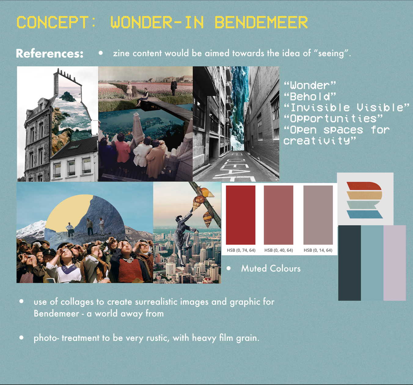
“…my aim and objective for the zine is to introduce thought-provoking ideas and combine them with interesting visuals to capture readers’ attention.”
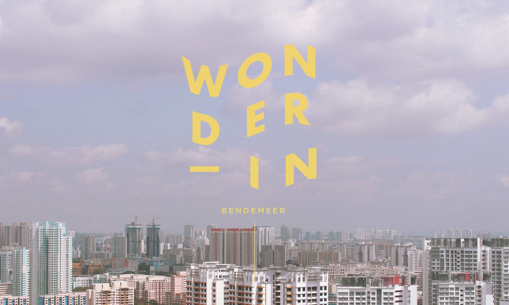
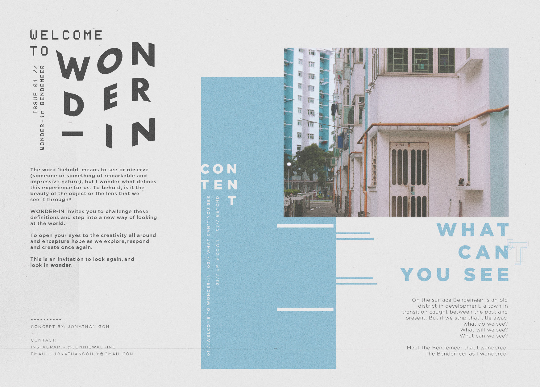
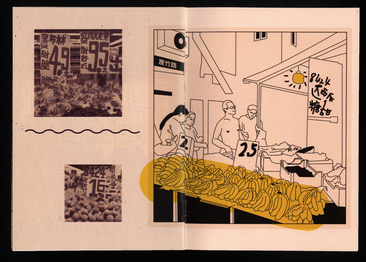
For the content, the idea was to challenge our perspectives as we go through our everyday. I titled the zine “Wonder-in” as a wordplay between the meanings of “wondering” which carries a certain idea of adventure and curiousity as well as “wonder” which is the feeling of admiration and amazement, towards the area of Bendemeer. Hence the title of the zine become “Wonder-in Bendemeer”. (carrying a dual meaning of both ‘wondering Bendemeer’ and Seeing the ‘wonder in Bendemeer’)
I decided to split the content of the zine to three chapters:
What Can’t You See
Up is Down
Beyond
Each chapter expresses a certain idea of “seeing” in wonder, and is based off a picture. The content ultimately affected the spread. Helping me determine the photo collage used for each spread and the colour palette subsequently.
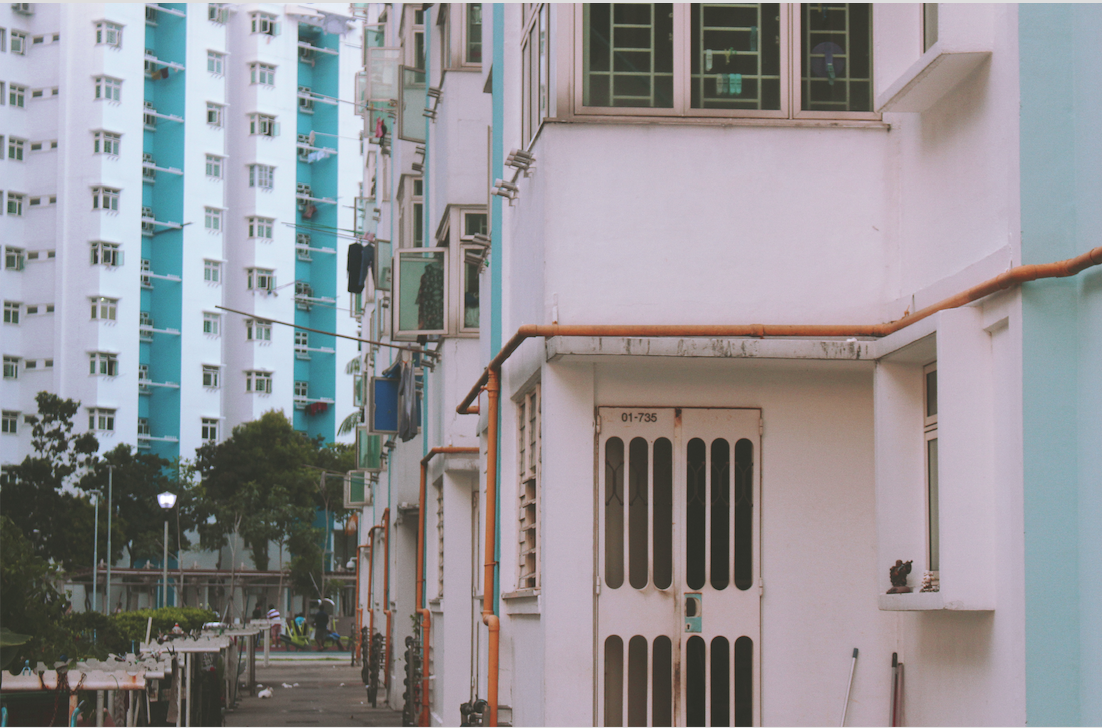
What Can’t You See
Colour choice: BLUE
I decided to use a normal photo for the first spread to introduce the first chapter of Wonder then leading into the next. I included a typographic play on the chapter title as well to illustrate the idea between what you can see and what you can’t – the difference ultimately lies within ourselves. The use of a normal photo suggests the idea that this is in fact what we see in plain sight, yet if we would only see again, the endless possibilities that could be…
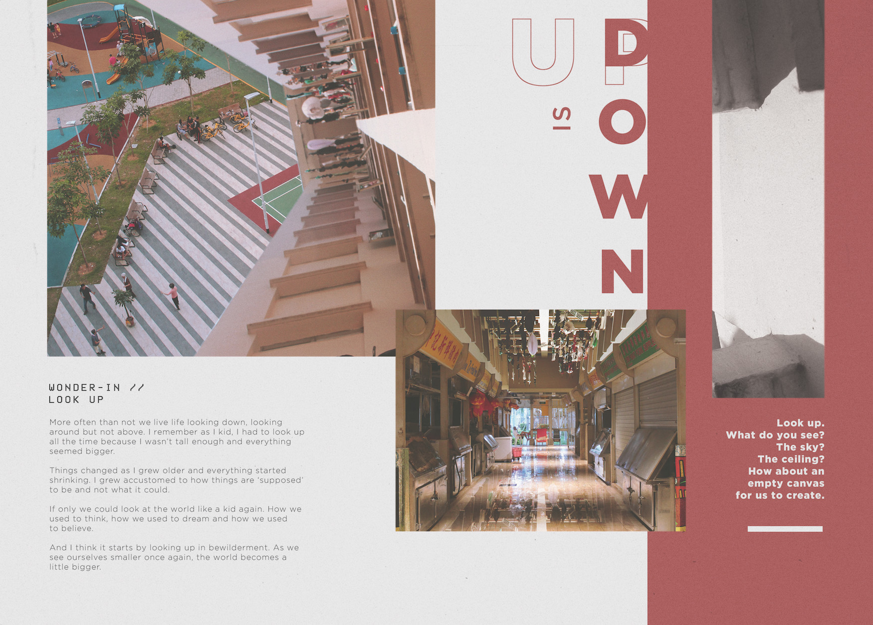
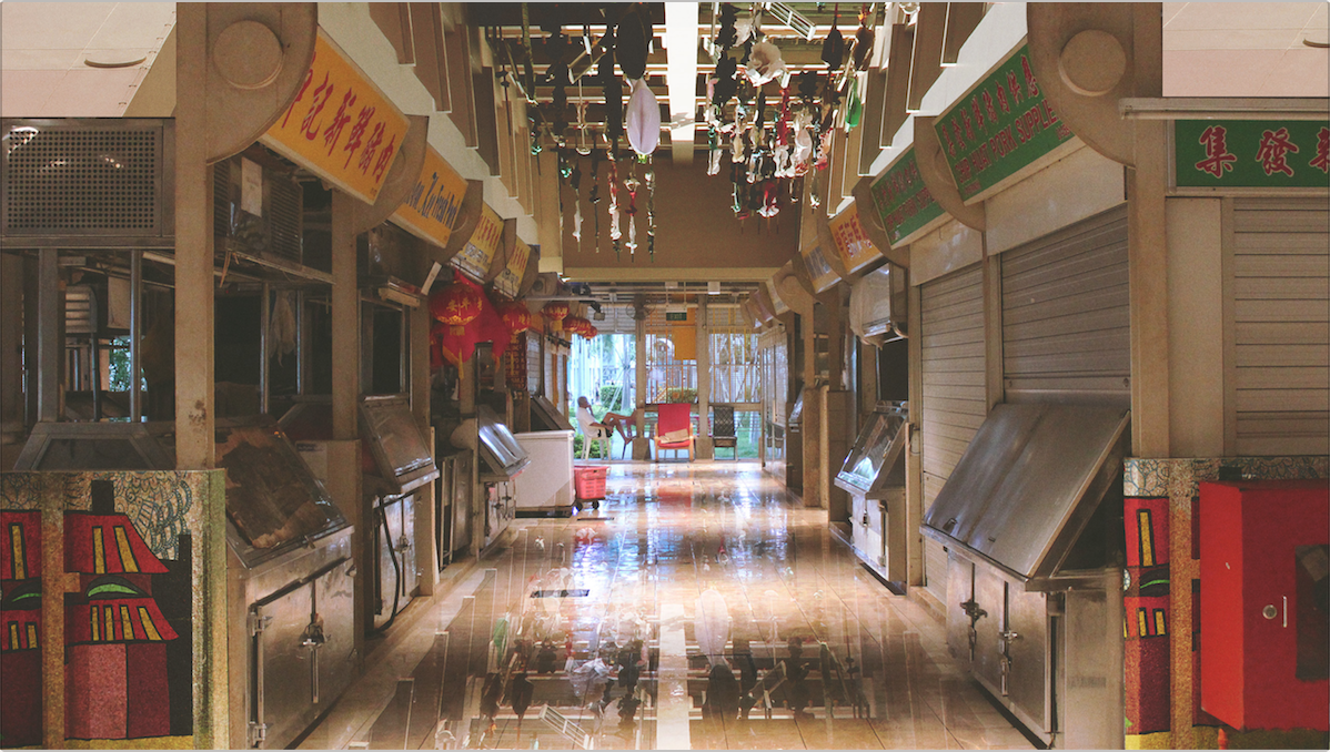
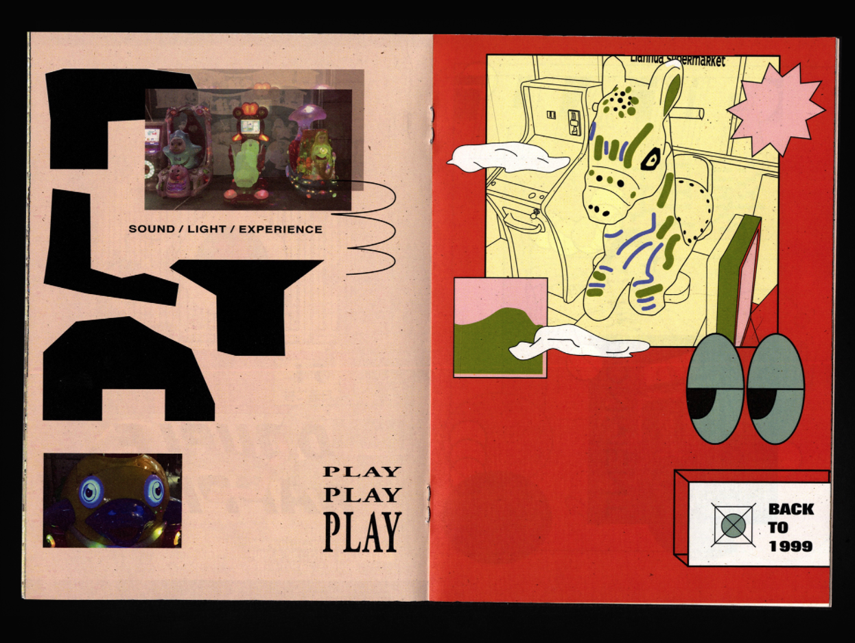
Up is Down
Colour choice: RED
To illustrate the idea of “wonder in looking up”, I used photos that allowed me to play with interesting angles, especially ones that showed either a ceiling or the sky. I replaced the image with something unlikely to highlight the contrast between what is and what isn’t. The use of red as the main colour scheme for this spread was to complement the warm colours present in the photo collages.
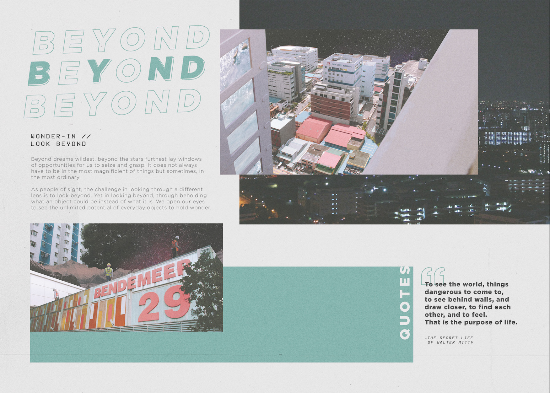
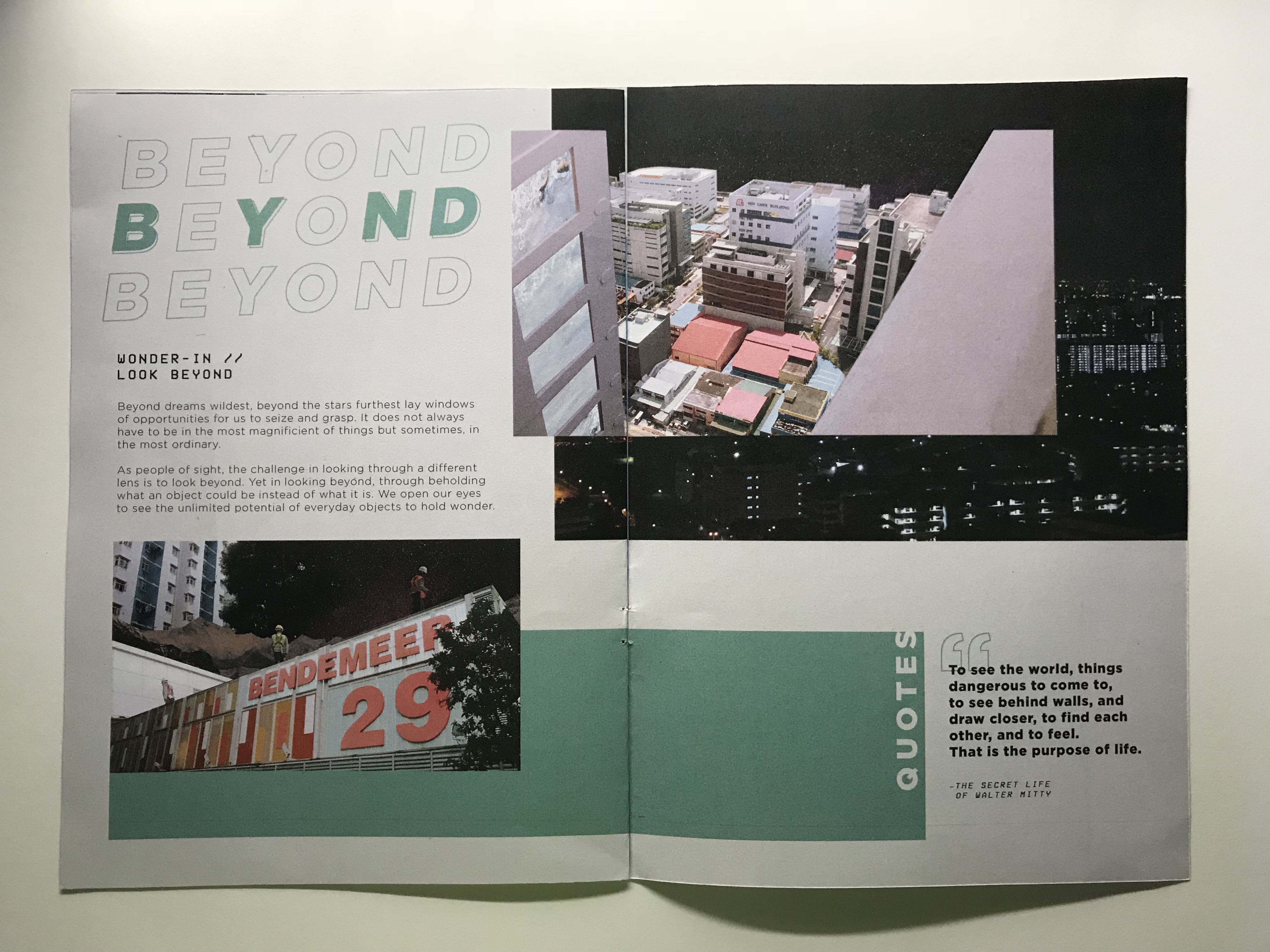
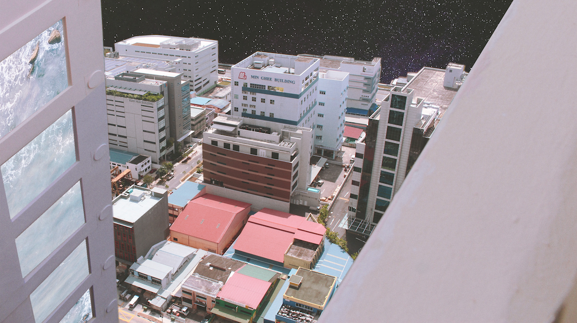
Beyond
Colour choice: GREEN
As the title suggests, Beyond is all about looking beyond, seeing an object not as what it is but what it could be. For the collages, I decided to go out a little, playing with images of space, mountains and oceans and combining it with the otherwise concrete jungle of Bendemeer. The result is a strong contrast between the sharp edges of the angular buildings together with the ‘softer’ scenery in the background. The idea of the images for this chapter was to create the sense of bewilderment.
PRINT.
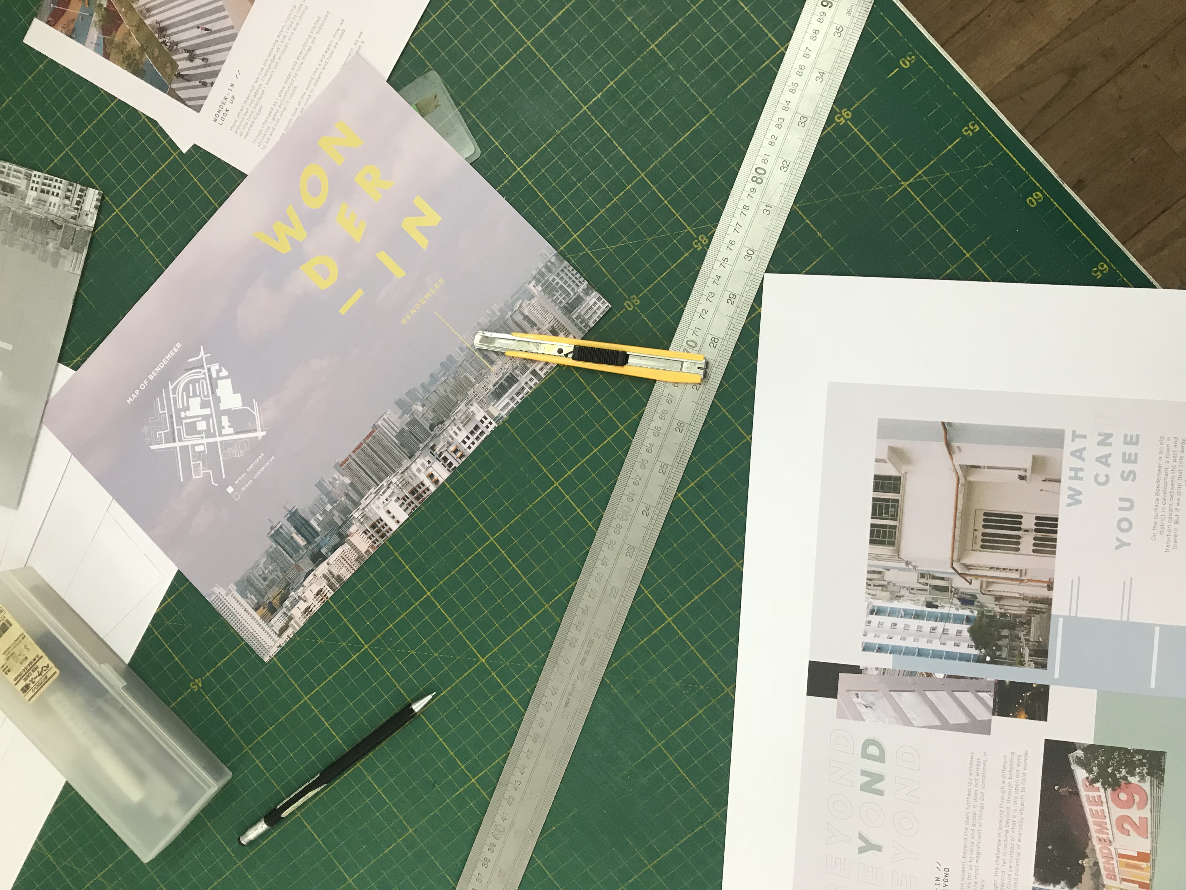
B&W: The first print sample was a black and white mock-up. Though the layout was not yet finalised, the purpose of this mockup was to test the alignment and the arrangement of the zine and to fix any print problems we may potentially face.
The print of the B&W sample was done using an A4 paper single sided print. I then glued both sides together. This was to increase the thickness of the paper and also avoid any printing errors as I did not want to waste ink.
As can be seen from the markings made, there were some changes to be made to the layout and design. Following the feedback, I then went on to make more edits and proceeded with print #2.
Colour Print #1: Colour Print 1 was printed after the overall layout was completed. It was done on 160 gsm paper, double-sided matte print. However, the final print colour seemed a little dull and the whiter areas had an overall pinkish tint to it.
Colour Print #2: Colour Print 2 was printed after the overall layout was completed. It was done on 100 gsm paper, double-sided print. The final print colour was stronger and had stronger contrast compared to the fade in Print #1. Hence, I decided to go with Colour Print #2 for the final print! (though the paper is thinner than I expected).
GOING BEYOND.
Once done with the traditional print, I wanted to venture and allow the audience to have more interaction with the zine. Also, with the 8 pages, there was a limitation in what can be shared and what content the video can experience.
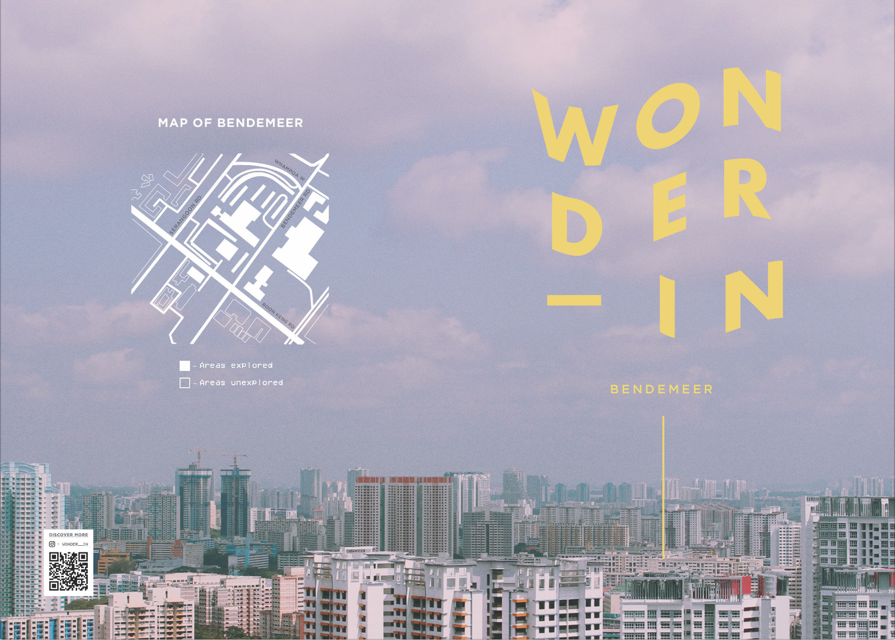
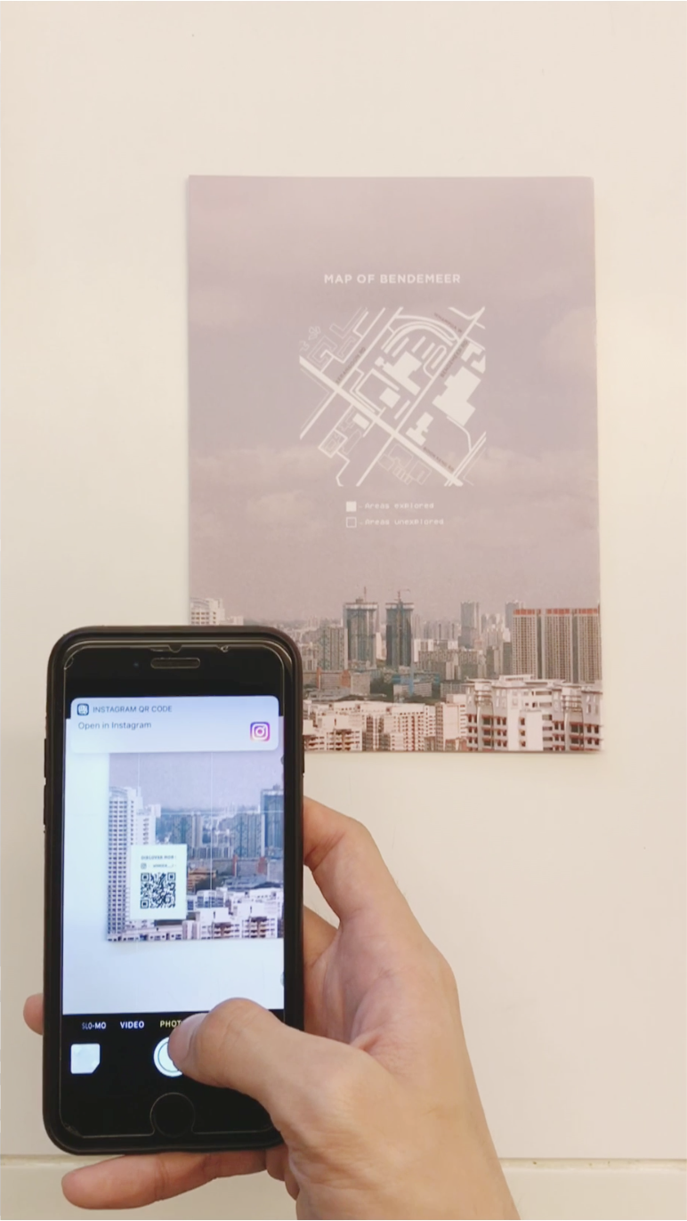
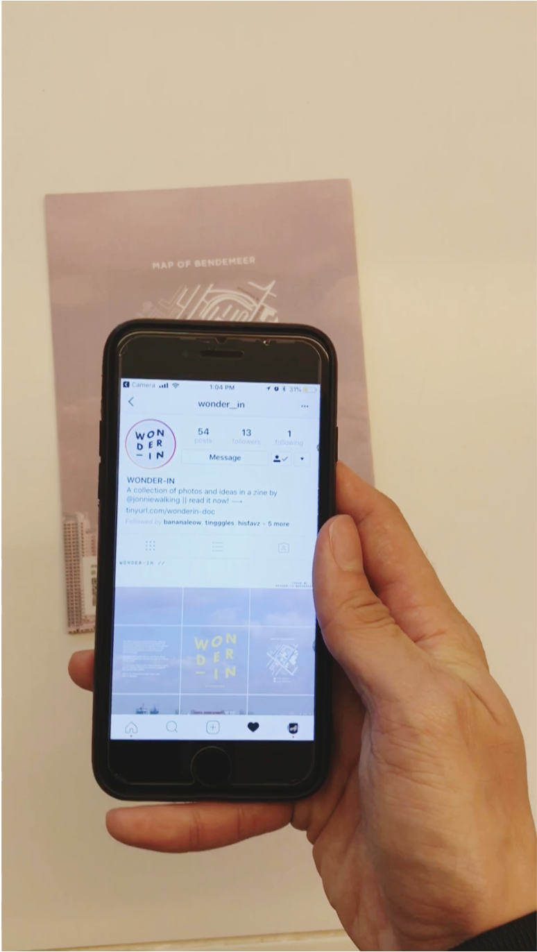
After much consideration, I decided to create an Instagram account page for the Zine, and link it via the QR code on the last page.
The reader can then scroll through the Instagram page to see a series of curated photos from the zine as well as other photos. The link in bio links to an Issuu page where the reader can browse a digital copy of the magazine on that platform.
DIRECTIONS FOR QR CODE: For iPhone users, just simply open your camera and point the camera towards the QR code. A banner notification with a link should appear prompting you to go to the link. Just click and voila, you’ve arrived on Wonder-in’s instagram page. Feel free to interact with the story (highlight) and scroll through the feed!
Example of Instagram grid system for Wonder-in
The purpose of the instagram page is an extension of the zine. It serves as a platform to inspire and engage as it encourages others to see the “wonder” in the ordinary. It also allows readers to share photos that inspire them with their friends.
CONCLUSION.
Its a tiring process coming up with a zine concept from scratch. However, through this project, I’ve realised the strengths and limitations of traditional print media. The (expensive) costs of printing, versus other mediums to allow someone to experience something.
I’m quite satisfied with the final outcome of Wonder-in, and am really glad that the final product came quite close to what I had planned. The content within the zine is also something that is very close to my heart and I’m really happy that I got the opportunity to communicate it through this project. 🙂
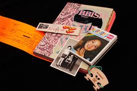
I have always loved reading magazines, especially zines. They have strong personalities, ideas and visual identities that is expressed through their content and visual graphics (photos/illustration/layout). The RUBBISH FAMzine series of Zines by local family art collective holycrap is one example of this. Their use of Zine as a platform to share personal experiences and thoughts as a family engages readers as their content becomes relatable and thoughtful. Combined with their use of strong visual themes, no wonder this Zine has won numerous design awards and is well recognised worldwide as well.
Rubbish FAMzine Issue #5Rubbish FAMzine Issue #5
Approaching this Project, I decided that I would want to create a zine that would allow space for these areas to show. Hence, my aim and objective for the zine is to introduce thought-provoking ideas and combine them with interesting visuals to capture readers’ attention.
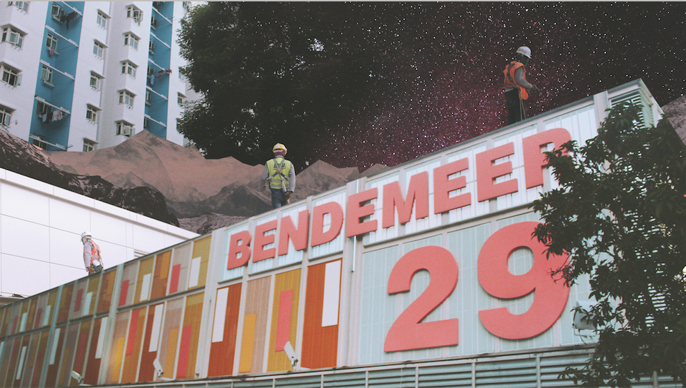
Journey to Bendemeer (Project 2a).
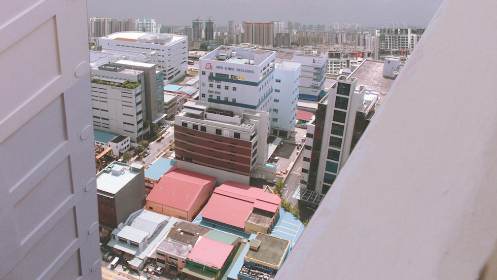
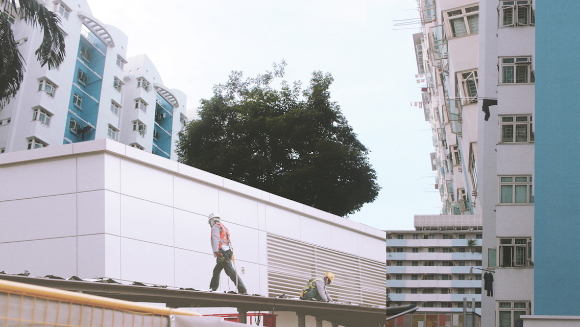
BENDEMEER. YES. I travelled from Yew Tee to Bendemeer (which I actually have never been to before) cos that was the area suggested/given/selected by me. I thought that the nearest MRT was Bendemeer (on the downtown line) but I was wrong. Turns out that Boon Keng is nearer to the Bendemeer Estate.
To cut a long story short, I actually visited the area twice. I alighted the first time at Bendemeer and ended up exploring the Industrial Estate there (which was not very interesting) and the second time at Boon Keng where I explored the residential areas and other areas of Bendemeer.
The MRT at Bendemeer was actually really empty (as though it was unoccupied). Felt kinda creepy.
MRT at Bendemeer
Anyway, read all about the exploration here in my presentation slides!
WONDER-ZINE.
While crafting the presentation, the idea of using collages to express a different side of Bendemeer came to mind and I decided to continue to explore that idea.
For the first consultation, I created a moodboard to firm up certain ideas I have had. I settled on a theme for my zine that would be exploring the concept of “seeing”. I added words that I associated “seeing” with to give myself a rough idea of what content and what other ideas I can explore with the zine.
I also included references images, and examples of layouts that inspired me.
As I have already curated a series of photos for use in my presentation, I decided to continue with these photos and try collaging them. The aim is to create a surrealistic visual that will allow readers to question the image.
Here are some examples of the first collage drafts:
Some feedback for the images were that some were not “surrealistic” enough and so it was back to photoshop once again.
Once I was done editing the image, I started to layout the images and spread them out to try the layouts. (without the content).
Presenting, WONDER-IN #1
Zine layout 1
I decided to use a sky image of Bendemeer as it gave the magazine a sense of context. The typography of the main title logo was deliberately wavy to translate the idea of “Wonder”.
I split the content into 3 main chapters, and tried to use different colours and typography treatment to highlight each chapter’s unique aspects.
The difficulty was trying to experiment interesting layout while ensuring that every spread is consistent and not out of place!
Feedback were that the spread for pg 4-5 and 6-7 were lacklustre in the energy in terms of the layout as compared to the spread in pg 2-3…
I was quite satisfied with the use of colours, and typography for the first draft so I didn’t change it much.
WONDER-IN #2
For V2 I tried experimenting more with the potential of the layouts but with the content not done, the layouts continued to grow and was edited along the way. To cut the long story short, here is the finalised layout at the end. which was V3438247384379482.
Final Layout.
With the content more or less complicated and in line with how I want the visual graphics to tie and link with, the layout was completed soon after. Due the to small amount of pages for this zine, I decided to do away with page numbers as well.
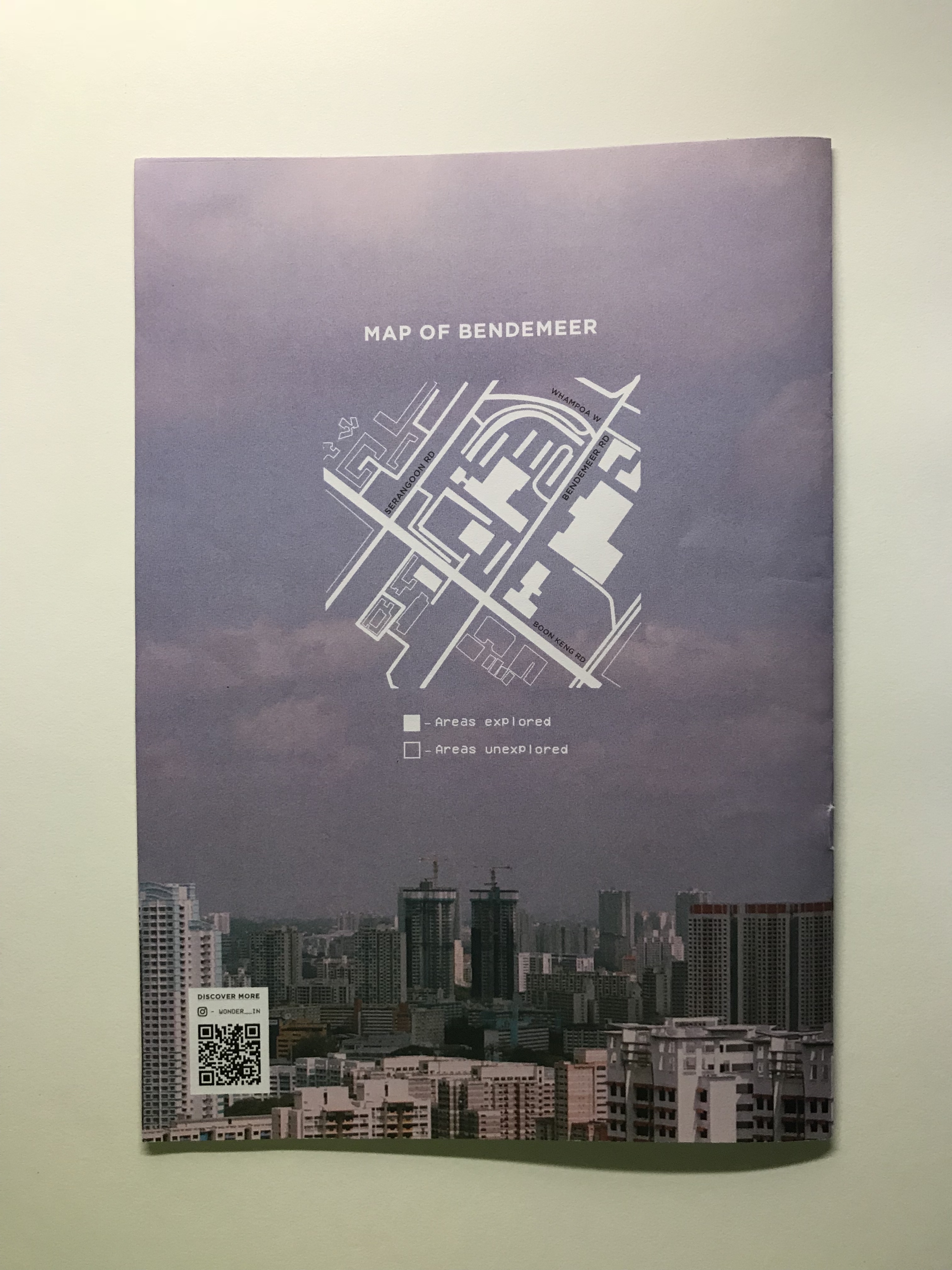
Apart from the minor changes in terms of layout, I also included a map of Bendemeer at the backpage as well as a QR code with a scan that links to an instagram page set up. But more on that in my next post!
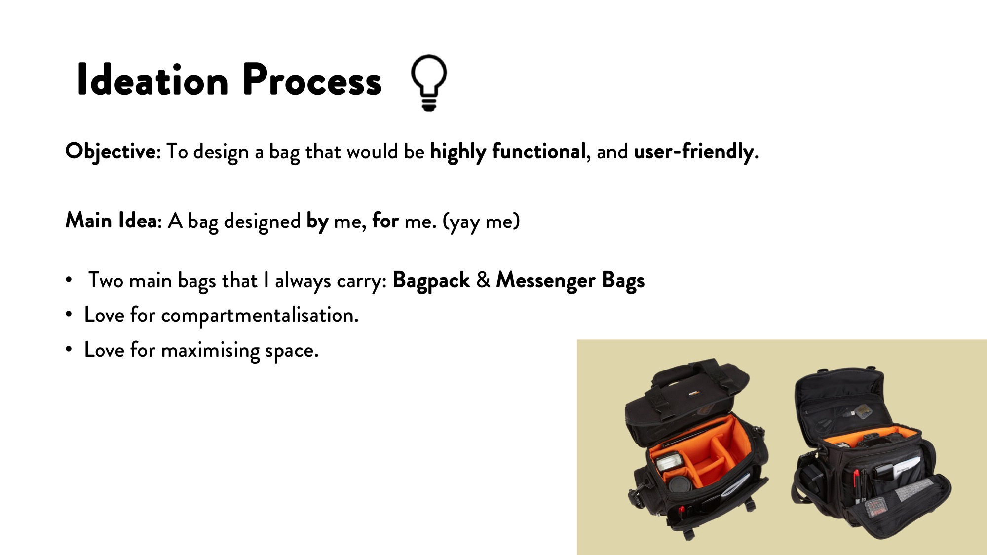
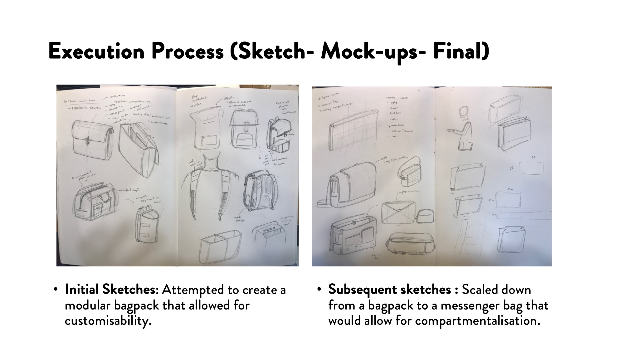
Ultimately the idea to create a modular bag pack got canned due to the fact that it was gonna be a very complicated construction process and given the limited time-line, it was gonna be very difficult to execute the idea.
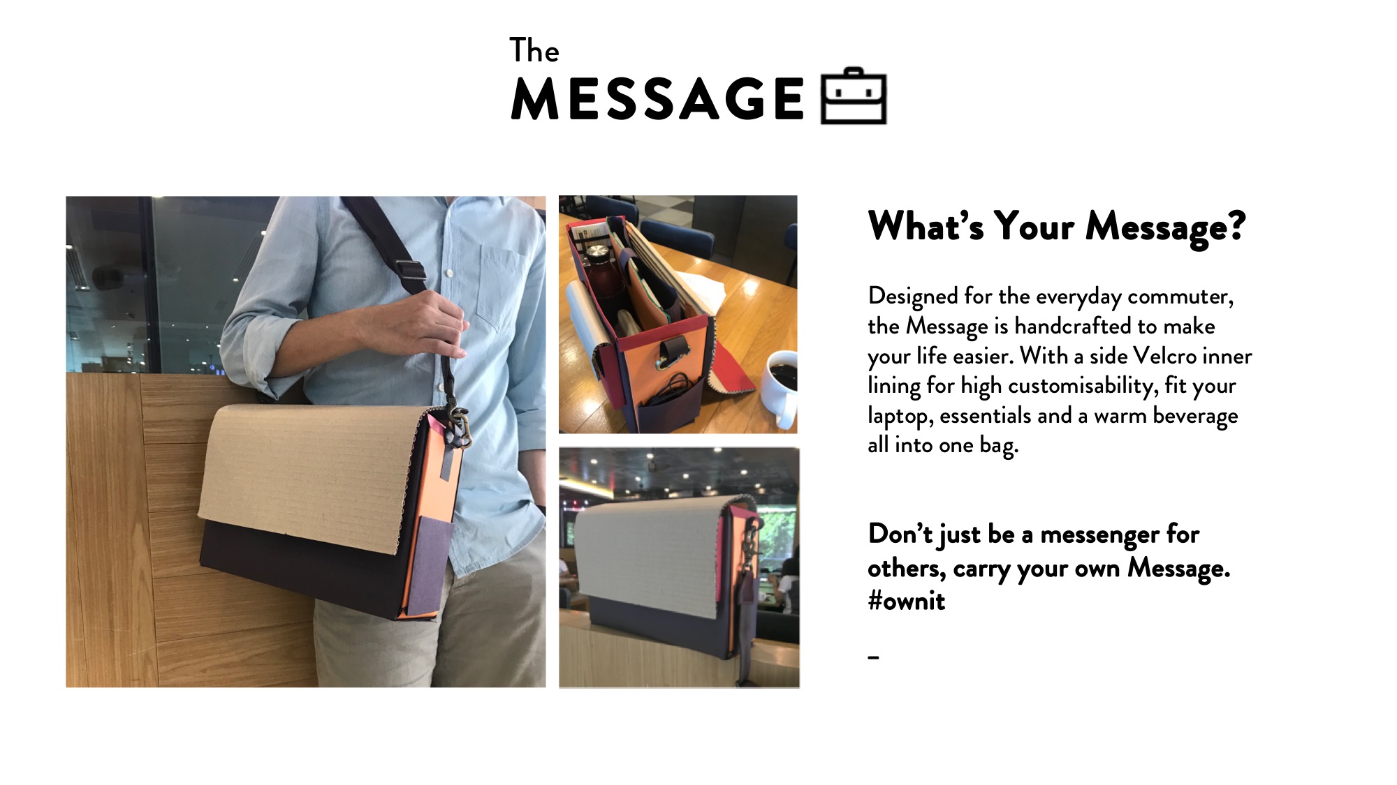
Nonetheless, the idea was to merge the core essential idea into a messenger bag by trying to balance space and compartmentalisation.
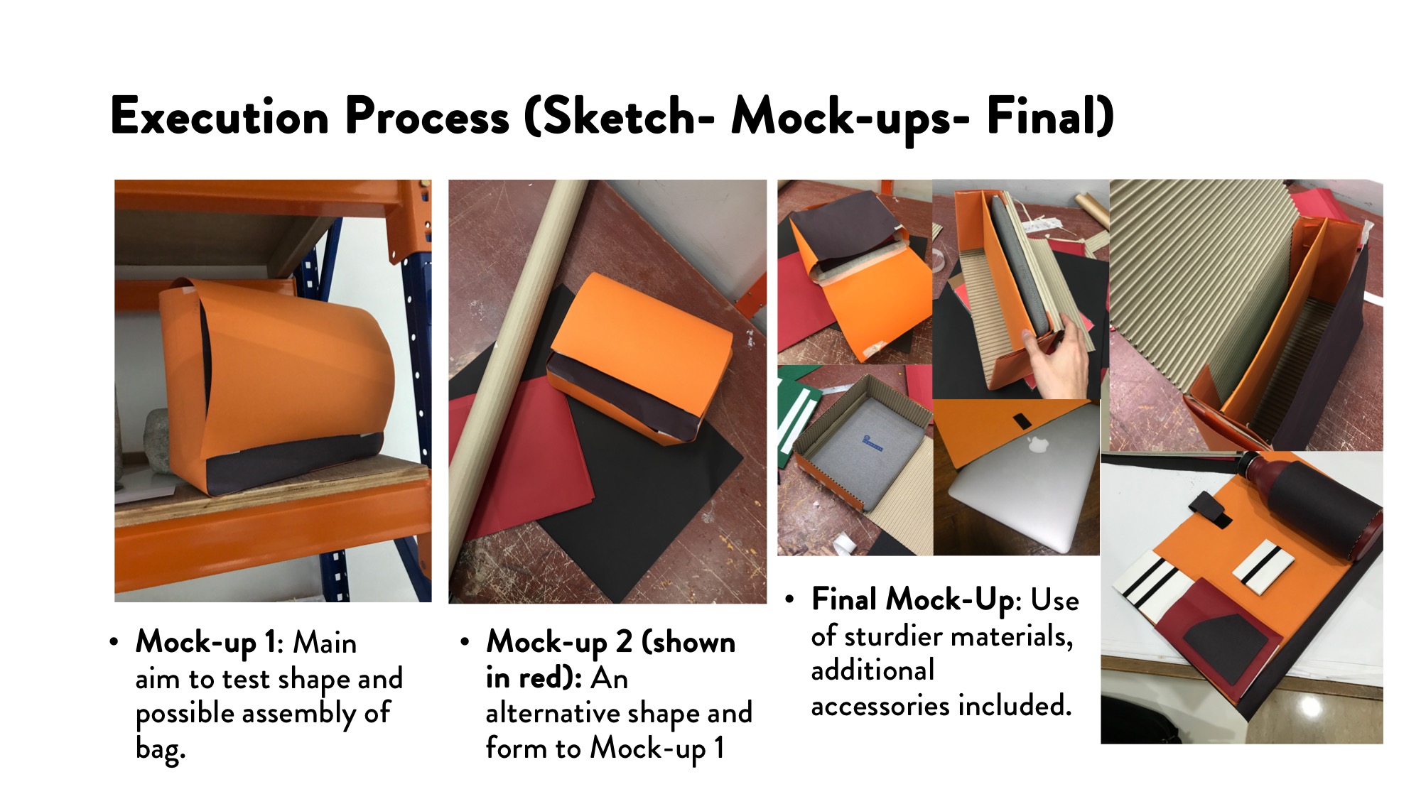
Some lessons from the first and second mock up includes Planning Ahead. Due to the use of paper materials, this meant that there would be certain limitations and problems. The use of certain folds on Mock-Up 2 made the entire bag look like a Document Folder which was not the intended result.
I ultimately went back to the form and shape of Mock-up 1, but used different materials to give the bag more shape and form. The use of Cardboard also gave the base and back of the bag more padding since it was suppose to hold a laptop.
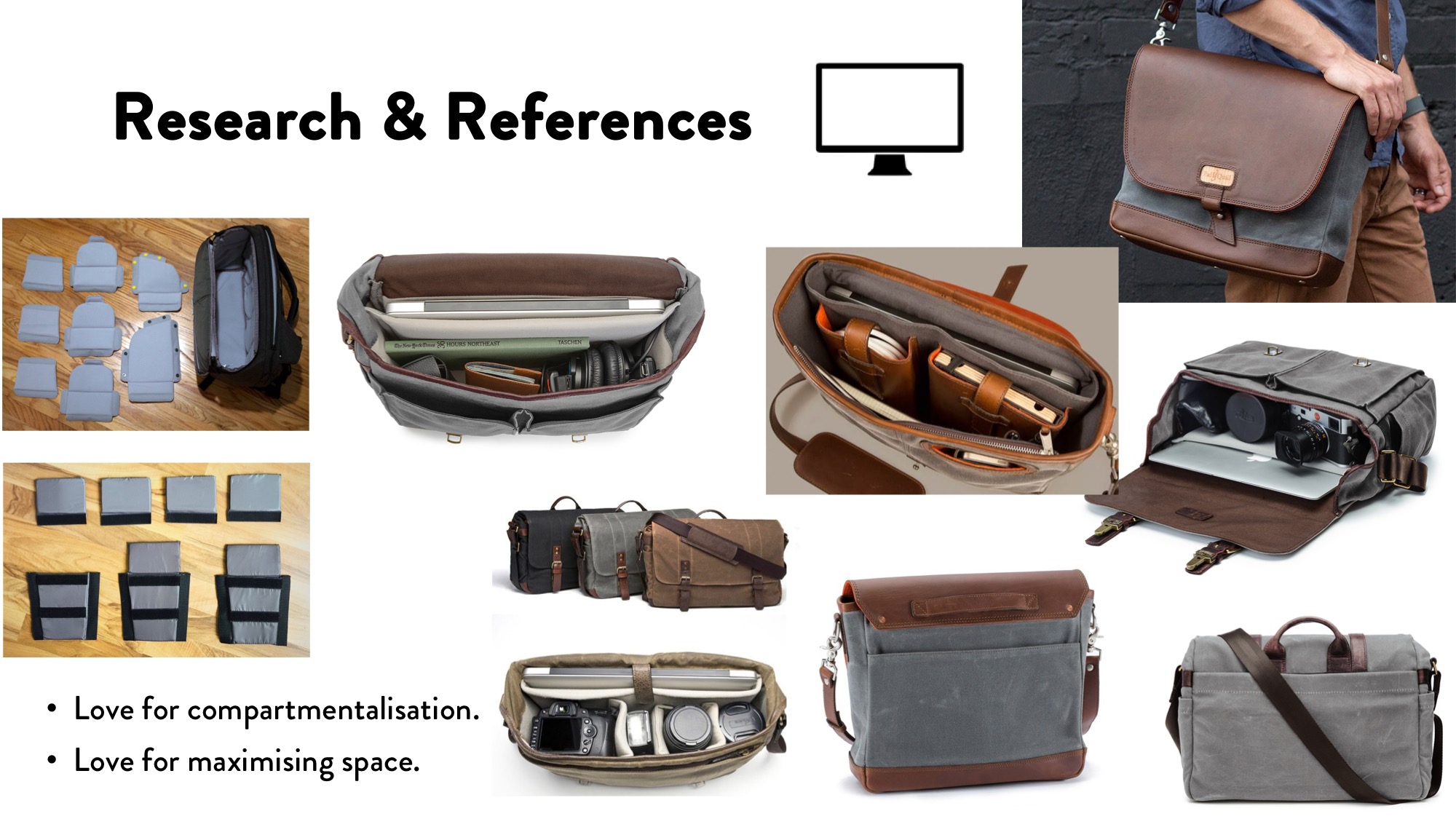
Throughout the entire process, I kept referring back to my references and my sketches, trying to mimic the folds and compartment types used and also trying to keep to my original design. In the end, the product design changed due to use of thicker materials and the need to include other considerations such as how to “close” the bag.
The main form of adhesive used for the construction of the bag was double sided tape. Masking tape was used at times and scotch tape on other occasions. UHU glue proved to be useless and did not provide a strong adhesive between surfaces hence was abandoned.
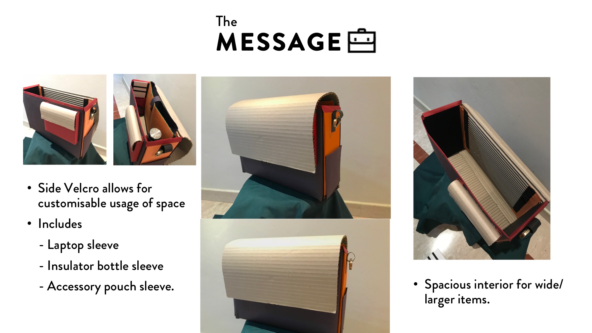
Once the shape of the bag is out, the next step is to include accessories to its interior. The selected accessories to go for are the Laptop Sleeve, a Beverage holder sleeve and a sleeve pouch. The accessories are all fitted with velcro so that they would be easily customisable to the side velcro lining. The addition of one front pockets as well as two side pockets allow space for small personal items as well.
The final touch-up was to add rims to the opening of the bags as they were ugly and quite unsightly. The use of rims also helped reinforced and strengthen the weaker areas (especially the front of the bag).
The final outcome of the bag is meant to demonstrate the functionality and use of the Bag itself. Hence I did not create a strap to go along with it. The strap used with this prototype was taken from another bag that I own.The aesthetic of the bag is not yet finalised as the front flap still remains bare.
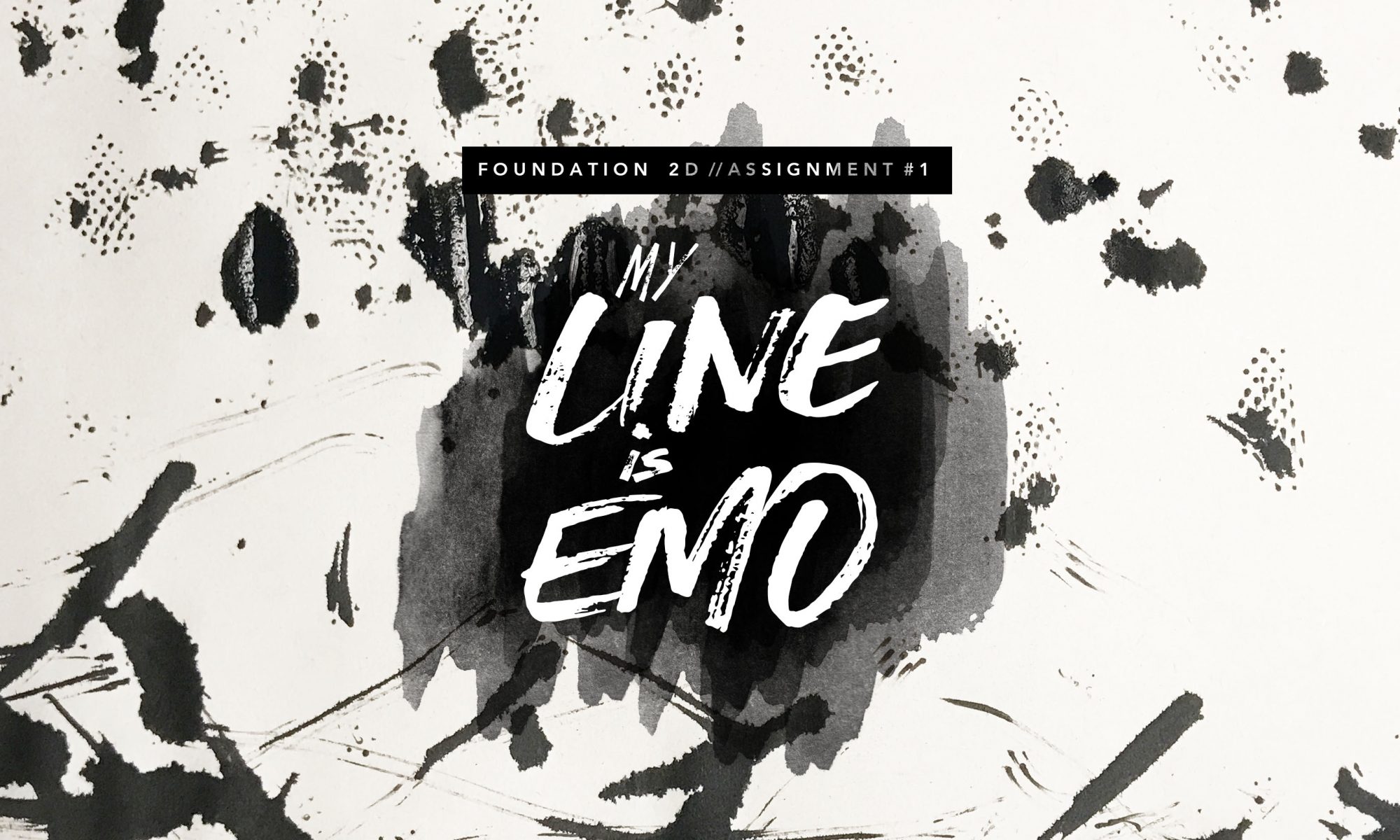
So it finally begins, our last assignment for Foundation 2D!!
Here’s a quick summary of the project brief:
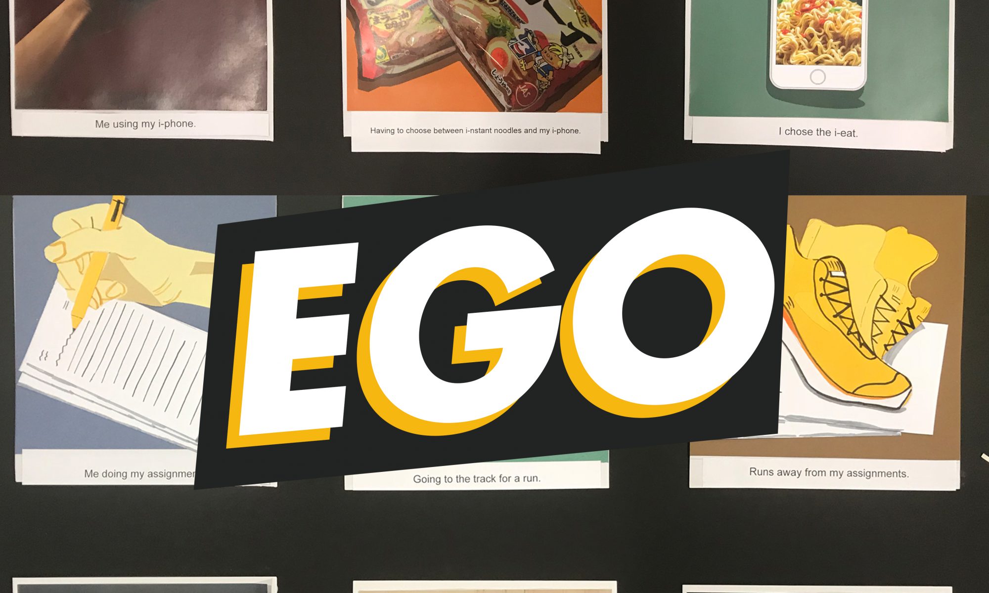
EGO.
“Apply your understanding of colours and colour theory to visually represent the multifaceted nature of your personality.
You may choose to do this digitally or by hand (or mix-media)“
After receiving the brief, I had mixed feelings, cos for the first time after 2 assignments, there wasn’t going to be any restrictions on medium and concept!? which also means anything is possible. And while the creative in me screams for joy, it also means a greater effort to focus my creativity on a particular area.
1.1- The Search for my Ego
I started my research by deciding first the personality trait I was gonna work on, and that included consulting my friends, some self-reflection, and noticing my reaction in social communities.
After much deliberation, I decided to explore my:
fear of heights
tendency to make puns
foodie
tech geek
tracker
inquisitive
dislike of crowds
safety consciousness
procrastination
love to collect toys
It’s a lot more than 4 settings, but I wanted to see and explore how I could use the 12 panels to convey these sides of my personality so this took alot more of time mixing and matching myself in settings to come up with the right mix of equations.
1.2- The Search for my Ego-style
No restrictions of mediums and style meant experimenting and trying different things!! So other than aesthetics, one of the main areas of research included varying styles and mediums!! (and colour too)
So above is a compilation of my design references that I relied on heavily in terms of style. As you can draw the similarities to my final pieces below.
Just a quick summary of the mediums explored above and I wanted to try:
Digital illustration (artist reference: Lee Xin Li)
Vector illustration (artist reference: Kim Nguyen, Alicia)
Paper cuts
Photo illustration
Photo-montage
There was value in each style but what caught my eye in the initial stages of the conceptualisation was Vector illustration and I wanted to use the same style for all 4 equations. But decided not to in the end. (read below)
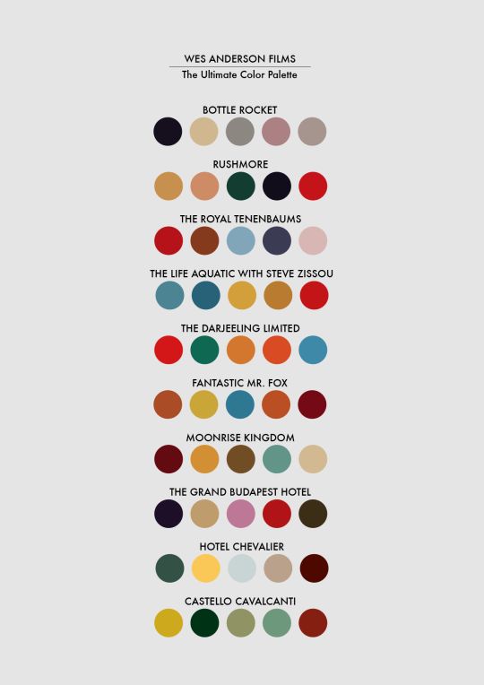
And my main source of inspiration for colour scheme was from Wes Anderson’s films. I like how they are used so effectively as a form of fim setting and also tells the mood of the scenes and the overall film in general. He uses different iterations of the colour palette, creating a film palette that is consistent with the tone of his films as well. Hence:
2- The Pro-less of Ego
This part of the assignment was the most painful and also the part where I spent the most time in (*insert sad emoji) but nonetheless, it was a good learning opportunity and apologies for the lack of photos (cos I didnt keep my bad designs and stuff) But anyway I hope these words will suffice, as I try to make it more structure but grouping my process.
2.1 – Conceptualising
As mentioned previously, with the research done, all that’s left was to put things together. To be honest, it went rather alright and everything just clicked when inspiration hit (though changes had to be made subsequently but more on that later)
The 4 rows that I have decided to work with are as follows:
Safe – Explores me being overly safe but after going through the army, my safety senses are being sharpened – inspired by the quote “You can’t spell safety without the SAF” (lol)
Medium: Digital Illustration
i-Eat – Explores me being a tech geek but having to choose between food and technology? I’d rather have them both. Also a reference to me making puns. (lol)
Medium: Paper cut, vector illustration
Heights – Explores my fear of heights and because I’m curious, I’d still try things that scare me (aka: Roller coasters)
Medium: Not decided
Toy Story – Explores my toy collection and tendency to procrastinate
Medium: Not decided
The concept of my idea was to try and merge different facets of myself from my research to fit not just 1 personality trait per equation but multiple.
However these were only the first draft and changes were made prior to the final due to various factors and reasons.
2.2 – Execution
I think this was where everything went south, but this was when I realised that I wasn’t able to do everything I wanted to do, or rather the result was not good enough to what I was expecting..
It was a cruel process of feeling demoralised again and again after 3 plus hours spent on a single panel of photoshop only to be erased because it “wasn’t good enough”
But I guess we learn? Sometimes stepping out of our comfort zone means getting uncomfortable, but I guess it was also cos I was feeling stressed from the pressing timelines as well so I gave up a lil too easily :/ but oh well
*LEARNING POINT: It was also during this time when I start to notice how my mind reacts and work in stressful situations and how I tend to become flustered and give up easily. It helped me to learn what are my weaknesses and I learnt how I could better work around it through coming up with a different thinking and ideation process that suits me better. so yaye.
I shall just skip this part and head straight to the FINAL pieces!!
3- The Pursuit of Ego
So… as mentioned previously, the final 4 equations turned out quite different from what I initially had in mind in terms of medium and style. The main reason for this is as a result of experimenting and trying out the different softwares for the style during my execution only to end up frustrated. HENCE, I decided to go back to my initial design references and try out a variety of mediums wit each equation exploring a different style. So… here are the new and improved EGO EQUATIONS!
1. Safe – Explores me being overly safe but after going through the army, my safety senses are being sharpened – inspired by the quote “You can’t spell safety without the SAF” (lol)
Medium: Photo illustration, Paper cut.
The initial design was a photo illustration, using photos of myself (I posed for them) and then drawing on it to help fit into the ‘story’. It was completed on Photoshop but I felt the image turned out to feel a little flat and since the visuals for this equation uses layers (aka the windows and scenery) I decided to make use of it and printed the different layers individually, cut them and layered them with a spacer to elevate the different layers, adding a sense of depth and dimension to the otherwise flat image.
For colours, I went with mainly analogous colours (seen from the background of the wall) of different shades of green since its a little about Army. Also the helment and body armour in the first image was suppose to stand out hence a complementary colour against the faint blue was to help bring the emphasis to the objects.
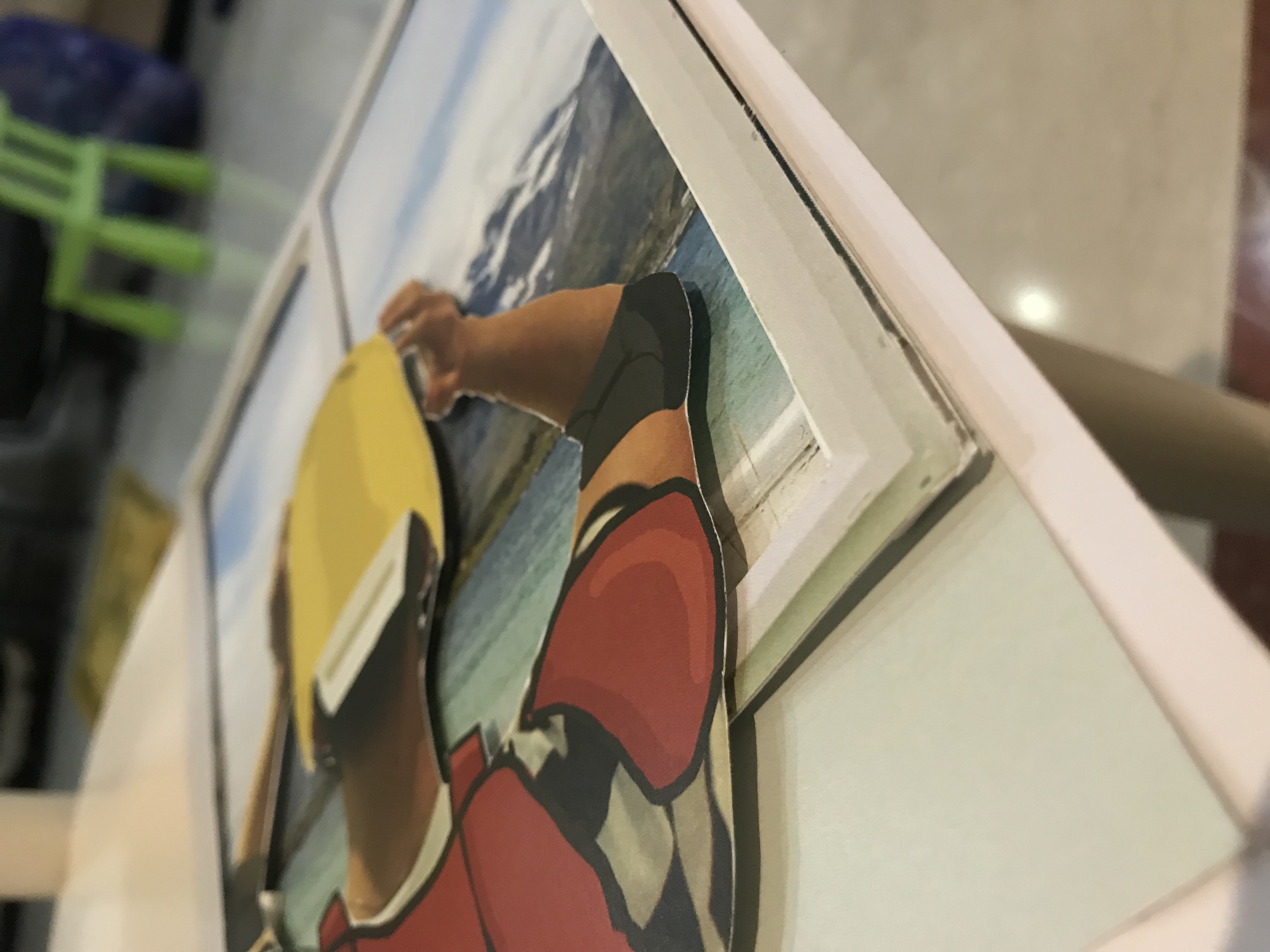
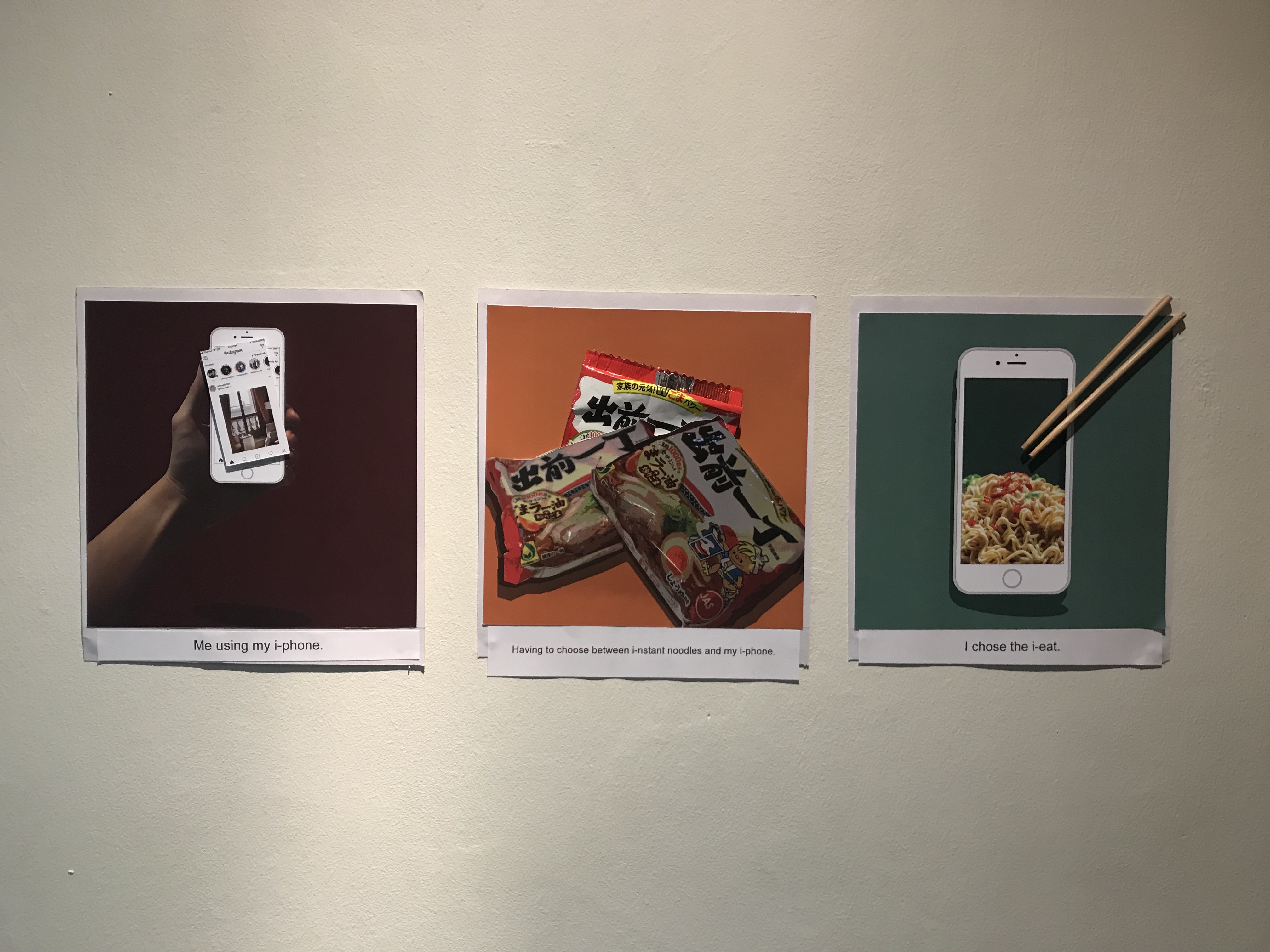
2. i-Eat – Explores me being a tech geek but having to choose between food and technology? I’d rather have them both. Also a reference to me making puns. (lol)
Medium: Mixed media. Photo manipulation
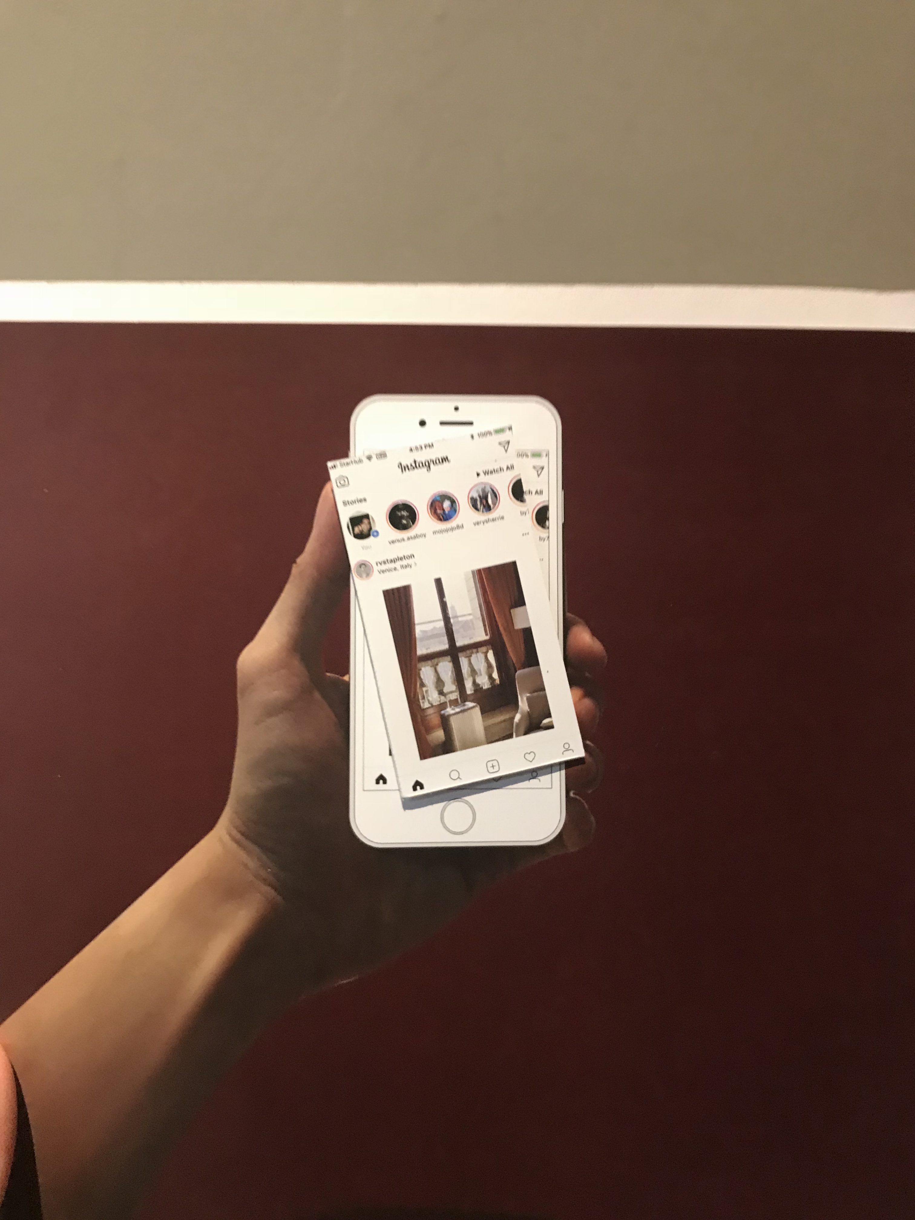
Similar to my first row, the designs for this equation was completed on photoshop, but I thought this row could include other materials and objects to cause it to look more visually interesting. For each of the various panels, I added an element to cause the image to pop out.
For the first image, I used popped up the screen on the phone. The second image is a packaging from the instant noodle packet used while the final image I used a pair of chopsticks. It was generally the most well-received and liked by my peers too.
Colour wise, I used a split complementary scheme with slightly darker tones to allow the objects stand out for themselves. (Also, I don’t particularly enjoy the jarring look of bright colours).
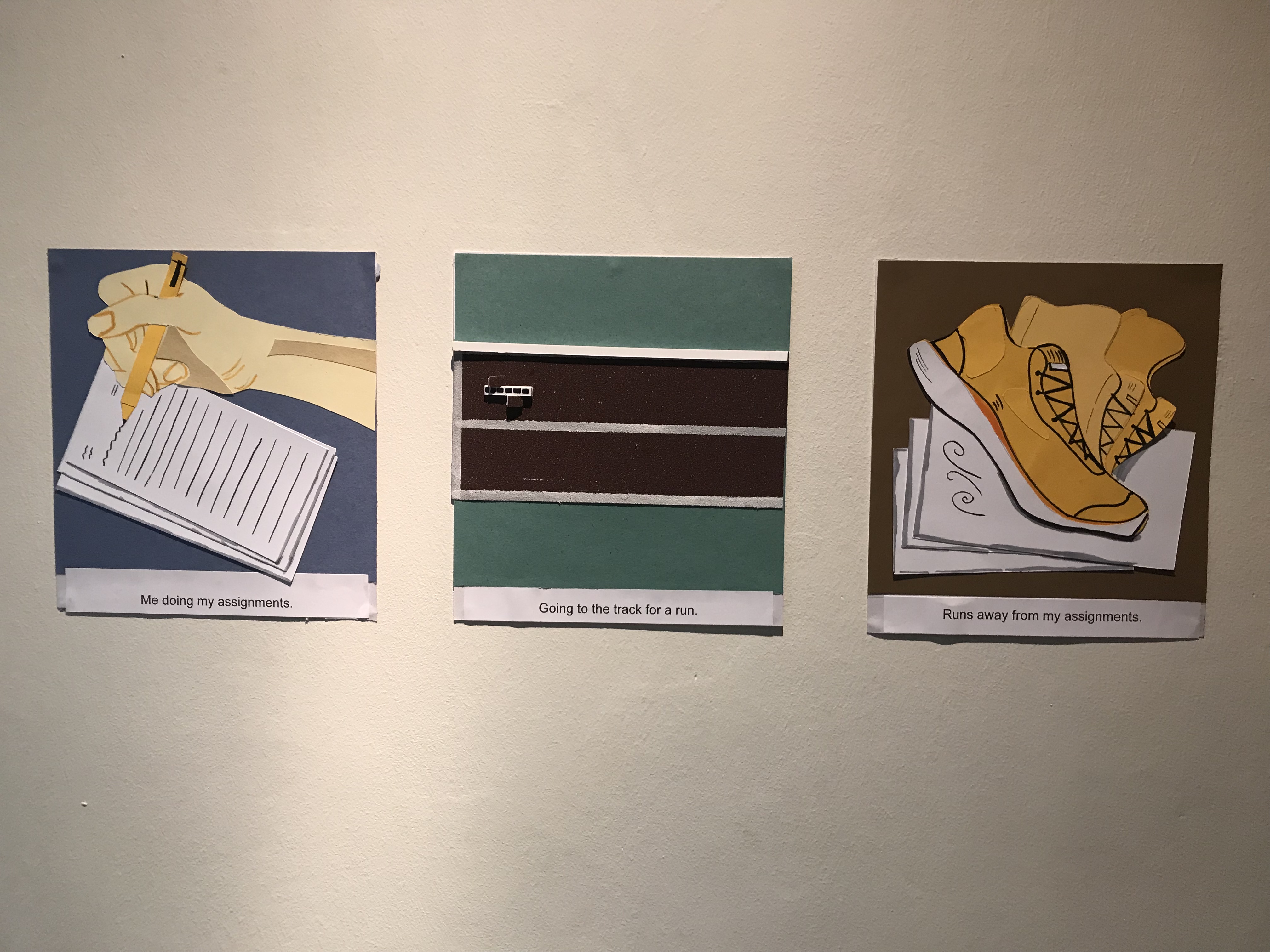
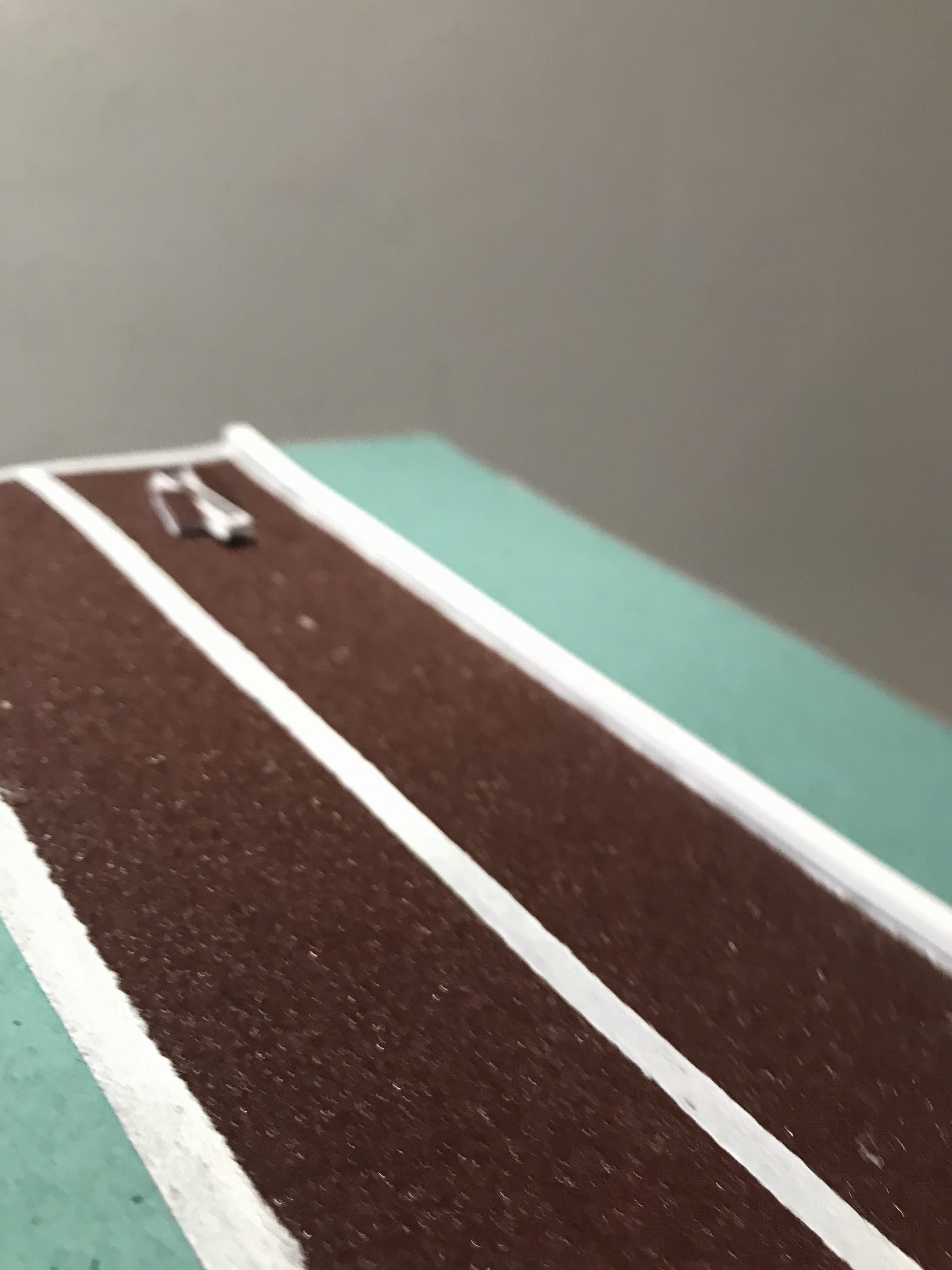
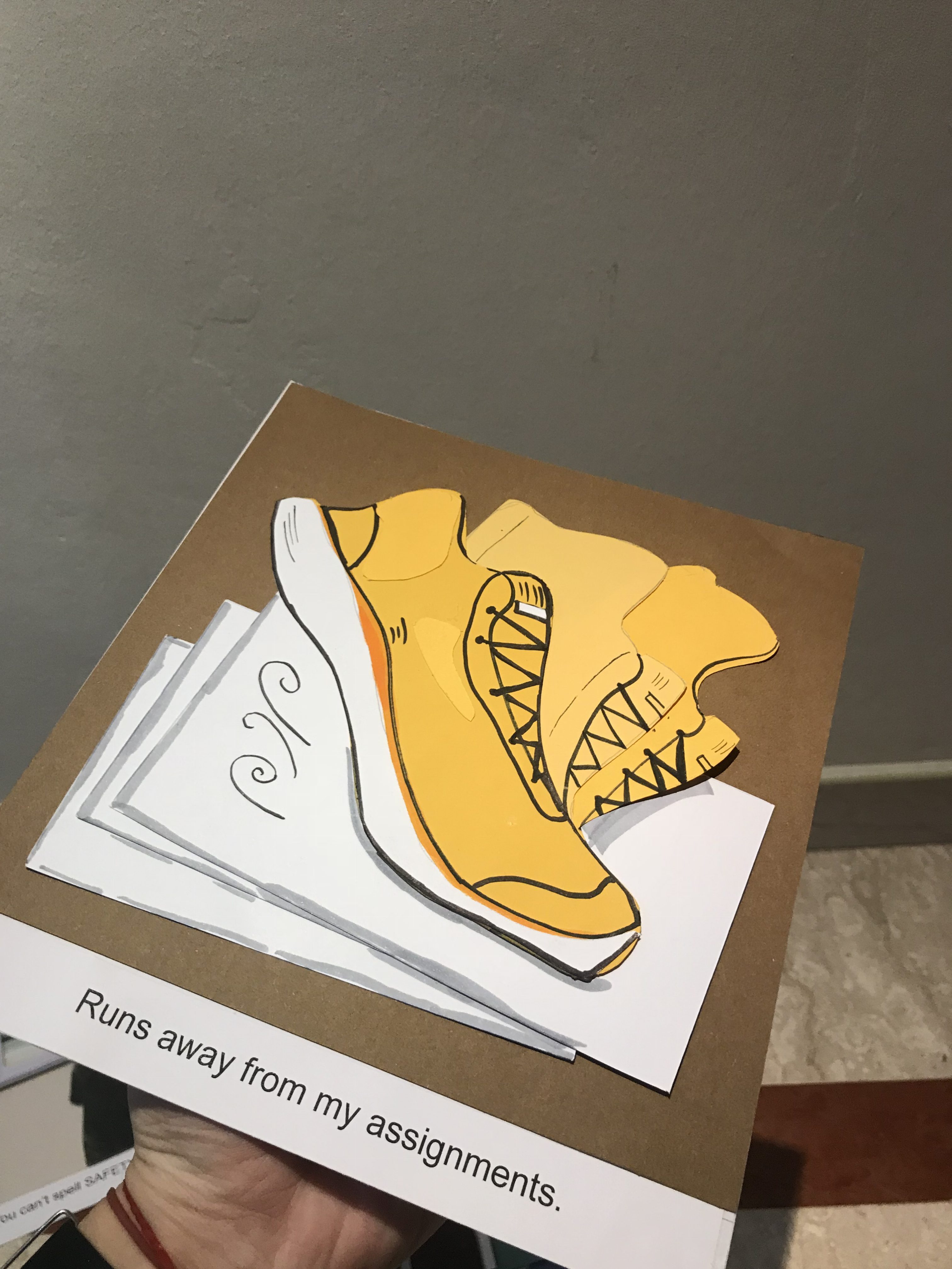
Run – Explores my tendency to procrastinate and my history as a tracker.
Medium: Paper cut, Mixed media
This design style was inspired by paper cut art styles that I found during my research, I felt that it as quite similar to using vectors for illustration since the colours used are generally flat. Hence I went shopping for colour papers, to try and piece to create my own Paper Vector art. The end is an interesting panel that I am quite satisisfied with. The only difficulty about this form of medium was the fact that you had to be quite patient and detailed with your hands and it takes a certain level of skill to cut the paper with extreme detail. (unlike mine)
The second image I used a bit of mixed media by using sand paper to imitate the visual look of a running track.
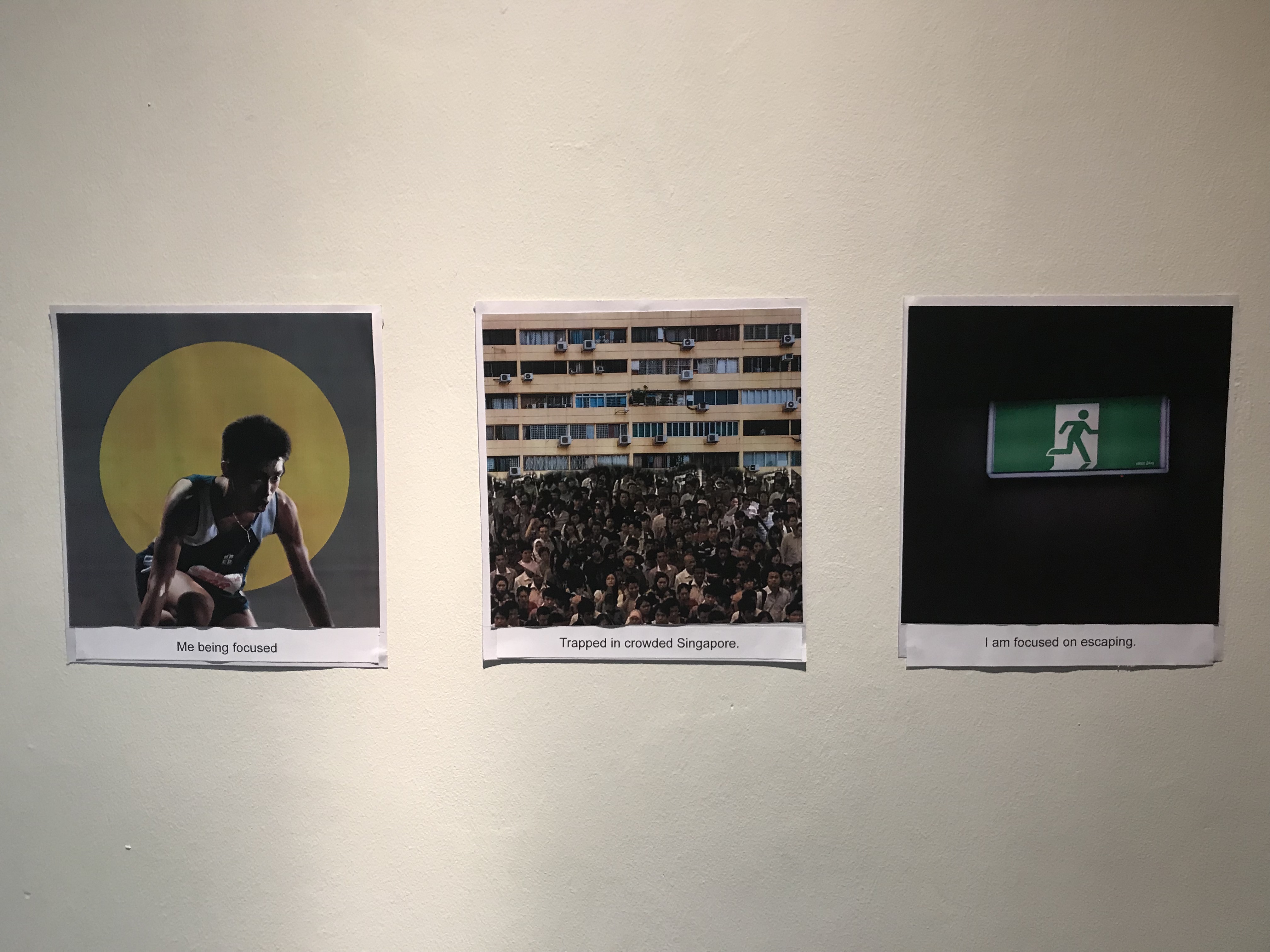
Focused – Explores my disdain for crowded places
Medium: Photomanipulation
This row is made of old images of myself, with the yellow circle to help bring the visual focus to me, and also to contrast the setting which is an image of crowded people infront of a yellow rectangular HDB block. And the last image of the man in the sign exiting is a representation of me in green (from the first image) running out.
The colour used for this image was generally darker tones since it is about something I dislike.
4- After Ego
In conclusion, it was a rather interesting assignment allowing us to have a (somewhat) better understanding of ourselves in different scenarios and it actually did help me learn something new about myself too (see learning point) so yaye?!
BOOM. Finally the end of 2D assignments!! It’s a rather long and wordy post, but thank you for making it to the end! :)) Special shoutout to Ms Shirley for being such a understanding and encouraging tutor during this semester! 🙂
Our first brief for Assignment 1 was to interpret emotions using lines through mark making techniques. Sounds pretty abstract right? It definitely was for me but I thought to just take things one step at a time and hopefully it’ll all start to make sense at the end of the day (which it did, but more on that later).
To be honest, it took awhile for me personally to reach the stage of research since I kinda skipped this part and went straight to the process (oops!) but I did come back to it in the end! So for the purpose of understanding and reading my process for this assignment in a chronological order I thought I’ll post this first, followed by my process and final work!
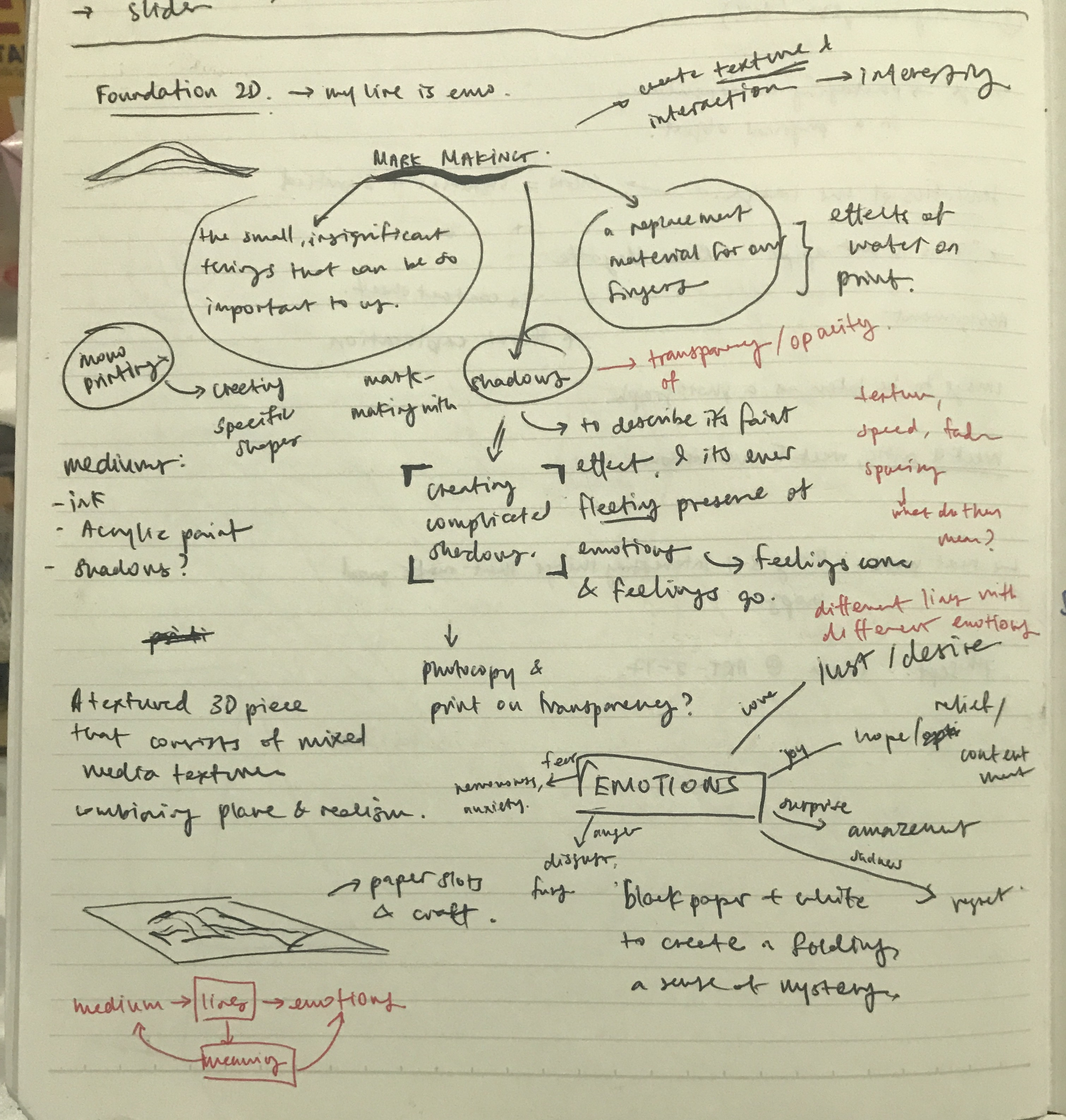
As a started on my research, I wanted to be objective with what I was reading up on and so I broke it down to a few aspects:
Research into the various types of lines and what they represent
Research into emotions, what are their definitions
Research into references. (Artist references, pinterest boards etc.)
Research into the medium and how a medium can affect the emotions/mood.
Which I hope this post covers or at least attempts to 🙂
Research: Lines and their Representation.
As an element of design, lines are fundamentally building blocks of design and are essential to everything we create and see. However as referenced from Steven Bradley from his article on Vanseo Design, (link: http://vanseodesign.com/web-design/points-dots-lines/) He suggests that the fundamental chracteristics of a line is its ability to connect or unite, be it invisible or visible. Which intrigues me to think beyond mark making. He gave the example that two dots on a the same plane have a connection even if that connection, the line in between, cannot be seen. (Mindblownnnnn ~ But I’ll get back to this thought again)
Simply put, a line connects two points and is also the path of a moving point. It can vary in direction, thickness, implied or literal and depending on the variation, express and mean different things. Below is a page from my notebook as I researched into various lines and its meaning, as referenced from (link: http://vanseodesign.com/web-design/visual-grammar-lines/)\
Research: Emotions and their Definitions.
Having figured the first part of the project brief (what’s the deal with Lines) I moved on to the next part- Emotions. This was when I started the entire process of unpacking the emotion and building that personal connection of what it meant to me, which helped alot in generating ideas during my process.
To begin, I shortlisted a few emotions I was interested in to work with then searched for the dictionary meaning of it:
Lust : strong sexual desire ; speaks of strong passion
Sensual : of or arousing gratification of the senses and physical, especially sexual, pleasure
Hope : A feeling of expectation & desire for something to happen.
Amazement : great surprise or wonder
Frustration : upset or annoyed as a result of being unable to achieve something ; prevention of progress, success or fulfillment of something.
Hurt : cause pain, suffer pain, cause distress to.
Anxiety : Worry, nervousness or uneasy about something with an uncertain outcome.
Exhausted : very tired, completely used up (resources)
Next was examining what each of the meaning means to me and building that personal connection that I wanted to express through lines. below is a quick rough sketch from my notebook of this process. I’ll talk more about it in process.
Research: Artist References/ Inspiration
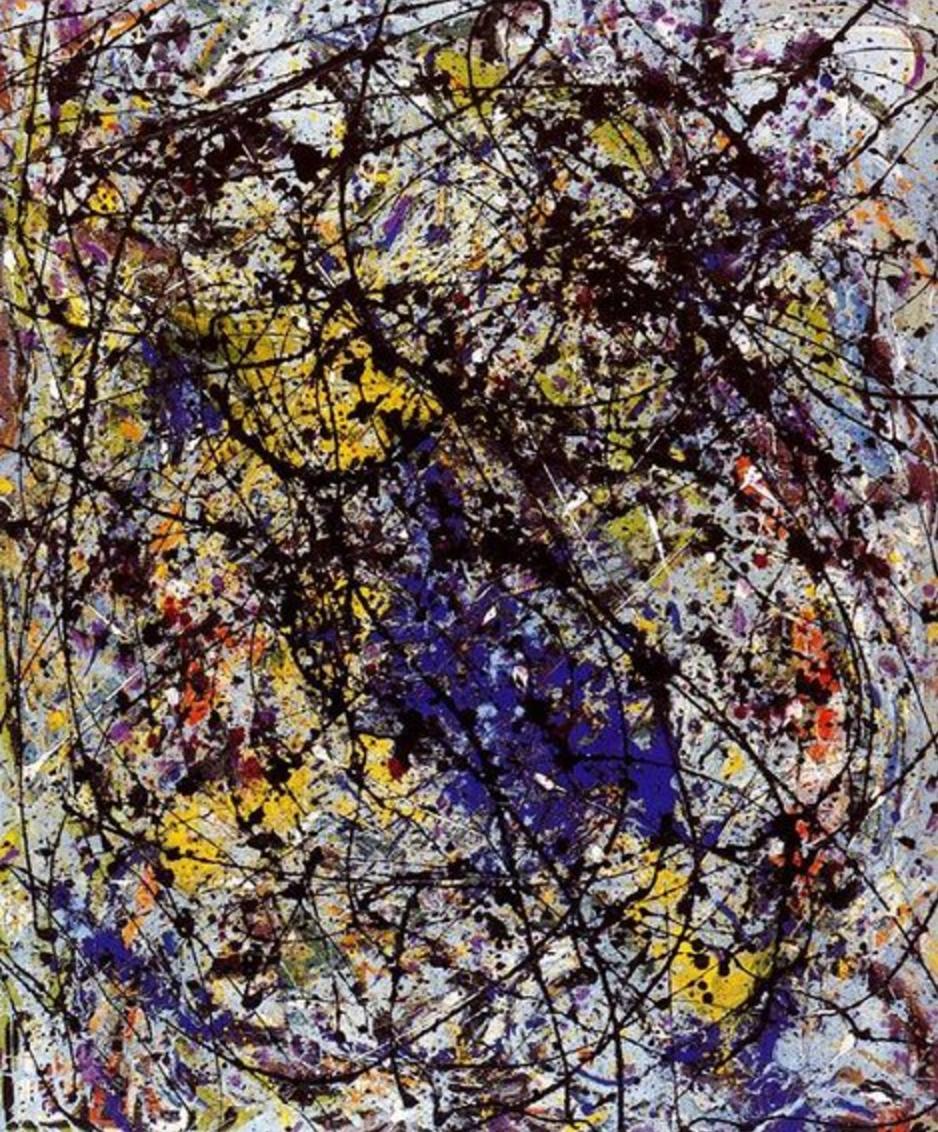
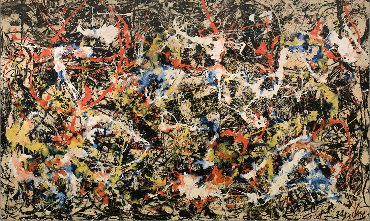
Jackson Pollock
One of the first names that pops in when I think of the idea of abstract art is the great Jackon Pollock. A leading artist in the movement of Abstract Expressionism which focuses on spontaneous, subconscious creation of paintings. Artists in this movement can vary in style but it is the dynamism of Pollock’s painting that attracts me.
(Disclaimer: The analysis of Pollock’s painting below are solely my own opinion and what I think of it!)
Reflection of the Big Dipper, 1947 by Jackson PollockMural, 1943 by Jackson PollockConvergence, 1952 by Jackson Pollock
In his paintings of Convergence (1952), Reflection of the Big Dipper (1947) and Mural (1943), we are able to see the difference in brush strokes and line weight that brings about different emotive languages. The large quick strokes and drips of paint with uneven thickness in Convergence seem to show a short, quick outbursts of energy amidst the background of short messy lines. The unplanned, messiness also creates a sense of spontaneity. In Reflection of the Big Dipper, Pollock used a myriads of tools including sticks and knives, even adding different materials like sand, broken glass, and coins to his canvas. The long diagonal (fairly) strokes of black paint dripped in this painting also shows movement but much gradual and feels more tamed. These paintings are in stark contrast with Mural that is make up of wavy, curved strokes all lined up vertically creating a natural systematic pattern. The strokes used are also thicker consistent compared to other piece. The overall artwork evoking a sense of calmness due to the vertical rhythmic pattern yet the rough wavy lines seem to show uneasiness.
Generally Pollock’s paintings and style demonstrates that how lines can be varied and constructed in space to evoke strong emotions.
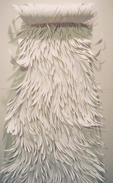
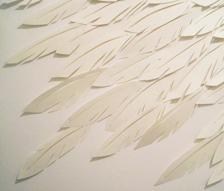
Sharon Arnold is an american artist famous for her paper cut installations that goes beyond the canvas and looks awe-inspiring. Below are pictures from her series called “Nixe, Chimaera, Muff”. That is inspired by Folklore and Mythology.
nixe, chimaera, muff by Sharon Arnoldnixe, chimaera, muff by Sharon Arnold
Her use of the common medium of paper to recreate the texture, and different features of characters from ancient stories such as fur, hair, feathers seem to juxtapose the idea of what’s familiar and known to us (paper) in contrast to a creature that exists only in Man’s imagination.
I really like how Sharon is able to use the medium so skillfully and tactfully to effectively communicate the intent of her art piece.
Geometric Patterns
A series of geometric designs from various artists. I like how the use of lines is able to create optical illusions and a stability with movement.
Marc Nagtzaam, 2014Tilman Zitzmann, 2015Tilman Zitzmann, 2015
Research: Conclusion
I think at the end of doing research, I find that it helps to build a better context of what I am actually creating, so that every experimentation is done intentionally and objectively rather than for no rhyme or reason 🙂 so YASSS!!
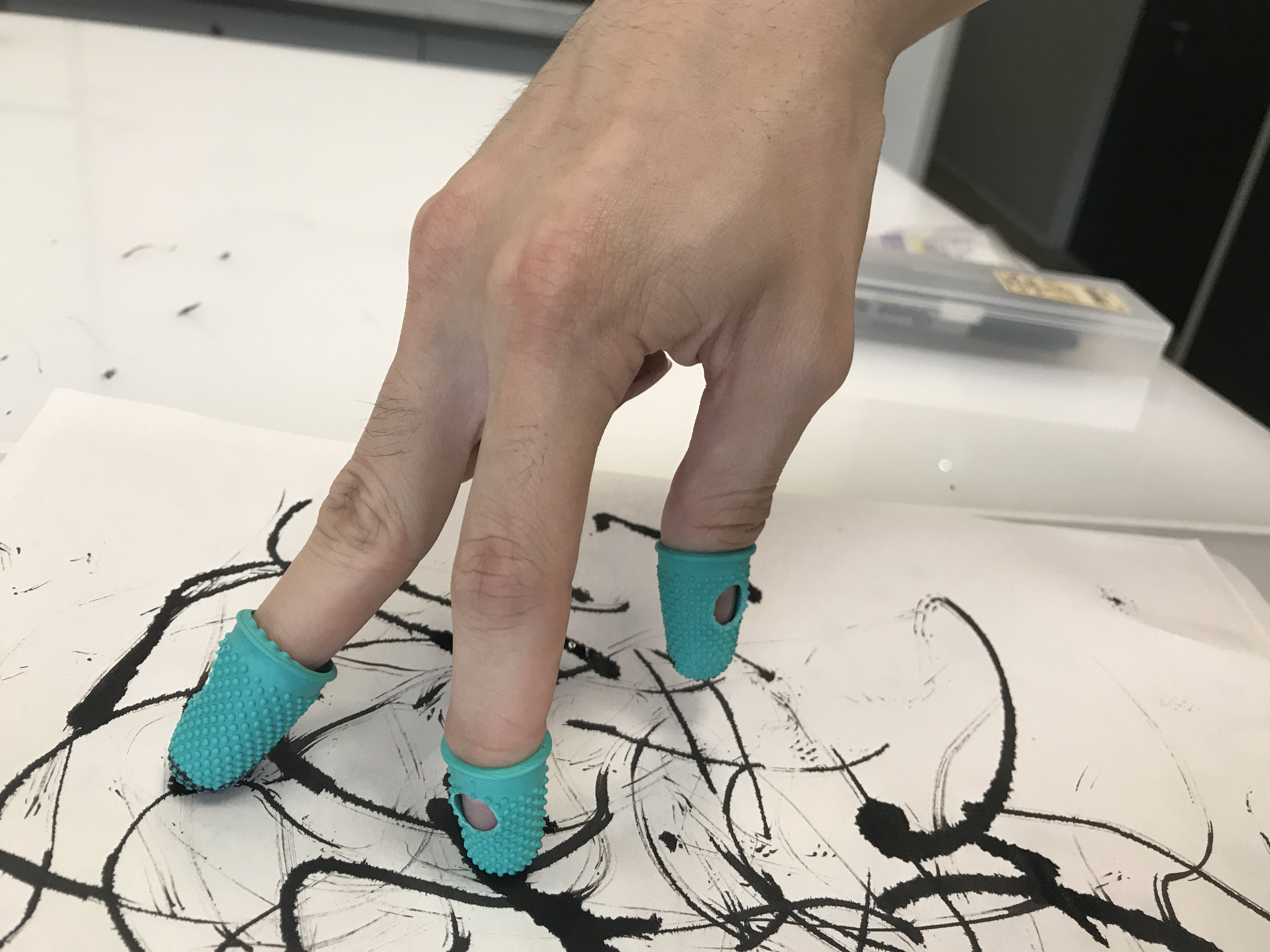
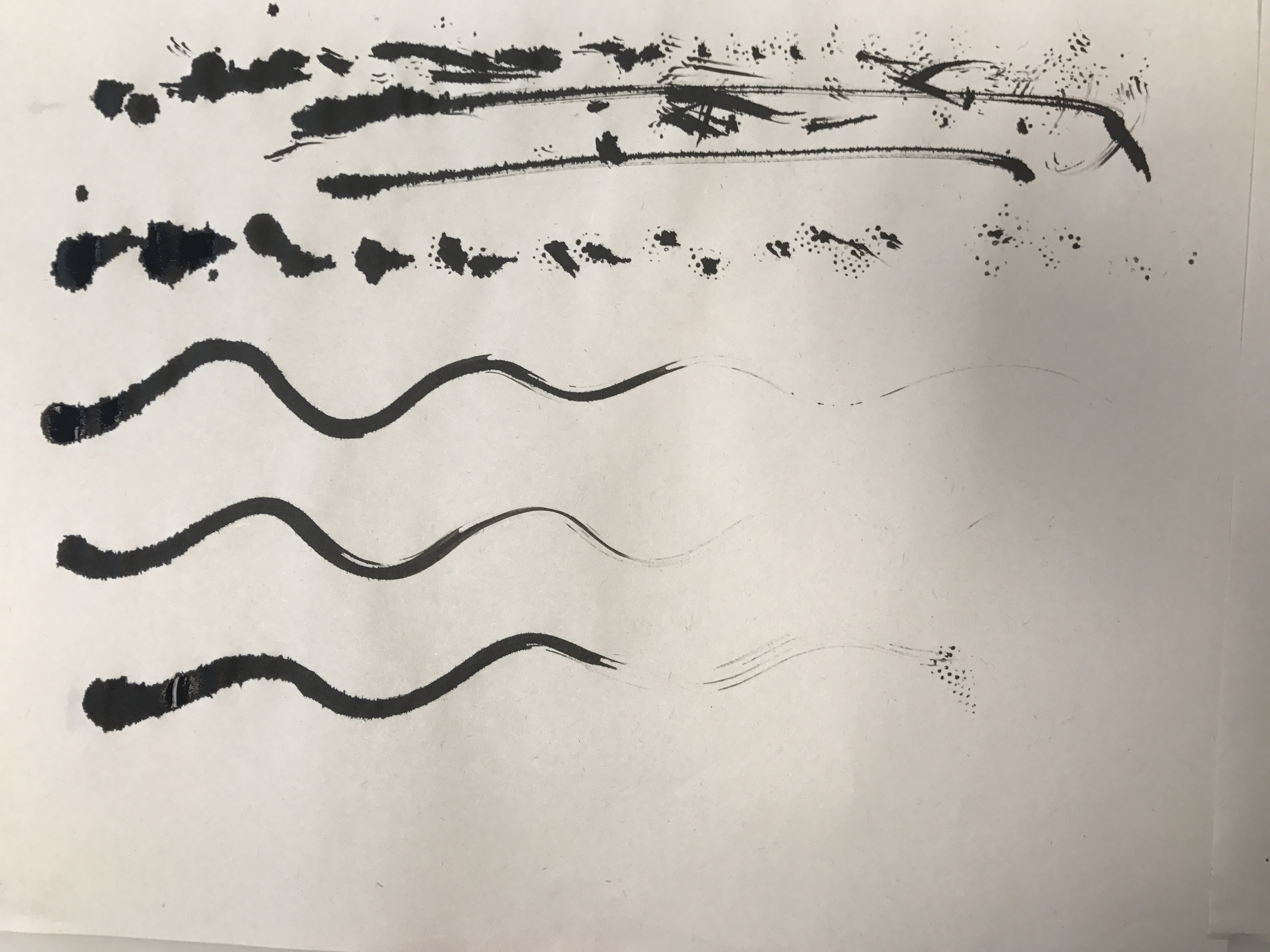
Process: A Bumpy Start
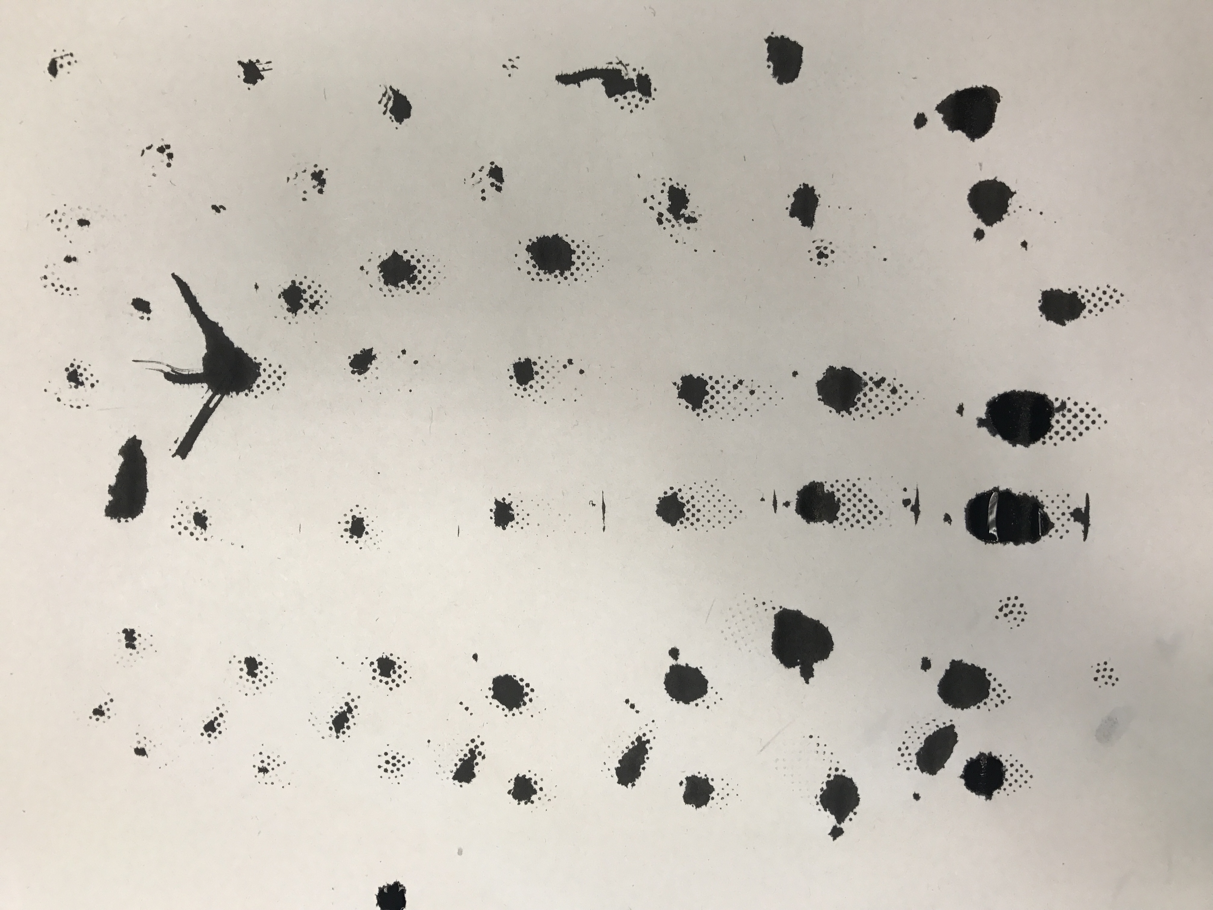
This was actually how I started with this assignment, using weird tools to do mark making. The end result was interesting but yet I wasn’t able to properly incorporate it into my final work as it was done without direction so it kinda went all over the place.
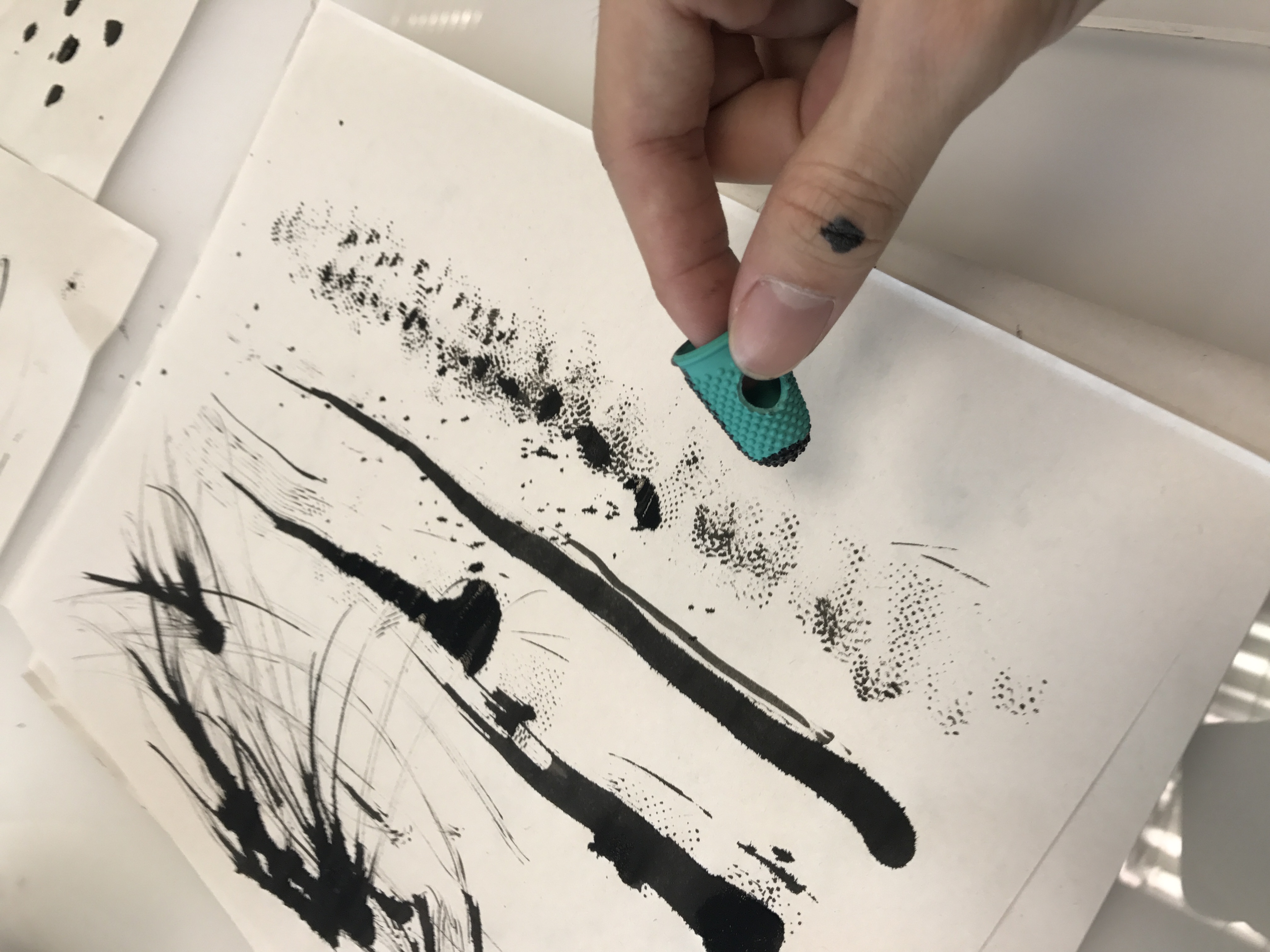
The first was using rubber finger stalls and ink to make marks. The idea was to replace our human fingers in the way we touch and feel, and in a sense challenge how like our fingerprints are all unique and different, would the mark we make still be unique if we use a similar tools? I wanted to expand the idea further and explore using different types gloves to do mark making, but thank God I didn’t. (this when I went back to do research and realised I was on the wrong track)
LESSON LEARNT: DO YOUR RESEARCH.
Regardless, I thought I’ll just include the photos below:
The idea is to use different types of markings with the finger stalls ranging from Dots, strokes or even using it as a brush as shown below.
And here are the final results
Process: A New Start
So BACK afresh from research and starting over, I started unpacking the different emotions and combining them with different mediums to see how i can communicate the emotions visually. This was when I had also shortlisted my initial 8 emotions to 6 which are as follows:
Lust : strong sexual desire ; speaks of strong passion >> MYSTERY?
Hope : A feeling of expectation & desire for something to happen. >> IN THE MIDST OF DRKNESS?
Amazement : great surprise or wonder >> INSPIRATIONAL, WONDER, AWE STRUCK?
Frustration : upset or annoyed as a result of being unable to achieve something ; prevention of progress, success or fulfillment of something. >> A ROUGH PATCH
Hurt : cause pain, suffer pain, cause distress to. >> WEAKNESS, FRAGILTY
Anxiety : Worry, nervousness or uneasy about something with an uncertain outcome. >> THE UNKNOWN
In the midst of going back and forth between the process and research, I was able to brainstorm many ideas and then decide which to pursue and develop further. Below is another except from my notebook:
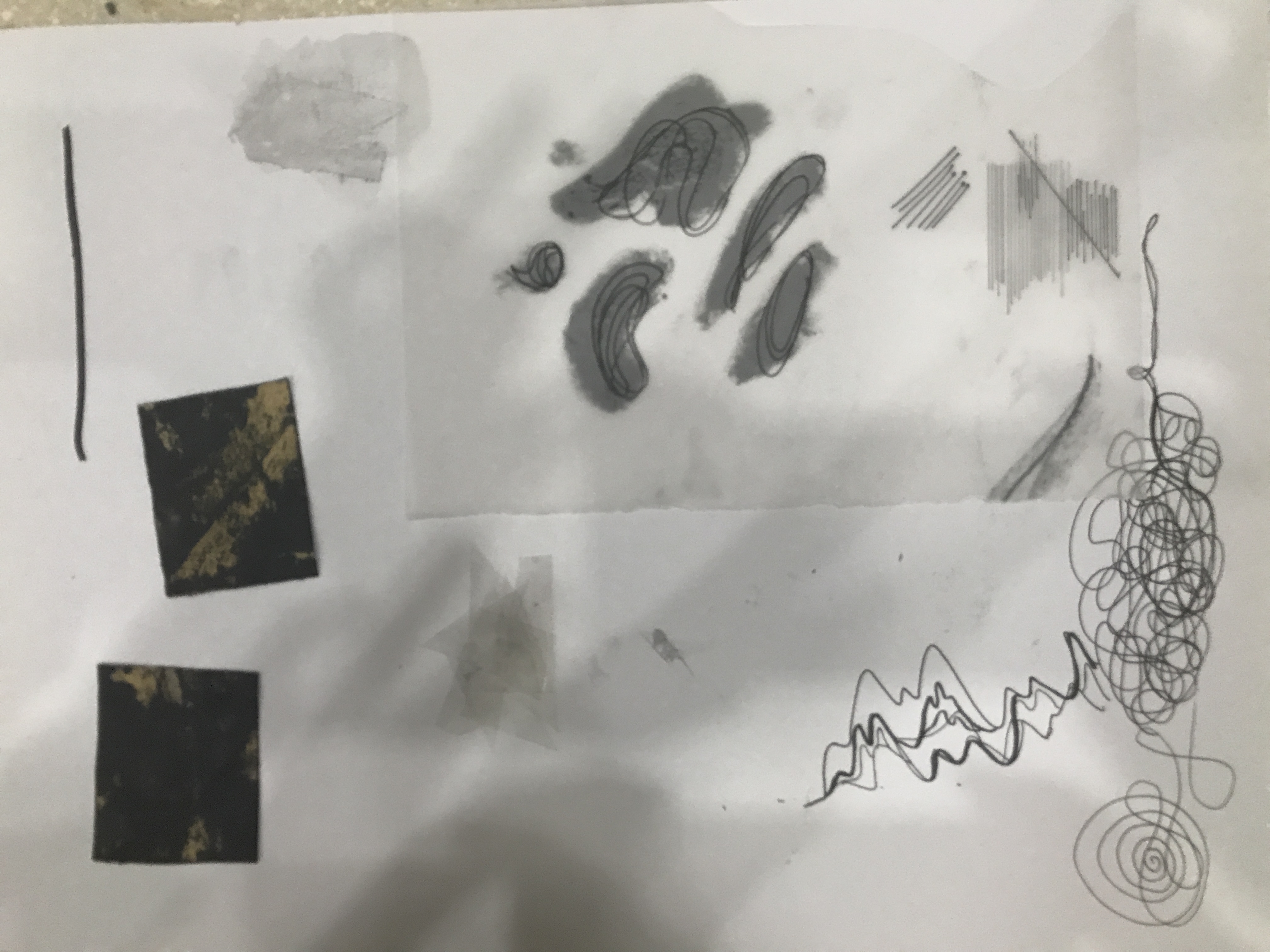
After narrowing the ideas that I wanted to pursue, it was time for experimenting and executing. Attached are some photos from the process of experimentation.
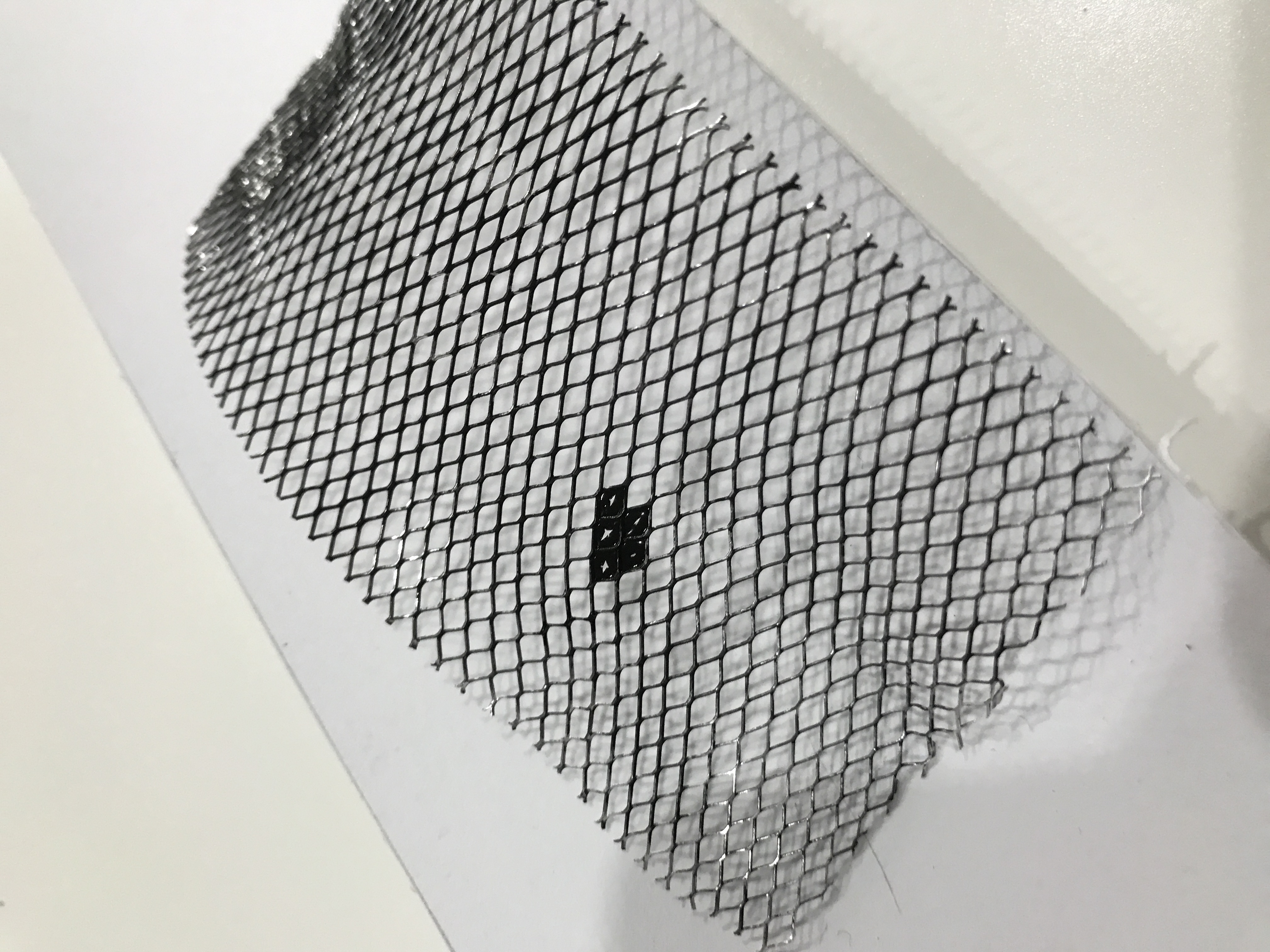
Mix of materials including toothpicks and calligraphy pensHOPE -Wire mesh to represent a cage that trap. Black dot in the shape of a heart symbolises a route of escape with love.A mix of mediums experimented including Transparency, Tracing paper, Sandpaper and acrylic paintHURT- Tooth picks as a form of representation of hurtful words flyingUsing a wedding corsage to make strokes, creating that dry brush effect
The next process was putting some of the ideas into prototype to see how they’ll look in the final piece.
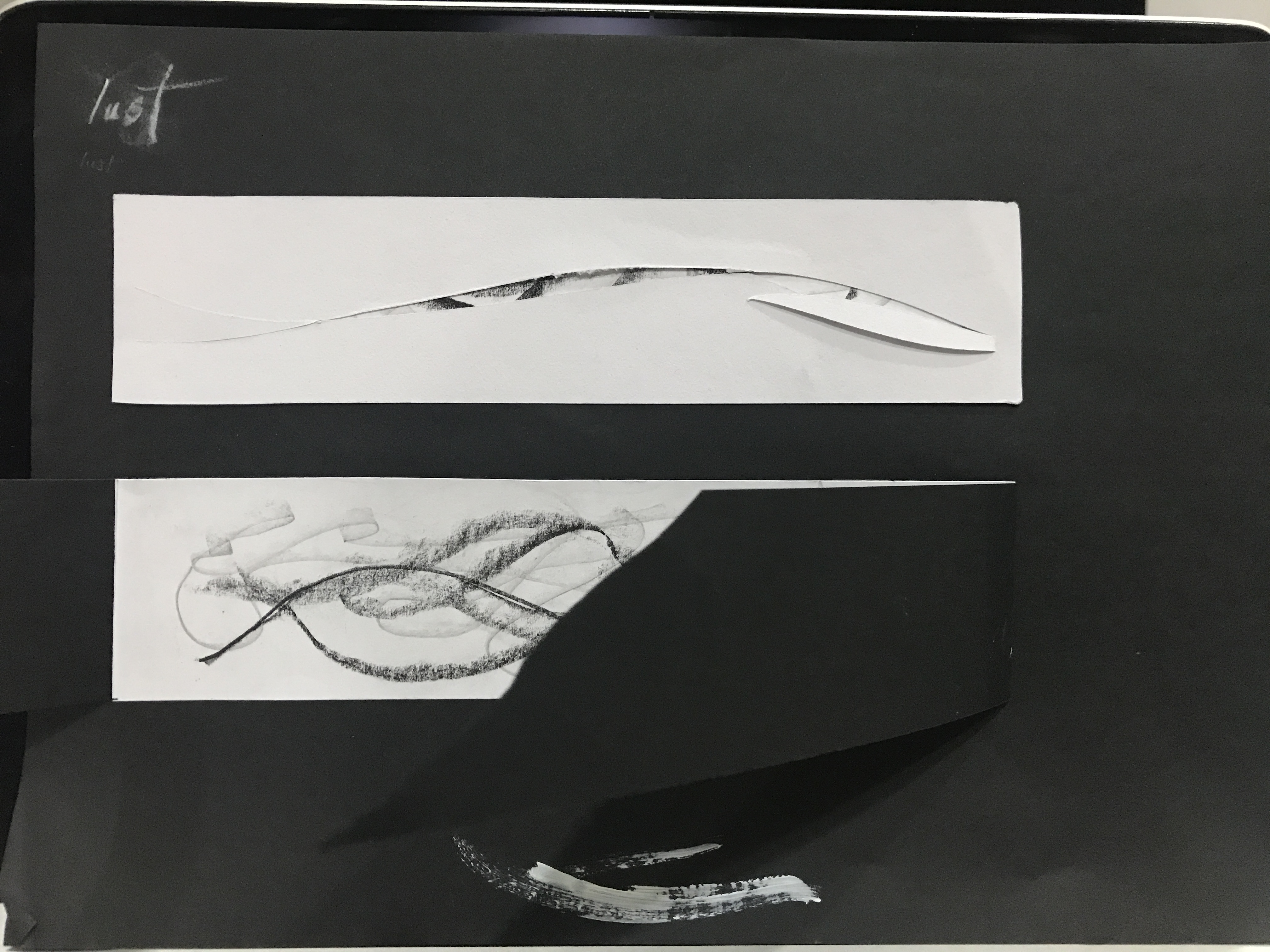
Exploration into the idea of Mystery in Lust- The above idea suggests slits to be made, revealing a hidden layer beneath made up of varying line weight of pencil, charcoal and china markers in a wave like motion.
The bottom idea suggests a form of reveal where it invites the viewer to physically ‘remove’ the outer layer of the art piece to reveal what is hidden beneath, to demonstrate the idea of “undressing”, that speaks of lust of the eyes. The former idea is modified and included into the final piece.
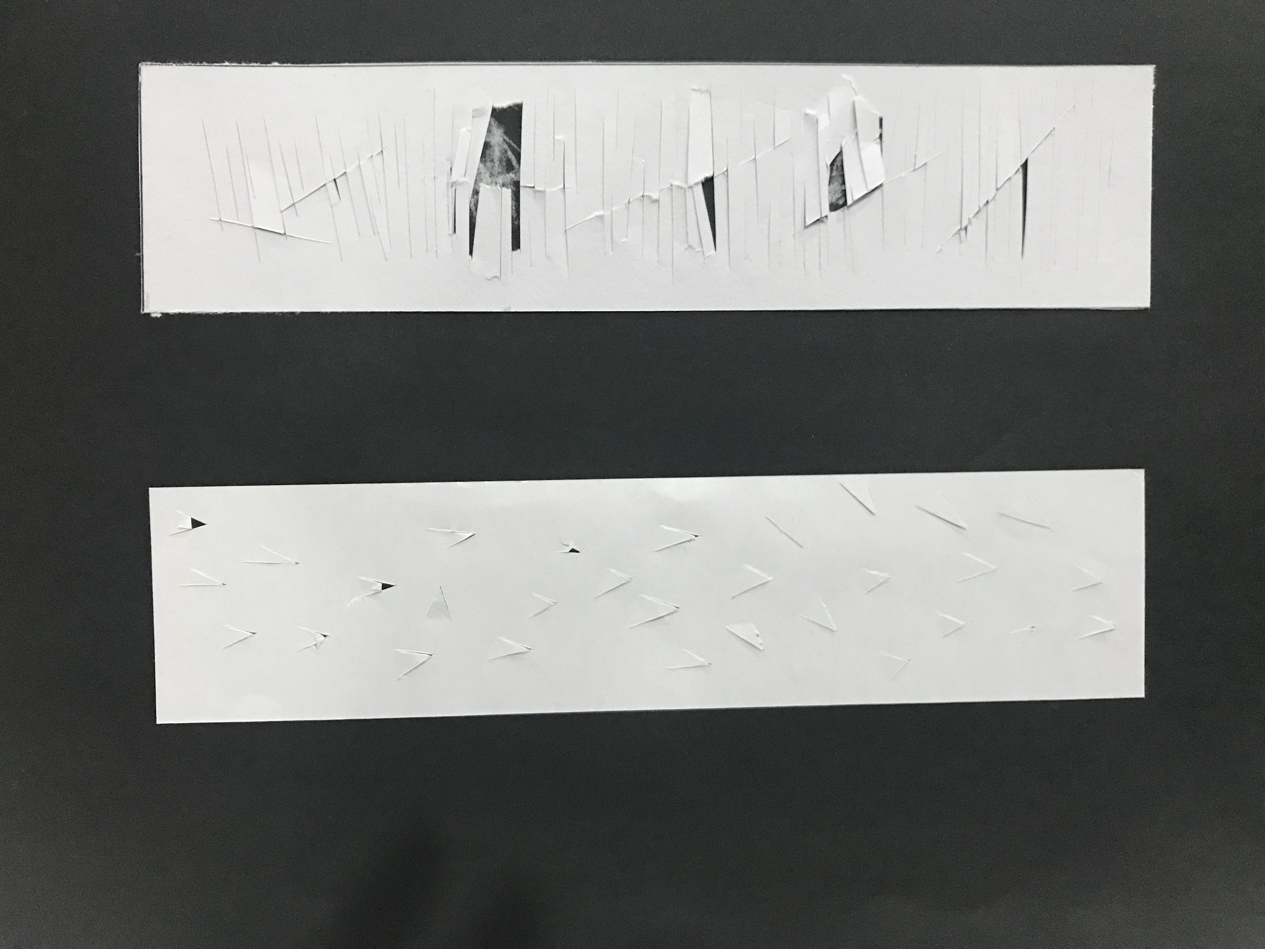
For Hurt, the above idea seeks to illustrate the idea of pain beneath. As seen from the vertical cuts coinciding with the sharp diagonal cuts to reveal a hidden layer beneath.
The second idea explores the idea of the saying “Hurt people hurt people” with cuts forming sharp thorns capable of causing paper cuts. Both ideas were eventually scrapped as it is too similar to the idea from Lust.
Through unpacking the definition of Frustration, I wanted to explore the idea of annoyance at one self and as a result being stuck at a rough patch. The above idea uses sandpaper with ink to create short quick strokes on the paper to show the exasperation one feels. The coarse sand texture from the sand paper also gets transferred onto the paper, creating the literal illustration of a ‘rough patch’.
The second idea uses craft tape that is intentionally creased and paste onto the paper to create sharp lines that are jarring. The use of medium also reminds that sense of frustration when one uses tape and it creases. The piece was then painted black.
The two ideas were combined for the final art piece after consideration.
Process: Coming to the end
A quote from Picasso, “it took me 30 years to do that masterpiece in 30 seconds.” Nobody creates great work in an instant. I think sometimes we are such an instant generation and we expect things to come up fast but thats not the case for creativity. It takes time to develop and grow. Its not so much of the end result of having the best art piece but being patient with ourselves during the process to learn, develop. Just a quick reflection before revealing my final pieces.
Final: My Line is Emo
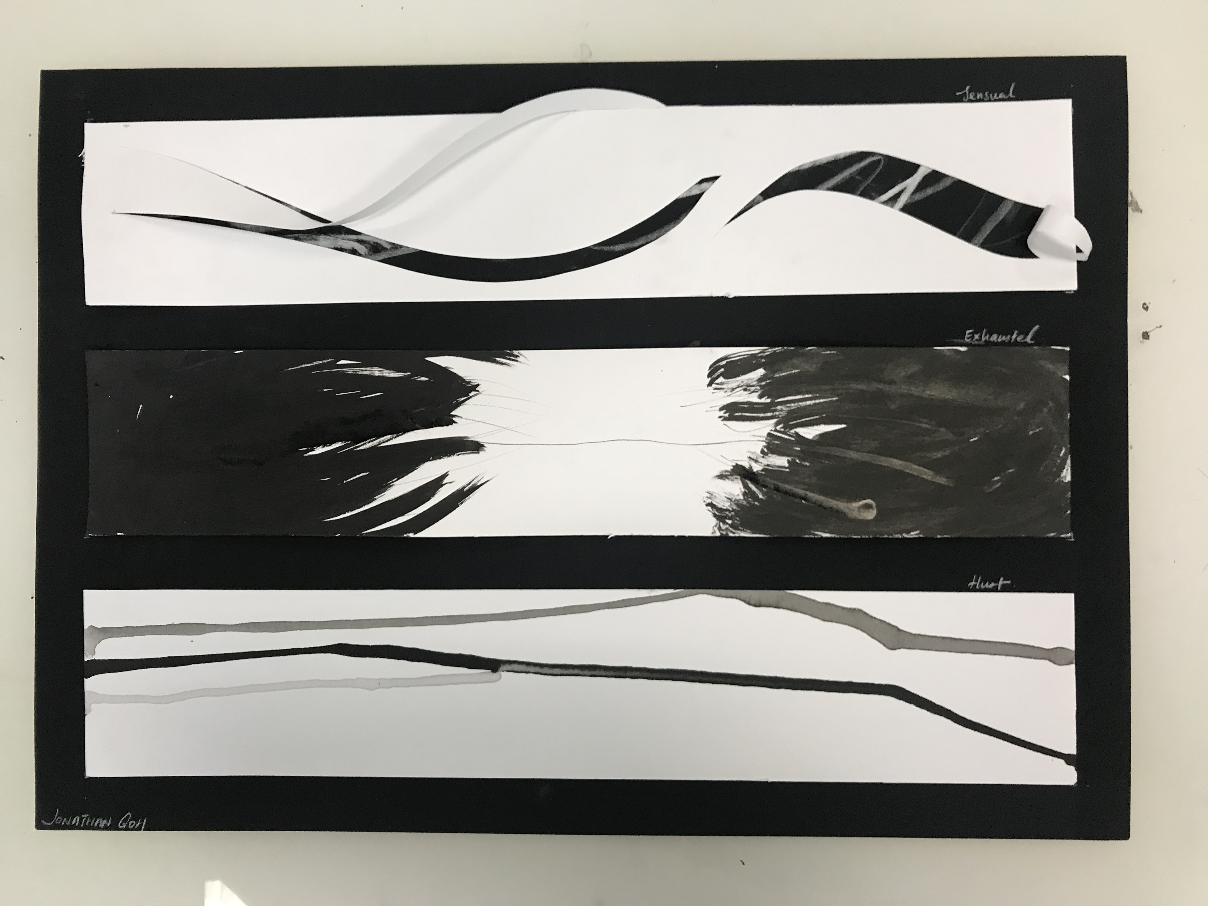
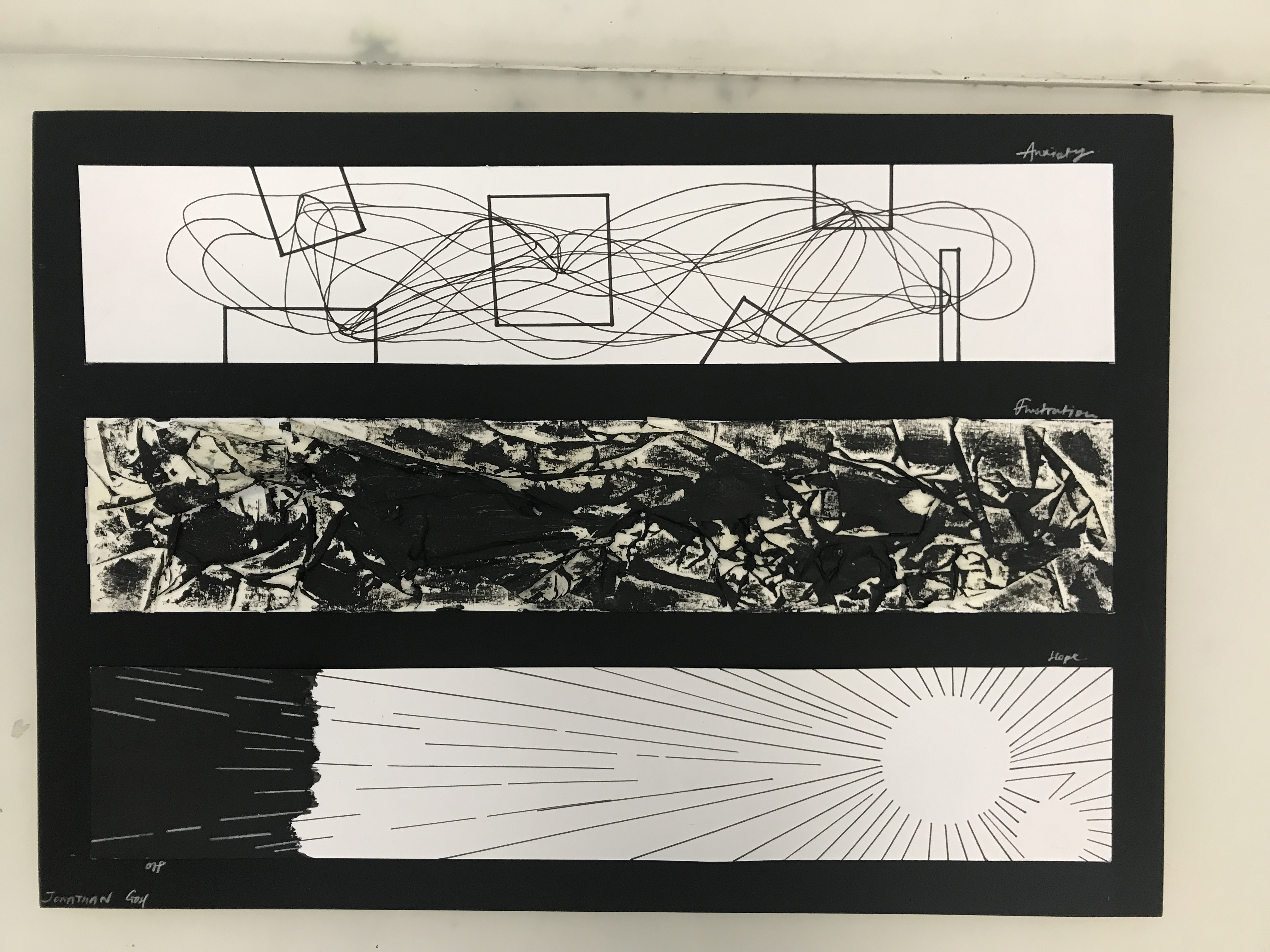
The final six emotions I decided to explore are: Lust, Exhaustion, Hurt, Anxiety, Frustration and Hope
From Top: Lust, Exhaustion, HurtFrom Top: Anxiety, Frustration, Hope
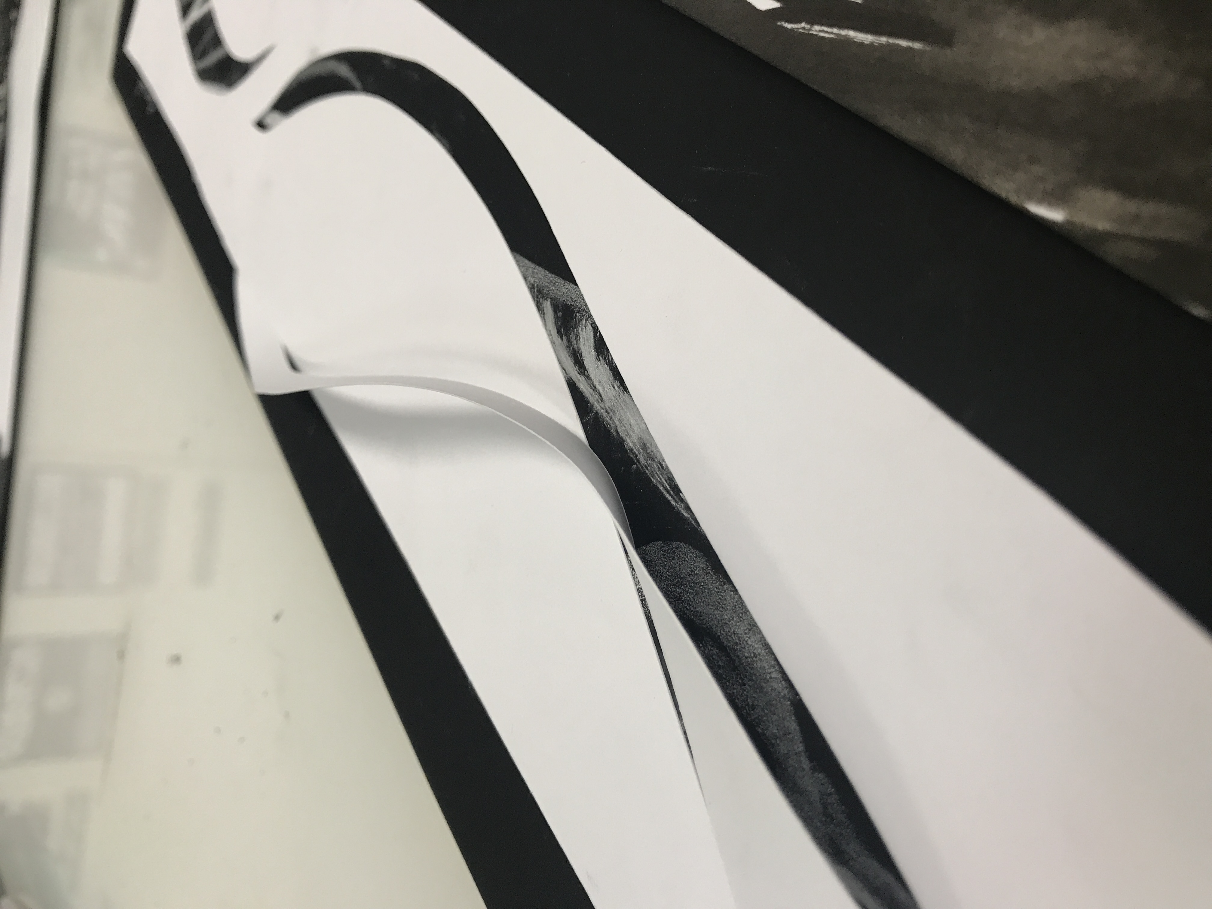
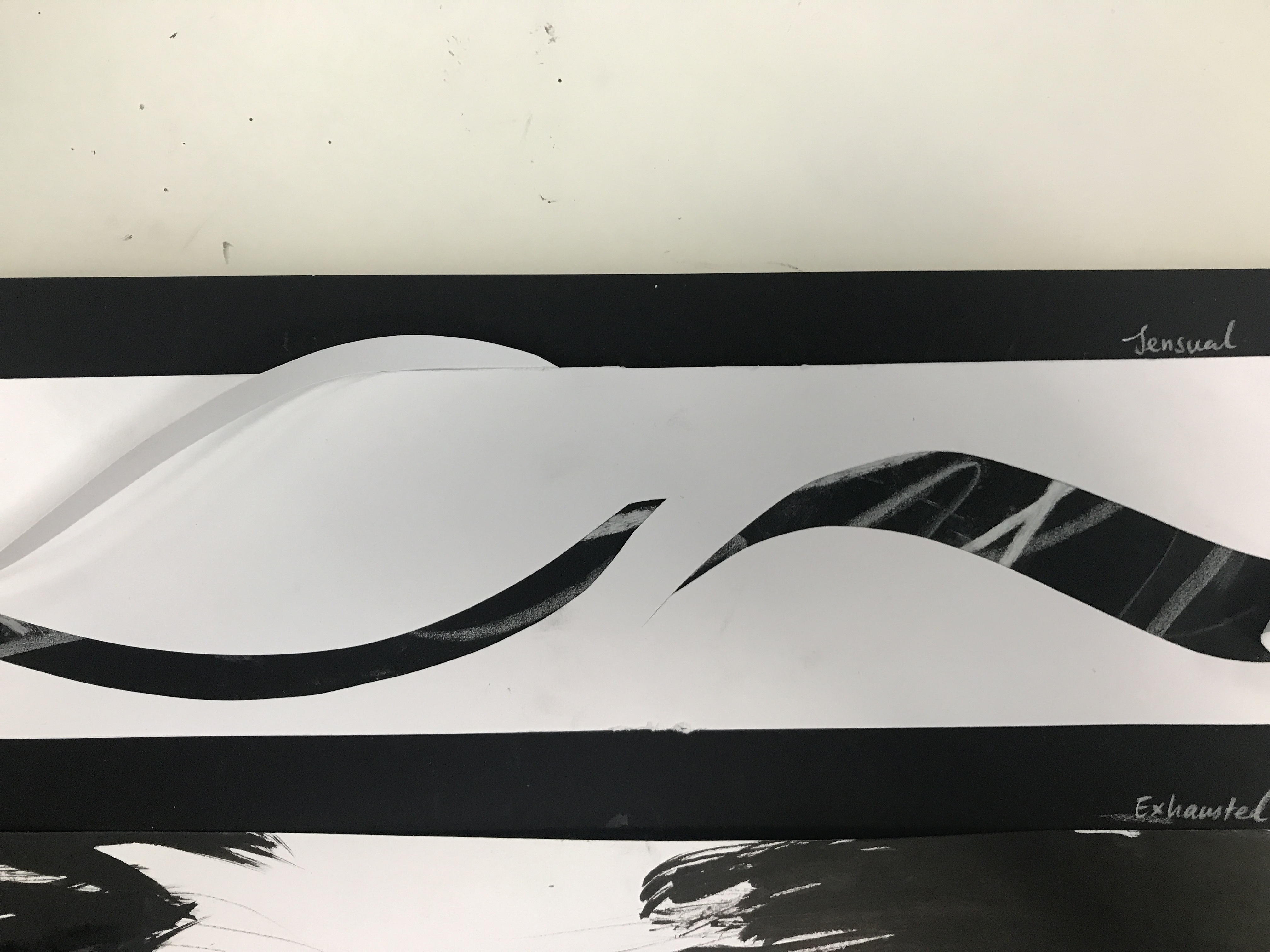
Lust : strong sexual desire ; speaks of strong passion.
Using paper folds to create a curvatureSlits on the main piece reveal a hidden layer made of a series of wavy lines
As mentioned previously, this piece aims to show the idea of mystery within passion. Using strong curve cuts to form slits on the front layer, this reveal a hidden layer that can only be seen from the small slits made. To further accentuate the curves on the front layer, paper folds from the slits made were made to form a 3D curvature that pops up.
The hidden layer is made up of White Colour pencils, and chalk to form a series of wavy lines of varying thickness and weight, to illustrate the fluctuation of our desires- strong and passionate for a moment, indifferent the very next.
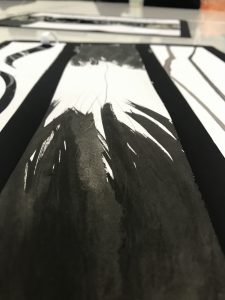
Exhausted : very tired, completely used up (resources)
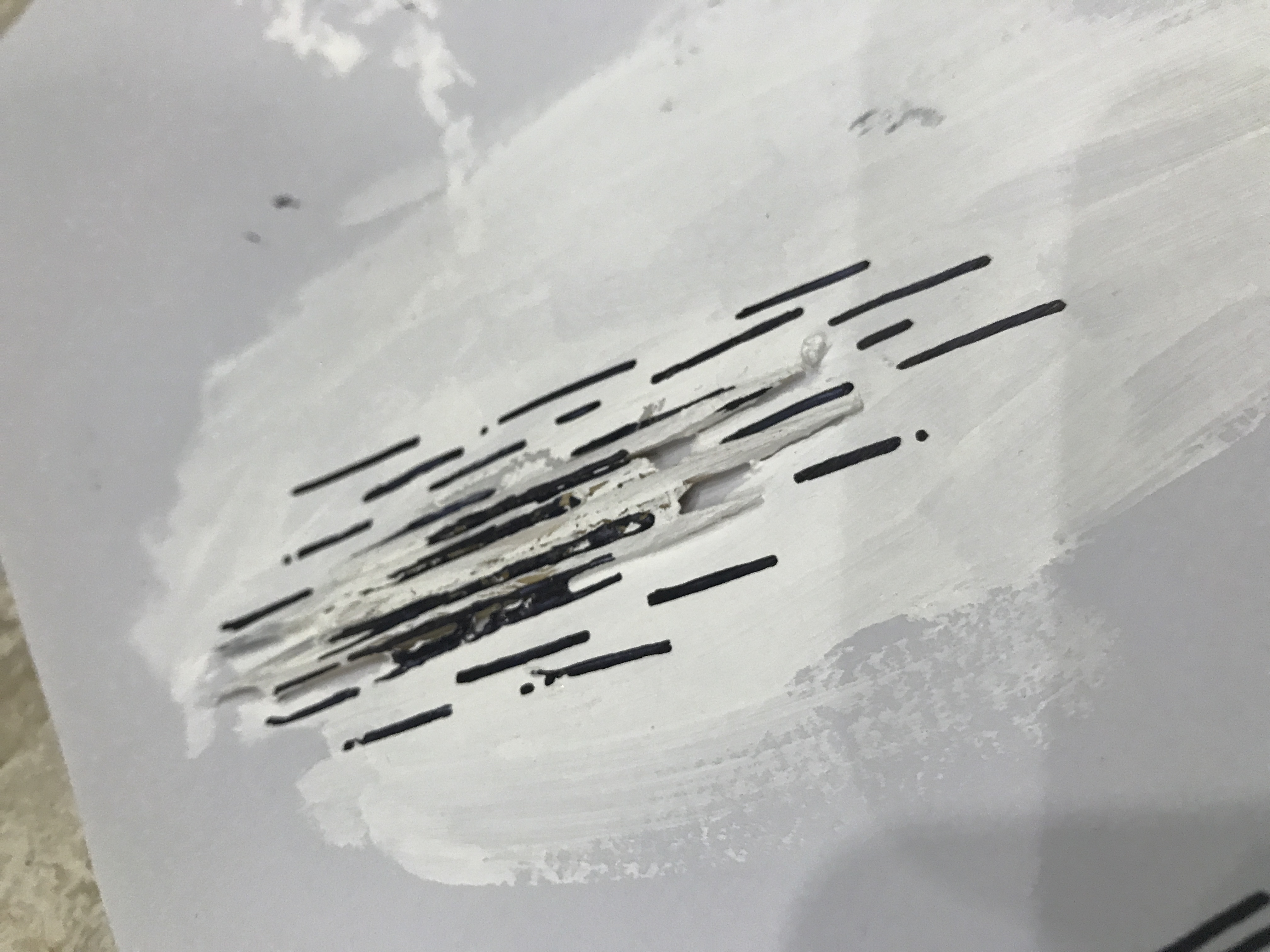
Created with brush and ink with the use of a tooth pick and a wedding corsage. The idea behind this piece is to symbolise the abrupt depletion of energy as a result of being stretched as shown from how the thick brush strokes quickly transit into a thin, wavering line on both sides. The thin, dry brush ends of the strokes resemble hands that are stretching out, reaching for the thin line, pulling on it, illustrating the definition of being “stretched thin”.
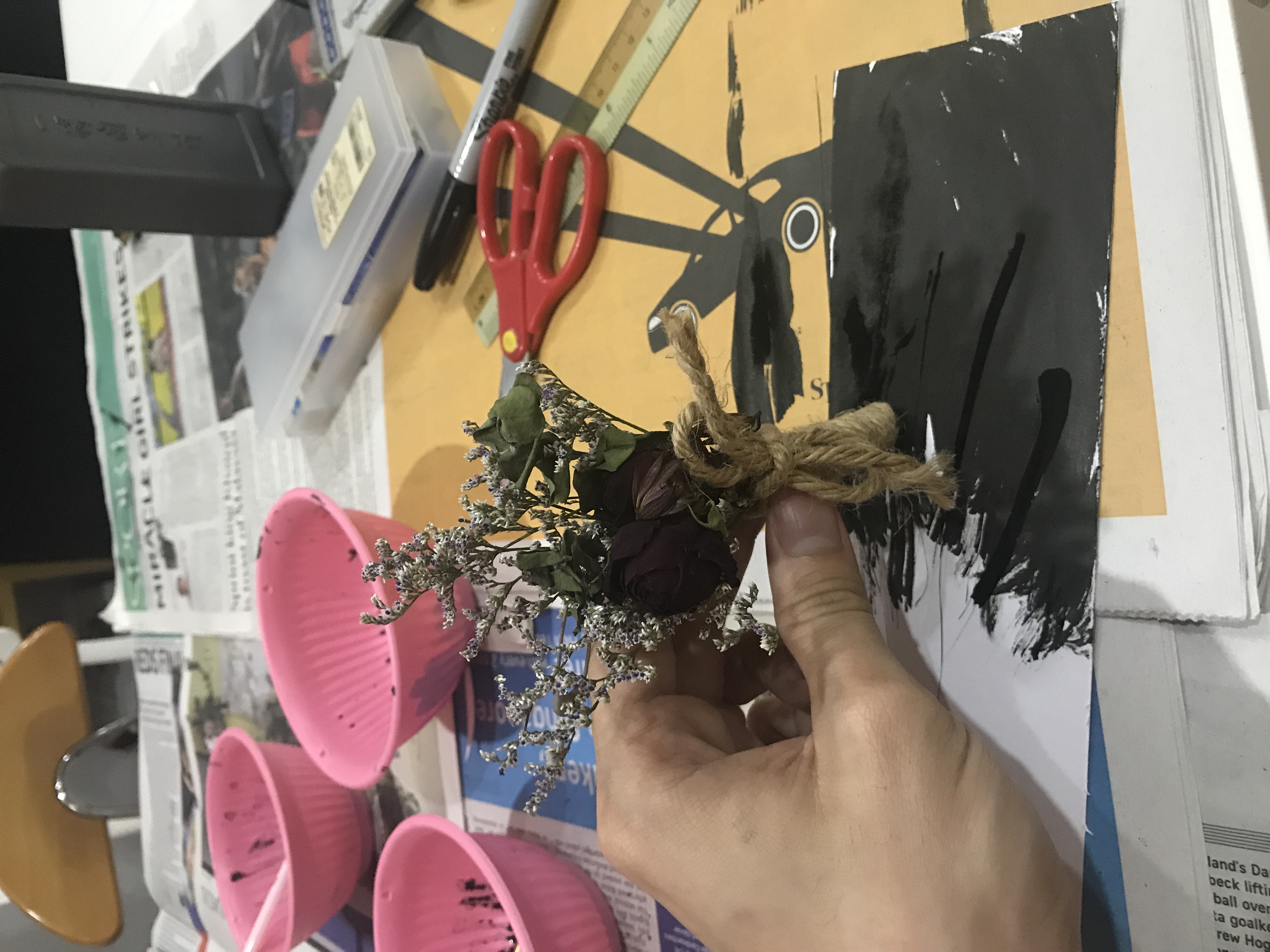
The reason why I decided to incorporate the use of a wedding corsage was as during the preparation for my Brother’s wedding, I was heavily involved and in the aftermath I felt extremely exhausted. The corsage brings to reminder the weariness and I wanted to include it as a mark making tool within the piece as a form of reminder of the same emotions I had felt.
A series of brush strokes that transit abruptly into a single thin line.The thin, ends of the brush strokes resemble hands that are stretching out, pulling on the weak line
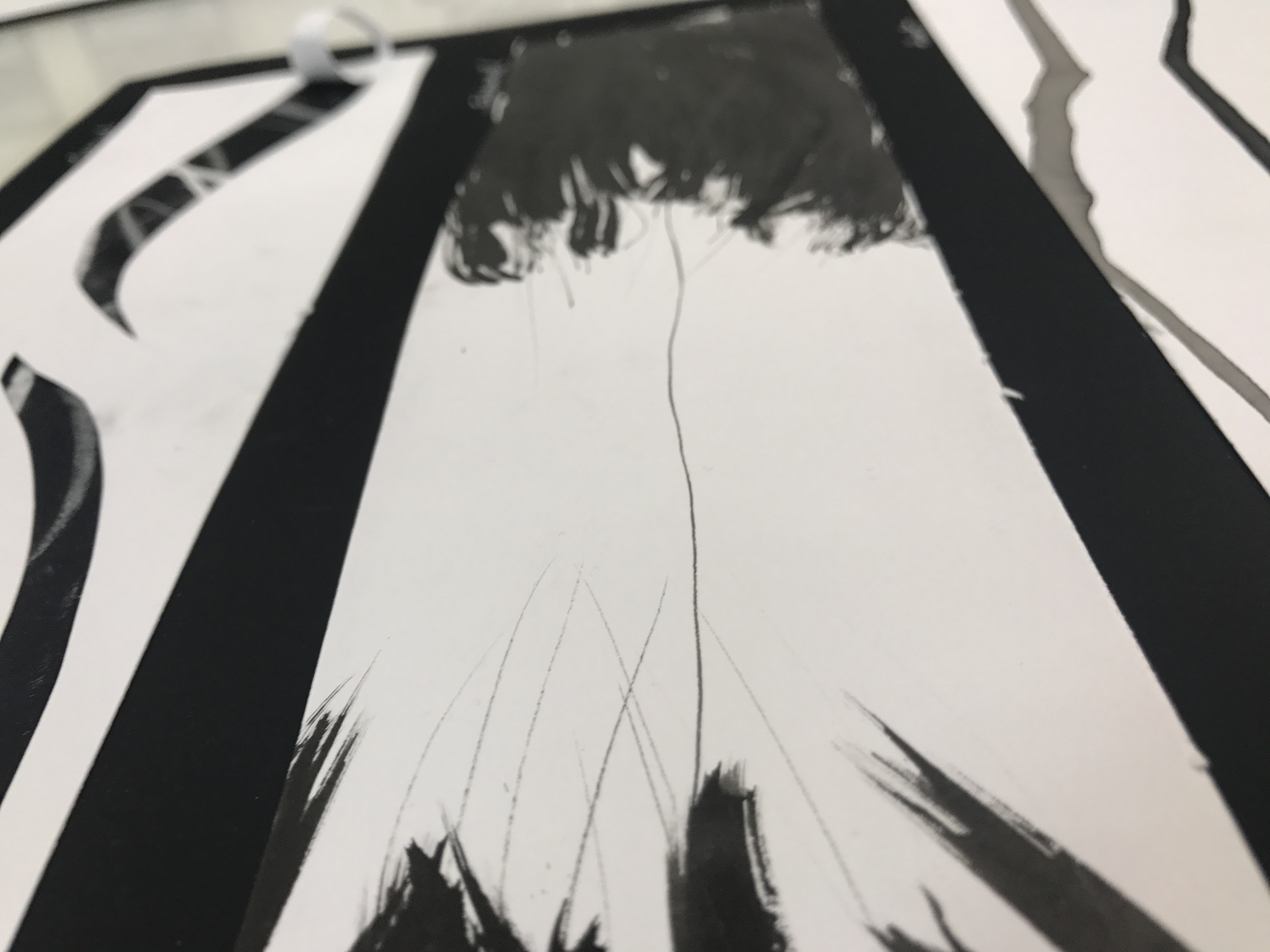
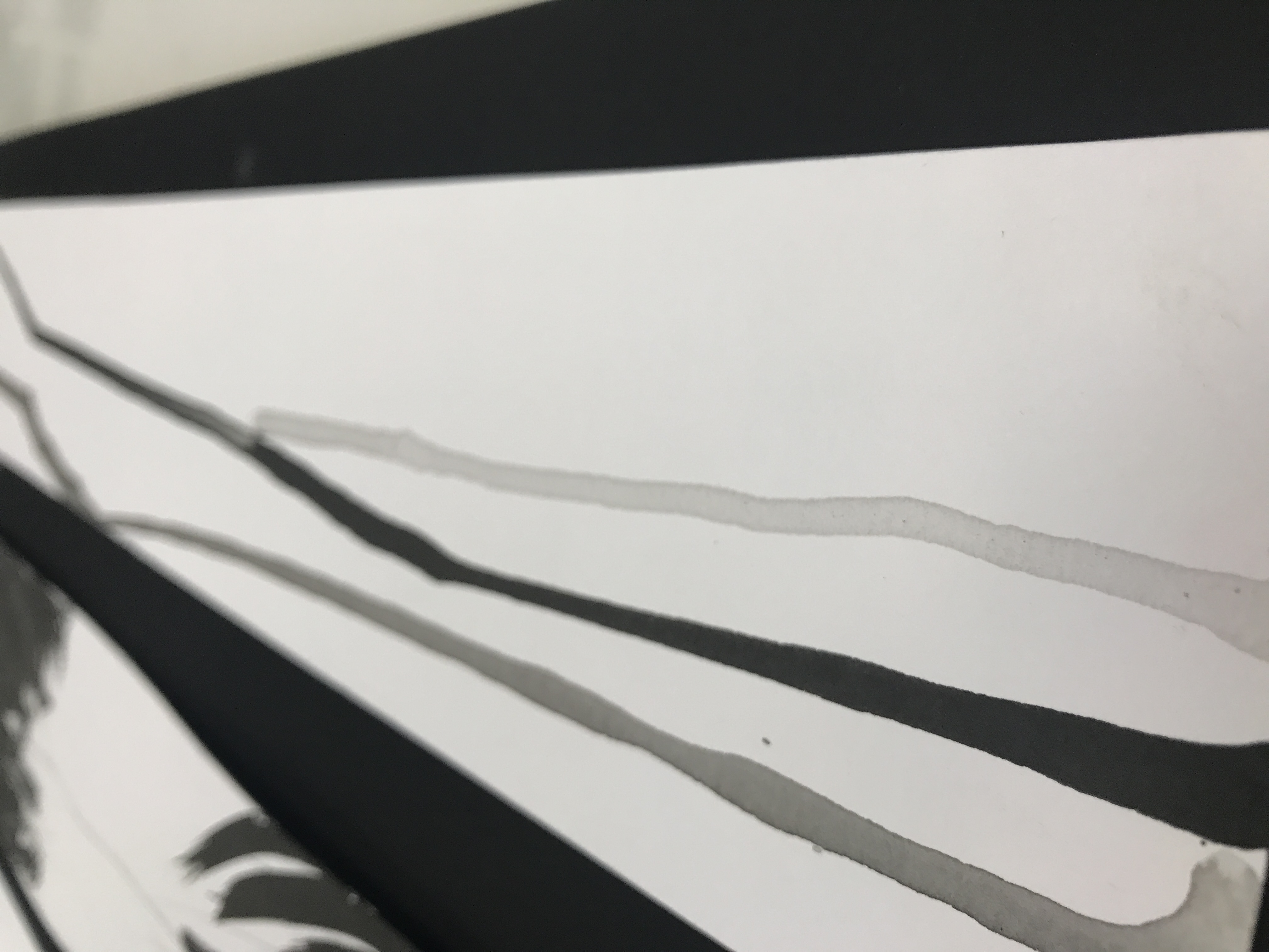
Hurt : cause pain, suffer pain, cause distress to.
The varying ink tone of each line likens to shows the degree and intensity of hurt.
For this piece, I decided to use tears to explore the idea of fragility as a facet of hurt as it is often viewed as a manifestation of hurt and pain.
The final work was created by dripping three drops of a mix of ink and water (varying in concentration) from one end of the paper and allowing it to flow from one end to the other to symbolise tear drops rolling down. The result is three lines , varying in colour tone that spans across the paper. The unevenness of the line weight and direction of the ink illustrates a sense of frailty in the line. Akin to the weakness we feel on the inside when we are hurt.
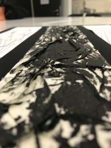
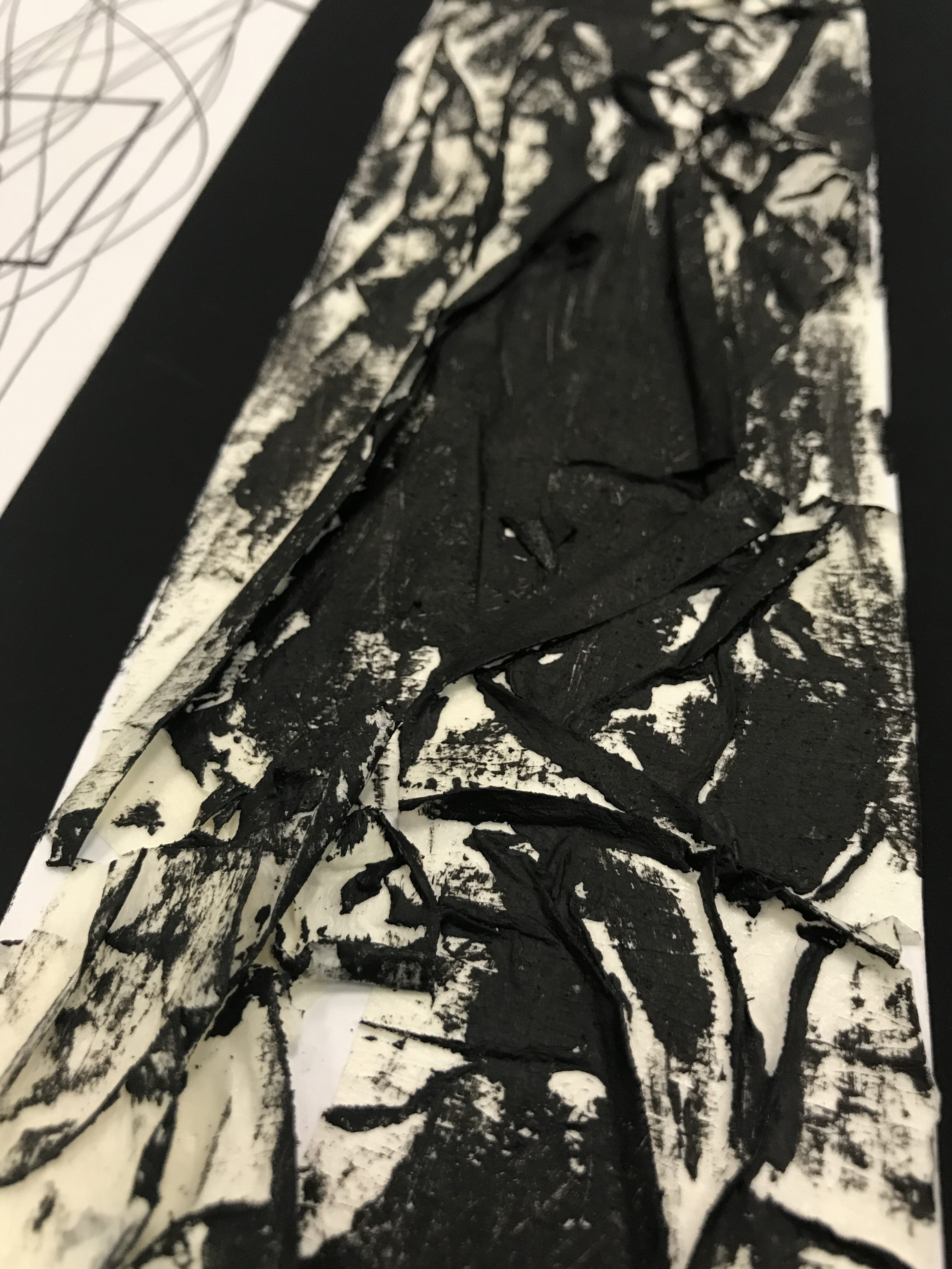
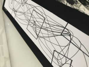
Anxiety : Worry, nervousness or uneasy about something with an uncertain outcome.
This work serves as a pictorial representation of the inner workings of the mind through understanding my interpretation of anxiety to me.
When I feel anxiety, it’s often an amalgamation of thoughts that seem to be grounded in reason. Yet at the end of the day, it becomes overly exaggerated and are simply thoughts that keep going round and round reaching no conclusion.
The lines in the work represent our thoughts. Long continuous lines serves to represent our mind that is always at work, always filled up with worries of some sort. To illustrate the frontal lobe of the brain (that controls reasoning), geometric shapes were used due to its even-length sides and rigid shape.
The end product is a series of lines to go back and forth in a series of cycles between the geometric shapes to create a type of ‘mess’, much like how when we are worried and nervous, our thoughts go all over the place. These worries and fears are very much grounded with reason, yet they seem to achieve nothing at the end of the day but cause more worry, as seen from how the lines are continuous cycles between the shapes that has no distinct start or end. That seems to suggest a never ending cycle of worry and more worry.
Frustration : upset or annoyed as a result of being unable to achieve something ; prevention of progress, success or fulfillment of something.
The coarse sand grains transferred onto the masking tape surface, creating the literal illustration of a ‘rough patch’.
As explained earlier, Frustration explores the thought of annoyance at one self and as a result, being stuck in a rough patch. The final piece is created using masking tape pasted with creases on paper, then using sandpaper with ink to create strokes on the masking tape surface.
Through the combination of these two processes, it is found that that black paint strokes made by the sandpaper accentuates the sharp lines formed by the creases creating a strong contrast of the jarring lines. The coarse sand texture from the sand paper also gets transferred onto the surface.
The end result of merging two ideas created a layered texture piece that is an interpretation of the rough patches in frustration that engages viewers not just visually but also through sense of touch.
The strokes of black paint creates areas of high contrast accentuating the crease lines formed by the masking tape
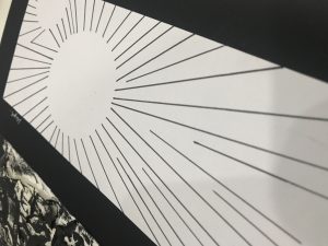
Hope : A feeling of expectation & desire for something to happen.
Hope speaks of positivity and carries an inclination towards something good. As such, I wanted this piece to reflect a fairly light mood. The idea behind this piece is the intangible yet powerful strength of Hope. In the light of tragedy when darkness seems to overwhelm, it is only with Hope that embodies that strength to pushes back against dark times.
Long thin lines radiating out all around forming the silhouette of a circle.The contrast at the side of the page shows the perennial struggle between light and darkness.
Lines radiating all around creates a silhouette of a circle. The use of these geometric patterns symbolise the stability and secureness we find in hope. While the silhouette illustrates the intangible nature of Hope. The strong lines that radiate out coincides with the back patch at the end of the paper, gradually overpowering it.
Final: My Line was Emo
Some final thoughts, while the assignment may have felt long arduous, it was really just a journey of stretching and getting uncomfortable to train our senses to be more acute and in tune with our emotions. For me, the process of unpacking the definition of an emotion thereby establishing a personal connection or revelation with it has been one of the most memorable moment of the assignment.
Lastly, Thank you for reading and being part of my research, process and final piece 🙂


 This work serves as a pictorial representation of the inner workings of the mind through understanding my interpretation of anxiety to me.