Read Part 1 here.
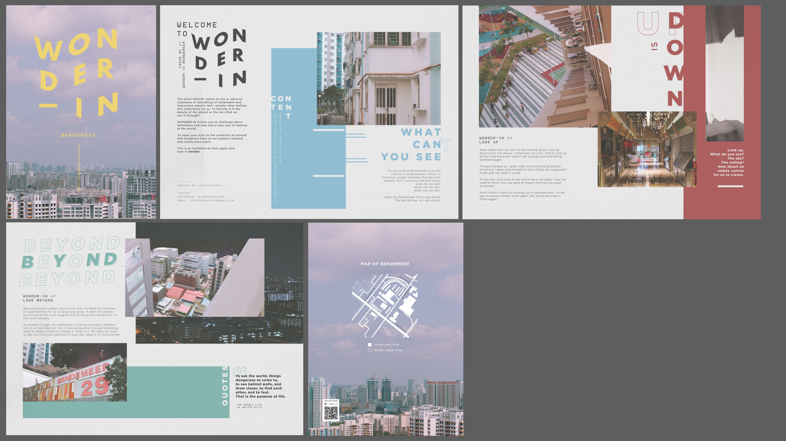
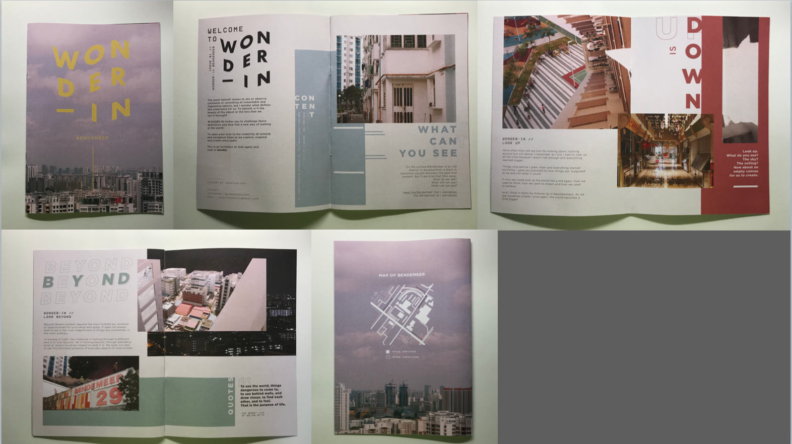
In case you missed it, here is the finalised layout for the zine!
CONTENT.
“…my aim and objective for the zine is to introduce thought-provoking ideas and combine them with interesting visuals to capture readers’ attention.”
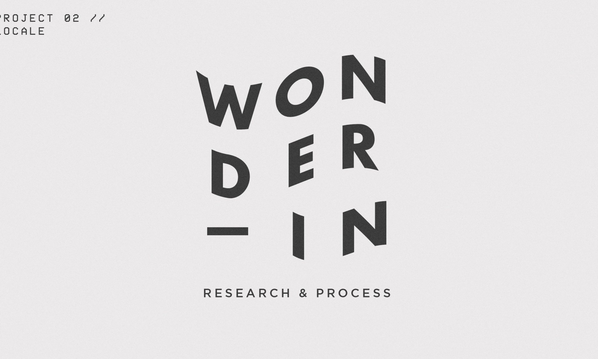
For the content, the idea was to challenge our perspectives as we go through our everyday. I titled the zine “Wonder-in” as a wordplay between the meanings of “wondering” which carries a certain idea of adventure and curiousity as well as “wonder” which is the feeling of admiration and amazement, towards the area of Bendemeer. Hence the title of the zine become “Wonder-in Bendemeer”. (carrying a dual meaning of both ‘wondering Bendemeer’ and Seeing the ‘wonder in Bendemeer’)
I decided to split the content of the zine to three chapters:
- What Can’t You See
- Up is Down
- Beyond
Each chapter expresses a certain idea of “seeing” in wonder, and is based off a picture. The content ultimately affected the spread. Helping me determine the photo collage used for each spread and the colour palette subsequently.
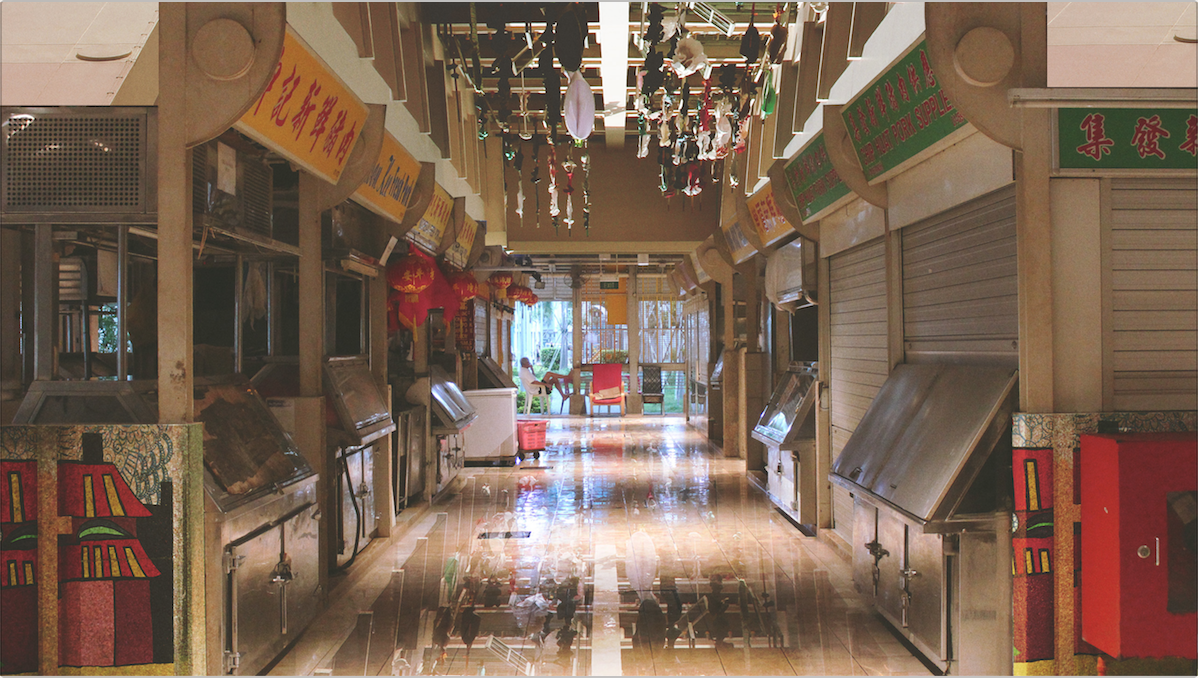
What Can’t You See
Colour choice: BLUE
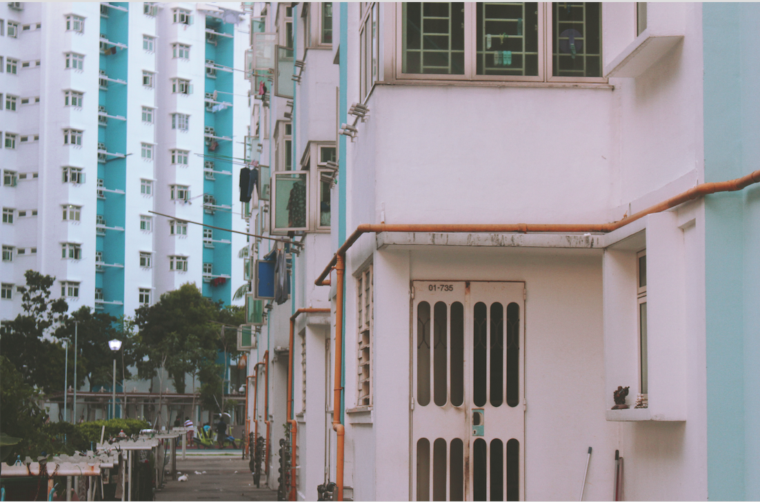
I decided to use a normal photo for the first spread to introduce the first chapter of Wonder then leading into the next. I included a typographic play on the chapter title as well to illustrate the idea between what you can see and what you can’t – the difference ultimately lies within ourselves. The use of a normal photo suggests the idea that this is in fact what we see in plain sight, yet if we would only see again, the endless possibilities that could be…
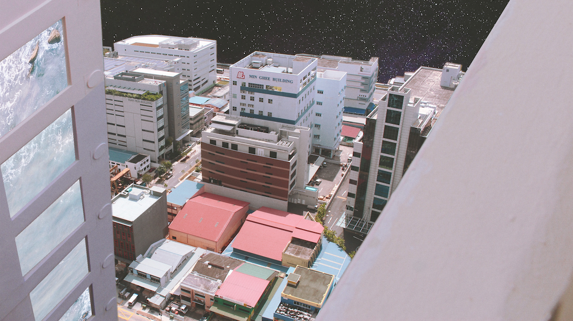
Up is Down

Colour choice: RED
To illustrate the idea of “wonder in looking up”, I used photos that allowed me to play with interesting angles, especially ones that showed either a ceiling or the sky. I replaced the image with something unlikely to highlight the contrast between what is and what isn’t. The use of red as the main colour scheme for this spread was to complement the warm colours present in the photo collages.
Beyond
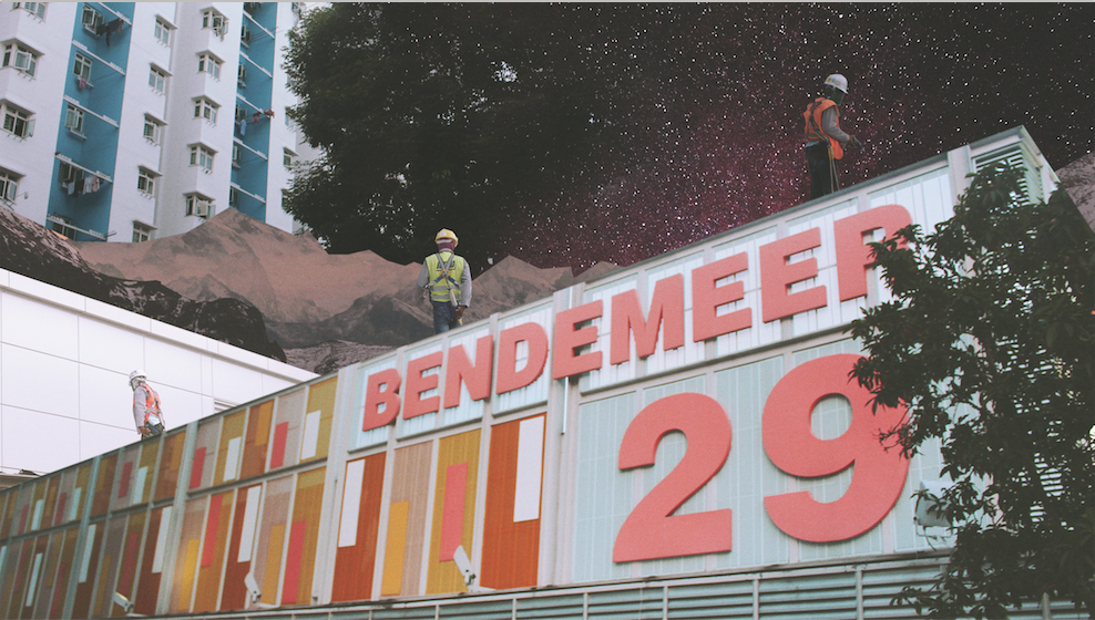
Colour choice: GREEN
As the title suggests, Beyond is all about looking beyond, seeing an object not as what it is but what it could be. For the collages, I decided to go out a little, playing with images of space, mountains and oceans and combining it with the otherwise concrete jungle of Bendemeer. The result is a strong contrast between the sharp edges of the angular buildings together with the ‘softer’ scenery in the background. The idea of the images for this chapter was to create the sense of bewilderment.
PRINT.
B&W: The first print sample was a black and white mock-up. Though the layout was not yet finalised, the purpose of this mockup was to test the alignment and the arrangement of the zine and to fix any print problems we may potentially face.
The print of the B&W sample was done using an A4 paper single sided print. I then glued both sides together. This was to increase the thickness of the paper and also avoid any printing errors as I did not want to waste ink.

As can be seen from the markings made, there were some changes to be made to the layout and design. Following the feedback, I then went on to make more edits and proceeded with print #2.
Colour Print #1: Colour Print 1 was printed after the overall layout was completed. It was done on 160 gsm paper, double-sided matte print. However, the final print colour seemed a little dull and the whiter areas had an overall pinkish tint to it.
Colour Print #2: Colour Print 2 was printed after the overall layout was completed. It was done on 100 gsm paper, double-sided print. The final print colour was stronger and had stronger contrast compared to the fade in Print #1. Hence, I decided to go with Colour Print #2 for the final print! (though the paper is thinner than I expected).
GOING BEYOND.
Once done with the traditional print, I wanted to venture and allow the audience to have more interaction with the zine. Also, with the 8 pages, there was a limitation in what can be shared and what content the video can experience.
After much consideration, I decided to create an Instagram account page for the Zine, and link it via the QR code on the last page.
The reader can then scroll through the Instagram page to see a series of curated photos from the zine as well as other photos. The link in bio links to an Issuu page where the reader can browse a digital copy of the magazine on that platform.
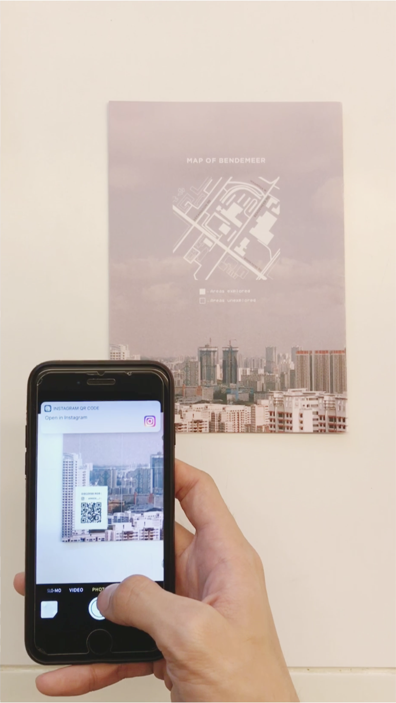
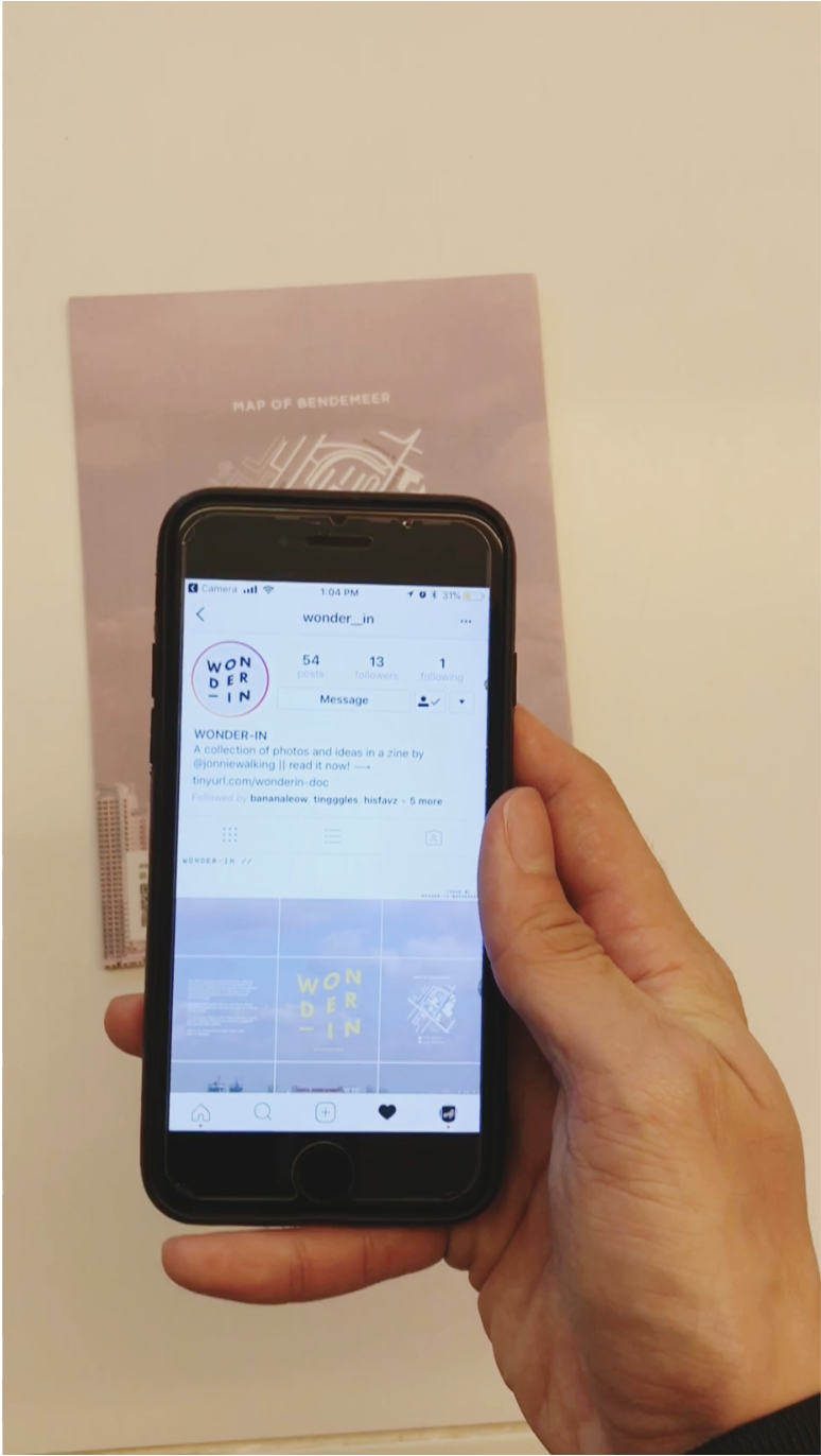
DIRECTIONS FOR QR CODE: For iPhone users, just simply open your camera and point the camera towards the QR code. A banner notification with a link should appear prompting you to go to the link. Just click and voila, you’ve arrived on Wonder-in’s instagram page. Feel free to interact with the story (highlight) and scroll through the feed!

The purpose of the instagram page is an extension of the zine. It serves as a platform to inspire and engage as it encourages others to see the “wonder” in the ordinary. It also allows readers to share photos that inspire them with their friends.
CONCLUSION.
Its a tiring process coming up with a zine concept from scratch. However, through this project, I’ve realised the strengths and limitations of traditional print media. The (expensive) costs of printing, versus other mediums to allow someone to experience something.
I’m quite satisfied with the final outcome of Wonder-in, and am really glad that the final product came quite close to what I had planned. The content within the zine is also something that is very close to my heart and I’m really happy that I got the opportunity to communicate it through this project. 🙂
What a great way to end the Graphic Form Module!
See the final outcome here.