The Housing Development Board (HDB) was formed in the 1960s to clear squatters and slums and solve housing issues in Singapore. This is achieved by building and resettling Singaporeans high-rise, low cost state-built housing that has since then become iconic in Singapore and is one of the many things that make Singapore unique.
With over 82 percent of Singapore living in public housing provided by the government, HDBs have resolved housing shortages and land scarcity problems that plagued the nation in its formation years.
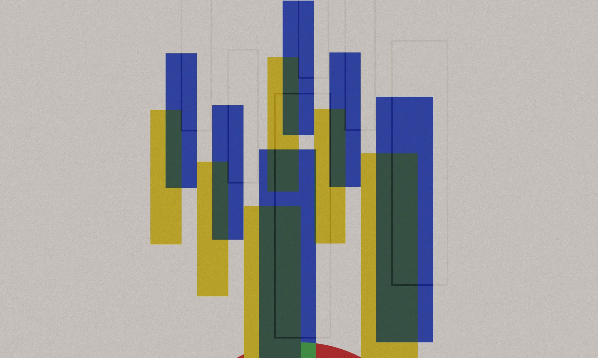
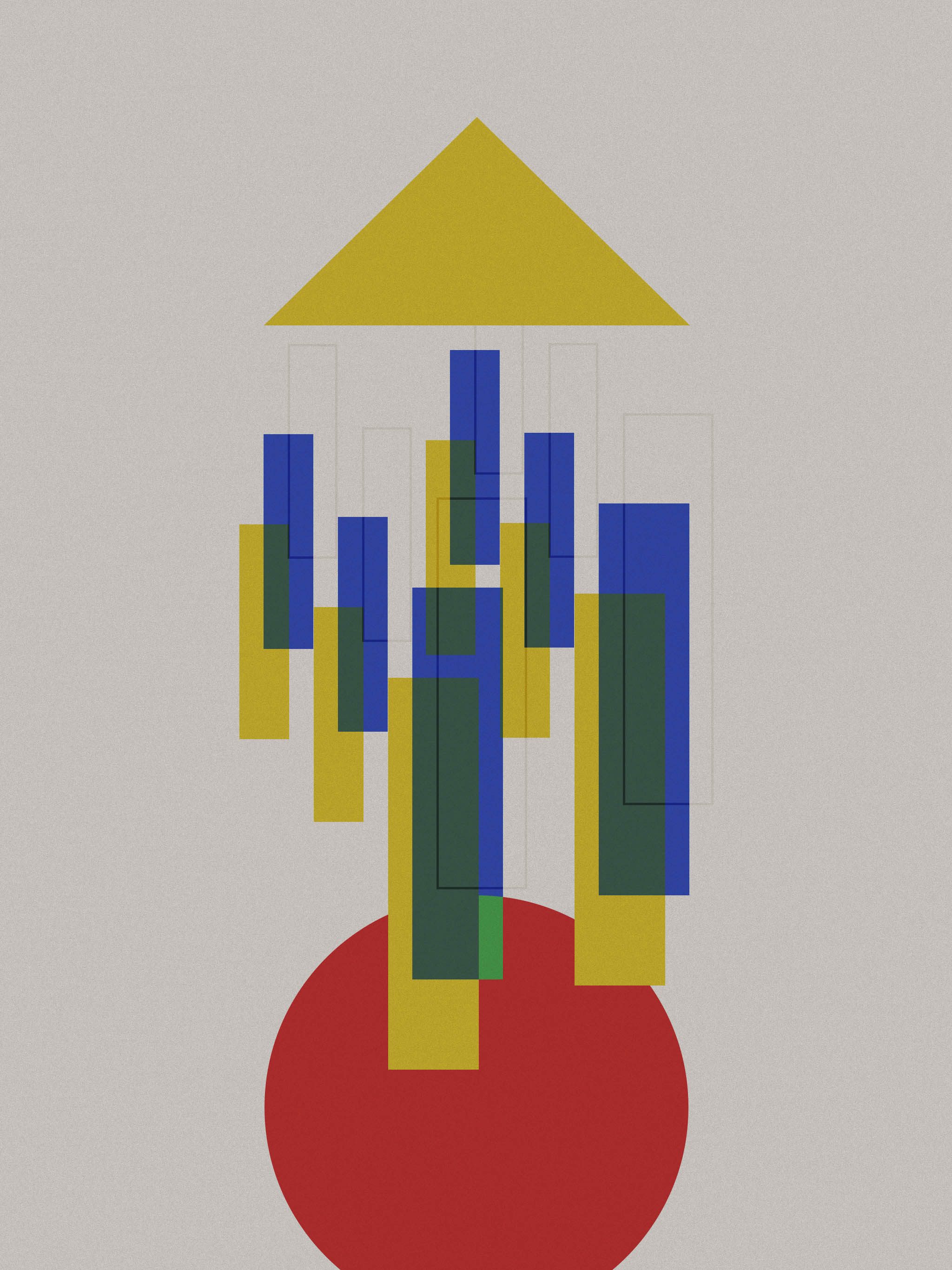
This design aims to capture the elements of HDB and also highlight some of the issues I feel it may face. The difficulty was trying to use basic shapes and its relationship to form abstract designs that would make sense of translate my thoughts. The idea of this design was to deconstruct the shapes of a simple house icon (that consists of a triangle roof and a square build) and combine that with Singapore’s HDB.
The red circle represents the tiny red dot of Singapore that we all live in. The elongated rectangles represents the densely packed HDB housing in Singapore. The use of different colours ( and line weight) to overlap all of the rectangles together was to illustrate the Ethnic Integration Policy that was introduced in the sales of HDB to promote racial integration in the HDB. The yellow triangle carries the meaning of both a roof and also an upwards facing arrow, symbolising Singapore’s continual progress as a nation.
The design attempts to question Singapore’s pursuit of progress and while HDB solves the housing issues of Singapore, many Singaporeans still struggle to find their sense of belonging and identity. Is this ‘home’ truly?
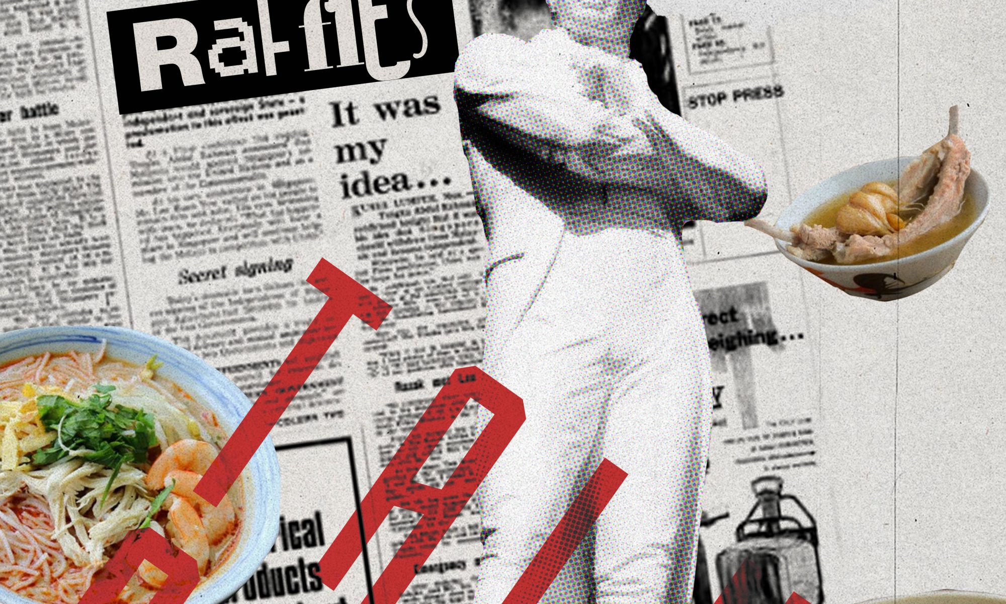
What stood out to me about the Dada art movement, was the underlying satirical and nonsensical nature of the artworks produced. Inspired by this, I wanted to explore this in the context of Singapore.
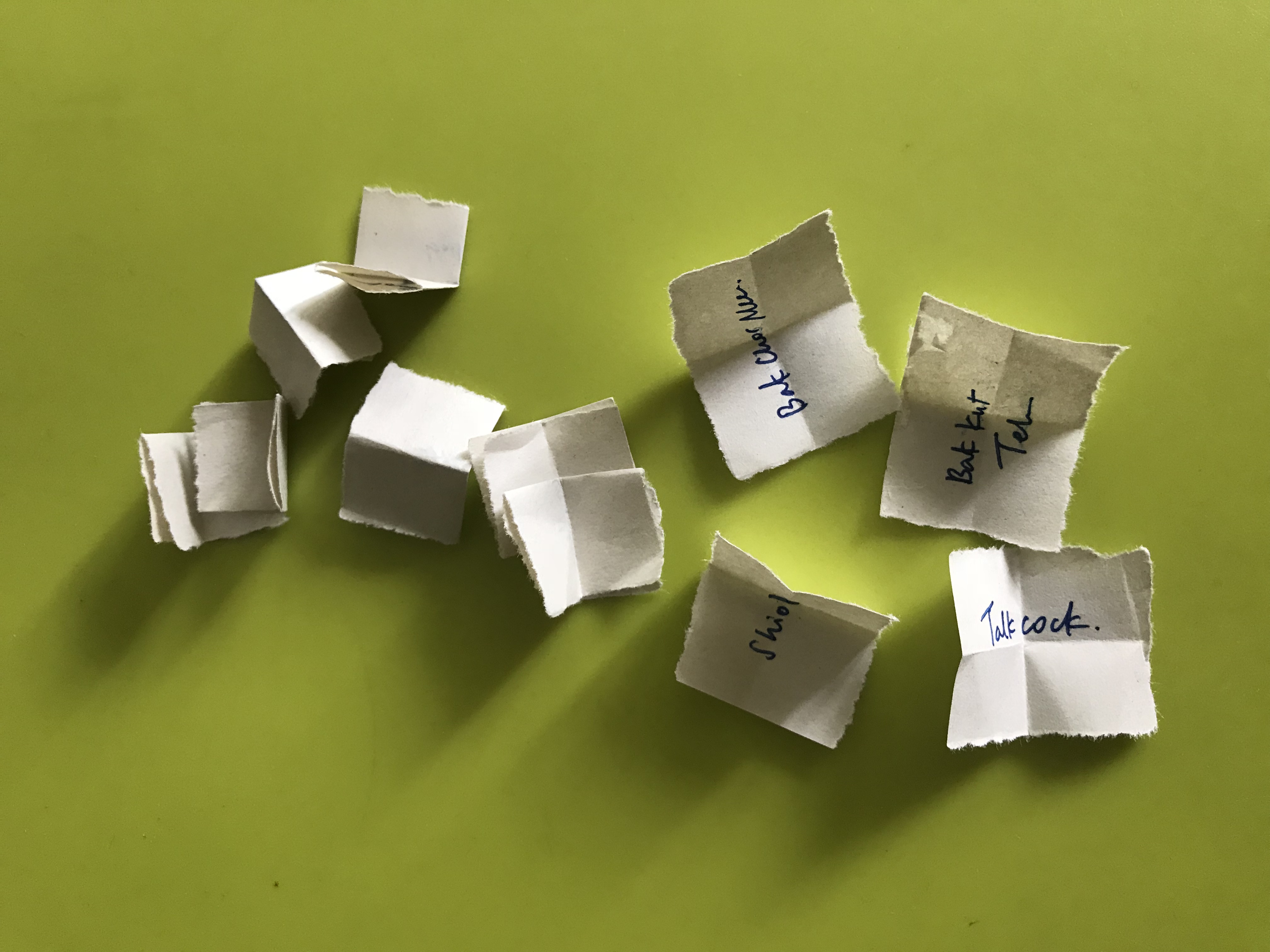
To start my ideation process, I wrote down on small slips of paper of what are some specific singlish phrases/food that are unique to Singapore. I then passed the slips of paper to members of my family to pick out and the results were as follows.
Bak Chor Mee
Laksa
Bak Ku Teh
Talk Cock
Shiok
With these five words, I then tried to connect the dots and search for meaning to express a certain message, making sure to include these 5 words in my final response.
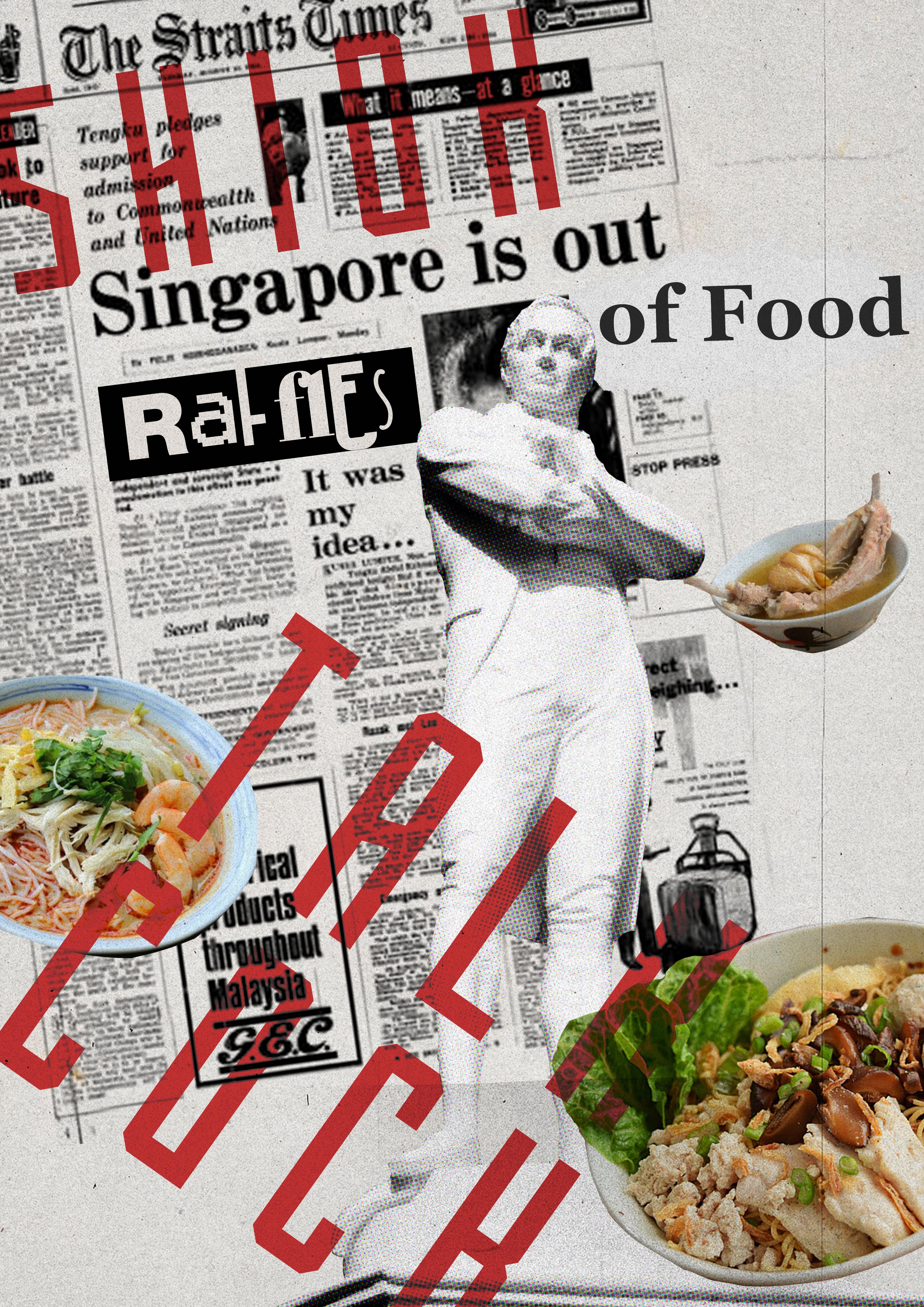
The end result is:
I wanted to explore the idea of FOOD culture in Singapore and inspired by Dadaism idea of rejecting logic and embracing irrationality, I decided to make a huge ‘what if’ statement within the culture of Singapore. This was created by bringing in ideas of ‘fake news’, to challenge the role of media in Singapore which is mainly used for national building. This included changing history by altering the popular news article page spread in which Singapore was reported to have split from Singapore, marking her journey towards independence. This is juxtaposed against Food as a national identity. And should Singapore be out of it, would this actually destroy our identity, or mark our step towards independence from it?
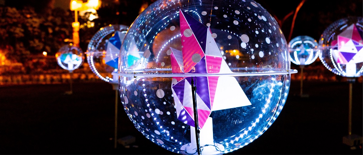
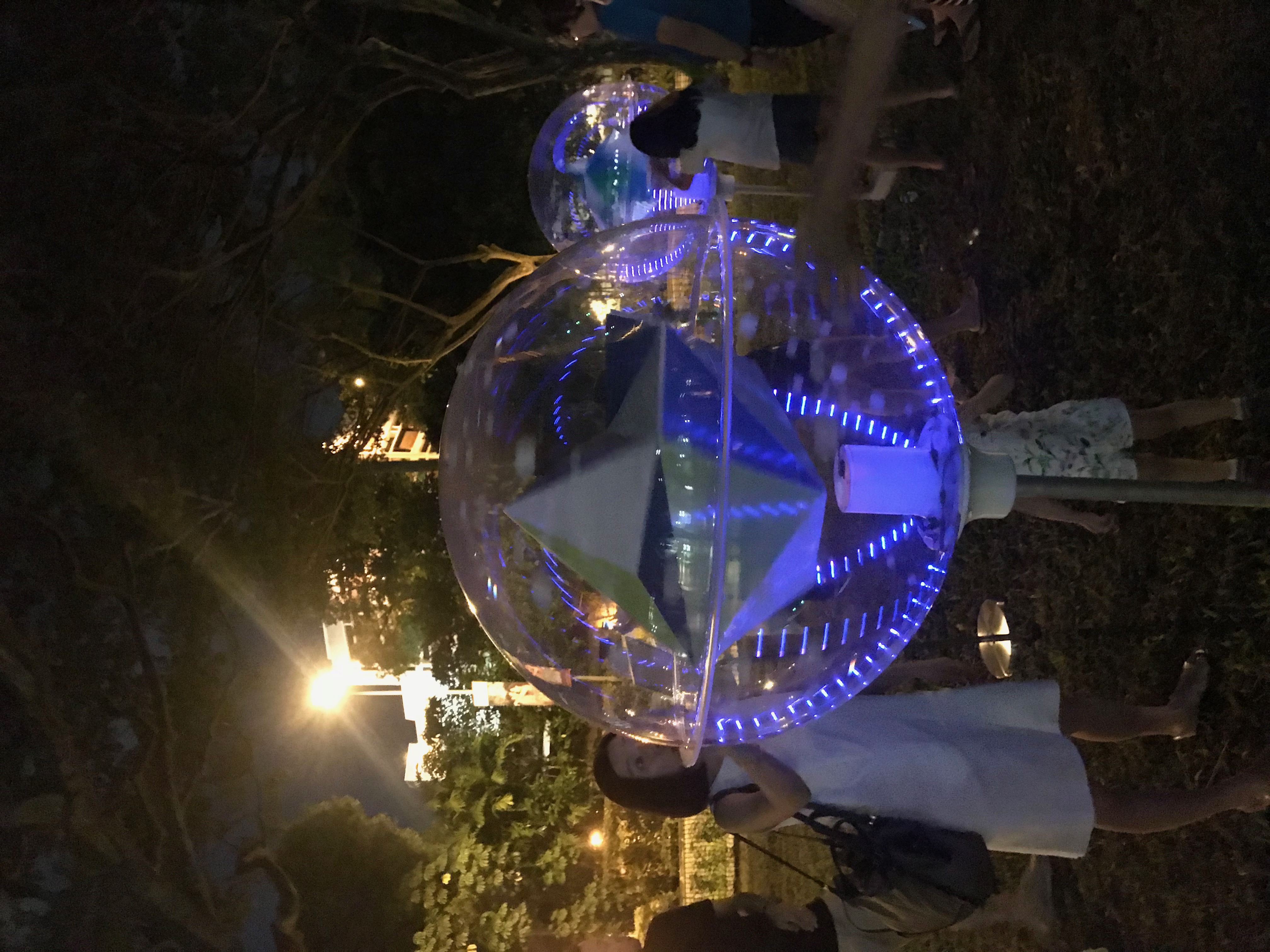
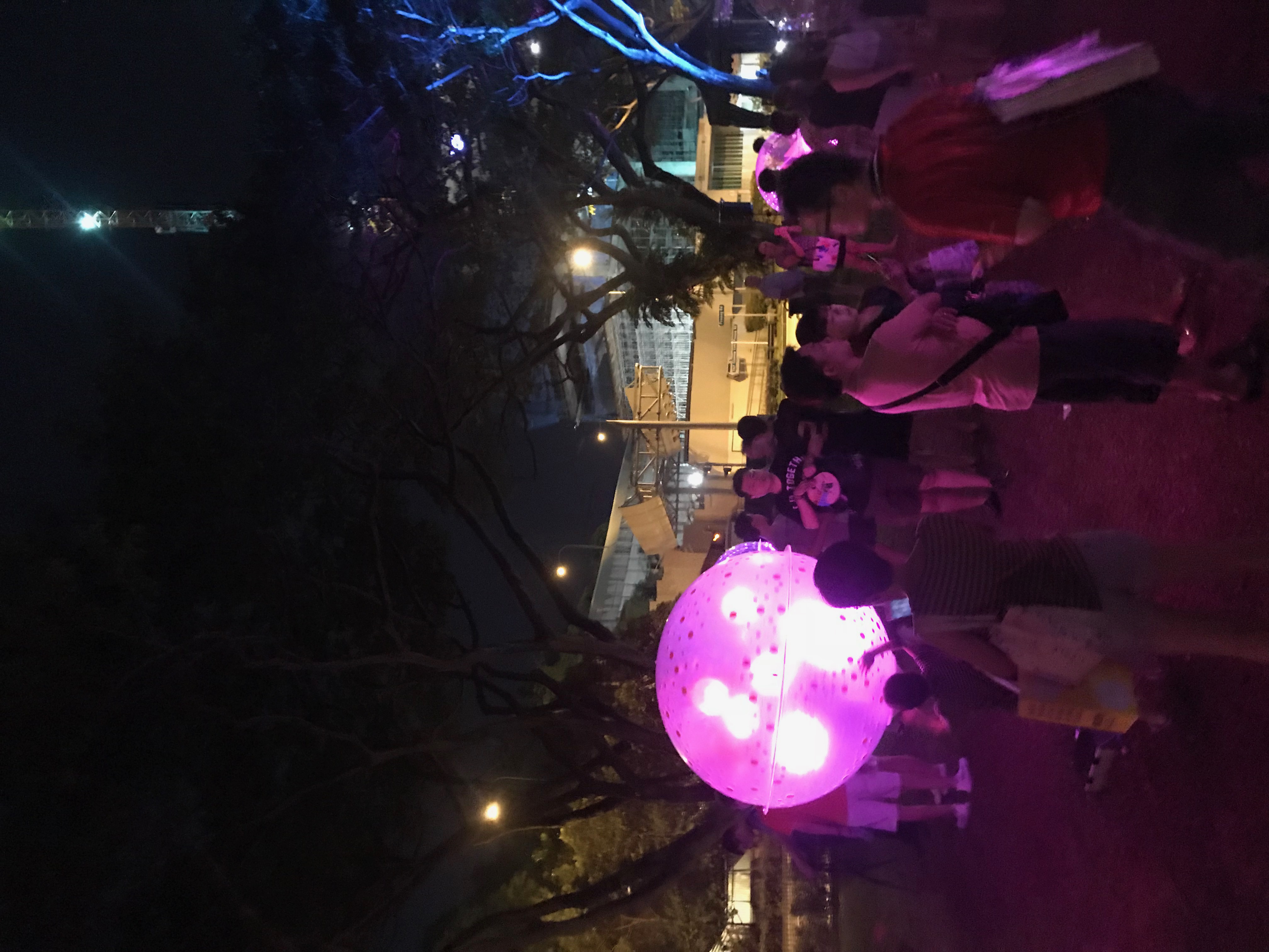
Image taken from: https://www.nightfestival.sg/nightlights/detail/orbit-by-litewerkz
Orbit by LiteWerkz X 3M
This installation occupies a fairly large area, with transparent orbs/spheres lit up arranged around a fairly larger sphere in the center. The idea is to liken the space to that of the solar system in space hence the name ‘Orbit’. The main form of interaction would be that audiences are invited to touch/move/spin the spheres. The spheres/planets would respond to those movements and touch by changing its light colour or flashing in different light patterns.
The installation offers audiences an immersive experience due to its set-up and scale. Just entering the space and looking at a field of lit up, semi-floating spheres was a beautiful sight. While visiting the installation, there were many others (mostly kids) playing with the installation and from a macro perspective, the lights flashing all at different times and spinning at different speeds creating a diverse imagery for audiences to behold. In a sense, while audiences are interacting with just a single sphere, there are also changing how the installation is being perceived as a whole as well.
I think the intention created for the audiences was to invoke that sense of wonder and awe at the unchartered beyond of being in Space. Likening the experience to that of orbiting and playing amongst the shining stars.
Upon a closer study of each sphere, I was able to identify that each sphere was mostly made up of LED strips attached within and I would think a motion sensor that picks up on the movement made to the sphere. The electrical circuits and wiring are hidden beneath the sphere in the rod that holds it in place which connects the sphere to the electrical plug and supply.
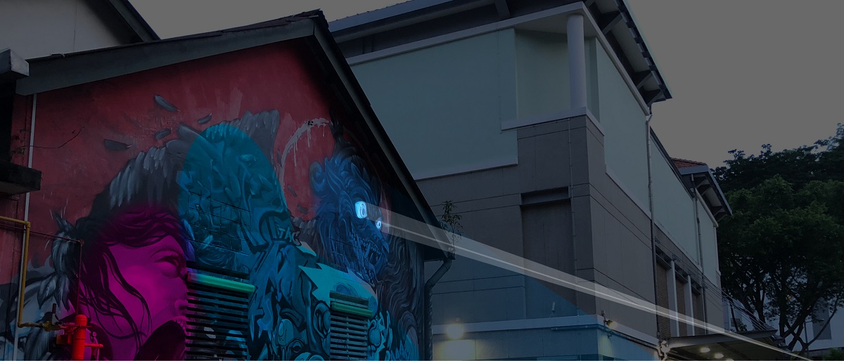
Image taken from: https://www.nightfestival.sg/nightlights/detail/graffiti-alive-by-arup
Graffiti Alive by Arup
So, having seen the critiques made by others in the class, I decided to choose an installation less spoken of and also an installation I felt was underwhelming compared to the other exhibits at Night Lights. Maybe from here I could draw some learning opportunities of some points to consider in my final project.
Situated at Armenien Street (beside the Substation), Graffiti Alive is a location specific installation that makes use of the graffiti art works along Armenien street and through motion sensors and lights, allow audiences to experience these works differently and see it in a new light (pun intended).
As I was visiting the installation, I saw a whole bunch of bulky equipment at the start and end of the street, accompanied by bright lights being cast on the graffiti wall. I did not quite understand the exhibit or the workings of it until I spoke to one of the volunteers present that I was suppose to work through the street and as I walked, the lights on the wall would then change colours and respond. I tried walking back and forth the street but there were minimal changes to the lighting. (It could have been due to the fact that there were others visiting the exhibit and could have messed up with the motion sensors)
I think the intention of the artist was to allow a personal experience for the audience to view and observe each graffiti art work in a new way and also provide some form of exposure to the street art scene in Singapore as Art like graffiti could only be enjoyed in the day due to lighting. By illuminating the space, the Artist wanted these works to be viewed and enjoyed in the night as well.
The set-up of the space was fairly elaborate with two huge balloon-shaped equipment (which I suppose is part of motion sensors) at the start and end of the street. As well as RGB spot lights set up opposite the wall. There were other smaller motion sensor devices placed along the wall as well.
Overall, I felt this installation was underwhelming as I thought that the artist would attempt to use some form of projection mapping on the wall to make the graffiti work come ‘alive’. I think that would allow me to experience the graffiti work differently instead of just different RGB lights cast on the artworks at different times as I walk across. Another would be how to best make use of motion sensors. I think it would be best to consider how people would and could they interact with the artwork and ensure that the system (the processes) would still work regardless. I wasn’t sure how the motion sensors would respond to the influx of a higher number of people and how the light cast on the wall would change as a result. But I suppose the bright lights did draw my attention over to this exhibit, but overall I still felt that it missed the mark for me compared to the other exhibits.
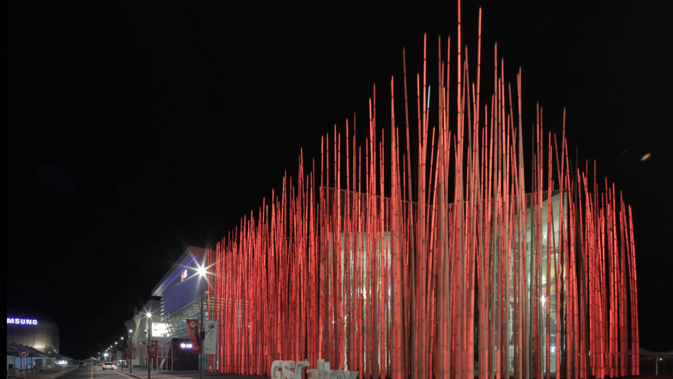
Created for Expo Korea, the GS Caltex Pavilion was designed to take the form of an over-sized rice paddy fields with tall-illuminated glass blades swaying like grass in the wind. Users are invited to walk through the larger than life installation and interact with the grass by touching the blades and watching it change colours.
The size of the installation adds to a sense of wonder as guests wonder into this larger than life exhibit and experience a new perspective. I think the colour, lights and space of the installation plays into the intention of creating a sense of awe and wonder in the concrete jungle.
Out of Bounds is an interactive installation that allows its viewers to peer through walls to explore hidden areas, engaging in ‘behind-the-scenes’ experiences in the Museum using an “X-ray Torch”. Participants simply shine their Torch around the walls and they are able to view the scenes behind.
The intention of the exhibit plays on our inner child-life ability to want to be able to have super-powers like X-ray vision. Coupled with the set-up of the exhibit, it allows the viewers to tap onto their curiosity and explore with the X-ray torch.
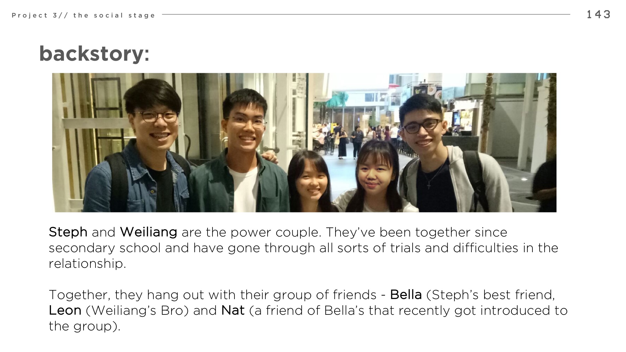
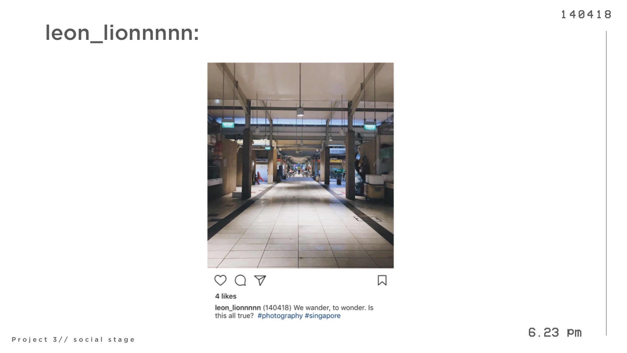
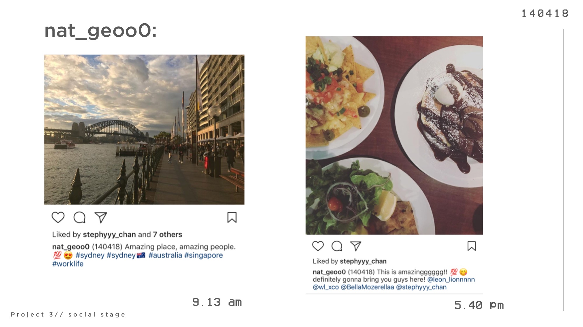
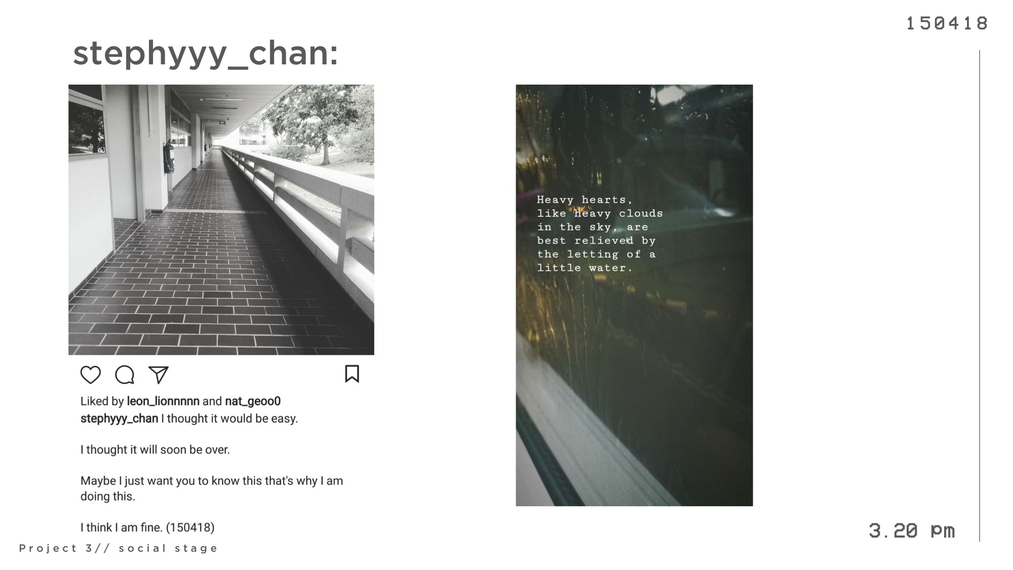
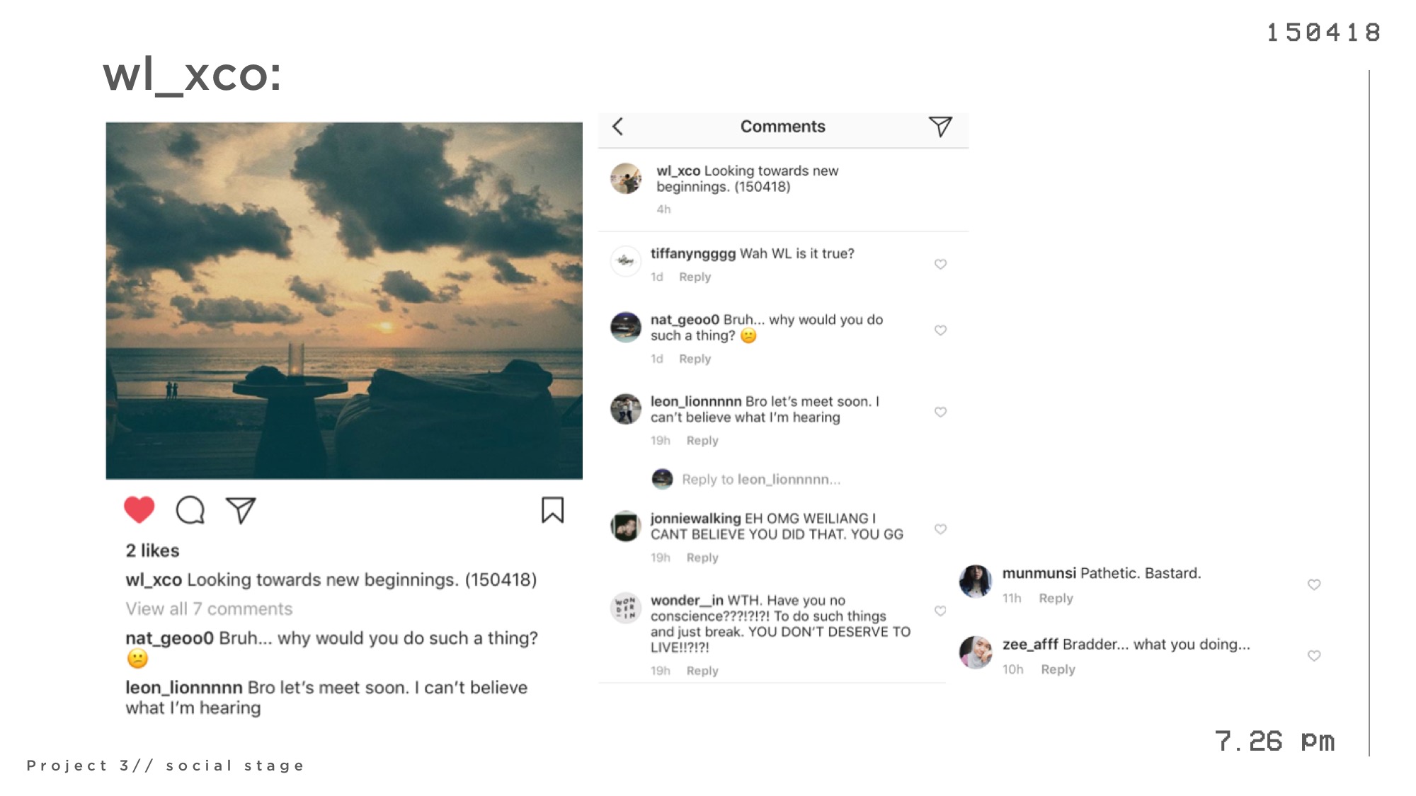
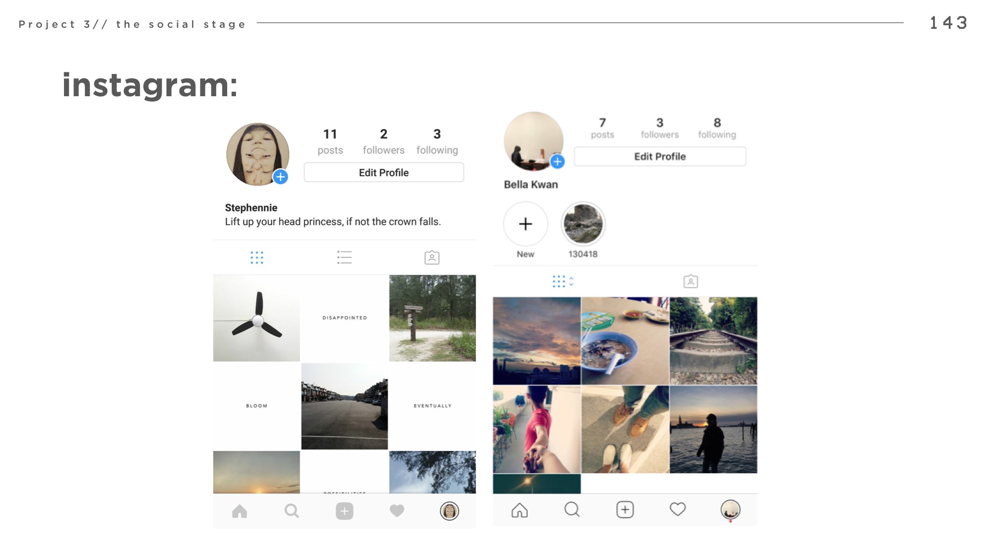
by Jonathan Goh, Tiffany Ng, Loke Mun Mun, Zafirah
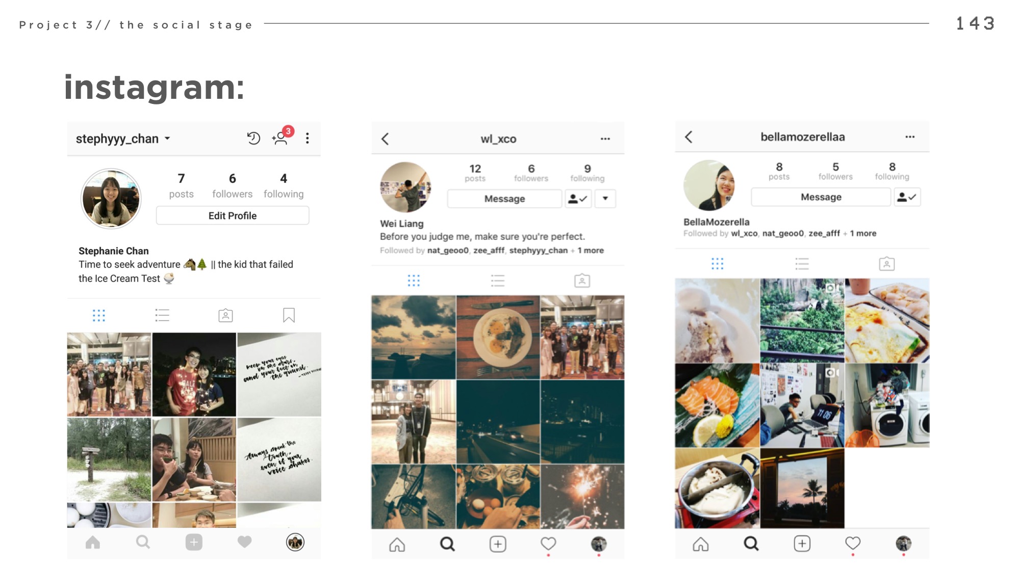
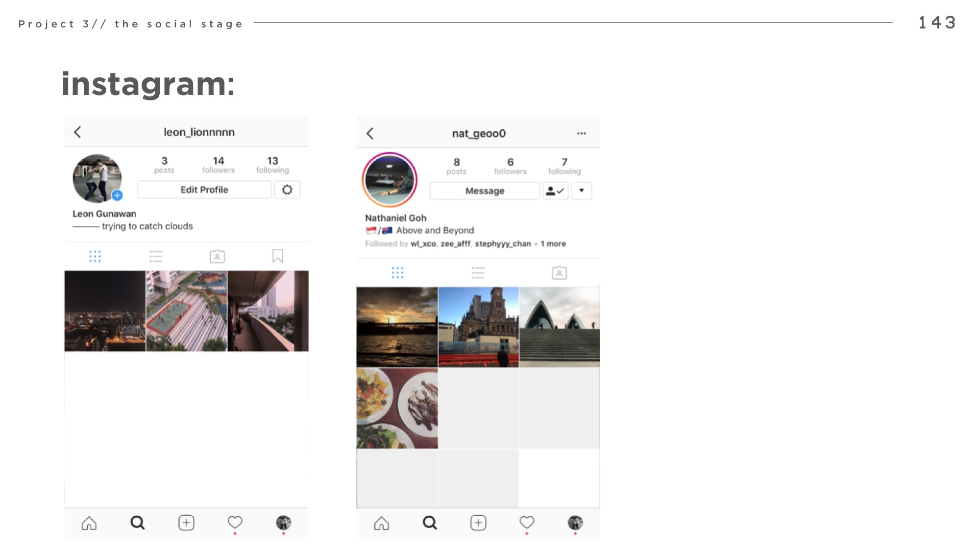
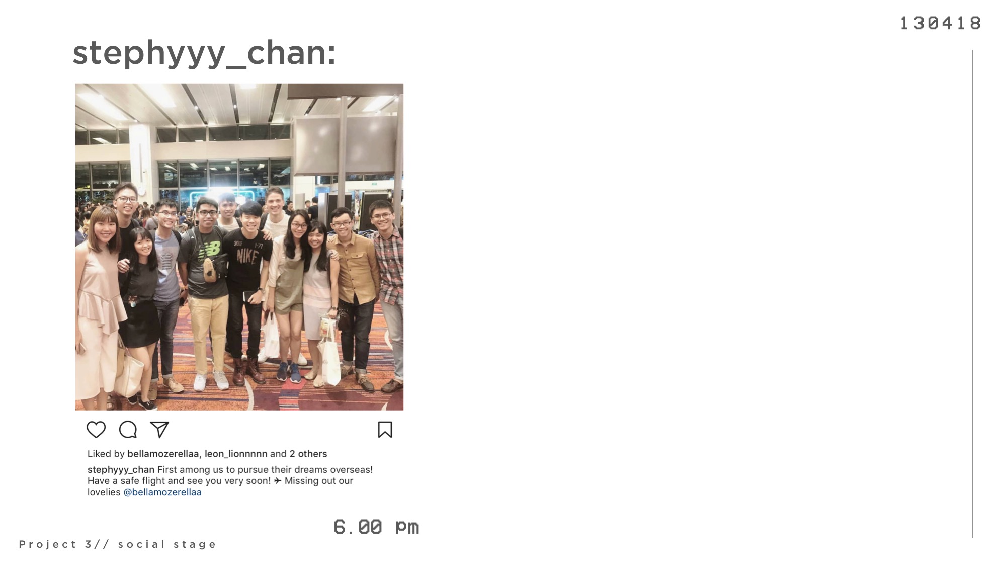
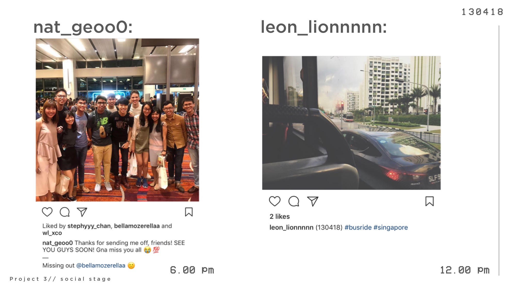
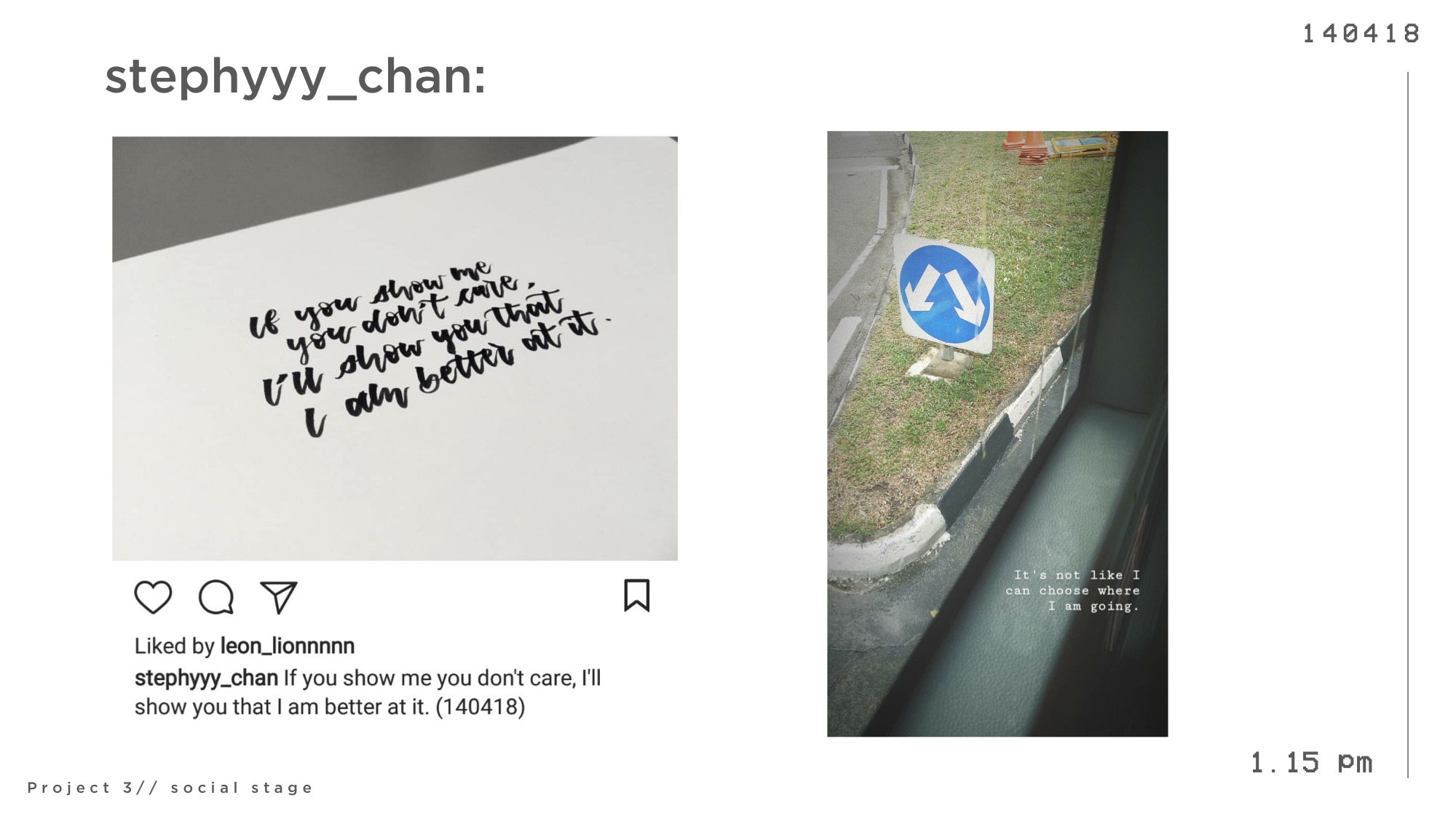
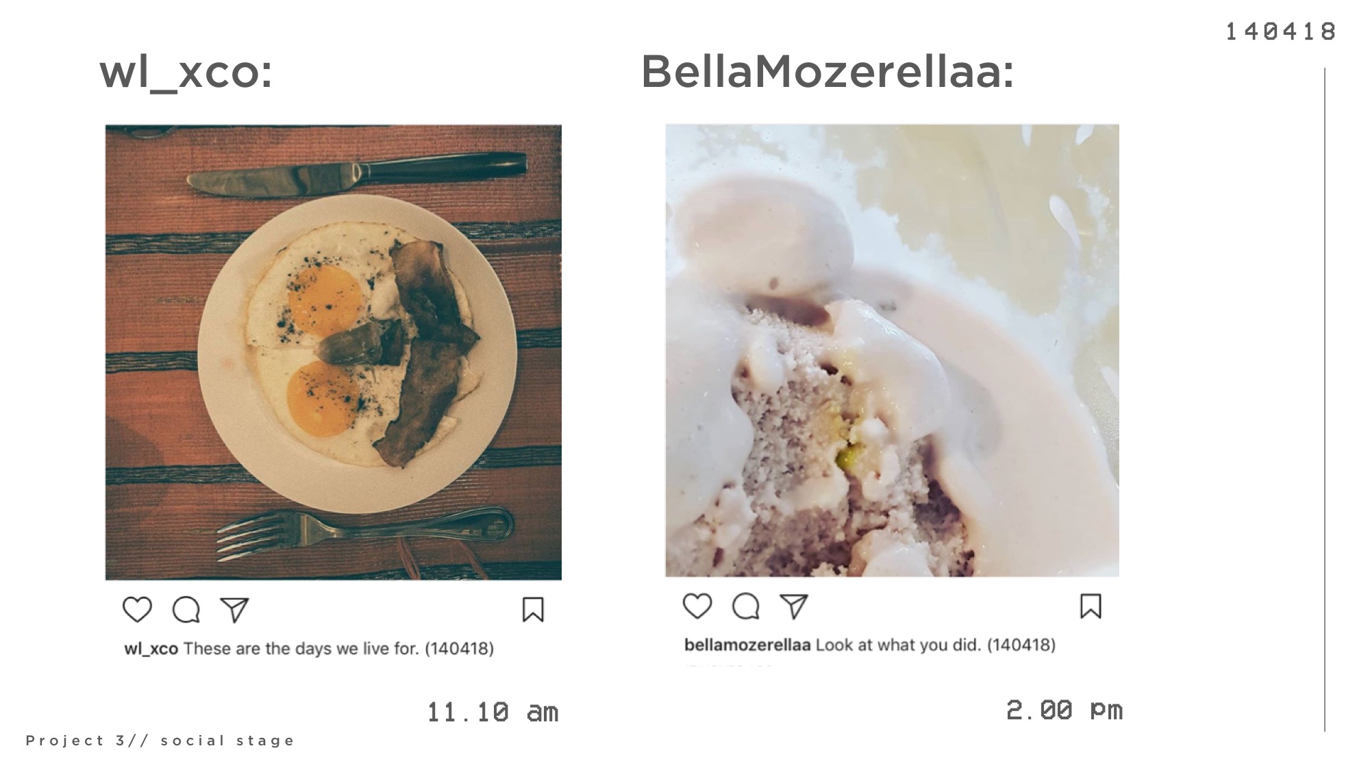
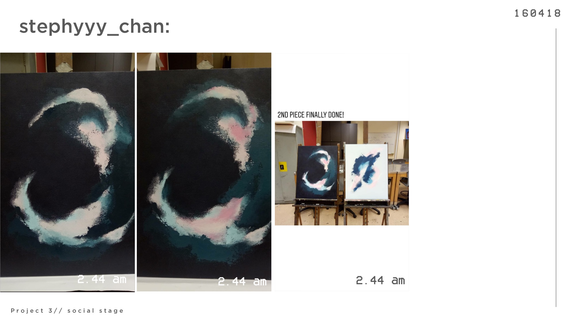
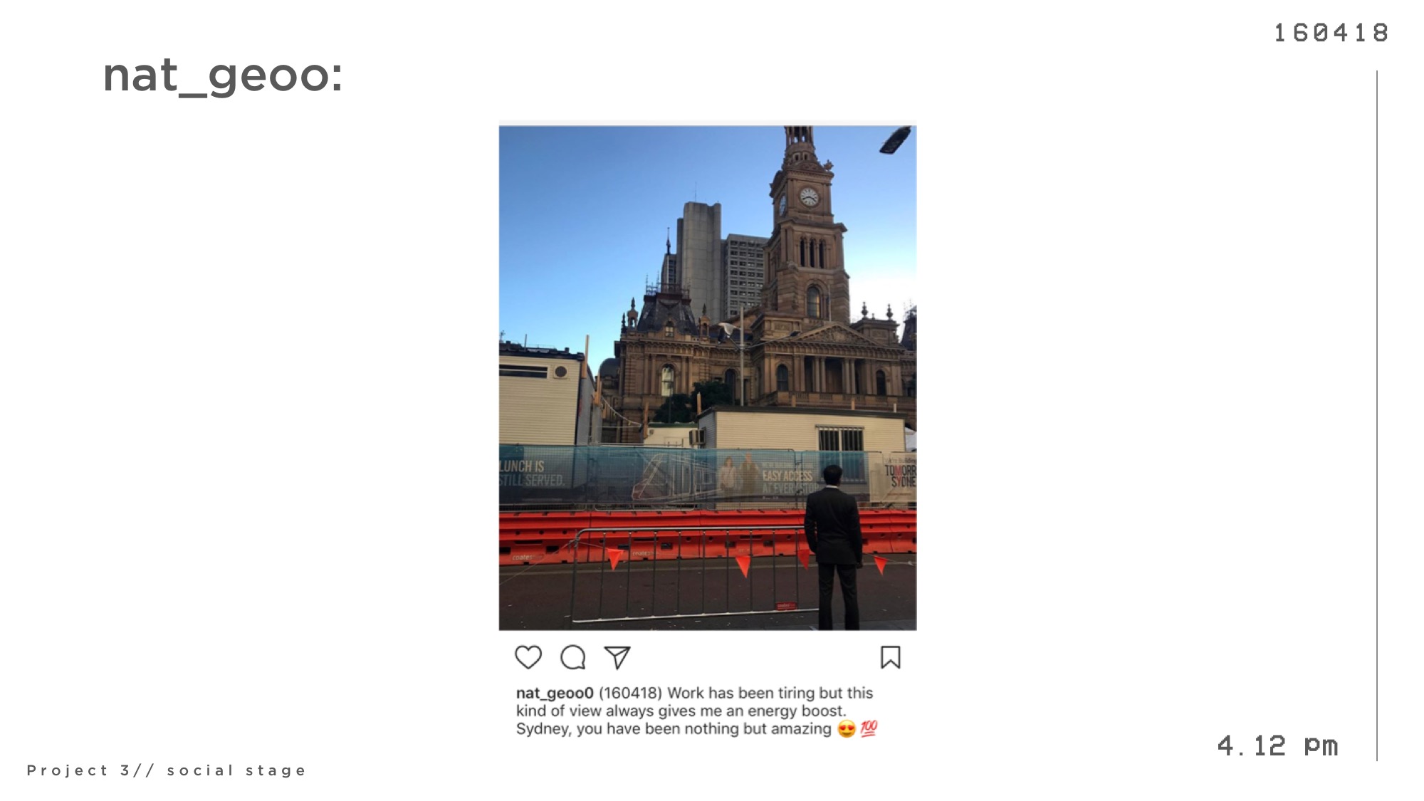
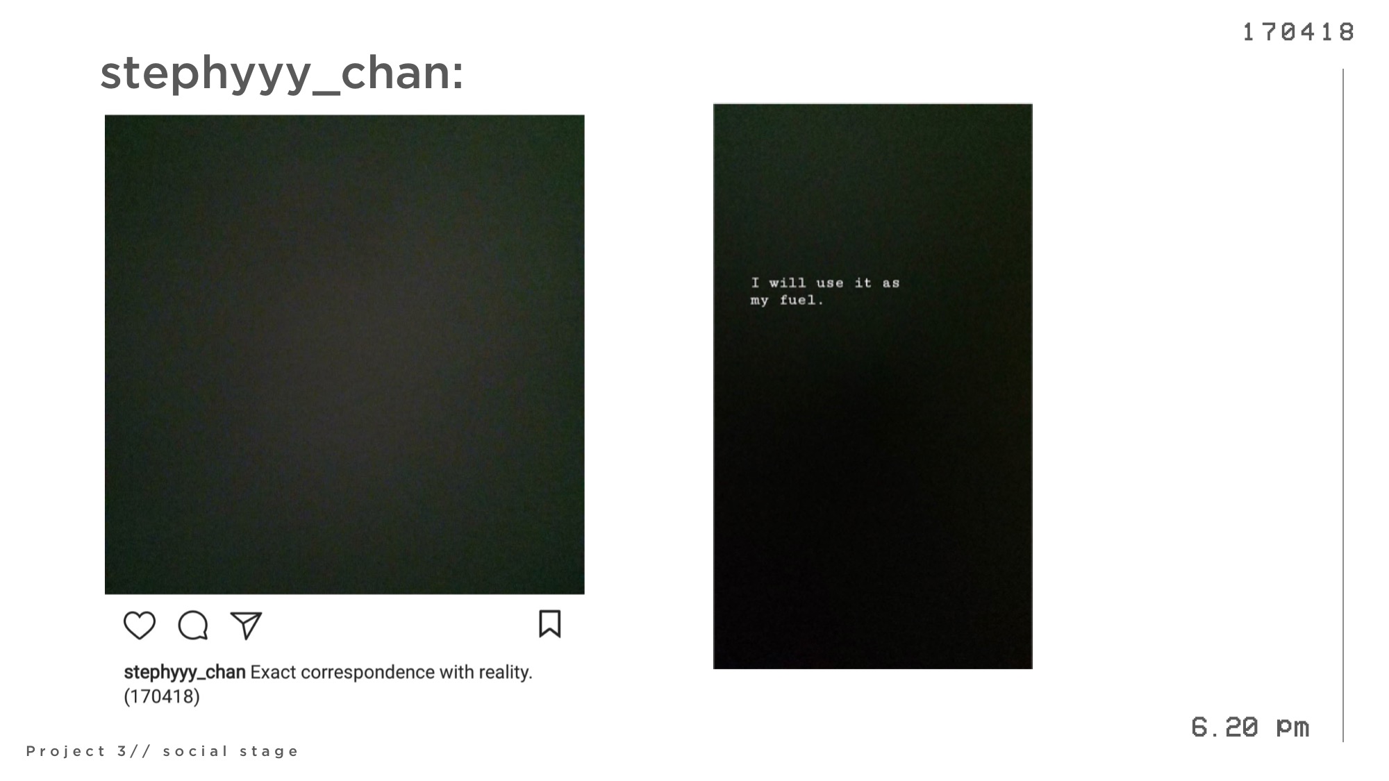
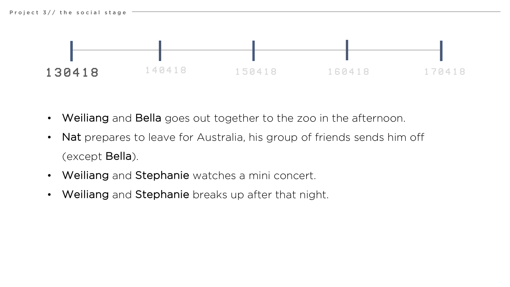
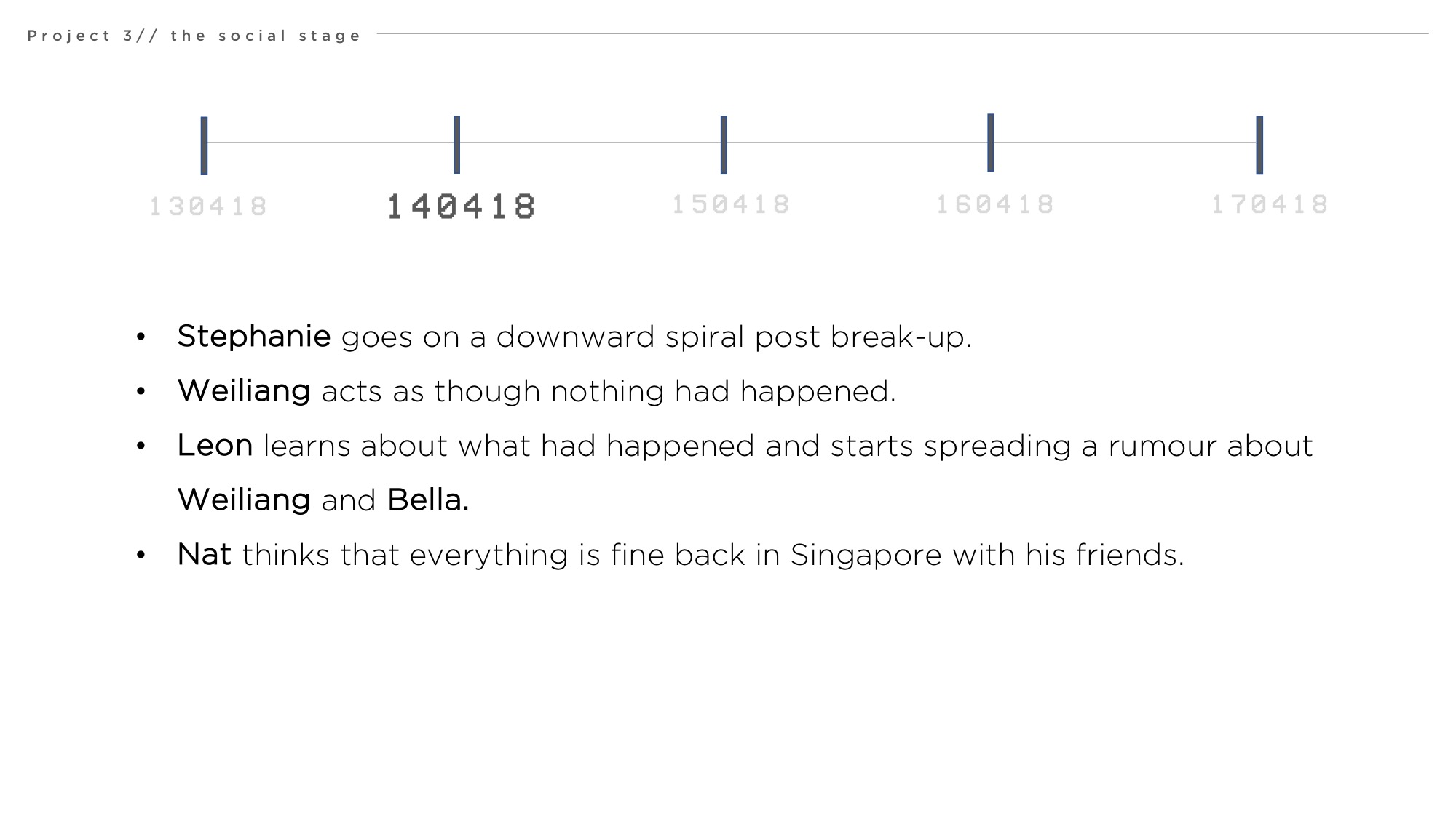
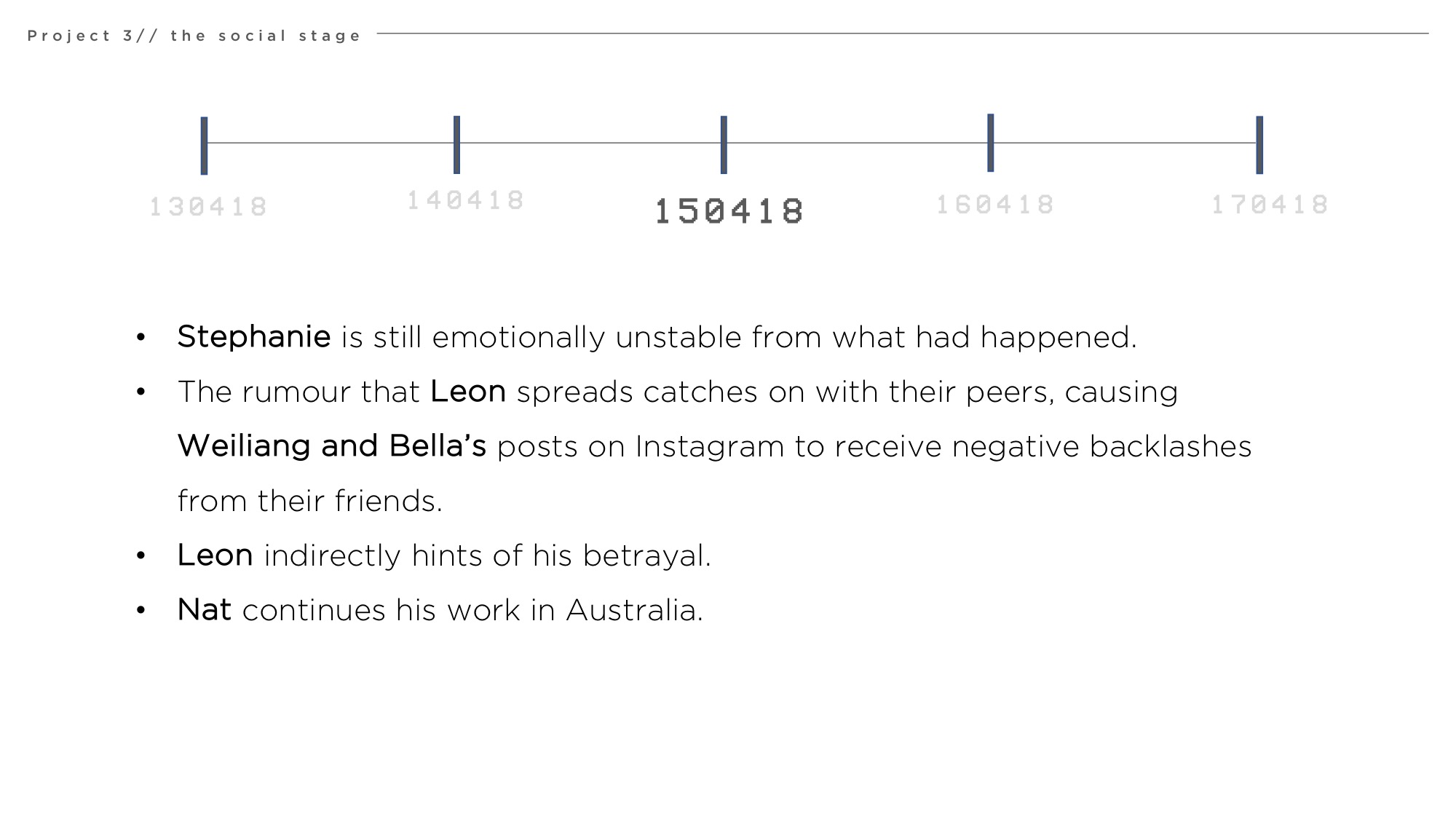
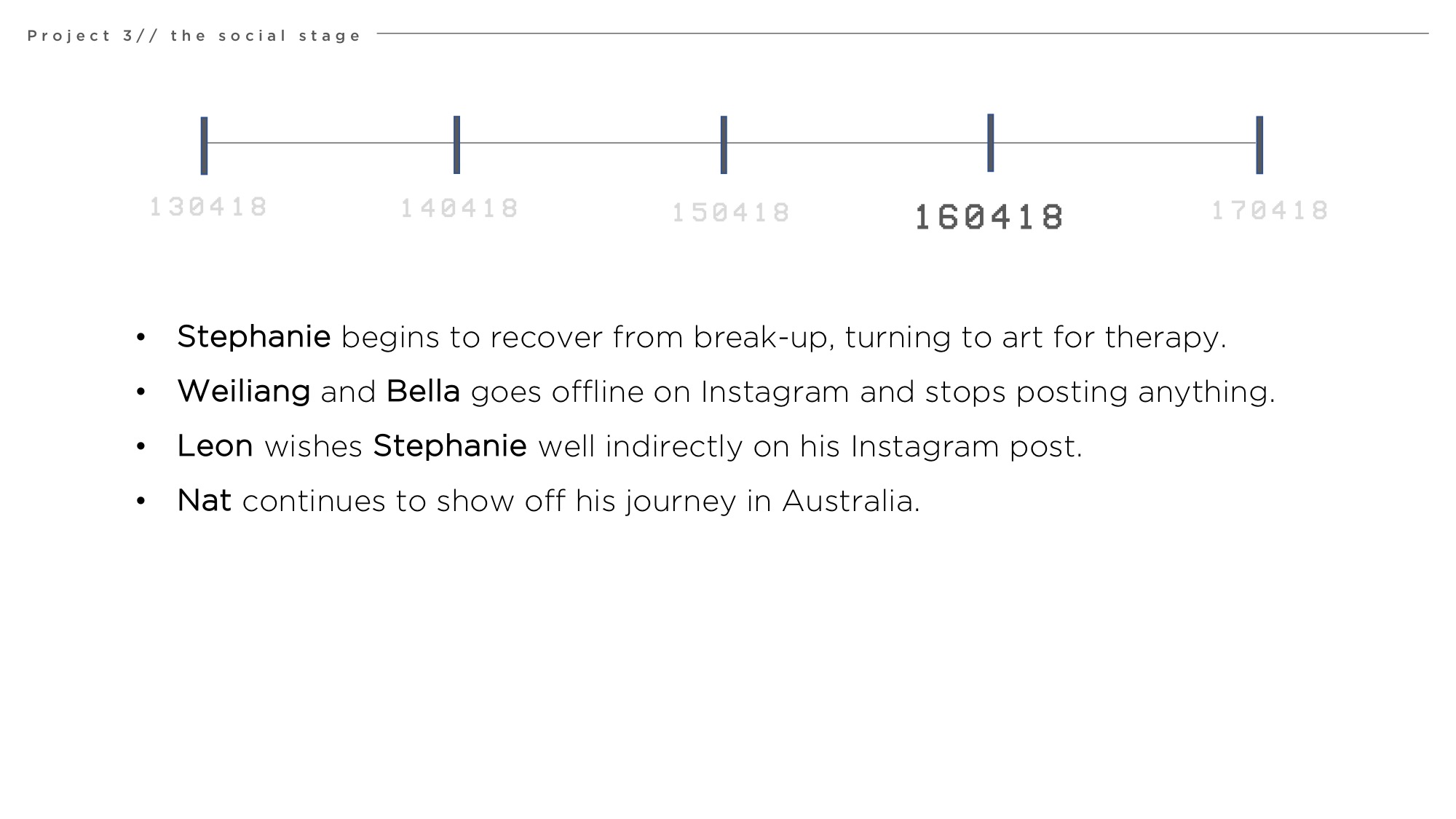
For this assignment, we were tasked to create and tell a narrative story through social media platforms and we decided to use Instagram as our chosen platform.
We wanted to focus on the idea that social media are actually platforms where we share bits of information of ourselves, but never the full story. We show but never tell and we keep things cryptic and abstract, as though we are hiding a secret life. It is often the push and pull between what we want others to find out while hiding what we don’t want them to know.
Audience (friends/peers) are then tasked with piecing these information together and drawing their own conclusions of the “story” or “gossip” whichever they determine it to be.
With our narrative, we have attempted to play on these elements to allow audiences to experience the journey of connecting the dots through such cryptic posts by playing a character in the story. This provides audience a window into the world in which the narrative take place and piece the story from a different perspective.
We decided to host our story instagram due to its features that allows us to show:
Immediate events (through instagram story)
Cryptic, abstract statements by characters (through instagram posts)
Engagement between characters (through instagram comments and likes)
A double-life (through the creation of private accounts)
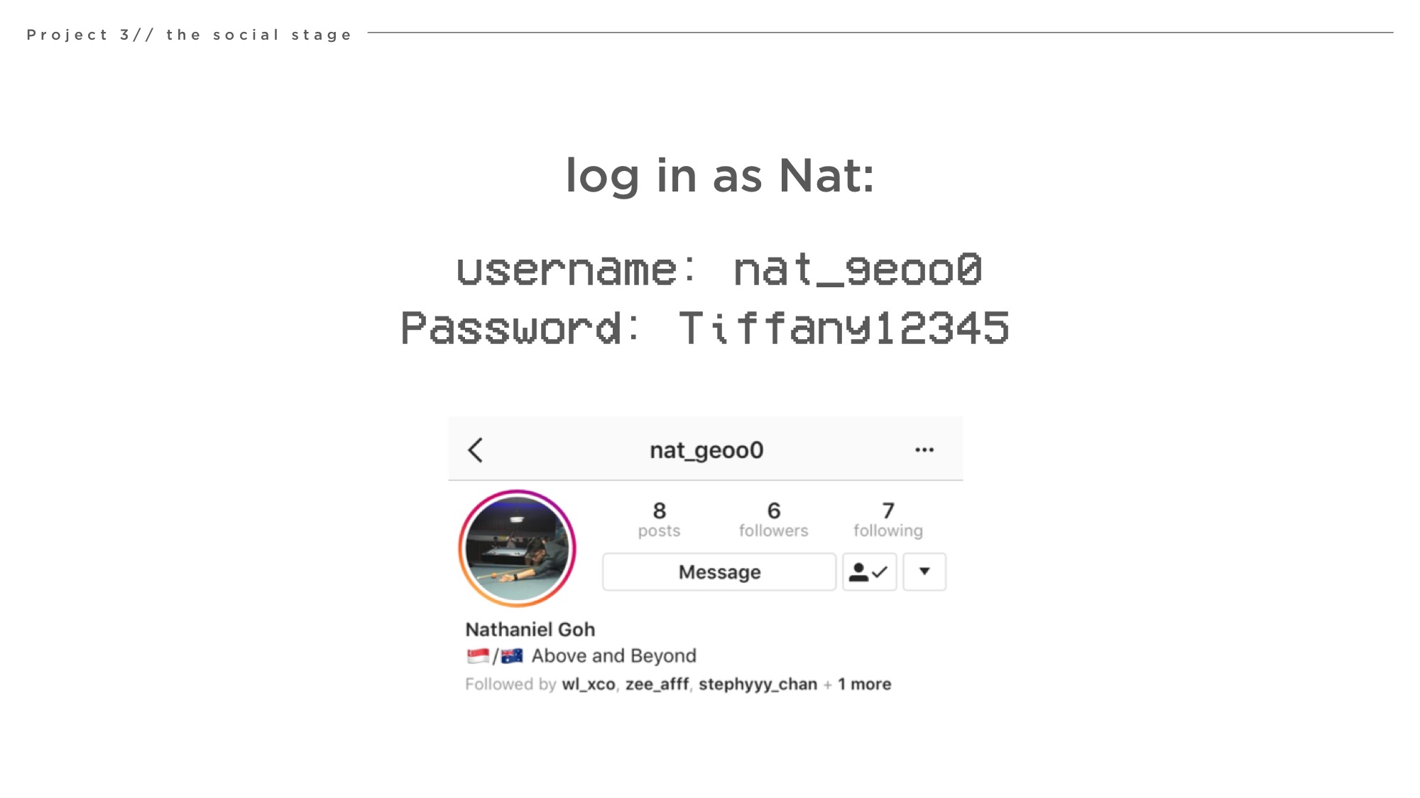
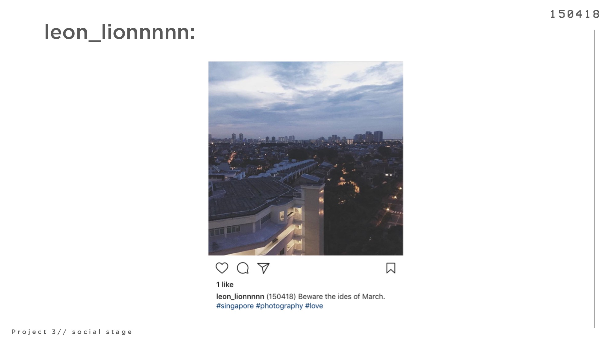
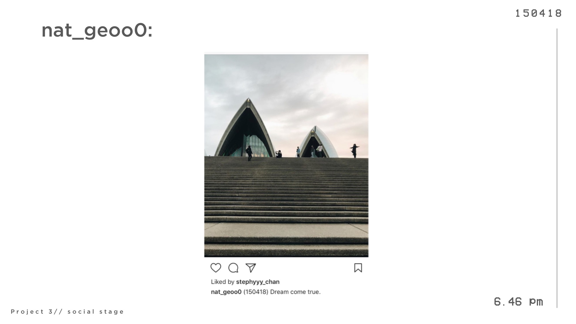
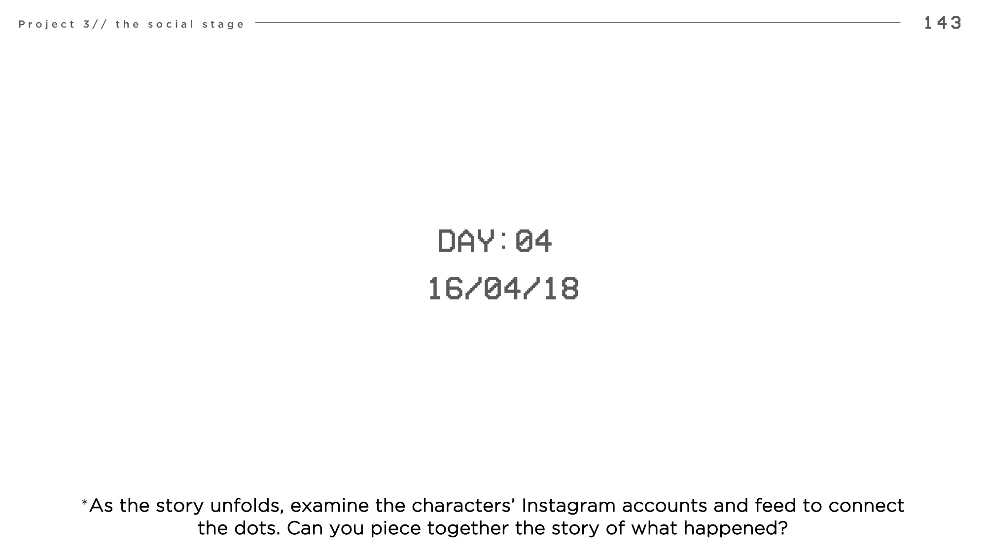
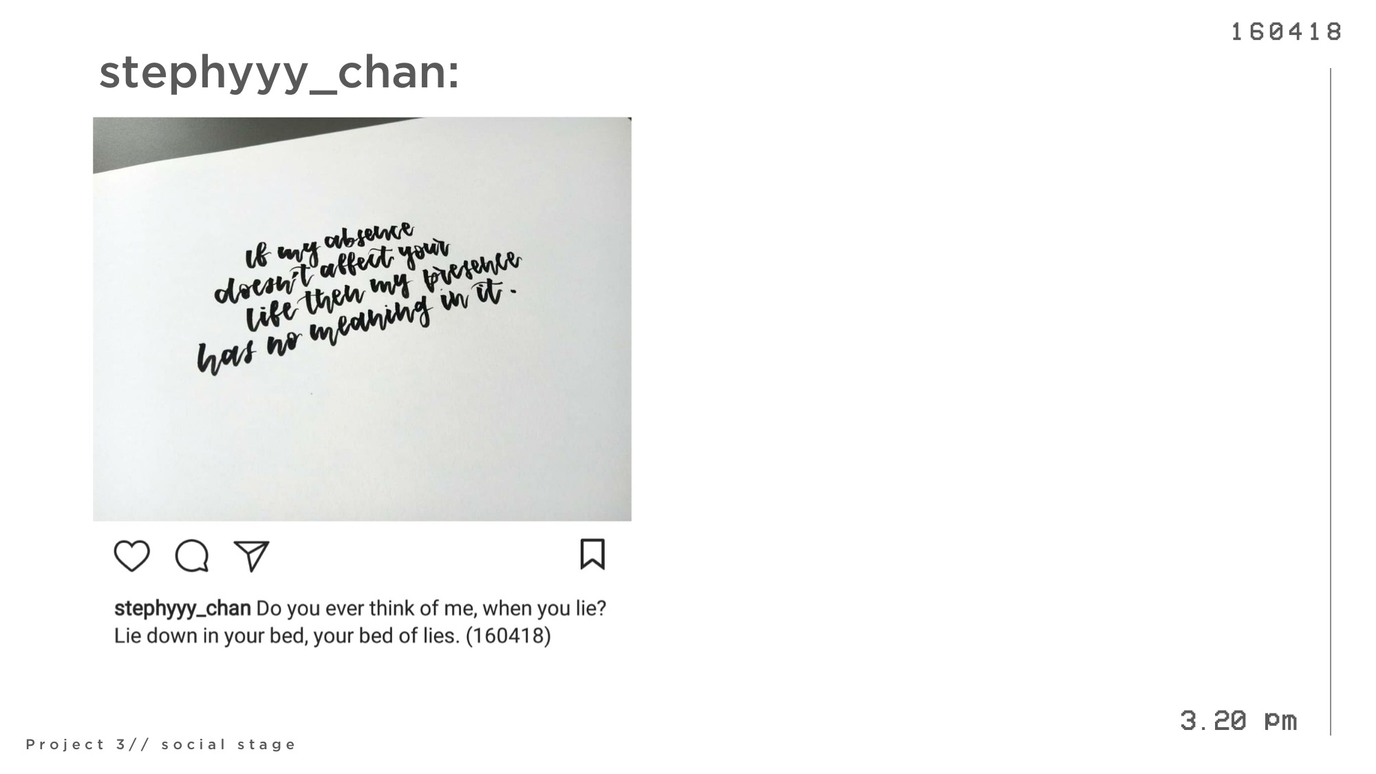
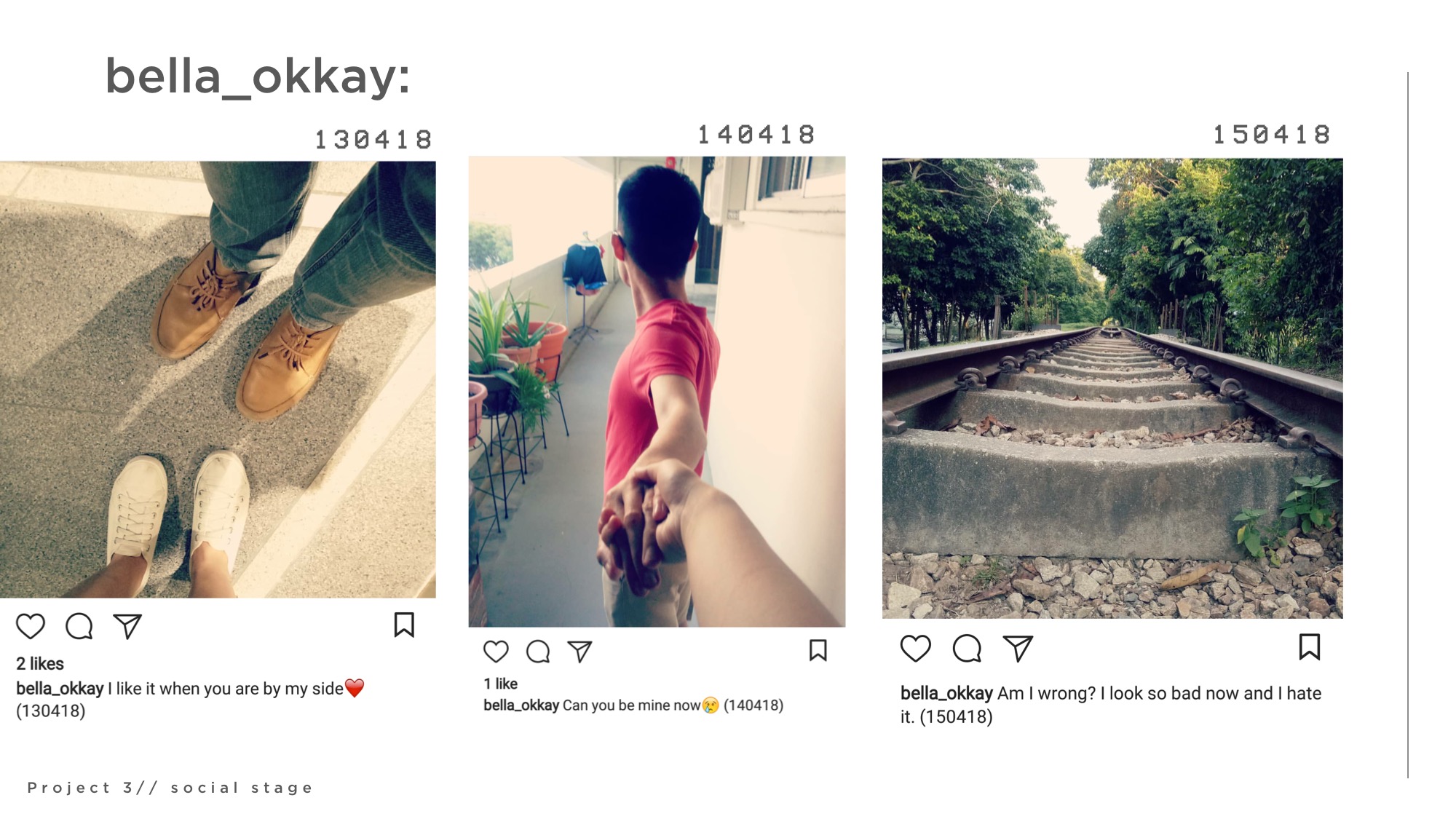
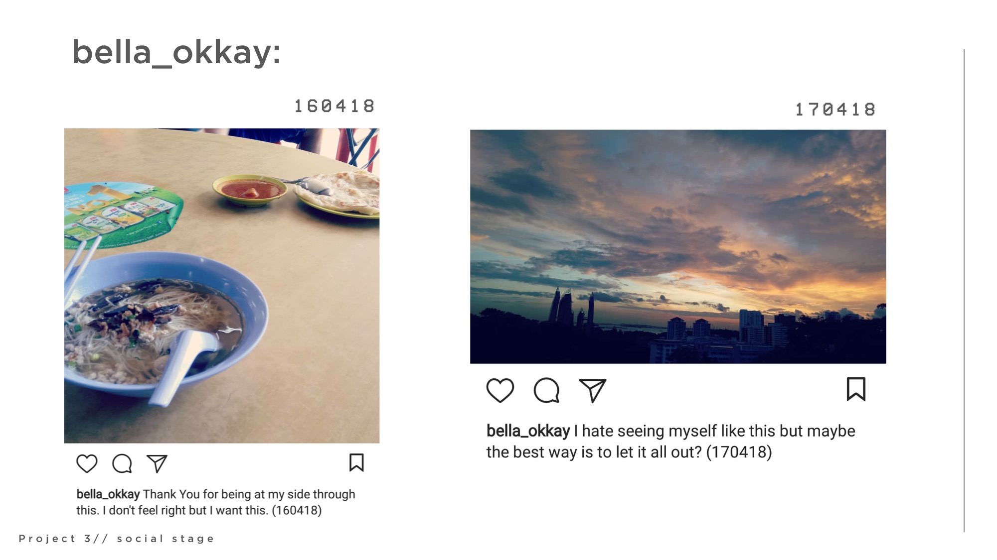
As you go through the following slides, take some time to read through the characters’ instagram accounts and posts. Read their caption, or even search them on instagram to find more details about them.
Try piecing together a story of what you think happened.
Before reading the reveal to find out the truth and intention behind every posts. Enjoy!
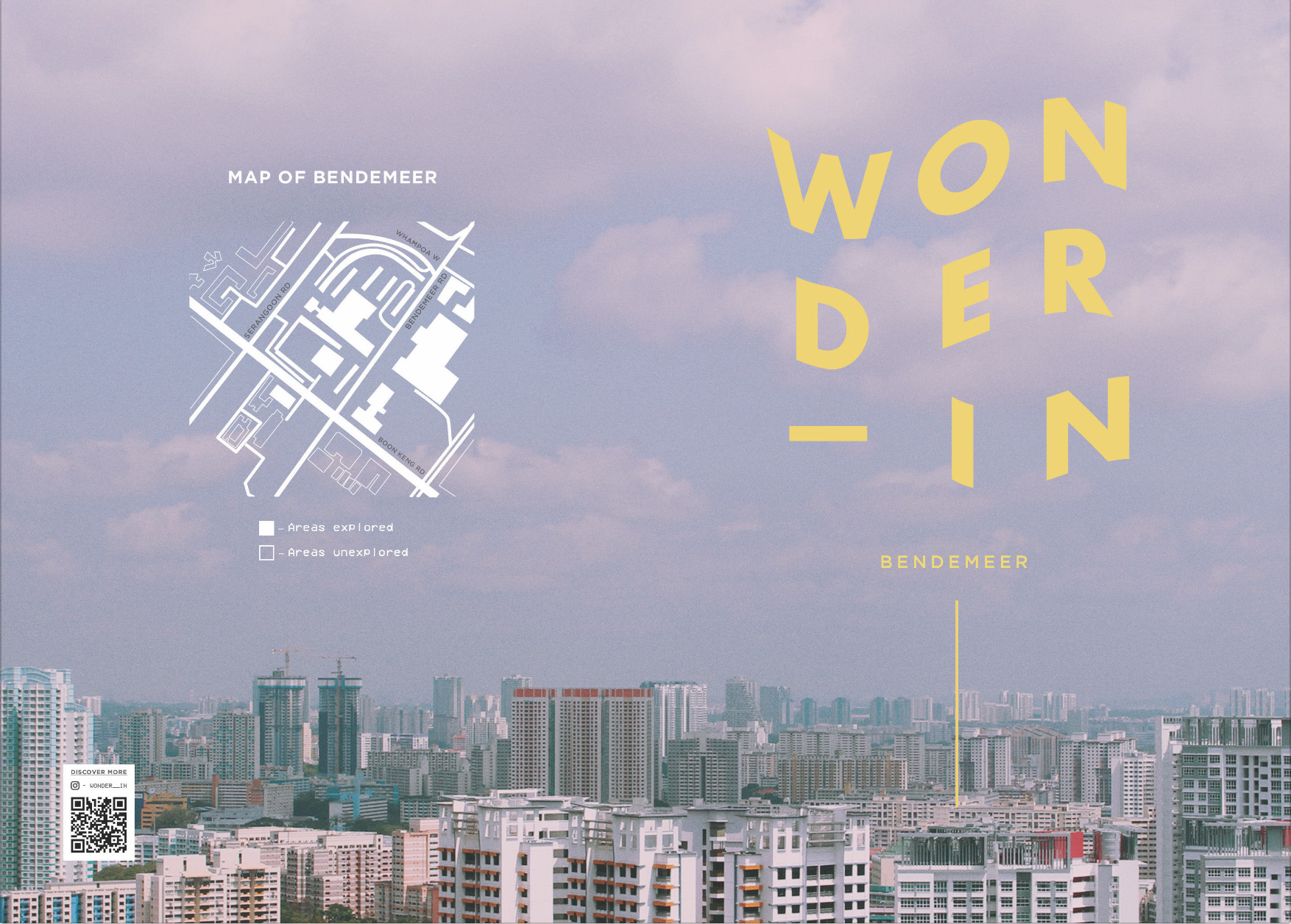
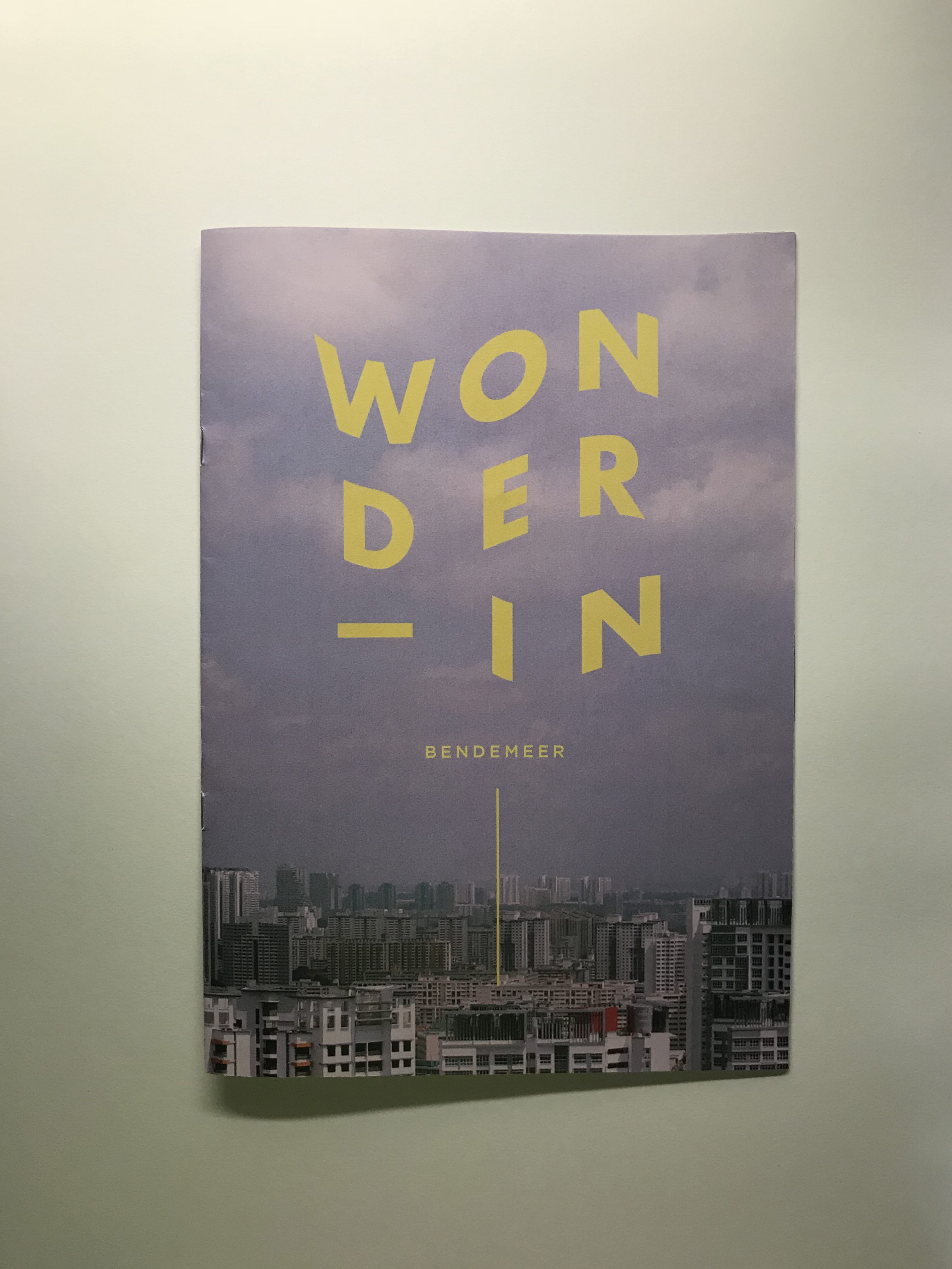
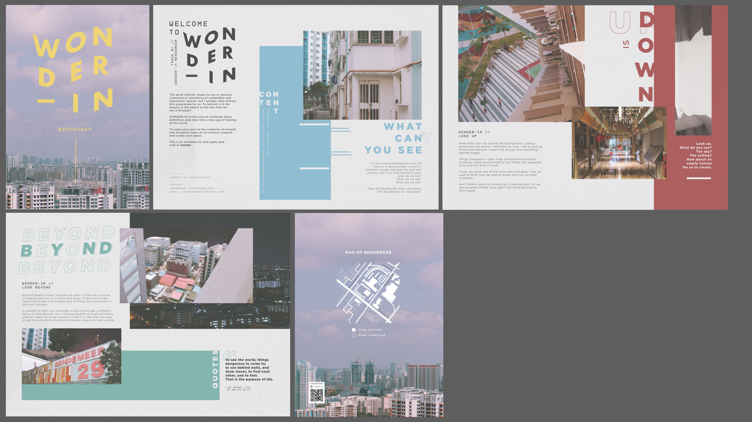
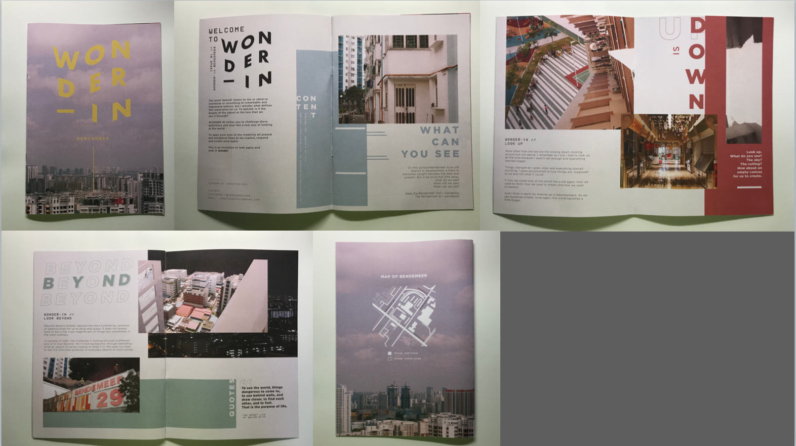
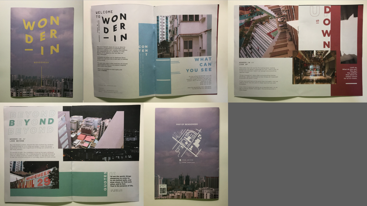
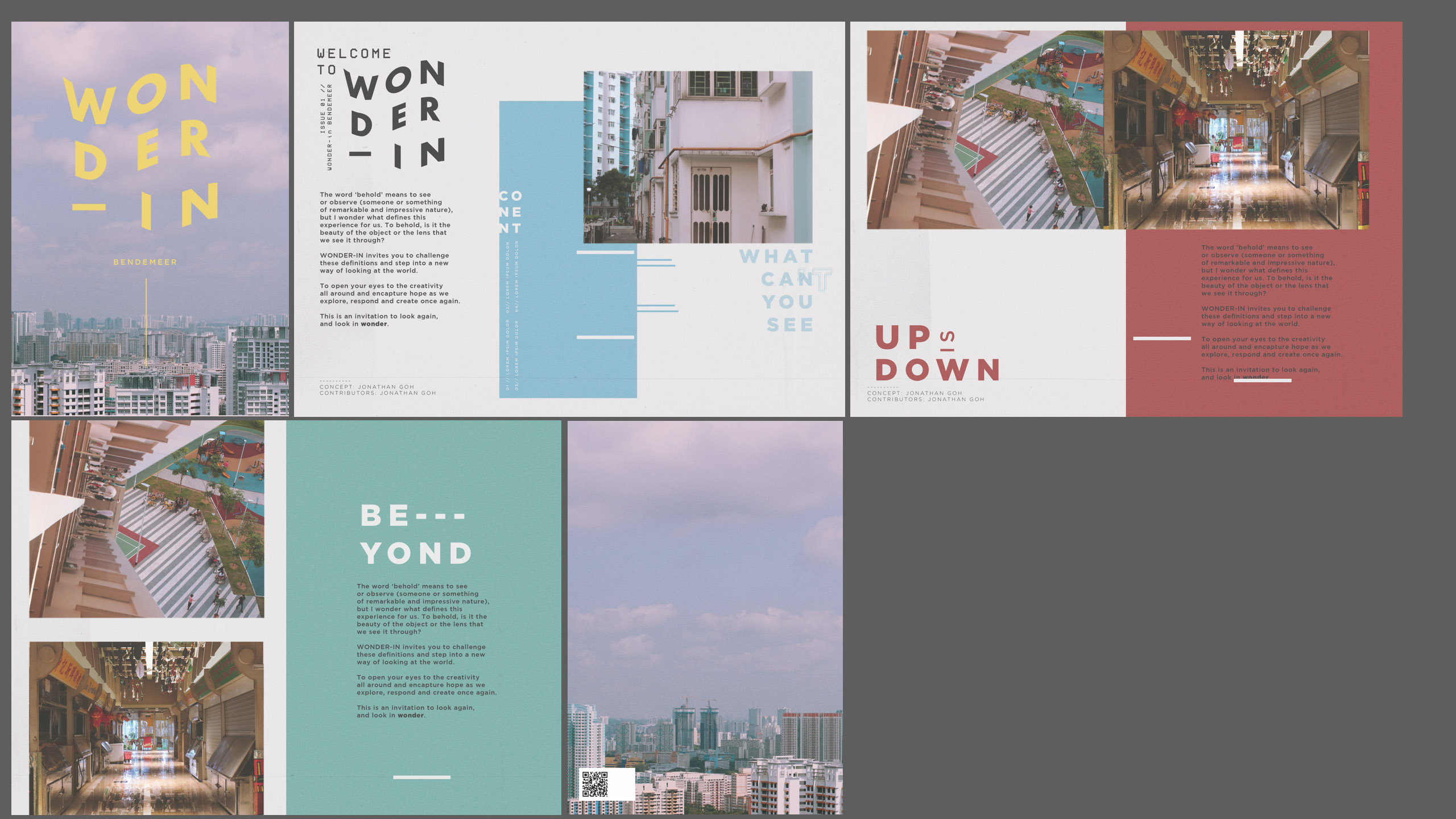
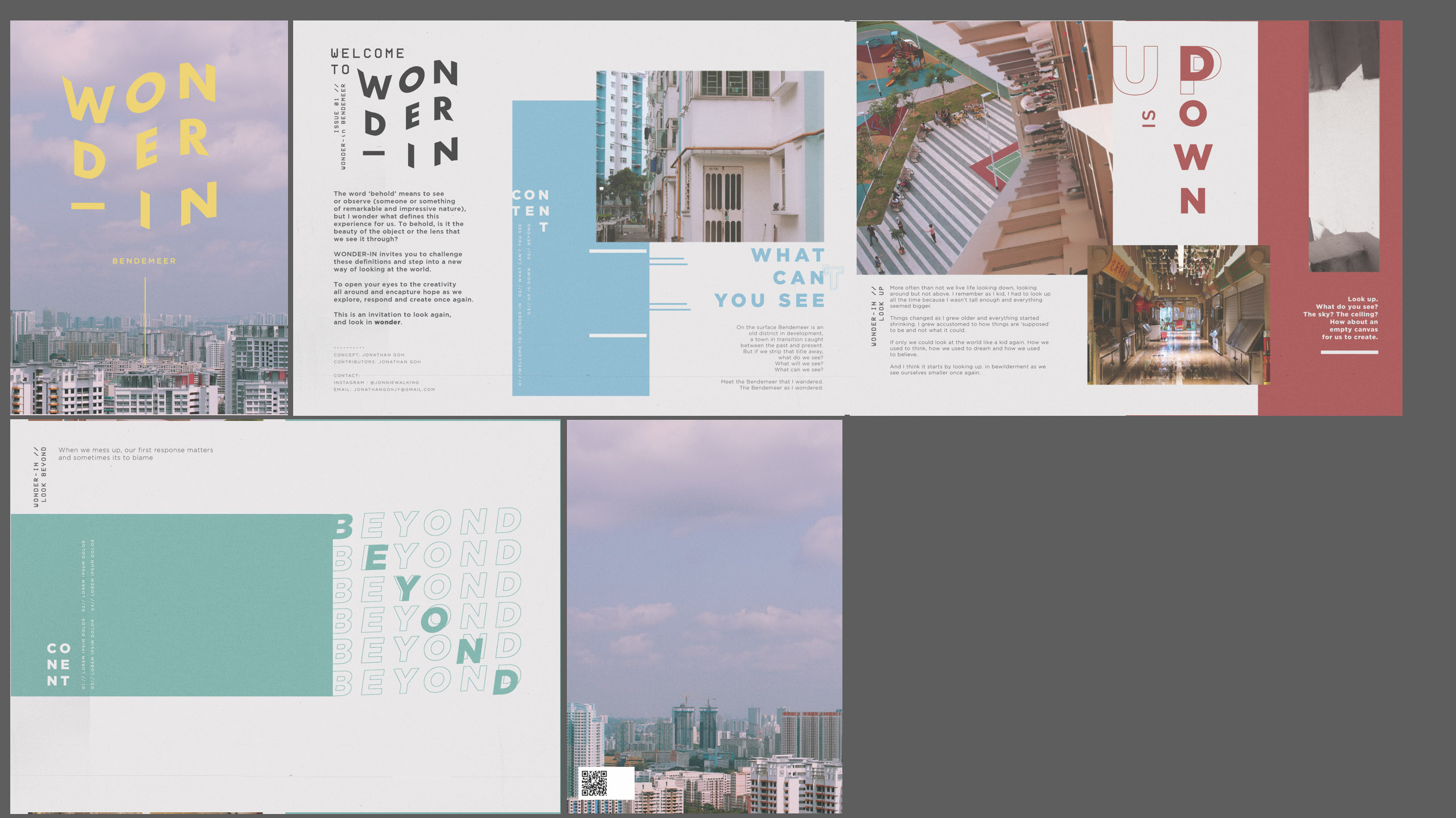
In case you missed it, here is the finalised layout for the zine!
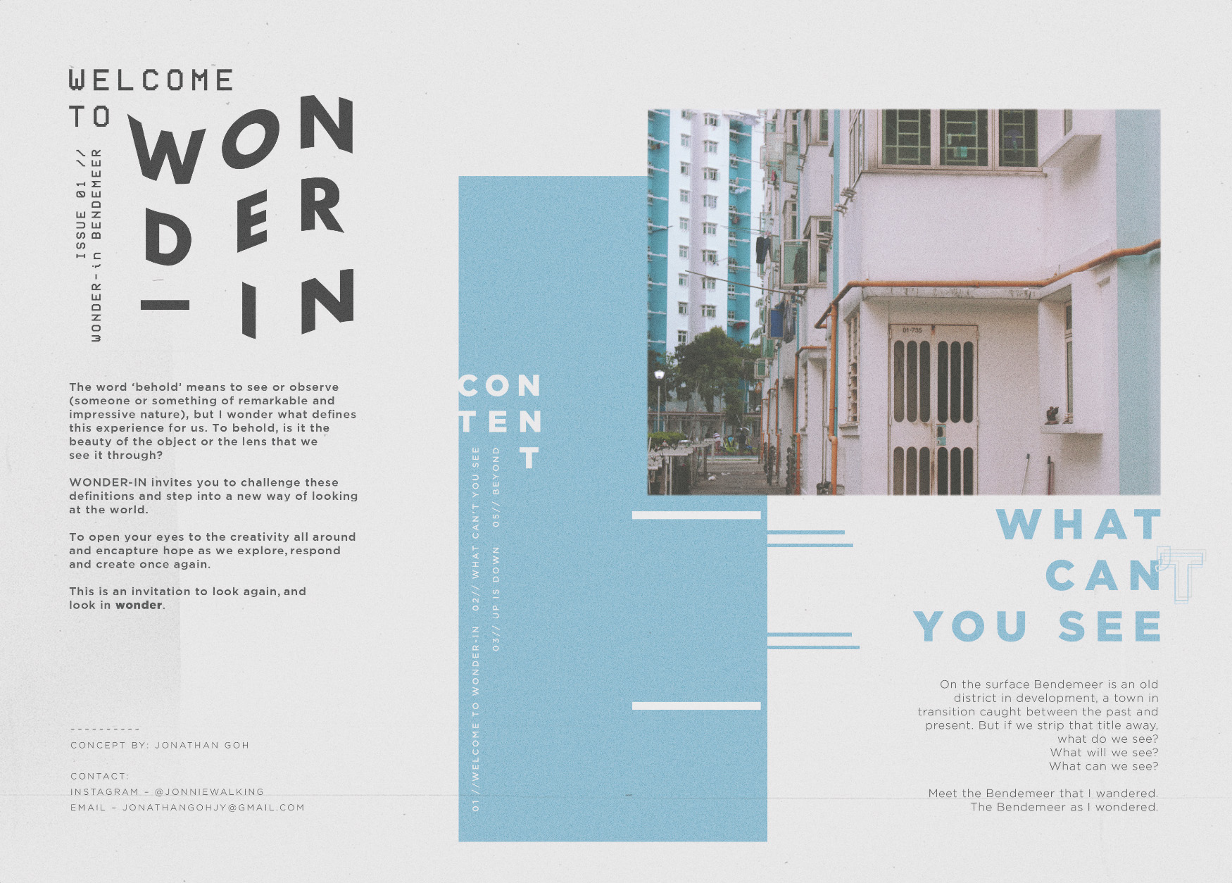
CONTENT.
“…my aim and objective for the zine is to introduce thought-provoking ideas and combine them with interesting visuals to capture readers’ attention.”
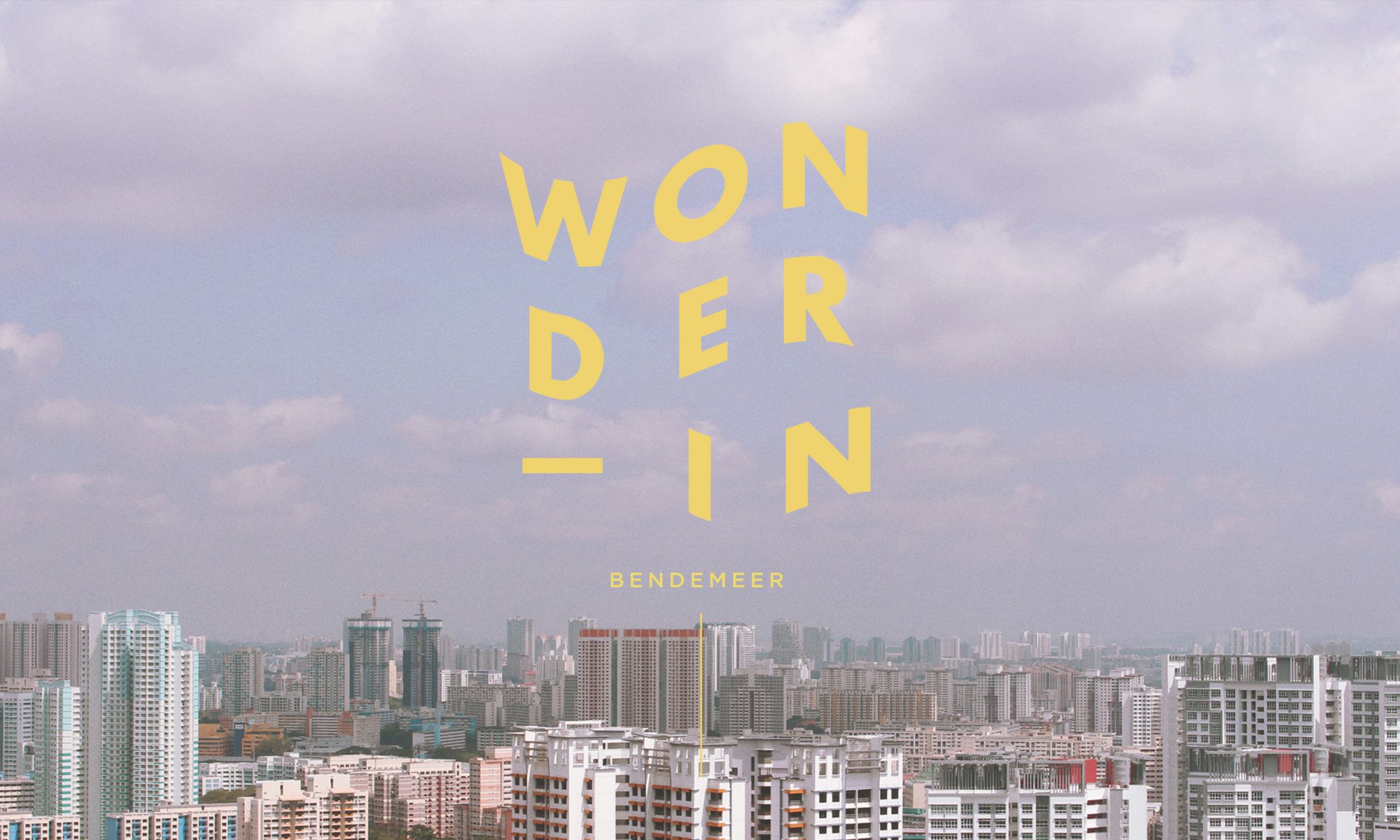
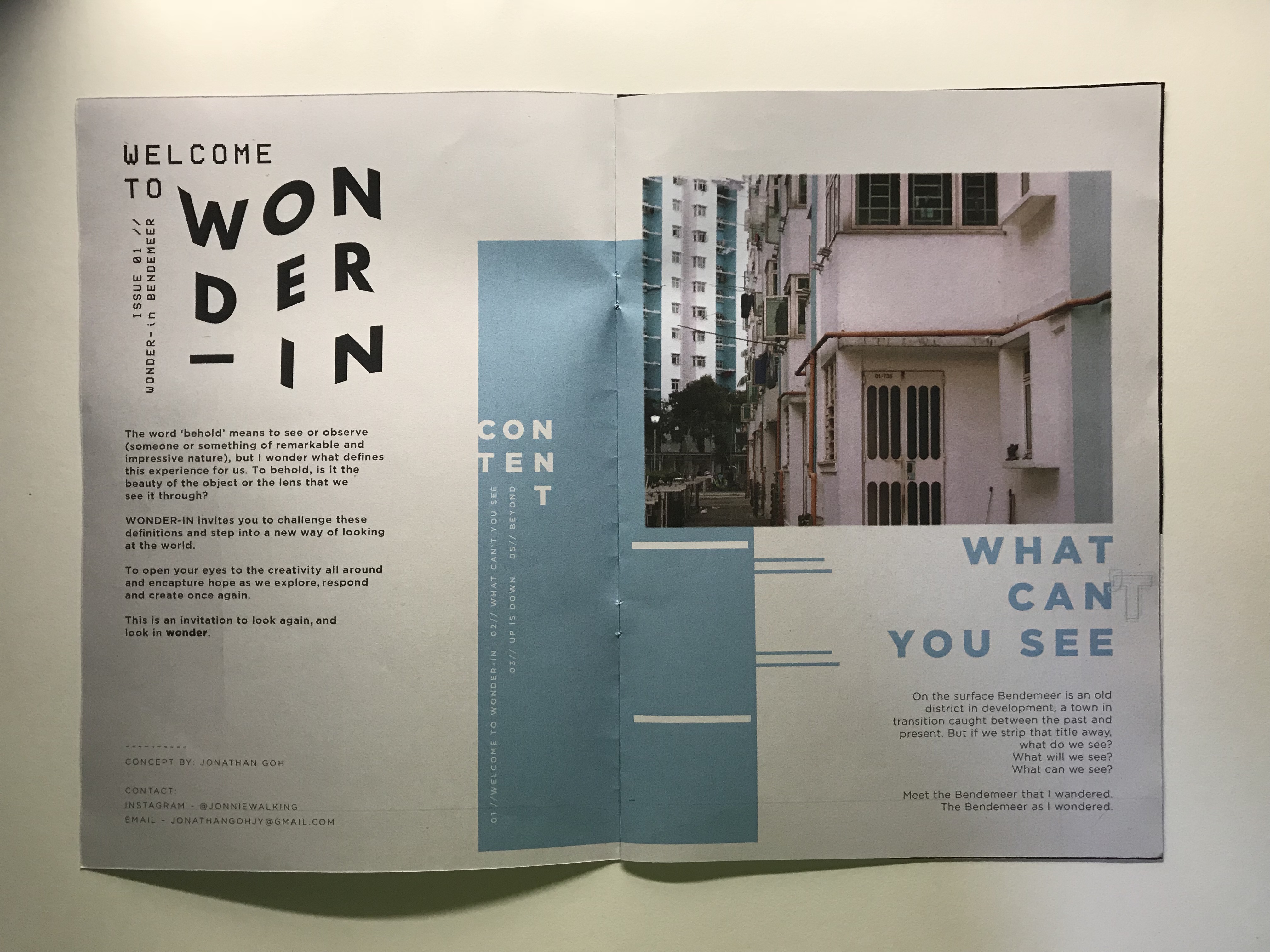
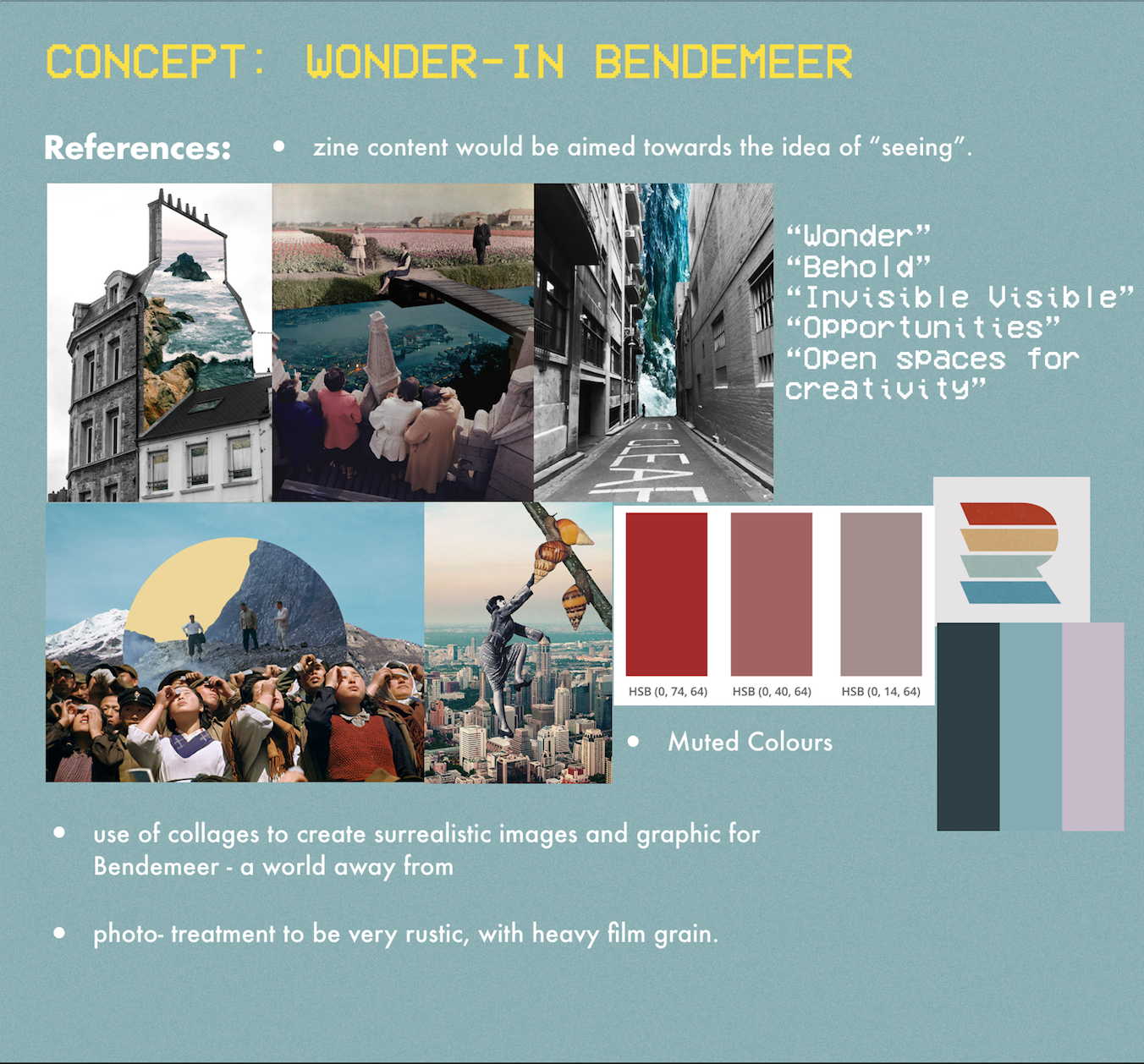
For the content, the idea was to challenge our perspectives as we go through our everyday. I titled the zine “Wonder-in” as a wordplay between the meanings of “wondering” which carries a certain idea of adventure and curiousity as well as “wonder” which is the feeling of admiration and amazement, towards the area of Bendemeer. Hence the title of the zine become “Wonder-in Bendemeer”. (carrying a dual meaning of both ‘wondering Bendemeer’ and Seeing the ‘wonder in Bendemeer’)
I decided to split the content of the zine to three chapters:
What Can’t You See
Up is Down
Beyond
Each chapter expresses a certain idea of “seeing” in wonder, and is based off a picture. The content ultimately affected the spread. Helping me determine the photo collage used for each spread and the colour palette subsequently.
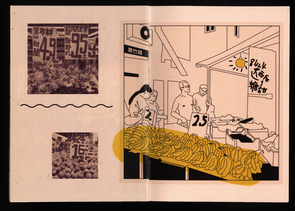
What Can’t You See
Colour choice: BLUE
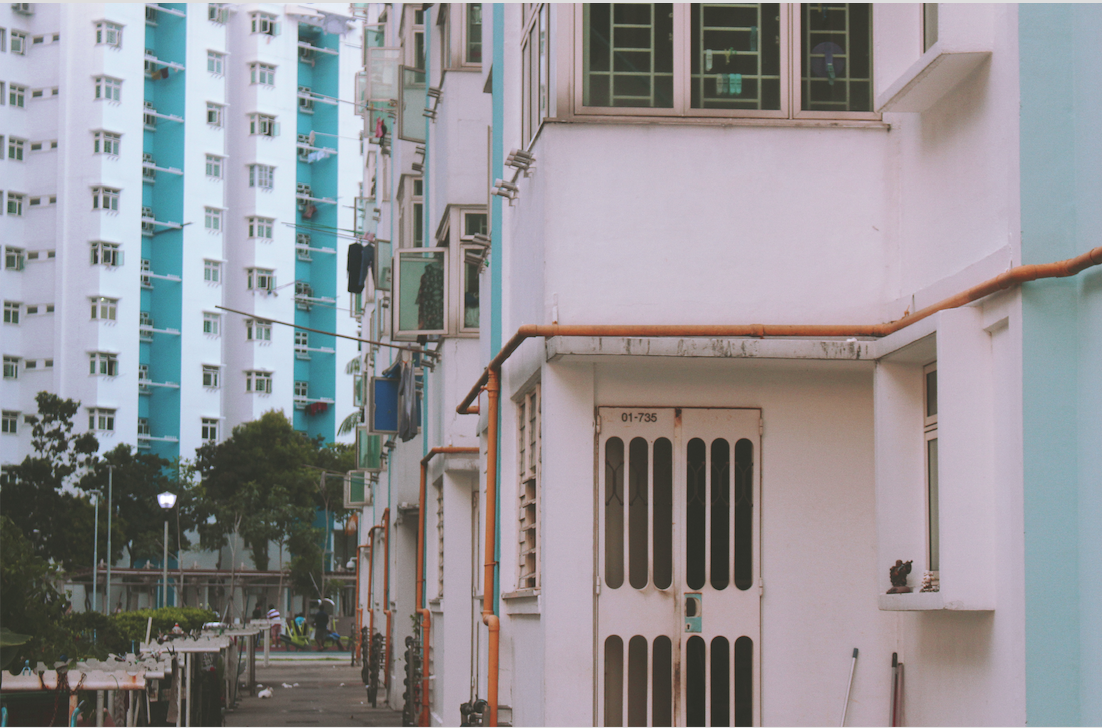
I decided to use a normal photo for the first spread to introduce the first chapter of Wonder then leading into the next. I included a typographic play on the chapter title as well to illustrate the idea between what you can see and what you can’t – the difference ultimately lies within ourselves. The use of a normal photo suggests the idea that this is in fact what we see in plain sight, yet if we would only see again, the endless possibilities that could be…
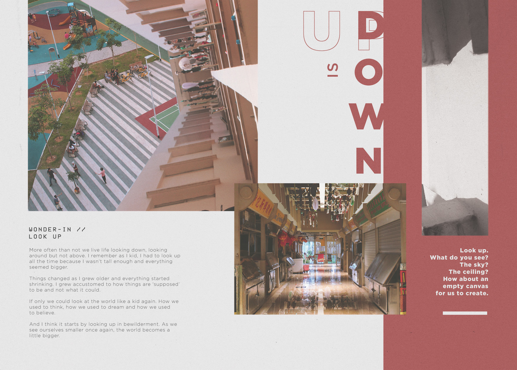
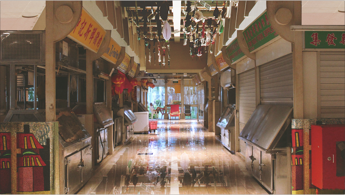
Up is Down
Colour choice: RED
To illustrate the idea of “wonder in looking up”, I used photos that allowed me to play with interesting angles, especially ones that showed either a ceiling or the sky. I replaced the image with something unlikely to highlight the contrast between what is and what isn’t. The use of red as the main colour scheme for this spread was to complement the warm colours present in the photo collages.
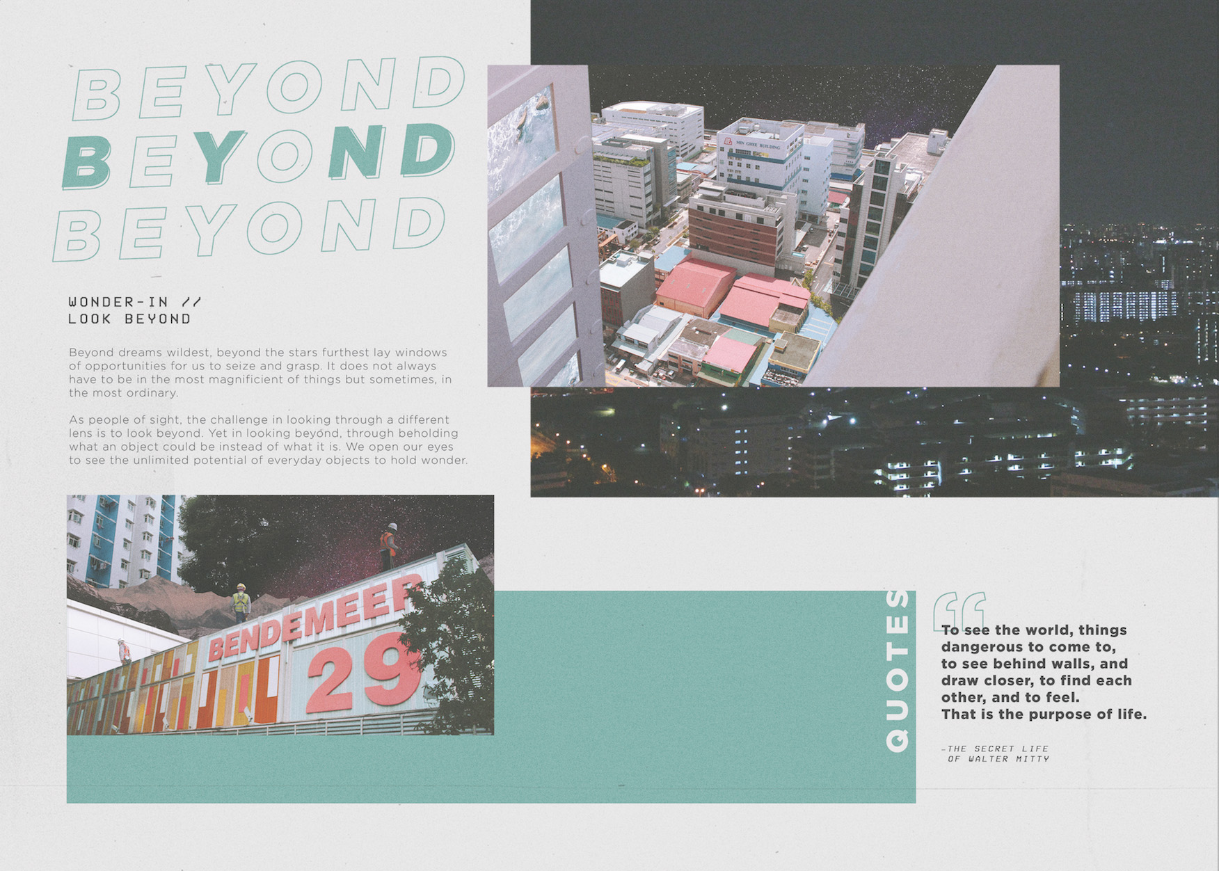
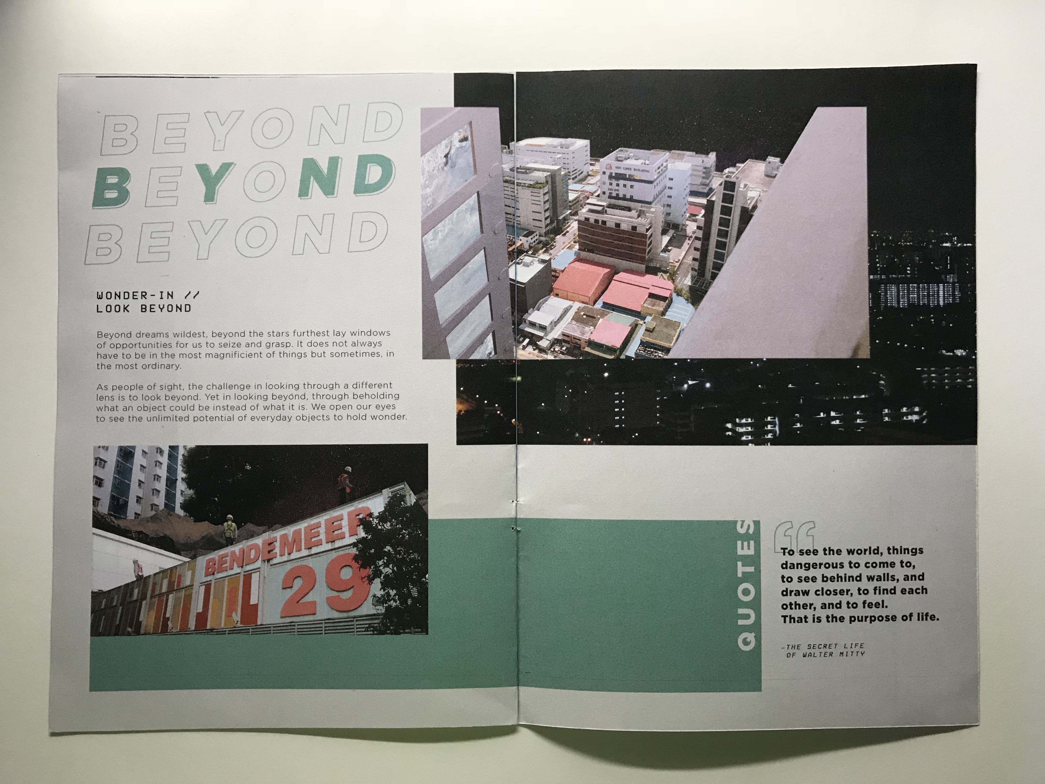
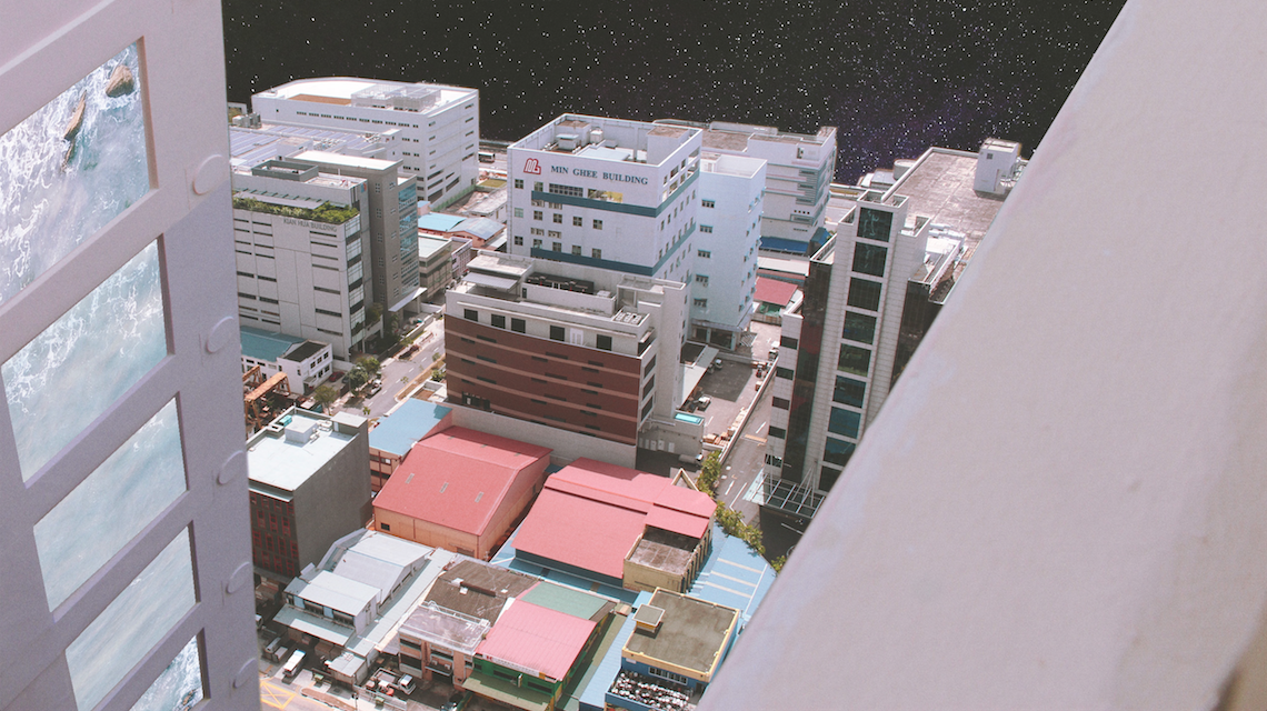
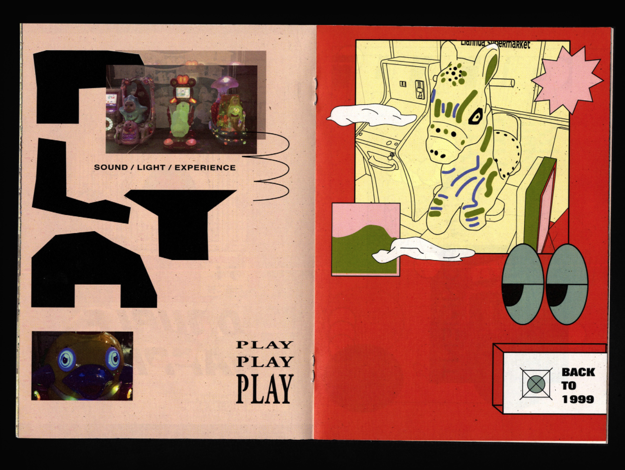
Beyond
Colour choice: GREEN
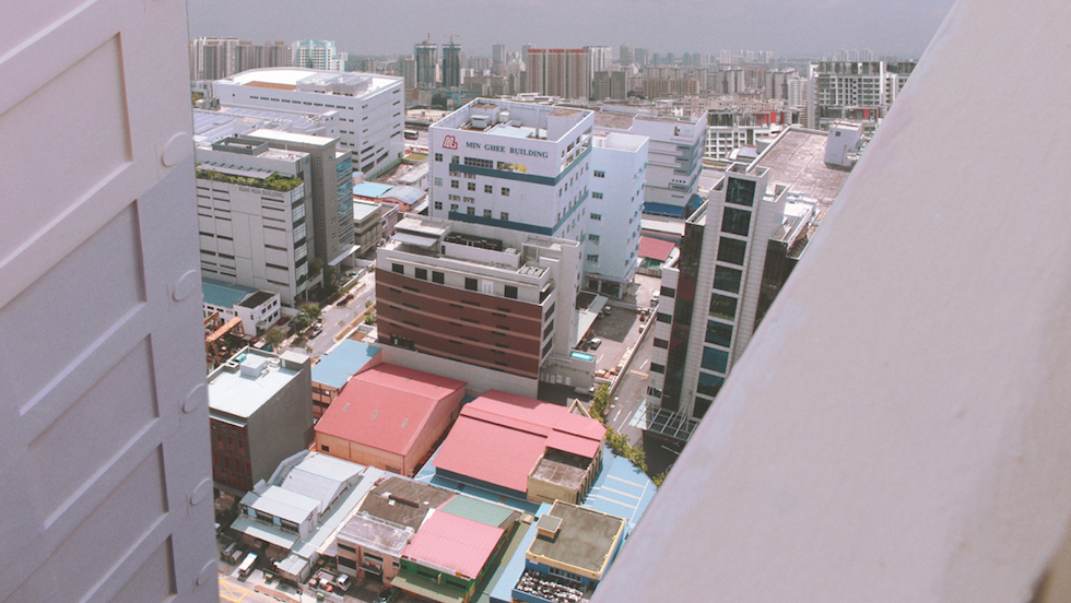
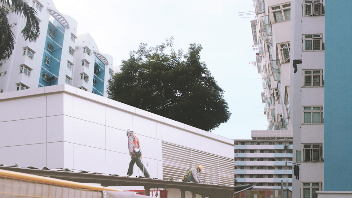
As the title suggests, Beyond is all about looking beyond, seeing an object not as what it is but what it could be. For the collages, I decided to go out a little, playing with images of space, mountains and oceans and combining it with the otherwise concrete jungle of Bendemeer. The result is a strong contrast between the sharp edges of the angular buildings together with the ‘softer’ scenery in the background. The idea of the images for this chapter was to create the sense of bewilderment.
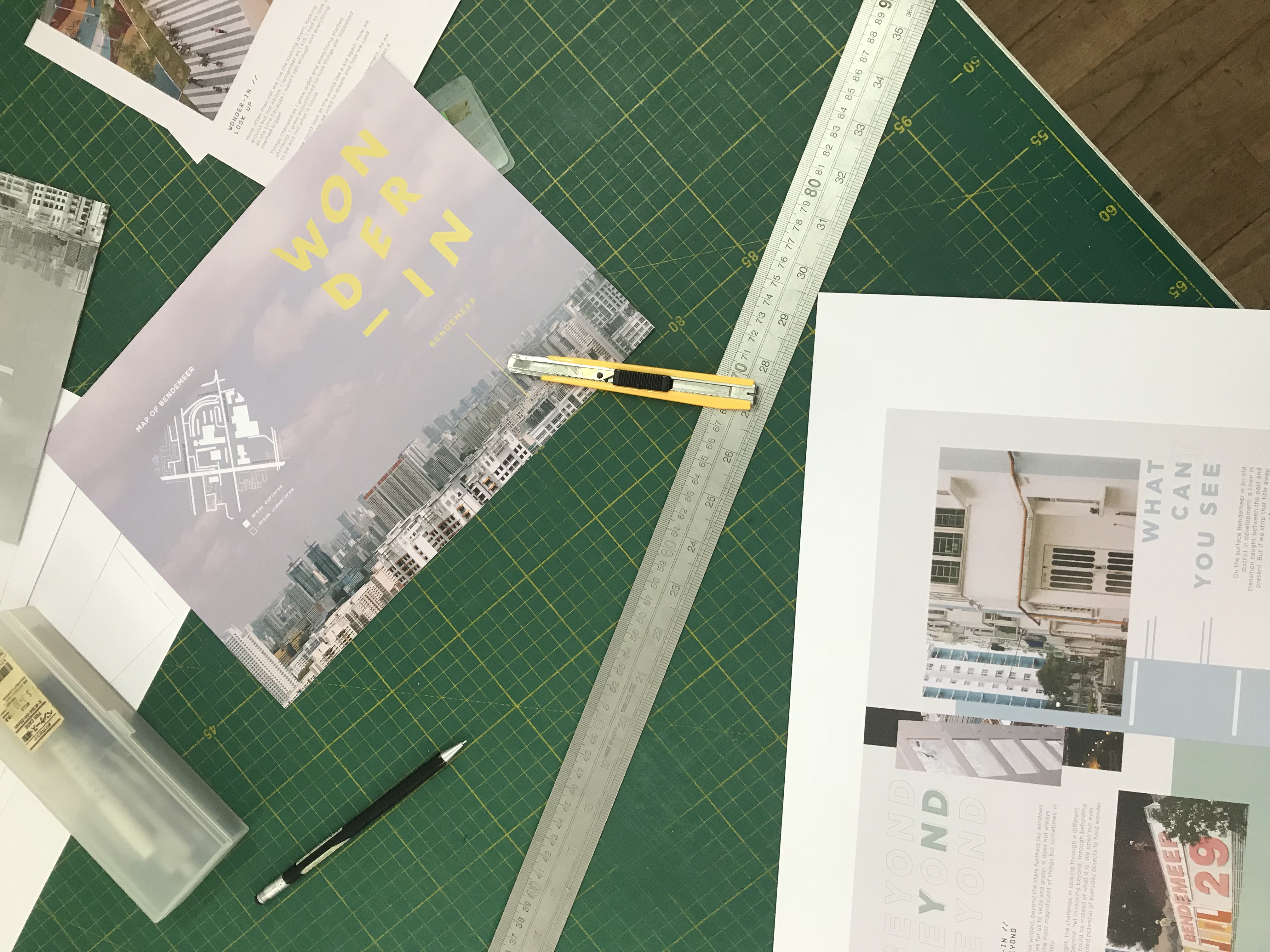
PRINT.
B&W: The first print sample was a black and white mock-up. Though the layout was not yet finalised, the purpose of this mockup was to test the alignment and the arrangement of the zine and to fix any print problems we may potentially face.
The print of the B&W sample was done using an A4 paper single sided print. I then glued both sides together. This was to increase the thickness of the paper and also avoid any printing errors as I did not want to waste ink.
As can be seen from the markings made, there were some changes to be made to the layout and design. Following the feedback, I then went on to make more edits and proceeded with print #2.
Colour Print #1: Colour Print 1 was printed after the overall layout was completed. It was done on 160 gsm paper, double-sided matte print. However, the final print colour seemed a little dull and the whiter areas had an overall pinkish tint to it.
Colour Print #2: Colour Print 2 was printed after the overall layout was completed. It was done on 100 gsm paper, double-sided print. The final print colour was stronger and had stronger contrast compared to the fade in Print #1. Hence, I decided to go with Colour Print #2 for the final print! (though the paper is thinner than I expected).
GOING BEYOND.
Once done with the traditional print, I wanted to venture and allow the audience to have more interaction with the zine. Also, with the 8 pages, there was a limitation in what can be shared and what content the video can experience.
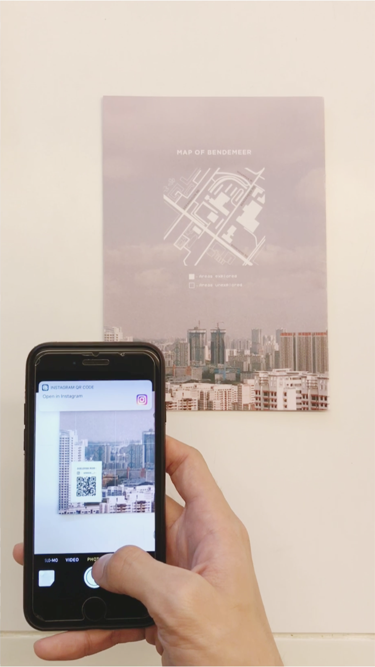
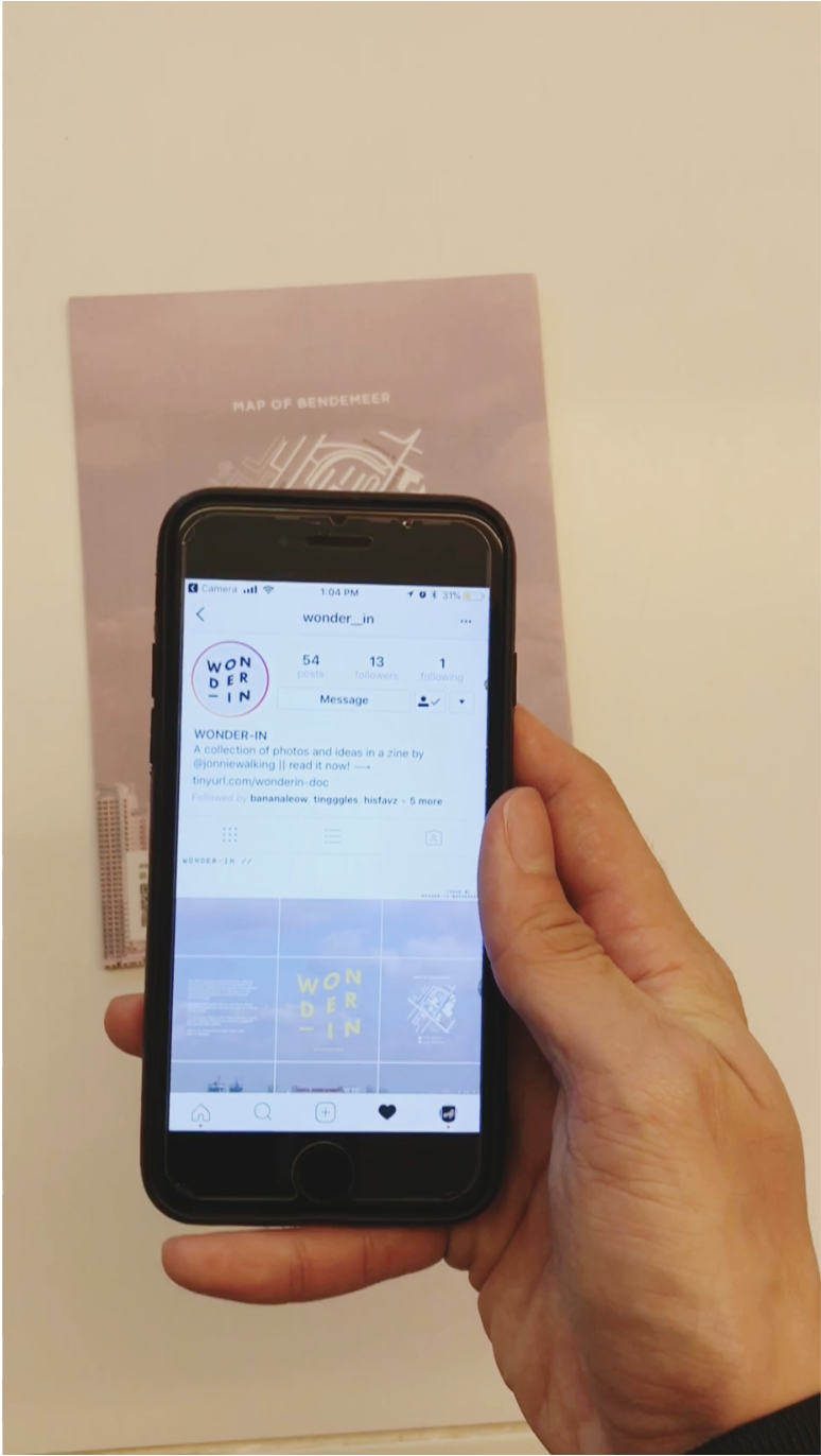
After much consideration, I decided to create an Instagram account page for the Zine, and link it via the QR code on the last page.
The reader can then scroll through the Instagram page to see a series of curated photos from the zine as well as other photos. The link in bio links to an Issuu page where the reader can browse a digital copy of the magazine on that platform.
DIRECTIONS FOR QR CODE: For iPhone users, just simply open your camera and point the camera towards the QR code. A banner notification with a link should appear prompting you to go to the link. Just click and voila, you’ve arrived on Wonder-in’s instagram page. Feel free to interact with the story (highlight) and scroll through the feed!
Example of Instagram grid system for Wonder-in
The purpose of the instagram page is an extension of the zine. It serves as a platform to inspire and engage as it encourages others to see the “wonder” in the ordinary. It also allows readers to share photos that inspire them with their friends.
CONCLUSION.
Its a tiring process coming up with a zine concept from scratch. However, through this project, I’ve realised the strengths and limitations of traditional print media. The (expensive) costs of printing, versus other mediums to allow someone to experience something.
I’m quite satisfied with the final outcome of Wonder-in, and am really glad that the final product came quite close to what I had planned. The content within the zine is also something that is very close to my heart and I’m really happy that I got the opportunity to communicate it through this project. 🙂
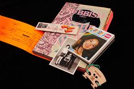
I have always loved reading magazines, especially zines. They have strong personalities, ideas and visual identities that is expressed through their content and visual graphics (photos/illustration/layout). The RUBBISH FAMzine series of Zines by local family art collective holycrap is one example of this. Their use of Zine as a platform to share personal experiences and thoughts as a family engages readers as their content becomes relatable and thoughtful. Combined with their use of strong visual themes, no wonder this Zine has won numerous design awards and is well recognised worldwide as well.
Rubbish FAMzine Issue #5Rubbish FAMzine Issue #5
Approaching this Project, I decided that I would want to create a zine that would allow space for these areas to show. Hence, my aim and objective for the zine is to introduce thought-provoking ideas and combine them with interesting visuals to capture readers’ attention.
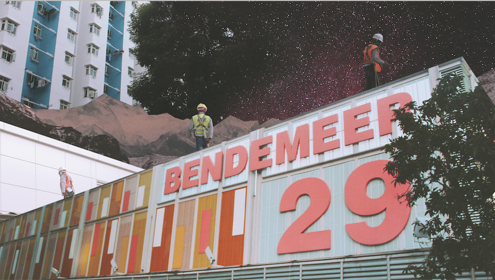
Journey to Bendemeer (Project 2a).
BENDEMEER. YES. I travelled from Yew Tee to Bendemeer (which I actually have never been to before) cos that was the area suggested/given/selected by me. I thought that the nearest MRT was Bendemeer (on the downtown line) but I was wrong. Turns out that Boon Keng is nearer to the Bendemeer Estate.
To cut a long story short, I actually visited the area twice. I alighted the first time at Bendemeer and ended up exploring the Industrial Estate there (which was not very interesting) and the second time at Boon Keng where I explored the residential areas and other areas of Bendemeer.
The MRT at Bendemeer was actually really empty (as though it was unoccupied). Felt kinda creepy.
MRT at Bendemeer
Anyway, read all about the exploration here in my presentation slides!
WONDER-ZINE.
While crafting the presentation, the idea of using collages to express a different side of Bendemeer came to mind and I decided to continue to explore that idea.
For the first consultation, I created a moodboard to firm up certain ideas I have had. I settled on a theme for my zine that would be exploring the concept of “seeing”. I added words that I associated “seeing” with to give myself a rough idea of what content and what other ideas I can explore with the zine.
I also included references images, and examples of layouts that inspired me.
As I have already curated a series of photos for use in my presentation, I decided to continue with these photos and try collaging them. The aim is to create a surrealistic visual that will allow readers to question the image.
Here are some examples of the first collage drafts:
Some feedback for the images were that some were not “surrealistic” enough and so it was back to photoshop once again.
Once I was done editing the image, I started to layout the images and spread them out to try the layouts. (without the content).
Presenting, WONDER-IN #1
Zine layout 1
I decided to use a sky image of Bendemeer as it gave the magazine a sense of context. The typography of the main title logo was deliberately wavy to translate the idea of “Wonder”.
I split the content into 3 main chapters, and tried to use different colours and typography treatment to highlight each chapter’s unique aspects.
The difficulty was trying to experiment interesting layout while ensuring that every spread is consistent and not out of place!
Feedback were that the spread for pg 4-5 and 6-7 were lacklustre in the energy in terms of the layout as compared to the spread in pg 2-3…
I was quite satisfied with the use of colours, and typography for the first draft so I didn’t change it much.
WONDER-IN #2
For V2 I tried experimenting more with the potential of the layouts but with the content not done, the layouts continued to grow and was edited along the way. To cut the long story short, here is the finalised layout at the end. which was V3438247384379482.
Final Layout.
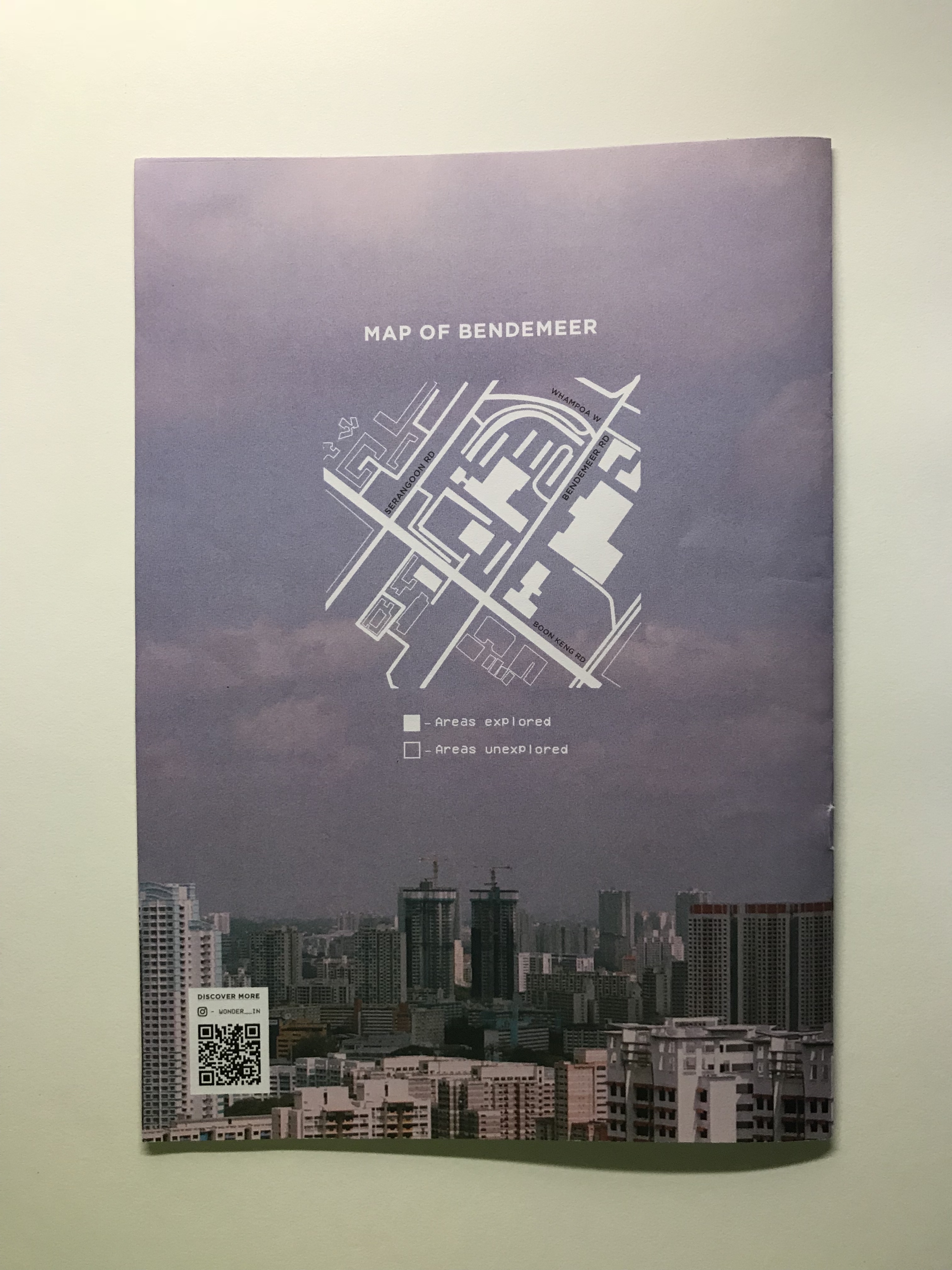
With the content more or less complicated and in line with how I want the visual graphics to tie and link with, the layout was completed soon after. Due the to small amount of pages for this zine, I decided to do away with page numbers as well.
Apart from the minor changes in terms of layout, I also included a map of Bendemeer at the backpage as well as a QR code with a scan that links to an instagram page set up. But more on that in my next post!