1) Zine – Inspiration
So to start off, must thank da people who really helped advice and suggest on how to improve my zine. So thank you Charmaine, Christopher and Rannie for all your help!! heheh and THANK YOU TEACHER SHIRLEY FOR EVERYTHING 😀 hehehe!! Ya’ll the real inspiration.
Very stressful, but very fun. hhahahaha
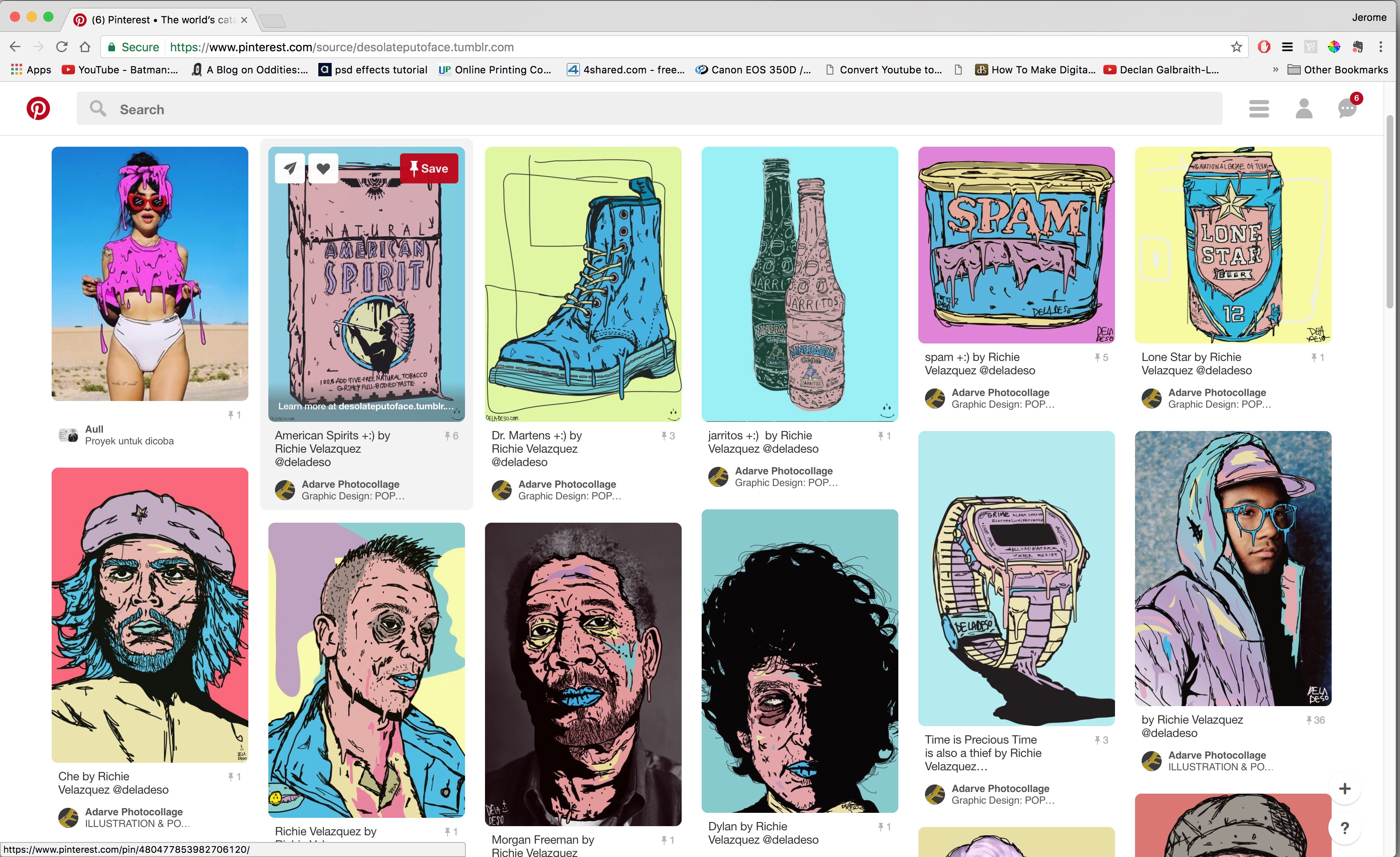
So, Pinterest.. our best friend.
So after doing my research, going to Ang Mo Kio and all, I had A LOT OF PICTURES SIA!! And I sort of had an idea for how to do up my zine. So I went onto Pinterest to get some inspiration to see if there was something i could follow.
i) So below is my initial thoughts on how to do my Zine. But it was something similar to what i’ve done before, so i was feeling kind of “meh” about it. But i knew i wanted something similar to this, so i went on to see if there was anything else.
↓
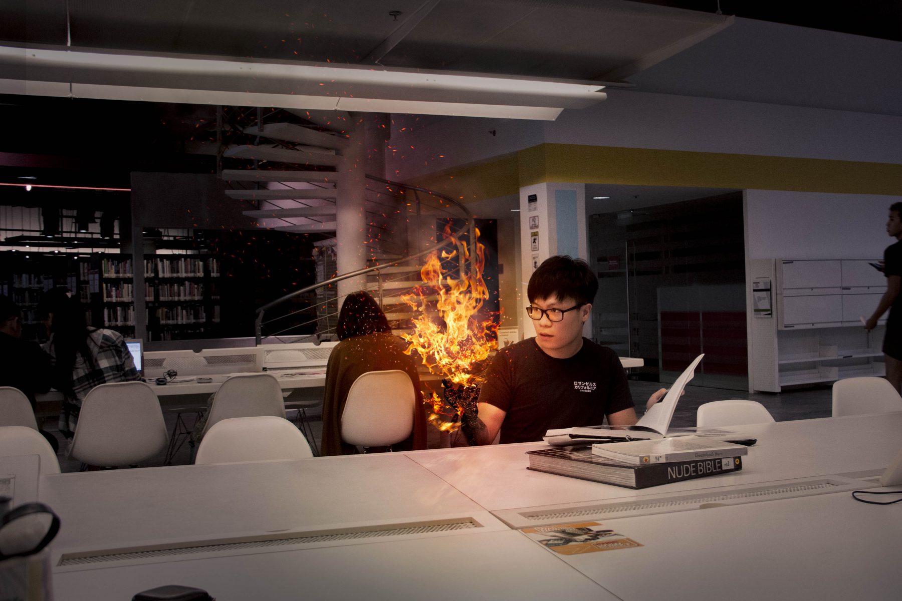
ii) And then!! I found something very interesting! I found this dude who did works that seemed to melt! I thought this was damn interesting and would work for my zine, so i went with this particular style.
↓
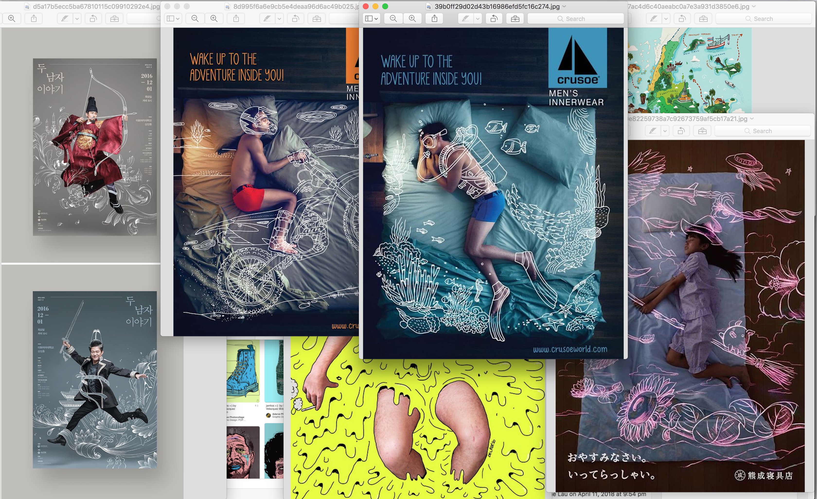
iii) When trying to figure out how to layout my content and photographs, i also referred to posts like the ones below that i could find on pinterest. Wa, super hard to find something suitable because the zine is so smallll.. But, it was a good challenge.
↓
2) Zine – Process
a) Mindmaps
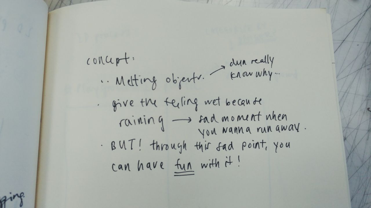
So when finally getting down to my concept, from my research I had decided to use playgrounds from Ang Mo Kio as my main subject matter. And when i thought of playgrounds, i thought of how on Channel 8, they always have this scene when the children run away or when your old ah ma cannot be found, they always go to the playground to try and find them.
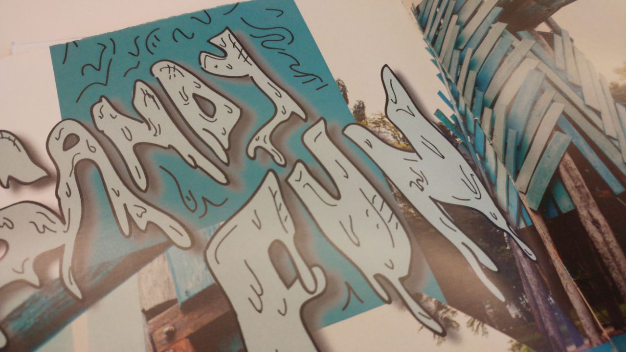
So i wanted to use the concept of Running away. Therefore Runaway became my title of the zine. And because running away can be seen as a sad thing, that’s why i wanted to use the melting style that i had found on pinterest. BUT i wanted to add my own little twist. Adding a little fun into it all. Chris gave me some ideas on how convey the message i wanted to show in my zine.
This is what i was trying to convey in my concept using the melting/watery feels for my objects and text in my Zine.
↓ 
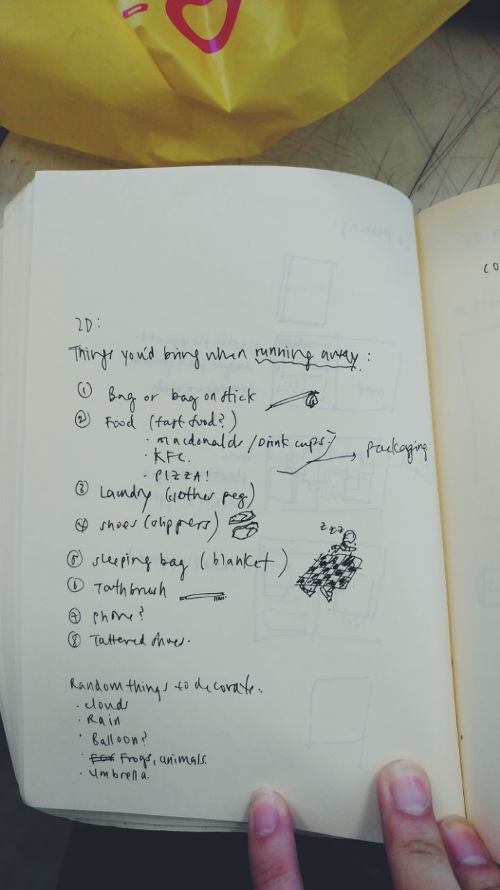
And since my Zine is about RUNNING AWAYYYYY, I thought it’d be quite interesting to add on a checklist on what to bring. So it becomes like a guide to what to do at the playgrounds.
↓
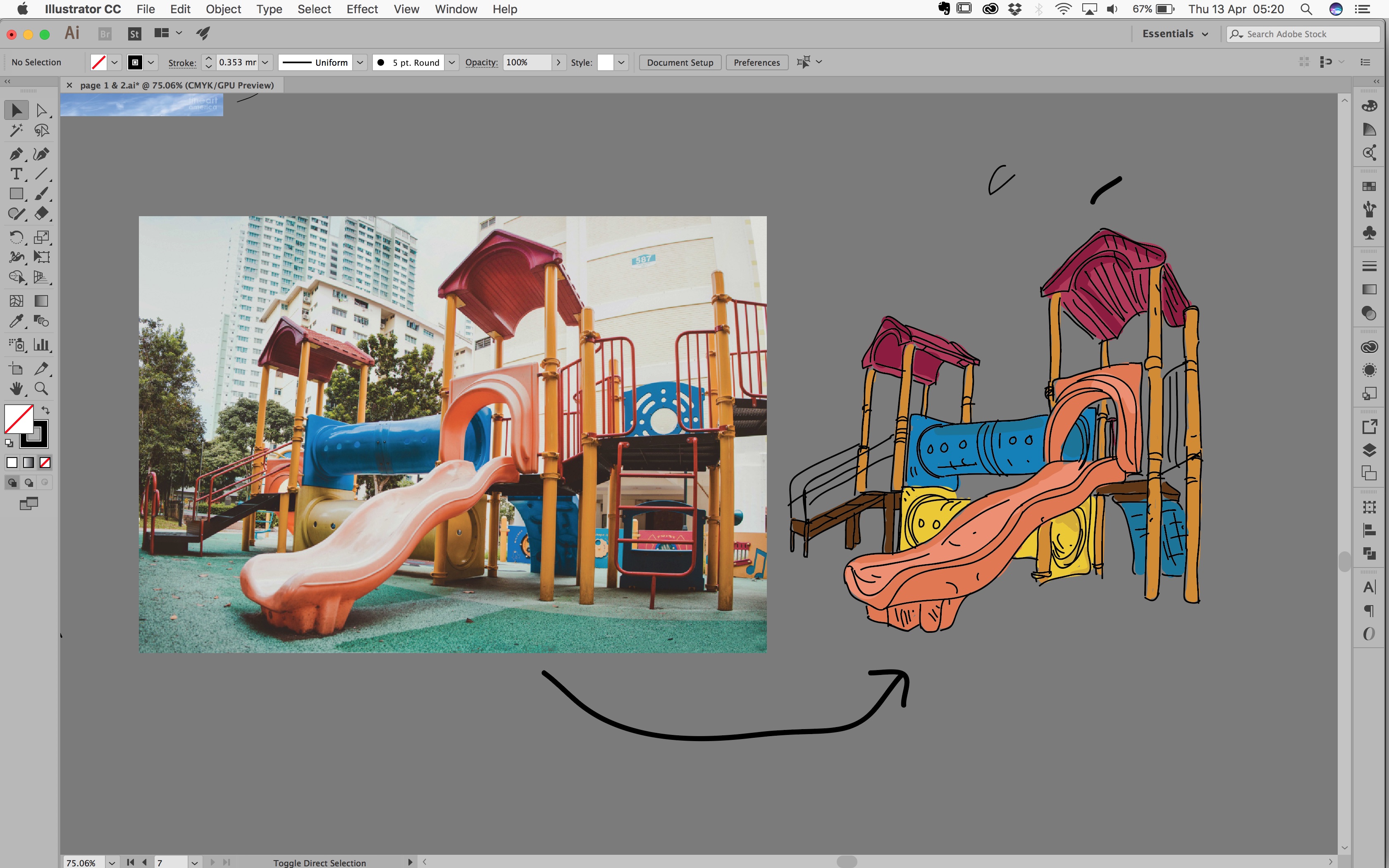
b) Illustrations
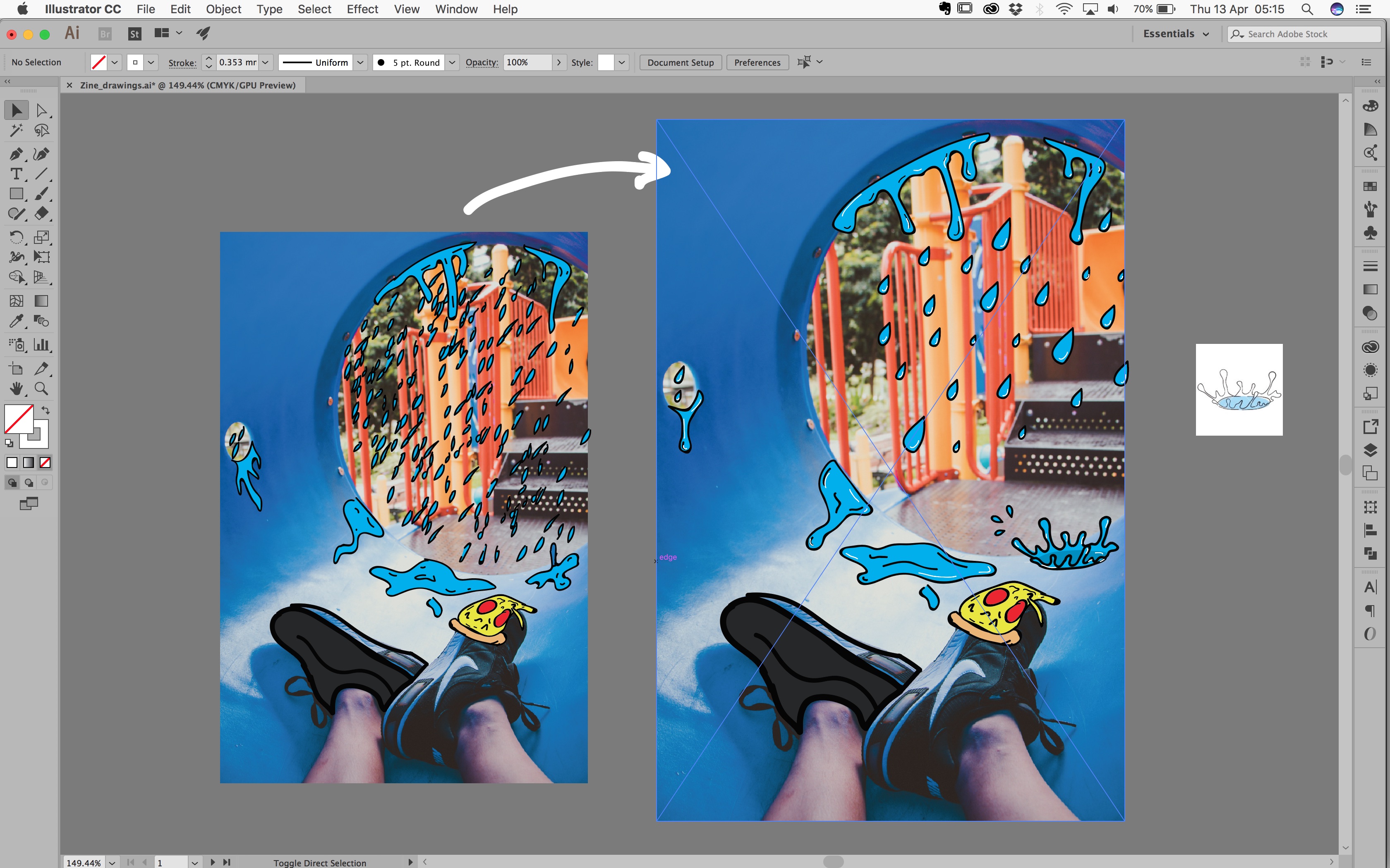
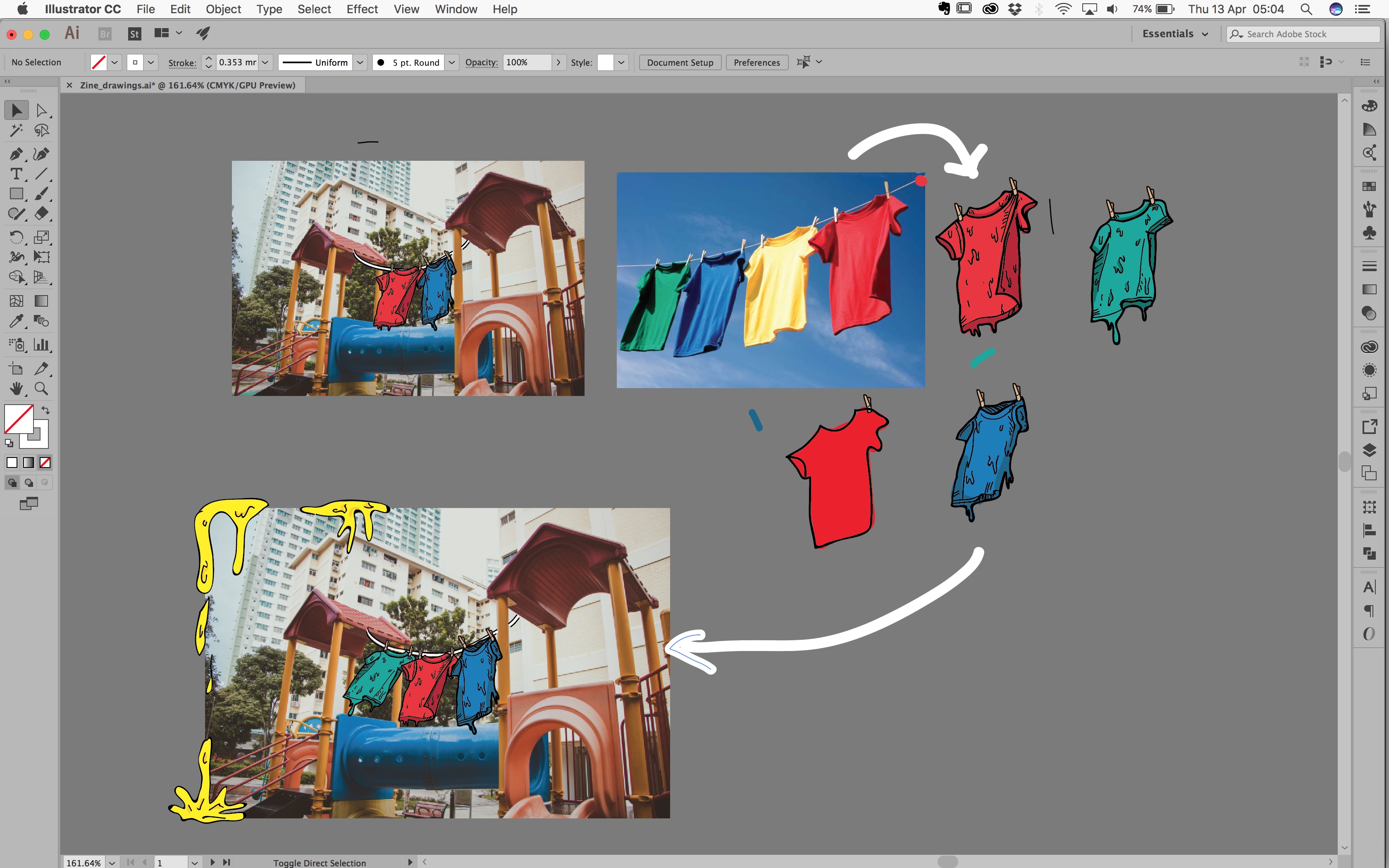
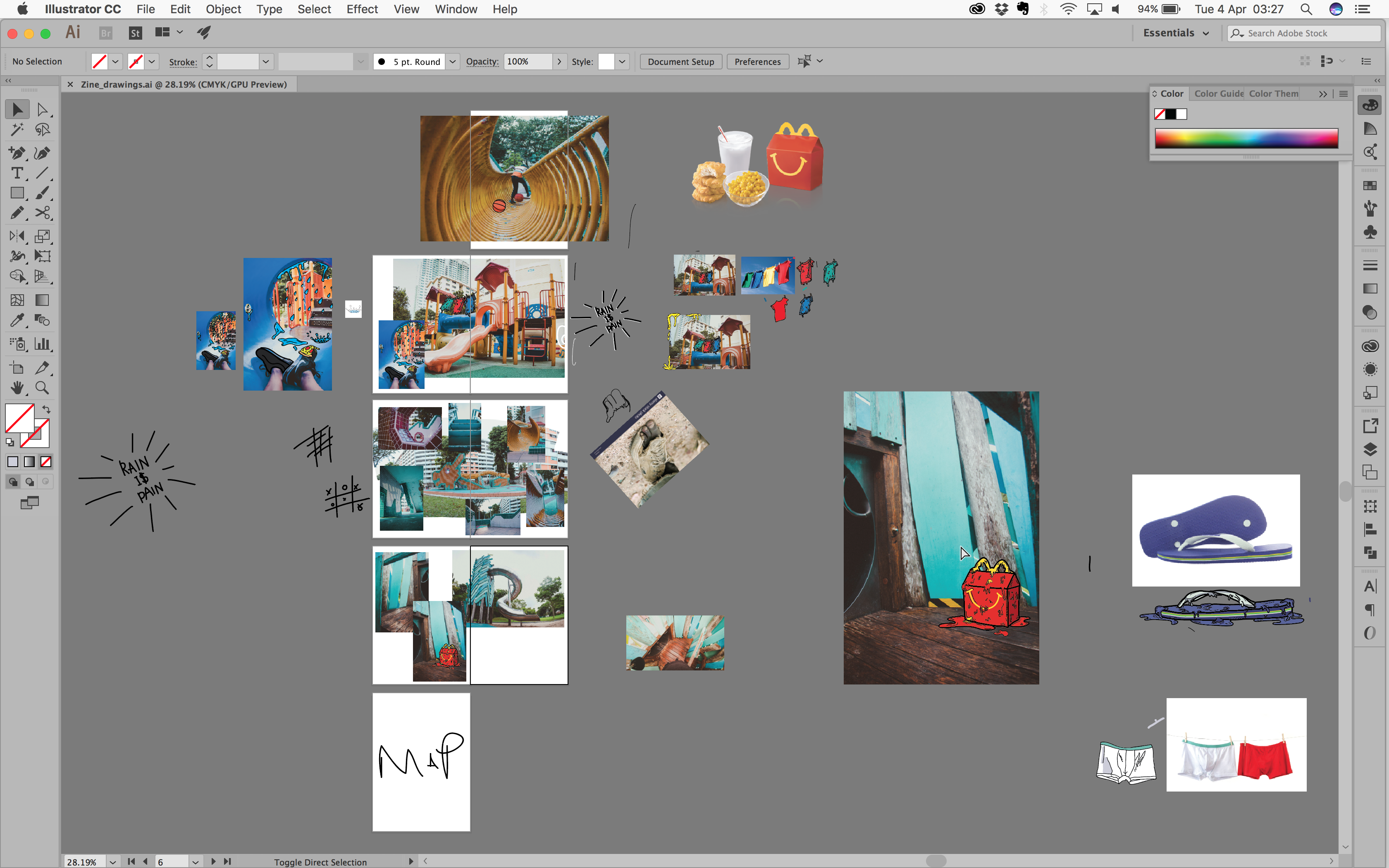
For my Runaway zine, i wanted to add in quite a few illustrations, so off to Adobe Illustrator i went. I was trying to experiment as much as i could with the images i took to see what illustrations match with the images. My illustrations basically went by my checklist eg, pizza, macdonalds, laundry shirts etc.
I had a bit of difficulty with the illustrations, hahhaha at first they turned out pretty ugly. Then Charmaine helped me a bit and taught me what i should try to do when using illustrator. Below is a clear example of before and after she helped me.
THANK YOU CHARMAINE.
↓
So i went on to do more illustrations on my own. And i think they turned out pretty ok! hahahaha, a lot better than i thought. So yay!
Along the way, it hit me that i should have a map for the zine, after all its a zine that introduces the playgrounds in AMK, so there’s got to be a map.
Like a TREASURE MAP!!
↓
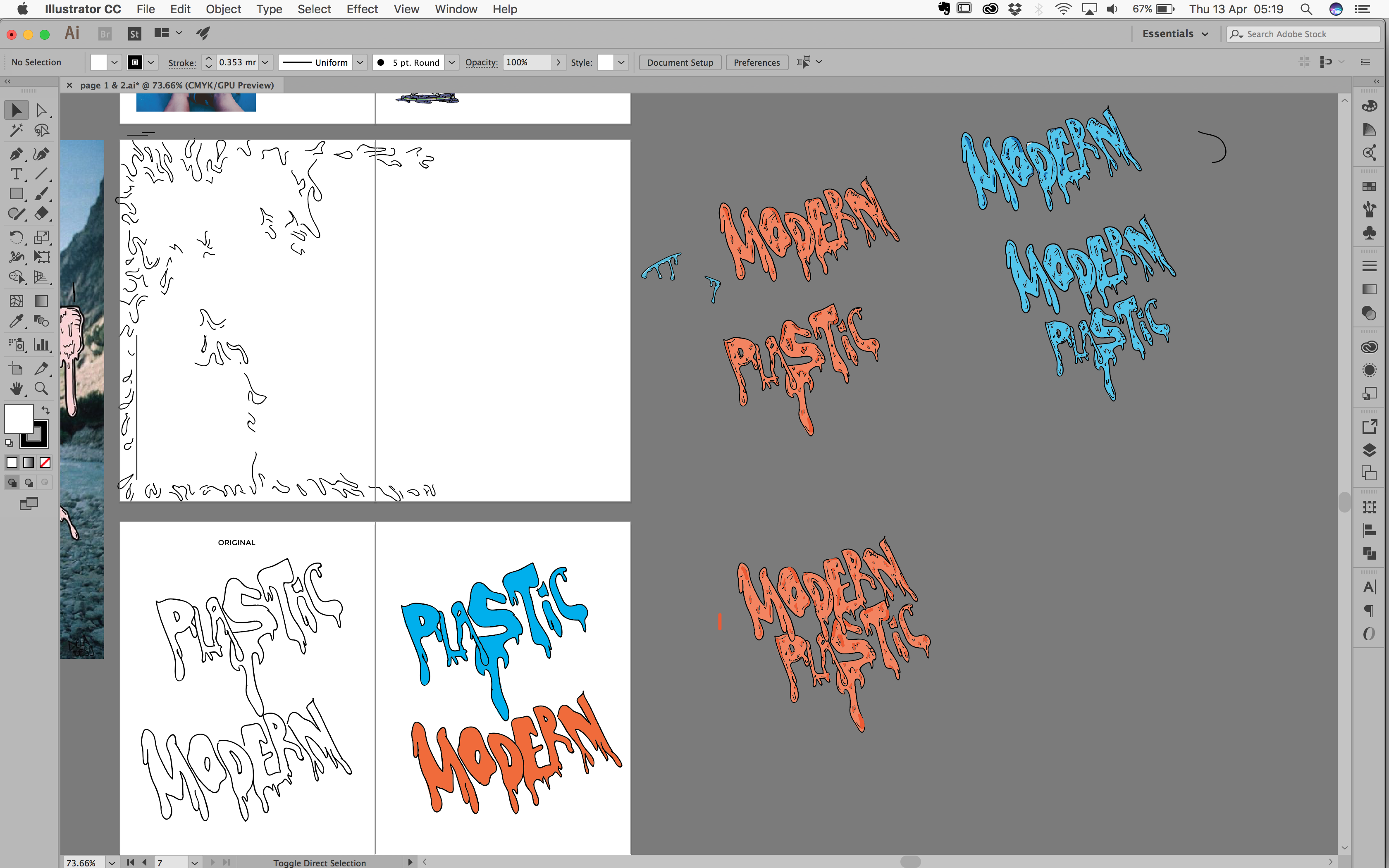
So i also experimented with the words, drawing them out letter by letter and “melting” them. Also playing around with the colour, which was really quite a headache.
↓ Playing with more colours and trying out whether it would look nice against the pictures that i was going to use.
↓
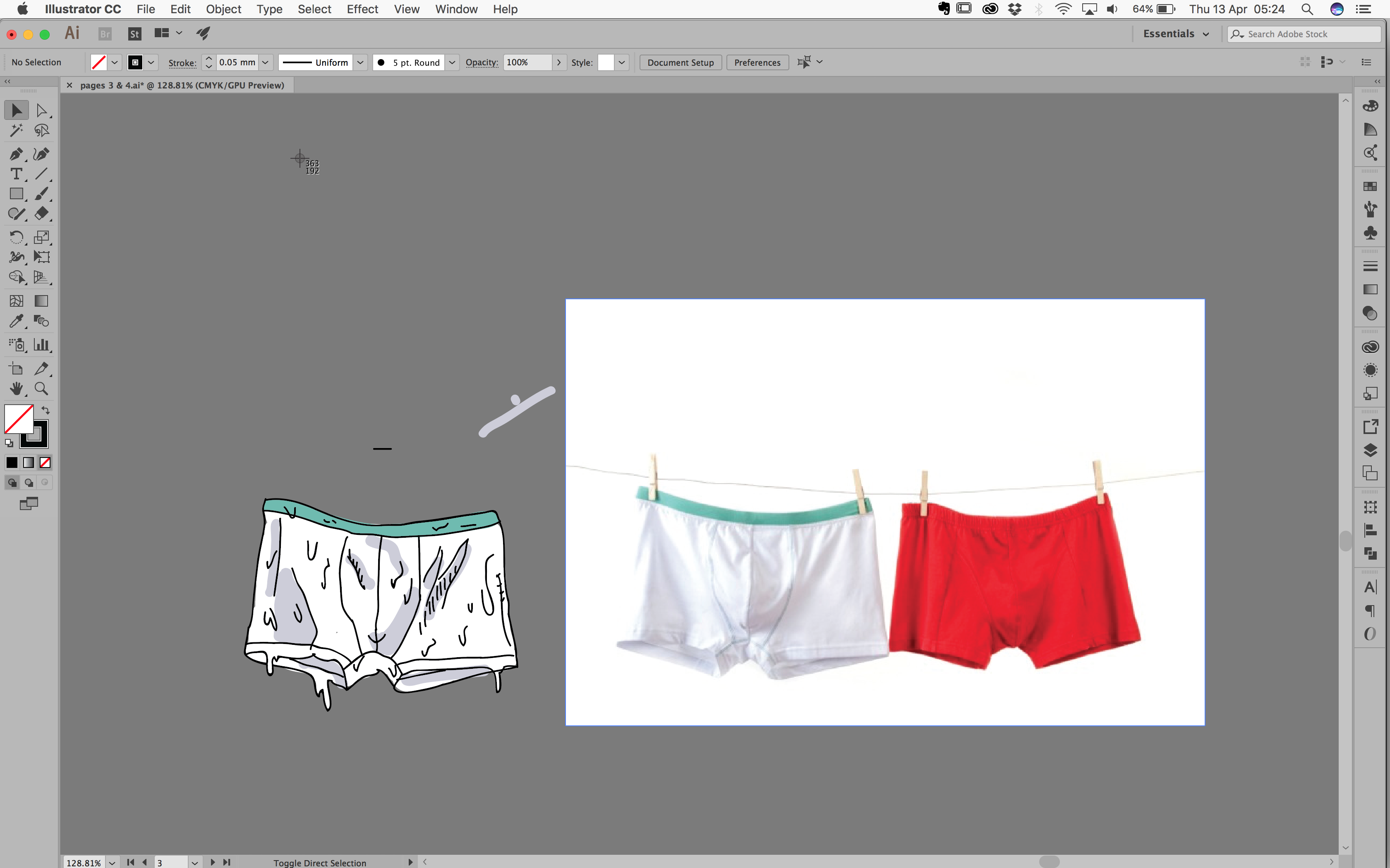
 UNDERWEARRRR
↓
At some point i was really getting quiteeee messy and all over the place.
↓
c) Layout and Text
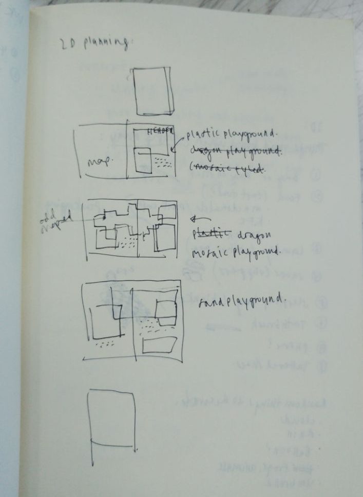
I wanted to categorise my playgrounds by MODERN (PLASTIC), OLD (MOSAIC) AND SANDY playgrounds.
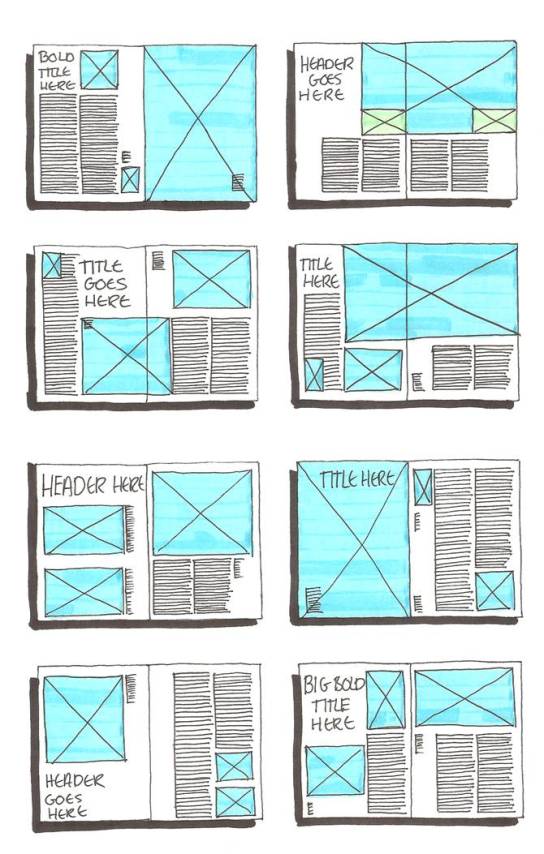
So i first tried to come up with a mini layout mock up for my zine, arranging which playground would come first in the zine. Of course this was a really rough guide to the layout, but having these to look at really does help.
↓
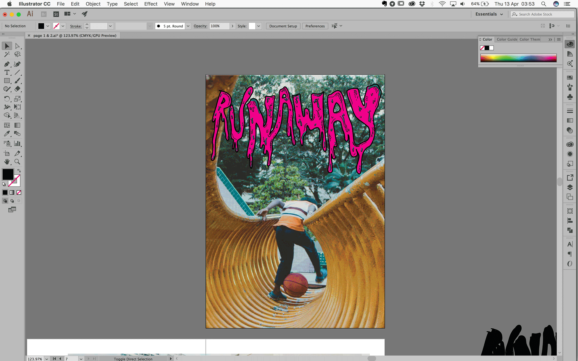
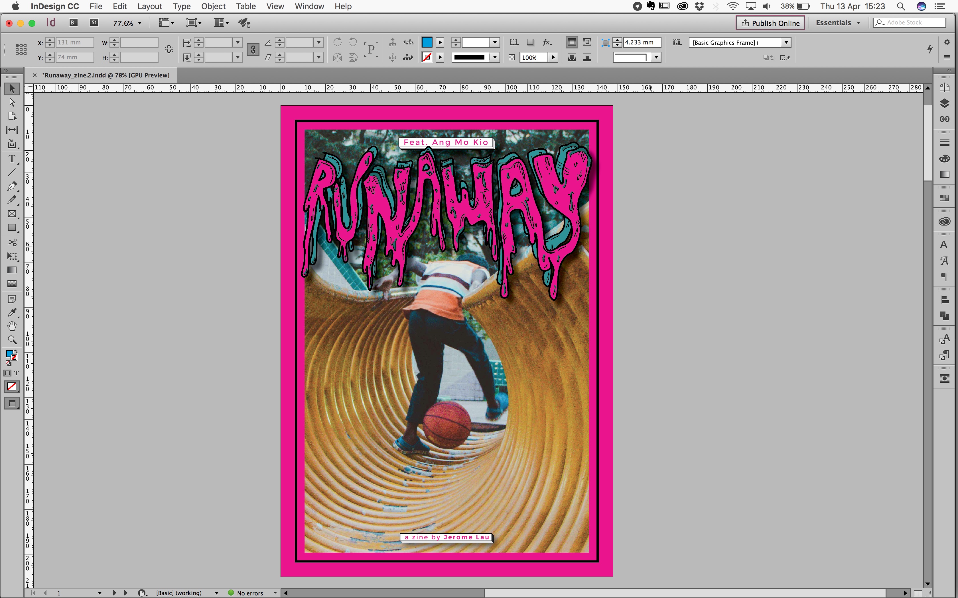
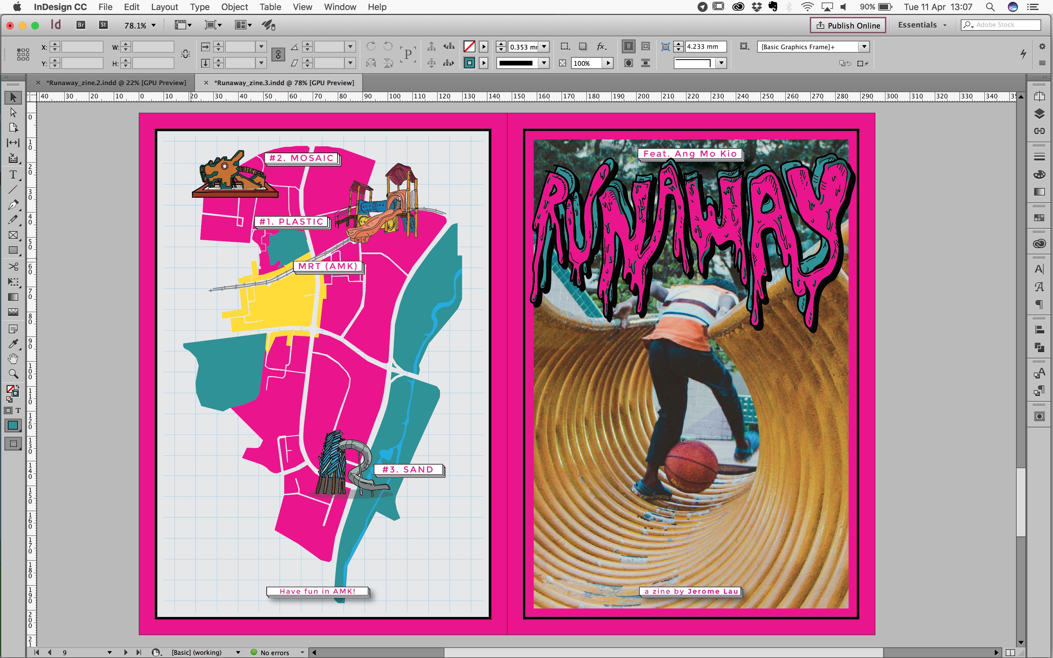
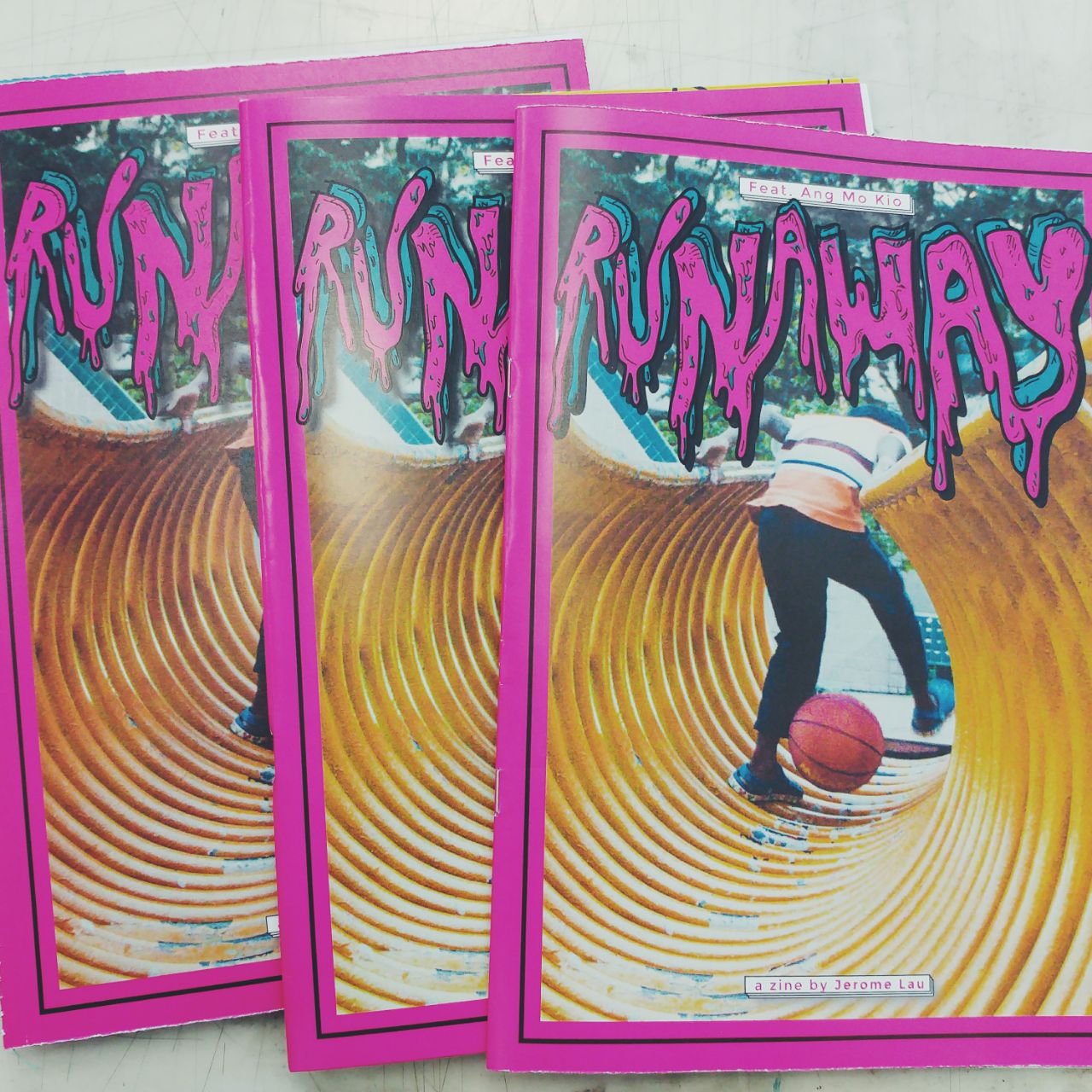
i) Cover page
I chose one of the images that i took of a boy playing with his basketball on the Dragon playground. Thought i was very apt because it looked like he was running away, which fits my entire zine’s theme. And this shot was really random, he just so happened to appear in front of the camera, and i was like OKAYYY lets take some pics.
I really wanted to add in more colours and patterns but feedback was that it was just too much, and i kinda agreed, so i focused on trying to find one simple colour for the border. Was really stressing over it because i thought it was very ugly, until i added a border, i was like WOOHOOO!
Colour wise, i was really just playing around, then someone told me try something boomz (because i initially put a green colour to match the photo’s background. And after randomly clicking on pink, i was OOoooooo IT WORKS!
AND it had the very punk rockish fun feel, which i really liked, so i went
along with it.
↓
Final Cover. Only change i made was during consultation when i was told to give more yellow visuals at the bottom, so i move the image upwards a little more.
↓
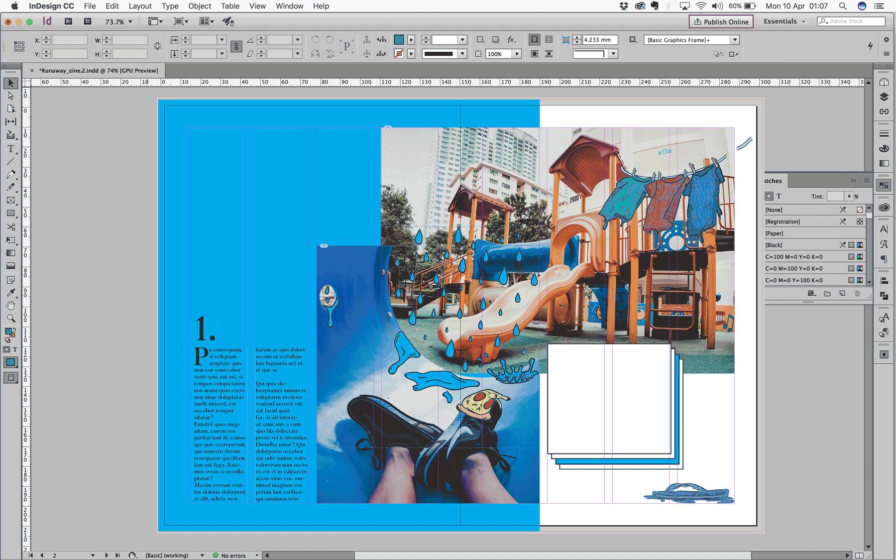
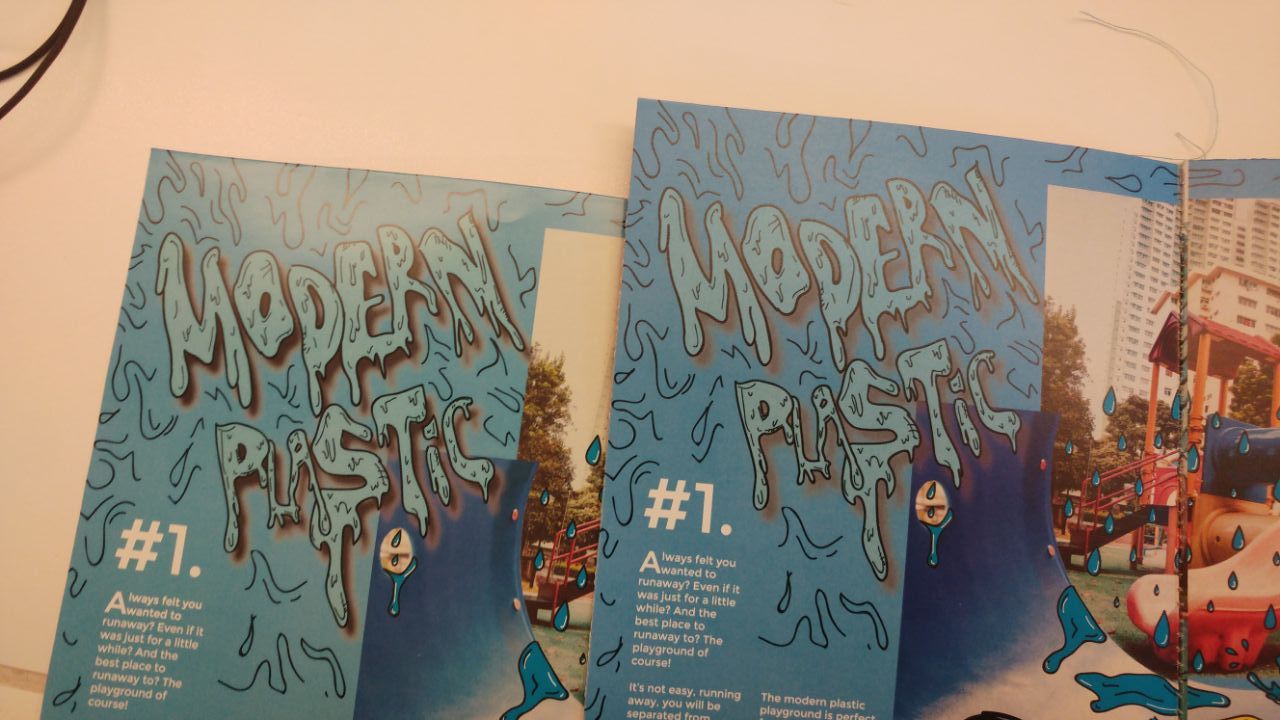
ii) 1st Spread — Plastic playground
A further planning of the first spread.
↓
My biggest worry was melding everything together so that they all fitted the whole feel i was going for.
Background colour for this spread i chose blue because i picked the colour that was most consistent from my photographs and that was blue.
Below is a colour test and text layout tryout.
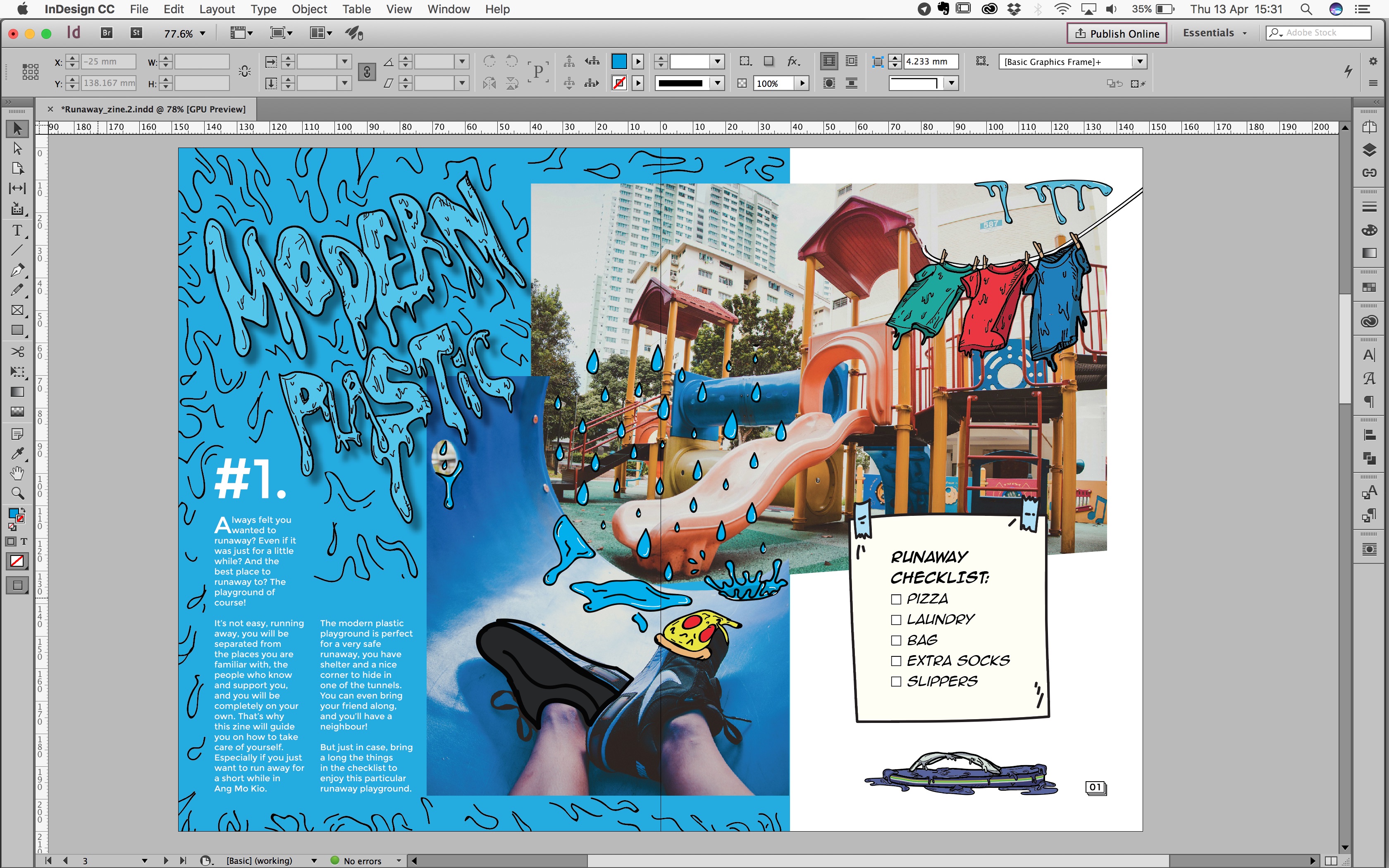
↓ 
Final 1st Spread. Had to change the checklist to a Runaway Checklist for clearer communication and replaced the background with a proper checklist-looking
pad thingy.
↓
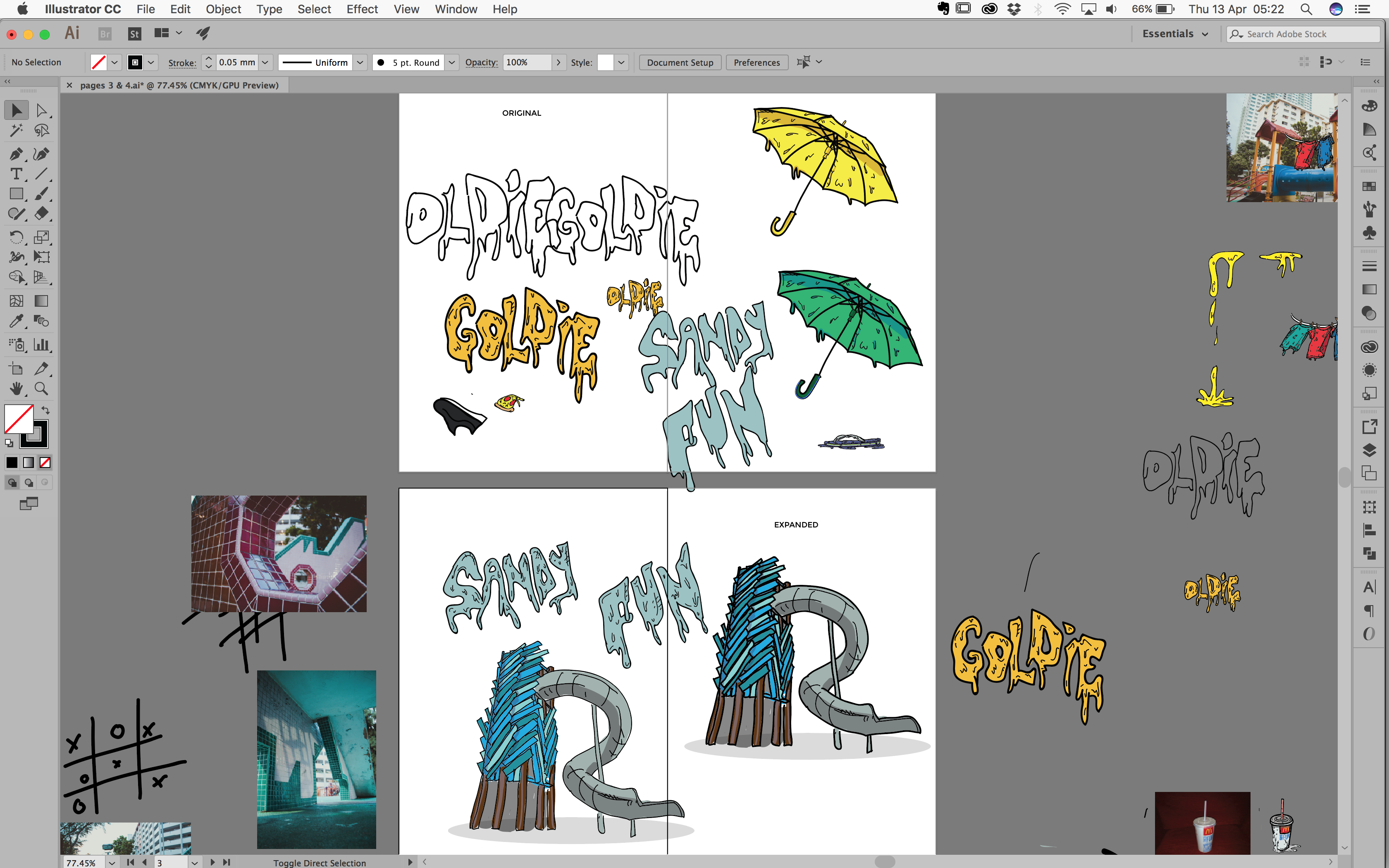
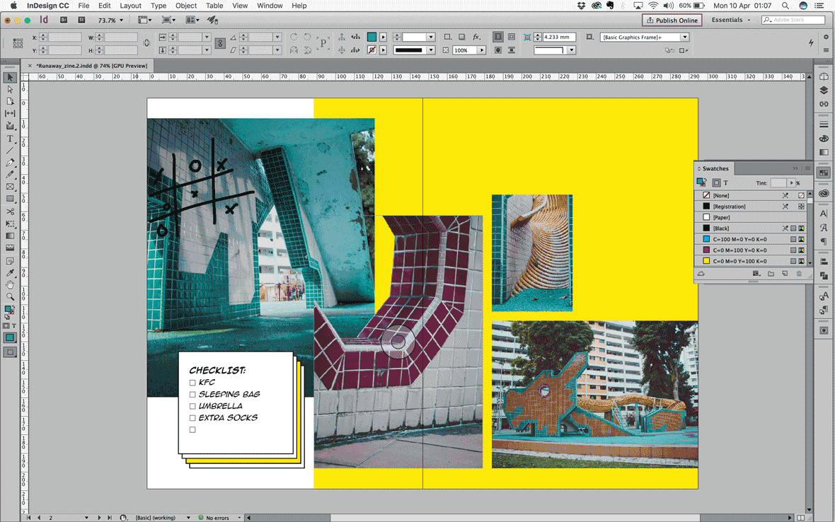
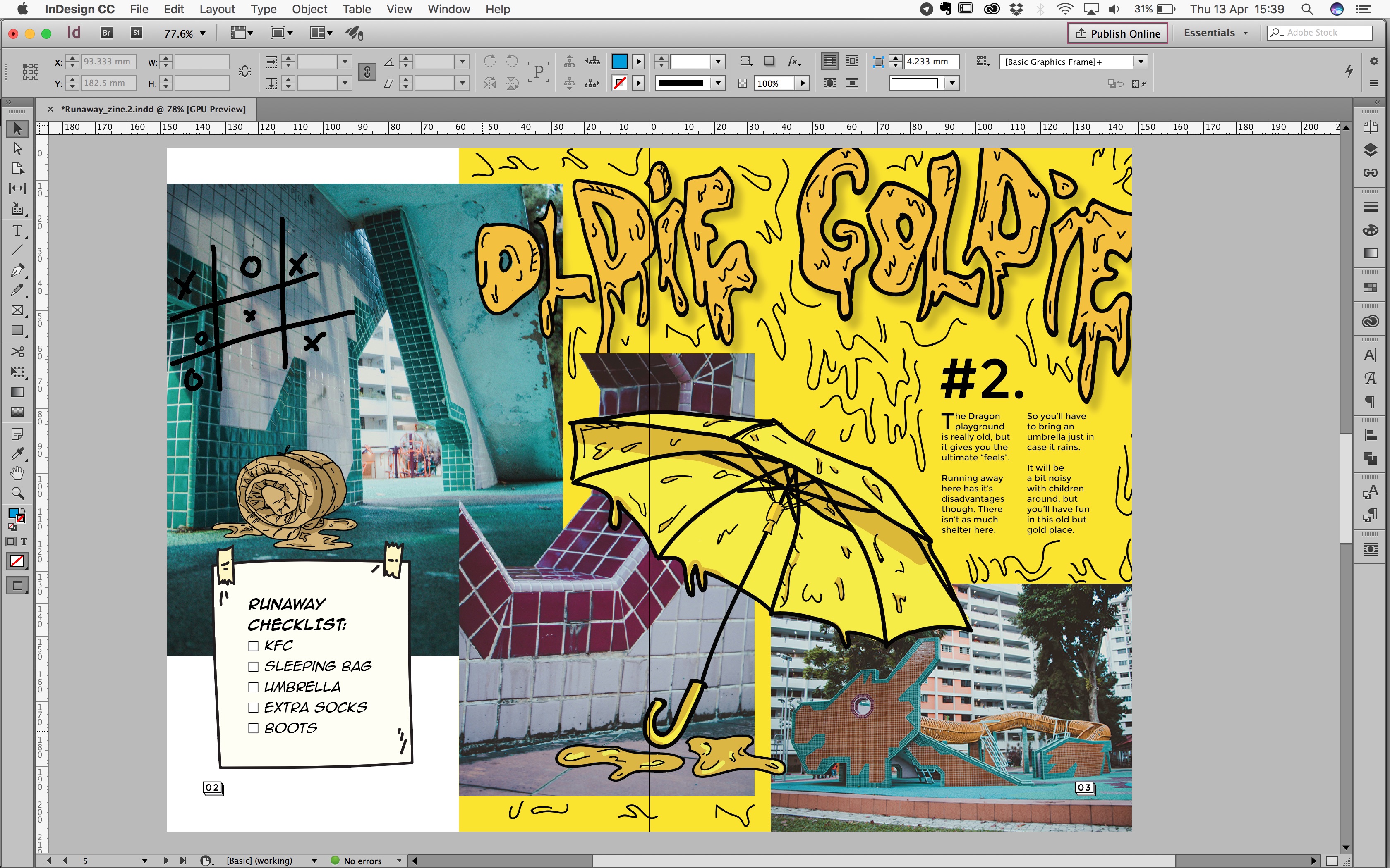
iii) 2nd Spread — Dragon playground (oldie goldie)
So for the 2nd spread i was trying to do it. Because i had A LOT OF IMAGES, and i wanted to put in as many as i could. BUT, Charmaine again said that i should just select a few, don’t try to do too much, so i just selected 3 images :'(

I chose yellow for the background because of the Dragon playground’s body, and even though in the end I didn’t show a close up or much of the yellow dragon’s body, i thought it fit the images quite well, so i stuck to the colour choice.
Below i played around as much as i could, to try and get the whole golden ratio in my layout. Not sure if it’s obvious or i failed, hahahah, but i was finally happy with the layout of this spread after agonising over it for so long.
↓
Final 2nd Spread. My concern was that i over did it with the background and the umbrella because i made it pretty big to match the proportion of the photographs that i put in. And i’m quite happy with the turn out of my header text. And it helped to show the type hierarchy.
↓
iv) 3rd Spread — Sandy playground
This spread again, i had a lotttt of images i wanted to use, but learning from my previous lesson, i very selectively picked which ones would work together (or at least which ones i THOUGHT would work together heheh.)
By this spread, i was pretty clear what i wanted and how to go about doing it already. So it was prettyyyy fast to get this done. Again i was doing my best to do the whole
Golden Ratio thing with my layout as you can see below haahahha.
↓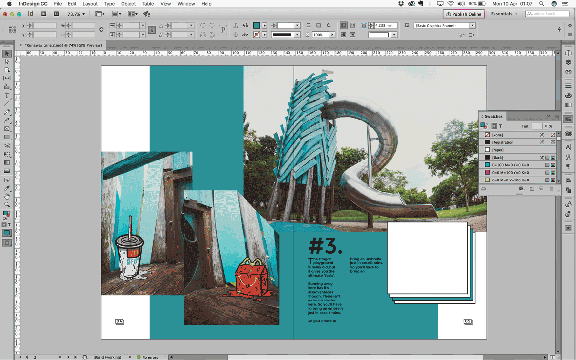
Final 3rd Spread. Oh oh so for my consultation, another thing that was mentioned was the readability of my body text. Initially as you can see above, my text was black, but when printed, it was not veryyyy clear, so was told to change it to white instead, and it looks better! So next time got to be more careful with these kind of things.
↓
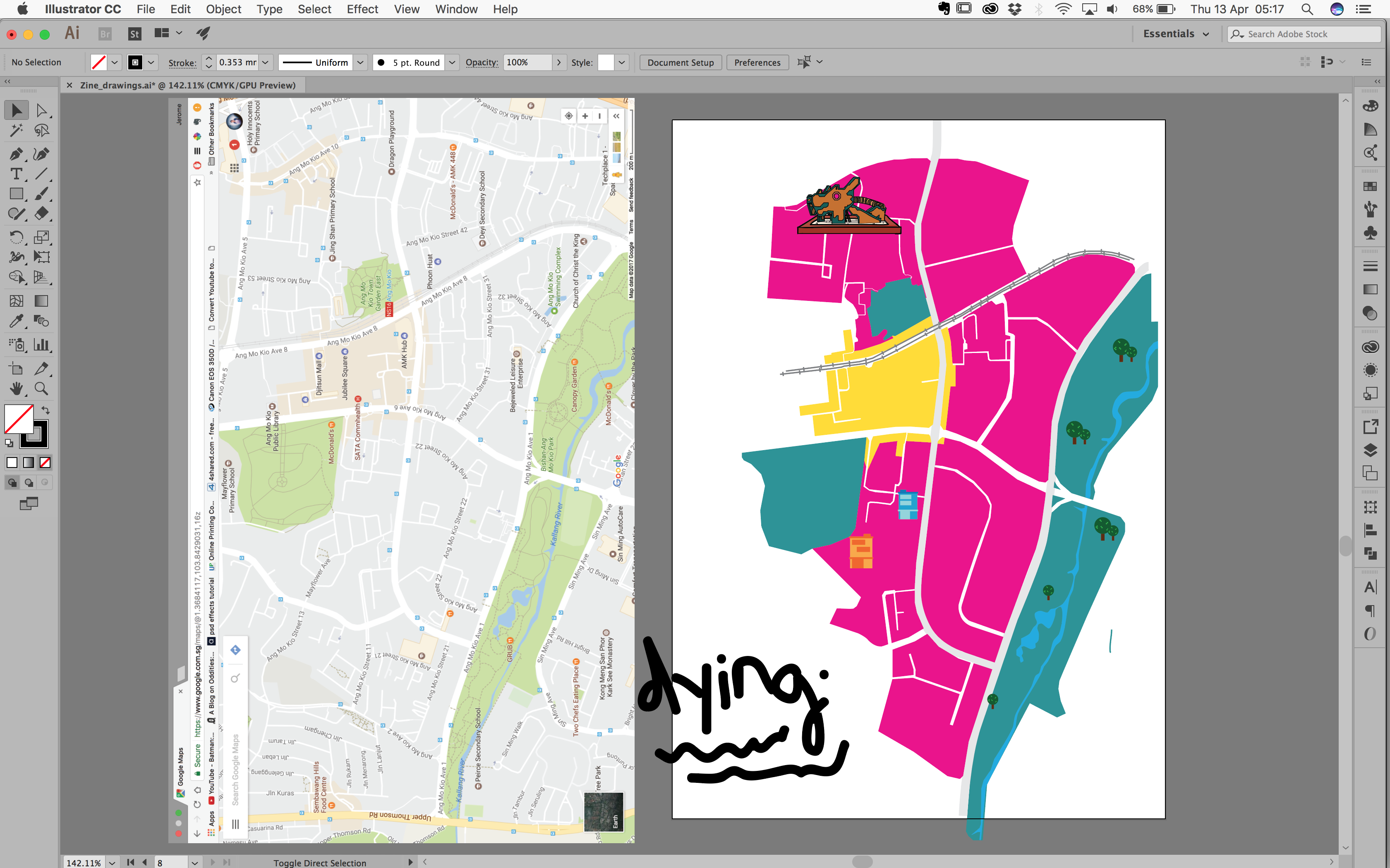
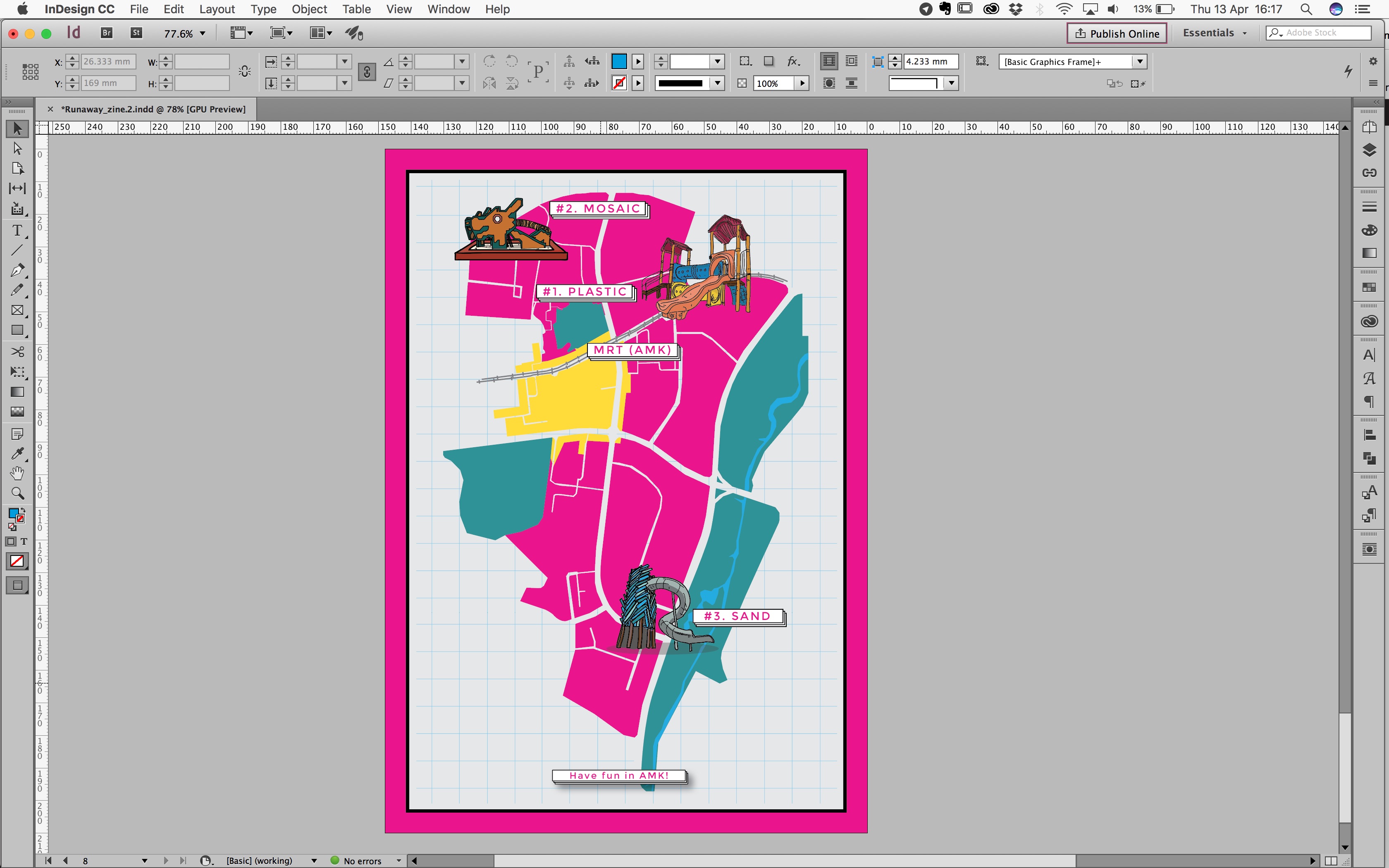
v) Back cover — Map
So initially i thought of having a map on the inside-front-page (IFP). But then Rannie mentioned that why not put it at the back page, then i can make use of the back page properly as well as use the IFP as part of my spread for my content.
So colour palette for my map i used all the colours i used inside my zine and of course from the pink of my cover. All to keep the consistency of everything.
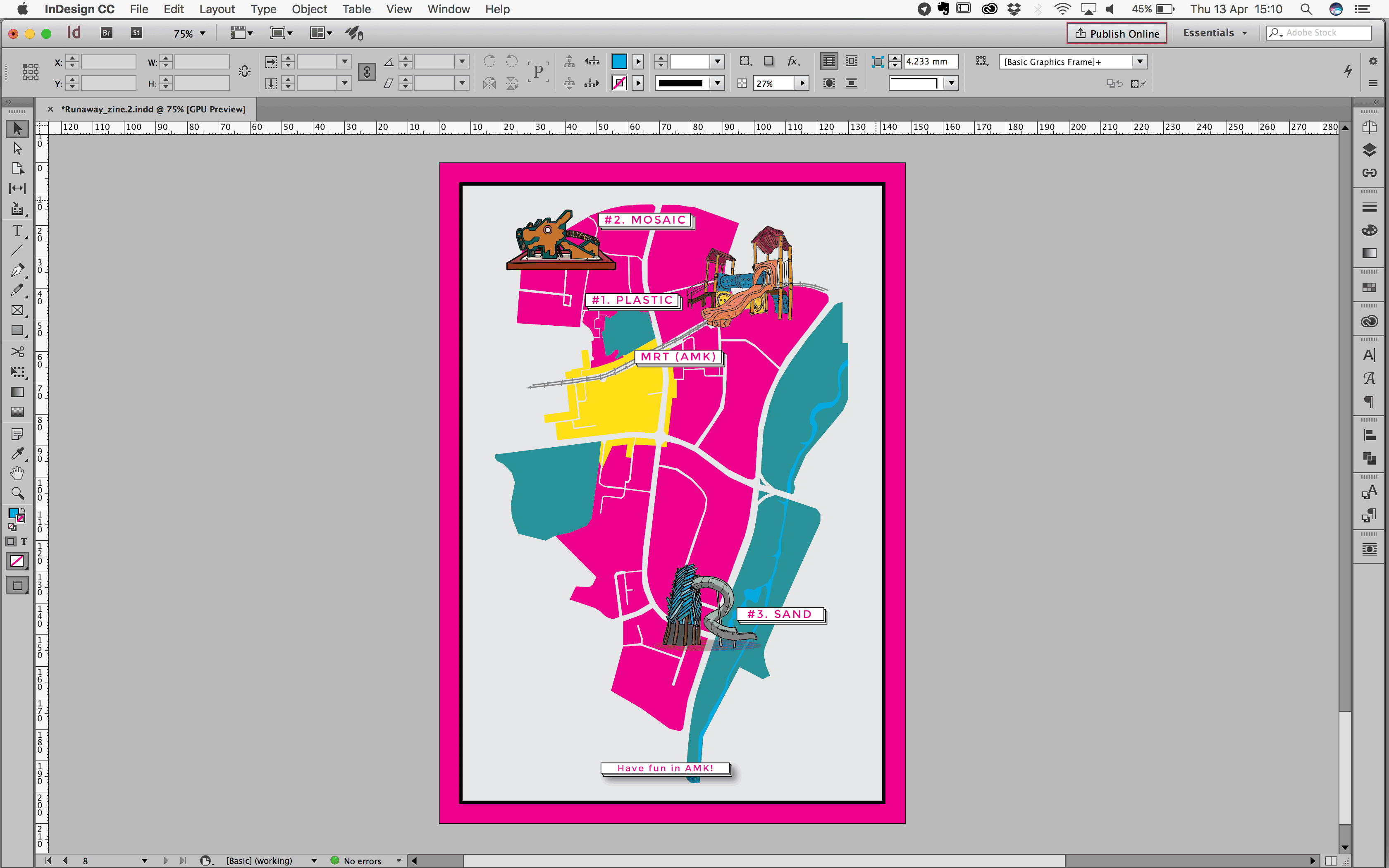
And initially i was wondering if i should fill up the map with the road names and all, but i decided against it because i didn’t want to clutter my map. So i just put the MRT placement there.
And i was worried about the background because i thought it was quite plain, so i thought of trying to do what i did for my background for the spreads. But nooooo, too much, and it ruined the feels a bit. Then Charmaine (needa thank her a lot hahahahh), suggested having the blue grid for the background, but bring down opacity so it wasn’t too jarring.
Soooo FINAL BACK COVER!!
↓
And COVER SPREAD!
↓
And its OVERRRRR!! Almost. So now to printing.
3) Zine – Printing
So for printing, my biggest issue was the drop shadow. Up until now i have no idea why drop shadow on indesign when printed, becomes grey like the images below, but only against certain colours. Was super sad when it happened. Had to reprint 3 times. So now learnt ma lesson, don’t use indesign drop shadow.
↓
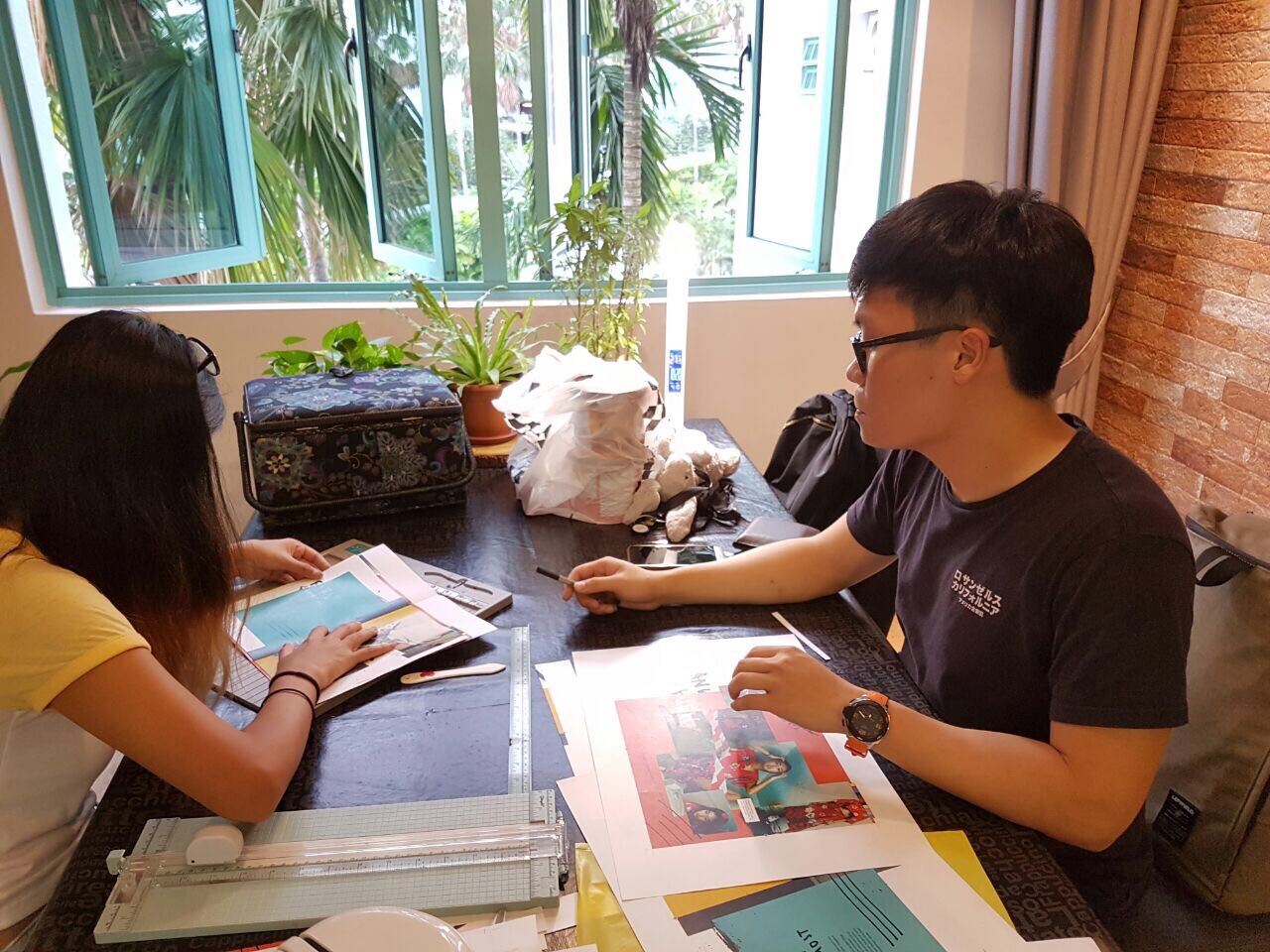
This was us trying to cut and fold the zines properly, wa headache sia and damn scared to screw it up also.
↓
And its finally DONEEE 😀 hehehehe
↓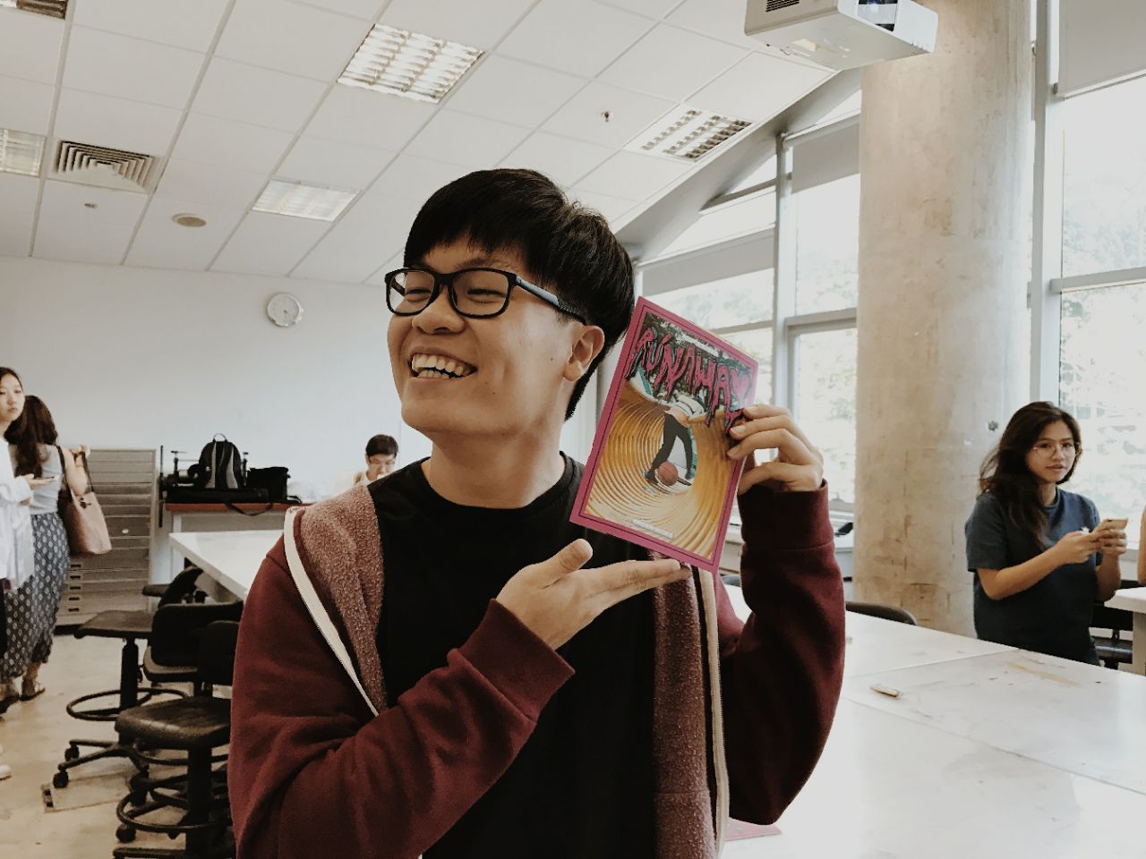
4) Zine – Takeaways (da bao)
So i learnt quite a lot this time round while trying to get the Zine done as well.
- While going to Ang Mo Kio to recce and take pictures, i had to find a focus and plan out my shoot otherwise i was just shooting blindly, which made it a waste of time. So planning is always good, and covering all aspects like taking pictures from wide angle, medium shot and close ups.
- And for layouts, HIERARCHY very important!! I was really trying my best to keep my type and visual hierarchy easy on the eyes.
- It was difficult to find a good balance for layouts, because with indesign there are the columns and grids that help you layout properly and balance your whole design. At first it was a bit annoying because i really had to follow the grids to make it look balance. So i learnt how to make use of the grids and columns better through this assignment. And i tried my best with the Golden Ratio layout.
- And through this assignment, i got to use illustrator a lot more because i was doing illustrations and doodles, so there were a few things i learnt from illustrator that i never knew, and i felt that was very important!
- Colour palette is very important!!! Glad i found a good colour scheme to follow that made the zine have the “feels” that i wanted to convey.
- As for previous assignments, the key thing to get out of a block (which i was in for the longest of times), is really to just try and start, it’ll flow easier after a while.
This was really a first time for me with to try this kind of style for my zine, so it was all in all a very good experience and learning journey.
THANK YOU SHIRLEY FOR EVERYTHING!
– End –
Below is my research video that i made for presentation the other time. Really had fun getting this Zine done, although there was a lot of time spent stressing out on layouts and everthing. IT WAS FUN!!
↓