TUSK 1

V  I  S  U  A  L    R  E  S  E  A  R  C  H 

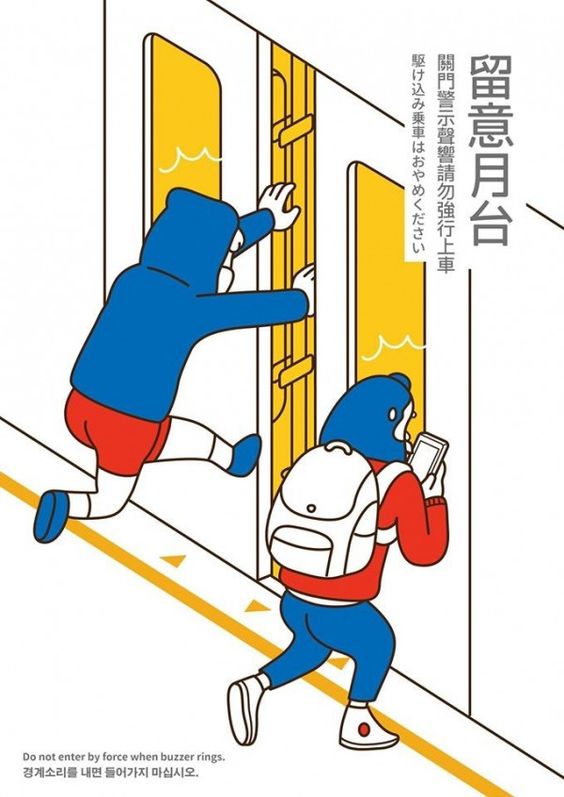
What is the poster communicating?
It is to warn commuters about the danger of forcing their way through into the train cabin after the buzzer sounds.

What emotion does the poster elicit?
Quirkiness, fun, fresh, youthful.

What makes the poster captivating?
The design is simple and information is kept succinct yet it is able convey the message across to the audience with great clarity. The main focus here is the illustration and the text supports and complements the design without snatching the audiences’ attention hence it making it easy on the eyes.

How did the poster generate visual interest and facilitate readability/legibility?
The use of primary colours as accents against the white background creates visual interest without being too overwhelming and distribution of colours help to guide our eyes across the poster.
The application of text hierarchy is clear in this poster whereby the title of the poster is of heavier than the supporting text.
The colour palette is too limited to the use of primary colours — red, yellow, blue against a white background. The two subjects are suggested through the use of red and blue against the accents of  yellow in the background creating a clear distinction.

How do you feel about the approach and execution?
I like the use of a very limited colour palette as it enables you to work with the placement of colours to bring out your design. I appreciate that the illustration is kept minimal yet being able to convey the message across to the audiences.


NOT A POSTER BUT I LOVE IT 
ITS SO UGGLEE


SaveSave

MY BLACKHEADS

1st Room: Love Forever

1. What techniques did Kusama use to unify her canvases?
– repetition of shapes/motifs (e.g eyes, circles, triangles

– monochromatic palette

2. Describe her use of space?

– all-over composition
– no subject in focus, fills the entire canvas

3. What emotional responses do you have when standing in front of her paintings? Can you observe anything about the relationship of the size of the paintings to your own body?

– overwhelmed, as the paintings tower over and surround us

4. What do the marks and forms in these black and white paintings remind you of?
– blackheads, my nose


2nd Room: Tulip Room Walk into the Tulip Room

1. How does your emotional response change going from Love Forever to the Tulip Room?
-unsettled (way too bright, too many colours…I can’t)

2. Does the Tulip Room evoke any memories? What are the sculptural forms telling you?
-M&Ms and smarties YUMYARRRMYAMYUM
– Doesn’t tell me much actually, seem like mere decorative objects


3rd Room: My Eternal Soul: Walk into the room My Eternal Soul

1. Compare the use of color to the Black and White painting in Forever Love. How does the color affect you differently? How do you feel?
-as more than one colour is used, the environment feels much more vibrant and exciting.

2. What techniques does Kusama use to unify the color canvases?
– 
repetition (the use of motifs)
– heavy, bold, black marker used

3. Compare the right & left walls. What are the difference in the emotions evoked by these different walls?
– 
RIGHT: looks like linocut, only 2 colours used
– LEFT: black + 2 colours
– The paintings on the right are less imposing with the absence of the heavy black lines.


4th Room: Narcissus Garden

1. What differences do you see between experiencing the Narcissus Garden on its own and knowing/imagining Kusama’s actions during the Venice Biennale where she wore the kimono and sold the balls. Please read the wall information about the performance.
experiencing it on its own there seems to be a lack of context
– looks like decorative objects


Room 5: Early Works

1. What painting techniques is Kusama using in the 1st five small paintings? What types of marks are used?
– layering
– dabbing and stamping
– dry brushing


Infinity Nets:

1. What is meant by the term “Repetitive All-over Approach”?
– 
The canvas is filled edge to edge with no particular focus or main subject.

2. Compare your emotional responses of the white Infinity Net paintings to the color Infinity net paintings on the opposite walls. What happens when you stare at these paintings?
– d i z z y y y s o d i z z y

3. Describe 1 or 2 of the Infinity Net paintings.
– 
1
– Subject: Net
– Content: Hallucinations she experienced as a child
– Materials: Oil on canvas
– Technique: Small loops painted over a monochromatic ground. All-over lattice patterns


Death of a Nerve: 

1. How does the title affect your understanding and response to the piece?
The title shapes our interpretation of the work
– Bleak


FOUR FINGERS GOT TO GO

First draft

P  O  I  N  T  S    T  O    N  O  T  E
Scalability, weight of lines, contrast, simplifications
Feedback was that I can invert the positive and negative space so that the design  commands more presence and scale up the design. On top of that, many of the details had to go as they were unnoticeable and look like blackheads when scaled down to 50%. e.g. the hands, small paint splatter.
Break up the shape with the limbs of the paint bucket, can be more playful with the positioning of the limbs AND REMOVE THE FINGERS THE FOUR FINGERS


F  I  N  A  L    D  E  S  I  G  N

B  L  A  C  K    &    W  H  I  T  E

G  R  E  Y  S  C  A  L  E

C  O  L  O  U  R

Sticking to the colour scheme of the corporate identity


SOBS MY FOUR FINGERS

Another design that did not make it


SaveSave

SaveSave

TUSK 3

C  O  L  O  U  R    E  X  P  L  O  R  A  T  I  O  N

Sticking to the colour scheme of the corporate identity with the colour red, and keeping in mind the teal vest which the pin will be pinned on, and a yellow colour to complement these two colours and at the same time capturing the spirit of the volunteers — liveliness, fun, excitement. 

VEST: Teal Base, Yellow, white and red accents (buttons)


These colours should come together to exude a sense of fun making the volunteers feel proud when wearing the badge and at the same time, appeal to people making them want the badge.


Playing with handwritten font and the chalkduster typeface (readability and scalability) as well as some alterations to the details (playing the the dominating colour and the choice of hue for the accent)  and also the application of the different values of the two different hues against the yellow background.


SaveSave

TUSK 2

T  R  A  N  S  L  A  T  I  N  G    &    E  X  P  L  O  R  I  N  G    D  E  S  I  G  N

Moving on from the mood board, we were tasked to produce at least thirty concept sketches. It’s pretty straight forward so there really isn’t much to explain or elaborate so I guess here are my designs?


T  R  A  N  S  F  O  R  M  A  T  I  O  N

Chameleons are often associated with change, adaptation and transformation, hence I decided to draw on this common association and make use of the image of a chameleon to capture the element of change this programme bring about.


A  R  T    O  N    T  H  E    M  O  O  O  V  E

Changing the patches on the cow to paint splatters


S  U  P  P  O  R  T    &    C  O  N  N  E  C  T  I  O  N

Couldn’t stop my hand from illustrating so whoops


K  A  L  E  I  D  O  S  C  O  P  E

Making use of the geometric shapes and lines to create patterns as you would observe through a kaleidoscope.


P  A  I  N  T    B  U  C  K  E  T    &    P  A  I  N  T    B  R  U  S  H  E  S