First thing that came to mind was food. Yes, again with food. I just can’t stop thinking about food. Since my first semester in ADM was spent mostly eating and snacking (my thighs and belly expanded twice its size), I thought why not just sum up my first semester here with a project centred around food. (actually I just wanted to draw more food). Hence, I decided to sum my first semester here into 4 stages: Orientation (ADM CAMP which also meant making new friends and a new environment), Problems and worries which arises as work begins to pile, Deadlines and lastly, meeting a group of friends I love.
Due to the hectic school life in ADM, where I have to rush between lessons and to meet the deadlines, my 4 course meal is now largely replaced by instant food. Hence, the choice of working with food packaging. A plus point is that it sets a boundary for me to work within when composing the visual and it enables me to pick the colour with greater ease. Regardless!!!! “There is no sincerer love than the love of food.”- George Bernard Shaw. I seek solace in food for it is able to comfort me no m. There’s always food in my mouth, I feel contented when I have something to munch on.
In ME RECIPE,
ME is represented with an ingredient,
SETTING is represented with a kitchen scene which involves the utensils ( I wanted to make the sharp objects a recurring image in the second column of all four equations so that there is a consistency )
and lastly, the OUTCOME (FOOD!!!) is represented by a food packaging where the words are altered to fit the context.
Medium: colour pencil? callus pencil OMG NOT KIDDING IT GAVE ME CALLUSES & water colour (I DIED)
S O U P
ME + MAKING NEW FRIENDS IN NEW ENV. =A PASSIVE & HELD BACK ME
My first step in ADM was to make new friends but I suck at making friends and isn’t comfortable too around new people. As I’m unsure about how other sees me and is too afraid that they may not be accepting of my weird behaviours and little habits, I will contain myself in front of new people and would take some time before I get comfortable and show my true gross side.
To suggest this sense of unease and discomfort in a foreign environment, I chose blue to be the dominating colour in this equation as blue is often associated with rather mellow feelings, and to can help depict a sterile environment.
In the second composition, I adopted a monochromatic blue palette. The hint of red was included as red is often associated with impending danger which evokes a sense of discomfort and anxiety. The inclusion of the measuring units was to show how I am pretty concern about how people look at or “measure” me initially.
For the outcome, I replaced Campbell with Camp不要 as I kind of dislike camps as I am “forced” to make friends. Likewise, when I get close to people, I tend to get too comfortable such that I would whine like a prune and lay on any flat surface available and this isn’t a pleasant side which many would be accepting of. Hence, I decided to include some DON’Ts to suggest how I hold myself back as I am afraid that people would not be able to accept my weird behaviours.
A P P E T I S E R
ME + PROBLEMS/WORRIES = OPTIMISTIC ME (or rather lazy me)
In this equation, I adopted an analogous colour palette, whereby the heavy use green was to suggest calmness and optimism. My friends say that I’m pretty optimistic but I’m just lazy to worry. It’s just so tiring to be troubled and to worry about things as they are bound to happen so we just have to deal with it and much on some chips and things would get better. And somehow this seems to be a form of optimism?
The outcome of the equation is an appropriation of the Lays packaging.
E N T R É E
ME + DEALINES = DOOMED ME
I think I can only work under stress as I have no sense of urgency. I love to laze around and take my own sweet time when doing work. Procrastinating is my forte.
Again, I represented myself with a ball of noodle in the first column a pair of scissors which towers over me, where the noodle with is embedded with pencil and ruler to show how I am being laden with school work.
Lastly, the outcome is an appropriation of the Nong Shim Ramen packaging with the brand name and words being replaced with words which suggests immense stress.
DEADLINES aka Si xian siao ( direct translation )
I adopted a warm, saturated analogous palette with red being the dominant colour to create an intensity.
D E S S E R T
ME + FRIENDS (REDTABLECLUB) = HAPPY/COMFORTABLE/LAZY ME
I’m really glad to have found a group of friends in ADM (RedTableClub) who I am so comfortable around. As they are accepting of my gross and annoying behaviours, I am extremely comfortable around them and at times lose control of myself. Although we all have very different personalities (hence the use of split complementary: yellow, red & blue, in my last panel to show how even though the colours are not harmonious, when we come together, there is no stark contrast or clashes), we get along well and we spend most of our time annoying each other.
For the setting, I wanted to show how our friendship is a blend of different personalities. Hence, I touched on the association of colours with emotions, making use of different colours to represents each unique personality. Red: Angsty Alyssa. Yellow: Giggly Dawin. Green: Zen Shiau Yu. Blue: Dead and gloomy Jon. Pink: Me (I love pink)
In the outcome, I changed the brand name to “COMPLETE PROCRASTINATION MIX” as when we come together, we spread our laziness and procrastinate together, talking nonsense, “Just Add Laziness”, “106 years nonsense (sum of our age), “Makes 92-97 whines (range of our birth years) hint at this too.
YAS FINALLLY DONE! STAYED UP THE WHOLE NIGHT I DIDN’T EVEN MAKE SENSE DURING PRESENTATION BUT YAY I LOVE FOOD
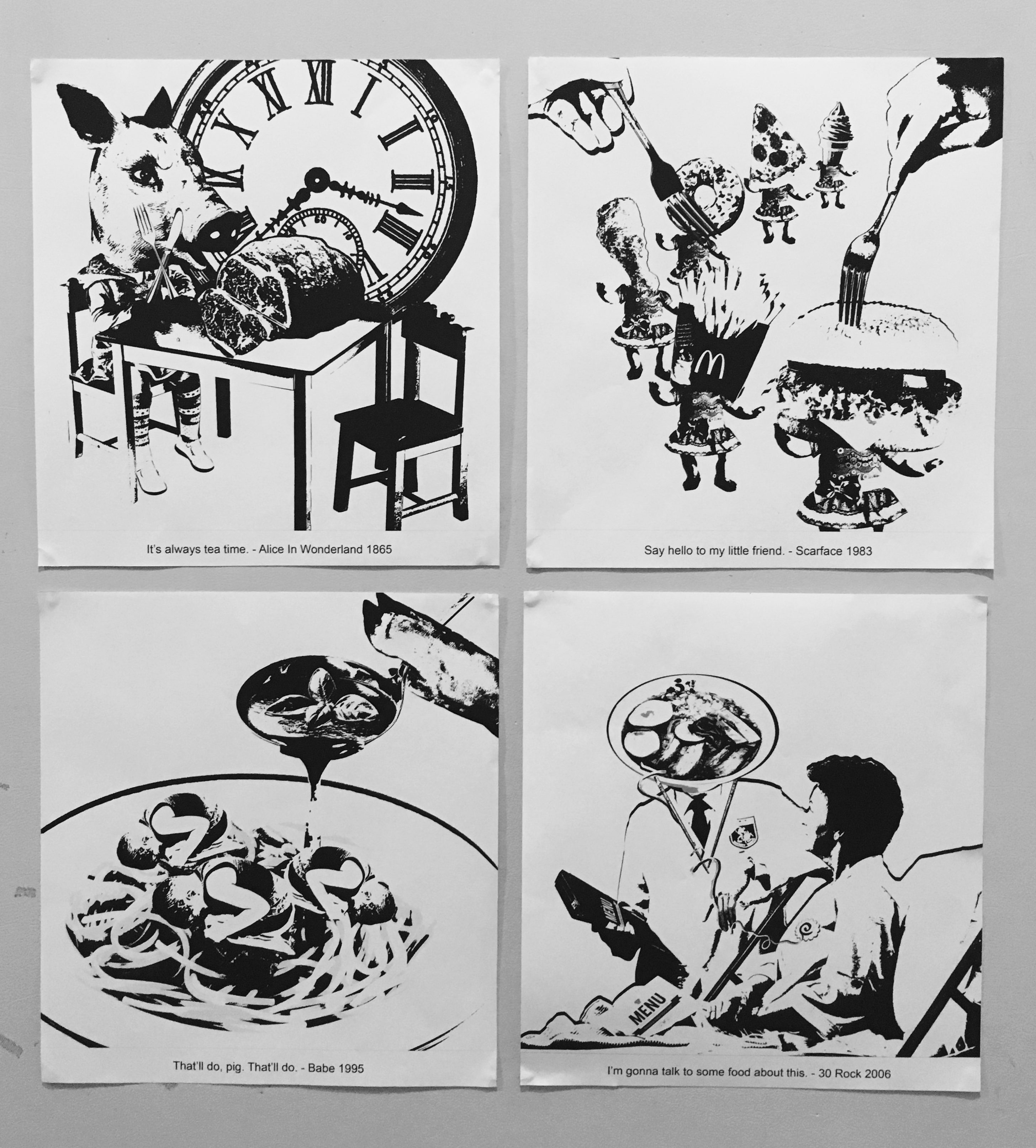
THEME: Negative impacts associated with food consumption (I LOVE FOOD)
TONE: Dark humour
I didn’t want my visuals to be serious hence I adopted dark humour which addresses issues in a light hearted manner yet it embeds a slight twist.
COMPOSITIONS
1. & 2.
It’s difficult for us to place a number on how many animals have been killed for your sinful love of juicy pork buns.
We are too busy plowing through and sinking our teeth in succulent meat that we do not think about what the animal went through before being served on our plates.
“The meat industry is by far the biggest killer of animals around the world. It’s also responsible for relentless, routine cruelty to pigs, sheep, cows, chickens, ducks, geese and other animals who suffer every minute of their short lives. Females are repeatedly forcibly impregnated. Babies are torn away from their mothers, mutilated, kept in filthy and severely crowded conditions and fed a cocktail of drugs and chemicals sometimes causing their bodies to become oversized, resulting in numerous health problems. Then, often when they’re only a few months old, they endure a stressful and terrifying trip to the abattoir, where many are killed while still conscious.”
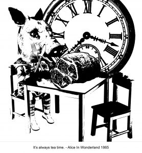
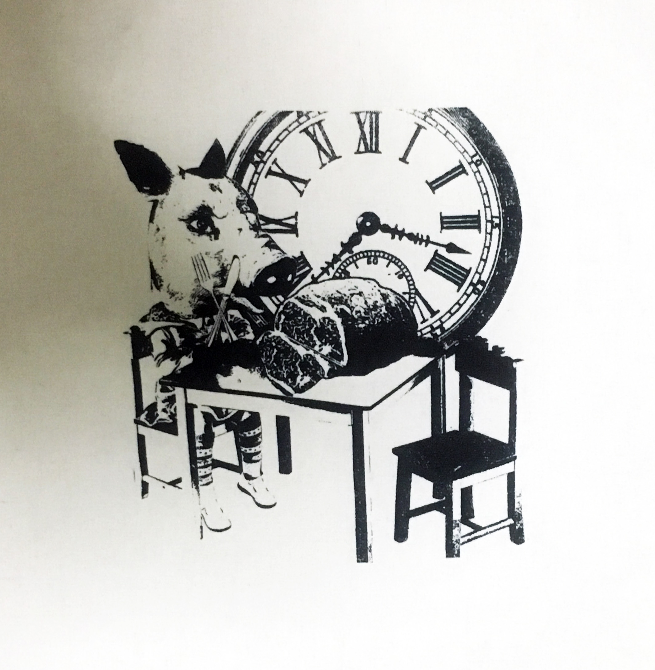
“IT’S ALWAYS TEA TIME.” ALICE IN WONDERLAND
“It’s always tea time.” to me connotes a sense of gluttony for the tea time is often taken to be a light meal of sinful indulgence where we sink our teeth into soft fluffy chiffon cakes and having buttery cookies melting in our mouths. Instead of portraying this in a pleasant manner, I decided to use this association to touch on our excessive consumption and killing of animals. The girl’s head has been substituted with that of a pig having her meal which is a slab of ham. It is ironic that she is consuming her own meat and hence this makes us ponder about the issue of animal cruelty as if the head of the girl had not been replaced with that of a pig but retained as it is, this visual would have looked perfectly normal. This hence proves further how selfish we are and our negligence towards this issue.
First draft
During the group consultation, Joy and my friends said that that the table is too cluttered hence there lacked a focus. I was’t really sure about this as I felt that in order to show gluttony there has to be excessiveness but by having a single slab of meat but by having it scaled up, it actually worked much better than a table full of poultry products. One of the feedback given was that there isn’t a need for the tea set as tea time in this case comes in the form of the poultry products. With their comments in mind, I decided to simplify the composition.
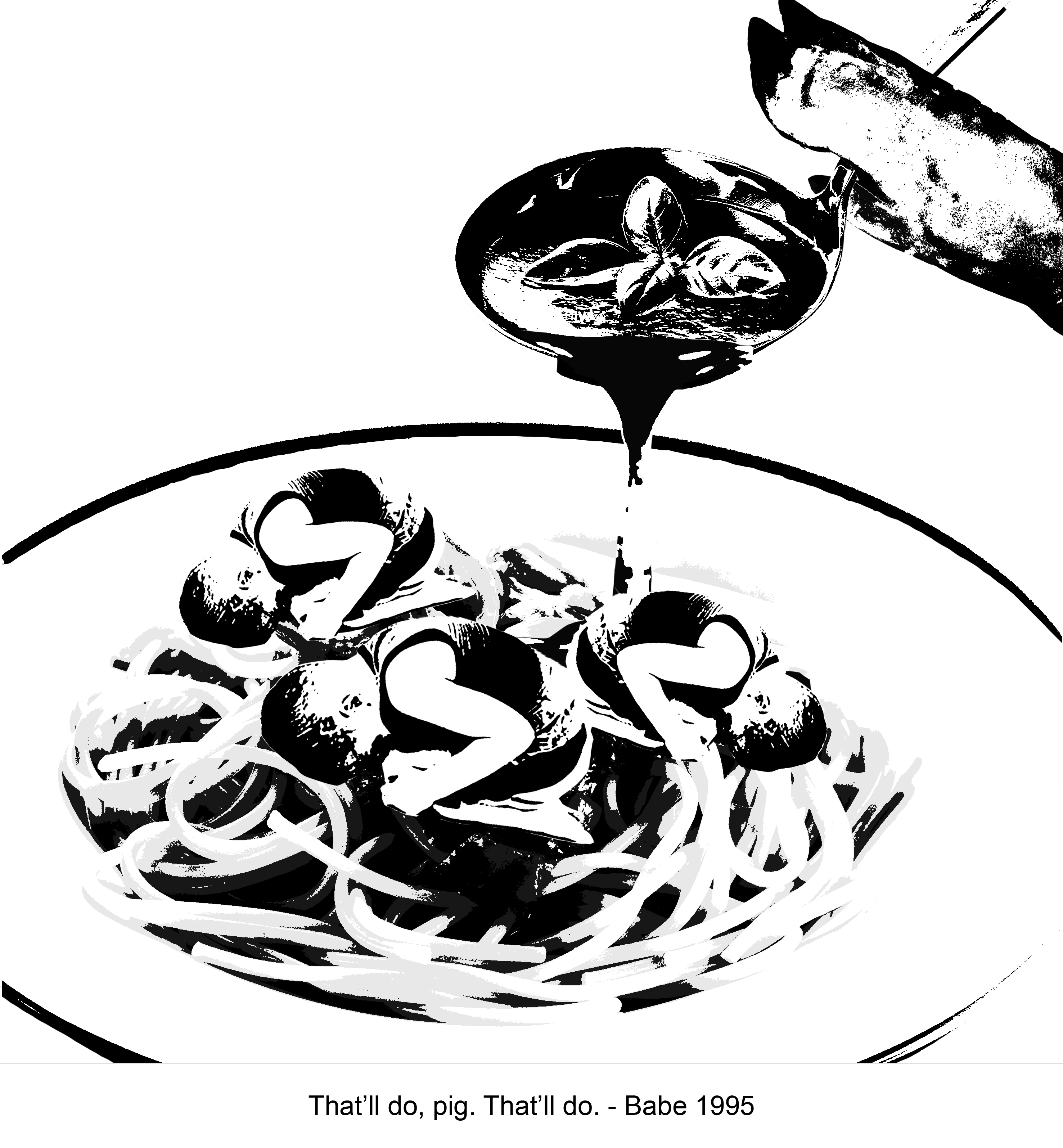
“THAT’LL DO, PIG. THAT’LL DO.” BABE 1995
I thought that this quote implies a tone of plead and would be pretty apt in conveying that idea of desperation. In this composition, the roles are swapped. Pork meatballs are replaced with a kid in fetal position and instead of a human hand holding the ladle it is replaced with that of a trotter. Hmmm, what would happen if the roles are really swapped like this in this composition. Maybe then we will really understand the pain these animals have gone through and cut on our cruel killing.
3.
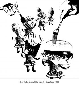
“SAY HELLO TO MY LITTLE FRIEND” SCARFACE 1983
This composition touches on the idea of excessive and unhealthy consumption of food. The little dolls’ heads are replaces with food that everyone loves, JUNK FOOD!!
To suggest a sense of depth, I decided to introduce repetition and played with scale. The slight spiral and arrangement of the doll’s in ascending scale help to create depth. The hands too help heighten the depth of field.
4.
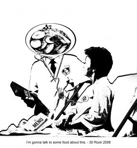
“I’M GONNA TALK TO SOME FOOD ABOUT THIS.” 30 ROCK 2006
Emotional eating is a form of dependence on food to relieve stress. Heavy dependance can have adverse effects on both out health and emotional states. In this composition, a patient is seeking treatment from food to convey this idea and it too suggests a food therapy.
Was inspired by Jon as he was picking on how I always solve my problems with food. His said that his kidney was hurting and I told him that he was just hungry and offered him sweet potato chips. “My toe hurts. My stomach hurts. I broke my leg. Oh you are just hungry.”
Again, I substituted the doctor’s head with a bowl of ramen. The stethoscope is replaced with chopsticks, the tubing with ramen and chest piece with japanese fish cake. The medical reports are too replaced with menu.
Difficulties:
As I didn’t like the effect bitmap gave, I treated all 4 compositions with threshold. However, with threshold, I had to have several layers and different adjustments as with just a single layer, it eliminated way too many details.
On the flip side, threshold made silk screening much easier as there wasn’t tonal gradations in my competitions and the positive areas are way larger than the lines or ellipses in bitmap. Hence, my print turned out well although some of the really fine lines did not show I am very satisfied with the outcome as it managed to capture the rest of the parts. Wouldn’t have been able to do this without the help of MR OCD DAWIN AND MY FRIENDS!!!
(left my tote bag in hall so I don’t have a photo of it to post. Will post it up soon)
FOOD!!!!! I like how her works are infused with a sinister twist without being too cynical. There is a balance struck between her dark meanings and jolly palatable paintings.
MARK RYDEN
MORE FOOD!!! Another artist who ushered in “Pop surrealism”, whose works thread on a fine line between cute and disturbing. I really love how a subtle disquiet inhabits his works. Beneath the sweet and cute works hints at a darker meaning.
EUGENIA LOLI
The way she juxtaposes images that do that belong together to create bizarre imageries is really interesting. Her visual narratives invites viewers to ponder and really think about what she is trying to convey in her work and this is what I hope to achieve in my works.
SAMMY SLABBINCK
Like in Loli’s work, I like how his works bear a narrative quality and he is able to achieve that through simple yet powerful visuals that at the same time are permeated by a subtle sense of humour. I really love his clever juxtaposition of images to present new meanings and puns.
Eating has never and never will be simply about satisfying physical hunger! We eat not only to quell a rumbling stomach, but also to satisfy the appetite and deal with our emotions!!
I would say that I share a pretty intimate relationship with food, for my feelings and emotions are tightly linked and affected by the food I consume. When I sit down to have my meal, I want to relish the flavours and textures hence I am very particular and picky with the food I consume. I know very well what food appeals to me and what not, and at times, these food can evoke very strong emotions in me.
When I was given the project brief, the first thing that came to mind was food as it has always been a recurring theme in most or otherwise all of my works. However, this time it involved a new approach as it was the first time I actually used actual food as my medium.
Join me as i venture into my messy relationship with food!
Initially, I was fixed on attaching each emotion to a different food hence the idea was pretty weak and lack development as I was simply expressing what food makes me happy those which cause me displeasure. However, after sharing my idea with Joy, I had a clearer direction. I shared with her my dislike for rice and how consuming it brought me unpleasant emotions and it was not simply sadness I felt as rice itself has led to other emotions. Hence, it involved a progression of emotions, instead of a single emotion that was felt and sometimes the progression of these emotions were not simply evoked by the food itself but too by the context or environment I am in. For instance, guilt, on of the other emotion that is linked closely with rice, as in the Asian context, rice is an epitome of filial piety and the refusal to consume rice could be seen as unfilial or and ungrateful act.
I have decided to tag the 18 strips of emotions to 6 types of food- mushroom, raisins, pizza, ice cream, dragon fruit, rice. Each of these food bears a progression of emotions that are evoked by both the consumption of it as well as the environment which I am in. As the flow of emotions I choose to portray are very personal, they are rather subjective.
First being MUSHROOMS.
Sentimentality -> Fondness -> Homesickness
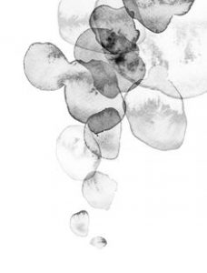
Mushrooms remind me of my grandma, as she would always whip up her signature mushroom soup whenever I am home. As I am staying in hall now, I do not get to drink it as often and really misses her soup on some of the days. Hence, I have chosen mushroom as the material to make the marks for it brought objectifies the progression of emotions. Firstly, sentimentality as the taste of mushrooms evoke a sense of nostalgia, which led to fondness which expresses my love for both the soup and my grandma and lastly, homesickness which suggests my attachment to her as I am away from home.
To express the feeling of sentimentality, I chose tissue paper instead of normal cartridge paper as I felt that the softness and absorbent quality of tissue could suggest the sense of fragility and idea of nostalgia. As the ink seeps into the tissue and spreads across the surface, certain parts fade out, This fading quality creates a hazy effect which could suggest sentimentality and nostalgia, as I recall and is reminded of my grandma.
I used chinese mushroom for the first strip with china ink as the medium.
(The experimental pieces are in my visual journal)
I was inspired by this
2. FONDNESS {affection, sentiment, familiarity}
I was stuck when trying to express these emotions as I restricted myself to using only chinese mushroom which limited the types of marks which I can achieve, despite varying the type of paper used. Jon suggested that I should try other kinds of mushrooms and not restrict myself to only that.
ENOKI MUSHROOM!!
To express homesickness, I applied the chinese ink onto the paper surface with swift actions to suggest the feeling of affection which I would perceive as something that is spontaneous and dynamic.
3. HOMESICKNESS {longing during a period of absence}
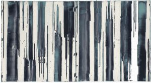
For this strip i made use of vertical lines and played with the positive and negative space to convey the idea of homesickness. I felt that the vertical lines that drag down the strip could suggest the sense of longing and the repetitive negative space conveyed the idea of absence.
Was inspired by these
UNTITLED MARK HARRINGTONEXPERIMENTING WITH VINTAGE PEN NIB FIONA WILSON
Secondly, RAISINS.
EXCITEMENT -> CONFUSION -> HATRED
“Every box of RAISIN is a tragic tale of grapes that could have been wine” HAHAHA
Raisin cookies that look like chocolate chip cookies are the main reason why I have trust issues. Wasn’t a fan of raisins to begin with but the dislike for raisin grew stronger such that I have come to hate raisins. I can still remember vividly the disappointment I felt when I bit into the “chocolate cookie” only to realise that they were wrinkly raisins instead. I was so excited to eat it but the excitement died down upon the sudden realisation that it wasn’t actually what I thought it would be leaving me in confusion which thus resulted in the hatred for raisins.
EXCITEMENT {anticipation, intensity}
With this strip, I played with tonal gradations to convey the idea of anticipation. I varied the tones created by the raisins dipped in the bock print ink which suggests a sense of eagerness building up.
Played with space and the repetition of patterns to convey the emotion of confusion. The overlap and collision of prints suggested the a sense of disorientation and the large empty spaces conveyed a sense of vastness and uncertainty.
Gabrielle Lamontagne
HATRED {intense dislike}
To convey the intensity of the the dislike I bear towards raisin, I soaked the raisins in china ink and tossed them onto the paper as I perceive hatred to bear a certain sense of violence. I made use of unorganised horizontal lines with splatter of paints made by the tossed raisins to suggest a sense of disorientation and sudden outbursts.
Next, PIZZA.
DISGUST -> UNEASINESS -> DREAD
OMG, I can’t put into words my dislike for pizza. I’m really not a picky eater, I just dislike some food as at this point I think I may seem pretty fussy with my food but I’m really not hahaha
Pizza is like a spaghetti wannabe for it is a dry, sad piece of bread disguising itself to taste like it, by slathering the surface with an excessive amount of bloody tomato sauce only to make the bread moist and soggy, and sprinkling an obscene about of cheese on the top to cover up the disgusting taste so that all your tastebuds can detect is saltiness. Yucks.
However, it is a star at parties and celebrations and I can’t decline the offer made by my friends and have no choice but to eat it just to “show-face”. Hence, it always make me uneasy under such social circumstances as I have to mask my disgust which makes it ever more dreadful.
With this 3 strips, I played with the material of paper to convey different emotions.
DISGUST {strong disapproval, detestation}
using wood block ink did not turn out the way I wanted it to look as it dried up matt and did not manage to capture the suggestion of grease and lack a sauce-like qualitySlime Bart Hess I feel that glossy surfaces are better able to convey theidea of disgust
To achieve the viscosity of pizza sauce, I recalled how I made the sauces in my food sculptures for my a level work and decided to mix chinese ink into glaze medium which was heavily employed in my work to imitate the appearance and texture of sauces. Fortunately, it turned out well as it was much easier to spread across the paper and it retained the gloss which could suggest the appearance of grease.
In this strip, I tore up the sandwich packaging to suggest the idea of take-out and fast food which is often associated to pizza. Prior to this, i splattered paint on baking paper itself and it failed to convey as sense of disgusts as it simply look like splatters of paint however, with the words like ‘Hot Bake’, ‘Delivered Fresh’, it add a different dimension to the strip for it heightens the intensity.
Untitled Nancy Crawford The decision to use packaging paper with typography was also inspired by this
UNEASINESS {apprehensive, lacking sense 0f security}
For this strip, I left a piece of bread out to dry and coated the strip with white acrylic paint. Thereafter, I dipped the bread in both acrylic paint and chinese ink and dabbed it onto the strip before the white paint it was coated with was dry. With this, the tacky white surface and the dabbing motion of the bread created a rather coarse texture and the random dabbing motion too suggests a sense of unease as it appears at unexpected and random intervals. I then crushed a piece of tracing paper and layered over it as an attempt to preserve the strip as there were crumbs of bread that were unintentionally stuck among the paint. In addition, the folds and creases of the crushed tracing paper too heightens the sense of unease as it reminds me of strong gripping. Likewise, the translucent quality of paper also suggests a lack of security as people can look through me.
Coordinates Emma McNally The decision to use tracing paper to layer over was inspired by this
DREAD {worry, concern}
Felt the the motion of dragging would be the best at conveying the idea of dread. This time I did it on brown corrugated cardboard which resembles the the boxes which pizza comes in.
Again, I made use of chinese ink and glaze medium to imitate the oil stains which pizza leaves on the take-out boxes.
Collage Cecil Touchon
Followed by, ICE CREAM.
WORRY -> RELIEF -> CONTENTMENT
Ice cream to me, is a both a form of sinful indulgence and a comfort food. It is able to MELT away my worries~ Shall keep this short and SWEET.
As ice cream is perishable and attract a ton of ants, I substituted it with paper clay mixed with a varying amount of water to imitate the texture of melting ice cream.
WORRY {troubled, anxious}
To convey the emotion of being troubled, I felt that a cloudy surface would best do so. Adopted a marbling approach by dripping ink onto the wet clay surface and swirling around. I thought that the approaching swirls suggests the sense of anxiety for they are about to collide.
RELIEF & CONTENTMENT
The grey tones gradually decreases in these 2 strips to suggest the idea of worry clearing up.
Next we have DRAGON FRUIT.
SURPRISE -> AMAZEMENT ->PLEASURE
I really didn’t expect the flesh of dragon fruit to look like that as it kinda looks like tiny black heads hidden in wet tissue. I was expecting the inside to look just like aloe vera as the outer skin reminded me of succulent or rather a cactus plant, leaving me surprised. Amazement was a result of the texture of the flesh. The tiny seed left me in awe as it brought a strange and unexplainable feeling. Lastly, I am a really lazy person who is too lazy to chew omg i can press the flesh against my gum with my tongue and it melts the flesh down 😀 How easy to consume and pleasurable!
SURPRISE {unexpected}
Using the little protrusions soaked with chinese ink, I tossed them onto the paper randomly to suggest a sense of spontaneity and give it an unexpected quality.
AMAZEMENT {great surprise, wonder}
Using the same approach as earlier but this time I made use of the dragon fruit seed as I am amazed at the sensation the seeds bring about in m mouth. Hence, I created a firework pattern with the seeds to suggest a greater intensity of surprise.
PLEASURE {happy satisfaction, enjoyment}
Made use of repetition and sinuous curves to suggest the sense of pleasure. It was mentioned during the presentation by my classmate that curved lines brings a sense of calmness and i decided to depict this in the strip.
Lastly, RICE.
DISPLEASURE -> FRUSTRATION -> GUILT
I kinda really hate rice? It tastes like little worms in my mouth and I really hate the gritty, mushy texture. However, I do not mind sushi or pearl rice drenched heavily in sauce. In general, I still dislike rice. I can’t have rice more than once a day or I will be really grouchy. Eating rice brings me displeasure. Back in secondary school when I could actually still make it home in time for lunch?! My grandma would sometimes cook porridge or rice and when I return home after a day at school all hungry (I did not study hard just to come home for rice) I would be annoyed and frustrated at the sight of rice. I would throw a tantrum and question my grandma why she still cooked rice despite knowing how much i dislike eating rice. After I cooled myself down, I begin to regret my disrespectful and rude behaviour and blamemyself for my irrational behaviour and is swollen with guilt.
Adopted the mono-printing approach by pressing the rice grains under the machine.
Was inspired by Beili Liu’s ‘Yun Yan”
Devin Powers
DISPLEASE {annoyance, irritation}
Tossed the rice grains randomly across the lino mat. Rolled it under the machine and managed to achieve the blotches of bold positive space against a stark, black background that I felt was able to convey the idea of annoyance due to the contrast paired with the irregular edge of the positive space.
FRUSTRATION {exasperation, bitterness, anger}
Similar approach but this time using the reverse print, I dabbed the kitchen towel with block print ink and applied pressure with it across the strip as an attempt to vent the anger.
GUILT {remorse, self-repproach}
I felt that the progressive blurring of the print was able to bring out the idea of guilt.
It wasn’t easy expressing 18 emotions contained within 2.4 x 31 cm strips using abstract marks but I am glad that I was able to step out of my comfort zone and did something new this time!
CLASS ACTIVITY
TRIED TO FEEL SO MANY DIFFERENT EMOTIONS OVER THE SPAN OF THESE FEW WEEKS IM NOT SURE IF I CAN FEEL ANYMORE HAHAHAHAHA
When I think of mark making, I imagine a studio full of heavy printing presses with the distinct smell of ink… a technique that is very systematic and mechanical.
Instead, we were introduced to the method of making marks with organic and simple everyday items (no need for fancy expensive materials poor art students like me can’t afford). As I am ever so obsessed with food, needless to say, i brought some dried ingredients to class. I dug through my grandma’s kitchen stash and managed to find quite a few items which have pretty interesting textures.
We were then left to experiment on our own… TIME TO GET MESSY AND MY HANDS DIRTY!!!
Here are some of the prints i ended up with
with Maggi noodle and block print inka rather similar mark but this time with the pill packagedragging and stamping with dried mushroom
We also had a go at mono printing!!!
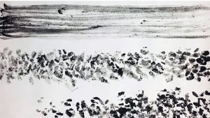
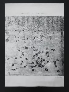
using riceif you are lucky and there is still enough ink on the lino mat you are able to get a second print called a “ghost print”OMG The grains of rice have been imprinted on the paper creating tiny dents which gives a textural quality to the once flat paper. I am really amazed at how simple material like rice can create such different prints and likewise a varied range of textures! Love this!!using the roller and block print ink on lino matthis time rolling directly on the paper itselfusing kitchen towelI really like the textural quality of the kitchen towel. It offered an alternative to the conventional smooth surface that paper has which is interesting!! Hence, the texture of the surface which we choose to print on is significant as it can bear certain meanings and offer us some variations!
I really love how each print is unique and different! The element of chance plays an important part in each creation and there can sometimes be happy accidents 🙂 The result from each print never fail to surprise me!
Back in hall…
experimented with the waxy table and chinese ink and natural coloured calligraphy paper (my mum will kill me if i attempt to do this at home)kind of look like one of those cells I came across in my bio textbook back in sec schoolanother one
and I managed to achieve a few interesting marks! Something to note when using calligraphy/rice paper is that you really have to control the ink, for instance the amount applied, the pressure, as well as the time you let the paper sit on the ink as i have torn quite a few pieces of paper.
Now with these experiments done, I am ready to move on to developing my idea and EXPERIMENTING MOREEEEEE