F O O D S T Y L I S T
Everyone needs a little help to look their freshest. Celebrities have makeup artists, Instagrammers have filters, and food has food stylists. Behind mouth-watering food photos is a stylist who tricks the viewer. I am fascinated by how food stylists have the ability to exploit the appetites of consumers by tricking them into believing the perfect and flawless image of food that is presented to them, but rather, the blemishes are actually covered up with mostly inedible materials to make the food more appealing.
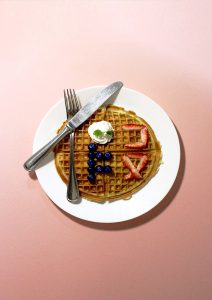
Hence, what is presented to the consumers is a facade (假 → Jiǎ), for the reality (真 → Zhēn) and what goes behind the preparation of the photo ready food is rather unappetising and unexpected sight.
I adopted a cheerful and bright colour palette, revealing the tricks and deceits in a fun, playful and light-hearted manner as the ability to make food look more appealing with the use of inedible materials was what drew me in to this job. Food stylists are not cheats, they are simply in the business of improvisation and manipulation to appeal to consumers.
My name is
and I’m a food stylist.
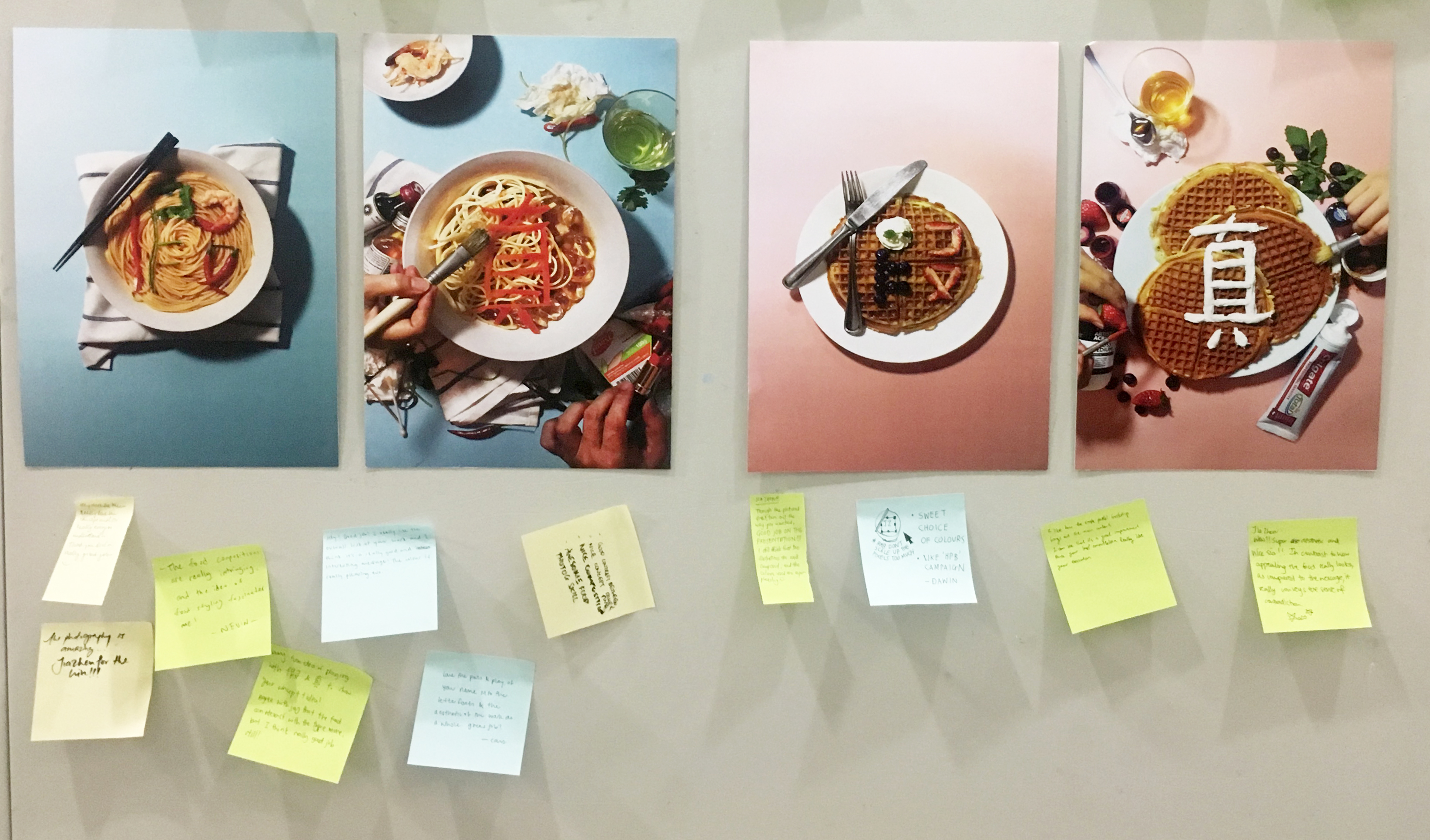
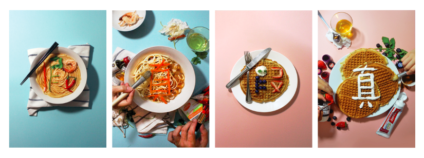
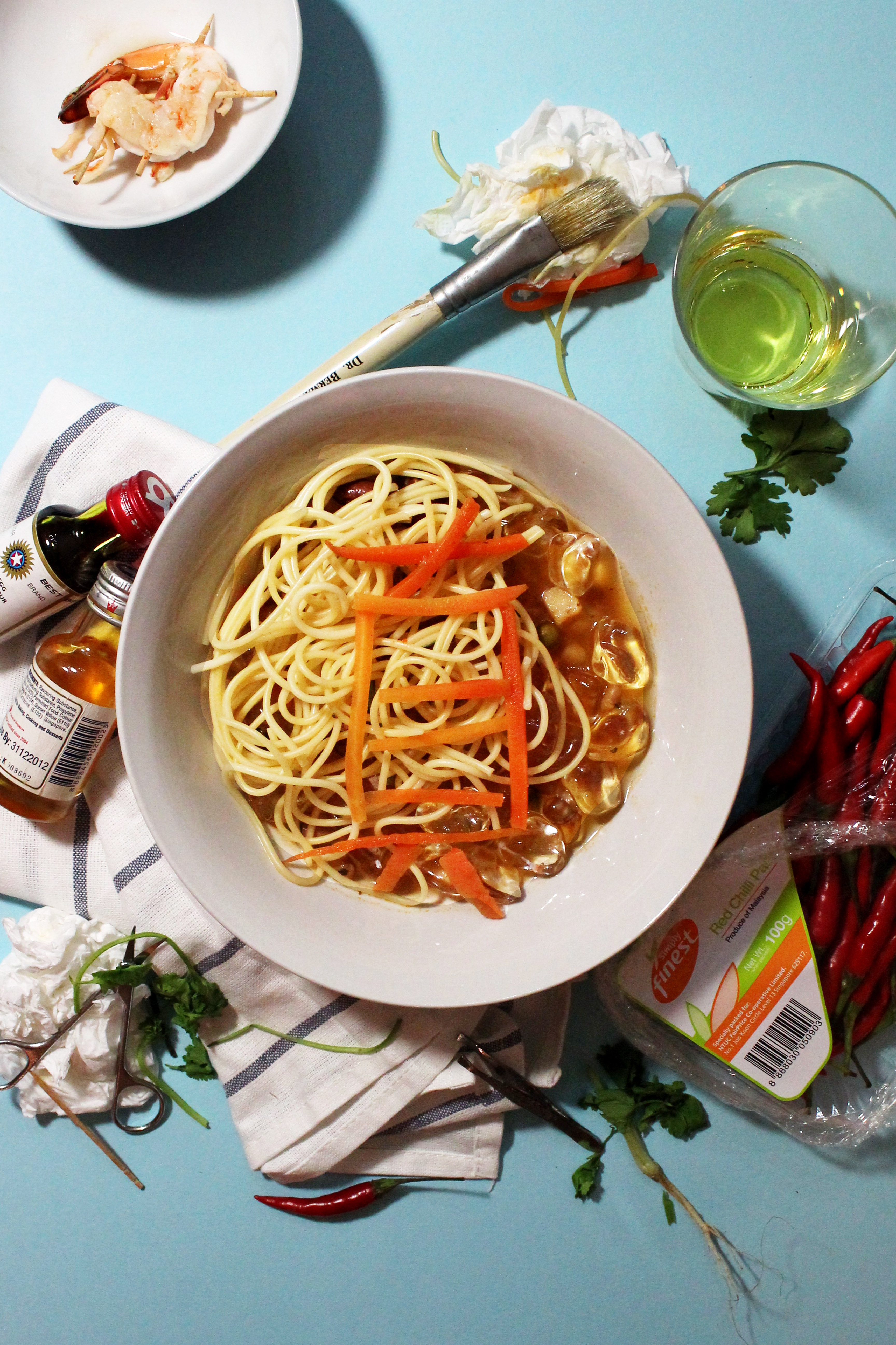
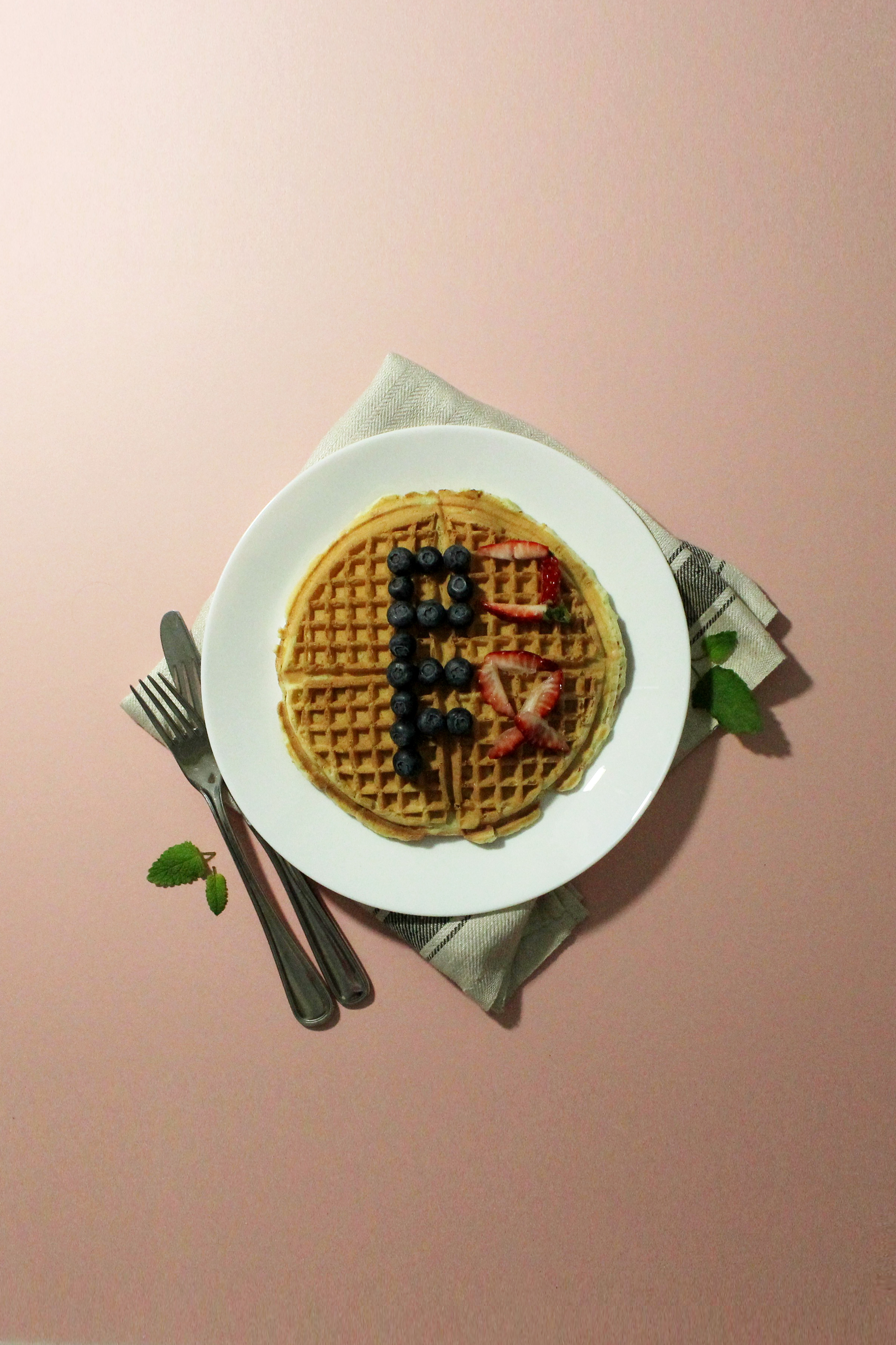
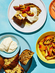
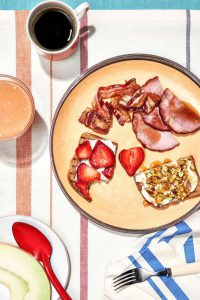
C O M P O S I T I O N 1
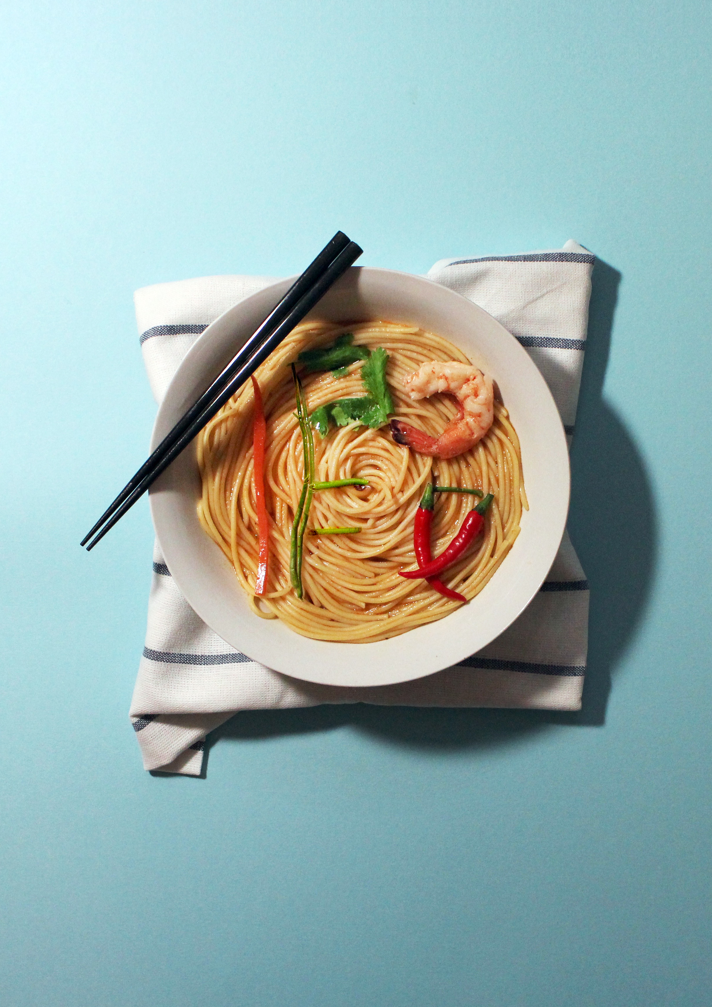
I tried to incorporate some of the ingredients from the broth into the composition but instead of aiding in the integration of the type into the noodle, it made it look rather cluttered and complicated, distracting the viewers from the type making it difficult to make out the type.
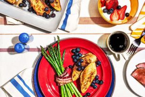
C O M P O S I T I O N 2

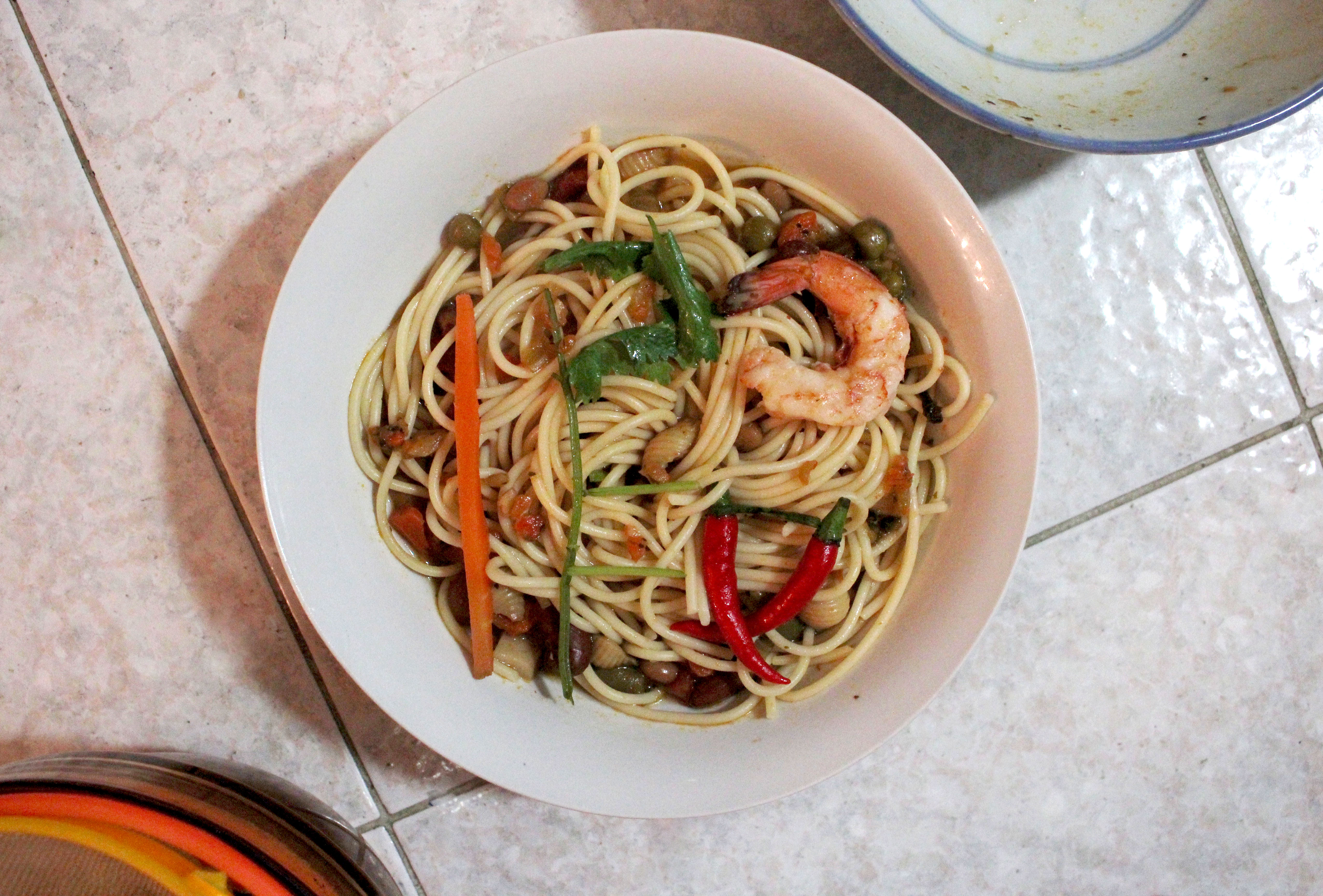
Here are some other arrangements that I have tried.
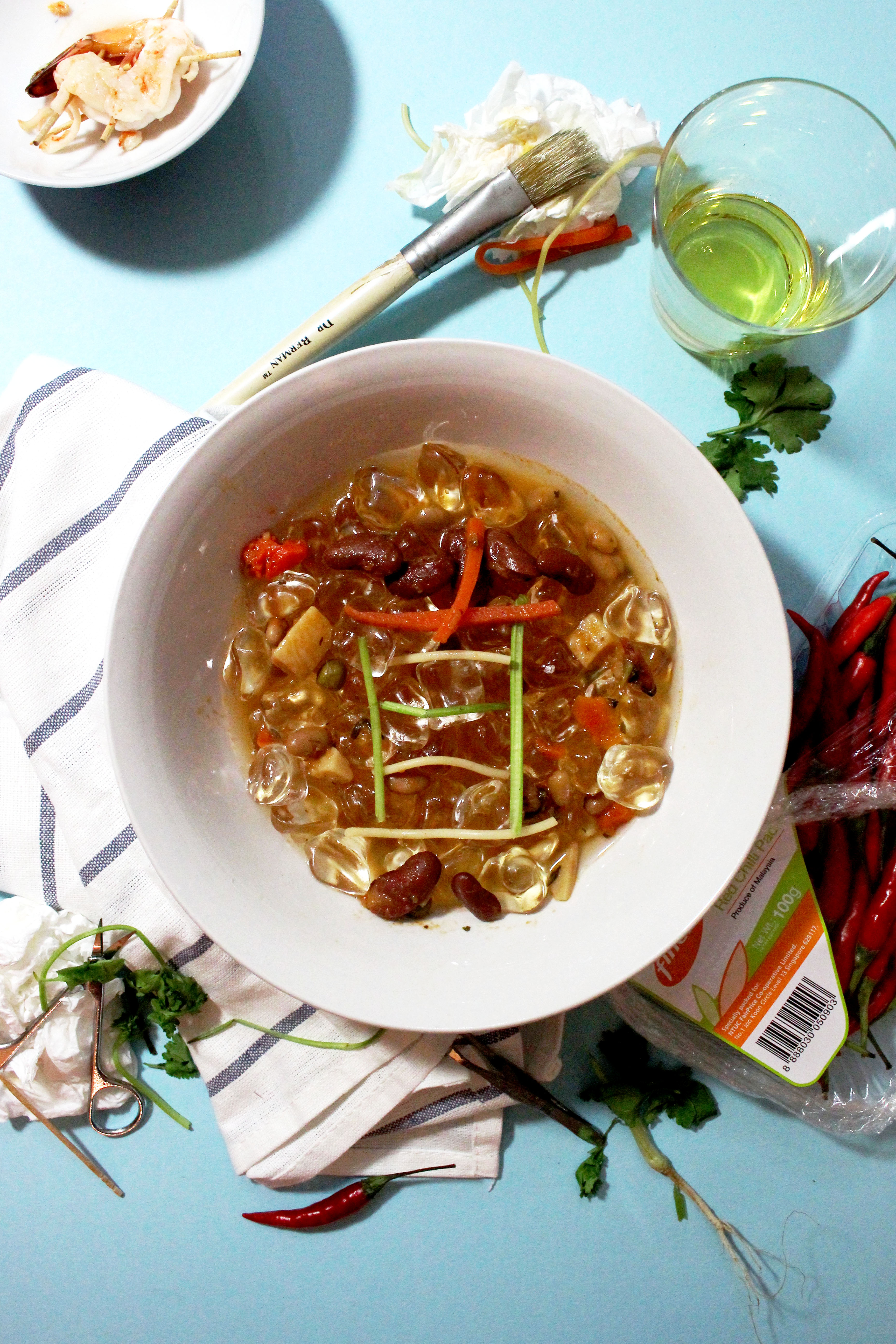
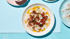
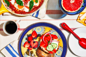
I tried to form the 真 using the ingredients from the soup as well as the garnish but there was way too many things going on in that bowl and hence failed to bring attention to the type.
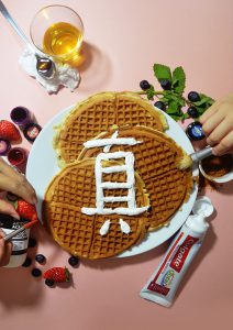
After taking some of these shots, I felt that the compositions look way too static and hence decided to include hands in my subsequent shots. Likewise, the usage of hands better depict the job of the food stylists as if I were to leave the tools in the frame without the hands carrying out the act of “beautifying” the food, it may be difficult for viewers to understand.

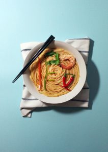
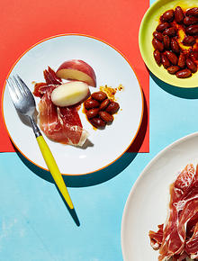
C O M P O S I T I O N 3

Here are some other arrangements I attempted.
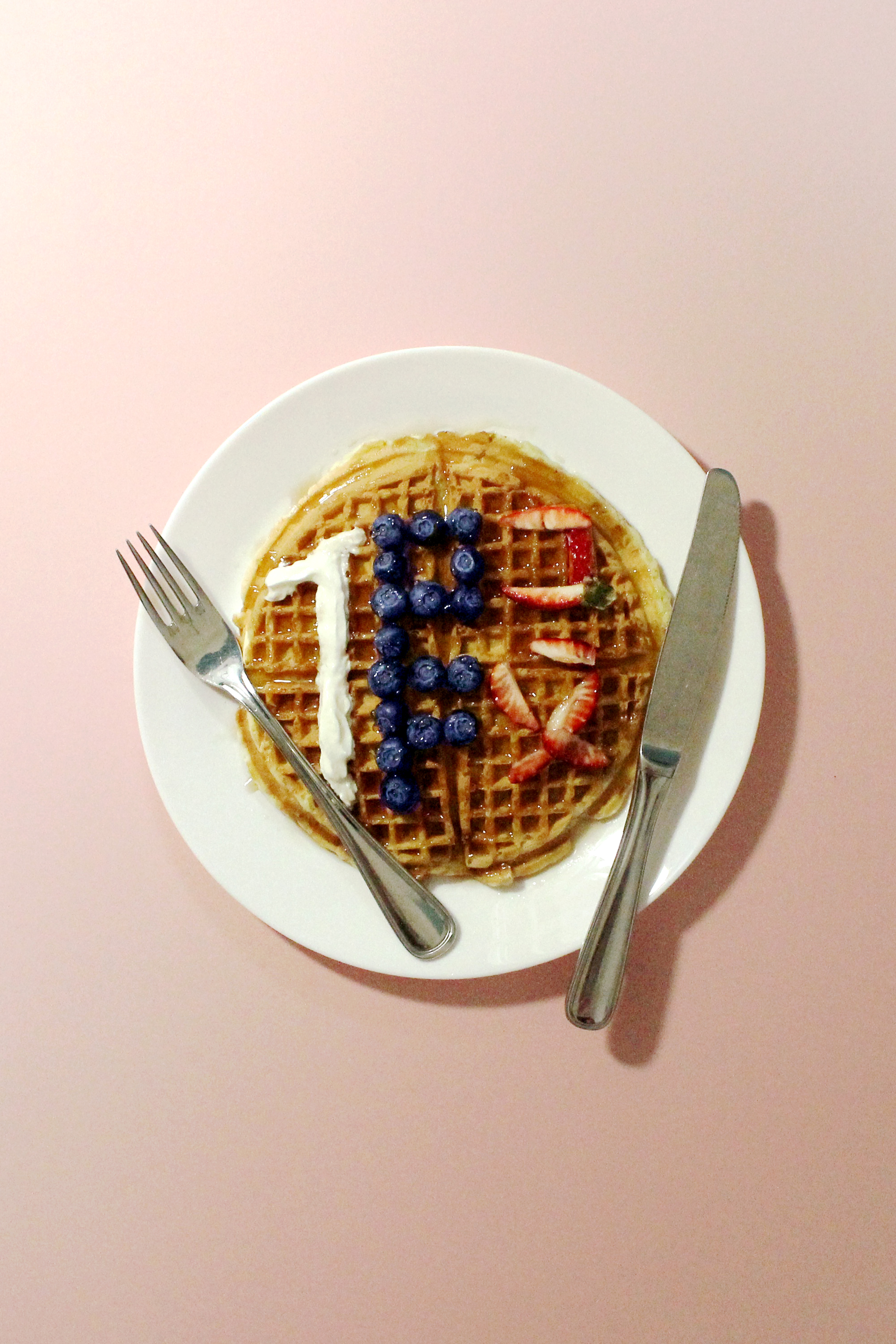
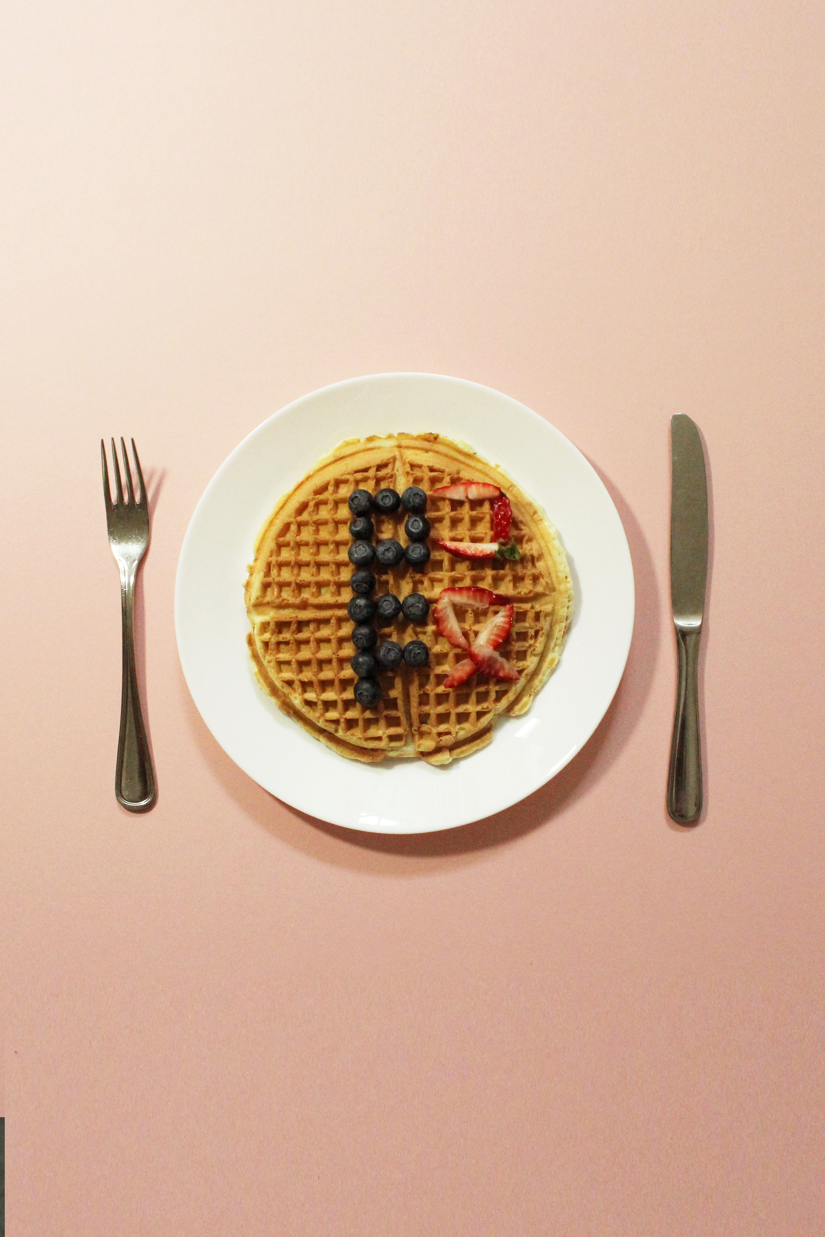

After these attempts, I finally decided on using the cutleries to form part of the word so as to make it seem like a set when placed beside the first 假 composition.
The blueberries were way too dark and black in the shots and required some colour correction.
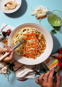
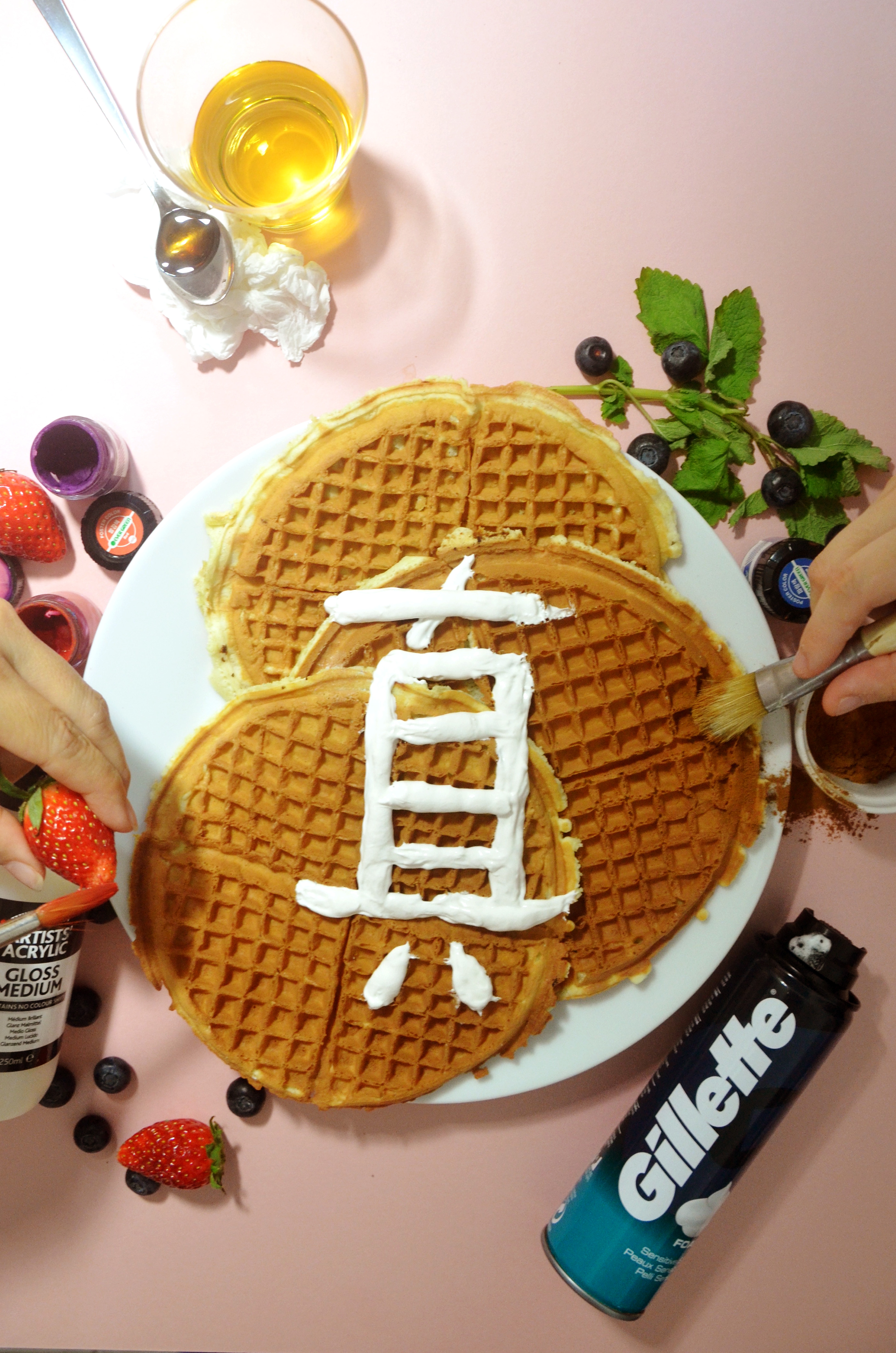
C O M P O S I T I O N 4
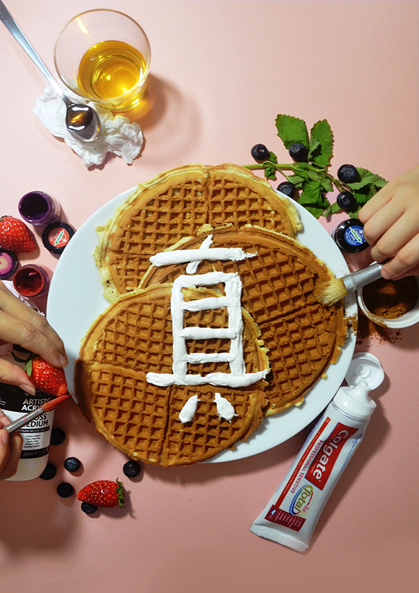
I decided on using the shot with tooth paste in replacement of the shaving foam as I felt that though the cool tones correspond with that of the blueberries, the word Gillette that was printed in bold white across the bottle was too jarring and was snatching too much attention away from the 真 which was the focus of the composition.
Tooth paste vs Shaving cream.
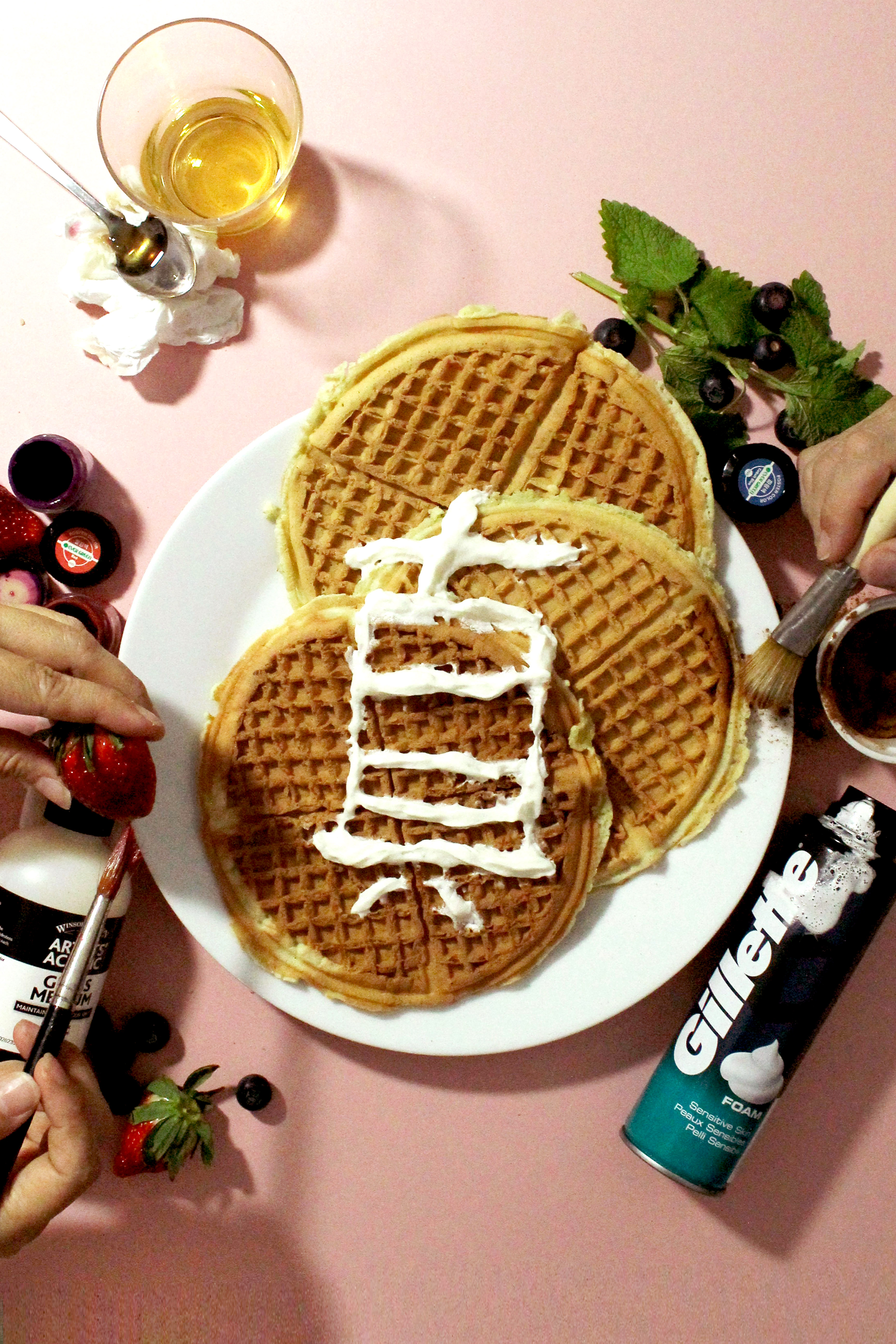
A failed attempt at writing the 真 as the whipped cream melted out too quickly before I could get the shot. (wanted to see if I could use whipped cream even though shaving foam and tooth paste are being used on shoot as I wanted to eat the waffles after)
A R T I S T R E F E R E N C E
T A M A C A R E Y

I really love how she kept the background flat so that focus is given to the food and how the blue complements the food on the plates making them stand out more.
I also love the hard edge shadows which she has in all of her compositions.
D A V I D E L U C I A N O
The bright colour palette which he adopts in his works was what I had in mind for my compositions.
S T E P H A N I E G O N O T
Again with the flat background.
J O H N B E N T H A M
Flat background! Simple and minimal composition with he food featured being the only focus.
S T R U G G L E S
OMG SPENT ALMOST 50 BUCKS ON PRINTING COS THERE WAS THIS STRIP THAT RAN ACROSS ONE OF MY COMPOSITIONS AND EACH PIECE WAS 4 BUCKS OMG…
and I forgot to convert printing files to CMYK an expensive lesson learnt. ALMOST DIED AT THE PRINTING SHOP never gonna do last minute printing again (I hope)
I was very disappointed by how colours turned out in print as the bright and pastel look was gone.
AND GREATEST MISTAKE…I went to drag the pixels to fit the frame and hence the prints turned out grainy and noisy. Lesson learnt! Got to frame the shoot and stretch the image to crop.
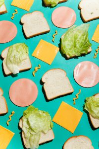
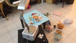
B E H I N D – T H E – S C E N E S
Tools: Table lamp, paper for the background and some tables
P R E S E N T A T I O N