
Hey diddle diddle! The cat and the fiddle,
The cow jumped over the moon,
The little dog laughed to see such sport,
And the dish ran away with the spoon.
*underlined – subject matter
*italics – verbs
- UNITY – similarity, coherence, joined together as a whole
common purpose of subject matter
How? – use of colour (b/w, grayscale), focal point within composition,
repetition, common direction of subject matter

- HARMONY – synchronization, merged, gelled up into the environment,
natural juxtaposition of subject matter
How? – use of colours (b/w, grayscale), textures
similar to unity?
- CONTRAST – state of being strikingly different from something else in juxtaposition,
How? – jagged vs smooth lines, organic vs geometric, big vs small (variation in sizes)
dark vs light, tonal contrast (grayscale)

- PATTERN – repetition, tessellation of subject matter,
continuous, duplication, multiplication
How? – use of colours, lines, sizes, duplicate layers!
eg. Textiles, architecture, prints
- MOVEMENT – general motion of subject in a composition
dynamism, flow of something, suggestion of speed
How? – Duplication of subject + variations in opacity, close arrangement to suggest movement path, variation of space to suggest speed (closer = slower, further = faster)
Blurring of subject, directional, towards a focal point, implied action

- BALANCE – stability of composition, weight of each subject
How? – arrangement of subject, variation of contrast throughout composition,
net force and net momentum of composition -> implied movement (e.g toppling, sliding off)

- EMPHASIS – special importance or value of a subject, prominence given to something
How? – Focus! Attention seeking,
variation of sizes, contrast, clarity, placement of subject in the foreground

Experimentation with compositions
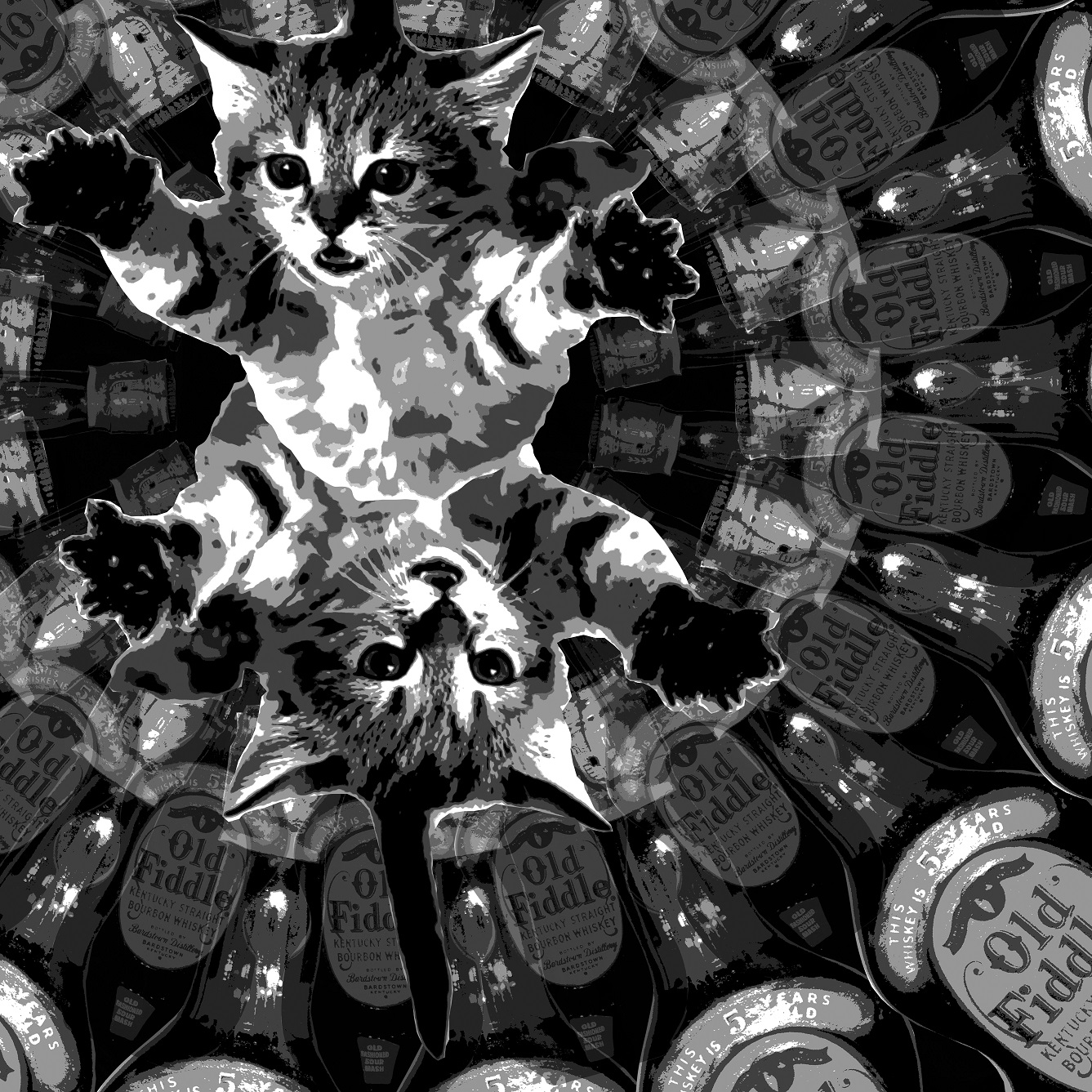
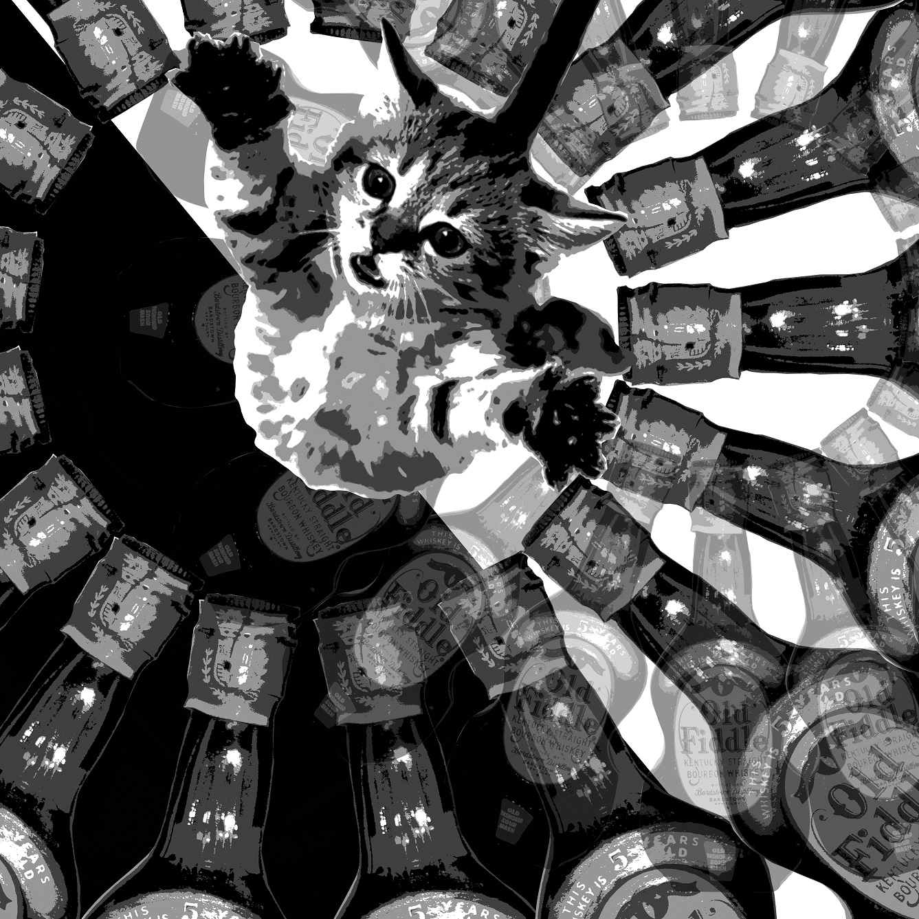
HEY DIDDLE DIDDLE! THE CAT AND THE FIDDLE,
Left: Black background, more symmetrical due to mirror image of kitten and complete round of whisky bottles. Less exciting as compared to the composition on the right as it lacks contrast and interesting details.
Right: Diagonal black and white background gives the composition a sense of imbalance. However, the additional details of the whisky bottles on the white background stands out more due to the contrast, hence balancing the composition as a whole again. The weight of the kitten also lies mostly on the side of the white background. Furthermore, the intoxicated kitty flying through its whisky wonderland gives this composition a trippy, imaginary feel, Hence, I chose this as one of my final images.


 HEY DIDDLE DIDDLE! THE CAT AND THE FIDDLE,
Top left: The majority of the weight lies at the top of the composition due to the multiplication of music scores. The grumpy cat that is emphasized at the bottom stands out, hence giving the image a top down balance. However, the composition is still slightly unbalanced horizontally.
Top right: This image is similar to the previous one except for the addition of fiddles amongst the music scores. The further repetition of the heavy contrasted fiddles gives the music cloud much more volume. By varying the opacity of the fiddles, I am also able to control the arrangement and solidity of the music cloud to create a sense of unity. Hence, I chose this as one of my final images.
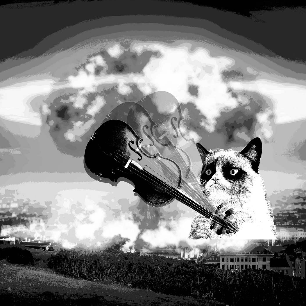
Bottom: This composition is much simpler despite the cat wrecking havoc in the middle of an exploding town. Violence is conveyed through the swinging down of the fiddle. The sense of movement is created by a repetition of the same image with varying opacity, arranged along the path of movement. As this image is heavily emphasized in the center and definitely captures attention, it was among my top choices for the finalization. However, the previous composition was chosen due to its more complex juxtaposition of subject matter.

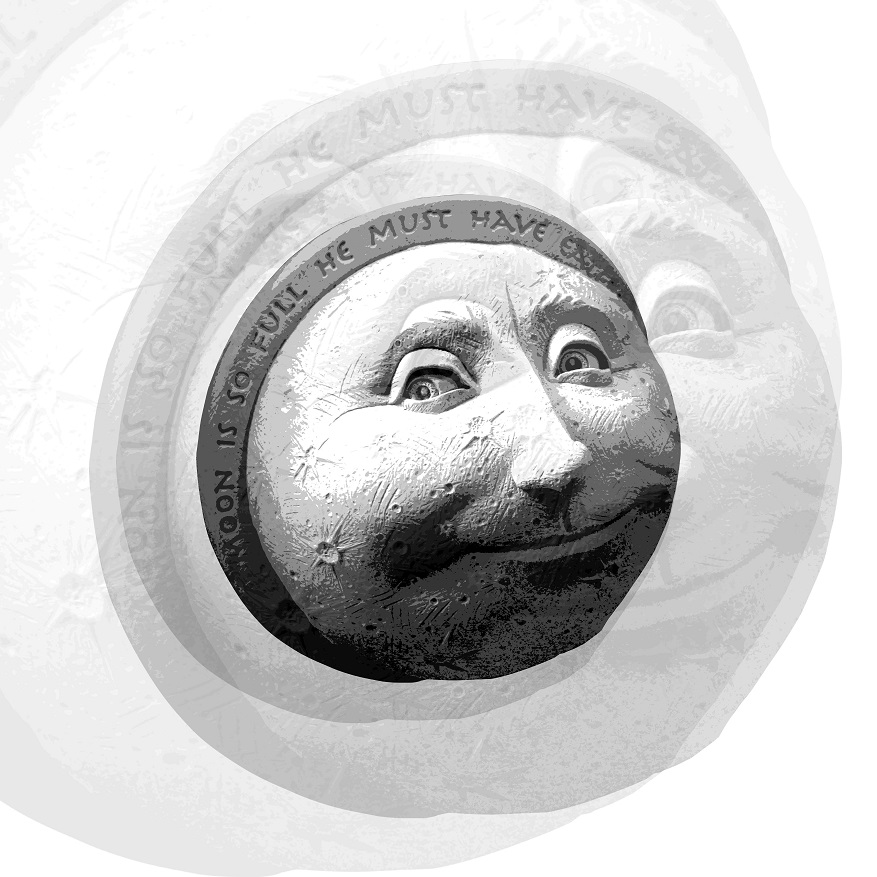
THE COW JUMPED OVER THE MOON
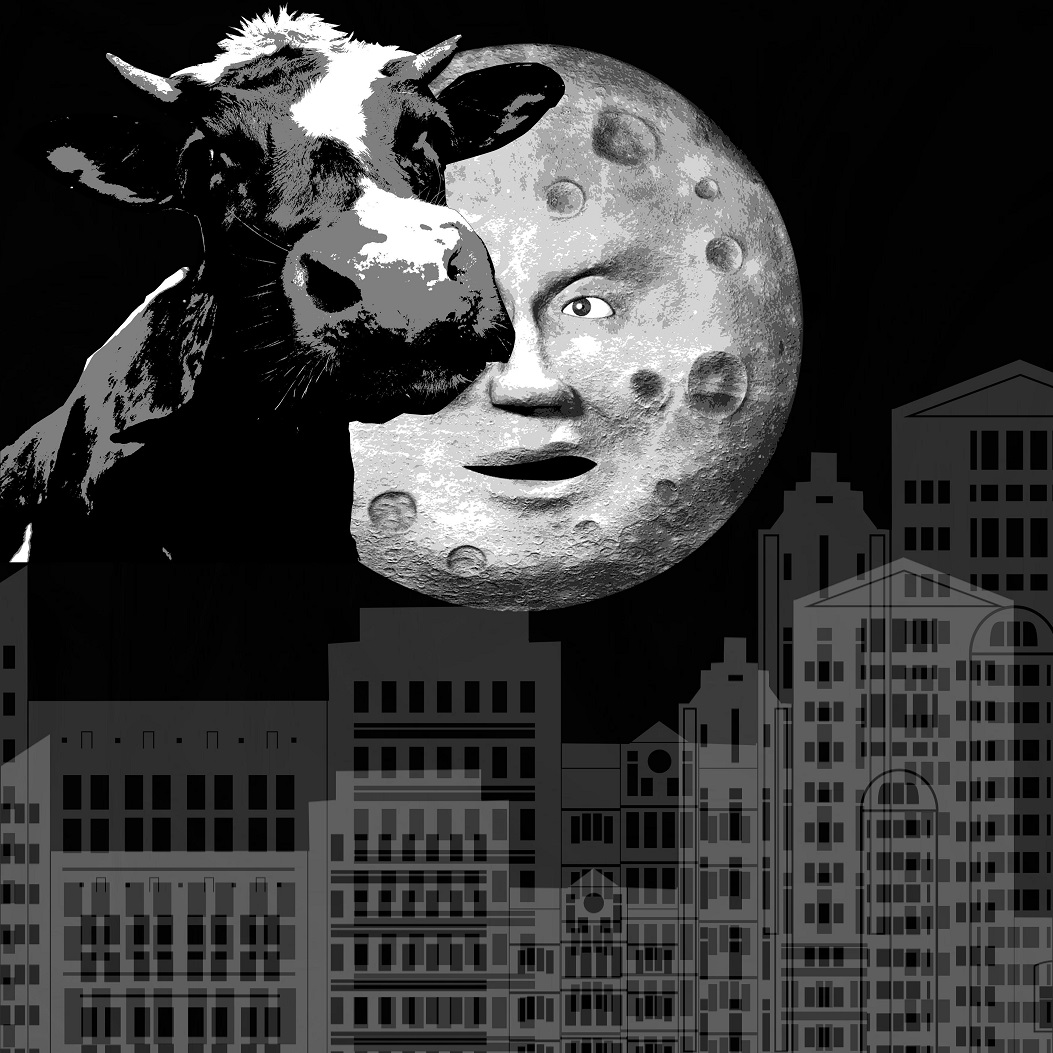
Top left & right: Both compositions at the top looks similar. The three major subject matter – cow, moon, buildings, are of approximately the same size and hence there are no clear emphasis at any point within the images. Although I like the details of the moon face and the cow when they are enlarged, I feel that these two compositions are flat and uninteresting, hence ineffective.
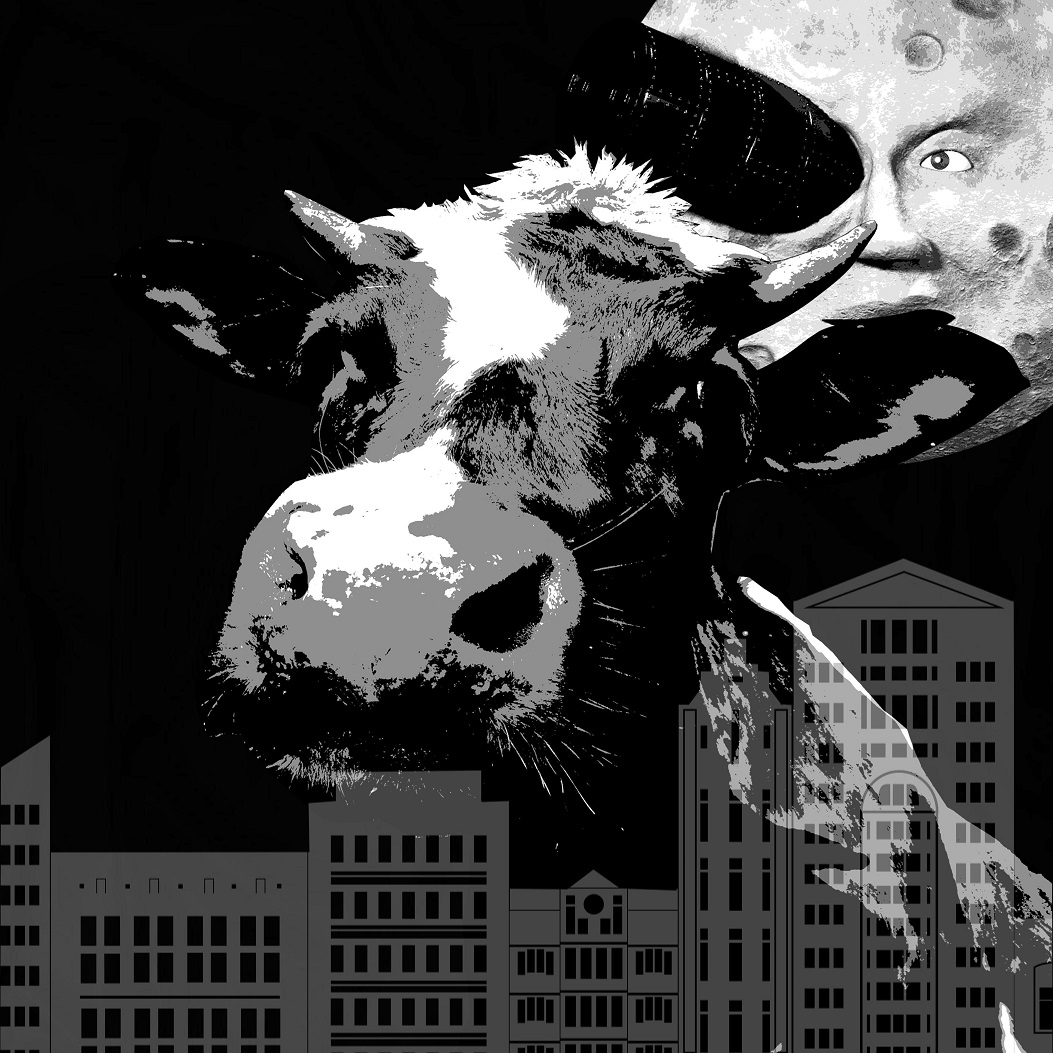
Bottom: This composition is slightly more complex as compared to the two on top. The multiplication and rotation of the moon face adds dynamic to the picture. The arch arrangement of the moon faces is also inspired by the jumping motion of the cow over the moon. The movement of the moon face is also somewhat a pattern due to the circular rotation. This variation of the composition was one of my top choices for finalization, but was eventually discarded as I felt that the overlapping at the bottom made the composition look a little flat.
‘
THE DOG LAUGHED TO SEE SUCH SPORT,
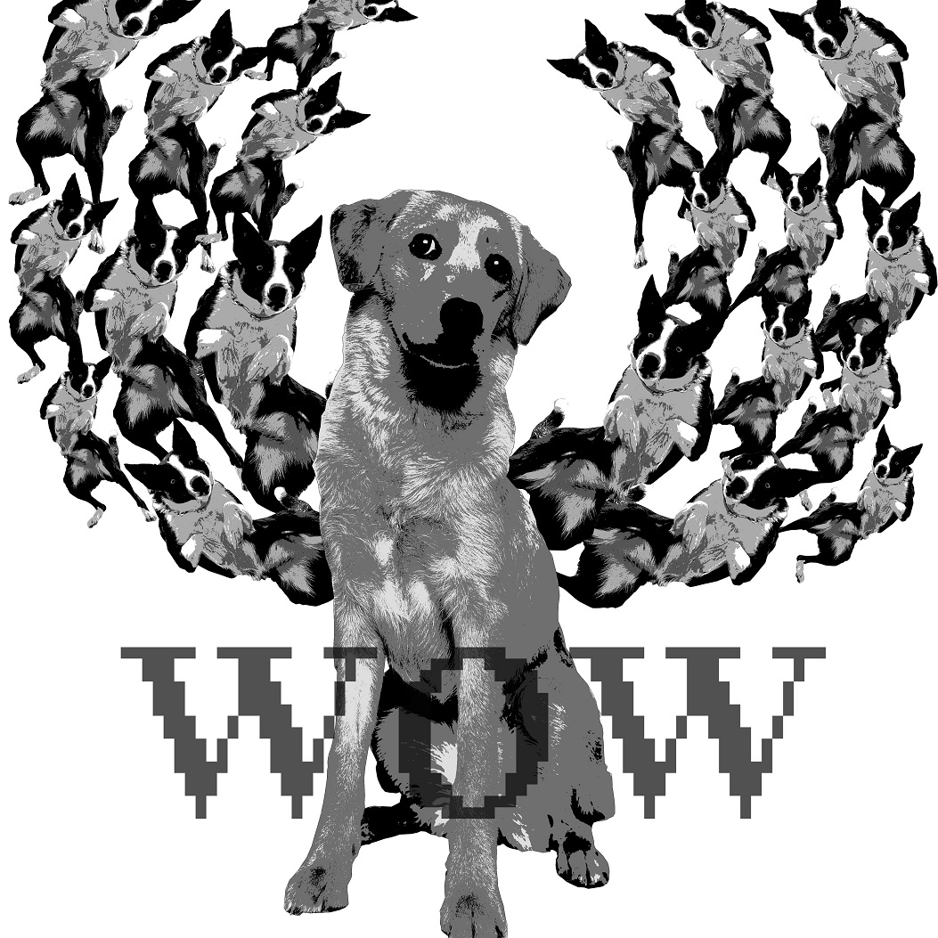
Left: This composition is pretty strange. The placement of dogs is somewhat symmetrical, but there is a lack of depth (due to the absence of a background, similarity in sizes), and hence I feel that this image is flat and aesthetically less pleasing.
Right: At first, I liked the arrangement of subject matter in this composition. However, I felt that the nature of the subjects (probably due to the treatment of images – halftone vs posterize) is too contrasted such that the composition lacked unity and coherence. Furthermore, the tonal contrast is also not ideal as the largest Scooby Doo in the foreground is not emphasized enough. The image looked a little too dull overall and hence, it was not chosen as my final.
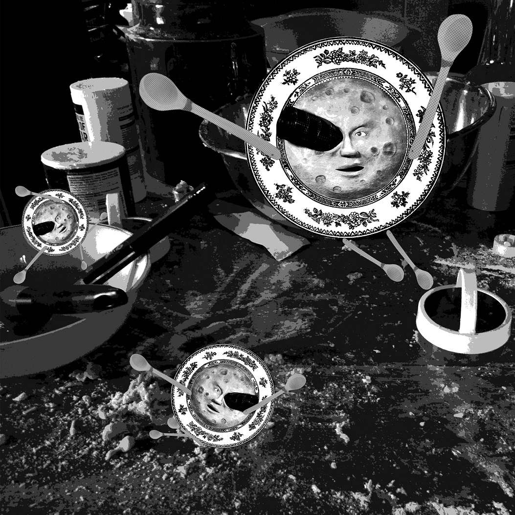
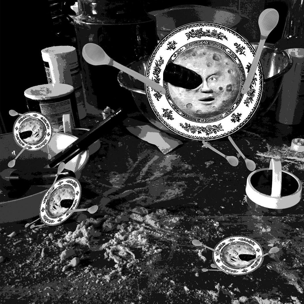
AND THE DISH RAN AWAY WITH THE SPOON.
Left: For this composition, I decided to put the subject matter – dish and spoon, in context. I felt that the humanized dishes fleeing from a kitchen war zone gave the image a sense of unity and coherence. However, this variation of the image was not chosen as the dishes were too similar in terms of shape and there is a lack of depth and hence is flat.
Right: I played around with the dimensions of the dishes in this composition, creating a sense of depth. The two dishes at the bottom of the pictures appear to be falling/have fallen onto the table top due to the sense of perspective. The addition of another humanize dish also adds to the dynamic of the composition as a whole. Hence, this image was chosen as one of my final.