Emergent Visions – Reflection on Krzysztof Wodiczko

Krzysztof Wodiczko is a Polish artist renowned for his large-scale slide and video projections on architectural facades and monuments. Since 1980, he has created more than 70 large-scale video projections on monumental architecture worldwide, and focuses of the ways in which these monuments reflect the collective memories of the communities and history, and are often politically charged. He uses monumental buildings as a symbol of victory, through which he gives voice to the concerns of marginalized and silent citizens who live in the monuments’ shadows.

1. The Investigators

5-kw

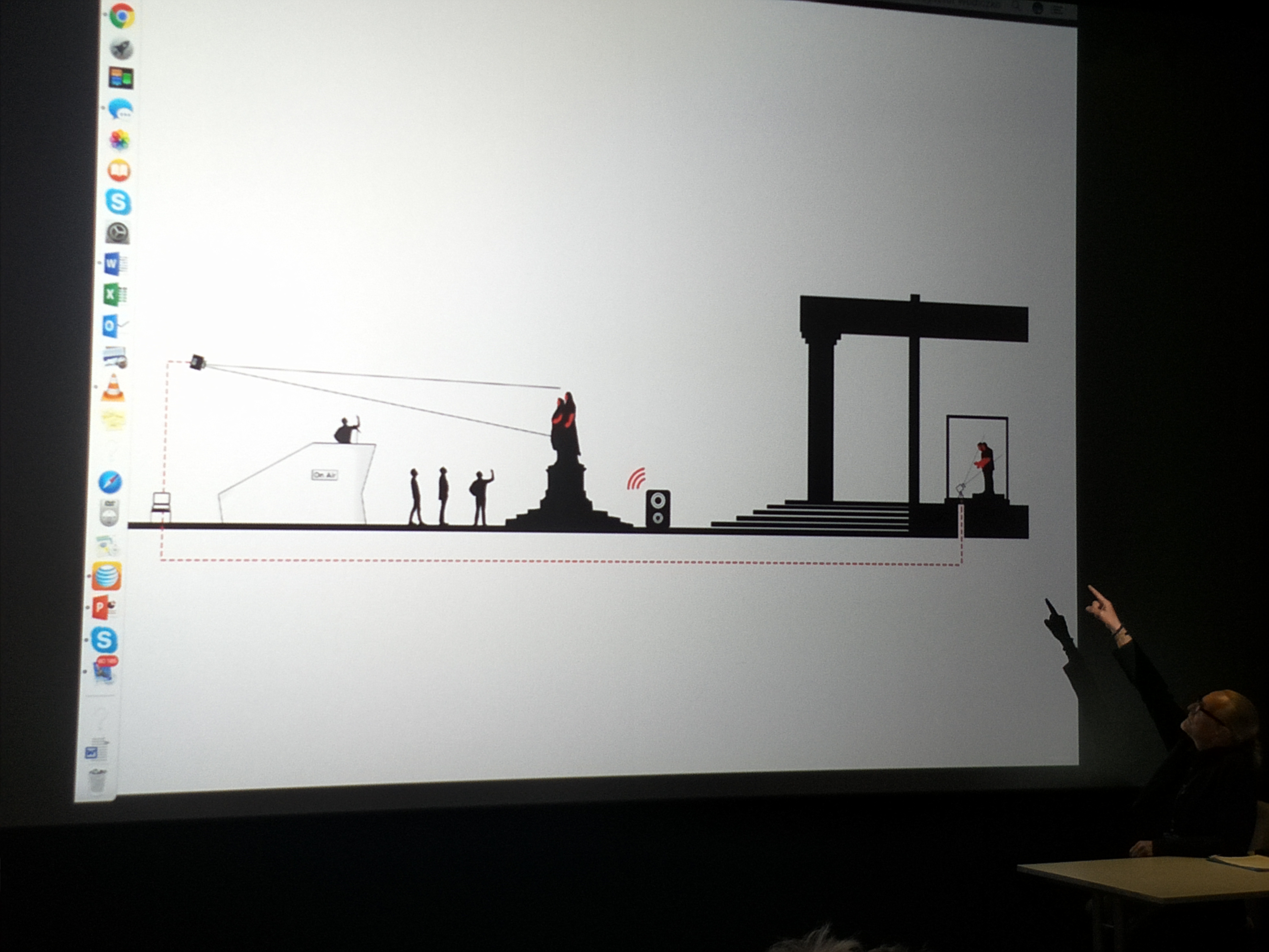
“The Investigators” is an interactive public video projection installation which took place originally in Weimar, Germany. Live images and voices of refugees are projected onto the statues of Schiller and Goethe, facing the assembled public standing on a raised platform. The act of talking back to a monument in real time allowed the refugees and general public to open up and share their historical experiences, and as a result was a political achievement.

“The statue represents a past that cannot be changed” – Wodiczko

In this work, Wodiczko presents an opportunity of the public to voice themselves, and make changes despite the fact that the public space is barricaded by monuments. As European cities are often packed with war memorials and monuments symbolic of war victories and defeat, Wodiczko believes that the whole city is in fact one big memorial to war, and that the communities of people are all war memorials inside of themselves.

Why Schiller and Goethe? – Symbolized a remarkable friendship and collaboration between two of the most well-known figures in German literature. Goethe sheltered Schiller as a refugee.

Images courtesy Krzysztof Wodiczko Studio.
Participants getting into position in the studio, behind the scenes.

2-kw
Live projection mapping by technicians behind the scenes.

2. Homeless Vehicle

Image result for homeless vehicle krzysztof wodiczko

Wodiczko teaches interrogative design at MIT. While the homeless vehicle is seen as a design solution to homelessness, 10 000 homeless vehicles cannot be made. In a way, the homeless vehicle provides emergency help, a metaphorical bandage, but has further implications of the conditions and problems behind the wound.

Image result for homeless vehicle krzysztof wodiczko

3. Hirshhorn Museum, Washington, D.C.

Image result for Hirshhorn Museum, Washington, D.C krzysztof wodiczko

The work displays a very powerful image of a hand holding a candle on the left, another on the right with a gun and microphones at the center of the building.

Concerns over the restaging of his projection following the Parkland Florida school shooting. A very relevant insight I got from this work was that there is a world behind the facade of museums. Museums operate in the same way that monuments hide behind the ideological smokescreen of victory and selectively memorable parts of the location’s history.,

The board of trustees(consisting of governmental figures and billionaires) told him to restage the work prior to the tragedy and the decision was made to postpone the work’s display as a gesture of respect. The imagery of the gun might have triggered someone who was affected by the shooting. The media plays a huge part in a work and every work is done with the expectation to be hijacked.The fact that the work opens itself to discourse is seen as an outcome that far outweighs its risks of being hijacked.

References

https://art21.org/artist/krzysztof-wodiczko/
https://parsejournal.com/article/the-investigators/

Assignment 4 – Response to Chapt 1 from Kim Goodwin, Designing for the Digital Age

Designing for the Digital Age by Kim Goodwin provides a framework for designers embarking on their projects, to achieve optimum efficiency and effectiveness, from a functional, industrial standpoint. Goodwin believes that the essence of design is to visualize concrete solutions through conceptualizing for stakeholders to see and understand, and eventually build. As mentioned in the second paragraph, the ability to serve human needs and goals is what sets a design artifact apart from art.

Goal-directed design is a method developed at Cooper (founded by software inventor Alan Cooper) for approaching the design of products and services. With user goals in mind, goal-directed design aims to aid skilled designers in their job of generating great solutions, instead of acting as a set of rules or restrictions. This method consists of four main components – Principles, patterns, process and practices, that make up some of the techniques that one can implement while designing projects in the real world.

In my opinion, this framework would be very helpful in the planning, conceptualising and the production of a design artefact, but should be used as a general guide, and not in a way where it dictates the direction of the ongoing project. While adapting this framework, certain components and processes may also change depending on the nature of the project and its participants, and exceptions should be made for unique cases. For example, the processes, structure and practices behind the makings of a computer game would be very different from the one behind the production of a household product. What do we change then?

Apart from that, some other questions also come to mind: Does this framework still come into play with several key stakeholders in collaboration? What if there is a conflict in interests and goals?

Assignment 3 – Response to Chapt 1 from Jonas Löwgren and Erik Stolterman, Thoughtful Interaction Design

This reading discusses about what constitutes a good design and the thought processes that should go through every designer’s head. While there are many different definitions of what a good design is and what design theory means, this chapter gives readers a general idea of core design concepts, and the scope of what should be considered when embarking on a thoughtful interaction design.

The design process encompasses the designer, the resources and the situation at hand, and by considering these elements, newly created designs should aim and participate in problem solving. Unlike logical problem solving, this sort of problem solving is an ongoing process that influences people’s work, leisure and everyday life. On top of that, this chapter generally emphasised on the importance of having a good balance between aesthetic design and its functionality, which in turn constitutes a thoughtful design.

One example of a relevant design with very practical consequences – Changi airport flight information boards, commonly found in the large areas near the entrance of the terminal:

6 LED flight info displays at Terminal 3
Split-flap display at Terminal 1

The efficiency of information transfer between the user and the boards lies in its design. Ideally, the user should be able to refer to the displayed information comfortably, find and effectively remember the details of their flight within a short amount of time. Personally, I prefer the design of the split-flap display for both its aesthetics and functionality.

Visual clarity

Unlike the downward layout of split-flap displays, LED displays lack direction and clarity when all six pages of information are displayed at once. With their attention already divided, one can easily lose track of their search if the information on the screen changes with no warning, resulting in a slower transfer of information to its users.

Tangible vs digital

Despite living in an increasingly digitised world, the process of learning is often more effective and enforced through tangible experiences. Physical tools often have a stronger impact than digital mediums. Similarly, the physical qualities of the split-flap display catch the attention of the viewers and draws them to the neat, structural layout of the electromechanical flaps. The metallic flapping sounds of the display alerts the viewers when the information is being updated, giving users a better understanding and a cognitive map of the information that is being presented to them.

Context

Considering the bright interiors of Changi airport terminals, with floods of both artificial and natural lighting in the day, high amounts of light may reflect off the screens, affecting the visibility range of large reflective displays. Split-flap displays, on the other hand, are non-reflective, allowing wider viewing angles, convenience and viewing experience for the general public.

However, when the budget and spatial limitations are taken into account, LED displays are in fact more feasible in some locations. On other levels of the airport with lower ceilings and less sunlight, these displays are laid out on a straight row instead of the 3×2 arrangement.

This also proves Löwgren and Stolterman’s point where:

“The good of a particular digital artefact also has to be judged in relation to the intentions and expectations present in the specific situation. This means that the artefact users’ competence and skills in judging quality has a great impact on how the artefact is assessed.”

Overall, this was an enriching read that presented many interesting ideas and applicable concepts to us, as interactive design students. It highlighted many key points that should be considered when embarking on any design projects, and provided insights about the processes relevant to the design industry.

Assignment 2 – The Oceanic Exhibition Report

Sound performance by Tarek Atoui

About Tarek Atoui

Tarek Atoui (Lebanon/France) is a sound artist and electroacoustic composer, known for his inventive instruments through complex engineering. He custom-builds his electronics and setup for his performances, truly utilising technology as a form of his identity and expression. Atoui’s projects often revolve around educational, social themes and extends into the history of music and instrumentation.

In one of his most notable works – Infinite Ear/WITHIN, he explored the different ways in which the deaf can perceive sound, and how they can also influence our understanding of sound art.

The Performance

In collaboration with TBA21-Academy and as a part of The Current Convening #3: Tabu/Tapu and The Oceanic, Tarek Atoui performed a sound piece exploring the human interventions in oceanic ecospheres. The piece lasted for almost an hour, consisting of many harbour and underwater sound recordings and electronically synthesized disturbances. While it was not stated for this piece, Atoui’s performances are usually improvised for the most part.

His performance began with a low rhythmic beat, with subtle tones. As the piece progresses, there was the addition of metal clinking, the sound of machines turning, engines and digitized sound effects. There was a gradual increase in volume towards the middle, although the piece fluctuated between being dominantly soothing and chaotic.

Atoui’s brand of sound art is also characterised by his manic bodily movements during the performance, as he switches between his electronic controllers and computers. Some of these movements include dramatic pushing of pressure triggers and turning of large imaginary knobs above his electronics which triggered real responses in sounds. His bodily movements follow closely the flow of his improvised piece, ranging from rigid, sudden movements for loud machinery sounds, to smooth dynamic movements for environmental sounds.

Considering Atoui’s fascination with history and electronics, I believe this piece plays an important role in bringing his audience on an audio voyage through the evolution of our global oceans. His piece consists of natural recordings build on by the addition of contrasting synthetic sound effects and disturbances, suggesting the correlation between environmental degeneration and human industrial creation. Atoui’s composition of the natural and synthetic suggests a range of ideas as to what these disturbances might be and whom they may have affected: remote communities, traditional tribes (refer to audio recording 8), warship radar and nuclear tests (audio recording 7), and the extraction of natural resources.

Link to audio recordings & videos:
https://drive.google.com/open?id=14HD3BOsxf36JTInRqL6SezktzcqDKtJ-

Link to group presentation with Xin Feng & Tiffany:
https://docs.google.com/presentation/d/156YK8W4hmqBQNOkiv–JBJNSLWY1P6c3689JvpfOLLA/edit?usp=sharing

References

http://soft-cells.com/about/news/tarek-atoui
https://www.newyorker.com/culture/culture-desk/tarek-atoui-visiting-tarab
https://www.gillmanbarracks.com/others/ntu-cca-singapore/1838

Assignment 1 – Resume + Bio

1. Resume
2. Bio + Recent Work
3. Work that inspires youBio

Joan is currently majoring in Interactive Media in Nanyang Technological University, School of Art, Media & Design (ADM). She graduated from Serangoon Junior College previously, where she was trained mainly in the traditional art mediums. In 2017, she worked as a programmer intern for Multimedia People, where she designed interfaces for Gardens By The Bay and the IRAS Gallery.

She is passionate about bringing attention towards environmental issues and creating works to help people get closer to and appreciate mother nature. She finds comfort and inspiration in nature and has incorporate many of these elements into her past works, such as interactive plants, animal documentation and weather simulators.

She strongly believes that visual arts and interactivity play crucial roles in today’s media and marketing, and its power to change perceptions. In her future projects, she also hopes to inject the element of fun into the interactive learning experiences of people of all ages.

Recent Work

(Link: https://www.youtube.com/watch?v=p4p9brBXsKM)

UFO (Universal Forecast Object) is an expandable mood umbrella, fitted with real-time temperature and weather display. Our umbrella is shaped like a cloud and covered with waterproof nylon fabric. It changes colour based on the temperature of the user’s hands and expands outwards based on the strength of the user’s grip around the handle. This feature serves as a functional purpose, especially on stormy days where the coverage can be increased with just a tighter grip.

Through this product, we hope to provide people indoors with immediate weather information based on their location, and to better prepare them for their journey outdoors.

Graffiti Nature

teamLab, 2016 – present, Interactive Digital Installation
One of the five interactive projects on display at the ArtScience Museum’s Future World: Where Art Meets Science

Link: https://www.teamlab.art/w/graffiti_nature/

“Graffiti Nature is an artwork that is completely created by the visitors. The ecosystem of flora and fauna expands when visitors draw and colour in more animals and flowers, and butterflies grow and increase where the flowers are. If the animals sense you, they run away. Stand still and flowers will blossom around you. Walk around and the flowers will scatter. Search for your animals, and whilst making the flowers bloom, explore the Future World that everyone has created,” said Mr Toshiyuki Inoko, founder of teamLab.

This work resonates with me as it presents a dream-like reality where humanity and nature co-exists in a harmonious manner. Its immense scale and aesthetic qualities allow a part of the museum to be transformed into an immersive world of digital animals, with designs and patterns created by the visitors themselves. While it attracts audience of all ages, it primarily targets children, providing them with an enriching learning experience and to let their imagination run wild.